FIGURE 7.1 Collapse of the House of Cards and Entropy

Great fortunes are made and lost on Wall Street with the power of mathematics. Quantitative or “quant” modeling is akin to an arms race among banks. The conventional wisdom is that a bank that has superior models can better exploit market inefficiencies and manage risk competitively.
Many of the modeling techniques and ideas were borrowed from mathematics and physics. In hard sciences, a mathematical law always describes a truth of nature, which can be verified precisely by repeatable experiments. In contrast, financial models are nothing more than toy representations of reality—it is impossible to predict the madness of the crowd consistently, and any success in doing so is often unrepeatable. It really is pseudoscience, not precise science. The danger for a risk manager is in not being able to tell the difference.
Empirical studies have shown that the basic model assumptions of being independent and identically distributed (i.i.d.), stationarity, and Gaussian thin-tailed distribution are violated under stressful market conditions. Market prices do not exhibit Brownian motion like gas particles. Phenomena that are in fact observed are fat-tailness and skewness of returns, and evidence of clustering and asymmetry of volatility. In truth, the 2008 crisis is one expensive experiment to debunk our deep-rooted ideas.
This chapter discusses the causes and effects of the market “anomalies” that disrupt the VaR measure. Due to its failings, VaR is increasingly recognized as a peacetime tool. It’s like supersonic flight—the shock wave renders the speedometer useless in measuring speed when the sound barrier is broken; likewise our riskometer fails during market distress—the moments such as variance and kurtosis can no longer be measured accurately.
In physics, entropy is a measure of disorder or chaos. The famous Second Law of Thermodynamics states that entropy can only increase (never decrease) in an enclosed environment. For entropy to decrease, external energy must flow into the physical system (i.e., work needs to be done). Thus, in nature there is a spontaneous tendency towards disorder. For example, if we stack a house of cards (as shown in Figure 7.1), a small random perturbation will bring down the whole structure, but no amount of random perturbation can reverse the process unless external work is done (restacking). Interestingly, entropy acts to suggest the arrow of time. Suppose we watch a recorded video of the collapse of the house of cards backwards—the disordered cards spontaneously stacking themselves—we know from experience this is physically impossible. In other words, manifestation of entropy can act as a clock to show the direction of time.
FIGURE 7.1 Collapse of the House of Cards and Entropy
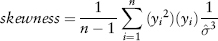
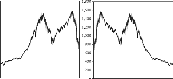
Figure 7.2 shows two charts of an actual price series. Can you tell which one has the time scale reversed purely by looking at the price pattern? Could this be evidence of entropy?
FIGURE 7.2 Which Chart Is Time Reversed? The Intuition of Entropy
Note the asymmetry—it takes a long time to achieve order (work needed) but a very short time to destroy order (spontaneous tendency). There is evidence that entropy exists even in social interactions. For example, it takes great marketing effort for a bank to attract and build up a deposit base, but only one day for a bank run to happen if there is a rumor of insolvency.
In information theory, entropy (or Shannon entropy) is a measure of uncertainty associated with a random variable used to store information.1 The links between physical, informational, and social entropies are still being debated by scientists.
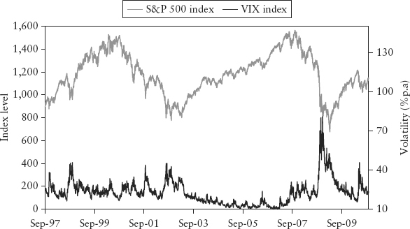
Financial markets’ entropy is manifested as the leverage effect, the phenomena whereby rallies are gradual and accompanied by diminished volatility, while sell-downs are often sharp and characterized by high volatility. Destruction of wealth has more impact on the economy than creation of wealth—it hurts the ability of firms to raise money and the individual’s spending power. For investors, the rush to exit is always more frenzied than the temptation to invest (there is inertia in the latter)—fear is a stronger emotion than greed. For example, consider Figure 7.3, which shows the S&P 500 index and the VIX index.2 There is an apparent negative correlation between a stock index and its volatility.
FIGURE 7.3 Negative Correlation between an Equity Index and Its Volatility
The leverage effect is also reflected in the equity option markets, in the form of an observed negative “volatility skew”—OTM puts tend to demand a higher premium compared to OTM calls of the same delta. The fear of loss is asymmetric; from investors’ collective experience, crashes are more devastating than market bounces. Thus the premium cost for hedging the downside risk is more expensive than that for the upside risk. Interestingly, this volatility skew appeared after the 1987 crash and is with us ever since. The volatility skew is illustrated in Figure 7.4; the horizontal axis shows the strike price of options expressed in percentage of spot (or moneyness). Points below 100% moneyness are contributed by OTM puts, while those above are contributed by OTM calls.
FIGURE 7.4 Illustration of “Volatility Skew” for an Equity Index

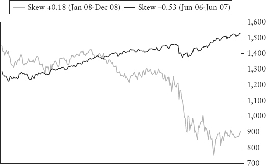
The asymmetry of risk causes skewness in distributions. In a bull trend, the frequency of positive observations is expected to be larger than negative ones. In this case, the skew is to the negative. As illustrated by Figure 7.5, the frequency on the positive side of the hump is larger. Because the area has to sum up to a probability of 1.0 and skew is measured on a centered basis, it causes a tail, which is skewed to the left. Conversely, in a bear trend, the skew is positive. Spreadsheet 7.1 lets the reader simulate these stylized examples. The rather unintuitive result is often observed in actual data. Figure 7.6 plots the S&P 500 index during a bull market (negative skew) and bear market (positive skew)!
FIGURE 7.5 Stylized Example of Bull Market and Negative Skew Distribution
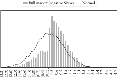
FIGURE 7.6 Skew of S&P 500 Index during Bull and Bear Phase
Consider equation (2.4) for sample skewness; it can be rewritten in terms of centered returns yi = xi −  :
:
which shows the interesting idea that skewness can be seen (loosely) as correlation between the movement of the random variable (Yi) and its volatility (Yi2)—by equation (2.16). Generally (but not always3) the correlation is negative during a rally and positive during a sell-down. Note the relationship between Yi and its volatility is quadratic and hence is not well described by linear correlation.
Unfortunately, skewness is an incomplete measure of risk asymmetry. In particular, it fails to account for price microstructure when prices approach important support and resistance levels. Consider a defended price barrier such as a currency peg like the USD/CNY. Speculators who sell against the peg will bring prices down to test the peg. This downward drift is gradual because the currency is supported by the actions of opposing traders who bet that the peg will hold and by the central bank managing the peg. On the other hand, each time the peg holds, short covering will likely see quick upward spikes. This will cause occasional positive skewness in the distribution, even though the real risk (of interest to a risk manager) is to the downside—should the peg break, the downward move may be large. In fact, the risk shows up as a negative volatility skew in the option market.4 Thus, statistical skewness is often an understated and misleading risk measure in situations where it matters most.
As the third moment, skewness is often erratic because it is calculated as a summation of many y terms raised to a power of three. Hence, any occasional large noise in the sample y will be magnified and can distort this number, and y can be quite noisy when the market price encounters support and resistance levels.
In conclusion, the leverage effect which depends on price path, critical levels, and trend, is too rich to be adequately described by simple statistics (of returns) such as skew and correlation. Measures such as VaR, made from moments and correlation, describe an incomplete story of risk.
Volatility clustering is a phenomenon where volatility seems to cluster together temporally at certain periods. Hence, the saying goes that high volatility begets high volatility and low volatility begets low volatility. Figure 1.3 shows the return series of the Dow Jones index—the clustering effect is obvious. This is caused by occasional serial correlation of returns—in stark violation of the i.i.d. assumption.
Under the assumption of i.i.d., return series should be stationary and volatility constant (or at least slowly changing). This naïve assumption implies that information (news) arrives at the market at a continuously slow rate and in small homogenous bits such that there are no surprises or shocks. But news does not come in continuous streams. Its arrival and effects are often lumpy—for example, news of a technological breakthrough, central bank policy action, H1N1 flu outbreak, 9/11 tragedy, a government debt default, and so on. Each of these can cause a sudden surge in market volatility.
Many volatility models attempt to account for clustering by making volatility conditional on past volatility (i.e., autoregressive); for example, EWMA and GARCH models (see Section 2.7). VaR based on these models will be more responsive to a surge in volatility.
Some thinkers argued that if a phenomenon is non-i.i.d., the use of frequentist statistics becomes questionable in theory. The late E.T. Jaynes, a great proponent of the Bayesian school, wrote in his book Probability Theory: The Logic of Science, “The traditional frequentist methods . . . are usable and useful in many particularly simple, idealized problems; but they represent the most proscribed special case of probability theory, because they presuppose conditions (independent repetition of a ‘random experiment’ but no relevant prior information) that are hardly ever met in real problems. This approach is quite inadequate for the current needs of science . . . .”
The phenomenon of volatility clustering implies another obvious fact, that volatility is not constant but stochastic. Volatility (like returns) changes with time in a random fashion. What is interesting is that stochastic volatility (or “volatility of volatility“) can cause fat tails.
Figure 7.7 shows two return series, which can be simulated using Spreadsheet 7.2. The upper panel is generated by GBM with constant volatility, while the lower panel is by GBM with stochastic volatility given by a simple process:
FIGURE 7.7 Return Series with Constant Volatility (upper) and Stochastic Volatility (lower)
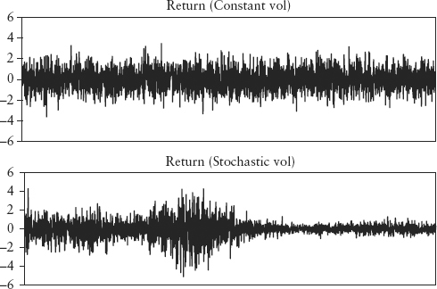
where the random element εt ∼ N(0,1). For a more realistic model, see Heston (1993). Notice the lower panel shows obvious clustering, characteristic of stochastic volatility. Figure 7.8 shows the probability distribution of both the series—constant volatility caused a normal distribution, but stochastic volatility caused the distribution to be fat-tailed. For a discussion of the impact of variable volatility on option pricing, see Taleb (1997).
FIGURE 7.8 Probability Distributions with Constant and Stochastic Volatility
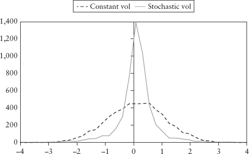
How does stochastic volatility create fat tails? The intuitive way to understand this is to consider the mixture of normal distributions in Figure 4.5. The fat-tailed distribution (bar chart) is just a combination of two distributions of varying volatilities. The high volatility observations dominated the tail whereas the low volatility observations dominated the middle or peak. So the net distribution is fatter at the tail and narrower in the middle as compared to a normal distribution. A distribution with stochastic volatility can be thought of as being a mixture of many normal distributions with different volatilities, and will thus result in a fat tail.
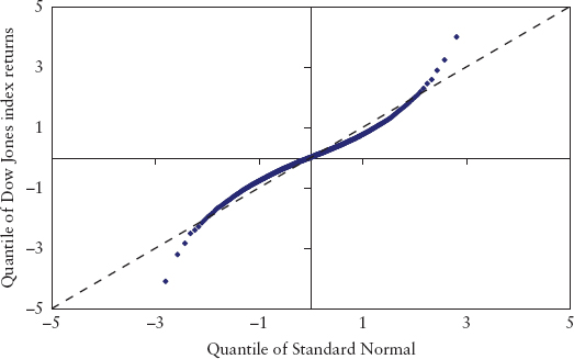
In Figure 7.8, it is hard to see any difference at the tails compared to a normal distribution. The histogram is an unsuitable tool to study the tail. A scatter plot is a better choice. For example, Figure 7.9 is a scatter plot of the quantiles (expressed in units of standard deviation) of the Dow Jones index daily returns from July 1962 to June 2009 versus the standard normal. Had the empirical data been normally distributed, the plot would have fallen on the dotted line (with unit slope). But the empirical data is fat-tailed, so the tail quantiles are more extreme (more risky) than the normal, while the lower quantiles are less risky.
FIGURE 7.9 Scatter Plot of Quantiles of the Dow Jones Index versus the Standard Normal
How far off are we if we use the tail of the normal distribution to model the risk of extreme events? Very. Empirical evidence of past market stress revealed that the normal distribution is an impossible proposition. Table 7.1 lists the 10 largest one-day losses experienced by the Dow Jones index in 20 years (1987 to 2008). The third column shows the statistical frequency (in units of years) for each event assuming the normal distribution holds. These are calculated using the simple relationship (in Excel notation):
TABLE 7.1 Top Ten Largest Single Day Losses for Dow Jones Index (1987–2008)
| Event Date | Daily Log Return | Mean Number of Years between Occurrences |
| 19-Oct-87 | −25.6% | 1.86E+56 |
| 26-Oct-87 | −8.4% | 69,074 |
| 15-Oct-08 | −8.2% | 37,326 |
| 1-Dec-08 | −8.0% | 19,952 |
| 9-Oct-08 | −7.6% | 5,482 |
| 27-Oct-97 | −7.5% | 3,258 |
| 17-Sep-01 | −7.4% | 2,791 |
| 29-Sep-08 | −7.23% | 1,684 |
| 13-Oct-89 | −7.16% | 1,346 |
| Jan-8-88 | −7.10% | 1,120 |
where the observed event of log return x is calculated to occur once every T years (assuming 250 business days per year). We have also assumed an annualized volatility σ = 25%, typical of equity indices.
The results show the forecast of the normal distribution is ludicrous—Black Monday (19 Oct 87) is computed as a once in 1.86 × 1056 year event! In contrast, the age of the universe is only 14 billion years. We have already witnessed 10 such extreme events in a span of just 20 years—clearly extreme events occur more frequently than forecasted by the normal distribution.
From a modeling perspective, there are two schools of thought on fat tails. One school believes that returns follow a distribution that is fat-tailed (such as the log-gamma distribution or stable Pareto distribution). The second school sees returns as normal at each instant of time, but they look fat-tailed due to time series fluctuations in volatility. In Section 13.2, we shall propose a third, whereby fat-tailness arises from a break or compression of market cycles.
Chapter 1 provided a prelude to the idea of extremistan. We shall continue by noting that financial markets are informational in nature and scalable. This gives rise to extremistan behavior of rare events such as crashes, manias, rogue trading, and Ponzi schemes. From the VaR perspective, attempts to forecast these events using Gaussian models will render us fooled by randomness because it will never let us predict Black Swans, but lull us into a false sense of security that comes from seemingly precise measures. Having a thick risk report on the CEO’s desk does not make this type of risk go away. Black Swans are not predictable, even using fat-tail distributions (such as that of EVT), which are just theoretically appealing fitting tools. Such tools are foiled by what Taleb called “inverse problems”—there are plenty of distributions that can fit the same set of data, and each model will extrapolate differently. Modeling extremistan events is futile since there is no typical (expected) value for statistical estimation to converge to.
The idea of extremistan has serious consequences. The business of risk measurement rests on the tacit assumption that frequency distribution equals probability distribution. The former is a histogram of observations, the latter is a function giving theoretical probabilities. There is a subtle philosophical transition between these two concepts, which is seldom questioned (most statistical textbooks often use the two terms interchangeably without addressing why). This equality is the great divide between the frequentist school and the Bayesian school (which rejects the idea). The frequentist believes that probability is objective and can be deduced from repeatable experiments much like coin tosses. This is simply untrue where extremistan is present—extreme events in financial markets and irregularities that happen in the corporate world are not repeatable experiments. Without the element of reproducibility, the frequency histogram becomes a bad gauge of probability, and the quantile-based VaR loses its probabilistic interpretation. Extremistan also broke the lore of i.i.d. since if events are nonrepeatable (and atypical), they cannot be identical in distribution.
Do we really need to be fixated on measuring risk? Suppose we admit that the tail is unknowable and are mindful that Black Swans will occur more frequently than suggested by model; we are then more likely to take evasive actions and find ways to hedge against such catastrophes. This is the message here. Taleb (2009b) suggested the idea of the fourth quadrant—a zonal map to classify situations that are prone to Black Swan catastrophes so that protective actions can be taken.
Taleb observed that the fourth moment (kurtosis) of most financial variables is dominated by just the few largest observations or outliers. This is the reason why conventional statistical methods (which work well on more regular observations) are incapable of tracking the occurrence of fat-tail events. Furthermore, there is evidence that outliers, unlike regular events, are not serially dependent on past outliers; that is, there appears to be no predictability at all in the tail.
In Taleb’s paper, distributions are classified into two types. Type-1 (mediocristan): thin-tailed Gaussian distribution, which occurs more often in scientific labs (including the casino) and in physical phenomena. Type-2 (extremistan): unknown tail distributions which look fat (or thick) tailed. The danger with type-2 is that the tail is unstable and may not even have finite variance. This wild fat tail should not be confused with just meaning having a kurtosis larger than the Gaussian’s, like that of the power-law tail generated by EVT and other models. For this mild form of fat tail, theoretical self-similarity at all scales means that the tails can always be defined asymptotically. This allows for extrapolation to more extreme quantiles beyond our range of observation, a potentially dangerous practice as we are extrapolating our ignorance.
Since measurements are always taken on finite samples, the moments can always be computed, which gives the illusion of finiteness of variance. This imperfect knowledge means that one can seldom tell the difference between the wild (type-2) and the mild form of fat tails. In fact, evidence suggests financial markets are mostly type-2.
Payoffs are classified into simple and complex. Simple payoffs are either binary, true, or false games with constant payout, or linear, where the magnitude of PL is a linear function like for stocks. Complex payoffs are described by nonlinear PL functions that are influenced by higher moments. A good analogy is to think of the different payoffs as a coin toss (binary), a dice throw (linear), and buying insurance (asymmetrical, nonlinear, option-like).
The four quadrants are mapped in Table 7.2. The first quadrant is an ideal state (such as in casino games) where statistics reign supreme. In the second quadrant, statistics are predictive, even though the payoff is complex. Most academic research in derivatives pricing in the literature assumes this idealized setting. In the third quadrant, errors in prediction can be tolerated since the tail does not influence the payoffs.5 The dangerous financial Black Swans reside in the fourth quadrant. Unfortunately, market crises are found to be extremistan, and positions held by banks are mostly complex.
TABLE 7.2 The Four Quadrants
| Simple Payoffs | Complex Payoffs | |
| DISTRIBUTION 1 (Thin tailed) | First Quadrant: Extremely safe | Second Quadrant: Safe |
| DISTRIBUTION 2 (Fat or unknown tails) | Third Quadrant: Safe | Fourth Quadrant: Exposed to Black Swans |
Taleb argued that since one cannot change the distribution, one strategy is to change the payoff instead; that is, exit the fourth quadrant to the third. This can be done using macro hedges to floor the payoff so that the negative tail will no longer impact PL. In practice this could require purchasing options, taking on specific insurance protection, or changing the portfolio composition.
A second strategy is to keep a capital buffer for safety. Banks are capital-efficient machines that generally optimize the use of capital. However, optimization in the domain of extremistan is fraught with model errors; a simple model error can blow through a bank’s capital as witnessed in the case of CDO mispricing during the credit crisis. Overoptimization can lead to maximum vulnerability because it leaves no room for error. Thus, one can argue that leaving some capital idle will be necessary for a bank’s long-term survival and protection against Black Swans. This of course is the motivation behind the Basel’s Pillar I capital (explained in Chapter 11).
In the field of technical analysis, any trend-following indicator is known to be lagging. Such indicators typically employ some form of moving average (MA) to track developing trends. Because it takes time for sufficient new prices to flow into the MA’s window to influence the average, this indicator always lags significant market moves. Figure 13.4 shows a simple 1,000-day MA of the S&P 500 index. To reduce lag (i.e., make the indicator more responsive) traders normally shorten the window length, but this has the undesirable effect of making the indicator erratic and more susceptible to whipsaws (i.e., false signals). This is the catch-22 of using rolling-windows in general—timeliness can only be achieved at the cost of unwanted noise.
This is instructive for VaR, which also uses a rolling window of returns. The lagging behavior means that regime shifts will be detected late, often seriously so for risk control. Consider a situation whereby the government explicitly guarantees all banks. One can expect a sudden shift in the way bank shares behave—their volatilities will be lower than before, they move more in correlation as a group, and they may even exhibit some local behavior (microstructure) such as mean-reversion within a certain price range. VaR will be late in detecting these changing risks, if at all.
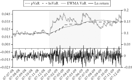
To test how VaR performs when faced with a regime shift, we simulate a regime change and compare the responsiveness of pVaR, hsVaR, and EWMA pVaR. In Figure 7.10, we simulated a doubling of volatility—the lower chart shows the return series; the upper chart shows various VaRs. The shaded area represents the 250-day window used to compute VaR, where the left edge marks the regime shift. The volatility to the right of this demarcation is twice that to the left. PVaR and hsVaR are able to detect this sudden shift but with a time lag—they increase gradually until the new volatility has fully rolled into the 250-day window. For EWMA VaR, its exponential weights shorten the effective window length. And, by virtue of being conditional, it is able to capture the regime shift fully in a fraction of the time. Unfortunately, timeliness comes with instability—the EWMA VaR is a lot noisier.
FIGURE 7.10 Simulated Regime Change—Doubling of Volatility
In Figure 7.11, the shaded area marks a regime shift in autocorrelation, suddenly changing from zero to +0.5; the volatility is kept constant. The new return series (lower panel) shows an obvious seasonal behavior, which we have introduced artificially. This test revealed that none of the three VaR methods is able to detect the regime shift. This case study is worked out in Spreadsheet 7.3.
FIGURE 7.11 Simulated Regime Change—Outbreak of Seasonality and Autocorrelation
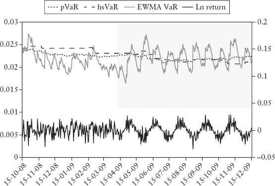
We conclude that VaR is able to capture changes in volatility regime (it is designed for this) but with an often fatal delay. Worse still, subtler regime changes such as that in correlation and market microstructure may not be detected at all.
The Turner Review (2009) identified that procyclicality is hardwired into the VaR method. A dire combination of three factors makes this a potent threat to the financial system. Firstly, procyclicality is rooted in the lagging nature of VaR. Consider Figure 7.10—VaR took almost a third of the 250-day interval to increase noticeably after the regime shift. This means VaR may lag the onset of a crisis by months, and VaR-based regulatory capital will be late in pulling the brakes on rising risks. Secondly, the leverage effect comes into play by manifesting subdued volatility during a rally. As a result, the regulatory capital will be very business-conducive (low) during the boom phase. Thirdly, mark-to-market accounting, a global standard for regulated fair accounting practice, allows banks to recognize their profits immediately in a rally. The gain is often used as additional capital for further investment and leverage. Otherwise, given so much liquidity (capital) and the general perception of low risks, banks will likely be faulted by shareholders for underinvestment. The net effect is that banks are encouraged to chase an economic bubble.
When a financial bubble bursts, the incentives are completely reversed. History tells us VaR often spikes up the most during the initial fall of a bust cycle. This increases the VaR-based capital requirement and forces deleveraging among banks in order to stay within the regulatory minimum.6 At the same time, volatility also grows by virtue of the leverage effect. The self-imposed discipline to mark-to-market the losses means that a bank’s capital base will shrink rapidly as the market collapses, forcing further deleveraging. And since most of the money in the system is leveraged (paperless accounting entries of borrowed money), they can vanish as quickly as they were created—liquidity dries up. This could lead to a vicious spiral for the banking system.7
As an overhaul, the Turner Review broadly recommended a “through the cycle” capital regime instead of the current “point in time”8 (VaR) regime. More importantly the FSA mentioned “introducing overt countercyclicality into the capital regime”—reserving more capital during a boom, which can be used to cushion losses during the bust phase. This eventually led to the Basel III countercyclical capital buffer for the banking book (2010); see Section 11.5. As we shall see in Part Four of this book, bubble VaR attempts to address the same problem in the trading book.
The purpose of VaR is to summarize the risk of the entire loss distribution using a single number. Even though features of the tail of the joint distribution are underrepresented, there is merit in using such a point estimate; it is convenient and intuitive for risk control and reporting.
Artzner and colleagues (1999) introduced the concept of coherence—a list of desirable properties for any point estimate risk measure. A risk measure (denoted here as VaR) is said to be coherent if it satisfies conditions (7.4) to (7.7).
If a portfolio has values lower than another (for all scenarios), its risk must be larger. X corresponds to the P&L random variable of a risky position.
Increasing the size of the portfolio by a factor a will linearly scale its risk measure by the same factor.
Adding riskless cash k to the portfolio will lower the risk by k.
The risk of the portfolio is always less than (or equal to) the sum of its component risks. This is the benefit of diversification.
A few key points regarding coherence are worth knowing. Firstly, the quantile-based VaR is not coherent—it violates the property of subadditivity, except in the special case of the normal distribution. This could lead to an illogical situation where splitting a portfolio decreases the risk.
Secondly, and more generally, coherence holds for the class of elliptical distributions, for which the contour of its joint distribution traces an ellipsoid. The (joint) normal distribution is a special case of an elliptical distribution. An elliptical distribution has very strict criteria—it is necessarily unimodal (single peaked) and symmetric. Hence, most realistic distributions are just not elliptical.
Why doesn’t incoherence wreak havoc on the lives of risk managers?9 It is because incoherence violates the integrity of the VaR measure in a stealthy and nonovert way. Consider the truism: an elliptical distribution is surely coherent. But the reverse is not true; that is, a nonelliptical distribution need not be incoherent. We can only say that coherence is not guaranteed; that is, we cannot say for sure that subadditivity is violated in realistic portfolios. Furthermore, even if subadditivity is violated, for a large portfolio, its effect may not be obvious (or material) enough for a risk manager to take notice, and may be localized within a specific subportfolio. The problem will be felt when the risk manager tries to drill down into the risk for small subportfolios containing complex products—he may get a nonsensical decomposition.
Fortunately, there is an easy backstop for this problem called expected shortfall proposed by Artzner and colleagues (1999). This brings us to the third point—expected shortfall, sometimes called conditional VaR (cVaR) or expected tail loss (ETL), satisfies all the conditions for coherence. It is defined as the expectation of the loss once VaR is exceeded:
For all practical purposes, it is just the simple average of all the points in the tail left of the VaR quantile, and thus can be easily incorporated using the existing VaR infrastructure. For example, the ETL at 97.5% confidence using a 250-day observation period is given by the average of the 6 (rounded from 6.25) largest losses in the left tail. For most major markets, assuming linear positions, the 97.5% ETL works out to be in the order of magnitude of three sigmas. Hence, under regular circumstances expected shortfall is roughly 50% higher than pVaR (which is 2 sigma) if positions are linear.
The ETL is sensitive to changes in the shape of the tail (what we are really after). VaR, on the other hand, is oblivious to the tail beyond the quantile level. In Section 13.6, we will show using simulation that ETL is superior to quantile VaR as a risk measure in terms of coherence, responsiveness, and stability. Indeed, the latest BIS consultative paper Fundamental Review of the Trading Book (2012) calls for the adoption of expected shortfall as a replacement for VaR.
1. The concept was introduced by Shannon (1948), the founder of information theory. More recently, Dionisio, Menezes, and Mendes (2007) explored the use of Shannon entropy as a financial risk measure, as an alternative to variance. Gulko (1999) argues that an efficient market corresponds to a state where the informational entropy of the system is maximized.
2. The VIX index is an average of the implied volatilities of S&P index options of different strikes. It is a general measure of precariousness of the stock market and is often used as a fear gauge.
3. This is because the volatility is also affected by local features of the market—for example, as prices approach support and resistance levels, volatility may sometimes decline because traders place trading bets that these levels will hold.
4. This volatility skew (which looks like Figure 7.4) can be mathematically translated into a PDF that slants to the left side—this implied distribution will disagree with the observed distribution. Technically speaking, the risk-neutral probability inferred from the current option market differs from the physical probability observed from historical spot prices.
5. For example, option pricing usually assumes geometric Brownian motion (a second quadrant setting). But if the tail is actually fat, the real pricing formula will be different from the Black-Scholes equation. In contrast, simple linear payoffs will be the same even if the tail is fat.
6. A well-researched counterargument is provided by Jorion (2002). The author found that the averaging of VaR over the past 60 days as required by Basel (equation (6.3)) means that market risk capital moves too slowly to trigger systemic deleveraging.
7. Without liquidity, a bank risks not being able to pay its obligations on time, which could lead to (technical) default. This has dire consequences, and hence banks hoarded liquidity during the 2008 credit crisis.
8. A point-in-time metric measures the current state in a timely manner, hence, it tends to move in synch with the market cycle. A through-the-cycle metric attempts to capture the long-term characteristic of the entire recent market cycle.
9. The issue of coherence (and subadditivity in particular) currently gets little attention from practitioners and regulators. It is debated more often in academic risk conferences.