01 / using inspiration in the design process
inspiration
One of the questions I get asked most is how to leverage inspiration without plagiarizing or stealing someone else's ideas. In some ways, this is a really easy question, simply answered. Don't steal ideas. The nuance of this is the hard part. At what point does inspiration become theft? The lines are blurry, especially when we consider the fact that no one operates in a bubble. All design is influenced by the previously created works we are surrounded by. Marko Prljic´ is a web designer who has also written on this very topic. This chapter, penned by Marko, takes us step-by-step through the creation of a new design. More importantly, it demonstrates how various ideas, approaches and design elements can be found elsewhere and merged together to create a new design. I am excited for this book to inspire you and challenge you to borrow ideas — without ripping them off.
using inspiration in the design process
using inspiration in the design process
By Marko Prljic´
Get inspired, but don't copy. There is a thin line between inspiration and copying — one that is further blurred as we are surrounded with designs and art in our everyday lives. Finding inspiration for a design is an easy task these days, having so many valuable resources to leverage. The web has been inundated with web design showcases. There is no exact formula for how to use inspiration and not copy someone else's work, but there are some straightforward ways to avoid it. Here, I will take you through my design process for a web site I recently created. Through examples of inspiration, I will demonstrate how I created a fresh and new design while leveraging various sources of inspiration. But before we step through an example, let's look at some core concepts when it comes to using inspiration.
USE MORE THAN ONE DESIGN FOR INSPIRATION
When you have found a design that you like and you think, “I could do something like this,” don't stop there; keep searching for additional designs that are similar in color, structure or content to what you have in mind. The goal will be to leverage the best elements of each of these as you merge these ideas into your new layout.
Start visualizing your new design with a combination of elements that inspire you. Look at the wire frames for your new site, and consider styles that might be applied to specific elements. The goal is not to pick a single design and copy it, but rather to find an assortment of elements that can work together in a new way. By the time you start creating mock-ups, you should have developed some fresh ideas with the result being something new and — most critically — unique.
BREAK THE DESIGNS DOWN
A great way to approach inspiration is not to look at the whole design, but rather to scan for the elements that are relevant to your project. Observe how others have solved problems similar to yours, and run with those aspects of the design. For example, the following observations on imagery could be made from this sample site (Figure 1 on the next page):
- The header is not split off by contrasting colors or boxes like typical sites are.
- The color palette is limited with lots of subtle tones.
- A large tagline clearly states the site's purpose.
- The large slide show has a clear set of icons below it, giving a sense of placement in the show.
- Lots of white (or gray) space makes the site feel comfortable and open.
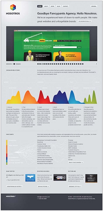
Figure 1

Figure 2
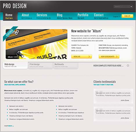
Figure 3
PICK YOUR FAVORITE DETAILS
When you have found some designs that inspire you, take a closer look and pick out the elements that really make them shine. Watch for gradients, light effects, typography — all of the subtle details that breathe life into the design. Ask yourself: What is it that makes this design so great? Figure 2 is another good example with some key elements highlighted.
THE CREATION OF A NEW DESIGN
Now let's dig into an example of this and step through the design process used for the creation of a template I designed for themeforest.net. Several great sites inspired this design, and I will demonstrate how they contributed to the final product. Let's start by taking a look at the final product in Figure 3.
When I started the design for this template, I thought about how it would be nice to create something modern, well-structured, content-rich, blog-adaptive and multifunctional. With this in mind, I had a vague idea of how the design should feel.
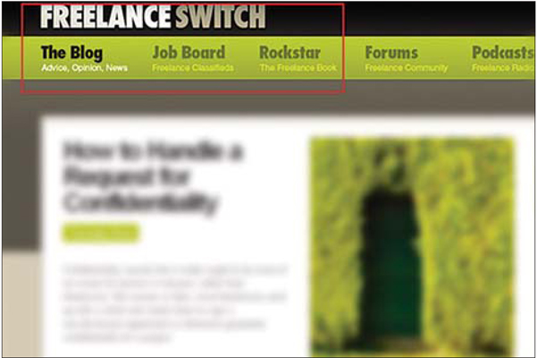
Figure 4 Inspiration
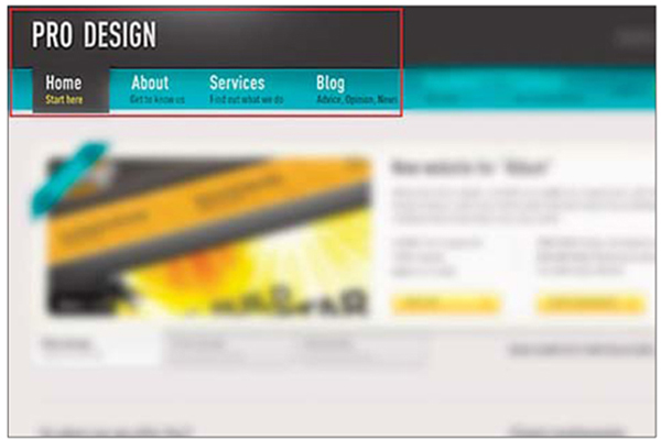
Figure 5 Design
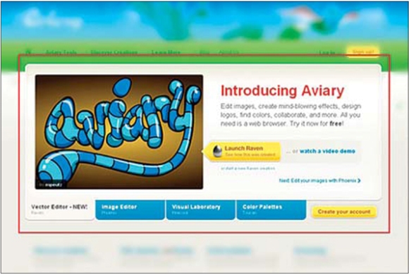
Figure 6 Inspiration
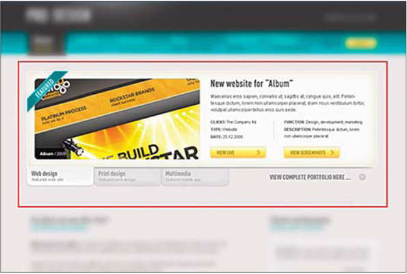
Figure 7 Design
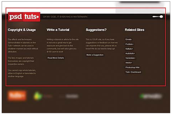
Figure 8 Inspiration
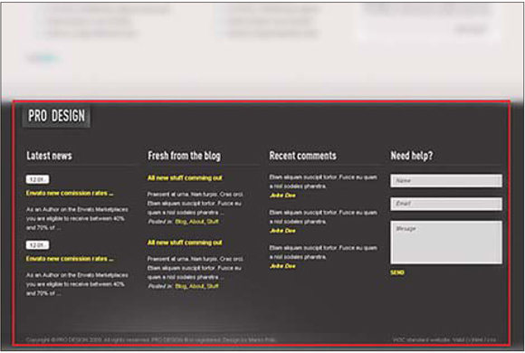
Figure 9 Design
From there, I found these organizations' sites as sources of inspiration:
- FreelanceSwitch
- Aviary
- Psdtuts+
Inspiration #1: FreelanceSwitch
The first thing I loved about this site's design was its navigation: It's big and clear, and contains small additional bits of information for each link. It also has multiple layers to the background, stretching from top to bottom, giving the site a more interesting look (Figures 4 and 5).
Inspiration #2: Aviary
The large content rotator on this homepage works great, so I thought this could be a key element of my design. This is a common design element, but it's great to see how others have approached it. There are a million ways to add variety to an element such as this through subtle changes in the configuration and layout (Figures 6 and 7).
Inspiration #3: PsdTuts+
A key element borrowed from this design is the footer. It's rather large, and it provides additional information and key links. I also noticed how the logo is repeated in the footer, so I tried the same thing with my own stylization (Figures 8 and 9).
CONCLUSION
If you look at the finished product, you can see how the various sources of inspiration contributed to it, and yet the result is a fresh design that doesn't feel like a direct replication of any of the other designs. Some will say I am suggesting you Frankenstein together various pieces to form a new design. Certainly, if you simply clip together various elements, the results are not likely to inspire anyone in a positive way. You must always work to unify the new work with common stylistic approaches and never lose track of the big picture. In the end, be inspired — but don't copy!