04 / the pitch • lighting • iPhone as flourish •
social media links • icons • typographic • photographic backgrounds
sites by design elements
Design elements come in a wide array of shapes, sizes, and styles. Some reflect mostly trendy design while others are the result of necessity. What fascinates me about these groupings though is that each and every one of them has a purpose. For as much as each of these has a way of being used that gives it a clear and intentional purpose, they can just as easily reflect a total lack of intention (clearly we will focus on the former). My deepest hope on this topic is that designers won't look on these chapters as design clichés to abuse, but rather as functional tools to be leveraged at the appropriate time. All I ask is that you endeavor to use these elements wisely and with purpose; this only requires a little thought, and that will carry you a long way. Think before you design and you will always find that the end product is better for it.
04 / sites by design elements
the pitch • lighting • iphone as flourish • social media links • icons • typographic • photographic backgrounds
While this is not a book on marketing, the topic of giving a pitch almost inevitably comes up. An elevator pitch is a sales pitch that can be given quickly (as in the length of a short elevator ride). Samples of incredibly short ones might be “I am a web designer” or “We build houses.” In this chapter is a set of sites that employ a prominent elevator pitch, most commonly on their homepage.
This design element plays a crucial role in rapidly communicating to a user. Visitors to a web site often have an incredibly short attention span and an insatiable thrust for efficiency. Though most users might not describe it as efficiency, this is exactly what is happening. Consider just how helpful it is to immediately understand the purpose of the organization behind a web site. In fact, their very ability to sum up exactly what they do best is a sure sign of a focused and polished organization. Let's look at some samples to see how this might work.
On the Concept Feedback site (Figure 1), the sales pitch “Free feedback for marketers and designers” is critical to helping users know why they are here and why they should stay. We immediately know whom this site is for, and the free part removes the most common barrier to entry: money.
One of my favorite examples of a homepage pitch is on the personal site for Andrew Barden (Figure 2). He simply states: “Hello. I like to design things.” While this leaves it vague enough to allow him to work in multiple mediums, it is succinct enough that we don't wonder if he is a developer, a shop full of a hundred people, or some sort of submarine parts company. It cuts to the chase and not only lets you know why you're here, but it lets you know in a way that invites you in further.
While the pitch statement on the Kindred Spirits site (Figure 3) is a bit longer, and perhaps less likely to be read, its prominent placement and large type at least gives it a reasonable chance of being read. In this case, the message comes across more like a mission statement than a quick summary, and I must say I agree with the decision as it would be very difficult to sum up the concept in fewer words.
Ultimately, this is a tool that can be invaluable in rapidly communicating a purpose. Careful consideration of the clarity of the message and the design in which it is presented will ensure that it works as expected.
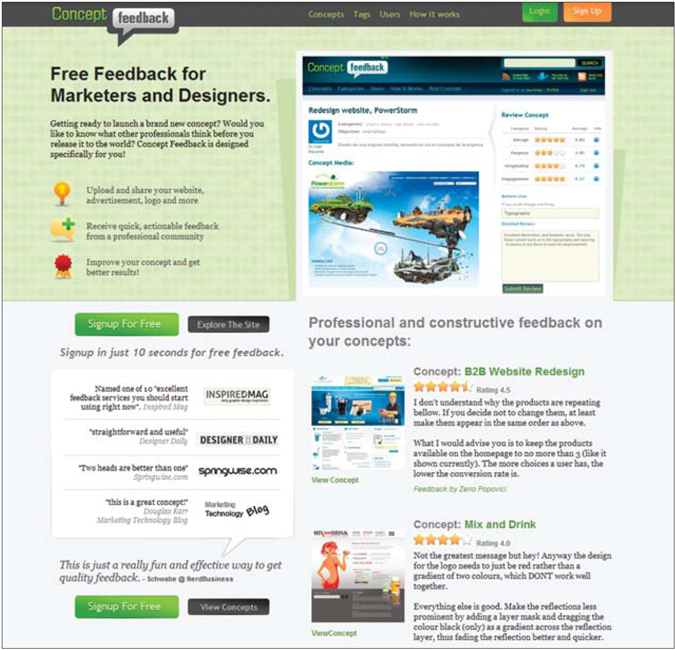
Figure 1 http://www.conceptfeedback.com
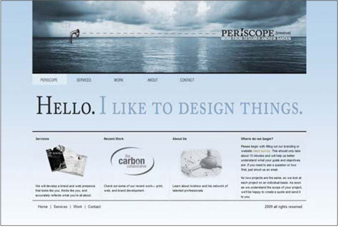
Figure 2 http://www.periscopecreative.com
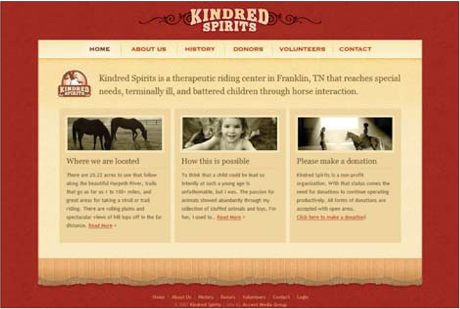
Figure 3 http://kindredspiritstn.org
04 / sites by design elements
the pitch • lighting • iphone as flourish • social media links • icons • typographic • photographic backgrounds
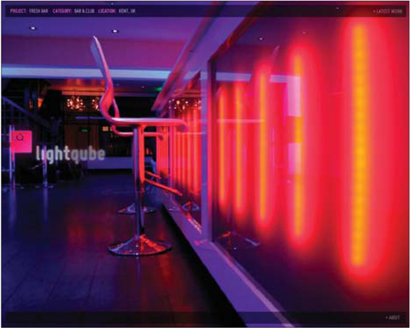
Lighting and illumination in web design can be a powerful design tool. The first thing to realize if you are new to this style is that it almost never uses the stereotypical lighting imagery — there are no light bulbs or hanging light fixtures in these designs. Rather, we find that the designs have been imbued with a sense of internal illumination that creates a certain aesthetic and atmosphere. Let's look at some specific sites to see what has been accomplished with this subtle element.
The Strutta site (Figure 1) is a prime example of how illumination can be leveraged. It is quite likely that the designer didn't necessarily consider this a lighting technique; instead, it was probably seen as an extension of a refined glossy style. Regardless, the end result is something that gives the sense of internal illumination. In this case, the style has been used not only to reflect an overall design style, but to draw focus to a key element of the page. The intro video that gives the quick overview is a key conversion tool that is brought to the forefront by the contrast of the illuminated backgrounds.
Another subtle demonstration of this style is found on the Pizza Inn site (Figure 2). Here, a radial burst accents the gradient background. Again, I doubt the designer intended to illuminate the scene, and yet this is just what has been done. The lighting makes the content pop and gives the page depth and a rich visual interest.
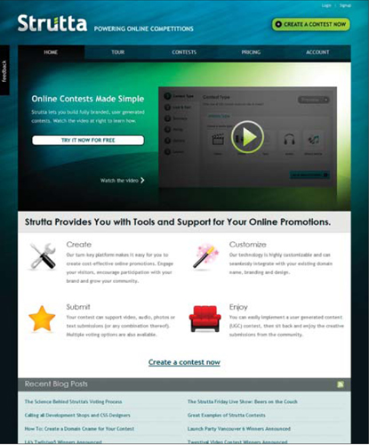
Figure 1 http://strutta.com
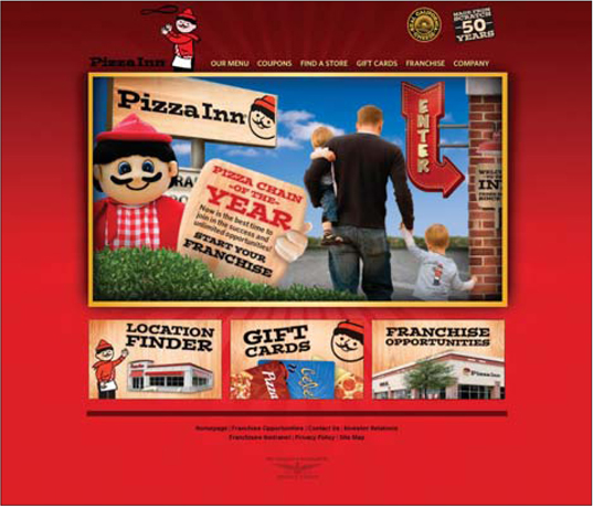
Figure 2 http://www.pizzainn.com
notes from a developer
While this style will not likely have a serious impact on implementation costs, there are some instances where it can be a bit of a pain. If your lighting technique relies on outer glows and lots of gradients, it is likely to cause some trouble.
Outer glows in particular are notorious for driving developers crazy. This is especially true when these items have roll-over states or otherwise have to change based on a user's action. Carefully consider how glow effects might interact with the elements around them (at least when it is an element the user will interact with). For example, a button with an outer glow over a gradient background will mean one of two things: either the image will be partially transparent (and require some PNG hacking to get working), or it will have to contain the background image as part of it, and will therefore be subject to very precise positioning needs.
In the end, this isn't a showstopper — it's just important to realize that gradients, drop shadows and outer glows can be elements that require careful attention to avoid problems.
04 / sites by design elements
the pitch • lighting • iphone as flourish • social media links • icons • typographic • photographic backgrounds
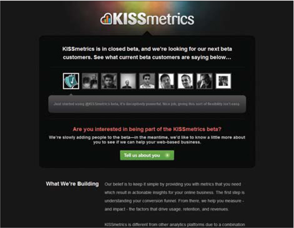
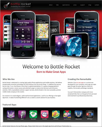
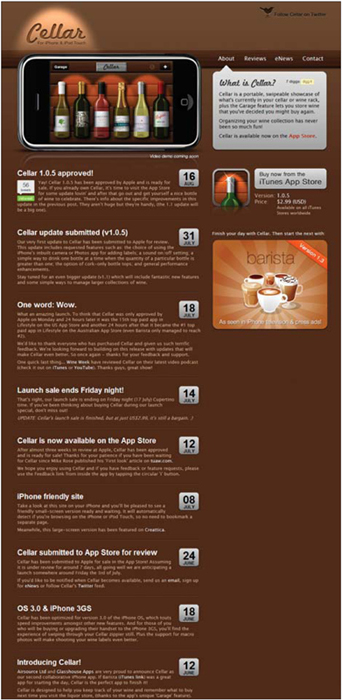
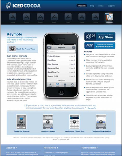
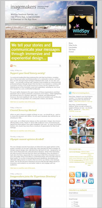
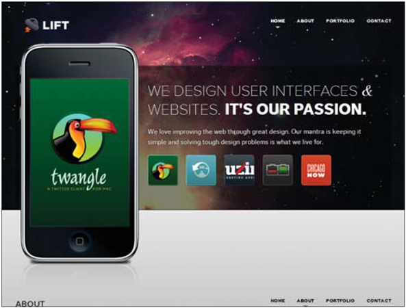
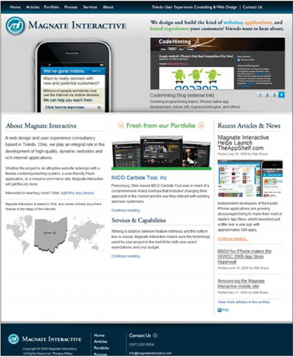
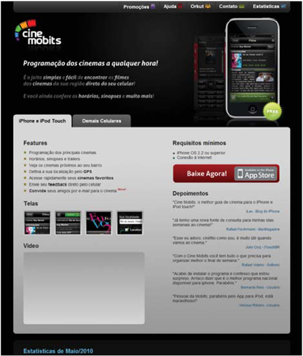
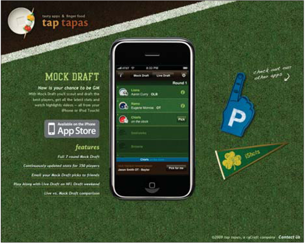
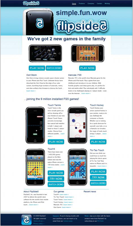
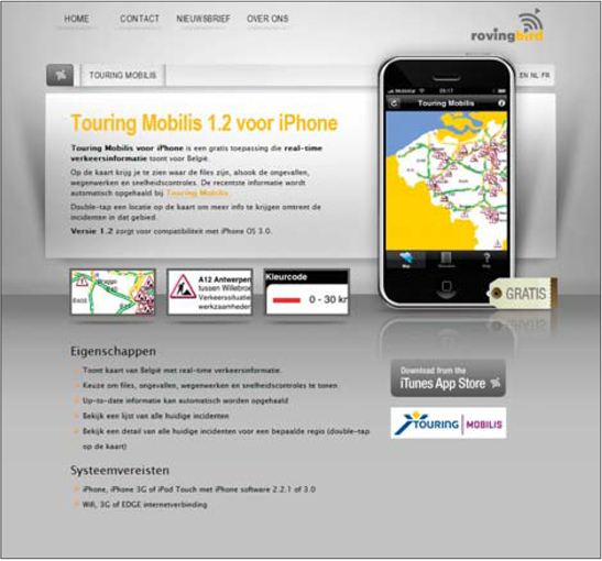
There are three things that make the iPhone a popular design flourish that has worked its way into countless web sites. First and foremost, the device is just beautiful; it makes my old flip phone look like an antiquated piece of junk. Secondly, the iPhone is massively popular and very cur-rent. So, in a small way, sites that leverage it in their designs are perhaps trying to say they are current or hip. Finally, many sites have iPhone-specific content, and displaying the gorgeous device is a surefire way to communicate this.
The Gelattina site (Figure 1) is a perfect example of this design element. In this case, it could easily be argued that the iPhone in the design is not necessary because it serves a more decorative role. But as it stands, the device fits in nicely with the desktop collage style and is a clever way to show a video.
Arat (Figure 2) is a development shop that focuses on Mac and iPhone development, so it is no surprise to find a large image of an iPhone on their homepage. What struck me as interesting about this site's design was that it puts a reflection beneath the device, which actually does something slightly remarkable. This simple reflection roots the device in the real world and reminds us that it is a real, three-dimensional thing. This, combined with the overlap of the border with the header, creates an illusion of subtle depth.
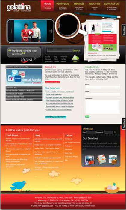
Figure 1 http://www.gelattina.com
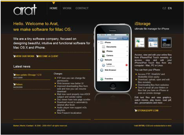
Figure 2 http://arat.cz
notes from a developer
The implementation of this style really depends on how it is used. If the element is simply a part of the visuals and doesn't function or interact with the user, then it's a no-brainer. On the other hand, if you want it to be an interactive element, to behave at all like a real iPhone or to have it play a video, there will be a cost implication.
If you want to play a movie, load it up in Flash and embed it in the page on top of the image of the device. No big deal.
For a more interactive version, the Yahoo! design library offers some great stencil sets, one of which contains iPhone assets perfect for working into a design. Download the set for free here: http://developer.yahoo.com/ypatterns/about/stencils.
04 / sites by design elements
the pitch • lighting • iphone as flourish • social media links • icons • typographic • photographic backgrounds
It is not the least bit surprising to find that links to various social media sites show up all over web sites. From corporate sites to personal blogs, links to Twitter, Facebook and other social platforms abound. There are loads of free icon sets for this purpose, and what I looked at in these examples is how the social media icon links have been worked into the design.
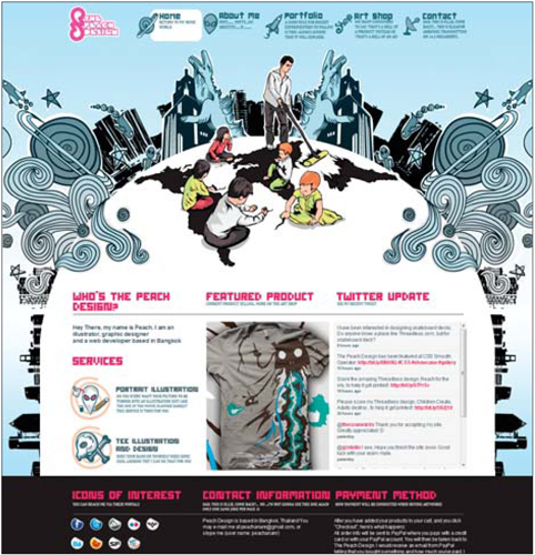
One of the most common approaches is to place all of the links in a list at the bottom of the page, as seen on the sites for Kim Burgess (Figure 1) and Lisa Bun (Figure 2). This convenient location has become very popular and is found in the footer of many sites. It makes good sense, too. Once you have consumed the site's content, you are presented with some links to other places to connect to the site or its owner.
Another tactic for icon location is prominent placement at the top of a page, as seen on the site for Aus120 (Figure 3). Here, we find the links at the top right corner, one of the most prominent locations on the site. For this site and others that choose this placement for links, building a following on social networks is a top priority. The same thing is found on Michael Austin's site (Figure 4). Though in this case, the icons are even more prominent, and a large Twitter feed is displayed at the top as well.
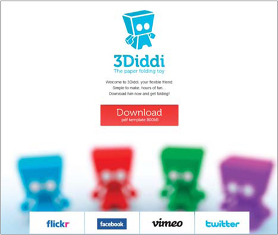
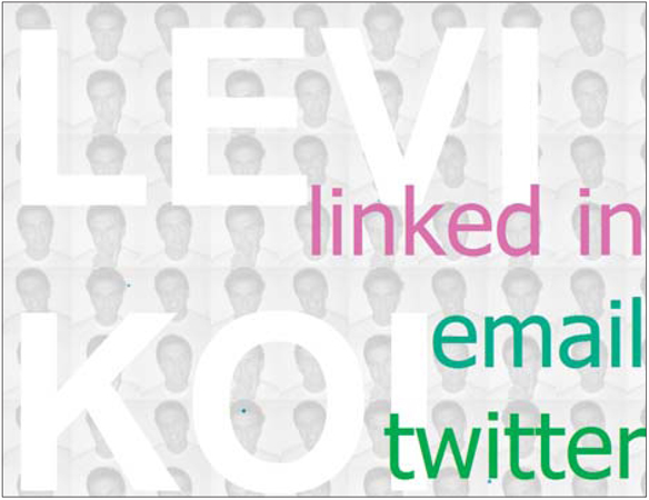
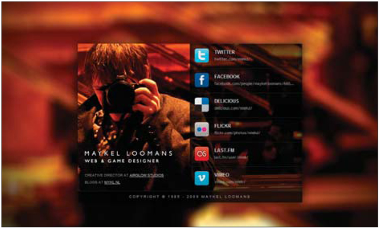
In other sites, like John Philips's mini site (Figure 5), we see that social media links have become the primary purpose of the site, and the homepage is nothing more than a portal to the various networks John participates in.
As with many design elements (or content elements, in this case), designers often forget to consider the goals of a site. The placement, prominence and design of these social media links should be driven by the site's goals.
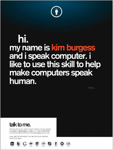
Figure 1 http://www.kimburgess.info
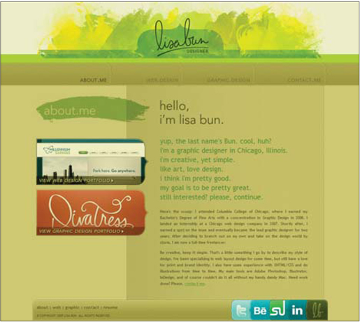
Figure 2 http://www.lisabun.com

Figure 3 http://www.aus120.com
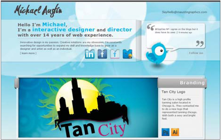
Figure 4 http://maustingraphics.com
notes from a developer
Social media is all the rage, so it is not surprising that the logos and links to these platforms have become a common part of web design. The technicalities of implementing these are very little, if any, and really have no impact on the end cost of a project.
While implementing simple links might be no big deal, showing a live feed of activity from these social platforms is not quite as easy. Showing RSS feeds is not too much work, but if you want to show live data from a third party, you're likely to have a few complications to get around. This will typically involve issues with calling the web service and handling contingencies like a service being unavailable.
Some of my favorite (and free) social media icon sets include:
The extensive Komodo Media set:
http://www.komodomedia.com/blog/2009/06/social-network-icon-packVikiworks's round social network icons:
http://vikiworks.com/2007/07/28/social-bookmark-iconset-part-2Jankoatwarpspeed.com's sketchy style icons:
http://www.jankoatwarpspeed.com/post/2008/10/20/Handycons-a-free-hand-drawn-social-media-icon-set.aspx and http://www.jankoatwarpspeed.com/post/2009/02/23/Handycons-2-another-free-hand-drawn-icon-set.aspx
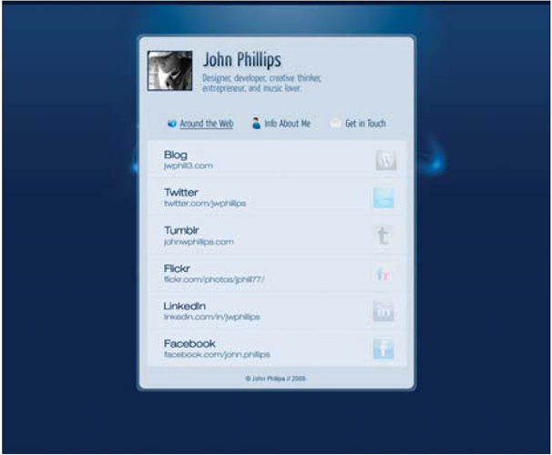
Figure 5 http://www.johnphillips.me
04 / sites by design elements
the pitch • lighting • iphone as flourish • social media links • icons • typographic • photographic backgrounds
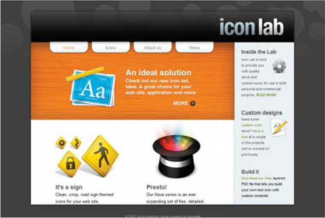
The icon is to the web what hood ornaments are to the car (or at least what they were in the 1970s). Icons can communicate so much information in so little space, they cry out to be used. As such, icons have been used in almost every way imaginable. I've picked out some of the more interesting samples to illustrate how to leverage their quick communicating power.
One of my favorites is the 53 Mondays site (Figure 1). In this case, hand-rendered icons break the standard pixel-perfect model and mesh with the site perfectly. They may be a free library, but you wouldn't know since the icons fit in so well. It would appear that the icons fit so well that they must have been hand created for this design. They still call on common themes in terms of what is depicted in the icons, which is how they become so functional. They rely on the standard imagery, but are presented in a totally fresh way.
Sometimes it is good to remember that icons don't have to dictate the entire direction of a design, and that they can be more effective as simple supporting elements. The Grooveshark VIP site proves this point perfectly (Figure 2). In this case, the icons are only in the bottom part of the site, but they still serve a communication role. This region of the design is more dense with content, and the icons help break it up and allow for quick scanning to find the content you're in need of.
Let's compare that site to the portfolio site of Lieve Sonke (Figure 3). Here, the icons basically are the design — they are larger than normal and sit on little ledges like trophies waiting to be viewed. The icons barely need defining, and the supporting text for each is pretty small. These function really well, as the icons call on their most well-known meanings.
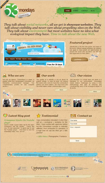
Figure 1 http://53mondays.com
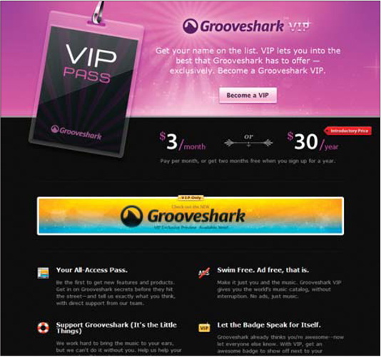
Figure 2 http://vip.grooveshark.com
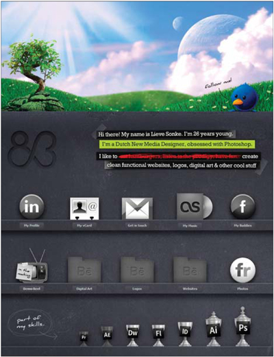
Figure 3 http://www.id83.nl
notes from a developer
From a developer's standpoint, the icon doesn't present many problems during implementation. So instead, I will point out a few key assets that can really help you find the right direction (assuming you're looking for a stock icon set).
Iconfinder.net is a fantastic search tool that will help you find many options for any basic icon needs. Once you get a sense of direction for your site's design, use this to see if you can find an entire set to fit your needs.
If you're designing for an application, one of the most popular sets to use is one from famfamfam.com. It's a huge set (more than 700 icons), and best of all, it's free.
Sometimes following standards is a helpful thing as you can draw on industry norms; standardized RSS feed icons can be found at feedicons.com.
Also, check the section in this book on social media links on page 119 for pointers to some other nice icon sets in that niche.
04 / sites by design elements
the pitch • lighting • iphone as flourish • social media links • icons • typographic • photographic backgrounds
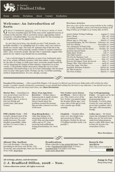
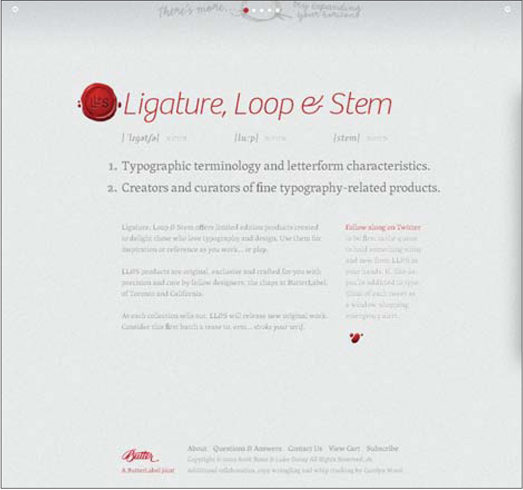
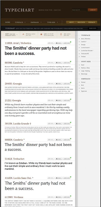
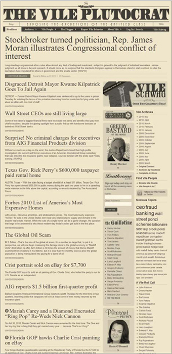
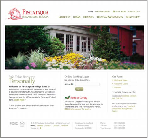
Typography on the web has always been limited, at times neglected, and most often scowled at by designers wanting to implement their typographic masterpieces. Their beautiful designs are often created in Photoshop, and the harsh realities of how web sites are made squash the ambitions of the otherwise hopeful designer. However, there are many tools in place that allow creatives' work to be replicated very effectively, especially when designers more fully understand the limitations they are operating under.
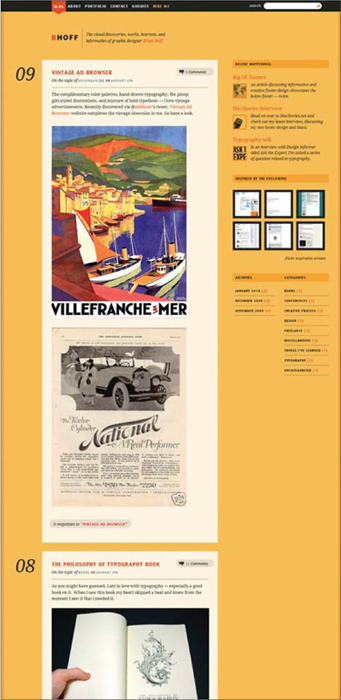
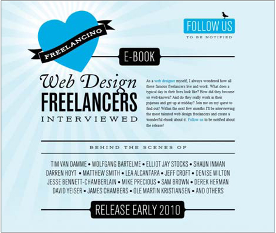
The limits of web site typography are often a bitter pill to swallow, but the examples provided here prove that beauty can prevail. One of my favorite examples is Darren Hoyt's personal site (Figure 1). Beautifully designed titles rule the site and define its style. These lovely titles eliminate the need for supporting graphics and are the singular element that elevates this otherwise simple design to a higher level. Sure, all the other details need to be in place, but the typographic treatment ensures a beautiful design.
The coDesign site (Figure 2) is a fan-tastic example of a designer working comfortably around the limitations of the web. No special tricks have been employed to make use of fonts that aren't web-safe. Instead, the designer embraced the safe fonts and simply made the design work with them. This makes for a lean site (code wise) and should have helped reduce the development time (and, thereby, the maintenance costs). Designs like this remind me how important it is for creatives to jump in and code something. Once you see the limitations, it is much easier to create a design that plays nice.
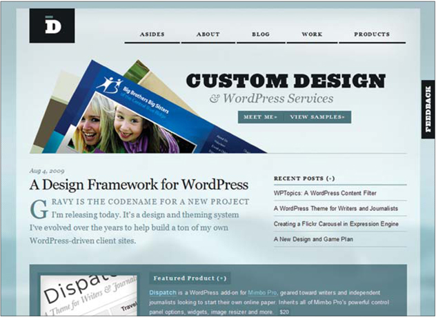
Figure 1 http://www.darrenhoyt.com
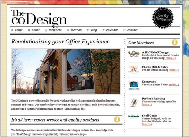
Figure 2 http://thecodesign.org
notes from a developer
For designers new to the web, the typography limitations can be painful. Short of creating lots and lots of images for headings, there are actually some practical solutions that are pretty easy to implement.
Three solid solutions to rendering fonts outside the web-safe list are sIFR (http://www.mikeindustries.com/blog/sifr), cufón (http://cufon.shoqolate.com/generate/) and Typekit (http://typekit.com/). The first two are free, and the last is commercial. I have used sIFR on numerous sites, and it's pretty simple to implement. Once set up, it renders text in the desired typeface dynamically, making it hands off once it's installed.
The real complication comes when using these tools with backgrounds that are not a solid color. This is something to pay attention to and to work closely with your developer on to ensure your design can be implemented and easily maintained. After all, the real question isn't if you can use a typeface, but rather, how much it will cost to maintain and work with. Automated solutions such as these will keep the cost low and the aesthetics high.
04 / sites by design elements
the pitch • lighting • iphone as flourish • social media links • icons • typographic • photographic backgrounds
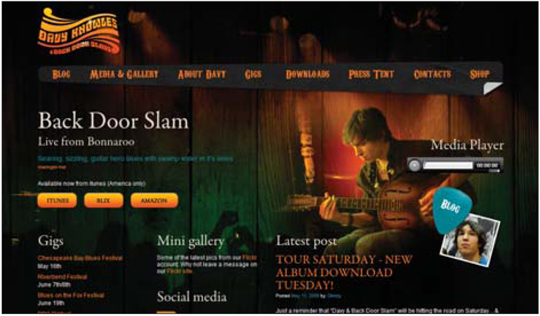
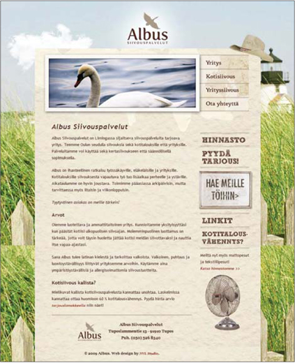
The use of photographs or otherwise complex backgrounds over solid colors, patterns and simple gradients has been popular in web design for a long time. From a designer's perspective, it offers a unique situation and some interesting possibilities in terms of the design.
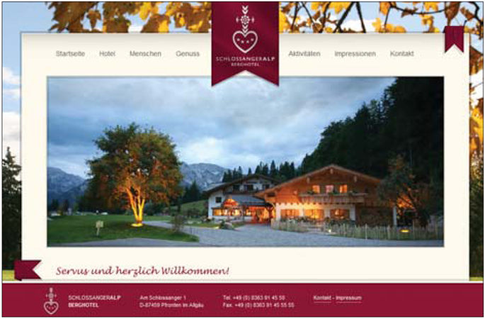
Traditionally, many sites make use of this style in a beautiful yet basic way. For example, the sites for Leaf Tea Shop & Bar (Figure 1) and The Creative Dot (Figure 2) have complex backgrounds that lead to inevitably simpler foregrounds. The image sets the mood of the site and communicates something about the site's purpose. While this design is effective, it seems that many have begun pushing the style a bit further.
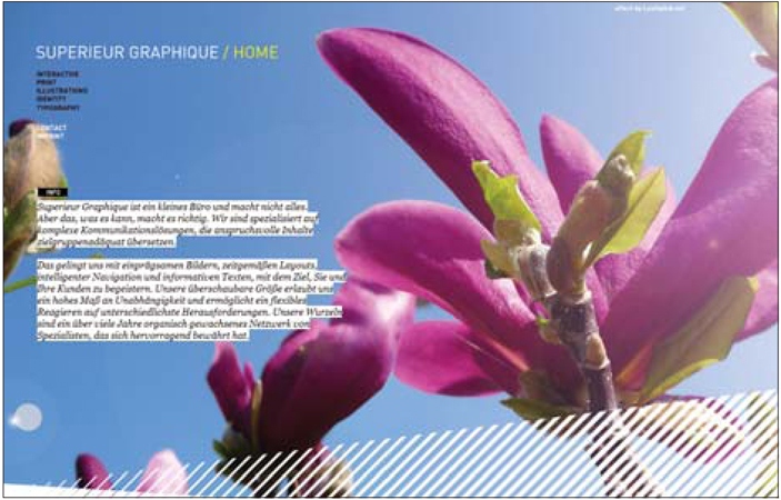
What gets really interesting is when the background image actually becomes a part of the content. On Rommil Santiago's site (Figure 3)], for example, the flower is in the background, and yet it's part of the foreground. The space left in the foreground actually makes the flower move forward, but it is overlapped by the foremost items. So it somehow lives halfway between.
We see this again on Noah Shrader's site (Figure 4). The background image is equally a part of the content itself. This dynamic makes the background an even more functional part of the site. Overall, it helps make the site distinct and unique, but also enables a sort of minimalism that leads to streamlined communication and a clear flow in the content.
It's exciting to find niche web design tools like the photographic background that are being leveraged in fresh ways. I am sure this has been done before, but it is an approach worth talking about and shows how something simple can be put to work in a complex and effective way. It makes me want to reconsider many basic elements that get put into my designs without extensive thought.
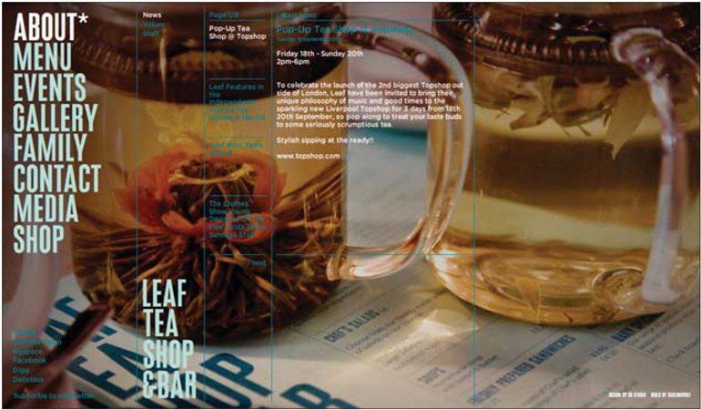
Figure 1 http://www.thisisleaf.co.uk
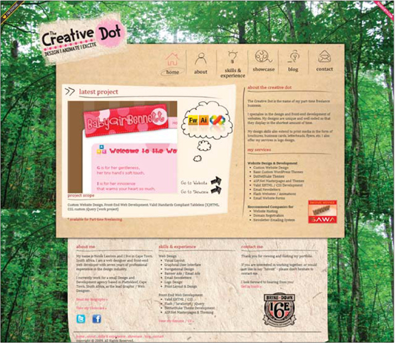
Figure 2 http://www.njwebdesign.co.za
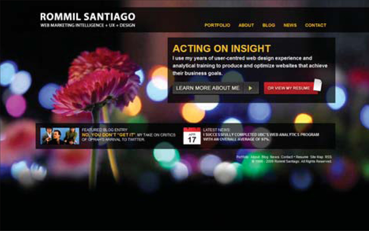
Figure 3 http://www.rommil.com
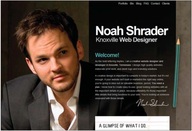
Figure 4 http://www.noahshrader.com
notes from a developer
If your design relies on portions of the background image showing through into content regions of the site, you're likely to hear your developer complain about this. If items over the background need to be able to move, transparent PNGs are inevitable. If the items don't need to move, the transparency can often be simulated by placing images appropriately.
PNGs are a file format similar to JPEG and GIF, except that they allow for alpha transparency. This means they can have varying degrees of transparency, much like items in Photoshop. This does cause some browser issues and will require a fix for good old Internet Explorer. One of the best solutions can be found here: http://www.twinhelix.com/css/iepngfix. All in all, this should not be a showstopper, but your developer will have to put a work-around into place. Overall, the cost implication should be minimal.
