05 / ultra clean • minimal • sketchy •
collage • illustrated • type-focused • solid colors • fabric • wood
sites by styles and themes
One might think that styles and themes are one and the same (if only because I group them together here), but in fact, they each have their own — but similar — purpose. It seems that styles represent more vague approaches to things that don't necessarily employ a particular visual element. For example while “retro design” is a style it doesn't dictate a particular imagery. All of this contrasts sharply with themes. A theme in and of itself dictates a particular visual vocabulary. For example, a sketchy theme will inevitable have some hand drawn elements in it. All this really means is that themes and styles are different ways of thinking about how you design a page. One could have a retro minimal style site or an illustrated ultra clean one. The idea here is to consider the basic approaches you can take to a design and figure out how to leverage them to your benefit.
05 / sites by styles and themes
ultra clean • minimal • sketchy • collage • illustrated • type-focused • solid colors • fabric • wood
If I had to pick a single style or approach to web design to use, it would have to be this one. The designs in this section represent for me not just a style, but an ideal in terms of clean and functional design. Ultra-clean sites lean toward minimalism, but they are not so focused on being less as they are on being crystal clear. As such, these sites are a joy to look at and are uniformly easy to use. They provide a great target to shoot for in terms of polish and functionality.
Let's start with the Nosotros web site (Figure 1) as an example of this style. The delicate touches throughout this design combined with an airy layout make this site sing. With an abstract name and a nondescript logo, the text on the homepage introduces the company and communicates a bit about how they approach design work. They set themselves apart from the stereotypes of agencies and support this by having a killer site. I can't imagine a more effective sales pitch. Sure, agencies have their place, but there is a market for the anti-agency (just as there is for freelancers or high school kids building web pages). The cleanliness of this site tells the user they can back up their words and lets you get hooked on them in an instant.
The NanoIntegris site demonstrates how powerful a clean site can be (Figure 2). In this otherwise dry manufacturing niche, the company showcases itself as a high-end company tuned in to the latest styles and technologies. This site makes learning about the company's products easy and clear, and it avoids the typical confusion found with extremely technical and complicated products.
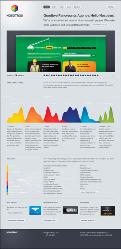
Figure 1 http://www.nosotroshq.com
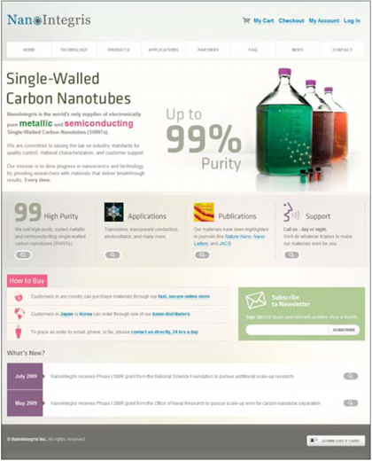
Figure 2 http://www.nanointegris.com
05 / sites by styles and themes
ultra clean • minimal • sketchy • collage • illustrated • type-focused • solid colors • fabric • wood
The minimalist style has always been popular, and it seems to maintain its status as one of the most viable and well-received approaches to web design. Not only does this style potentially offer the most usable designs, it also tends to produce ones that are timeless. Sites in this style are also typically easier to build and maintain. Don't be deceived, though — the minimal style is not easy to design or to implement. It requires painstaking attention to detail, and a keen eye for the subtleties of design.
The Inbox Awards (Figure 1) web site is an interesting example of this style. Not only is it minimalist in nature, it also incorporates a very atypical layout and navigation system. As a site that showcases great design, a minimalist style makes perfect sense. The work being showcased (instead of some fancy e-mail-based theme) is allowed to grab the full attention of the viewer. In this case, the style doesn't say much about the site's owners or the content directly, but it does reflect a pragmatic focus on the content and a desire to make it the showcase of the site.
The retrostrobe site (Figure 2) offers another fine version of this style and shows that just because the style is called minimal, it doesn't have to be lame, boring or otherwise uninteresting. Here, we see a design that functions to allow the user to get an insight into the approach this agency might take on a project. It would seem they look at a project and find the best, most efficient way to communicate the site's goals. In this case, a minimal style showcases the agency in a positive light as an effective, results-oriented shop. And we get all that from the style they selected. It is up to them to live up to that, but the message they communicate with their design is inevitable.
Another interesting minimalist example is the Sreski site (Figure 3). While it may be tempting to use a white background for a traditional minimal-style site, this example shows that you can still have a minimal style with a nonwhite/different colored/dark background. On this site, the trimmed-down design lets the work shine. What really strikes me about the design is how the image layout is adapted to fit the images. Why crop these long images to simple squares? Instead, the designer worked to show the pieces in the best possible way. It's truly refreshing.
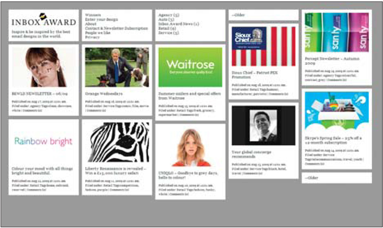
Figure 1 http://www.inboxaward.com
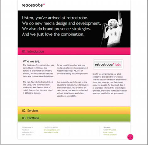
Figure 2 http://www.retrostrobe.com
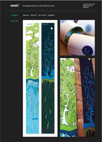
Figure 3 http://www.sreski.com
05 / sites by styles and themes
ultra clean • minimal • sketchy • collage • illustrated • type-focused • solid colors • fabric • wood
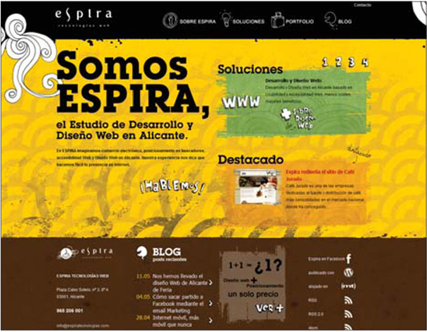
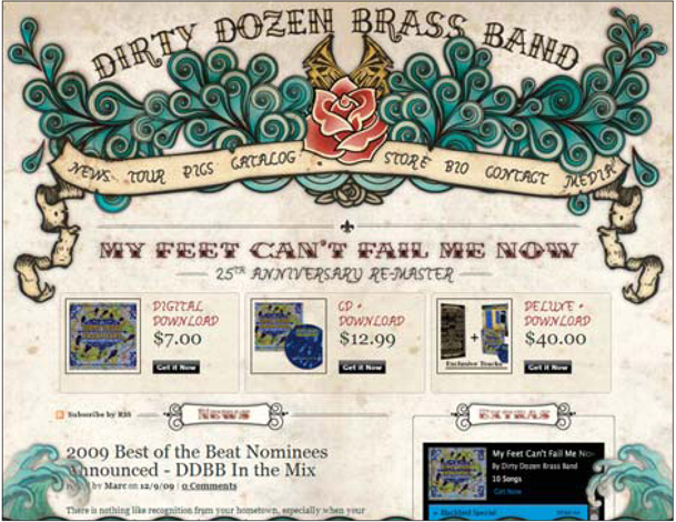
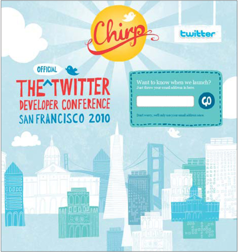
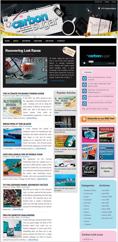
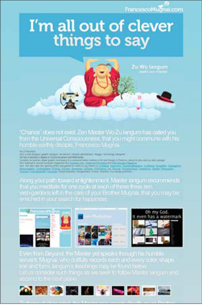
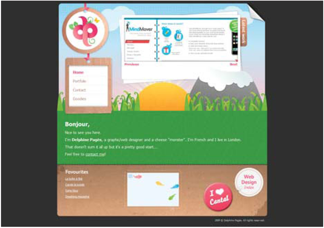
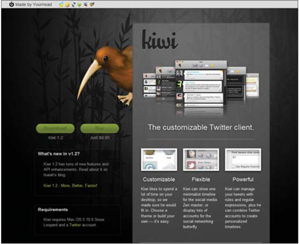
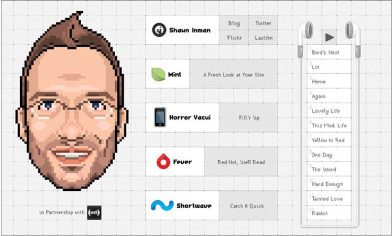
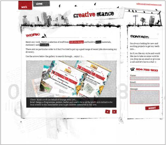
One surefire way to create a totally unique design is to incorporate hand-drawn elements into it. This works for obvious reasons — no two people will draw the same thing in the same style with the same imagery. Even when two people set out to sketch the same object, they will approach it with different techniques, different compositions and different personal histories. As such, this style finds its way into a number of sites. Let's look at a few examples.
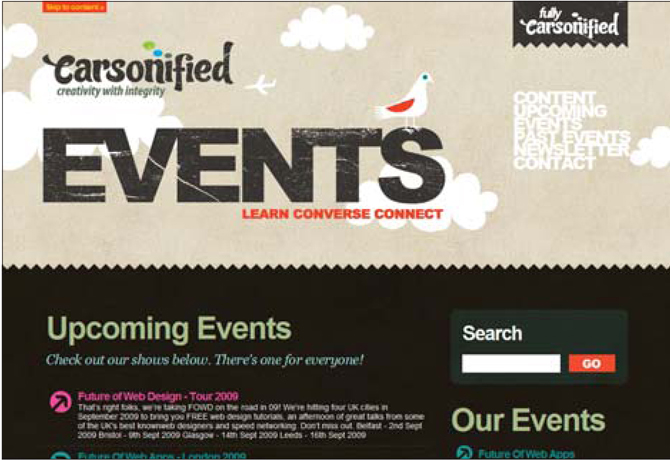
The sketchy style of the Twiggy site (Figure 1) comes across as totally unique; in no way does it feel the same as any other site. In this case, the style connects with an organic and hip atmosphere. It appears to be a project from Internet hipsters instead of some uber-nerd code junkies. Who knows if this is true or not: In many ways, it doesn't matter. Ultimately, they are pushing a product, and the image they present is key.
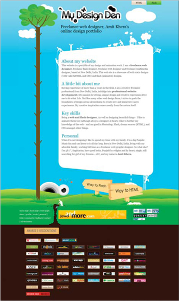
In other cases, such as Camelia Dobrin's site (Figure 2), the purpose is far more literal and obvious. Here, it is the portfolio site of a creative. As such, it does the artist well to show off her skills. The simple drawing on the homepage is unique and portrays the individual's style very clearly. We see this approach on other sites, like that of Jessette Dayate (Figure 3). Again, the individual's unique style is clearly and prominently communicated with the site's hand-drawn visuals. These illustrations not only decorate the page, they also communicate to the user what the site's owner does.
Another purpose of hand-drawn elements is to connect with the root purpose of a site. Such is the case with the Greenville site (Figure 4). Being an organization that operates in the health care industry, it faces some key challenges. Foremost is an impersonal stigma. This is most likely what drove them to a hand-drawn style for their site. Not only does it present them in a unique way (especially within the industry), it also attempts to let the consumer know that the company isn't lifeless. This personal style connects with the user in a way that breaks down some of the stereotypes and assumptions about what a health care experience will be.
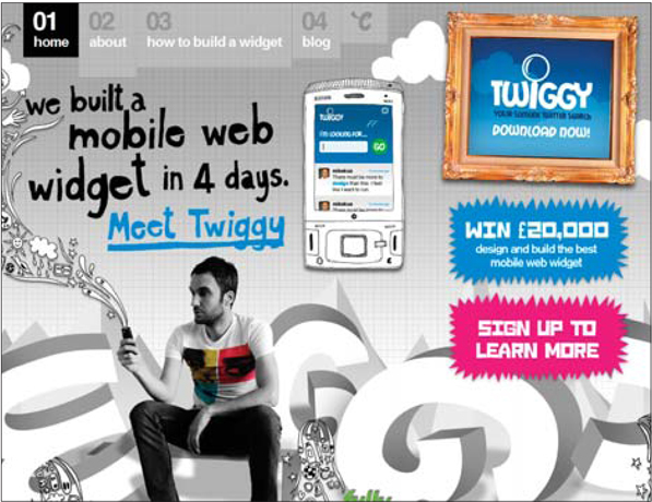
Figure 1 http://twiggy.carsonified.com
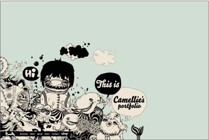
Figure 2 http://www.camellie.com
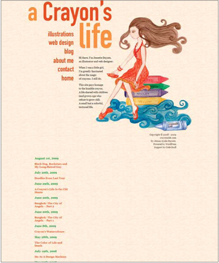
Figure 3 http://www.crayonslife.com
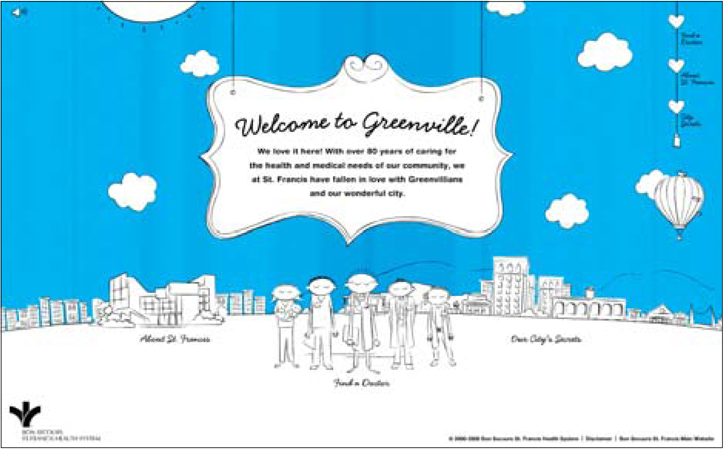
Figure 4 http://www.happyingreenville.com
notes from a developer
This is one of those styles that could be an implementation nightmare, or it might have no impact on things at all. It all depends on the design. Here are some important things to consider that will impact how much your developer wants to strangle you.
How many elements do you have that will have to be rendered in a custom way each time copy changes? (For example, a page header that has type rendered by hand.) This will get tiresome after a while, so it better be really necessary. Two great ways around this situation are handwriting fonts that can be combined with tools found in the Typography section of this book on page 129, or this nifty font generator that uses your own handwriting to make the file: http://www.yourfonts.com.
Another important thing to look for is overlaps and odd alignments. If your sketchy design includes elements that break borders and merge multiple items, it will cause a slight amount of extra work for your developer.
This style isn't likely to break the budget when used wisely.
05 / sites by styles and themes
ultra clean • minimal • sketchy • collage • illustrated • type-focused • solid colors • fabric • wood
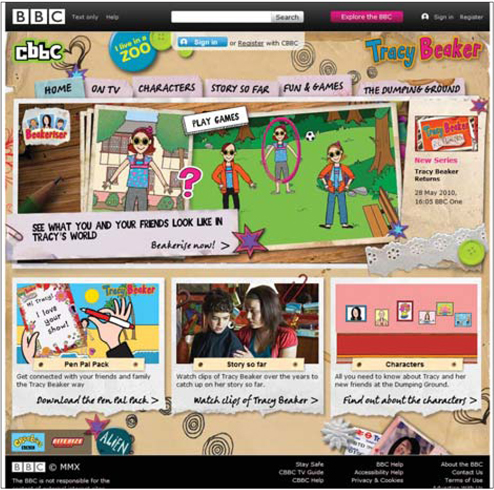
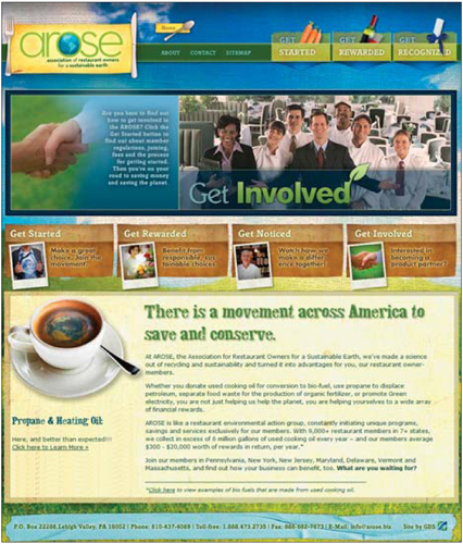
The collage style is one that seems to never go out of style. This versatile style creates a design that brings in numerous design elements that all carry their own meaning. Together, they create a collage that not only looks visually interesting, but also contains many messages about the content and people behind a site. What's perhaps most interesting about the set of samples here is the extremely diverse range of topics the style shows up in.
For example, the Real Sangria (Figure 1) site uses the style to create a pattern-based focal point for the page, while the Adam's Magic site (Figure 2) creates a much more playful and fun style with the same technique. Both designs piece together various elements and draw on an aged and worn style, yet they communicate radically different messages. Perhaps this flexibility explains the appeal of the style.
Other sites put this approach to use for more aesthetic purposes. That is to say, there is less meaning in it and it's more about just looking sharp. Matt Northam's site (Figure 4) and the Duirwaigh Studios (Figure 3) site use the style to make the page feel fresh and unique. Yes, the collages on these sites create a very distinct style and set a certain mood, but overall it is more about creating something beautiful to look at.
One of the most common uses of the collage style is to create a retro atmosphere. This style easily connects with the early to mid-1900s and is a perfect solution to reference that time period in a stylish way. The Sign Shop site (Figure 5) is a prime example of this.
The collage style is one of the more overused design styles and seems to frequently be used when no other more thoughtful style is found. I suspect this style can be a crutch designers rely upon. So it is always refreshing to find good examples of it and consider how it can effectively be saved as a potential style in our design library.
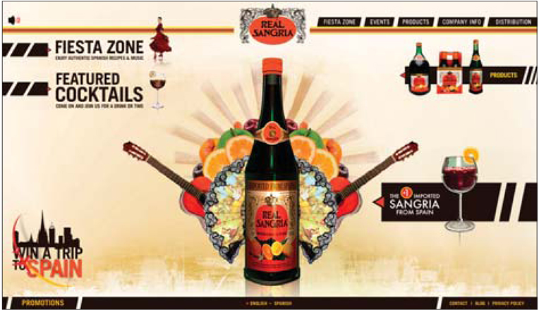
Figure 1 http://real-sangria.com
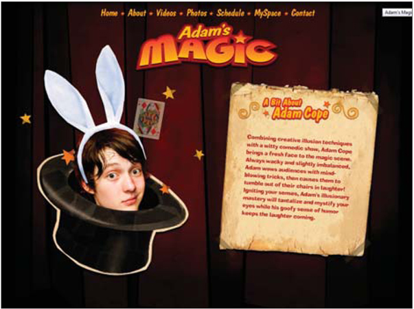
Figure 2 http://www.adamsmagic.com
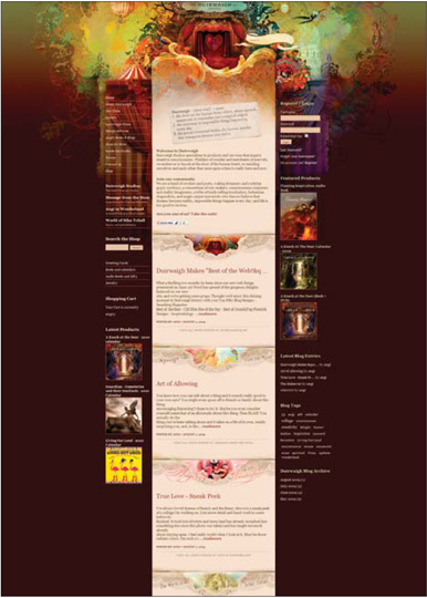
Figure 3 http://www.Duirwaigh.com
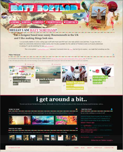
Figure 4 http://www.mattnortham.com
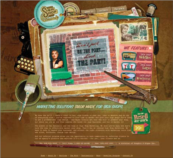
Figure 5 http://www.signshopmarketing.com
notes from a developer
The issues created by many collage styles will actually reflect problems found with transparent images, as noted in the Photographic Backgrounds section on page 135. Beyond that, the impact this style has on the developer depends on the design. If the collage regions are contained, it is likely to just be a static image. If, however, the collage is pervasive throughout the design and overlaps many borders, there will be some considerations. First, many developers will observe that collage elements crossing the borders of containers might be problematic, but a dash of CSS positioning tactics combined with some transparent PNGs should solve this problem. The real issue for the developer is more likely to be the visually demanding style this often creates. By this, I mean that this style often produces designs that are visually intertwined, making it very important for the developer to replicate the design perfectly. This level of precision will likely increase the cost of converting the design into functional code.
05 / sites by styles and themes
ultra clean • minimal • sketchy • collage • illustrated • type-focused • solid colors • fabric • wood
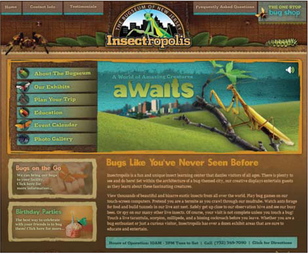
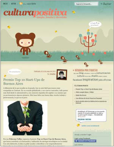
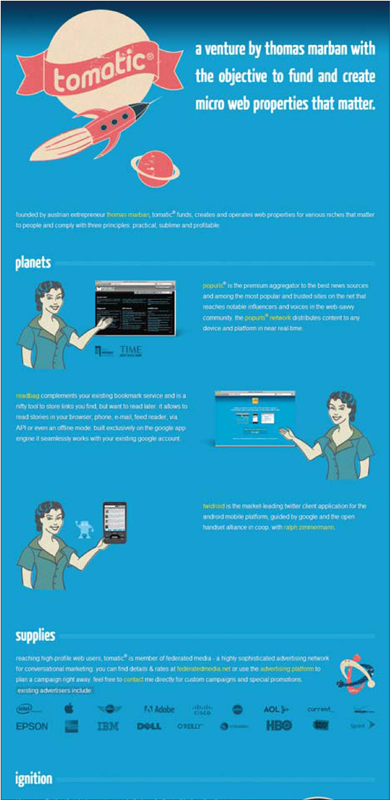
As a designer, it is not uncommon to find that a gift for illustration can come in handy. Perhaps the most distinct advantage this offers is the ability to add something fresh and unique to the design. And in a digital world where attention spans are nonexistent, anything to stand out is openly welcomed.
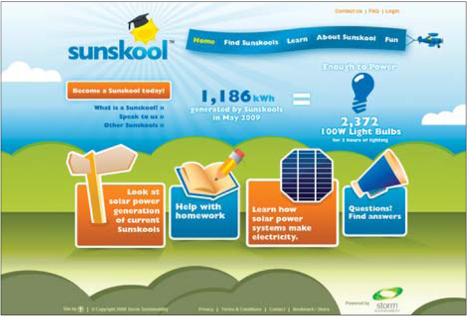
Let's look at a site developed by my friends at FireHost (Figure 1). Web hosting isn't exactly cool, and it wouldn't be much of a stretch to put it in the nerdy bucket. That being said, this site's fresh design brings a great personification of hosting, servers, security, hackers and the like to the table. The comic book style illustrations and animation bring life to this design and make it stand out. The overall design flows well with the comic book characters, but the designer didn't overdo it and put everything in speech bubbles or a half-tone pattern. For me, this strikes the perfect balance of thematic and traditional design.
On the Lionite site (Figure 2), we find an illustrated style where the theme has been carried to every aspect of the design. What saves the design from being carried too far is an illustration style that is not loud and obnoxious, but rather subdued, clean and orderly. In this case, the style reflects the personality of the people behind the site and helps the visitor see them as humans and not just another stock photo of some lady on the phone pretending to be helpful.
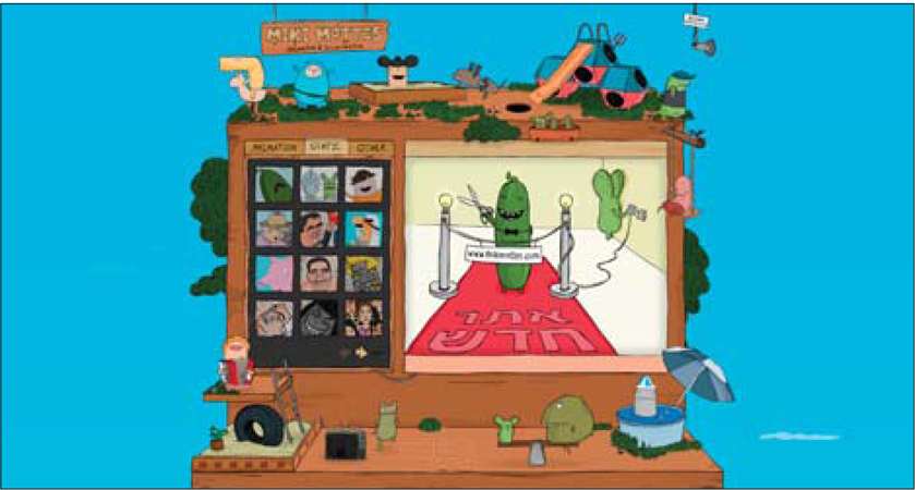
A few of the sites from Saizen Media Studios (Figures 3, 4 and 5) demonstrate how a web site can truly be a work of art. This style is probably not possible for the bulk of us, but this is not to say that we can't be inspired by it. The goal here is to break the conceptions that keep us designers from seeing such approaches as a viable option.
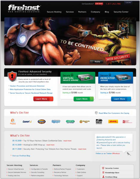
Figure 1 http://www.firehost.com

Figure 2 http://www.lionite.com
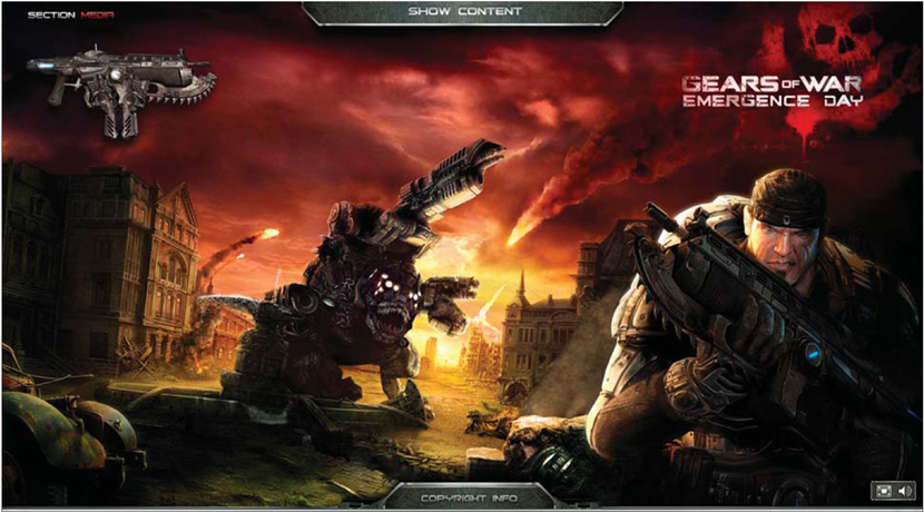
Figure 3 http://www.emergence-day.com
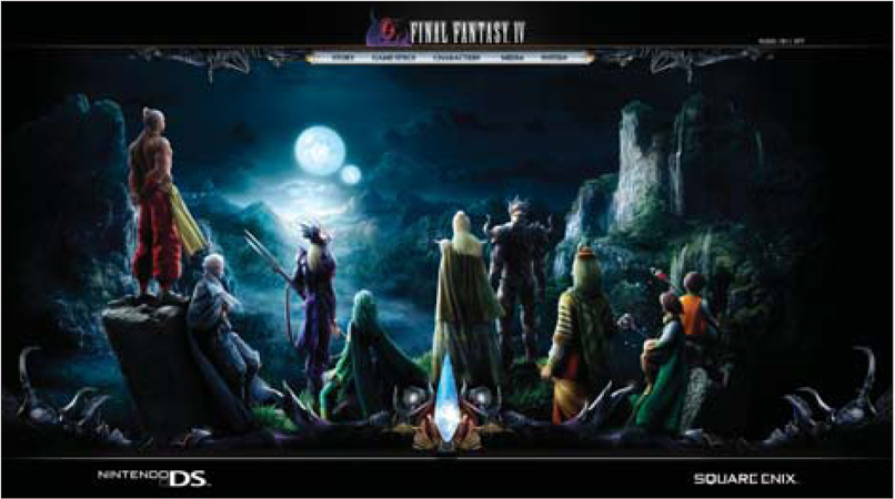
Figure 4 http://www.saizenmedia.com/FFIV
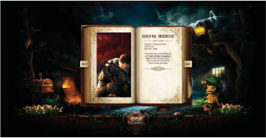
Figure 5 http://www.saizenmedia.com/nightwish
05 / sites by styles and themes
ultra clean • minimal • sketchy • collage • illustrated • type-focused • solid colors • fabric • wood
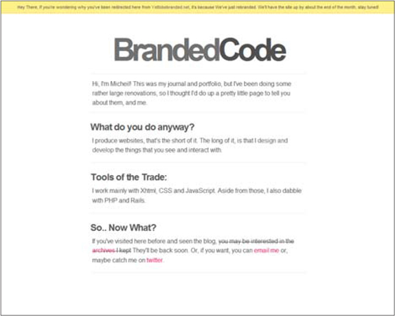
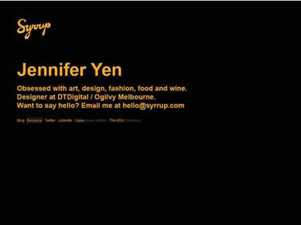
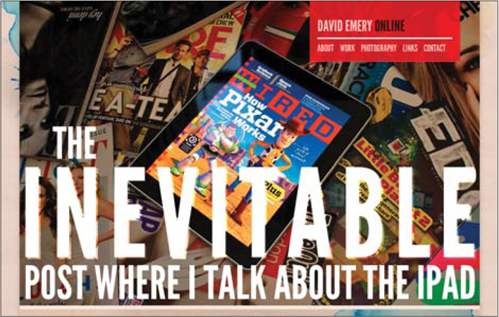
In this section, we will focus on designs that leverage type as the predominant element. Most of these designs could easily be considered minimalist, and perhaps this is just a different way of looking at the same topic. The slight difference here is that the focus is on the usage of type in elegant ways.
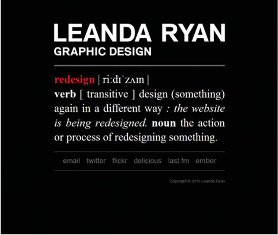
On the portfolio and personal site of Shay Howe (Figure 1), for example, the design is by all means minimalist, makes use of solid colors and lines to differentiate content, and uses type as an element of design. In particular, the basic type-driven logo sets the mood for the entire design. Huge benefits of such an approach are fast-loading pages and content that is extremely easy to consume.
Another of my favorite examples of type-focused design is the Johny Favourite site (Figure 2). Here, the type is treated in an elegant and beautiful way; the simple contrast of color combined with such a clear hierarchy in the page makes this mini site crystal clear. The irony of an example like this is that it looks so easy, yet delicately manipulating type to look this great takes a lot of work.
One surprising place to find such an approach is on a site for a design shop, like the Buckenmeyer & Co. homepage (Figure 3). It's surprising because most creative shops can't resist the temptation to put their creative juices to work and generate a highly visual design. Instead, this minimalist, type-focused design presents the content with a totally different atmosphere. The site comes across as bold and confident, yet conservative and reliable. It's strange how so much can be inferred from the style of design selected.
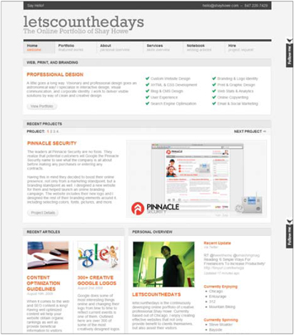
Figure 1 http://www.shayhowe.com
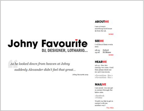
Figure 2 http://dj.johnyfavourite.co.uk
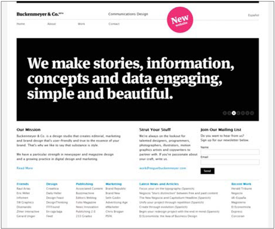
Figure 3 http://www.miguelbuckenmeyer.com
notes from a developer
The most obvious limitation this style confronts is that of web-safe fonts. If this idea is new to you, I suggest you start by checking out typetester.org. This site will help you quickly understand just how limited typesetting is on the web. That being said, there are ways around it. Many of the tools for such purposes are presented in the Typography section of this book on page 129.
So, if your design relies heavily on typography, and especially if the content is being styled to be the showcase of the site, it is extremely pragmatic of you to design with basic web-safe fonts in mind. The most likely solution is a site that merges modern web type trickery and basic web-safe fonts.
05 / sites by styles and themes
ultra clean • minimal • sketchy • collage • illustrated • type-focused • solid colors • fabric • wood
Currently, there is a very popular pattern of using solid colors on web sites. That is to say, rather than using patterns or embellished containers, many designers are turning to a more basic approach and have been leveraging solid colors heavily. While there is not a lot to say about some deep meaning buried in the use of this style, we can make a few observations regarding how it is used.
The first is that though the style is “solid colors,” this does not mean it must be used in an overly obsessive way; you can break your own self-prescribed rules. Remix (Figure 1) is the perfect example of this. While the design is largely based on the use of solid colors, you can see that it has but only a few actual solid colors in it. The trick in this case is subtle gradients that come darn close to being solid. The net result is a site design that is crisp, clean and downright beautiful.
Another prime example of the style being selectively applied is the IntuitionHQ site (Figure 2). Lots of dominant sections of solid color are offset by slick pseudo 3-D elements that help key parts of the design pop out. The designer gave the site additional depth with a gradient background and helped the logo pop by giving it a subtle shiny treatment. The trick to using a solid color style is finding the right balance between applying the style and breaking your own rules.
In other cases, the style is more literally applied. On the 99% site (Figure 3), for example, nearly all of the color applied to the site is solid and done via CSS background colors. This particular site is content heavy, and the design actually minimizes any distraction from the content. Additionally, with very few images to load, this solid color design makes for a really fast-loading page.
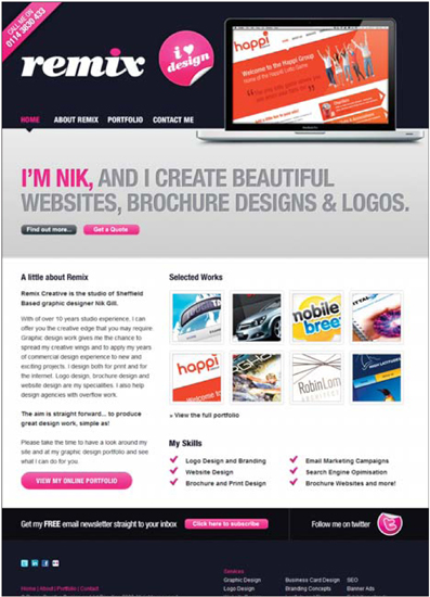
Figure 1 http://www.remixcreative.net

Figure 2 http://www.intuitionhq.com
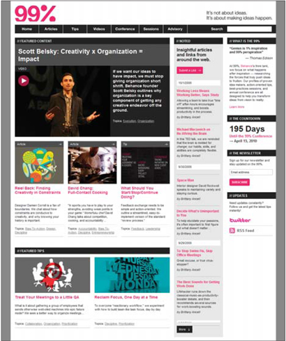
Figure 3 http://the99percent.com
notes from a developer
It should come as no surprise to hear that sites using solid color designs are typically easy to implement, and this style is most likely going to produce sites that can load blindingly fast.
Let's contrast this with a much more visual style (like collage, wood or fabric styles). These styles rely on large and numerous images to piece together their layouts. With this, file sizes grow and loading a page takes much longer.
For those of us on high-speed connections, this might seem like a non-issue. But seconds count: There have been numerous studies to show that slower web sites equal lower revenue, for e-commerce sites, especially. This article from peer1.com spells out the problem: http://www.peer1.com/hosting/how-slow-websites-impact-visitors-and-sales.php.
So, a site designed in this style will play nicely when it comes to page load times, and it is a great design approach for extremely dynamic sites like e-commerce ones.
If you're wondering why your site is running slow, Yahoo!'s YSlow Firefox add-on is a fantastic tool: http://developer.yahoo.com/yslow.
I must also point out that more than the design, the quality of your web hosting will perhaps impact load time. Keep this in mind when you're tempted to go cheap on hosting.
05 / sites by styles and themes
ultra clean • minimal • sketchy • collage • illustrated • type-focused • solid colors • fabric • wood
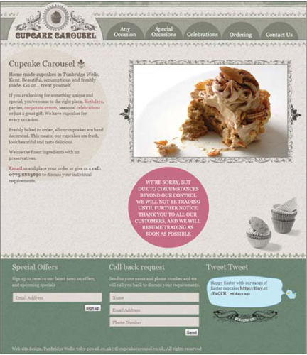
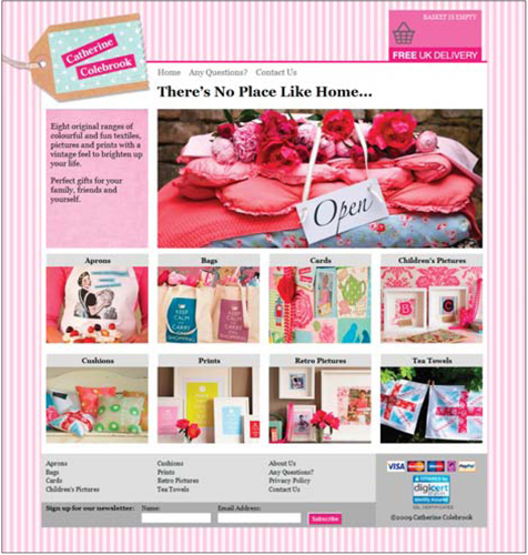
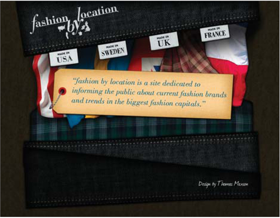
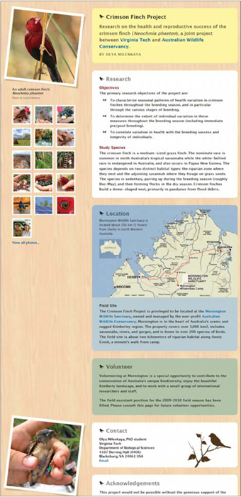
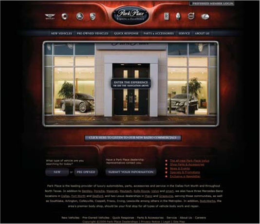
A fabric-style site quite literally makes use of fabric as a part of the design. This distinct look seems to be nothing short of a popular trend, one that is finding its way into all types of sites. One of the key reasons I can see for this being the case is the same as with many other common styles: a need to break the digital mold and give the site an aesthetic that feels comfortable, inviting and just generally welcoming. Think of the industrial-style slab concrete benches found in many public spaces; while they might look nice in the big picture, they just aren't fun to sit on, and they certainly don't beckon you to relax and take it in. Sites that leverage an inviting style inevitably give a pleasant and welcoming aesthetic.
A prime example of this fabric-style design is the web site for Fourth Avenue Church (Figure 1). What more could a church hope for in its web site than to be inviting, friendly and comfortable? It's such a logical connection that it isn't too difficult to see why a fabric style would make perfect sense. A common trend in church sites is a gritty, organic, splatter style, which communicates some similar elements that this homegrown fabric style does. Both say they are fresh, hip and keen to modern trends, but the latter does so with a bit more of a traditional style that doesn't alienate a fresh generation of churchgoers.
For a demonstration of a subtle way to leverage the style, take a look at the portfolio site for Tomaž Žlender (Figure 2). It is the dominant style of the site, and yet it is not overpowering. The textures of the fabrics bring this design to life and create a rich and elegant style. This type of approach is also found on the site of Bruno Duarte (Figure 3), where we find fabric in a supporting role of the design. We again see how a fabric design style can offer a lively balance to a medium otherwise ruled by technology. What could be more low-tech than textiles?
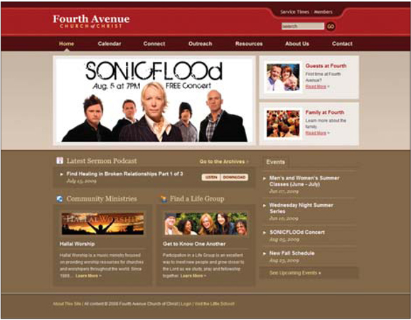
Figure 1 http://fourthavenuechurch.org
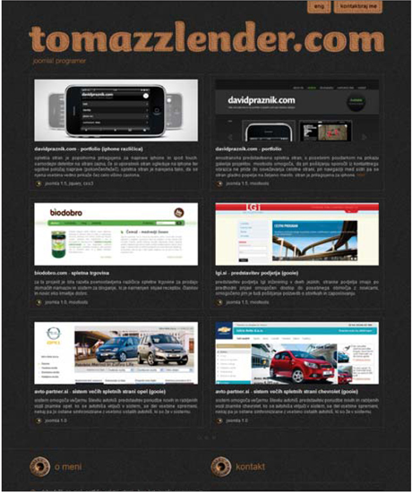
Figure 2 http://www.tomazzlender.com
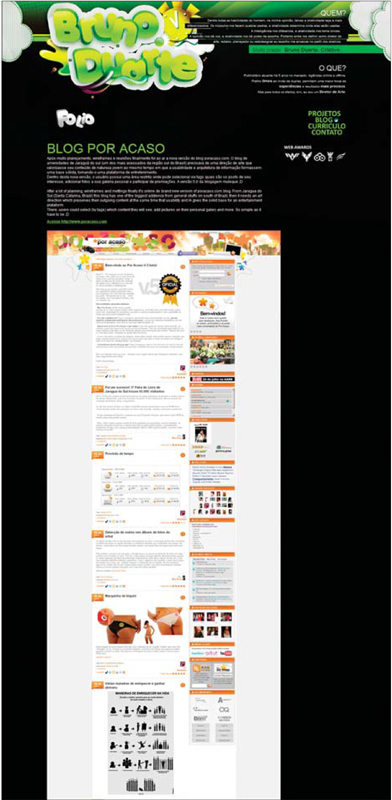
Figure 3 http://www.mormasso.com
notes from a developer
When it comes to implementation, fabric style sites raise one particular problem more than any other: image alignment. Many sites in this style rely on photographs or scanned bits of real fabric to create the composition. As such, it is likely that these designs will require pixel-perfect slicing and placement. This isn't totally unique to this style, but it is certainly a common factor. This isn't a showstopper, it just means your developer is going to spend a bit more time and energy getting it sliced up and properly aligned. I would also imagine this means you will have to pay careful attention to ensure it is properly translated into code.
If you want to help your developer, be mindful of elements at angles and ones that overlap others; if these items require transparency to interact, it will create some minor issues that also have to be surmounted. Remember, layers in a web page don't interact as rationally as they do in Photoshop. In fact, just to get transparency to work the way you expect it to requires a hack or two in order to make Internet Explorer cooperate.
05 / sites by styles and themes
ultra clean • minimal • sketchy • collage • illustrated • type-focused • solid colors • fabric • wood
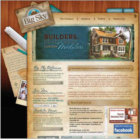
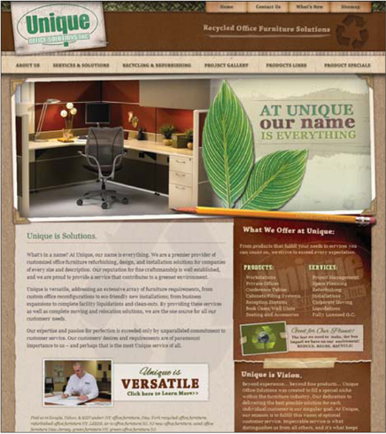
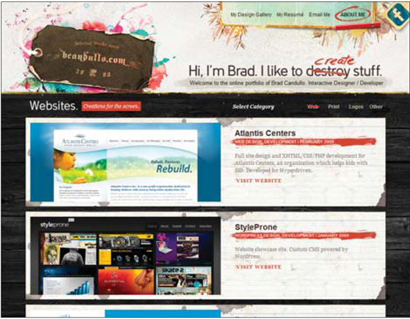
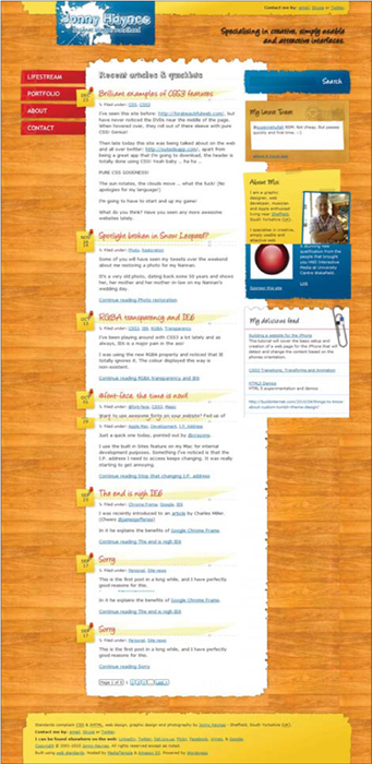
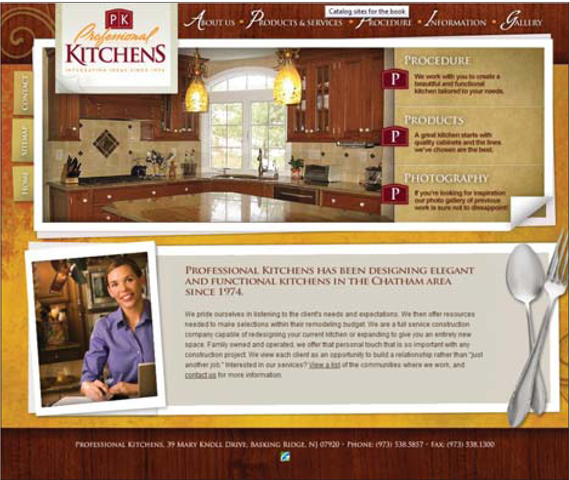
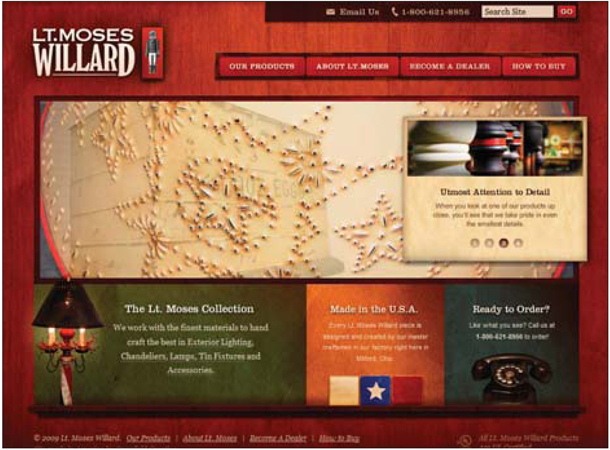
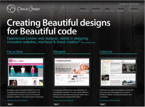
One of the most compelling reasons to use wood textures in a site design is for the purpose of creating a certain atmosphere. Wood can no doubt be used in a purely aesthetic way, to simply dress up the page. So what kind of atmospheres can wood establish? The range is quite dramatic, so let's look at a few examples.
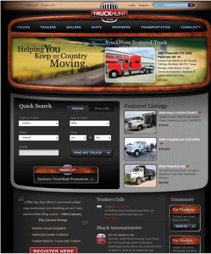
The Kinetic Technology Group web site (Figure 1) has made prominent usage of wood as a visual element, and the result is remarkably effective. I actually come from an IT background, having worked as a network engineer for some time, and as such am pretty familiar with the stigma the industry carries. Let's face it, no one calls for IT support unless something is broken. Because of that, a bit of a negative and impersonal aura has formed around the industry. The use of wood in this case helps humanize the company. Instead of a band of uber-nerds that will mock you for your foolishness, you get what appears to be a company employing normal people who just want to help. And take careful note of the style of wood used — it isn't a pretentious designer wood, but rather a down-home, everyday, normal kind of wood.
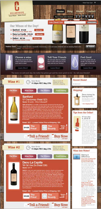
The Rocky Creek Winery site (Figure 2) leverages wood for a very different atmosphere. Here, the design is classy, but just shy of luxurious. The winery comes off as a nice establishment, without appearing overly snooty. And there are the obvious connections to nature and barrels in which wine is aged, enhancing the effectiveness of the design style.
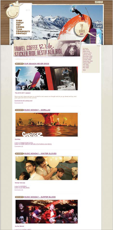
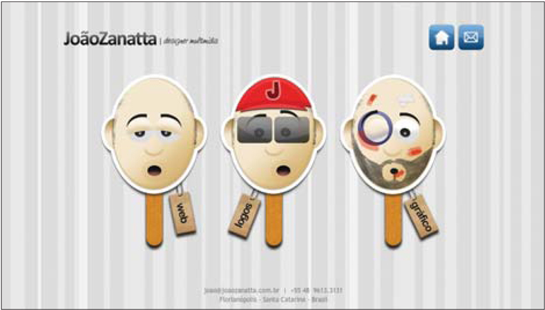
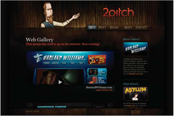
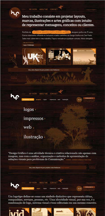
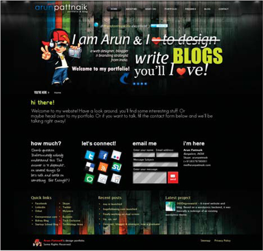
The personal site of Brent Lafreniere (Figure 3) uses wood mostly for decorative purposes, but it does lend itself to a casual atmosphere — one that is echoed in other small ways, like the playful illustration at the top and the lack of capital letters in the large welcome statement. These elements all combine to produce an approachable design that no doubt reflects the personality of the individual behind the site.
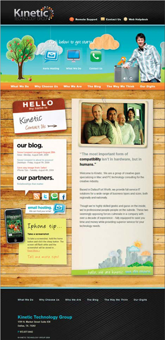
Figure 1 http://www.kinetictg.com
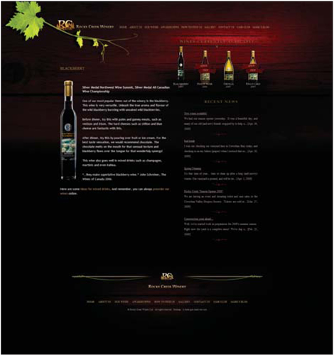
Figure 2 http://www.rockycreekwinery.ca
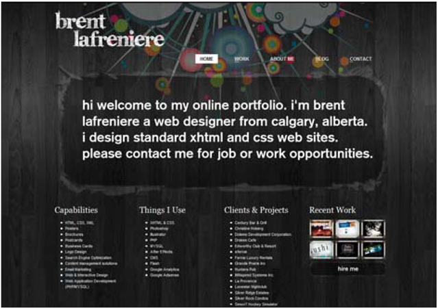
Figure 3 http://www.tnerb.com
notes from a developer
When it comes to the use of wood images in your design, one of the things your developer most likely will need from you is a repeating background. This is one of those cases where you can let the developer sort it out and hope it looks like what you want, or you can plan ahead and make sure those wood backgrounds repeat properly, making life easy for your developer and ensuring the results you want.
One solution is to make the wood image huge, but this just causes other issues. The preferred method is to use a somewhat smaller image and repeat it. Many designers I talk to have no idea how to create a repeating image. It seems like an impossible task until you figure out the offset filter in Photoshop. This article from Tutorial Blog describes the process perfectly: http://tutorialblog.org/make-repeating-seamless-tile-backgrounds-with-photoshop.
Tackling this ahead of time is a great way not only to support your developer, but to make her love you for being prepared.
