02 / emphasis • contrast • balance • alignment •
repetition • flow
basic principles of design
My approach to design analysis and learning has always been from a sample standpoint. That is to say, I much prefer to analyze samples of design and how they address various issues, rather than talking abstractly about vague topics. Through the analysis of real-life examples, we get a practical overview on the basic underlying principles of design. This is good not only for the beginner, but also for the more advanced designer. I often find that when I go back to the basics, I find something new that gives me a fresh perspective. It also seems that whenever a design is suffering, I need only to review the list of basic principles to be reminded of an aspect of the design I have neglected.
For the basic principles covered here, I turned to the book Basics of Design by Lisa Graham. It is the book I used in school, and it has always served as a basic reference point for me. According to Lisa, all design is built on the basic principles of emphasis, contrast, balance, alignment, repetition and flow. The more thought that is put into these elements, the better the design is likely to be. When these principles are forgotten, a design often goes astray. By returning to the fundamentals, you can refocus your eyes and mind to produce an exceptional design.
However, keep in mind that simply following a formula doesn't guarantee success: I'm not saying that this is the formula to good design. I can say, though, that time and time again, these principles are what encourage me to polish my own designs and allow me to discover why some designs work and others fail.
In this section, a focused effort has been made to provide examples of sites that demonstrate these elements in a variety of ways. Some samples use them in strikingly obvious ways, while others are more subtle. This is what I love about real-life examples, though; they are much more practical for illustrating a point because nothing in the real world happens in textbook-perfect patterns.
02 / basic principles of design
emphasis • contrast • balance • alignment • repetition • flow
Emphasis highlights a special importance or significance, and in many ways emphasis is closely related to, if not the same as, hierarchy. In order to design around the principle of emphasis, you must analyze a site's content in order to determine what hierarchy of importance the content should use. Once this is established, you can create a design that effectively carries out the hierarchy. A great method to establish what needs emphasis is to list all of the elements required on a page. Then, number the elements in order of importance. With this list in mind, design so that the visual hierarchy of the page reflects the determined importance. One reason this is so important is to avoid an attempt to emphasize everything. It also helps avoid the trap of an accidental hierarchy. It is always better to consciously decide what should be the visual priority and not just leave it to chance. If you try to emphasize everything, you effectively emphasize nothing. Let's look at some samples to see what has been done to create a visual hierarchy.
Bryan Connor (Figure 1)
Bryan Connor's site is a great demonstration of emphasis. The most prominent element of the page is the most recent post from his blog. It has a sharp contrast to the majority of the page by being the only white section, and the type is large and placed near the top of the page. This is a sign of clear intention and a desire to direct attention. In cases like this, it might be tempting to think the portfolio pieces or the contact information should be equally important, but again, trying to make everything equal ultimately makes everything blend together.
Digitalmash (Figure 2)
This site offers another clear use of emphasis to control the user's consumption of the page. The large, dominant text, which has again been placed at the top of the page, clearly states the site owner's purpose: This site is intended to get him work. It's not there to show off to his family, to share Flickr photos with friends or to hype up his latest tweet. It's simply to drum up work. Consider your site's purpose and how you can use emphasis to bring it out and highlight it.
Cold Stone Creamery (Figure 3)
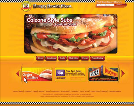
This site offers a common layout formula that leverages effective emphasis. The page has a typical header containing a logo and key navigation items. From there, the design starts with a very strong emphasis. Primarily controlled by the amount of physical space elements occupy, the emphasis of items is reduced as you move down the page. Some sites will have more than the three layers we find here, but that is not necessarily required. Here, the large masthead movie directs the user's attention and offers the sites owners to direct user attention as they see fit. Then the design moves into a denser content region with three messages in separate buckets. This density means it will be looked at second and not first. It makes really good sense to match the flow of emphasis to the way a user engages a page: top to bottom. Don't fight it, just go with it and work it to your advantage.
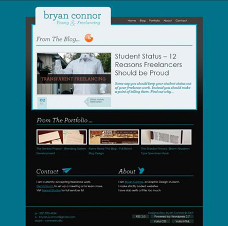
Figure 1 http://www.bryanconnor.com
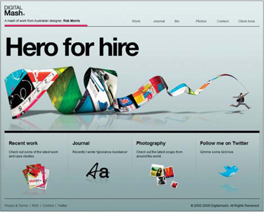
Figure 2 http://www.digitalmash.com
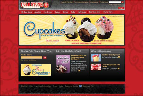
Figure 3 http://www.coldstonecreamery.com
02 / basic principles of design
emphasis • contrast • balance • alignment • repetition • flow
Contrast is the visual differentiation of two or more elements. Elements with strong contrast appear distinct and separate, while elements with low contrast appear similar and tend to blend together. There are many design elements you can manipulate to achieve contrast, including color, size, position, font choice and font weights. Contrast in a design will help a site have visual variety and avoid being stale. Contrast can also help achieve focus, thereby addressing the need for emphasis on certain elements. You can see how a loop among the basic design principles appears, as contrast is used to affect emphasis, flow and other aspects of a design.
Contrast may have its largest impact on the hierarchy of a page, as it is often used to enforce the desired emphasis. In this way, contrast can contribute to the visual order of a design. It can quickly draw attention to key elements, such as content, action items or purpose statements. As always, the needs of a site should be carefully considered so you can intentionally draw attention to certain elements though the deliberate control of contrast. Let's look at some samples to see what other designers have done with contrast.
Twe4ked Studios (Figure 1)
In this example, it is easy to spot the contrast because the two large green buttons leap out of the page. These key calls to action have been emphasized through size and color. Clearly the designer of this site is driving at two purposes; he wants you to either look at his portfolio or give him a call. We also find contrast at work in a few other areas on this site. His introduction is large and dominates the top of the page. Not only is it the full width of the page, but it is also the largest text on it. The entire top half of the page is black on white with the bottom being reversed out. This contrast sets the top content apart with an apparent level of importance, which is further emphasized by the contrast in type density. The content in the bottom is far denser, making it feel less important. It's amazing how fundamental contrast is and how inescapable it can be.
Be the Middle Man (Figure 2)
This site again demonstrates how a radical use of contrast can drive emphasis and the desired action for your user. This site encourages the user to test out their search tool by making it a dominate element in the page. As such, their goal is clear. Another interesting aspect of this design is how the density of content gets greater as the page goes down. This increasing contrast flows nicely and matches a user's behavior. If a person is reading this page to the bottom, chances are he is more and more interested as he reaches the bottom of the page (or perhaps more desperate to find what he needs), so the site packs in more and more to try to offer up what the user is looking for.
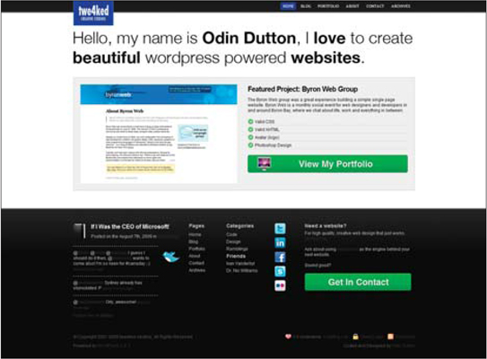
Figure 1 http://twe4ked.com
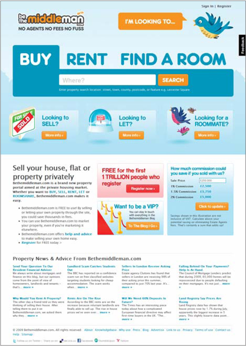
Figure 2 http://www.bethemiddleman.com
02 / basic principles of design
emphasis • contrast • balance • alignment • repetition • flow
The principle of balance revolves around the idea of how the elements in a design are distributed and how they relate to the overall distribution of visual weight within the page. This has a considerable impact on the visual stability of the design. As elements are grouped together in a design, they create visual weight. Typically, this weight must be balanced out by an equal and opposite weight in order to achieve balance in the design. Not doing so results in a design that feels unstable, though this is not to imply that it would be necessarily bad. I have no doubt that a lack of balance could be put to effective use. But a well-balanced design creates a subtle notion of stability and is generally more appealing.
There are two approaches to balance:symmetrical and asymmetrical. We will look at examples of each.
SYMMETRICAL BALANCE
Balance through symmetrical design is accomplished when the design of a page is mirrored on some axis and the two halves have identical visual weights. In web design, this is typically seen when the left and right sides are split vertically and each side has an equal weight. As always, I prefer samples, so let's look at one.
MINT Wheels (Figure 1)
The use of symmetrical balance matches with the content of this site in a very natural way. Consider the precise efforts that go into ensuring perfect balance in luxury cars; these cars offer up some of the most perfectly balanced experiences one can find on the road. In this way, a symmetrically balanced site fits well with the type of experience one has when driving a car such as this. Note how the logo has been moved to the top center of the page. This not only helps establish symmetrical balance, but also puts the logo in the visual hot spot for the layout (top and center). This site is slick and clean, and it perfectly matches its content.
ASYMMETRICAL BALANCE
Asymmetrical balance is achieved when the visual weight of a page is equally distributed on an axis, but the individual elements of these halves are not mirror images. That is a really complex way of saying that asymmetrical balance is a result of the use of dissimilar elements to create an overall balance. That still sounds complicated; let's look at some samples to see how this works.
Dallas Baptist University (Figure 2)
Asymmetrical balance is extremely common in web design because it is often a more natural solution to the content being presented. In this case, we see asymmetrical balance throughout the page, starting with the header. The logo balances out the main navigation items (which have been placed where the logo usually resides). The logo is tall and dark, allowing its small size to still match up with the navigation. Bellow the banner section, the text box with the welcome message is larger than the denser quick facts section. The size of the left box is well matched by the smaller but denser box next to it.
Campaign Monitor (Figure 3)
In some cases, it will make most sense to actually blend these two approaches to achieving balance. This is exactly the approach taken on the Campaign Monitor landing page. At the top, we see asymmetrical balance with the copy section balancing the image. But below that, we see a section of balance where the six items, the logos below that and the footer copy are all perfectly balanced left to right in a symmetrical way.
Balance is one of the more subtle elements of design, and one that many of us will address instinctively. If your design feels lopsided, consider how you can balance it by minimizing the contrast. This might mean two dominant elements that match well, or a set of equally controlled, less prominent items to balance it out. Does your design feel like it would tip over? Does it feel unstable? These are the types of questions to ask yourself to discover if you have balance issues.
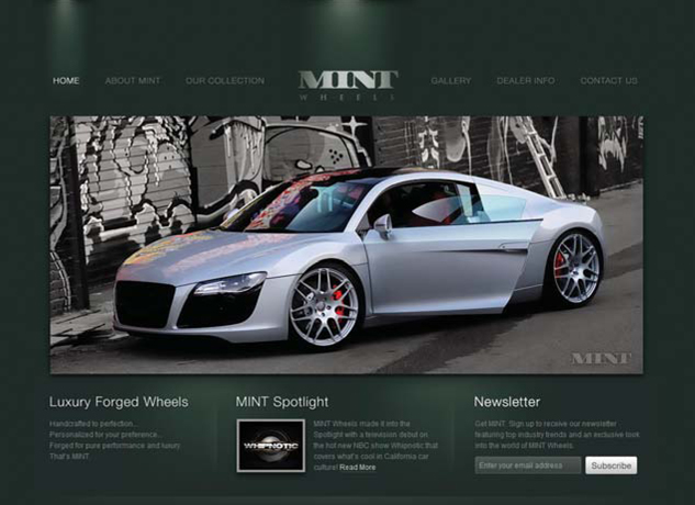
Figure 1 http://www.mintwheels.com
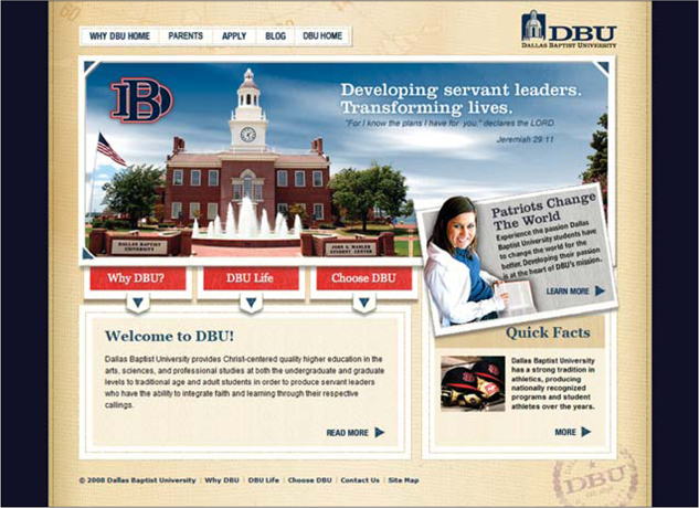
Figure 2 http://whydbu.dbu.edu

Figure 3 http://campaignmonitor.com/designers
02 / basic principles of design
emphasis • contrast • balance • alignment • repetition • flow
Alignment is the arrangement of elements in such a way that the natural lines (or borders) created by them match up as closely as possible. By doing so, these elements become unified and form a greater whole. This is often referred to as working with a grid. Unaligned elements tend to fall apart and lack the unification we so often seek. Some examples of aligned elements are having the tops of two columns line up, or the left edges of a series of stacked elements align with each other. While these examples are fairly obvious, there can be far more intricate alignments in a page that work to create a unified and pleasing design.
If you have been given the task of taking designs and turning them into code, you should be particularly aware of this principle. As a design is translated into reality, it often becomes tedious and difficult to replicate the alignments established in the original design. Not only is it a challenge, it also can be easy to overlook these carefully crafted details entirely. An awareness of design on this level can really help a developer in the translation process.
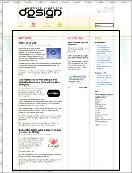
Design Without Frontiers (Figure 1)
This site is like the poster child for demonstrating alignment in web design. The deliberate and consistent use of alignment makes for a design that feels clean and balanced. For example the width of the logo matches the width of the content and the titles all align. Thanks to the nature of this design, one need only follow the lines to see what the designer intended. The meticulous usage of alignment creates a design that is perfectly balanced.
Indextwo (Figure 2)
Alignment doesn't have to be taken to the extreme, and it is a self-applied rule that can be broken at times. In this site's design, we see an overall three-column layout. Each level of the design works within that. Oftentimes, the consistency from one layer to another is lost by not maintaining alignment. In the header on this site, the main navigation has broken the column structure, though the divider between two items conveniently falls on the border. This is a perfect example of breaking the rules to serve a purpose. If the designer had compressed the options into the smaller space, they would be closer and smaller, making them much more difficult to use.
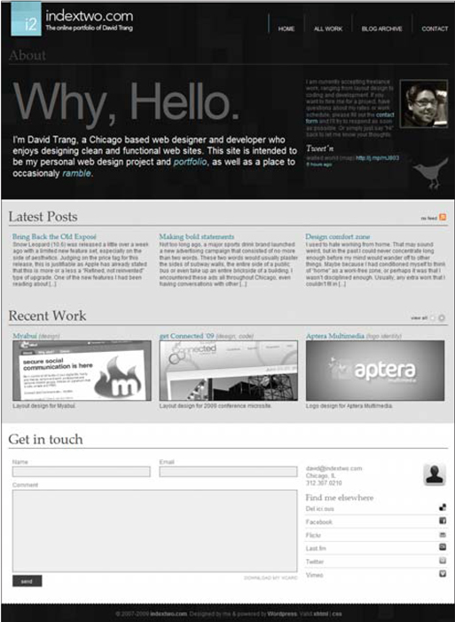
Figure 2 http://www.indextwo.com
02 / basic principles of design
emphasis • contrast • balance • alignment • repetition • flow
With repetition, the focus is on how elements of a design are used more than once throughout a design in varying ways. Designs that contain repetition become unified. Repetition can be achieved using many forms, including color, shape, line, fonts, imagery and an overall approach to style. This is often an inevitable design principle, because if a design has no repetition in its elements, it typically lacks a unified and cohesive feel.
A huge benefit of repetition is predictability. The user will learn to expect certain things if a site's design maintains key elements in a consistent way. All too often, a web site loses its visual cohesiveness by starting each page with a blank slate instead of developing some basic formulas to work with.
Vim Interactive (Figure 1)
In this example, there is so much repetition that it would take many pages of commentary to point them all out. I will, however, point out some of the more subtle uses of repetition. Spacing is one: Consider the amount of padding inside each container and how it matches up to the spacing elsewhere in the site. This overall consistency gives the site a very clean feel. The complexity of the dense content is reduced by this simple, hardly noticeable element. Another interesting element of the design that is heavily repeated is the pattern of larger text always having a less prominent sub text: the logo has a tagline next to it; the phone number has a statement encouraging you to use it; the large text next to the map has a smaller explanation; each “learn more” bucket has a title with sub text. This leads to the notion of predictability. In this design, the user comes to know what to expect, and the repetition is soothing.
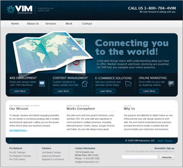
Figure 1 http://viminteractive.com
02 / basic principles of design
emphasis • contrast • balance • alignment • repetition • flow
Flow is the path the user's eyes take through a design. This is primarily a result of how elements like emphasis and contrast are used. In fact, flow is entirely the result of how other elements are put together.
One thing to always remember when considering flow is the natural order of things. There have been studies that show people tend to look at things in a rather predictable fashion. Typically, a person's eyes will go from left to right and top to bottom. This is why a web site that is right-justified feels so funky to us left-to-right readers. There's nothing inherently wrong with going against the natural order; we simply must consider the implications of such decisions. The point is that it would be wise to work with the natural flow instead of trying to force something different.
Every site has a flow, good or bad. Who decides when the flow of a site is bad? When I was selecting sites as examples of good flow, I had to determine what defines good flow. This is what I settled on: I look for demonstrations of flow that feel smooth, comfortable and as natural as possible. It can be complex, but it must feel natural and comfortable so that I don't feel like I am bouncing around the page like a pinball. For me, a smooth flow is better than a rough one. A person's eyes will naturally bounce around, but a site with what I consider good flow will encourage the user to take a nice stable path, and at times it will take the person's eyes in a loop to help keep interest.
Wilson Doors (Figure 1)
This site is a nice example of comfortable flow. It doesn't hurt that the homepage is not content heavy, and there is only a small number of options. The focus starts with a large and interesting image that gives the quick elevator pitch of what they sell. From there, our eyes flow to the bottom left and across the bottom, leading us back to the main image. This clean loop makes it easy to scan and understand the options, but also to make a choice and dive in. Notice that this loop contains all the key items for the site and ensures that a user will be exposed to the option she is looking for. Also of note is the fact that the main navigation doesn't pop out. If it did, it would compete for placement in the flow and distract the user from consuming the primary set of messages.
This looping pattern is one you will find in many of the samples in this chapter. As I already mentioned, flow is the strategic combination of other design elements. This also makes flow one of the easiest elements to forget and overlook. But again, I find that if a design isn't working for me, considering this element of design can lead to the answer of why it feels broken.
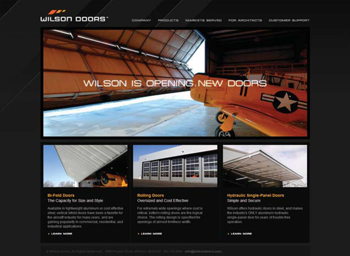
Figure 1 http://www.wilsondoors.com
