06 / atypical navigation • atypical layouts •
pseudo-flash • horizontal scrolling • one-page
sites by structural styles
If I could suggest a single section of this book to someone to encourage them into new ways of thinking, it would be this section. It seems there are often two sides to a debate over structure. One dictates that doing anything that might be dubbed “atypical” is wrong and creates poor usability. The other side is driven to break the rules and find solutions that work, but don't stay within the lines. This is what I love about this section: the topics force us to reconsider things. Does the main navigation have to be at the top? Does a site require more than one page? What if I scrolled the page horizontally? So many hot topics, so little time. These are the sections that have always created the most tension on Design Meltdown and have always had the most interest; I think it is because they provide some serious inspiration value.
06 / sites by structural styles
atypical navigation • atypical layouts • pseudo-flash • horizontal scrolling • one-page
The notion of breaking the norm, setting new patterns and generally creating a truly fresh web site inevitably leads designers to experimenting with alternate forms of navigation. As with many such experiments, this often leads to bizarre and unusable solutions. But out of such exploration can come new methods that actually make a site not only more interesting, but often more usable.
The use of the word “atypical” in titling this section suggests that there are some norms that these sites go against — this is true. Typical sites have the logo in the top left, main links across the top, login links in the top right, and secondary navigation down the left. All these are norms that many users and designers have come to embrace. So why break the norm in the first place? Usability is the only legitimate reason.
Ironically, if a design has good or bad usability, it might not be as obvious at times on sites that use this style. Such is the case with the JPEG Interactive site (Figure 2). Here, we find a very unusual navigation system that can only be fully understood as you use it. In this case, the process of getting to the information is half the art of the site. Considering the type of work the agency does, this is a perfect embodiment of the type of work they would like to attract. Another great example of this going-against-the-norm style is the Nalin Design site (Figure 1), where again we find a very unique system of navigation.
For what might be considered a more practical demonstration of this style, take a look at the personal site of Benny Martinson (Figure 3). Here, the primary navigation has been boiled down to three main links. Instead of the typical landing page full of content, the user is quickly and easily guided to the main section she is in search of — more information, his portfolio or his contact information.

Figure 1 http://www.nalindesign.com
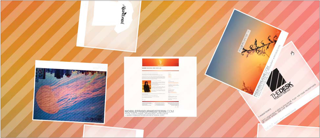
Figure 1 (close up) http://www.nalindesign.com
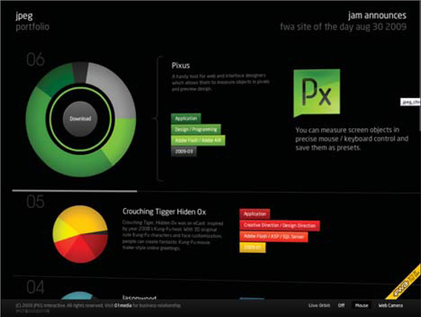
Figure 2 http://www.jpeg.cn

Figure 3 http://www.bennymartinson.com
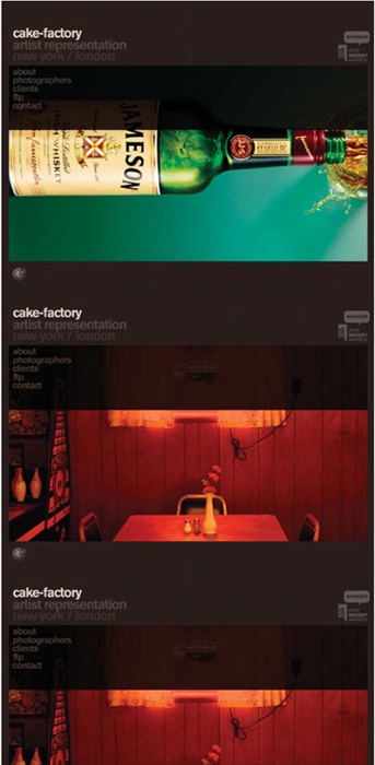
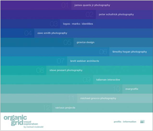

http://www.rsabroker.com/movingstories

notes from a developer
There is perhaps nothing more exciting — and, at the same time, nothing more annoying — than a designer reinventing navigation. The pragmatic developer will scoff at breaking the norms. The visionary developer will see the challenge and rise to the occasion.
As you design your site using atypical navigation, never lose sight of the user's experience. If your crazy interface approach makes the site impossible to use, you better reconsider. As you take this approach, it is important to have an open mind and to be prepared for some really negative feedback. This is most certainly not a style that should be chosen flippantly. The best uses of it do so for a reason, and the navigation adds to the experience and doesn't detract from it.
If you want to let people explore your product in a new way so they can understand how it works, atypical navigation just might be the answer. On the other hand, if you're building an e-commerce site, you better be extremely careful before you try something wacky, as you might prevent anyone from making it through your “cool” checkout system.
06 / sites by structural styles
atypical navigation • atypical layouts • pseudo-flash • horizontal scrolling • one-page
It seems that the very notion of a layout being branded atypical sparks all sorts of responses. Many people are annoyed by it and find it to be total rubbish, while others see it as refreshing and the challenging way of thinking they were looking for. So, I present to you a set of some of the finest examples of atypical layouts I have found.
The BigKid site (Figure 1) has a simple and completely nonstandard layout. There isn't really anything about the layout that resembles the norm except that you can find the logo in the top left. Somehow, the design has managed to transform its content into what feels like a work of art. Perhaps it is the beautiful photographs, or the frame-like containers. Whatever the case, this design serves as a great portal to the content, fills the screen to make as much of it visible as possible, and just generally serves its purpose beautifully. I love that its alternative layout style doesn't detract from its usability.
The Paddocks Education site (Figure 2) demonstrates this style in a practical way. On some key elements, the site sticks to tried-and-true layout mechanics: the logo is in the top left, primary navigation is across the top, the key call to action is near the top left, and key info and links are in the footer. Yet the content region of this site mixes things up enough so as not to look like every other site. Here, the designer was liberal enough to push the limits, and at the same time leverage some common patterns.
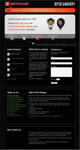
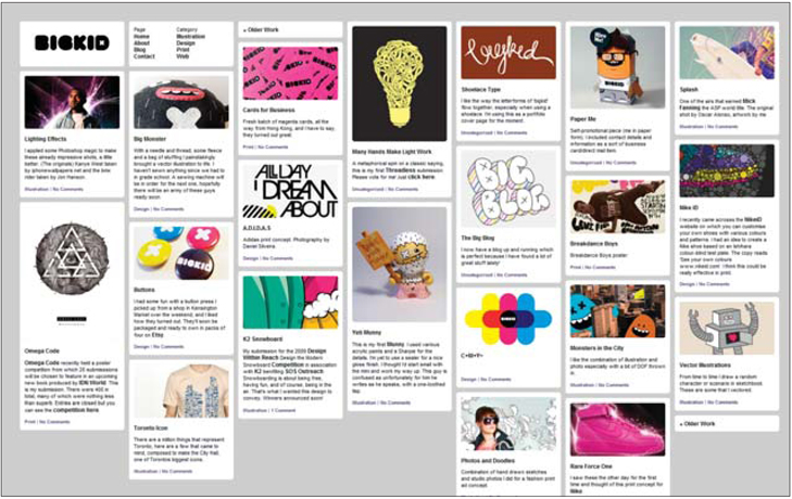
Figure 1 http://www.bigkid.co.nz
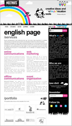
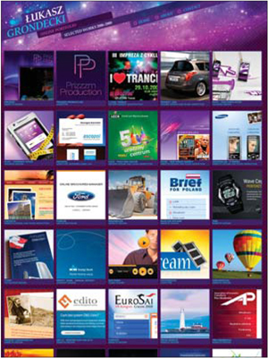
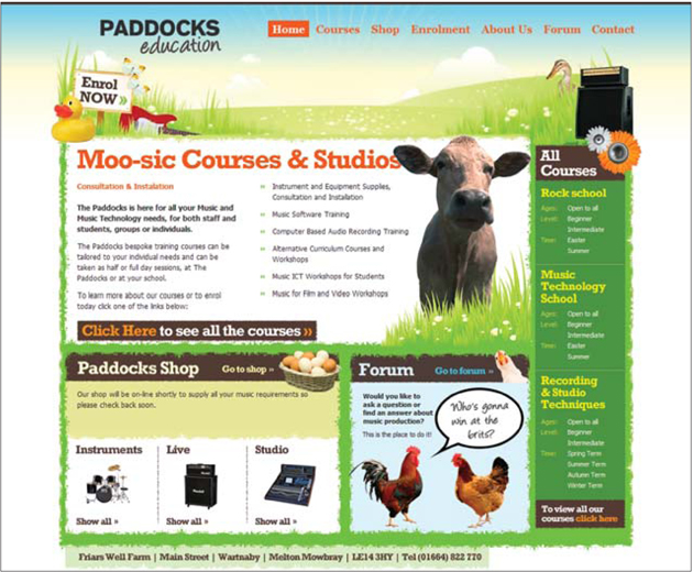
Figure 2 http://paddockseducation.com
notes from a developer
In contrast to the section on Atypical Navigation on page 194, this style will not likely get nearly as negative a response from your developer. On the surface, many developers will object to doing something outside the norm, but if your design is practical and focuses on the user's needs, it will likely be well received. In many ways, developers are far more creative than they get credit for — it's just that their creativity comes in solving technical problems and not visual ones. All the same, a good programmer can understand the notion of good design. And if your design embraces the user's needs and improves functionality by breaking the norms of page layout, you probably have something worth pursuing. Your best bet is to present your atypical layout design in the context of how functional it is, not how original it is.

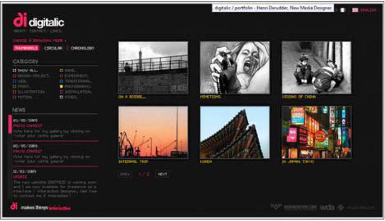
http://www.digitalic.org/portfolio
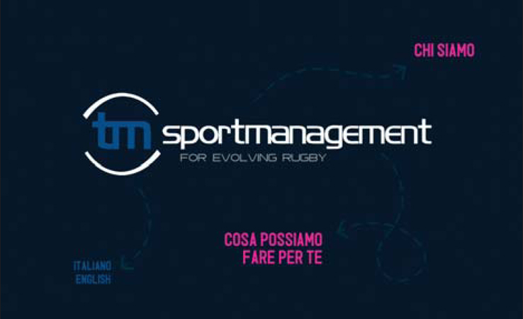
http://www.tmsportmanagement.com
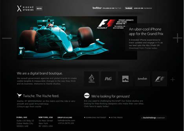
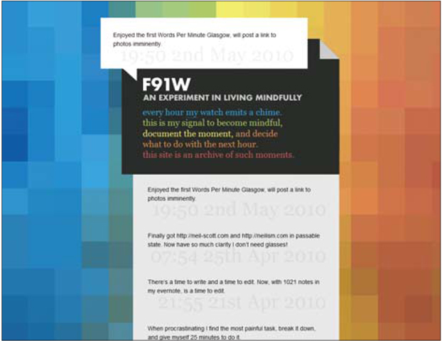

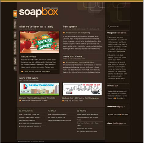
http://www.rabbleandrouser.com
06 / sites by structural styles
atypical navigation • atypical layouts • pseudo-flash • horizontal scrolling • one-page
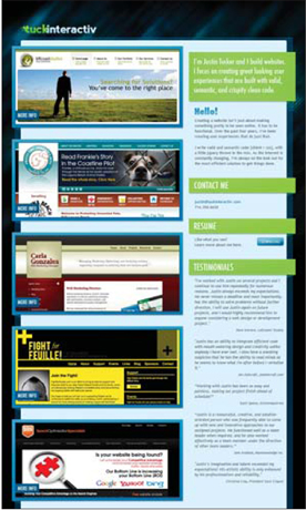
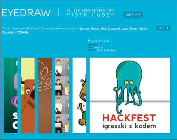
It isn't that Flash is going away or some-how falling out of popularity, but there is a sharp increase in the number of sites displaying Flash-like functionality via good, old-fashioned JavaScript. The refinement of tools such as jQuery, script.aculo.us and MochiKit has provided ways to quickly build such functionality, saving both time and money.
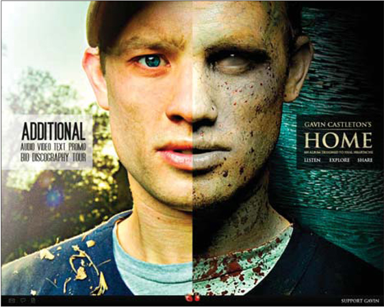
In many cases, this Flash-like style shows up in small ways, like navigation elements that fade in and out as you hover over them, or slick bubble pop-ups as you mouse over something. Countless small things have been done to provide more interactive aspects of a site that create beautiful flourishes and bring a design to life. This section will focus on a slightly more ambitious use of the style. The samples collected here manage to emulate an entirely Flash-based site and offer interfaces that make the user presume he is looking at a Flash site.
So why go to all this trouble to make an HTML and CSS site behave like a Flash one? I can think of two obvious reasons. The first is skill sets. Flash is a niche in the web industry that can drive entire careers. It takes a lot of time to learn to do it right, and even more time to actually build stuff. Given the combination of technical and visual skills required, it is perhaps one of the most difficult aspects of web development. As such, many more people have become familiar with JavaScript and, as a result, this is simply a more viable option.
The second, and perhaps most likely, reason for the increase in Flash-like designs is SEO — good old search engine optimization. Yes, many great developments have been made to enable Flash-based content to be indexed by search engines, and, yes, there are a number of ways to make it work. But the question I always come back to is if SEO is the goal, why bother with a platform that makes you work so hard? And that's the real beauty of these sites; under the hood, they are straightforward HTML, styled up with CSS and animated with JavaScript. This means search engines see all the content in its unstyled format with no additional effort.
The pragmatic developer in me can't resist loving this solution. This approach is becoming more and more popular and is likely to be very common in coming years.
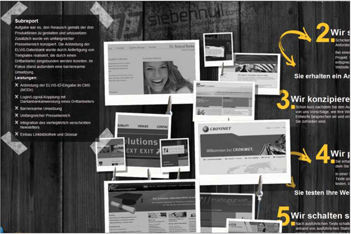
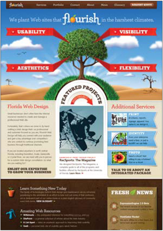
http://www.floridaflourish.com


notes from a developer
As a designer, this approach is very tempting, but I would suggest a healthy dose of caution as you consider embarking on such a site. Not only is it quite likely to be much more expensive and time consuming than you might expect, but it will probably also be quite difficult to implement.
This is another situation where the more experience you have in actually building web sites, the better equipped you are to make use of this style. A great way to take baby steps into this style is to familiarize yourself with the types of effects jQuery can perform. By studying the types of effects available, you can be sure to design around known factors as opposed to pie-in-the-sky ideas. Dig through the jQuery effects library here: http://api.jquery.com/category/effects.
There is nothing quite as powerful as going to your developer with your design in hand and corresponding examples of code that does what you're looking for. Not only does it spell it out for your developer and communicate exactly what you're looking for, it also shows a level of respect for the developer's world and demonstrates that you want to play nice with what is realistic.
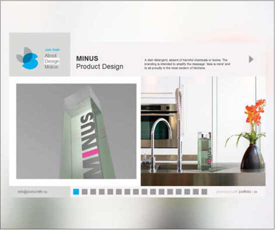
http://www.joshsmithdesign.com


06 / sites by structural styles
atypical navigation • atypical layouts • pseudo-flash • horizontal scrolling • one-page
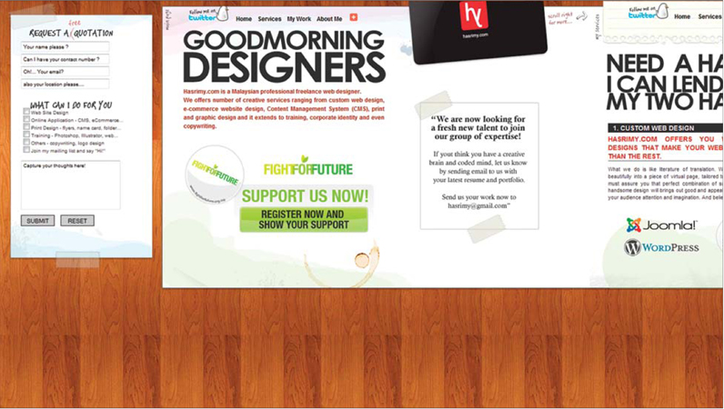
For many designers the notion of a horizontal scrolling site is not even a possibility — it's an approach that never enters their minds. This is perhaps for good reason, as it breaks a firmly ingrained user expectation of scrolling up and down; however, there are many cases where it can be used with great success. Claire Baxter's personal site is one such example (Figure 1).
On Claire's site, we see how a single-page site can be transformed into a quick-responding site that is like a traditional site with many pages, but with the benefit of a nice page-to-page transition. This is one of those sites you simply have to use to really love. It responds super fast, flows really well and is crystal clear. Amazingly, this site avoids even the least bit of confusion that might result from scrolling side to side.
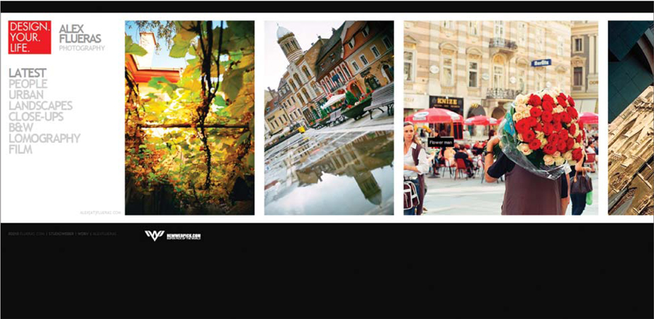
Sites that showcase photography, such as Melissa Marie Hernandez's portfolio, can be very well-served by a horizontal scrolling site (Figure 2). Photographs work particularly well in this style, as they line up so perfectly and make for a beautiful strip of images. On Melissa's site, the size and flow of the photographs means that the next image peeks out at you, enticing you to keep clicking. This hint of what is to come drove me to shuffle through the galleries, and this is certainly what the owner wants potential clients to do.
One place that it would seem rather unlikely to find a horizontal scrolling site would be in the real-estate industry, but this is just the case with the Pinchot Forest web site (Figure 3). In addition to being another example of a page with a smooth-moving side scroll, it also has the interesting feature of a static menu bar. Many sites like this repeat the navigation on each frame as it moves, and others force you to return to the homepage to dig into other content. Instead, this site simply slides the content along with the logo and navigation anchored in place. This is a wonderful use of the style that doesn't detract from usability and makes for a unique experience.
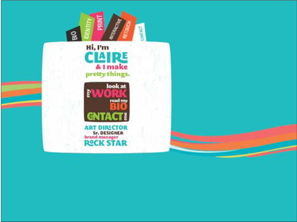
Figure 1 http://www.vanityclaire.com
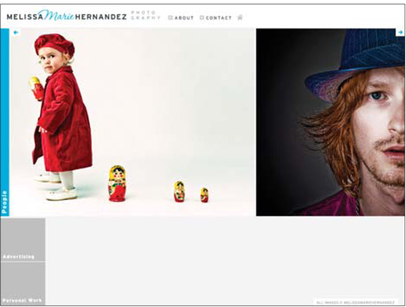
Figure 2 http://www.melissamariehernandez.com
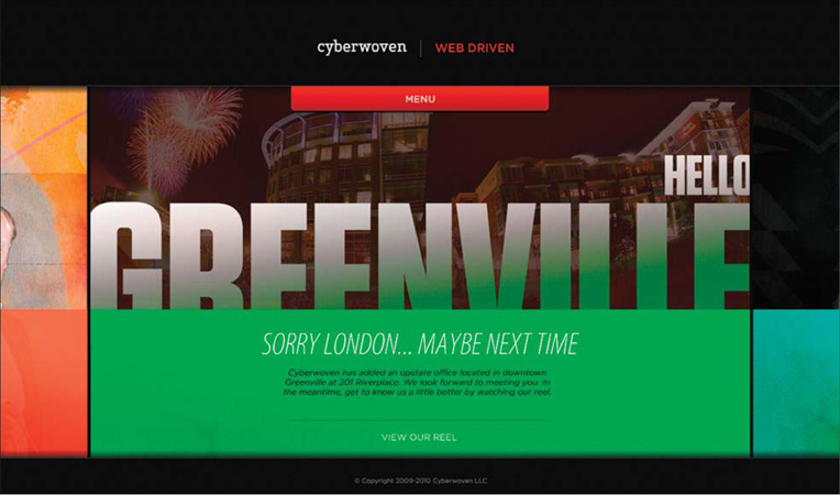
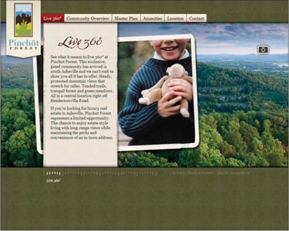
Figure 3 http://www.pinchotforest.com
notes from a developer
As a developer, I have had a wide range of designs brought to me ready to be coded. But this is one style I have yet to implement in code myself. I can tell you that the day a designer tells me this is his grand idea, he will probably see me roll my eyes and let out a small sigh. This approach can create huge usability issues, as well as technical snafus.
In particular, suppressing the vertical scroll bar and just showing a horizontal one might sound simple, but it isn't so cut and dried. Considering that most browsers are designed to allow users to scroll vertically to see content, you have to be careful when you start overriding this behavior.
If this is truly the direction you want to go, carefully consider the size of your content and how it will show up on browsers when they aren't full-screen on your fancy 30-inch monitor. If you can design within reasonable limitations in this regard, your developer is likely to be a lot more open to the approach.

06 / sites by structural styles
atypical navigation • atypical layouts • pseudo-flash • horizontal scrolling • one-page
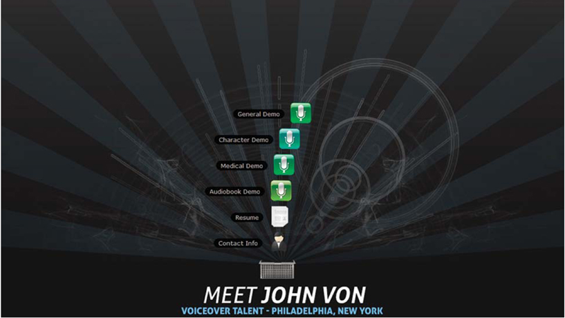
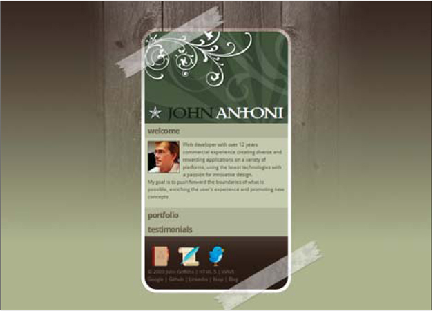
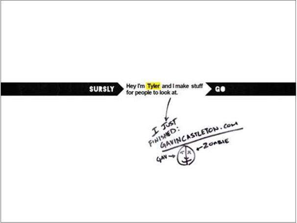
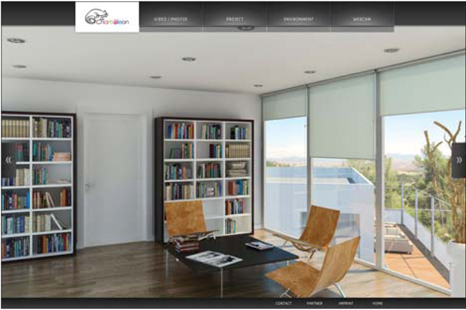
The one-page site has so many obvious purposes, it is difficult to figure out what can be said or done with it that's actually new or fresh. Remarkably, though, the examples provided here actually manage to feel totally fresh and unique.
Many of the samples rely on overall minimal styles, which very effectively complement the minimalist notion of a single-page web site. Many of the sites featured here could easily have had several pages, and the designers would have been driven to fluff up the content to fill the space. Instead, a focus on efficiency and ease of use dominates the end result, which features content that is easy to consume, quick to load and keen on satisfying the user with all the information she needs.
A perfect example of this is the portfolio site of Jack Bloom (Figure 1). This one-page site does many things remarkably well. For starters, it is certainly in a semi-minimalistic style. I say semi because it does have some flourish and embellishment, but overall it is bare bones. For example, the text itself is rendered in creative and beautiful ways, allowing it to serve two roles: decoration and content.
There is another potential strategy in putting all of the content in a single page. The NineFlavors (Figure 2) site is a single-page site that uses a sort of in-line scrolling to change out the content. On first glance, this is kind of clever and feels nice. But it does lead to the inevitable question: Why not just put each content bit on its own page? There are many possible answers, and I want to focus on one that seems like a different perspective. As a design agency, it can be quite difficult to get people to thumb through all of your content, samples and history in order to sell them on you as an agency. In this case, if the user takes the first step and clicks a link, he is surprised that the content just pops in. Somehow it feels like less of a time investment than going through multiple pages. As a user, I am quickly enticed to click all the links and thereby run through all the content. So this is a great way to make it simple for someone to get a quick overview of a fair amount of content. It reduces the sensation of surfing around a big mass and needing to get orientated.
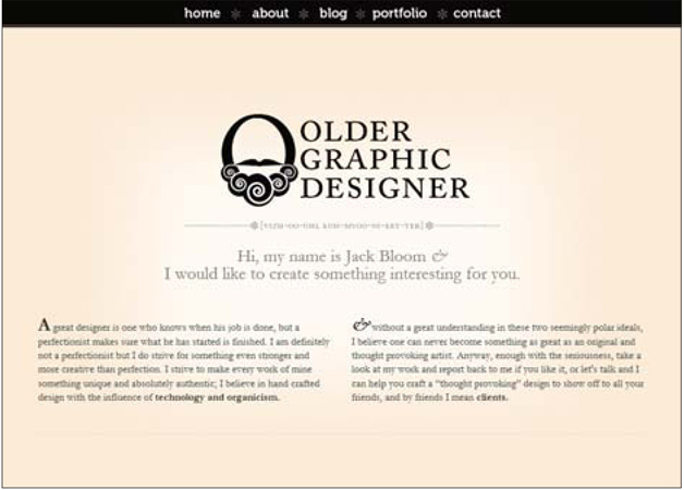
Figure 1 http://oldergraphicdesigner.com
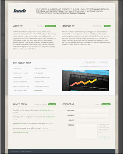
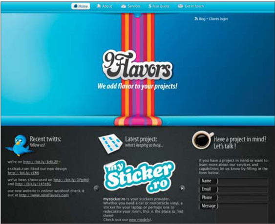
Figure 2 http://www.nineflavors.com
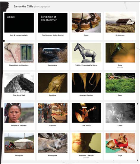
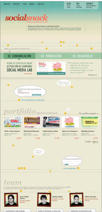
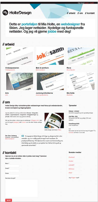


http://www.thismortalmagic.com

