CHAPTER 14
Study this chapter to learn about:
Data Interpretation questions present you with one or more tables, charts, or graphs, and ask you to make calculations and inferences based on this information. Most of the time, the questions will appear in graphs in one of three forms: bar graphs, circle graphs, or line graphs. Each Quantitative Reasoning section will have three Data Interpretation questions. The tables, charts, and graphs will appear either at the top or to the left of every corresponding question.
The math on these questions is fairly straightforward; the difficult part is fully comprehending the information in the charts and answering the questions quickly and efficiently. Most of the questions will test concepts that you should be familiar with from the previous chapters: fractions, decimals, percentages, ratios, averages, probability, and, occasionally, geometry. Since these topics are already known to you, the key to doing well on these questions is to fully understand the data so that you use the proper information to answer the questions. Though your calculator will certainly come in handy on many of these questions, Data Interpretation questions are designed to test your estimation and approximation abilities, so you would be well-served to practice these questions with and without a calculator.
The two graphs and three multiple-choice questions following them illustrate a typical Data Interpretation question group and will form the basis of this overview of Data Interpretation strategies and methodology:
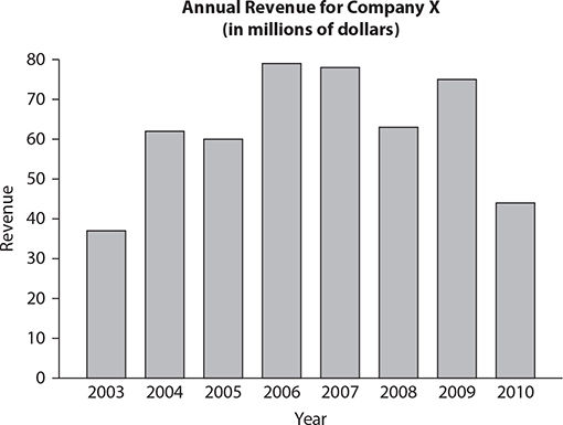
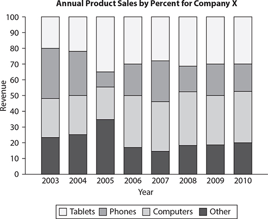
1. For which year was the percentage change in revenue from the previous year the greatest?
 2003
2003
 2004
2004
 2008
2008
 2009
2009
 2010
2010
For this question, indicate all of the answer choices that apply.
2. For which of the following years was the revenue from computers greater than in the previous year?
 2004
2004
 2005
2005
 2006
2006
 2008
2008
 2010
2010
For this question, write your answer in the box.
3. During the period from 2006–2008, what was the average annual revenue from phones? Round your answer to the nearest $100,000.

The first step to understanding the data is to note the title of the given graph. The first graph provides you with the annual revenue for a company from 2003–2010. Notice that the title tells you that the data is in millions of dollars. Thus the numbers on the y-axis represent millions of each labeled quantity.
The second graph provides you with the breakdown of the company’s annual revenue by product sales. Make sure to understand the legend and to understand how to read each bar. For example, you should note that even though the top bar of the Computers component of 2003 ends at ≈45, computers did not account for 45% of that year’s revenue since the bottom bar ends at ≈22. Thus computers accounted for ≈(45 – 22) = ≈23% of that year’s revenue.
How to Answer Data Interpretation Questions
When answering Data Interpretation questions, you will want to keep a few principles in mind.
 Principle 1: When possible, you should estimate. Many of the questions you see in Data Interpretation will use words such as approximately or closest to. When you see these words, the test-makers are essentially telling you that you are not expected to arrive at a precise value. Instead, make sure that you stay roughly within the range of the given information, and the answer you arrive at will almost always be near only one of the choices. This strategy is particularly helpful in situations with bar graphs, where it might not be quite clear whether, for example, the review in 2003 is $38 million or $39 million. The short answer is that it does not matter. Stay within reasonable estimates, and the correct choice will still be obvious.
 Principle 2: Don’t confuse percentages, averages, and numbers. Question 1 asks you to determine which year had the greatest percent change from the previous year. You should first recognize that the years with the greatest absolute change from the previous year were 2003 and 2010. You may then be tempted to select 2010 since the absolute difference between 2009 and 2010 is greater than the absolute difference between 2003 and 2004. But recall from the percentages chapter that percent change depends on the original value. Since the revenue in 2003 is so much less than the revenue in 2009, the percent change from 2003 might be greater than from 2009, even though the absolute change is less. Thus you should calculate the percent change for those two periods (keeping in mind the importance of estimating!):
Percent change from 2003 to 2004: The revenue in 2003 is roughly $37 million and the revenue in 2004 is roughly $64 million. The percent change is thus:  = ≈0.68 = 68%.
Percent change from 2009 to 2010: The revenue in 2009 is roughly $75 million and the revenue in 2010 is roughly $44 million. The percent change is thus  = ≈0.41 = 41%. Thus the correct answer for Question 1 is B.
 Principle 3: Use your eye. Unless noted otherwise, the diagrams are drawn to scale. This is helpful since you can minimize calculations when you are comparing choices or elements of a graph. For example, in Question 2, you can determine all of the correct answers by eyeballing instead of by doing calculations:
Choice A: In the second graph, the percentage revenue from computers in 2004 is about equal to the percentage revenue from computers in 2003. From the first graph, you know the total revenue in 2004 was greater than in 2003. Thus the revenue from computers in 2004 is an equal slice of a larger whole (relative to 2003). → Keep Choice A.
Choice B: In the second graph, the percentage revenue from computers in 2005 is slightly less than the percentage revenue from computers in 2004. From the first graph, you know the total revenue in 2005 was less than in 2004. Thus the revenue from computers in 2005 is a smaller slice of a smaller whole (relative to 2004). → Eliminate Choice B.
Choice C: In the second graph, the percentage revenue from computers in 2006 is greater than the percentage revenue from computers in 2005. From the first graph, you know the total revenue in 2006 was greater than in 2005. Thus the revenue from computers in 2006 is a larger slice of a larger whole (relative to 2005). → Keep Choice C.
Choice D: In the second graph, the percentage revenue from computers in 2008 is roughly equal to the percentage revenue from computers in 2007. From the first graph, you know the total revenue in 2008 was less than in 2007. Thus the revenue from computers in 2008 is an equal slice of a smaller whole (relative to 2007). → Eliminate Choice D.
Choice E: In the second chart, the percentage revenue from computers in 2010 is roughly equal to the percentage revenue from computers in 2009. In the first chart, you know the total revenue in 2010 was less than in 2009. Thus the revenue from computers in 2010 is an equal slice of a smaller whole (relative to 2009). Eliminate Choice E. The correct answer for Question 2, therefore, is choices A and C.
 Principle 4: Link to what you know. Since these questions test mathematical skills covered in previous chapters, you should recall the relevant properties that a question is addressing. For example, Question 3 requires you to use the average formula twice. Since the total revenues for 2006 and 2007 are roughly equal ($78 million), and the percentage revenues from phones during those two years are roughly equal (30%), the total for those two years is approximately $78 million × 30% × 2 = $46.8 million. The other data point is the revenue from phones in 2008. The percentage revenue from phones in 2008 is roughly 32%, and the total revenue is roughly $63 million. Thus the revenue from phones in 2008 is approximately $63 million × 32% = $20.16 million. The total average is approximately
  = $22,320,000. Rounding off to the nearest $100,000 gives an answer of $22,300,000.
Exercise: Data Interpretation
Questions 1–6 refer to the following diagrams:
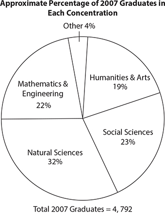
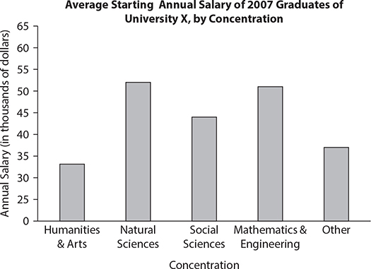
1. The average starting annual salary of 2007 graduates concentrating in mathematics and engineering was approximately what percent greater than that of graduates concentrating in the humanities and arts?
 33.3%
33.3%
 50%
50%
 83.3%
83.3%
 133.3%
 150%
150%
2. If 10% of the graduates concentrating in the social sciences were psychology majors, approximately how many 2007 graduates were psychology majors?
 50
50
 110
110
 230
230
 470
470
 1,200
1,200
3. What is the approximate average combined annual salary for students concentrating in the humanities and arts and in the natural sciences?
 $38,000
 $39,000
 $42,000
 $44,000
 $46,000
4. If the areas of the sectors in the circle graph are proportionate to the percentages shown, then what is the approximate measure, in degrees, of the sector representing the percentage of students concentrating in the humanities and arts?
 19
19
 34
34
 42
42
 68
68
 136
136
For this question, indicate all of the answer choices that apply.
5. Which of the following can be inferred from the data above?
 The average starting annual salary for all 2007 graduates of University X was above $40,000.
 The range of starting salaries for all 2007 graduates of University X was less than $30,000.
 The median starting salary of 2007 graduates concentrating in Other was less than the median starting salary of 2007 graduates concentrating in natural sciences.
6. Approximately how many students concentrating in the natural sciences would have needed to switch concentrations to mathematics and engineering for the percentage of students concentrating in the natural sciences to equal the percentage of students concentrating in mathematics and engineering?
 120
120
 180
180
 240
240
 300
300
 360
360
Questions 7 to 10 refer to the following diagrams:
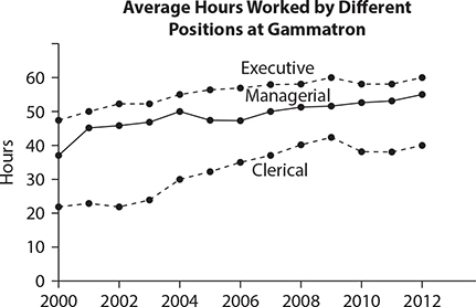
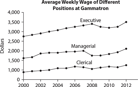
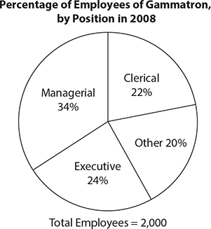
7. From 2009 to 2012, by approximately what percent did the average hourly wage of an executive at Gammatron increase?
 4%
4%
 5%
5%
 6%
6%
 7%
7%
 8%
8%
8. If a is the total amount of money paid to managerial employees in 2008, and b is the total amount of money paid to executive employees in 2008, then the average of a and b is closest to
 $72,000
 $85,000
 $100,000
 $120,000
 $140,000
For this question, indicate all of the answer choices that apply.
9. If an employee from Gammatron in 2008 were picked at random, which of the following could be the probability that this employee would have an average weekly wage above $1,500?

10. The total salary paid to clerical employees in 2008 is closest to
 $15 million
 $18 million
 $20 million
 $23 million
 $25 million
Questions 11 to 14 refer to the following diagram:
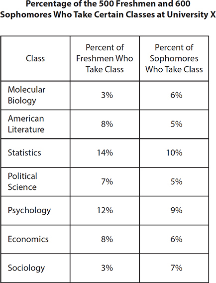
11. The number of freshmen who take American literature is how much greater than the number of sophomores who take American literature?
 3
3
 10
10
 30
30
 40
40
 70
70
12. The number of freshmen who take statistics is approximately what percent greater than the number of sophomores who take statistics?
 10%
10%
 14.3%
14.3%
 16.7%
16.7%
 28.6%
28.6%
 40%
40%
For this question, write your answer in the box.
13. What is the ratio of the number of freshmen not taking any of the listed classes to the total number of freshmen and sophomores?

For this question, indicate all of the answer choices that apply.
14. Based on the table above, which of the following is true?
 The range of the number of freshmen in each of the listed courses is greater than the range of sophomores in each of the listed courses.
 The standard deviation of the number of freshmen in each of the listed courses is greater than the standard deviation of the number of sophomores in each of the listed courses.
 The median of the number of freshmen in each of the listed courses is greater than the median of the number of sophomores in each of the listed courses.
Exercise Answers
1. B The average salary for mathematics and engineering majors is ≈$51,000, and the average salary for humanities and arts majors is ≈$34,000. The percent greater formula is % of – 100% = % GREATER. Plug in the values to get the salary of mathematics and engineering students as a percentage of the salary of humanities and arts students: $51,000/$34,000 = 150%. Subtract 100%. The answer is 50%.
2. B The approximate number of students concentrating in the social sciences was 23% × 4,792 ≈ 1,102. 10% of 1,102 is approximately 110.
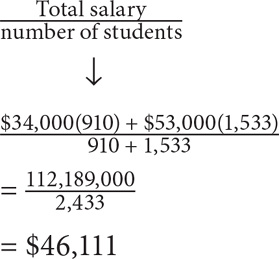
3. E The total salary for graduates of the humanities and arts = average × number of students. The average is approximately $34,000. The number of students is approximately 0.19(4,792) ≈ 910. The total salary for these students is approximately $34,000(910). The total salary for graduates of the natural sciences = average × number of students. The average is approximately $53,000. The number of students is approximately 0.32(4,792) ≈ 1,533. The total salary for these students is approximately $53,000(1,533). The average salary for both concentrations combined equals:
The closest answer is E.
4. D The sector area for humanities and arts represents 19% of the total circle. Thus the central angle = 19% (360) = 68.4.
5. A Before doing the calculations, try to eyeball the figure.
Choice A: Other than the humanities and arts, all of the average salaries are near or above $40,000. Since humanities and arts graduates make up only 19% of the entire population of graduates, their relative weight is not enough to bring the total average below $40,000.→ Choice A is true.
Choice B: Each of the bars provides an average. Since numerical values cannot be inferred from an average, the actual range for the starting salary of any of the concentrations cannot be determined.→ Eliminate Choice B.
Choice C: The same reasoning that applied to Choice B applies to Choice C. Since you do not know the actual salaries in either set, you cannot determine the median of either set or how the medians compare. → Eliminate Choice C.
6. C To make the number of students in each concentration equal, their percentages must be equal. Let x represent the percentage of students that leave the Natural Science concentration and enroll in the mathematics and engineering concentration. Thus
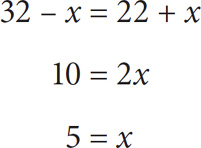
Thus 5% of the total students would have to switch. 5% of 4,792 ≈ 240.
7. D To solve for percent increase, use the percent change formula:  . To determine the average hourly wage for executives in 2009, divide the weekly wage by the number of hours worked each week: $3,250/60. To determine the average hourly wage for executives in 2012, divide the weekly wage by the number of hours worked each week: $3,500/60. Substitute these values into the percent change formula:

8. D In 2008, executive employees made approximately $3,300 per week. In 2008, managerial employees made approximately $1,750 per week. However, there were more managerial employees than executive employees in 2008. To solve for the average weekly wage of the two groups combined, set up a weighted average, where the weight of managerial employees is approximately  and the weight of executive employees is approximately
  .
.
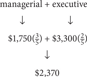
Finally, to get the yearly average, multiply this value by 52: (2,370)(52) = $123,240.
9. D and E In 2008, managerial and executive employees had average weekly wages above $1,500. Thus the probability of choosing an employee with such a weekly wage is at least  Eliminate choices A, B, and C. However, it is possible that some of the employees in the “Other” category also had weekly wages above $1,500. Thus it is possible for the probability to be above
  . Since
  E is an answer as well.
10. D If 22% of the 2,000 employees in 2008 were clerical, then there were 0.22(2,000) = 440 clerical employees. The average weekly wage for each of these employees was approximately $1,000. Thus, the average yearly wage for each of these employees was approximately $1,000 × 52 = $52,000. The total yearly wage for all such employees was thus:

11. B Since there are 500 freshmen, the number of freshmen who take American literature = 8%(500) = 0.08(500) = 40. Since there are 600 sophomores, the number of sophomores who take American literature = 5%(600) = 0.05(600) = 30. 40 – 30 = 10.
12. C The number of freshmen who take statistics is 14% of 500 = 0.14(500) = 70. The number of sophomores who take statistics is 10% of 600 = 0.1(600) = 60. Now solve for the following question: 70 is what percent greater than 60? Use the percent greater formula:
percent greater = percent of – 100%
Solve for percent of: (70/60) × 100 = 116.66%. Thus percent greater = 116.66% – 100% = 16.66%. The closest answer is C.
13.  55% of the freshmen are taking the listed classes, so 100% – 55% of the freshmen are not taking the listed classes. Since there are 500 freshmen at the school, the number of freshmen not taking the listed classes is 45%(500) = 0.45(500) = 225. The total number of freshmen and sophomores in the school is 500 + 600 = 1,100. Thus, the desired ratio is
14. A, B, and C
Choice A: Solve for the maximum and minimum within each of the columns. The greatest number of freshmen taking a listed course is 0.14(500) = 70. The least number of freshmen taking a listed course is 0.03(500) = 15. The range for the number of freshmen in a listed course is thus 70 – 15 = 55. The greatest number of sophomores taking a listed course is 0.1(600) = 60. The least number of sophomores taking a listed course is 0.05(600) = 30. The range for the number of sophomores in a listed course is thus 60 – 30 = 30. The range for the freshmen is thus greater than the range for the sophomores. → Choice A is true.
Choice B: Compare the spreads of the two sets. Though you can calculate the standard deviation of each set, you should instead pay attention to how dispersed the numbers are. For freshmen, the numbers in increasing order are (0.03)500, (0.03)500, (0.07)500, (0.08)500, (0.08)500, (0.12)500, (0.14)500 = 15,15,35,40,40,60,70. For sophomores, the percentages in increasing order are (0.05)600, (0.05)600, (0.06)600, (0.06)600, (0.07)600, (0.09)600, (0.10)600 = 30, 30, 36, 36, 42, 54, 60. The spread for the number of freshmen is greater. → Choice B is true.
Choice C: Calculate the median for each set. To calculate the median number of students in a listed course for freshmen, first list the percentages in increasing order: 3, 3, 7, 8, 8, 12, 14. The median is thus 8% of 500 = 40. To calculate the median number of students in a listed course for sophomores, first list the percentages in increasing order: 5, 5, 6, 6, 7, 9, 10. The median is thus 6% of 600 = 36. 40 > 36. → Choice C is true.