Editing and post-production work is often a polarizing part of digital photography. Everyone has an opinion: Some say that any departure from a completely faithful and untouched reproduction of the original subject is fraudulent; others say the sky is the limit, and you can do whatever you like to any image. As usual, the truth lies somewhere in the middle.
For one, there is no such thing as a completely faithful reproduction—the process of capturing photons, converting them into digital information, and displaying that information in a two-dimensional format requires various levels of creative interpretation at several steps along the way. And on the other hand, the more digital enhancement that goes into an image—particularly as you begin introducing special effects and adding elements that weren’t in the original scene at all, such as with composites—the closer you get to crossing a line between a photograph and a work of digital art.
This section will cover the space in between these extreme interpretations Starting with an overview of the image-editing programs available to today’s photographer, we will spend two chapters thoroughly covering your various options for image optimization—and that word is used quite intentionally. Even in more creative and subjective techniques like black-and-white conversion, the methods covered concern themselves primarily with making the most out of the latent potential within each image. The final chapter, on the other hand, covers the more open-ended topics of digital editing, in which you’ll be combining separate images into one composite, removing unwanted objects from the image, stitching together panoramas, and other techniques that delve deeper into the creative tools available in pixel-level editors.
Hide your work
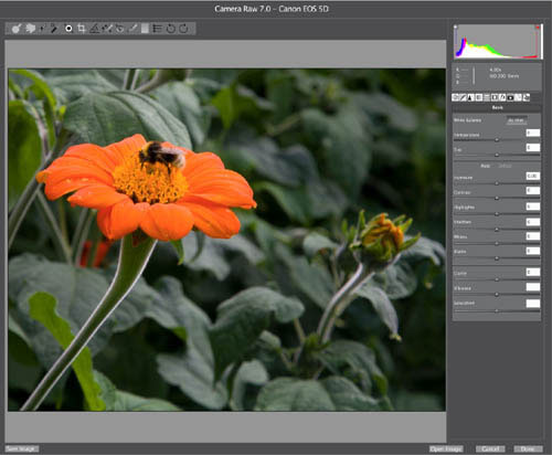
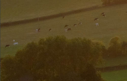
This relatively straightforward landscape has, in fact, had the sky desaturated, the greens and yellows saturated individually, and the contrast reduced by a curves adjustment. And yet, the resulting image is more faithful to the original scene.
Some of these techniques will resonate with your personal photographic style and workflow, others will likely not. However, for all the techniques discussed herein, whether or not you use them in your own photography is not nearly as important as the fact that you will be able to if needed or desired—that you recognize and are familiar with the various tools and options available, so that you can make the right decisions for each image that crosses your desktop. That is also the idea behind the Challenges scattered throughout the book: They are not meant to necessarily convince you that, say, Curves is the best tool for adjusting your shadows and highlights, or that HDR is the only technique for dealing with high-contrast situations. Rather, they are meant to get you familiar with possible courses of action, and prepare you for the wide range of photographic possibilities that you will encounter.

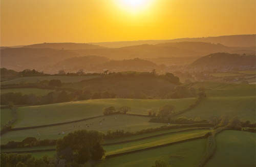
Clean representation
Even completely “faithful” photographs like those used in art catalogs often require some degree of optimization in post-production.
Before we begin to look in detail at the tools and practices of digital photo editing, it’s worth spending just a brief moment or two discussing the concept of the digital photography workflow, as this will help you see where image editing fits within the broad scheme of creating a digital image.
In the context of digital photography, “workflow” describes the entire process of producing a digital image—from capture and importing, organizing and reviewing, through Raw processing and post-production, to distribution and backup. If you’re unfamiliar with any of these terms: Capture essentially means the action of taking the photograph; importing is simply transferring the image files to the computer; organizing and reviewing involve creating appropriate folders, ranking, and making a selection of your images; Raw processing and post-production (often grouped together) are concerned with optimizing the image so that it looks as good as it possibly can; distribution is primarily about preparing the image for either print or viewing on-screen; and finally, backup refers to the process of safely archiving and storing your images. Although there’s no single specific workflow for all photographs, there are definite considerations that must be taken before an image is ready for display.
Out of the workflow just described, the two areas that are of specific relevance to photo editing are Raw processing and post-production. For the purposes of this book we’ll use the term Raw processing to describe all aspects of optimizing the Raw image file once it has been downloaded to the computer; post-production, on the other hand, we’ll use to describe any aspect of optimization once the Raw file has been saved as a TIFF or JPEG. As you’ll see later, this does have a bearing on the type of software you’ll use for certain tasks.
To understand Raw processing, you first need to be familiar with the Raw format. “Raw” is the generic term for the unprocessed file format available on all digital SLRs and many advanced compacts—whether Nikon’s NEF, Sony’s SR2, or Canon’s CR2 format, to name just three. The benefits of shooting Raw are well documented, but are essentially concerned with capturing the most amount of image data possible. This data, rather than being processed automatically and indiscriminately by the camera as a JPEG, can instead be downloaded onto the computer, where you can manually process it using more powerful processors and software than are available in-camera. The end result, particularly with images shot under challenging lighting conditions, is improved tonal quality, sharper detail, and more accurate colors. Of course, you can process JPEGs instead, and much of the time JPEGs will provide perfectly good results. But when things get tough, you want as much data as possible in order to get the optimum result.
The dramatic improvement in Raw-processing software in recent years has allowed more optimization to take place at this initial stage than at the post-production end of the workflow. The benefits of optimizing at the Raw stage are: You have the greatest amount of leeway when correcting aspects such as exposure or color; and Raw processing is nondestructive—i.e., although on the surface you’re altering how the image looks, the alterations are being relayed by a series of instructions (or “parameters”) that simply overlay the original image data, which itself is left untouched and can be accessed again whenever you want. Post-production software, on the other hand, such as Photoshop or PaintShop Pro, alters the tonal and color values of the image’s pixels themselves (hence the term “pixel editing,” which you may have come across), and while up to a point you can track back and undo changes, saving the files is permanent.
Increasingly, therefore, it’s good practice to perform as much optimization as possible in Raw processors. However, as we shall go on to discover, there are certain things that Raw-processing software can’t achieve, and that’s when you have to turn to post-production software.
Bearing in mind the distinction between these two optimization processes, the first few pages of this section deal with Raw processing, the tools and techniques, while later pages cover post-production, paying attention to what can be achieved only in post-production software.
Capture
Import
Organize and Review

Raw processing
Post-production
Distribution

Backup
Along with the development of more efficient image sensors and the ability to shoot video on DSLRs, another of the more significant advances in digital photography—certainly for those photographers who enjoy the editing process—is the development of Raw-processing software.
Early examples of Raw processors, such as the first releases of Adobe Camera Raw (ACR)—a plug-in that became available in 2002 with Photoshop 7.0.1—did not offer a great deal of freedom when it came to the adjustments that could be made to Raw files. Exposure, white balance, and color adjustments were well catered for; but other features, such as sharpening, noise reduction, and fixing chromatic aberration were in their infancy, while yet more features such as lens correction, adjustment brushes, and spot removal didn’t even exist.
As the true value of Raw processing became increasingly apparent in terms of the image quality it provided, software developers, such as Adobe, Apple, and Phase One to name just three, worked hard at developing Raw-processing software that was capable of an ever-broader range of adjustment. Camera manufacturers, such as Nikon and Canon, also developed their own Raw processors that were designed specifically to work with their proprietary Raw formats. This was often bundled on CD-Rom with the purchase of the manufacturers’ cameras.
Adobe Camera Raw (ACR)
This processor ships as a plug-in with Photoshop and Photoshop Elements, and is an extremely powerful Raw processing package in its own right. It features an almost identical image-editing toolset to Lightroom (in fact, it shares the same processing engine), only arranged and presented in a different way. As a plug-in, it works seamlessly with the rest of Photoshop or Elements.
Today’s Raw-processing software has come a long way since these early examples. As the software has evolved it’s become possible to undertake more and more image-editing tasks at the Raw-processing stage of the editing process. Processes such as sharpening, noise reduction, and fixing lens distortion and chromatic aberration are now performed by powerful algorithms that are capable of producing excellent results. These developments, together with the advent of localized adjustment in the form of spot removal, editable adjustment brushes, and control points have almost rendered post-production software obsolete for certain types of photography. Many professionals today who shoot and edit large numbers of images, such as wedding or sports photographers, will often use only Raw-processing software to optimize their images. However, as we shall discover later, for other types of photography or for certain specific image-editing tasks, using post-production software such as Photoshop or PaintShop Pro is the only option.
Along with increasing the functionality of Raw processors, software developers have also taken the opportunity to develop programs that mirror the digital workflow. Taking the example of wedding or sports photographers again: Everything they need for their images, from importing and selecting, to optimizing and distributing, can all be achieved within the same program.
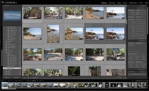
Adobe’s Lightroom illustrates this perfectly. The program features seven discrete modules or sections—Library, Develop, Map, Book, Slideshow, Print, and Web. Images are imported into the Library, where you can create and organize folders, and add keywords and ratings. Optimization takes place in the Develop module. The Map section allows for geocoding, while in the Book module you can generate files to create illustrated books. The Slideshow mode allows you to create resentations, to share as JPEG, PDF, or video slideshows. In the Print and Web sections you can prepare your images for both delivery methods. Other Raw processors have similar modes, hence they are often referred to as “workflow software.”
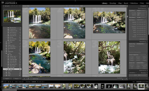
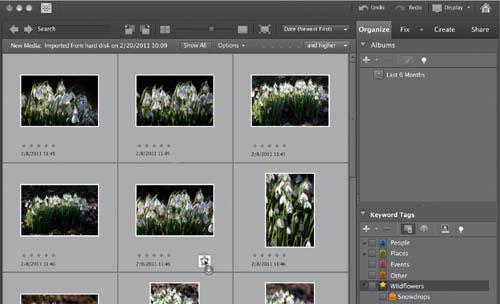
Lightroom’s Library module
This module behaves like a dedicated image database. Here you can view, compare, rank, organize, and add captions and keywords to your images. It’s also possible to view the EXIF data embedded in the image.
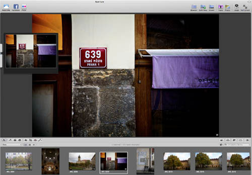
Apple’s Aperture
Like Lightroom and Phase One’s Capture One, Aperture is an extremely powerful Raw processor. It has a built-in image database, sophisticated editing capability, including localized adjustment tools, and a useful slideshow feature. It’s even possible to send images to sites such as Facebook and Flickr at the touch of a button.
The history of post-production software is much longer than that of Raw processors, which are in fact relative newcomers in comparison.
It’s no surprise that such software started with Adobe Photoshop. Photoshop, and the other programs that followed, were initially conceived of as general graphics packages. Photoshop’s ability to create and manipulate vector graphics using features such as Paths and the Pen and Shape tools, together with the Text tool, reveals its identity as a graphics program. However, it also supports pixel-based, or raster, graphics, and as digital photography (with its pixel structure) has developed over the last decade or so, software companies have spent time developing tools for their pixel-based image editors that photographers find useful, such as Healing and Spot Removal brushes. However, unlike Raw processors that, with their workflow structure, are clearly aimed at photographers, Photoshop and most of the other pixel-based editors have a much broader audience. In fact, there are vast sections of Photoshop that are of limited use to photographers.
However, we can’t be too dismissive of the program that most professional and many amateur photographers have embraced; and, of course, it’s not just Photoshop. Photoshop Elements, PaintShop Pro, and the myriad other post-production programs are extremely powerful, versatile tools that many pros couldn’t do without. The ability, should you so wish, to manually change each individual pixel in an image to whatever you want provides an unparalleled level of control. This powerful versatility, coupled with features such as layers, adjustment layers, masks, channels, and filters, ensures that, given enough time and with sufficient skills, you can make an image appear pretty much however you want. For professional photographers, notably in the fashion or advertising industries, the ability to edit at pixel level is essential. For such professional photographers, Raw-processing software—although perhaps initially useful for organizing and conducting a first edit—simply won’t provide the comprehensive tools they need to create the final image.
In terms of workflow, unsurprisingly, complex programs such as Photoshop, which was developed before the concept of a digital photography workflow was a reality, cannot compete with the more recent Raw workflow software which has been developed with one eye always on workflow. Photoshop does, however, ship with a dedicated browser—Bridge—which is a perfectly adequate image organizer, and from which you can access Photoshop directly.
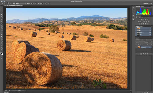
Adobe Photoshop
Photoshop has evolved from a primarily graphics-intensive program into a comprehensive image-editing workhorse.
Less complex post-production software, such as Photoshop Elements and PaintShop Pro, have been redesigned over time to take into account the digital workflow approach. Elements, for example, has discrete workspace modules called Organize, Fix, Create, and Share, while PaintShop Pro takes a similar approach with its Manage, Adjust, and Edit workspaces.
So the next obvious question is which type of software do you need? Well, that depends largely on what you shoot, the amount you shoot, and what your intended end use is. Most professionals will have both Raw processing and post-production software—and this is the ideal scenario; but for most amateurs this is probably not necessary. If you shoot a lot of images, but don’t want to spend hours retouching them, and you’re not too bothered about adding text or special effects, then Raw-processing software is likely to be most appropriate for your needs. These programs are generally quicker and more intuitive to use than pixel editors, and better at creating image libraries. And remember, although they’re called Raw processors, you can edit JPEGs and TIFFs using the same nondestructive methods—the only difference is you won’t have the benefit of the extra data you get from Raw files.
If, however, you enjoy manipulating images, such as merging elements from different photographs, and adding text or other special effects, then you’ll need post-production software such as Photoshop, as Raw processors simply can’t perform such tasks. And just as Raw processors will allow you to edit JPEGs or TIFFs, most pixel editors will allow you to process Raw files to a lesser or greater degree, before you convert to a TIFF or JPEG to complete the image editing.
Elements import window
Photoshop Elements, while not quite as comprehensive as the full version of Photoshop, offers most of the features more commonly used by photographers, and also offers a complete workflow setup—beginning with this Import window.

Corel PaintShop Pro
While Adobe certainly dominates the field of image-editing software, alternatives do exist. PaintShop Pro is a fully competent option, and one that has been around almost as long as Photoshop itself. Here, the workflow is divided among Manage, Adjust, and Edit modules.
With workflow being just as important to Raw-processing software as image editing, it comes as no surprise to discover that most Raw processors have more than one workspace. Lightroom, for example, has seven, while Apple’s Aperture and Phase One’s Capture One—two other popular Raw processors—have similar environments but with fewer modules. The broad approach of all these programs being: organize, edit, and share.
The digital photography workflow begins with importing, and with most Raw processors simply attaching the camera or memory card to the computer and launching the software will prompt an import routine. At this stage you can create a folder in which to place the images, add keywords that are common to all the images, apply preset or customized picture settings, and embed metadata—which may include information about the photographer, any copyright notices, the date and location of the shoot, and so on. Getting into the habit of organizing your photos into folders and embedding keywords and other metadata during the import routine will help you maintain a coherent image library later down the line. Once the images have downloaded to the Library you can quickly go through the collection ranking or deleting images, and making an initial selection of your favorites. With the selection made, you can add keywords that are specific to the individual images. If your intention is to sell your images via any of the numerous micro picture libraries that have cropped up on the Internet in recent years, keywords are essential as they help people search for your images.

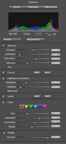
Apple Aperture
Here, the program offers three discrete modules: Library, Metadata, and Adjustments.
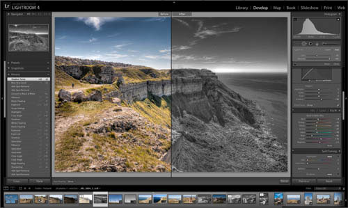
Before and after
By clicking on the icons underneath the image preview, you can call up a Before & After viewscreen, which gives you excellent perspective on the degree of adjustment you are making to the original image.
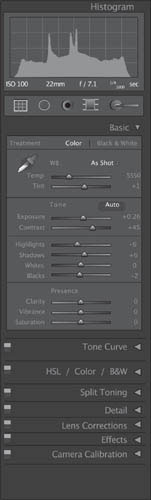
Lightroom’s Develop module, like Aperture’s Adjustments, is where all the image editing takes place. The Develop workspace is arranged into four main areas. Running down the left-hand side you’ll find an extensive list of Lightroom preset photo styles, including a variety of black-and-white, cross-processed, and sepia-toned options, to name a small selection. These can be applied to an image simply by clicking on the preset name. Beneath these presets are Snapshots. This allows you to record the image-editing actions you’ve undertaken on one image and apply them to another. The History tab details the editing actions applied to the selected image. You can use History to retrace your steps and return to an earlier phase of the editing sequence.
The main image view located in the center of the screen shows a preview of the image. Naturally this updates as you apply different image-editing commands. You can toggle through the appearance of the preview using the icon found directly under the main view.
The right-hand panel is home to Lightroom’s extensive range of image-editing tools. We’ll look at these in greater detail later, but it’s worth noting here that the tools are grouped together and organized into discrete palettes. Each palette relates to a specific area of editing, whether dealing with tone, color, or sharpening, for example. Like most of Lightroom’s controls, the image-editing palettes can be expanded and collapsed by clicking on the small triangle next to its name.
Beneath the main preview runs the filmstrip. This shows thumbnails of all the images in the selected folder. The filmstrip appears in all of the modules and provides a way of accessing images without having to return to the Library each time. The Slideshow, Print, and Web modules all have a similar workspace, with control panels on either side of the main view, and the film strip running below. Although we’ve described in some detail the Lightroom workspace, as suggested earlier, other Raw processors share a similar structure.
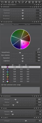
Although by no means identical, the similarity between the tool panels of much Raw-processing software is clear to see from the three examples shown here. Individual palettes or panels, each with readily identifiable names such as Exposure, Detail, Highlights & Shadows, and Lens Correction, feature a number of labeled sliders that can be accessed by clicking on the arrow that expands the palette. For the most part, it’s clear what each of the sliders does—Brightness and Contrast, for example, are self-explanatory; and in less obvious cases, a slider’s functionality is quickly learned by experimentation and observation. Because Raw processors, unlike many post-production pixel editors, have been designed from the ground up with photographers in mind, the palettes and their individual sliders are all closely associated with specific digital photography issues, and that’s one of the things that helps to make Raw processors so intuitive.
Aperture vs Lightroom
Aesthetic differences aside, it is easy to see the common tools that exist across various Raw processors—some of these tools even appear in the same order moving down the toolbar. Of course, the Lightroom toolbar shown right is cut off—it goes on for some length below; but each discrete palette can be collapsed when not in use, making it easier to scroll through all the various tools and sliders.
With the majority of Raw processors, the sliders make adjustments in real time. In other words, as you move the Brightness slider, for example, the image will become lighter or darker corresponding to the movement of the slider—as opposed to the adjustment being made once you release the slider. This allows you to achieve the exact look you want instantly, rather than by trial and error. Although real-time image adjustment is not unique to Raw image-editors, it reinforces such software’s user-friendliness. It is worth noting that the speed at which the software will display your adjustments depends on the capabilities of your particular hardware. If your computer is particularly stressed by running multiple applications, or if it doesn’t have sufficient RAM, there may well be a delay between making your adjustments and the preview being updated to reflect them.
As well as making adjustments using the sliders, it’s also usually possible to input specific numeric values in boxes next to the sliders. Although you’re unlikely to make many adjustments this way initially, it can be useful if you’re attempting to replicate specific settings between two different images.
As you progress through this section, you’ll become increasingly familiar with what each control slider does, and the occasions when you’ll use it. And over time you’ll discover that there are some panels, palettes, and controls that you’ll use frequently, while others that you’ll barely utilize at all.
Phase One’s Capture One
While Phase One is primarily a high-end, medium-format camera manufacturer, they have also developed an impressive Raw processor called Capture One that is in most cases just as robust as other options from Adobe and Apple.
As I’m sure you are aware, nearly all computer programs have keyboard shortcuts that you can use instead of clicking on menus and commands with the cursor—and Raw processors are no exception.
As you become increasingly familiar with the program you’re using, you’ll find that you’ll automatically begin to learn the more common shortcuts. It really pays to try to remember these—they increase the speed of your workflow considerably. For the time being, however, the most important shortcut to remember now is Ctrl/Cmd + Z. If you’re not already familiar with this life-saver, it’s “Undo” in most programs. So if you make a mistake, hit these keys to take a step back.
Photoshop is the undisputed king of the post-production pixel editors. It was the first image-editing software to have a truly global impact, and as such, most other editing programs have emulated it in regards to its tools, functions, menus, architecture, and commands. For this reason most of the terminology in the post-production parts of this section will have a bias toward Photoshop—although for the reasons stated on the previous pages, it should be clear to users of other programs which tools or menus are being referred to. It’s probably also fair to say that if you’ve mastered Photoshop, it won’t take you long to master other pixel-editing programs.
Despite being the heavyweight of image-editors, Photoshop is certainly not a big-hitter when it comes to efficient workflow (of course, it was never intended to be). Before the arrival of the Bridge plug-in, Photoshop had no form of browser or image organizer at all. And even now, in comparison with Raw-processing software, jumping between Bridge and Photoshop is still slow and rather cumbersome.
In terms of workflow, the less powerful, but often perfectly satisfactory pixel editors such as Photoshop Elements or PaintShop Pro are more useful, certainly for the amateur photographer. These emulate the workspaces of Raw processors, such as Lightroom and Aperture, by having discrete modules in which you can organize, edit, and share your images. Although switching between the various modules is not as seamless as it can be with Raw processors, you do at least have all the tools you need to create, edit, and share images from an image library.
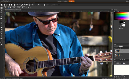
Turning to the main image-editing workspace of post-production software, what is immediately obvious is that there’s a great deal to take on. While with many Raw processors you can find your way around on your own in a relatively short space of time, with pixel editors and certainly with Photoshop, delving into the program without prior instruction is likely to result in mental meltdown. It’s exactly for this reason that “consumer” versions such as Photoshop Elements have readily accessible tutorials that help you learn your way. Photoshop has none of these, so you really need to spend some time learning the basics before you can begin to reap the rewards of the powerful software. Photoshop’s main workspace is relatively clutter free. However, this belies the sophisticated toolset that accompanies the software. Shown opposite are images of Photoshop’s and PaintShop Pro’s Edit workspace, showing how similar they are.
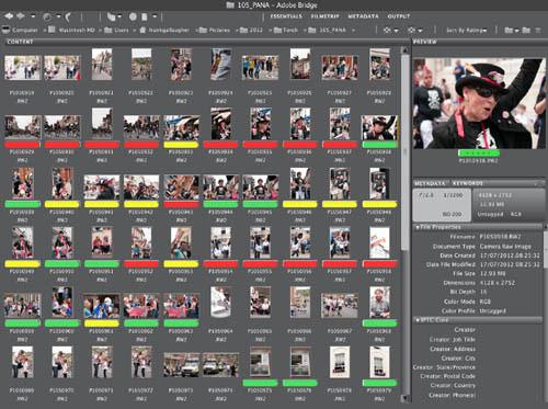
Adobe Bridge
You can customize this main screen to offer a wide variety of additional information, or clear it of everything but your image thumbnails to get a light-table workspace.
There are quite a few commonalities to be seen between these two image-editing programs. The main toolbars are both arranged along the left side, with tool options stretching horizontally from the upper left. The right side is dominated by a series of palettes, with Layers being the most significant feature.
Compared with Raw processors, post-production pixel editors are rather less intuitive and have a more complex toolset to learn.
Much of the complexity of post-production pixel editors is due to the fact that, unlike most Raw processors in which the tools are primarily grouped together in one long panel, pixel editors have a whole host of tools, dialogs, commands, and menus dotted around the workspace. It’s true that many of the mid-level editors such as Photoshop Elements and PaintShop Pro now feature user-friendly wizards and tutorials that help you perform specific tasks, but you’ll find that when you come to perform an editing task, rather than reaching for a single slider, as you more often than not are able to do with Raw processors, with pixel editors you may find you have to open and use a number of various tools, commands, and dialogs to achieve a similar result.
However, once you’ve learned your way around one piece of post-production software, you’ll begin to appreciate how powerful these pixel editors are—as mentioned earlier, there are things you can do with pixel post-production software that are simply not possible with Raw-processing software.
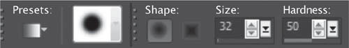
Tool options
As well as the main Toolbox, to which you’ll turn in order to select specific tools, pixel editors also tend to feature Tool Options bars. Here you can adapt the functionality of the tool, or its size and shape, for example, to make it more suitable for the task in hand.

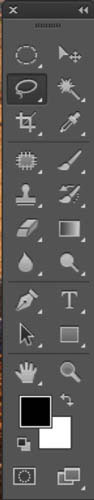
Photoshop toolbar
Many of the tool icons utilized by post-production pixel editors are now almost generic. The Crop tool, Eyedropper, Type tool, and many others are the same across a number of applications. This certainly makes it easier when switching between programs.


Learning tool names and hot keys
With most post-production programs, hovering the cursor for a second or two over a specific tool will usually cause the name of the tool to appear. This is certainly beneficial when you’re learning a new application. Note that the keyboard shortcut often appears next to the name.
Although the many adjustment panels, dialogs, and palettes make learning image-editing software such as PaintShop Pro and, in particular Photoshop, a lengthy process, it is precisely these controls that make such software so powerful and adaptable. Layers and Curves, for example, as you’ll discover later, are key to many of the editing tasks you’ll be undertaking using pixel editors. Fortunately, as with the tools themselves, there are many cross-overs when it comes to the fundamental way in which pixel editors work. Layers and Curves are just two commands that you’ll find in most mid-level and professional pixel-editing software.

Sidebars and palettes
What many users new to post-production software find confusing is that, in addition to the numerous tools and tool options (which in themselves take time to learn), there is also a seemingly endless collection of palettes and other adjustment controls that have to be mastered.

One of the first assessments you’re likely to make of an image before progressing with other editing tasks is deciding whether or not the image is straight. Depending on the particular shot, this may not be too critical, but if there are distinctive horizontals or a horizon visible in the shot, you’ll want to ensure that the frame is properly aligned with these linear elements contained within it.
Cropping an image—essentially, removing any unwanted part of a composition—is another simple editing task, and yet potentially one of the most effective ways of ensuring a photo has the greatest possible impact.
Naturally, we should always be thinking of composition when we’re framing our photos, but often we’re shooting at speed or grabbing a shot under rapidly changing lighting conditions, and it’s not until later, when we have time to fully assess an image on a computer monitor, that we can see how the composition of the image can be improved. It may also be the case that there are some alternative crops we’d like to try to see which works best.
Another reason for cropping is that the image size and shape is dictated by something outside of our control. Perhaps the final image requirement is for a square shot, in which case you’ll need to crop a landscape or portrait format to suit.
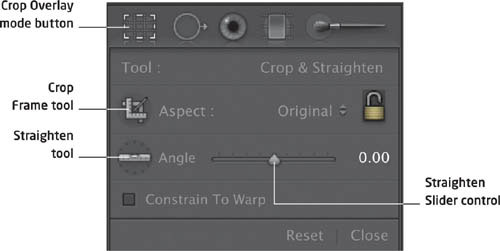
Lightroom’s crop palette
This palette is found near the top of the Develop module under the histogram. To reveal the various tools associated with the Crop Overlay mode, click the dotted rectangle (or press R).
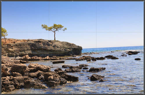
Grid overlay
Having selected the Crop mode, a grid will be displayed over the image. At the corners of the image and in the center of each side are bounding box handles.

Grid options
Above we’ve selected the Thirds grid, but other options include Golden Ratio, Triangle, or Golden Spiral, all of which are intended to help with composition (though they are all doubtful formulas to apply without careful thought.)
Rotate options
There are a number of ways to rotate an image. If you place the cursor near a corner box handle it will turn into a double-headed arrow. Move the cursor up or down and the image will rotate. However, a more accurate method is to select the Straighten tool. On the image draw a line along the horizon or horizontal line that you’re using as a point of reference. As soon as you’ve drawn the line and released the mouse button, the image will automatically rotate. Notice also, that the image is automatically cropped to accommodate the rotation.
Cut out distractions
To tidy up the image and improve the crop, using the Thirds grid the left-hand control point was dragged to the right so that the slightly distracting tree at the edge of the frame is cropped out, and so that the remaining solitary tree sits on a rule of thirds line. The top handle was then dragged down so that the ocean horizon is in the middle of the frame, giving the final image a better sense of balance.

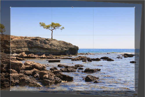
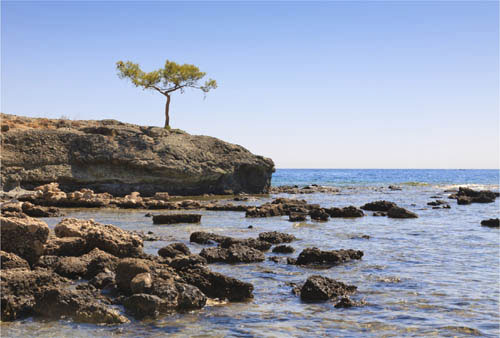
© Steve Luck
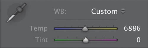
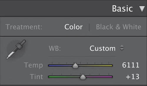
As we’ve learned daylight can actually change color during the course of the day, from an orange hue just after sunrise, through the purer, almost blue white light of midday, and then warming up again as the sun sets. But the color temperature of light is also affected by atmospheric conditions such as clouds, or more dramatically by artificial light sources such as streetlamps or even lightbulbs.
To ensure that white objects always appear white, no matter what the ambient color temperature, your camera has a variety of white balance settings—these usually have names such as Daylight, Cloud, Shady, Tungsten, Incandescent, Flash, and so on. And, in fact, most cameras will perform adequately if left on the Auto setting. However, every now and again you may come across a shooting situation that has the camera fooled—a mixture of natural and artificial light, for example, which results in an image that exhibits some odd-looking color casts.
Shooting Raw is the best way to ensure that you can freely adjust the color balance when editing your images. If you shoot Raw, no matter what the camera’s white balance setting at the time of shooting, you can alter this to give a more (or less, if you want a creative interpretation) neutral result without impacting on image quality in any way.

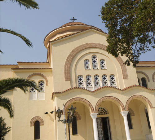
© Steve Luck
Not quite blue enough
Although the lighting (daylight) in this shot of a Greek monastery was neutral, the Auto setting has produced a slightly orange image. The sky isn’t as blue as it should be and the overall effect is a muddy appearance.

A neutral target
With the Raw processor’s Eyedropper tool selected, click on a neutral gray pixel—try to get the red, green, and blue values as close as possible.
Blue sky restored
As soon as you select a neutral-gray area, the software automatically balances the colors in the image, and the result is a photo free from the orange color cast.
Avoid clicking on an area that’s too white or bright, as one of the color channels may be clipped (exhibiting only the maximum intensity of the color with no detail), resulting in an inaccurate white balance measurement, which in turn could produce an inaccurate color adjustment.
If for some reason using the Eyedropper doesn’t produce a result you’re happy with, use the Raw processor’s Temperature and Tint sliders to manually adjust the white balance. Raw processors even have some presets that might provide you with the result you want.
Creative white balance
You can use the Raw processor’s white balance sliders in a creative rather than purely prescriptive way. White balance can be subjective, with no actual right or wrong result, so use the sliders to cool down or warm up the image for very different results.

© Steve Luck
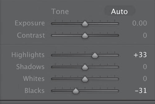
Of all the benefits of shooting and editing in the Raw format, perhaps the greatest is the level of adjustment that can be made to the image’s exposure long after you’ve pressed the shutter release. In most cases it’s possible to increase or decrease the exposure setting by around two stops in Raw-processing software—making a total possible adjustment of up to four stops—without affecting the quality of the image. Furthermore, the adjustment doesn’t necessarily have to be made to the image as a whole. It’s possible to make only certain areas brighter while holding (or even reducing) the exposure in other areas—although care needs to be taken to ensure that such an adjustment doesn’t result in an unrealistic image.
Adjusting exposure is a key aspect of image optimization—the process of making an image look its best—and involves ensuring that the image has the fullest possible range of tones. The golden rule of optimization is to avoid overly clipped highlights. When highlights are clipped too much you lose important detail; however, if they are not bright enough the image can appear dull and flat.
As well as setting the highlights or white point, you’ll also need to set the black point. This determines how much detail remains visible in shadow regions. This is less crucial than setting the white point, as our eyes are less drawn to pure black in an image than they are pure white; and much of the time setting the black point is a matter of personal taste.
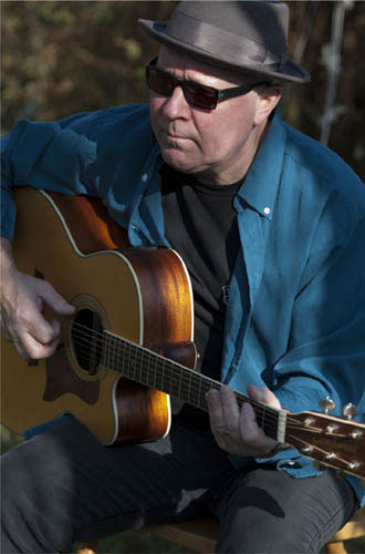
© Steve Luck
Mostly underexposed
Shot outside in dappled, contrasty lighting, a spot-meter reading from the guitarist’s face has ensured the most important element of the image is not overexposed, but has left the rest of the image too dark.
Global exposure increase
Using the Raw processor’s exposure controls, we can globally increase the exposure by a couple of stops. This has improved the overall exposure, but the face now looks overexposed.

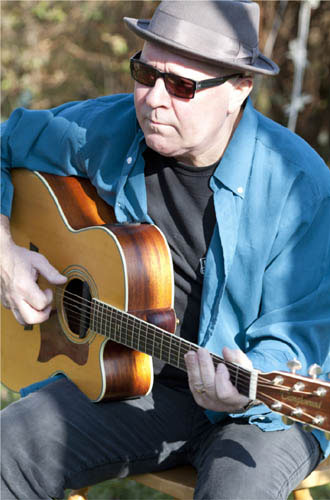
Highlight clipping warning
Activating this feature indeed shows that parts of the musician’s face are in fact blowing out—they’ve become pure white and have lost detail altogether. It’s essential that we fix this if the image is to be successful.
The Recovery or Highlights slider, an essential part of most Raw processors, will darken highlights and (with any luck) add back some lost detail. Holding down the Alt or Cmd key, depending on the Raw processor you’re using, while moving the slider will reveal the elements of the image that are clipping against a black background. Here, the blown highlights on the face have been recovered, and the only ones now clipping are the specular highlights of the guitar’s white edge. These are acceptable. Returning to the main preview, we can see that the face is no longer overexposed.

Setting the black point
Using the Black or black-point slider, and again holding down the Alt or Cmd key, move the slider until the shadows are just beginning to clip. This will give the image a richer appearance with better contrast.
Shadow fill
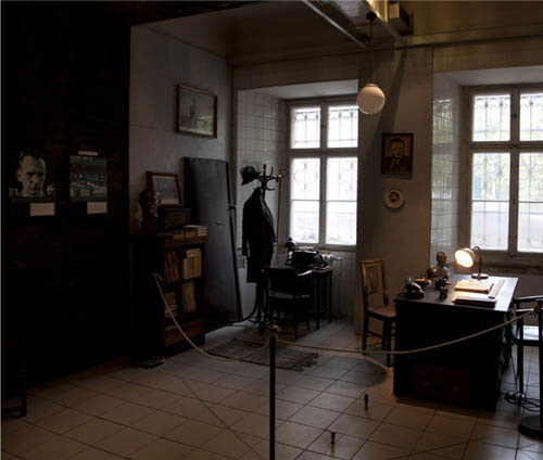
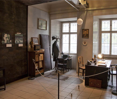
The ability to open up shadows in an image without affecting the highlights is another relatively new aspect of Raw editing. Lightroom’s and Aperture’s Shadows slider (sometimes called the Fill Light slider in other programs) both perform the task exceptionally well. Here, we’ve used a Raw processor to lighten the interior of a room in the Communist museum in Prague without losing detail around and outside the windows.
© Steve Luck
Now that you are shooting Raw, it’s time to get in the habit of making those initial, essential adjustments to your images as soon as you open them up in your Raw processor. Is the image lined up with the horizon? Is the white balance accurate? And even if it is, do you want to portray this subject accurately or creatively? As this is all nondestructive editing at this point, feel free to experiment. Sometimes it would never occur to you to warm up an image’s tones until you slide the Temp scale a bit to the right (just for an example). And finally, take a look at your exposure—maybe with the highlight/shadow warning activated, and see if there’s any detail you want to recover hidden away at the far sides of the histogram.
Low-contrast original
Intentionally shooting with low contrast and low saturation levels is often a wise choice—it lets you concentrate on the essential qualities of exposure and composition without getting distracted by trying to make the image “pop” straight out of the camera. Such inclinations are best left to dedicated post-production software.
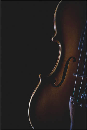
WB and Exposure
The original is a bit too cold and too green, the temperature is warmed up and the Tint is shifted slightly toward magenta. Next, blacks are pulled down to make the area to the left of the violin drop out completely, and highlights are boosted to bring out the highlight sheen on the front of the instrument.
© Dmitri MIkitenko
Optimized and ready
Sometimes all it takes to find a backlit shot is changing your angle—in this case, looking straight up. Careful positioning and composition is key.
Challenge Checklist
→ Even if you set an exact custom white balance, check that there isn’t some other possible, more flattering color cast by experimenting with your Temp and Tint sliders.
→ Your highlight and shadow clipping warnings can be invaluable—often its difficult to discern the exact levels of exposure with the naked eye.
→ When you’re finished, save the image as a Tiff, but always archive the original Raw file for future reference.
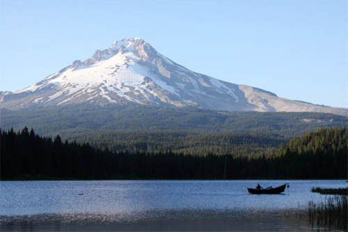

© Dan Goetsch
While Trillium Lake was beautiful, the sunset on Mount Hood was a bit of a let down. The position of the sun was washing out some of the deep blues. In Photoshop, I brought the blues back in with the color balance, and set it up with different layer masks to affect only the sky. I did the same to bring back some of the yellows and greens for the tree line, then merged the layers and adjusted vibrance to make it look natural and closer to what I was seeing in person versus what the camera saw.
Dan Goetsch
Well-executed recovery, particularly of the blue sky, which can end up looking false and/or banded if carelessly done. More than that, this is a good example of the need to rely on your own perception of what the image should look like, because you were there and knew what you wanted.
Michael Freeman

© Johnny Chang
To combat the underexposure, I added almost 4 stops to the entire photo. Then, I wanted to make the graffiti artist blend into his work by making him and his surroundings appear more graphic novel-esque, so I converted to black and white and worked on increasing the contrast. Then I manually added vignetting with the adjustment brush to focus in on him. I then dodged and burned various parts of the image to my taste. I also played with grayscale mix to get the right blend of each color.
Johnny Chang
A lot of work went into this, and successfully given your aim. I like the idea behind it, and that you included the ground in the treatment. I’d be interested to know why you underexposed so strongly, according to the attached original.
Michael Freeman
Many of the spots you see on digital photographs are caused by dust on the image sensor. This primarily affects DSLRs, and occurs when dust enters the camera body—when a lens is being changed for example—and settles on the sensor’s surface. Fortunately, such spots are only really noticeable in areas of flat color, such as blue skies. Getting rid of most spots is quick and easy, although with others, you may have to work a bit harder to remove them.

© Steve Luck
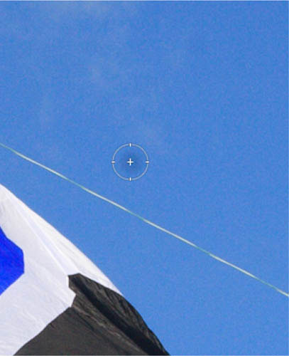
Select the dust spot
Select the Spot Removal tool or Retouch brush Check that the tool is in Heal mode. Adjust the size of the tool or brush so that it fits neatly over the dust spot. There are usually keys you can use to adjust the brush size—it’s quicker and more accurate than using the slider.

Sample a separate area
With the tool fitting neatly over the dust spot simply click the mouse. The Raw processor will automatically choose a sample area (usually adjacent to the target area) that it uses to blend with the pixels from the target area, so removing the spot.

A clear sky regained
In a matter of moments, the ugly dust spot has disappeared, and we’re ready to move on to the next problem area.
Here, the dust spot is located close to a dark edge of the kite. Let’s see what happens if we use Spot Removal or Retouch brush in Heal mode, and simply click the mouse button. As before, the Raw processor automatically selects a sample area to blend with the target area.
However, here the result is unsatisfactory. First, because the sample circle hasn’t aligned with the target circle. Second, because in Heal mode the Removal tool uses pixels from the edge of the target circle when blending with the sample.
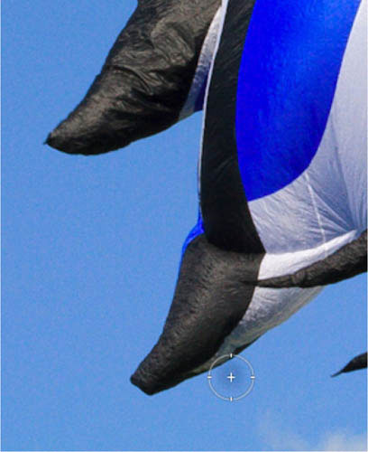
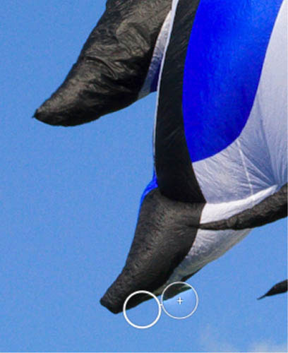
A case for cloning
Where the spot is near an edge, change to Clone mode, in which the Spot Removal tool doesn’t attempt to blend the surrounding pixels. This provides a more clearly defined blending edge. Here, we’ve selected the sample and dragged it away from the kite to a cleaner position. Moving the sample area to a more appropriate position has resulted in a better alignment, while the Clone mode creates a cleaner result.

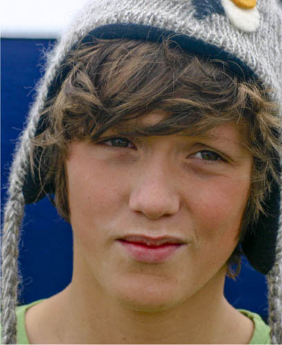
Applied to a portrait
The Spot Removal tool or Retouch brush, when in Heal mode, is an ideal way to remove skin and other blemishes.
© Steve Luck
We’ve learned a lot about sharpening digital images over the last few years—and software manufacturers have too. Sharpening procedures and tools have become increasingly sophisticated, and this has continued as Raw processors have also developed and improved.
Recently, distinctions have been made between capture sharpening and output sharpening. Capture sharpening is the sharpening applied to a Raw image file during Raw processing. The idea behind capture sharpening is that it counteracts the softening effect of the low-pass or anti-aliasing filter that sits directly in front of the camera sensor. When shooting Raw, no in-camera sharpening is applied as it is with JPEGs, therefore you need to sharpen an image so that it looks crisp on-screen; and that is what we’re going to cover here—how far to apply it, and what to avoid.
Output sharpening, on the other hand, takes place at the end of all other post-production tasks, and is essentially concerned with preparing an image for print or screen display. Output sharpening is mostly automated through the Raw processor’s preset controls when you go to print or save an image for the web, and is not particularly in the remit of this book.
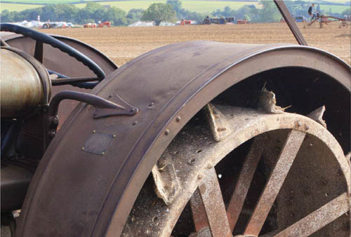
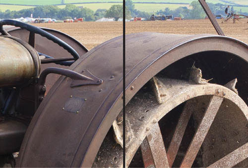
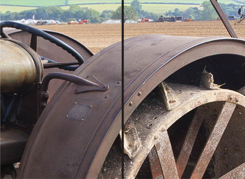
Straight from the camera
This image of an old tractor has been reproduced straight from the Raw file, and although optimized for color and tone, no capture sharpening has been applied. You can see from the close-up view that the image is soft, and the abundant texture of the metal is not rendered as sharply as it could be.
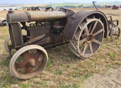
© Steve Luck
The aim of capture sharpening is to get the image to look pleasingly sharp on-screen. Don’t sharpen the image so much that it begins to exhibit ugly halos or visible noise.
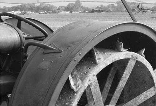
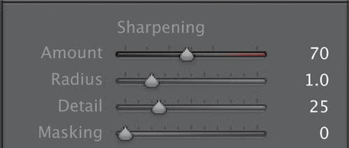
Most Raw processors have one main sharpening slider that applies an overall sharpening effect. In the side-by-side comparison shown right, Lightroom’s Amount slider has been increased from the default 25 to 70 (on the left) and the maximum 150 (on the right). It’s clear that the maximum setting has oversharpened the image, as there are visible artifacts. At a setting of 70 the image is visibly sharper, and although the artifacts are less obvious, there is still some noise visible in the flatter areas of the image.
View at 1:1
Before you begin to sharpen any image, it’s essential that you view the image at 100%, 1:1, or actual size (different terms for the same thing). Viewing the image at a smaller scale won’t provide you with an accurate preview of the sharpening effects.
Grayscale preview
With Lightroom, holding the Alt/Opt key while adjusting any of the sharpening controls renders the preview as a grayscale image. This essentially makes it easier to see which part of the image is being affected by the particular adjustment.
Sharpening controls
Lightroom’s Radius slider controls how sharpening is applied to details. With a low setting (as on the left) sharpening is applied only to fine details. Increasing the Radius setting applies sharpening to larger details (as on the right). Generally, a high Radius setting will often result in ugly artifacts. As a rule of thumb, if you’re sharpening an image with a lot of fine detail, a Radius setting between 0.5 and 1 is usually sufficient.
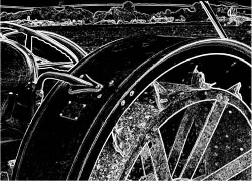
Combatting halos
Lightroom’s Detail slider helps to reduce halos—unnaturally light or white edges, usually along a high-contrast area. A low Detail setting (on the left) ensures that sharpening is applied only on the very edges, while a high Detail setting (right) results in sharpening being applied to much more of the image. Here we want the Detail setting to bring out the texture of the rougher metal but to hold back sharpening artifacts on the smoother metal. Like most adjustments, a trial-and-error approach is the best method—simply move the slider until you strike the most appealing balance between detail and artifacts.
Lightroom’s Masking slider, like the Detail control, is a way of suppressing the two active sharpening commands. A low Masking setting (left) applies almost no mask at all, resulting in almost no change to the sharpening effect. A high setting applies a mask on everything but high-contrast edges. This is a good way of ensuring that sharpening is applied to edges but not to flat tonal areas, where noise is often more apparent.


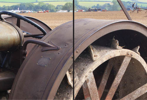
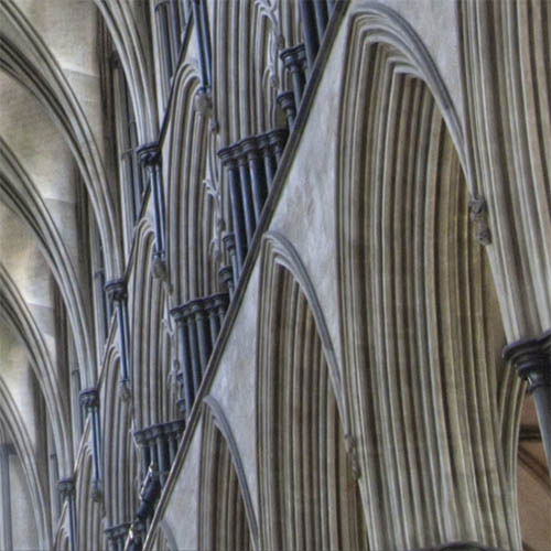
Sharpening complete
The final image following capture sharpening is much crisper and shows more textural detail without the introduction of halos, noise, or other sharpening artifacts. This image is now ready for further post-production work, if necessary.
As we know, if you’re shooting in the Raw format images will appear soft when first viewed onscreen. The challenge this time around is to take a Raw image, preferable one with lots of fine detail, and using your preferred image editor, sharpen up the shot so that all the fine detail really “pops.” Experiment with the various controls that you have at your disposal and push them to extremes to see exactly the impact they have on the image. Pay particular attention to “flat” featureless areas to see the effect of extreme sharpening here. Ultimately you want to reach a happy medium with sharp halo-free details and flat regions free of sharpening artifacts.
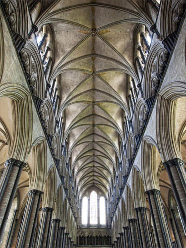
Cathedral interior
This straight-from-the-camera Raw file is clearly soft, both because sharpening was set to 0 and because a high ISO was used, and the resulting noise needs to be smoothed over a bit—further softening the shot.
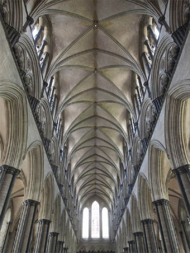
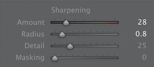
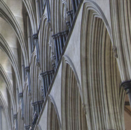
Soft to sharp
While it may look acceptable at a distance, zooming in to full 1:1 magnification makes it clear that the delicate ridges of the architecture are not being rendered nearly as crisply as they should be. As these are very fine details, a relatively small radius is set; and as most of the frame contains intricate architectural textures, the Detail slider is left at a safe 25. The Amount slider is simply increased little by little until the magnified view looks crisp on-screen.
© Frank Gallaugher
Ready for processing
After the capture sharpening is applied, the rest of the editing workflow consisted of a simple tweak to the colors and saturation levels. But it’s the sharpening that really brought this shot to life, and the abundance of fine detail it now exhibits draws the viewer in without introducing any ugly artifacts or grain.
Challenge Checklist
→ It’s best to use a light touch at first, and always keep an eye out for distracting sharpening artifacts that may start to appear in empty areas of the frame—a clear sign you’ve oversharpened.
→ If your image has a mixture of empty areas that don’t need much sharpening, and intricate details that would benefit from a relatively strong sharpening, make use of your Detail and Masking slider to strike a pleasing balance across the frame.

© Faith Kashefska-Lefever
After assembling each photo in Photoshop, I merged the layers together so they were all on the same layer. I went into the Filter menu, down to Sharpen and selected the Unsharp Mask. Setting the radius to 2.9 pixels at 105% gave me a crisp and clear image that would be ready for large printing.
Faith Kashefska-Lefever
Sharpening for printing is different from sharpening to compensate for loss of crispness in capture, hence the high radius here, I assume. It’s all about appearance, and that looks the right amount for this example. I’m also assuming that you archived the original file without sharpening!
Michael Freeman

© Johnny Chang
The sodium vapor lamp robbed any semblance of color and added an unappealing tone, so I converted to black and white. To finish, I tweaked the tone curve, sharpened, added vignetting, split toned the highlights/shadows, removed larger distracting snowflakes and cropped a bit off the top of the frame.
Johnny Chang
The abundance of fine detail in this image, from the tips of the tree branches to the textured footprints throughout the snow, to the very snowflakes themselves, definitely calls for sharpening to bring it all to life. Crisp is the word, and turns the soft original into an engaging shot.
Michael Freeman
No doubt you’re all too familiar with the issue of noise in digital images. Noise manifests itself as ugly-looking clumps of pixels and a graininess that is particularly apparent in larger areas of a single, flat tone. It’s also more prevalent in shadow regions, and the problem is exacerbated at high ISOs.
There are two principal types of noise: luminance and chroma (or color). Luminance noise is likened to the static you see on a television station with poor reception—it is grainy and, if particularly bad, may appear as vertical or horizontal stripes (or bands) across darker areas of the frame. Chroma noise, on the other hand, appears as discolored blotches, and is usually more unnatural looking (and therefore more important to reduce).
With many Raw processors the noise controls are located directly beneath or at least near to the sharpening commands. This makes perfect sense, as the more you sharpen an image, the more apparent the presence of noise becomes. In most Raw-processing workflows, capture sharpening is swiftly followed by noise reduction.
As with sharpening, noise reduction has become increasingly sophisticated and effective as software algorithms have evolved. Even with the noisiest images, today you can often expect to end up with a usable image. All Raw processors offer noise reduction, but some have more controls than others.
Too small to notice
Printed at this small size, the noise in this image may not be particularly visible (and it’s worth bearing in mind that some print processes are very forgiving). However, the detail shown left clearly reveals there is significant luminance and color noise present.

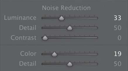
Chroma vs luminance
With Lightroom and Capture One, you have the option of tackling either the luminance or color noise individually, using the relevant sliders. Other Raw processors reduce both types of noise at once. If you have the option, I find dealing with color noise first makes it easier to judge the more subjective task of luminance noise reduction. Here, the Lightroom Noise Reduction Color slider was set to 50.
Not-so-fantastic plastic
Having dealt with the chroma noise, it’s time to look at reducing the luminance noise. It’s tempting when reviewing an image at 100% to set a noise reduction value that eradicates the noise altogether. However, this will result in an unrealistic, plastic-looking image (seen above).
A touch of texture
You want to retain some of the luminance noise as it gives the image an essential photographic textural quality. Here, the Luminance slider was set to 27, and the Detail to 85. The Detail slider provides a good way of fine-tuning the amount of noise left in the image.
Ready for output
The finished image retains enough detail without including any obvious or distracting areas of noise, and can be printed at a much larger size as a result.
If you’re shooting with the latest and greatest camera gear, you may have great confidence in your camera’s ability to shoot a clean high-ISO file; but this doesn’t mean you never need to worry about noise. Far from it, if you’re shooting Raw, you’re still in charge of your noise reduction. Even if you tend to stick closer to your base ISO, subtle post-production work like lifting shadows can often introduce noise where there was none before. This is another time when you’ll want to zoom in close and inspect your images with a fine-toothed comb to see if they can benefit from a simple clean up. And with what you now know about noise, you may be able to go back in your archives and salvage a noisy shot that was thrown out.

Low light, high noise
The high-ISO required to get this narrow-aperture, low-light shot may not be terribly obvious at first, but becomes readily apparent upon closer inspection. It’s a fairly even balance between chroma and luminance noise, and definitely needs to be cleaned up before this image is ready for output.
Strike a balance
It’s easy to get carried away with noise reduction—particularly when you’re zoomed close in and losing the bigger picture of what the final, full image will look like. With a high enough setting on your sliders, you can indeed obliviate all the noise in most any shot; of course, you’ll also be destroying all the fine detail. Here, the Luminance slider was slowly increased until the noise was low enough to not be seen at a normal viewing distance, but still high enough that the details in the trees still stand out.
© Daniel Loretto
Clean as the snow
Just a touch of noise reduction salvaged this shot and struck a fine balance between texture and noise. There’s still some luminance noise left in the shadows, but only if you zoom in very close, and it doesn’t detract from the final image.
Challenge Checklist
→ Push yourself to shoot at a higher ISO than you’re usually comfortable with, and see if you can clean it up to a degree with which you’re happy.
→ Don’t lose sight of the big picture—literally! Switch back and forth between a 1:1 magnification and a full-image view, and make sure your image doesn’t take on too much of a plastic appearance.
→ Know when to call it quits. By all means, try your best to clean up a shot, but sometimes the end of the workflow is recognizing that there’s simply too much noise in the image to make it presentable.

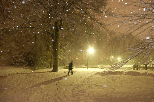
© Guido Jeurissen
This picture was shot at night, with a long shutter speed to make the water very smooth. In Lightroom, I started with changing the color temperature toward blue/magenta. Then I changed the lighting and contrast, and used the selective color adjustment tool to get the colors I wanted. After that I used to noise-reduction, with Luminance set fairly high and detail and contrast very low. After this I used a mask to make the pole sharper and brighter, as it had lost too much detail in the noise reduction. I finished it all off with a soft vignette.
Guido Jeurissen
I’m assuming that you did use the camera’s noise removal option for fixed-pattern noise but that some still crept in over 2 minutes. The result looks perfect, and my only question is why you sharpened the pole afterwards rather than apply noise removal to a selection that excluded it.
Michael Freeman
© Faith Kashefska-Lefever
I took this photo when I was just starting out. The light was low and my ISO setting was set high, resulting in a very grainy and noisy photo. Though some may like this effect, I wanted a softer look. Using the noise reduction tool in Lightroom, I set Luminance to 100%, which created a beautiful softness.
Faith Kashefska-Lefever
Like you, I find it hard to love noise in the same way that I could accept graininess in film, and this is an image that wants to be softer rather than gritty. Here’s a good case of image editing coming to the rescue, but I guess you’ll be avoiding the noise in the first place in future!
Michael Freeman
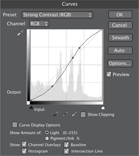
A tone curve is a visual representation of the relationship between the highlights, midtones, and shadows in an image. Tone curves appear in the form of a graph, in which the horizontal X-axis represents the original tonal values (or input), while the vertical Y-axis represents the adjustments made to the original values (or output).
Tone-curve commands are found in a number of applications, both in Raw processors such as Lightroom and Aperture, and in post-production pixel-editing programs such as Photoshop, Photoshop Elements, and PaintShop Pro.
Tone curves provide a powerful and extremely versatile means of adjusting the entire range of tones present in an image by dragging points on the tone-curve line. Broadly speaking, the lower third of the line represents the shadows, the middle third reflects the midtones, and the upper third stands for the highlights.
By default, the tone curve forms a straight diagonal line (because no adjustments have yet been made, so each input value on the X-axis corresponds exactly to its equivalent on the Y-axis). Adjusting the shape of the curve alters the relationship between the various tones in the image.
Histogram overlay
This example of a default tone curve overlays the image’s histogram—a graph representing the image’s distribution of tonal values. Like the tone curve, the histogram moves along the horizontal X-axis from shadows, to midtones, to highlights.
Midtone brightening
Clicking on the central point of the line and dragging it upward will brighten the entire image, but primarily the midtones. Note that by dragging the curve, you pull up not only that particular segment of the curve, but also all the rest of the curve—which is to say, Curves adjustments are global, affecting the entire image.

Clicking on the central point of the line and dragging it down will darken the entire image. Again, it is primarily affecting the midtones, but all other areas are also affected, with the adjustment gradually becoming less significant as you move away from the midtone areas.

The S-curve
A common curve adjustment is the “S”-shape curve. This is formed by clicking in the highlight region and moving the point up, while at the same time selecting a shadow point and moving it down. The resulting high-contrast image adds greater detail in the midtones, but loses detail in the highlights and shadows, which become brighter and darker, respectively.


Multiple adjustments
Here, a highlight point has been selected to darken the highlights in the top right of the image, while other points have been added to create extra contrast in the rest of the scene.


Lightroom’s Tone Curve
Here, this command also features sliders that can be used to alter the shape of the tone curve. This is helpful for users who aren’t familiar with making adjustments via points on the tone curve.
Having set the white balance and optimized the image’s tonal values, it’s likely that the colors are now pretty accurate (or at least appear so). However, there are a number of reasons why you may want to further adjust the colors in an image, ranging from a simple overall color boost to localized adjustments to a specific color.
Raw processors have sophisticated color-correction tools that allow you to adjust color in a variety of ways. Although the adjustment tools themselves may vary, Raw processors generally rely on hue, saturation, and luminance (HSL) to determine the source and target colors. Hue determines the color shift (wherein, for example, you can make oranges appear red, or blues appear purple). Saturation controls the color level (where you can specify how far from gray your color should be represented). Luminance darkens or lightens the color without affecting the hue or saturation.

Hue/Saturation/Luminance panel
Rather than using the traditional primary additive (red/green/blue) and subtractive (cyan/magenta/yellow) colors for correction, Lightroom’s HSL sliders utilize colors that are more meaningful to photographers.
Hitting the saturation sweet spot
If you’re shooting Raw, it’s likely that the camera will produce images with muted colors, giving you the opportunity to add color in a more controlled way during Raw processing. Most Raw processors have a Vibrance as well as Saturation slider; both increase the overall color in the image, but the Vibrance slider works in a nonlinear way, increasing the saturation of muted colors before already saturated colors. This provides a more realistic color boost, and helps to preserve skin tones.

© Steve Luck
You can use the Luminance slider to darken any of the colors in your image. This works better than the Lightness slider in Photoshop (found within the Image > Adjustments > Hue/Saturation window), which tends to desaturate colors when making them darker. In this example we’ve reduced the luminance value of blue. This renders the blue sky darker so that the minaret stands out more. Used in this way, the color adjustment mimics the effect of a polarizing filter.

© Steve Luck
Hue adjustments
Many wildflowers are delicately colored, and their color can change depending on whether they are photographed in sunny or shady conditions. If you don’t have a gray card off of which to set an accurate white balance at the time of shooting, you may find flowers such as these bluebells are not quite the color you expected when you open the image. However, color control in Raw processors is sufficiently versatile to allow subtle shifts in the hue of specific colors. Here, a hue adjustment was made to the blue slider to obtain a more accurate color.

© Steve Luck
Lightroom Target Adjustment
Lightroom has a useful feature that allows you to edit specific and complex tones, such as that of skin. The Target Adjustment tool is activated by clicking on the small circle at the upper right of the HSL panel. Then, you can click and hold anywhere on the image, and by moving the mouse up or down, you will adjust only the sample in that particular area.
An excellent example of this tool’s usefulness is in adjusting skin tones. In the top image, the skin tone is too pink. By clicking on the shoulder with the Target Adjustment tool, and dragging it upward, the oranges and yellows it samples are increased, thus reducing the overall red tint. The Target Adjustment tool is not just restricted to the Color and Black and White panel; it can also be used to make adjustments to Tone Curves. It’s a very useful way of identifying and making tonal corrections or adjustments to specific elements of an image.

Another positive aspect of shooting digitally, and in particular when using the Raw format, is that when reviewing your images you’re likely to find a few that potentially lend themselves well to a monochrome treatment.
Converting images to black and white at the Raw-processing stage utilizes the full 16-bit Raw data for maximum image quality; and as the conversion is nondestructive, you can revert back to color at any stage during the process should you so wish.
Raw processors utilize color sliders that allow you to adjust the tones in the black-and-white image once the basic conversion has been made.

An appropriate subject for B&W
This street shot of a man in profile passing in front of a colorful mural has an interesting composition, strong graphic qualities, and lots of different colors to play with.

Initial conversion
When you select the B&W mode in the Raw processor, the program uses the grayscale information in the red, green, and blue channels to create the black-and-white version. The Auto conversion is an accurate version of the color image, and is fine as such; but we can make more of an impact with some quick adjustments.
Selective luminance adjustments
Between his dark coat, his shadow, and the bold blue and red-orange on the mural behind him, the main figure is getting a bit lost in the dark. To enhance the contrast and make him stand out more, we can selectively brighten the colors behind him by using the Target Adjustment (upper left corner of the B&W panel below). Simply click on the colored area and, while keeping the mouse button pressed, move the mouse up slightly to brighten that particular color (or balance of several colors).
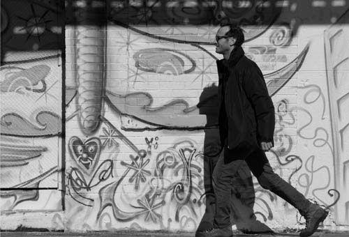

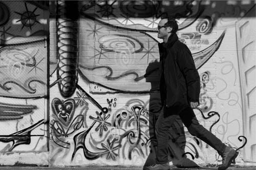
Conversion complete
With the main figure now adequately pronounced, the rest of the colors are darkened to add interest throughout the rest of the frame. The finished shot has a classic street feel to it, and makes an excellent graphic statement.
This challenge begins with finding a shot that has lots of potential for a black-and-white conversion. You’re looking for something with contrasting colors—too much of the same tone and all you’ll end up with is a gray image. Once you make your selection, you still have a lot of options in terms of how to render your subject in grayscale. If it’s a portrait, you probably don’t want to push your contrast too hard, and you’ll want to keep your color sliders relatively close to each other. On the other hand, if you’re going for a more dramatic look, see how far apart you can spread your tones in various parts of the frame for a final image that delivers a big impact.
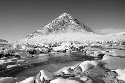
Mountain vista
The bold, blue sky cast against the white snow, with foreground shadows in the river, all come together to make this a color shot with great B&W potential. The initial conversion, set to Auto, is quite conservative, resulting in a mostly gray image that doesn’t really inspire. To add drama, the tones are pushed farther apart, upping the contrast considerably.

© JAC


→ Start by using your editing program’s automatic conversion, just to set a baseline from which to explore other possibilities. You may also experiment with some of the presets.
→ Contrast is the name of the game, and you will have to decide not only how much or how little, but also where you want your contrast, and which tones best play off each other in grayscale.
→ Remember that you can specific colors to adjust by clicking and holding on that area of the frame, then sliding your mouse up or down to make your luminance adjustments.
Dark skies, bright snow
The high-contrast final image, with the blue skies pulled into almost pure black, contrasting strongly with the bright whites of the landscape but complementing the foreground shadows, is bold, impactful, and effective.

© Johnny Chang
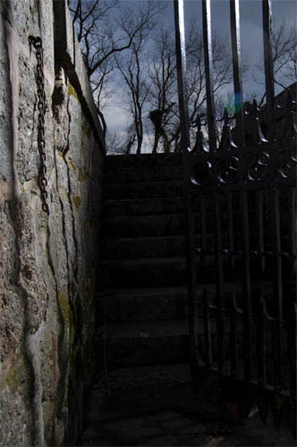
The first thing I did was try to amplify my idea of casting the shadow of the gate onto the ground—my strobe was not strong enough in the daylight to do this. Then I played around with Curves and dodging/burning parts of the stairs and wall to get a frightening image that led the eyes up the stairs to what almost seems to be headless a zombie at the top. After that, I adjusted the blue grayscale mix amount to give a dramatic sky, and added a slight tilt to give it a more uncomfortable feeling.
Johnny Chang
It’s extreme processing, but justified by your intention of making an unsettling image. The unexpected shadow certainly contributes to this (how far was the flash off-camera?). Good choice of method for darkening the sky at the top, which gives the image a tonal completion.
Michael Freeman
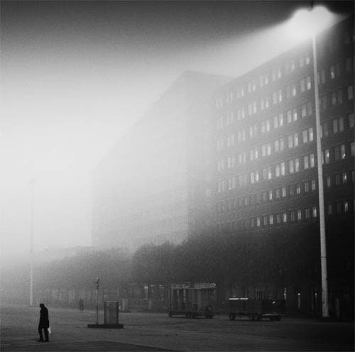
© Guido Jeurissen
I really liked the composition, so I scaled the image to a square frame to eliminate all the distracting objects in the periphery. Top right—the light; bottom left—the man. I liked it. Next I used the NIK Silver Effex Pro to convert the image to B&W. I played with the filters until I found one that I liked, added contrast and sharpness to make the walking man stand out more, then gave it some noise by adding an Ilford 400 film simulation. I gave it a custom vignette to finish it off.
Guido Jeurissen
Good composition and smart cropping at left to make a meaningful diagonal from the flaring streetlight to figure, with a clear contrast between the foggy distance and the grainy shadows along the bottom. Black and white concentrates the attention on the shapes and the man, with no distraction from the sky.
Michael Freeman
Dodging and burning is a well established photo-editing technique that dates back to conventional darkroom processing. The technique involves making local exposure adjustments to specific parts of an image to make that particular area brighter (dodging) or darker (burning).
When dodging in the darkroom, a piece of card is used to mask a specific area from the light of the film enlarger. The less light that strikes the photographic paper, the lighter the results. Burning involves making a standard exposure, and then further exposing those areas that are required to be darker, while masking the rest of the image.
Dodging and burning tools exist in Raw processors in the form of the adjustment brush, which can be used to selectively lighten or darken specific areas of the image.

© Steve Luck
Unadjusted original
Trying to achieve a balanced exposure without the use of a graduated neutral density filter in this scene has resulted in a sky that doesn’t do justice to the glowering nature of the clouds, and foreground rocks that are underexposed. There are various options we can use to fix this, but one method that provides a good level of control is to use the adjustment brush to dodge and burn the exposure where needed.

Select the skies
Select the adjustment brush and either select the Burn option or reduce the exposure setting of the brush. Zoom into the sky region and start painting over the clouds. You’ll notice the clouds become darker as you paint over them.
Mask overlay
All Raw processors, when using a selection tool, will allow you to view the selection as a color overlay. This is helpful, as it shows you exactly the areas that have been selected. Notice how the darker cliffs have been carefully avoided.
Making morose skies
With the sky region selected, you can fine tune the exposure to whatever you want using the adjustment sliders. Here, we’ve reduced the exposure of the sky so that the clouds more closely resemble how they were. Once the proper exposure setting is found, press enter to clear the mask and make the adjustment.
Brightening the foreground
Next, repeat the process on the underexposed rocks. The Dodge brush was selected for this, but you can alternately increase the exposure setting of the adjustment brush—the effect is the same.
Converted to B&W
With the sky darkened and the foreground rocks brightened so that they draw in the viewer’s eye, the final stage was to convert the image to black and white and sharpen it to ensure the textures stand out in stark relief.
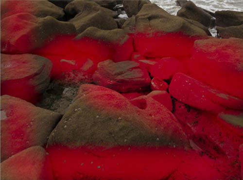
The Levels command is one of the key ways in which to adjust the overall tone in an image. Although it is not as versatile as the Curves feature (see pages 304–305), the Levels dialog is still one of the first places to go when post-processing an image (particularly if the image hasn’t been through a Raw-processing stage).
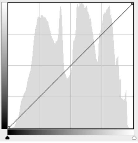
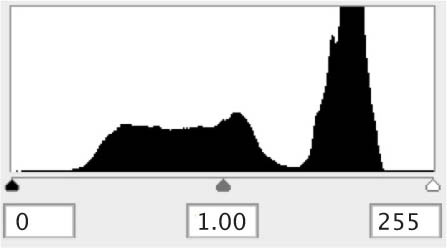
The Levels command is centered around the histogram. Histograms are graphical representations of the tones present in the image. Running along the horizontal or X-axis are the tonal variations ranging from black at the left to white at the right, while the vertical or Y-axis represents the number of pixels with a specific tone. Histograms are an excellent way in which to quickly judge an image’s tonal distribution, which is why they are available to view on almost all digital cameras, and why they are a key reference in all imaging programs.
The main function of an initial Levels adjustment is to set the black and white points, in other words to ensure that there are a number of pixels that are both pure black and pure white. This ensures that there is a full range of tones distributed throughout the image.
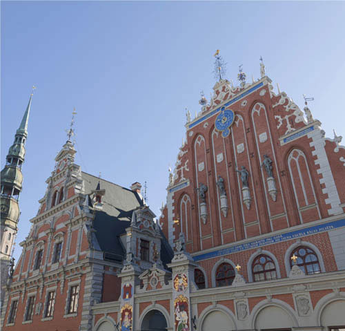
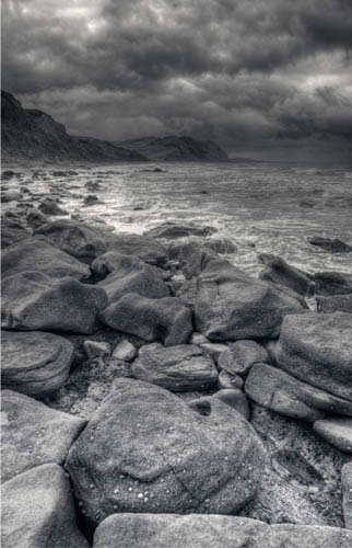
Low-contrast original
This image was shot under diffused natural lighting and the overall tones are flat and gray. The lack of contrast is clear to see in the accompanying histogram, which is displayed when you call up the Levels command (under Image > Adjustments > Levels in Photoshop). There are almost no pixels recorded at either the dark shadows (left) or bright highlights (right).
Setting the black point
Here we’ve clicked on the Black Point slider and moved it right to align with the left-hand group of pixels, darkening the image. Notice that the central Gray Point slider moves relative to the black slider. This indicates that the midtones are adjusting in proportion. If you notice a color cast in the deep shadows, go to the channel of that color in Levels. If the pixels are not closed up to the left, dragging in the Black Point slider for that channel only will neutralize the cast.
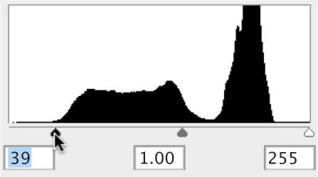
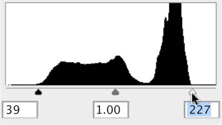
The next step is to repeat the process, but this time with the White Point slider at the right of the histogram. Drag the slider left until it sits under the group of pixels at the right of the histogram. Again, you can hold down the Alt/Option key to show the parts of the image that will be clipped to pure white as you move the slider. This should also be kept to a minimum.

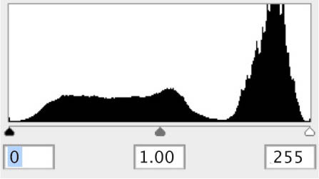
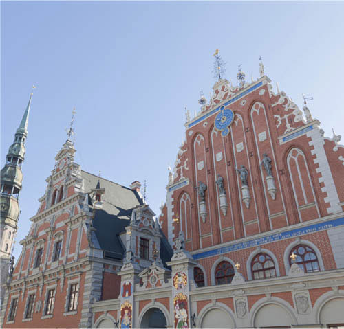
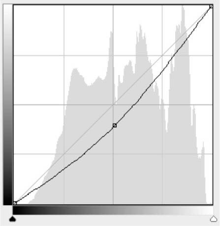
Updated histogram
Once the black and white points have been set, if you close and reopen the Levels command, the histogram will then be refreshed to illustrate the new distribution of tonal values. Here, you can see that the image covers a greater spread of tones, and also has much more contrast because the shadows and highlights are farther apart.
Midtone adjustment
Although the image now has a full range of tones from white to black, the midtones are a little dark. This is easily addressed by moving the midpoint or gray slider left toward the black point so that more of the midtoned pixels are grouped at the white end of the scale. This has the effect of brightening the image. Moving the midpoint slider to the right would have the effect of darkening the midtones in the image.

© Steve Luck
When it comes to essential adjustments to apply initially across the whole image, Levels is right up there with Curves in terms of importance and value; so it’s time you start getting familiar with how to set your White/Black points and Midtones. Levels will be your first step for many shots, particularly those that feel rather flat and lack contrast. Such images often have a perfectly fine exposure, they just need the luminance information redistributed between the shadows and highlights. So for this challenge, pick a shot that may seem a bit ho-hum at first, and see how much impact you can give it while restricting yourself to only the Levels command.
An Edinburgh exposure
This very bright image has a fine composition and plenty of detail in the highlights and shadows—too much detail, in fact. To make it a bit punchier, the highlights are pulled back just a touch, and the black point is set to 9, letting the shadows—particularly those under the tree at the bottom right of the frame—drop out and anchor the whole scene with some much needed contrast. Finally, the midtones are shifted every so slightly darker, resulting in a much more dynamic finished image.
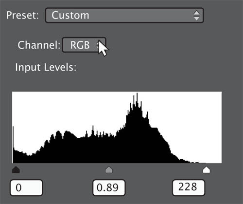
© Urmoments
This shot had to endure some overexposure in order to capture the glare of the sun (which is still slightly blown out—but in a way that works just fine in livening up the scene). Consequently, the shadows had to also be raised, and the resulting contrast is quite low. In Levels, the White Point is left alone, but the Black Point is set significantly higher, and then compensated for by pulling the midtones back toward the peak in the middle of the histogram. The finished shot is much more effective as a result.
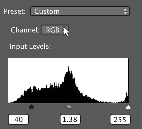

© Andrei Merkulov
Challenge Checklist
→ Begin by looking at the extremes of the image: Are the highlights bright enough? Are the shadows dark enough?
→ Limit yourself to Levels, even if you know there is another, more familiar tool that could achieve your desired result. The point of this challenge is to recognize the potential of the Levels command, and explore how much you can achieve in this one single window.

© Dan Goetsch
Using Levels I brought some brightness and contrast back into this image. I brought the sliders back into the part of the histogram where the slopes started and evened things out. After that was done all that was left was to bring back a bit of the vibrance that was lost from increasing the brightness.
Dan Goetsch
Levels were a good choice for an image that contains no real tonal problems and for which center-weighted mid-tone adjustments will work perfectly. And it’s good to use Vibrance rather than Saturation, as it protects against clipping.
Michael Freeman

© Johnny Chang
First, I dodged his face to see how much detail I could get back—it was very dark because there was no strobe at this angle (they were constantly moving around relative to my lights). I then cropped in to give tighter framing, burned some of the elements in the background that were distracting, and dodged parts of his leg and other areas that were not standing out enough from the background.
Johnny Chang
Yes, that was my first reaction—how you brought up the face and the T-shirt successfully. It’s a well-caught moment, and careful processing makes it into an effective shot. It’s also an example of how different procedures are often needed together—here, Levels plus dodging.
Michael Freeman
Color changes in post-production pixel editors are made in much the same way as they are in Raw processors, in that colors are specified by their hue and saturation, as well as lightness (although this is called “luminance” in Raw processors, which as we shall see is significant). In addition to being able to adjust all the colors at once (for, say, an overall saturation increase), post-production editors also allow you to adjust individual colors—usually red, green, blue, cyan, magenta, and yellow.
As mentioned, where Raw processors and pixel editors can differ is that the former use a “Luminance” slide while the latter a “Lightness” slider. This may sound a trivial difference, but it is important. You’ll find that reducing the Lightness value of a specific color in Photoshop, for example, will also desaturate the color rather than just darken it. To successfully darken a color in Photoshop without desaturating it you may need to experiment with all three sliders to get the result you want—for example, decreasing Lightness while compensating with a saturation boost.
Fresh from Levels, but lacking in color
This image of a former medieval monastery, Forde Abbey, England, has been tonally optimized using the black and white points in the Levels dialog, but the colors still look dull.
Global saturation boost
Using the Hue/Saturation command to increase all the colors (Master) has definitely given the image a color boost, but the sky still appears a little washed out.


To increase saturation in the sky only, select Blues from the pull-down menu bump up the saturation. It’s easy to overdo blue skies, to the point where they look quite unnatural, so use the preview button to switch between the original and adjusted preview, in order to see its effect.


Add a touch of sunshine
Although this image was shot at the height of summer, that isn’t particularly apparent. To add some warmth to the image, try increasing saturation levels in the Yellows.


© Steve Luck
Colorization
Some of the image editors that have a Hue/Saturation dialog also feature a Colorize button. When selected, Colorize automatically turns the color image into a monochrome one.

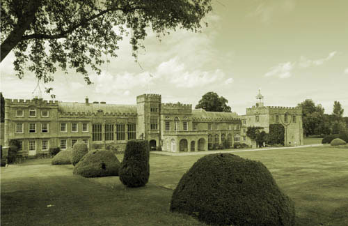
Experimenting in monochrome
Once the image has been converted into a grayscale version, you can use the Hue, Saturation, and Lightness sliders to set a specific tone.

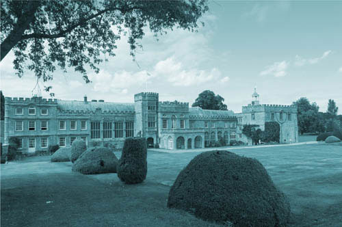
Changing specific colors
As well as the Hue/Saturation control, which allows you to adjust all colors together or the primary colors individually, a number of programs have a Color Range or Color Changer control that allows you to be much more selective about the colors you want to adjust.
Select a color
Find the Color Range/Color Changer command in your editing program, then use the Eyedropper tool to select the color you want to adjust. The dialog box allows you to set a higher or lower threshold to determine the extent of the selected color range. Only what appears white in the preview panel will be selected—the remaining black areas are left untouched. Below, you can see the dotted outline around the flowers, indicating the selection of that particular shade of red/orange.


Red-to-yellow shift
With the gladioli flowers on the left selected via the Color Range command, I then opened the Hue/Saturation window and shifted only their color from red to yellow.


© Steve Luck
As an extremely subjective component of photography, color will always involve some creative decisions on your part. Indeed, your personal color preferences are likely to become a major component of your photographic style. Do you like bold, saturated colors, or a more muted, nostalgic effect? Which is more visually pleasing: a warm, glowing cast or a cooler one tending towards blues? Ask yourself these questions as you begin to explore your color adjustment options in this challenge. The particular image you choose to process will, of course, have its own unique demands. As usual, it’s a mixture of visualizing what you want to achieve in advance, and then experimenting with other options along the way.
Torii Gate, Miyajima
Like most sunsets, this image gives a lot of leeway in terms of how far you can go in your saturation levels. However, a straightforward global saturation increase mostly affected only the oranges and reds in this image, which isn’t quite the intended look. In the Hue/Saturation (or HSL) window, only the yellows were selected, their hue was shifted so that they occupied more of the image, and finally they were selectively saturated.


Stronger and yellower
The final image is now suffused in golden tones that, while not completely wful to the original scene, do a much more effective job of creating an evocative look.
→ It’s exceedingly easy to get carried away with your saturation levels—particularly if you’ve been staring only at HSL sliders for hours. So start conservative and move up from there. What seems edgy and impactful one minute might be revealed as simply gaudy the next.
→ Selective color switching is not only fun, it can be a necessary part of color management. Not all colors are created equal when captured by your sensor, so don’t hesitate to adjust a particular color’s hue if it doesn’t represent the original scene as you remember it.
→ Don’t forget the colorization option that is also offered by the HSL panel. Particularly if you are already considering a B&W conversion, colorization can be both fun and effective at communicating a certain mood or ambience.
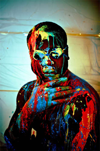
© Guido Jeurissen
I used two 800W halogen film lights (RedHead) fairly close to the subject to avoid shadows on his face. I shot at f/3.5 for a slightly blurred background. After white balance and sharpness adjustments, I used Lightroom to edit the colors. The HSL tab in gave me a lot of control over each separate color. I tried to make his skin as dark as possible, and the colors as bright as possible. Then I used split toning to make it a little bit cooler. It also gave the background a blue color, which I really liked.
Guido Jeurissen
That’s a lot of work from your notes, yet the result, though vibrant, does not look over-cooked. I like the attention to detail in your processing, aimed at a well thought-through and obviously personal interpretation.
Michael Freeman

© Johnny Chang
Due to unmatched strobe lighting, I had turned my other shots to B&W; but for this one I wanted to bring out the team colors. I played with the fill light, black point, contrast, and vibrance, while reducing saturation. Then I selectively dodge/burned and cropped what I didn’t want to be the focus, and added a sepia tone.
Johnny Chang
Definitely a good moment, and not one to be spoiled by the hot color of the lighting. Good choice of process in not only opening the pack of skaters up, but restraining the color so that the team shirts don’t totally overwhelm the image.
Michael Freeman
Layers have been a feature of image-editing programs since 1994. These powerful tools allow you to create composite images made up of individual elements held on layers that can be “stacked” on top of each other, and which can be moved, resized, tonally amended, and so on—independently of one another, but also merged when necessary. You can also use Layers to enhance a single image, with adjustments applied to duplicate layers of the original. In this way you can optimize an image while leaving the original untouched—though this function has largely been replaced by Adjustment Layers (see page 332).
As nondestructive Raw-processing controls have grown increasingly more versatile, particularly in terms of the localized adjustments that you can now make with them, in some ways Layers have become less significant, at least in terms of “standard” photographic image editing. However, if you’re looking to combine images to create a montage, for example, or replace one element of a photo with that from another, or add text or special effects, it’s essential that you know how Layers work.
Beginning with two distinct images
Using these two shots—one skyscape of dusk over the Catskill mountains, the other a NASA model of the moon—we can make a simple layer-based montage to show how layers work and interact with one another.

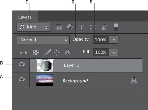
A Layer thumbnail and name
B Visibility eye
C Blending mode
D Opacity slider
E Controls for adding new layers, deleting layers, adding effects, and creating layers masks
Place moon on top
The first step is to make a selection of only the moon (dropping out the surrounding black) and place it in its own layer on top of the background. Then the moon is resized and positioned over the clouds at the right spot. The skyscape is also flipped horizontally for better composition.
Layer reversal
Next, switch the layers to bring the clouds forward, and blend the two layers to weaken the moon.
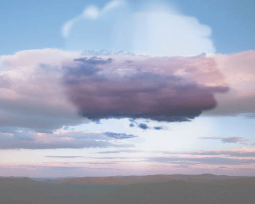
Touch-up
The cloud background is then duplicated and selectively brushed to strengthen the clouds until they appear to overlap perfectly.

Massive moon
By combining these shots using layers, we’re able to achieve a surrealistic shot of an enormous moon on the horizon. These same blending techniques are applicable to a wide range of potential composites.
Just as layers can be thought of as comprising individual image components that combine together to make up the composite image, so adjustment layers can be considered as comprising individual image adjustments that together create the finished image. And just as layers are independent of one another and can be amended at any time during the creation of the composite image, so too are adjustment layers.
Although there are many similarities between layers and adjustment layers, they differ in one important respect: Layers contain image objects made up of actual pixels, just as in any digital image, whereas adjustment layers don’t contain any pixels; instead they comprise the information that shows how the image will look when the adjustment is applied. The adjustment can be anything from a Levels or Curves command, to a Hue/Saturation boost, to a Dodge or Burn. This means that you can make and view any number of adjustments to the original image without altering the image itself. In this respect, adjustment layers are comparable to the nondestructive edits made during Raw processing.
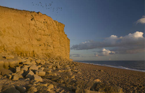
© Steve Luck
Sandstone cliffs
This image of a coast in southern England has potentially strong colors, an attractive sky, and some pleasing graphic qualities. However, it’s underexposed, lacks contrast, and the colors are initially a little dull.
Levels adjustment with an adjustment layer
When you create a new adjustment layer (Layer > New Adjustment Layer) you’ll be presented with the corresponding dialog. Here, we’ve created a new Levels adjustment layer to set the black and white points; the Levels adjustment layer will appear as a new layer in the Layers palette (below left).
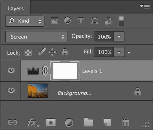
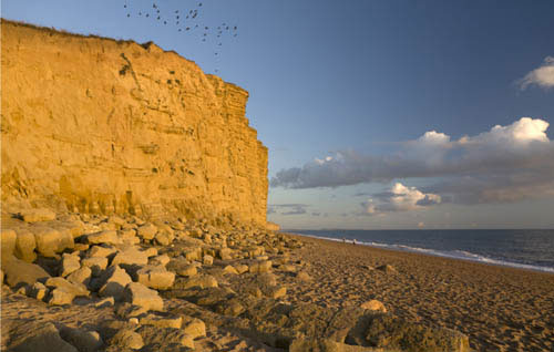
The next step is to add contrast by creating a Curves adjustment layer, and setting a characteristic “S” curve. Adjustment layers behave just like normal layers; you can use the visibility eye to gauge its effect, and even use the Opacity slider to alter the strength of the adjustment.

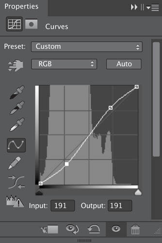
Finishing touches
In our example, the last adjustment layer added was Hue/Saturation. In the Hue/Saturation dialog, I selected Red and reduced the Saturation setting; I then increased the Blue saturation. To finish, I double-clicked the Levels layer to bring up that dialog, and moved the midpoint slider to the left to brighten the midtones.

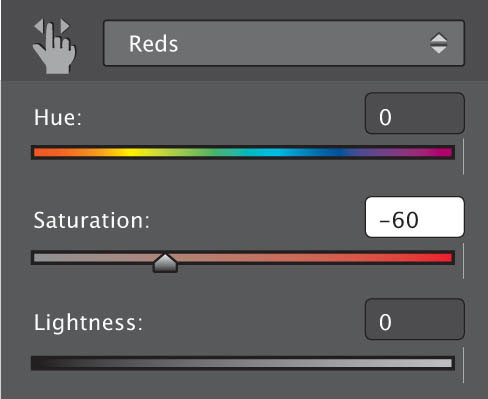
Blending modes are another powerful editing feature associated with layers. Essentially, they offer numerous ways layers can interact with one another based on the color and luminance values present in the images.
Many post-production image editors offer a variety of blending modes, and they are similar across the various programs. Blending modes have a vast number of photographic uses, too many to go into detail here; but the most useful are those that help to control and amend exposure, contrast, and color, and these are the ones on which we’ll concentrate.
It’s certainly worth spending time applying each blending mode to a couple of images to get a feel for what each does, but for now we’ll take a look at some of the more common blending mode applications.

Uneven underexposure
This image is underexposed, but more so at the bottom than the lighter sky at the top—a common photographic scenario. Increasing overall brightness using a Levels command would improve the exposure at ground level but result in a washed out or even overexposed sky.

Blending mode
This pull-down menu is found at the top of the Layers palette in Photoshop.
Gradient layer
To address the exposure issue, create a new layer and apply a black/white gradient from top to bottom. With the blending mode set to the default Normal mode in the Layers palette, all you’ll see on screen is the gradient.


If, however, you change the blending mode to Soft Light, the background image will appear, but you’ll see that it has been altered by the gradient layer. The black of the gradient renders the top of the image darker, while the whiter area of the gradient renders the bottom of the image lighter.

Fine adjustment
Although the street level is now much lighter and the sky is darker, there are elements at the top of the image, the building and spire, for example, that need to revert to the original exposure. To do this, add a layer mask to the Gradient layer and paint out the dark gradient. We can also reduce the effect of the gradient by reducing its opacity using the Opacity slider.
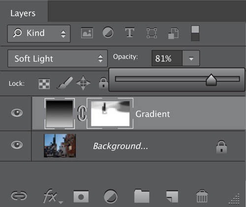
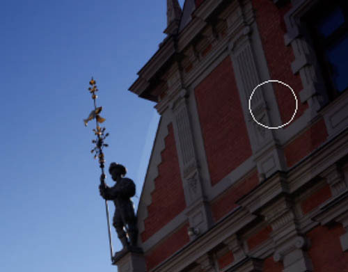
© Steve Luck
Along with making selections and cut-outs, removing unwanted objects from photos is another common post-production image-editing task.
There are innumerable reasons why you might want to delete objects from a photo, whether it’s a sign emerging from someone’s head or, as is the case here, cables running in front of a building.
Although there are ever-more sophisticated cloning tools and algorithms available, such as Photoshop’s Content-Aware option (which is certainly worth trying), you’re still likely to have to turn to manual cloning at some point to get the precise result you want.
Cluttered with cables
In this example, we’re going to use a variety of tools to remove the cables and lamp from this otherwise attractive image of a church.

Healing brushes
If you have a healing brush option, it’s certainly worth trying it where you can. Photoshop has two healing brushes: the Spot Healing Brush, which automatically attempts to replace the selected object with pixels of a similar color and brightness value located nearby; and the standard Healing Brush. With the latter you have to sample a source before the tool works.

Spot Healing Brush
With Content-Aware set in the Options bar, this has done a good job of replacing the cables in the sky, but look closely at the side of the building and you’ll see that the tool has created two darkly colored blurred areas, where the cables pass in front of the building.

Clone Stamp
As the area that we need to fix is uniformly patterned, we can’t use any auto healing options. Instead, we turn to the Clone Stamp tool, and sample the edge of the building by holding down the Alt/Opt key.

Follow the edge
With the area sampled, simply click on the affected region, ensure it’s aligned accurately, and replace it with the unaffected area that we cloned earlier. The Clone Stamp tool works best with a soft brush—a hard brush may result in visible edges. It’s also worth experimenting with the Opacity setting in the Tool Options bar. A setting of around 50% means you have to click a few times for the cloning to complete, but it does afford a level of control.

Keep it aligned
Keep the Clone tool on the default Aligned option. This ensures the source point moves with the brush as you clone over affected areas.
If you’re cloning straight objects, such as this cable, select a source point as usual, click to clone away the cable, but hold down the Shift key. Click at the end of the cable and the tool will automatically replace the entire length of cable.


The Patch tool
There are number of ways you could remove this lamp. Photoshop’s Content-Aware Fill option would do a good job, but here we’re using the Patch tool. In Source mode, make a selection of the lamp, then move the selection to a source area and release the mouse. The tool will automatically use the source area to replace the lamp. When replacing such a large object in one go, you’ll need to tidy up after with the Clone Stamp tool.

Larger brushes for faster work
Don’t be afraid to increase the size of the Clone Stamp tool brush when cloning regularly patterned areas. As long as the alignment is true, the cloning will look natural.

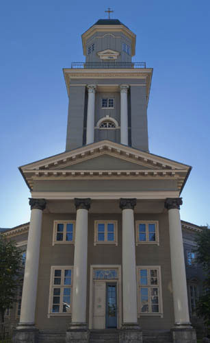
© Steve Luck
Uncluttered
The finished image, free of distracting and ugly cables.
Creating panoramas has never been so straightforward as it is today. In fact, with the sophisticated stitching software that’s now available, pretty much the whole process is taken care of automatically once you have the source images.
There are, however, some important rules to remember when shooting panoramas. First, use manual exposure when shooting your source images to ensure consistent exposure throughout the series. Second, it pays to focus manually, so that the camera doesn’t inadvertently autofocus on some close-up object as you’re panning round. Finally, to be safe, use the most appropriate white balance preset for the conditions under which you’re shooting rather than relying on auto white balance. Again, this ensures consistency. (Yes, this is adjustable as long as you’re shooting Raw, but it does simplify the process.) If your camera has a Panorama shooting mode, it may implement these settings on its own Using a tripod will help you ensure the individual source images align, but most of today’s software is powerful enough to identify features to create an accurate alignment even if the source images aren’t perfectly aligned.
Three shots with plenty of overlap
These three images show the Czech capital Prague’s historic old town district from the top of Prague’s Betří Lookout Tower (a scaled-down version of the Eiffel Tower). When shooting for a panorama, aim to overlap images by around 40% to give plenty of room to work and line up.
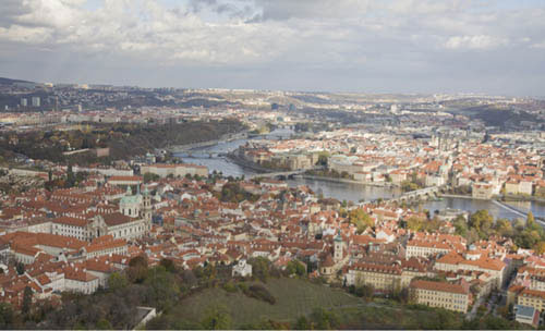
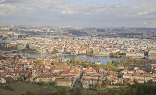
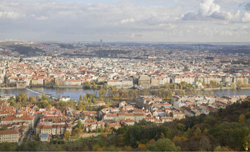
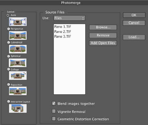
Photomerge
After downloading the source files, I launched Photoshop’s Photomerge command and browsed to select the images. This particular stitching software offers a number of options: The Layout options provide control if you’re creating long panoramas or 360° types. Auto works well in most instances. Select Blend Images Together to create seamless joins between the frames. Vignette Removal helps ensure a smoothly toned sky. Use Geometric Distortion Correction only to counteract noticeable barrel or pin-cushion distortion.
Stitch them together
Once you’ve made the various selections, click OK, and then Photomerge will automatically blend the images together to create the panorama. Here, I used the Auto layout option, which produces the optimal result based on the source files.

Crop out the edges
Look for any obvious misalignments or poor tonal mismatch in areas of flat color. If this occurs you may need to consider using alternative layout options and the Vignette Removal control. When you’re happy, flatten the image and crop out any white space.
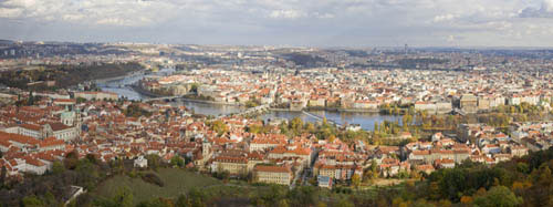
Final adjustments
After you’ve cropped out the white space you can fine-tune the overall tone, color saturation, sharpening, and so on before saving the final panorama.
Sometimes the world just can’t fit into a single frame. And sometimes you want to get as much resolution as you can of a particular scene. Whatever your motivation, a panorama is an essential tool in your photographic repertoire, and once you work through this challenge, you’ll be surprised just how easy they are to achieve. The first step is choosing an appropriate subject—typically we think of horizontally wide ones, but vertical panoramas are just as valid. Step two is getting plenty of shots to work with, followed by step three: the stitching. You may have some special effect possibilities built into the stitching software, so feel free to play around and see what your various options are.
Pre-pano adjustments
This series of shots all needed some slight color adjustments, so they were synchronized in Adobe Camera Raw and adjusted first, before then being ported into Photoshop’s Photomerge function via Adobe Bridge.

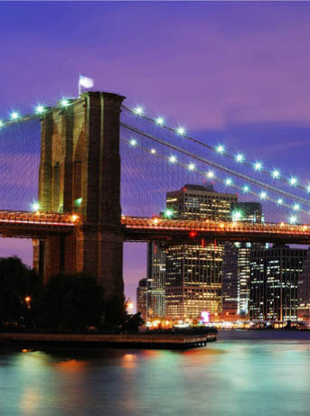
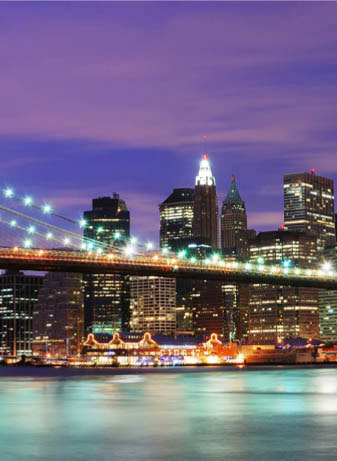
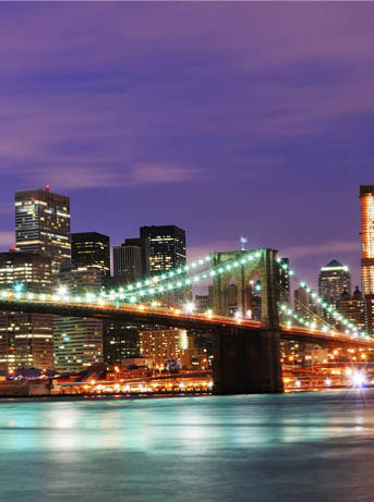
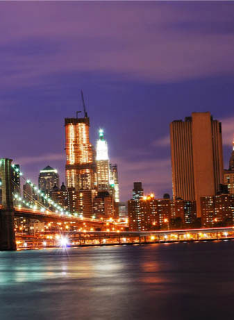
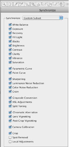

The image sequence is moved to Photoshop and arranged as a series of overlapping layers. The next step is, of course, to crop rectangle with clean edges out of the roughly stitched full image. At this stage, you must consider your output. Few display options exist for extremely wide images, so while this could be cropped considerably wider, a 16:9 (common HD) aspect ratio was chosen.
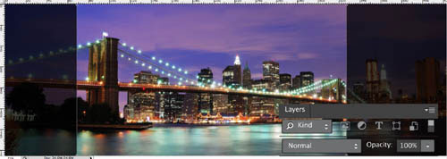


Challenge Checklist
→ While a tripod is always a useful tool, don’t let the lack of one prevent you from attempting a series of shots while you’re out in the field. Just get plenty of overlap between each shot, so your stitching program has a better chance at lining things up afterward.
→ Manual exposure mode is a definite requirement. You don’t want to be making painstaking adjustments to each image, trying to equalize the exposure across the series. Besides, any slight different will be readily viewable along the joins.

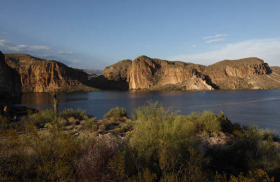

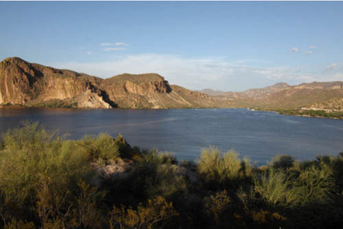
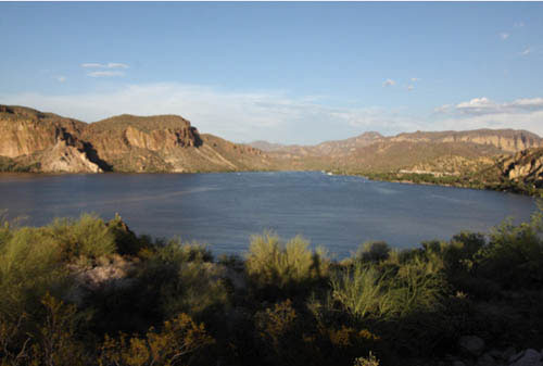
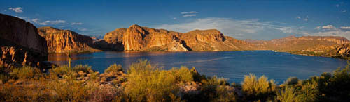
© Dan Goetsch
The sun was going down quick and I didn’t want to miss my chance with the great light. I pulled my car off to the side of the road and hiked down an embankment. I took six shots to fit the entirety of the lake into one shot. In Photoshop I used the Photomerge script to create the panorama. Once that was done I used the Lens Correction filter to remove some of the lens distortion from using my wide-angle lens. I also cropped the image to get rid of the uneven parts created while merging the photos. From there I wanted to bring back some of the warm sunset tones that I saw when I was there, so I adjusted the saturation, vibrance, and contrast.
Dan Goetsch
Excellent! You shot for the essential horizontality of the scene, including the capping of the hills by cloud, and a panoramic stitch does it real justice. Nice closure at the right. I can see that you guaranteed the shot by overlapping more than was probably needed for the stitch—which was the professional thing to do.
Michael Freeman