Chapter 3. Preparation
In this chapter, you’ll learn how to best lay the groundwork that will make creating projects in Blender easy. This includes gathering and creating references, designing your characters, planning the composition of the final image, and setting up Blender to make the resources you have gathered available while you work. At the end of the chapter, we will be ready to start modeling our projects, with a more solid idea of what it is we want to create and how to go about getting there.
Concept Art and References
Any project requires research and preparation. Before creating the projects in this book, I spent some time thinking about what I really wanted to make, collecting reference images, and creating basic concept art to keep me on track.
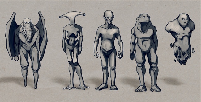
When preparing to tackle a particular project, play with various rough ideas and designs, discarding or changing ones that don’t work quite right before spending a lot of time on any one. For example, Figure 3-1 shows various sketches that I made for characters before choosing the Bat Creature design used in this book.
Creating, Finding, and Using References
Concept art serves two purposes: First, it is a quick way to experiment with ideas, and second, it serves as a guide to refer to when creating your project. This means that you don’t need to keep the whole of your idea in your head all the time, and you can plan ahead for the different parts of your project, saving you time and effort. Use your sketches each time you begin part of your project as a reminder of your goals. You can use reference images or concept art directly in Blender or GIMP to help with the modeling and texturing process, whether you use them as background images or as a starting point for projecting and baking textures.
When conceptualizing your project, consider whether there are real-world references that you can use. The Internet is a great resource, of course, as are books, objects around you, and your own photographs. For example, when developing the Jungle Ruins project in this book, I began by searching Flickr and Google Images with phrases like “jungle ruin” and “Mayan temple” and then gathering images I liked. (Obviously, you should make sure that you aren’t directly copying someone else’s work; gathering inspiration is fine, but copyright violation is not!)
Even when you want to create a completely fictional design, like a dragon or a sci-fi spaceship, it can help to examine real-world objects that share some aspects of your design in order to help better visualize your creation. For example, when creating a dragon, you might search for images of dinosaurs, lizards, large birds, bats, or even mammalian predators, like lions or wolves. Each animal might have some aspect that you can use in your dragon, like the pattern of scales on a lizard or the wing structure of a bird or bat. When creating a spaceship, you could examine existing crafts, like space shuttles, airplanes, industrial vehicles, or even automobiles. Adopting aspects of existing things will help bring realism and believability to your work.
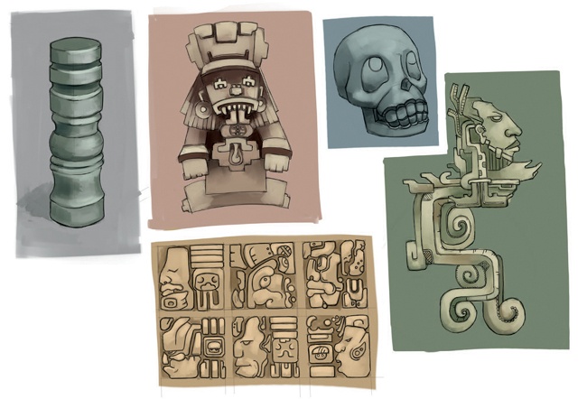
Once you’ve gathered some references, you could dive straight into modeling, or you might sketch some aspects of your project. Figure 3-2 shows examples of some of my studies of Mayan architecture for the Jungle Ruins project.
If you’re not much of a traditional sketcher, consider sculpting a rough concept of your project in Blender from a simple base mesh (see Chapter 6) or block out a rough idea of your scene in 3D in Blender using simple geometric shapes. Remember that each aspect of any project, whether it’s composition, lighting, textures, or models, will affect your concept art, so think about and play with each of these aspects before starting your project in earnest.
What to Look for in Reference Material
When collecting reference material, here are some things to keep in mind.
Subject matter. Try to collect or create as many images as you can that match the subject matter; who knows when one might come in handy. The more reference material you have at your disposal, the better!
Point of view. Try to collect or create reference material that shows your subject from many different angles, both close up and as a whole, to make sure that you won’t get stuck when it comes time to create the back of your character or a small object in your scene.
Lighting. Both strongly lit and evenly lit references are useful. When texturing, it can be really handy to have reference material that doesn’t show strong lighting or specular highlights, but when you’re modeling, you will want those highlights and contrasting lighting to show the shape of your subject. Don’t pass up either kind of reference.
Lens. When using photography, try to collect images taken with as long a lens as possible, especially if you plan to use your reference directly as an orthographic reference in Blender’s Viewport for modeling. The shorter the lens, the greater the degree of distortion in the image, and if you blindly incorporate this distortion into your model, you are bound to get some strange results. If you can’t get a photograph taken with a long lens, at least try to determine what lens was used when the image was taken and keep this in mind when modeling.
Licensing/copyright. While you can use any image loosely for inspiration or as a jumping-off point, if you plan to use a photo or artwork created by other people, you must comply with their intentions for their work. If an image is protected by copyright, you must get the copyright holder’s permission to use it or perhaps contact a licensing third party, like 3d.sk or iStockPhoto. If the image is under a less restrictive license, like Creative Commons, be sure to comply with the specific terms of that license. When in doubt, assume that an image is protected by copyright and don’t directly use it in your work.
Above all, remember that all photographic references have their limitations. In addition to manifestations of lens distortion, images may be small, taken from awkward angles, poorly lit, blurry, or incomplete. This doesn’t mean that imperfect images aren’t useful, but don’t be a slave to your references. What matters in the end is that things look right, and if they don’t, don’t let your reference deceive you into making poor artistic decisions. If something doesn’t look right, change it.
Composition
When creating any artwork, whether animated or still, it is important to think about composition, and doing so before you start will make it a lot easier to fit together the final elements of your scene. This was particularly true for the Jungle Ruins project, where the goal was to create a final image from a single vantage point. Remember that you want the final results not only to look convincing and detailed but also to be pleasing to the eye when placed within the setting of your final renders.
Composition is a very rich subject, and it is beyond the scope of this book to cover it in detail, but here are some basic principles.
The Rule of Thirds
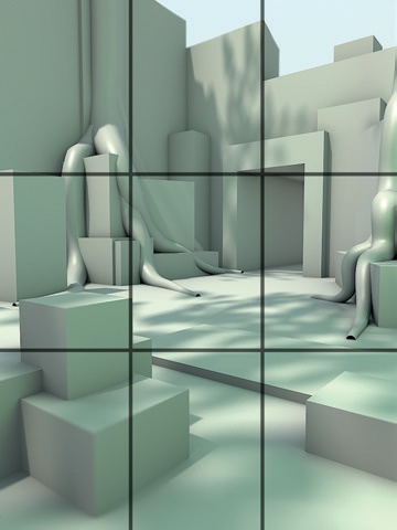
The rule of thirds principle argues that the points of interest in an image should fall roughly in line with an imaginary grid drawn over the image. This imaginary grid splits the image into thirds along both its length and width. The goal is to carve the image into less symmetrical areas to produce something that is generally more pleasing to the eye, as opposed to an image split right down the middle by the various points of interest. Figure 3-3 shows how I split an image into a total of nine sections, using three rows and three columns.
For another example of the rule of thirds in action, think of a scene showing the sky and a horizon together with some buildings. Applying the rule of thirds, we would place the horizon at one horizontal division of the image (about one-third of the way up from the bottom or down from the top), with the sky occupying the area above the horizon. If the main points of interest are situated above the horizon, such as a tall building or a lit moon in the night sky, we might place the horizon above the lower third of the image to allow the building and moon to occupy more space. On the other hand, if the main points of the image are below the horizon, say some boats on a lake, placing the horizon at the upper third division would allow us to give the boats more space while creating a balanced composition.
The rule of thirds doesn’t always apply to images containing single characters, however. For example, if your image is a portrait or full-body shot of a character, it will likely make more sense to give the subject center stage. But even in these cases, you might apply the rule of thirds to other aspects of the image, such as the character’s eyeline or a heavy object carried in his arms.
It’s worth pointing out that the rule of thirds isn’t the only theory driven by the beauty of asymmetry and imbalance. Other rules, like the golden mean, which places the grid lines according to the golden ratio (approximately 1.618:1), have similar effects and share the goal of not dividing an image into obvious symmetrical halves.
Silhouettes and Negative Space
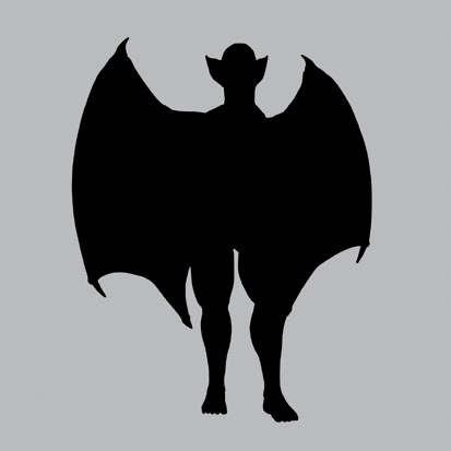
For your image to read well, it must have a strong silhouette. The silhouette is the outline of your subject, as shown in Figure 3-4. If when looking at your image’s silhouette you can still tell what the image is, you have a strong design. If the silhouette looks like just a jumble of shapes, however, viewers may have a hard time processing the image, even in its final state. To get a better idea of your model’s silhouette, try adding a black material to it with no specularity (see Chapter 12), and render it on its own to see it as a black shape on a plain background (Figure 3-4).
In the same way, the negative space around and between your subject and any other objects also affects the appearance of your composition. For example, when placing the horizon on a rule of thirds line, as discussed in the previous section, we are likely to create a pleasing negative space in the form of the sky.
Simplicity and Focus
When creating any image, you should strive to control the viewer’s gaze. If your image is busy with too much going on, a viewer may be overwhelmed and not know what to pay attention to. To avoid potential confusion, an image should have some “rest” areas—parts that are simple and don’t demand attention so that other, more important parts are not overlooked. For example, if you model and texture a fantastic portrait, you might avoid putting a complex, cluttered background in the negative space behind the portrait because this background might distract the viewer. The negative space in this example is the rest area, but rest areas may simply be less complex and detailed parts of the main image itself.
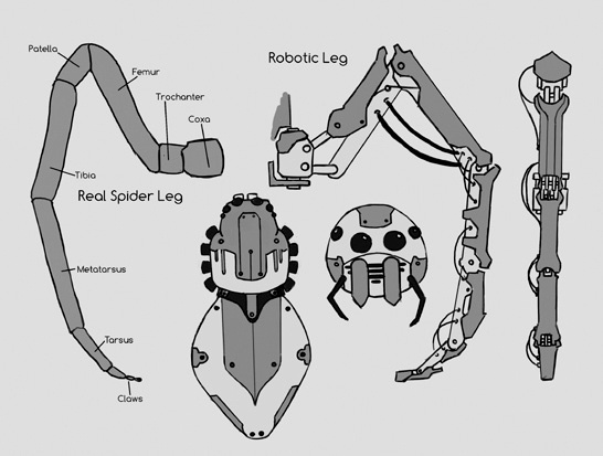
The same idea applies to all aspects of design: Keep things simple and control the viewer’s focus. If you cover the whole of any object in elaborate detail, the result may be an indecipherable mélange of competing focal points. If instead you focus the details in specific areas while keeping others simple, the viewer can more easily understand your design. For example, in the Spider Bot project shown in Figure 3-5, some aspects of the design, like the legs and the mechanical details of the joints between the body segments, are quite detailed, while other areas, like the surface of the body, are kept simple.
Defining areas of focus and simplicity can be accomplished in many ways, the most obvious of which is by placement: Simply leave space between the complex areas in your scene. But there are other ways, too. For example, you can use lighting to put less important areas of a composition in darkness or to overexpose those areas so that they are mostly white, or you can use depth of field to put foreground and background areas of the image out of focus. (We’ll touch on these techniques in various chapters, especially in Chapter 13 and Chapter 14.)
Visual Path
Most images contain multiple elements. When working with such an image, you should create a path that draws viewers through each element before they look away from the image. By planning this path, you can make your image tell a story and expose more of your scene.
You can use the rule of thirds to create a visual path through an image, as the viewer will naturally look to the intersections of the rule of thirds lines first. You can also use perspective, allowing converging lines in the image to direct the viewer through your composition’s various focal points. Or you might frame the points of interest with negative space. In images containing characters, you might have the characters look at the focal point so that the viewer follows their gaze, or you might even just have the characters point at it!
Testing Compositions in Blender
Blender can be useful when blocking in compositions for a scene before going all-out and creating it. For example, in the case of the Jungle Ruins scene, I tried various compositions simply by creating a rough blocking of the scene using cubes, and I then added simple lighting to see how different options would affect the composition.
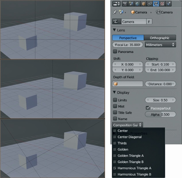
Blender also has some handy tools for you to use in guiding your composition choices. With your camera selected, you can access these tools from the Object Data tab of the Properties editor, as shown in Figure 3-6. For example, to better see how your image is framed, you can turn up the Alpha value of the Passepartout setting to hide the area outside your camera’s view. You’ll also find several composition guides that you can toggle to help line up your composition according to the rule of thirds, the golden ratio, or the center lines, as shown in Figure 3-6.
Preparing References in GIMP
Whether you’re collecting references for a project from photos or drawing them, it usually pays to invest some time in GIMP making sure that your references will be as useful as possible once you bring them into Blender. For example, you can use GIMP to combine images into reference sheets or to correct distortions in your images to get the best reference possible.
Creating a Reference Sheet
It is generally useful to have multiple images on hand that you can quickly reference when working on your project. For this reason, it helps to combine a lot of images into a single reference sheet that you can then load as a single image into Blender.
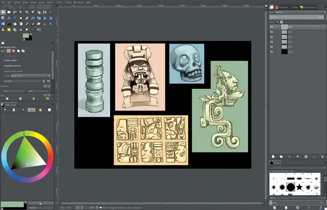
To create a reference sheet, choose File▸Open As Layers in GIMP and then select the images you want to import. Next, increase the size of your canvas using Image▸Canvas Size so that you can spread out your images and arrange them to fit on the one canvas using the Move tool (M), as shown in Figure 3-7. Scale down any images that are significantly larger than others using the Scale tool (SHIFT-T). Finally, add a black background behind the images by adding a new layer, filling it with black, and moving it to the bottom of the layer stack. Save the reference sheet as a .jpg file.
Aligning Orthographic References
Orthographic references, or ortho refs, are reference images drawn or taken from specific vantage points (front, side, back, or top) with as little perspective as possible. It’s easy to reduce perspective when drawing; to reduce perspective with photos, take them as far away from the subject as possible, using a long lens.
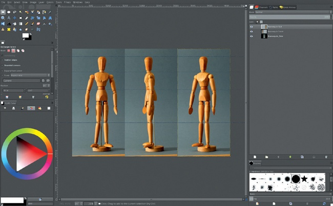
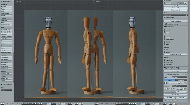
If you will be using orthographic photo references or drawings in your project, consider aligning them in GIMP in a single image, as shown in Figure 3-8, before opening them in Blender so that the features of each part line up in each image. By aligning your images, you will be able to follow each feature from more than one viewpoint when modeling.
If your reference was taken with a long lens or drawn in orthographic perspective, you should be able to align it easily. To do so, open your images as layers, as described in Creating a Reference Sheet, and then pick one layer to use to align all the others. Use guides (click and drag from the rulers at the side of the image window) to mark the vertical positions of the key features and then use GIMP’s Rotate, Scale, and Move tools to position your next layer so that the features line up. By repeating these steps for as many orthographic views of your subject as you have, you’ll essentially create a blueprint of your project that you then can use for modeling (see Figure 3-9).
Note that when aligning images with photo references, some features may not line up perfectly in every view due to lens distortion and perspective, particularly if they weren’t all the same distance from the camera. While you can correct lens distortion to some extent using GIMP’s lens distortion filter (Filters▸Distort▸Lens Distortion), the result will not be a perfect ortho ref because you still won’t be able to correct for perspective. It’s easier to simply align the key features as best you can and remember that you aren’t shackled to your reference when modeling; you can correct for any errors that you know will be there using your own judgment.
Using Concepts and Reference Images in Blender
Once you’ve prepared your concept art and reference images, there are several ways to make them available for use as references in Blender. Of course, you can just open your image in your standard image viewer and keep it off to one side of your screen, but you can also use Blender’s UV Image editor, background images, or the image display option for an empty object.
UV Image Editor
To open up an image in Blender’s UV Image editor, select Image▸Open Image from the header, navigate to your reference image or concept art in the file browser, and select Open. Blender should open your image in the UV Image editor. If you then open another image, you can access any previously opened images, as well as any used by texture datablocks, from the drop-down menu in the header.
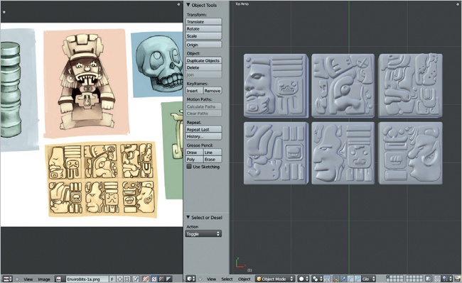
When working with several reference images while creating my compositions, I like to combine them all into one big reference sheet in GIMP. I then save that reference sheet as a .jpg file and open it in Blender’s UV Image editor, as shown in Figure 3-10. This reference sheet allows me to pan around the image and zoom in and out to look more closely at specific references without having to load each into Blender separately and switch between them constantly.
Background Images
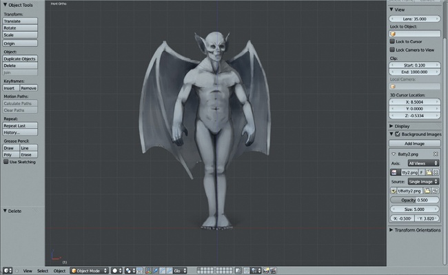
If you want to display an image in Blender’s 3D Viewport, the simplest way is by using background images. With your cursor over the 3D Viewport, press N to bring up the Properties region, which contains the Background Images panel (see Figure 3-11). Here you can add images to the 3D Viewport, change their size and location in the 3D View, and define which views they appear from using the Axis setting.
Image Empties
Background images are really useful when modeling from orthographic references because you can set them to appear only from the correct view or when looking from the camera’s viewpoint.
If there’s a downside to using background images, it’s that they aren’t visible when you have perspective enabled in the 3D Viewport. Fortunately, Blender 2.6 allows you to add an image as the draw type for any empty, which you can then position as you like. This makes image empties great both for arbitrarily placing reference images in your scene so you can move them as you please and for setting up orthographic references that can be viewed from any angle.
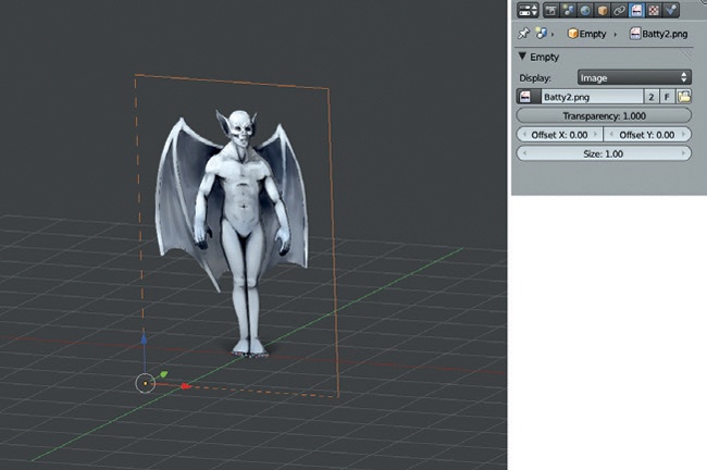
To use an image empty, create an empty in your scene using SHIFT-A▸Empty. Then in the Properties editor under the Object Data tab, you can set the empty’s display type to Image and select an image to display (see Figure 3-12). The empty will now display this image on a plane that you can move, scale, and rotate to place the image in your scene as you would any object, but this object won’t interfere with your renders because it will be visible only in the 3D Viewport.
In Review
In this chapter, we have looked at the preparatory steps to think about when working on a project in Blender, including planning what you want to make, collecting reference and concept art, and generating ideas for your final composition. We then moved on to discuss ways to make this information available to you in Blender while you work. In the next chapter, we begin modeling our projects. By blocking out the key elements of our projects, we will develop a foundation on which to build more complex models.
