 Tables are organized in columns and rows. The columns go up and down the table vertically from top to bottom, and the rows go across the table horizontally from left to right. Each unit of data is presented in a cell.
The Integrated Reasoning section tests your ability to use information to solve complex problems. This section may seem intimidating, but these questions simply test skills you’ve used in school and when taking other tests. The difference is that you must combine these skills to answer questions correctly.
The Integrated Reasoning section is intended to provide business schools with additional information to help evaluate admissions candidates. The decision-making skills that candidates display in answering the questions can help schools identify which candidates are most likely to be successful within the classroom and in their careers.
The Integrated Reasoning section has a 30-minute time limit. The section includes 12 questions, some of which may have multiple parts.
Integrated Reasoning questions test your ability to solve complicated problems using information from multiple sources. They test your logic and reasoning abilities, your skills at analyzing and synthesizing information, and your math and computation skills. They also test your ability to convert between graphical and verbal representations of ideas. Several different skills may be tested by a single question.
Integrated Reasoning questions do not test your business knowledge, but they do test the types of real-world skills you would use in the classroom or on the job. While you might never need to measure the hypotenuse of a right triangle over the course of your career, you will likely be required to read text, tables, and charts and to make decisions based on complex information.
There are four types of GMAT Integrated Reasoning questions:
1. Table Analysis
2. Graphics Interpretation
3. Multi-Source Reasoning
4. Two-Part Analysis
Each format requires you to solve complex problems using information from multiple sources. Understanding these formats will help you know what to expect and how to approach each question.
Table Analysis questions require you to analyze data in spreadsheets or tables. The questions may contain spreadsheets or tables that can be sorted. You may have to sort the data to determine the accuracy of given answer statements.
Here are some helpful strategies for approaching table analysis questions.
 Tables are organized in columns and rows. The columns go up and down the table vertically from top to bottom, and the rows go across the table horizontally from left to right. Each unit of data is presented in a cell.
 The first row of a table is called the header row. The header row contains category names that identify the data in each column.
 To sort the information in a table, click on the header cell of a column. The data in the entire table will be reorganized according to that column. Information can be sorted from lowest to highest (1–100 or A–Z) only.
 Use estimates where possible to calculate answers quickly.
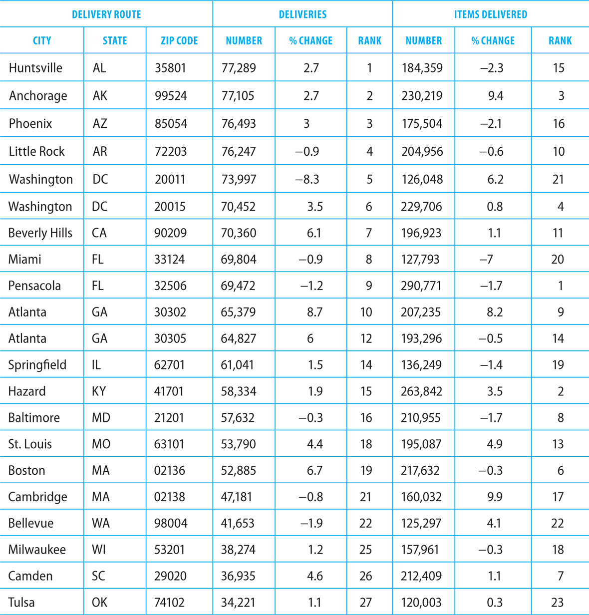
The table below gives information on total deliveries (total delivery trips made to addresses on record) and total items delivered (packages and letters) in 2015 by a private company for a one-year period to 21 zip codes throughout the country. The 21 zip codes fall among the top 35 for this annual period in terms of both total deliveries and total items delivered by the company. In addition to providing the numbers of total deliveries and total items delivered for each route, the table also gives the percent of increase or decrease over the numbers for 2014 and the rank of the route for total deliveries and total pieces delivered.
Sorted by Percent Change in Deliveries (Column 5)

Sorted by Rank of Deliveries (Column 6)
Sorted by Percent Change in Items Delivered (Column 8)

Sorted by Rank of Items Delivered (Column 9)

Review each of the following statements. Based on information provided in the table, indicate whether the statement is true or false.


The delivery route with the median rank based on total number of deliveries is Atlanta, GA (30305). The delivery route with the median rank based on total number of items delivered is St. Louis, MO (63101).
In 2015, there were approximately 160,000 items delivered in Cambridge. This represented an increase of about 10% over the previous year. In 2014, therefore, the number of items delivered was approximately 160,000/1.10, which is about 145,000.
The delivery route experiencing the greatest percent increase in total deliveries from 2014 to 2015 is Atlanta, GA (30302). The delivery route that saw the greatest increase in the percent of items delivered is Cambridge, MA (02138).
In 2015, 7 delivery routes experienced a percent decrease in the number of deliveries. There were 10 delivery routes that experienced a percent decrease in the number of items delivered.
Graphics Interpretation questions contain graphs, images, or charts. You will be required to review the image and interpret it to answer a question. Graphics Interpretation questions contain fill-in-the-blank answer statements. To select the correct answer, you must choose from several options on a drop-down list.
For these questions, you’ll need to use data analysis, percentages, and coordinate geometry skills. Here are some key points:
 Two factors are positively related if one increases as the other does. If one increases as the other decreases, the relationship between the two is negative.
 On a graph, the slope of a line is a measure of its steepness. The steeper the line, the greater the absolute value of the slope.
 If a line slants upward from left to right, its slope is positive. If the line slants downward from left to right, its slope is negative.
 To calculate the percentage represented by part of a whole, divide the part by the total. In the following example, to calculate the percentage represented by 3 plants, divide 3 by 60. The percentage is 0.05, or 5%.
 Where possible, use estimation to answer Graphics Interpretation questions.

The graph above is a scatter plot with 60 points, each representing the number of daily hours of sunlight to which 60 plants were exposed and the corresponding height, measured in centimeters, that each plant attained. The plant heights were measured after 6 weeks of consistent sun exposure. The solid line is the regression line, and the dashed line is the line through the points (1, 4) and (7, 8).
Select the best answer to fill in the blanks for each of the statements below, based on the data shown in the graph.
1. The relationship between the hours of sun exposure and plant height is _______.
 zero
zero
 negative
 positive
2. The slope of the dashed line is ________ the slope of the regression line.
 greater than
 less than
 equal to
3. The number of plants that received more than 6 hours of daily sun exposure is closest to _______ % of 60.
 0
0
 5
5
 10
10
 20
20
 40
40
1. C The relationship between the hours of sun exposure and plant height is positive. As sun exposure increases, so does plant height.
2. B The slope of the dashed line is less than that of the solid line. The solid line is steeper than the dashed line, so its slope is the larger of the two.
3. B The number of plants that received more than 6 hours of daily sun exposure is closest to 5% of 60. Exactly 3 plants received more than 6 hours of daily sun exposure, so 5% of the plants received this amount.
Multi-Source Reasoning questions require you to examine multiple sources and calculate the correct answers to problems. Two to three sources of information will be provided: these may include text, graphs, charts, tables, or spreadsheets. You will have to consult more than one source to answer each question.
Keep the following points in mind when confronting a Multi-Source Reasoning question.
 Multi-Source Reasoning questions are presented in “tabbed” format. To see the different sources, click on the tabs at the top of the screen. You can view only one source at a time.
 These questions give you more information than needed to arrive at the answer. Sort through the information to determine what is relevant before answering.
 When determining whether an inference is supported, consider the source materials carefully. A topic might be mentioned in the sources without necessarily supporting an inference about it.
E-mail #1—E-mail from division director to donations coordinator
August 10, 9:37 A.M.
Yesterday I spoke with the computer training lab administrator to update him on the status of donations for the school district’s computer donations drive. He extended the donations deadline for another week, until next Tuesday. Are we on track to receive enough donations from students’ families to meet our goal of computers for the new training lab? Do we need to extend our request to local businesses too?
E-mail #2—E-mail from donations coordinator in response to the division director’s August 10, 9:37 A.M. message
August 10, 10:04 A.M.
To date, we have received 40 computers. We need 100 computers donated to meet our goal for the new training lab. We have requested help from all of the students’ families, so we should invite local businesses as well. In all of our past drives, including this one so far, we have received donations from about 20 percent of those who receive requests. (Of course, we might always receive more or less than that average, so we should consider the possibilities of not meeting the goal or overspending the budget for the thank-you event.) Each individual or organization donating a computer will receive two invitations to our thank-you event to celebrate the opening of the lab. Refreshments and supplies for the event are expected to run $20 per person. What is the total budget for the thank-you event?
E-mail #3—E-mail from division director to donations coordinator in response to the donation coordinator’s August 10, 10:04 A.M. message
August 10, 10:35 A.M.
The budget for the thank-you event is fixed at $4,000. This would allow us to accommodate two attendees for each of the 100 computers donated. The budget is firm, so we should take care to ensure that the event costs stay within this amount. Although we do not have resources to extend the budget, if necessary we could determine ways to reduce the cost per person if we receive more donations than the original goal amount.
Consider each of the following statements. Does the information in the three e-mails support each inference as stated?


The donations coordinator states in E-mail #2 that local businesses should be invited to contribute to the drive.
The e-mails do not suggest that the donation coordinator does not believe the goal of the drive can be met. This inference is not supported by the information provided.
The division director states in E-mail #3 that the budget for the thank-you event is firm and cannot be extended.
The e-mails do not suggest a disagreement between the two over the per-person budget for the thank-you event. The donations coordinator mentions this amount in E-mail #2, and the division director proposes that attempts might be made to reduce the cost per person if necessary.
The answers to these questions will have two components. Components are presented in table format, with one component per column. To answer the questions, you must analyze different combinations of the two components.
When answering Two-Part Analysis questions, remember these strategies.
 To answer Two-Part Analysis questions, you must consider both components. In the example below, consider the increases for both Acme Company and Brown Company.
 Two-Part Analysis questions may involve more than one outcome. In the following example, two outcomes are projected: the companies produce the same number of units in 10 years, and after 10 years, Acme produces more units than Brown.
 The problem below can be solved by working backward. Start with a number in the middle for Acme—say, 50 units per year. If Acme increases its production by 50 units per year, in 10 years it will produce 8,000 units. If Brown increases its production by 50 units per year, in 10 years it will produce 8,500 units. The number of 50 for Acme is too small. Try the next larger number. If Acme increases its production by 100 units per year, in 10 years it will produce 8,500 units. This would match Brown’s production at an increase of 50 units per year.
 You can also use algebra to help find the answer. Set up an equation for the first outcome:
7,500 + 10x = 8,000 + 10y
Solve for x in terms of y:

This tells you that Acme’s production (x) is 50 units more than Brown’s production (y). The only options that fit from the table are 100 units for Acme and 50 units for Brown.
Acme Company currently produces 7,500 circuit board units per year. Brown Company currently produces 8,000 circuit board units. The numbers of units produced by both companies are increasing each year at a constant rate. If each of these companies continues to produce an increased number of units annually at its constant rate, in 10 years both companies will produce the same number of units for the first time. After the 10-year mark, Acme Company will produce more units per year than Brown Company.
In the table below, identify the rates of increase, in annual units produced, for each company that together meet the performance projections given above. Select only one option in each column.
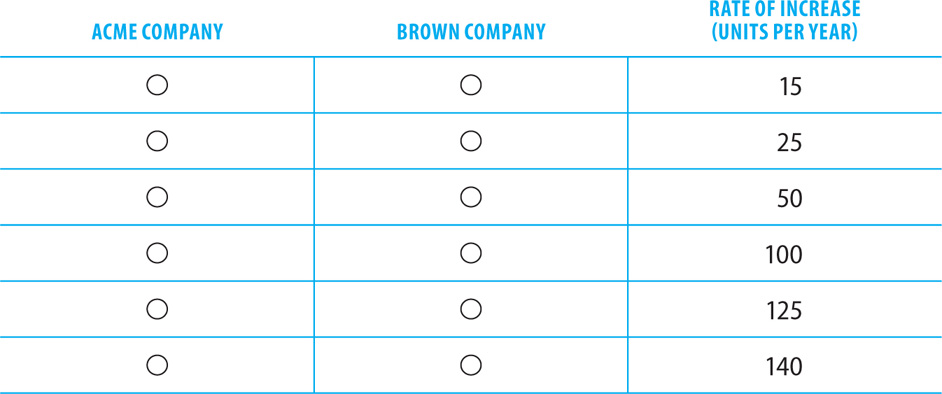
The correct answer is 100 units per year for Acme Company and 50 units per year for Brown Company.

If Acme Company increases its production by 100 units per year, in 10 years it will produce 8,500 units per year. Brown Company would reach the 8,500-unit mark at the same time by producing 50 more units per year. Every year after the first 10, Acme will produce more units than Brown Company.
Directions: Select the best answer or answers for the questions below. You may use a calculator for this section of the test only.
1. Clark University currently enrolls 8,800 students per year. Talbot College currently enrolls 15,100 students per year. The numbers of students enrolled by both schools are increasing each year at a constant rate. If each of these schools continues to enroll an increased number of students annually at its constant rate, in 7 years both schools will enroll the same number of students for the first time. Each year after 7 years, Clark University will enroll more students per year than Talbot College.
In the table below, identify the rates of increase, in annual students enrolled, for each school that together meet the enrollment forecasts described above. Select only one option in each column.

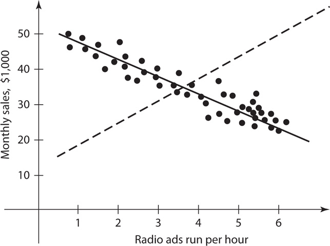
2. The graph shown is a scatter plot with 48 points, each representing the number of radio ads per hour run by a company each day over 48 months, and the corresponding monthly sales revenue that the company earned. The sales revenues, measured in thousands of dollars, were tallied on the last day of each month that the ads were run. The solid line is the regression line, and the dashed line is the line through the points (1, $20,000) and (6, $50,000). Select the best answer to fill in the blanks in each of the statements below based on the data shown in the graph.
The number of months in which the company generated more than $50,000 of revenue is closest to _______% of 48.
 0
0
 10
10
 15
15
 17
17
 25
25
The slope of the regression line is _________ the slope of the dashed line.
 less than
 greater than
 equal to
The relationship between the radio ads run per hour and sales revenue is __________.
 negative
 zero
zero
 positive
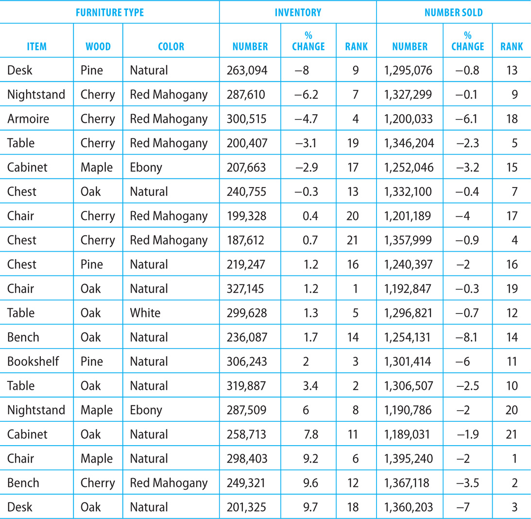
3. The table below gives information on the total inventory in 2015 and the total items sold by an international furniture manufacturer over a three-year period, from 2013 through 2015. The 19 furniture items were included in the table because they fall among the top 25 items produced by the company in terms of both total inventory and total items sold. In addition to listing the total inventory and total number sold for each furniture type, the table also gives the percent increase or decrease over the 2014 inventory and 2010–2012 sales numbers and the rank of each furniture type for total inventory and total items sold.
Sorted by Percent Change in Inventory (Column 5)
Sorted by Rank of Inventory (Column 6)
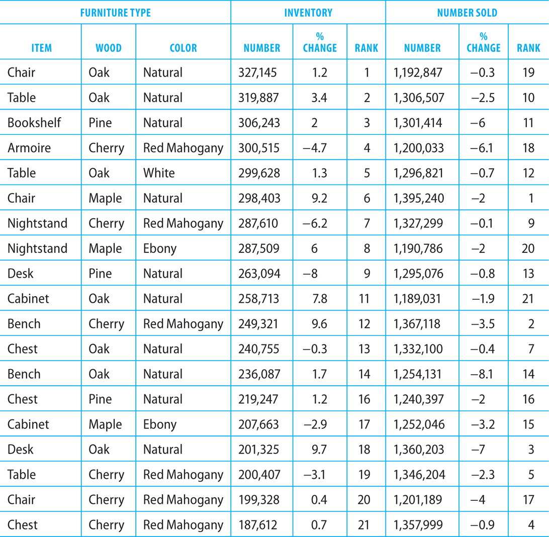
Sorted by Percent Change in Number Sold (Column 8)
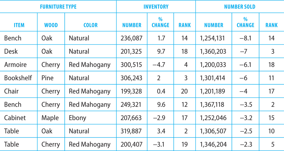
Sorted by Rank of Number Sold (Column 9)

Review each of the statements below. Based on information provided in the table, indicate whether the statement is true or false.

4. Read the sources below before answering the question that follows.
E-mail #1 E-mail from Division Director to Donations Coordinator
August 10, 9:37 A.M.
Yesterday I spoke with the computer training lab administrator to update him on the status of donations for the school district’s computer donations drive. He extended the donations deadline for another week, until next Tuesday. Are we on track to receive enough donations from students’ families to meet our goal of computers for the new training lab? Do we need to extend our request to local businesses too?
E-mail #2 E-mail from Donations Coordinator in Response to Division Director’s August 10, 9:37 A.M. message
August 10, 10:04 A.M.
To date we have received 40 computers. We need 100 computers donated to meet our goal for the new training lab. We have requested help from all of the students’ families, so we should invite local businesses as well. In all of our past drives, including this one so far, we have received donations from about 20 percent of those who received requests. (Of course, we might always receive more or less than that average, so we should consider the possibilities of not meeting the goal or overspending the budget for the thank-you event.) Each individual or organization donating a computer will receive 2 invitations to our thank-you event to celebrate the opening of the lab. Refreshments and supplies for the event are expected to run $20 per person. What is the total budget for the thank-you event?
E-mail #3 E-mail from Division Director to Donations Coordinator in Response to Donation Coordinator’s August 10, 10:04 a.m. Message
August 10, 10:35 A.M.
The budget for the thank-you event is fixed at $4,000. This would allow us to accommodate 2 attendees for each of the 100 computers donated. The budget is firm, so we should take care to ensure that the event costs stay within this amount. Although we do not have resources to extend the budget, if necessary we could determine ways to reduce the cost per person if we receive more donations than the original goal amount.
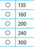
Suppose that the donations coordinator requests computer donations from 400 local businesses. If all of the information in the three e-mails is accurate, the number of attendees that will be invited to participate in the thank-you event is closest to:
5. Company X currently owes $200,000 on a business loan. Company Y currently owes $410,000 on a business loan. Both companies repay their loans at a fixed dollar amount per year that includes both interest and principal. If each company repays its loan at its fixed dollar amount per year, in 3 years the companies will owe the same amount. After 3 years, Company Y will owe less than Company X until the loans are paid off.
In the table below, identify the fixed dollar annual repayment amounts for each company that together meet the repayment projections given above. Select only one option in each column.

6. 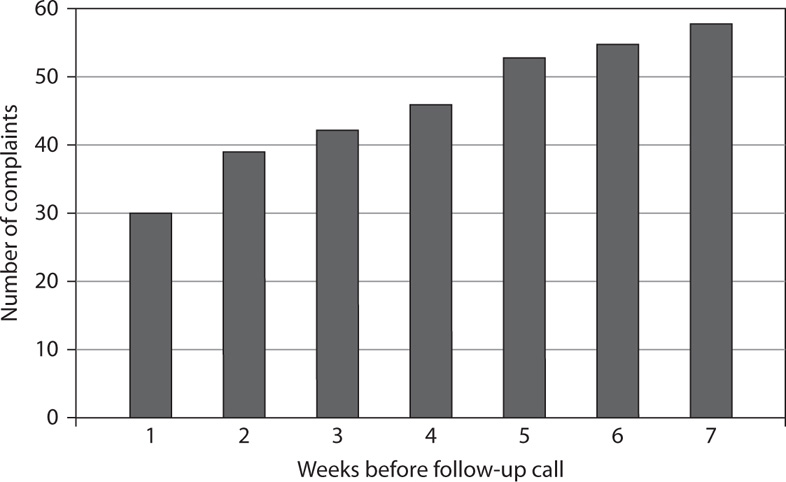
The graph above is a bar graph with 7 bars, each representing the number of complaints received by a telephone company from its new customers. The customers received follow-up calls anywhere from 1 to 7 weeks after placing their orders. The customers were grouped by follow-up call timing, and the number of complaints was recorded for each group over a one-year period. Select the best answer to fill in the blanks in each of the statements below based on the data shown in the graph.
The relationship between the number of complaints and the number of weeks before the call is ________.
 zero
zero
 negative
 positive
The number of complaints made by customers who received a follow-up call 1 week after placing their orders is closest to ________% of the number of complaints made by customers who received a follow-up call 7 weeks after placing their orders.
 0
0
 15
15
 30
30
 50
50
 75
75
Based on the information shown in the graph, if the company wishes to limit its complaints to 40 or fewer per year, it should make follow-up calls no later than ___________ weeks after customers place their orders.
 4
4
 3
3
 2
2
 1
1
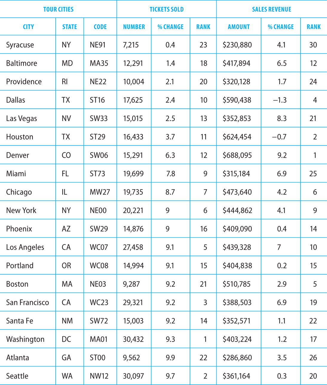
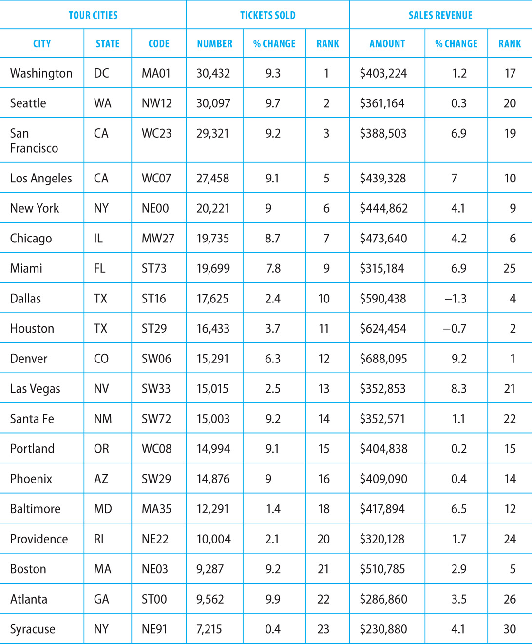
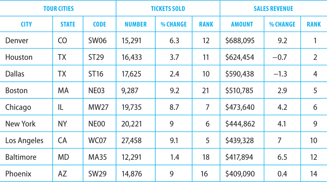
7. The table below gives information on the total number of tickets sold and the total sales revenue earned by a touring performance act in 2015. The 19 tour cities included in the table were among the top 30 cities on the tour in terms of both total numbers of tickets sold and total sales revenue. In addition to listing the total tickets sold and total sales revenue for each tour city, the table also gives the percent increase or decrease over the 2014 numbers and the rank of each tour city for total tickets sold and total sales revenue.
Sorted by Percent Change in Tickets Sold (Column 5)
Sorted by Rank of Tickets Sold (Column 6)
Sorted by Percent Change in Sales Revenue (Column 8)

Sorted by Rank of Sales Revenue (Column 9)
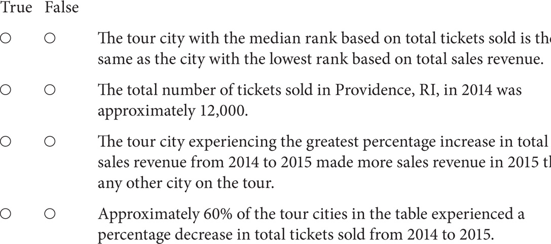
Review each of the statements below. Based on information provided in the table, indicate whether the statement is true or false.
8. The sources that follow accompany questions 8 and 9.
E-mail #1 E-mail from Marketing Director to Research Associate
November 12, 1:15 P.M.
What was our return on investment last year from ads placed in various media? I am developing our marketing budget for next year and would like to determine whether Internet advertising should be continued as extensively as we have in past years. Also, is there data to show how returns from various advertising campaigns differ from quarter to quarter?
E-mail #2 E-mail from Research Associate in Response to Marketing Director’s November 12, 1:15 P.M. Message
November 12, 1:35 P.M.
Attached is a graph that shows the return on investment from last year’s advertising campaigns. Typically we do not repeat campaigns in media that return less than 20% in any quarter. The return on investment for Internet ads was strong throughout the year, which supports continuing Internet advertising as we have in the past.
Graph #1 Attached to Research Associate’s November 12, 1:35 P.M. Message

Consider each of the following statements. Does the information in the three sources support the inference as stated?
9. Suppose that the 2016 returns from campaigns in all advertising media remain the same as those received in 2015. If all of the information in the three sources is accurate, and the company spends $100,000 on television advertising during the first quarter of 2016, the returns received from television advertising during this quarter will be closest to:

10. Johnston Booksellers currently generates $50,000 in annual sales revenue. Its competitor, Trevor Books, currently generates $490,000 in annual sales revenue. The sales revenue generated by Johnston Booksellers is increasing each year at a constant rate, while the sales revenue generated by Trevor Books is decreasing each year at a constant rate. If Johnston continues to generate an increased amount of revenue annually at its constant rate, and Trevor continues to generate a decreased amount of revenue annually at its constant rate, in 4 years the bookstores will earn the same amount of annual sales revenue. After the 4-year mark, Johnston Booksellers will receive more sales revenue per year than Trevor Books.
In the table below, identify the rates of increase or decrease, in annual revenue earned, for each bookstore that together meet the revenue forecasts described above. Select only one option in each column.

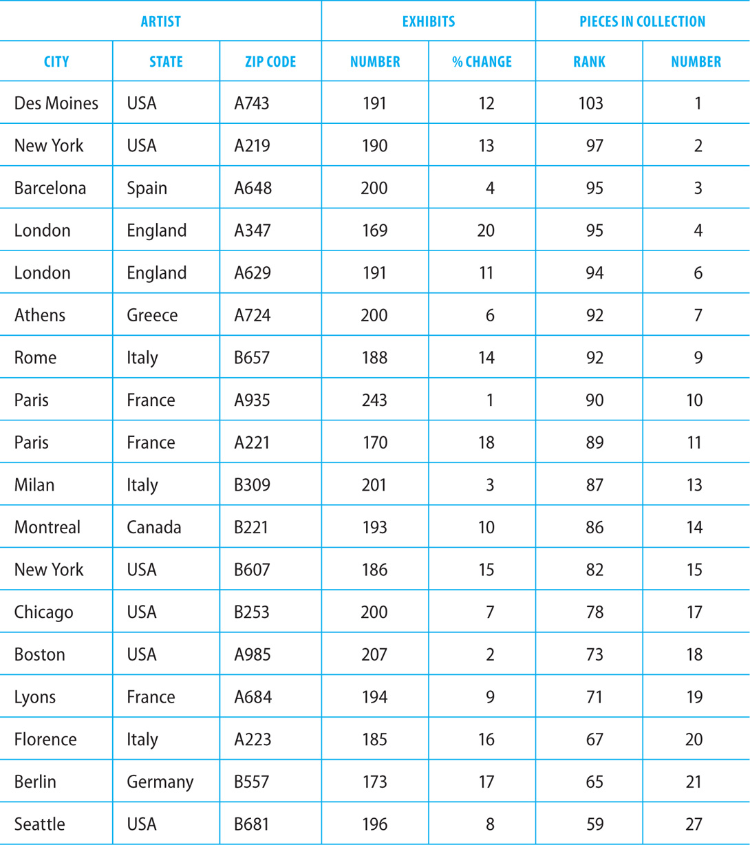
11. The table below gives information from a gallery management database regarding the total number of exhibits and the total number of art pieces maintained for 18 artists from around the world. The artists in the table are among the top 30 artists internationally in terms of both total numbers of exhibits and total pieces in the company’s collection. The table ranks the artists according to their total exhibits and total pieces in the art collection.
Sorted by Artist Code (Column 3)

Sorted by Rank of Exhibits (Column 5)

Sorted by Rank of Pieces in the Collection (Column 7)
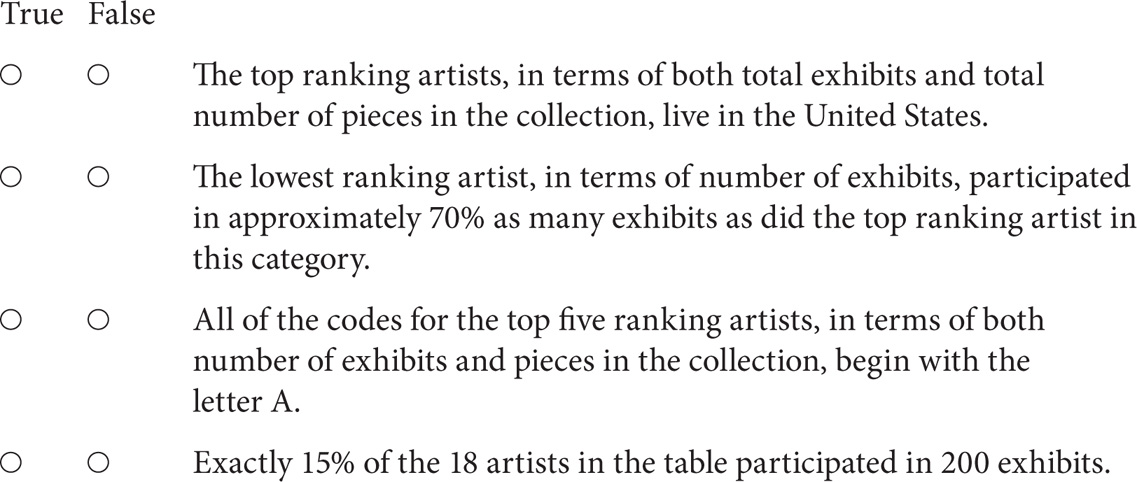
Review each of the statements below. Based on information provided in the table, indicate whether the statement is true or false.
12. The graph shown is a scatter plot with 60 points, each representing the number of quality assurance inspections conducted on products manufactured at one of 60 different factories, and the corresponding numbers of product recalls experienced by each factory. Each factory conducted a consistent number of quality assurance inspections on all products produced during a one-year period, and the number of product recalls was measured over that same period. The solid line is the regression line, and the dashed line is the line through the points (1, 1) and (7, 5). Select the best answer to fill in the blanks in each of the statements below based on the data shown in the graph.

The slope of the regression line is _________.
 positive
 negative
 zero
zero
The number of products that received more than 7 quality assurance inspections is closest to ______% of 60.
 0
0
 10
10
 20
20
 35
35
 50
50
The relationship between quality assurance inspections and the number of product recalls is best described as ________.
 none
none
 negative
 positive
1. The correct answer is 1,800 enrollments per year for Clark University and 900 enrollments per year for Talbot College.
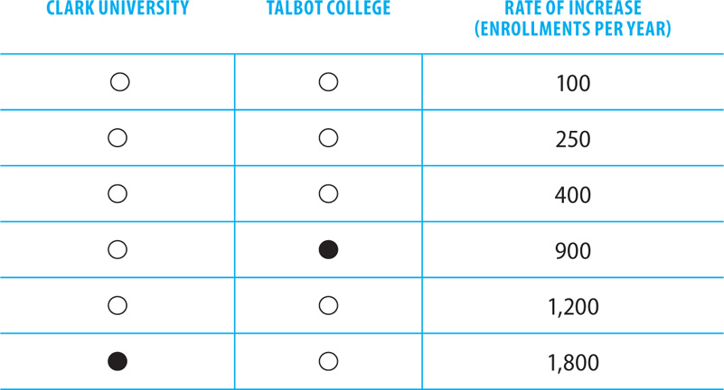
If Clark University increases its enrollment by 1,800 students per year, in 7 years it will enroll 21,400 students per year. If Talbot College increases its enrollment by 900 students per year, in 7 years it will enroll 21,400 students per year as well. After the 7-year mark, Clark University will enroll more students per year than Talbot College.
2. The answer to the first question is A. The number of months in which the company generated more than $50,000 of revenue is closest to 0% of 48. According to the graph, only one month generated $50,000 in revenue; no months generated more than $50,000.
The answer to the second question is A. The slope of the regression line is less than the slope of the dashed line. The regression line slants downward from left to right, so it has a negative slope. The dotted line slants upward from left to right, so it has a positive slope.
The answer to the third question is A. The relationship between the radio ads run per hour and sales revenue is negative. As the number of ads per hour increases, the monthly revenue decreases.
3. The correct answers are shown below.
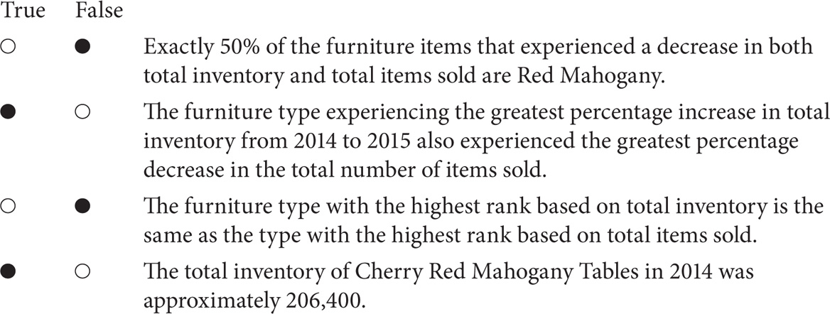
There were 6 furniture items that experienced a decrease in total inventory. Of these, 3 (exactly 50%) are Red Mahogany. However, all 19 furniture items experienced a decrease in total items sold. Only 6 of these (32%) are Red Mahogany, so the statement is false.
The furniture type experiencing the greatest percentage increase in total inventory from 2014 to 2015 is the Oak Natural Desk, at 9.7%. This same item also experienced the greatest percentage decrease in the total number of items sold (–8.1%).
The furniture type with the highest rank based on total inventory is the Oak Natural Chair. The furniture type with the highest rank based on total items sold is the Maple Natural Chair.
The total inventory of Cherry Red Mahogany Tables in 2015 was 200,407. This furniture type experienced a 3.1% decrease in total inventory. Its inventory in 2014 was therefore 200,407/(1 – 0.031) = 200,407/0.969, which is about 206,800.
4. The correct answer is 240 invitees.
In E-mail #2, the donations coordinator states that donations are usually received from about 20 percent of those who receive requests. The computer drive had already received 40 donations, and each donor would receive 2 invitations to the thank-you event, for a total of 80 invitees. If requests were extended to 400 local businesses, and 20 percent of those made a donation, the drive would receive 80 computers from businesses. That would add 160 invitations to the thank-you event, for a total of 240 invitees.
5. The correct answer is $10,000 per year for Company X and $80,000 per year for Company Y.

If Company X repays its loan at a rate of $10,000 per year, in 3 years it will owe $170,000. If Company Y repays its loan at a rate of $80,000 per year, in 3 years it will also owe $170,000. After the first 3 years, Company X will owe more on its loan than Company Y, until the loans are paid off.
6. The answer to the first question is C. The relationship between the number of complaints and the number of weeks before the call is positive. As the number of weeks increases, the number of complaints also increases.
The answer to the second question is D. The number of complaints made by customers who received a follow-up call 1 week after placing their orders is closest to 50% of the number of complaints made by customers who received a follow-up call 7 weeks after placing their orders. Approximately 30 complaints were made by customers who received a follow-up call 1 week after placing their orders, and nearly 60 complaints were made by customers who received a call after 7 weeks.
The answer to the third question is C. If the company wishes to limit its complaints to 40 or fewer per year, it should make follow-up calls no later than 2 weeks after customers place their orders. If the company waits 3 weeks or longer, it is likely to receive more than 40 complaints per year.
7. The correct answers are shown below.

The tour city with the median rank based on total tickets sold is Denver, CO. Denver has the highest rank based on total sales revenue, so the statement is false.
The total number of tickets sold in Providence, RI, in 2015 was 10,004. Providence experienced a 2.1% increase in ticket sales from 2014 to 2015. So, the number of tickets sold in 2014 would be less than 10,000, not greater than 10,000.
Denver, CO, experienced the greatest percentage increase in total sales revenue from 2014 to 2015, at 9.2%. It also made more sales revenue in 2015 than any other city on the tour, at $688,095.
None of the tour cities in the table experienced a percentage decrease in total tickets sold from 2014 to 2015. All of the cities experienced a percentage increase in total tickets sold over this period.
8. The correct answers are shown below.

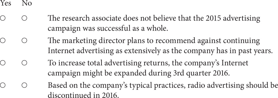
The first inference is not supported by the information in the three sources. The research associate does not evaluate the advertising campaign as a whole in E-mail #2.
The marketing director does not imply an intent to recommend reducing Internet advertising. In E-mail #1, the director requests data to determine whether Internet advertising should be continued as extensively as it has been in past years.
The graph shows that returns from Internet advertising were strongest during 3rd Quarter 2015. To increase total advertising returns, the company might expand its Internet advertising during this quarter, to capitalize on the potential for additional gains.
In E-mail #2, the research associate explains that the company typically does not repeat campaigns in media that return less than 20% in any quarter. Radio advertising returned less than 20% in every quarter of 2015, so based on the company’s practices, the radio campaign should be discontinued.
9. The correct answer is $25,000.
The graph shows that television advertising returned 25% on funds invested in first quarter 2015. If the return remains the same for 2016, the $100,000 invested in television advertising would produce gains of 25%, or $25,000.
10. The correct answer is $90,000 per year for Johnston Booksellers and $20,000 per year for Trevor Books.

If Johnston Booksellers increases its sales revenue by $90,000 per year, in 4 years it will earn $410,000 in annual revenue. If Trevor Books decreases its sales revenue by $20,000 per year, in 4 years it will also earn $410,000 in annual revenue. After the 4th year, Johnston Booksellers will generate more sales revenue each year than Trevor Books.
11. The correct answers are shown below.
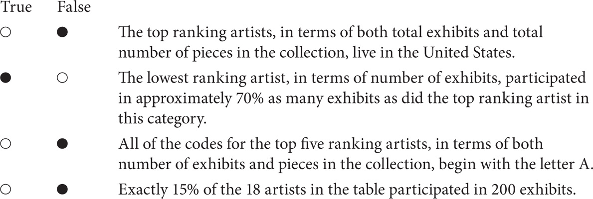
The top ranking artist for total exhibits is from Paris, France.
The lowest ranking artist, in terms of number of exhibits, participated in 169 exhibits. The highest ranking artist in this category participated in 243 exhibits. The lowest ranking artist participated in 69.5% as many exhibits as the top ranking artist, or approximately 70%.
The third-ranking artist for exhibits is code B309, so the third statement is false.
A total of 3 artists participated in 200 exhibits. There are 18 artists listed in the table, so 3 artists represents 16.67% of the total, not 15%.
12. The answer to the first question is C. The slope of the regression line is zero. The solid line is flat, slanting neither upward nor downward. This means the line has no change; its slope is therefore zero.
The answer to the second question is B. The number of products that received more than 7 quality assurance inspections is closest to 10% of 60. The graph shows that 4 products received more than 7 quality assurance inspections. These 4 products are 0.067 percent of the total, or 6.7%.
The answer to the third question is A. The relationship between quality assurance inspections and the number of product recalls is best described as none. The number of product recalls does not appear to be affected by the number of quality assurance inspections. As inspections increase, product recalls stay about the same.
Directions: Select the best answer or answers for the questions below. You may use a calculator for this section of the test only.
1. The graph below is a scatter plot with 20 points, each representing the average temperature in degrees Celsius of a major European city, measured against elevation in meters. Select the best answer to fill in the blanks in each of the statements below based on the data shown in the graph.
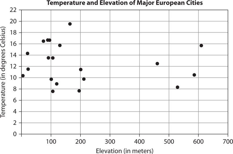
Of the two coldest cities, one is ________ percent higher above sea level than the other.
 10
10
 20
20
 50
50
 100
100
 200
200
The relationship between average temperature and elevation is _______.
 negative
 zero
zero
 positive
 indeterminate
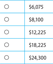
2. Jamie is self-employed and pays her taxes quarterly. For the first quarter, she paid $1,700 dollars in taxes, based on her income. She expects her taxes to increase by 14 percent from the first quarter to the second quarter, by 17.5 percent from the second quarter to the third quarter, and by 21 percent from the third quarter to the fourth quarter.
In the table below, identify the amount of taxes Jamie can expect to pay in the third quarter. Also, based on the information given, identify how much more in taxes Jamie will pay in the fourth quarter than in the second quarter. Select only one answer in each column.

3. Read the sources below before answering the question that follows.
Services
Marysville Property Management Company provides services to owners of residential apartment complexes. Leasing, rental contracts, routine maintenance, and repairs are provided by MPMC, with some major repairs contracted to third parties. In-house staff members include a resident manager for each complex, an on-call maintenance crew based out of MPMC’s office facilities, and a general operations manager. A minimum population for each complex is set at 180 residents or 135 units. Requests for maintenance from residents for plumbing, electrical, or heating and cooling problems performed by the MPMC maintenance crew are charged to the client at standard base rates, plus time and material exceeding the base.
Charges
 Maintenance staff labor rates are charged at $18/hour, or $23/hour for after-hours and holidays.
 Minor repairs during normal business hours are charged at $35/hour.
 Plumbing or electrical calls are $65 per call, with a surcharge of $50/call for after-hours or holiday calls.
 Annual heating and cooling checkups are $45 per unit.
 Carpet, roofing, and rehab contractors are charged on a case-by-case basis, plus a 10% premium to MPMC.
Annual staff labor costs for MPMC are calculated as follows:
1. The operations manager has a yearly salary of $52,780.
2. Resident managers receive free apartments as a portion of their salary: 4 apartment rentals valued at $9,360 to $10,700, with a total of $39,800.
3. Resident manager salaries are paid at a range of $28,600 to $37,300, with an average of $32,000; the total paid annually is $128,000.
4. The maintenance staff of three employees is paid a total of $112,000 annually.
Suppose that MPMC manages three apartment complexes that each meets the minimum population requirements exactly. The total charges for providing annual heating and cooling checkups for all units in each of the three apartment complexes is closest to:
4. This table displays data on band merchandise sold by a major record label in 2014.
Sorted by Item (Column 1)
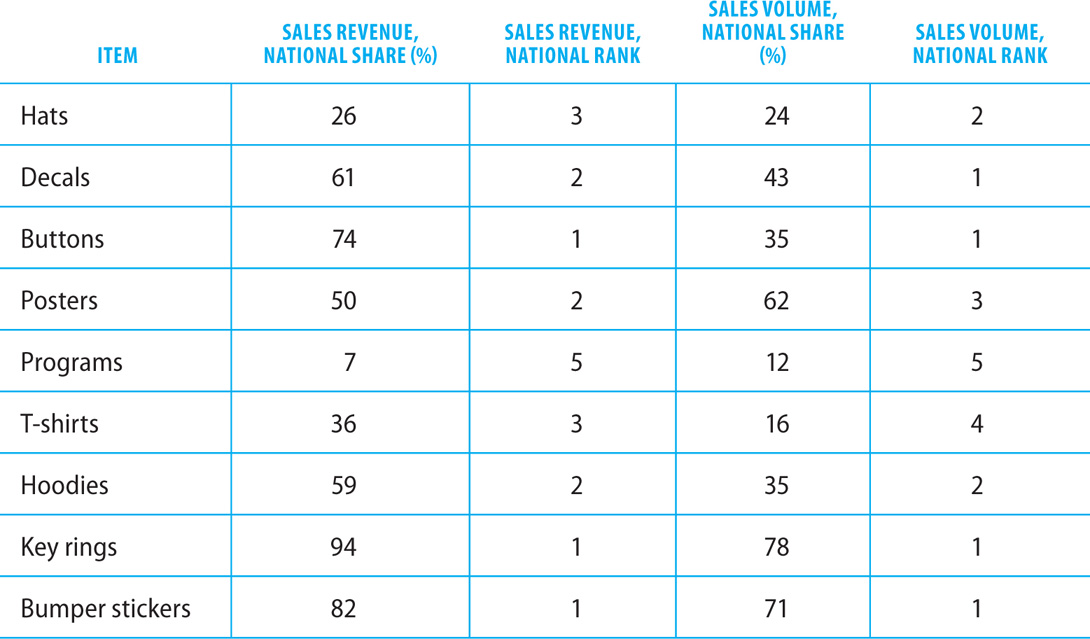
For each of the following statements, select Yes if the statement can be shown to be true based on information in the table. Otherwise select No.

5. The way Americans have incorporated meat into their diets has changed significantly for a number of reasons, including cost, dietary discoveries, and more. The table below compares the number of pounds consumed annually, per meat type, by the average American in 1970 and 2005. Select the best answer to fill in the blanks in each of the statements below based on the data shown in the graph.

The total amount of all four types of meat consumed annually by the average American was _________ in 2005 compared to 1970.
 greater
 the same
 less
less
The number of pounds of beef consumed by the average American in 2005 is closest to ________% of the number of pounds consumed in 1970.
 60
60
 75
75
 85
85
 120
120
 130
130
6. A major manufacturer of MP3 players wants to produce both black and white plastic cases for its new 32 GB MP3 line. The manufacturer wants to spend a maximum of $200,000 dollars on case production. White plastic cases cost $2 more per case to produce than black plastic cases.
Using W to represent the cost of producing each white case and B to represent the cost of producing each black case, select the expression that reflects the cost of producing one white case, and select the expression that reflects the maximum number of each type of case that can be produced within the company’s $200,000 budget if the same number of black and white MP3 cases are made. Make only two selections, one in each column.

7. Use the table that follows on Percentage of Dogs Attending Selected Training Classes, Single Year, to answer the question that follows.
Percentage of Dogs Attending Selected Training Classes, Single Year
Sorted by Breed (Column 1)

Sorted by Percentage Attending Obedience Classes (Column 3)
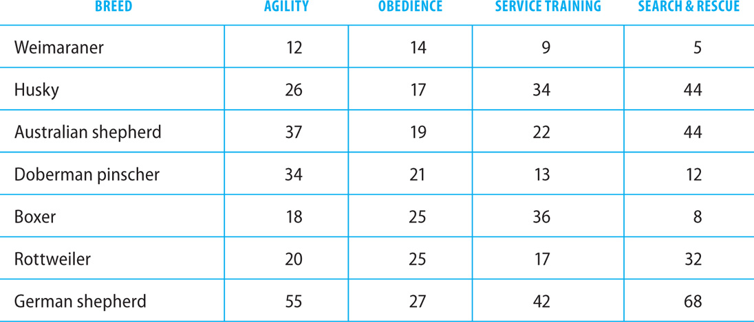
Sorted by Percentage Attending Search & Rescue Classes (Column 5)
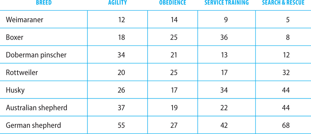
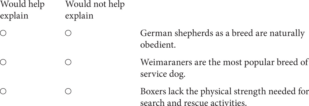
For each of the following statements, select Would help explain if it would, if true, help explain some of the information in the table. Otherwise select Would not help explain.
8. Read the sources below before answering the question that follows.
E-mail #1 USFS Publications Director to County Commissioners of Western Colorado
July 1, 9:12 A.M.
Due to the pine beetle infestation in the Rocky Mountain National Forest in Colorado, the U.S. Forest Service is required to provide estimates of the number of acres affected and the numbers of dead trees per acre. These numbers are based on USFS aerial photos and county field observation reports.
Each county in Colorado must submit its field reports to the USFS by October 1, for the publication of statewide maps of the affected areas. The Forest Service will compile the data from photos and county field observation reports for its annual report to Congress. Please see the attached list of counties that must comply with the reporting requirements. Counties with no Forest Service lands are not required to participate. Field observation reports must follow the designated format found in the document attached.
We rely on your cooperation to fulfill this reporting requirement and would remind you to take all necessary precautions to ensure the safety of your field observers in the infested areas.
E-mail #2 County Commissioner of Summit County in Response to USFS Publications Director’s E-mail of July 1
July 5, 11:45 A.M.
Regarding field observation reports of pine beetle infestation: our county budget has been reduced by the recent economic downturn. Will there be funds available for hiring field observers, data entry workers, and report writers? We estimate that compliance with the reporting requirements will cost an estimated $286,000. Please advise.
E-mail #3 USFS Publications Director in Response to Summit County Commissioner’s E-mail of July 5
July 8, 7:30 A.M.
Our understanding is that reporting costs will be reimbursed to you based on a percentage of the actual number of affected acres in your county. Keep in mind that the number of affected acres in your county is based on last year’s estimates of total affected acreage. If you observe an increase, it must correlate with this year’s aerial photos to qualify for increased reimbursement costs. Current reimbursement costs are calculated at 70% of total acreage, with a per-acre reimbursement of $6.00.
Suppose that Summit County completes the reporting required by the Forest Service, and its reporting costs total $286,000. If all of the information in the three e-mails is accurate, in order for Summit County to be reimbursed for its entire reporting costs, the number of acres affected by the pine beetle infestation in the county would have to be closest to:

9. Consider each of the following statements. Does the information in the three sources support the inference as stated?

10. The table below gives information on the total vehicles sold and the total sales revenue for a national Internet auto dealer over a four-year period, from 2011 through 2015. The 23 models were included in the table because they fall among the top 30 models sold by the company in terms of both the total number sold and total sales revenue. In addition to listing the total number sold and total sales revenue for each vehicle model, the table also gives the percent of increase or decrease over the 2006–2010 numbers sold and sales revenue and the rank of each vehicle model for total number sold and total sales revenue.


Sorted by Rank in Number Sold (Column 6)
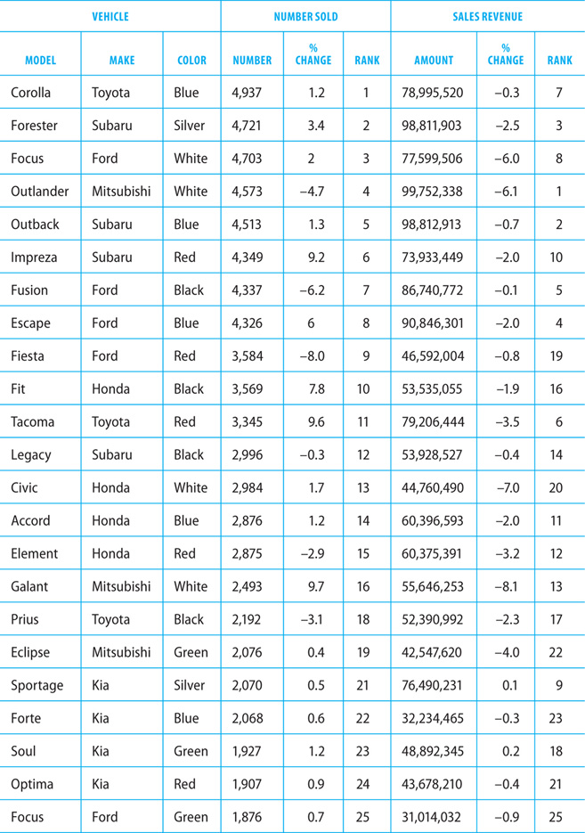
Sorted by Rank in Sales Revenue (Column 9)

Review each of the statements below. Based on the information provided in the table, indicate whether the statement is true or false.

11. The graph below models the 10-day trend of stock prices for two rival shoe companies trading on the NASDAQ. The 10-day trend was recorded between the 10th and the 20th of January in 2015. NKE stock is shown on the upper line, and AG stock is shown on the lower line. Select the best answer to fill in the blanks in each of the statements below based on the data shown in the graph.
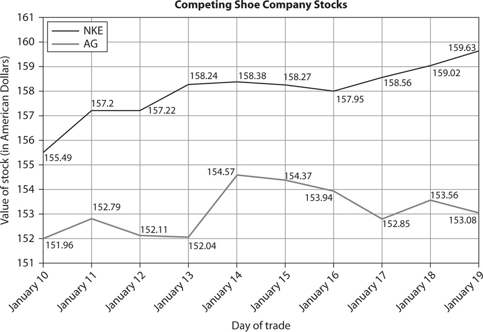
The percent change in the value of NKE stock over the entire ten days is about _______ the percent change in the value of AG stock over that same period.
 equal to
 2 times
 4 times
For the span between January 13th and January 16th, the average (arithmetic mean) value of AG stock falls approximately between _______ dollars.
 151 and 153
 153 and 155
 157 and 159
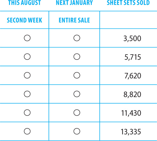
12. Classic Whites runs two seasonal white sales, one in January and one in August. Each sale runs for 14 days. The January sale this year sold an average of 3,500 sheet sets per week during its two-week price cut. The August sale exceeded the January sale by an average of 130 sets per day during its two-week price cut, despite the fact that it sold only 1,200 sets during its first week. The event to be held next January is expected to sell a weekly average of 75% of the sheet sets sold during the second week of this year’s August event.
In the table below, identify the number of sheet sets sold in the second week of this year’s August white sale event, and identify the total number of sheet sets that are expected to be sold during the entire sale next January. Make only one selection in each column.
1. The answer to the first question is D. Of the two cities whose average temperature is below 8 degrees Celsius, one has an elevation of 100 meters and the other has an elevation of 200 meters, which is 100 percent higher.
The answer to the second question is D. A relationship between temperature and elevation cannot be determined.
2. The correct answers are $2,277.15 for the third quarter taxes and $817.35 for the amount of additional taxes paid in the fourth quarter compared to the second quarter.
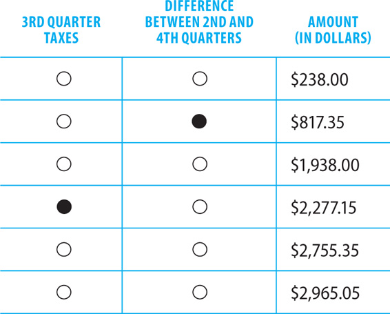
In the second quarter, Jamie pays 14% more taxes than she paid in the first quarter. She paid $1,700 in the first quarter, so her second quarter tax increase is $1,700 × 0.14, or $238. Her total second quarter taxes are $1,700 + $238, or $1,938.
In the third quarter, Jamie pays 17.5% more than she pays in the second quarter—an increase of $1,938 × 0.175, or $339.15. Her total third quarter taxes are $1,938 + $339.15, or $2,277.15.
In the fourth quarter, Jamie pays 21% more than she pays in the third quarter. This is an increase of $2,277.15 × 0.21, or $478.20. Her total fourth quarter taxes are $2,277.15 + $478.20, or $2,755.35. This amount exceeds her second quarter tax payment by $817.35.
3. The correct answer is $18,225.
Each of the three apartment complexes has 135 units. The cost for annual checkups is $45 per unit. The total cost for all three complexes is 135 × 3 × $45, or $18,225.
4. The correct answers are shown below.

For this label to have made three-quarters of the nation’s revenue from button sales while making only one-third of the total volume of sales, the label must have earned more money per button than did its competitors.
The label sold more posters compared to other labels than it did T-shirts compared to other labels, but we can’t know if it sold more posters than it did T-shirts without more information, such as how many total posters and T-shirts were sold by all the labels.
No information is available about the actual number of decals or hats sold by the label nationwide, so it is impossible to tell which was more popular.
5. The answer to the first question is A. In 1970, the average American consumed a total of 168 pounds of the four types of meat shown; in 2005, the average total was 185 pounds.
The answer to the second question is B. The 63 pounds of beef consumed in 2005 is about 79 percent of the 80 pounds consumed in 1970.
6. The correct answers are B + 2 for the cost of producing one white case, and  for the maximum number of each color case that can be produced.

White cases cost $2 more to produce per case than black cases. The cost of producing one white case is represented by the expression B + 2.
The company produces the same number of black and white cases. Let x represent the number of each color case that is produced. Set up an equation that shows the parameters given:
(cost of white cases) + (cost of black cases) ≤ $200,000
To find the cost of each type of case, multiply the number of cases by the cost per case:
(number of white cases × cost) + (number of black cases × cost) ≤ $200,000
Substitute x for the number of white and black cases. Substitute B for the cost of black cases and B + 2 for the cost of white cases:
x(B) + x(B + 2) ≤ $200,000
Now solve for x, the number of each type of case:

7. The correct answers are shown below.

A more obedient breed of dog would not be more likely to be sent to obedience training classes; if anything, it might be less likely to need the training.
The most popular breed of service dog would probably not be the breed with the lowest percentage attending service training.
A breed that is poorly suited to search and rescue operations would be less likely to be trained for them.
8. The correct answer is 68,096.
The third e-mail tells us that the reimbursement cost is $6 per acre. To cover its report costs completely, Summit County would have to be reimbursed for $286,000 ÷ $6, or about 47,667 affected acres.
The Forest Service only reimburses counties for 70% of their total affected acreage. To receive reimbursement for 47,667 acres, Summit County would have to have a total acreage larger than 47,667. To determine the amount, divide 47,667 by 70%, or 0.70. The answer is approximately 68,096. If Summit County had a total of 68,096 affected acres, it could be reimbursed for 68,096 × 0.70, or 47,667 acres.
9. The correct answers are shown below.

The first inference is supported by the information in the three sources. The second e-mail indicates that the Summit County Commissioner has estimated costs for meeting the reporting requirements. A total of $286,000 will be spent to hire field observers, data entry workers, and report writers.
The second inference is not supported by the information in the three sources. The Forest Service instructs the County Commissioner on how reimbursements are calculated. No mention is made of the exact reporting costs for Summit County or the total number of affected acres. Therefore, the reimbursement percentage cannot be determined.
The third inference is not supported by the information in the three sources. This statement is not suggested in any of the three sources.
10. The correct answers are shown below.

Two colors of Focus are shown in the table; altogether, 6,579 of those were sold compared to only 4,937 Corollas.
The blue Forte, Escape, Accord, and Outback were outsold by other models of the same make, but the blue Toyota Corolla was not outsold by any other Toyota model.
The Kia models all ranked lower than 20th in number sold, two Kia models ranked higher than 20th in sales revenue.
Sorting the table by rank of both number sold and sales revenue, we can see that the top ten cars each time include no green cars.
11. The answer to the first question is C. The value of AG stock increased by about 0.7 percent over the ten days; meanwhile, the value of NKE stock increased by about 2.7 percent, or about four times as much.
The answer to the second question is B. The average value of AG stock for the span between January 13th and January 16th is a little under 154 dollars.
12. The correct answers are 7,620 sheet sets sold in the second week this August, and 11,430 total sheet sets sold during the entire sale next January.
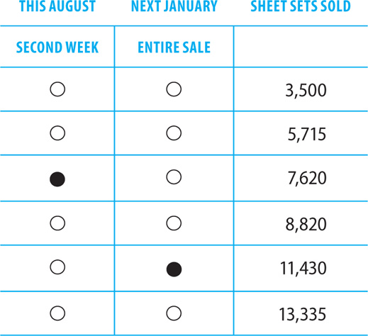
An average of 3,500 sheet sets was sold per week last January. The sale is two weeks long, so 7,000 sheet sets were sold in last January’s sale.
The August event exceeded last January’s total by an average of 130 sheet sets per day. The event runs for 14 days, so August’s sales exceeded January’s sales by 130 × 14, or 1,820 sheet sets. The total for August was 7,000 + 1,820, or 8,820 sheet sets.
The first column asks for the number of sheets sold in the second week of the August event. In the first week, 1,200 sheets were sold, so in the second week this August, 7,620 sheets were sold.
The second column asks for the total number of sheet sets expected to be sold during the entire two-week sale next January. Next January’s event is expected to have a weekly average of about 75% of sheet sets sold during the second week this August, or 0.75 × 7,620 = 5,715. The total sales are expected to be twice that number: 5,715 × 2, or 11,430 sheet sets.
Directions: Select the best answer or answers for the questions below. You may use a calculator for this section of the test only.
1. The sources that follow accompany questions 1 and 2.
Source #1 Voice Mail from Real Estate Agent
I have excellent news. The owners have accepted your bid of $179,000! You close on your new home in 30 days. Call me back soon and we will work out the details.
Source #2 January 2016 Mortgage Statement

Source #3 Amortization Table

Consider each of the following statements. Does the information in the three sources support the inference as stated?

2. If the information contained in all three sources is correct and the first payment on the loan was made in January 2016, the down payment made on the purchase of the home was closest to:

3. The graph below is a scatter plot with 35 points, each representing the teen birth rate in a major American city. The population of teenage females, age 15 to 19, was measured against the number of births within that population over a 12-month period. Select the best answer to fill in the blanks in each of the statements below based on the data shown in the graph.

The city with the largest population of 15- to 19-year-old women had about _______ percent as many births in that age group as the city with the smallest population.
 5
5
 10
10
 21
21
 210
210
 2,100
2,100
The relationship between the number of women between 15 and 19 and the number of births within that population is ______.
 negative
 zero
zero
 positive
4. The table below gives information on the total employees and total sales revenue in 2015 for divisions of an international conglomerate. The 24 company divisions included in the table fall among the top 30 divisions for this annual period in terms of both total employees and total sales revenue. In addition to providing the numbers of total employees and total sales revenue for each division, the table also gives the percent of increase or decrease over the numbers for 2014 and the rank of each for total employees and total sales revenue.
Sorted by Country (Column 2)


Sorted by Rank in Number of Employees (Column 6)

Sorted by Rank in Sales (Column 9)

Review each of the statements below. Based on the information provided in the table, indicate whether the statement is true or false.

5. The sources that follow accompany question 5.
Memo #1 from CEO to Market Analyst
We are consistently seeing more growth in the Northwest sector than in the three other sectors of the United States. Although we are spending equal amounts on advertising and the same product is being marketed across the country, sales fail to meet our expectations in the Northeast, Southwest, and Southeast. We would like to determine how to convince potential customers in other regions that our product is a better buy than the competitors’ products.
Memo #2 from Market Analyst to CEO
Our research suggests that potential customers do not fully understand the benefits of your product; in warmer regions the idea that it might keep the skin cool—rather than just insulating against the cold—is not well understood. In the Northeast, though advertising is as frequent, there are significantly fewer retailers of the product, which may make it less visible in some communities. I recommend developing separate lines of advertisement for each sector of the country that emphasize the specific benefits of the product for that particular area. Also, in regions of dense population, attempts should be made to increase the number of product retailers per capita.
In the marketing analyst’s review of the company’s advertising strategy, it is brought to light that a cause and effect relationship exists between the way advertising is handled and the company’s product sales experiences. Choose the cause and subsequent effect in the table below, based on the market analyst’s suggestions. Make only one selection in each column.

6. Life expectancy for both males and females regularly increases as medical science improves. The graph below models the life expectancy trends for both men and women from 1965 to the present. Select the best answer to fill in the blanks in each of the statements below based on the data shown in the graph.

The percent difference in life expectancy for males born in 1995 as compared to those born in 1990 is approximately __________ the difference in life expectancy for females born in 1995 as compared to those born in 1990.
 equal to
 5 times
 10 times
The number of years by which the average female born in 2010 can expect to outlive the average male born the same year is closest to _________ percent of the number of years by which the average female born in 1975 can expect to outlive the average male born the same year.
 50
50
 60
60
 70
70
7.
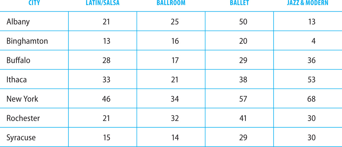
Percentage of Dance Studios Offering Instruction in Selected Styles, Single Year
Sorted by City (Column 1)
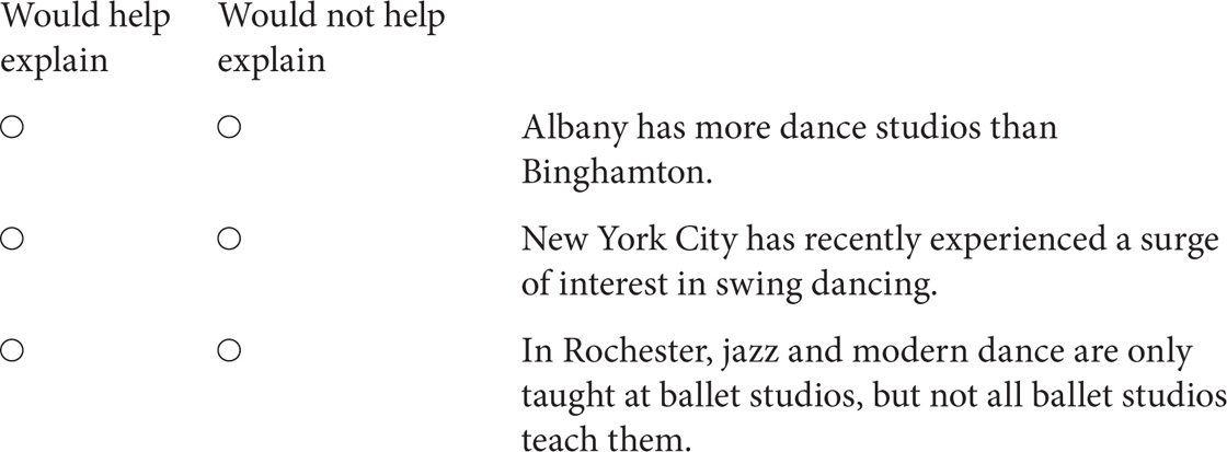
For each of the following statements, select Would help explain if it would, if true, help explain some of the information in the table. Otherwise select Would not help explain.
8. Read the sources below before answering the question that follows.
Source #1 Candy Man Company Price List

Source #2 E-mailed Order
Hi Candy Man,
I would like to place an order for chocolate mints for a retirement celebration on April 14th. We will require 6 pounds of small mints in the midsize range. Please use at least three colors in your presentation, preferably including blue and green, since those are the primary colors in our company logo. The shape of the mints is unimportant as long as the appearance is professional; either basic round mints or flower-shaped mints are fine.
Thanks,
Betsy Carver
Source #3 Candy Man Invoice

Consider each of the following statements. Does the information in the three sources support the inference as stated?

9. This table displays data on undeliverable mail received by a Philadelphia post office in 2010.
Sorted by Month (Column 1)
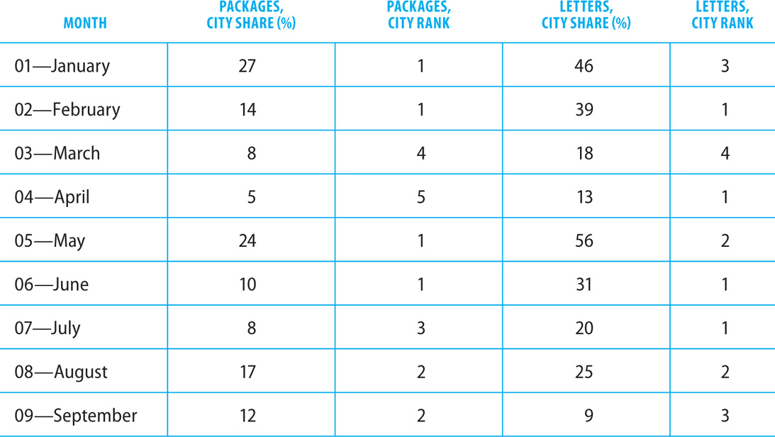
For each of the following statements, select Yes if the statement can be shown to be true based on information in the table.
Otherwise select No.

10. The following excerpt is from a fictitious article in a journal of psychiatric medicine about a fictitious mental health condition called diaemotiopluralism.
For psychiatrists studying the behavior of those suffering from diaemotiopluralism, there is critical significance in observing the subject both when alone and when interacting with his or her peers. Such observations allow researchers to study not only the normal or “base” state of the affected person, including the effect that being alone has on an individual, but also the effects of diaemotiopluralism on social interactions, position in social order, and ability to participate in constructive workplace relationships. Individuals who suffer from diaemotiopluralism are often susceptible to overstimulation, particularly in situations involving high levels of interpersonal contact. Moreover, there are varying degrees of diaemotiopluralism, with different social situations affecting individuals in unique ways. It is interesting to observe not only the actual symptoms of the disorder but also the coping mechanisms that the individual develops in an attempt to compensate for, overcome, or manage his or her condition.
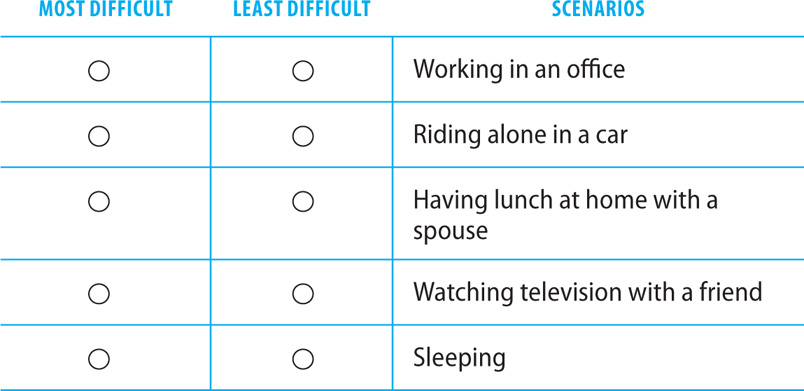
In the table below, identify the scenario that is likely to be the most difficult to manage for a person with diaemotiopluralism based on the definition given above, and then identify the scenario that a person suffering from diaemotiopluralism is likely to find least difficult to manage.
11. The graph below represents the results of a survey given to four focus groups labeled A, B, C, and D. Each group was shown a different image of the same man dressed for a professional interview. Each image pictured a different interview outfit containing more profession markers than the previous image, including a tie, formal shoes, a briefcase, and other factors. After the group viewed the image, members were asked two questions: “Did you feel the candidate dressed professionally?” and “How likely is the candidate to get hired for the position?”
The position of each circle on the graph reflects the perceived level of professionalism of the attire in a given photo, based on the percentage of focus group members who indicated that the outfit was professional. The relative size of the circle indicates the degree to which focus group members indicated that the candidate would be hired for the job. Select the best answer to fill in the blanks in each of the statements below based on the data shown in the graph.

The relationship between the percentage of the group who felt the subject was dressed professionally and the percentage of the group who believed the subject would be hired is ______.
 negative
 zero
zero
 positive
The percentage of people in group B who felt the candidate was dressed professionally is closest to ______ times the percentage of people in group A who felt the candidate was dressed professionally.
 1.5
1.5
 2
2
 2.5
2.5
12. Libby Ketchup purchases products from 25 tomato suppliers and 30 packaging suppliers.
In the table below, select two numbers among the numbers listed that are consistent with the information given. In the first column, select the largest number of suppliers that sell either tomatoes or packaging products to Libby, and in the second column, select the largest number of suppliers that could possibly sell both tomatoes and packaging products to Libby. Select only one option in each column.

1. The correct answers are shown below.

The late payment fee is 2% of the total payment amount. The amount of the late payment can be determined by subtracting the regular payment from the late payment amount. This gives a difference of $20.37. Divide this difference by the regular payment to find the percentage charged.
In Source #1, the real estate agent states that the buyers’ bid has been accepted. However, there is no information regarding the original asking price of the house.
Making double principal payments in the first year would mean paying an extra $167.41 per month. This is calculated by dividing the annual principal for the first year by 12.
2. The correct answer is $29,000. At the end of the first year of the loan, the mortgage balance is $147,991.05. During this year, the total principal paid on the loan was $2,008.95. So, at the start of 2016, the amount owing on the loan was $150,000. The purchase price for the house was $179,000, so the buyers made a down payment of $29,000.
3. The answer to the first question is E. The city with the largest population (the farthest right on the graph) had about 2,100 births; the smallest city (the farthest left) had about 100 births. So the largest city had about 21 times as many births as the smallest, or about 2,100 percent.
The answer to the second question is C. Generally, the number of births is greater for cities with larger populations, so the relationship between those variables is positive.
4. The correct answers are shown below.

The top five divisions in sales revenue were all insurance, real estate, and entertainment divisions.
The U.S. had two different insurance divisions.
Division FTMR had the most employees and the highest sales revenue.
The real estate division in Hong Kong had more employees than the one in France.
5. The correct answers are Statement #1 for the cause, and Statement #2 for the effect.

The analyst determined that people in the warmer regions were not purchasing the product because they did not understand that its insulating properties could have a cooling effect. They believed the product was strictly for protection against the cold. As a result, they were not buying as much of the product as the company had hoped.
6. The answer to the first question is C. Life expectancy for females born in 1995 is about 0.1 percent greater than for females born in 1990; life expectancy for males born in 1995 is about 1 percent greater than for males born in 1990, so the increase is about ten times as great.
The answer to the second question is C. The average female born in 1975 can expect to outlive the average male born the same year by 7.8 years; the average female born in 2010 can expect to outlive the average male born the same year by 5.6 years, or about 72 percent of 7.8 years.
7. The correct answers are shown below.

The total number of dance studios in a city doesn’t affect what percentage of them offer which styles.
It’s not apparent what effect the popularity of swing dancing in New York City would have on the relative popularities of other styles.
If all studios in Rochester that teach jazz and modern teach ballet, but not all the studios that teach ballet teach jazz and modern, that explains why fewer studios in Rochester teach jazz and modern than teach ballet.
8. The correct answers are shown below.

The cost per pound is $10.97 after tax and delivery. This is calculated by dividing the total cost of the shipment, in this case $65.80, by the number of pounds of candy delivered: $65.80 ÷ 6 = $10.97.
Sugar-free chocolates cost $5.85 a pound, while regular chocolates cost an average of about $3.25 per pound. Sugar-free chocolates cost $2.60 more per pound than regular chocolates, on average. This is 80% more than the cost of regular chocolates.
The Candy Man charged $10.00 to deliver Betsy Carver’s order. The order consisted of 6 pounds of chocolate. That works out to $10.00 ÷ 6, or $1.67 per pound.
9. The correct answers are shown below.

The table doesn’t provide any information about how many total letters or packages were sent through this post office, let alone in the entire city.
No trend is visible over the course of the year.
A greater percentage of the city’s undeliverable packages went through this post office than did undeliverable letters, but not necessarily a greater number of undeliverable packages compared to letters.
10. The correct answers are working in an office as most difficult to manage, and sleeping as least difficult to manage.

We know from the information given in the journal article that those with diaemotiopluralism have a problem with overstimulation from social interactions. Working in an office is the scenario in which there is likely to be the most social interaction to stimulate an individual. When sleeping, stimulation from outside sources would most likely not be an issue.
11. The answer to the first question is C. As the percentage of the group who felt the subject was dressed professionally increased, so did the percentage of the group who believed the subject would be hired; the relationship between those percentages is positive.
The answer to the second question is B. About 20 percent of group A felt the candidate was dressed professionally, and about 40 of group B did, which is twice as much.
12. The correct answers are at most 50 suppliers that sell either tomatoes or packaging products to Libby, and at most 20 suppliers that could possibly sell both tomatoes and packaging products to Libby.

Libby has 25 tomato suppliers and 30 packaging suppliers. The total number of tomato and packaging suppliers combined is 25 + 30, or 55. The largest number listed in the table is 60, which is too large, so there are at most 50 suppliers providing either tomatoes or packaging products.
If all of the tomato suppliers were also packaging suppliers, there would be 25 suppliers providing both items. This is the largest number of suppliers who could provide both tomatoes and packaging products. The number 25 is not listed in the table, however, and 30 is too large. So, of the numbers listed in the table, the largest number of suppliers who could be providing Libby with both tomatoes and packaging products is 20.