Apple put a lot of energy into exploiting the size and shape of your screen. In a program made for managing lists and reading messages, you need all the room you can get.
You’ve always been able to tweak Mail’s look, layout, and proportions—but now you have both the modern layout (three columns) and the Classic layout (list above, message below), which is still around. The following pages offer advice for modifying the design of both layouts.
The three-column view is shown in Figure 16-2 at top. Here’s some of the plastic surgery you can perform:
Try Full Screen mode. Click the green
 dot in the upper-left corner to make the Mail window expand to fill your monitor. (See Full Screen Button for details on Full Screen mode.) Full Screen mode is a natural for space-hungry email, especially on a small laptop screen.
Tip
In El Capitan, Apple finally fixed one of the biggest frustrations of Mail in full screen: When a message was open, you couldn’t get to any other message (to refer to it or copy from it, for example). Now, when you click outside an open message, it collapses to the bottom of the screen, where only the title bar is visible. Now you’re free to peruse other messages; the first one pops back up when you click its title bar.
Similarly, if you begin writing several messages, they can all be accessible at once; they sprout tabs across the top, just like Safari web pages do.
Install folders onto the Favorites bar. You can drag any icon in the mailboxes list onto the Favorites toolbar, where it becomes a button or a pop-up menu. The button works exactly like a folder: For example, you can drag a message onto one to file it there, or you can click one of these folder buttons (or use its pop-up menu) to see what’s inside.
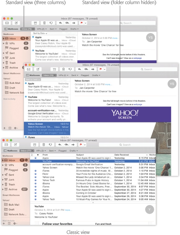
Figure 16-2. Mail can have several different layouts. In the standard three-column view (top), all your mailboxes are grouped tidily in the far-left column. You can hide that column, though, so that you have more space for reading (middle). You can also return to the pre-Lion layout (bottom), in which the messages list is above the message body.
The Favorites bar comes with starter buttons already installed, like Inbox, Sent, Notes, and so on. But you can, and should, install your own favorites there, and remove the ones you don’t want (Figure 16-3 shows this effect). (To move a button around, ⌘-drag it. To get rid of it, just drag it away from the toolbar.)
Hide the mailboxes panel completely. To do that, click the
 above it. Now you have much more screen space to work with.
Tip
Hey, here’s a thought! Combine the previous two ideas. Install the most important folders onto the Favorites bar, so you can get at them, and then hide the mailboxes list. Now you have easy access to the most important folders, but your mailboxes list isn’t eating up a lot of screen space. This glorious, space-efficient result is shown in Figure 16-2, center.
Label the toolbar buttons. Out of the box, the buttons on the toolbar (
 ,
,  , and so on) have no labels. But if you right-click (or two-finger click) the toolbar, you get a pop-up menu that offers you other styles for those buttons: Icon & Text, Icon Only, Text Only (which is very space-efficient), and None (which is even more space-efficient—provided you know the keyboard shortcuts for all the buttons you’ve just hidden away).
Change the type size/icon size for the folders in the mailboxes panel. To do that, open System Preferences→General. Use the “Sidebar icon size” pop-up menu to choose Small, Medium, or Large.
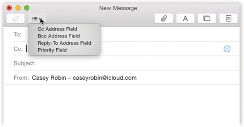
Redesign the New Message window. What signature do you want stamped on every outgoing message? Do you want the Cc and Bcc lines to show up? How about the Priority pop-up menu?
You can make all these settings using the little
 menu in the New Message window; see Figure 16-4.
Adjust the message window width. Drag the very right edge of the window inward or outward to adjust the width of the message itself. Double-click the edge of the messages list to hide the message completely. Now you have only the mailboxes list and the very wide messages list; to read a message, you have to double-click it to open it into a new window. (Double-click the right edge of the window to restore the message-reading pane.)
Adjust the width of the mailboxes or messages list. Similarly, you can drag the right edges of the first two columns to adjust their width. Or double-click the right edge to make the column exactly as wide as Mail thinks it should be.
Change what morsels show up in the messages list. The messages list (center column) usually shows the sender’s name, subject line, and the first few lines of the message itself (an iPhone/iPad feature brought to the Mac). But you can add additional info displays to the list—message size, mailbox, date sent, and so on—by choosing from the View→Message Attributes submenu.
Change what details show up in the header. The header is the top part of a message, where you see the details of how the message reached you. Ordinarily, Mail shields you from the geekiest details of the header; if you really want to see it all, choose View→Message→All Headers.
But if you’d rather, you can tailor the standard header so that Mail always shows you exactly the information you want. In Mail→Preferences→Viewing, use the “Show header detail” pop-up menu to choose Custom. Now you can add just the details you always want to see: Attachments, Bcc, Cc, Flag, From, Reply-To, Resent-Cc, and so on.
Control how many lines of preview text appear. In Mail→Preferences→Viewing, you can use the List Preview pop-up menu to control how many lines of each message you want to appear, in light gray, as a preview of what’s in the message itself. You can choose up to five lines, or choose None to hide the preview completely.
Sort the messages. Use the “Sort by” pop-up menu above the messages list (“by Date,” “by Attachment,” “by Unread,” and so on). Use the bottom two commands—Ascending or Descending—to control which way the sorting goes (A to Z, Z to A, or whatever).

Tip
If you click the “Sort by” bar above the messages list, you jump directly to the top—just like you do on the iPhone or iPad. Some ideas you just can’t keep down.
UP TO SPEED: Bcc, Reply-To, and Priority
A blind carbon copy (Bcc) is a secret copy. This feature lets you send a copy of a message to somebody secretly, without any of the other recipients knowing that you did so. To view this field when composing a message (if it’s not already visible), choose View→Bcc Address Field.
You can use the Bcc field to quietly signal a third party that a message has been sent. For example, if you send your coworker a message that says, “Chris, it bothers me that you’ve been cheating the customers,” you could Bcc your supervisor to clue her in without getting into trouble with Chris.
The Bcc box is useful in other ways, too. Many people send email messages (corny jokes, for example) to a long list of recipients. You, the recipient, have to scroll through the long list of names the sender placed in the To or Cc field.
But if the sender used the Bcc field to hold all the recipients’ email addresses, you won’t see anybody else’s names at the top of the email. In the To box, you might see the sender’s name, or “undisclosed recipients,” or nothing at all. (Spammers have also learned this trick, which is why it usually looks like you’re the only recipient of a junk message when there are actually millions of other people who received the same message.)
Another hidden field you can add to your messages is Reply-To. (Choose View→Reply-To Address Field.) That field has one simple purpose: to make the recipient’s email program reply to a different email address than the one you sent the message from.
For example, if your business email address isn’t working but you absolutely have to send a field report to your boss, you can send the message from your personal email account but put your business address in the Reply-To field. That way, when your boss emails you back to congratulate you, the email goes to your business account.
Finally, if you click the on the left side of an email message, you can enable one more hidden header option: Priority. (It’s the pop-up menu with an exclamation mark in it.) If you turn on the checkbox next to that pop-up menu and click OK, then all your email messages let you set how important they are on a three-tiered scale.
The good part about this system is that it lets your recipient see that an email you’ve sent is, for example, urgent. The bad part is that not every email program displays the priority of email—and even if your recipient’s email program does display your message’s priority, there’s no guarantee that it’ll make him respond any faster.
Out of the box, Mail assumes a new three-column layout (Figure 16-2, top): mailboxes list at left, messages list in the middle, and the message itself at right.
There are two advantages to this layout. First, your Mac’s screen is wider than it is tall, so columns of information make more sense than horizontal strips. Second, by devoting only about half the screen to the message itself, the column of text is kept to a comfortable reading width; too wide, and your eyeballs have to scan across the whole screen, which is supposedly tiring.
But if you hate that layout, you can always go back to the older layout, shown at bottom in Figure 16-2, by choosing Mail→Preferences→Viewing and turning on “Show Classic layout.” Here again, you can adjust the sizes of the panes and columns by dragging the divider lines. You can also control which columns appear using the commands in the View→Columns menu.
In either layout—Classic or standard—you have full control over the toolbar. You can rearrange or remove icon buttons (by ⌘-dragging them); add interesting new buttons to the toolbar (View→Customize Toolbar); change its display to show just text labels or just icons (choose View→Customize Toolbar, and then use the Show pop-up menu); or hide the toolbar entirely (using the View→Hide Toolbar command).