
Lana’s forever home
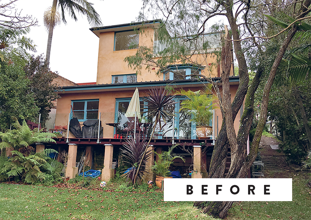
Having lived in this house for 15 years, Lana knew she was finally ready to renovate her home, even though she had no idea what style to go with. Hamptons? Scandi? Coastal? Boho? … She liked them all!
When envisioning your dream home, it’s awesome to dream BIG, but you also don’t want to be off with the fairies. You have to work with what you’ve got! By that we mean you have to look at the features and bones of your home and try to imagine them as better versions of themselves. That’s what Lana was eventually able to do with her Forever Home.
Truth be told, it took her a pretty while to pick up on the Tuscan vibes the terracotta-coloured render and climbing bougainvillea were emitting. But, once she tuned into them, the penny dropped and Lana realised the best renovation for her home was going to be one that embraced its distinctly Euro origins. After a lot of vision boarding (a process we teach in The Reno School), she finally landed on the idea of a modern Mediterranean villa, or, as it’s more affectionately known around Three Birds HQ, #SantoriniInSydney.
Once her vision was nailed down, the rest of the design decisions were a breeze. We had an answer for everything. Lana’s vision board became our true north and her terracotta house became the whitewashed family home of her dreams.

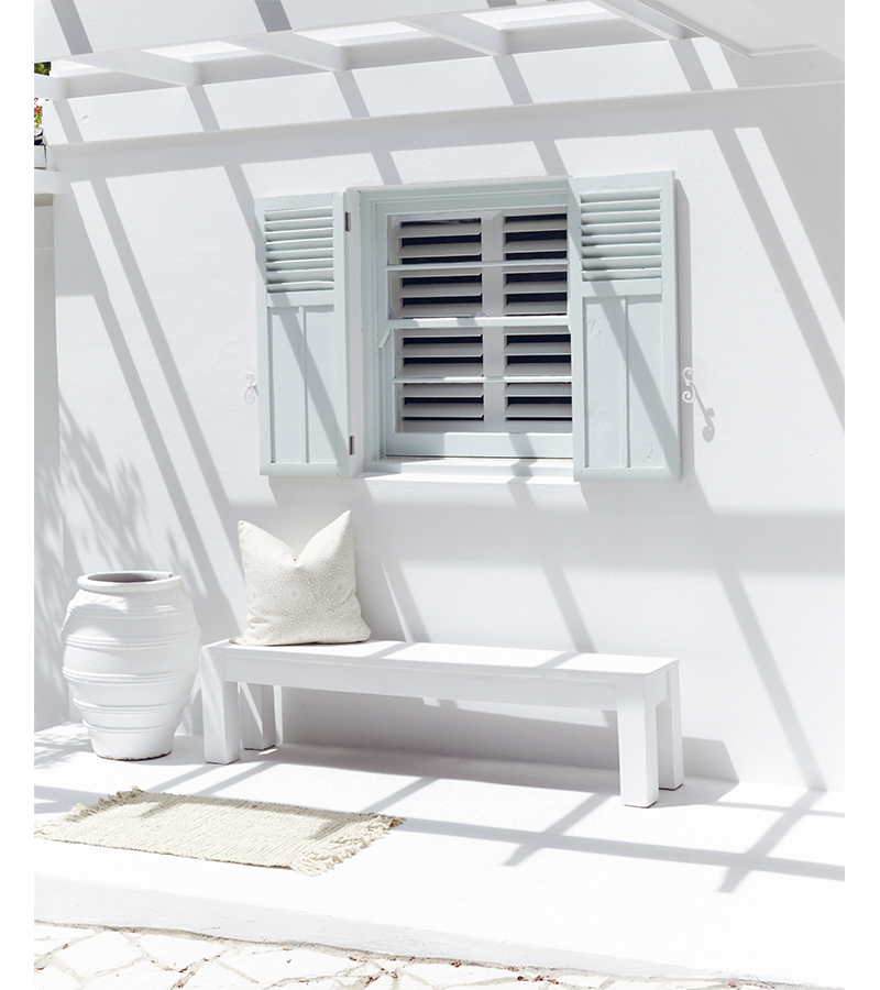
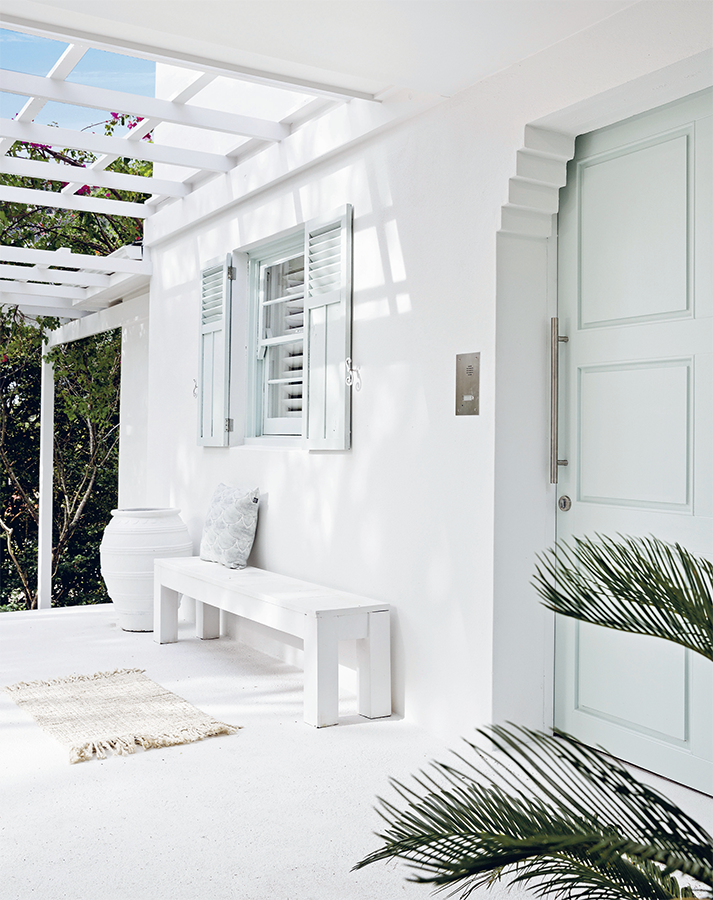
Any old pots get a makeover
Before you buy any pots, look for old ones lying around your garden, then paint them to match your house using the same paint as the exterior, like we did here.
GET REAL ABOUT YOUR BIG VISION
Before you fall in love with a vision for your dream home, do a bit of research so you understand the original architectural style of the home you have, as this should guide you on what ‘looks’ may be easiest to achieve. For example, if your house is a 1920s Californian bungalow, you’re probably best renovating to a style that works with some of the original features of that home rather than trying to create something completely different. With Lana’s home, the original Tuscan render made it easy to create a modern Mediterranean-style look – it just worked. If, however, her dream had been to have a Federation-style home with fretwork and a wrap-around balcony … well, no amount of renovating would have made that happen because her house just didn’t have Federation origins. To put it another way, if you’re born with the same colouring as Nicole Kidman or Naomi Watts, you’ll be forever disappointed if you keep showing inspo pictures of Eva Mendes to your hairdresser. The same goes for houses. Work with what you’ve got and improve on it.
GIVE IT UP FOR CONCRETE ROOF TILES!
Lana replaced her terracotta roof tiles with concrete ones and reckons they’re a winner on every front. Not only are they cheaper than terracotta tiles, concrete roof tiles also happen to be the most durable and economical option on the market – they actually strengthen with age and can last up to 50 years. (Believe us, not many things get better with age when it comes to renovating!) They are made from sand and cement, usually with a pigmented coat on top or mixed through for longer wear. They’re unglazed too, so it’s easier to change the colour of your roof down the track. Concrete tiles are pretty much the chameleons of the roof tile world as they can be created to resemble many other styles and materials.
PAINT IS YOUR FRIEND
If you already live in a rendered or ‘bagged’ house (bagging is a lighter, easier version of rendering), a fresh coat of paint and change of colour might be all you need to transform the exterior. Lana loved her bagged home, but wasn’t in love with the terracotta colour, so she painted it using Dulux Weathershield in Casper White Quarter and nailed that Greek-island look.

Lana
“Plan your window coverings, both inside and out. External shutters can bring your vision to life and provide accent colour, while your choice of internal window coverings can also be seen from the street.”

THE MUST-HAVE MUD ROOM
The concept of a mud room is nothing new. In fact, mud rooms are a staple in homes located in wet, cold and country areas. This is Lana’s ‘urban mud room’ – a place to put shoes on and take them off, and maintain her white-on-white Santorini style. Seriously, no-one gets past this room with their shoes on (except the police – they refused, but that’s a story for another book!). Regardless of where you live, if you can fit a mud room in your home, it’s a winner for tossing school bags, hats, dirty shoes and all those items you walk through the front door carrying. Ideally, this room should be located wherever you enter the house, either just inside the front door, or next to your garage if you have internal access.
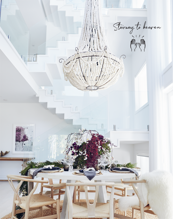
HOLY MOTHER OF STAIRCASES!
At least that’s what we thought when we saw this 10-metre wonder spring to life in Lana’s Forever Home. This one proves that staircases can connect levels AND take your breath away at the same time. Lana wanted her stairs to be an architectural feature – a functional piece of art. Supported by a powder-coated steel frame, the stairs look as if they’re floating mid-air and have a seamless finish. There are no fussy supports or busy balustrades to distract the eye from the stunning zig-zag design created by the boxed-in treads and risers. There was a lot of debate about whether to leave them unpainted, with a timber finish, but Lana had a clear vision of Santorini and stayed true to it by painting the stairs white. It was the right call.
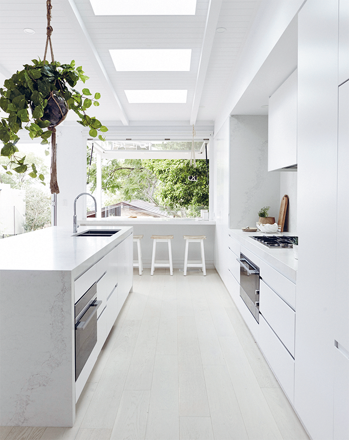
OUR MOST DISCREET CABINETS
The handles used in Lana’s kitchen are discreet finger-pulls. They’re a popular choice because they look chic and clean, and they let the cabinetry dominate the aesthetic. These finger-pulls are easy to clean (no fiddly handles to wipe around), but you will have to clean them regularly as the rebated channel can collect dust and food crumbs.

A modern take on a Santorini kitchen. We took a minimalist approach in this kitchen by using discreet cabinet fronts with no handles and fully integrated appliances. We drew attention to the island bench (with its amazing mitred waterfall edge), climbing Caesarstone splashback (with drop-down rangehood) and hanging greenery.
Max out millimetres
Benchtops and cabinetry are typically 600 mm deep, however, you may need to increase this along your main kitchen wall to at least 700 mm in order to accommodate your cooktop. And go even deeper if necessary, to make sure your fridge doesn’t stick out (eek!). Remember to allow at least 200 mm clearance on either side of your cooktop so you can turn your saucepan handles outwards (basically, the more millimetres, the merrier).
THE RIGHT BENCHTOP CAN MAKE OR BREAK YOUR KITCHEN
We spend a lot of time thinking about benchtops when designing kitchens because there are so many options to choose from. Our favourite material is Caesarstone, which is also referred to as quartz. It’s man-made and has been augmented to have superpowers that real marble can’t emulate. Specifically, engineered stone is stronger and harder, making it more scratch-resistant and chip-resistant. Its impenetrable surface also makes it much more stain-resistant and scorch-resistant. #wonderwomanIt’s not entirely infallible though – it can chip if you get unlucky and drop something on one of the edges, but that can usually be repaired.
DESIGN FOR EVERYDAY LIFE
You might love to entertain, but please don’t sacrifice what you would prefer to live with every day for the sake of what looks nicer when visitors pop by once a month. For example, do you put the kitchen sink on the back bench, out of full view of visitors so things look tidy when you have a dinner party, or do you put it smack bang in the middle of the kitchen island, so you can face everyone while you work in the kitchen and watch the TV when washing up? We think you should choose the option that suits your everyday lifestyle best. Lana did!
Lana’s compromises
STYLE VS. FUNCTION
Renovating is often about compromise but you should still be able to create a kitchen that looks good AND works well. Just be warned that at every turn, you may have to make decisions that feel like a trade-off. Here are a few examples of decisions Lana had to make when designing her kitchen.
01
Not locating the oven at eye level (a popular location these days) because it would have ruined the white, streamlined look she wanted.
02
Going without handles on the integrated fridge (even though handles would have made it easier to open) because, again, it would have interrupted the overall aesthetic.
03
Forgoing additional storage, with no overhead cabinetry above the cooktop, because she wanted the splashback to run up to the ceiling.
04
Locating the sink on the island bench rather than on the back bench because she wanted to be able to look out onto the rest of the room while standing at the sink, even though this meant dishes drying on the draining board would be more visible.
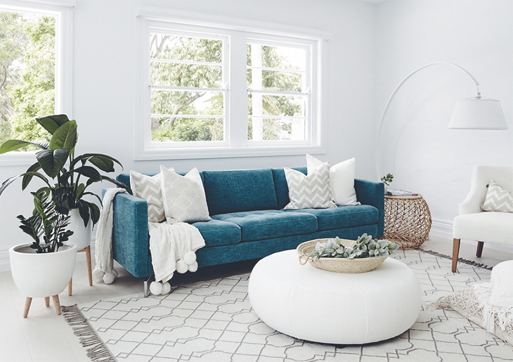
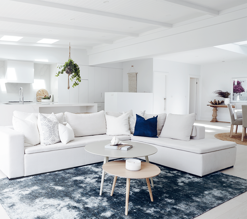
LAYER UP YOUR LOUNGE ROOMS
When it comes to designing lounge rooms, we always start by choosing the biggest furniture items first and then moving on to all the soft stuff (i.e. cushions, pillows, poufs, throws and rugs). We use these soft elements to add layers to a room and finish off the colour palette. For Lana’s main family lounge room, which is next to the kitchen, we kept the sofa pale and neutral, and the cushions more muted. The rug gave us our pop of colour. In her secondary living area (above), we did the inverse. A teal couch became the statement piece so we opted for a neutral rug and ottoman to tone things down and allow the couch to remain the hero of the room.
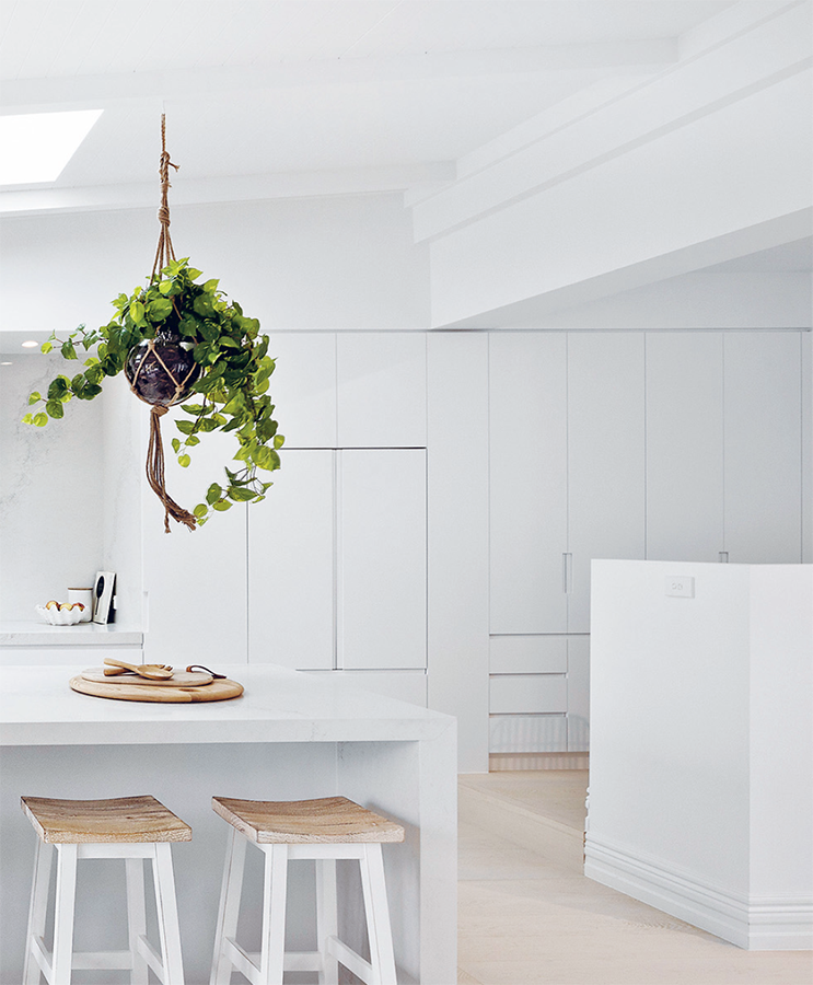
THE GREENER, THE BETTER!
Greenery is an absolute must-have in the homes we design. We are yet to come across a space that wouldn’t benefit from a plant of some description. They add colour, freshness and that feeling that ‘THIS IS HOME!’ In Lana’s white-on-white home, hanging plants above the island and by the window add pops of brightness. P.S. Go faux! The hanging plant you see here is fake, so it always looks the goods!
Off-centre art
It’s best to hang artwork at eye level but that doesn’t mean it always has to be centred. Sometimes it’s more interesting to position it off to one side, like we did here.
Light + view = the business
Fixed windows are an economical choice when you don’t need airflow but still want lots of natural light and perhaps a view. We love boxing them out and creating a picture window with built-in bench seating.
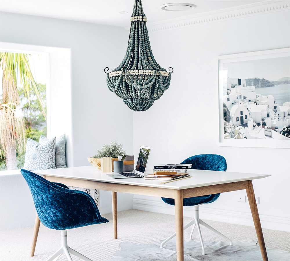
GIVE YOURSELF A HOME OFFICE TO BE PROUD OF!
If you’re one of the thousands of people who now work from home some or all of the time, forget about squeezing your office into a cramped hallway or under the stairs. Renovating your home is a golden opportunity to give yourself the best position in the house. For Lana, that meant claiming the light-filled room at the top of that showstopping staircase for her home office. It’s large and airy with the best views. She figured if she was going to spend that much time working from home, why not enjoy it? Her home office is bright, beautiful and a space that makes her want to sit down and open her laptop. Creating this office was a total game changer for Lana, and it could be for you, too.
UPGRADE TO FAB FURNITURE
Forget the fluoro lights and swivel chairs, office decor need not be boring. This is your own office so you can make it ah-mazing! Choose a luxe rug and quilted chair, and don’t be shy to add a gorgeous chandi above your desk. The better it looks, the more you’ll love working in it. Check out Bon’s home office here for more inspo.
A FEW MORE HOME (OFFICE) TRUTHS
 Depending on the climate you live in, having fresh air circulating through your office, feeding your lungs and brain, can be energising. Look around your space. Is there anything you can do to increase airflow?
Work, by definition, isn’t always fun, but that doesn’t mean the place where it happens can’t be beautiful. Statement pieces can add unexpected excitement to an office. If you fall in love with a fancy chandelier, who cares if it’s not standard office furniture. Hang it loud and proud right over your desk. And you know what? It will make you happy every time you see it.

The butler’s office
LANA’S BRAINCHILD
MOVE OVER ‘BUTLER’S PANTRY’, THERE’S A NEW SHERIFF IN TOWN
HELLO, BUTLER’S OFFICE!
Lana doesn’t ‘believe in’ butler’s pantries. To her mind, the babushka doll idea of a kitchen within a kitchen is flawed. If you have two kitchen spaces you can spend time in, why would you ever choose the smaller one? Lana thinks having a closed-off butler’s kitchen defeats the whole purpose of open-plan living. (We can’t really argue with her logic.)
Lana was never going to have a butler’s pantry in her home. The space that would be a much-coveted butler’s pantry in someone else’s home became what she calls her ‘butler’s office’ (that’s right, she has two offices!). It’s a smallish open-plan workspace (Lana’s is about 4 square metres) located next to the kitchen, and connected to the other living spaces around it.
This butler’s office was a real innovation for us – something Lana designed from scratch based on the needs of her family. It’s not for everyone, but it definitely works in this kitchen thanks to the fact that it’s cleverly concealed behind a half-wall and placed on a raised platform, which helps to separate and define the two zones.
The beauty of a butler’s office is that it allows mums and dads to float between serving afternoon tea and closing a mega-deal via email, or pay some bills while waiting for a pot to boil. It’s also a great place for kids to do their homework, especially if they’re at an age where they need a little help with it or require some discreet supervision during screen time. It’s getting harder to separate work and family life, so if this is an issue for you, maybe it’s time to embrace it!
THINK ABOUT YOUR WINDOW SITUATION
Natural light is certainly the best and cheapest form of lighting. If you’re thinking of adding new windows to your bathroom, make sure you know exactly what the view will be, and who might be able to see in. Sure, you can always choose frosted glass and shutters for privacy, but those won’t help when you want to leave your window open. Having said that, casement-style windows in frosted glass can be opened on a tight angle, making it almost impossible for someone to see in.
AND DON’T MOVE THE WINDOW
Whenever possible, we say leave the existing window where it is and create your layout around it. Baths are perfect for squeezing in under windowsills.
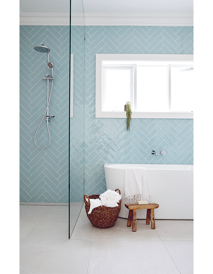
Two in one!
Rail showers are height-adjustable, making them perfect for keeping your hair dry or showering little kids. Lana chose one with two showerheads in this bathroom so she could wash both kids at the same time. She’s a true multitasker!
ALL BATHS ARE NOT CREATED EQUAL
Back-to-wall baths are a bit of a hybrid between a freestanding style and a built-in. They look just like a freestanding bath, but they’ve been designed to be pushed up hard against the long-side wall and sealed. This is a fabulous way to get the freestanding look in a space-efficient manner, but without the hassle of soggy dust collecting behind the bath. Lana put a back-to-wall bath in her kids’ bathroom and she reckons it looks even better than if it had been a regular freestanding bath.
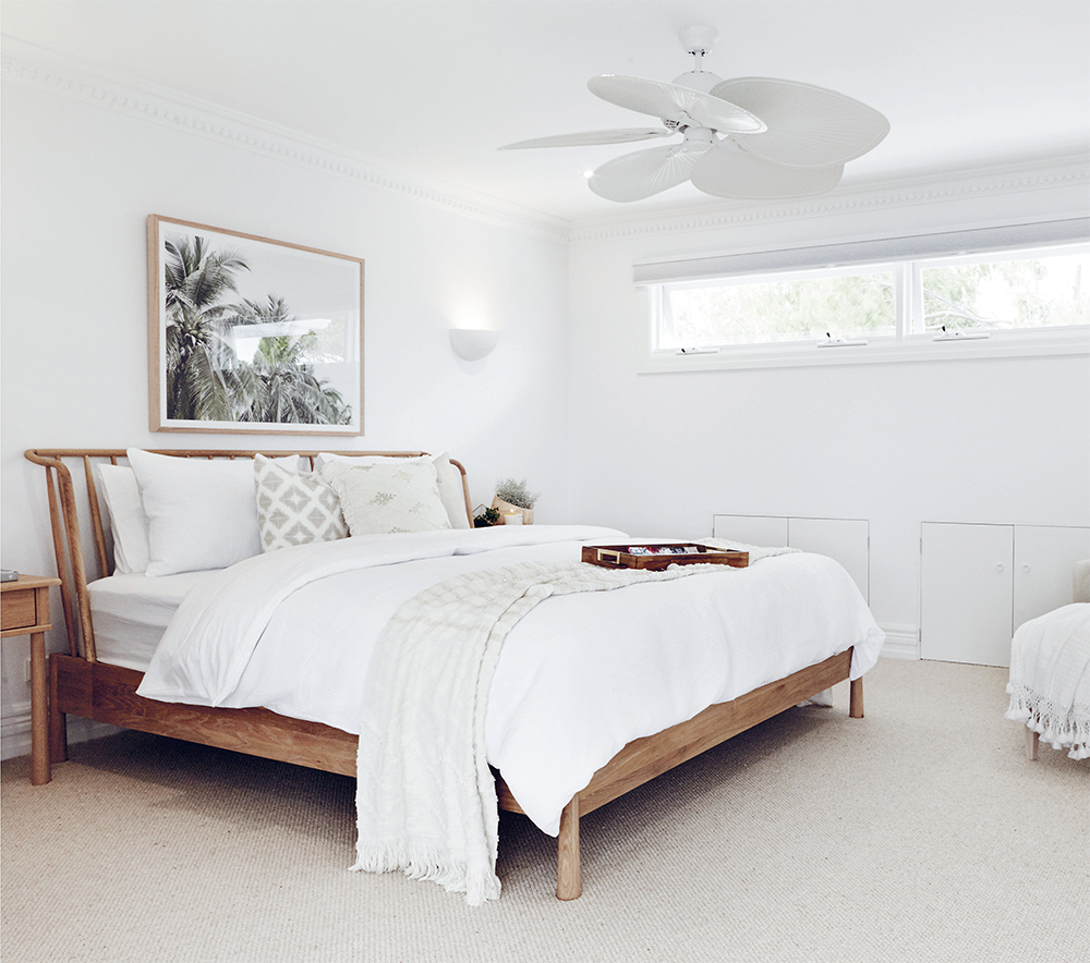
CREATE A MASTER SUITE ESCAPE
There are a few key elements that go into creating a master suite that really blows your hair back, and one of them is deciding on a statement piece. Regardless of which style of bedroom you’re going for, most people want their bedroom to be a relaxing escape from the rest of world. And nothing says ‘close your eyes, breathe in and relax’ more than a beautiful ceiling fan. You wouldn’t think it possible for a ceiling fan to be the star of the room, but we put these leaf-shaped fans in Lana and Bonnie’s master suites and we’ve been inundated with ‘OMG – THOSE FANS!’ comments ever since.
CONSIDER YOUR BED FRAME
Your linen and cushion choice will ultimately create the style of your bed, but the bed frame plays an important role too. Our advice here is similar to the advice we give about choosing frames for artwork. The colour needs to complement the rest of the room, so if you opt for a timber frame, make sure it works with the colour of your floors – especially if they are also timber. We find black or wrought-iron frames less versatile than white or timber ones. If in doubt, it’s hard to go wrong with a white bed frame, or even safer, an ensemble base (where there is no frame at all).
OPT FOR CARPET
There are so many price points and options when it comes to choosing carpet, you really can find something to match your style and budget. Lana put wool in her house because she wanted a natural fibre, and the large loop style felt beautiful underfoot. As with clothing, 100% wool carpets are a natural, premium, high-quality choice.
COMBINE FLOORING WISELY
If you’re going to have different flooring throughout the house (say carpet in the bedrooms and floorboards everywhere else), make sure those two types of flooring look good together. Get samples of both, in different colours if you need to, and put them next to each other.
What lies beneath
Don’t forget to budget for underlay when planning to use carpet. If you order a high-quality or sound-reducing underlay, this cost will sting if you’re not expecting it.
DRESS YOUR ENSUITE TO IMPRESS
Designing a bathroom is kinda like choosing an outfit for a night on the town: you pick your favourite piece of clothing first, then build the rest of your outfit around that (sound familiar?). Same goes for bathrooms. Choose that ‘wow’ item first and then make everything else work in with it. In Lana’s ensuite, the wow is unquestionably the amazing turquoise feature wall we created with the fish scale tiles. With this as the feature, everything else in the room had to be toned down.
IS A TILED FEATURE WALL RIGHT FOR YOU?
A tiled feature wall should provide a pop of colour or pattern, so we always recommend choosing the feature tile first, and then any other tiles you use in that space will have to work in around that. Keep the rest of the tiles in the bathroom muted – with either neutral colours like black, white or a marble-look. We usually only use two types of tile in a bathroom: one tile for the feature wall and then a neutral tile for the floor and remaining three walls. This really helps that feature wall pop, while the other three walls and floors visually merge into one. After deciding on turquoise fish scale tiles for her shower, Lana chose inexpensive 600 x 600 mm porcelain tiles for the floor to free up her budget for those pricier, but glorious, feature tiles. Putting your money into a small feature wall and then using basic tiles everywhere else is a smart way to divvy up your tile budget.
DON’T REINVENT THE (TILE) WHEEL
There are so many tiles to choose from, but that doesn’t mean you should feel obliged to come up with a completely original tiling scheme on your own. If you have something very specific in mind that you want to try, go for it – but if you want more of a sure thing, look at what others have done and take your inspo from there. If you really love something, feel free to copy the tile and pattern exactly. There’s no patent on tile patterns and you’ll probably feel more at ease knowing that you are spending money on a scheme you’ve seen before and already love.
SHOW OFF YOUR BATHROOM’S BEST ANGLES
Bathroom doors are often left open to signal that the the room is vacant, right? With that in mind, make sure your bathroom’s layout passes the ‘walk-past test’ – i.e. what can you (and your guests) see when walking past your bathroom (from any direction) and upon entering it? Ideally, you want to have the gorgeous stuff, like a feature wall, a statement bath or a vanity with mirror on show. Keep the toilet hidden. (Full disclosure: in some of our earlier renos we didn’t manage to hide the toilet, but it is definitely always our aim.) In Lana’s ensuite, much of her design was influenced by what could be seen when walking down the hallway towards the bathroom (which, incidentally, has no door). We also wanted to create a resort-style feel so we designed the layout to ensure one end of the beautiful bath and the trio of hanging greenery above were the only elements visible from the hall.
SHOWER SMARTS
Like many of us, Lana didn’t want a door on her ensuite shower. If you opt not to have a door on your shower, you need to make sure your shower screen is long enough to prevent overspray and you’ll also need a strong ‘fall’ on the floor to keep the water flowing towards the drain. We spent ages designing the walk-in shower for Lana’s ensuite and the measurements worked out perfectly. The glass pane is 1000 mm long, leaving an opening of 640 mm.
We prefer using frameless glass for showers whenever possible.
THIS GLASS IS ‘CHANNEL-SET’, MEANING NO HINGES NECESSARY.

TILING TIPS
01
Use tiles from the same batch – this is really important as different batches can have noticeably different colours.
02
Order 10–15% extra tiles to ensure you have enough to cover off-cuts and damaged tiles.
03
Don’t start tiling until you’ve checked you have enough tiles to complete the area.
04
Check all the tiles for shade variations before your tiler starts to lay them.
05
Tell your tiler you expect him not to lay any tiles that aren’t the right colour or shade.
06
Store any leftover tiles in a safe place in case you ever need to replace one or two. This will guarantee they match.
07
Decide early if you want to have a cornice in your bathroom or a square set ceiling. This will impact how your tiler sets out the tiles and also how they are finished at the top.
08
Remember that you need to make all these decisions well before your reno begins to ensure your tiler can accurately quote the job and that you can get the amount of tiles you want on site by the date your tiler needs to start. #theearlybirdgetsthetile
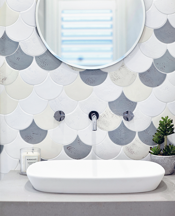
FISH SCALE TILES: UP OR DOWN?
We’ve laid these both ways. For an art deco look, lay them curve up; for the mermaid look (like we went for here), lay them curve down.
WALL-MOUNTED TAPS
Wall-mounted taps provide more space behind the basin for standing toiletries, however, they will be more difficult to repair as you may need to open up the wall. Also take note that if those pipes are housed in a wall, you won’t be able to have a cavity-sliding door on that same wall. Before you buy any tapware, make sure the spout will extend far enough over your basin – ideally, it should sit above the drain hole. This might sound obvious, but you’d be surprised how often spouts fall short. For this reason, it’s best to choose your basin and tapware together.
SHOW YOUR LAUNDRY SOME LOVE
A laundry is a discreet zone where we like to have a bit of fun and try something different. Bonnie took this philosophy to a whole new level in her home (check out here and brace yourself for pure amazingness!). Lana’s laundry is a great example of doing something different that still fits with the overall vision for her home. She chose completely different tiles to the bathrooms, but they were gorgeous beachy pebbles that still ticked the box of her theme, Santorini in Sydney. To save some coin, don’t tile all the walls. A lick of paint will do. Lana chose a pale blue/green tint to bring the Mediterranean Sea to her pebbled beach.
AIR IT OUT!
Of all the rooms in the house, the laundry probably needs ventilation the most. Good airflow will help keep it free from dreaded moisture and mould. An external window or door works best – especially a window that can be locked open while you are out. If you have a door but no window, consider a glass louvre door. It’s just like a louvre window inserted into a door frame –perfect for keeping that air flowing. If your laundry doesn’t have access to fresh air (as many don’t), an exhaust fan is a must. If you have a Euro-style laundry, put the fan in the ceiling of the cupboard. In fact, it’s a good idea to install an exhaust in every laundry so you can use it on those cold days when you don’t want to open the laundry to the outside. Having said that, ‘condensing dryers’ dramatically reduce the moisture in a laundry – if your ventilation options are limited, this might be a good choice.
Don't bend, sit!
A little stool in the laundry can make loading and unloading your front-loader so much easier. And it can look mighty cute too!

Lana went for these amazing pebble-like tiles in her laundry, but if your laundry is going to double as a mud room, large format tiles would be a better choice, as they’re easier to clean and have fewer grout lines.
Lana
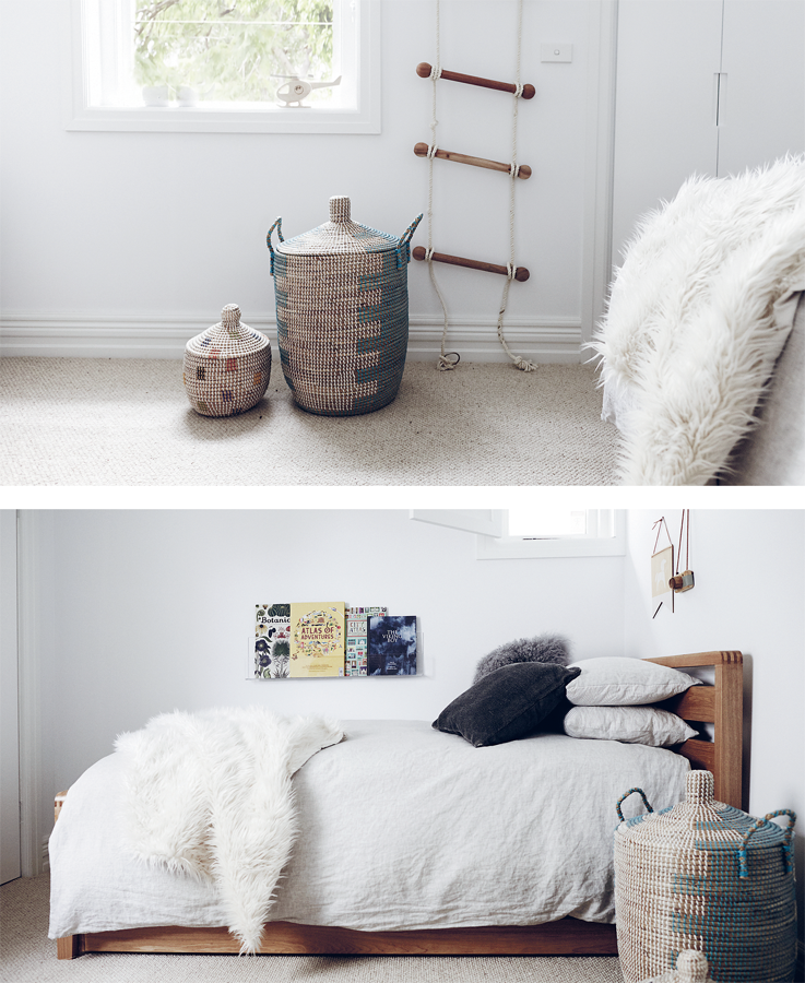
“When it came to designing the bedrooms for my kids, I wanted to stay away from the bright colours and materials used for a lot of ‘kiddie’ furniture. I love the look of timber and rattan, and wanted to use things like woven baskets that could be functional, but also a bit unexpected in a child’s room. This style will be able to grow with them.”
REDUCE THE NOISE FACTOR
Even though it’s good to keep your laundry near the action, try to avoid locating it right next door to a bedroom or even a lounge room. No matter which washing machine you buy, it will still make some noise, especially when it’s spinning. If you’re constructing a new laundry room, you can choose building materials (like sound-reducing insulation and plasterboard) that will limit the noise coming from inside your laundry. A solid core door will also help keep the noise down.
ENCOURAGE SOME DESK TIME
Setting up a clean and fun desk for your child to use can be a great way to get them into the groove of doing arts and crafts, and later the inevitable … homework!

Bargain buy!
These second-hand doors were $40 each.

Double doona
LAYER THOSE LITTLE LINENS
Just because they’re kids doesn’t mean a basic sheet set will do. Splurge on extra pillows, throws and even a second doona to add layers of softness and extra ‘fluff’. Style one as you would a normal doona (folded out) then place the second doona folded in half at the base of the bed. Don’t overdo the pops of colour or the patterns – when it comes to making a statement, less is more. We went for some pin-tucks and cute details here – making it girly, but still sweet and definitely not childish. There’s plenty of texture, and a bit of ‘gritty pretty’ thanks to the rattan and timber details. A few pops of gold and pink balanced things out nicely and made it really special.
SHELVES SHOULDN’T BE BORING!
You can pick up fun floating shelves from specialist boutiques to display colourful items or pictures that are personal to your child. You can also buy see-through bookshelves that can be mounted low on the walls, at kiddie level. These eliminate the need for a standing bookcase and also mean the book covers are on display, which adds colour and fun to the room in a way that’s easily updated.
BE CLEVER ABOUT STORAGE
When we design bedrooms, we try to avoid taking up floor space with furniture – that means we don’t go for chests of drawers or freestanding wardrobes. Instead, we look for every opportunity to create ‘out of sight’ storage, whether that’s built-in wardrobes, walk-in dressing rooms or (one of our favourites) under-bed storage. There are loads of beds with pull-out drawers around now, and these drawers often offer MORE storage than a chest of drawers. It’s a great place to stash linens, pyjamas, bath towels and bedding without crowding the room.
Most builders will include standard skirting, architrave and cornice profiles in their quotes. If you upgrade to a more decorative shape or profile, be aware you’ll also be upgrading in price. In your Forever Home this may be worth it, but if you’re looking to save money, this can be a good place to be economical.
LANDSCAPING, AKA THE FORGOTTEN CHILD
A great garden has the ability to make your house feel like a home you never want to leave. But even so, it’s easy to focus attention inside and forget about the backyard. When we first started renovating houses, we were totally guilty of this. We didn’t plan properly and under-budgeted in this area. But we learned our lesson quickly – there’s nothing worse than a beautifully renovated home with a scrappy-looking garden.
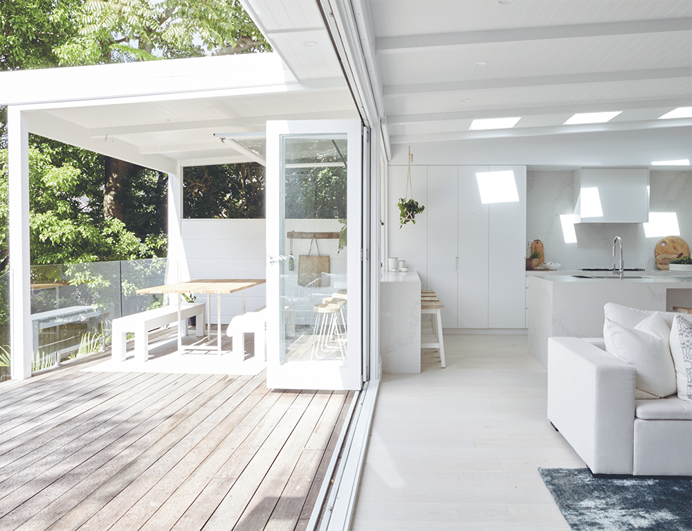
BUY BI-FOLD, IF YOU CAN
Bi-fold doors are definitely the ‘crème de la crème’ of doors, especially for large openings as they stack at one end without blocking views or access. We re-used Lana’s original blue bi-folds to ‘unzip’ the back of her house and simply painted them white. The large opening seamlessly connects the inside and out. The best thing about bi-folds is that they pretty much suit any style of house. The downside (apart from the ‘ain’t cheap’ factor) is that when closed, they interrupt your view more than other doors, like large sliders, which have less framework. It comes down to deciding between the vista when open or the vista when closed. It’s also important to discuss with your builder what finished height the bi-fold floor track will sit at. The best tracks are recessed into the floor so they end up flush, meaning there’s nothing to step over when walking from inside to out.

Already got a gorgeous garden?
If the answer is yes, talk to your builder about how to best protect it, what damage might occur and who is responsible for repairing any damage. At the very least, your turf will likely be destroyed, so plan for that.
Hello, holiday vibes!
AHHH, FEEL THAT INDOOR/OUTDOOR FLOW
A great trick when trying to make an outside space feel like a seamless continuation of the inside is to use the same ceiling lining. So, for example, if you have a panelled ceiling with exposed rafters inside, continue those same panels and rafters outside. Here, we continued Lana’s white panelled ceilings right out over her alfresco area, giving her family a place to relax and enjoy – rain or shine.

CLASSING UP THE SERVERY
Don’t you just love having a bar-height place to perch in an alfresco area? It’s even better when the servery runs seamlessly from inside to out. In fact, we’ve included an inside/outside servery in almost every house we’ve done, so it would’ve been criminal not to put one in Lana’s home! Ideally, the depth of the servery should be a minimum of 500 mm inside plus 300 mm outside (for a total of 800 mm when the window is open). Lana went with these measurements for hers. However, if space is limited, you can get away with a 300 mm depth on the inside. Lana also chose to run a single slab of Caesarstone from inside the kitchen to outside – when the window is open, it becomes an intimate eight-seater dining table (which we’ve put to the test many times with great success).
SIZE MATTERS (WITH FURNITURE)
When it comes to outdoor furniture, bigger is NOT better. You need to be able to move around the furniture and easily get in and out of the table or lounge setting. Lana’s deck is a good example of how tight you can go. Although it’s a relatively long deck (10 metres), it’s quite skinny (3.2 metres) so it provided a great challenge for us when it came to how much furniture we could squeeze in.
GOTTA HAVE THAT HANDRAIL!
Take note that if your alfresco area is higher than 1 metre off the ground, most building codes state that you need to have a handrail/balustrade. Not only will this prevent your friends and family from taking a tumble, it can also impact the look and feel of your outdoor space. Frameless glass is a great option if you want to maintain an unobstructed view – especially if you’ll be seated at lounge level and looking through, rather than over, the balustrade. Glass also provides the clearest view for watching kids in the pool. A cheaper option is a timber balustrade (which your carpenter or landscaper can build and paint) but this might block your view and/or not suit the look of your house. Having said that, white balustrades usually look amazing (see here).
GAS STRUT G.L.O.R.Y
Gas-strut windows are the bee’s knees. In fact, you could say they’ve become a bit of a trademark of a Three Birds reno! Here’s why we think gas-strut windows are so great:
01
They offer an unobstructed view when closed, versus bi-folds, which have framework around each little window leaf.
02
They are so easy to open. Nudge the window and it opens up like it’s motorised. But take note, if you make the window too tall, you might need a stool (or a tall friend) to help you close it.
03
They are such a space saver compared to bi-folds, which stack up to one side, taking up valuable servery space.
04
When open, they can act as an awning and provide cover from rain.
05
Their design is inherently cool, so they bring a relaxed beachy vibe to the space.
06
They are a bit cheaper than bi-folds.
07
Umm, they just look so damn fine! #obsessed


Lana's bougainvillea
This gorgeous bougs had been growing at Lana’s for years, and it became the key to her Santorini in Sydney vision. Everyone who stepped on site (including a poor postie!) was told it had to be protected at all costs. It’s now happily climbing those white walls, and if it doesn’t say Santorini, we don’t know what does.

USE IT OR LOSE IT
Please don’t forget to pay attention to all four sides of your home when dreaming up your reno. You want to create a plan that works for the front, the back and the sides of your home. One of the biggest transformations at Lana’s house happened when the side of her home went from being nothing more than an ugly thoroughfare to an entertainer’s delight. This transformation involved lots of hardscaping (meaning decks, walls and paving) but it made a BIG difference.
WE LOVE A BUILT-IN BENCH SEAT
We installed the ultimate bench seat on this side deck. It’s about 6 metres long and could probably seat 20 people, if needed. It helps to create that ‘outdoor room’ vibe and provide loads of practical seating options. Whether you use a bench seat to optimise a corner space, or to provide seating along one side of a dining table, bench seats are an #alfrescowin. They’re practical and pretty, not to mention pretty cheap to build. When designing your alfresco area, make sure you look around and ask yourself, ‘Where could I build a sneaky little bench seat?’ Get your carpenter to knock one up for you, add a splash of paint and voila!

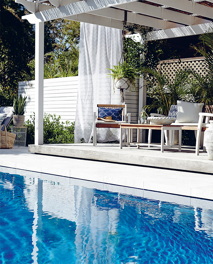
SPLASH OUT
The crowning glory of Lana’s garden is her pool. It’s the finishing touch that gives her home that ‘on holiday every day’ vibe she was dreaming of at the start of the renovation. But, as we discovered, building a pool isn’t as straightforward as you might think. As with everything else in the world of renovation, there’s a lot to learn and research. Lana started with the look she was after. Once you know that, you are ready to embark on the next big decision – fibreglass or concrete? True story, Lana never knew the difference between them until she started getting quotes. Fibreglass and concrete are both great options. You just need to work out which one best meets your needs. (Bonnie went with concrete for her pool, so head to here to find out why that was the best option for her.)
THE MANY PROS OF FIBREGLASS POOLS
01
Cheaper They usually cost around 20% less than a concrete pool to build and install, and ongoing costs are lower due to these pools requiring less maintenance, fewer chemicals and energy.
02
Faster Installation takes only 3 weeks vs. 3 months for a concrete pool. In fact, we’ve heard they can be installed in 3 days (surely not?)!
03
Gentler The non-abrasive surface is softer on your feet (no torn-up tootsies) and fibreglass is not as rock-hard as concrete if your kids accidentally hit the bottom.
04
Warmer Fibreglass acts as a natural insulator so it holds in the heat for longer.
05
Cleaner The gel-coating is smooth and non-porous, which makes it easier to clean.
06
Greener Less cleaning + less chemicals + less energy consumption = a smaller carbon footprint.
07
Stronger It’s hard to believe anything is stronger than concrete but fibreglass is very durable and can even withstand movements in the earth better than concrete.
Blue hues
Before locking in your colour, ask your pool company if you can visit some of the pools they’ve installed. Nothing beats eyeballing the real thing before making your final decision.
TAKE YOUR PRETTY TIME CHOOSING YOUR POOL COLOUR
We can guarantee you will LOOK at your pool more often than you swim in it, so don’t rush the CRUCIAL decision of choosing your pool colour. For many people, it’s their shortcut to a ‘water view’, so you should love the colour from afar as much as you do when immersed in it.
DON’T FORGET ABOUT DECKING
We are constantly asked what type of timber Lana used for her pool deck (opposite) and how she achieved that look. She wanted a pale grey deck so she did a huge amount of research on how to achieve that natural, silvered look. Lana found a product called Cutek CD-50 Oil that protects the timber while allowing it to silver naturally (though you could also add colour to it if you wanted a stained look). The timber has silvered beautifully and she could not be happier with it.
LIMITATIONS OF FIBREGLASS
The biggest drawback with fibreglass pools is that there are limitations when it comes to design and colour. They are pre-made and can only be bought ‘off the rack’, whereas a concrete pool can be custom-made just for you. Having said that, there is a huge range to choose from, and many modern fibreglass pools come with swim-outs and lounge areas built into the pool shell so they’re worth checking out. These pools need to be transported by road so their width is limited to around 4.2 metres (this should be wide enough for most backyards). The other thing to keep in mind is that a crane is usually needed to lift the pool shell off the truck and into your backyard. This can sometimes be tricky but it is something that will be managed by the pool installers.