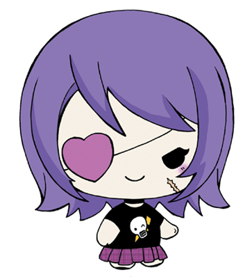
Kawaii characters are in cute overdrive. Some are cheerful and agonizingly adorable. Others may be dark but with an adorable evil quality. Still others, including fantasy animals and anthros, are quirky and weird but just as mind-numbingly cute. But whatever form Kawaii takes, people always find it irresistible.
Most manga fans are familiar with chibis—the popular minipeople of Japanese graphic novels. You may think that Kawaii characters are the same as chibis. That’s a common misconception. Kawaii-style chibis have a distinct, younger, and more stylized look—a look all their own.
* Head is more complex than a single shape, like a circle.
* Eyes feature “shines” as an important part of their characteristics.
* Individual strands of hair are articulated.
* Thin ink line is used.
* Costume contains details, such as folds and lapels.
* Hands are drawn with individual fingers.
* Colors are generally realistic.


* Head is usually based on a simple shape (a circle or an oval).
* Eyes are most often black dots without shines.
* Hair is simplified.
* Outline is usually thick.
* Costume is bold but streamlined.
* Hands are simplified to eliminate fingers, although sometimes thumbs are still shown.
* Colors are bolder, splashier, and unrealistic.


Drawing supercute means more than simply drawing supersmall. The proportions have to be cute, too. Now, you might be thinking, “Cute proportions? No one can create proportions that convey cuteness! It simply can’t be done. Foolish mortal.”
You can draw a wonderful character, with cute features and an adorable costume—but if the proportions are off from Kawaii standards, then there is no way it will ever be supercute.
To be supercute, the head must be bigger. It must be drawn much bigger than it would be on normal characters. How much bigger? Way, way, way, way bigger—until the head is bigger than the entire body.

1 1/2 HEADS TALL
This is the “it can’t miss” gold standard of cute proportions. How cute is that?
2 HEADS TALL
Hmmm. The character is getting a little on the tall side. Although this is pushing it a bit, it still makes it under the limbo stick.
3 HEADS TALL
Whoa! This doesn’t work. The added height gives the character a huge “cuteness deficit.”
In manga, as in comic art, cartoons, and even realistic figure drawing, artists typically make small adjustments to the outline of the head, refining it as they create the character. But not so in Kawaii. The shapes that serve as the foundation of the head remain unchanged from beginning to end. This has a profound effect on the drawing. It creates the look of a graphic—a flat image, based on shapes executed in ultrastylized simplicity. At first glance, Kawaii appears so easy to draw. And, yes, it can be. But you have to understand the concepts that go into it. Many professional manga artists draw fantastic shoujo but have difficulty with the Kawaii style because they don’t know how to add the right style to the basic foundation shapes.
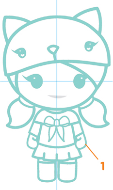
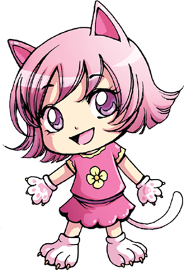
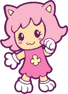
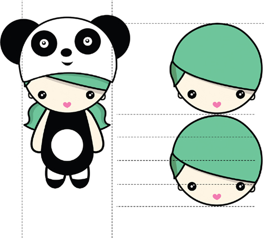
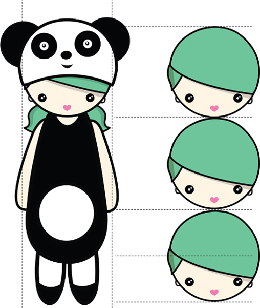
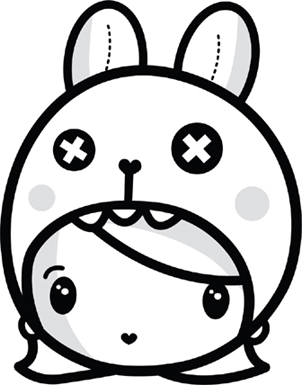
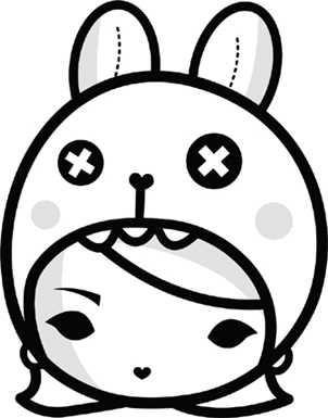
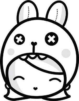
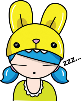
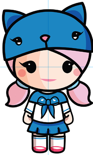
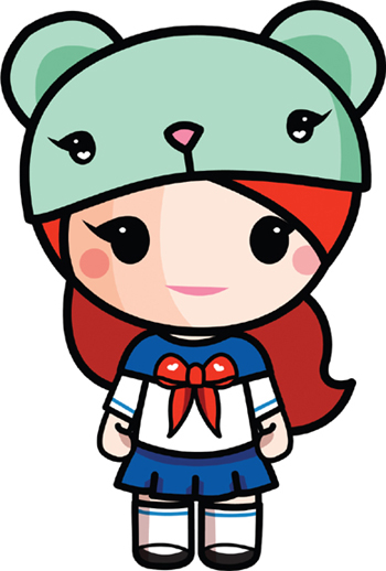
Let’s start with a typical, popular, Kawaii girl character as our example. She’s cute, bubbly, with dot-style eyes, no nose, and a small smile. She wears her hair short and has a thing covering her head. Wait a minute—what the heck is that, anyway? That, my friends, is an anthro-hat (anthro refers to animals). It’s an adorably drawn, animal-shaped hat (often a hood). Why is she wearing it? Because it exponentially increases the charm factor by 3.2501 percent.
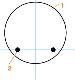
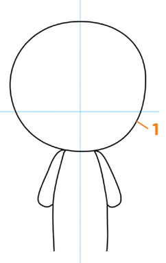
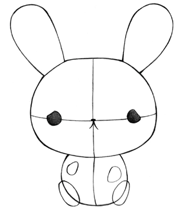
1. Begin with a circle for the head.
2. Place the eyes low on the head, and space them wide apart. This is important for cute characters!

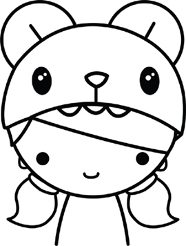
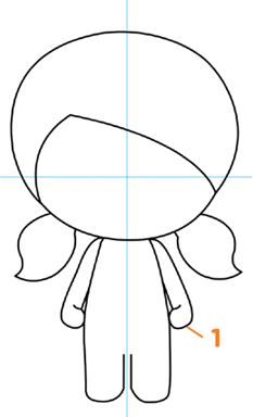
1. Make the line of the hat curved—not flat. The curve emphasizes the roundness of the head.
2. Omit the nose entirely. The character will never even know it’s gone. Unlike mouths on regular chibi characters, the mouth on Kawaii characters is almost always tiny.

1. Draw the bangs on a diagonal. This gives her a haircut a lively look.
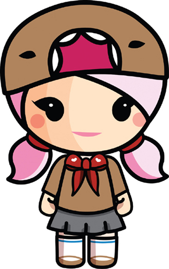
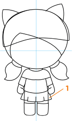
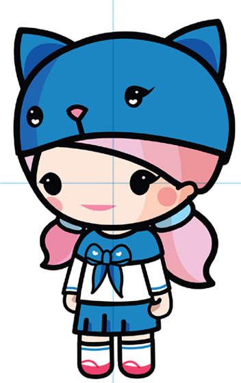
Notice the thick linework in this step. Although not every Kawaii character is drawn with extrathick lines, many are. A thicker line makes the character look flatter, which, in turn, makes it look more stylish. It also pushes the needle a few notches higher on the Cute-O-Meter. This approach further carves out the unique identity of Kawaii.

Apply the initial colors. Color themes vary according to the genre. This happy girl gets cheery colors, whereas a gothic girl would get a whole different color treatment.

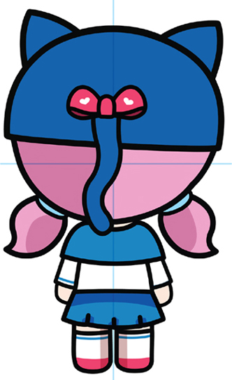
Adding highlights and shadows to the colors is optional but effective. For information on how to create highlights and shadows, see this page.
 QUICK TIP
You don’t need to draw a perfect circle. Lots of artists draw them freehand. But if you want to try drawing characters with perfect circles, then I suggest purchasing something called a template at any art store or from an online art store. They’re really inexpensive, because each one is just a piece of plastic. Templates come in all different sizes of circles that you can trace.
The most common eye type for Kawaii characters—humans, animals, or fantasy creatures—are dots; that is, black circles. However, they’re not the only type used. Some artists use variations to create unique characters. But don’t stray too far from the classic type. Drawing a small pupil surrounded by the white of the eye, for example, would not give your character a Kawaii look. Only draw the black pupil.


Kawaii is about communicating joy, fun, and good feelings. Appealing character design is essential. But character design itself isn’t enough. If your character’s expression is understated or, equally problematic, if it’s too broad, you’ll find yourself out of Charmingland without a map.
Although Kawaii expressions may be somewhat subdued, they’re not subtle. It’s always crystal clear what the character is feeling. Try to do more with less. The fewer lines you use to create an expression, the cuter it will look. That’s the key to this style.


The head is the focal point of every Kawaii character design. It’s what creates the basic cute appeal. To that end, keep the size of the body small in comparison, so as not to divert attention from the adorableness.
This approach requires us to pack a lot of visual information into a small package—the body. Keep in mind two important things: First, it’s cuter if your character appears to be slightly on the pudgy side. And second, since the body is so truncated, don’t try to do too much with the pose. Dynamic or action poses subtract from the overall cuteness.
1. Draw the basic head and body shapes.
1. Don’t define fingers and feet; imply them.
1. Draw the clothes over your figure; then erase the unwanted lines.

1. A symmetrical pose is cute, funny, and charming.
1. Thicken the line (optional).

“Checkerboard” the blue colors with the white colors. This method prevents even the tiniest outfit from appearing cluttered.

Apply shadows and highlights.

Remove any remaining guidelines. Voilà! Your drawing is finished.
Because Kawaii characters are designed with such a flat look, they look best when facing forward. Most of them are drawn that way. A 3/4 view, though, is not unusual. But the profile and rearview poses are. However, never say never.
3/4 VIEW
Second-most popular angle.

PROFILE
Avoid this if at all possible.
REAR
Rarely seen but cute; use it if the situation calls for it.
Beginners often do rough sketches before making a finished drawing. And yet, when it comes to applying colors, they usually go with their first attempt, as if they only get one bite at the apple.
Allow me to recommend the important, but greatly overlooked, process of “sketching” color roughs before deciding on a finished palette.
Here’s how it’s done: Make a few copies of your finished drawing. Or, if you don’t have access to a copy machine, use your discarded pencil roughs. I’ve done that, and it works almost as well. Roughly apply a few colors to various areas. Sometimes, it only takes one or two strokes of a marker or colored pencil to envision it. At other times, you may need to color a larger area—usually when judging how several colors, placed side by side, interact with each other.
But you’re not stuck choosing one approach from the three or four colored roughs you did if you don’t like any of them. One technique I recommend is selecting what works from each colored rough and, from that, create one “master rough.” For example, you might like the hat color on one rough you did while also liking the hair color from a different rough. This master rough incorporates the best ideas from all three of the colored roughs. If this works, then go on to complete the final, colored image. If not, then do another master rough, using different selections the next time.

SUGGESTIONS FOR COLORING BY HAND
To create highlights, first decide what color you want the character to be. Once you’ve selected the color, apply a lighter tone of that color to all the places you wish to highlight. Then use the original richer color you chose for your character to color in the rest of the character, being careful not to color over the highlighted areas you just laid down. The second color you just applied is darker than the first color you used; therefore, the first color will “pop”—and serve as your highlights.
To create the shadow effects, go over the specific areas you want to shade, using a darker tone of the same color.
By using a few simple, targeted techniques, you can produce the intended emotional response from your viewer—an irresistible desire to squeeze each character until he or she pops!
Most aspiring artists draw instinctively, which is hit or miss. Yet cute characters share specific features, which professional manga artists and animators incorporate in the initial steps of their drawings. Widely understood in the professional artists’ community, these techniques have rarely been communicated to beginners. Until now.
To best illustrate these techniques, we’ll look at examples of how a typical beginner might draw a Kawaii character, compared to a professional’s more expressive character. Beginners, and even intermediate artists, often overlook some important opportunities. We’ll point those out so that you can begin to take advantage of them.
Though the beginner’s drawing is appealing, it still has a way to go. Let’s take a look at a few techniques which, when added, make the character so cute it’s almost painful.
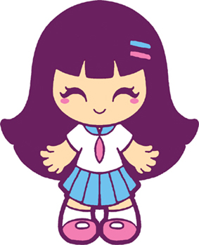
BEGINNER VERSION

1. Head needs to be slightly bigger (yes, even bigger), compared to the girl’s body.
2. Eyes are too high on the head.
3. Teddy is kind of plain.
4. Making the clothes fit well is a bad idea! They should be oversized.
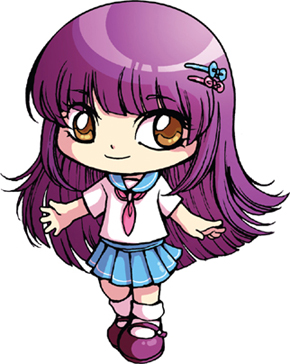
PRO CONSTRUCTION

PRO VERSION
Pajama-type hood-to-toe “anthro” outfits always maximize cuteness. Almost by definition they do two things that make them appear sweet and charming: It makes them look younger and cuddly.
BEGINNER VERSION
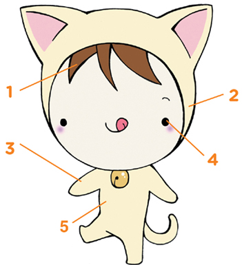
1. Younger characters look best with lots of floppy hair.
2. Anthro hoods are cutest when they surround the entire head. This one doesn’t.
3. Proportions are wrong: too lanky. Shorter limbs are cuter than longer limbs
4. Eyes are way too small. Cute eyes are always an ample size.
5. Body not “chunky” enough to be squeezable. Needs to be somewhat chubby.
PRO CONSTRUCTION

PRO VERSION

Drawing Kawaii Goth characters is tricky. With all their dark and mean-looking elements, they can come across as repellent if you don’t play it just right. Does that mean you should avoid drawing them altogether? Not at all! At the beginning, focus on laying out the “cute essentials” and proportions for these entertaining figures. If the construction is cute, then the finished version will be cute, whether it is a gothic or an innocent-looking character.
BEGINNER VERSION
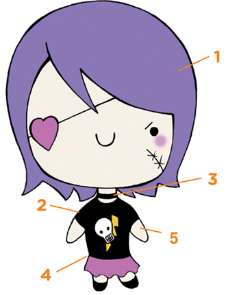
1. Hairdo has no personality or style, and there isn’t enough hair.
2. Shoulders are too broad.
3. Whoa! The neck is way too long.
4. Kawaii-style chibis don’t get narrower at the waist.
5. You can only get away with supersimplified arms without hands if the body is supersimplified too. This body is too long.
PRO CONSTRUCTION

PRO VERSION
Characters with bodies based on little more than simplified shapes can be ultra-adorable. They almost look like bathtub toys! Try to minimize their features, as well as their limbs, so that the cute outline shape of the character stands out. Be selective with the type of character you choose to draw with this technique. Penguins are a natural, as are pigs and elephants. But something with a more complex body type, like a horse, would not do well with a one-shape treatment.
BEGINNER VERSION
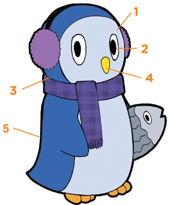
1. Without an obvious expression, this penguin doesn’t appear very cute.
2. Animation-style eyes look weird on Kawaii characters. Stick with the dots.
3. Definition between the head and the body is a “cuteness remover.”
4. Droopy, big noses are rarely cute. Take your character to a good Kawaii plastic surgeon and get the nose reduced.
5. There is no definable, overall shape suggested by this body type.
PRO CONSTRUCTION
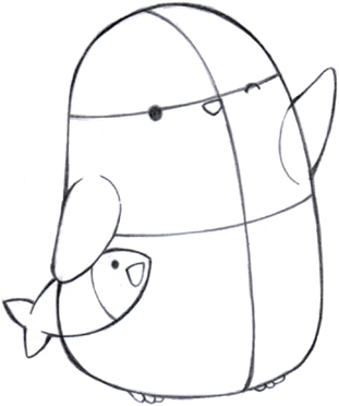
PRO VERSION

Some of the most sympathetic expressions are actually teary-eyed ones. They evoke heart-rending feelings. It’s a great way to manipulate your viewers’ emotions. Viewers are like putty in a Kawaii artist’s hands. Oh, yes, we are that diabolical.
BEGINNER VERSION
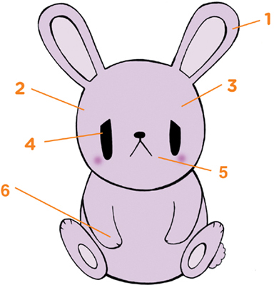
1. The ears could use a little fattening.
2. The head is a perfect circle—but a wider face would be cuter.
3. Head has to be bigger, and body has to be smaller. That’s standard.
4. The eyes shouldn’t droop.
5. The mouth is cuter when it’s smaller than this.
6. Big hands and feet are never as cute as little hands and feet.
PRO CONSTRUCTION
PRO VERSION

The difference between a drawing that’s adequate and a drawing dripping with cuteness is often just a matter of a few small tweaks; however, don’t underestimate the effect that an accumulation of small changes has on a drawing. The difference that you see between the example of the Beginner Version below and the corresponding Professional Version is due to a combination of subtle adjustments, which, when taken together, add up to a significant improvement. That’s one of the main differences between a beginner and a pro: The pro will make adjustments to small inconsistencies in his drawings, whereas the beginner is more likely to adjust only the prominent mistakes. So get in there, and have fun working on the details too.
BEGINNER VERSION

1. The muzzles are not separately defined.
2. With no ribbons, bows, ties, or glasses, all the characters look the same.
3. For eyes, ovals aren’t as cute as dots.
4. The nose is too high on each face.
5. There’s too much empty space in the basket—it needs more characters to feel cozy.
6. The mouths are too big.
PRO CONSTRUCTION

PRO VERSION