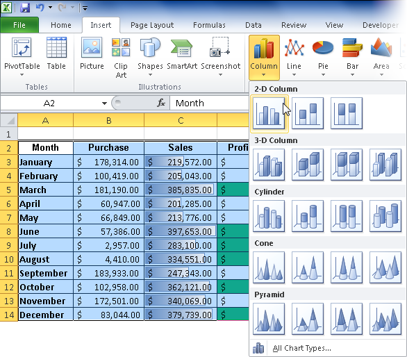
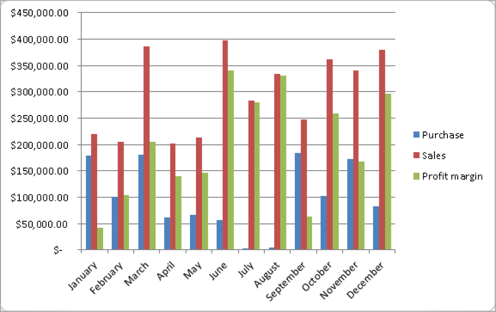
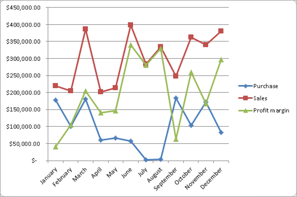
In the same way you created a column chart, you can create a 2D, 3D, or line chart (see Figure 1-41). To do this, select a chart format by clicking the Line button to open the menu.
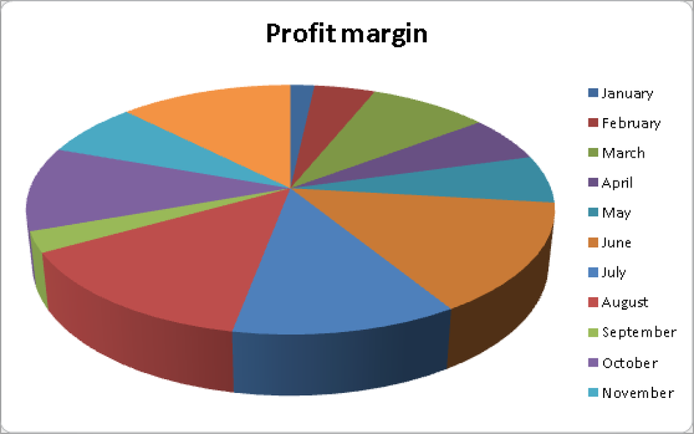
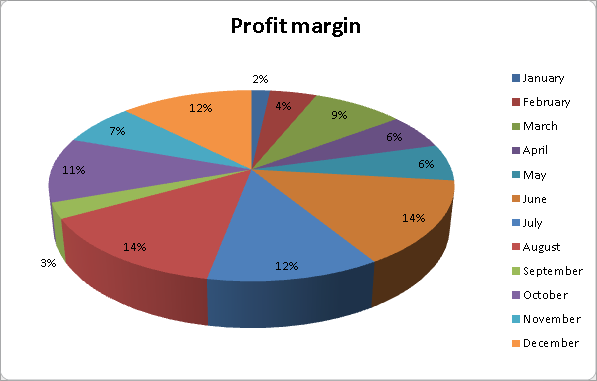
To display the values in the Profit Margin column by month, you can use a pie chart. Do the following:
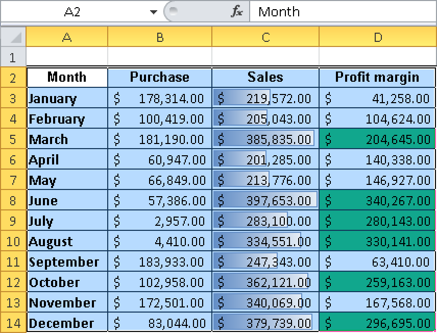
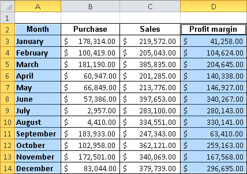
Select the cells containing values in the Months and Profit Margin columns. To select only these two columns, first select the Months column. Then press the Ctrl key and select the Profit Margin column. Both columns are selected (see Figure 1-42).
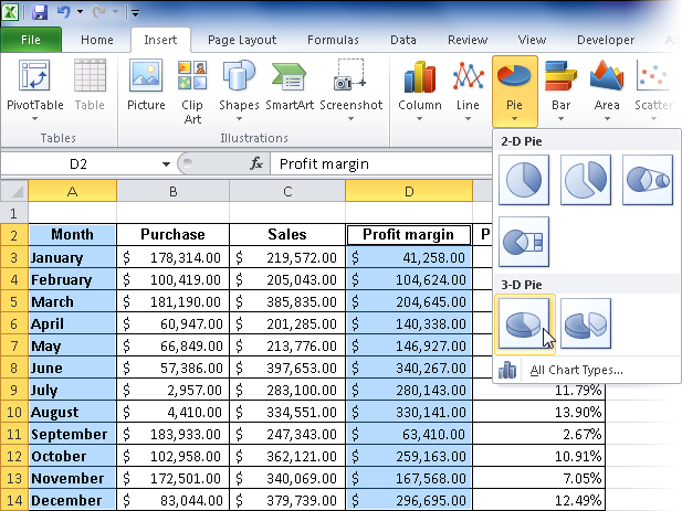
Click the Pie button to open the menu, and select the first chart type under 3D Pie (see Figure 1-43).
Excel 2010 provides many formatting options you can use to emphasize values in pie charts.
The Chart Tools contextual tab opens. On this tab, you can choose between the available formatting options (see Figure 1-45).
With these tools, you can select any of the format options. For example, click Layout 6 in the Chart Layouts section (see Figure 1-46).
Layout 6 displays your pie chart with percentages, or values (see Figure 1-47).
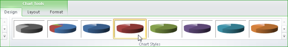
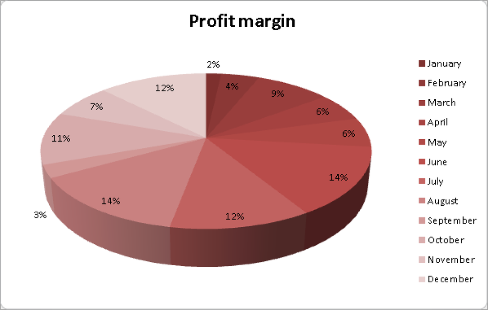
With the chart formats, you can also adjust the chart colors. Just click one of the available formats (see Figure 1-48).
The color of the chart changes according to your selection (see Figure 1-49).
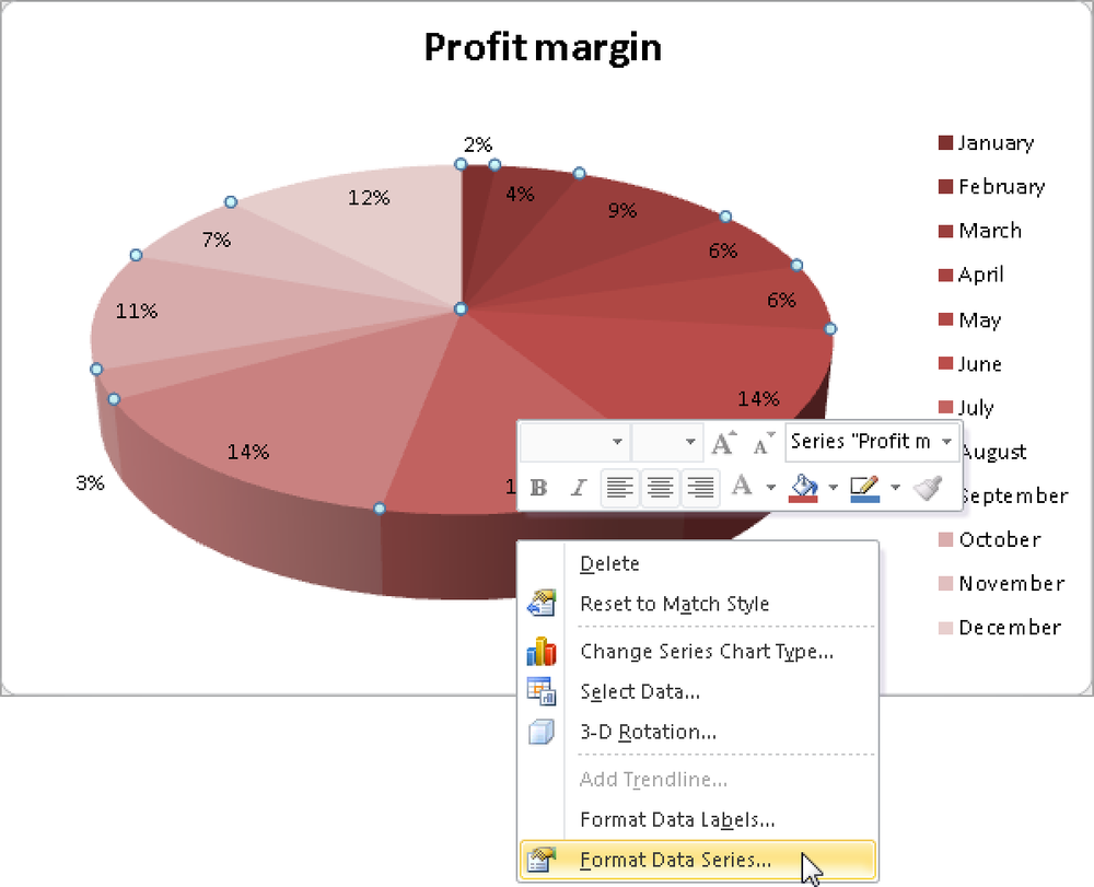
In Excel 2010—as in Excel 2007 and Excel 2003—more chart format options are available in the shortcut menu of the selected chart. Right-click the chart to open the menu, and then select Format Data Labels or Format Data Series to change the format of your chart (see Figure 1-50).

In Excel 2010, working with charts is a lot easier. The options for editing and formatting are more extensive, and fully formatted charts can be created with just a few clicks.
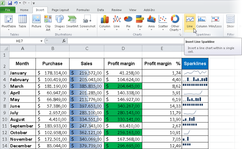
Inside Out: Use sparklines to graphically represent values
Check out the new sparklines in Excel 2010. These “word graphics” illustrate values by using miniature line, bar, or profit-and-loss charts. Sparklines illustrate numeric values so that the values can be interpreted more easily (see Figure 1-51).