The new user interface also makes it easier to create PivotCharts. All filter enhancements for PivotTables are also available for PivotCharts. There are special PivotChart tools and shortcut menus you can use to create a PivotChart to analyze the data within a chart.
You can change the layout and the format of charts or the chart elements in the same way you make changes for Pivot Tables. Unlike in previous Excel versions, in Excel 2007 and Excel 2010, the chart format is maintained if you change the PivotChart.
Creating a chart for a PivotTable takes only seconds. Use the previous PivotTable example to practice. Do the following:
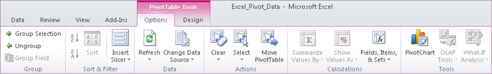
Click in the PivotTable, and select the PivotTable Tools contextual tab above the default tab (see Figure 1-60).
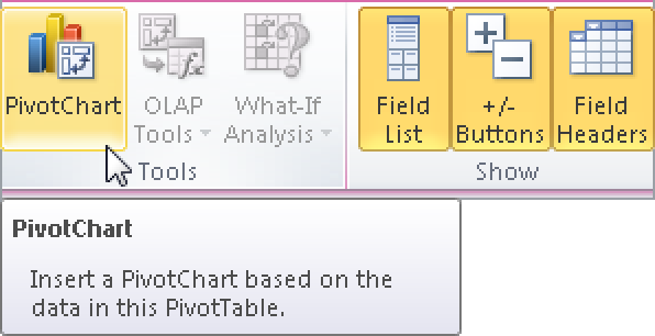
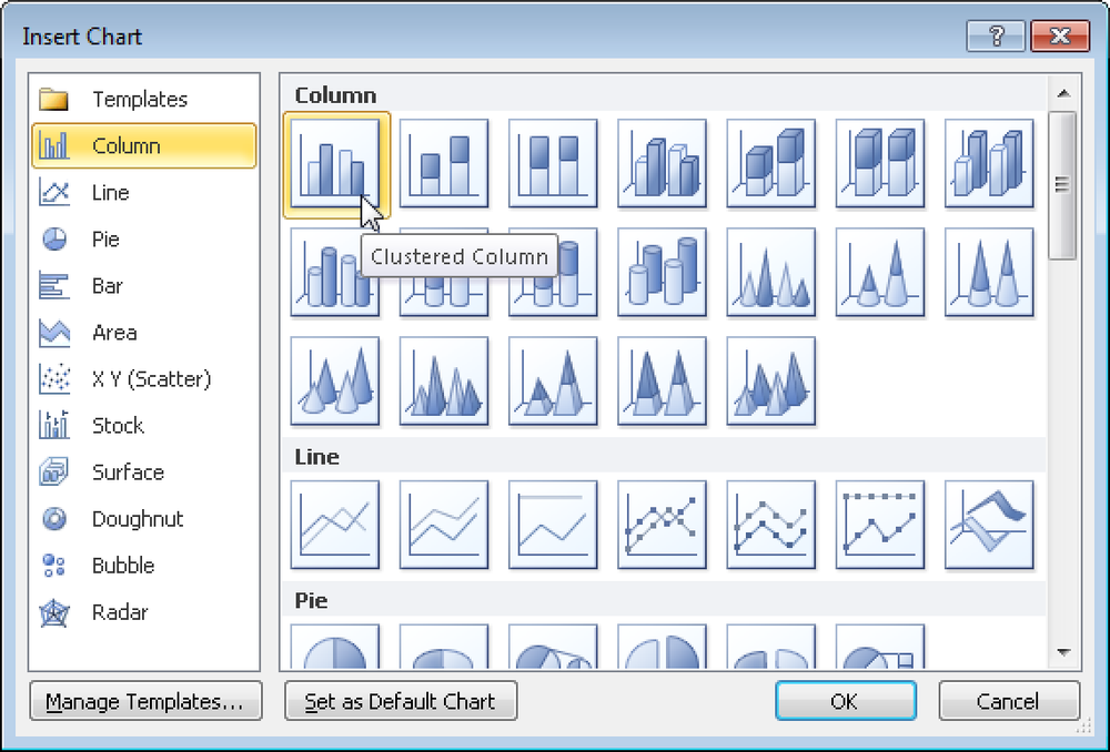
In the Tools group, click the PivotChart button (see Figure 1-61). The Insert Chart dialog box opens. The first layout under Column is selected (see Figure 1-62).
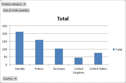
Keep this setting and click OK. The chart and a PivotChart filter range are displayed (see Figure 1-63).
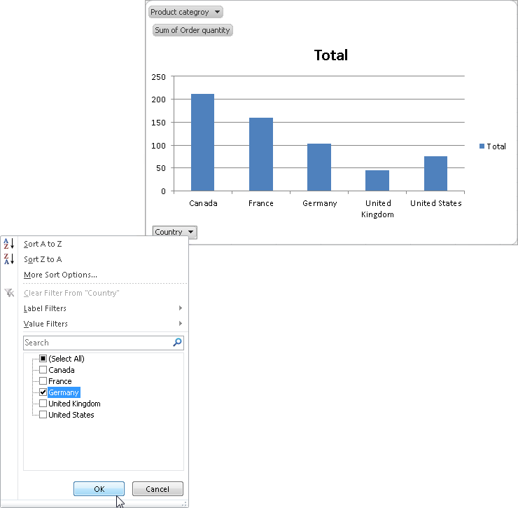
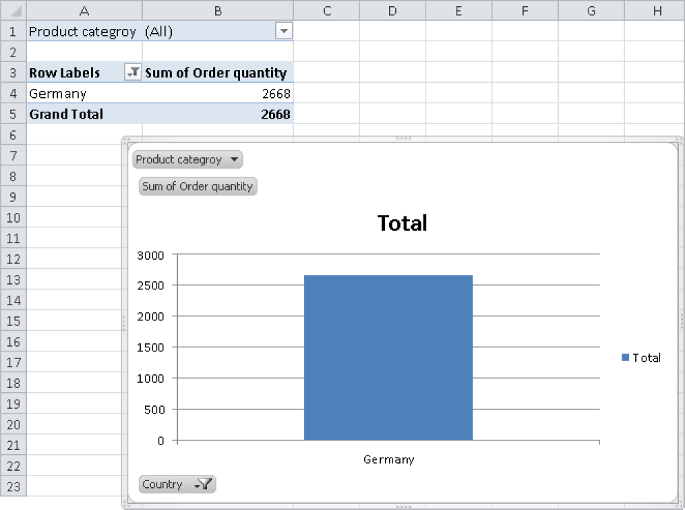
As soon as you change the filter, the chart also changes. In the Country list, select Germany and click OK (see Figure 1-64).
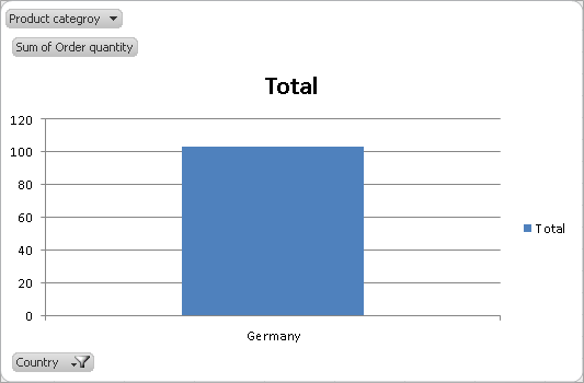
The chart changes automatically, and the corresponding values are displayed (see Figure 1-65).
PivotTables and PivotCharts change dynamically: If a value changes in the original data, the PivotTable and the associated chart also change. Try it out:
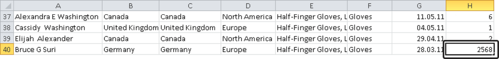
In the original data, increase the order quantity for gloves in Germany in any row (see Figure 1-66).
Go back to the PivotTable and open the PivotTable Tools contextual tab.
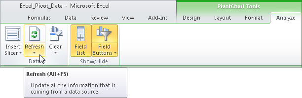
On the Analyze tab, in the Data group, click the Refresh button (see Figure 1-67).
The PivotTable as well as the PivotChart are automatically updated (see Figure 1-68).
Note
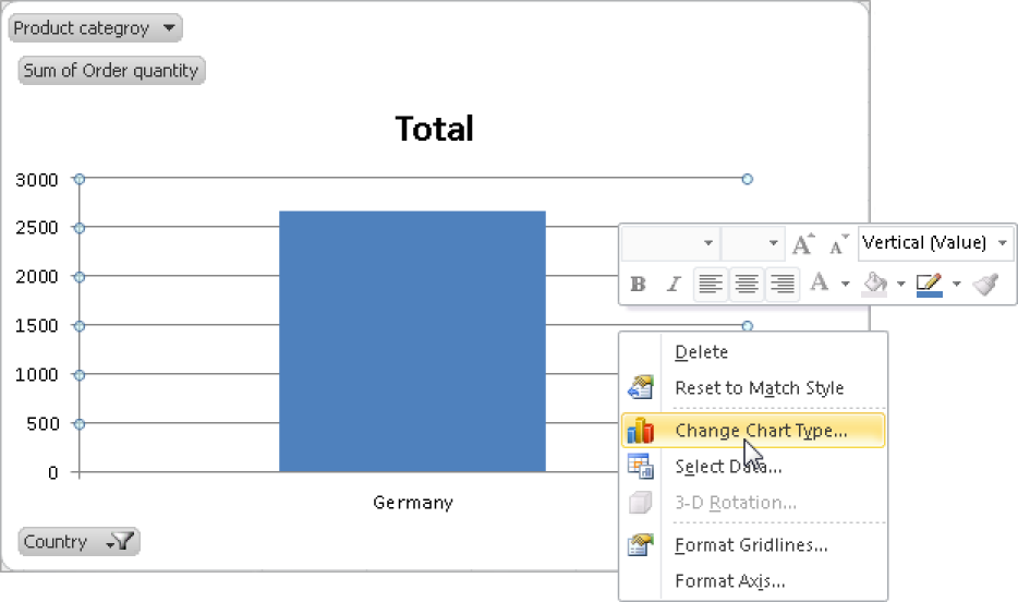
You can change additional settings for PivotCharts: Select a chart element and open the shortcut menu (see Figure 1-69).