S
oftware metrics and analysis provide the data and information that allows an organization’s quality management system to be based on a solid foundation of facts. The objective is to drive continual improvement in all quality parameters through a goal-oriented measurement and analysis system.
Software metrics programs should be designed to provide the specific information necessary to manage software projects and improve software engineering processes, products, and services. The foundation of this approach is aimed at making practitioners ask not “what should I measure?” but “why am I measuring?” or “what business needs does the organization wish its measurement initiative to address?” (Goodman 1993).
Measuring is a powerful way to track progress toward project, process, and product goals. As Grady (1992) states, “Without such measures for managing software, it is difficult for any organization to understand whether it is successful, and it is difficult to resist frequent changes of strategy.”
According to Humphrey (1989), there are four major roles (reasons) for collecting data and implementing software metrics:
-
To understand: Metrics can be gathered to learn about software projects, processes, products, and services, and their capabilities. The resulting information can be used to:
-
Establish baselines, standards, and goals
-
Derive models of the software processes
-
Examine relationships between process parameters
-
Target process, product, and service improvement efforts
-
Better estimate project effort, costs, and schedules
-
-
To evaluate: Metrics can be examined and analyzed as part of the decision-making process to study projects, products, processes, or services in order to establish baselines, to perform cost/benefit analysis, and to determine if established standards, goals, and entry/exit/acceptance criteria are being met.
-
To control: Metrics can be used to control projects, processes, products, and services by providing triggers (red flags) based on trends, variances, thresholds, control limits, standards and/or performance requirements.
-
To predict: Metrics can be used to predict the values of attributes in the future (for example, budgets, schedules, staffing, resources, risks, quality, and reliability).
Effective software metrics provide the objective data and information necessary to help an organization, its management, its teams, and its individuals:
-
Make day-to-day decisions
-
Identify project, process, product and service issues
-
Correct existing problems
-
Identify, analyze, and manage risks
-
Evaluate performance and capability levels
-
Assess the impact of changes
-
Accurately estimate and track effort, costs, and schedules
The bottom line is that effective metrics help improve software projects, products, processes, and services.
Define and describe metrics and measurement terms such as reliability, internal and external validity, explicit and derived measures, and variation. (Understand)
BODY OF KNOWLEDGE V.A.1
Metrics Defined
The term metrics
means different things to different people. When someone buys a book or picks up an article on software metrics, the topic can vary from project cost, and effort prediction and modeling, to defect tracking and root cause analysis, to a specific test coverage metric, to computer performance modeling, or even to the application of statistical process control charts to software.
Goodman (2004) defines software metrics as “The continuous application of measurement-based techniques to the software development process and its products to supply meaningful and timely management information, together with the use of those techniques to improve that process and its products.”
As illustrated in Figure 18.1
, Goodman’s definition can be expanded to include software projects and services. Examples of software services include:
-
Responding with fixes to problems reported from operations
-
Providing training courses for the software
-
Installing the software
-
Providing the users with technical assistance
Goodman’s definition can also be expanded to include engineering, as well as management information. In fact, measurement is one of the key required elements to move the software from a craft to an engineering discipline.
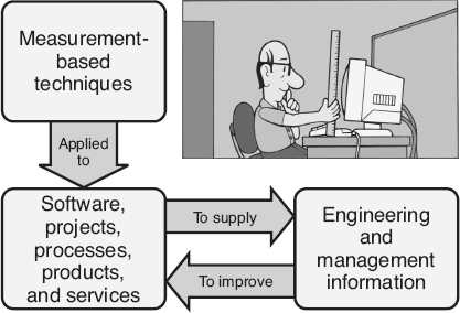
Figure 18.1
Metrics defined.
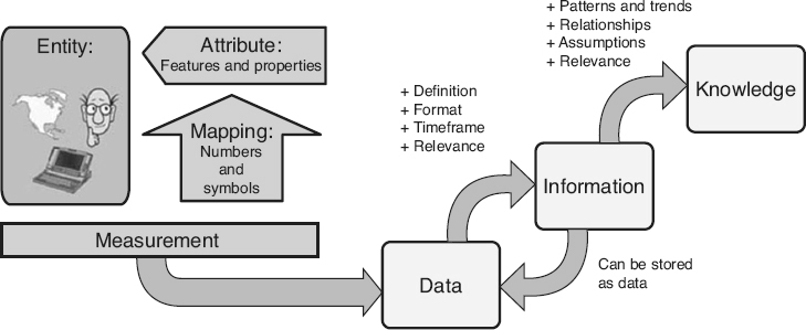
Figure 18.2
Converting measurement data into information and knowledge.
Software metrics are standardized ways of measuring the attributes of software processes, products, and services in order to provide the information needed to improve those processes, products, and services. The same metrics can then be used to monitor the impacts of those improvements, thus providing the feedback loop required for continual improvement.
Measurement Defined
The use of measurement is common. People use measurements in everyday life to weigh themselves in the morning, or when they glance at the clock or at the odometer in their car. Measurements are used extensively in most areas of operations and manufacturing to estimate costs, calibrate equipment, and monitor inventories. Science and engineering disciplines depend on the rigor that measurements provide. What does measurement really mean?
According to Fenton (1997), “measurement
is the process by which numbers or symbols are assigned to attributes of entities in the real world in such a way as to describe them according to clearly defined rules.” The left hand side of Figure 18.2
illustrates this definition of measurement.
Entities
are nouns, for example, a person, place, thing, event, or time period. An attribute is a feature or property of an entity. To measure, the entity being measured must first be determined. For example, a car could be selected as the entity. Once the entity is selected, the attributes of that entity that need to be described must be chosen. According to IEEE (1998d), an attribute
is a measurable physical or abstract property of an entity. Attributes for a car include its speed, its fuel efficiency, and the air pressure in its tires.
Finally, a mapping system,
also called the measurement method
or counting criteria,
must be defined and accepted. It is meaningless to say that the car’s speed is 65 or its tire pressure is 32 unless people know that they are talking about miles per hour or pounds per square inch. So what is a mapping system?
In ancient times there were no real standard measurements. This caused a certain level of havoc with commerce. Was it better to buy cloth from merchant A or merchant B? What were their prices per length? In England they solved this problem by standardizing the “yard” as the distance between King Henry I’s nose and his fingertips. The “inch” was the distance between the first and second knuckle of the king’s finger and the “foot” was literally the length of his foot.
To a certain extent, the software industry is still in those ancient times. As software practitioners try to implement software metrics, they quickly discover that very few standardized mapping systems exist for their measurements. Even for a seemingly simple metric such as the severity of a software defect, no standard mapping system has been widely accepted. Examples from different organizations include:
-
Outage, service-affecting, non-service-affecting
-
Critical, major, minor
-
C1, C2, S1, S2, NS
-
1, 2, 3, 4 (with some organizations using 1 as the highest severity and other organizations using 1 as the lowest)
An important element of a successful metrics program is the selection, definition, and consistent use of mapping systems for selected metrics. The software industry as a whole may not be able to solve this problem, but each organization must solve it to have a successful metrics program.
Data to Information to Knowledge
Once the measurement process is performed, the result is one or more numbers or symbols. These are data items. Data items
are simply “facts” that have been collected in some storable, transferable, or expressible format.
However, if the data are going to be useful, they must be transformed into information products that can be interpreted by people and transformed into knowledge, so that it can be used to make better, fact-based decisions. According to the Guide to Data Management Body of Knowledge
(DAMA 2009), “information
is data in context.” The raw material of information is data. By adding the context, collected data starts to have meaning. For example, a data item stored as the number 14 does not by itself provide any usable information. If the data item’s context is known, that data item is converted to information. For example, when the data item has:
-
A definition: Such as “the number of newly detected defects”
-
A timeframe: Such as “last week”
-
Relevance: Such as “while system testing software product ABC”
Once one or more data items are converted to information, the resulting information can also be stored as additional data items.
Information in and of itself is not useful until human intelligence is applied to convert it to knowledge
through the identification of patterns and trends, relationships, assumptions, and relevance. Going back to the data item example, if the information regarding the 14 newly-detected defects found last week during the system testing of software product ABC is simply put in a report that no one reads or uses, then the information is never
converted to knowledge. However, if the project manager determines that this is a higher defect arrival rate (trend
) than was found during the previous three weeks (relationship
) and determines that corrective action is needed (assumption
) resulting in the shifting of an additional software engineer onto problem correction (relevance
),
that information becomes knowledge. Of course the project manager can also decide that everything is under control and that no action is necessary. If this is the case, the information has still been converted to knowledge. The right hand side of Figure 18.2
illustrates this transformation of measurement data into information and then knowledge.
The moral is that the goal should never be “To put metrics (or measurements) in place.” That goal can result in an organization becoming DRIP
(Data Rich—Information Poor). The goal should be to provide people with the knowledge they need to make better, fact-based decisions. Metrics are simply the tools to make certain that standards exist for measuring in a consistent, repeatable manner in order to create reliable and valid data. For example, by establishing “what” is being measured through well-defined and understood entities and attributes, and “how” it is being measured through standardizing the mapping system and the conditions under which measures are done. Metrics provide a standardized definition of how to turn collected data into information, and how to interpret that information to create knowledge.
Reliability and Validity
Metric reliability is a function of consistency or repeatability of the measure. A metric is reliable
if different people (or the same person multiple times) can use that metric over and over to measure an identical entity and obtain the same results each time. For example, if two people count the number of lines of code in a source code module, they would both have the same, consistent count (within an acceptable level of measurement error, as defined later in this chapter). Or, if one person measured the cyclomatic complexity of a detailed design element today and then measures the same design element tomorrow, that person would get the same, consistent measure (within an acceptable level of measurement error).
A metric is valid
if it accurately measures what it is expected to measure, that is, if it captures the real value of the attribute it is intended to describe. IEEE (1998d) describes validity in terms of the following criteria:
-
Correlation: Whether there is a sufficiently strong linear association between the attribute being measured and the metric
-
Tracking: Whether a metric is capable of tracking changes in attributes over the life cycle
-
Consistency: Whether the metric can accurately rank, by attribute, a set of products or processes
-
Predictability: Whether the metric is capable of predicting an attribute with the required accuracy
-
Discriminative power: Whether the metric is capable of separating a set of high-quality software components from a set of low-quality software components
This definition of validity actually refers to the internal validity
of the metric or its validity in a narrow sense—does it measure the actual attribute? External validity, also called
predictive validity,
refers to the ability to generalize or transfer the metric results to other populations or conditions. For a metric to be externally valid, it must be internally valid. It must also be able to be used as part of a prediction system, estimation process, or planning model. For example, can the mean time to fix a defect, measured for one project,
be generalized to predict the mean time to fix for other projects? If so, then the mean-time-to-fix metric is considered externally valid. External validity is verified empirically through comparison of the predicted results to the subsequently observed actual results.
A metric that is reliable but not valid can be consistently measured, but that measurement does not reflect the actual attribute. An example of a metric that is reliable but not valid is using cyclomatic complexity for measuring reliability. Cyclomatic complexity can be consistently measured because it is well-defined and has a consistent mapping system. However, it is internally invalid as a measure of reliability because it is a measure of complexity, not of reliability.
A metric is internally valid but not reliable if it measures what it is supposed to measure, but can not be measured consistently. For example, if criteria are not clearly defined on how to assign numbers to the severity of a reported problem, resulting in different people assigning different severities to the same problem, the severity metric may be valid but not reliable. As illustrated in Figure 18.3
, the goal is to have metrics that are both reliable and internally valid. In fact, IEEE (1998d) actually includes reliability as one of the criteria for validity. For predictive-type metrics, external validity is also required.
To have metrics that are both reliable and valid, there must be agreement on standard definitions for the entity and its attributes that are being measured. Software practitioners may use different terms to mean the same thing. For example, the terms defect
report, problem report, incident report, fault report, anomaly report, issues report or call report may be used by various organizations or teams for the same item. But unfortunately, they may also refer to different items. One organization may use “user call reports” for a user complaint and “problem reports” as the description of a problem in the software. Their customer may use “problem reports” for the initial complaint and “defect reports” for the problem in the software.
Different interpretations of terminology can be a major barrier to correct interpretation and understanding of metrics. For example, a metric was created to report the “trend of open software problems” for a software development manager. The manager was very pleased with the report because she could quickly pull information that had previously been difficult to get from the antiquated problem-tracking tool. One day the manager brought this report to a product review meeting, so she could discuss the progress her team had made in resolving the problem backlog. The trend showed a significant decrease, from over 50 open problems six weeks ago, to only three open problems currently. When she put the graph up on the overhead, the customer service manager exploded. “What is going on here? Those numbers are completely wrong! I know for a fact that my customers are calling me every day to complain about the over 20 open field problems!” The problem was not with the numbers, but with the interpretation of the word “open.” To the software development manager, the problem was no longer open when they had fixed it, checked the source into the configuration management library, and handed it off for system testing. But to the customer service manager, the problem was still open until his customers in the field had their fix.
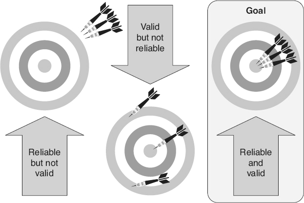
Figure 18.3
Reliability and validity.
As the above examples illustrate, the software industry has very few standardized definitions for software entities and their attributes. Everyone has an opinion, and the debate will probably continue for many years. An organization’s metrics program can not wait that long. The suggested approach is to adopt standard definitions within an organization and then apply them consistently. Glossaries such as the ISO/IEC/IEEE Systems and Software Engineering—Vocabulary
(ISO/IEC/IEEE 2010) or the glossary in this book can be used as a starting point. An organization can then pick and choose the definitions that correspond with their objectives, or use them as a basis for tailoring their own definitions. It can also be extremely beneficial to include these standard definitions as an appendix to each metrics report (or add definition pop-ups to online reports) so that
everyone who receives the report understands what definitions are being used.
Explicit Measures
Data items can be either explicit or derived measures. Explicit measures,
also called base measures, metrics primitives,
or direct metrics,
are measured directly. The Capability Maturity Model Integration
(CMMI
) for Development
(SEI 2010) defines a base measure as a “measure defined in terms of an attribute and the method for quantifying it.” For example, explicit measures for a code inspection would include the number of:
-
Lines of code inspected (loc_insp)
-
Engineering hours spent preparing for the inspection (prep_hrs)
-
Engineering hours spent in the inspection meeting (insp_hrs)
-
Defects (defects) identified during the inspection (defects)
For explicit measures, the mapping system used to collect the data for each measure must be defined and understood. Some mapping systems are established by using standardized units of measure (for example, dollars, hours, days). Other mapping systems define the counting criteria used to determine what does and does not get counted when performing the measurement. For example, if the metric is the “problem report arrival rate per month,” the counting criteria could be as simple as counting all of the problem reports in the problem-reporting database that had an open date during each month. However, if the measure was “defect counts” instead, the counting criteria might exclude all the problem reports in the database that did not result from a product defect (for example, those defined as works-as-designed, operator error, or withdrawn).
Some counting criteria are very complex, like the counting
criteria for measuring function points, or the criteria for counting effort on a project. In the latter example, the units of effort might be defined in terms of staff hours, months, or years, depending on the size of the project. Other counting criteria decisions would include:
-
Whose time counts: Does the systems analyst’s time count? Does the programmer’s or engineer’s time count? How about the project manager? The program manager? Upper management? The lawyer? The auditor?
-
When does the project start or end: Does the time spent doing the cost / benefit analysis count? Does the time releasing, replicating, delivering, and installing the product in operations count?
-
What activities count: If the programmer’s time counts, does the time they are coding count? How about the time they spend fixing problems on a previous release? Or the time they spend in training?
-
Does overtime count: Does it count if it is unpaid overtime?
Of course, many organizations solve this problem by simply stating that if the time is charged to the project account number, then it counts. But they still must have counting criteria established that define the rules for what to charge to those account numbers.
Having a clearly defined and communicated mapping system helps everyone interpret the measures the same way. The metrics mapping system and, if applicable, data needed based on the associated counting criteria, define the first level of data that needs to be collected in order to implement the metric.
Derived Measures
According to the CMMI for Development
(2010), a derived measure,
also called complex metrics,
is a “measure that is defined as a function
of two or more values of explicit measures,” that is, the mathematical combinations of explicit measures or other derived metrics. For a code inspection, examples of derived metrics would include:
-
Preparation rate: The number of lines of code inspected, divided by the hours spent preparing for the inspection (loc_insp/insp_hrs)
-
Defect detection rate: The number of defects found during the inspection, divided by the sum of the hours spent preparing for the inspections and the hours spent inspecting the work product (defects/ [prep_hrs + insp_hrs])
Most measurement functions include an element of simplification. When creating a function, an organization needs to be pragmatic. If an attempt is made to include all of the elements that affect the attribute or characterize the entity, the functions can become so complicated that the metric is useless. Being pragmatic means not trying to create the perfect function. Pick the explicit measures that are the most important. The ideal measurement function is simple enough to be easy to use, and at the same time provides enough information to help people make better, more informed decisions. Remember that the function can always be modified in the future to include additional levels of detail as the organization gets closer to its goal. The people designing a function should ask themselves:
-
Does the measurement provide more information than is available now?
-
Is that information of practical benefit?
-
Does it tell the individuals performing the measure what they want to know?
Measurement functions should be selected and tailored to the organization’s information needs. As illustrated in Figure 18.4
, to demonstrate the selection of a tailored function, consider a metric that calculates the duration of unplanned system outages.
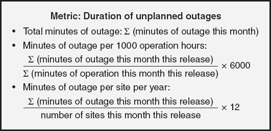
Figure 18.4
Different functions for the same metric—examples.
-
If a software system, installed at a single site and running 24/7, is being measured, a simple function such as the sum of all of the minutes of outage for the calendar month may be sufficient
-
If the software system, installed at a single site, runs a varying number of operational hours each month, or if different software releases are installed on a varying number of sites each month, this might lead to the selection of a function such as minutes of outage per 1000 operation hours per release
-
If the focus is on the impact to the customers, this might leadto the selection of a function such as minutes of outage per siteper year
Measurement Scales
There are four different measurement scales
that define the type of data that is being collected. The measurement scale is important because it defines the mathematics, or kinds of statistics, that can be done using the collected data.
The nominal scale
is the simplest form of measurement scale. In nominal scale measurements, items are assigned to a classification (one-to-one mapping), where that classification categorizes the attribute of the entity. Examples of nominal scale measurements include:
-
Development method (waterfall, V, spiral, other)
-
Root cause (logic error, data initialization error, data definition error, other)
-
Document author (Linda, Bob, Susan, Tom, other)
The categories in a nominal scale measurement must be jointly exhaustive and cover all possibilities. This means that every measurement must be assigned a classification. Many nominal scale measures include a category of “other,” so everything fits somewhere. The categories must also be mutually exclusive. Each item must fit one and only one category. If an attribute is classified in one category, it can not be classified in any of the other categories.
The nominal scale does not make any assumptions about order or sequence. The only math that can be done on nominal scale measures is to count the number of items in each category and look at their distributions.
The ordinal scale
classifies the attribute of the entity by order. However, there are no assumptions made about the magnitude of the differences between categories (a defect with a critical severity is not twice as bad as one with a major severity). Examples of ordinal scale measurements include:
-
Defect severity (critical, major, minor)
-
Requirement priority (high, medium, or low)
-
SEI CMM level (1 = initial, 2 = repeatable, 3 = defined,4 = managed, 5 = optimized)
-
Process effectiveness (1 = very ineffective, 2 = moderately ineffective, 3 = nominally effective, 4 = moderately effective,5 = very effective)
Since there is order, the transitive property
is valid for ordinal scale measures, that is if data item A > data item B and data item B > data item C, then data item A > data item C. However, without an assumption of magnitude, mathematical operations of addition, subtraction, multiplication, and division can not be used on ordinal scale measurement values.
For interval scale
measurements, the exact distance between the data items is known. This allows the mathematical operations of addition and subtraction to be applied to interval scale measurement values. However, there is no absolute or non-arbitrary zero point in the interval scale, so multiplication and division do not apply. The classic example of an interval scale measure is calendar time. For example, it is valid to say, “May 1st
plus 10 days is May 11th
,” but saying “May 1st
times May 11th
” is invalid. Interval scale measurements require well-established units of measure that can be agreed upon by everyone using the measurement. Either the mode or the median can be used as the central tendency statistic for interval scale metrics.
In the ratio scale,
not only is the exact distance between the scales known, but there is an absolute or non-arbitrary zero point. All mathematical operations can be applied to ratio scale measurement values, including multiplication and division. Examples of ratio scale measurement include:
-
Defect counts
-
Defect density (defects per size)
-
Minutes of outage
-
Hours of effort
-
Cycle times
-
Rates (for example arrival rates and fix rates)
Note that since derived measures are mathematical combinations of two or more explicit measures or other derived measures, those explicit and derived measures must be at a minimum interval scale measurements (if only addition and subtraction are used in the measurement function) and they are typically ratio scale measurements.
Variation
To start the discussion of variation, consider an exercise from Shewhart’s book, Economic Control of Quality of Manufactured Product
(Shewhart 1980). This exercise begins by having a person write the letter “a” on a piece of paper. The person is then asked to write another “a” identical to the first one; then another just like it, then another, until the person has 10 a’s on the paper. When all of the letters are compared, are they all perfectly identical or are there variations between them? The instructions were to make all of the a’s identical, but as hard as the person may have tried, that person can not make them all identical. But, why can a person not write ten identical a’s? Most people could probably think of multiple reasons why there are variations between the letters. Examples might include:
-
The ink flow in the pen is not uniform
-
The paper is not perfectly smooth
-
The person’s hand placement was not the same each time
People accept the fact that there are many reasons for the
variation, and that it is impractical, and most likely impossible, to try to remove them all. If two people were asked to do this same exercise, there would probably be even more variation between one person’s a’s and another person’s a’s., because different people doing the same task adds another cause of variation.
Quality practitioners talk about two distinct sources for variation. The first of these sources is called common causes,
also known as random causes
or chance causes
of variation. Common causes of variation are the normal or usual causes of variation that are inherent in a consistent, repeatable process. A process is said to be in statistical control
when it only exhibits common causes of variation. As long as the process does not change, these common causes of variation will not change. Therefore, based on historic data or on a sample set of data from the current process, practitioners can quantify common causes of variation in order to predict the amount of variation that will occur in the future.
Common cause variation comes from normal, expected fluctuations in various factors, typically classified as influences from:
-
People (worker) influences
-
Machinery influences
-
Environmental factors
-
Material (input) influences
-
Measurement influences
-
Method influences
The only way to change or reduce the common causes of variation is to change the process itself (for example, through process improvement). It should be noted that there is always some level of variation in every process, and that not all common causes of variation can be or should be eliminated. There are engineering trade-offs to be made. For example, eliminating common causes of
variation in one part of the process may cause problems in another part of the process, or it may not be economically feasible to eliminate a source of common cause variation.
The second source of variation is special causes,
also called assignable causes,
which are outside the normal “noise” of the process and result in abnormal or unexpected variation. Special causes of variation include:
-
One-time perturbations: For example, someone bumps the person’s elbow while he/ she is writing an a.
-
Things that cause trends: For example, the person’s hand starts getting tired after written the thousandth a.
-
Shifts and jumps: For example, making process improvement changes is a special cause that will typically result in a shift in the amount of variation in the process. Another example of a shift or jump may be caused by changing the person performing the task.
-
Unexpected variation in quantity or quality of the inputs to process: Such as raw materials, components, or subassemblies. For example, the pen’s ink gets clogged or starts skipping.
If special causes of variation exist in a process, that process is not performing at its best and is considered out of control.
In this case, the process is not sufficiently stable enough to use historic data or samples from the current process to predict the amount of variation that will occur in the future. That means that statistical quality control cannot be applied to processes that are out of control. Special causes of variation can usually be detected, and actions to eliminate these causes can typically be economically justified.
Statistics and Statistical Process Control
Statistics
is defined as the science of the collection, organization, analysis, and interpretation of data. Statistical quality control
refers to the use of measurement and statistical methods in the monitoring and maintaining of the quality of products and services. Faced with a large amount of data, it may seem daunting to try to turn that data into information that can be used to create knowledge. However, there are some basic descriptive statistics that can be used to characterize a set of data items in order to provide needed information about a data set.
The location
of the data set refers to the typical value or central tendency that is exhibited by most data sets. The location refers to the way in which data items tend to cluster around one or more values in that data set. Figure 18.5
shows examples of three data sets, each with the same variance and shape, but with three different locations.
Three statistics are typically used to represent the location of a data set:
-
The mean is the arithmetic average of the numbers in the data set. The mean is “used for symmetric or near-symmetric distributions or for distributions that lack a clear, dominant single peak” (Juran 1999). The mean is calculated by summing the data values and dividing by the number of data items. For example, if the data items were 3, 5, 10, 15, 19, 21, 25, the mean would be (3 + 5 + 10 + 15 + 19 + 21 + 25)/7 = 14. The mean is probably the most used statistic in the quality field. It is used to report and/or predict “expected values” (for example, average size, average yield, average percent defective, mean time to failure, and mean time to fix). However, since division is involved in calculating the mean, it can only be used on ratio scale measurement data.
-
The median is the middle value when the numbers are arranged according to size. The median is “used for reducing the effects of extreme values or for data that can be ranked but are not economically measurable (shades of color, visual appearance, odors)” (Juran 1999). For example, if the data items were 3, 5, 10, 15, 19, 21, 102, the median would be 15. If there is an even number of items in the data set, then the median is calculated by adding the two middle values and dividing by two. For example, if the data items were 3, 5, 10, 15, 19, 21, 46, 102, the middle two items are 15 and 19, so the median would be calculated by (15 + 19)/2 = 17. Since the median requires the data items to be sorted in order, it can not be used on nominal scale measurement data.
-
The mode is the value that occurs most often in the data. The mode is “used for severely skewed distributions, describing irregular situations where two peaks are found, or for eliminating the effects of extreme values” (Juran 1999). For example, if the data items were, 1, 1, 1, 1, 1, 3, 3, 5, 10, 21, 96, the mode would be 1 (the most frequently occurring value). For the data set 1, 2, 3, 4, 5, there are 5 modes because all 5 data items have the same number of occurrences. The mode is also used for nominal scale measurement data.
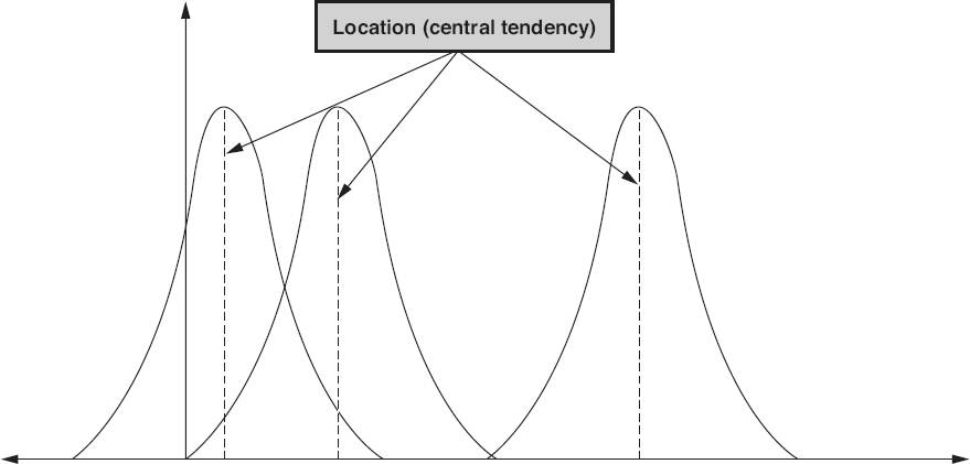
Figure 18.5
Data sets with different locations—examples.
In most data sets, the individual data items tend to cluster around the location and then spread or scatter out from there toward the extreme or extremes of the data set. The extent of this scattering is the variance,
also called the spread
or dispersion,
of the data set. The variance is the amount by which smaller values in the data set differ from larger values. Figure 18.6
shows an example of three data sets, each with the same location and shape, but with three different variances.
The simplest measure of variance is the range of the data set. The range
is the difference between the maximum value and the minimum value in the data set. The more variance there is in the data set, the larger the value of the range will be. For example, if the data items were 3, 5, 10, 15, 19, 21, 25, the range would be equal to 25 − 3 = 22.
The most important measure of variance from the perspective of statistical quality control is standard deviation. Standard deviation
is a measure of how much variation there is from the mean of the data set. A low value for standard deviation indicates that the data values are tightly clustered around the mean. The
larger the standard deviation, the more spread out the data values are from the mean. The Greek letter sigma (σ) is used to represent the standard deviation of the entire population, and the letter “s” is used to represent the standard deviation for a sample from that population.

Figure 18.6
Data sets with different variances—examples.
In statistics, the distribution
describes the shape of a set of data. More specifically, the probability distribution
describes the range of possible values for the data in the set and the probability that any given random value selected from that population is within a measurable subset of that range. Figure 18.7
illustrates a normal distribution,
also called a Gaussian distribution
or bell curve.
A normal distribution
is a continuous distribution where there is a concentration of observations around the mean, and the shape is a symmetrical bell-like shape. In a normal distribution, the three location statistics of mean, median, and mode are all equal. Figure 18.7
also illustrates the percentage of data items under a normal distribution curve as plus and minus various standard deviations.
For example, 68.26 percent of all data items in a normal distribution fall within ±1 standard deviation under the curve. At ±3 standard deviations, 99.73 percent of all data items in a normal distribution fall under the curve. Calculations for the standard deviation are dependent on the distribution of the data set. The normal distribution is the most well-known and used probability distribution. Data sets for many quality characteristics can be estimated and/ or described using a normal distribution. As discussed in Chapter 19
, normal distributions are also used as the basis for creating statistical process control charts.
A normal distribution is just one type of distribution or shape that a data set can have. There are also other types of distributions, grouped into two major classifications:
-
The shape of a set of variable data is described by a continuous distribution. A normal distribution is one example of a continuous distribution. Uniform exponential, triangular, quadratic, cosine, and u-shaped are other common continuous distributions.
-
The shape of a set of attribute data is described by a discrete distribution. Common discrete distributions include, uniform, Poisson, binomial, and hyper geometric distributions.
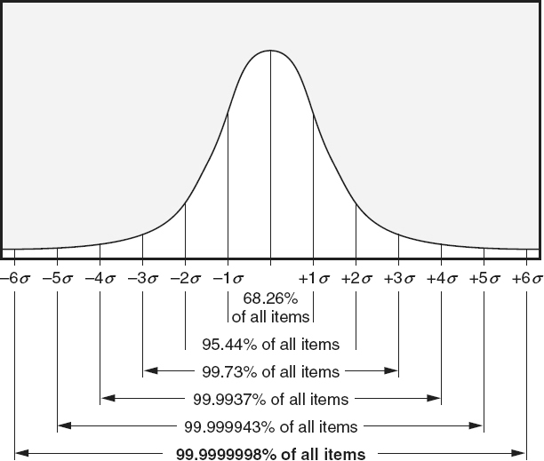
Figure 18.7
Normal distribution curve with standard deviations.
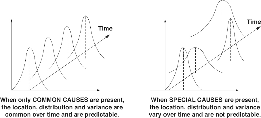
Figure 18.8
Common cause and special cause impacts on statistics—examples.
When only common cause variation exists in a process, the location, distribution, and variance statistics of the data collected from that process will be stable and predictable over time, as illustrated on the left side of Figure 18.8
. This means that statistics for a data set collected from the process today will be the same as for the data set collected next week, and the week after that, and the week after that and so on.
Whenever special causes of variation are introduced into the process, the location, distribution, and variance statistics of data sets collected from that process will vary over time, and will no longer be predictable, as illustrated on the right side of Figure 18.8
.
Choose appropriate metrics to assess various software attributes (e.g., size, complexity, the amount of test coverage needed, requirements volatility, and overall system
performance). (Apply)
BODY OF KNOWLEDGE V.A.2
Metric Customers
With all of the possible software entities and attributes, it is easy to see that a huge number of possible metrics could be implemented. So how does an organization or team decide which metrics to use? The first step is to identify the customer. The customer of the metrics is the person or team who will be making decisions or taking action based on the metrics. The customer is the person who needs the information supplied by the metrics.
If a metric does not have a customer—someone who will make a decision based on that metric (even if the decision is “everything is fine—no action is necessary”)—then stop producing that metric. Remember that collecting data and generating metrics is expensive, and if the metrics are not being used, it is a waste of people’s time and the organization’s money.
There are many different types of customers for a metrics program. This adds complexity because each customer may have different information requirements. It should be remembered that metrics do not solve problems—people solve problems. Metrics can only provide information so that those people can make informed decisions based on facts rather than “gut feelings.” Customers of metrics may include:
-
Functional managers: Are interested in applying greater control to the software development process, reducing risk, and maximizing return on investment.
-
Project managers: Are interested in being able to accurately predict and control project size, effort, resources, budgets, and schedules. They are also interested in controlling the projects they are in charge of and communicating facts to management.
-
Individual software practitioners: Are interested in making informed decisions about their work and work products. They will also be responsible for generating and collecting a significant amount of the data required for the metrics program.
-
Specialists: The individuals performing specialized functions (marketing, software quality assurance, process engineering, configuration management, audits and assessments, customer technical assistance). Specialists are interested in quantitative information on which they can base their decisions, findings, and recommendations.
-
Customers and users: Are interested in on-time delivery of high-quality, useful software products and in reducing the overall cost of ownership.
Selecting Metrics
Basili and his colleagues defined a goal/question/metric
paradigm, which provides an excellent mechanism for defining a goal-based measurement program (Grady 1992). The goal/question/metric paradigm is illustrated in Figure 18.9
. The first step to implementing the goal/question/metric paradigm is to select one or more measurable goals for the customer of the metrics:
-
At the organizational level, these are typically high-level strategic goals. For example, being the low-cost provider, maintaining a high level of customer satisfaction, or meeting projected revenue or profit margin targets.
-
At the project level, the goals emphasize project management and control issues, or project-level requirements and objectives. These goals typically reflect the project success factors such as on-time delivery, finishing the project within budget, delivering software with the required level of quality or performance, or effectively and efficiently utilizing people and other resources.
-
At the specific task level, goals emphasize task success factors. Many times these are expressed in terms of satisfying the entry and exit criteria for the task.
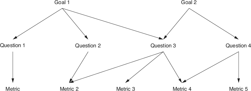
Figure 18.9
Goal/question/metric paradigm.
The second step is to determine the questions that need to be answered in order to determine whether each goal is being met or if progress is being made in the right direction. For example, if the goal is to maintain a high level of customer satisfaction, questions might include:
-
What is our current level of customer satisfaction?
-
What attributes of our products and services are most important to our customers?
-
How do we compare with our competition?
-
How do problems with our software affect our customers?
Finally, metrics are selected that provide the information needed to answer each question. When selecting metrics, be practical, realistic, and pragmatic. Metrics customers are turned off by
metrics that they see as too theoretical. They need information that they can interpret and utilize easily. Avoid the “ivory tower” perspective that is completely removed from the existing software engineering environment (currently available data, processes being used, and tools). Customers will also be turned off by metrics that require a great deal of work to collect new or additional data. Start with what is possible within the current process. Once a few successes are achieved, the metrics customers will be open to more radical ideas—and may even come up with a few metrics ideas of their own.
Again, with all of the possible software entities and attributes, it is easy to see that a huge number of possible metrics could be implemented. This chapter touches on only a few of those metrics as examples of the types of metrics used in the software industry. The recommended method is to use the goal/question/metric paradigm, or some other mechanism, to select appropriate metrics that meet the information needs of an organization and its teams, managers, and engineers. It should also be noted that these information needs will change over time. The metrics that are needed during requirements activities will be different than the metrics needed during testing, or once the software is being used in operations. Some metrics are collected and reported on a periodic basis (daily, weekly, monthly), others are needed on an event-driven basis (when an activity or phase is started or stopped), and others are used only once (during a specific study or investigation). The Software Capability Maturity Module Integration (CMMI) for Development, Service and Acquisition (SEI 2010; SEI 2010a; SEI 2010b) includes a Measurement and Analysis process area which provides a road map for developing and sustaining a measurement program.
As discussed previously, metrics must define the entity and the attributes of that entity that are being measured. Software product entities
are the outputs of software development, operations, and
maintenance processes. These include all of the artifacts, deliverables, and documents that are produced. Examples of software product entities include:
-
Requirements documentation
-
Software design specifications and models (entity diagrams, data flow diagrams)
-
Code (source, object, and executable)
-
Test plans, specifications, cases, procedures, automation scripts, test data, and test reports
-
Project plans, budgets, schedules, and status reports
-
Customer call reports, change requests and problem reports
-
Quality records and metrics
Examples of attributes associated with software product entities include size, complexity, number of defects, test coverage, volatility, reliability, availability, performance, usability and maintainability.
Size—Lines of Code
Lines of code
(LOC) counts are one of the most used and most often misused of all the software metrics. Some estimation methods are based on KLOC
(thousands of lines of code). The LOC metric may also be used in other derived metrics to normalize measures so that releases, projects, or products of different sizes can be compared (for example, defect density or productivity). The problems, variations, and anomalies of using lines of code are well documented (Jones 1986). Some of these include:
-
Problems in counting LOC for systems using multiple languages
-
Difficulty in estimating LOC early in the software life cycle
-
Productivity paradox—if productivity is measured in LOC per staff month, productivity appears to drop when higher-level languages are used, even though higher-level languages are inherently more productive
No industry-accepted standards exist for counting LOC. Therefore, it is critical that specific criteria for counting LOC be adopted for the organization. Considerations include:
-
Are physical or logical lines of code counted?
-
Are comments, data definitions, or job control language counted?
-
Are macros expanded before counting? Are macros counted only once?
-
How are products that include different languages counted?
-
Are only new and changed lines counted, or are all lines of code counted?
The Software Engineering Institute (SEI) has created a technical report specifically to present guidelines for defining, recording, and reporting software size in terms of physical and logical source statements (CMU/SEI 1992). This report includes check sheets for documenting criteria selected for inclusion or exclusion in LOC counting for both physical and logical LOC.
Size—Function Points
Function points
is a size metric that is intended to measure the size of the software without considering the language it is written in. The function point counting procedure has five steps:
Step 1:
Decide what to count (total number of function points, or just new or changed function points).
Step 2:
Define the boundaries of the software being measured.
Step 3:
Count the raw function points, which are determined by adding together the weighted counts for each of the following five function types, as illustrated in Figure 18.10
:
-
External input: The weighted count of the number of unique data or control input types that cross the external boundary of the application system and cause processing to happen within it
-
External output: The weighted count of the number of unique data or control output types that leave the application system, crossing the boundary to the external world and going to any external application or element
-
External inquiry: The weighted count of the number of unique input/output combinations for which an input causes and generates an immediate output
-
Internal logical file: The weighted count of the number of logical groupings of data and control information that are to be stored within the system
-
External interface file: The weighted count of the number of unique files or databases that are shared among or between separate applications
Within each function type, the counts are weighted based on complexity and other contribution factors. Raw function point counts have clearly defined measurement methods, as established by the International Function Point Users Group (IFPUG).
Step 4:
Assign a degree of influence to each of the 14 defined by IFPUG. These factors are used to measure the complexity of the software. Each factor is measured on a scale of zero to five (five being the highest). These adjustment factors include:
-
Data communications
-
Distributed data or processing
-
Performance objectives
-
Heavily used configuration
-
Transaction rate
-
Online data entry
-
End user efficiency
-
Online update
-
Complex processing
-
Reusability
-
Conversion and installation ease
-
Operational ease
-
Multiple site use
-
Facilitate change

Figure 18.10
Function points.
Step 5:
Adjust the raw function point count. To do this, the sum of all 14 degrees of influence to the value adjustment factors is multiplied by 0.01 and added to 0.65. This results in a value from
65 percent to 135 percent. That percentage is then multiplied by the raw function point count to calculate the adjusted function point count. For example, if the sum of the degrees of influence is 42 and the raw function point count is 450, then the adjusted function point count is calculated as:

As with lines of code, function points are used as the input into many project estimation tools, and may also be used in derived metrics to normalize those metrics, so that releases, projects, or products of different sizes can be compared (for example, defect density or productivity).
Other Size Metrics
There are many other metrics that may be used to measure the size of different software products:
-
In object-oriented development, size may be measured in terms of the number of objects, classes, or methods.
-
Requirements size may be measured in terms of the count of unique requirements, or weights may be included in the counts (for example, large requirements might be counted as 5, medium requirements as 3, and small requirements as 1). Other examples of weighted requirements counts include story points used in agile (the estimation of story points is discussed in Chapter 15 ), and use case points (based on the number and complexity of the use cases that describe the software application, and the number and type of the actors in those use cases, adjusted by factors of the technical complexity of the product and the environmental complexity of the project).
-
Design size may be measured in terms of the number of design elements (configuration items, subsystems, or source code modules).
-
Documentation is typically sized in terms of the number of pages or words, but for graphics-rich documents, counts of the number of tables, figures, charts, and graphs may also be valuable as size metrics.
-
The testing effort is often sized in terms of the number of test cases or weighted test cases (for example, large test cases might be counted as 5, medium test cases as 3, and small test cases as 1).
Complexity—Cyclomatic Complexity
McCabe’s cyclomatic complexity
is a measure of the number of linearly independent paths through a module or detailed design element. Cyclomatic complexity can therefore be used in structural testing to determine the minimum number of path tests that must be executed for complete coverage. Empirical data indicates that source code modules with a cyclomatic complexity of 10 or greater are more defect prone and harder to maintain.
Cyclomatic complexity is calculated from a control flow graph by subtracting the number of nodes from the number of edges, and adding two times the number of unconnected parts of the graph (edges—nodes + 2p). In well-structured code, with one entry point and one exit point, there is only a single part to the graph, so p = 1. Cyclomatic complexity is a measure that is rarely calculated manually. This is a measurement where static analysis tools are extremely useful and efficient for calculate the cyclomatic complexity of the code. This explanation is included here so people understand what the tool is doing when it measures cyclomatic complexity
As illustrated in Figure 18.11
:
-
Straight-line code (control flow graph A) has one edge, two nodes and one part to the graph, so its cyclomatic complexity is 1 − 2 + 2 X 1 = 1
-
Control flow graph B is a basic if-then-else structure and has four edges and four nodes, so its cyclomatic complexity is 4 − 4 + 2 X 1 = 2
-
Control flow graph C is a case statement structure followed by an if-then-else structure. Graph C has 12 edges and nine nodes, so its cyclomatic complexity is 12 − 9 + 2 X 1 = 5.
Another way of measuring the cyclomatic complexity for well-structured software (no two edges cross each other in the control flow graph, and there is one part to the graph) is to count the number of regions in the graph. For example:
-
Control flow graph C divides the space into five regions, four enclosed regions, and one for the outside, so its cyclomatic complexity is again 5
-
Control flow graph A has a single region and a cyclomatic complexity of 1
-
Control flow graph B has two regions and a cyclomatic complexity of 2
-
Control flow graph D is a repeated if-then-else structure and has 13 edges and 10 nodes, so its cyclomatic complexity is 13 − 10 + 2 X 1 = 5 (note that it also has five regions)

Figure 18.11
Cyclomatic complexity—examples.
Just to illustrate an example of a software component where the number of parts is greater than one, assume an old piece of poorly structured legacy code has two entry points and two exit points. For example, assume control flow graphs C and D in Figure 18.11
are both part of the same source code module. That module would have 25 edges (12 from C and 13 from D), 19 nodes (9 from C and 10 from D) and 2 parts (part C and part D that are not connected). The cyclomatic complexity would be 25 − 19 + (2*2) = 10. This makes sense because both control flow graphs C and D each had a cyclomatic complexity of 5, so together they should have a cyclomatic complexity of 10.
Complexity—Structural Complexity
While cyclomatic complexity is looking at the internal complexity of an individual design element or source code module, structural complexity is looking at the complexity of the interactions between the modules in a calling structure (or in the case of object-oriented development, between the classes in an inheritance tree). Figure 18.12
illustrates four structural complexity metrics. The depth and width metrics focus on the complexity of the entire structure. The fan-in and fan-out metrics focus on the individual elements within that structure.
The depth
metric is the count of the number of levels of control
in the overall structure or of an individual branch in the structure. For example, the branch in Figure 18.12
that starts with the element labeled “Main” and goes to the element labeled “A” has a depth of three. Each of the four branches that starts with the element labeled “Main” and go to the element labeled “D” has a depth of five. The depth for the entire structure is measured by taking the maximum depth of the individual branches. For example, the structure in Figure 18.12
has a depth of five.
The width
metric is the count of the span of control in the overall software system, or of an individual level within the structure. For example, the level that includes the element labeled “Main” in Figure 18.12
has a width of one. The level that includes the elements labeled “A” and “B” has a width of five. The level that includes the element labeled “C” has a width of seven. The width for the entire structure is equal to the maximum width of the individual levels. For example, the structure in Figure 18.12
has a width of seven.
Depth and width metrics can help provide information for making decisions about the integration and integration testing of the product and the amount of effort required.
Fan-out
is a measure of the number of modules that are directly called by another module (or that inherit from a class). For example, the fan-out of module Main in Figure 18.12
is three. The fan-out of module A is zero, the fan-out of module B is four, and the fan-out of module C is one.
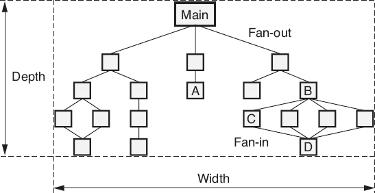
Figure 18.12
Structural complexity—examples.
Fan-in
is the count of the number of modules that directly call a module (or that the class inherits from). For example, in Figure 18.12
, the fan-in of module A is one, the fan-in of module D is four, and the fan-in of module Main is zero.
Fan-in and fan-out metrics provide information for making decisions about the integration and integration testing of the product. These metrics can also be useful in evaluating the impact of a change and the amount of regression testing needed after the implementation of a change
Quality—Defect Density
Defect density is a measure of the total known defects divided by the size of the software entity being measured (Number of known defects/Size). The number of known defects is the count of total defects identified against a particular software entity during a particular time period. Examples include:
-
Defects to date since the creation of the module
-
Defects found in a work product during an inspection
-
Defects to date since the shipment of a release to the customer
For defect density, size is used as a normalizer to allow comparisons between different software entities (for example, source code modules, releases, products) of different sizes. To demonstrate the calculation of defect density, Table 18.1
illustrates the size of the three major subsystems that make up the ABC software system and the number of prerelease and post-release defects discovered in each subsystem.
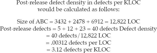
Defect density is used to compare the relative number of defects in various software components. This helps identify candidates for additional inspection or testing, or for possible reengineering or replacement. Identifying defect-prone components allows the concentration of limited resources into areas with the highest potential return on the investment. Typically this is done using a Pareto diagram as illustrated in Figure 19.16
.
Another use for defect density is to compare subsequent releases of a product to track the impact of defect reduction and quality improvement activities as illustrated in Figure 18.13
. Normalizing defect arrival rates by size allows releases of varying size to be compared. Differences between products or product lines can also be compared in this manner.
Table 18.1
Defect density inputs—example.


Figure 18.13
Post-release defect density—example.
Quality—Arrival Rates
Arrival rates
graph the trends over time of problems newly opened against a product. Note that this metric looks at problems, not defects. Testers, customers, technical support personnel, or other originators report problems because they think there is something wrong with the software. The software developers must then debug the software to determine if there is actually a defect.
In some cases, the problem report may be closed after this analysis as “operator error,” “works as designed,” “can not duplicate,” or some other non-defect-related disposition.
Prior to release, the objective of evaluating the arrival rate trends is to determine if the product is stable or moving toward stability. As illustrated in Figure 18.14
, when testing is first gearing up, arrival rates may be low. During the middle of testing, arrival rates are typically higher with some level of variation. However, as shown for product A, the goal is for the arrival rates to trend downward toward zero or stabilize at very low levels (the time between failures should be far apart) prior to the completion of testing and release of the software. By stacking the arrival rates by severity, additional information can be analyzed. For example, it is one thing to have a few minor problems still being found near the end of testing, but if critical problems are still being found, it might be appropriate to continue testing. Product B in Figure 18.14
does not exhibit this stabilization and therefore indicates that continued testing is appropriate. However, arrival rate trends by themselves are not sufficient to signal the end of testing. This metric could be made to “look good” simply by slowing the level of effort being expended on testing. Therefore, arrival rates should be evaluated in conjunction with other metrics, including effort rates, when evaluating test sufficiency.
Post-release arrival rate trends can also be evaluated. In this case the goal is to determine the effectiveness of the defect detection and removal processes, and process improvement initiatives. As illustrated in Figure 18.13
, post-release defect arrival rates can be normalized by release size in order to compare them over subsequent releases. Note that this metric must wait until after the problem report has been debugged, and counts only defects.
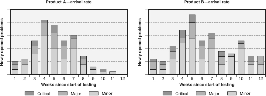
Figure 18.14
Problem report arrival rate—examples.

Figure 18.15
Cumulative problem reports by status—examples.
Quality—Problem Report Backlog
Arrival rates only track the number of problems being identified in the software. Those problems must also be debugged and defects corrected to increase the software product’s quality before that software is ready for release. Therefore, tracking the
problem report backlog
over time provides additional information. The cumulative problem reports by status metric illustrated in Figure 18.15
combines arrival rate information with problem report backlog information. In this example, four problem report statuses are used:
-
Open: The problem has not been debugged and corrected (or closed as not needing correction) by development
-
Fixed: Development has corrected the defect and that correction is awaiting integration testing
-
Resolved: The correction passed integration testing and is awaiting system testing
-
Closed: The correction passed system testing, or the problem was closed because it was not a defect
The objectives for this metric, as testing nears completion, is for the arrival rate trend (the shape of the cumulative curve) to flatten—indicating that the software has stabilized— and for all of the known problems to have a status of closed.
Quality—Data Quality
The ISO/IEC Systems and Software Engineering—Systems and Software Quality Requirements and Evaluation (SQuaRE)—Measurement of Data Quality
standard (ISO/IEC 2015) lists the following quality measures for data quality and provides associated measures:
-
Accuracy: A measure of the level of precision, correctness, and/or freedom from error in the data
-
Completeness: A measure of the extent to which the data fully includes all of the required attribute values for its associated entity
-
Consistency: A measure of extent to which the data is free from contradictions and inconsistencies, including the data’s strict and uniform adherence to prescribed data formats, types, structures, symbols, notations, semantics, and conventions
-
Credibility: A measure of the degree to which the users believe the data truly reflect the actual attribute values of the entities they describe
-
Currentness: A measure of timeliness of the data—is the data up-to-date enough for its intended use
-
Accessibility: A measure of the ease with which the data can be accessed
-
Compliance: A measure of the data’s adherence to required standards, regulations and conventions
-
Confidentiality: A measure of the degree to which only authorized users have access to the data
-
Efficiency: A measure of the degree to which the data’s performance characteristics can be accessed, stored, processed, and provided within the context of specific resources (including, memory, disk space, processor speed, and so on)
-
Precision: A measure of the data’s exactness and discrimination, representing the true values of the attributes for its associated entity
-
Traceability: A measure of the degree to which an audit trail exists of any events or actions that accessed or changed the data
-
Understandability: A measure of the degree to which the data can be correctly read and interpreted by the users
-
Availability: A measure of the extent to which the data is available for access and/ or use when needed
-
Portability: A measure of the effort required to migrate the data to a different platform or environment
-
Recoverability: A measure of the effort required to retrieve, refresh, or otherwise recover the data if it is lost, corrupted,or damaged in any way
Amount of Test Coverage Needed
There are a number of metrics that can help predict the amount of test coverage needed. For example, for unit-level white-box tests, metrics for measuring the needed amount of test coverage might include:
-
Number of source code modules tested: At its simplest, coverage is measured to confirm that all source code modules are unit tested
-
Number of lines of code: Coverage is measured to confirm that all statements are tested
-
Cyclomatic complexity: Coverage is measured to confirm that all logically independent paths are tested
-
Number of decisions: Coverage is measured to confirm that all choices out of each decision are tested
-
Number of conditions: Coverage is measured to confirm that all conditions used as a basis for all decisions are tested
For integration testing, metrics for measuring the needed amount of test coverage might include:
-
Fan-in and fan-out: During integration testing, coverage is measured to confirm that all interfaces are tested
-
Integration complexity: Coverage is measured using McCabe’s integration complexity metric to confirm that independent paths through the calling tree are tested
For functional (black box) testing, metrics for measuring the
needed amount of test coverage might include the number of requirements and the historic number of test cases per requirement. By multiplying these two metrics (Number of requirements × Historic number of test cases per requirement), the number of functional test cases for the project can be estimated. A forward-traceability metric can be used to track test case coverage during test design. For example, dividing the number of functional requirements that trace forward to test cases by the total number of functional requirements provides an estimate of the completeness of functional test case coverage. A graph such as the one depicted in Figure 18.16
can then be used to track the completeness of test coverage against the number of planned test cases during test execution.
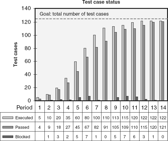
Figure 18.16
Completeness of test coverage—examples.
Requirements Volatility
Requirements volatility,
also called requirements churn
or scope creep,
is a measure of the amount of change in the requirements once they are baselined. Jones (2008) reports that in the United States, requirements volatility averages range from:
-
0.5 percent monthly for end user software
-
1.0 percent monthly for management information systems and outsourced software
-
2.0 percent monthly for systems and military software
-
3.5 percent monthly for commercial software
-
5.0 percent monthly for Web software
-
10.0 percent monthly for agile projects, however, Jones states that the “high rate of creeping requirements for agile projects is actually a deliberate part of the agile method”
It is not a question of “if the requirements will change” during a project, but “how much will the requirements change?” Since requirements change is inevitable, it must be managed, and to appropriately manage requirements volatility, it must be measured. Figure 18.17
is an example of a graph that tracks requirements volatility as the number of changes to requirements over time. The line on this graph reports the current requirements size (number of requirements or weighted requirements). The data table includes details about the number of requirements added, deleted, and modified. This detail is necessary to understand the true requirements volatility. For example, if five requirements are modified, two new requirements are added, and two other requirements are deleted, the number of requirements remains unchanged even though a significant amount of change has occurred.
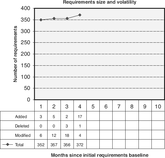
Figure 18.17
Requirements volatility: change to requirements size—example.
Another example of a requirements-volatility metric is illustrated in Figure 18.18
. Instead of tracking the number of changes, this graph looks at the percentage of baselined requirements that have changed over time. A good project manager understands that the requirements will change and takes this into consideration when planning project schedules, budgets, and resource needs. The risk is not that requirements will change—
that is a given. The risk is that more requirements change will occur than the project manager estimated when planning the project. In this example, the project manager estimated 10 percent requirements volatility, and then tracked the actual volatility to that threshold. In this example, the number of changed requirements is the cumulative count of all requirements added, deleted, or modified after the initial requirements are baselined and before the time of data extraction. If the same requirement is changed more than once, the number of changed requirements is incremented once for each change. These metrics act as triggers for contingency plans based on this risk.
Other metrics used to measure requirements volatility include:
-
Function point churn: The ratio of the function point changes to the total number of function points baselined
-
Use case point churn: The ratio of the use case point changes to total number of use case points baselined
Reliability
Reliability
is a quality attribute describing the extent to which the software can perform its functions without failure for a specified period of time under specified conditions. The actual reliability of a software product is typically measured in terms of the number of defects in a specific time interval (for example, the number of failures per month), or the time between failures (mean time to failure). Software reliability models are utilized to predict the future reliability or the latent defect count of the software. There are two types of reliability models: static and dynamic.
Static reliability models
use other project or software product attributes (for example, size, complexity, programmer capability) to predict the defect rate or number of defects). Typically, information from previous products and projects is used in these models, and the current project or product is viewed as an
additional data point in the same population.
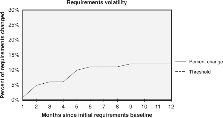
Figure 18.18
Requirements volatility: percentage requirements change—examples.
Dynamic reliability models
are based on collecting multiple data points from the current product or project. Some dynamic models look at defects gathered over the entire life cycle, while other models concentrate on defects found during the formal testing phases at the end of the life cycle. Examples of dynamic reliability models include:
-
Rayleigh model
-
Jelinski-Moranda (J-M) model
-
Littlewood (LW) models
-
Goel-Okumoto (G-O) imperfect debugging model
-
Goel-Okumoto nonhomogeneous Poisson process (NHPP) model
-
Musa-Okumoto (M-O) logarithmic Poisson execution time model
-
Delayed S and inflection S models
Appropriately implementing a software reliability model requires an understanding of the assumptions underlying that model. For instance, the J-M model’s five assumptions are: (Kan 2003)
-
There are N unknown software faults at the start of testing
-
Failures occur randomly, and times between failures are independent
-
All faults contribute equally to cause a failure
-
Fix time is negligible
-
Fix is perfect for each failure; there are no new faults introduced during correction
Various other models make different assumptions than the J-M model. When selecting a model, consideration must be given to the likelihood that the model’s assumptions will be met by the project’s software environment.
Availability
Availability is a quality attribute that describes the extent to which the software or a service is available for use when needed. Availability is closely related to reliability because unreliable software that fails frequently is unavailable for use because of those failures. Availability is also dependent on the ability to restore the software product to a working state. Therefore, availability is also closely related to maintainability in cases where a software defect caused the failure and that defect must be corrected before the operations can continue.
In the example of an availability metric illustrated in Figure 18.19
, post-release availability is calculated each month by subtracting from one the sum of all of the minutes of outage that
month, divided by the sum of all the minutes of operations that month, and multiplying by 100 percent. Tracking availability helps relate software failures and reliability issues to their impact on the user community.
When defining reliability and availability metric for software, care should be taken not to use formulas intended for calculating hardware reliability and availability to evaluate software. This is because:
-
Unlike hardware, software does not wear out and/or fail over time because of aging
-
Unlike hardware where manufacturing can interject the same error multiple times (bent pins, broken wires, solder splashed), once a defect is found and removed from the software that defect is gone, assuming good configuration management practices do not allow the defective component to be built back into the software by mistake
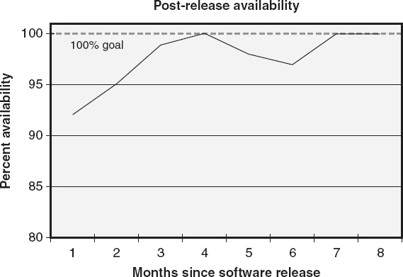
Figure 18.19
Availability—example.
System Performance
System performance metrics are used to evaluate a number of execution characteristics of the software. These can be measured during testing to evaluate the future performance of the product, or during actual execution. Examples of performance metrics include:
-
Throughput: A measure of the amount of work performed by a software system over a period of time, for example:
-
Mean or maximum number of transactions per time period
-
Percentage of throughputs per period that are compliant with requirements
-
-
Response time: A measure of how quickly the software reacts to a given input or how quickly the software performs a function or activity, for example:
-
Mean or maximum response time
-
Percentage of response times that are compliant with requirements
-
-
Resource utilization: A measure of the average or maximum amount of a given resource used by the software to perform its functions, for example:
-
Mean or maximum memory utilization
-
Mean or maximum disk space or other storage device utilization
-
Mean or maximum bandwidth utilization
-
Mean or maximum input/output (I/O) device utilization
-
Mean or maximum processor utilization
-
Percentage of the time that the utilization of a given resource is compliant with requirements
-
-
Accuracy: A measure of the level of precision, correctness, and/or freedom from error in the calculations and outputs of the software
-
Capacity: A measure of the maximum number of activities, actions, or events that can be concurrently handled by the software or system
-
Maximum number of users when software is in a specified mode
-
Maximum number of simultaneous transactions when software is in a specified mode
-
Maximum number of peripherals that can be interfacing with the software when that software is in a specified mode
-
Maintainability
Maintainability
is a quality attribute describing the ease with which a software product or one of its components can be modified after it has been released. Several metrics can be used to measure maintainability. Examples include:
-
Mean time to change the software when an enhancement request is received
-
Mean time to fix the software when a defect is detected
-
The number of function points a maintenance programmer can support in a year
-
Maintainability can also be measured as a function of other metrics such as coupling, cohesion and complexity
Usability
Usability
is a quality attribute describing the amount of effort that the users must expend to learn and use the software. Usability is measured in terms of five main factors:
-
Speed: A measure of how quickly users can accomplish their tasks using the software (for example, measured in mean time to perform a task)
-
Efficiency: A measure of how many mistakes are made by the users while performing their tasks (for example, measured in the average number of mistakes per task, or the average number of mistakes per usage time)
-
Learnability: A measure of how easy it is, or how much training or time it takes, to learn to use the software proficiently (for example, measured in the average number of hours of training required to reach a specific level of proficiency, minimum speed or error rate)
-
Memorability: A measure of how easy it is for the users to remember how to use the software once they have learned how to use it (for example, if a user does not use the software for a period of time, what is the average amount of time required to relearn the software once they start using it again)
-
User preference: A measure of what the users like about the software (for example, the number of users that reported liking the software or a software feature, on a survey or during an interview)
There are typically engineering trade-offs between these various factors, and between these factors and other attributes of the software product. For example, the speed of data entry might be a trade-off with efficiency, that is, the faster the user enters data, the more mistakes they make. The speed of accessing the software or its data might also require an engineering trade-off against the security of the software or the integrity of the data. The goal is to optimize as many of these usability factors as possible, balanced against optimizing other product attributes based on the priorities of the various software product attributes.
Measure the effectiveness and efficiency of software processes (e.g., functional verification tests (FVT), cost, yield, customer impact, defect detection, defect containment, total defect containment effectiveness (TDCE), defect removal efficiency (DRE), process capability). (Apply)
BODY OF KNOWLEDGE V.A.3
Software process entities
can be major development, maintenance, or acquisition activities, such as the entire software
development process from requirements through delivery to operations, or small individual activities such as the inspection of a single document. Software process entities can also be time intervals, which may not necessarily correspond to specific activities. Examples of time intervals include the month of January or the first six months of operations after delivery.
Examples of attributes associated with process entities include cycle time, cost, the number of incidents that occurred during that process (for example, the number of defects found, the number of pages inspected, the number of tasks completed), controllability, productivity, efficiency, effectiveness, stability, and capability.
Cost
The cost
of a process is typically measured as either the amount of money spent, or the amount of effort expended, to implement an occurrence of that process, for example:
-
The number of U.S. dollars (money) spent for conducting an audit
-
The number of engineering hours (effort) expended preparing and conducting a peer review
Collecting measurements on average cost of a process, and/or cost distributions over multiple implementations of that process, can help identify areas of inefficiencies and low productivity that provide opportunities for improvement to that process. After those improvements are implemented, the same cost metrics can be used to measure the impacts of the improvements on process costs in order to evaluate the success of the improvement initiatives.
Cost metrics can be used to estimate the costs of a project and project activities as part of project planning, and to track actual costs against budgeted estimates as part of project tracking. The
collection and evaluation of process cost metrics can help an organization understand where, when, and how they spend money and effort on their projects. This understanding can help improve the cost estimation models for predicting costs on future projects.
First-Pass Yield
First-pass yield
evaluates the effectiveness of an organization’s defect prevention techniques by looking at the percentage of products that do not require rework after the completion of a process. First-pass yield is calculated as a percentage of the number of
items not requiring rework because of defects after the completion of the process, divided by the total number of items produced by that process. For example, if the coding process resulted in the creation and baselining of 200 source code modules, and 35 of those modules were later reworked because defects were found in those 35 modules, then the first-pass yield for the coding process is ([200 − 35]/200) x 100% = 82.5%. As another example, if 345 requirements are documented and baselined as part of the requirements development process, and 69 of those requirements were modified after baselining because of defects, then the first-pass yield of requirements development is ([345 − 69]/345) x 100% ≈ 80%.
Cycle Time
Cycle time is a measurement of the amount of calendar time it takes to perform a process from start to completion. Knowing the cycle times for the processes in an organization’s software development life cycle allows better estimates to be done for schedules and required resources. It also enables the organization to monitor the impacts of process improvement activities on the cycle time for those processes. Cycle time can be measured as either static or dynamic cycle time.
Static cycle time
looks at the average actual time it takes to perform the process. Cycle time helps answer questions such as “how long, on average, does it take to code a source code module, to correct a software defect, or to execute a test case?” For example, if four source code modules were programmed this week and they took five days, ten days, seven days, and eight days, respectively, to program, the static cycle time = (5 + 10 + 7 + 8)/4 = 7.5 days per module.
Dynamic cycle time
is calculated by dividing the number of items in progress (items that have only partially completed the process) by one-half of the number of new starts plus new completions during the period. For example, if 52 source code modules were started this month, 68 source code modules were completed this month, and 16 source code modules were in progress at the end of the month, the dynamic cycle time = (16/[(52 + 68)/2]) x 23 days (the number of working days this month to convert months to days) ≈ 6.1 days per module.
Customer Impact—Customer Satisfaction
Customer satisfaction
is an essential element to staying in business in this modern world of global competition. An organization must satisfy and even delight its customers and other stakeholders with the value of its software products and services to gain their loyalty and repeat business. So how satisfied are an organization’s customers and other stakeholders? The best ways to find out is to ask them by using customer satisfaction surveys. Several metrics can result from the data collected during these surveys. These metrics can provide management with the information they need to determine their customers’ level of satisfaction with their software products, and with the services and processes associated with those products. Software engineers and other members of the technical staff can use these metrics to identify opportunities for ongoing process improvements and to monitor the impact of those
improvements.
Figure 18.20
illustrates an example of a metrics report that summarizes the customer satisfaction survey results and indicates the current customer satisfaction level. For each quality attribute polled on the survey, the average satisfaction and importance values are plotted as a numbered bubble on an x–y graph. It should be remembered that to make calculation of average satisfaction level valid, a ratio scale measure should be used (for example, a range of zero to five, with five being very satisfied). If an ordinal scale metric is used, the median should be used as the measure of central tendency. The darker shaded area on this graph indicates the long-term goal of having an average satisfaction score of better than four for all quality attributes. The lighter shaded area indicates a shorter-term goal of having an average satisfaction score better than three. From this summary report it is possible to quickly identify “initial software reliability” (bubble 2) and “documentation” (bubble 7) as primary opportunities to improve customer satisfaction. By polling importance as well as satisfaction level in the survey, the person analyzing this metric can see that even though documentation has a poorer satisfaction level, initial software reliability is much more important to the customers and therefore should probably be given a higher priority.
Figure 18.21
illustrates an example of a metrics report that shows the distribution of satisfaction scores for three questions. Graphs where the scores are tightly clustered around the mean (question A) indicate a high level of agreement among the customers on their satisfaction level. Distributions that are widely spread (question B), or particularly bimodal distributions (question C), are candidates for further detailed analysis.

Figure 18.20
Customer satisfaction summary report—example.
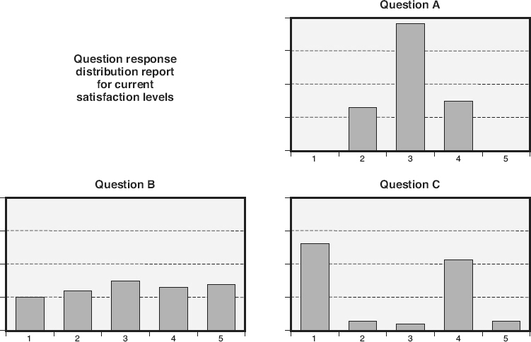
Figure 18.21
Customer satisfaction detailed report—example.
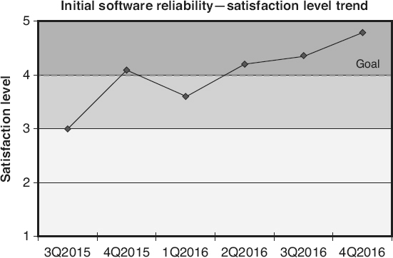
Figure 18.22
Customer satisfaction trending report—example.
Another way to summarize the results of a satisfaction survey is to look at trends over time. Figure 18.22
illustrates an example of a metrics report that trends the initial software reliability based on quarterly surveys conducted over a period of 18 months. Again, the dark and light shaded areas on this graph indicate the long- and short-term satisfaction level goals. One note of caution is that to trend the results over time the survey must remain unchanged in the area being trended. Any rewording of the questions on the survey can have major impacts on the survey results. Therefore, historic responses from before wording changes should not be used in future trends.
The primary purpose of trend analysis is to determine if the improvements made to the products, services, or processes had an impact on the satisfaction level of the customers. It should be remembered, however, that satisfaction is a lagging indicator
because it provides information only about what has already occurred. Customers have long memories; the dismal initial quality of a software version, from three releases ago, may still impact their perception of the product even if the last two versions have been superior.
Customer satisfaction can be considered both a product and a process metric. It measures the stakeholder’s satisfaction with the current product and services as well as the supporting processes like installation and customer support. It can also be used as a process measure to measure the impacts of process improvements to those processes.
Customer satisfaction is a subjective measure. It is a measure of perception, not reality, although when it comes to a happy customer, perception is more important than reality. One phenomenon that often occurs is that as the quality of software improves, the expectations of the customers also increase. The customers continue to demand bigger, better, faster software. This can result in a flat trend even though quality is continuously improving. Worse still, it can cause a declining graph if improvements to quality are not keeping up with the increases in the customer’s expectations. Even though this impact can be discouraging, it is valuable information that the organization needs to know in the very competitive world of software.
Customer Impact—Responsiveness to Reported Problems
When a customer has a problem with software, the developer must respond quickly to resolve and close the reported problem. Service level agreements may define problem report response time goals based on the severity of the incident (for example, critical problems within 24 hours, major problems within 30 days, and minor problems within 120 days). The graph in Figure 18.23
illustrates an example of a metric to track actual performance against these service level agreements. This graph trends the percentage
of problem reports closed within the service level agreement time frames each month. This metric is a lagging indicator,
a view of the past. Using lagging indicator metrics is like painting the front windshield of a car black and monitoring the quality of the driving by counting the dead bodies that can be seen in the rearview mirror. If an organization must wait until the problem report is closed before tracking this response-time metric, they can not take proactive action to control their responsiveness.
The graph in Figure 18.24
shows all non-closed, major problem reports distributed by their age, the number of days since they were opened. Analysis of this graph can quickly identify problem areas, including problem reports that are past their service level agreement goal and reports approaching their goal. This information allows a proactive approach to controlling responsiveness to customer-reported problems. This metric is a leading indicator
because it helps proactively identify issues. Similar graphs can also be created for minor problems (since critical problems must be corrected within 24 hours it is probably not cost-effective to track them with this type of metric).

Figure 18.23
Responsiveness to customer problems—example.
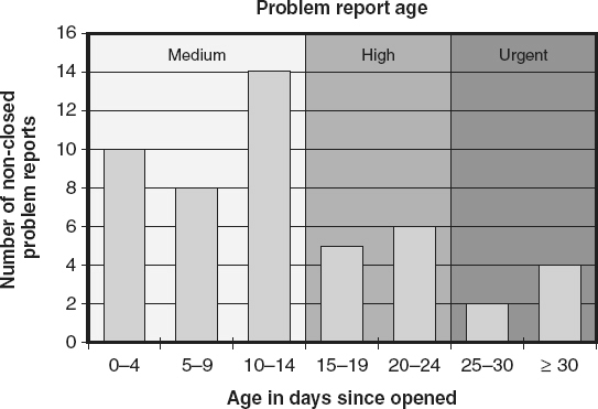
Figure 18.24
Defect backlog aging—example.
Efficiency of Defect Detection—Escapes
One way to measure the effectiveness of a process is to measure the number of escapes from that process. An escape
is any issue, defect, or nonconformance that exists during the process but is not discovered by the process. To explain the concept of escapes, let’s first talk about escapes from the various defect detection processes. An analogy for these escapes is to think of each defect detection process as a screen door that is catching bugs (defects). Escapes are the bugs that make it through the screen door and get farther into the house. A person can not determine how effective the screen door is by looking at the bugs it caught. The person must go inside and count the number of bugs that got past the screen door.
In software there is no way of counting how many defects
actually escaped a defect detection process. The number and origin of defects detected by subsequent defect detection processes must be examined to approximate the number of actual escapes. For example, as illustrated in Figure 18.25a
, at the end of the first defect detection process (requirement defect detection—typically a requirement peer review) there are no known escapes.
However, as illustrated in Figure 18.25b
, after analyzing the defects found by the second design defect detection process, there are not only design-type defects (seven dark gray bugs) but also requirement-type defects (three light gray bugs), so three requirement escapes have been identified.
As illustrated in Figure 18.25c
, after analyzing the defects found by the third coding defect detection process, there are not only coding-type defects (seven black bugs) but also requirement-type defects (one light gray bug) and design-type defects (three dark gray bugs). So four requirement escapes and three design escapes have now been identified.
As illustrated in Figure 18.25d
, everything found in the testing defect detection processes are escapes because no new defects are introduced through the testing process (new defects introduced during testing are the result of requirement, design, or code rework efforts). Analysis of defects found in testing shows requirement-type defects (two light gray bugs), design-type defects (five dark gray bugs) and coding-type defects (three black bugs). There are now six requirement escapes, eight design escapes, and three coding escapes.
Finally, as illustrated in Figure 18.25e
, everything found in operations is also an escape. Analysis of defects found in operations shows requirement-type defects (one light gray bug), design-type defects (three dark gray bugs), and coding-type defects (four black bugs). There are now a total of seven requirement escapes, eleven design escapes, and seven coding escapes. Of course these counts will continue to change if
additional defects are identified in operations.
However, escapes are not just limited to defect detection processes. Escapes can be examined to evaluate the effectiveness of other processes as well. For example:
-
Escapes from the configuration change control process would include approved changes that were never implemented in the software, or unauthorized changes that were incorporated into the software
-
Escapes from the backup process would include work products or data items that could not be restored because they were either not backed up or they were corrupted after backup
-
Escapes from the quality record control process would include quality records that were either not retained, that were retained for a shorter period of time than required, or that did not remain retrievable, identifiable, and or readable after retention
-
Escapes from an audit process would include existing nonconformances that were not identified during the audit, but were later discovered during another audit, or that later caused issues for the organization
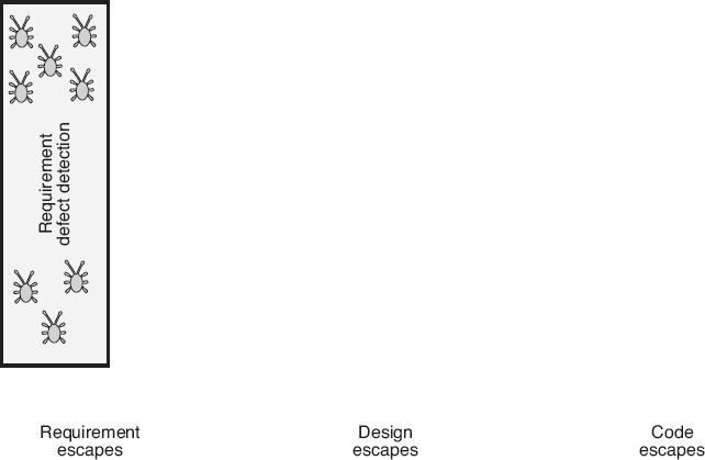
Figure 18.25a
Measuring escapes—requirements example.
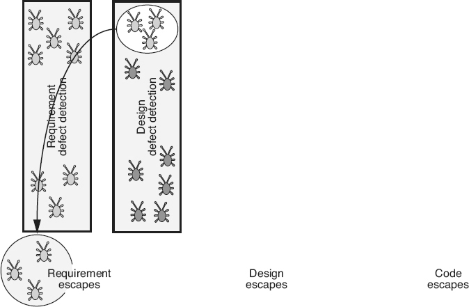
Figure 18.25b
Measuring escapes—design example.
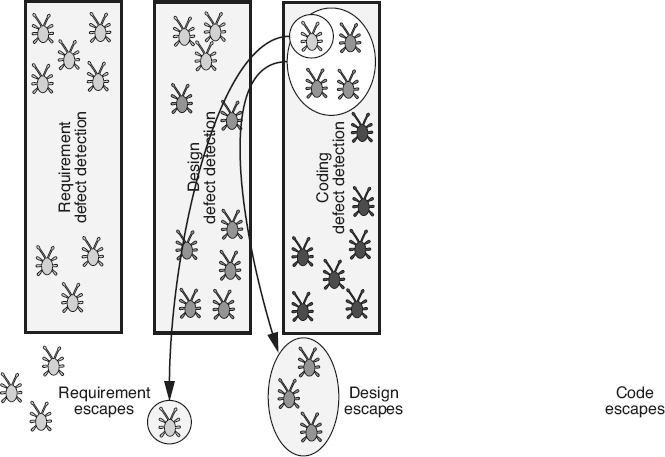
Figure 18.25c
Measuring escapes—coding example.
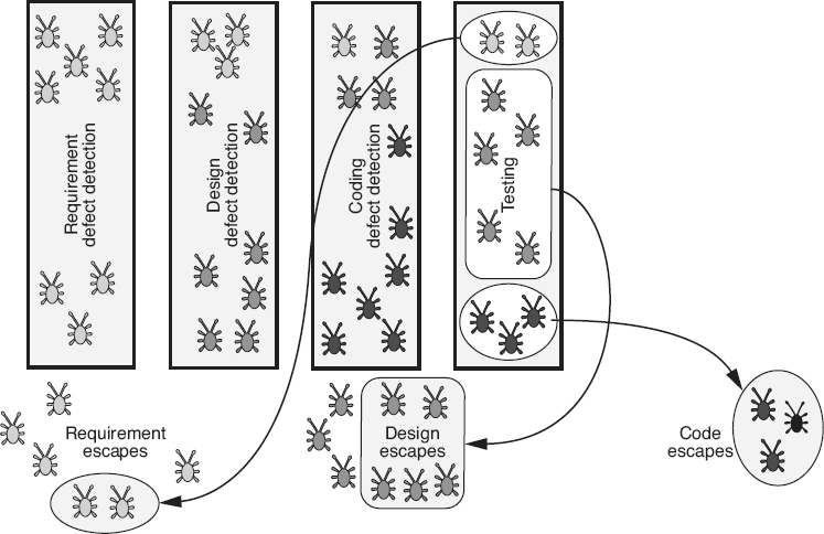
Figure 18.25d
Measuring escapes—testing example.
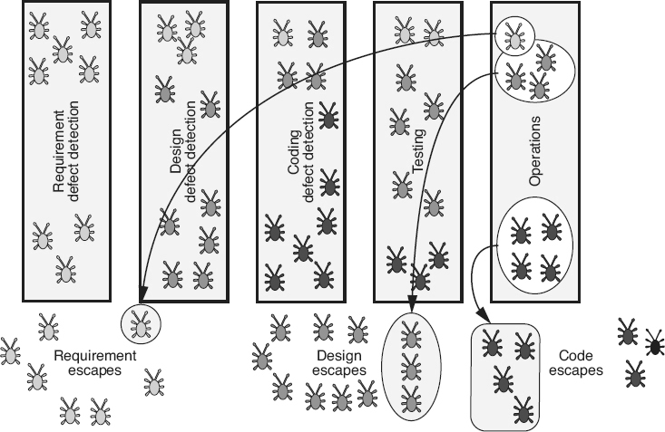
Figure 18.25e
Measuring escapes—operations example.
Defect Containment and Total Defect Containment Effectiveness (TDCE)
Defect containment
in general looks at the effectiveness of defect detection processes to keep defects from escaping into later phases or into operations. Phase containment effectiveness
is a defect containment metric used to measure the effectiveness of defect detection processes in identifying defects in the same phase as they were introduced. Many studies have been done that demonstrate that defects that are not detected until later in the software development life cycle are much more costly to correct. By understanding which processes are allowing phase escapes, organizations can better target their defect detection improvement efforts. Phase containment is calculated by:

Figure 18.26
illustrates an example of calculating phase containment. For the requirements phase, 15 requirement-type defects were found and fixed during that phase, and 10 requirement-type defects were found in later phases for a total of 25 requirement-type defects. The requirements phase containment is 15/25 = 60%. For the design phase, 29 design-type defects were found and fixed during that phase, and 12 design-type defects were found in later phases for a total of 41 design-type defects. The design phase containment is 29/41 = 71%. To continue this example, for the code phase, 86 code-type defects were found and fixed during that phase, and 26 code-type defects were found in later phases for a total of 112 code-type defects. The code phase containment is 86/112 = 77%. Since the requirements phase containment percentage is the lowest, the requirements phase would be considered the best target for process improvement.
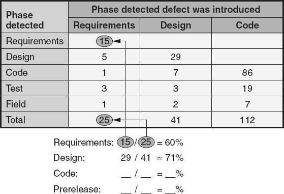
Figure 18.26
Defect containment effectiveness—example.
While this example shows the phase containment metrics being calculated after the software has been in operations for some period of time, in real use the phase containment metrics should be calculated after each phase. At the end of the requirements phase, the requirement phase containment is 15/15 = 100%. At the end of the design phase, requirement phase containment is 15/20 = 75%. These ongoing calculations can be compared with average values baselined from other projects to determine if corrective action is necessary at any time. For example, if instead of five requirement-type defects being found in the design phase, assume that 30 requirement-type defects were found. In this case, the requirements phase containment would be calculated as 25/55 ≈ 45%. This much lower value might indicate that corrective action in terms of additional requirements defect detection activities
should be performed before proceeding into the code phase.
The total defect containment effectiveness (TDCE)
metric shows the effectiveness of defect detection processes in identifying defects before the product is released into operation. TDCE is calculated as:

For the example in Figure 18.26
, 24 requirement-type defects, 39 design-type defects, and 105 code-type defects, for a total of (24 + 39 + 105) = 168 defects, were found prior to release. Total defects found (including those found after release) is (25 + 41 + 112) = 178. TDCE for this example is 168/178 ≈ 94%. The TDCE for this project could then be compared with the TDCE for previous projects to determine if it is at an appropriate level. If process improvements have been implemented, this comparison can be used to determine if the improvements had a positive impact on the TDCE metric value.
Defect Removal Efficiency
Defect removal efficiency
(DRE), also called defect detection efficiency
or defect detection effectiveness,
is a measure of the effectiveness of a detect detection/removal process. DRE is a measure of the percentage of all defects in the software that were found and removed when a detection/rework process was executed. Unlike phase containment, this metric can be calculated for each defect detection process (instead of by phase). For example, if
both code reviews and unit testing were done in the coding phase, each process would have its own DRE percentage. DRE also includes all defects that could have been found by that process, not just the ones introduced during that phase. DRE is
calculated by:

Figure 18.27a
illustrates an example of the calculation of DRE. Note that the DRE for the requirements review process is 15/25 = 60%. Since this is the first defect detection/ removal process and the only types of defects available to find are requirement-type defects, then the phase containment and DRE numbers are the same. However, in the design review processes, not only can design-type defects be found, but the defects that escaped from the requirements review can also be found. As illustrated in Figure 18.27a
, there were five requirement-type defects and 29 design-type defects found during the design review. However, an additional five requirement-type defects and 12 design-type defects escaped the design review process and were found later. The DRE for the design review is (5 + 29)/(5 + 29 + 5 + 12) ≈ 67%.
As illustrated in Figure 18.27b
, the DRE for the code review is (1 + 3 + 54)/(1 + 3 + 54 + 4 + 9 + 58) ≈ 45%. To complete this example, the DRE for:
-
Unit testing = (0 + 4 + 32)/(0 + 4 + 32 + 4 + 5 + 26) ≈ 51%
-
Integration testing = (1 + 3 + 13)/(1 + 3 + 13 + 3 + 2 + 13) ≈ 49%
-
System testing = (2 + 0 + 6)/(2 + 0 + 6 + 1 + 2 + 7) ≈ 44%
Note that of the peer reviews, the coding peer review had the lowest DRE in this example at 45 percent. Of the testing activities, system testing had the lowest DRE. Therefore, these two activities would be candidates for process improvement.
As with phase containment effectiveness, while these examples show the defect removal efficiency metrics being calculated after
the software has been in operations for some period of time, in real use these metrics should be calculated after each major defect detection/removal process and compared with baselined values to identify potential issues that need corrective action.
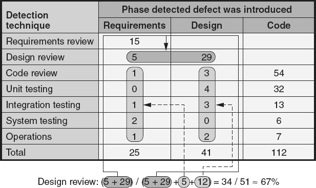
Figure 18.27a
Defect containment effectiveness—design review example.
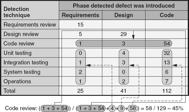
Figure 18.27b
Defect containment effectiveness—code review example.
Process Capability
When measuring process capability, the software industry offers guidance in the form of the CMMI Continuous Representation (SEI 2010; SEI 2010a; 2010b) and the ISO/ IEC 15504 set of standards. Based on these documents, each process area is assigned a capability level from zero to five, based on whether the implementation of that process within the organization meets defined criteria for good industry practice.
Many of the metrics already discussed can also be used to understand the process capabilities of each individual process, help an organization recognize the amount of variation in its processes, and act as predictors of future process performance. Examples of these metrics include first-pass yield, phase containment, defect detection efficiency, cycle time, productivity, cost, and the product measures of the products being produced by
the process. For example, the higher the defect density of requirements specification, the lower the capability of the requirements development processes.
Project and Risk Metrics
In Chapter 16
, several software project metrics were discussed for tracking projects. In Chapter 17
, several software risk metrics were discussed for analyzing, planning for and tracking risks.
Agile Metrics
One of the primary practices of eXtreme programming (XP) is the informative workspace,
which uses the workspace to communicate important, active information. For example, story cards (sorted by “done,” “to be done this week,” “to be done this release”) or big, visible charts for tracking progress over time of important issues might be posted on the wall. Beck (2005) says “An interested observer should be able to walk into the team space and get a general idea of how the project is going in 15 seconds. He should be able to get more information about real or potential problems by looking more closely.”
Another agile methodology, called crystal, has a similar strategy called information radiators.
Information radiators are forms of displayed project documentation used or placed in areas where people can easily see them. Examples of information radiators include posting: (Cockburn 2005)
-
Flip-chart pages from facilitated sessions
-
Index cards or sticky notes with documented user stories
-
Butcher paper depicting project timelines and milestones
-
Photographs of, or printouts from, whiteboard results from informal discussions
-
Computer-generated domain models, graphs, or other outputs printed to plotters that produce large-size images
Information radiators show status such as the:
-
Current iteration’s work set (use cases or stories)
-
Current work assignments
-
Number of tests written or passed
-
Number of use cases or stories delivered
-
Status of key servers (up, down, or in maintenance)
-
Core of the domain model
-
Results of the last reflection workshop
Agile also uses metrics called burn charts.
Burn charts are intended to be posted in a visible location, as part of the informative workspace or information radiator. Burn charts should show how the project’s estimations (predictions) compare to its actual accomplishments. Figure 16.9
shows a burn-up chart
example. A burn-up chart starts with zero and tracks progress by graphing the number of items completed up to the ceiling (goal). A burn-down chart
starts with the total number of items that need to be done and tracks progress by graphing the number of items left to do, down to zero items left to do.
Describe the importance of data integrity from planning through collection and analysis, and apply various techniques to ensure data quality, accuracy, completeness, and timelines. (Apply)
BODY OF KNOWLEDGE V.A.4
The old saying “garbage in, garbage out” applies to software metrics. A software quality engineer (SQE) should be able to
analyze the integrity of the data used as inputs into creating information products. An SQE should be able to analyze the metrics design and implementation processes and the data collection and analysis processes to evaluate the quality, accuracy, completeness, and timeliness of the data, metrics, and information products.
If the right data items are not collected, then the objectives of the measurement program can not be accomplished. Data analysis is pointless without good data. Therefore, establishing a good data collection plan is the cornerstone of any successful metrics program. The data collection plans may be part of standardized metrics definitions at the organizational level, or included/tailored in project plans or sub-plans (for example, measurement plans, communication plans, quality assurance plans). A data collection plan should include who is responsible for collection and/or validation of the data, how the data should be collected (for example, measurement units used, and conditions under
which the measurement should be collected), when the data is collected, and where and how the data is stored. Data collection plans may also include information about archiving or retiring data.
Who Should Collect the Data?
Deciding who should collect the data is an important part of making sure that good data is collected. In most cases the best choice is the owner of the data. The data owner
is the person or tool with direct access to the source of the data and in many cases is actually responsible for generating the data. Table 18.2
includes a list of example data owners and the types of data that they own. For example, when a user calls in to the help desk, the help desk staff has direct access to the problem identification data that is being reported by the user, and collects that data into a customer call report database. On the other hand, in some cases the users themselves have access to a problem-reporting database. In that
case the users are the owners of the problem-identification data and collect that data. Whenever possible, tools should be used to collect the data and relieve people of the burden of data collection.
The benefits of having the data owner collect the data include:
-
Data owners can collect the data as it is being generated, which helps increase accuracy and completeness.
-
Data owners are more likely to detect anomalies in the data as it is being collected, which helps increase accuracy.
-
Having data owners collecting the data helps to eliminate the human error of duplicate recording (once by data recorder and again by data entry clerk), which helps increase accuracy. If a tool can collect the data that can completely eliminate the possibility of human error.
Table 18.2
Data ownership—examples
|
Data owner
|
Examples of data owned
|
|
Management
|
|
|
Software developers
|
|
|
Testers
|
|
|
Configuration management
|
|
|
Users
|
|
|
Tools
|
|
Once the people who need to gather the data are identified, they must agree to do the work. They must be convinced of the importance and usefulness of collecting the data. Management has to support the program by giving the data owners the time and resources required to perform data collection activities. To quote Watts Humphrey (1989), “The actual work of collecting data is tedious and must generally be done by software professionals who are busy with other tasks. Unless they and their immediate managers are convinced that the data is important, they either will not gather it or will not be very careful when they do.”
So what can the metrics providers do to help make certain that the data owners collect good data? First, the metrics providers can design metrics that are as objective and unambiguous as possible. A data item is objective if it is collected the same way each time. Subjective data can also be valuable. For example, customer satisfaction metrics are typically subjective. However, the goal is to make the data as objective as possible. A data item is unambiguous if two different people collecting the same measure for the same item will collect the same data. This requires standardized definitions and well-defined measurement methods.
Second, the metrics provider can design the metrics and establish data collection mechanisms that are as unobtrusive and convenient as possible. Data collection must be an integral part of the software development process and not some outside step that detracts from the “real work.” Data collection must be simple enough not to disrupt the working patterns of the individual collecting the data any more than absolutely necessary. In some
cases this means automating all or part of the data collection. For example, having a pulldown pick list is much more convenient than making the data owner type in “critical,” “major,” or “minor,” and it can also contribute to more accurate data by eliminating misspellings or abbreviations. As another example, do not make the data owner type in the current date. The computer knows the date, so have the computer default that data item.
Third, the data owners must be trained in how to collect the data so that they understand what to do and when to do it. For simple collection mechanisms, training can be short (≤ one hour). Hands-on, interactive training, where the group works with actual data collection examples, often provides the best results. Without this training, hours of support staff time can be wasted answering the same questions over and over again. An additional benefit of training is promoting a common understanding about when and how to collect the data. This reduces the risk of invalid and inconsistent data being collected.
Fourth, the metrics providers must feed the metrics information back to the data owners so that they can see that the data items are used and not just dropped into a black hole. Better yet, the metrics providers can use the data to create metrics that are directly useful to the data owners. There must also be people assigned to support the data collection effort so that the data collectors can get their questions answered, and issues related to data, and data collection problems, are handled in a timely manner.
How Should the Data Be Collected?
The answer to the question how should the data be collected,
is automate, automate, automate, and automate:
-
Automate data collection and validation as much as possible
-
Automate the databases
-
Automate data extraction
-
Automate metrics reporting and delivery
There is widespread agreement that as much of the data-gathering process as possible should be automated. At a minimum, standardized forms should be used for data collection, but at some point the data from these forms must be entered into a metrics database if it is to have any long-term usefulness. Information that stays on forms can quickly get buried in file drawers, never to see the light of day again. In order for data to be useful and used, easy access to the data is required. The people who need the data have to be able to get to them easily. The easier the data items are to access, the easier it is to generate timely metrics reports.
Dumping raw data and hand-tallying or calculating measurements is another way to introduce human error into the measured values. Even if the data are recorded in a simple spreadsheet, automatic sorting, extracting, and calculations are available and should be used. They also increase the speed of producing the metrics and therefore can help increase timeliness.
Automating metrics reporting and delivery eliminates hours spent standing in front of copy machines. It also increases usability because the metrics are readily available on the computer. Remember, metrics are expensive. Automation can reduce the expense while making the metrics available in a timely manner.
Quality Data and Measurement Error
In order to have high-quality data, the measurements taken need to be as free from error as possible. A measurement error
occurs when the measured value or data item collected (the assigned number or symbol) differs from the actual value (that would be mapped to the attribute of the entity in a perfect world). For example, a person might be measured as 6 foot 2 inches tall, while in reality that person might be 6 foot 2.1385632 inches tall. The
0.1385632 inches is measurement error. According to Arthur (1985), measurement error can happen for a number of reasons, including:
-
Imperfect definition of what is being measured: For example, if asked to measure how “big” the person is, the data owner might measure the person’s height when the individual requesting the measurement actually wanted to know that person’s weight.
-
Imperfect understanding of how to convert what is being measured into the measurement signal (data): For example, if a three-year-old is asked to measure a person’s height, there might be an error because they do not understand how to even take that measurement.
-
Failure to establish the correct conditions for taking the measurement: Should the person be measured with or without shoes? How should the data owner deal with a full head of hair piled up above the scalp?
-
Human error: Then there is error simply because people make mistakes. For example, the data owner might have misread a 3 as a 2, or might have incorrectly converted the 75 inches they measured into 6 foot 2 inches instead of 6 foot 3 inches.
-
Defective or deficient measurement instruments: The tool used to take the measurement might also be defective in some way. For example, a tape measure might be old and all stretched out of shape.
Data Accuracy
What if data has measurement error and is inaccurate? Can inaccurate data be accepted and used anyway? There are two reasons why the answer may be yes. First, the data may be accurate enough to meet the required objectives. Go back to the time sheet example.
When reconstructing the data, the engineer may overstate one project by a few hours one week and understate it the next. The result is still a fairly good approximation of total time spent over the life of the project. When estimating time requirements for future projects, the time card data may be accurate enough for its intended use.
The second reason for reporting inaccurate data is to make it accurate. For example, a metrics analyst created metrics reports to show the trend over time for non-closed problems. The project managers then complained that the reports were inaccurate. They said that many of the problems were actually closed, but the database had not been updated. However, upper management utilized these reports to continue the focus on reducing the backlog of uncorrected problems. This provided the leverage needed to update the data and increase its accuracy.
If metrics providers wait for 100 percent data accuracy, they may never produce any metrics. Remember—good enough is good enough. On the other hand, metrics providers and users need to be aware of data inaccuracies, and consider those inaccuracies when determining how reliable and valid the metrics are. This awareness can help determine the level of confidence that can be placed in the measurement results.
Data Completeness
What if the data are incomplete? Again there are similar circumstances where the metrics provider can still use the data. In the time sheet example, the data might be considered incomplete because they do not include overtime. In this case, the metrics provider can change the metrics algorithm for estimating the next project to take this into consideration. If they know engineers are working about 10 hours a week unpaid overtime, they can use a 1.25 multiplication factor in the model to estimate total engineering effort for the next project.
The reporting of incomplete data can be used to make the data more complete. When one company first started reporting code review metrics, the initial reports indicated that only a small percent of the code was being reviewed. Actually, a much higher percent was reviewed, but data were not being recorded in the database. By reporting incomplete data, emphasis was placed on the need to record accurate and complete data so that the measurement reflected the actual accomplishments. This is especially true when projects recording data use that data to demonstrate both cost and time savings to upper management.
However, as with accuracy, metrics providers and users need to be aware of data incompleteness as a consideration when determining how reliable and valid the metrics are, so they can determine the level of confidence that can be placed in the measurement results.
Data Timeliness
Data collection and reporting must be timely. For example, if a supplier is trying to make a decision on whether or not to ship a software product, having defect status data from the previous week is of little value. Two time frames need to be considered when talking about timeliness and data collection:
-
Data collection time: Is the data being collected in a timely manner? The longer the time period between the time an event happens and the time when the data about that event are collected, the less integrity the data probably has. For example, if an engineer records the time spent on each task (effort) as that engineer is working on those tasks, the effort data will be more accurate than they would be if the engineer waited until the end of the week to complete the data on a time sheet.
-
Data availability time: Is the collected data being made available in a timely manner? If there is a large gap of time between when the data are collected and when they are available in the metrics database, the integrity of the reported metrics can be impacted. For example, even if inspection data are collected on forms during the actual inspection, those forms may sit for some period of time before the data are entered into the inspection database.
There are also two time frames to consider when talking about timeliness and data reporting:
-
Data extraction time: Looks at the timeliness of extracting the data from the metrics database. This timing may be an issue in information warehouse environments where data are extracted from operational systems on a periodic basis and made available for metrics reporting. For example, data extracted the previous midnight might be considered untimely for an immediate ship/no ship decision, while being perfectly timely for monthly summary reports.
-
Data reporting time: Looks at the timeliness of report generation and distribution of the extracted data. This timing may especially be an issue if the metrics are hand-calculated and distributed in hard copy.
The timing of data synchronization is also important. If the data for a metrics report are pulled while data are being input or refreshed, it could result in part of the data extraction being old and out of sync with another part of the extraction that reflects newer data. Data synchronization may also be a problem if data collection, availability, or extraction times vary for different data sets used in the same metrics report. If these data time frames are not synchronized for the measurements being analyzed, that analysis will be severely limited or even completely defective/erroneous.
Measurements Affect People
Measurements affect people, and people affect measures. The simple act of measuring affects the behavior of the individuals who are performing the processes and producing the products and services being measured. When something is being measured, it is automatically assumed to have importance. People want to look good, so therefore they want the measures to look good. They will modify their behavior to focus on the areas being measured. For example, think about the fact that most people study harder if there is going to be a test than they might just because they were taking a class or had a desire to learn something new.
This is known as the Hawthorne effect.
The Hawthorne effect was first noticed in the Hawthorne Works plant where production processes were being studied to determine the impact of various conditions (for example, lighting levels and rest breaks) on productivity. However, each change in these conditions resulted in overall increases in productivity, including the return to the original conditions. Measurements like this were done across multiple aspects of the workers’ behavior. It was concluded that productivity increases, and other positive improvements, were not a consequence of actual changes in working conditions, but happened because of the simple act of measurement. Measurement gave attention (demonstrated interest by management) to values being measured and therefore caused the workers to endeavor to make those measurements improve.
Whether a metric is ultimately useful to an organization or not depends on the attitudes of the people involved. Therefore, the organization must consider these human factors when selecting metrics and implementing their metrics program.
People Affect Metrics and Measuring
People also affect measures through their behaviors by:
-
Being more careful, accurate, or complete when collecting data
-
Correcting data inaccuracies and updating incomplete data or not
-
Utilizing the measurements in appropriate or inappropriate ways
-
Attempting to “beat” the metric or measurement
When implementing a metric, the people doing that implementation must always decide what behaviors they want to encourage. Then take a long look at what other, negative behaviors might result from the use or misuse of the metric. For example, a team implemented a metric to monitor an initiative aimed at reducing the number of unfixed problem reports each development team had in their backlog. The desired behavior was for managers to dedicate resources to this initiative and for engineers to actively work to correct the problems and thus remove them from the backlog. However, on the negative side, some people tried to beat the metrics by:
-
Not recording new problems (going back to the “paper napkin” or e-mail reporting mechanism), which caused a few problems to slip through the cracks and be forgotten.
-
“Pencil whipping” existing problems by closing them as “cannot duplicate” or “works as designed.”
-
One manager got very creative. The manager determined that the metrics were only extracting data and counting software problems on the last day of the month. Just before he went home that evening the manager transferred all of his group’s problems over to his buddy in hardware so his numbers looked great for the senior management meeting.
To quote an unknown source, “Do not underestimate the intelligence of your engineers. For any one metric you can come up with, they will find at least two ways to beat it.” While the goal is to appropriately close out problems and improve product quality by decreasing the product defect backlog, the organization also does not want to have to rediscover “known” problems later in operations because they have been forgotten or inappropriately closed.
Metric and Measurement Do’s and Don’ts
There are ways to minimize the negative impacts of implementing software metrics. The following is a list of do’s and don’ts that can help increase the probability of implementing a successful metrics program. To minimize negative impacts:
-
Don’t measure individuals: The state of the art of software metrics is just not up to this yet and may never be. Individual productivity measures are the classic example of this mistake. Managers typically give their best and brightest people the hardest work and then expect them to mentor others in the group. If productivity is then measured in product produced per hour (the typical productivity metric), these people may concentrate on their own work to the detriment of the team and the project. They may also come up with creative ways of increasing their output (for example if productivity is measured in lines of code per hour, the coder may program the same function using many more extra lines of code then they normally would just to appear more productive).
-
Don’t use metrics as a stick: Never use metrics as a “stick” to beat up people or teams. The first time a metric is used against an individual or a group is probably the last time unbiased data will be collected.
-
Don’t ignore the data: A sure way to kill a metrics program is for management to ignore the data when making decisions. “Support your people when their reports are backed by data useful to the organization” (Grady 1992). If the goals management establishes and communicates don’t agree with management’s actions, then the individual contributors will perform based on management behavior, not their stated goals.
-
Don’t use only one metric: Software development, operations, and maintenance are complex and multifaceted. A metrics program must reflect that complexity. A balance must be maintained between cost, product quality and functionality, and schedule attributes, to meet all of the customer’s needs. Focusing on any single metric can cause the attribute being measured to improve at the expense of the other attributes, resulting in an anorexic software process. It is also much harder to beat a set of metrics, than it is to beat a single metric.
-
Don’t collect data if they are not going to be used: It costs time, effort, and money to collect and store the data. If they are not being actively used to provide people with information then that cost is a waste and should be eliminated.
-
Do align metrics with goals: To have a metrics program that meets the organization’s information needs, metrics must be selected that align with the organization’s goals and provide information about whether the organization is moving toward or accomplishing its goals. If what gets measured gets done, then the measurements must align with and support the goals.
-
Do focus the metrics on processes, products, and services: Products, processes, and services are what the organization wants to improve. Management needs to continually reinforce this through both words and deeds. This can be a fine line. Everyone knows that Doug wrote that error-prone module. But is the metric being used appropriately to focus on reengineering opportunities or risk-based peer reviews or testing, or it is being used inappropriately to beat up Doug?
-
Do provide feedback to the data providers: Providing regular feedback to the team about the data they help collect has several benefits. First, when the team sees that the data are actually being used and are useful, they are more likely to consider data collection important and improve their data collection behaviors. Feedback helps maintain the focus on data collection. Second, if data collectors are kept informed about the specifics of data usage, they are less likely to become suspicious that the data may be being used against them. Third, by involving data collectors in data analysis and process improvement efforts, the organization benefits from their unique knowledge and experience. Finally, feedback on data collection problems and data integrity issues helps educate team members responsible for data collection, which can result in more accurate, consistent, and timely data.
-
Do obtain buy-in for the metrics: To have buy-in to both the goals and the metrics in a measurement program, team members need to have a feeling of ownership. Participating in the definition of the metrics will enhance this feeling of ownership. In addition, the people who work with a process, product, or service on a daily basis will have intimate knowledge of that process, product, or service. This knowledge gives them a valuable perspective on how it can best be measured to safeguard accuracy and validity, and how to best interpret the measured result to maximize usefulness.
Other Human Factors
A famous quote usually attributed to Mark Twain talks about the three kinds of lies— “lies, damn lies, and statistics.” Marketers use statistical tricks all the time to help sell their products. When an organization puts its metrics program together, it needs to be aware of these issues and make conscious decisions on how to display the metrics for maximum usefulness and minimum “deviousness.” If engineers and managers catch the metrics producer playing a marketing-type trick to make the metrics look good, they will stop believing the metrics.