
CHAPTER ONE
UNDERSTANDING LIGHT SOURCE TO CREATE THREE-DIMENSIONAL FORM
Creating a detailed, three-dimensional plant drawing feels like magic to me. Perhaps this is because I tried for a long time to make my drawings look this way and failed. Something was not quite right. It might have been the perspective, the proper proportions, or a consistent use of light and shadow. I didn’t have a clear focus on how to accomplish what I wanted. I proceeded in a haphazard way, sometimes creating an area of a drawing that worked but never knowing how I achieved the success, and I was unable to do it consistently.
One of the most important concepts in botanical drawing is to understand how to use a single, specific light source to describe three-dimensional form. In this chapter, I will show you what I mean by a consistent light source and how to visualize it on forms in nature—even if you don’t actually have a light illuminating your subject this way. We will start with simple geometric shapes, practice using this idealized light source on these forms, and then immediately explore similar complex forms in nature.
To understand how light behaves on three-dimensional forms, observe the illustration [A] of an ideal light-source setup on this page. As you progress, you’ll find that the light source isn’t a mystery to solve, just a visualization exercise that will get easier and easier to do. To better understand the importance of using one light source on forms, sometimes we’ll translate a photo of our subject into gray tones. Discarding the color information can help you visualize how to create shadows, midtones, and highlights on form in the proper places. Gray tones show the placement of light and shadow without the added distraction of color.
Your goal is simple at first: make your form look three-dimensional with one consistent light source. This is your mantra. Tell yourself this over and over again, because I promise you, at first you will forget and go back to the way most of us approach drawing. We tend to think we have to draw the shadows and highlights exactly as we see them, even if we don’t have a good light source set up. But soon you will know where you want to put the highlights and shadows, even if they aren’t visible on your subject.
When you are drawing, use a light that illuminates your subject exactly as described in “Creating a Consistent Light-Source Setup” on this page; eventually you will learn to keep this ideal light in your head even if you don’t have a light on your subject the way you will be drawing it. We will call this the imagined “head light.” Your drawing is not a crime scene for which you need to document every detail as you see it but rather a drawing that will convey your subject either in a light source that you create in your head or in a light source that is actually illuminating your subject. This means that if there are multiple highlights on your subject because light is hitting it from many locations, you will choose the best highlight to show and not draw them all. Extremely harsh shadows will also be toned down so as not to overpower the drawing. Learn how simple geometric forms receive this light source. Once you memorize the light on the simplified form, you can translate the same head light onto more complex forms in nature. We’ll start with a sphere, a cylinder, a cup, a cone, and an open book as reference subjects.


TERMS TO KEEP IN MIND
These are the terms I’ll explain and use throughout the book, but I’ve gathered them here so that you can reference them easily if you ever forget what one means.
BURNISHING: Blending colors for a smooth finish, usually with a light-colored pencil.
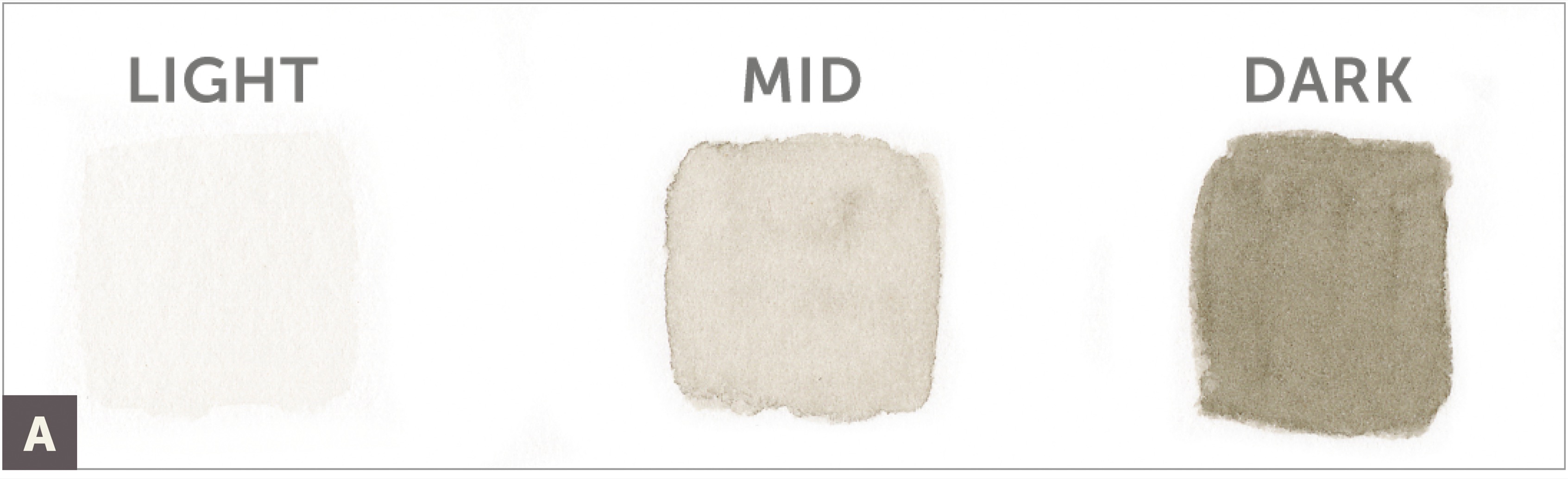
CAST SHADOW: A darker shadow area that falls on the surface on which a subject is sitting. Cast shadows are created when the form of the subject blocks the light that is hitting it. A shadow is not a form itself, so it should be extremely subtle. It should be darkest next to the edge of the shape that is casting the shadow. Shadows graduate from dark to very light and should not end in a sharp line but should fade away into the color of the paper.
CONSISTENT LIGHT SOURCE (HEAD LIGHT): Your setup or imagined light source is always placed on the left or right, in front of your subject. The light hits the subject at a 45-degree angle, and so approximately one-third of your subject is in shadow while two-thirds is illuminated.
CONTOUR LINES: An outline that follows the edges or shape of a form.
CROSS-CONTOUR SKETCH: Cross-contour lines travel across a form to help describe the three-dimensional surface and how it bends away from and toward light. These quick sketches can help you visualize the placement of light and shadow. They also often follow the venation pattern (arrangement of veins on a leaf) on a form.
HIGHLIGHT: The bright areas on the surface of a form (usually on the highest points of a three-dimensional form) created by the light source hitting it directly. Even if you don’t see highlights on your form, you can put them in to convey this important structural message in a drawing.
LOCAL OR DOMINANT COLOR: The main color of your subject.
OVERLAPPING: The spots where forms intersect each other, defining foreground and background. For example, when a leaf rolls over or curls or when one form is slightly in front of another, it creates an overlap. Rendering overlaps properly enhances space, depth, and structure.
REFLECTIVE HIGHLIGHTS: A reflective highlight is a weak light that bounces off of a surface onto a form or subject. It helps to differentiate between two overlapping forms or separates a form from a cast shadow. The reflective highlight should not be as light in value as a highlight. It should be very subtle, at a value of 4 or 5 (see “Create a Nine-Value Tone Bar” on this page). It’s best when it feels like glowing light and is not just a straight, empty line.
PICTURE PLANE: For our purposes, think of the picture plane as an imaginary perpendicular window right up against your subject. Taking measurements on this plane helps you to measure in perspective.
THUMBNAIL SKETCH: This simple, quick, small shape drawing of your subject is a reminder of how the light illuminates your subject so that you know where to put the shadow side, the midtones, and the highlight.
TONE OR VALUE: These terms refer to how light or dark a color appears.

Creating a Consistent Light-Source Setup
Practice visualizing light on form (use your head light) to help you make decisions on how to draw your form, even when you aren’t seeing a single light source. It is also important to understand that even if you don’t actually see the highlight and shadows, you can still put them on the form in your drawing. It takes a while to get used to this concept, so it’s best to practice and remind yourself of it. Remember your mantra: make your form look three-dimensional with one consistent light source.

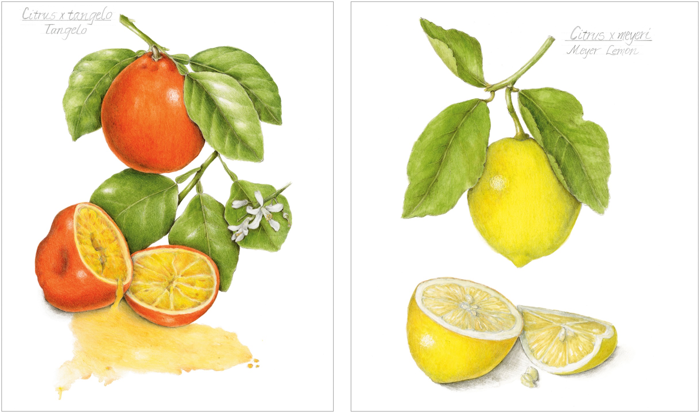
Look at my two examples of citrus drawings (following). The tangelo shows light coming from the upper right, while the Meyer lemon shows light coming from the left. The effect is the same but just from opposite sides. If possible, turn off all other light sources in the room and close window shades so that your subject is receiving light from only your light-source setup. The box can help block out other light sources. Note: If you are right-handed, I recommend placing this light on the upper left. If you are left-handed, place this light on the upper right. The goal is to have a good source of light on your subject that doesn’t cast a shadow on your paper from your drawing hand as you are drawing.
Position your box on a table and place the lamp in front of the box on the left side. (A simple gooseneck lamp is fine, though you can also use a specific light that is closer to daylight, such as an OttLite. On the fly, I light my subject with a flashlight or my cell phone light to help get an overview of the highlight, the midtones, the shadows, and the cast shadows.) The light should be hitting your subject at about a 45-degree angle from the upper left or right. This position is your consistent light source.
SUBJECT
Several small plant specimens in various shapes (try a small tomato, branch, leaf, and flower)
ADDITIONAL MATERIALS
• Shoe box or similar small box
• Table light (that can be directed at the box)
• Practice paper (anything you have available, doesn’t need to be good paper)

Place a round subject such as a tomato or an apple in the box and notice how the light hits the form. Take time to study the placement of the highlight and how the values gradually change, getting darker and darker until the darkest shadow. If you see a reflective highlight, take note of it, then pay attention to the cast shadow that is created when your subject blocks light from the surface on which it’s sitting. (A)

Snap some photos with your cell phone or a camera for reference of this correct light source on your subject. In your photo-editing program, try changing the color mode to gray scale to see more clearly (without the distraction of color) how the gradual shift in values is essential to create three-dimensional form.
Draw a rough thumbnail sketch of the light source on your subject to help memorize where the shadows and highlights will be placed. (B)

Now move your light source and look at your subject to see how the light hits the form from different directions so that you realize this consistent light source is the best light-source model to use to make your form look descriptive. It is also good practice to go outside on a sunny day and position yourself with the light source of the sun behind you from the left and position a subject in the correct place.
Next, switch your subject to a cylindrical shape, such as a small branch. Follow the same procedure for looking at the form. Snap a photo and draw a thumbnail sketch. Try a cup shape and a cone shape using the same procedure, and finally practice on an open-book shape. You can create a quick model of a simple leaf out of white paper that is folded to create two distinct planes, or look at a leaf in the light to visualize how light interacts with two distinct planes. (C)

Practice looking at leaves in natural light to see the two planes created by a midvein and study leaves on plants outside. Look at other subjects: flowers, seedpods, even architectural elements, to practice visualizing light on form.
How to Use Watercolor Pencils for Botanical Drawing
There are several ways to use watercolor pencils, but this is my favorite. When you draw on a plastic palette made for watercolor pencils, or a substrate plastic, such as Grafix Dura-Lar Film or Yupo synthetic paper, the surfaces have enough friction to lay down the watercolor pencil, so when water is added to the pigment, it turns into paint. You can mix your watercolors to make other colors and also apply the watercolors directly to your drawings from the paint you mix on the palette. The palettes can also be washed and reused over and over again.
ADDITIONAL MATERIALS
• Watercolor pencils (any colors)
Draw a small area of pigment onto your palette.
Dip your favorite brush in a tiny bit of water and mix it into the watercolor on your palette. You can mix colors easily this way and control the ratio of pigment to water on your brush. This is how I recommend you work the majority of the time.
Paint a few swatches of color onto hot press watercolor paper, and experiment with the amount of water you add to the pigment. Paint a light color, a medium color, and a dark color. Also try swatches where you first wet a small area of paper and then apply the color wash onto the wet paper to experience how the watercolor spreads easily this way.

Slow-Toning to Create a Seamless Blend of Values from Light to Dark Using Watercolor and Colored Pencil
In this lesson I introduce the mechanics of creating tonal variation with a slow buildup of layers. Please focus on these two concepts as you practice the step-by-step techniques. I’ll create tonal variation with a slow buildup of layers starting with a watercolor tone bar and then colored pencils, which change gradually from the lightest tone (the white color of your paper) to the darkest tone (as dark as you can get with your darkest pencil). This is the key to making forms look extremely three-dimensional. It works best to understand this concept by first working only in neutral tones without the distraction of colors.
Note: You can practice all lessons without using watercolor, but this requires more layering of colored pencils and more burnishing. It’s a slower technique but allows for more control for the beginner. The watercolor speeds up the process. With these techniques, combined with the understanding of a consistent light source that you’ve just acquired from the first lesson, you’ll start to gain confidence. At the same time, you’ll feel relaxed (because repetitive, slow drawing feels good), and soon a feeling of well-being will come over you. These exercises are really fun to do when you take the time to do them slowly and methodically, and you’ll find that they become an important component for all your drawing. Soon your confidence level will rise, and you will no longer be telling yourself that you have no talent and cannot draw!
Create a Tone Bar
I like to let my watercolor dry completely before drawing on top of it. How long is this? It depends on your climate and how wet you got your paper. I would say it’s a good idea to wait twenty minutes for your paper to dry, but waiting even longer is always better. I often work on more than one drawing or area at a time so that while one area of watercolor is drying, I can work on something else. If you try to draw on top of your watercolor while it is not completely dry, the paper will not take the pencil and sometimes the pencil can start to chew up the paper.
ADDITIONAL MATERIALS
• Dark Sepia watercolor pencil #175
• Watercolor brush #2
• Dark Sepia colored pencil #175
WATERCOLOR PENCILS
#175
COLORED PENCILS
#175
On your watercolor pencil palette, draw an area of Dark Sepia watercolor pencil (about 1 inch in size).
To test the value of the Dark Sepia, dip your medium-size brush into clean water and mix it into a tiny bit of the Dark Sepia watercolor pencil. Diluted, it should be a very light value. Test the watercolor wash first by painting three small squares, one light and the other two with less water in the pigment so that you get a midtone and a dark value. (A) If there is too much water on your brush, blot it on your folded paper towel and then dip it back into the paint.
To create the tone bar, lightly draw a ½by 3½-inch area with a graphite pencil on your paper. (B)

Paint this area with clean, plain water, starting on the right side of the tone bar and pushing the brush out to the left. Apply Dark Sepia watercolor about half to three-quarters of the way across, then blot your brush quickly on a paper towel and continue painting into the light side, making the transition to the paper seamless. (C)

Next, while this is all still wet, add a bit more Dark Sepia pigment on your brush and apply, starting on the right side and moving toward the middle in a seamless transition. Horizontal brushstrokes work well to help with this.
While you wait for your watercolor tone bar to dry, follow the procedure on this page to create a nine-value tone bar to use as a reference.
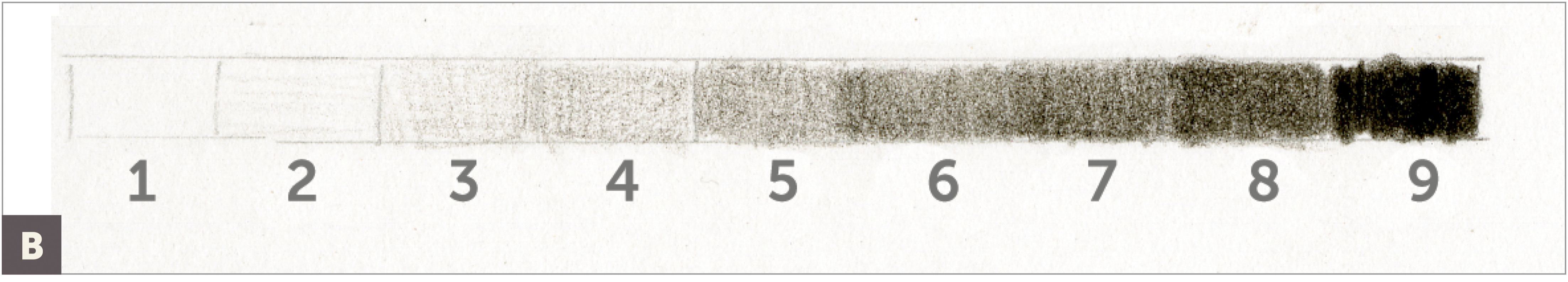
Create a Nine-Value Tone Bar
This tone bar will be used as your guide for a complete range of values from shadow to highlight. You can use this guide to help you evaluate your drawings and make sure you have created a complete range of values on each subject.
First draw nine small boxes underneath the watercolor tone bar, each about 3/8 inch wide.
Number each segment from left to right, starting with 1 on the left and ending with 9 on the right. (A)

Fill each segment with tone values from dark (9) to light (1) with your Dark Sepia colored pencil. Start on the right side and fill in a dark value, as saturated as possible, for your darkest number 9 value. Leave number 1 empty. With the side of your pencil, gently lay down a very light layer in number 2. Box number 3 might have two light layers of tone so it is just a bit darker than number 2. Number 4 is a bit darker, and number 5 has perhaps five light layers of tone.
Now switch to number 8 and get dark, but not as dark as number 9. Number 7 will be a tiny bit lighter than number 8, and number 6 will be darker than number 5 but lighter than number 7.
Make adjustments in each box so that you have nine distinct values, gradually stepping from dark to light. This is now your guide for a complete range of values from shadow to highlight. (B)
Smooth, Seamless Toning with a Neutral Colored Pencil
To create smooth, seamless toning in your tone bar, start on the right side with slow toning, then with each layer, cover a little bit less of the tone bar, leaving the left side of the tone bar lightest. Switch the directions of your strokes, and even consider turning your paper to continue laying down tone in a relaxed, comfortable manner. This is very important. You want this process to be a very slow buildup of values, and for each layer, apply smaller and smaller strokes. The final layers of strokes become tiny circular strokes that fill in the light areas of fine texture on the paper, creating a seamless, blended tone bar. If you are feeling a sense of calm and well-being, chances are you are applying your tone correctly.
You will use this technique, or develop your own variations of this technique, throughout the book. It is most important to find your own method of achieving the goal of creating many layers of seamless tonal variation. Notice the feeling of space, depth, and movement from dark to light even in a simple tone bar such as this. In the end, you should feel relaxed and proud of your tone bar. If you work too quickly and don’t have a nice, smooth transition with all nine values, try another tone bar. It is fun to allow yourself the luxury of creating slow, seamless tonal drawings. And not only is it fun, but it is an essential skill to develop. Once mastered, you will be on your way to creating realistic three-dimensional drawings. Who knows, this could become your daily meditation!

Make sure your watercolor wash tone bar (that you created in the lesson on this page) is completely dry. Apply a first layer of Dark Sepia, starting on the right side, with close, vertical strokes, then make your strokes farther apart until they end at the middle of the tone bar. (A)

Hold your pencil toward the top end, and starting again on the right, apply the next layer of tone in a horizontal direction. In order to start getting a smooth seamless transition of tones from light to dark, lay down horizontal strokes that are about 3/8 inch long and then do another group of horizontal strokes in between those, overlapping them a little bit. Keep adding horizontal strokes in this way to about the middle of the tone bar. (B)
Add more tone in a diagonal direction (C), followed by another layer going in the opposite diagonal direction. (D)

Continue to build layers of tone with tiny circular strokes, creating a seamless blend of values from as dark as you can get on the right side to a gradual fade into the lightest area, which is the blank paper color. (E) (F)

Compare your watercolor tone bar to your nine-step tone bar to make sure you have a complete range of tones. (G)

A Curved or Three-Dimensional Tone Bar
A curved tone bar represents a form that is curved or bending away from or toward light, thus creating various values. Use the same technique for building layers from the previous lesson on a curved tone bar here. This time you’ll leave the blank area inside the bar, near the left edge. This lightest area is an imagined highlight. As you build tones to create a bending tone bar, you will start to see the three-dimensional illusion develop right before your eyes. This is a magical feeling, so be sure to go slowly and enjoy the process. I often imagine that my pencil point is a tiny insect crawling across this curved bar, starting in a dark, shadowed valley and slowly creeping up toward the sunlight at the top of a hill as I get to the highlight.
ADDITIONAL MATERIALS
• Watercolor brush #2
• Dark Sepia watercolor pencil #175
• Dark Sepia colored pencil #175
WATERCOLOR PENCILS
#175
COLORED PENCILS
#175
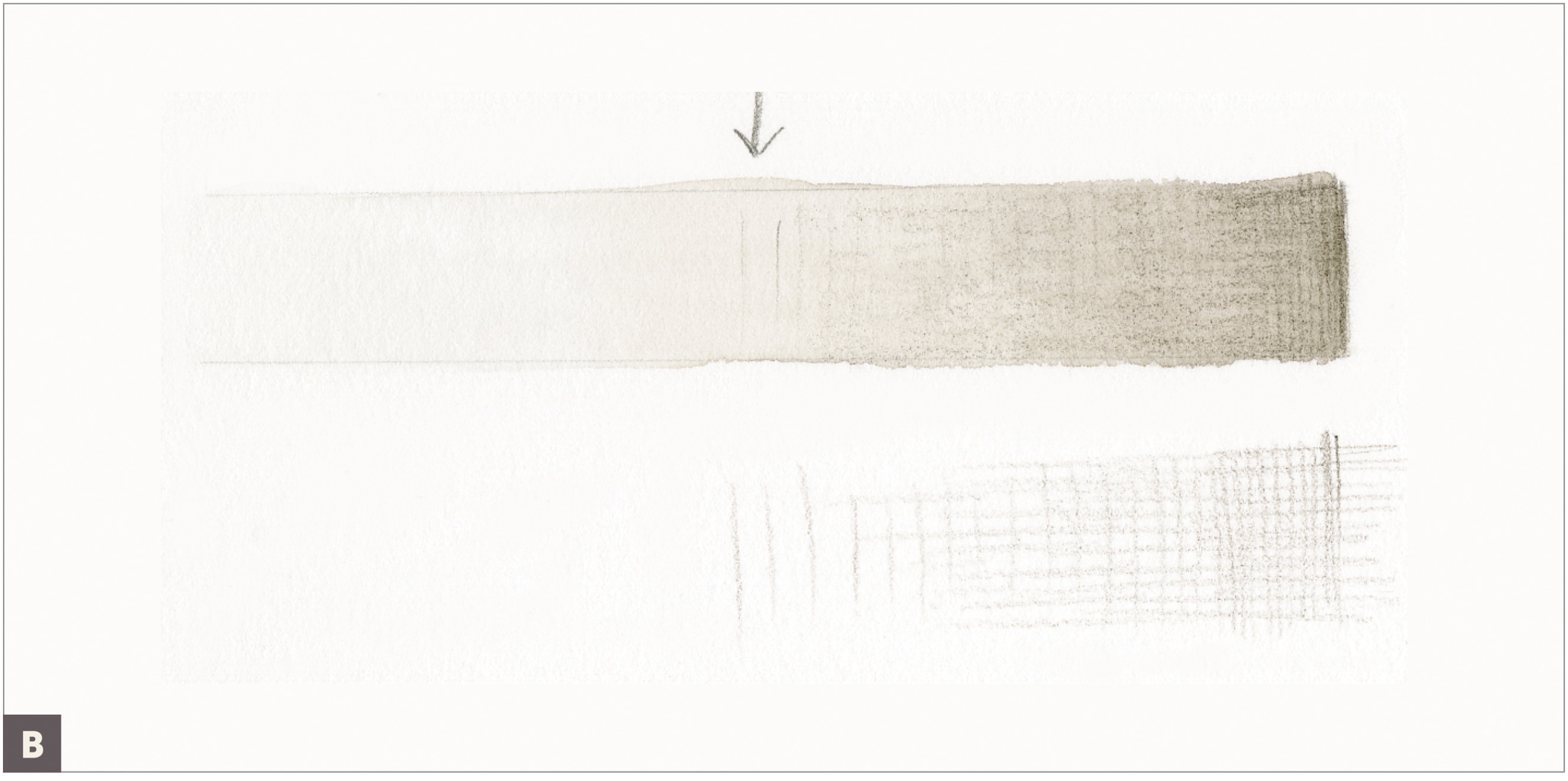
Draw a light outline of a curved tone bar with graphite pencil approximately ½inch high by 2 inches wide. (A)

Using a #2 brush, apply a graduated layer of graduated Dark Sepia watercolor, from right to left, stopping about ½inch from the left side. Next apply a small amount of watercolor starting on the left side, leaving a small area of the paper showing. This will become the highlight. Let dry completely. (B)
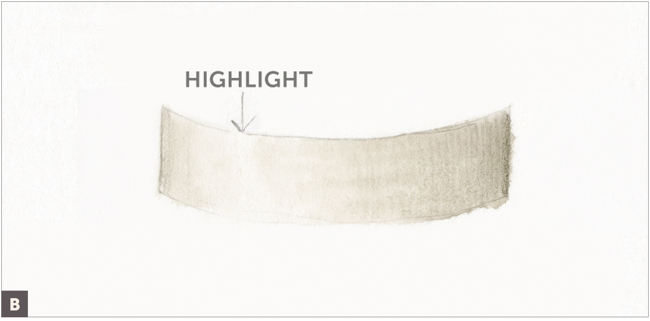
Using a sharp Dark Sepia colored pencil and building layers slowly, start to layer value from light to dark. Leave a blank area, about three-fourths of the way across from the right, for the highlight. (C)
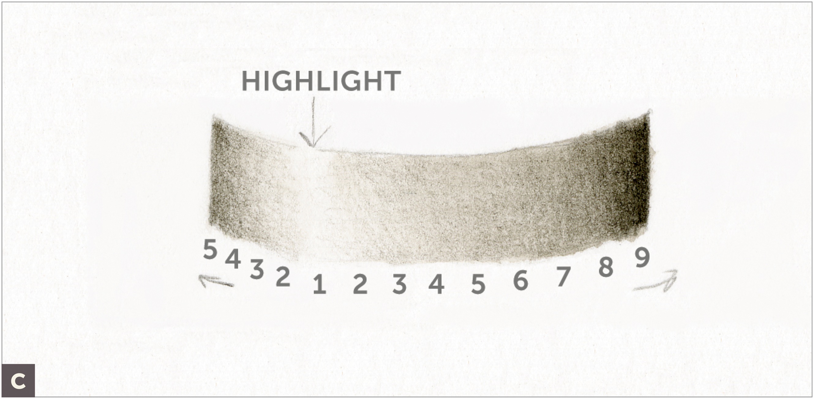
To create a convincing highlight that looks as if it is shimmering light and not just an empty area, continue to add more and more of the lightest values into the empty area so that, by the end, the empty area no longer looks like blank paper but feels like bouncing or shimmering light. Instead of adding marks in a straight line, use zigzag strokes, little dots, or whatever else seems to work. In the end, the amount of blank paper left is small, and there will be several light values bleeding into the highlight area. Observe this enlarged image of a highlight. (D)

