Klaus Madsen and Bente Dahl Thomsen
Chapter Summary. The color scheme of a product is especially used as a means of enhancing the product’s visual appeal. Both surface textures and the materiality are equally important in the experience of the product’s colors. Our work therefore revolves in developing features in the design process that ensures that shape and surface are created in a combined process that includes the gradual clarification of material, technical, marketing, production, and manufacturing aspects. The features enhance efforts in both research and concept development as the processing and the experience of the surface is highlighted as a separate subject in the Key Performance Indicator 1 (KPI). The features are focusing on the generation of model surfaces as a presentation of the product designers’ intentions of the surfaces so they appear as true as possible. The survey’s version of the KPI is seen in Figure 18.1, which visualizes the mutual expectations of what the design process includes.
To exemplify how the color composition of a product is significant to our experience of the product, the color scheme of the thermos shown in Plate 39 is initially analyzed. The thermos consists of three parts, when we leave out the inner parts: a black foot, a white body with handles, and a black lid with a white top surface. In addition a rectangular red area is placed asymmetrical in the top surface just above the opening in the lid’s inner closing function. In our culture we often associate the color red with stop, for example, most emergency stop buttons are red, so we would immediately assume that the red spot indicates a stop of some kind. The thermos’s open and closing function consists of the lid being a screw with an opening in the thread. When the lid is screwed tightly the thermos is closed, and as seen in Plate 39, the red rectangle refers to nothing in this position. Turning the lid from the closed position till the red rectangle reaches the middle of the spout, as seen in Plate 39 in the top righthand corner, the thermos opens just enough that you can pour a cup of coffee without the lid falling off. Rotate the lid further and it can be separated from the thermos. If the red spot is perceived as a kind of stop signal, it is logical that a position next to the spout means that the outlet is closed and the diametrically opposite that the outlet is opened, but this is not how the thermos’s open and closing function works and therefore this solution cannot be said to be cognitive ergonomic. Simply replacing the red colored spot with a color that does not in the same way signal either stop or start would create less confusion. A vertical milling on the edge of the lid would also facilitate the reading, since the milling would signal that there is a screw lid and not a kind of plug. The edge of the lid is also milled to enhance the slip security. The color scheme of the thermos is neutral with respect to the context we often encounter with the thermos; it is both robust, suitable for applying your corporate logos and functional when you are familiar with it. The thermos’s black/white color contrast makes it easy on the senses, to identify the foot’s meeting with bright tablecloths and the lid’s meeting with the thermos’s body.
Figure 18.1 The Key Performance Indicator shows what is emphasized in the design process. The colored area expresses the overall resource and the area’s points show the level of resources devoted to such elements as development of the product’s visual appeal.
Supposedly the thermos is made of plastic, which is why the color scheme of the thermos has been subject to the requirements of the manufacturing process where the injection molded parts should be made as simple as possible. The red rectangular area though is not embedded in the top surface due to the manufacturing processes, but solely because of the functionality as it is the only signal we have to indicate where the underlying opening is located. Both for reasons of wearing and the experience of a “real surface,” it might be necessary to bind the color scheme to the material and plan a delineation of the colored areas, with consideration to the selected manufacturing method as in the example of the thermos. Or if acceptable the colors can be applied by paint, adhesion of films or similar process, and the designer will have a wider range of choice, but will then be facing a problem of authenticity. Namely a clarification of whether the surface appears as a copy of something else, such as wood’s year rings, or as a design pattern with its own identity that tells a story of origin. Plate 40 shows a good example of how a color mix can emphasize the product’s reference to a bird without the pattern actually looking like feathers.
The foregoing considerations have opened our eyes to the fact that surface characteristics must have a central role in the design process from the beginning. With this as a starting point, the studies initiating problems were limited to:
How to create awareness of surface issues in the research phase?
How to handle surface issues in the concept development phase?
What criteria are relevant in assessing the result?
The first question led us to develop a research instruction focusing on surface conditions, which could be combined with participants’ inquiries about their own product ideas. Product fairs are good both to draw inspiration from and to check whether the design you are researching doesn’t already exist. Therefore we chose to develop a research instruction and test its functional ability during a visit to the interior and design fair Formland. The purpose of the research instruction was to ensure that surface issues were identified, and the participants collected examples of good design solutions. The research instruction is elaborated in the section “Identifying Process Problems Concerning Surfaces.”
The handling of surface issues should be seen in relation to our study, which is based on a design process with a concept development similar to the Bauhaus Dessau school, which entails: Products are created with a basis in theoretical knowledge of aesthetics, in an experimental process with materials and their textures as a starting point for the concept selection. The form and its surface are clarified by experiencing both. The experimental approach involves testing the product’s functionality and aesthetics through digital as well as physical models. Addressing the model technical problems this approach entails are discussed in the section “Methods in an Experimental Approach” (Rasmussen 1966).
CLARIFICATION OF CONCEPTS
Some of the concepts that are fundamental to an understanding of this chapter have more obscure meanings. Consequently, we must first give a clarification of the meaning of these concepts concerning this study:
The color value—depends on how it emphasizes the character of the product (appearance attributes), accentuates the shape and substance, and clarifies the content (the product’s objective, weight, use, etc.).
Cognitive ergonomics—is about the physical reception of information and how it gives us a sense of the surroundings. A color scheme, based on cognitive ergonomic considerations, is therefore based on experiences in the way we have learned to decode and understand the world.
The materiality—characterizes the material’s physical distinctiveness, material composition such as whether it is homogeneous or grainy, whether the material feels smooth—furry, hard—soft, cold—warm, moist—dry, transparent—translucent—saturated.
Structure—the way in which something is created, formed, constructed of elements, joined by its components. This means the mutual order of the components in which something consists.
Texture—surface characteristics or mechanical processing, that refers to the tactile sensation. Textures include all sorts of micro patterns that stand out from or enter the object surface.
Visual appeal—refers to the aesthetic characteristics that appeal to our sense of vision. That means properties that capture the consumers’ attention and make an impression. It means one or more properties that excite attention such as a feature of a tool that ties it to an underlying story or a humorous touch as do many of the Alessi products.
The aesthetic concerns everything that appeals to our senses—what we see, hear, smell, taste, feel, and recognize from our experience of time and place. Colors that are the focus of this study can only be experienced through sight, so we have limited the inquiry to address the visual appeal, while making no distinction between intellectual and emotional appeal (Favrholdt 2000).
IDENTIFYING PROCESS PROBLEMS CONCERNING SURFACES
In Scandinavia we have again seen a change in interior design from preferred colors that blend into the context and natural occurring materials to strong colorful wall areas possible with a white edging and matching products, emphasizing the room’s atmosphere. The more expensive interior though is still kept in the more neutral color schemes, while the cheaper interior accessories and tools are to be subjected to trends or seasonal color schemes to boost consumer spending. The increasing individualism has simultaneously triggered a demand for new color variations with the ability to select individual products in contrast or bright colors. In our investigation, we have made a delimitation from looking at the color scheme of products compared to the mentioned interior design trends. We will instead investigate the color scheme, which has the aim of emphasizing the product’s appearance and increase the product’s user value from a cognitive ergonomic perspective, that is, in the case concerning the color value. This distinction gave us the freedom to explore the products detached from the context they are designed for and in which we cannot experience them at design fairs. The criteria’s usability is tested by the participants both in their mid-term seminar and in the final examination of the product proposal.
Initiating a study of surface problems is in itself a way to enhance the participants’ awareness of these issues, therefore we involved our students in the study. The many participants made it possible to cover the entire fair, as the participants each had an area they should cover. This division of the study area also contributed to the analysis of a diverse range of products. Participants who chose to do the investigations at a store often chose the same products as were elected at the fair, which can be seen as an indication that these products represent particularly good design solutions.
The research instruction was as follows:
Find in the assigned area (or at a chosen store) a product whose visual appeal is entirely dependent on the color, texture, and materiality.
Draw or take a picture of the product and explain why you think the product’s visual appeal is depending on color, texture, and materiality. If you cannot find a product in which the color, texture, and materiality are part of the visual appeal, you may find several products that together exemplify the color, texture, and materiality of the product’s visual appeal.
Find also at least one example of a product whose colors, texture, or materiality contributes to cognitive ergonomics. Explain how you think the colors, texture, or the materiality are essential for the product based on a cognitive ergonomic consideration.
The participants brought crayons in case it was not possible to get permission to photograph the product, get a brochure or material samples. The method of recording using crayons comes from architect Anne Kappel (Kappel 1998).
A total of fifty-eight students participated in the survey, of which forty-two were at the Formland Fair. Participants had to pay for both transportation and admission to the fair, therefore, the remaining sixteen students preferred to do the survey in local stores, which contributed to the study’s range.
At Formland the many exhibitors had their focus on the six selected colors: warm red, yellow, orange, oriental blue, spring green, and dark purple. Even the company Stelton had designer Paul Smith remake Arne Jacobsen’s classic jug series in bright colors on the occasion of Stelton’s fiftieth anniversary (see Plate 41). The new eye-catching colors have a lot of visual appeal next to the uncolored original, but hardly among the other colorful products, where the colors have to fight for our attention. From a cognitive ergonomic consideration the colored functional surfaces can facilitate our physiological reception in relation to information of, for example, where we must grab. Viewed from this perspective Stelton’s approach is an improvement of the product’s usability.
Stelton’s new color scheme for Arne Jacobsen’s design breaks with the original monochrome principle, which emphasizes the whole product because the gray-colored steel and the black-colored handle match each other in contrast to the colored handles.
Among the products selected for visual appeal was the “Crushed Cup,” designed by Rob Brandt for AMTT (Figure 18.2), because the porcelain mug’s form in itself is sculptural, but the noncolored surface also strengthens the product’s appeal because the color contributes significantly to the reference of the classic Dutch cups in plastic. The cups are dented and crumpled as we know it from the plastic cups that are easily deformed.
The Michael Graves kettle with bird that Alessi produces in two monochrome versions with color and material contrast between white or black plastic and the original colored version with a soft light blue in contrast to the polished steel. The juxtaposition of a colored and an uncolored version of the kettle illustrates how colors can emphasize the nature of the product and link the individual components together. The grip on the boiler’s handle and heating element are connected by the light blue color, and the whistling bird’s dark red color links it to the boiler because of the small balls of the same color on each side of the grip. A monochrome version is shown in Figure 18.3.
Eva Solo’s decanter and appertaining cloak has a visual appeal that is dependent on both color and texture in interaction between the individual elements’ materiality. It is precisely the interplay between these elements that makes the product interesting and different. The decanter is made of a glass bottle with a drip-free spout in polished steel and a rubber ring.
The insulating cloak is a textile made of Neoprene. The design of the cloak with the big zipper in the fabric means that we associate it with a suit or coat, which consequently gives the product visual appeal. The contrast between the cold and warm, the smooth/shiny and furry/rough materials combined with the large zipper makes the product seem almost toy-like (see Plate 42). It arouses one’s curiosity and make one want to look at the jug and touch it, try it. Furthermore the color contributes to the decanter’s visual appeal but whether the appeal is positive or negative will depend on the combination of the textile color and the color of the drink the consumer will pour from the decanter. The combination of the color of the drink and the colors of the tableware have an impact on our well-being (Kringelbach and Thomsen 2009).

Figure 18.2 Crushed Cup, designed by Rob Brandt for AMTT. © Rob Brandt (www.robbrandt.com).
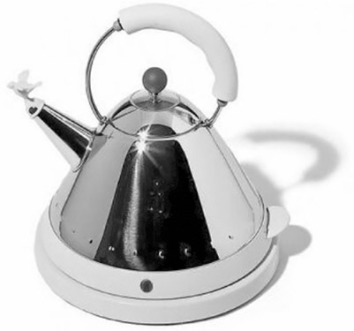
Figure 18.3 Electric kettle, designed by Michael Graves. Courtesy of/© Alessi (www.alessi.com).
The color scheme of both the electric kettle and the decanter also takes the cognitive ergonomics into account, as the functional surfaces are highlighted by both color and material contrast on the two products. The plastic’s materiality on the boiler’s grip is highlighted by a vague uniform texture, which makes us perceive it as a heat-insulating handle. The decanter’s cloak is made of a knitted fabric, which has a texture that makes us perceive it as something that is pleasant to touch, and gives us a good grip on the cool bottle that otherwise can be steamy and slippery.
One of the many mugs and drinking glasses that have been fitted with a colored ribbon, it should be noted for the way the materiality, color, and texture are exploited in terms of cognitive ergonomics, and not just to highlight the product’s uniqueness. For example, the double-sided mug from Bodum Design Group Canteen (www.bodum.com) provides a gripping surface with a soft rubber band positioned in a recess in the mug’s surface between 14 millimeters (9∕16 inches) from the bottom and 28 millimeters (1 7∕64 inches) from the top. The ribbon comes in multiple colors, that all stands in clear contrast to the white porcelain of the mug. The ribbon has a distinct texture in the form of a horizontal milling. The gripping surface is thus clearly marked with a signal of a non-slippery, soft grip. The ribbon also differentiates the drinking and supporting surfaces.
The Index cutting board designed by Damian Evans for Joseph Joseph is an example of colors used as a tool for functional differentiation. The product contains four cutting boards in a single storage box. The four cutting boards are provided with an icon and a corresponding color to tell the user what the cutting board’s use should be limited to in compliance with the hygienic rule of differentiation between the different types of food during cooking. The cutting board with the fish icon is blue and should be used for raw fish, similarly, the red for raw meat, the green for vegetables, and the white for cooked/prepared food. This way it becomes easier to keep the different types of food separated in the kitchen.
The cutting boards can be purchased alone—only with the storage box, but it is also possible to acquire them with matching knives. Each knife is equipped with a colored dot that tells what cutting board it belongs to and hence for what type of food the knife is intended. The idea of linking each of the cutting board’s color with a certain type of food is good. However, the solution with raw meat on a red plastic cutting board may be less effective as most users would probably prefer a wooden cutting board, as it gives a better color perception of the meat and also improved hygiene as beech is both bacteria-destructive and suitable for dishwashing (Institute of Technology 2002).
In connection with the research at the Formland Fair it was observed that the color, texture, and partly the materiality often didn’t emphasize the character of the product or the product’s use from a cognitive ergonomic consideration. In the specific exhibition areas at Formland reserved for students and recently qualified, it was also observed that the exhibited prototypes far from often gave a true presentation of the surface design desired on the finished product.
METHODS IN AN EXPERIMENTAL APPROACH
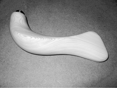
The aforementioned research provides the basis for our examination of how problems concerning the creation of the surface can, if not be equated with problems surrounding the creation of the form, then at least get more attention in the concept development. According to the Belgian Groupe μ the form is the sensory perception’s central unit, while colors and textures are secondary (Groupe μ 1992). The materiality is not accentuated as a separate parameter in the Groupe μ’s sensory model. The form’s existence is dependent on a material’s existence in the same way as the surface’s existence is dependent on a form’s existence. In aesthetics the colors and textures are characterized as secondary figurations (Bundgård 2004), precisely because neither the color or texture can be present without a form with surfaces. In the experimental work we often develop color, texture, and material using small samples and models in materials whose properties are very different compared to those of the product. An example is seen in Figure 18.4, which shows a model in wood where the growth rings give a completely different experience of form next to the mirroring prototype in brass.
The design process involved in the investigation had its focus on clarifying the leading features, that is, indicating the idea and structure of the product’s overall form, as well as the content of specific form elements. The overall shape is the whole that constitutes the product. This clarification of the leading features is similar to Alexander Baumgarten’s “illuminating methodology” (Brandt and Kjørup 1968). We assumed in the study that a surface area that constitutes a functional surface may be regarded as a form element, taking into account the cognitive ergonomics that determines the presence of well-defined areas with the same color or color mix that differs from the whole. The previously mentioned thermos’s foot constitutes an external functional surface that the designer has chosen to give the color black, like the edge of the lid constituting a second functional surface. An external functional surface is a surface that has an active function to the surrounding world according to engineer Eskild Tjalve (Tjalve 1976). The participating students were initially introduced to Tjalve’s method of systematic product development.
|
|
Figure 18.4 Model in wood and prototype in brass of the same door handle made by Lise Kaasing Munk.
It was the introduction to Tjalve’s model that led us to the fact that surface problems can be solved using the same design approach as we developed by combining the “illuminating methodology” with artist Erik Thommesen’s “form element method” (Morell 2006; Thomsen and Craudin 2008). The method consists of subdividing the overall form into a number of form elements whose general location is defined by the form’s structure; for example Forsters + Partners’s door handle, Fusital—Two Ranges Door Furniture Italy, 1995–1995, used at Bundestag Berlin, is divided into an outside and an inside element in colored plastic with a connecting element between the two and a joining element in metal closest to the door plate. Form elements’ mutual size are adjusted while their relative positions are tweaked until the form is in balance and harmony is achieved between the form elements. As indicated earlier we associate surface properties like color and texture to these form elements like material properties. An overall form will consist of multiple form elements that are processed separately in terms of shape, color, texture, and materiality. Simultaneously the whole of the form is being assessed after each adjustment of the overall form’s form elements. This division has proved well suited to handle the surface issues in the concept development phase, although it provides some model technical challenges in obtaining an accurate expression of texture and materiality in a model material that is significantly different from the product. The treatment of surface issues using models in scale, for example, 1:5, is especially a problem, since the model’s materiality should be finer-grained and the texture should be in the same scale as the model.
Designer Hella Jongerius, with “Polder sofa XXL,” Figure 18.5, has shown how such a division in the form elements can give the product a distinctive visual appeal by an individual color scheme. The green colors in the sofa reflect the variation found in different tree crowns and with this choice Jongerius achieves both an unusual interior color scheme and, from nature, a very recognizable color scheme that draws nature into the living room.
THE MODEL’S PRESENTATION OF THE DESIGNER’S INTENTIONS
Through the senses, the experience of form, color, material, and texture penetrate into the mind and gather into an “image” of the future product. It provides the manufacturers who are considering acquiring the rights to manufacture the product with some expectations for the finished result. The same applies to the buyers at a fair that place an order on the basis of a catalog and a model or prototype. Very often both architects and designers prepare monochrome work and sales models to give a tangible impression of the future product.
The uncolored abstract model that changes from cold white in the light to warm and broken in the half shadows and gray in the shadows is a fascinating spatial form with its own artistic expression that presents itself beautifully at an exhibition. The improved options to produce models with milling and three-dimensional printing has significantly contributed to at least the model’s form being consistent with the future product. It’s harder, though, with the material and surface properties, both of which will reflect the manufacturing process and the model’s materiality. As a presentation of the future product’s values the monochrome model is therefore often so inadequate that even professionals can be surprised when they see the finished product.

Figure 18.5 “Polder sofa XXL” by Hella Jongerius. © Vitra (www.vitra.com).
Models that are being colored and perhaps have textures applied seem more real and in that way help the viewer to imagine the future product. The model’s materiality may deviate from the product because of different scales, since it can distort the overall picture if, for example, shadow effects from the surface’s structure do not fit the scale. The model material’s (or the primer’s) color can also shine through the paint and give us a different experience of the color of the model than the same color paint would give the product. Even models painted in the colors the product will consist of can present the viewer with problems imagining the quality of the product. In addition colors are perceived very differently in combination with a coarse uniform texture, a pattern, or a completely smooth surface. Text, drawings, and material samples, though, may support the presentation of the designer’s intent, but it is left in the hands of the viewer to gain an overall understanding of the future product.
The first step toward a solution to this model interpretation problem is to increase awareness of the problem among all parties and allow them to train the ability to combine the many inputs about the product’s surface texture into a perception of the whole. The combinations of model, prototype, and product that can be seen on many design exhibits is a very good way to achieve this.
The next step we must take is that we as designers make it clear to ourselves what the model should convey in the specific context. For instance, if the model is being used in a competition context or at a museum or gallery exhibit, its artistic expression can be at the highest priority. If, however, the model is being used for sales fairs or meetings with collaborators, an expression as true as possible to the product’s surface must be at the highest priority.
Through experiments with old and new painting techniques and model materials, it is possible to get very far in efforts to convey the product’s surfaces via models, but it is required that surface problems that occur are treated early in the process. It requires both a number of experiments and a good process to achieve credible surfaces.
Our best product examples have been exhibited at fairs, such as CODE at the Bella Center, where most visitors expect to see finished products, and therefore evaluate models as such. These models or prototypes must first help to capture the visitors’ attention as they are passing by, and in that situation it may well be accepted that only the visual impression is credible. This means that:
1. We must choose model materials, with a materiality that visually is as close to the final product as possible. Finishing the product with staining, filling, roughening, and so on can be considered.
2. The color scheme of the model must be consistent with the product.
3. The texture must appear to resemble the product so much that a credible expression can be achieved, for example, by adding paint filler, so the finished result is similar to the product’s surface after polishing, painting, and so on.
If the model has enticed the guest to enter the stand, we have the opportunity to explain how the overall sensory impression of the product is expected to be, therefore it can better be accepted that the materiality is not completely credible and that the tactile experience is a little unclear.
RESULTS OF THE STUDIES
Regarding the issues raised in the introductory paragraph, the studies have provided some practical useable answers:
It is possible to raise awareness of surface issues in the research phase, by letting the design of the surface be a separate topic both in the Key Performance Indicator and in the research instruction.
Surface problems can be handled in the concept development phase by dividing the overall form into form elements so that each functional surface represents an area on a form element. For the individual form elements’ surface characteristics such as color, the color’s micro patterns, materiality, texture, and perhaps textures for additional elements, along with the form’s geometry and material, are being specified.
Clarification of criteria that are relevant to the assessment of surface characteristics in comparison with the product’s achievement of high visual appeal and clear cognitive ergonomics:
The surface’s ability to emphasize the product’s character respectively
The surface’s ability to emphasize the product’s use.
Furthermore, there may be cases where ethical criteria regarding “the surface’s authenticity” can be presented, that is,
The surface’s ability to convey the materiality, or
The surface pattern’s ability to emphasize the surface’s character and origin.
Criteria for assessing the qualities of the model surface in relation to conveying the expectations for the product:
The surface’s ability to visually convey the quality of the product’s surfaces in both light and shadow
The surface’s ability to convey the product’s materiality, primarily visually and secondarily textile
The surface’s ability to convey the product’s textures, primarily visually and secondarily textile.
Of course there are also a number of issues concerning the surface’s ability to patinate aesthetically, worn so that it highlights the character of the product and the color’s interaction with the contamination. These issues were investigated by Engelhardt (Frederiksen 1965) and they would be very relevant to include among the evaluation criteria, but in regard to this study’s context, the exhibitions at Formland and CODE, this was not possible. They should nevertheless be included in future studies that deal with the products in used conditions.
NOTE
1. An explanation of the Key Performance Indicator can be found at http://www.kpilibrary.com.
REFERENCES
Brandt, Per Aage, and Kjørup, Søren (1968), Baumgarten og æstetikkens grundlæggelse, Copenhagen: Forlaget Eccers, 73–74.
Bundgård, Peer F. (2004), Kunst Semiotiske beskrivelser af æstetisk betydning og oplevelse, Copenhagen: P. Hasse & Søns Forlag, 85.
Favrholdt, David (2000), Æstetik og filosofi, Copenhagen: Høst Humaniora, 116–51.
Frederiksen, Erik Ellegaard (1965), Knud V. Engelhardt Arkitekt and Bogtrykker 1882–1931, Copenhagen: Arkitektens Forlag.
Institute of Technology (2002), “God hygiejne starter på et skærebræt af TRÆ—Overrasket?,” http://vot.teknologisk.dk/_root/media/Tr%E6_og_levnedsmidler_konsument.pdf.
Kappel, Anne (1998), Farvens Format, Copenhagen: Kunstakademiets Arkitektskoles Forlag.
Kringelbach, Morten L., and Thomsen, Kristine Rømer (2009), Den farverige hjerne, Louisiana Museum of Modern Art, Magas in #31, 40–49.
Morell, Lars (2006), Skulpturen. Samtaler med Erik Thommesen, Rønde: Boggalleriet.
Groupe μ (1992), Trait du signe visuel. Pour une rhtorique de l’image [Treatise on the visual sign: Towards a visual rhetoric], Paris: Seuil.
Rasmussen, Steen Eiler (1966), Om at opleve arkitektur, Copenhagen: Gads Forlag, 161–87.
Thomsen, Bente Dahl, and Chraudin, Marianna (2008), “The Dilemma—The Creation of Forms via Digital or Manual Models,” 10th International Conference on Engineering and Product Design Education, Barcelona, Spain.
Tjalve, Erik (1976), Systematisk Udformning af industriprodukter, Copenhagen: Akademisk Forlag.