CHAPTER 9
Statistics and Data Analysis
Data can be any collection of information. The heights of trees in a certain area, voters’ opinion on a hot topic, the income of residents in a certain state—all are examples of data. Understanding data is important to virtually every career field. Statistics is the science of studying and understanding data. While statistics is a huge field, questions on the GED® test focus entirely on summarizing data, either by making certain calculations (such as finding the mean) or by creating charts (such as pie charts).
Analyzing Data Sets
The mean, median, and mode are all measures of the same thing: the “central tendency” of a data set. The idea is that by describing the central tendency in a collection of data values, you can tell what the typical data value in that collection looks like. Deciding which of the three measures best summarizes the data depends on the nature of the data itself.
The Mean
The mean is the average of a data set. It is calculated by adding all of the values in the set and dividing by the total number of values. For example, the mean of 18, 4, 2, 9, and 6 is 7.8.
18 + 4 + 2 + 9 + 6 = 39 and 39 ÷ 5 = 7.8
The mean is affected by extreme values, called outliers. These are values that are much greater than, or smaller than, most of the other values in the set. If a data set includes one or two outliers, then the mean is “pulled” toward those outliers and may not accurately represent the true center. In the following figure, you can see the effect of changing one value in the data set to an outlier.

In some data sets, the same values appear numerous times. In such cases, when you are asked to calculate the mean, you may not be given a list of every individual value. Instead, you may be given the values and told the frequency of each one (how many times it appears in the data set). When calculating a mean with frequencies, multiply each number by its frequency, add the results, and then divide by the total frequency.
EXAMPLE 1
Jake has been playing a video game and has kept track of his scores. The following frequency table shows his scores for the last 30 games.

What was his average score for these 30 games?
Step 1: Multiply each value by its frequency and add the results.
(1200 × 2) + (1800 × 10) + (2000 × 12) + (3000 × 6) = 62,400
Step 2: Divide by the total frequency (the total number of values).
The total frequency is 30, so the mean is 62,400 ÷ 30 = 2080.
The Median
The median is the middle value of a data set when all of the numbers are listed in order from least to greatest or greatest to least. How it is calculated depends on how many values are in the data set. If there is an odd number of values in the data set, then to find the median, put all of the values in order and select the middle value. If there is an even number of values in the data set, put all of the values in order and find the average of the two middle values. That average is the median.

The median is less affected by outliers. Looking at data set 2 in the preceding figure, the median would be 14 whether the last value is 20 or 200 because the two middle values would still be 13 and 15.
The Mode
For some data sets, such as the eye colors of students in a class, finding a mean or a median is not possible or doesn’t make sense. This is even true for some numerical data sets. If you collected the zip code of everyone in your workplace, would it make sense to find an average? What would that represent?
For data sets like these, the mode can be a way to measure the central tendency. The mode is simply the most commonly occurring value. In the data set 3, 3, 3, 1, 4, 9, for example, the mode is 3. If two different data values occur with the same frequency, both data values are modes. If all of the values in a data set are different, the set does not have a mode.
Weighted Averages
When more importance (or “weight”) is placed on certain numbers in a calculation of the mean, you are finding what is called a weighted average. This is common in some grading schemes in which exams may count more than homework. A weighted average is calculated by multiplying each value by its weight and then adding the results.
EXAMPLE 2
The final grade in a science course is determined by a student’s performance on two exams, a final, and quizzes. Each exam is worth 25%, the final is worth 30%, and the quizzes 20%. Given Sara’s grades, which follow, what will be her final grade in the course?

Using the weights, the final score will be:
(0.25 × 85) + (0.25 × 75) + (0.30 × 72) + (0.20 × 80) = 77.6
The Range
In statistics, there are many ways to measure the extent to which a data set is spread out. One of these measures is called the range. The range is calculated by taking the largest value in the data set and subtracting the smallest value. For example, the range for the data set 1, 9, 2, 5, 6 is 9 − 1 = 8.
EXERCISE 1
Analyzing Data Sets
Directions: For the following questions, calculate the indicated value. Round your answers to the nearest hundredth if necessary.
1. At a certain summer camp there are ten 9-year-olds, six 12-year-olds, and three 11-year-olds. What is the average age of the campers?
Use the following to answer questions 2 through 4.
The employees of the Marla Community Hospital held a charity event to raise money. The following are the amounts raised by the six hospital departments that participated.
$451.00
$690.00
$318.00
$500.00
$405.00
$320.00
2. What was the mean amount raised by the departments?
3. What was the median amount raised by the departments?
4. What was the range of the amounts raised by the departments?
5. On each of her exams this semester, Emily has scored between 60 and 70. If she scores a 90 on her next exam, which of the following must be true?
A. Her mean score will decrease.
B. Her mean score will stay the same.
C. Her mean score will increase.
D. Her mean score may increase or decrease depending on how many exams she has taken.
Summarizing Data with Pictures
The mean, median, and mode all represent specific numerical summaries of a data set. Graphical summaries, by contrast, are charts or graphs that are designed to give an overview of a whole data set. Statisticians use many different types of graphical summaries, and each has its own special features. The following types of charts and graphs commonly appear on the GED® test.
Bar Charts
Bar charts are a useful way to compare data for different categories. The categories might be numerical, such as the ages of different people, or non-numerical, such as different brands of automobiles. When working with bar charts, you need to pay close attention to the labels on the bars and also to the scaling on the horizontal or vertical axis. You will need to understand the scaling to answer questions.
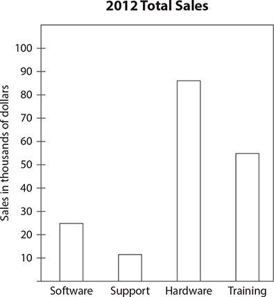
The sample bar chart shows the total sales of a certain electronics company in 2012, broken down by department. The heights of the bars tell you the sales totals for each department. For example, the bar for the software department reaches a point midway between 20 and 30 on the scale shown on the vertical axis. Because the label says that the scale shows sales in thousands of dollars, the bar for software indicates that sales by the software department totaled approximately $25,000. Note how you can see at a glance that the hardware and training departments earned far more in sales than the software and support departments. Bar charts are a good way to illustrate contrasts of this kind.
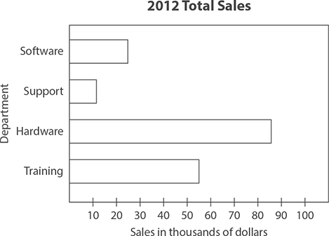
The bars in bar charts can be horizontal instead of vertical, as you can see in the following example. This bar chart illustrates the same data as the chart with vertical bars. The only difference is that the bars are horizontal and the scale appears along the horizontal axis at the bottom.
Circle Graphs
Circle graphs are also known as pie charts. These graphs use a circle to show how the parts of a whole relate to each other. The circle represents the whole. The size of each segment of the circle indicates the size of that category and the share of the whole that it represents.
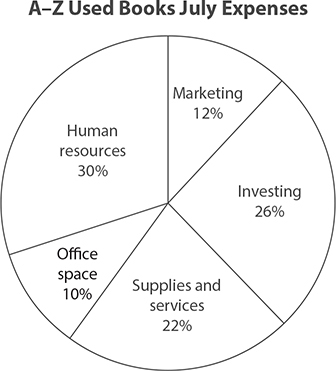
The graph shows the breakdown of expenses for a small business in July. Note that the size of each section of the circle corresponds to the size of the percent. For example, human resources accounted for 30% of expenses in July, so a section corresponding to 30% of the circle is labeled “Human resources.” Note that the total percents add up to 100.
EXAMPLE 3
Suppose that the total expenses in July for A–Z Used Books were $14,780. Based on the graph, how much did the company spend on marketing during this month?
The circle graph indicates that 12% of the July expenses was spent on marketing. Therefore, you need to find 12% of $14,780. Multiply:
0.12 × 14,780 = 1773.6
In July, $1,773.60 was spent on marketing.
EXERCISE 2
Bar Charts and Circle Graphs
Directions: The following bar graph shows the enrollment for a weeklong seminar offered monthly to college juniors and seniors who are looking for jobs while in school. Use this information to answer questions 1 through 5.
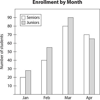
1. In which month was total enrollment greatest?
2. How many seniors were enrolled in February?
3. In which month did the number of seniors exceed the number of juniors enrolled?
4. What was the total enrollment in the seminar in April?
5. In which month was the largest difference in the number of seniors and juniors enrolled?
The following circle graph shows the job classifications for 1800 attendees at a technology conference. Use this to answer questions 6 through 10.

6. How many conference attendees were classified as Project Leaders?
7. What was the most common job classification among the attendees?
8. How many attendees were classified as a Senior Associate I or II?
9. If half of the attendees listed as “other” were freelancers, how many freelancers attended the conference?
10. What was the ratio of attendees classified as Senior Associate I to those classified as Senior Associate II?
Answers are on page 517.
Dot Plots
Dot plots are very detailed graphs that can be used on a wide variety of data sets. On a dot plot, each individual data value is represented as a dot above a number line and any repeated value is “stacked” on top of the others. This type of graph can be used to show how the data are spread out without losing any information about the individual data values.
The following dot plot shows the results of a survey in which a random sample of adults were asked how many Internet-connected devices are owned by members of their household.
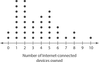
Each dot represents an individual response. Because there are two dots above 0, you know that two people stated that there are no Internet-connected devices owned by members of their household. Similarly, only one person stated there were 10 such devices in his or her household.
EXAMPLE 4
Based on the preceding dot plot, how many people in the survey stated that members of their household owned more than 5 Internet-connected devices?
Count the number of dots for responses of 6, 7, 8, 9, and 10 Internet-connected devices:
3 + 1 + 2 + 1 = 7
Box Plots
Box plots show a data set broken up into four sections. These sections are based on the median and two new measures: the first quartile and the second quartile. These quartiles are defined as follows.
Given any data set, you can arrange it in order from smallest to largest in order to calculate the median. Because the median is the middle value, you can say that about 50% (or half) of the data set is smaller than the median and about 50% (or half) of the data set is greater than the median.

The quartiles break these two halves into quarters. About 25% of the data values are smaller than the first quartile. About 75% of the data values are smaller than the third quartile.

Along with the greatest and smallest data values, the quartiles and median are included in every box plot. The general shape is shown in the following figure. Note that any very small or very large outliers are shown by stars or similar symbols.
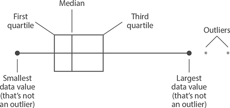
As with bar charts, you may see some box plots drawn horizontally. Either way, the basic structure remains the same. As you answer questions about any box plot, remember that it is presenting the data in order, broken up into fourths or quarters.
The following box plot shows the salaries, in thousands of dollars, for all full-time employees at a printing company.
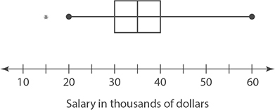
Using this plot, you can see that the smallest salary earned by any employee is $15,000 while the largest is $60,000. The box that covers the space from the first to the third quartile represents the middle 50% of the data. In this example, that means that 50% of the employees earn between $30,000 and $40,000 a year. The median is $35,000 (the line in the middle of the box), so you can also say that 50% of employees earn less than $35,000 in salary.
EXAMPLE 5
Use the preceding salary box plot to complete the following sentences.
1. About 25% of employees earn more than __________.
2. About 75% of employees earn more than __________.
Here are the solutions:
1. The third quartile ends at $40,000, so about 25% of employees earn more than $40,000.
2. The first quartile begins at $30,000, so about 75% of employees earn more than $30,000.
Histograms
At first, histograms seem not too different from bar graphs. However, the information contained in a histogram is much more detailed. Because histograms can be complicated, let’s start by analyzing an example.

This histogram shows the distribution of hourly wages based on survey data. The wage levels are broken up into ranges that are shown on the wage scale at the bottom. The height of each bar represents the frequency for each range, or how many data values are in that range. Thus there are 18 people who have an hourly wage of $8 up to $11, and there are 10 people who have an hourly wage of $11 up to $14. In each range, the last value is not included. For example, if a person makes $11 per hour, that person is counted in the $11-to-$14 range and not in the $8-to-$11 range.
With histograms, no information about individual data values is shown. In this example, there is no way to tell how many people have an hourly wage of exactly $9. You can only see how many are in a given range.
EXAMPLE 6
Based on the preceding histogram showing hourly wages, how many people were surveyed? What percentage of them earn less than $14 per hour?
Because the groups do not overlap and the height of the bars tells you how many people are in each group, add up the heights of all the bars: 18 + 10 + 10 + 8 + 2 + 4 = 52. There were 52 people surveyed.
To find the percentage that earn less than $14 an hour, you need to add the frequencies of the bars that cover that range of values (the part) and divide by 52 (the whole).

53.8% of those surveyed earn less than $14 an hour.
EXERCISE 3
Histograms and Dot Plots
Directions: The following dot plot shows the ages of children enrolled in a weeklong summer day camp. Use this plot to answer questions 1 through 3.

1. How many children are enrolled in the day camp?
2. How old is the youngest camper?
3. What is the most common age among the campers?
The box plot shows the scores on a factory’s in-house certification exam. The data are divided into two groups. The people in Group 1 studied on their own, while those in Group 2 were assigned a mentor who guided their study plans. Use this data to answer questions 4 through 6.
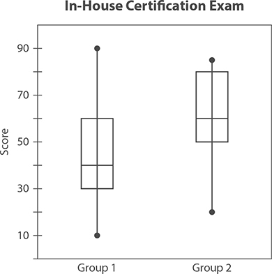
4. In which group was the person with the lowest score?
5. What was the median score for those in Group 2?
6. What percentage of people in Group 1 scored higher than 60?
Amanda searched a local website and collected data on the asking prices for all the homes for sale in her town. The data she collected is represented in the following histogram. Use this histogram to answer questions 7 through 10.
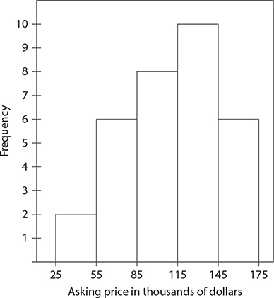
7. How many asking prices for homes are included in the histogram?
8. How many homes had an asking price of less than $145,000?
9. What percentage of homes had an asking price of $115,000 or more?
10. What percentage of homes had an asking price of less than $55,000?
Answers are on page 517.
Relationships Between Data Sets
Line graphs and scatter plots are both used to illustrate relationships between two sets of data. In line graphs, one data set is the time when data values in the other set are occurring. In scatter plots, the two data sets can be anything! Both types of graphs are common on the GED® test.
Line Graphs
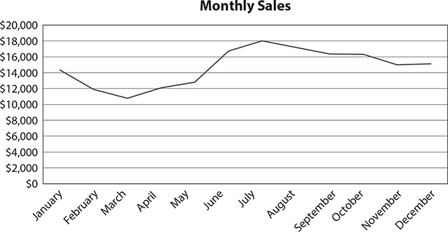
The following table shows the sales that a company made each month last year. Looking at this table, it is clear that the company’s best month was July, but what was the overall trend? Did sales fall in the winter? Did sales rise steadily throughout the year?

Displaying this data in a line graph will help you answer those types of questions. In a line graph, the data is plotted against time, and lines are drawn connecting the data values so that the trends are easier to see. The sales data is plotted in the following line graph.
EXAMPLE 7
The preceding line graph shows the monthly sales for a company last year. Based on this graph, between which two months did the company see the largest increase in sales?
The steepest section of the graph is between May and June. Steep sections of line graphs represent sudden changes in time periods.
Scatter Plots
A mechanic wants to know if there is a relationship between the age of a car and the typical repair bill at his shop. He finds the bills for ten randomly selected cars that he has worked on. The following table shows the data he has collected.

This is an example of paired data. Each repair bill is paired with the age of the car. Data like these can be plotted on a scatter plot just like points in the (x, y) plane. For example, one bill was for $200 on a 7-year-old car.
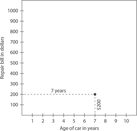
Each pair of data values is plotted in a similar way to complete the scatter plot.
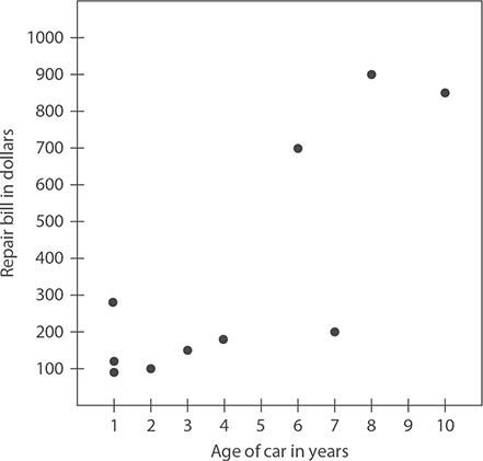
When analyzing a scatter plot, look at the overall pattern. If the points tend to locate along an imaginary line that rises from left to right, we say that there is a positive relationship between the two values. That is, as one value increases, so does the other. If the points tend to locate along an imaginary line that falls from left to right, we say that there is a negative relationship between the two values. That is, as one value rises, the other falls.

In the repair bill data plot, there is a positive relationship between the two values. This means that as the age of the car increases, the repair bill tends to increase too. That may not be true in every single case, but it is the overall trend.
EXERCISE 4
Relationships Between Data Sets
Directions: Casey is a runner and has kept track of her weekly mileage for the past two months. Use the following graph to answer questions 1 through 3.
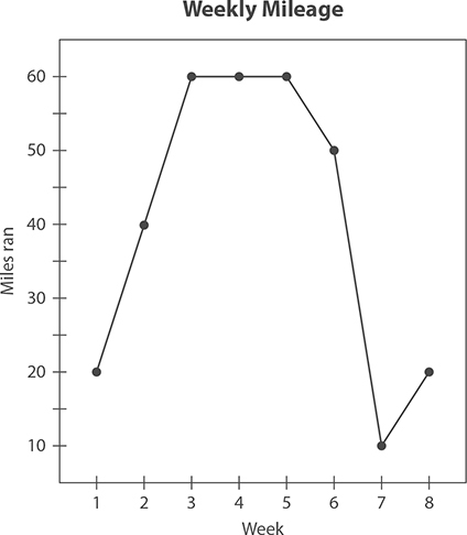
1. In week 6, Casey twisted her ankle and had to run less the following week. How much did her mileage drop from week 6 to week 7?
2. During which weeks did Casey run more than 40 miles?
3. If Casey burns 110 calories for each mile she runs, how many calories did she burn running in week 2?
Kaitlyn, a middle school teacher, wants to see if her students’ quiz scores (graded from 0 to 30) are related to their exam scores (graded from 0 to 100). She collected the following data from 8 students. Use this to answer questions 4 and 5.

4. Use the following scale to sketch a scatter plot of this data.
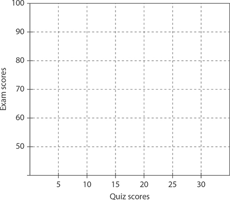
5. Based on the scatter plot you sketched, which of the following statements is true for the students whose scores were included in the data set?
A. In general, students with higher quiz scores tend to have lower exam scores.
B. In general, students with higher quiz scores tend to have higher exam scores.
C. In general, there is no relationship between quiz scores and exam scores.
D. There is a nonlinear relationship between quiz scores and exam scores.
Answers are on page 517.