Appendix: Constellations, Cognitive Maps, and the Politics of Data Visualization
Derek Laventure
In a global context defined by increasingly complex webs of data, extracting and interpreting the information required to make sound political decisions can be extremely difficult. In response, the growing field of data visualization (Tufte 2001) has emerged to provide a useful compromise between the subjective interpretation of data and a statistical-analysis approach aimed at objective representation. Cognitively, the visual rendering of even moderate amounts of data can yield deeper understandings of the subject matter while highlighting the degree to which a data set is more than the sum of its parts. At its best, data visualization allows us to begin constructing what Frederic Jameson referred to as a “cognitive map,” a “situational representation” of “the ensemble of society’s structures as a whole” (1991, 51). Especially valuable in light of late capitalism’s fragmentation of experience, such a map can help us to see relations that would otherwise go unnoticed and concretely determine “where we stand” in relation to the data points located throughout the spatialized array.
Like cartography (Jameson 1991), which had to pass through a subjective “itinerary” and objective “mimetic” phase before coming to terms with interpretive representational problems (e.g., how do you capture a swirling planetary orb on a little flat map?), data visualization is less about “the way it is” than about the manner in which the objective field might deliberately be navigated from a situated perspective. Despite proprietary constraints, the democratization of geographic information through tools like Google Maps (which combine scales while oscillating between itinerant and mimetic perspectives) hints at a corresponding cognitive development. The goal: thinking of ourselves as nodes within—and not merely as detritus upon—the swirling vortices of globalized capital.
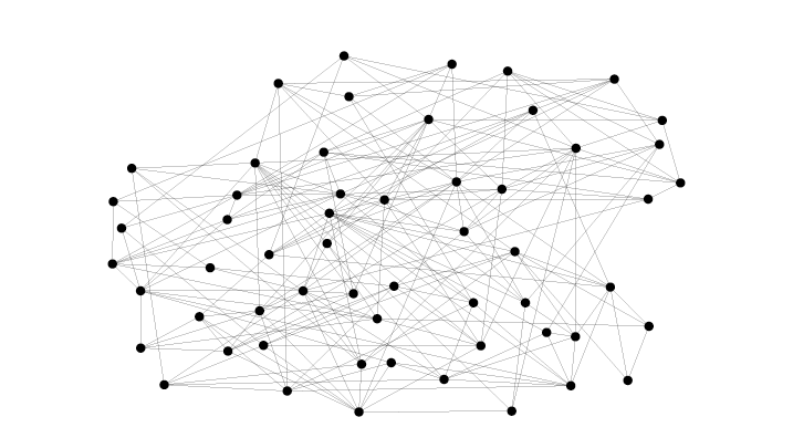
Recognizing the value of creating a visual representation of the vocabulary explored in this volume, the editors of Keywords for Radicals asked me to help map the connections outlined in the “see also” lists contained at the end of each entry. Inspired by the work of neo-conceptual artist Mark Lombardi (1951–2000), whose hand-drawn “global networks” traced the connections binding together actors involved in financial scandals and other shady deals (Lombardi 2003), we aimed to devise our own cognitively rich strategy for representing the contested vocabulary of late-capitalist struggle. Following Raymond Williams (1983), we wanted to foreground how understanding this vocabulary required recognizing that the relative fixity of any given word was contingent upon its association with other words, which were in turn marked by their own conceptual relativity. For Williams, words played a key role both in producing and in giving expression to our reality. Consequently, when a term’s meaning fluctuated, it tended to signal a corresponding change in the world’s social and material configuration. By perceiving these interconnections and locating ourselves among them, we can begin to consider how we might influence their development.
When I started researching how to produce a “semantic network” diagram to represent these keywords, I quickly discovered that researchers, developers, and hackers all over the world had been working collaboratively to produce a variety of opensource tools to aid with data visualization. These downloadable tools (along with their associated documentation) are free to use, to modify, and to repurpose. Since we had to produce a basic representation of the network, lay it out in a useful visual arrangement, and style it so that it could be published in print form, it became clear that no single tool would do everything we needed. After writing a couple of custom scripts to parse the simple textual representation of each keyword and its “see also” connections, I used the network visualization tools Gephi and Cytoscape to manipulate that representation into a serviceable graphical form. Finally, to get the styling right, I set up a semi-automated “command script” in Cytoscape to highlight each keyword and its immediate connections before exporting a scalable vector graphic of the results.50
Reflecting on this technical process, it became clear that the political importance of “free as in freedom” opensource tools was similar to that of the “cognitive mapping” process that had set us in motion. By developing collaborative, socially defined terms and tools, we become more capable of locating both our power and ourselves. With such tools, it becomes possible to begin producing meaning—and reality—in ways that connect rather than alienate. Like the constellation and the cognitive map, opensource software is a collective achievement. The field it enables us to visualize is one defined by struggle. However, with the right tools, it’s a struggle we can win.
50. Those interested in learning more about the gory details can consult my technical blog post at http://tranzform.ca/keywords.