
 DOTPLOTS
DOUBLE BAR CHARTS
BACK-TO-BACK STEMPLOTS
PARALLEL BOXPLOTS
CUMULATIVE FREQUENCY PLOTS
Many real-life applications of statistics involve comparisons of two populations. Such comparisons can involve modifications of graphical displays such as dotplots, bar charts, stemplots, boxplots, and cumulative frequency plots to portray both sets simultaneously.
TIP
When asked for a comparison, don’t forget to address shape, outliers (unusual values), center and spread (SOCS or CUSS), and to refer to context. You must use comparative words, that is, you must state which center and which spread is larger (or if they are approximately the same). Simply making two separate lists is not enough and will be penalized.
 EXAMPLE 3.1
The caloric intakes of 25 people on each of two weight loss programs are recorded as follows:
Program A: 1000, 1000, 1100, 1100, 1100, 1200, 1200, 1200, 1200, 1300, 1300, 1300, 1300, 1300, 1400, 1400, 1400, 1400, 1400, 1500, 1500, 1600, 1600, 1700, 1900
Program B: 1000, 1100, 1100, 1200, 1200, 1200, 1300, 1300, 1300, 1400, 1400, 1400, 1400, 1500, 1500, 1500, 1500, 1500, 1600, 1600, 1600, 1700, 1700, 1800, 1800
These data can be compared with dotplots, one above the other, using the same horizontal scale.
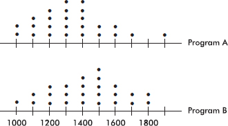
Program A appears to be associated with a lower average caloric intake than Program B. Comparing shape, center, and spread, we have:
TIP
Don’t forget to label and provide a scale for all graphs!
Shape: We see that both sets of data are roughly bell-shaped (the empirical rule applies), and Program A has an outlier at 1900 calories (while Program B has no outliers).
Center: Visually, or by counting dots, the centers of the two distributions are 1300 and 1400 calories, for Programs A and B respectively. (A calculator gives means of xA = 1336 and xB = 1424.) By any method, the center for Program B is higher.
Spread: The spreads are approximately the same, 1000 to 1900 calories for Program A and 1000 to 1800 calories for Program B. (A calculator gives standard deviations of sA = 218 and sB = 218.)
EXAMPLE 3.2
A study tabulated the percentages of young adults who recognized various photographs as follows: Joe Stalin (10%), Joe Camel (95%), Senator Simpson of Wyoming (5%), Bart Simpson (80%), Al Gore (30%), Al Bundy (60%), Mickey Mantle (20%), Mickey Mouse (100%), Charlie Chaplin (25%), Charlie the Tuna (90%). These data can be illustrated with a bar chart appropriately displayed in pairs of bars.
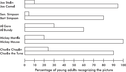
The pairs of bar graphs visually indicate the reason for concern felt by some educators.
EXAMPLE 3.3
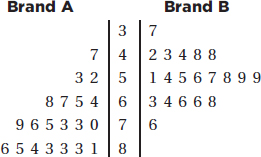
In a 40-year study, survival years were measured for cancer patients undergoing one of two different chemotherapy treatments. The data for 25 patients on the first drug and 30 on the second were as follows:
Drug A: 5, 10, 17, 39, 29, 25, 20, 4, 8, 31, 21, 3, 12, 11, 19, 10, 4, 22, 17, 18, 13, 28, 11, 14, 21
Drug B: 19, 12, 20, 28, 22, 35, 1, 21, 21, 26, 18, 28, 29, 20, 15, 32, 31, 24, 22, 26, 18, 20, 22, 35, 30, 18, 25, 24, 19, 21
In drawing a back-to-back stemplot of the above data, we place a vertical line on each side of the column of stems and then arrange one set of leaves extending out to the right while the other extends out to the left.
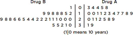
Note that even though drug A showed the longest-surviving patient (39 years) and drug B showed the shortest-surviving patient (1 year), the back-to-back stemplot indicates that the bulk of patients on drug B survived longer than the bulk of patients on drug A.
Comparing shape, center, and spread, we have:
Shape: Both distributions are roughly bell-shaped (the empirical rule applies). The drug A distribution appears to have a high outlier at 39, while the drug B distribution appears to have a low outlier at 1.
Center: Visually, or by counting values, the centers of the two distributions are 17 and 22, respectively. (A calculator gives means of xA = 16.48 and xB = 22.73.) By either method, the drug B distribution has a greater center.
Spread: The spreads are 3 to 39 survival years for drug A and 1 to 35 survival years for drug B. (A calculator gives standard deviations of sA = 9.25 and sB = 6.97.) By either method, the drug A distribution has a greater spread than the drug B distribution.
EXAMPLE 3.4
Mail-order labs and 1-hour minilabs were compared with regard to price for developing and printing one 24-exposure roll of 35-millimeter color-print film. Prices included shipping and handling charges where applicable. Following is a computer output describing the results:
For mail-order labs:
Mean = 5.37 Standard deviation = 1.92 Min = 3.51
Max = 8.00 N = 18 Median = 4.77
Quartiles = 3.92, 6.45
For 1-hour minilabs:
Mean = 10.11 Standard deviation = 1.32 Min = 8.58
Max = 11.95 N = 15 Median = 10.08
Quartiles = 8.97, 11.51
In drawing parallel boxplots (also called side-by-side boxplots) of the above data, we place both on the same diagram:
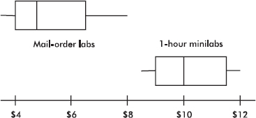
Boxplots show the minimum, maximum, median, and quartile values. The distribution of mail-order lab prices is lower and more spread out than that of prices of 1-hour minilabs. Both are slightly skewed toward the upper end (the skewness can also be noted from the computer output showing the mean to be greater than the median in both cases.)
Parallel boxplots are useful in presenting a picture of the comparison of several distributions.
EXAMPLE 3.5
Following are parallel boxplots showing the daily price fluctuations of a certain common stock over the course of 5 years. What trends do the boxplots show?
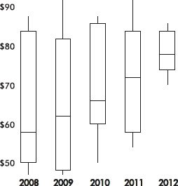
The parallel boxplots show that from year to year the median daily stock price has steadily risen 20 points from about $58 to about $78, the third quartile value has been roughly stable at about $84, the yearly low has never decreased from that of the previous year, and the interquartile range has never increased from one year to the next.
EXAMPLE 3.6
The graph below compares cumulative frequency plotted against age for the U.S. population in 1860 and in 1980.
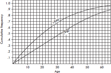
How do the medians and interquartile ranges compare?
Answer: Looking across from .5 on the vertical axis, we see that in 1860 half the population was under the age of 20, while in 1980 all the way up to age 32 must be included to encompass half the population. Looking across from .25 and .75 on the vertical axis, we see that for 1860, Q1 = 9 and Q3 = 35 and so the interquartile range is 35 – 9 = 26 years, while for 1980, Q1 = 16 and Q3 = 50 and so the interquartile range is 50 – 16 = 34 years. Thus, both the median and the interquartile range were greater in 1980 than in 1860.
SUMMARY
To visually compare two or more distributions use:
 Dotplots, either one above the other or side-by-side
Double bar charts
Histograms, either one above the other or side-by-side
Back-to-back stemplots
Parallel boxplots
Cumulative frequency plots on the same grid
For all the above, make note of any similarities and differences in shape, center, and spread.
QUESTIONS ON TOPIC THREE: COMPARING DISTRIBUTIONS
Multiple-Choice Questions
Directions: The questions or incomplete statements that follow are each followed by five suggested answers or completions. Choose the response that best answers the question or completes the statement.
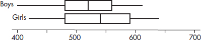
1. The dotplots below show the yearly wages of all male and female executives at a large firm.
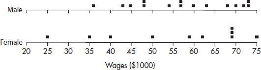
Which of the following conclusions cannot be drawn from the plots?
(A) A greater proportion of male employees than female employees are executives at this firm.
(B) No executive receives a salary less than $25,000.
(C) The median salary paid to male executives is less than the median salary paid to female executives.
(D) The range of salaries paid to male executives is less than the range of salaries paid to female executives.
(E) More male than female executives have salaries over $70,000.
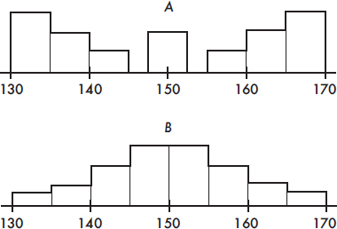
2. Which of the following statements about the two histograms above is true?
(A) The empirical rule applies only to set A.
(B) The mean of set A looks to be greater than the mean of set B.
(C) The mean of set B looks to be greater than the mean of set A.
(D) Both sets have roughly the same variance.
(E) The standard deviation of set B is greater than 5.
3. Consider the following back-to-back stemplots comparing car battery lives (in months) of samples of two popular brands.
Which of the following are true statements?
I. The sample sizes are the same.
II. The ranges are the same.
III. The variances are the same.
IV. The means are the same.
V. The medians are the same.
(A) I and II
(B) I and IV
(C) II and V
(D) III and V
(E) I, II, and III
4. The following boxplots were constructed from SAT math scores of boys and girls at a high school:
Which of the following is a possible boxplot for the combined scores of all the students?
(A) 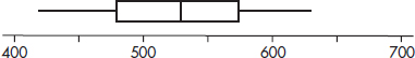
(B) 
(C) 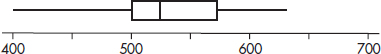
(D) 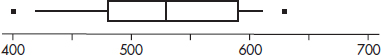
(E) 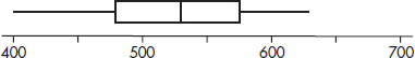
Questions 5–7 refer to the following population pyramids (source: U.S. Census Bureau).
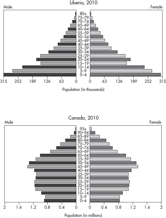
5. What is the approximate median age of the Liberian population?
(A) 0–4
(B) 15–19
(C) 30–34
(D) 40–44
(E) There is insufficient information to approximate the median.
6. Which country has more children younger than 10 years of age?
(A) Liberia
(B) Canada
(C) You can’t tell without calculating means.
(D) You can’t tell without calculating medians.
(E) You can’t tell without calculating some measure of variability.
7. Which of the following statements are plausible, given the graphs?
I. Canadian women tend to live longer than men.
II. The recent civil war in Liberia, with the extensive use of child soldiers, has had an impact on the population age distribution.
III. Canadian demographics show a decreasing birth rate.
(A) I only
(B) I and II only
(C) I and III only
(D) II and III only
(E) All three are plausible.
8. Looking at very large sets of communications metadata, mainly phone call and e-mail logs, a government agency tracks connections starting with intelligence targets overseas and extending to “contact chains” of different lengths. During January 2014 and January 2015, the lengths of contact chains analyzed are shown in the following histograms.
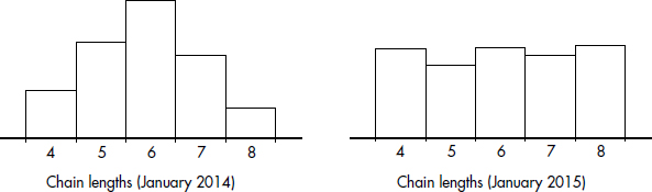
In which month did the chain length distribution have the greater standard deviation?
(A) January 2014 because of its bell-shaped distribution
(B) January 2014 because the 2015 distribution is roughly uniform
(C) January 2015 because of similar means, but a later date
(D) January 2015 because more data are further from the mean
(E) This cannot be answered without more information.
Free-Response Questions
Directions: You must show all work and indicate the methods you use. You will be graded on the correctness of your methods and on the accuracy of your final answers.
FOUR OPEN-ENDED QUESTIONS
1. Are women better than men at multitasking? Suppose in one study of multitasking a random sample of 200 female and 200 male high school students were assigned several tasks at the same time, such as solving simple mathematics problems, reading maps, and answering simple questions while talking on a telephone. Total times taken to complete all the tasks are given in the histograms below.
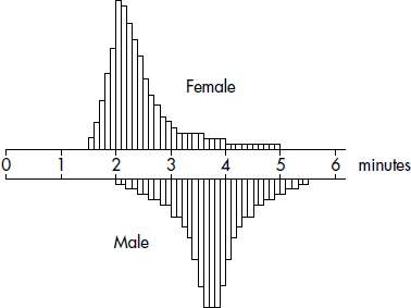
Write a few sentences comparing the distributions of times to complete all tasks by females and by males.
2. In independent random samples of 20 men and 20 women, the number of minutes spent on grooming on a given day were:
Men: 27, 32, 82, 36, 43, 75, 45, 16, 23, 48, 51, 57, 60, 64, 39, 40, 69, 72, 54, 57
Women: 49, 50, 35, 69, 75, 35, 49, 54, 98, 58, 22, 34, 60, 38, 47, 65, 79, 38, 42, 87
Using back-to-back stemplots. compare the two distributions.
3. To analyze the social media behavior differences between boys and girls, Mrs. V’s FDA high school AP Statistics class was asked to count the number of text messages that they sent over a long three-day weekend. The following table summarizes the data:
|
Values under Q1 |
Q1 |
Median |
Q3 |
Values over Q3 |
|
Females |
15, 43, 100 |
130 |
175 |
358 |
450, 573, 1098 |
|
Males |
3, 59 |
72 |
183 |
273 |
293, 337 |
(a) Construct parallel boxplots of this set of data.
(b) Do the data indicate that females or males had the greater mean number of texts? Explain.
4. Cumulative frequency graphs of the ages of people on three different Caribbean cruises (A, B, and C) are given below:
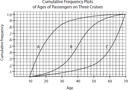
Write a few sentences comparing the distributions of ages of people on the three cruises.
AN INVESTIGATIVE TASK
The NFL quarterback rating formula provides a means of comparing passing performances. The graphs below show the quarterback ratings for two players during one 16-game season.
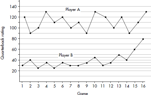
(a) Construct dotplots showing the frequencies of each rating for each player.
(b) Compare the distributions of quarterback ratings for the two players.
(c) What information is more apparent from the dotplots than from the above 16-game graphs?
(d) What information is more apparent from the above 16-game graphs than from the dotplots?
A central moving average is calculated using data equally spaced either side of the point in the series where the mean is calculated. The first few lines of the 3-game central moving averages for the quarterback ratings of the two players are as follows:
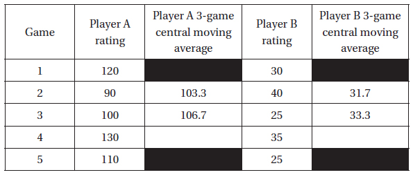
(e) Fill in the two blank spaces corresponding to the fourth game above. Show your calculations.