
 SCATTERPLOTS
CORRELATION AND LINEARITY
LEAST SQUARES REGRESSION LINE
RESIDUAL PLOTS
OUTLIERS AND INFLUENTIAL POINTS
TRANSFORMATIONS TO ACHIEVE LINEARITY
Our studies so far have been concerned with measurements of a single variable. However, many important applications of statistics involve examining whether two or more variables are related to one another. For example, is there a relationship between the smoking histories of pregnant women and the birth weights of their children? Between SAT scores and success in college? Between amount of fertilizer used and amount of crop harvested?
Two questions immediately arise. First, how can the strength of an apparent relationship be measured? Second, how can an observed relationship be put into functional terms? For example, a real estate broker might not only wish to determine whether a relationship exists between the prime rate and the number of new homes sold in a month but might also find useful an expression with which to predict the number of home sales given a particular value of the prime rate.
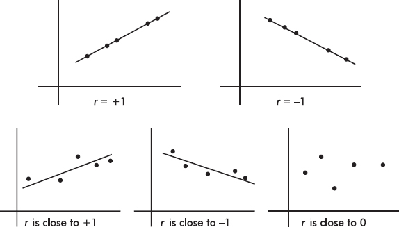
A graphical display, called a scatterplot, gives an immediate visual impression of a possible relationship between two variables, while a numerical measurement, called a correlation coefficient, is often used as a quantitative value of the strength of a linear relationship. In either case, evidence of a relationship is not evidence of causation.
Suppose a relationship is perceived between two quantitative variables X and Y, and we graph the pairs (x, y). We are interested in the strength of this relationship, the scatterplot arising from the relationship, and any deviation from the basic pattern of this relationship. In this topic we examine whether the relationship can be reasonably explained in terms of a linear function, that is, one whose graph is a straight line.
TIP
Recognize explanatory (x) and response (y) variables in context.
For example, we might be looking at a plot such as
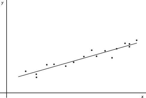
We need to know what the term best-fitting straight line means and how we can find this line. Furthermore, we want to be able to gauge whether the relationship between the variables is strong enough so that finding and making use of this straight line is meaningful.
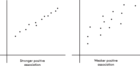
Patterns in Scatterplots
When larger values of one variable are associated with larger values of a second variable, the variables are called positively associated. When larger values of one are associated with smaller values of the other, the variables are called negatively associated.
 EXAMPLE 4.1
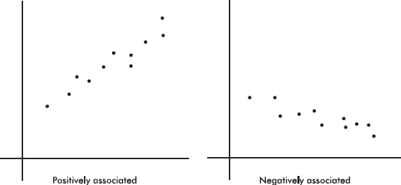
The strength of the association is gauged by how close the plotted points are to a straight line.
EXAMPLE 4.2
Sometimes different dots in a scatterplot are labeled with different symbols or different colors to show a categorical variable. The resulting labeled scatterplot might distinguish between men and women, between stocks and bonds, and so on.
EXAMPLE 4.3
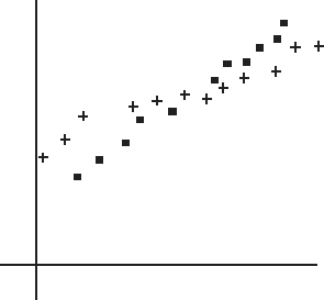
The above diagram is a labeled scatterplot distinguishing men with plus signs and women with square dots to show a categorical variable.
When analyzing the overall pattern in a scatterplot, it is also important to note clusters and outliers.
EXAMPLE 4.4
An experiment was conducted to note the effect of temperature and light on the potency of a particular antibiotic. One set of vials of the antibiotic was stored under different temperatures, but under the same lighting, while a second set of vials was stored under different lightings, but under the same temperature.
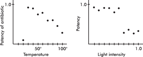
In the first scatterplot note the linear pattern with one outlier far outside this pattern. A possible explanation is that the antibiotic is more potent at lower temperatures, but only down to a certain temperature at which it drastically loses potency.
TIP
Note when the data falls in distinct groups.
In the second histogram note the two clusters. It appears that below a certain light intensity the potency is one value, while above that intensity it is another value. In each cluster there seems to be no association between intensity and potency.
IMPORTANT
Correlation does not imply causation!
Although a scatter diagram usually gives an intuitive visual indication when a linear relationship is strong, in most cases it is quite difficult to visually judge the specific strength of a relationship. For this reason there is a mathematical measure called correlation (or the correlation coefficient). Important as correlation is, we always need to keep in mind that significant correlation does not necessarily indicate causation and that correlation measures the strength only of a linear relationship.
Correlation, designated by r, has the formula
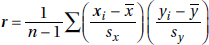
in terms of the means and standard deviations of the two sets. We note that the formula is actually the sum of the products of the corresponding z-scores divided by 1 less than the sample size. However, you should be able to quickly calculate correlation using the statistical package on your calculator. (Examining the formula helps you understand where correlation is coming from, but you will NOT have to use the formula to calculate r.)
Note from the formula that correlation does not distinguish between which variable is called x and which is called y. The formula is also based on standardized scores (z-scores), and so changing units does not change the correlation. Finally, since means and standard deviations can be strongly influenced by outliers, correlation is also strongly affected by extreme values.
TIP
With standardized data (z-scores), r is the slope of the regression line.
The value of r always falls between –1 and +1, with –1 indicating perfect negative correlation and +1 indicating perfect positive correlation. It should be stressed that a correlation at or near zero doesn’t mean there isn’t a relationship between the variables; there may still be a strong nonlinear relationship.
EXAMPLE 4.5
NOTE
We can also say that r2 gives the percentage of variation in y that can be explained by the regression line, with x as the explanatory variable.
It can be shown that r2, called the coefficient of determination, is the ratio of the variance of the predicted values  to the variance of the observed values y. That is, there is a partition of the y-variance, and r2 is the proportion of this variance that is predictable from a knowledge of x. Alternatively, we can say that r2 gives the percentage of variation in y that is explained by the variation in x. In either case, always interpret r2 in context of the problem. Remember when calculating r from r2 that r may be positive or negative.
While the correlation r is given as a decimal between –1.0 and 1.0, the coefficient of determination r2 is usually given as a percentage. An r2 of 100% is a perfect fit, with all the variation in y explained by variation in x. How large a value of r2 is desirable depends on the application under consideration. While scientific experiments often aim for an r2 in the 90% or above range, observational studies with r2 of 10% to 20% might be considered informative. Note that while a correlation of .6 is twice a correlation of .3, the corresponding r2 of 36% is four times the corresponding r2 of 9%.
What is the best-fitting straight line that can be drawn through a set of points?
TIP
If a scatterplot indicates a non-linear relationship, don’t try to force a straight-line fit.
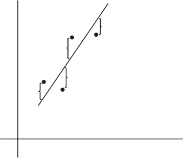
On the basis of our experience with measuring variances, by best-fitting straight line we mean the straight line that minimizes the sum of the squares of the vertical differences between the observed values and the values predicted by the line.
TIP
A hat over a variable means it is a predicted version of the variable.
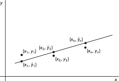
That is, in the above figure, we wish to minimize

It is reasonable, intuitive, and correct that the best-fitting line will pass through (x, y) where x and y are the means of the variables X and Y. Then, from the basic expression for a line with a given slope through a given point, we have
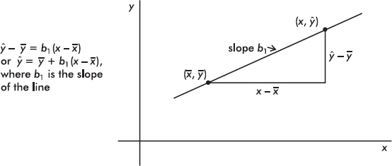
The slope b1 can be determined from the formula

where r is the correlation and sx and sy are the standard deviations of the two sets. That is, each standard deviation change in x results in a change of r standard deviations in y. If you graph z-scores for the y-variable against z-scores for the x-variable, the slope of the regression line is precisely r, and, in fact, the linear equation becomes zy = rzx.
This best-fitting straight line, that is, the line that minimizes the sum of the squares of the differences between the observed values and the values predicted by the line, is called the least squares regression line or simply the regression line. It can be calculated directly by entering the two data sets and using the statistics package on your calculator.
TIP
Just because we can calculate a regression line doesn’t mean it is useful.
EXAMPLE 4.6
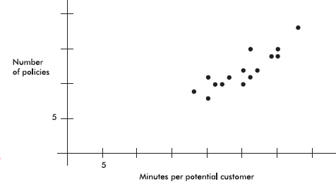
An insurance company conducts a survey of 15 of its life insurance agents. The average number of minutes spent with each potential customer and the number of policies sold in a week are noted for each agent. Letting X and Y represent the average number of minutes and the number of sales, respectively, we have
X: 25 23 30 25 20 33 18 21 22 30 26 26 27 29 20
Y: 10 11 14 12 8 18 9 10 10 15 11 15 12 14 11
Find the equation of the best-fitting straight line for the data.
Answer: Plotting the 15 points (25, 10), (23, 11), …, (20, 11) gives an intuitive visual impression of the relationship:
TIP
Be sure to label axes and show number scales whenever possible.
This scatterplot indicates the existence of a relationship that appears to be linear; that is, the points lie roughly on a straight line. Furthermore, the linear relationship is positive; that is, as one variable increases, so does the other (the straight line slopes upward).
Using a calculator, we find the correlation to be r = .8836, the coefficient of determination to be r2 = .78 (indicating that 78% of the variation in the number of policies is explained by the variation in the number of minutes spent), and the regression line to be
= y + b1(x – x)
= 12 + 0.5492(x – 25)
= –1.73 + 0.5492x
We also write: 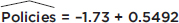 Minutes
Adding this to our scatterplot yields
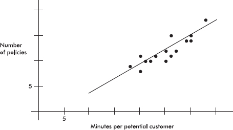
Thus, for example, we might predict that agents who average 24 minutes per customer will average 0.5492(24) – 1.73 = 11.45 sales per week. We also note that each additional minute spent seems to produce an average 0.5492 extra sale.
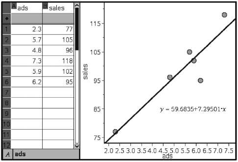
EXAMPLE 4.7
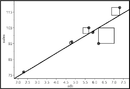
Following are advertising expenditures and total sales for six detergent products:
Advertising ($1000) (x): 2.3 5.7 4.8 7.3 5.9 6.2
Total sales ($1000) (y): 77 105 96 118 102 95
Predict the total sales if $5000 is spent on advertising and interpret the slope of the regression line. What if $100,000 is spent on advertising?
Answer: With your calculator, the equation of the regression line is found to be
= 98.833 + 7.293(x – 5.367) = 59.691 + 7.293x
TIP
Use meaningful variable names.
(A calculator like the TI-84, with less round-off error, directly gives = 59.683 + 7.295x.)
It is also worthwhile to replace the x and y with more appropriately named variables, resulting, for example, in

The regression line predicts that if $5000 is spent on advertising, the resulting total sales will be 7.293(5) + 59.691 = 96.156 thousands of dollars ($96,156).
The slope of the regression line indicates that every extra $1000 spent on advertising will result in an average of $7293 in added sales.
If $100,000 is spent on advertising, we calculate 7.293(100) + 59.691 = 788.991 thousands of dollars (≈$789,000). How much confidence should we have in this answer? Not much! We are trying to use the regression line to predict a value far outside the range of the data values. This procedure is called extrapolation and must be used with great care.
TIP
Be careful about extrapolation beyond the observed x-values.
It should be noted that when we use the regression line to predict a y-value for a given x-value, we are actually predicting the mean y-value for that given x-value. For any given x-value, there are many possible y-values, and we are predicting their mean. So if $5000 is spent many times on advertising, various resulting total sales figures may result, but their predicted average is $96,156.
The TI-Nspire gives
EXAMPLE 4.8
A random sample of 30 U.S. farm regions surveyed during the summer of 2003 produced the following statistics:
Average temperature (°F) during growing season: x = 81, sx = 3
Average corn yield per acre (bu.): y = 131, sy = 5
Correlation r = .32
Based on this study, what is the mean predicted corn yield for a region where the average growing season temperature is 76.5°F?
Answer: 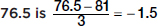 standard deviations below the average temperature reported in the study, so with a correlation of r = .32, the predicted corn yield is .32(–1.5) = –0.48 standard deviations below the average corn yield, or 131 – 0.48(5) = 128.6 bushels per acre.
Alternatively, we could have found the linear regression equation relating these variables: 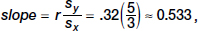 intercept ≈ 131 – 81(0.533) ≈ 87.8, and thus
  = 0.533 Temp + 87.8. Then 0.533(76.5) + 87.8 ≈ 128.6.
CAREFUL!
Order is important; residual equals observed – predicted.
The difference between an observed and predicted value is called the residual. When the regression line is graphed on the scatterplot, the residual of a point is the vertical distance the point is from the regression line.
NOTE
When the data point is above the regression line, the residual is positive; a data point below the line gives a negative residual.
The regression line is the line that minimizes the sum of the squares of the residuals.
EXAMPLE 4.9
We calculate the predicted values from the regression line in Example 4.7 and subtract from the observed values to obtain the residuals:
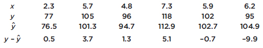
Note that the sum of the residuals is
0.5 + 3.7 + 1.3 + 5.1 – 0.7 – 9.9 = 0.0
The TI-Nspire easily shows the “squares of the residuals,” the sum of which is minimized by the regression line.
The above equation is true in general; that is, the sum and thus the mean of the residuals is always zero.
The notation for residuals is 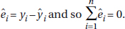 The standard deviation of the residuals is calculated as follows:
se gives a measure of how the points are spread around the regression line.
Plotting the residuals gives further information. In particular, a residual plot with a definite pattern is an indication that a nonlinear model will show a better fit to the data than the straight regression line. In addition to whether or not the residuals are randomly distributed, one should look at the balance between positive and negative residuals and also the size of the residuals in comparison to the associated y-values.
The residuals can be plotted against either the x-values or the -values (since is a linear transformation of x, the plots are identical except for scale and a left-right reversal when the slope is negative).
It is also important to understand that a linear model may be appropriate, but weak, with a low correlation. And, alternatively, a linear model may not be the best model (as evidenced by the residual plot), but it still might be a very good model with high r2.
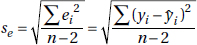
EXAMPLE 4.10
Suppose the drying time of a paint product varies depending on the amount of a certain additive it contains.
Additive (oz), x: |
1 |
2 |
3 |
4 |
5 |
6 |
7 |
8 |
9 |
10 |
Drying time (hr), y: |
4 |
2.1 |
1.5 |
1 |
1.2 |
1.7 |
2.5 |
3.6 |
4.9 |
6.1 |
Using a calculator, we find the regression line = 0.327x + 1.062, and we find the residuals:
x: |
1 |
2 |
3 |
4 |
5 |
6 |
7 |
8 |
9 |
10 |
y – |
2.61 |
0.38 |
–0.54 |
–1.37 |
–1.5 |
–1.32 |
–0.85 |
–0.08 |
0.89 |
1.77 |
The resulting residual plot shows a strong pattern:
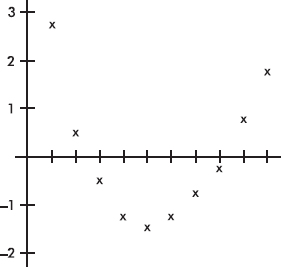
This pattern indicates that a nonlinear model will be a better fit than a straight-line model. A scatterplot of the original data shows clearly what is happening:
The ability to interpret computer output is important not only to do well on the AP Statistics exam, but also to understand statistical reports in the business and scientific world.
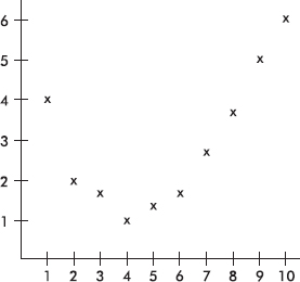
EXAMPLE 4.11
Miles per gallon versus speed for a new model automobile is fitted with a least squares regression line. The graph of the residuals and some computer output for the regression are as follows:
Regression Analysis: MPG Versus Speed
The regression equation is
MPG = 38.9 – 0.218 Speed
Predictor |
Coef |
SE Coef |
T |
P |
|
Constant |
38.929 |
5.651 |
6.89 |
0.000 |
|
Speed |
–0.2179 |
0.1119 |
–1.95 |
0.099 |
|
Analysis of Variance
Source |
DF |
SS |
MS |
F |
P |
Regression |
1 |
199.34 |
199.34 |
3.79 |
0.099 |
Residual Error |
6 |
315.54 |
52.59 |
|
|
Total |
7 |
514.88 |
|
|
|
a. Interpret the slope of the regression line in context.
Answer: The slope of the regression line is –0.2179, indicating that, on average, the MPG drops by 0.2179 for every increase of one mile per hour in speed.
b. What is the mean predicted MPG at a speed of 30 mph?
Answer: At 30 mph, the mean predicted MPG is –0.2179(30) + 38.929, or about 32.4 MPG.
c. What was the actual MPG at a speed of 30 mph?
Answer: The residual for 30 mph is about +3.5, and since residual = actual – predicted, we estimate the actual MPG to be 32.4 + 3.5, or about 36 MPG.
d. Is a line the most appropriate model? Explain.
Answer: The fact that the residuals show such a strong curved pattern indicates that a nonlinear model would be more appropriate.
e. What does “S = 7.252” refer to?
Answer: The standard deviation of the residuals, se = 7.252, is a “typical value” of the residuals and gives a measure of how the points are spread around the regression line.
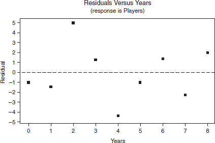
EXAMPLE 4.12
The number of youngsters playing Little League baseball in Ithaca, New York, during the years 1995–2003 is fitted with a least squares regression line. The graph of the residuals and some computer output for their regression are as follows:
Regression Analysis: Number of Players Versus Years Since 1995
Predictor |
Coef |
SE Coef |
T |
P |
Constant |
123.800 |
1.798 |
68.84 |
0.000 |
Years |
12.6333 |
0.3778 |
33.44 |
0.000 |
S = 2.926 R–Sq = 99.4% R–Sq(adj) = 99.3%
Analysis of Variance
Source |
DF |
SS |
MS |
F |
P |
|
Regression |
1 |
9576.1 |
9576.1 |
1118.45 |
0.000 |
|
Residual Error |
7 |
59.9 |
8.6 |
|
|
|
Total |
8 |
9636.0 |
|
|
|
|
TIP
Simply using a calculator to find a regression line is not enough; you must understand it (for example, be able to interpret the slope and intercepts in context).
a. Does it appear that a line is an appropriate model for the data? Explain.
Answer: Yes. R–Sq = 99.4% is large, and the residual plot shows no pattern. Thus a linear model is appropriate.
b. What is the equation of the regression line (in context)?
Answer: Predicted # of players = 123.8 + 12.6 (years since 1995)
c. Interpret the slope of the regression line in the context of the problem.
Answer: The slope of the regression line is 12.6, indicating that, on average, the predicted number of children playing Little League baseball in Ithaca increased by 12 or 13 players per year during the 1995–2003 time period.
d. Interpret the y-intercept of the regression line in the context of the problem.
Answer: The y-intercept, 123.8, refers to the year 1995. Thus the number of players in Little League in Ithaca in 1995 was predicted to be around 124.
e. What is the predicted number of players in 1997?
Answer: For 1997, x = 2, so the predicted number of players is 12.6(2) + 123.8 = 149.
f. What was the actual number of players in 1997?
Answer: The residual for 1997 (x = 2) from the residual plot is +5, so actual – predicted = 5, and thus the actual number of players in 1997 must have been 5 + 149 = 154.
g. What years, if any, did the number of players decrease from the previous year? Explain.
Answer: The number would decrease if one residual were more than 12.6 greater than the next residual. This never happens, so the number of players never decreased.
OUTLIERS AND INFLUENTIAL POINTS
In a scatterplot, regression outliers are indicated by points falling far away from the overall pattern. That is, a point is an outlier if its residual is an outlier in the set of residuals.
EXAMPLE 4.13
A scatterplot of grade point average (GPA) versus weekly television time for a group of high school seniors is as follows:
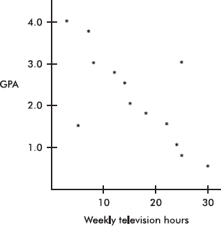
By direct observation of the scatterplot, we note that there are two outliers: one person who watches 5 hours of television weekly yet has only a 1.5 GPA, and another person who watches 25 hours weekly yet has a 3.0 GPA. Note also that while the value of 30 weekly hours of television may be considered an outlier for the television hours variable and the 0.5 GPA may be considered an outlier for the GPA variable, the point (30, 0.5) is not an outlier in the regression context because it does not fall off the straight-line pattern.
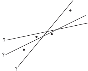
Scores whose removal would sharply change the regression line are called influential scores. Sometimes this description is restricted to points with extreme x-values. An influential score may have a small residual but still have a greater effect on the regression line than scores with possibly larger residuals but average x-values.
EXAMPLE 4.14
Consider the following scatterplot of six points and the regression line:
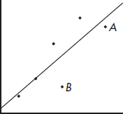
The heavy line in the scatterplot on the left below shows what happens when point A is removed, and the heavy line in the scatterplot on the right below shows what happens when point B is removed.
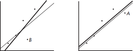
Note that the regression line is greatly affected by the removal of point A but not by the removal of point B. Thus point A is an influential score, while point B is not. This is true in spite of the fact that point A is closer to the original regression line than point B.
TRANSFORMATIONS TO ACHIEVE LINEARITY
Often a straight-line pattern is not the best model for depicting a relationship between two variables. A clear indication of this problem is when the scatterplot shows a distinctive curved pattern. Another indication is when the residuals show a distinctive pattern rather than a random scattering. In such a case, the nonlinear model can sometimes be revealed by transforming one or both of the variables and then noting a linear relationship. Useful transformations often result from using the log or ln buttons on your calculator to create new variables.
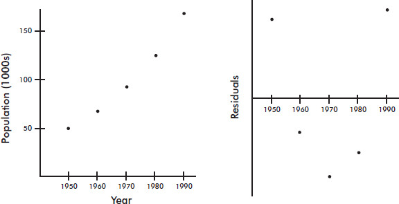
EXAMPLE 4.15
Consider the following years and corresponding populations:
Year, x: |
1950 |
1960 |
1970 |
1980 |
1990 |
Population (1000s), y: |
50 |
67 |
91 |
122 |
165 |
The scatterplot and residual plot indicate that a nonlinear relationship would be an even stronger model.
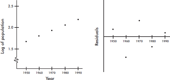
Letting log y be a new variable, we obtain
x: |
1950 |
1960 |
1970 |
1980 |
1990 |
log y: |
1.70 |
1.83 |
1.96 |
2.09 |
2.22 |
The scatterplot and residual plot now indicate a stronger linear relationship.
A regression analysis yields 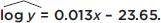 In context we have:
  –23.65 + 0.013(Year). So, for example, the population predicted for the year 2000 would be calculated
  0.013(2000) – 23.65 = 2.35, and so Pop = 102.35 ≈ 224 thousand, or 224,000. The “linear” equation
  0.013x – 23.65 can be re-expressed as = 100.013x–23.65 [= 10–23.65 × (100.013)x = 2.2387E–24 × 1.0304x].
There are many useful transformations. For example:
Log y as a linear function of x, log y = ax + b, re-expresses as an exponential:
y = 10ax+b or y = b110ax where b1 = 10b
Log y as a linear function of log x, log y = a log x + b, re-expresses as a power:
y = 10a log x+b or y = b1xa where b1 = 10b
 as a linear function of x, = ax + b, re-expresses as a quadratic:
y = (ax + b)2
 as a linear function of x, = ax + b, re-expresses as a reciprocal:

y as a linear function of log x, y = a log x + b, is a logarithmic function.
Note: Although you need to be able to recognize the need for a transformation, justify its appropriateness (residuals plot), use whichever is appropriate from above to create a linear model, and use the model to make predictions, you do not have to be able to re-express the linear equation in the manner shown above.
EXAMPLE 4.16
What are possible models for the following data?
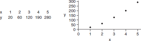
Answer: A linear fit to x and y gives = 65x – 61 with r = 0.99.
A linear fit to x and log y gives log y = 0.279x + 1.139 with r = 0.98. This results in an exponential relationship:
= 100.279x+1.139 = 13.77(100.279x) = 13.77(1.901x)
A linear fit to log x and log y gives log y = 1.639 log x + 1.295, also with r = 0.99. This results in a power relationship:
= 101.639 log x+1.295 = 19.72(x1.639)
All three models give high correlation and are reasonable fits. Further analysis can be done by examining the residual plots:
The first two residual plots have distinct curved patterns. The third residual plot illustrates both a more random pattern and smaller residuals. (One can also create residual plots using the derived curved models, but we choose to restrict our attention to residual plots of the linear models.) Among the above three models, the power model = 19.72(x1.639), appears to be best.
SUMMARY
 A scatterplot gives an immediate indication of the shape (linear or not), strength, and direction (positive or negative) of a possible relationship between two variables.
If the relationship appears roughly linear, then the correlation coefficient, r, is a useful measurement.
The value of r is always between –1 and +1, with positive values indicating positive association and negative values indicating negative association; and values close to –1 or +1 indicating a stronger linear association than values close to 0, which indicate a weaker linear association.
Evidence of an association is not evidence of a cause-and-effect relationship!
Correlation is not affected by which variable is called x and which y or by changing units.
Correlation can be strongly affected by extreme values.
The differences between the observed and predicted values are called residuals.
The best-fitting straight line, called the regression line, minimizes the sum of the squares of the residuals.
For the linear regression model, the mean of the residuals is always 0.
A definite pattern in the residual plot indicates that a nonlinear model may fit the data better than the straight regression line.
The coefficient of determination, r2, gives the percentage of variation in y that is accounted for by the variation in x.
Influential scores are scores whose removal would sharply change the regression line.
Nonlinear models can sometimes be studied by transforming one or both variables and then noting a linear relationship.
It is very important to be able to interpret generic computer output.
QUESTIONS ON TOPIC FOUR: EXPLORING BIVARIATE DATA
Multiple-Choice Questions
Directions: The questions or incomplete statements that follow are each followed by five suggested answers or completions. Choose the response that best answers the question or completes the statement.
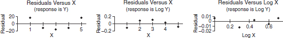
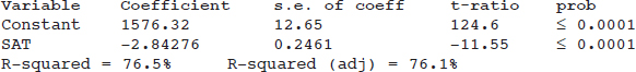
1. A study collects data on average combined SAT scores (math, critical reading, and writing) and percentage of students who took the exam at 100 randomly selected high schools. Following is part of the computer printout for regression:
Which of the following is a correct conclusion?
(A) SAT in the variable column indicates that SAT is the dependent (response) variable.
(B) The correlation is ±0.875, but the sign cannot be determined.
(C) The y-intercept indicates the mean combined SAT score if percent of students taking the exam has no effect on combined SAT scores.
(D) The R2 value indicates that the residual plot does not show a strong pattern.
(E) Schools with lower percentages of students taking the exam tend to have higher average combined SAT scores.
2. A simple random sample of 35 world-ranked chess players provides the following statistics:
Number of hours of study per day: x = 6.2, sx = 1.3
Yearly winnings: y = $208,000, sy = $42,000
Correlation r = 0.15
Based on this data, what is the resulting linear regression equation?
(A)  = 178,000 + 4850 Hours
(B) = 169,000 + 6300 Hours
(C) = 14,550 + 31,200 Hours
(D) = 7750 + 32,300 Hours
(E) = –52,400 + 42,000 Hours
3. A rural college is considering constructing a windmill to generate electricity but is concerned over noise levels. A study is performed measuring noise levels (in decibels) at various distances (in feet) from the campus library, and a least squares regression line is calculated with a correlation of 0.74. Which of the following is a proper and most informative conclusion for an observation with a negative residual?
(A) The measured noise level is 0.74 times the predicted noise level.
(B) The predicted noise level is 0.74 times the measured noise level.
(C) The measured noise level is greater than the predicted noise level.
(D) The predicted noise level is greater than the measured noise level.
(E) The slope of the regression line at that point must also be negative.
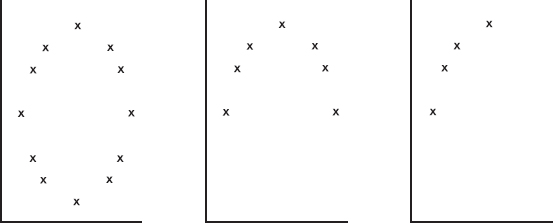
4. Consider the following three scatterplots:
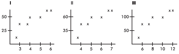
Which has the greatest correlation coefficient?
(A) I
(B) II
(C) III
(D) They all have the same correlation coefficient.
(E) This question cannot be answered without additional information.
5. Suppose the correlation is negative. Given two points from the scatterplot, which of the following is possible?
I. The first point has a larger x-value and a smaller y-value than the second point.
II. The first point has a larger x-value and a larger y-value than the second point.
III. The first point has a smaller x-value and a larger y-value than the second point.
(A) I only
(B) II only
(C) III only
(D) I and III
(E) I, II, and III
6. Consider the following residual plot:
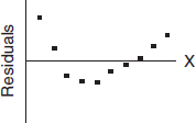
Which of the following scatterplots could have resulted in the above residual plot? (The y-axis scales are not the same in the scatterplots as in the residual plot.)
(A)

(B)

(C)

(D)

(E) None of these could result in the given residual plot.
7. Suppose the regression line for a set of data, = 3x + b, passes through the point (2, 5). If x and y are the sample means of the x- and y-values, respectively, then y =
(A) x.
(B) x – 2.
(C) x + 5.
(D) 3x.
(E) 3 x – 1.
8. Suppose a study finds that the correlation coefficient relating family income to SAT scores is r = +1. Which of the following are proper conclusions?
I. Poverty causes low SAT scores.
II. Wealth causes high SAT scores.
III. There is a very strong association between family income and SAT scores.
(A) I only
(B) II only
(C) III only
(D) I and II
(E) I, II, and III
9. A study of department chairperson ratings and student ratings of the performance of high school statistics teachers reports a correlation of r = 1.15 between the two ratings. From this information we can conclude that
(A) chairpersons and students tend to agree on who is a good teacher.
(B) chairpersons and students tend to disagree on who is a good teacher.
(C) there is little relationship between chairperson and student ratings of teachers.
(D) there is strong association between chairperson and student ratings of teachers, but it would be incorrect to infer causation.
(E) a mistake in arithmetic has been made.
10. Which of the following statements about correlation r is true?
(A) A correlation of 0.2 means that 20% of the points are highly correlated.
(B) Perfect correlation, that is, when the points lie exactly on a straight line, results in r = 0.
(C) Correlation is not affected by which variable is called x and which is called y.
(D) Correlation is not affected by extreme values.
(E) A correlation of 0.75 indicates a relationship that is 3 times as linear as one for which the correlation is only 0.25.
Questions 11–13 refer to the following:
The relationship between winning game proportions when facing the sun and when the sun is on one’s back is analyzed for a random sample of 10 professional players. The computer printout for regression is below:
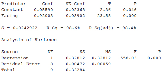
11. What is the equation of the regression line, where face and back are the winning game proportions when facing the sun and with back to the sun, respectively?
(A)  0.056 + 0.920 back
(B)  0.056 + 0.920 facing
(C) 0.920 + 0.056 back
(D) 0.920 + 0.056 facing
(E) 0.024 + 0.039 back
12. What is the correlation?
(A) –0.984
(B) –0.986
(C) 0.984
(D) 0.986
(E) 0.993
13. For one player, the winning game proportions were 0.55 and 0.59 for facing and back, respectively. What was the associated residual?
(A) –0.028
(B) 0.028
(C) –0.0488
(D) 0.0488
(E) 0.3608
14. Which of the following statements about residuals are true?
I. The mean of the residuals is always zero.
II. The regression line for a residual plot is a horizontal line.
III. A definite pattern in the residual plot is an indication that a nonlinear model will show a better fit to the data than the straight regression line.
(A) I and II
(B) I and III
(C) II and III
(D) I, II, and III
(E) None of the above gives the complete set of true responses.
15. Data are obtained for a group of college freshmen examining their SAT scores (math plus writing plus critical reading) from their senior year of high school and their GPAs during their first year of college. The resulting regression equation is
 0.55 + 0.00161 (SAT total) with r = 0.632
What percentage of the variation in GPAs can be explained by looking at SAT scores?
(A) 0.161%
(B) 16.1%
(C) 39.9%
(D) 63.2%
(E) This value cannot be computed from the information given.
16. In a study of whether the structure of the adult human brain changes when a new skill is learned, the gray matter volume of four individuals was measured before and after learning a new cognitive skill. The resulting scatterplot was:
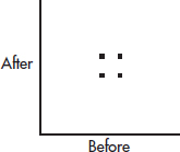
The correlation above is 0. Three researchers each run the experiment on a new subject and each obtain an additional data point:
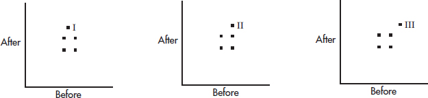
Match the above scatterplots with their new correlations.
(A) | I: –0.33 | II: 0 | III: 0.33 |
(B) | I: 0 | II: 0.33 | III: 0.64 |
(C) | I: 0 | II: 0.33 | III: 1.0 |
(D) | I: –0.33 | II: 0 | III: 1.0 |
(E) | I: 0 | II: 0.50 | III: 1.0 |
17. In a study of winning percentage in home games versus average home attendance for professional baseball teams, the resulting regression line is:
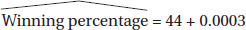
What is the residual if a team has a winning percentage of 55% with an average attendance of 34,000?
(A) –11.0
(B) –0.8
(C) 0.8
(D) 11.0
(E) 23.0
18. Consider the following scatterplot of midterm and final exam scores for a class of 15 students.
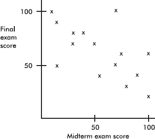
Which of the following is incorrect?
(A) The same number of students scored 100 on the midterm exam as scored 100 on the final exam.
(B) Students who scored higher on the midterm exam tended to score higher on the final exam.
(C) The scatterplot shows a moderate negative correlation between midterm and final exam scores.
(D) The coefficient of determination here is positive.
(E) No one scored 90 or above on both exams.
19. If every woman married a man who was exactly 2 inches taller than she, what would the correlation between the heights of married men and women be?
(A) Somewhat negative
(B) 0
(C) Somewhat positive
(D) Nearly 1
(E) 1
20. Suppose the correlation between two variables is r = 0.23. What will the new correlation be if 0.14 is added to all values of the x-variable, every value of the y-variable is doubled, and the two variables are interchanged?
(A) 0.23
(B) 0.37
(C) 0.74
(D) –0.23
(E) –0.74
21. Suppose the correlation between two variables is –0.57. If each of the y-scores is multiplied by –1, which of the following is true about the new scatterplot?
(A) It slopes up to the right, and the correlation is –0.57.
(B) It slopes up to the right, and the correlation is +0.57.
(C) It slopes down to the right, and the correlation is –0.57.
(D) It slopes down to the right, and the correlation is +0.57.
(E) None of the above is true.
22. Consider the set of points {(2, 5), (3, 7), (4, 9), (5, 12), (10, n)}. What should n be so that the correlation between the x- and y-values is 1?
(A) 21
(B) 24
(C) 25
(D) A value different from any of the above.
(E) No value for n can make r = 1.
23. Consider the following three scatterplots:
Which of the following is a true statement about the correlations for the three scatterplots?
(A) None are 0.
(B) One is 0, one is negative, and one is positive.
(C) One is 0, and both of the others are positive.
(D) Two are 0, and the other is 1.
(E) Two are 0, and the other is close to 1.
24. Consider the three points (2, 11), (3, 17), and (4, 29). Given any straight line, we can calculate the sum of the squares of the three vertical distances from these points to the line. What is the smallest possible value this sum can be?
(A) 6
(B) 9
(C) 29
(D) 57
(E) None of these values
25. Suppose that the scatterplot of log X and log Y shows a strong positive correlation close to 1. Which of the following is true?
(A) The variables X and Y also have a correlation close to 1.
(B) A scatterplot of the variables X and Y shows a strong nonlinear pattern.
(C) The residual plot of the variables X and Y shows a random pattern.
(D) A scatterplot of X and log Y shows a strong linear pattern.
(E) A cause-and-effect relationship can be concluded between log X and log Y.
26. Consider n pairs of numbers. Suppose x = 2, sx = 3, y = 4, and sy = 5. Of the following, which could be the least squares line?
(A) = –2 + x
(B) = 2x
(C) = –2 + 3x
(D) 
(E) = 6 – x
Free-Response Questions
Directions: You must show all work and indicate the methods you use. You will be graded on the correctness of your methods and on the accuracy of your final answers.
TEN OPEN-ENDED QUESTIONS
1. Average home attendance and number of home wins for the 2009–2010 NBA Pacific Division teams were as follows:
|
|
Lakers |
Suns |
Clippers |
Warriors |
Kings |
|
Average attendance |
18,997 |
17,648 |
16,343 |
18,027 |
13,254 |
|
Home wins |
34 |
32 |
21 |
18 |
18 |
(a) Does a winning team bring out the fans? Can average attendance be predicted from number of wins? Find the equation of the best-fitting straight line.
(b) Interpret the slope.
(c) Predict the average attendance for a team with 25 home wins.
(d) What number of home wins will predict an average of 17,000 fans?
(e) What is the residual for the Lakers average attendance?
2. The shoe sizes and the number of ties owned by ten corporate vice presidents are as follows:
Shoe size, x: |
8 |
9.5 |
9 |
11 |
9 |
9.5 |
8.5 |
9 |
9 |
9.5 |
Number of ties, y: |
10 |
10 |
8 |
15 |
12 |
13 |
16 |
7 |
12 |
4 |
(a) Draw a scatterplot for these data.
(b) Find the correlation r.
(c) Can we find the best-fitting straight-line approximation to the above data? Does it make sense to use this equation to predict the number of ties owned by a corporate executive who wears size 10 shoes? Explain.
3. Following is a scatterplot of the average life expectancies and per capita incomes (in thousands of dollars) for people in a sample of 50 countries.
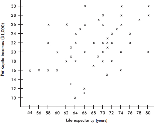
(a) Estimate the mean for the set of 50 life expectancies and for the set of 50 per capita incomes.
(b) Estimate the standard deviation for the set of life expectancies and for the set of per capita incomes. Explain your reasoning.
(c) Does the scatterplot show a correlation between per capita income and life expectancy? Is it positive or negative? Is it weak or strong?
4. (a) Find the correlation r for each of the three sets:
A = {(5, 5), (5, 10), (10, 5), (10, 10)}
B = {(50, 50), (50, 55), (55, 50), (55, 55)}
C = {(90, 90), (90, 95), (95, 90), (95, 95)}
(b) Find the correlation for the set consisting of the 12 scores from A, B, and C.
(c) Comment on the above results.
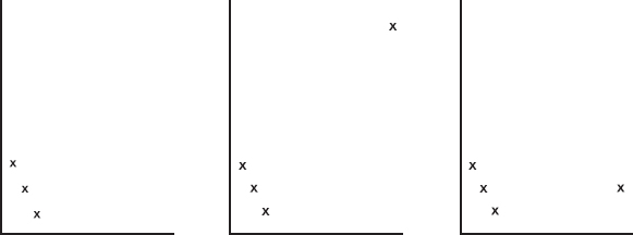
5. An outlier can have a striking effect on the correlation r. For example, comment on the following three scatterplots:
6. Fuel economy y (in miles per gallon) is tabulated for various speeds x (in miles per hour) for a certain car model. A linear regression model gives Predicted fuel economy = 34.8 – 0.16 (Speed) with the following residual plot:
A quadratic regression model gives = –0.0032x2 + 0.26x + 23.8 with the following residual plot:
(a) What does each model predict for fuel economy at 50 miles per hour?
(b) Which model is a better fit? Explain.
7. The following scatterplot shows the grades for research papers for a sociology professor’s class plotted against the lengths of the papers (in pages).
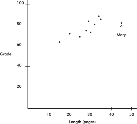
Mary turned in her paper late and was told by the professor that her grade would have been higher if she had turned it in on time. A computer printout fitting a straight line to the data (not including Mary’s score) by the method of least squares gives
Grade = 46.51 + 1.106 Length
R–sq = 74.6%
(a) Find the correlation coefficient for the relationship between grade and length of paper based on these data (excluding Mary’s paper).
(b) What is the slope of the regression line and what does it signify?
(c) How will the correlation coefficient change if Mary’s paper is included? Explain your answer.
(d) How will the slope of the regression line change if Mary’s paper is included? Explain your answer.
(e) What grade did Mary receive? Predict what she would have received if her paper had been on time.
8. Data show a trend in winning long jump distances for an international competition over the years 1972–92. With jumps recorded in inches and dates in years since 1900, a least squares regression line is fit to the data. The computer output and a graph of the residuals are as follows:
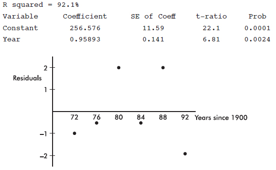
(a) Does a line appear to be an appropriate model? Explain.
(b) What is the slope of the least squares line? Give an interpretation of the slope.
(c) What is the correlation?
(d) What is the predicted winning distance for the 1980 competition?
(e) What was the actual winning distance in 1980?
9. A scatterplot of the number of accidents per day on a particular interstate highway during a 30-day month is as follows:
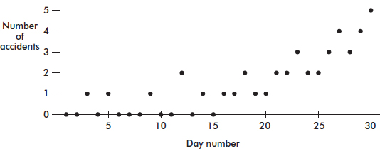
(a) Draw a histogram of the frequencies of the number of accidents.
(b) Draw a boxplot of the number of accidents.
(c) Name a feature apparent in the scatterplot but not in the histogram or boxplot.
(d) Name a feature clearly shown by the histogram and boxplot but not as obvious in the scatterplot.
10. The following scatterplot shows the pulse rate drop (in beats per minute) plotted against the amount of medication (in grams) of an experimental drug being field-tested in several hospitals.
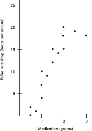
A computer printout showing the results of fitting a straight line to the data by the method of least squares gives
PulseRateDrop = –1.68 + 8.5 Grams
R–sq = 81.9%
(a) Find the correlation coefficient for the relationship between pulse rate drop and grams of medication.
(b) What is the slope of the regression line and what does it signify?
(c) Predict the pulse rate drop for a patient given 2.25 grams of medication.
(d) A patient given 5 grams of medication has his pulse rate drop to zero. Does this invalidate the regression equation? Explain.
(e) How will the size of the correlation coefficient change if the 3-gram result is removed from the data set? Explain.
(f) How will the size of the slope of the least squares regression line change if the 3-gram result is removed from the data set? Explain.