
5 Exploring Categorical Data: Frequency Tables
 MARGINAL FREQUENCIES AND DISTRIBUTIONS
CONDITIONAL FREQUENCIES AND DISTRIBUTIONS
While many variables such as age, income, and years of education are quantitative or numerical in nature, others such as gender, race, brand preference, mode of transportation, and type of occupation are qualitative or categorical. Quantitative variables, too, are sometimes grouped into categorical classes.
MARGINAL FREQUENCIES AND DISTRIBUTIONS
Qualitative data often encompass two categorical variables that may or may not have a dependent relationship. These data can be displayed in a two-way contingency table.
 EXAMPLE 5.1
The Cuteness Factor: A Japanese study had volunteers look at pictures of cute baby animals, adult animals, or tasty-looking foods, after which they tested their focus in solving puzzles.
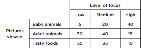
Pictures viewed is the row variable, whereas level of focus is the column variable. One method of analyzing these data involves calculating the totals for each row and each column.
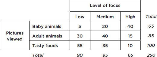
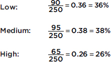
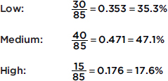
These totals are placed in the right and bottom margins of the table and thus are called marginal frequencies (or marginal totals). These marginal frequencies can then be put in the form of proportions or percentages. The marginal distribution of the level of focus is
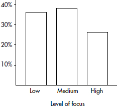
This distribution can be displayed in a bar graph as follows;
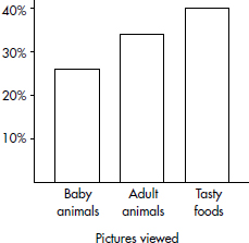
Similarly, we can determine the marginal distribution for the pictures viewed:
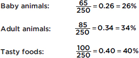
The representative bar graph is
CONDITIONAL FREQUENCIES AND DISTRIBUTIONS
The marginal distributions described and calculated above do not describe or measure the relationship between the two categorical variables. For this we must consider the information in the body of the table, not just the sums in the margins.
EXAMPLE 5.2
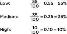
We are interested in predicting the level of focus from the pictures viewed, and so we look at conditional frequencies for each row separately. For example, in Example 5.1 what proportion or percentage of the participants who viewed baby animals then had each of the levels of focus?
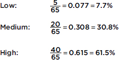
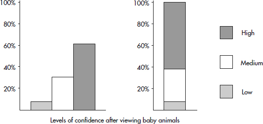
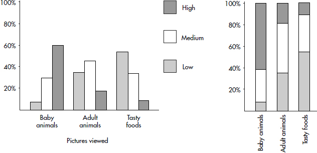
This conditional distribution can be displayed either with groupings of bars or by a segmented bar chart where each segment has a length corresponding to its relative frequency:
Similarly, the conditional distribution for the participants who viewed adult animals are
For the participants who viewed the tasty foods, we have
Both of the following bar charts give good visual pictures:
EXAMPLE 5.3
A study was made to compare year in high school with preference for vanilla or chocolate ice cream with the following results:
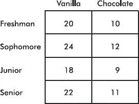
What are the conditional relative frequencies for each class?
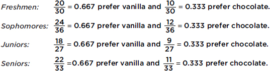
In such a case, where all the conditional relative frequency distributions are identical, we say that the two variables show perfect independence. (However, it should be noted that even if the two variables are completely independent, the chance is very slim that a resulting contingency table will show perfect independence.)
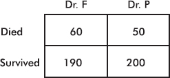
EXAMPLE 5.4
Suppose you need heart surgery and are trying to decide between two surgeons, Dr. Fixit and Dr. Patch. You find out that each operated 250 times last year with the following results:
Whom should you go to? Among Dr. Fixit’s 250 patients 190 survived, for a survival rate of 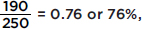 while among Dr. Patch’s 250 patients 200 survived, for a survival rate of
 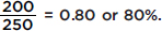 Your choice seems clear.
However, everything may not be so clear-cut. Suppose that on further investigation you determine that the surgeons operated on patients who were in either good or poor condition with the following results:
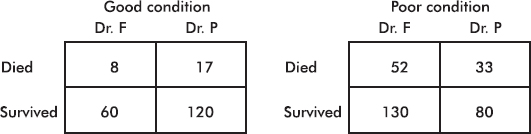
Note that adding corresponding boxes from these two tables gives the original table above.
How do the surgeons compare when operating on patients in good health? Dr. Fixit’s 68 patients in good condition have a survival rate of 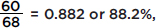 while Dr. Patch’s 137 patients in good condition have a survival rate of
  or 87.6%. Similarly, we note that Dr. Fixit’s 182 patients in poor condition have a survival rate of
 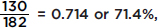 while Dr. Patch’s 113 patients in poor condition have a survival rate of
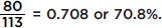
Thus Dr. Fixit does better with patients in good condition (88.2% versus Dr. Patch’s 87.6%) and also does better with patients in poor condition (71.4% versus Dr. P’s 70.8%). However, Dr. Fixit has a lower overall patient survival rate (76% versus Dr. Patch’s 80%)! How can this be?
This problem is an example of Simpson’s paradox, where a comparison can be reversed when more than one group is combined to form a single group. The effect of another variable, sometimes called a lurking variable, is masked when the groups are combined. In this particular example, closer scrutiny reveals that Dr. Fixit operates on many more patients in poor condition than Dr. Patch, and these patients in poor condition are precisely the ones with lower survival rates. Thus even though Dr. Fixit does better with all patients, his overall rating is lower. Our original table hid the effect of the lurking variable related to the condition of the patients.
SUMMARY
 Two-way contingency tables are useful in showing relationships between two categorical variables.
The row and column totals lead to calculations of the marginal distributions.
Focusing on single rows or columns leads to calculations of conditional distributions.
Segmented bar charts are a useful visual tool to show conditional distributions.
Simpson’s paradox occurs when the results from a combined grouping seem to contradict the results from the individual groups.
QUESTIONS ON TOPIC FIVE: EXPLORING CATEGORICAL DATA
Multiple-Choice Questions
Directions: The questions or incomplete statements that follow are each followed by five suggested answers or completions. Choose the response that best answers the question or completes the statement.
Questions 1–5 are based on the following: To study the relationship between party affiliation and support for a balanced budget amendment, 500 registered voters were surveyed with the following results:
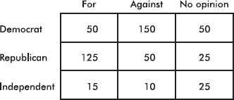
1. What percentage of those surveyed were Democrats?
(A) 10%
(B) 20%
(C) 30%
(D) 40%
(E) 50%
2. What percentage of those surveyed were for the amendment and were Republicans?
(A) 25%
(B) 38%
(C) 40%
(D) 62.5%
(E) 65.8%
3. What percentage of Independents had no opinion?
(A) 5%
(B) 10%
(C) 20%
(D) 25%
(E) 50%
4. What percentage of those against the amendment were Democrats?
(A) 30%
(B) 42%
(C) 50%
(D) 60%
(E) 71.4%
5. Voters of which affiliation were most likely to have no opinion about the amendment?
(A) Democrat
(B) Republican
(C) Independent
(D) Republican and Independent, equally
(E) Democrat, Republican, and Independent, equally
Questions 6–10 are based on the following: A study of music preferences in three geographic locations resulted in the following segmented bar chart:
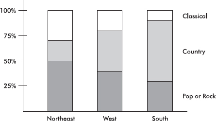
6. What percentage of those surveyed from the Northeast prefer country music?
(A) 20%
(B) 30%
(C) 40%
(D) 50%
(E) 70%
7. Which of the following is greatest?
(A) The percentage of those from the Northeast who prefer classical.
(B) The percentage of those from the West who prefer country.
(C) The percentage of those from the South who prefer pop or rock.
(D) The above are all equal.
(E) It is impossible to determine the answer without knowing the actual numbers of people involved.
8. Which of the following is greatest?
(A) The number of people in the Northeast who prefer pop or rock.
(B) The number of people in the West who prefer classical.
(C) The number of people in the South who prefer country.
(D) The above are all equal.
(E) It is impossible to determine the answer without knowing the actual numbers of people involved.
9. All three bars have a height of 100%.
(A) This is a coincidence.
(B) This happened because each bar shows a complete distribution.
(C) This happened because there are three bars each divided into three segments.
(D) This happened because of the nature of musical patterns.
(E) None of the above is true.
10. Based on the given segmented bar chart, does there seem to be a relationship between geographic location and music preference?
(A) Yes, because the corresponding segments of the three bars have different lengths.
(B) Yes, because the heights of the three bars are identical.
(C) Yes, because there are three segments and three bars.
(D) No, because the heights of the three bars are identical.
(E) No, because summing the corresponding segments for classical, summing the corresponding segments for country, and summing the corresponding segments for pop or rock all give approximately the same total.
11. In the following table, what value for n results in a table showing perfect independence?
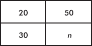
(A) 10
(B) 40
(C) 60
(D) 75
(E) 100
12. A company employs both men and women in its secretarial and executive positions. In reports filed with the government, the company shows that the percentage of female employees who receive raises is higher than the percentage of male employees who receive raises. A government investigator claims that the percentage of male secretaries who receive raises is higher than the percentage of female secretaries who receive raises, and that the percentage of male executives who receive raises is higher than the percentage of female executives who receive raises. Is this possible?
(A) No, either the company report is wrong or the investigator’s claim is wrong.
(B) No, if the company report is correct, then either a greater percentage of female secretaries than of male secretaries receive raises or a greater percentage of female executives than of male executives receive raises.
(C) No, if the investigator is correct, then by summation of the corresponding numbers, the total percentage of male employees who receive raises would have to be greater than the total percentage of female employees who receive raises.
(D) All of the above are true.
(E) It is possible for both the company report to be true and the investigator’s claim to be correct.
Free-Response Questions
Directions: You must show all work and indicate the methods you use. You will be graded on the correctness of your methods and on the accuracy of your final answers.
TWO OPEN-ENDED QUESTIONS
1. The following table gives the numbers (in thousands) of officers and enlisted personnel by military branch in the U.S. armed forces.
|
Army |
Navy |
Marine Corps |
Air Force |
|
|
Officers |
88 |
52 |
20 |
65 |
|
Enlisted |
452 |
276 |
178 |
258 |
(a) Calculate the percentage
i. of military men and women who are enlisted.
ii. of military men and women who are not Marine Corps officers.
iii. of officers who are in the Navy.
(b) Construct a graphical display showing the association between career path (officer vs. enlisted) and military branch.
(c) Summarize what the graphical display illustrates about the association between career path (officer vs. enlisted) and military branch.
2. The graduate school at the University of California at Berkeley reported that in 1973 they accepted 44% of 8442 male applicants and 35% of 4321 female applicants. Concerned that one of their programs was guilty of gender bias, the graduate school analyzed admissions to the six largest graduate programs and obtained the following results:
|
Program |
Men Accepted |
Men Rejected |
Women Accepted |
Women Rejected |
|
A |
511 |
314 |
89 |
19 |
|
B |
352 |
208 |
17 |
8 |
|
C |
120 |
205 |
202 |
391 |
|
D |
137 |
270 |
132 |
243 |
|
E |
53 |
138 |
95 |
298 |
|
F |
22 |
351 |
24 |
317 |
(a) Find the percentage of men and the percentage of women accepted by each program. Comment on any pattern or bias you see.
(b) Find the percentage of men and the percentage of women accepted overall by these six programs. Does this appear to contradict the results from part (a)?
(c) If you worked in the Graduate Admissions Office, what would you say to an inquiring reporter who is investigating gender bias in graduate admissions?