Chapter 10
Following Trends to Boost Your Probability of Success
IN THIS CHAPTER
 Spotting uptrends and downtrends
 Finding areas of support and resistance within a trend
 Identifying different kinds of gaps
 Understanding continuation and retracement patterns
 Planning for failed trading signals
Technical analysis helps you identify emerging price trends and anticipate the end of existing trends. Being able to identify those two extreme end points means you can develop a consistently profitable trend‐following trading system. Technical analysis can also help you evaluate the persistence of a trend, which is useful for finding secondary entry points and generating short‐term trading signals.
In this chapter, we discuss trading strategies for several trend‐following techniques. In addition, you discover methods for identifying continuation patterns, retracement patterns, and reversal patterns, as well as strategies for dealing with the inevitable failed trading signal.
Identifying Trends
Identifying a trend is relatively straightforward. Instinctively, you know it when you see it. Remember, a stock can be in only one of three states: an uptrend, a downtrend, or a sideways trading range. Don’t overthink it!
You can use visual techniques and calculated indicators to identify trend signals. We discuss visual identification techniques in this chapter. We cover calculated indicators in Chapter 11.
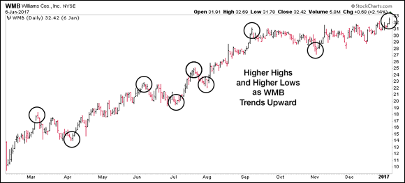
A steadily rising or falling stock is a trending stock. But if you watch stocks for any period of time, you know that they rarely go straight up or down. Instead, you see a stair‐step effect in which a stock rises several steps and then falls back. Talking about a trend as a series of intermittent highs interrupted by intermittent lows makes good sense. So an uptrend, then, is a series of higher intermittent highs and higher intermittent lows. Conversely, a downtrend is a series of lower intermittent highs and lower intermittent lows.
Figure 10‐1 shows a price chart of Williams Companies, Inc. (WMB), exhibiting a series of higher highs and higher lows as it climbs in a distinct uptrend.
The first step to successfully recognizing an uptrend is spotting the higher highs and higher lows. You use those points to draw the upper and lower channel lines of the trend’s range. We explore how to draw trend lines and trend channels later in this chapter.
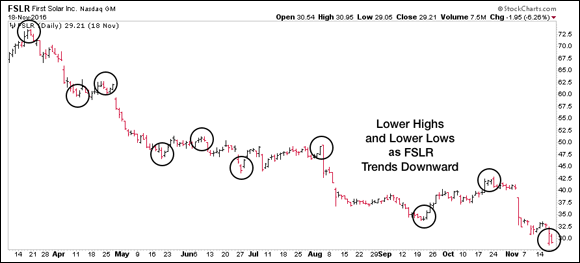
Figure 10‐2 shows a downtrending price chart of First Solar, Inc. (FSLR), and identifies its series of lower highs and lower lows. As the downtrend continued throughout 2016, the stock lost over half its value. This is a perfect reminder of why it’s difficult to call the bottom in a falling stock and goes to show why trend following is a higher‐probability practice. If the trend is strong and clear, don’t fight it.
Supporting and Resisting Trends
You may have noticed in Figure 10‐2 that a small double bottom formed in late June/early July (see Chapter 9 for more on double bottoms) and was followed by a nice positive trend until the beginning of August. Although smaller than others you’ll find, this is known as a retracement. Although the pattern of lower highs and lower lows appeared to be breaking, FSLR fell sharply in early August and resumed its clear downtrend.
 In an uptrend, as long as the pattern of higher highs and higher lows continues, you can say that the trend persists. The converse (lower highs and lower lows) is true in a downtrend. However, it’s foolish to conclude that any one break in these patterns represents the end of the existing trend. Even the strongest of trends are bound to see reversals at some point along the way.
As higher prices are reached, for example, old sellers will need to be shaken out of the stock, causing a brief reversal that could (falsely) appear to signal the end of the uptrend. With an educated understanding of trends and the right exit strategies in place, you’ll be able to better distinguish the false ends from the real reversals and trade these moves appropriately.
Drawing trend lines to show support
Similar to the support and resistance lines covered in Chapter 9, trend lines can be drawn across a price chart to help clearly identify the trend’s direction and slope. Trend lines can also uncover key price points that are likely to trigger short‐term trading signals as you monitor the progress of a trend.
You need only two points to define a trend line, but the more price points that touch the trend line, the better.
- In an uptrend, the line is formed by connecting at least two price lows. This results in a trend line that follows the bottom of the uptrend.
- In a downtrend, the line is formed by connecting at least two price highs. This results in a trend line that follows the top of the downtrend.
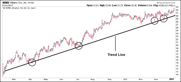
 If you’re stuck, remember this simple line: bottoms up, tops down. To see an uptrend in action, take a look at Figure 10‐3.
Unfortunately, drawing trend lines is not a precise discipline, and no universal consensus exists for where and how to draw them. In fact, you’re not likely to find any two traders drawing trend lines in exactly the same place for the same stock. Furthermore, you’ll drive yourself crazy trying to touch all the important price points with your trend line.
Despite the ambiguity, don’t lose sight of the overall purpose of a trend line. What’s important is that each trend line you draw strengthens your interpretation of the stock’s present state. It’s not about the exact position of the trend line itself. Instead, it’s about the question that the trend line is meant to answer: In what direction are prices currently moving?
Watching the price bar cross below the trend line can be disturbing, because doing so can signal the end of the trend, or it may mean that you need to redraw the trend lines. Unfortunately, when the stock price closes below the trend line, you can’t know whether the break represents the end of the trend or just another opportunity to redraw the trend line to conform to the newest price data.
 One alternative technique for drawing a trend line reduces the ambiguity just a bit. Instead of drawing the trend line from left to right, the way most people instinctively do, draw the trend line backward, or from right to left. For instance, if the stock is in an uptrend, connect the two most recent lows in the trend by drawing a trend line backward as long as it’s meaningful, and then project the trend line toward the right. This approach has a couple of benefits:
- The slope of the trend line is more closely aligned with the most recent trading data, which is more relevant to your trading decisions.
- You’ll resign yourself to the necessity of continually redrawing your trend lines based on the newest data.
 With the online chart annotation tool at StockCharts.com, you can draw trend lines directly on your charts. Click the tab for Free Charts at the top of any web page, and then look for the SharpCharts box in the upper‐left portion of the page. Enter the symbol you want to view in the box labeled Create a SharpChart, and then click Go. When you get to the chart, set up the chart attributes at the bottom of the chart, such as HLC Bars and Separate Volume, as we explain in Chapter 9. Then click the Annotate button just below your chart. Select the trend line tool — the second button down in the menu on the left — and then click and drag to begin drawing your trend lines. You can save your annotations directly to your account and even edit them in the future as new price data is added to the chart.
Using channels
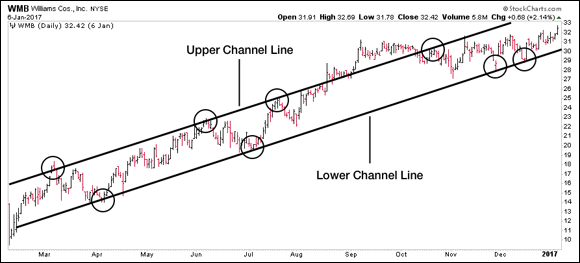
Traders use channels to identify potential entry and exit points during a trend. You form channel lines by drawing two parallel lines on the chart, one along the trend’s price lows and one along the trend’s price highs. The two channel lines bound the trading prices to help you visualize the range in which the stock is trading throughout the trend. The top channel line is analogous to the resistance line in a trading range, which we discuss in Chapter 9. Similarly, the bottom channel line corresponds to the support line in a trading range. Figure 10‐4 shows an example of a channel.
Trending and channeling strategies
The strategies for using trend lines and channels are similar. When an uptrending stock approaches the trend line or the bottom channel line, short‐term traders often see an opportunity to take a position in the direction of the dominant trend. As long as the stock’s price doesn’t fall through this support level, they will hold the position. Position traders, on the other hand, may use these same conditions to confirm that their existing positions are still in play. If, however, the stock closes below the trend line and remains below it for longer than a day or two, position traders and short‐term traders must consider the possibility that the trend has reached its end. At this point the stock may enter a new trading range or even reverse into a downtrend.
It may seem surprising, but an uptrending stock breaching the top channel line isn’t always good news. After such a move, the stock may become overextended, making it more likely to pull back sharply. At the very least, it’s an indication that traders should pay close attention. In Figure 10‐4, WMB rose outside of its top channel line several times. In September, the stock hovered above the top of its channel for nearly an entire month. Eventually, however, after a failed retest of its new high around $31.00, the stock reversed back down all the way to the bottom of its channel.
 Trend lines and channels work better across longer periods of time. A stock price that violates a long‐running, persistent trend or channel line on a weekly chart provides more meaningful guidance than when it breaches a support line on a daily chart or an intraday chart.
When a stock breaks a short‐term trend line, we believe the best practice is to step back one time increment to evaluate the situation. For example, if you’re trading based primarily on daily chart data, pull up a weekly chart and examine its trend. If the march of higher highs and higher lows remains intact on the weekly chart, you may want to give your trade a little more room to work itself out. However, if a longer time frame shows a break in the trend of higher highs and higher lows, a reversal is much more likely. This dual‐chart signal should cause you to consider exiting your position right away.
 We use trend lines for guidance while trading, but rarely do we make decisions solely on the basis of a trend‐line penetration. Although initiating short‐term positions in the direction of the dominant trend is possible by using channels to enter and exit the position, doing so is very difficult, and few traders are able to engage in that practice profitably. Some traders even take this concept one step further by trying to take positions in opposition to the dominant trend as the stock price approaches the upper channel line. We believe trading in the direction opposite that of a dominant trend is simply foolish. Doing so is an excellent way to lose a substantial portion of your trading capital. If a trend is clear and strong, why fight it?
 Bottom line: Trend lines and channels are additional tools that you can use to monitor the progress of a stock price trend. You can use them to help identify trading opportunities and make informed decisions about the likely future direction of a stock or fund. Still, we recommend they not be your primary method of determining entry and exit points. Instead, combine trend lines and channels with other tools and strategies to form a robust technical system.
Seeing Gaps
A price gap forms on a bar chart when the opening price of the current bar is above or below the closing price of the previous bar. Gaps occur mostly on daily charts, sometimes on weekly charts, and rarely on intraday charts. Depending on the circumstances, gaps can show continuation and reversal patterns, and they can signal an opportunity to enter or exit a position.
Some gaps are obvious and some are subtle. For example, if the opening price is above the previous close but the low of the current bar is below the previous high, then those bars overlap and the gap is hard to spot. Many traders simply ignore that type of gap. If, however, the low of the current bar is obviously higher than the high of the previous bar, that gap is clear and will draw the attention of most traders. In reality, traders only focus on these obvious gaps that immediately stand out. Examples of clear gaps are shown in the following sections.
Gaps are divided into several broad categories based on where the gap occurs. These categories determine your trading strategy and are discussed in the sections that follow.
Common gap
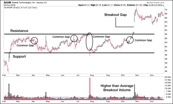
Gaps that occur within a trading range, as described in Chapter 9, can be either a common gap or a breakout gap. If the gap occurs in the middle of the trading range, far from either its support or resistance level, it’s a common gap. Common gaps occur frequently and are, well, rather common. They rarely provide meaningful trading opportunities. Ignoring them is usually the best policy. Figure 10‐5 shows several common gaps in addition to a breakout gap.
Breakout or breakaway gap
When a stock gaps above or below the resistance or support levels, respectively, or a well‐established trading range, traders classify the gap as either a breakout or breakaway gap. A breakout gap often provides excellent trading signals to enter a new position, in the direction of the gap. Figure 10‐5 shows an example of a breakout gap from a longstanding trading range. We discuss trading strategies for trading range breakouts in Chapter 9.
Continuation gap
A continuation gap is also known as a runaway gap or an acceleration gap. This type of gap occurs within an uptrend when the open price of the current bar is higher than the close price of the previous bar. If the low of the current bar is also obviously above the high of the previous bar, this gap usually indicates that the trend is very strong. Continuation gaps may also occur in downtrends. The defining characteristics are opposite those of a continuation gap in an uptrend.
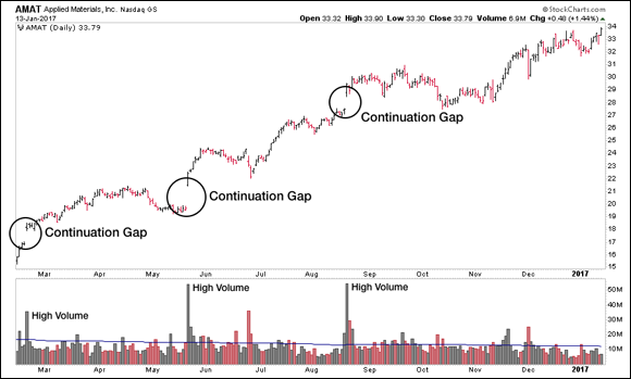
Figure 10‐6 shows several examples of continuation gaps in an uptrend. Some short‐term traders may use a continuation gap as a signal to enter a position in the direction of the gap. Position traders may use this same signal to confirm that a current trade remains in play. You sometimes see a series of continuation gaps occur in close proximity to each other, and these gaps usually provide strong confirmation of the prevailing trend. However, continuation gaps also warrant caution, because they can turn into what is known as an exhaustion gap.
Exhaustion gap
 Exhaustion gaps occur at or near the ends of strong trends. Unfortunately, the defining characteristics for an exhaustion gap are virtually identical to those for a continuation gap. Exhaustion gaps are often accompanied by very large volume, which is one clue that the gap may not be a continuation gap. Otherwise, distinguishing an exhaustion gap from a continuation gap is sometimes impossible, until the stock price changes direction. By that time, it’s usually obvious that something is wrong with the trade, and you should exit your position.
In Figure 10‐6, the third continuation gap could have easily turned out to be an exhaustion gap. Before resuming its climb to the upside, the stock actually filled the initial gap and fell back to its pre‐gap price level in early October. At that point, the bulls regained control, and the stock moved higher. However, if that pullback had turned out to be the start of a new downtrend for the stock, the continuation gap would be classified as an exhaustion gap.
Island gap
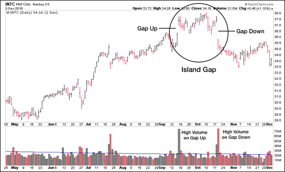
An island gap, or an island reversal (shown in Figure 10‐7), forms when a trend changes direction. The pattern is actually two gaps that isolate either a single bar or a short series of bars from both the dominant trend and the new trend. An island gap usually is a good indicator that the prior trend has been extinguished. You can use an island gap to signal an exit from an existing position. You may also use it to initiate a new position, but only if the direction of the new trend aligns with the stock’s underlying fundamental condition. Be sure to review the “Dealing with Failed Signals” section, later in this chapter, before initiating any positions based on an island gap.
Waving Flags and Pennants
Flag and pennant patterns represent areas of consolidation within a trend. You’ve already encountered these patterns, just not by name. In a series of higher highs and higher lows, for example, these patterns form the basis for the higher lows. In other words, the higher lows are made of flag and pennant patterns.
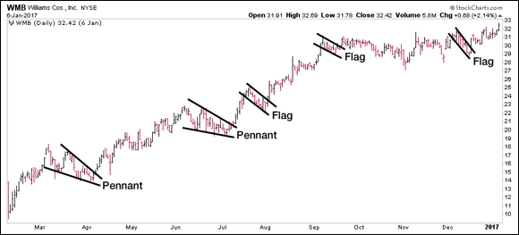
A pennant pattern looks like, well, a pennant. Support and resistance lines converge into a point forming what looks like a small pennant shape. A flag pattern, on the other hand, is bounded by parallel lines. All these patterns almost always fly counter to the prevailing trend, but the direction in which they’re flying is not actually a requirement.
Figure 10‐8 shows examples of flags and pennants on the chart of a trending stock.
 The key for each of these patterns is the breakout. If the breakout from the formation is in the direction of the established trend, then the trend continues. If prices break against the dominant trend, then the trend may be over.
Flags and pennants typically are associated with a trend, but you may also see these patterns appear as a stock moves sideways within a trading range. When a flag or pennant forms near the top of a trading range, it hints at an eventual breakout. That pattern shows the stock consolidating near the top of its trading range, which suggests that selling pressure is diminishing and the stock is preparing to test the zone of resistance.
Withstanding Retracements
A retracement occurs when a trending stock revisits recent prices. You’ve already seen many examples. When a stock makes a higher high followed by a higher low, it’s considered a retracement. A trading range as discussed in Chapter 9 can also be considered a retracement. You may hear a retracement called a price consolidation or a pullback, but the concept is the same.
Flags and pennants are relatively simple forms of retracement patterns. More complex retracements can occur within a defined trend, and like their simpler counterparts, they don’t actually signal the end of the trend. Unfortunately, when complex retracements occur, they can both confuse and frustrate traders. Besides being difficult to anticipate, they send conflicting signals to traders trying to make sense of which trading‐plan adjustments are needed.
Three‐step and five‐step retracements
In an uptrend, higher highs and higher lows aren’t always a given. Sometimes you see breaks in this pattern as the stock fails to reach a new high or makes a lower intermittent low. You may even see several occurrences of these worrisome lower lows and/or lower highs happen one right after the other, but then find that the strong uptrend suddenly resumes.
You’ll see a couple of these benign multistep patterns frequently occur in the midst of a strong trend, so it’s useful to watch for them. A three‐step retracement makes at least one lower intermittent high and one lower intermittent low. A five‐step retracement makes two lower highs and two lower lows. Multistep retracements also occur during downtrends when a falling stock makes a brief, countertrend series of higher highs and higher lows.
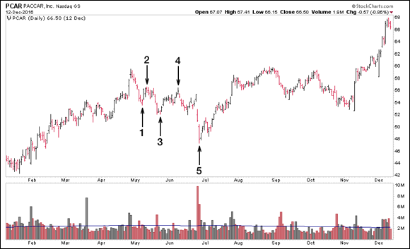
Figure 10‐9 shows an example of a five‐step retracement that ultimately resolves in the direction of the prevailing trend. The five steps are identified, along with the corresponding intermittent highs and lows.
As a trend‐following trader, it’s natural for these retracement situations to feel disconcerting, even frightening. There can be a fine line between a healthy retracement pattern and true trend reversal. There’s no magic tool to signal exactly when a trend has ended, but by closely watching the charts and maintaining a proper exit plan, you’ll be ready to take action when the time is right.
 Exactly where the multistep retracement occurs within a trend should have some bearing on your trading plan. If the stock price has just broken out of a long trading range and then falters, you may want to close the position and wait for a subsequent attempt to break out of the trading range. Keep an eye on the stock while you look for additional trading opportunities elsewhere.
If a stock price starts what may be a three‐step or a five‐step retracement after a long period of strong trending, and your position is profitable, you may want to see how the retracement plays out. Absent any obvious sell signals, such as an island reversal or a downside breakout from a flag, pennant, or trading range formation, you can wait to see how the retracement resolves itself. The risk may be worth the reward in this case.
Checking out a chart that covers a longer time frame can also be helpful here. For example, you can examine a weekly chart when the retracement occurs on the daily chart. If the trend shows no signs of faltering on the weekly chart, hold your position and let the retracement play out. If the stock recovers and heads higher, so much the better, but if it establishes another lower high and trades below its next lower low, it’s time to exit.
Finally, considering fundamental factors before making your decision makes good sense. If a company’s deteriorating financial situation or weak forward guidance is an underlying cause of the retracement, then you may want to exit your position. You also need to be aware of the cycle the economy is in when making your decision. If the economy is approaching a turning point as your stock’s technical situation deteriorates, getting out of the position is usually a smart idea.
Subsequent trading ranges
Trading ranges and cup and handle formations, like the ones described in Chapter 9, also are complex consolidation patterns. A trend that’s interrupted by a period of range‐bound trading may indicate either a pause before the trend resumes or the end of the trend entirely. The only way to know which direction the trend will go is to watch for the breakout. Unfortunately, you may be in for a long wait.
While we see a clear five‐step retracement pattern on the chart in Figure 10‐9, some technicians could justifiably argue that the chart’s price history actually forms a cup and handle pattern. Remember, technical analysis is an art, not a science, so you may encounter ambiguous situations like this. The results in this case were the same regardless of your interpretation. The stock broke out of its consolidation pattern in early July and resumed its trend to the upside.
 Breakouts that occur in the direction of the prevailing trend may indicate that the trend has further to run, but they may also be a prelude to a failed breakout signal. Trading‐range breakouts provide the strongest signals when they result in a change of direction from the previous trend.
Dealing with Failed Signals
All trading signals are subject to failure. Sometimes, things just don’t work out as planned. However, even a failed signal provides important information that you can use to revise your trading plans. In fact, sometimes the best trading signals are the direct result of a failed signal.
Trapping bulls and bears
Breakouts from trading ranges and cup and handle patterns sometimes fail. These failures happen to both bullish and bearish signals, and when they fail, it’s called a trap. The two kinds of traps are
- Bull traps: These traps occur after an upside breakout. The stock breaks out of its trading range to the upside but then reverses back into the trading range and ultimately breaks out to the down side. The bullish traders that took action based on the breakout signal are trapped by the reversal, hence the name bull trap.
Bear traps: These traps occur after a downside breakout. This opposite scenario to the bull trap is often very bullish. The stock reverses course and reenters its trading range. If a bear trap occurs within a trading range that’s preceded by an extended period of declining prices, it often represents an excellent buying opportunity because it’s a sign that selling pressure has evaporated in the stock, which thus is likely to attempt an upside breakout.
 Whenever you see a potential bear trap taking place and the stock meets all your fundamental criteria, you may want to enter a long position as soon as the stock price reenters the trading range.
Filling the gaps
A developing gap is usually interpreted as a signal that the prevailing trend will continue. If a stock reverses and retraces prices within the gap, we say that the gap has been filled. A gap that’s filled negates the trading signal that it generated.
 When dealing with a breakout gap, a stock that reverses, fills the gap, and falls back through the trading range resistance zone is likely to turn bearish. Similarly, when a continuation gap is filled, you need to consider it a failed signal and exit your position. The same is true for an island gap. If prices trade back into the area of the isolated island, the trading signal has failed, and you need to exit your position.
Deciding whether to reverse directions
A bear trap shows an example in which taking a position based on a failed signal makes sense. If, however, you already have a position and the signal fails, it’s wise to exit your position. Let the market sort out its psychology without leaving your money at risk.
You also need to consider economic and fundamental factors when deciding how to handle a failed signal. Acting on a contrary signal makes sense only if economic and fundamental conditions support the decision.
For example, if a bullish signal fails and becomes a bearish signal, selling a stock short makes sense only if it’s fundamentally weak and the stock’s sector is in decline. Conversely, if a bear trap occurs and generates a buy signal, taking a position in the stock makes sense only if its earnings are strong and growing, its sector is performing well, and the economy is on an upswing.
 Many inexperienced traders mistakenly think that the best course of action after exiting a long position is to dive headfirst into a short trade. Just because your analysis says the stock is likely to stop rising doesn’t mean that a short position is the smartest option. If other factors confirm that decision, it can be carefully considered. If not, stay patient and trust that another opportunity will come along soon enough.
 Spotting uptrends and downtrends
 Finding areas of support and resistance within a trend
 Identifying different kinds of gaps
 Understanding continuation and retracement patterns
 Planning for failed trading signals
 In an uptrend, as long as the pattern of higher highs and higher lows continues, you can say that the trend persists. The converse (lower highs and lower lows) is true in a downtrend. However, it’s foolish to conclude that any one break in these patterns represents the end of the existing trend. Even the strongest of trends are bound to see reversals at some point along the way.
 If you’re stuck, remember this simple line: bottoms up, tops down. To see an uptrend in action, take a look at
 We use trend lines for guidance while trading, but rarely do we make decisions solely on the basis of a trend‐line penetration. Although initiating short‐term positions in the direction of the dominant trend is possible by using channels to enter and exit the position, doing so is very difficult, and few traders are able to engage in that practice profitably. Some traders even take this concept one step further by trying to take positions in opposition to the dominant trend as the stock price approaches the upper channel line. We believe trading in the direction opposite that of a dominant trend is simply foolish. Doing so is an excellent way to lose a substantial portion of your trading capital. If a trend is clear and strong, why fight it?