Part I: Getting Started
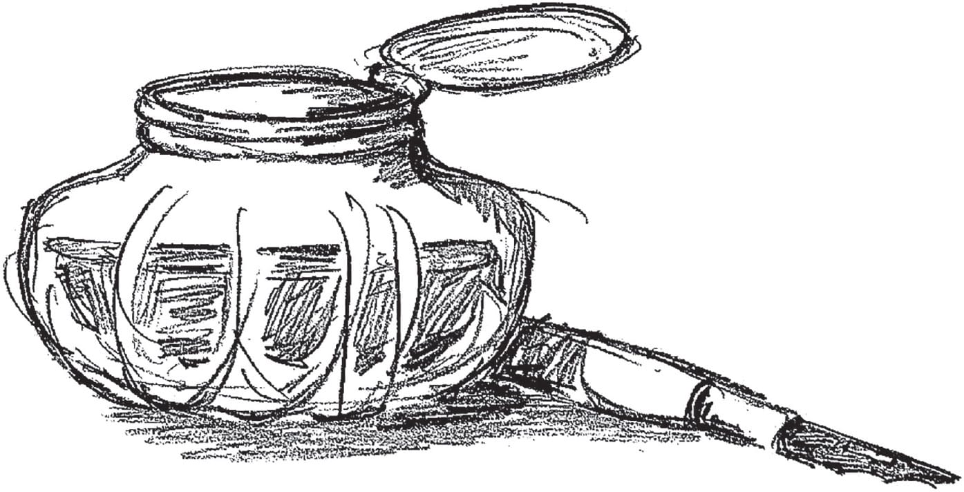
Calligraphy is a craft that does not require many tools or materials. All you need to begin is a pen, nib, ink, paper, and practice!
Calligraphy & Lettering Basics
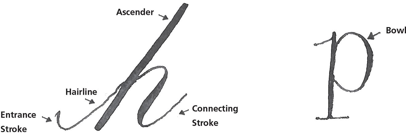
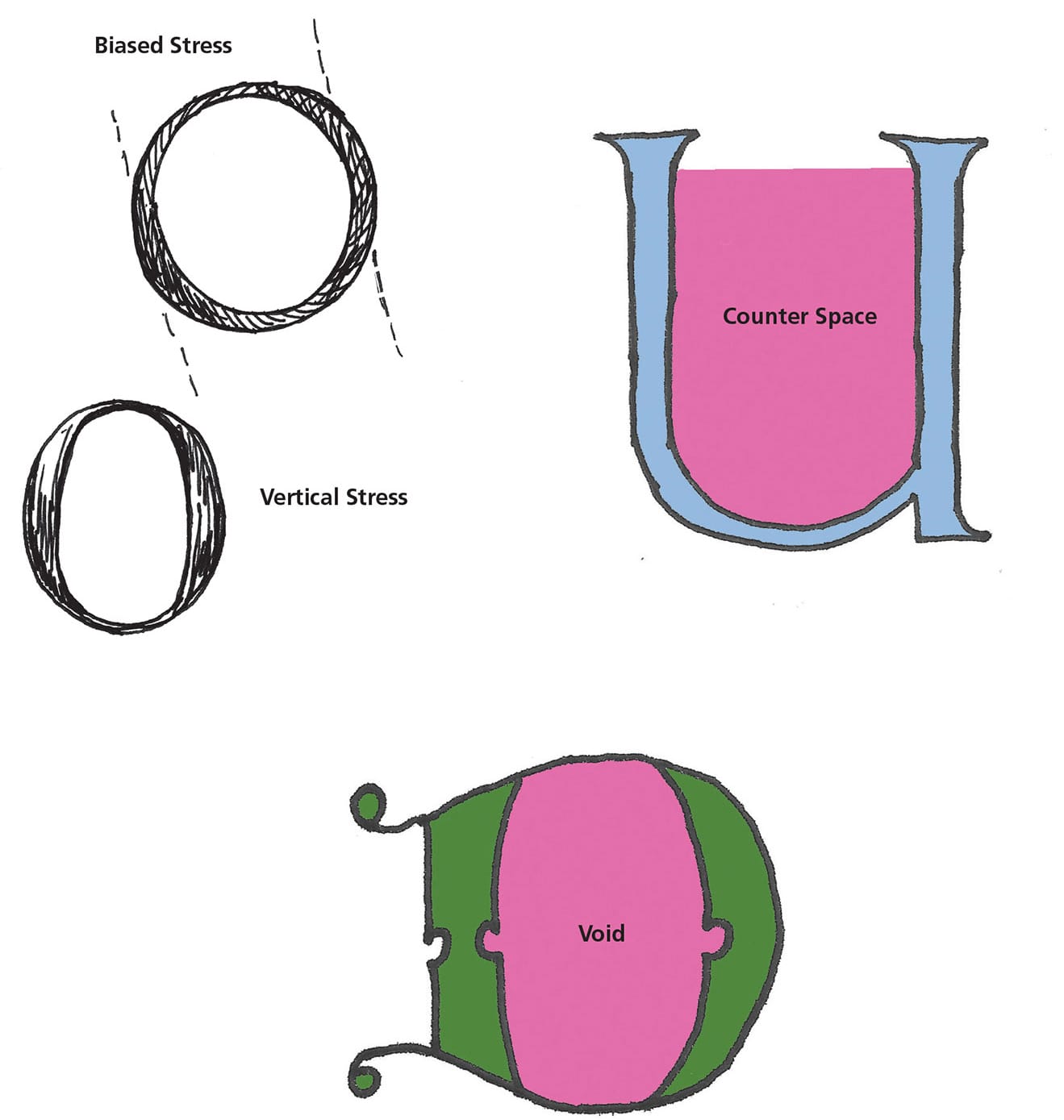
The Importance of Lines
Lines are important in lettering for practice and learning, as well as for creating finished pieces.
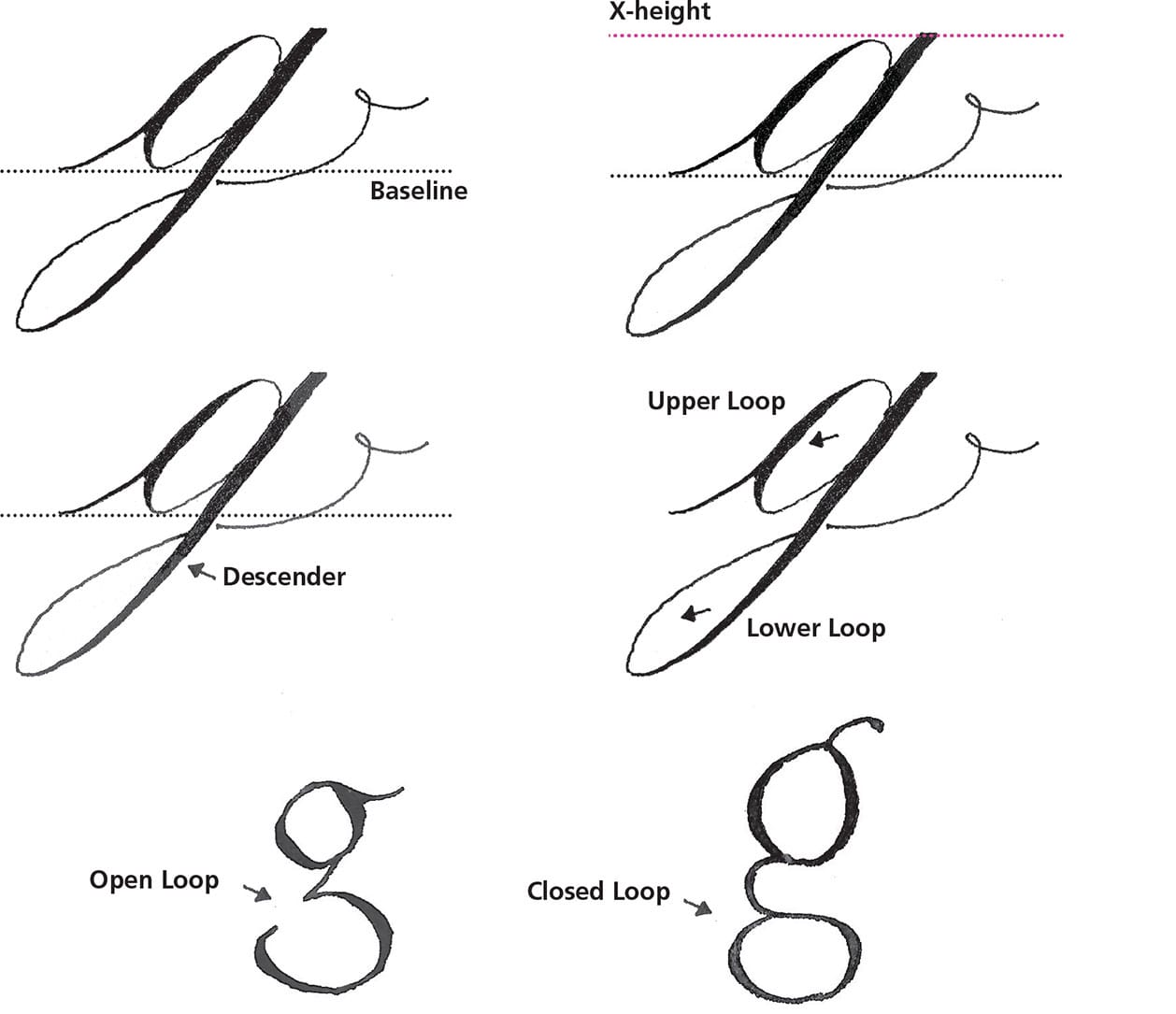
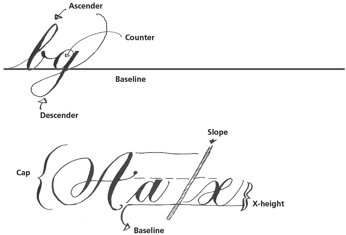
There are four key lines in calligraphy: baseline, x-height, cap height, and slant line. These lines are arguably the most important aspect of creating beautiful and legible calligraphic art.

• The baseline is the line upon which all the letters rest.
• The x-height is the height of a small letter “x” placed upon the baseline. When creating letters, it’s a priority to keep them nicely placed along the baseline, and to keep all the x-height letters within the x-height.
• The cap height is the height of the capital letters, or majuscules.
• The slant line is the line at which the letters are sloped. Keep all downstrokes at this angle.
Tools & Materials
Basic Calligraphy Materials
Pen Holder
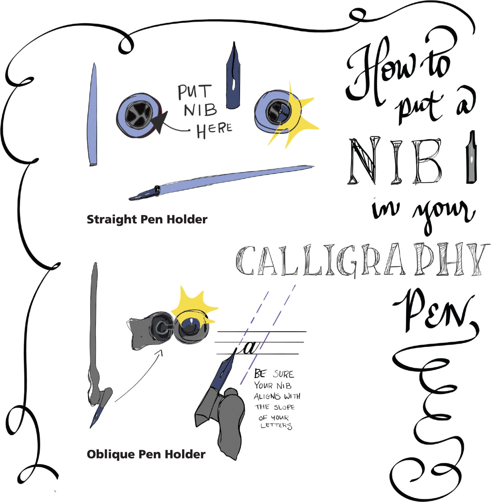
I recommend an oblique pen holder, but you may wish to try a straight pen holder. Plastic calligraphy pens are available at most art stores, but choose a turned-wood holder if you can find one and would like to invest. Make sure your chosen nib will fit your holder.
Nib
You need at least one pointed-pen nib. If you’re not sure where to start, I suggest Hunt #56, Nikko G, Hunt #101, and/or Gillott #404.
Ink
Black ink, such as an India ink, is opaque and permanent. Look for Japanese sumi ink, if possible, which is formulated especially for calligraphy and sumi painting.
Paper
The best paper for basic pointed-pen calligraphy is smooth white drawing paper. Look for Bristol or bond paper. If you plan to add watercolor or gouache washes or illustrations, use 140-lb. or heavier watercolor paper, and learn about paper stretching.
Choose hot-pressed paper for your watercolor calligraphy projects. Hot-pressed paper is machine-made and run through hot rollers, creating a smooth surface.
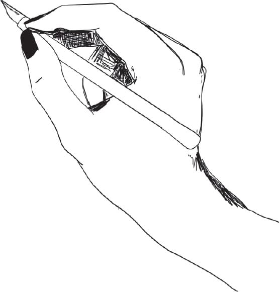
Straight Calligraphy Pen
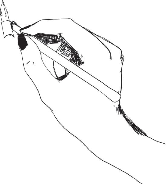
Oblique Pen
Other Basic Supplies
• Small jar, fitted with a sponge to clean your nibs
• Ammonia or alcohol to clean pen nibs
• Old toothbrushes (for cleaning nibs and pens)
• Small glass jars for decanting ink and mixing colors
• Light box
Watercolor & Gouache
Watercolor and gouache are among the best ways to color lettering and calligraphy. Watercolors have a transparent quality that allows for layering and creating washes. Choose white or light colored paper for use with watercolor.
Gouache is opaque and can be used on dark or light paper. White gouache is excellent for writing on a dark surface. Gouache also comes in a range of metallics.
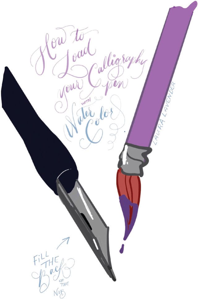
Paints are available in tubes and pans and come in student-grade and artist-grade. You should always buy the best quality you can afford. Artist-grade paints are made from high-quality pigments, resulting in a denser watercolor and better lightfastness. If you’re just starting out, student-grade paints will still give you lovely results.
Pen Holders & Nibs
Pointed-pen holders are either oblique (in which the pen nib is held at an angle) or straight. Each style creates a different writing angle. The oblique holder positions the nib at an angle that facilitates a 35- to 55-degree slant required for formal pointed-pen styles. The straight holder can be used at any angle, depending on the position of your hand and the nib. Additionally, a straight pen holder can be used with other nibs, such as broad-edged nibs, which are used to produce other calligraphy hands. It’s helpful to have both a straight pen holder and an oblique holder.
Try out different nibs to determine which works best for you. There are a variety of different pointed-pen nibs available. Some nibs are made of stiffer metal and require more pressure to create a thick stroke. Others are made of more flexible metal and require a more delicate touch. All calligraphers have their own collection of nibs, with their favorites in rotation.
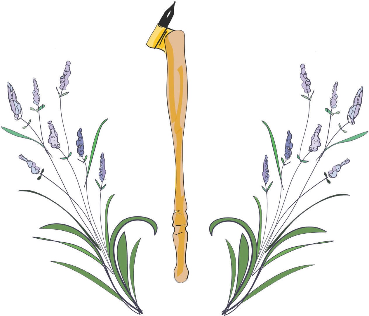
The Pointed-Pen Nib
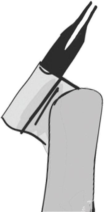
The pointed pen comes to a sharply pointed, fine tip.
The pointed-pen nib works through pressure. The more pressure placed on the nib, the more the tines separate. The separation of the tines allows more ink to flow out, creating thick swells. When you glide the pen along the paper without pressure, you create thin, elegant hairline strokes.
All the calligraphy and lettering in this book is done with a pointed pen. (Although, the embellished lettering can also be done with a fine black marker, if you prefer!)
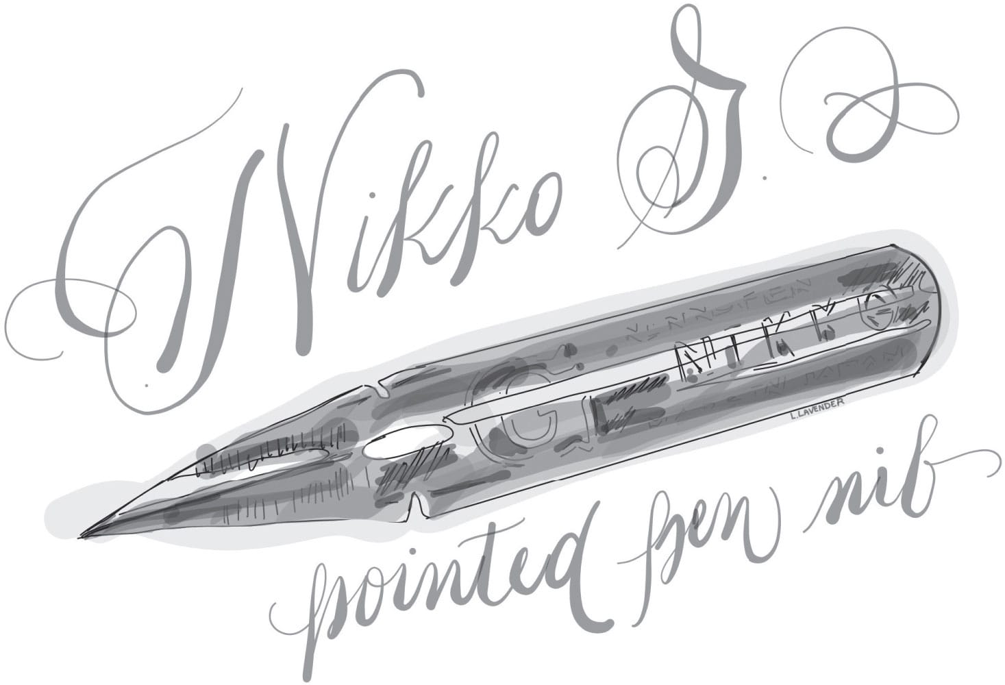
The Nikko G (shown above) is a large, sturdy, stiff pointed-pen nib. This Japanese nib is frequently recommended for beginning calligraphers. Because we all hold our pens differently, various nibs produce different results, depending on the user. Sample as many nibs as possible. Here are some suggestions:
• Brause 361 Steno
• Leonardt Shakespeare
• Leonardt/Hiro Crown #41
• Leonardt Index
• Zebra G
• Brause Rose #76
• Hunt 100
• Leonardt/Hiro 700
• Gillott #291
Attaching a Nib
Ensure you position your nib correctly in your pen holder. The keyhole needs to point upward, and the tines need to be equally weighted on the paper.
Dipping your Pen
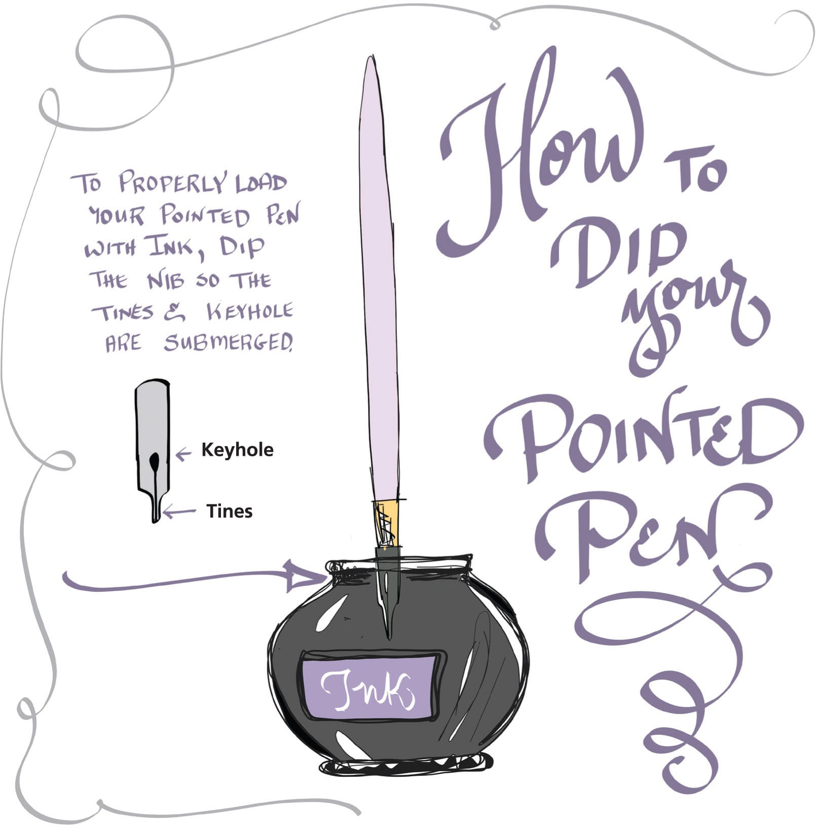
When dipping your pointed pen, ensure the keyhole is submerged in the ink, as this aids in ink retention and longer strokes. Do not dip the pen holder in the ink. After you dip the nib, practice a stroke on scrap paper to ensure that it is not overloaded with ink. Look for too much ink buildup in the back of the nib. If this happens, gently wipe the ink back into the jar.
Caring for Your Nibs & Pens
Basic maintenance of your pens and holders will help them have a longer life:
• Never leave nibs or holders soaking in water.
• Keep your pen nibs and holders clean. In between dipping the nib in ink, give it a wash in a jar of water regularly. This will keep the nib clear of dried ink, which can inhibit the flow. Keep a towel nearby to dry your nib prior to dipping again.
• When needed, give your nib a scrub with an old toothbrush and some dish soap. Rinse well, and ensure that the nib and pen holder dry thoroughly. If your nibs are really dirty, cleaning them with ammonia should do the trick.
Work Environment
Your environment is important to your success in calligraphy. For example, if you practice with bad posture, you may find the whole calligraphy experience uncomfortable or even painful for your neck, back, and shoulders. Here are some tips for creating a comfortable environment for maximum productivity.
Posture Aim for a relaxed body position and a straight back. Loosen arms and wrists.
Writing Hand Keep your writing hand free and agile on the paper so that it glides as you write. Avoid planting your hand like a tree; instead, envision a light “butterfly” hand.
Setup Keep supplies, such as ink, water, paper, etc., to the side of your writing hand. Place some extra paper under your writing paper; padding will improve your pen’s performance. Use a guard sheet or a small scrap of card under your hand to avoid transferring oils from your hand to your working paper.
The Sweet Spot Keep your work positioned in a straight line in front of your heart for best posture, control, and visibility. Arrange your arms, body, and paper so that you can most comfortably work in the “sweet spot.”
Lighting Position yourself and your light source so that your body, arms, and hand are not casting a shadow on your work.
Work at an Angle Keep your work positioned at an angle on a drafting table, light table, or a board propped on your lap.
Tips for Left-Handed Calligraphers
1. Try a variety of paper positions. Adjust your paper so that you can easily maintain the correct pen angle/slope, even though you may not be able to easily see your lettering. Place the paper at a 90-degree angle, and try positioning your paper farther away from your body and not directly under your chin.
2. Use an oblique pen holder. Adjust the nib in the holder at the correct position for you. Aim for both tines of the nib to be squarely on the paper, with the keyhole pointed up.
3. Try different hand and arm positions, such as overhand, underhand, or whatever feels right to you.
4. Use a guard sheet under your hand so your letters do not get smudged.
5. Try a different order of strokes from those suggested by the ductus.
6. Use other tools. Practice calligraphy with a ballpoint pen, pencil, or thin marker. These tools will let you practice letter shapes and try out hand, arm, and paper positions without the added worry of smudges and splatters.
7. Get a “left-handed” nib with an angled cut if you are working with a broad-edged nib. Pointed-pen nibs do not come with nibs styled for left-handed calligraphers. Keep your eye out for calligraphy tools specifically manufactured for the left-handed calligrapher.
8. Use a “bridge.” Similar to a tiny table, some left-handed calligraphers rest their hand on this tool while they write to avoid smudges.
General Practice Tips
Calligraphy guides recommend short but frequent practice sessions—usually a half hour at a time—to avoid burnout and discouragement. Whether you are a beginner or an experienced calligrapher, the following tips and exercises shown here will give your pointed pen a great workout!
Warm Up Warm up your calligraphy muscles by making some easy strokes (see here).
Techniques Once you feel warmed up, move through the essential technique strokes from the Copperplate tradition. These are key to using the pointed pen (see here).
Stroke Exercises Pick one of the exercises shown here, and practice for 30 minutes.
Additional Tips:
• Practice both the individual strokes and strokes compiled into the letters.
• Write out a line of the letter “e” in your chosen alphabet, with each “e” joined to the next; then try another letter.
• Invent a few of your own practice strokes.
• Write out a list using a pointed pen.
• Use your pointed pen to write in your journal or daily planner.
• Handwrite a letter or card to one friend per month. Add a flourished border!
• Create hand-lettered gift tags. Blank tags are available at office supply stores and craft stores.
• Purchase a copy of George Bickham’s The Universal Penman and then practice tracing the elaborate flourishes!
Pointed-Pen Exercises
Warm Up
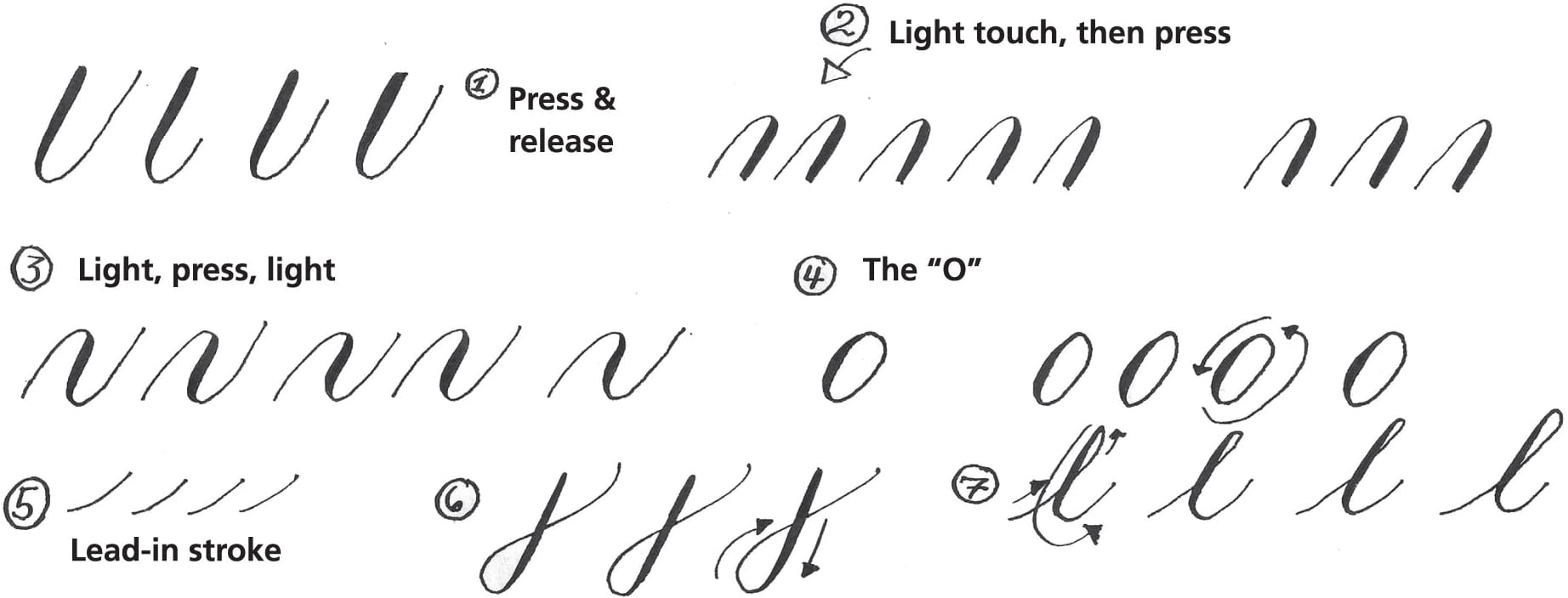
Work through the casual warm-up exercises below, keeping the following points in mind:
1) Put pressure on the nib on the downstroke, and 2) Use light pressure on the upstroke.

Techniques
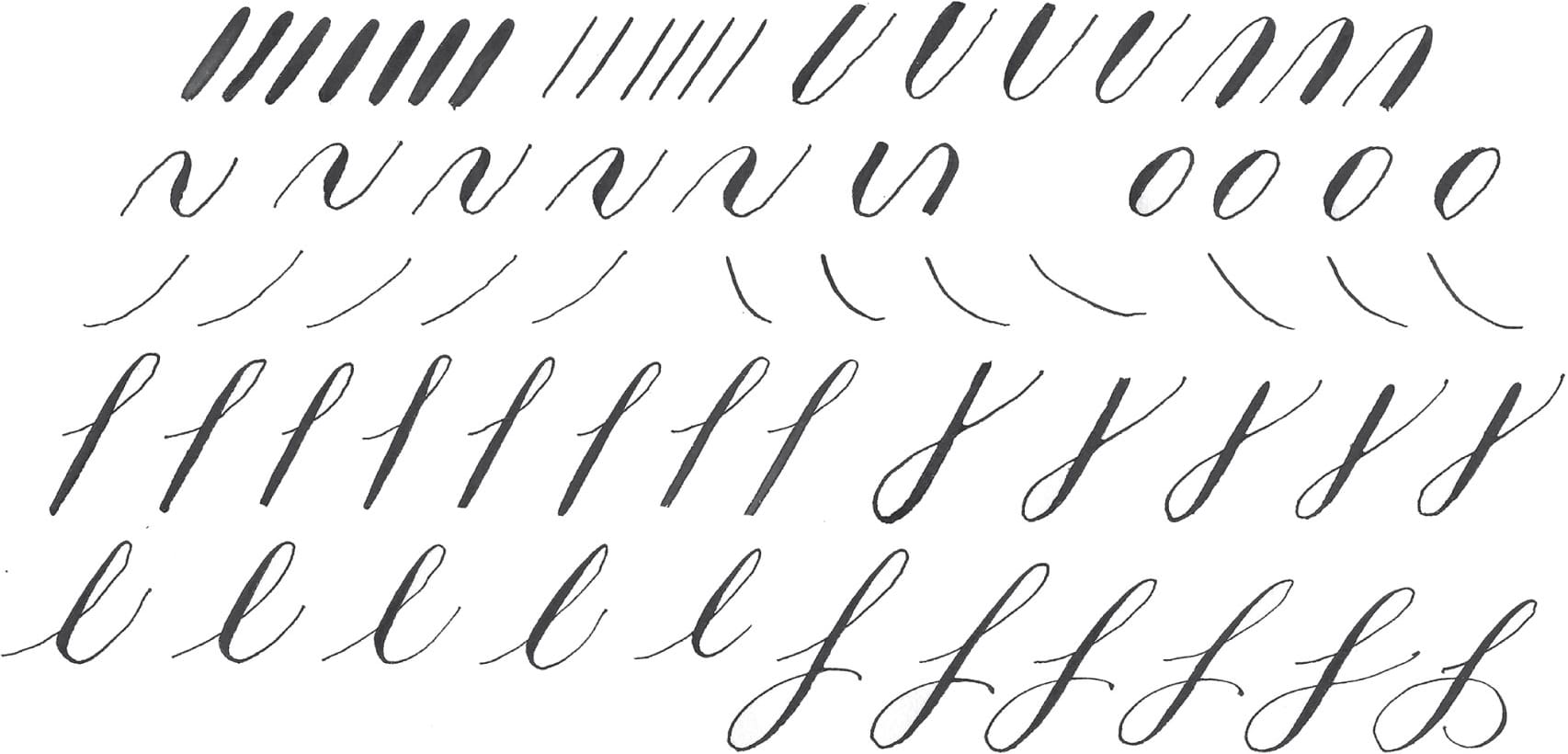
The strokes below, from the Copperplate hand, are essential for working with pointed pen.

Stroke Exercises
Mountain & Valley Stroke
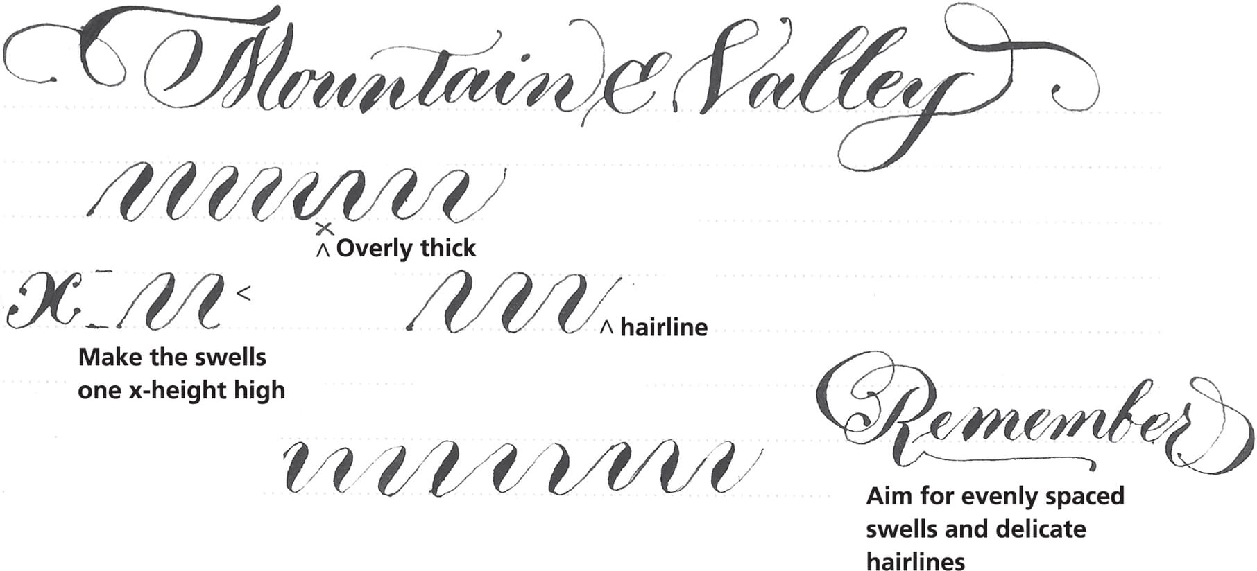
The most important exercise for working with the pointed pen is what I call the mountain and valley stroke. This stroke practices the smooth graduation between thick and thin; it also develops a smooth rhythm for writing.

When you are creating mountain and valley strokes, imagine creating small circles in the bottoms and tops of the strokes.
Snake Stroke
The snake stroke practices the swelled downstroke, which is important for pointed-pen majuscules. Begin with a hairline stroke and gently extend into a swelled thick stroke by gradually applying more pressure to the pen nib. Taper the stroke out into a hairline again.

For your snake stroke practice, create a swelled downstroke; then mirror it with another, opposite-swelled downstroke.
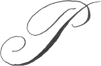
Here you can see the swelled downstroke in an English Round Hand “P.”
As a beginner, warm-up exercises are vital to getting comfortable with the feel of the pen in your hand, as well as learning how much pressure to apply to achieve thick downstrokes and thin upstrokes. Don’t underestimate the power of a great warm up! You’ll approach your work with more ease and familiarity—and possibly save yourself some mistakes!
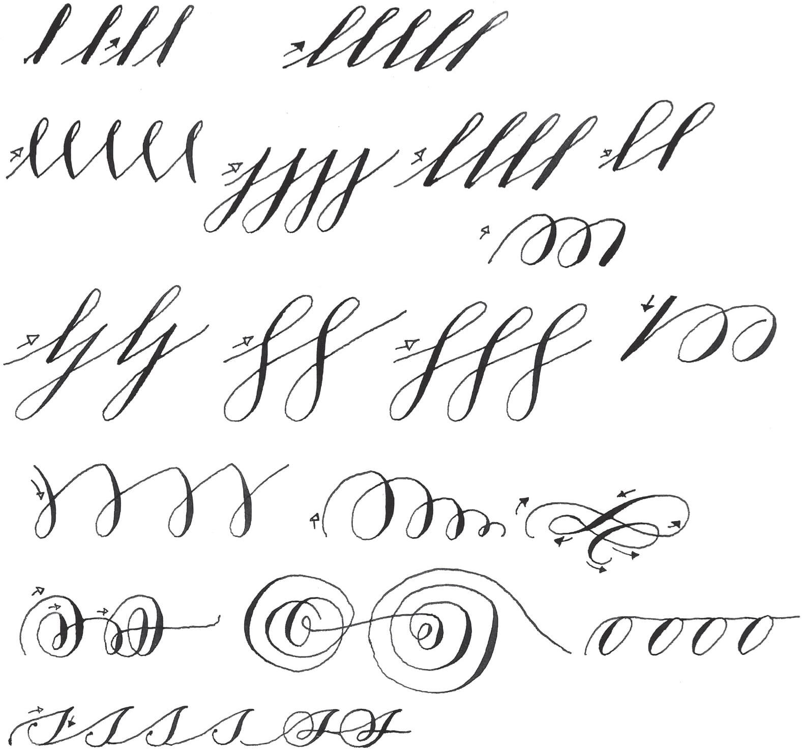
Practice Template!
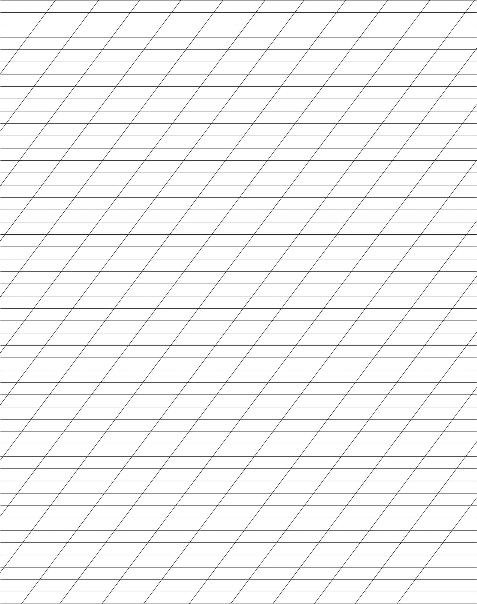
See here for more about working with this template. If you would like to download this template for printing, click here: https://www.quartoknows.com/page/timeless.
Pointed-Pen Script Styles
Let’s take a quick look at the details and characteristics of pointed-pen script styles, which include Copperplate, Spencerian, Italian, and Bickham.
Minuscule Letter Groups
For the study of these pointed-pen script styles, we will learn the minuscule letters based on letter groups. These groups of letters are formed in a similar fashion: the entrance and exit strokes are similar, the ascender or descender formation is similar, and the pattern of strokes is the same. Many of the letters contain similar strokes and formations to other letter groups, so there is some overlap.
Generally, the minuscule letter groups are as follows:
• a, o, e, c, d, g, q
• h, l, k, b
• f, p, j
• u, v, w, x, y, z, m, n
• s, r
• i, t
Majuscule Letter Groups
The pointed-pen script majuscules, or capital letters, are different from one another. Rather than group them by shape, we’ll study the majuscule letters individually from A to Z. There are, however, a few of the same strokes that are used in several majuscule letters. They are:
• The swelled downstroke: The swelled downstroke begins with a hairline stroke that gently extends into a swelled thick stroke by gradually applying more pressure to the pen nib. The stroke then tapers into a hairline again. This stroke is evident in many capital letters in a variety of fashions: A, B, D, F, I, J, L, N, P, R, T, V. This is an important stroke to practice.
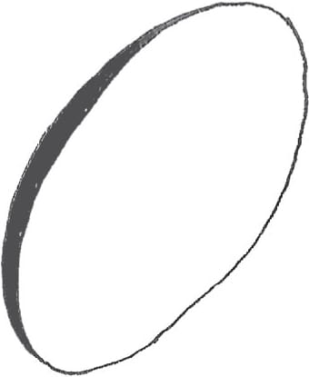
• The oval shape: The majuscule oval is formed in the same way as the minuscule oval shape. The stroke is gradually weighted as the oval is formed—as you ascend up the side of the oval, the line becomes a hairline.
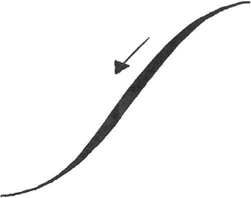
Swelled downstroke
Oval shape
Pointed-Pen Script Numbers
Numbers are best drawn roughly the size of minuscule letters (x-height). Aim for clarity in your numbers, and avoid overly embellishing them. Instead, aim to form them beautifully.


Pointed-Pen Alignment
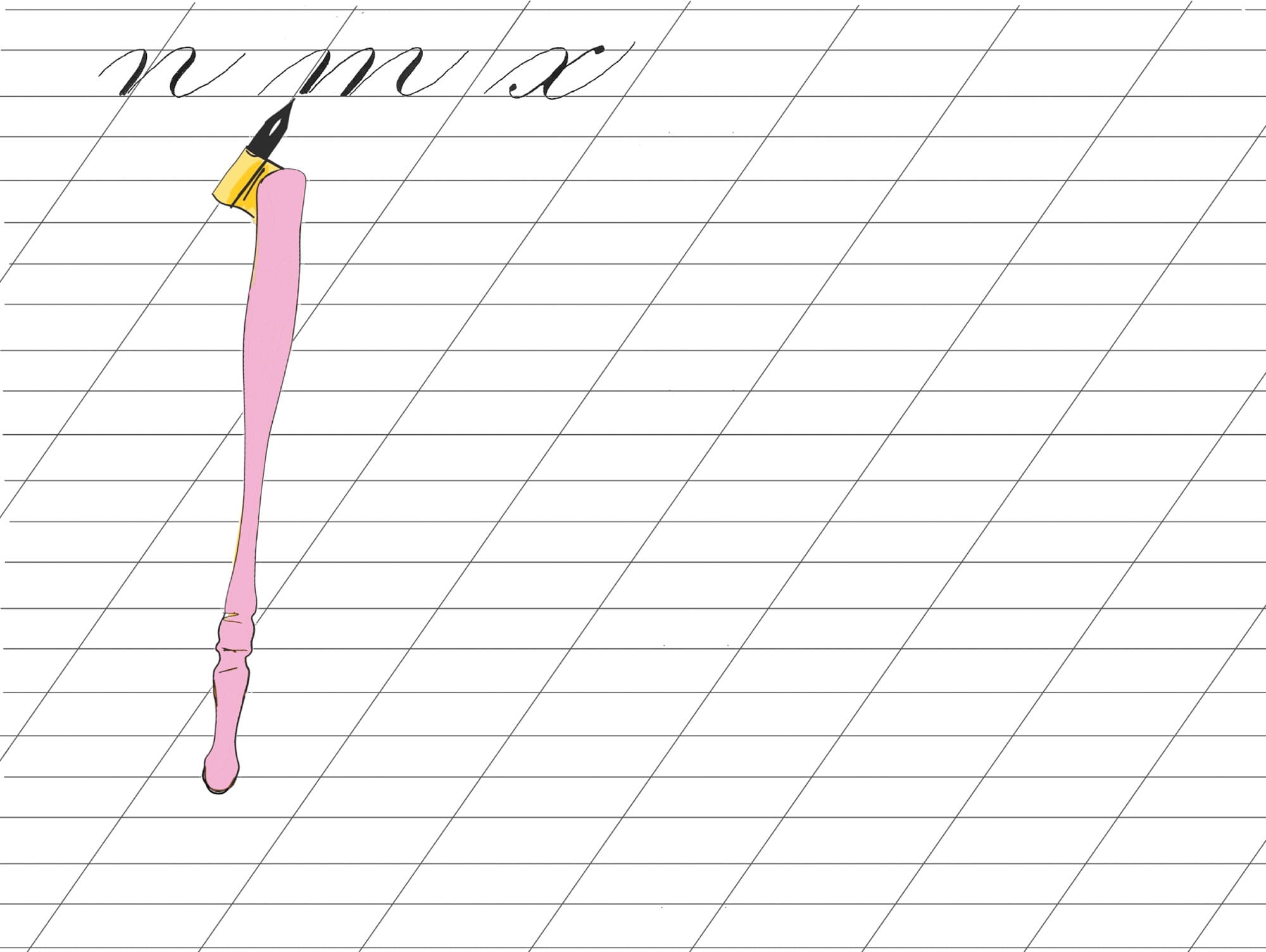
This illustration shows the ideal alignment of the pointed-pen nib, the slant line, and the downstroke. These three items should be in line for every downstroke. Keep the tines of the pen nib equally pointed along the slope line, and the keyhole centered and facing up.
See here for more pointed-pen practice templates.
Spacing
Spacing is important in calligraphy. The spacing between words and between letters is essential for legibility, elegance, and style.
Spacing between letters. In calligraphy, you need to have what appears to be equal spacing between all of the letters. I say “appears” because the letters of a given alphabet are shaped differently. For example, the spacing between the letters “d” and “p” has a different shape than the spacing between “s” and “s.” It’s helpful to think of spacing between letters in a word as volume, rather than a measurement.
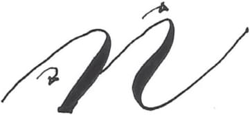
Spacing between words. For spacing between words, envision a minuscule letter “n” of your alphabet between the words.
Joining Strokes
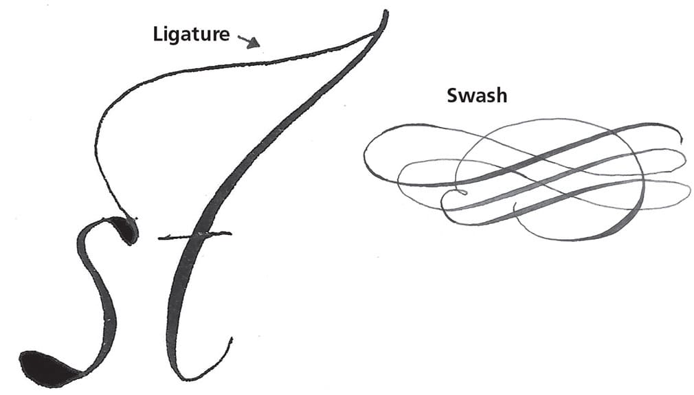
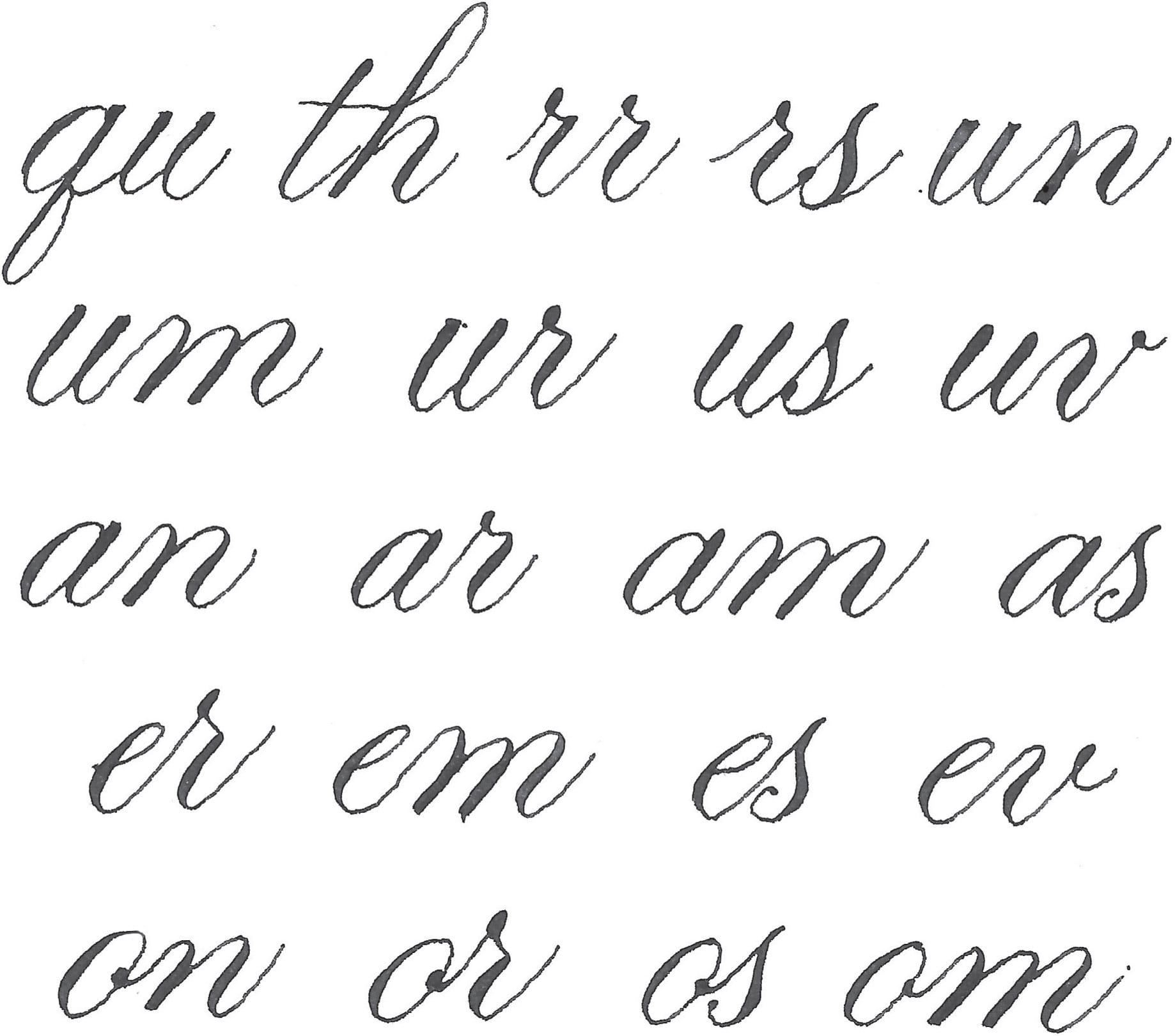
The entrance and exit strokes on your letters are how the letters are linked into words. To join letters together, merge the exit stroke of one letter into the entrance stroke of the next. Below are some tricky letter joins. These will give you an idea of how to join them, depending on the chosen alphabet.
Step-by-Step Project
Make Your Own Oak Gall Ink
OAK GALLS ARE ROUND OBJECTS THAT FORM ON OAK TREES. The oak galls are created by certain species of wasps. They may not be very pretty, but they make lovely ink! The below is adapted from an 11th-century recipe.
STEP ONE Wrap the oak galls with some newspaper and bruise them with a hammer.
STEP TWO Cover the bruised oak galls with boiling water in a large glass jar. Allow to soak for 24 hours. Strain and discard the galls. (If needed, strain again.)
STEP THREE Combine a few drops of the myrrh, a few drops of essential oil, the iron sulfate, and the gum arabic in a small jar.
STEP FOUR Stir in the oak gall infusion.
STEP FIVE Bottle and label your ink.
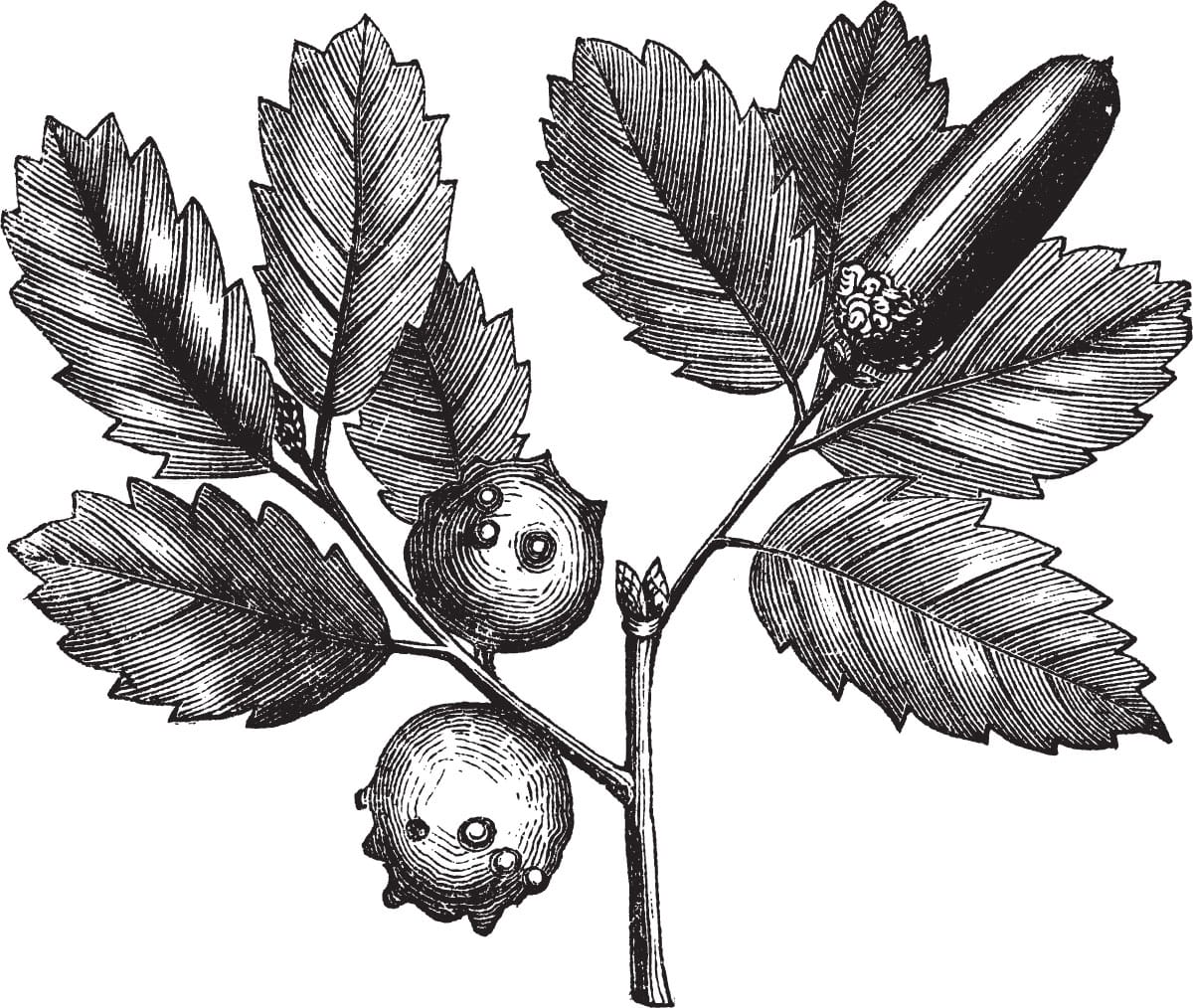
Oak gall ink, which was commonly known as iron gall ink, common ink, or iron gall nut ink, was the standard ink used in Europe between the 5th and 19th centuries. Many ancient manuscripts were written with this kind of ink.