Part III: Timeless Calligraphy Styles
Victorian Hands
THE VICTORIANS FAVORED HIGHLY ORNATE ECLECTIC DECORATIONS IN ALL AREAS OF THEIR LIVES, including the written word. Highly fanciful hand lettering was abundant in everything from advertisements, newspapers, and legal documents to birth certificates and wedding pieces.
Envision letters encircled by serenading angels, wreathed in bountiful blooms, or worked into an illustration for an upcoming passage. In this chapter, we’ll be inspired by this unique and whimsical style to draw our own letters. The Victorians drew from many historical lettering styles when creating their pieces, including Roman, Uncial, and Gothic letters.

Classic Roman Letters
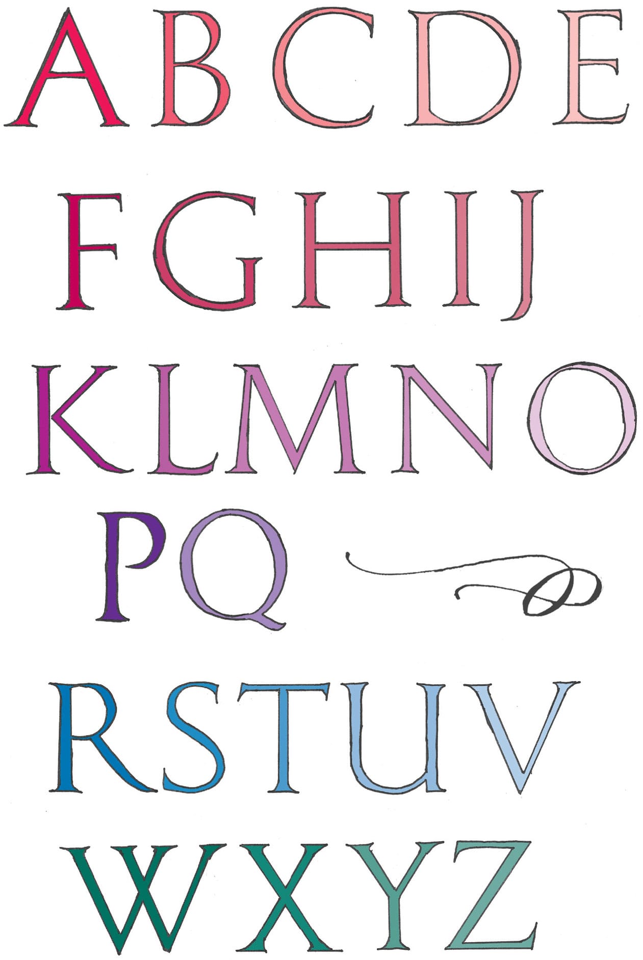
Classic Roman letters form the basis of Victorian letters. Note that there are both thick and thin lines within each letter. The positioning of these lines is key to the classic Roman look, even if the contrast is not that dramatic. Additionally, notice the serifs and that the size of each individual letter in relation to the next is fixed. This means some letters take up lots of space—for example, “W”—and some take up very little space, such as “I.” To draw these classic roman letters, I like to use small drafting triangles and a circle template to create smooth lines.
Origins of Embellished Letters
Some letters didn’t exist for the Romans (J, U, and W). By embellishing these letters with florals, decorative elements, and illustrations, we can recreate lovely—and easy to read—embellished Victorian letters!
Basic Shapes
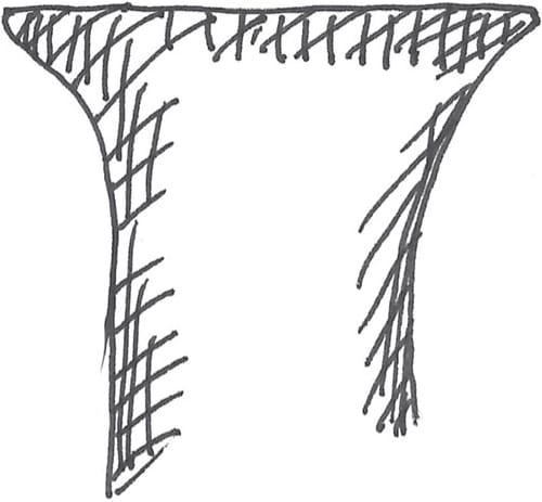
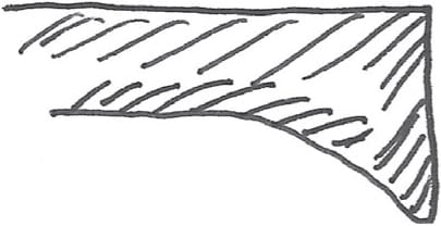
This shows the shape of the classic roman serifs.
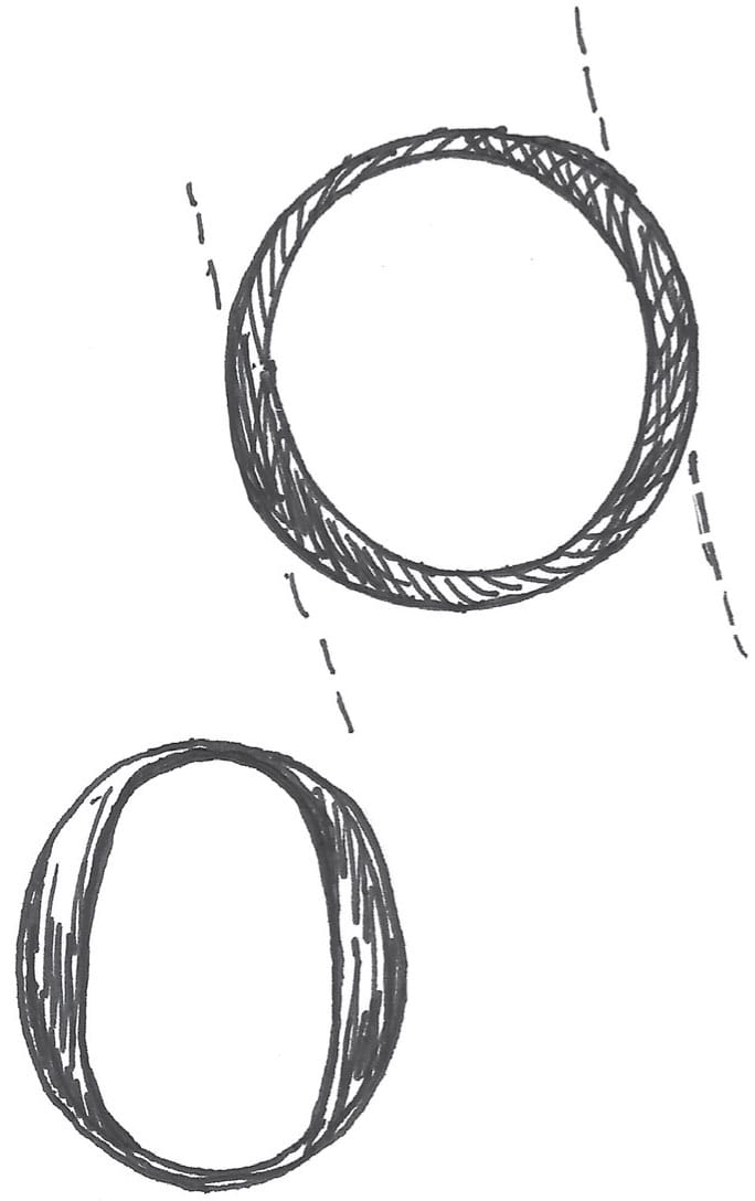
The shape of the letters “O” and “Q” are important. Notice how the weight of these letters—the thickest part of the line—is off-center.
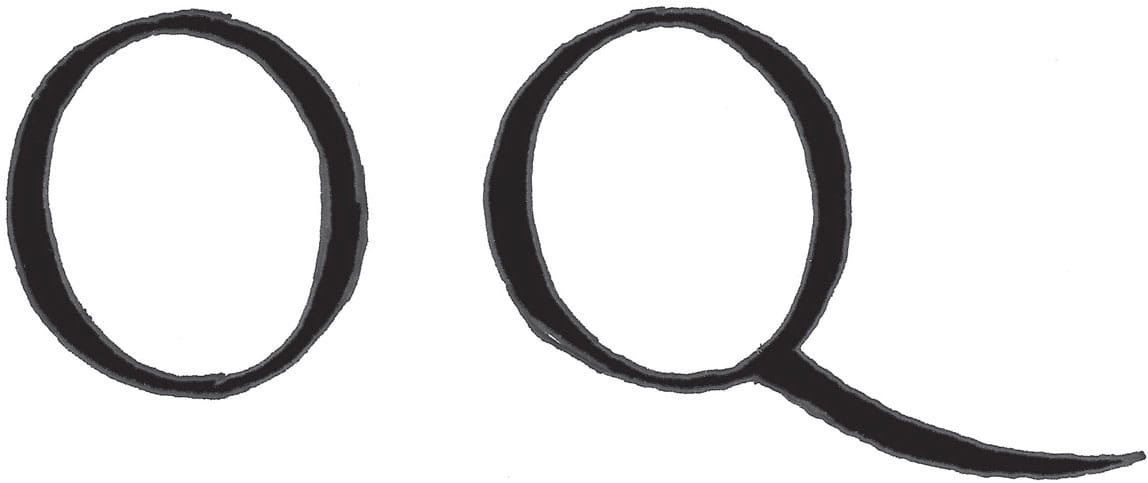
Compare the placement of the thickest part of the line in a classic Roman “O” (top) and a modern Roman “O” (bottom).
Victorian Embellished Capitals
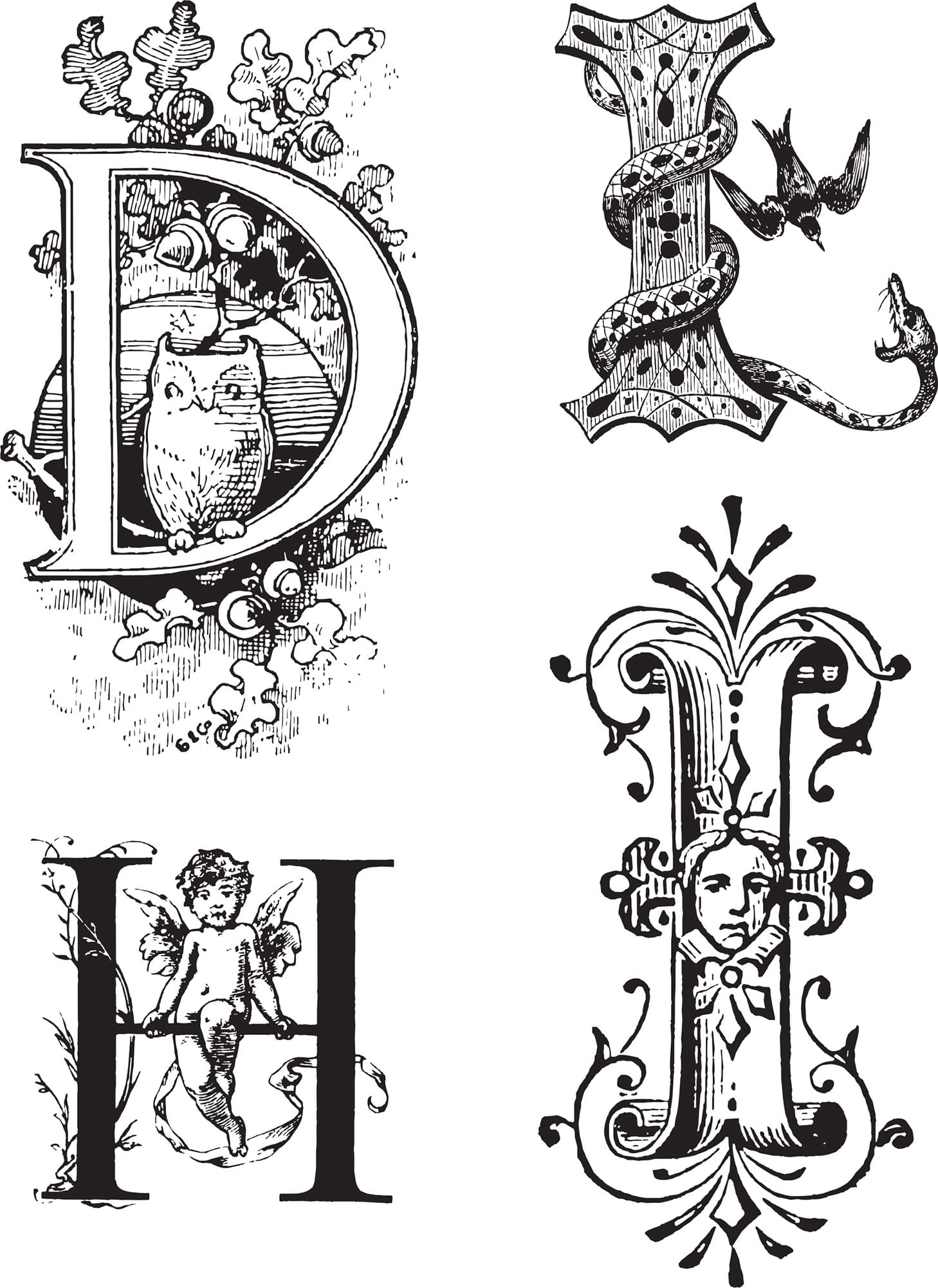
During the Victorian era, embellished letters—similar to the ones shown here—emerged as a way to weave story into art. These letters often included characters, animals, objects, and floral motifs.
Quintessential Victorian Letters
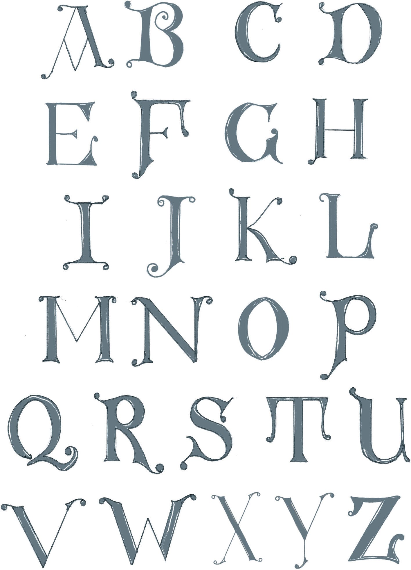
To me, these are the quintessential Victorian letters. Keep these lines smooth and gentle. Some of these letters have a bit of an Uncial look to them. Do you see it?

Victorian Lombardic Letters
The little half-moon shaped cutouts give these Lombardic capitals some Victorian extravagance.
Whimsical Victorian Letters
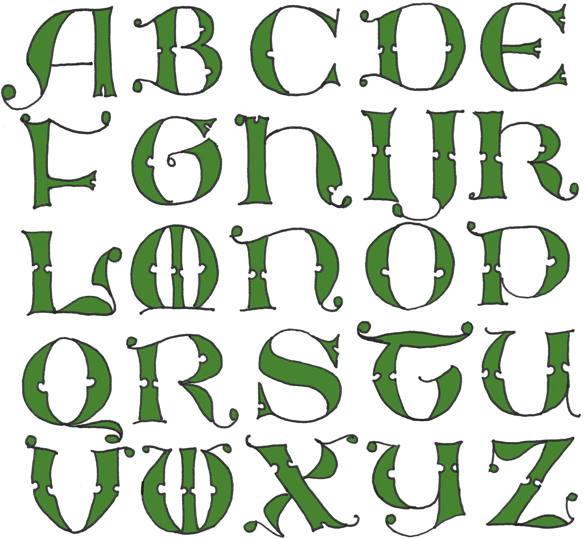
These whimsical letters have character! With a definite Roman flavor, the curly serifs and little ball terminals really finish them off! For these letterforms, I was inspired by Otto Weisert designs from the 19th century.
Step-by-Step Project
Silhouette Letters
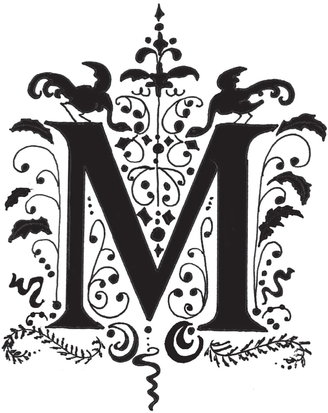
SILHOUETTES HAVE BEEN POPULAR SINCE THE MID-1700S when they were used to create portraits. “Silhouette” is a term used for any art piece that is backlit—a dark figure on a white background.
This project is inspired by some 19th-century embellished letters created by Julius Klinkhardt from the Bibliothèque des Arts Décoratifs in Paris. For these initials, choose a single classic roman letter, and then embellish it with black filigree decorations, foliage, and more!

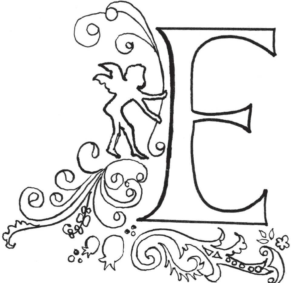
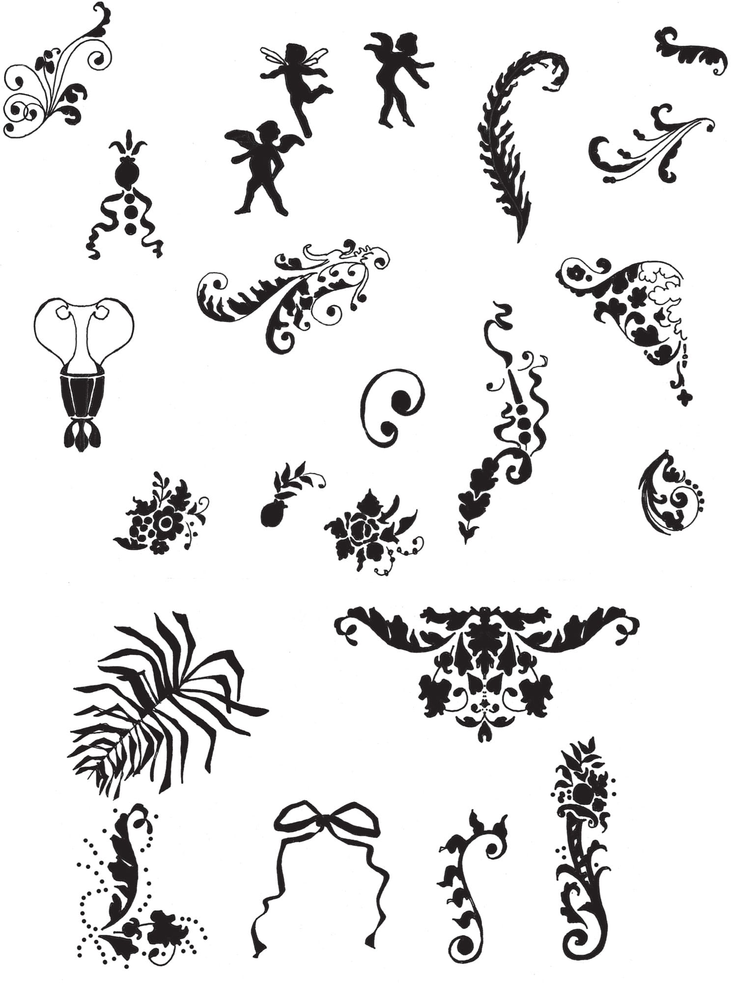
STEP ONE Choose an initial from the classic roman alphabet shown here and sketch it in pencil. Once you’re happy with the sketch, grab your preferred ink pen (mine is the Tombow® calligraphy marker), and start adding embellishments. On the letter “E,” the ideal starting point for embellishing the letter is the left side of the stem. I add a cherub surrounded by filigree and decorations. (See here for embellishment ideas.)
STEP TWO Continue to embellish the letter, building up and out. It looks best when the flourishes follow the direction of the letter. For example, the arms of the “E” point to the right, so draw the designs flowing toward the right.
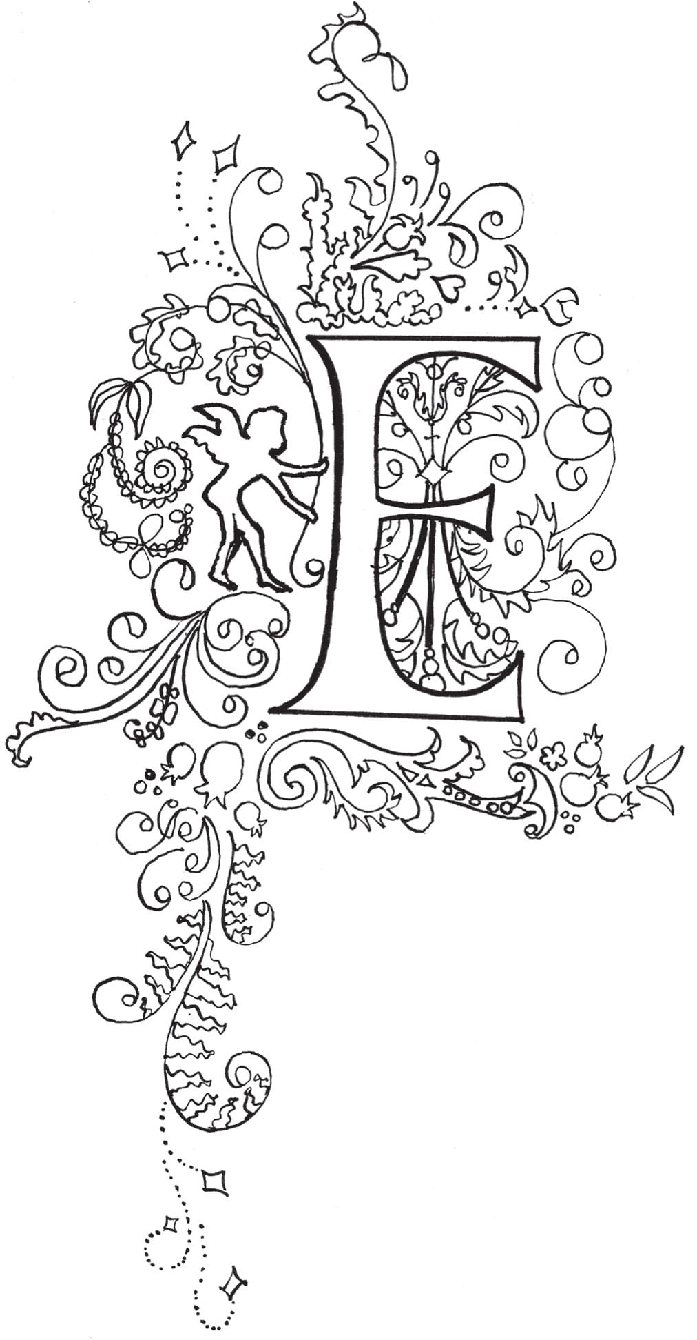
STEP THREE Extend the design further out and down. This descending decoration would look wonderful as the starting letter to a paragraph or quotation!
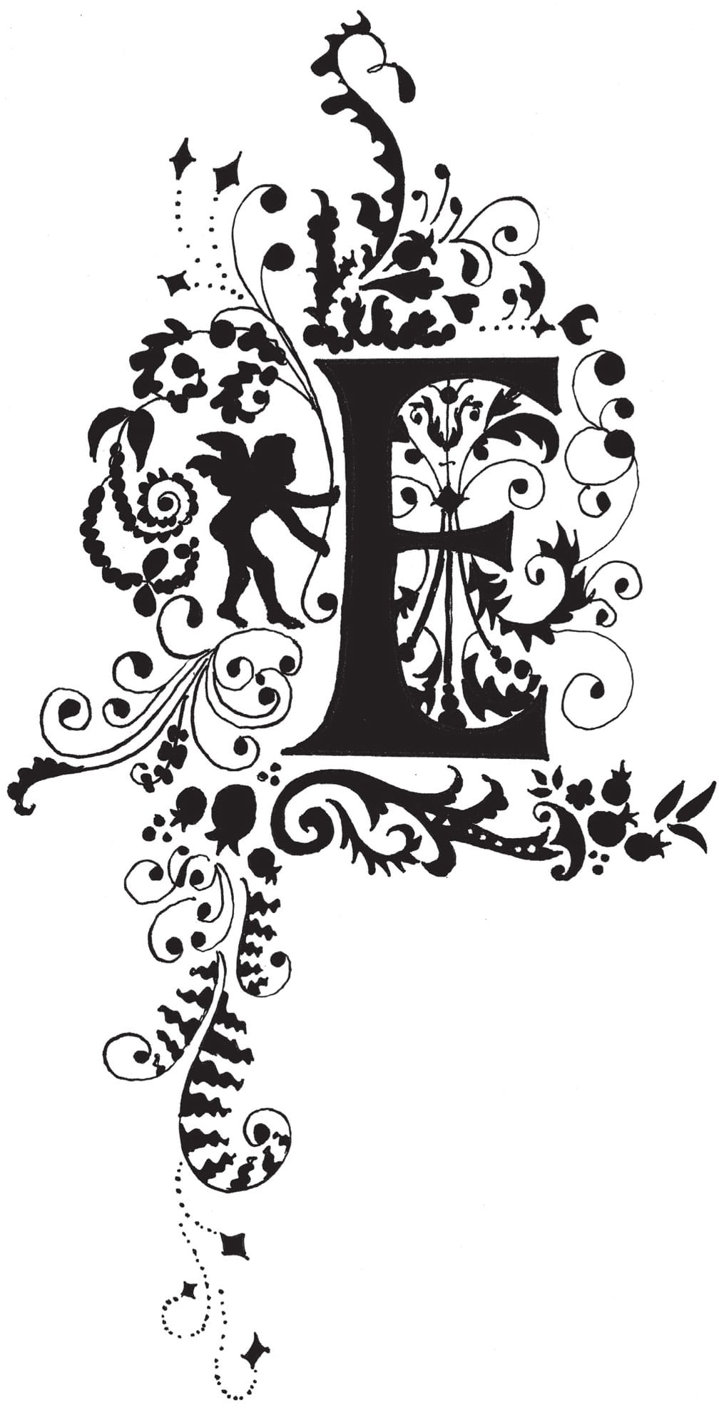
STEP FOUR For a classic silhouette look, use black paint or India ink to carefully fill in the letter. Alternatively, scan the letter into your computer and use photo-editing software to fill it in.
Embellishments
Step-by-Step Project
Victorian-Inspired Story Letters
FOR THIS PROJECT, WE’LL CREATE A DECORATED “STORY” LETTER in watercolor. Story letters were popular in Victorian newspapers and magazines. This letter features a cheeky dragon curled up inside the counter space, ready to blow a puff of smoke!
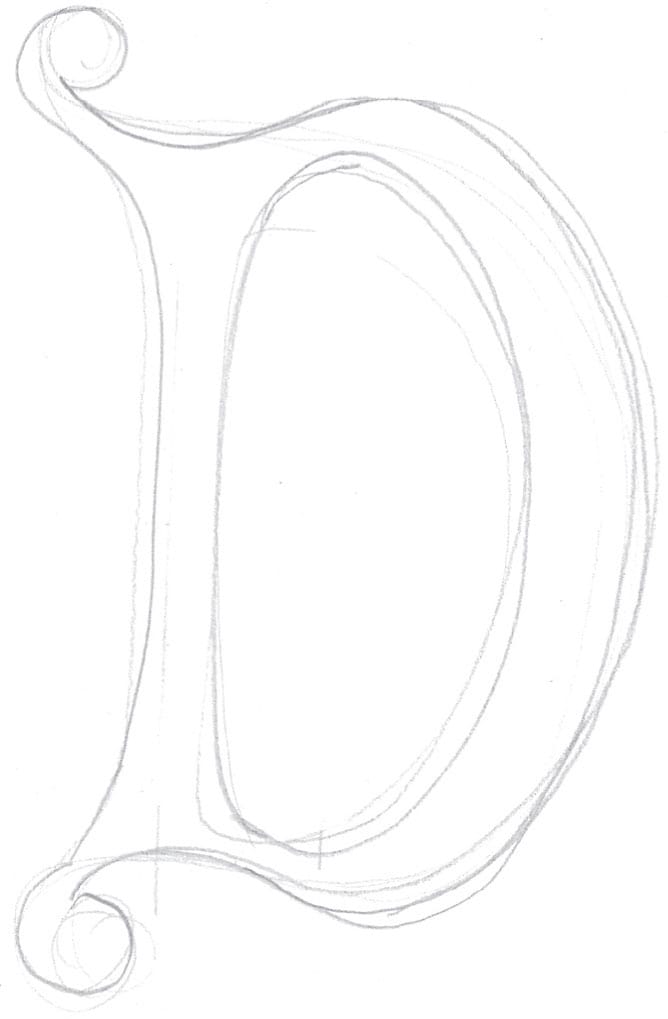
STEP ONE Sketch the letter on draft paper in pencil. You may need to sketch several times to get the proportions and shape just right!
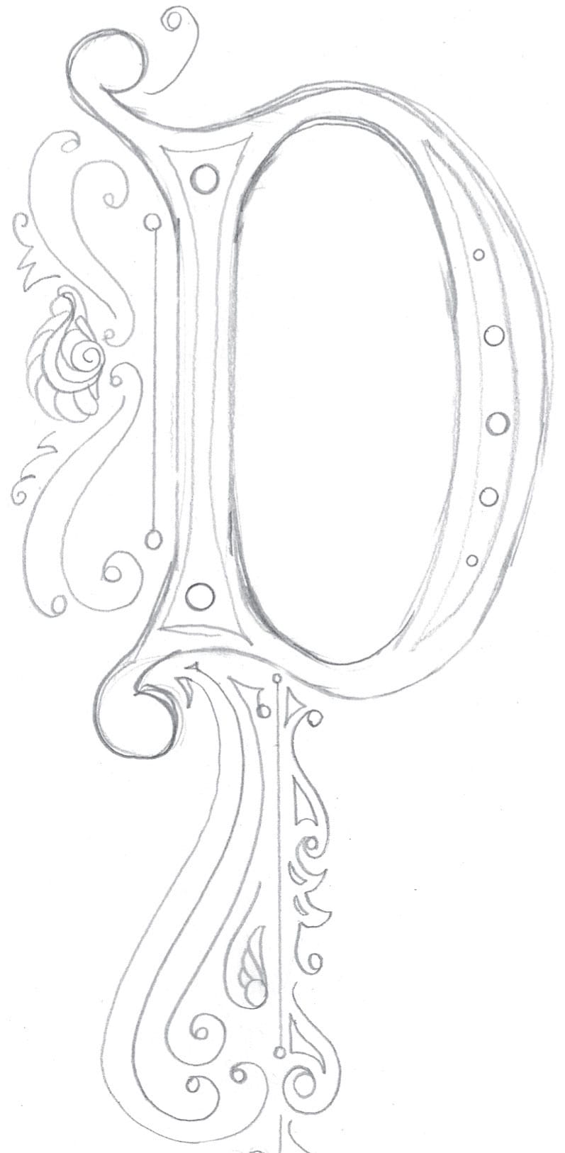
STEP TWO Inside the letter, I add elegant little circles moving from small to large. Outside the letter, add some swirls and curlicues, anchored by a straight line along the stem of the letter and descending below it.
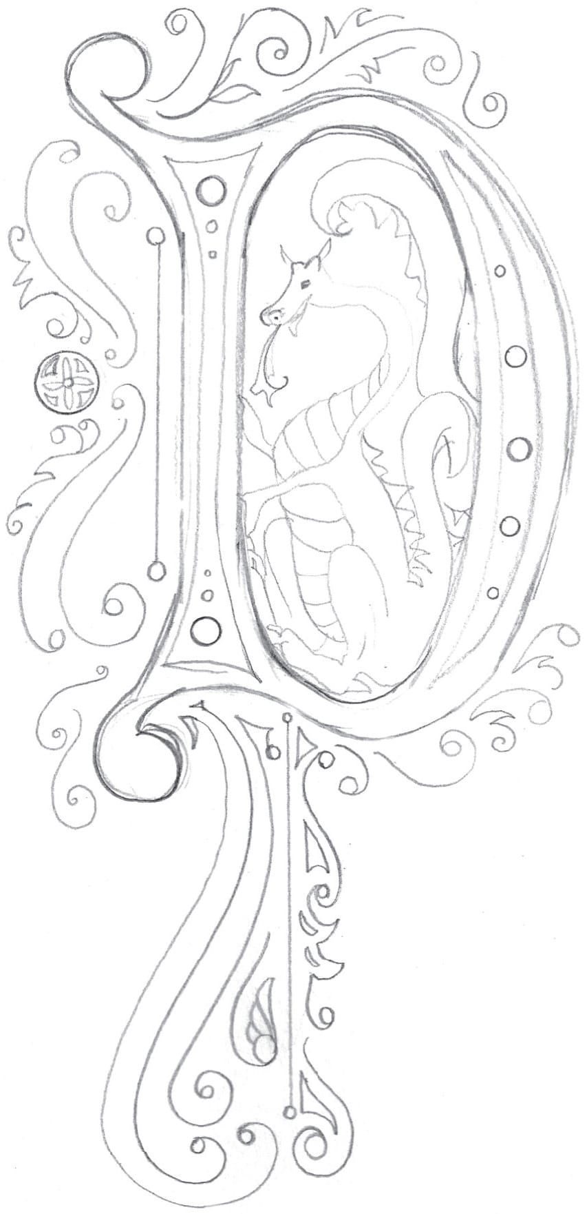
STEP THREE Time to add the dragon! I drew mine sitting comfortably inside the counter space.
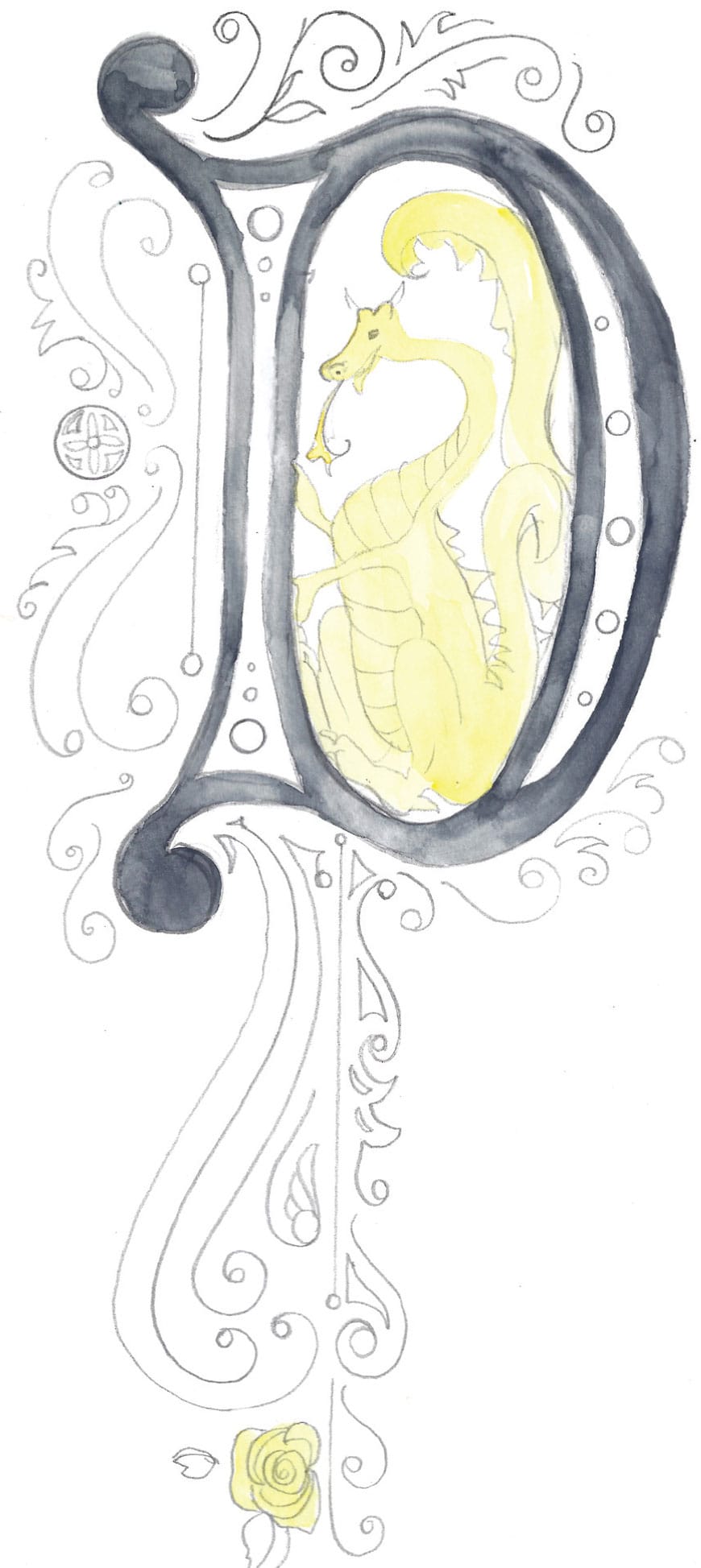
STEP FOUR With watercolors and a mediumsized brush, start with the lightest colors first. I add a layer of yellow on the dragon and the rose at the lowest part of the descending decoration. Then I add a preliminary layer of dark blue-gray to fill the letter.
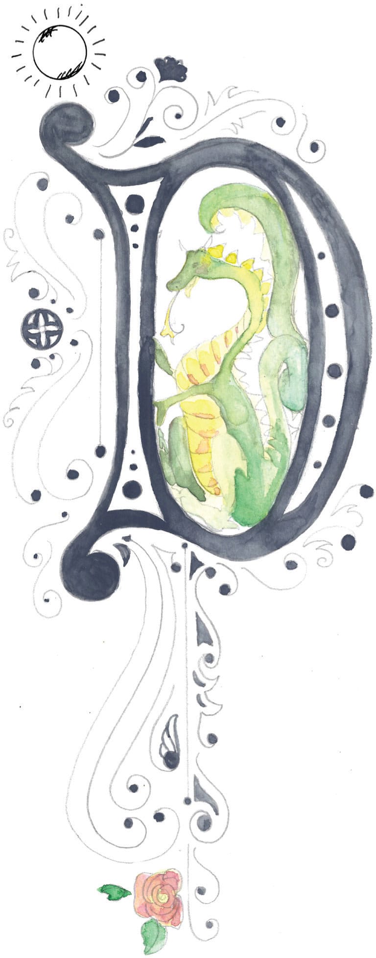
STEP FIVE Once the yellow layer is dry, use a variety of greens to add depth and shadow to the dragon. I add a little sunshine to assist with placing the cast shadow. I envision the sun shining from the upper left-hand corner—so all the shadows will be at the lower right-hand side. Add shadow to the chest and belly area with darker orange shading over the yellow.
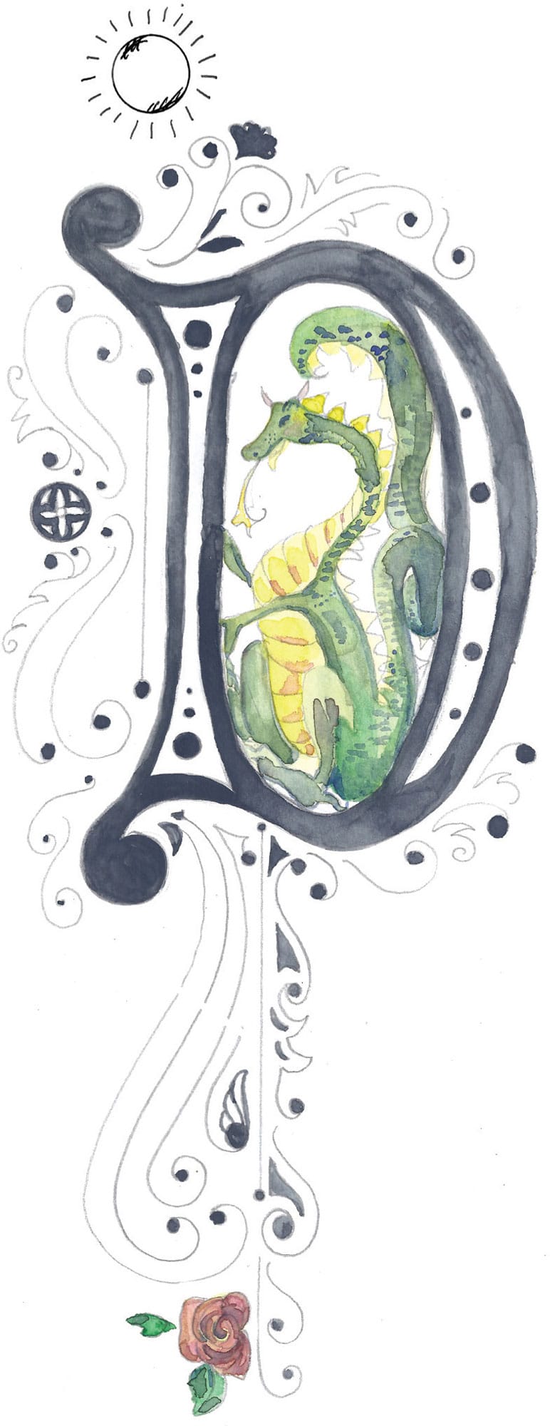
STEP SIX Add more dark tones and shadows by mixing your greens with dark blue and brown. Add these in the dragon’s cast shadow area.
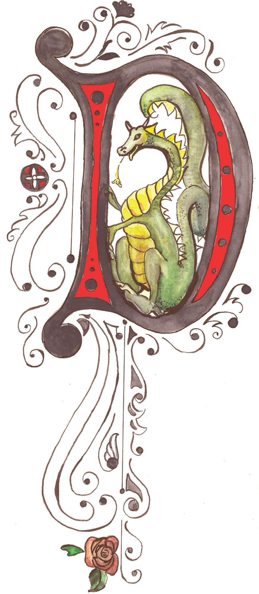
STEP SEVEN Blend the greens with a wet brush to create a smoother finish. Then rinse the brush well and use it to lift some areas of watercolor to create lighter, highlighted spots.
Step-by-Step Project
Victorian-Inspired Watercolor Letter
This whimsical watercolor letter takes a softer approach to illuminated Victorian lettering. Unlike the previous project, it doesn’t tell a story, but it would make a beautiful statement for any illuminated manuscript page.
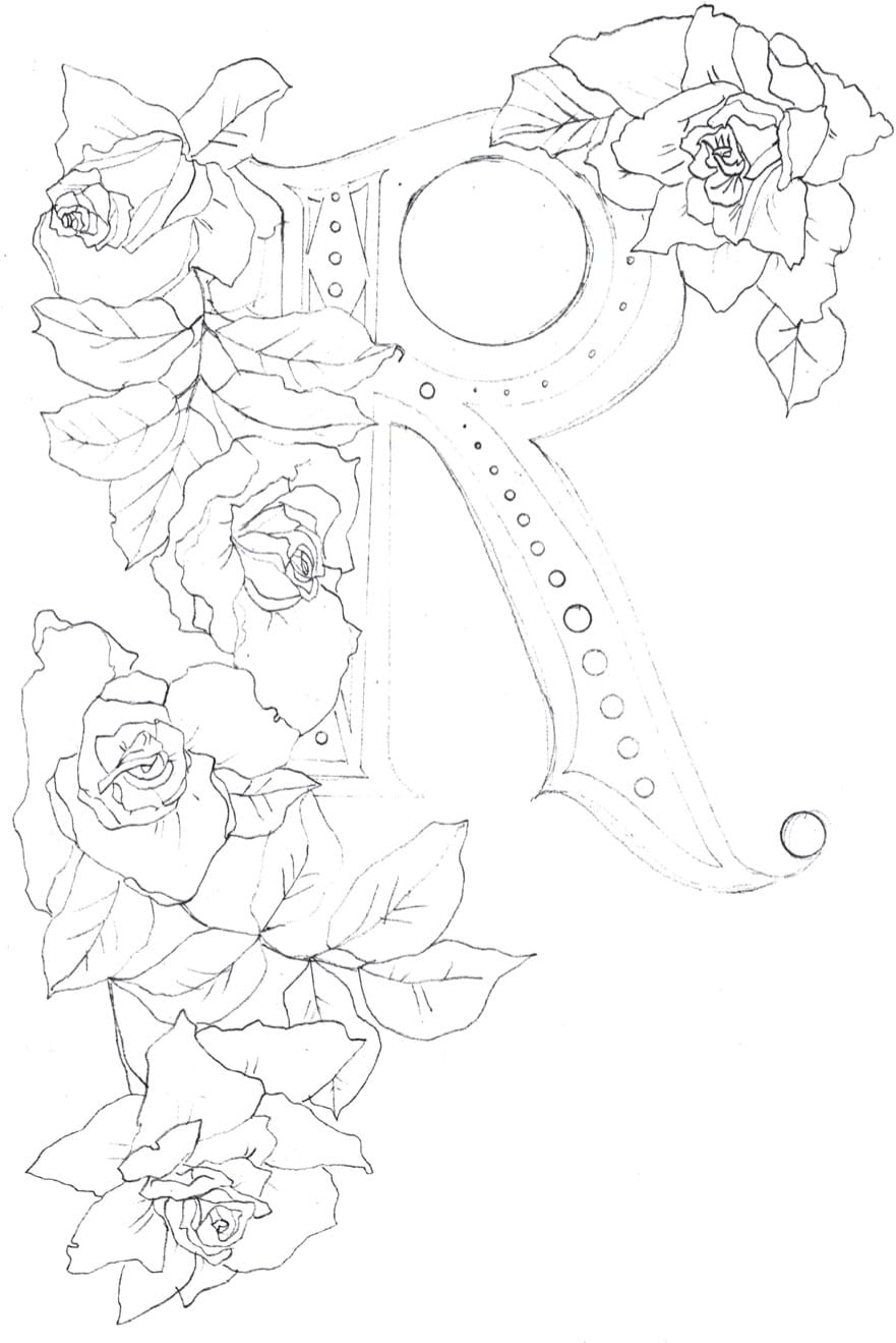
STEP ONE Work out your design on drawing paper first, and then transfer it to watercolor paper. Or you can work directly on watercolor paper from the start. Sketch the letter first, and then add florals or leaves around the letterform.
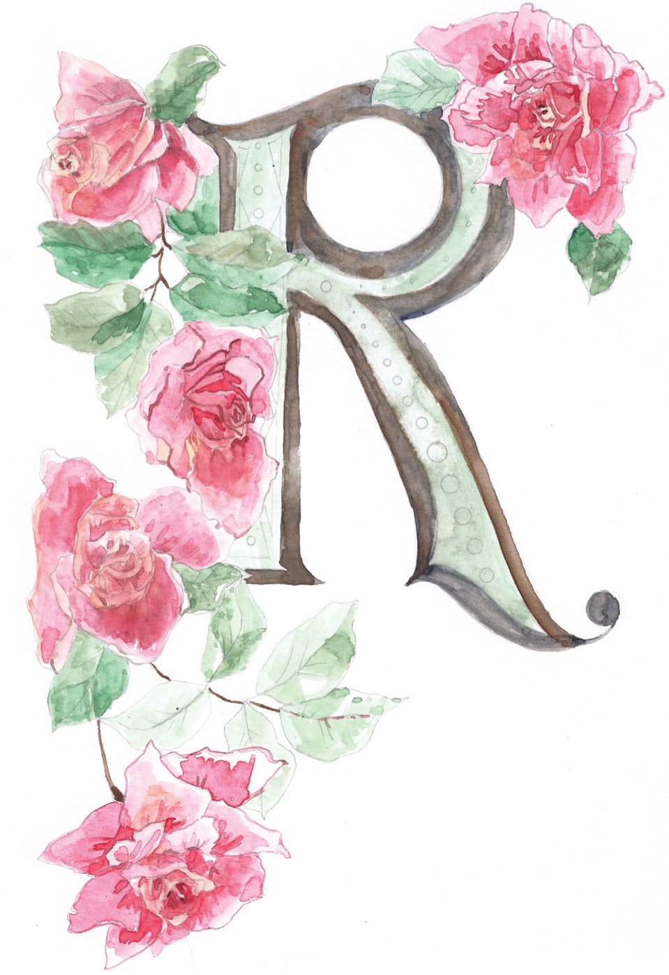
STEP TWO Working on watercolor paper, apply light washes of color to fill the letter and its outline. Add initial washes of color to the florals. Remember that watercolor paint spreads easily, so work on dry paper to keep the paint within the outlines.
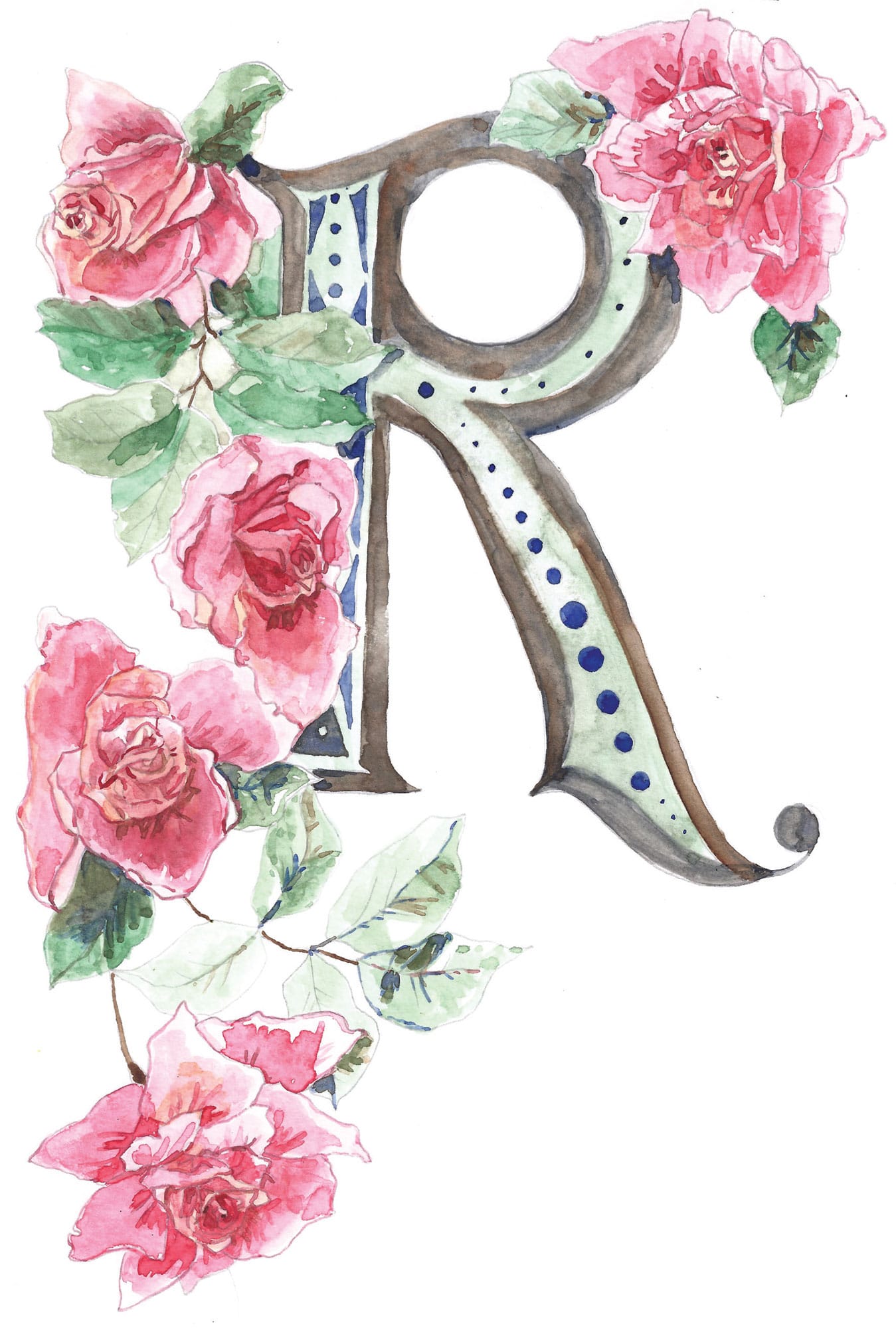
STEP THREE Allow the paint to dry and then add final touches and additional washes to define and darken the florals. Note how I used the same blue watercolor paint from the letter embellishments to add some shadows in the florals—using the same color throughout unifies the piece as a whole.

Art Nouveau Capitals
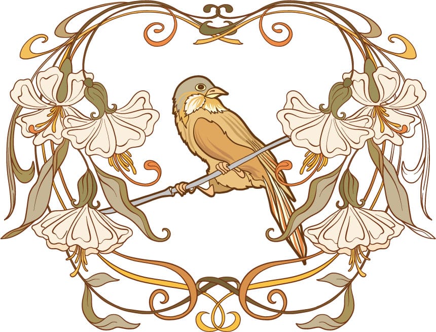
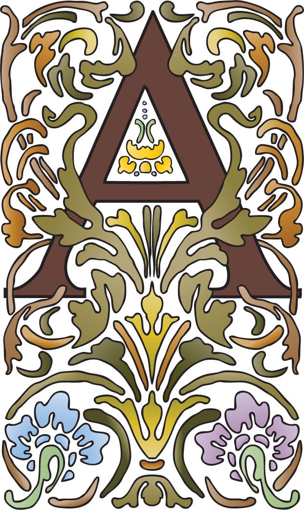
A POPULAR ART STYLE FROM THE LATE 19th-to early 20th-century, Art Nouveau design is known for sinuous, flowing shapes and elegant flora and fauna.
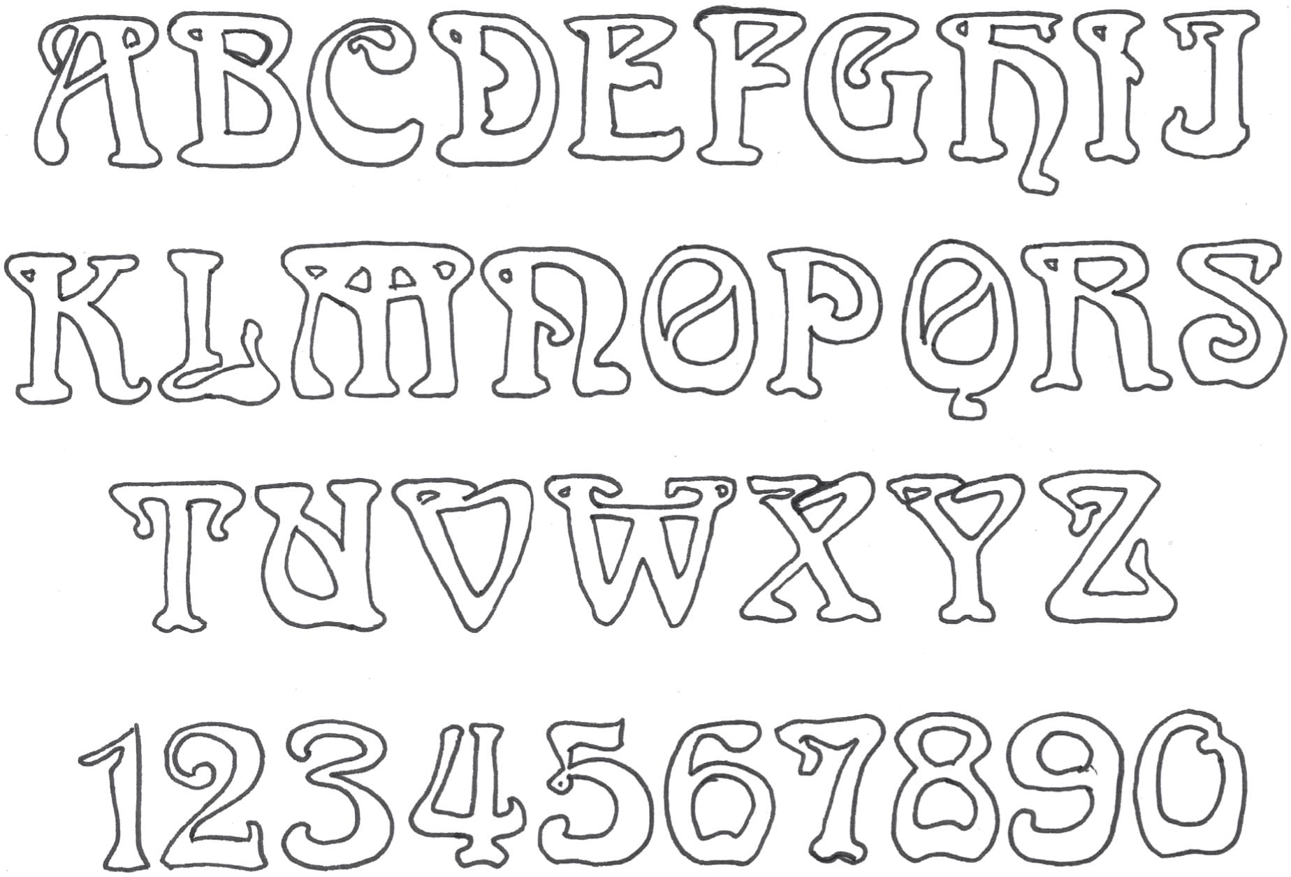
Classic Alphabets
Let’s begin by looking at some letters that are classically Art Nouveau. I drew these letters from quintessential Art Nouveau typefaces. Note the high and low crossbars!

Creative Exercise
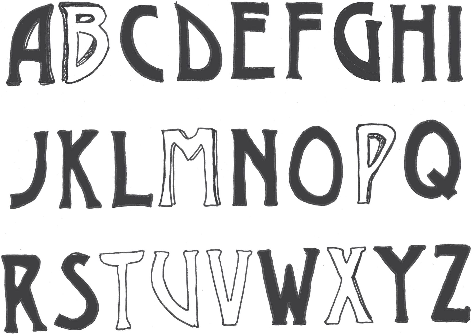
Böcklin Hand
These letters are a simplified version of a typeface designed in 1904 by the Schriftgiesserei Otto Weisert type foundry. It was named for a symbolist painter from Switzerland, Arnold Böcklin.
Sometimes, fixing a lettering mistake involves getting creative. Can the mistake be changed into the letter it was supposed to be? For example, if you wrote an “I” but needed a “d,” perhaps the semicircle of the “d” can be added to the stem of the “I”.
Working with Color
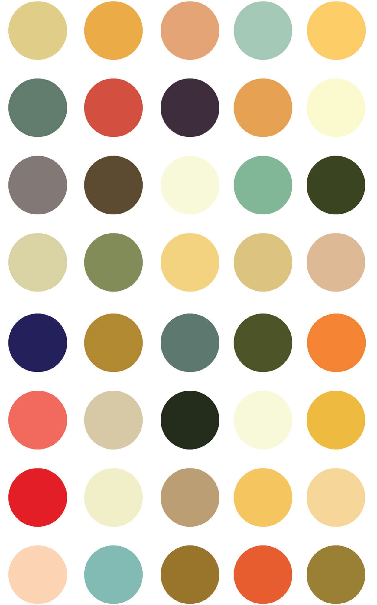
The Art Nouveau style generally employed a limited color palette to give the art unity and cohesiveness. Try replicating one of the Art Nouveau alphabets shown on the previous pages. Then use paint or markers to add color to your work using the historically inspired palette below as a guide! Turn to here for step-by-step instructions for creating a Böcklin-inspired letter.
Step-by-Step Project
Embellished Art Nouveau Letter
Select a letter from the alphabets shown here or here, or follow the steps below to create Böcklin-inspired “J.”
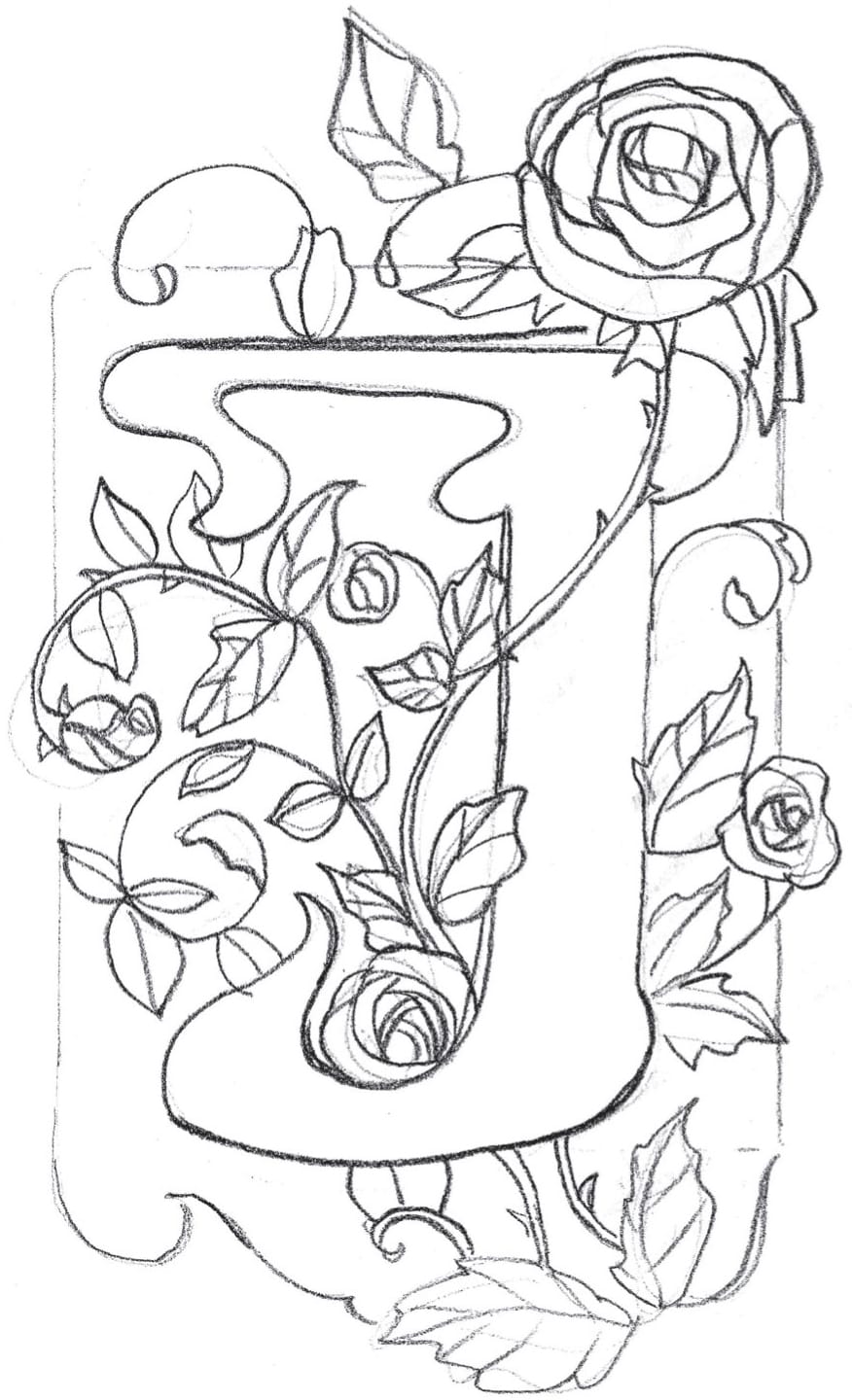
STEP ONE Sketch the letter in pencil, and then add foliage, such as roses that weave in and out of the letter. Border the letter with a frame. In keeping with the Art Nouveau style, keep all the corners round.
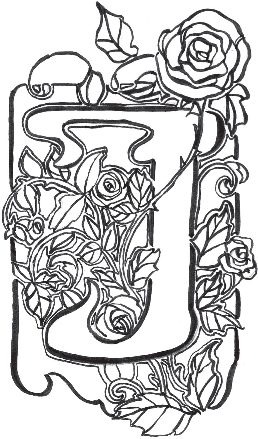
STEP TWO Transfer the sketch to a clean sheet of paper and outline in heavy black to create the Art Nouveau flavor we are looking for! I use a black Tombow® lettering pen, because it allows for pleasing thick-and-thin line transitions, which add interest.
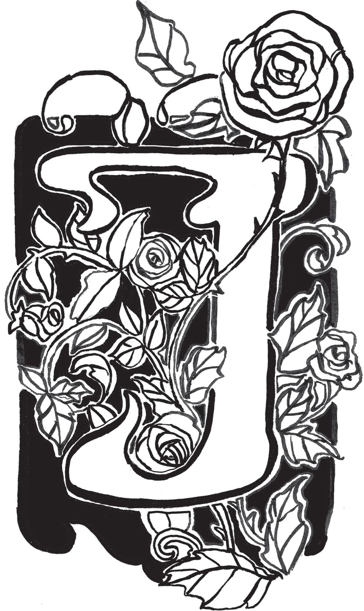
STEP THREE As you outline, imagine a stained-glass window—all the shapes that make up the piece are separate pieces of glass. That’s the look you want to achieve.
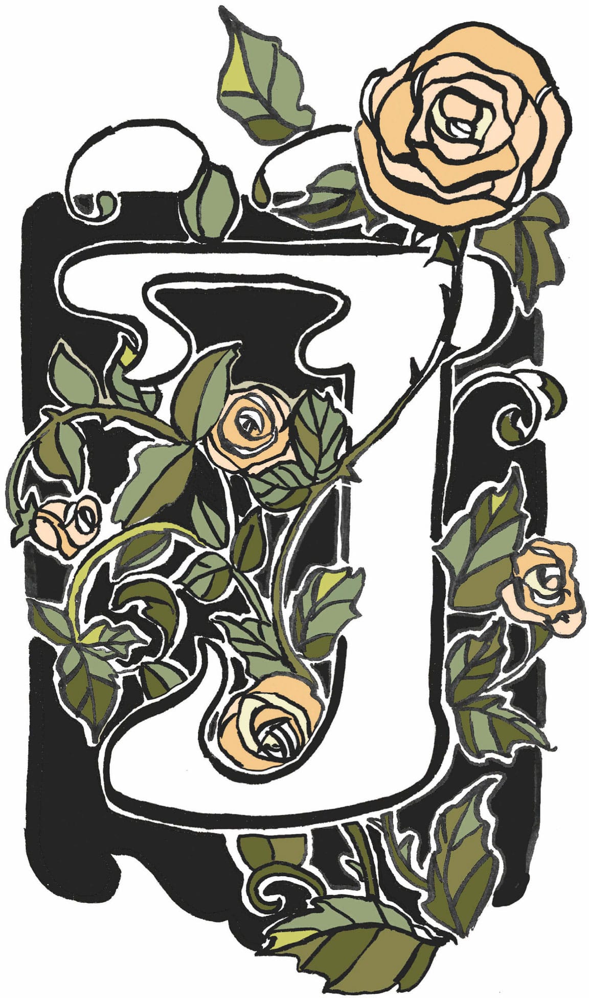
STEP FOUR Now add color. You may scan the inked page and import it into a photo-editing program or color by hand using paint or markers. Add color from an Art-Nouveau palette (see here), adding different shades of the same colors to the leaves and petals for depth and interest.
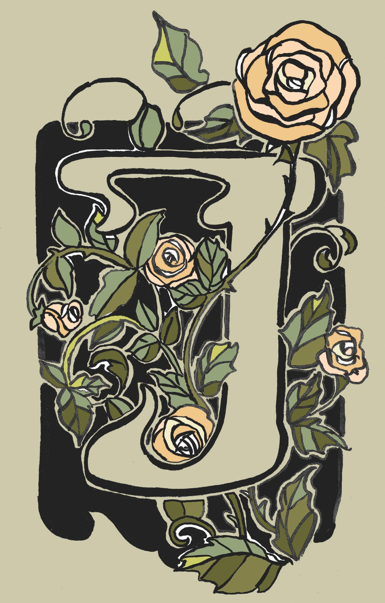
STEP FIVE For a finishing touch, I add a pale gray-green background.

Gothic Style
DURING THE GOTHIC PERIOD, THE DEMAND FOR BOOKS GREW AT A FAST RATE, and private book artisans began using letters to decorate elaborate books. The elegant main letter would highlight the beginning of a passage, coordinating with thick, intricate borders and illustrations. Each page was a veritable work of art.
For our look at Gothic letters, we will focus uniquely on the Lombardic style. English calligraphy scholar Edward Johnston (1872–1944) gave these rounded “Uncial-flavored” letters this name.
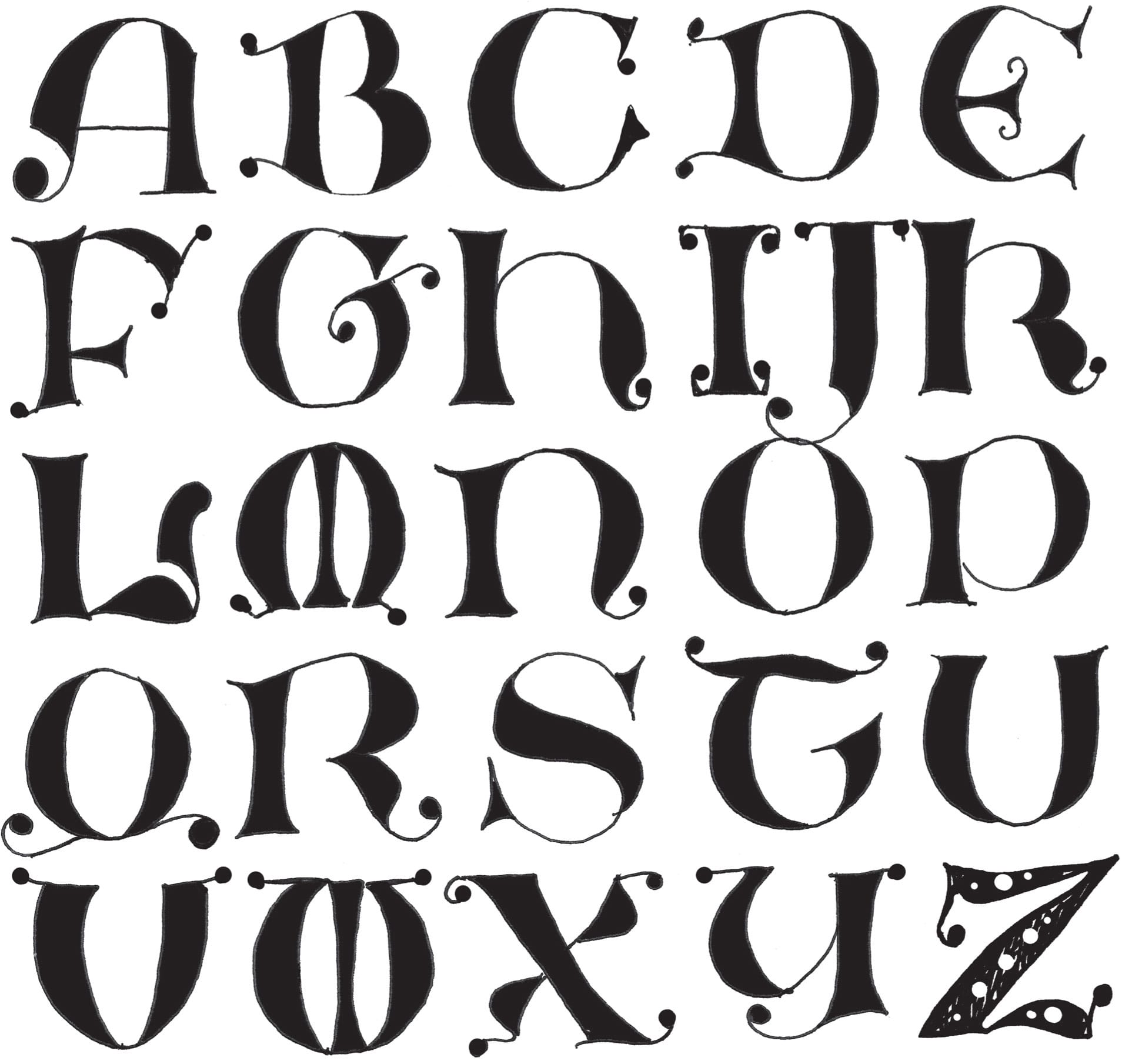
Lombardic Alphabet
This Unical-inspired alphabet is fun to embellish. Make dots large (as in the “A”), small (as in the “X”), or leave them off altogether (as in the “P”). Try dressing up the serifs with curlicues (as in the “E”).
Basic Gothic Forms
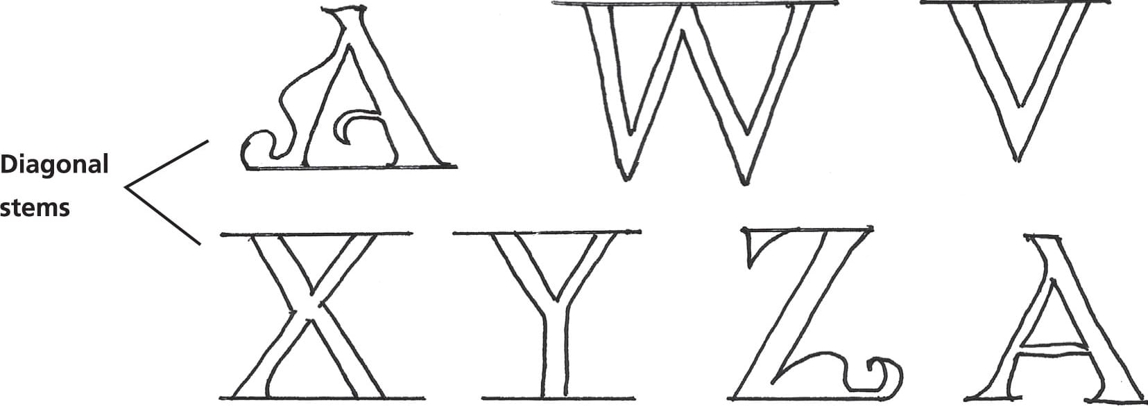
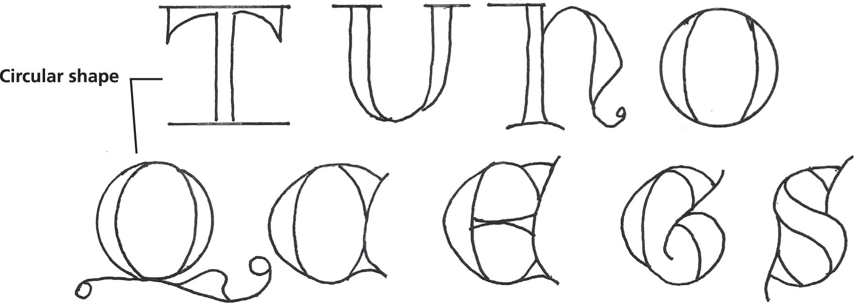
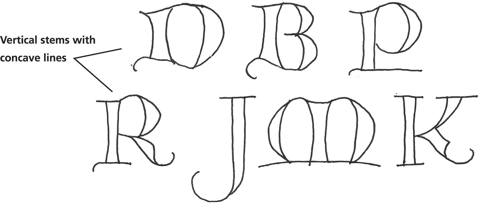
The letters below are grouped according to similarities in construction. In the top row, the letters have straight diagonal stems. In the second group, the letters have straight vertical stems. The third group is based on the circle. The letters in the fourth group feature a vertical stem with concave lines.

Creative Exercise
Embellish a Gothic Letter
First, select a frame for your letter, choosing a shape that fits the letterform. Add color to the negative space inside the frames, if desired. Filling the frame with color is an excellent way to emphasize your letter.
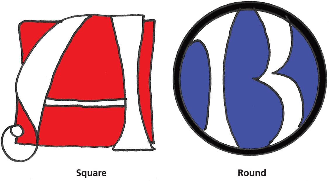
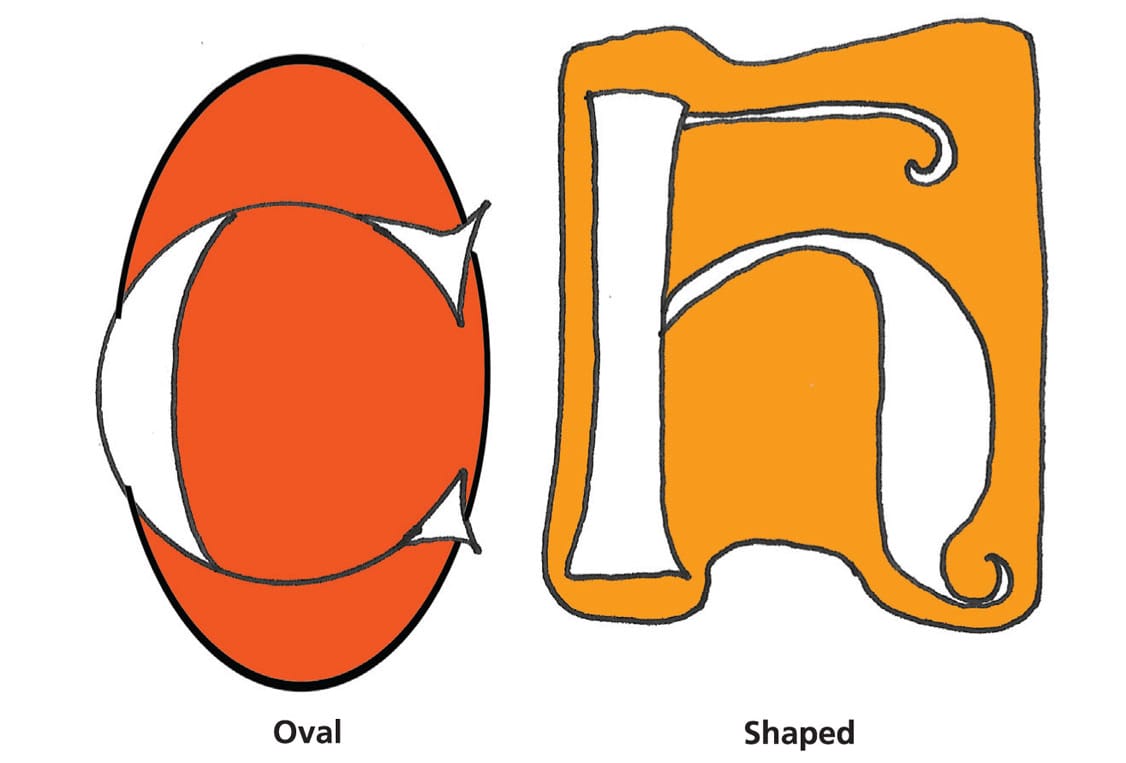
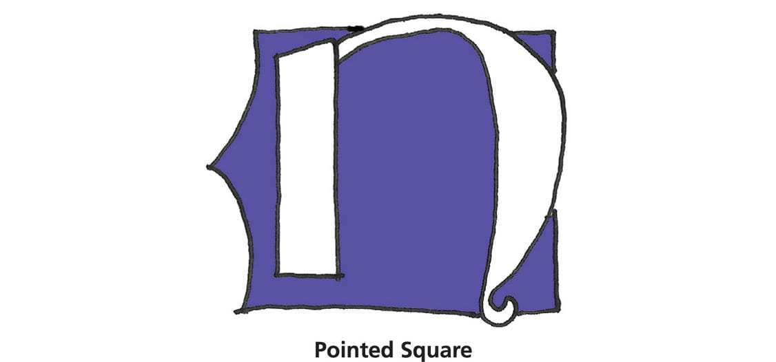
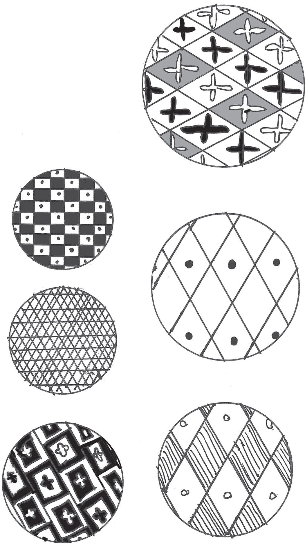
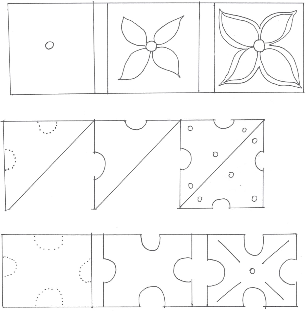
Gothic letter frames are often filled with intricate patterns. Shown are some pattern ideas, including stripes, diamonds, checks, and harlequin patterns!

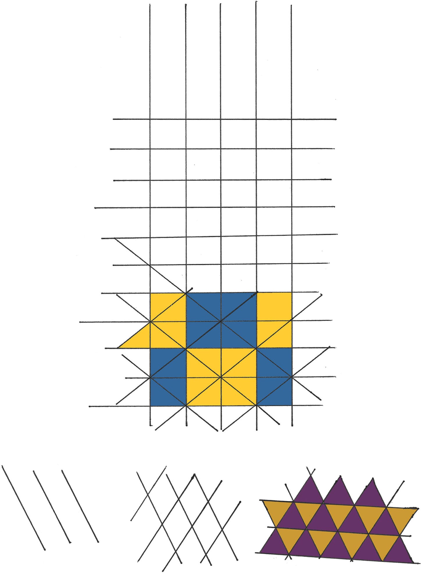
Use grid lines to help you create interesting diamond and triangle pattern designs.
Once you’ve chosen a letter and have the frame and background in place, accentuate the letter with embellishments and designs of your choice.
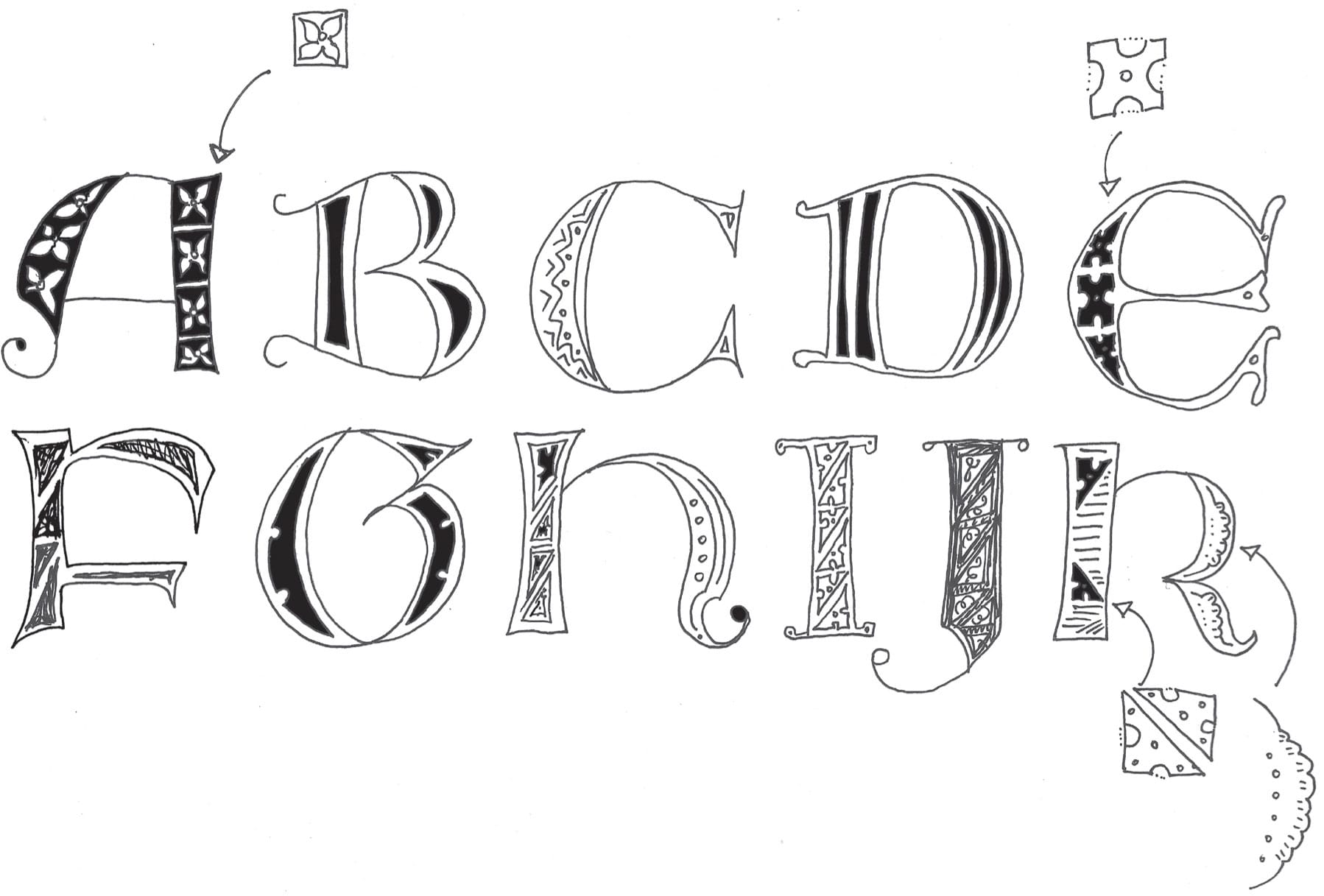
Below are four common gothic letter decorations. Even seemingly complex designs are quite simple if you just take it step by step.
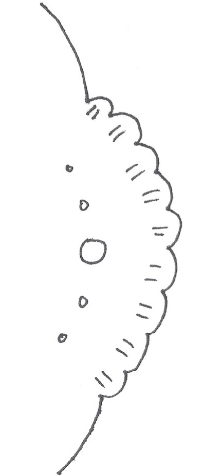
A scallop shape is perfect for embellishing curved parts of a letter.
Adding Color
For an authentic historical look to your letters, choose bright red (such as cadmium red), bright blue (such as ultramarine blue), white, black, and gold.
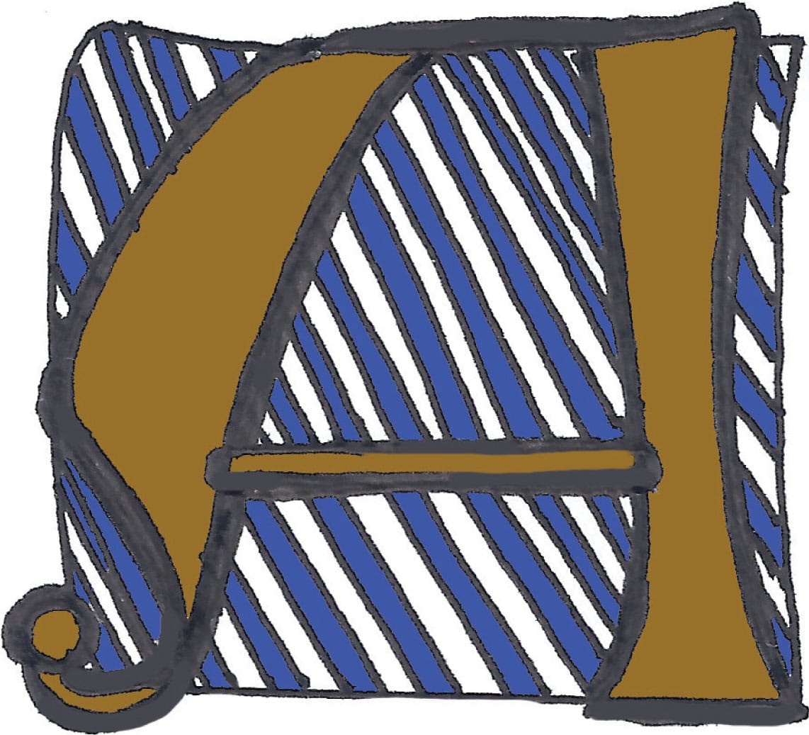
Here, the letter “A” is enclosed by a loose square shape. I added freehand stripes to the background and colored them in with bright blue. I filled in the letter with a golden shade.
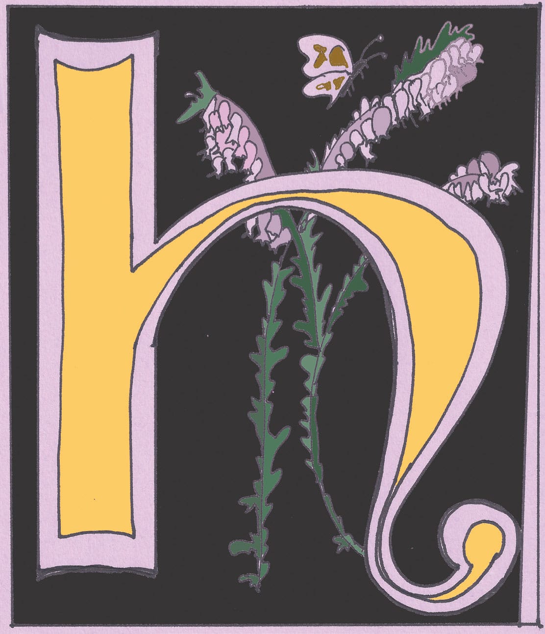
This letter was inspired by floral medieval letters. I drew the letter on lavender paper with a marker. Then I filled the square frame with solid black to make the letter and flora really stand out. To decorate the background, I added heather florals and greenery.
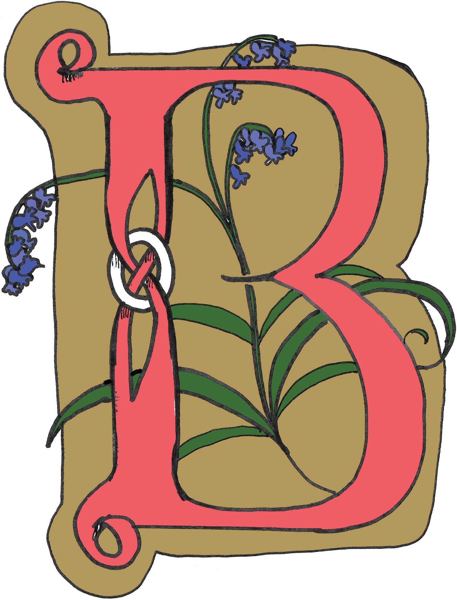
Also inspired by floral medieval letters, I drew this letter “B” with a marker, and then scanned the artwork into my computer for coloring.
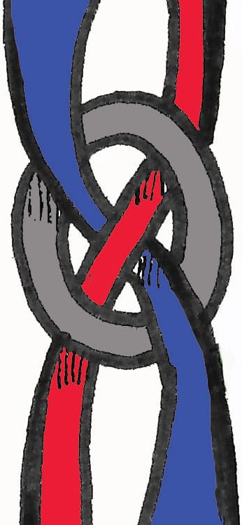
Use this woven Celtic knot for the stem for any letter you would like to have some additional flair. To create the knot look, carefully draw the strands in the correct position!
Step-by-Step Project
Gouache Floral Letter
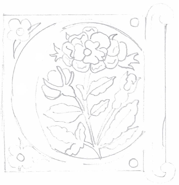
STEP ONE Choose a letter from here. Lightly sketch your letter using an HB pencil.
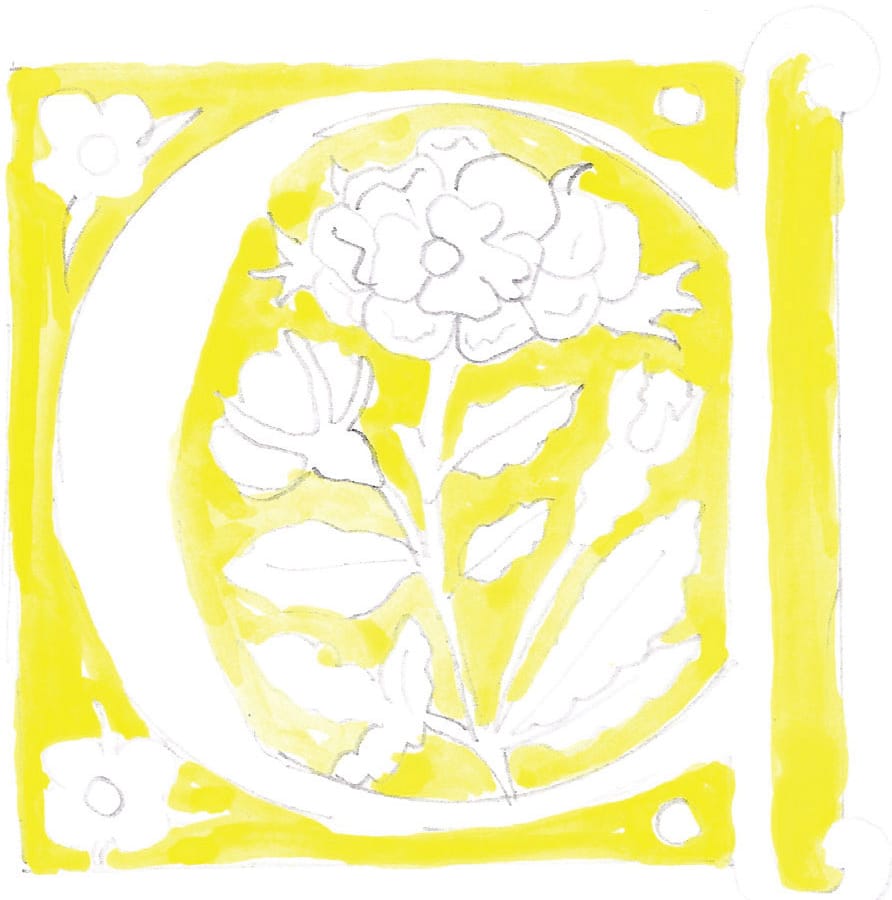
STEP TWO Use gold gouache to replicate gold leaf. To make the gold really pop, first add a layer of yellow.
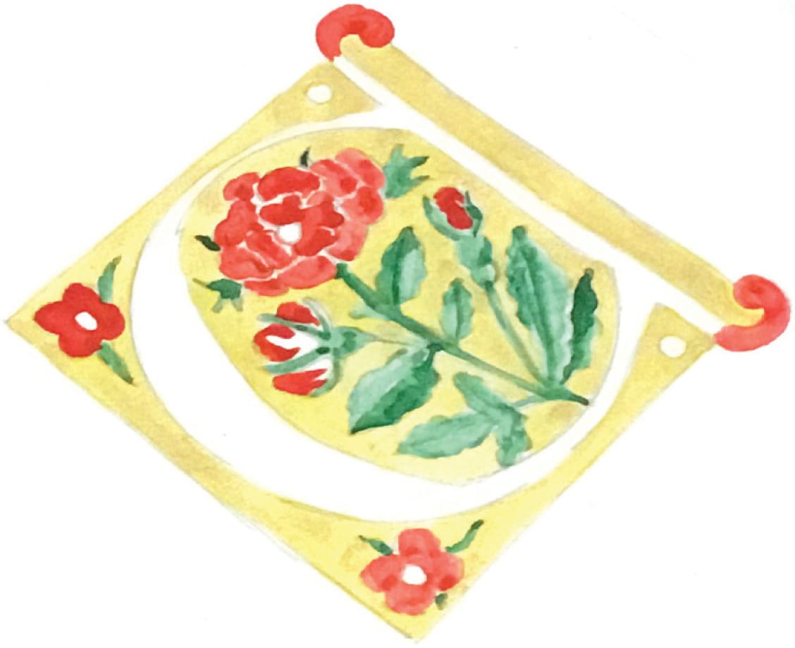
STEP THREE Once the paint is dry, apply a layer of gold gouache. Add vermillion red to the petals, leaving space in the rose to show the details. Paint the leaves and stems with bright viridian green washes.
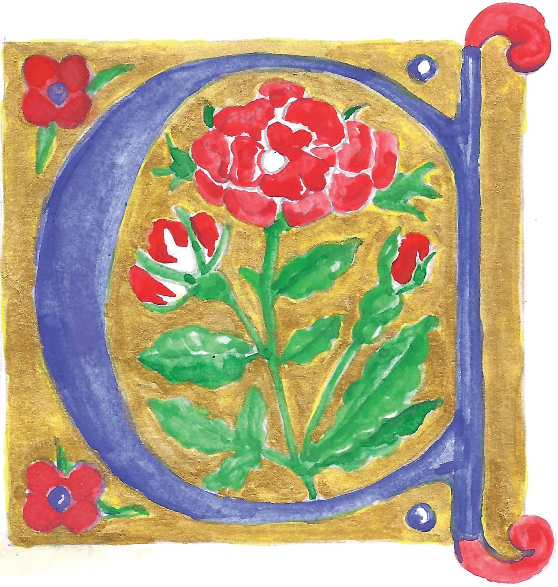
STEP FOUR Next apply cobalt blue to the letter followed by another layer of gold gouache.
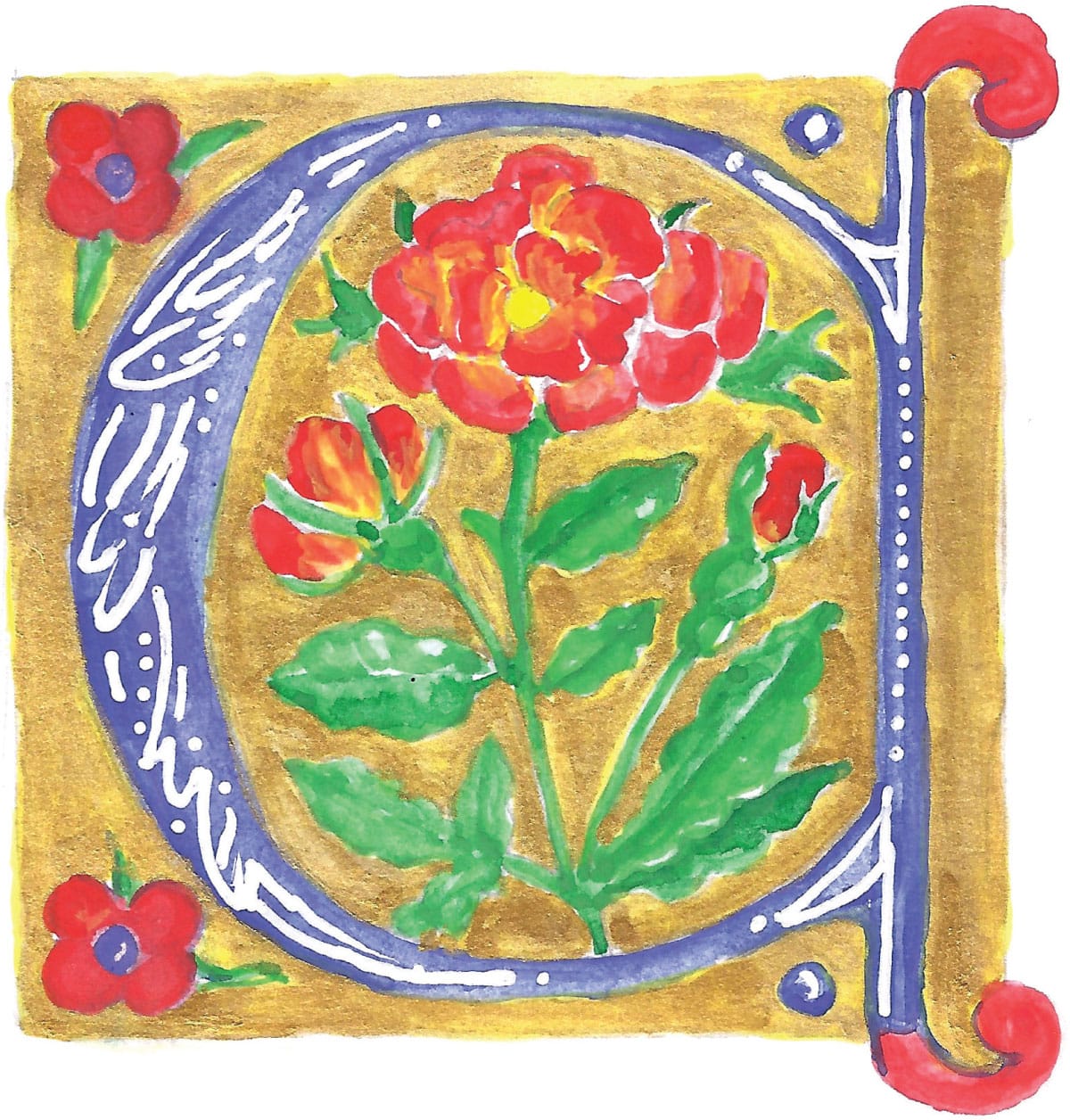
STEP FIVE Now add in white embellishments to the letter body using a fine paint pen or a small size 00 paintbrush. Add a bit more yellow gouache for highlights.
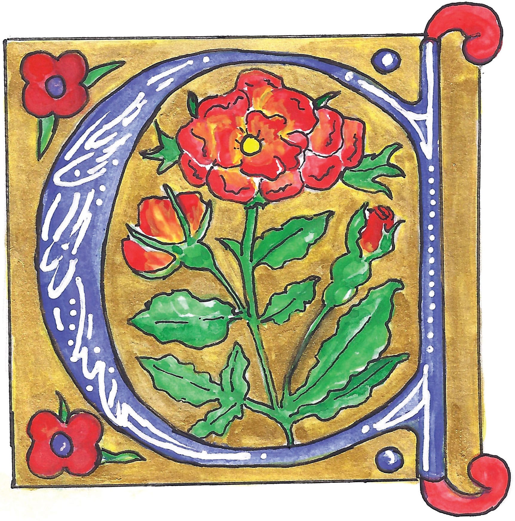
STEP SIX Outline the letter with a fine black pen to make the various elements of the letter pop!
Voilà! An elegant homage to these beautiful floral lombardic letters.
Illuminating
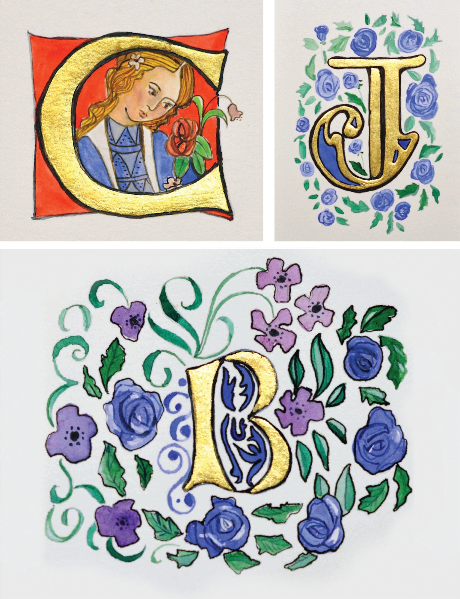
I created these letters with gouache and 24-karat gold guild. I used special guild glue to affix the gold leaf to the paper prior to adding paint.

Creative Exercise
Illuminated Manuscript Page
Choose a passage from a favorite book or poem; then use your pointed pen to create a large decorative capital letter, followed by the text. Below are some ideas to get you started.
