COLOUR
Who says I don’t do colour?
You might be surprised to see such a large section on colour in my book. Although I’m known for my love of taupe and neutral palettes, I’m not afraid of colour. In fact, I use it a lot, as colour adds chic, wit, warmth and drama to any scheme. Nevertheless, it still always amazes me how its introduction can completely change a room, sharpening it and giving it an additional bolt of energy. Like a pinch of fragrant saffron enlivening plain rice, the right shade can spice up a neutral scheme and bring out the very best in all the ingredients. Used on the inside of cabinetry, like a bright silk lining inside a sober suit, colour can surprise and delight; when employed as, perhaps, luxurious deep-pile velvet upholstery on a star piece of furniture, colour can sing and make a statement. From sulphur yellow, burnt orange and lipstick red to berry tones or the palest rose and the shades of the sea, colour has an unrivalled capacity to be subtle and serene or outrageous and bold.

In an old apartment of mine, a yellow wing chair by Squint provides a pop of colour in the otherwise monochrome interior, standing out against the black metal staircase and Ring Screen, designed by Kelly Hoppen, which separate the living space from the dining area behind.
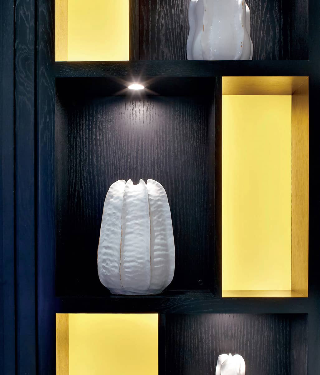
Colour can also be added in more subtle ways than introducing a yellow object, fabric or paint to a room. In this display cabinet warm LED strips have been used to light niches within the shelving system, transforming them into soft pockets of light that look yellow; the textural ceramics in the adjacent niches are lit up by 12-volt halogen spotlights.
SULPHUR
Yellow is a striking colour that can be used in many ways and shades to accent different rooms in the home, from the warm glow of artificial light, to the glint of a gilt picture frame, to the bright pop of yellow lilies.
The colour of sunshine, spices, sand and spring flowers such as primroses and daffodils, yellow brings instant warmth or an uplifting splash of vibrancy to interiors. The clearer, fresher shades work well in modern, clean-lined spaces, while the dirtier, burnt tones of mustard, yellow ochre and gleaming amber glassware suit the retro mood of mid-century style. Warm creams and buttery tones are welcoming and easy to live with, while dashes of gilt and soft gold tones complement classic interiors and antique pieces.
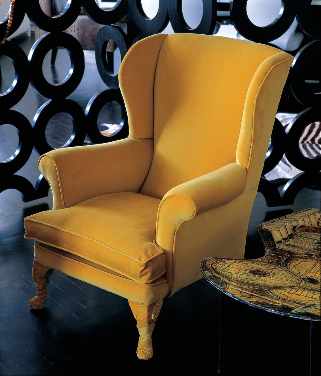
The classic wing chair by Squint is covered with bold yellow velvet, right down to its wrapped legs.
A living room decorated in buttery shades of cream and yellow ochre is a warm and welcoming space.
Yellow arum lilies, in vases by Anna Torfs, accent this seating area, tying in with the paintings by Pia Fries.

The yellow-gold tones of the mesh curtain work well with the polished stone floor and inset taupe carpet.

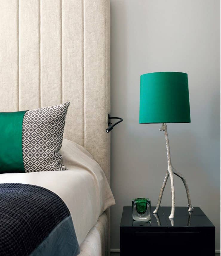
A pair of yellow velvet headboard panels and cushions, along with the patterned linen La Fibule stool, accent a monochrome bedroom.

Cylindrical glass pendant lights glow warmly against dark wood shutters.

The painted interior of a Moissonnier cupboard adds unexpected colour.
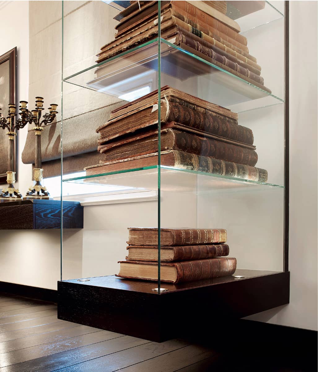
Colour can come from unusual sources, such as the foxed pages of antiquarian books in a glass cabinet.

Custom-made shelves have been lit from underneath with LED strips, bathing them in warm yellow light.
Vistas from one space to another are an important consideration. In this monochrome hallway, where the matt wood surface of a pair of oversized African drums is juxtaposed with the glossy dark floor, the eye is drawn past the white-painted wall by the hints of colour in the living room beyond, namely the yellow sofa and curtain and the green foliage displayed in a glass bowl on a plinth.

Every detail counts towards the big picture that is formed, such as the fine maple veneer trim on these sleek black-lacquered kitchen drawers, which were designed with classic Japanese style in mind.
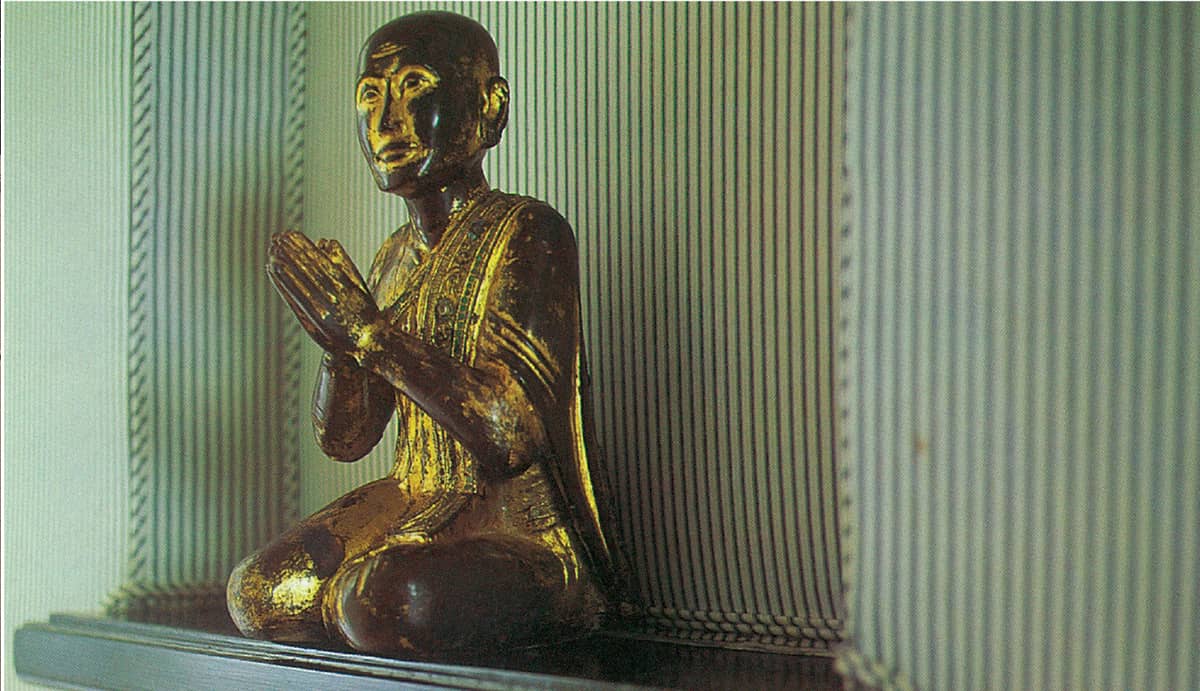
The unusual backdrop to the gold statue of a praying Buddha is utilitarian mattress ticking, which has been used as an inexpensive wall covering.

In the same Japanese-influenced kitchen shown above, uplighters have been concealed in the ceiling, creating a yellow-toned cruciform feature in each corner, designed by Kelly Hoppen.
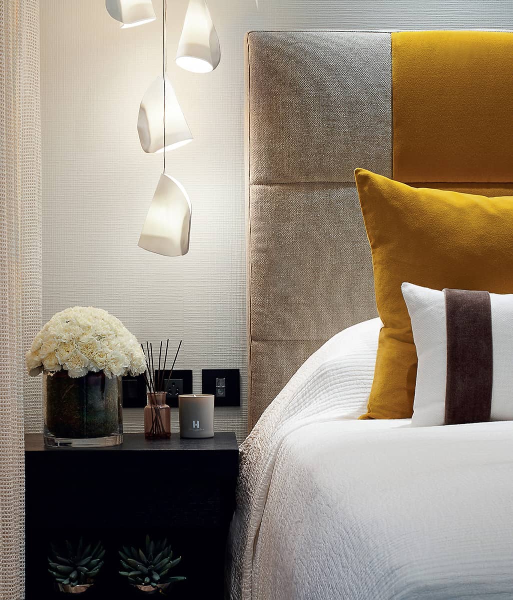
A detail of the bedroom shown reflected in the mirror on a previous page (here) clearly shows the variety of textures at play – from the white mesh curtain, textured wallpaper and bedcover to the combination of linen and velvet, dark wood, glass and white porcelain Bocci lights. The result is a warm, layered room, even with only a simple colour accent in the form of the yellow velvet from Abbott and Boyd.
CITRUS
Bright and zesty orange makes a great accent for a white room scheme, making the mood light, airy and fresh, while burnt orange is a pleasing partner for all shades of taupe. Natural wood with gold or taupe undertones is enhanced by orange accents, which can be introduced in the form of glassware or ceramics, soft furnishings or flowers, all of which can be changed easily to alter the mood of a room. Painting a small area, such as a stripe along a wall or a runner along the floor, or the inside of alcoves, niches or shelves, is a clever and restrained use of colour. A painted cupboard interior will also surprise the eye with an unexpected pop of fleeting colour when the door is opened.

Flowers are a simple but effective way to introduce an accent colour, and, of course, they can easily be changed to create a different mood; here, orange rose heads have been scattered in the base of two glass fishbowls and placed on the glossy lacquer surface of a bespoke dining table (see also here).
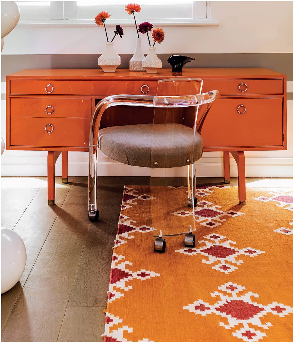
The bright orange tones of the lacquered desk in this bedroom (see also below) are echoed in the kilim from The Rug Company and the zinnias in vintage white ceramic vases.

Other than the bowls of roses, colour is brought into this dramatic dining space – where the stand-out piece is the cascading chandelier of mirrored-glass droplets from Beau McClellan – by the orange-painted alcoves in the custom-made bookcase by Moissonnier.

A palette of white and taupe, with orange accents in the form of a bed runner, cushions, rug and glassware, is uplifting for a bedroom.

All-white schemes work well with accents of bold, bright hues, such as this orange silk cushion and the rainbow of colours in the Moons artworks by Luca Missoni on the wall behind.

At the other end of the same symmetrically designed space, a gridwork of shelving is used to display a collection of vessels and glassware from Bergdorf Goodman; the orange cushions and arum lilies underline the light, uplifting feel of the living room.
Matt burnt-orange velvet plays against the sheen of black sheepskin.

The dark wood floor of this entrance hall is washed with warm light, while ceiling spots highlight the tan leather of the Christian Liaigre benches.

Orange Squint chairs with taupe and black have a harmonious strength, perfect for this mezzanine library.

From above, orange spiral stairs look like an organic sculpture, while lighting enhances the warm tones and grain patterns of the treads.

A monochrome room is instantly changed by the addition of an orange cashmere runner and cushion band, and a display of kumquats.

A carefully curated combination of wide and narrow stripes in spice tones makes a graphic statement.

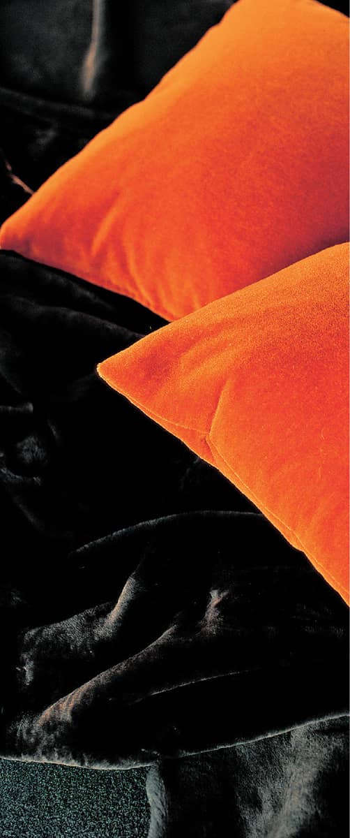
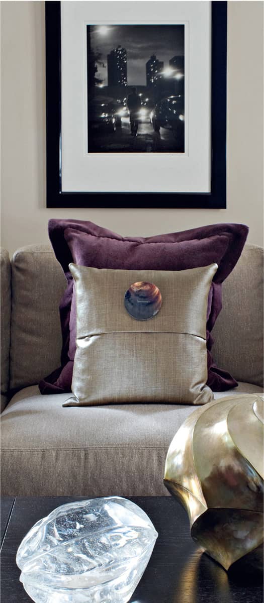
An orange velvet cushion with a mother-of-pearl button brings a pop of colour to a taupe linen sofa.

A display of orange arum lilies in clear glass fishbowls is striking against the wenge console table.
LIPSTICK
The colour of passion, red is an arresting hue that brings energy and vibrancy to a room. It is undeniably glamorous – think of the teasing flash of a Louboutin sole on a stiletto, a crimson lining in a tailored jacket or a slash of scarlet lipstick. From bright, bold red to deep, rich burgundy, this colour makes an eye-catching foil for monochrome palettes. In combination with white it is fresh and bright; set against black, it is bold and dramatic with a distinctive Eastern feel; mixed in with shades of taupe, grey and cream, it is warm and chic.

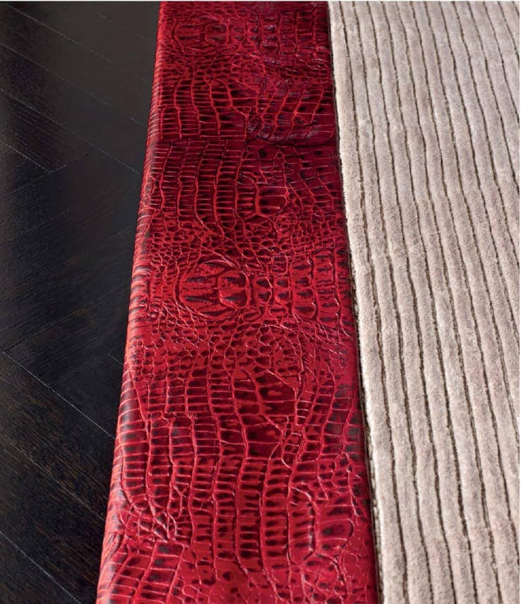
Red suede Gobbi club chairs by Dennis Miller with a row of Flibuste tables by Christian Liaigre form one of two seating zones in an open-plan living area (see also second following image). They are positioned on a ribbed silk rug bordered with red embossed leather, in contrast with the dark parquet floor (see next image).


The simple lines of a black-lacquered coffee table on a red-striped Kelly Hoppen rug emphasize the grid.

Beneath Stuart Redler’s artwork, textural red accents are introduced in the form of velvet cushions, glass bowls by Anna Torfs and flowers.

Scarlet velvet and natural linen play beautifully against wood-clad walls.
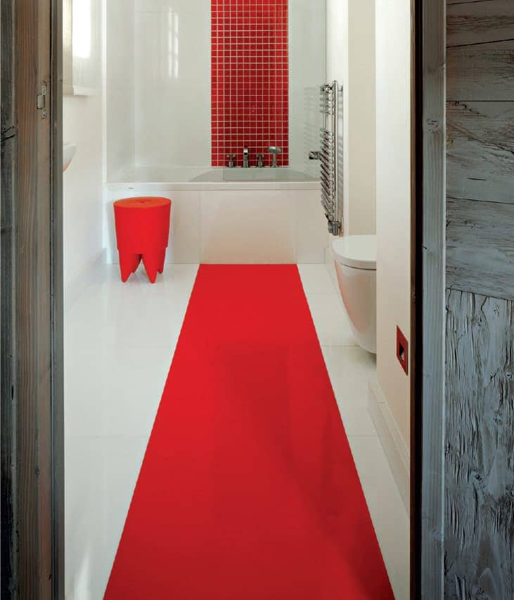
A runner of red Dalsouple rubber set into a white-tiled bathroom floor is continued up the wall behind the bath, in the form of square red tiles, and accessorized with a red stool.

Simple displays of red flowers and berries contribute to the texture and colour story in a taupe bedroom.

A graphic red-and-white, wall-mounted shelf, together with a red leather Massant armchair (see next image), bring seductive glamour to a bedroom.


Scarlet padded velvet gives the Meridiani Belmondo armchairs and footstools a plush feel and is the perfect complement to the grey shag-pile carpet and velvet walls of this home cinema.

Printed red leather and horsehair cushions add texture and colour to a black wenge chair.
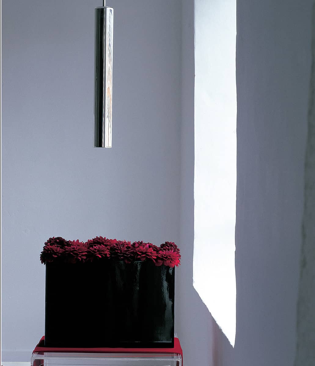
A black lacquer vase of burgundy dahlias on a Perspex table beneath a cylindrical light makes an interesting vignette.

A red Sutra Throne chair by Mark Brazier-Jones brings drama and flamboyance to a bedroom.

A scarlet velvet runner and a silk striped cushion add Eastern-style opulence to a bed.

Crimson dahlia heads in a Perspex tray are simple but dramatic on a black tabletop.

Daniel Kelly’s artwork, Topsy Turvy (2008), brings bold red into this chic dining room, furnished with a Christian Liaigre sideboard and chairs.

Burgundy shot-silk bands make taupe linen cushions glamorous.
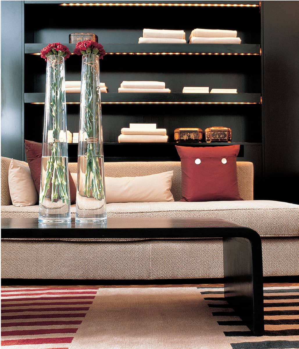
The linear theme of this seating area is emphasized by the striped rug, red cushions and tall glass vases of flowers.
BLUSH
The soft, calming shade of dusty, pastel pink – the colour of vintage silk lingerie – is a colour I have started to use more and more and I have become increasingly fond of it. From subtle touches in the form of blush-pink blooms and sculptural succulents to larger and more permanent accents on furniture and soft furnishings, this gentle hue adds warmth and femininity to a scheme based on taupe, grey or white tones. As with every colour, the texture you choose is all-important: shiny glass, metal or mother-of-pearl add instant glamour; light-reflecting silk velvet, shot silk or lacquer create a luxe, opulent feel; matt velvet, linen or paintwork add understated layers of colour and texture.

A dusty-pink chest of drawers with silver detailing adds cool, feminine opulence to a pale grey and off-white bedroom.

One of a pair of vintage armchairs, upholstered in pinky taupe silk velvet, sits below a photograph by Louise Bobbe, giving my dressing room a Hollywood-boudoir vibe (see also here).

Iridescent mother-of-pearl is one of my favourite textural accents and I often use it in the form of oversized buttons as embellishments on cushions; here, they make a great display in a papier-mâché bowl.

This terrific antique-copper-shelled snail by Robert Kuo is a humorous focal point on a roof terrace.
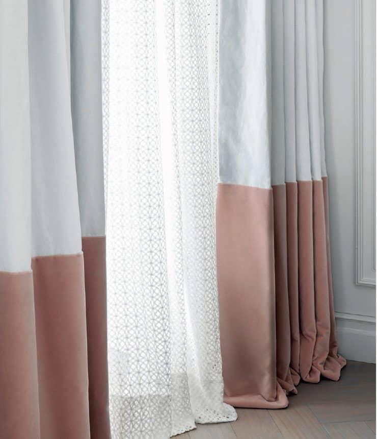
White linen curtains layered over white mesh curtains are given substance with a contrasting wide band of matt blush-pink velvet.
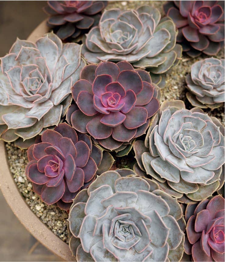
A stone dish of succulents displays a variety of colour tones and is a contemporary way to add texture.
Vases of pale pink roses are sometimes the only accents needed, either as a centrepiece on a dining table (above), or on side tables, as in my bedroom (below).

Grouping similar items always makes an impactful display: nude-pink roses in a cluster of pearlized containers stand out on a black wood shelf.

Nude-pink textured glassware on a taupe glass shelf brings warmth to a marble and stone bathroom.
BERRY
Rich and opulent, purple is not for shrinking violets. It’s a bold, strong colour that instantly brings a luxe feel to a room and is especially effective in sumptuous fabrics such as velvet, leather, satin and silk. In its purest form, purple and blackberry tones make fantastic partners for dark charcoal, silvery or smoky greys, black and white, while deep plums and aubergines have a subtler effect and are perfect complements for rich mahogany shades, natural wood and taupe tones. Mother-of-pearl, bronze, glass and glossy black finishes are all welcome additions in such colour schemes.
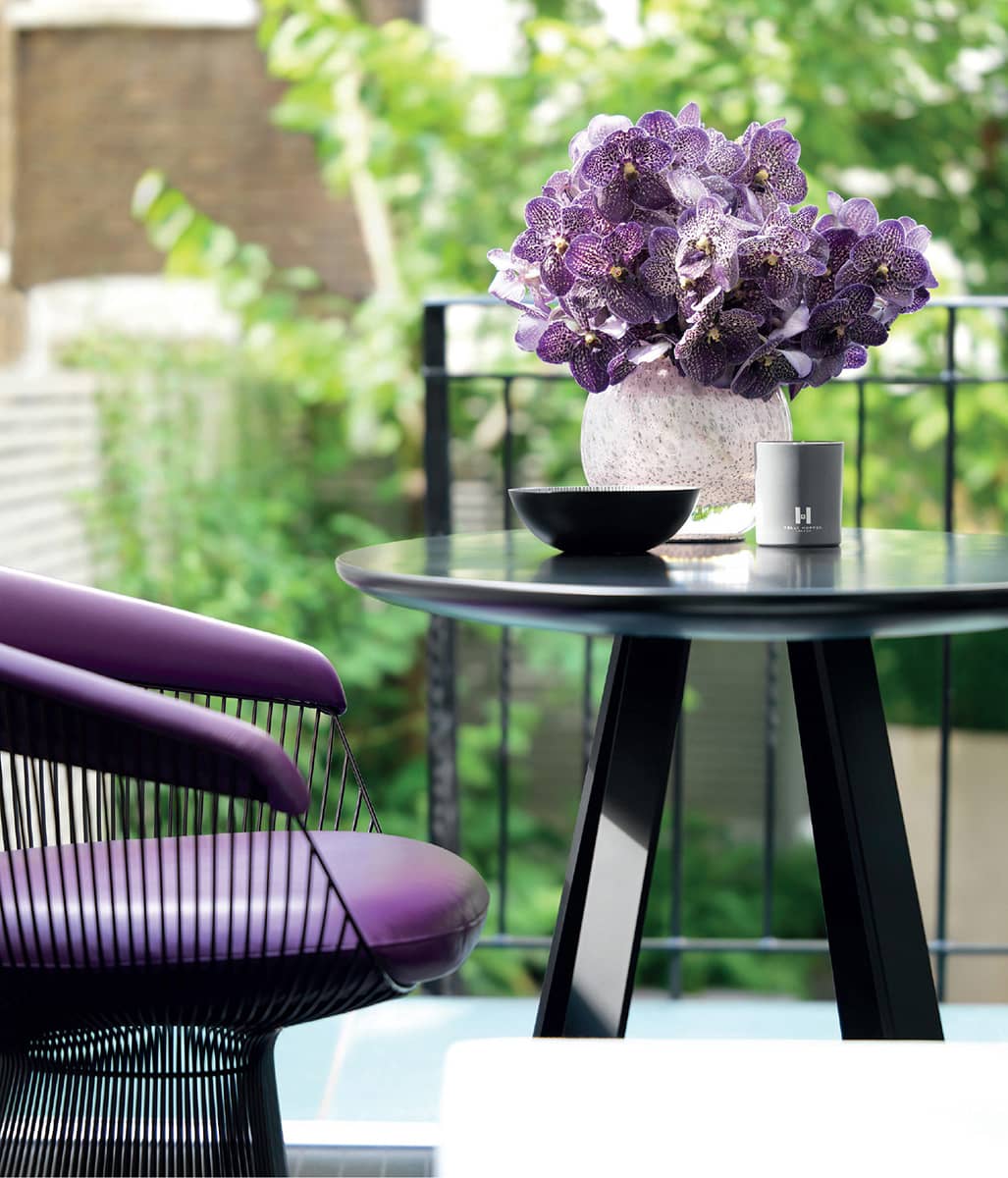
Purple orchids echo Warren Platner’s leather Knoll chair.
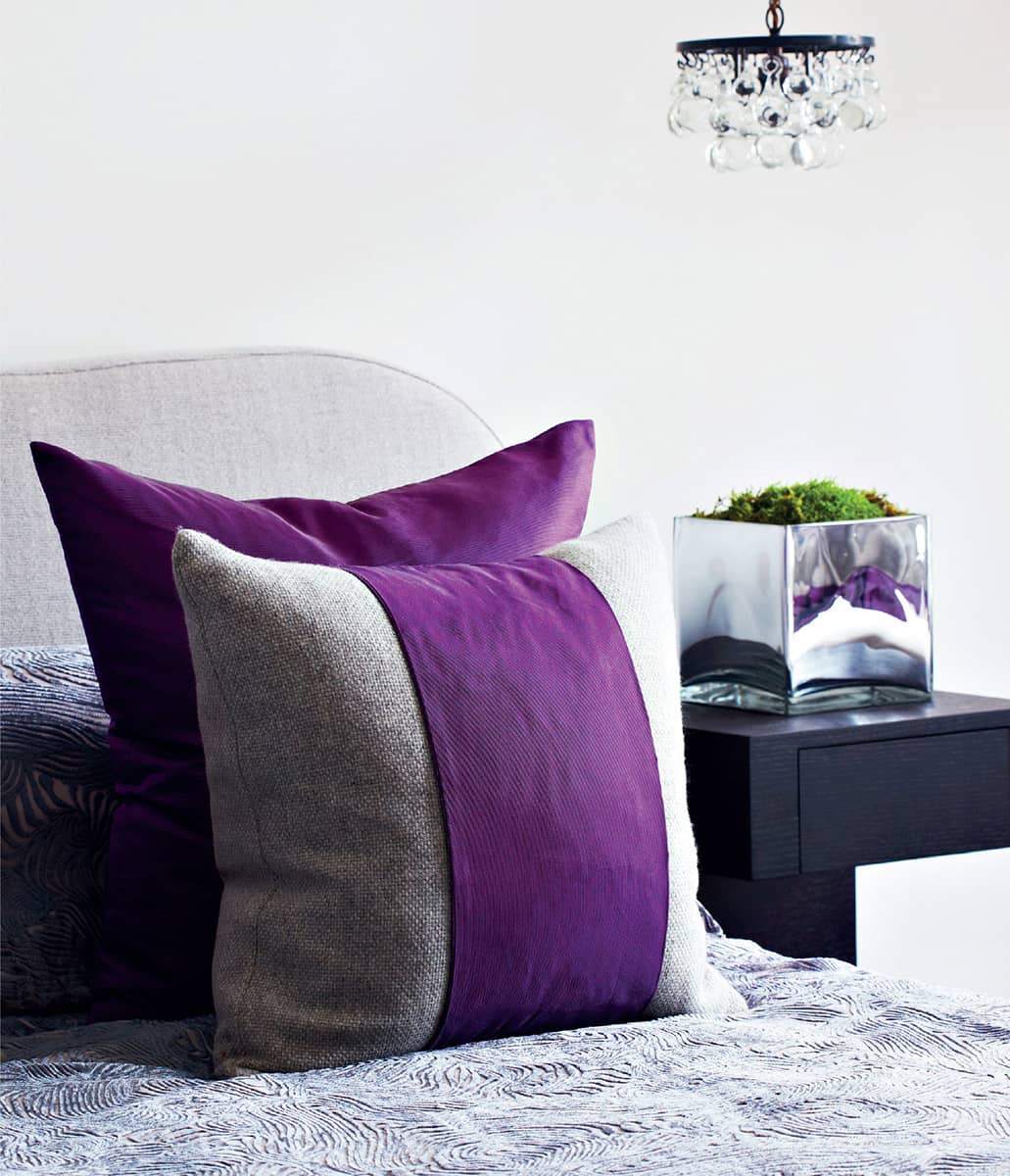
Purple velvet complements natural linen and grey textured velvet in a bedroom.

A violet silk cushion adorns a daybed draped in white voile, a light counterpoint to the studded wenge cabinet from David Gill.

Plum glazed-linen upholstery, a velvet band and a leather rug border are tonally in tune with a taupe carpet and linen cushions.
Similar textures and tones are at play on another sofa, but in different proportions.
Bronze floor lamps with glossy black shades throw light on a taupe sofa with purple velvet cushions.
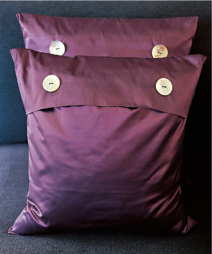
Plum cushions of silk organza with mother-of-pearl buttons add lustre to charcoal upholstery.

A purple leather bolster complements a dark grey linen bench.
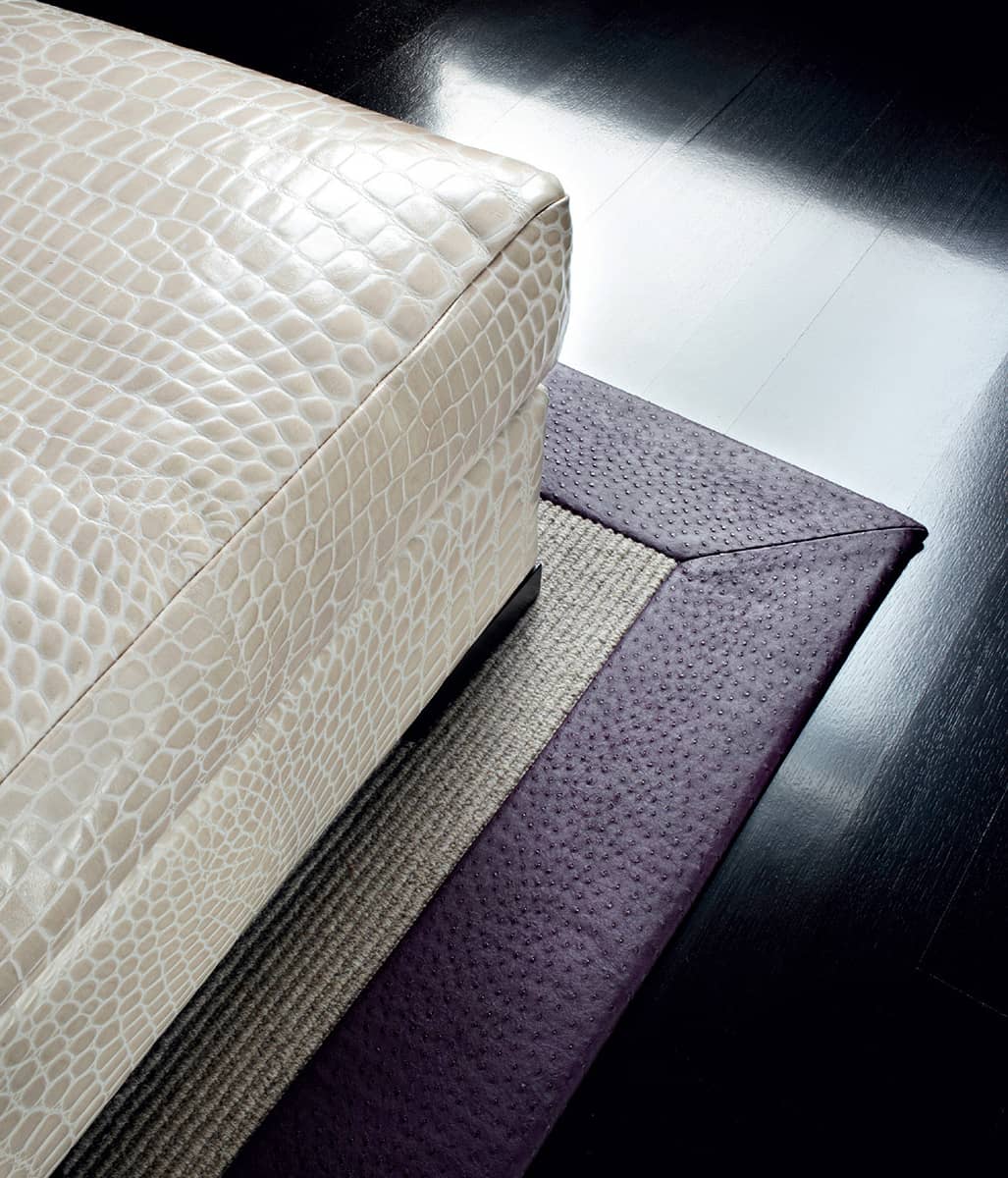
Leather rug borders are a great way to contrast colours and textures.
OCEAN
From bright turquoise and aquamarine to shades of almost grey and blue, ocean colours encompass almost as many tones as the sea itself: the clear turquoise of tropical waters under a bright blue sky, the emerald and sapphire depths of a Mediterranean cove, the undulating blue-grey swell of a wintry English sea under low-lying rain clouds and the lighter, dirtier shade of seafoam on a stormy day. These colours are easy partners for natural materials and neutral tones. They have an innate affinity with water and so work well as accents in bathrooms, pool areas and home spas, and they are also inherently soothing when introduced into bedrooms.
An aquamarine silk cushion band and lampshade bring bold colour into a neutral bedroom, with a splash of metallic from the Porta Romana lamp.

Gentle seafoam tones with white detailing have been used on the wall panelling in another bedroom.
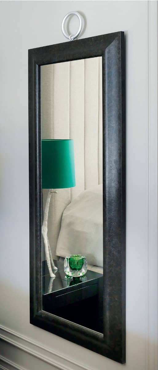
The bedroom shown here is reflected in a black-framed mirror.

All the objects on the glossy blue table by India Mahdavi in one of my guest rooms (see also here) tie in with the grey, taupe, white and sea-green theme.

This rustic bronze sculpture adds colour and emphasizes the grid.

Vintage bedside tables have been sprayed in sea-green lacquer, and the striped velvet runner picks up all the dark tones in the room.

This bedroom palette takes its cue from the artwork by Neil Reddy, with accents of turquoise silk and velvet.
Organic-shaped ceramic vases from kellyhoppen.com are a simple way to bring splashes of colour into a space.

A specialist wall finish of textured plaster combined with blue-green pigment is an example of a more committed approach to colour and texture.
MEADOW
Lush green is perhaps nature’s most prolific colour in all its tones and shades, from the yellow-green of new spring shoots to the rich emerald of moss, and everything in between. It is an easy colour to use with most materials, since it looks as good with all types of wood and stone as with man-made composites, rubber, resin and Perspex. There is a shade of green that will complement every neutral colour you can think of. The most obvious and simplest way to bring accents of green into a room is with foliage and plants, which can be used to make striking but easily changeable displays.

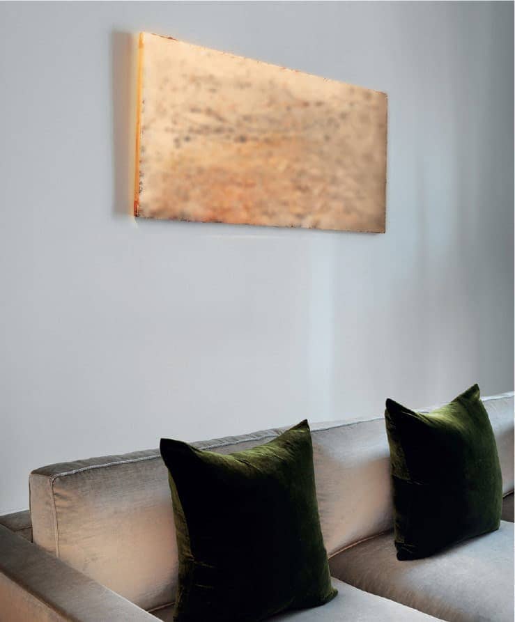
An all-white bedroom is lifted with accents of metal (Tom Dixon’s Mirror Ball light), black oak, and green velvet cushion bands and a bed runner.

A white sheer curtain is trimmed with a deep band of emerald velvet in a monochrome hallway.

Shallow nickel bowls of moss and echeveria make a contemporary display.
A green velvet cushion with contrasting linen band complements the white linen cover of the Kelly Hoppen chair, with its long chainmail fringe.

I decorated one of my guest rooms in earthy khaki offset by black and white; this timeless neutral is a fashion favourite and now I’m using it in interiors.
Moss-green velvet cushions accent a Christian Liaigre sofa in taupe velvet.
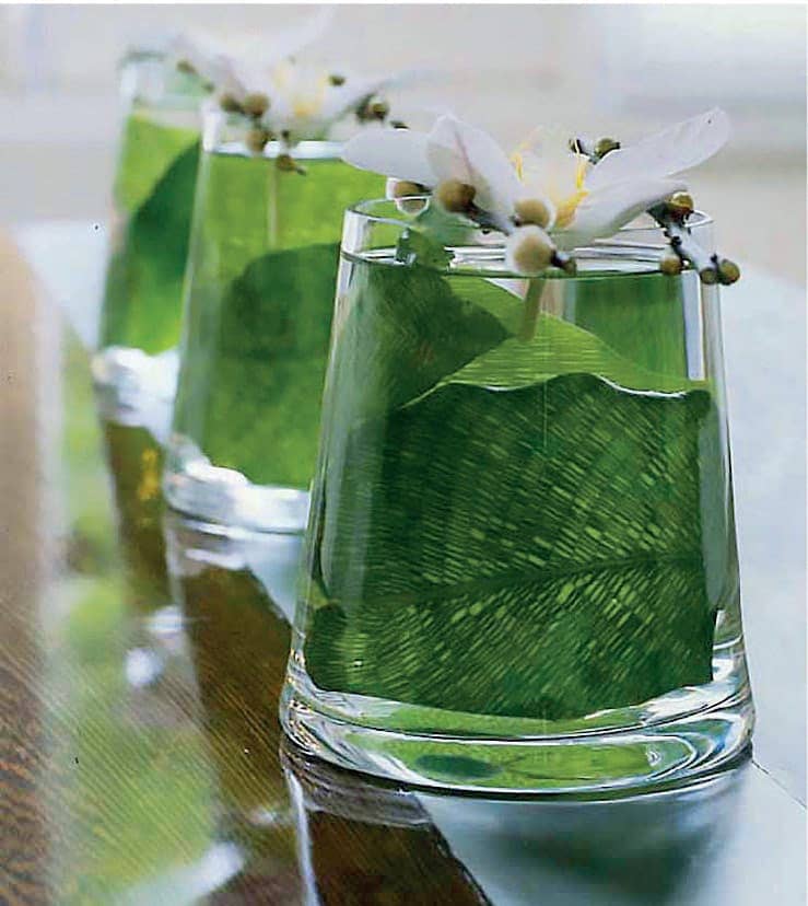
The leaves lining this trio of glass containers are showcased against the wenge table with its stainless-steel runner.

Glossy limes look extra vibrant against the marble and brass bowl from Apparatus Studio.
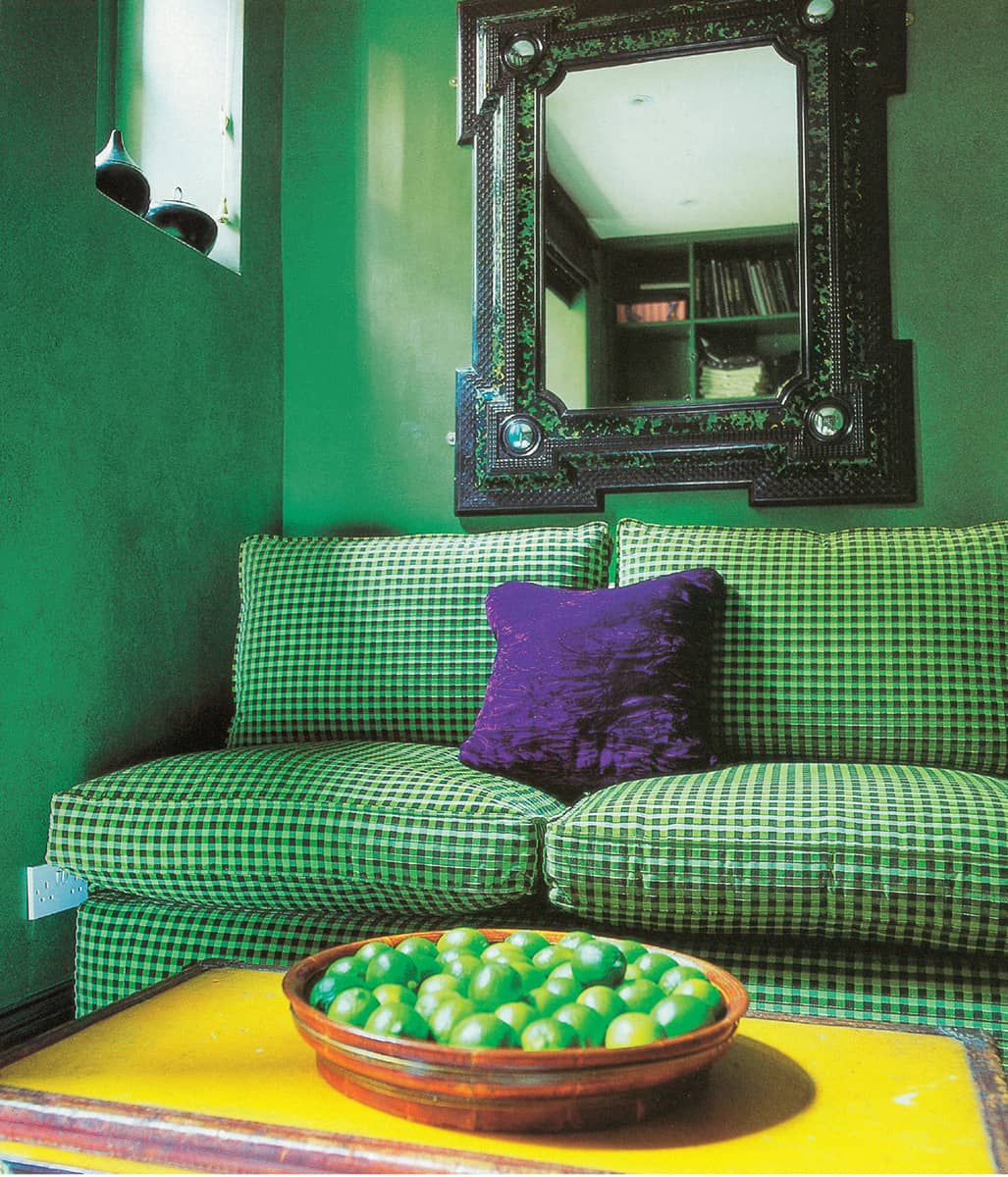
One of my early designs was this study decorated in lime-green paint and gingham, with yellow and purple accents.

Another is this Eastern-inspired dining room in paddy-field green and black on a neutral backdrop, with Carolyn Quartermaine gold-script fabric on the chairs.

Glass bowls of snake grass are displayed on a line of elegant Modénature wenge tables.

A less formal display of hydrangeas in different glass vessels adorns the table in my entrance hall.
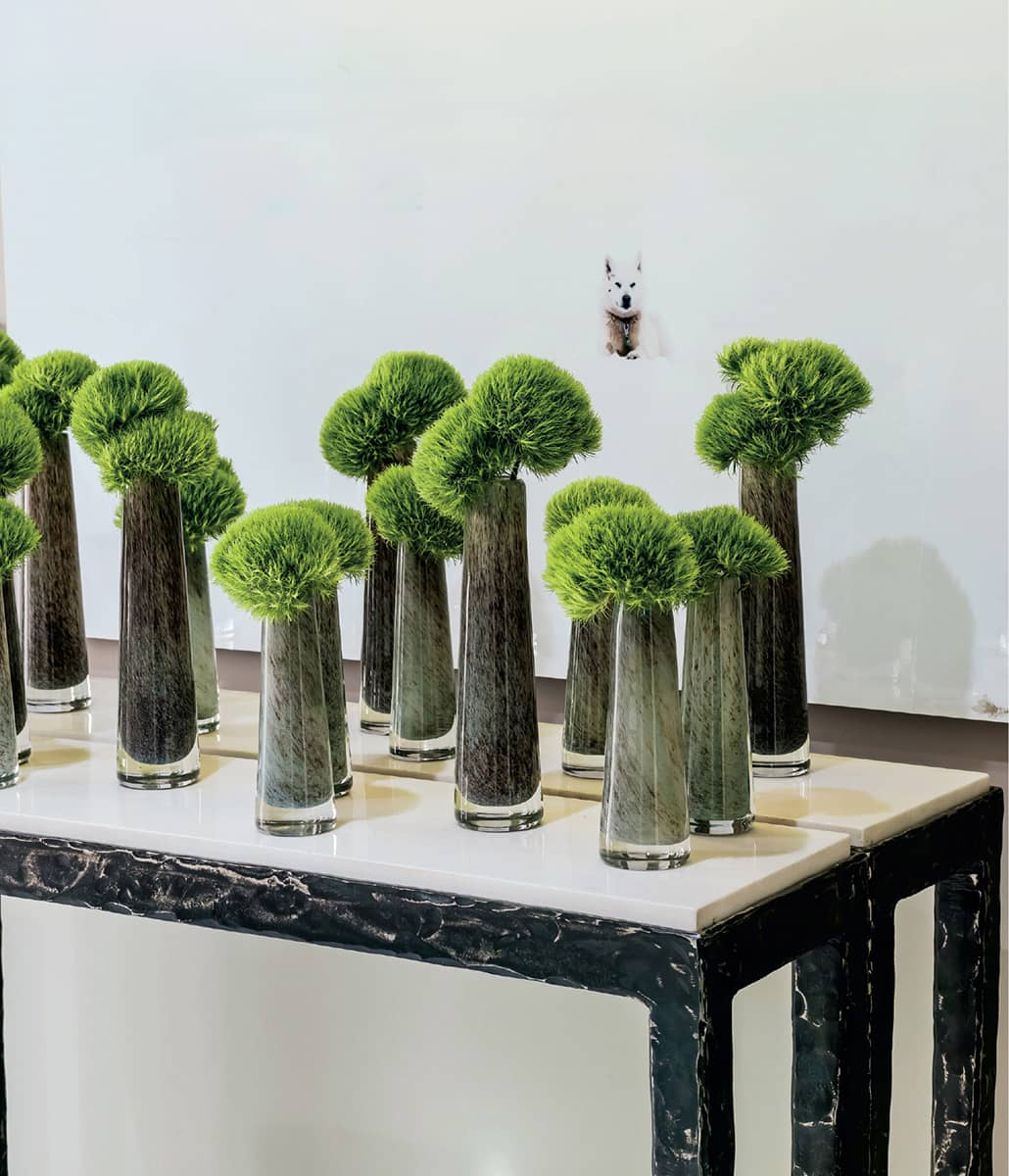
This display on my landing is a symphony of textures: the beaten metal and marble Christian Liaigre console, the patterned glass vases and pompom blooms that draw the eye to the husky.
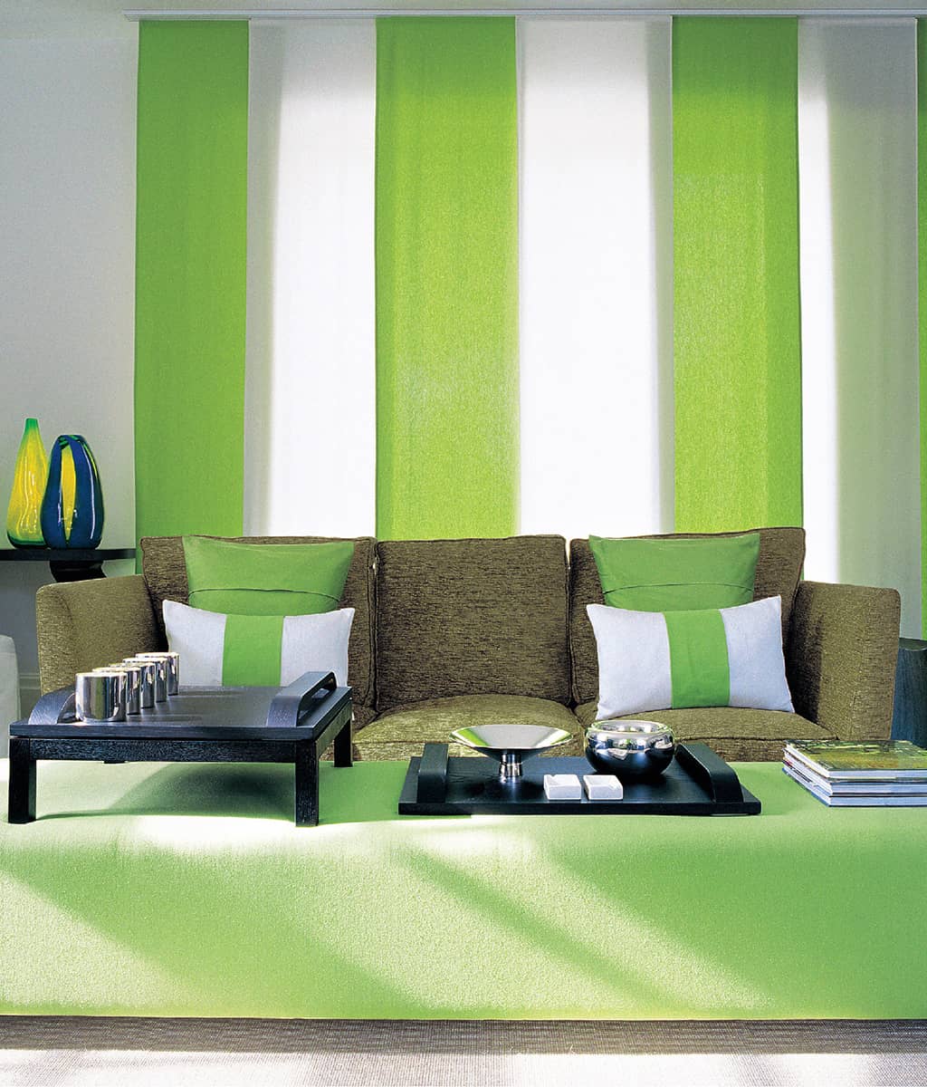
Vertical panels of fresh green and white linen are echoed by the cushions and balanced by the horizontal of the silk ottoman.

Lush green velvet is juxtaposed with black hessian on a black wood chaise longue.