The arts and crafts movement had widened the debate about what constituted good design, but had little effect on conventional interior design at the turn of the century, either in America or Europe. For the grander type of interior the prevalent style was the Beaux-Arts, so called because its source was in the teaching of the École des Beaux-Arts in Paris. This was a conservative style, inspired by French classical architecture of the seventeenth and eighteenth centuries, and in interior decoration was marked by lavish use of carving, gilding, rich marble and extravagant lighting, well suited to provide an atmosphere of grandeur for large hotels, department stores, opera houses and the ostentatious houses of the wealthy. A graduate of the École, Jean Louis Charles Garnier (1825–1898), created the best-known example of the style with the foyer of the Paris Opéra (1861–74). The wide, sweeping staircase, caryatids, polychrome marble, richly carved ornament in an exaggerated baroque style and sheer quantity of candelabra all contributed to a glittering effect.[23]
The Paris Opéra and the Beaux-Arts style in general influenced interiors of opera houses, department stores, hotels, municipal buildings and private houses all over the world. This influence was most pronounced in America, where even after the First World War an average of fifteen American candidates each year sat the entrance examination for the École. The American Richard Morris Hunt (1827–1895) joined the École in 1846 (the first American to do so) and the academic training bore fruit when he returned to America in 1855 to design French Renaissance Revival mansions for millionaires such as W.K. Vanderbilt and J.J. Astor in New York and Long Island. The leading American architectural practice of McKim, Mead & White (1879–1915) owed a similar debt to the Beaux-Arts tradition. One of the partners, Charles Follen McKim, trained at the École from 1867 to 1870, and the interiors of large public buildings such as the Boston Public Library (1887) and the Pierpont Morgan Library, New York (1903–6), as well as smaller domestic residences such as that of John Innes Kane, New York City, reveal an adherence to the academic principles taught at the École.
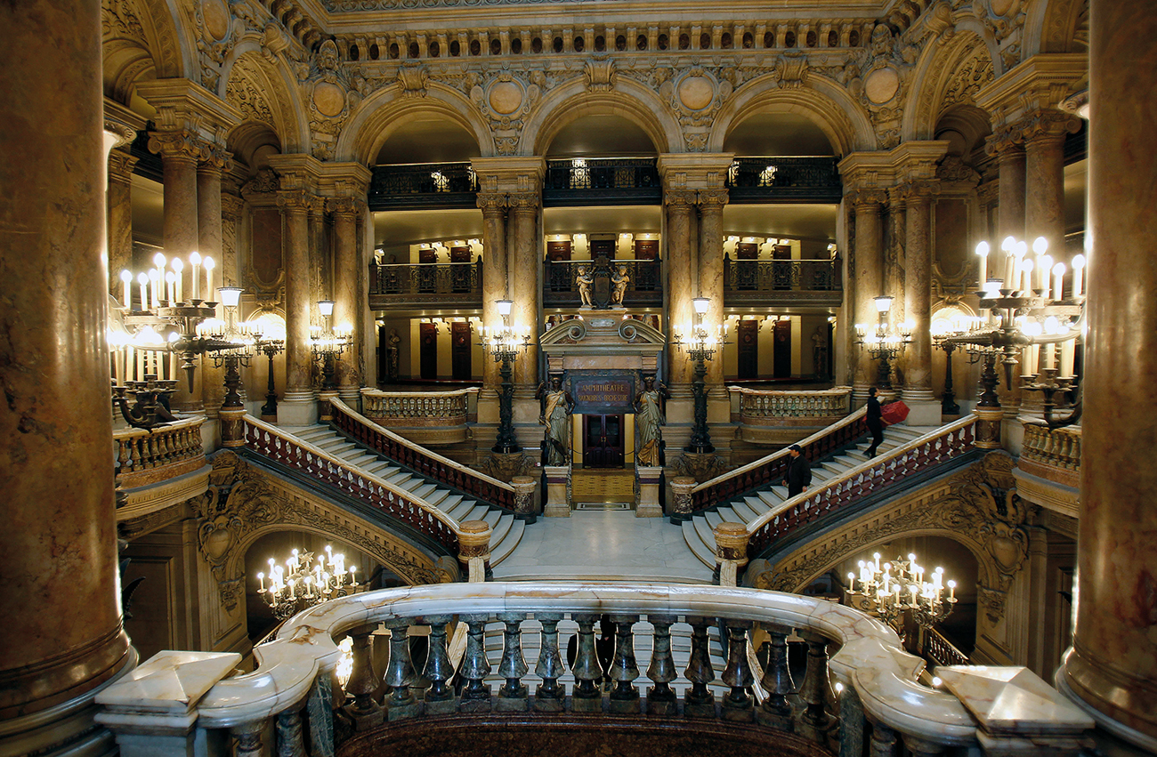
23 Charles Garnier’s staircase, Paris Opéra, 1861–74: a baroque version of the Beaux-Arts style. The international influence of the École continued right up to the Second World War, and interest in the French classical tradition was renewed in the 1970s with the advent of post-modernism.
Splendid interiors by McKim, Mead & White are preserved at the Villard houses, Madison Avenue, New York (1883–5), designed as a group of residences for the railway magnate Henry Villard and his friends (now the public rooms of the Lotte New York Palace Hotel). The Gold Room is the most lavish. Originally intended as a music room, it is two storeys high with a balcony at the north end to accommodate the musicians. The decoration of the room was finished in 1886 when Whitelaw Reid bought the house and commissioned Stanford White (1853–1906) of McKim, Mead and White to oversee its completion. The coffered ceiling is ornately carved and gilded in the Renaissance manner. The American artist and designer John La Farge (1835–1910) filled the two large arches at the top of the north and south walls with paintings in an academic style, representing music and drama. Beneath are carved panels that reproduce those by Luca della Robbia in the Sacristy of Florence Cathedral. The rest of the wall-panelling is richly carved with musical instruments and garlands in low relief. Such heavy reliance on classical models and grand, expensive decoration is typical of the Beaux-Arts.
In Britain the firm of Mewès and Davis (1900–14) were the leading exponents of the Beaux-Arts style. They designed the Ritz Hotel, London (1903–6), as well as smaller commissions such as the interior of the Regency country house Polesden Lacey in Surrey (1906) for Mrs Ronald Greville, the daughter of the founder of a successful Scottish brewery. The Drawing Room decorated with carved and gilt panelling from a North Italian palace of c. 1700 provided the perfect setting to impress her aristocratic guests.
It was against a background of such historicism that designers in Belgium and France created a style without historical precedent that made new use of materials such as iron, and was directed towards the middle classes and intelligentsia rather than the very wealthy. The style is characterized by the asymmetrical whiplash line that gives a sense of dynamic movement wherever it is applied: to furniture, wallpapers, stained glass and metalwork. Although interior design had yet to emerge as a profession, the influence of the British arts and crafts movement led Continental architects and theorists to approach the planning and decorating of interiors with a respect that had traditionally been reserved for the exterior. From 1893, art nouveau architect-designers concerned themselves with all the elements of a building, from the architectural shell down to the door handles. To create a fully integrated and contemporary environment was the pivotal aim of the movement.
Art nouveau was indebted to the arts and crafts for its flowing line, simplicity in furniture design and rejection of academic models. Its formal inspiration also came from post-impressionist and symbolist painting. The threatening vortices of Van Gogh and Edvard Munch, the alluring curves of Gauguin and Aubrey Beardsley have their counterparts in the art nouveau interior. Artists and designers shared an admiration for Japanese art that manifested itself in an ubiquitous asymmetry.
Unlike the arts and crafts designers, avant-garde designers on the Continent were eager to exploit new technological advances. The progress made in iron construction during the second half of the nineteenth century is crucial for the development of the art nouveau interior. The French engineer Gustave Eiffel (1832–1923) pioneered the use of exposed-metal frameworks for buildings, exemplified by his Galerie des Machines at the Paris Exhibition of 1867. The influential French architectural theorist Eugène-Emmanuel Viollet-le-Duc (1814–1879) advocated the combination of iron and masonry in his Entretiens sur l’Architecture (1872), which was read by leading art nouveau designers including Victor Horta, Hector Guimard, Antoni Gaudí and the American Louis Sullivan. The early art nouveau’s frank exposure of metal in the domestic interior had radical implications in the context of the traditional styles and materials used by Beaux-Arts architects.
In Belgium and Italy the style was linked with socialism. The style’s Belgian originator, the architect-designer Victor Horta (1861–1947), had received a traditional academic training, and made a career designing houses for bourgeois intellectual patrons in the Ixelles suburb of Brussels. In 1896, however, he was invited to design the Brussels Maison des Peuples by members of the Parti Ouvrier Belge, the chief socialist party in Belgium, which in 1894 had achieved some measure of success by winning twenty-eight seats in parliament. Thereafter, Maisons des Peuples were built in most Belgian cities to provide meeting-places for workers’ organizations. The young Horta’s style was considered fitting for the new building in lacking the aristocratic overtones of the Beaux-Arts.
Horta exploited the formal possibilities of an exposed-iron frame by moulding pillars and beams into organic curves. Most successful was the double-storey auditorium at the top of the building. Acoustically the large space worked perfectly, and the winding tendrils that became a hallmark of the style were used for the metalwork banisters, beams and supporting columns.
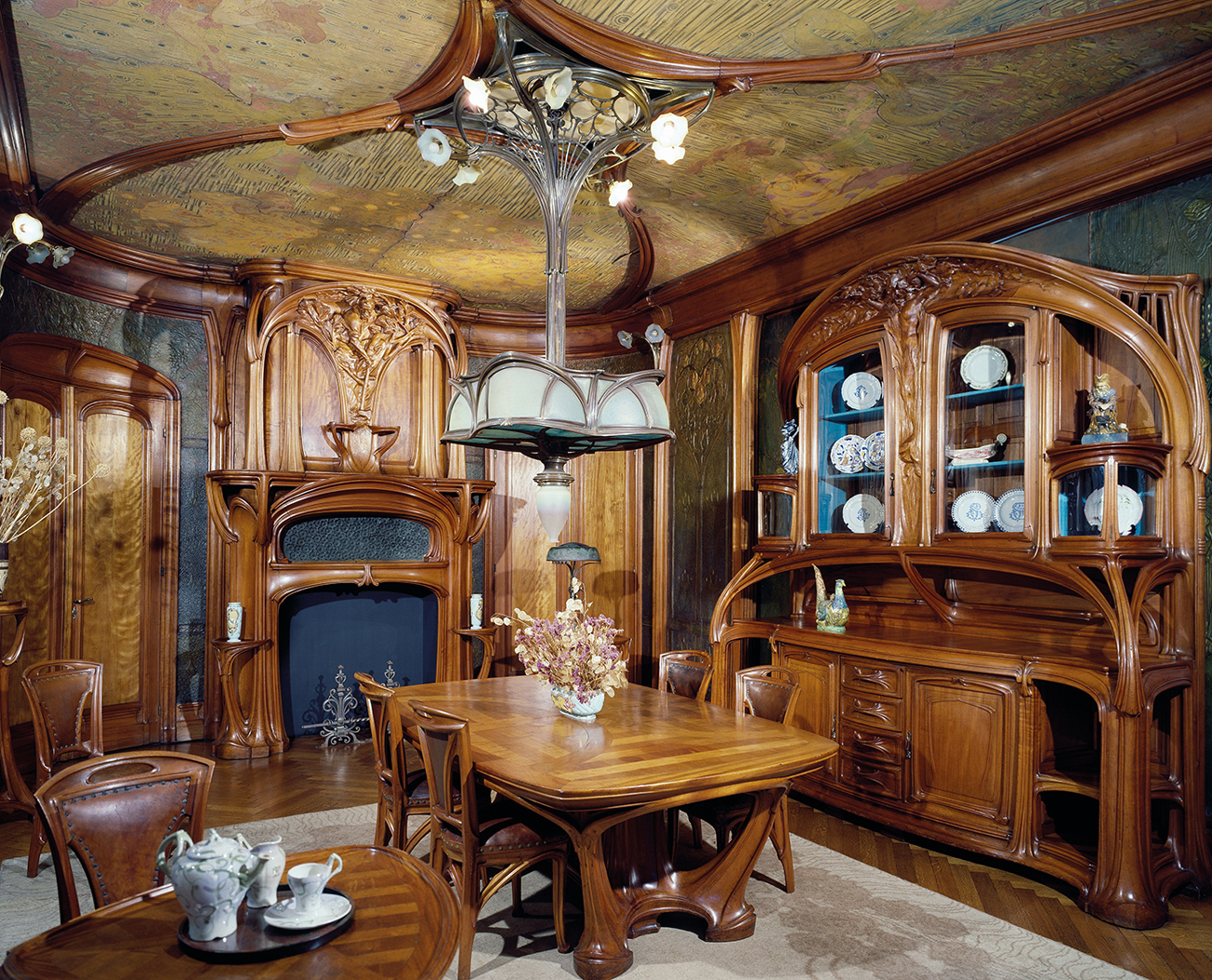
Horta’s earliest interior in the style he pioneered was the Tassel house at 6 Rue Paul-Emile Janson, Ixelles, designed for a professor of geometry, Émile Tassel, and completed in 1893. There are some restrained organic motifs in the exterior decoration, but, as with most later art nouveau buildings, the originality is in the interior.[1] Like all Horta’s designs of the period, the Tassel house plan allows free circulation throughout the principal rooms. Internal walls are reduced in number by means of cast-iron supports in the centre of the house. Horta does not disguise the metalwork infrastructure of the house but incorporates it into the design. In the hall, for example, the supporting metal column of the stair and the beams are embellished with swirling metal tendrils, and the same organic forms are painted on the wall, carried out in mosaic on the floor and repeated in the metal light fitting and banister.
An indication of Horta’s English sources for this style comes with the use of an English wallpaper in the dining room. This was probably an arts and crafts design by the Century Guild designer Heywood Sumner for Jeffery and Co., the company that printed William Morris’s first wallpaper designs. Horta may have seen it at an exhibition in Brussels in 1872–3, or at the Paris Exposition of 1889.
A group of avant-garde artists known as Les Vingt had been formed in 1884 in Brussels to hold discussions and exhibitions with the purpose of finding a successor to French Impressionism. Important exhibitions for the creation of Belgian art nouveau included those of Gauguin’s paintings in 1889 and Van Gogh’s in 1890. Members of Les Vingt such as Jan Tooroop (1858–1928) and Fernand Khnopff (1858–1921) showed work in a style marked by flowing lines and flat colour areas. There is no proven link between Horta and Les Vingt, but a young progressive architect in Brussels at this time would certainly have known of their activities.
Horta designed two further Ixelles houses, for the chemist Ernest Solvay at 224 Avenue Louise (1895) and for Baron Van Eetvelde at 4 Avenue Palmerston (1897).[24] The Hôtel Solvay, like the Tassel house, has exposed-metal structural supports and organic motifs for such items as light fittings and door handles. The Hôtel van Eetvelde has as its most important interior feature a central double-storey space around which the main staircase winds. The central area is used on the principal floor as a winter garden, and is defined by a circle of slender steel pillars that support a decorative stained-glass canopy. The same motif of vine-like branches that decorates the canopy is repeated on the iron banister and for the light fittings, which continue the organic motif with shades in the form of flower-heads. The unusual manipulation of space allows the visitor to look from the dining room, through the winter garden and into the living room.
Horta designed thirteen such Brussels houses, satisfying a taste for the exotic that may have been prompted by his clients’ recent colonial contacts or travels. (It was the Belgian colonies which supplied much of the wealth for the art nouveau decoration of homes.) Horta termed these homes ‘portrait houses’, reflecting his belief that their design ‘should not merely reflect the owner’s life-style, but be his portrait’.
The most interesting of Horta’s later domestic interiors is the house he designed for himself at 23–25 Rue Américaine, Ixelles, from 1898 (now the Horta Museum). The plan completely reworks the conventional layout for such a townhouse.[25] The kitchen is not located in the basement as was customary, but at ground level, and a skylight illuminates a centrally placed staircase of white Carrara marble that forms the centrepiece of the whole design, winding up through three floors. The yellow-and-white skylight has huge mirrors at either side that give an effect of infinite space. The visitor is led by this impressive stair to the upper floor of the house which contains the dining and drawing rooms.
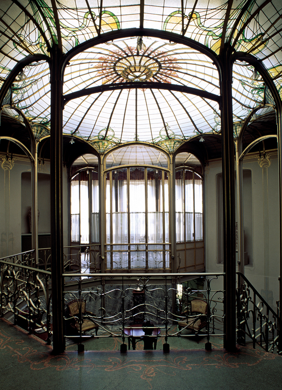
24 Victor Horta: ground floor, Winter Garden, Hôtel van Eetvelde, Ixelles, Brussels, 1897. The novel layout allows the occupants of one first-floor room to look through the Winter Garden and into the room opposite.
Colour is used as the uniting feature of the dining room. The honey tones of the ash furniture, marble-faced walls, copper picture rails and painted decoration create an overall impression of simple elegance and lightness that is not found in the grander interiors of the period. The white-enamelled bricks covering the walls instead of wallpaper were an especially unusual feature. For the floor covering Horta chose, not carpeting, but wood-parquet with a border of mosaic with copper inlay, to echo the clear-cut linear motifs of the painted ironwork arch supports. Typically, Horta did not disguise these supports but made them a feature. Throughout the house, Horta’s attention to detail is evident: light-fittings, door handles and towel rails have a consistent organic motif to give unity to the interior. Horta also applied organic ornament to department-store interiors, particularly A l’Innovation (1901) in Brussels and Grand Bazar (1903) in Frankfurt.
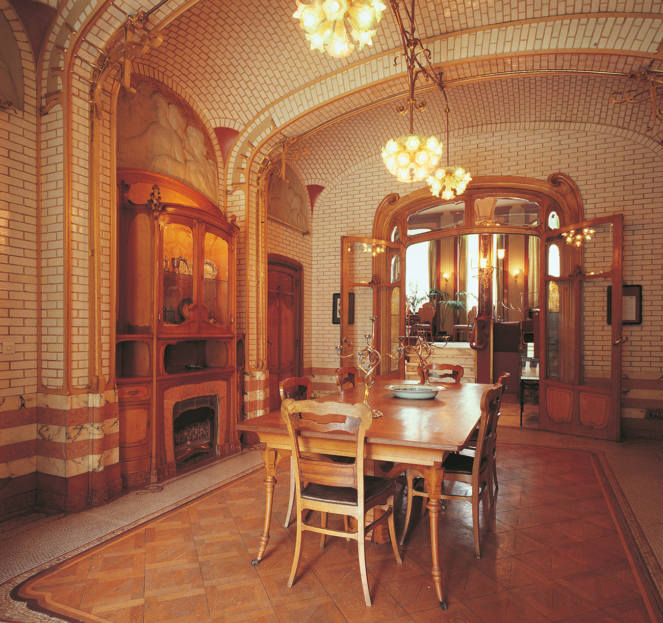
25 Victor Horta: dining room of his house, Ixelles, 1898. Honey-toned ash combined with white-enamelled wallbricks create a warm, elegant and unpretentious interior. A serving hatch opens above the gas fire, with recesses at either side to keep food warm.
A contemporary of Horta, Paul Hankar (1859–1901), was responsible for the art nouveau design of smaller Brussels shops and houses: the Niguet Shirt Shop (1899) and his own house (1893) look solid and clumsy when compared with Horta’s graceful designs. His display screens for the Ethnographical Rooms of the Brussels-Tervueren Colonial Exhibition of 1897 were topped by linear cut-outs that were based on Celtic motifs rather than on art nouveau, with broader lines and a symmetrical overall pattern. A third Belgian architect-designer, Ernest Blerot (1870–1957), used a similar style for many modest houses for Ixelles-district clients, but here too the handling of motifs is heavier and less sophisticated than Horta’s. He follows a conventional plan, and the carved wood, metalwork and coloured glass used for the interior decoration lack the detail and fine craftsmanship of Horta’s work.
The design theorist and propagandist Henry Van de Velde (1863–1957), author of many influential articles in French, German and Belgian periodicals and of Die Renaissance im Modernen Kunstgewerbe (1901), is conventionally grouped with these Belgian designers. However, at the time of Horta’s buildings, Van de Velde was working within the Flemish vernacular tradition. He began work as an artist, training mainly in Paris, where he came under the influence of Van Gogh and Gauguin. Returning to Belgium he joined Les Vingt in 1888, and his paintings, graphic work and tapestries reveal these influences in their use of flat colour and rhythmic lines. He married in 1894 and decided to emulate his idol William Morris by designing a house for himself and his new bride. Indeed, Van de Velde’s fiancée, Maria Sèthe, travelled to England specifically to meet Morris and buy arts and crafts wallpapers and textiles. The Villa Bloemenwerf of 1895 at Uccle near Brussels echoes earlier British models, particularly the designs of Voysey and Baillie Scott. It has a double-storey hall that acts as a focus for the interior, overlooked by various passages and rooms on the upper floor. Van de Velde designed modest, solid furniture and simple naturalistic wallpaper for his house. His intention with his first attempt at wallpaper design would seem to have been to achieve overall integration, for as he wrote: ‘the three colours, amaranth-red, blue and green, were repeated in the plaster, in the grey and deep green of the gable and in the reddish roof-tiles.’
The new Belgian interior design began to influence the French as designers and shop-owners visited Brussels. The first Parisian designer to do so was Hector Guimard (1867–1942), who is best known for his metalwork for the Paris Metro stations. He had already begun to practise as an architect when, early in 1895, he went to Brussels and met Horta. This meeting and his inspection of the Tassel house inspired Guimard to rethink the interior design of a commission on which he was then working, the Castel Béranger apartment block (1895–7) at Rue La Fontaine.[26] Although Guimard had already applied for planning permission for the apartments and could alter little of the architecture, the decorative features could be reworked in response to Horta’s new style. Guimard was able to design furniture, wallpapers, carpets, mosaic floors and even door handles for the thirty-six apartments, using a sinuous, asymmetrical line. The importance Guimard attached to these designs is indicated by his publication of a luxury volume of coloured drawings, L’Art dans l’Habitation Moderne, Le Castel Béranger (1898). Forty-one of the sixty-five illustrations show various interiors and details of furniture and fittings.
Guimard devoted much space to the entrance hall, which is the most distinctive and exciting feature of the interior. The wrought iron and copper gate at the entrance to the hall uses all the main ingredients of art nouveau design: it is asymmetrical, the ornament is derived from natural forms, and the dynamic whiplash line is used repeatedly. The same contorted shapes appear on the green ceramic panels that line the hall, in the carpets, on the banisters and in the coloured glass. The apartments are comparatively sparsely decorated. Stylistic unity was achieved by using asymmetrical, elongated, winding forms for all the furniture and fittings. Such forms are more extreme than their Belgian counterparts, with fireplaces, settees and door-handles moulded into fluid and contorted shapes.
While they had attracted much criticism in the press for their extreme styling, the apartments were let easily and profitably. Guimard installed his studio there, and went on to use the style in other private interiors, including his own house at 122 Avenue Mozart, Paris (1909–12). The artistic synthesis achieved in these interiors, with art nouveau windows, plasterwork, furniture and light fittings, is reminiscent of the rococo interiors of eighteenth-century Paris, for example the Hôtel de Soubise. There was a rococo revival at this time in France, but the two styles are quite distinct. They have asymmetry and playful curves in common, but where rococo merely embellishes classical proportions, art nouveau melts them away.

26 Hector Guimard: entrance hall, Castel Béranger apartments, Paris, 1895–7. The repeated whiplash line and winding tendrils on the columns reveal a recent visit to Horta in Brussels.
Horta was an important influence on Guimard, but Van de Velde was the designer who did most to propagate the new style in France and Germany. In 1895 he received two important visitors from Paris at the Villa Bloemenwerf: the art dealer Samuel Bing and the art critic Julius Meier-Graefe. Bing had previously owned a shop selling oriental goods in Paris, and on 26 December 1895 opened a shop and gallery, the ‘Salon de l’Art Nouveau’, in the Rue de Provence. Bing invited Van de Velde to contribute four room-settings to his shop. The designs caused a great stir in the press, with opinions both for and against, and helped to establish the ‘art nouveau’ style in interior design in France.
An organic style had already been developing in France with the glass and furniture of Émile Gallé (1846–1904) and the group of designers who worked with him in Nancy, which included the prominent furniture designer and manufacturer Louis Majorelle (1859–1926). Gallé was inspired by organic forms, and kept a comprehensive collection of plants in the grounds of his factory, where they served as living models for his marquetry designs. Believing that all artistic inspiration should come from nature, Gallé was critical of the more contorted and exaggerated designs being shown at the turn of the century, and always used traditional forms for his own furniture, allowing art nouveau surface decoration only. Gallé was among those who exhibited at Samuel Bing’s shop, the main centre of the display of art nouveau interior decoration. At exhibitions held there and at the Paris Exposition of 1900, Bing used room-settings to show the work of such important French (or French domiciled) designers as Edward Colonna, Georges de Feure and Eugène Gaillard, as well as designers from Britain and America who were searching for a new style, including Charles Rennie Mackintosh (1868–1928) and Louis Comfort Tiffany (1848–1933), who both showed work at the opening exhibition in 1895.
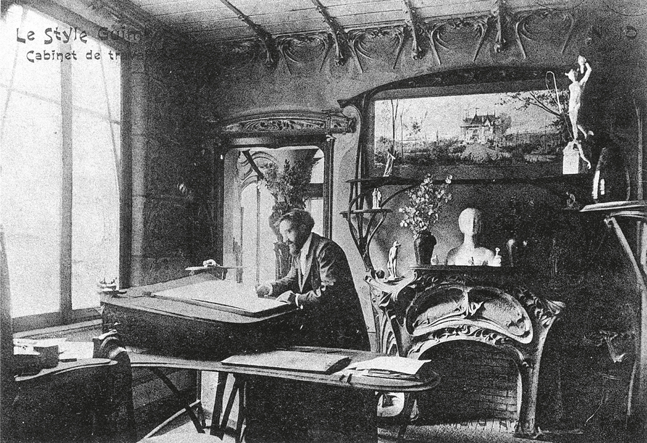
27 Guimard in his studio in the Castel Béranger, c. 1903. The photograph was printed as a postcard advertising the ‘Style Guimard’, as Guimard termed art nouveau.
While the new interior design style was flourishing in France, it was also beginning to make an impact in Germany through the medium of the British arts and crafts movement and the work of Van de Velde. In 1898 Meier-Graefe commissioned furniture from Van de Velde for his own Paris showrooms, ‘La Maison Moderne’, established a year earlier in competition with Bing’s ‘Art Nouveau’. He also featured Van de Velde’s work in his small-circulation magazine Pan, published in Germany. Pan had been modelled by Meier-Graefe on The Studio magazine, which had brought stimulating news of British arts and crafts theory and design to Germany since its foundation in 1893. The keen German interest in British interior design is exemplified in the work of Hermann Muthesius (1861–1927), an attaché at the German Embassy in London from 1895 to 1903, who made a thorough survey of English domestic architecture of the later nineteenth century, including the work of Voysey, Baillie Scott and Ashbee. His admiration for the arts and crafts and the functional design of British interiors was recorded in his influential book Das englische Haus (1904–5).
German art nouveau was known as Jugendstil, ‘Young style’, from a periodical, Jugend, founded in Munich in 1896, and the name reflects the desire of avant-garde designers to throw off historicism and create something entirely fresh for the new century. After successfully designing a rest-room for the 1897 art nouveau exhibition in Dresden, Van de Velde arrived in Berlin in 1899. The interior of François Haby’s barber’s shop (1900) and the Havana Tobacco Company cigar shop (1899–1900) are designed in a somewhat heavy version of art nouveau adapted to German taste.[29] The paintwork on the walls is partly geometric, and the carved wooden shelving in the cigar shop, unlike French art nouveau, is entirely symmetrical, with thick, sweeping curves. The barber’s shop design caused a great outcry in the press, for Van de Velde had decided to leave the plumbing and light-cables exposed.
28 Eugène Vallin: dining room, displayed at the Salon d’Automne, 1910. The organic, deeply moulded curves typify the École de Nancy, but Vallin rarely used marquetry decoration, and only occasionally incorporated carved floral motifs.

29 Henry Van de Velde: Havana Tobacco Company cigar shop, Berlin, 1899. Sweeping curves echo Gauguin’s painting and the Belgian artists of Les Vingt, as well as ubiquitous arts and crafts influence. On the walls they playfully suggest curling cigar smoke.

30 August Endell: staircase and hall, Atelier Elvira, Munich, 1897–8: Jugendstil at its most extreme, with dreamlike, floating marine motifs.
German designers who developed Jugendstil included August Endell (1871–1925), whose Atelier Elvira, Munich (1897–8), has an iron staircase and light-fitting contorted into fantastic marine-inspired shapes.[30] The light-fitting rises out of the curved newel post like a giant piece of floating seaweed. Jugendstil proved short-lived, and by 1901, when Endell designed the Buntes Theater, Berlin, a more controlled, geometric effect is evident, probably inspired by the work of the Glasgow School (page 54), which was making an impact in Europe through The Studio from 1897 onwards.
31 Charles Rennie Mackintosh: drawing room, Hill House, Helensburgh, 1902. The gesso panel above the fire is by Mackintosh’s wife Margaret Macdonald. Mackintosh’s decoration combines geometrical motifs with art nouveau.

32 Antoni Gaudí: dining room, Casa Batlló, Barcelona, 1904–6. Window frames, doors and furniture melt into the exuberant curves of Gaudí’s arte moderno.
In Russia, a revival of national folk crafts had gained momentum during the 1870s, and their styles mingled with the influence of European symbolism and French art nouveau. Moscow was the centre of the stil moderne in Russia, and Fedor Shekhtel (1859–1926) united the three influences in designing the Ryabushinsky house (1900) and the Derozhinskaia house (1901). His upholstery fabric for armchairs is based on the rhythmical use of line seen at this time in the paintings of Mikhail Vrubel (1856–1910), an artist, theatrical designer and craftsman who had worked at the artists’ colony established by Princess Tenisheva on her estate of Talashkino, and at the similar colony at Abramtsevo. Vrubel provided ceramic wall-decoration and mural paintings for the Ryabushinsky house. In the library of the house, designed for the singer Derozhinskaia, Shekhtel uses the sinuous line of art nouveau to decorate the wooden doors and built-in seating.
In Spain and Italy as in Russia, art nouveau was used as an expression of new national and political aspirations. The cradle of arte moderno (as the style was known in Spain) was the Catalan capital of Barcelona, then attempting to break free from Spanish domination. The most prominent architect-designer in the style was Antoni Gaudí (1852–1926), who expressed his religious beliefs and fervent nationalism through his designs for apartment blocks and churches. His inspiration came partly from organic sources, by way of Viollet-le-Duc, partly from the arts and crafts movement via The Studio, and partly from his own desire to design without historical reference. He designed complete interiors with organic or flowing, lava-like forms. The commission for the Casa Batlló (1904–6) was to reface and refurbish an apartment block.[32] The interiors have undulating ceilings and strangely curved window- and door-frames, and contain biomorphic furniture designed by Gaudí himself and carved in solid oak.
The Stile Liberty, as it was known in Italy because of the influence of the London store of that name, was associated with the new wave of Italian mild socialism, democracy, and the entry of Italy into the international arena as a manufacturing nation. The International Exhibition of Decorative Art held in Turin in 1902 was planned to assist the regeneration of the once-great Italian city, and the number of countries and exhibitors who participated exceeded the organizers’ expectations. The exhibition provided the most comprehensive international overview of art nouveau. The many interiors on view included examples by Van de Velde, Horta and Guimard. The site and pavilions were designed by the leading Italian art nouveau architect, Raimondo D’Aronco (1857–1932), whose Central Rotunda with its rich and detailed decoration was intended as a monument to the movement. The interior plasterwork was painted with highly stylized flowers and abstract grids. Italian designers whose international careers were promoted by the exhibition included Carlo Bugatti, a member of the famous car-designing family, whose exotic interiors and furniture were heavily indebted to African sources, and who used unusual materials such as vellum and pewter inlay. At the Turin Exhibition he showed a suite of rooms, the most extreme of which was the Camera de Bovolo (Snail Room) with furniture based on the snail-shell spiral.[33]
The stile Liberty continued to flourish in Italy after 1902 when elsewhere art nouveau had passed its peak. Giuseppe Sommaruga (1867–1917) used it for commissions such as the Palazzo Castiglioni (1903) in Milan, as did Giovanni Michelazzi for his Villino Lampredi (1908–12) in Florence.
The work of American art nouveau designers shown at the 1902 Turin Exhibition included that of Louis Comfort Tiffany, whose exotic glassware was inspired by Gallé and Bing. American architect-designers had also been working against the empty historicism of the Beaux-Arts towards the creation of a new style. The movement was led by the architect-designer Louis Sullivan (1856–1924), who succeeded in finding appropriate ornament for innovative architectural structure. After a brief architectural training, partly at the École des Beaux-Arts, in 1881 Sullivan went into partnership with the engineer Dankmar Adler (1844–1900) in Chicago. The firm’s first major commission came with the Auditorium Building, constructed 1887–90, and at the time the city’s largest building.[34]
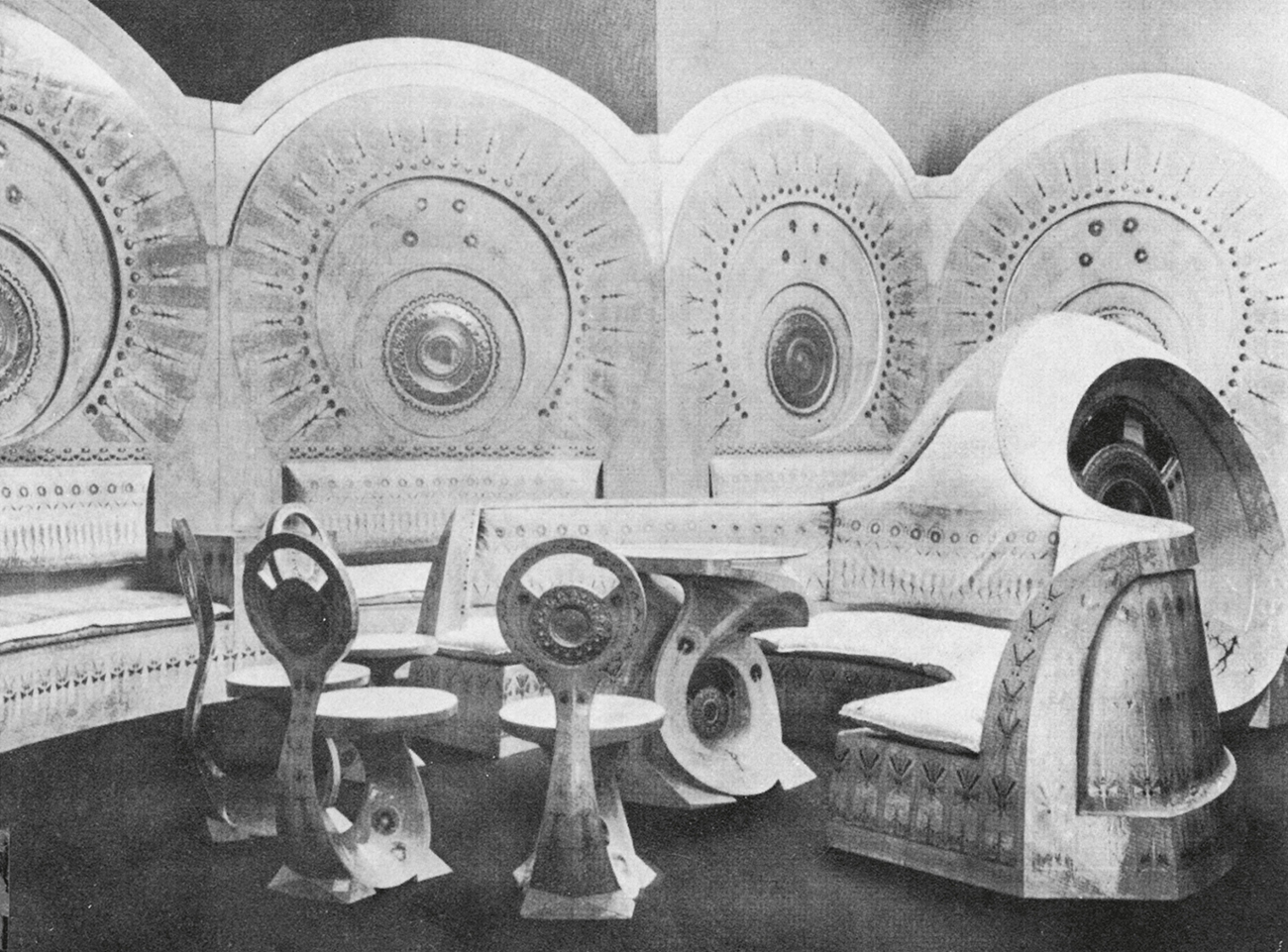
33 Carlo Bugatti: Snail Room, Turin Exhibition, 1902. Curved fitted seating terminates in a circular cupboard, and separate chairs and table continue the snail-shell motif.
The Auditorium is noteworthy in the history of interior design because it is here that electric light was used for the first time as a design feature. The impressive ‘Golden Arches’ that span its theatre interior are decorated in an eclectic style, with luscious gilded plant-forms picked out with clear electric light bulbs. Although non-structural, the arches were used to conceal ventilation ducts and improve the acoustics. The effectiveness of the overall colour scheme of gold and ivory and the use of new technology ensured that the fame of the theatre interior spread worldwide, and it was regarded by some critics as the modern successor to the Paris Opéra. Sullivan justified his decorative schemes by reference to a number of theories, and took his inspiration from sources as varied as oriental art, Ruskin and Darwinism, believing that decoration should relate to natural forms. Like art nouveau architect-designers in Europe, Sullivan developed a new language of ornament to suit new building types such as the department store.
It was in the Chicago offices of Adler and Sullivan that Frank Lloyd Wright (1867–1959) learned the foundations of architectural design and theory, and it was he who succeeded in establishing a distinctive American style for domestic and commercial interiors. During the first years of the century Wright shared the concern of his European counterparts for the integrated interior and their disdain for historical precedent. Much of Wright’s early career as an independent designer was devoted to houses in and around Chicago, described as ‘prairie houses’ because of their proximity to and sympathy with the huge, flat expanses of land in the Midwest. The houses are usually planned around a central core provided by a brick or stone fireplace, reminiscent in this of American seventeenth-century Colonial houses. Interiors such as those of the Martin House (1904–6) at Buffalo and the Robie House (1909) in Chicago provide a flowing, integrated space, with the fireplace as the symbolic heart. Wright’s responsibility for the entire look of the interior, from architecture to furniture to textiles, is well illustrated by the living room of the Francis W. Little House (1912–14), Wayzata, Minnesota (now installed in the American Wing of the Metropolitan Museum of Art, New York). The entire decoration is based on horizontals and verticals, from the square electroglazed skylights to the box-like upholstered chair that makes few concessions to the human form.[35] The interior is further unified by Wright’s use of oak treated only with blond wax for both the furniture and fixtures such as wall-lamps.
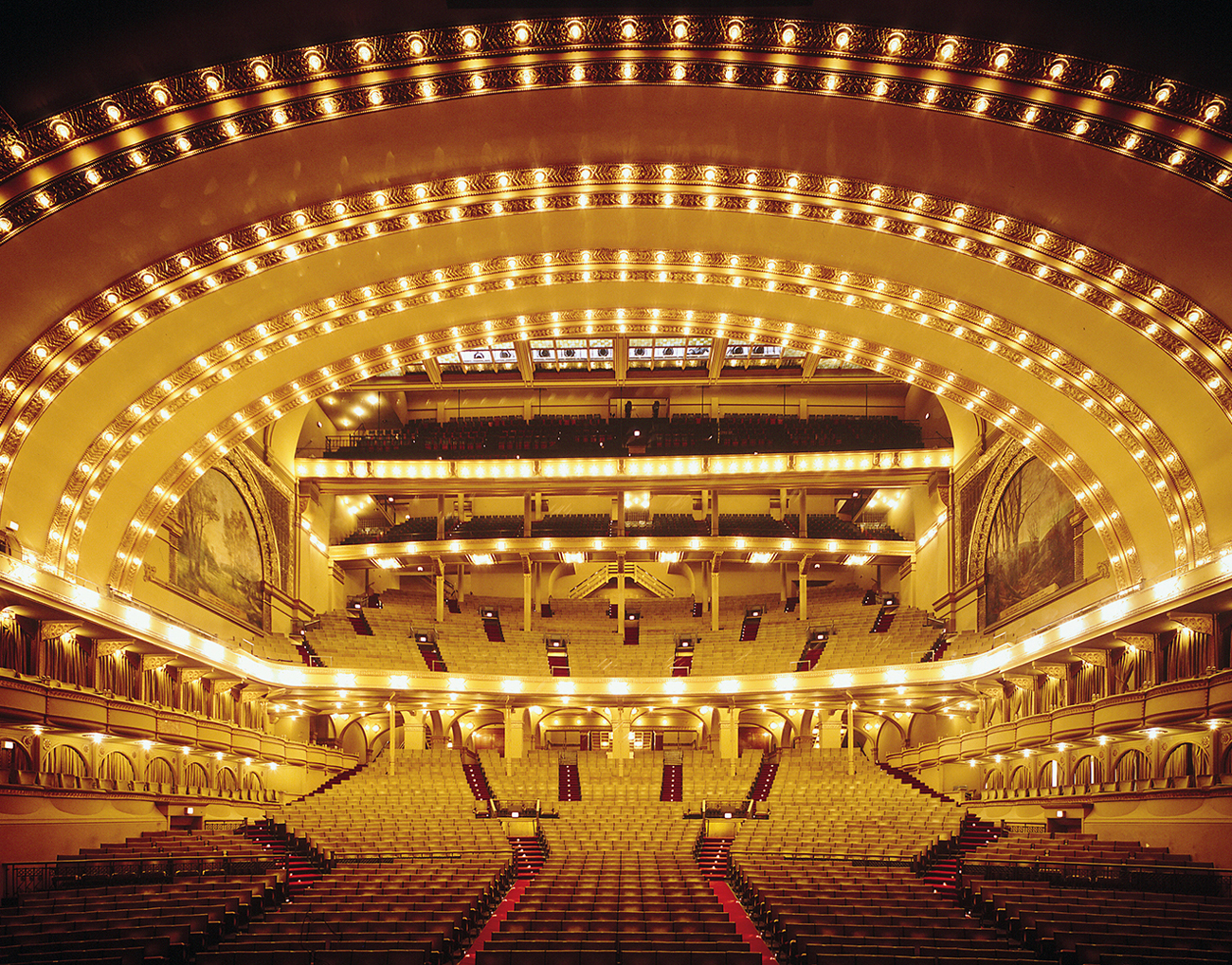
34 Louis Sullivan with Dankmar Adler: theatre of the Auditorium Building, Chicago, 1887–90. The influences of art nouveau and the Beaux-Arts style combine to brilliant effect in the famous ‘Golden Arches’.
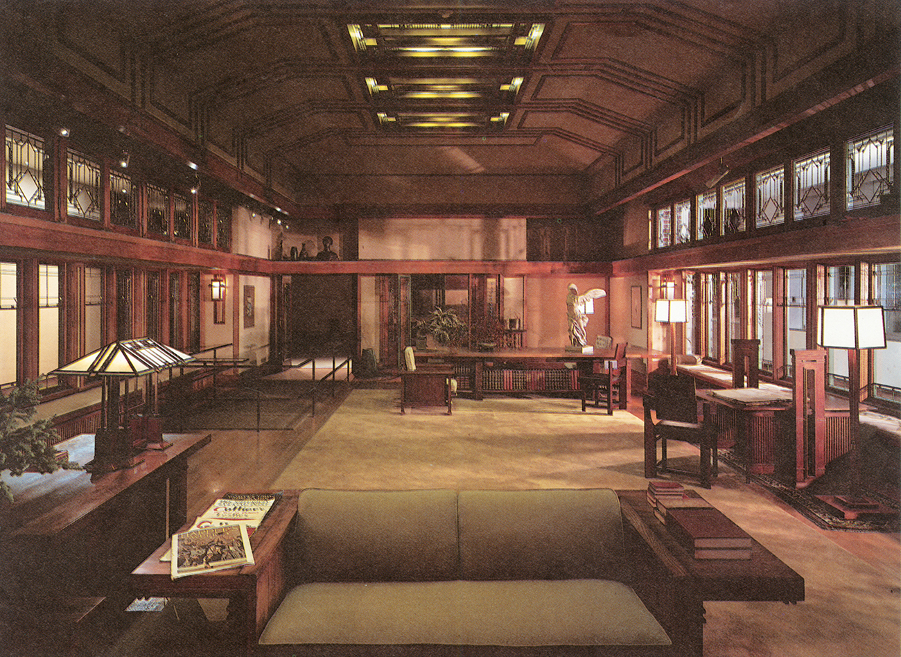
35 Frank Lloyd Wright: Francis W. Little House, Wayzata, Minnesota, 1912–14. A protean designer, Wright adapted a design of horizontals and verticals and the use of natural materials to create a uniquely American style of expression.
Wright’s designs for commercial buildings of this period include the Larkin Administration Building, Buffalo (1904), where the most striking feature of the interior is a five-storey skylit atrium with all its services concealed in corner pillars.[36] The interior is sparse, faced with cream-coloured brick. Here again Wright designed the furniture, including early examples of metal chairs and desks.
The Turin Exhibition of 1902 marked the beginning of the decline of art nouveau as an avant-garde movement. Demand for the style reached saturation point very quickly. During the years leading up to the First World War, the avant-garde interior became simpler and more geometric. This trend is already evident in Wright’s interiors, and can be observed in the work of designers in Britain and Austria.

36 Wright’s Larkin Administration Building, Buffalo, New York, 1904. An early example of the central atrium for office use. In contrast with Wright’s private houses, the building looks entirely inwards, and it was one of the earliest offices to be equipped with climate control.
The art nouveau style never found favour in Britain, and was criticized by leading designers there for its exoticism and femininity. This was an opinion shared by the Glasgow School, centred loosely around the Glasgow School of Art at the turn of the century. It never identified itself with art nouveau, but only with the search for a new style. George Walton (1867–1933) was typical in taking his inspiration from Voysey and the traditional Scottish interior with its inglenook, as well as from Celtic sources. He developed a successful interior-design business, first in Glasgow and then London, and worked extensively for George Davison, head of European sales for Kodak, designing many of their showrooms in the Glasgow Style. Walton’s work was well known throughout Europe, but he continued to work within a simplified, vernacular tradition and was not deeply affected by developments on the Continent.[37]
The same could not be said of his contemporary Charles Rennie Mackintosh, arguably the most original architect-designer working during the period. After studying at the Glasgow School of Art, Mackintosh was apprenticed to the academic architect, John Hutchinson. In 1890 he travelled to France and Italy, and on his return to Glasgow worked with his future wife Margaret Macdonald, her sister Frances and her future husband, Herbert McNair. Known as The Four, they exhibited their symbolist-inspired graphic work at Samuel Bing’s showroom in Paris during 1895.
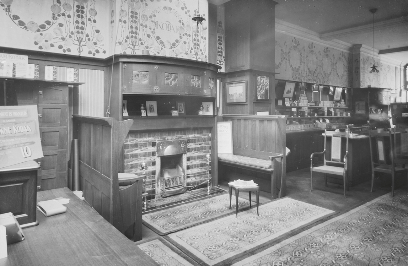
37 George Walton: Kodak shop, London, 1900. Walton’s high-backed settees and geometrical stencilled decoration typify the Celtic influence and the style of the Glasgow School.
Mackintosh is acclaimed today first as an architect and second as a furniture designer, but it was as a designer of interiors that he was best known during his lifetime. Key commissions came from the eccentric Catherine Cranston, a hotelier’s daughter who developed the tearoom business in Glasgow for the city’s burgeoning nouveau-riche clientele. Mackintosh was commissioned by George Walton to redesign the furniture and fittings for the Crown Lunch and Tea Rooms in 1896, and later in the same year, in turn commissioned Walton to design the furniture for the Buchanan Street Tea Rooms. Both these early designs were within the arts and crafts tradition of Lethaby and Voysey, with the use of heart-shaped motifs and unpolished ash furniture. Mackintosh’s next design for Cranston in 1900, at the Ingram Street Tea Room, was entirely his own and used the white-painted furniture that had become a feature of his most recent designs, including that of his own modest house at 120 Mains Street, Glasgow (1900), which are now preserved by the University of Glasgow.
A hallmark of these interiors was the use of bold contrasts between light and dark.[38] In Mains Street Mackintosh created an intimate atmosphere in his dining room with the sombre brown of the walls, which were covered with coarse wrapping-paper. The stained-oak chairs have 135 cm (53 inch) high backs, when measured from the floor, and so help to subdivide the space of the room when the diners are seated, adding to the sense of intimacy. The darkness of the furniture and walls is set off by white paint above the picture rail and on the ceiling.
In the drawing room Mackintosh created an equally dramatic effect with white for the wall and floor coverings as well as for the majority of the furniture. He created a light and spacious living area, diffusing natural daylight with muslin stretched over the windows. The desk, bookcase and fireplace are all white-enamel-painted to ensure that no detail of joints or grain of the wood detracted from the sculptural effect. The furniture was also very carefully placed, revealing Mackintosh’s debt to Japanese house-design. To contemporary taste at the turn of the century such an interior appeared sparse, and the decoration mean.

38–40 Charles Rennie Mackintosh: (top left) sitting room, Mains Street, Glasgow, 1900; (top right) Derngate, guest bedroom, 1919; (bottom) Hill House, Helensburgh, 1902. Light and clear design of Japanese and organic inspiration (Mains Street) yields first to rectangular motifs (Hill House), and finally to strongly geometric design (Derngate), reflecting the contacts between Mackintosh and the designers of the Vienna Secession and Werkstätte.
Even when working on a complete building, Mackintosh began his design from the inside out, defining the particular requirements of the clients before considering the outside appearance. The procedure is well documented in the design of Hill House, Helensburgh (1902), for the publisher Walter Blackie and his family, where Mackintosh spent much time discovering how the family lived before embarking on his designs. Mackintosh’s planning of Hill House was also based on his competition entry for ‘the House of an Art Lover’ of 1901, in which he came second to Baillie Scott (largely because he failed to comply with the rules, which stipulated interior perspectives). Like the House of an Art Lover, Hill House had a carefully planned interior, where the children’s nursery was placed as far away as possible from the parents’ living and sleeping areas.
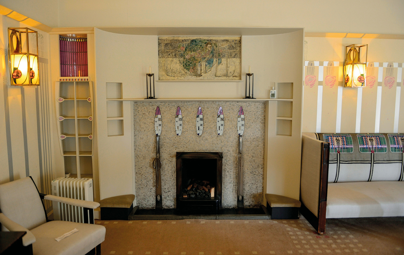
At Hill House as in other projects, the dining room was decorated in dark tones, on this occasion with wood panelling.[40] In the drawing room Mackintosh succeeded in dividing the limited space into smaller zones for different activities. There is an area by the piano for musical evenings, seats around the fire for reading and conversation, and a bay window with a fitted seat and shelving, for contemplation of the view. The walls are decorated with a stencilled design of pink roses on a formalized blue trellis pattern. The floral inspiration was important for Mackintosh, and can be seen again in the columns at either side of the window seat. White predominates. As in his own house, it made a clean, uncluttered interior.
The main bedroom makes a similar effect with white-painted furniture and highlights of rose-coloured glass, but Mackintosh now began to introduce more geometrical elements. The tiny panes of coloured glass in the doors and window-shutters are square, and the shape of the furniture is also more box-like.
His final commission for Miss Cranston was ‘Willow Teas’ (1904) in the fashionable shopping area of Sauchiehall Street, Glasgow. In the Room De Luxe ladies could look out upon the street through leaded windows that included mirror-glass. Mirror-glass was used for the surrounding wall-frieze and enhanced the atmosphere of luxury. The characteristic high-backed chairs are painted an unfamiliar silver.
Mackintosh’s last great interior in the city was the Library of the Glasgow School of Art, one of the most spectacular of the period.[41] He had won the competition to design the School in 1896; part of his design was built, opening in 1899, and the Library was added in 1907–9, at the same time as the West Wing. The bookshop over the ground floor of the Library building is suspended on steel stirrups from the beams that support the floor above, allowing a freer use of ground-floor space, which with its exposed timber supports and carefully planned lighting appears immensely greater than its actual 11 metres (36 feet) square.
Mackintosh left Glasgow in 1914 as interest in his work declined, probably intending to go to Vienna where appreciation of his work was greater. On the outbreak of the First World War he settled first in Walberswick, Suffolk, and then in Chelsea, London. He found his last patron in the model-engineering manufacturer and early member of the Design and Industries Association, W.J. Bassett-Lowke, who commissioned him to design the interior of his house at 78 Derngate, Northampton, in 1916.[39] Because of his engineering background and European contacts, Bassett-Lowke wanted an impressive but functional design. Mackintosh responded with a black entrance hall with a stencilled band of black and white squares, and above it a painted frieze composed of yellow, grey, vermilion, blue, green and purple triangles. The geometrical theme was repeated in furniture with lattice squares.
Mackintosh’s move from organically inspired geometrical motifs had begun at Hill House in 1902, and was furthered by his contacts with Viennese designers after he had exhibited Vienna in 1900. He was recalled by Bassett-Lowke in 1919 to design the guest bedroom at Derngate, the last and perhaps the most startling interior of his short career. The room was painted white except for the wall behind the two beds and the ceiling directly above them, which is papered with black-and-white stripes trimmed with ultramarine ribbon. All the fabrics in the room were integrated into the scheme, with printed stripes and appliqué squares. The furniture was not overpowered in this dazzling ensemble: the light oak was painted with a black stripe and blue squares. The combination of strong colours and geometrical details, particularly lines of small squares, reveals the mutual influence of Mackintosh and the designers of the Vienna Secession.

41 Charles Rennie Mackintosh: Library, Glasgow School of Art, 1907–9. The double-storey height of the small room is emphasized by vertical columns and electric lights suspended on long chains.
Although Mackintosh was largely ignored in Britain (the Derngate interiors were illustrated in Ideal Home in 1920 without mention of his name), he had attracted admiration throughout the rest of Europe. A simpler style in reaction to art nouveau was beginning to emerge in Germany and Austria, where designers associated with the Vienna Secession, founded in 1897, and the Wiener Werkstätte, founded in 1903, admired the starkness of Mackintosh’s designs. His work had been publicized in articles in The Studio written by Gleeson White in 1897, and in illustrations in the periodical Dekorative Kunst in the following year and in various later avant-garde periodicals. Mackintosh took part in the 1900 Secession Exhibition in Vienna, showing a tea room.
42 Otto Wagner: main counter hall, Austrian Post Office Savings Bank, Vienna, 1904–6. Wagner planned the plain and clear interior in great detail, constructing a model ‘counter’ in 1905. The tidy cube-shaped desks and stools are dark-stained beechwood.
The Vienna Secession was a breakaway exhibition society for Austrian and other European avant-garde painters and architects who were dissatisfied with the dominance of the Academy of Fine Arts. One of its principal aims was to dissolve existing barriers between art and design. This was to be accomplished by the arts and crafts method of the fine artist or architect applying his superior taste and vision to design concerns. It is indicative that one of the founder-members of the Secession, Josef Hoffmann (1870–1956), is referred to in The Studio as ‘Architect and Decorator’.
The Secession elevated the status of design by giving it a prominent role in exhibitions. The first Secession exhibition of 1898 showed paintings by the Belgian symbolist artist Fernand Khnopff, lithographs by Whistler, works by one of the founder-members, the painter Gustav Klimt, and Walter Crane’s book illustrations, alongside designs for wallpaper and stained glass. Hoffmann created the Ver Sacrum room especially for the exhibition (named after the magazine of the Secession, founded in 1898). The room itself and the furniture were both simple. Whereas in art nouveau the unifying visual element was the taut whiplash line, here the dominant motif was the vertical. The chair-backs, table-legs, cabinet-fronts and door frames were all in the form of three parallel strips of wood. The starkness of the room was increased by plain wall- and floor-coverings and simple curtains at the window.
So great was the financial success of the exhibition that the Secession was able to build its own exhibition hall in the same year. The founder-member Joseph Maria Olbrich (1867–1908) combined geometrical design and motifs with a huge dome of golden intertwined laurel branches. The interior is designed for maximum flexibility of use.
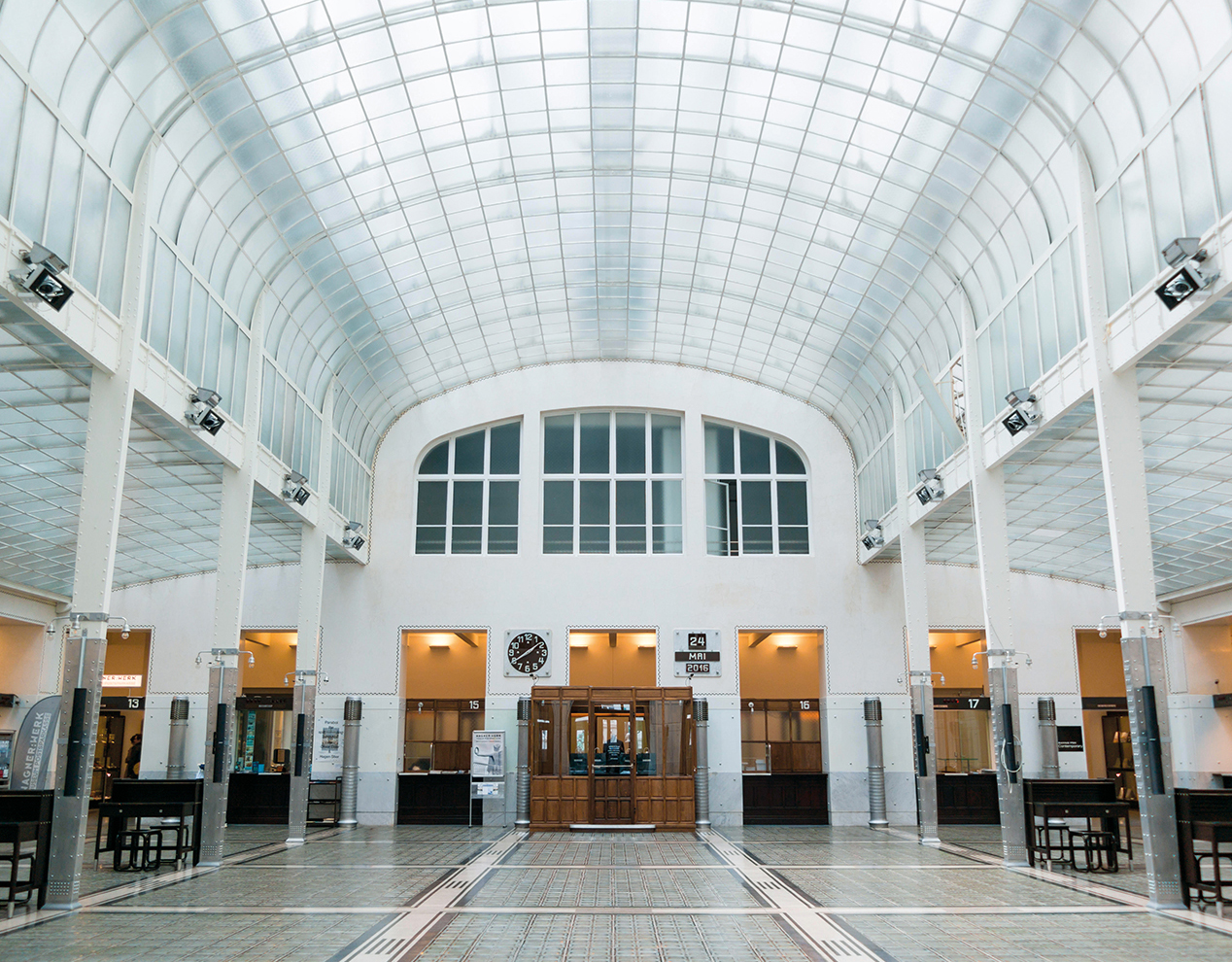
The second Secession exhibition showed architectural drawings by Otto Wagner (1841–1918), the father of the Viennese avant-garde, whose liberal teaching methods had encouraged Hoffmann and Olbrich. His design for the Post Office Savings Bank in Vienna (1904–6) includes one of the clearest and most functional interiors of the early twentieth century.[42] The main hall has a glass barrel-vaulted roof, plain metal pillars, and aluminium hot-air-blowers that punctuate the wall-space at regular intervals. Such a plain interior was the antithesis of the Revivalist splendour prevailing in Vienna, particularly with the Ringstrasse completed in 1888. Simple room settings formed a major part of Secession exhibitions until the group dissolved in 1905.

43 Josef Hoffmann and Koloman Moser: main hall, Purkersdorf Sanatorium, 1904–5. Chairs, floor and wall design emphasize the theme of the square.
The success of the Secession and the ideals of the British arts and crafts movement inspired Hoffmann and the designer Koloman Moser (1868–1918) to found the Wiener Werkstätte in 1903 as a modest crafts workshop. Like the arts and crafts movement, Hoffmann and Moser were opposed to the methods of mass production, and aimed to use only materials and skills of the highest quality. This failure to come to terms with twentieth-century means of production led the Werkstätte to produce only precious objects for wealthy customers.
The Werkstätte had an architect’s office for the coordination of building and interior design, and the first major commission was for a sanatorium at Purkersdorf (1904–5).[43] Hoffmann was responsible for the whole design, to the last detail, of this early iron and concrete building, including the furnishings, decorations and appliances that were made in the Werkstätte studios. As with the Ver Sacrum room, the interior design is restrained and functional. It is based entirely on horizontals and verticals: the entrance-hall floor tiles form a pattern of squares, the backs and sides of chairs are constructed of a square framing seven vertical slats, and even Hoffmann’s designs for smaller objects such as a silver tea service and trays are based on the square.
44–5 Josef Hoffmann and the Wiener Werkstätte: dining room and central hall, Palais Stoclet, Brussels, 1905–11. A ‘total artwork’ executed for a wealthy patron, and demonstrating that design based on rectangles was just as appropriate for luxurious furnishings as for functional interiors.
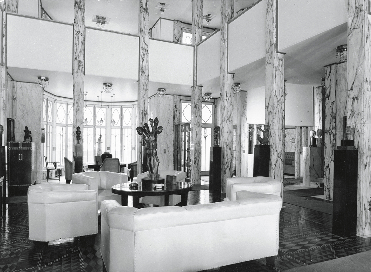
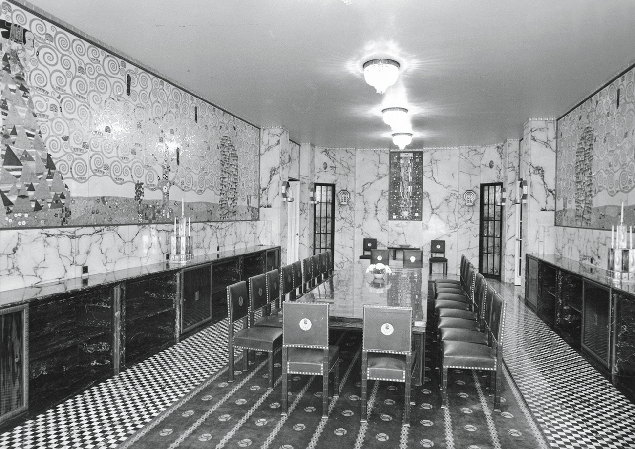
The Werkstätte’s most significant commission, the Palais Stoclet in the Avenue de Tervueren, Brussels (1905–11), represented the successful collaboration of architect-designers, craftsworkers and fine artists.[44-5] Here the Werkstätte had no need to compromise the principle of using the finest materials and best workmanship; the palatial residence was designed for a millionaire banker, Adolphe Stoclet, who put no limit on expenditure. Hoffmann and the Werkstätte designed the building, the garden, the interior and all the fittings, down to the cutlery. It was the ultimate Gesamtkunstwerk or ‘total work of art’. The central hall rising through two storeys had columns and walls faced with yellow and brown marble, parquet flooring, and low-backed easy chairs and sofas covered in chamois. The narrow dining room is faced with marble. Above its continuous sideboards running the length of the room are art nouveau frieze panels by Gustav Klimt. The mosaic of silver, enamel, coral and semi-precious stones depicts formalized figures and scroll-like trees-of-life.
In common with most interior design described in this chapter, the Palais Stoclet was a unique commission. Architect-designers had yet to come to terms with the challenge of mass production and attempted to continue in a pre-industrial age. As the Austrian correspondent of The Studio explained: ‘The future of modern art rests with the middle class, but they need educating. They are worth educating too; nothing proves this here in Vienna more than the rush for the modern during the past five or six years. But it behoves those who cater for this class to be very careful only to produce really good things, perfect in design and workmanship. If the public is taught how to distinguish true art from the many varieties of false, it will appreciate each at its proper value. True, it costs more to produce superior articles, but the expense is only an initial one, for in this, as in other things, in the long run good articles are cheaper – and, moreover, they often come to have an intrinsic worth of their own.’ Modern movement designers were to address the challenge of mass taste with varying degrees of success during the next avant-garde phase of interior design.