What are the dominant themes in interior design in the early decades of the twenty-first century, the age of post-industrial globalization? In general, the boundaries between architecture, fashion, graphics, fine art and the interior have become less rigid. Architects have become more interested in interior design, and artists have explored the built environment as part of their creative practice, in works such as House (1993) by Rachel Whiteread (b. 1963), a cast of the interior of a Victorian terraced house. There is also less emphasis on style in the twenty-first century compared with the twentieth: commercial interiors are dictated more by corporate identity and branding than by high style. And the subject of interior design has recently become the focus of a more sustained level of academic enquiry. But the overriding issue is that of sustainability, which has grown in importance on a global level, and for the field of design generally. As awareness about issues such as scarce resources and global warming is raised, so government policy in the developed world calls for a more responsible use of precious materials and energy. This has led to a change of emphasis from fashionability to building usage and careful use of resources.
Today, interior designers are acutely aware of the need to use woods from renewable sources – materials regarded as exotic in the art deco era, such as ebony, are now banned in an attempt to halt deforestation in tropical and temperate rain forests. Other materials, such as bamboo, a highly renewable source, are recommended for flooring, wall decoration and furniture construction. Bamboo does not need replanting and grows organically, without the need for fertilizers or pesticides. The toxicity of materials is also of concern, and interior designers are increasingly aware of the properties of certain plastics or synthetic paints. The lifecycle of materials must also be borne in mind, and acceptable levels of disposability or recycling attained. Bamboo is again ideal, as it can be composted, rather than buried in landfill sites. Indeed, designers are now expected to conceive not only the style and appearance of an interior, but also its integration into the eco-system.
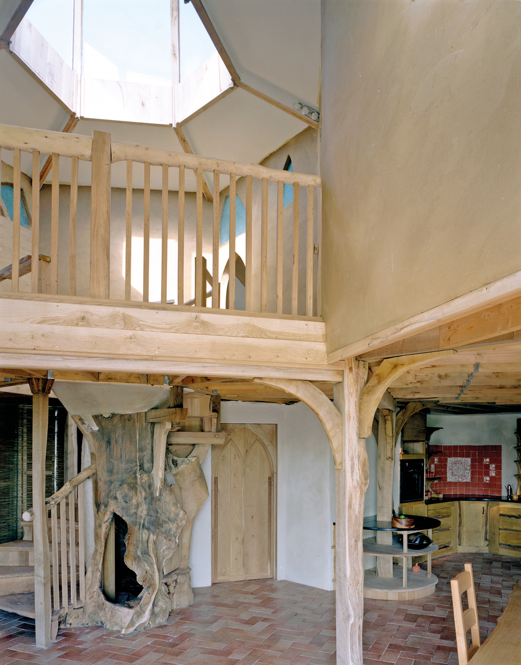
191 Kelly and Masoko Neville: a self-build house created for the Channel 4 series Grand Designs in 2007. The central focus of this sustainable interior is an 800-year-old oak tree from which the wooden staircase was fashioned. The house is hexagonal and was inspired by Tolkien’s The Hobbit.
There has been a marked increase in self-build projects using sustainable materials: approximately nine thousand such homes are built every year in the United Kingdom alone. The Eco House in Cambridgeshire, for example, which featured on Channel 4’s Grand Designs television programme, is an oak-framed house, with straw insulation.[191] The central staircase was carved from a single, 800-year-old oak tree, salvaged by the owner-builder. The house has large windows and a lantern in the roof, which enhances the flood of natural light into the house and saves on power. The power itself is supplied by a wind turbine. Sustainability extends to public buildings too. One extreme example, the Icehotel in Jukkasjärvi, Sweden, runs an annual competition in which entrants are invited to design ice interiors for its lobby and bedrooms.[192-4] Carved from ice in organic forms, the entire building melts in the spring to be rebuilt afresh in winter.
A sustainable approach to materials is enhanced by the careful use of energy. Interior designers can, for example, make better use of natural light and exploit the latest technology in glazing design, choosing photochromatic, thermochromatic or electrochromatic glass for windows. This new generation of ‘smart’ glass can reduce the amount of glare entering a building from the sun: in the case of photochromatic glass, the windows automatically darken when exposed to solar rays, thus saving on air-conditioning costs. Thermochromatic glass fulfils the same function, but darkens when the glass reaches a certain temperature. Electrochromatic glass can be altered by means of an electric current – on the Ferrari Superamerica sports car, for example. The Revocromico window in the car’s roof can be darkened by the driver using a switch; it happens automatically when the car is parked to prevent fading of the interior and overheating.
Thresholds between the exterior and interior have become less distinct as buildings are opened up to the outside world and natural light is used as a feature of the design. Ventilation can also be introduced, rather than wasteful air conditioning, as with the so-called Gherkin Building in the City of London.[195] Designed by Foster and Partners for the financial company Swiss Re, in the heart of the business district, the building’s structure means that it uses fifty per cent of the energy normally employed for a building of its height. A series of atria spirals within the steel framework, acting like lungs for the distribution of air in the forty-one storeys and 76,400 square metres (822,000 square feet) of floor space. The space-rocket profile was dictated by the confines of the site, and the external pressure differentials help to drive the air circulation within. The club room at the very apex of the building offers spectacular views across the city, enhanced by extensive glazing.[196] The BMW plant (2004) built by Zaha Hadid (1950–2016) in Leipzig, Germany, used a similarly fluid approach to inside and outside and allowed the flexibility to accommodate different functions within the building. The central building is the nerve centre for the mass production of BMW’s 3-Series cars, and pulls together the separate functions of the production areas – body-shell unit, paint shop and assembly area. The most striking aspect is the part-assembled cars that move along a track around the building through areas such as the staff canteen and the reception area.
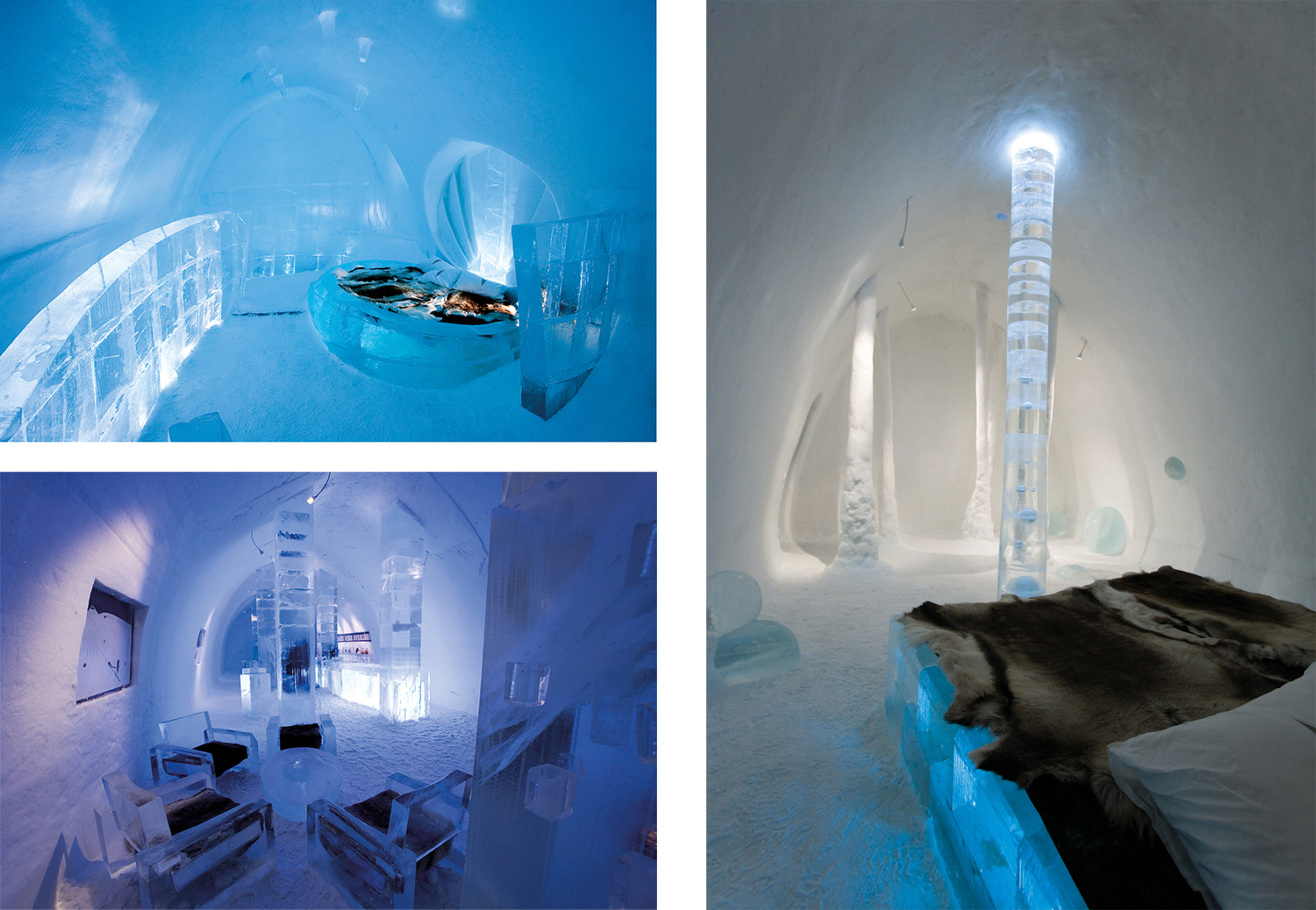
192–4 Icehotel, Jukkasjärvi, Sweden, 2006. The hotel is designed and built every year by carving out interiors in the ice. A competition is held annually for the design of the interiors. Top left, Doug Meerdink and David E. Scott: ‘The Helices’, ice suite 310. Bottom left, Mikael Nille Nilsson, Mark Armstrong and Åke Larsson: ‘Absolute Icebar’. Right, AnnaSofia Mååg: ‘Bubbleboil Swamp’, ice suite 301.
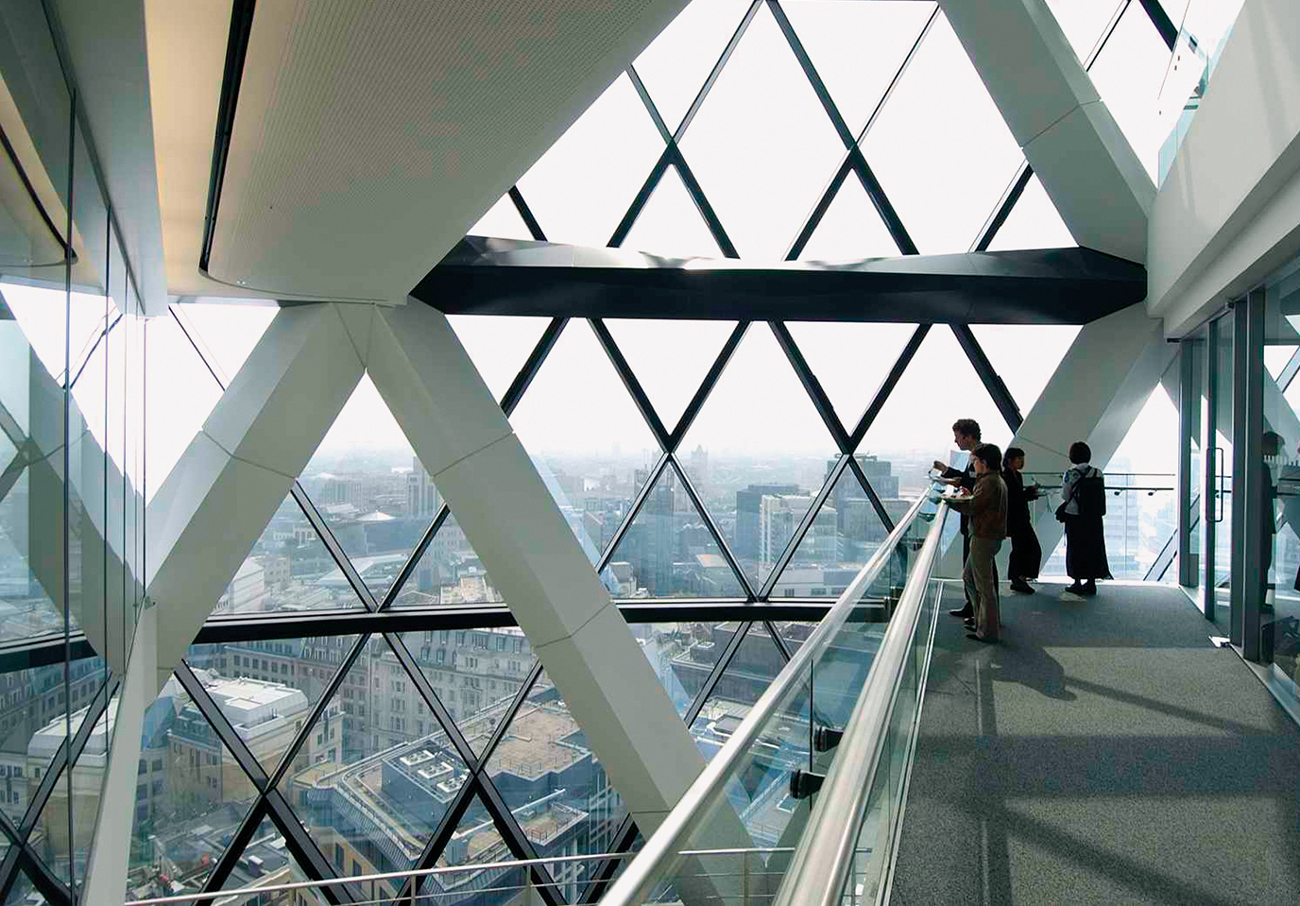
195 Foster and Partners: Swiss Re Building, London, 2004. Nicknamed the Gherkin because of its pickle shape, it is arguably the first environmentally sustainable office skyscraper. On the 40th floor, at the very top, is a bar that offers a panoramic view of the city through the vast expanses of glass and skeletal structure.
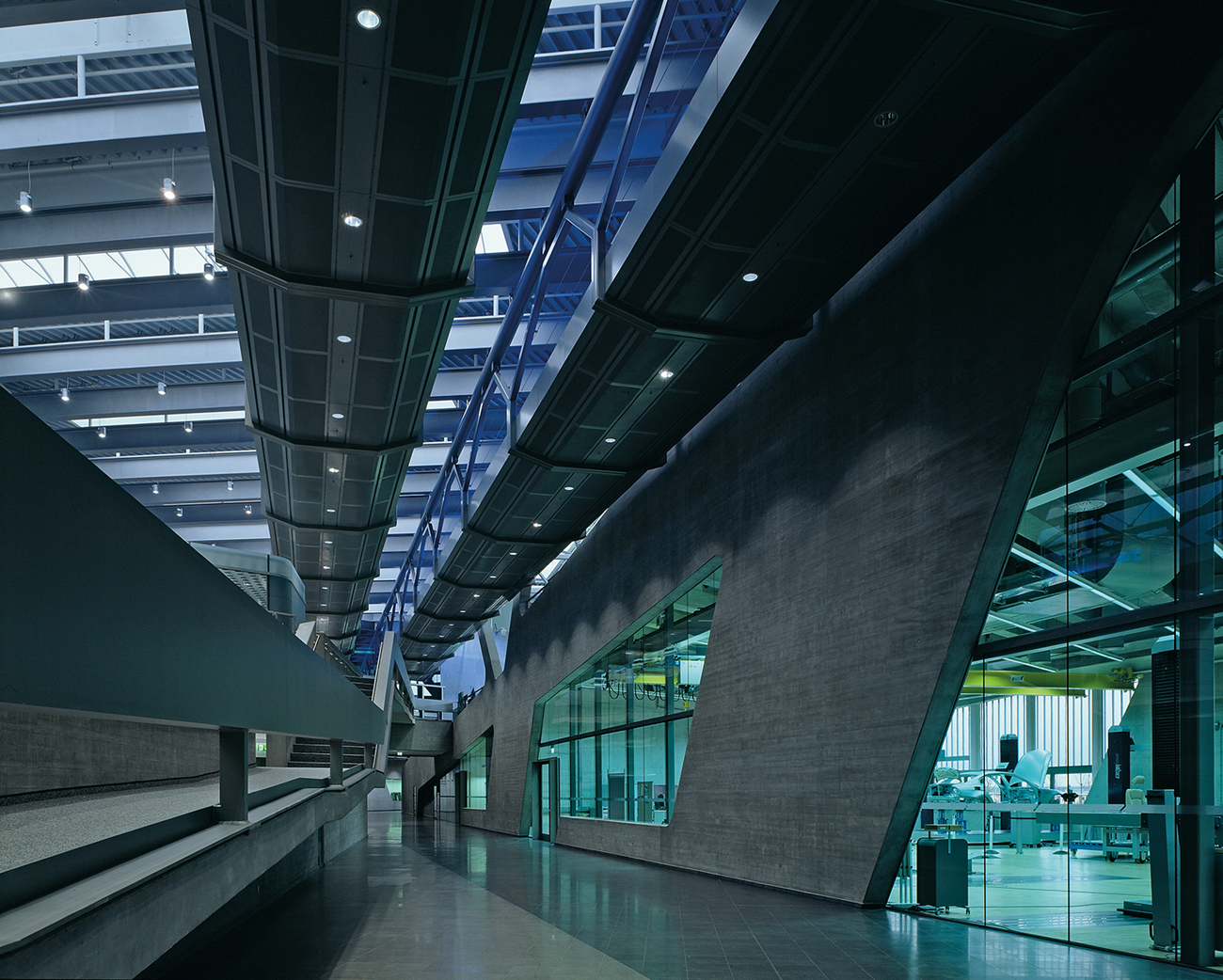
196 Zaha Hadid: interior, BMW plant, Leipzig, 2004. The production line for the 3-Series cars circulates at ceiling height through the staff canteen and reception area, past the terraced open-plan offices.
The Eden Project in Cornwall, England, reflects the growing public interest in ecological and environmental issues.[197] Opened in 2001, three huge geodesic domes, structures shaped like part of a sphere, house plants from different global climates to raise awareness of our dependency on the natural world. The architect Nicholas Grimshaw (b. 1939) used a twin-layer steel structure for the domes and ethylene tetrafluoroethylene (ETFE) film, an extremely hardwearing plastic, for the panels, to enhance the solar energy within by allowing maximum light penetration. In 2006, The Core was added as an education space, constructed in an organic, spiral structure made from wood.
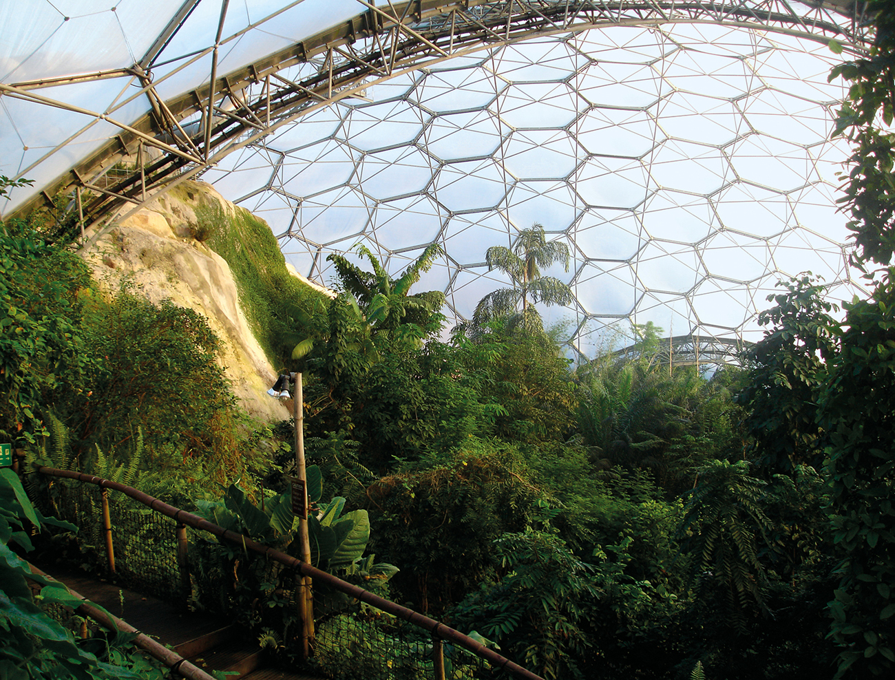
197 Nicholas Grimshaw: interior of the Eden Project dome, Cornwall, 2001. A geodesic dome provides a micro-environment for tropical plants.

198 Diller Scofidio + Renfro: interior of the Brasserie, Seagram Building, New York, 2000. A classically modernist interior has been refurbished to preserve the authentic experience of dining at the Four Seasons restaurant, with twenty-first-century touches.
Alongside new builds with sustainable elements, there is also a trend to refit and refurbish existing buildings: a sign of increased interest in sustainability and in the historic past.[198] For example, the Brasserie restaurant in the archetypal modernist Seagram Building in New York was refurbished in 2000. Originally designed by Philip Johnson in 1959 as the Four Seasons restaurant, it was damaged by fire in 1995. Seagram were anxious to preserve the fashionable appeal of the restaurant, and employed Diller Scofidio + Renfro to redesign the space. They kept the modernist style by using sage-green vinyl to cover the tall booth dividers. A vast wave of dark timber envelopes the main dining area, which is spectacularly lit to enhance the drama of entering the restaurant by means of the glass, steel and stone staircase. A video installation, which plays sequentially on a series of fifteen monitors above the bar, is based on Diller and Scofidio’s Para-site installation at the Museum of Modern Art in New York (1989) and shows film of visitors entering the building.
The Seagram scheme preserved and enhanced the original use of a space: a significant proportion of architectural design work is about remodelling buildings and reshaping them to signify one type of use rather than another. Instead of the resource-intensive design and construction of brand new buildings, with the attendant problems of waste disposal, disused buildings, usually industrial, are being given a new lease of life.[199] For example, Matchworks in Liverpool, developed by Urban Splash from 2001, is a group of office spaces created from the former Bryant and May match factory. Other key examples can be found in the field of museum design. Tate Modern in London, originally designed by Sir Giles Gilbert Scott (1880–1960) in 1939 as a power station, is now London’s prime space for the display of modern and contemporary art. Rather than disguise and attempt to supplant the building’s original purpose, the Swiss architects Herzog & de Meuron exploited the might of the vast Turbine Hall as the key public space of the building. Industrial materials are laid bare.[200] Five storeys high and 152 metres (500 feet) in length, it is the key circulatory focal point of the interior. The shop, cafe, stairs and lifts are all visible from this space, and the three gallery floors overlook it. Headline-grabbing shows, including Test Site (2006) by Carsten Höller (b. 1961), which brought funfair slides to the art gallery, and Ai Weiwei’s (b. 1957) installation Sunflower Seeds (2010–11), have been situated in the hall. At the top of the building, Herzog & de Meuron added two glazed storeys, with a restaurant and bar, affording views of the River Thames and the footbridge engineered by Ove Arup & Partners and designed by sculptor Anthony Caro (1924–2013) and architect Norman Foster (b. 1935), which takes pedestrians to the financial district of London and to St Paul’s Cathedral. Such an opening up of a pre-existing building to the outside world, making less of a distinction between the exterior and the interior, is a common element in many such remodelling projects.
199 Urban Splash: office interior, Matchworks, Liverpool, 2004. The vast industrial space, built between 1919 and 1921 for the mass production of matches, was taken over by Bryant and May in 1923 and eventually closed in 1994. The factory has been remodelled to create rentable office space.
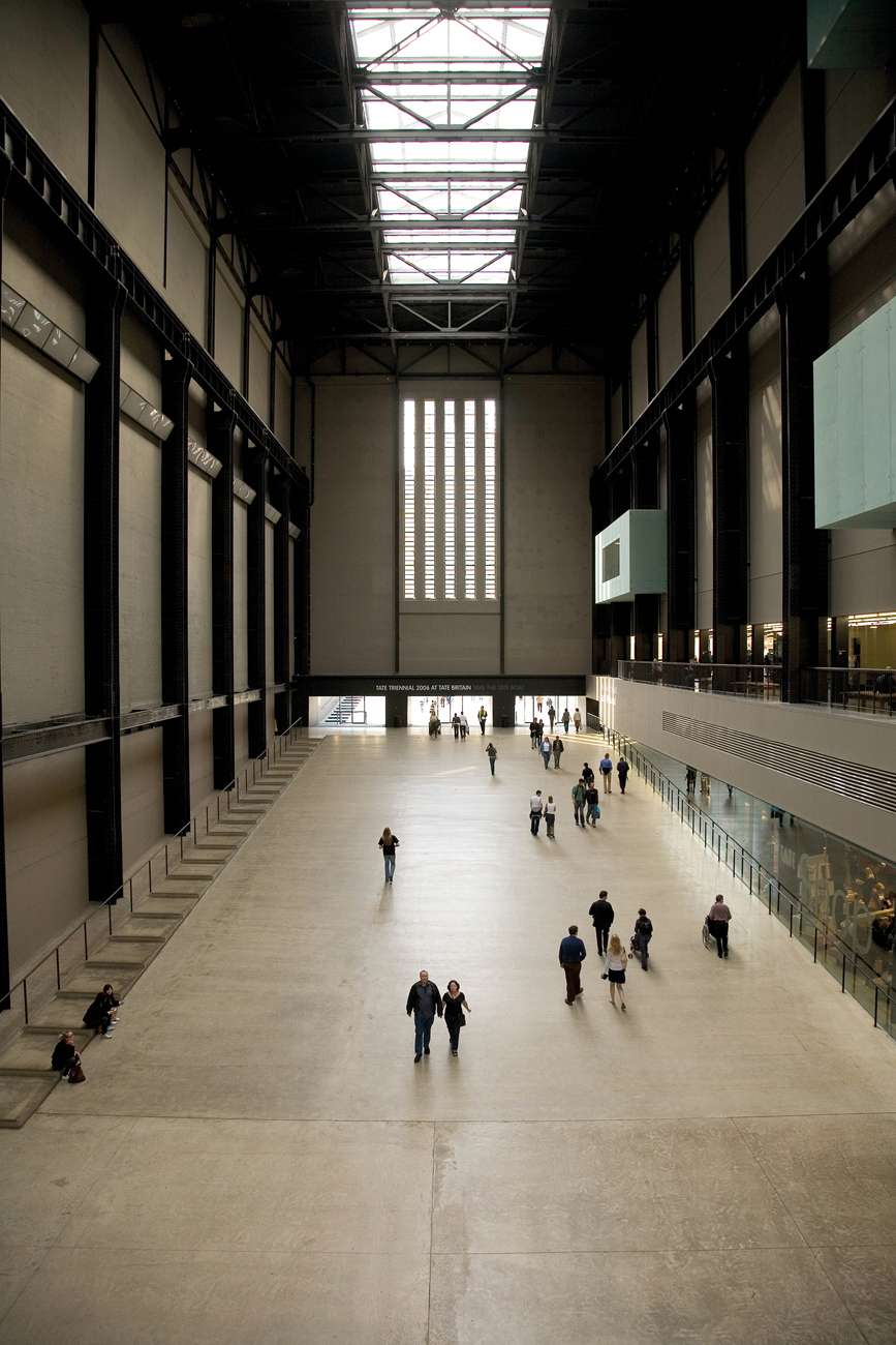
200 Herzog & de Meuron: Turbine Hall, Tate Modern, London, 2000. This vast industrial space acts as an awe-inspiring setting for contemporary fine art. The old power station’s machinery was removed and a steel structural framework installed within the brick shell of the old building to create seven new floors.
The Great Court in London’s British Museum was reconfigured by Foster and Partners in 2000.[201] The existing building opened in 1852, and was designed in the fashionable Greek Revival style by Sir Robert Smirke (1780–1867). The original domed, circular Reading Room, designed by Smirke’s brother Sydney (1798–1877), was added to the empty quadrangle at the heart of the building between 1854 and 1857. With piecemeal additions throughout the nineteenth and twentieth centuries, the British Museum was in need of a complete revamp and a higher profile for its commercial enterprises and education space, owing to the massive increase in visitors, now numbering five and a half million a year. Foster preserved the newly restored Reading Room at the centre of the two-acre space and used a bespoke computer system to design the glazed roof, which consists of 3,312 individually shaped triangular panes, supported in a steel framework. It adds light and a sense of space, which the original design lacked, and opens up the previously enclosed courtyard to more natural daylight and the outside world.
Foster and Partners added a similar structure to the Reichstag, the German parliament in Berlin, in 1999.[202] Following the collapse of the Berlin Wall, and with it communism, in 1989, the Reichstag, originally built in the nineteenth century as a symbol of the newly united Germany, was radically reworked. The building had been burnt out by anti-Nazi agitators in 1933, the ensuing outrage in part strengthening Hitler’s new position as chancellor. It was further damaged during the Second World War. Attempts at using the interior were made during the 1960s, but by then the importance of the building had diminished, as the national government of West Germany now met in Bonn. Mezzanine floors were added and other internal additions were made between 1958 and 1972, which Foster subsequently removed. With Germany reunited again in 1990, Berlin became the capital once more and a focal point for new corporate buildings, including the spectacular Sony Centre by Helmut Jahn (b. 1940), which consists of eight buildings, grouped around a glazed atrium, employed as residences, shops, offices and entertainment centres. The new Reichstag uses glazing in a similarly adventurous way, with a spectacular dome rising out of the centre of the nineteenth-century shell. Visitors may enter the dome and view the parliament below through a glass floor. Panoramic views of the city can be enjoyed from the spiralling ramp within the dome. The entire interior of the Reichstag was removed and replaced with modern materials and open spaces, but the focus is the glazed dome, which diminishes the barriers between government and the public.

201 Foster and Partners: Great Court, British Museum, London, 2000. A specially engineered roof opens up the central space to light. The new space gives a focus to the museum for circulation of visitors, retail and education.
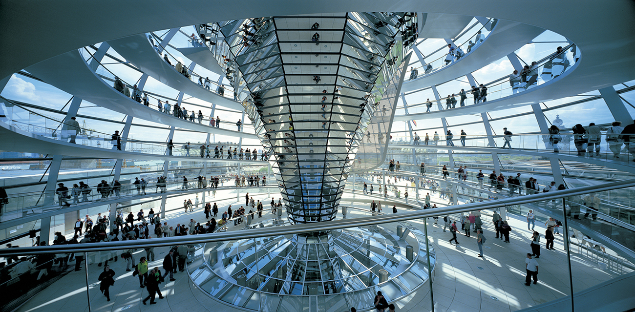
202 Foster and Partners: interior, Reichstag Dome, Berlin, 1999. The new dome allows visitors to enjoy a panoramic view of the reunited city and to observe the parliament at work through the glass panel in the centre.
Hotel design has also seen the imaginative recycling of existing buildings.[203] In Holland, the Kruisherenhotel in Maastricht, designed by Henk Vos (b. 1939) in 2005, reworked the interior of a fifteenth-century monastery and gothic church. Part of the Camille Oostwegel Château Hotels & Restaurants chain, the hotel has an entrance in the form of a copper-lined, trumpet-shaped tunnel. The reflective qualities of the material are capitalized upon with fluorescent lights embedded in the concrete floor. This leads to the reception area, once the nave, which now has high-end designer furniture and lighting, and a glass elevator. A new mezzanine floor was created directly above the reception area to house the restaurant, providing views through the vast gothic windows of the streets of Maastricht beyond. A conference room leading off the restaurant is housed in an electrochromatic glass cube, which can be made either clear or opaque white at the flick of a switch. The guest rooms, situated in the former monks’ cells, have been simply decorated, with digitally enlarged copies of paintings and photographs and modern furniture. Gothic details are juxtaposed with sleek contemporary furniture in the public areas to create surprising effects. This trend is seen elsewhere within the hotel industry. For example, Malmaison Oxford, an old prison, has luscious interiors designed by Jestico & Whiles; the erstwhile cells have become the guest rooms.[204] Malmaison, a British hotel chain, has pioneered the innovative reuse of buildings for their chic city-centre hotels. In Belfast, a nineteenth-century dockside warehouse has been utilized, incorporating bare brick and industrial ironwork alongside unconventional contemporary furniture. The small lift is padded in deep purple velvet. The juxtaposing of the luxurious with the industrial (or, in the case of Oxford, with a prison) is the chain’s highly successful trademark.
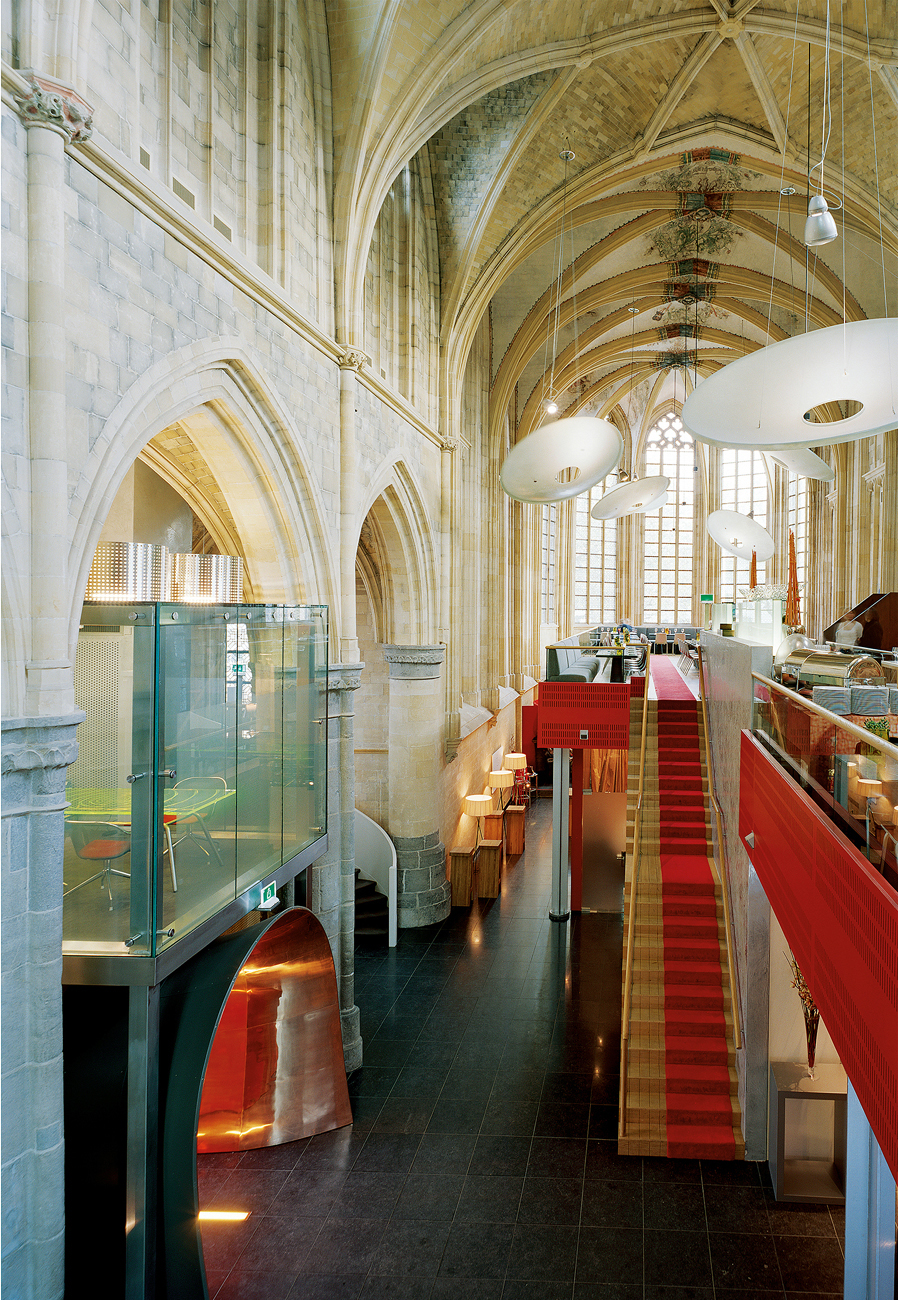
203 Henk Vos: interior of the Kruisherenhotel, Maastricht, 2005. A gothic church has been remodelled as a hotel, with the restaurant on a newly constructed mezzanine to the right. The copper-lined entrance tunnel can be seen on the lower left.
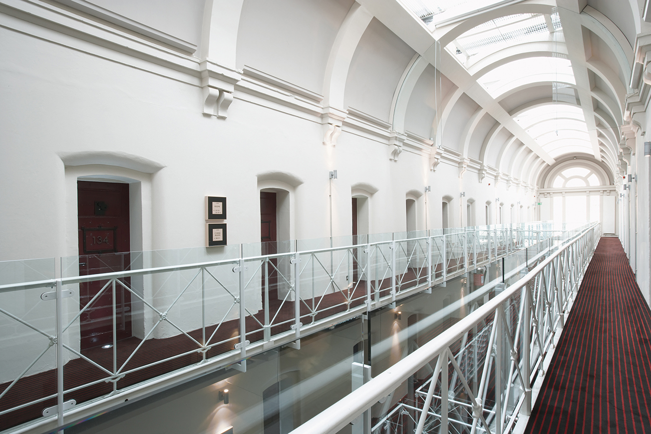
204 Jestico & Whiles: interior, Malmaison Oxford (formerly Oxford Castle), 2006. The top floor of the former prison has been reworked as a boutique hotel with cells transformed into luxury rooms.
A slightly different approach to hotel design has been taken by fashion designers, who are now much more likely to explore the boundaries between clothing design, retailing and bespoke interior design. For example, the French fashion designer Christian Lacroix (b. 1951) remodelled a seventeenth-century bakery in Paris into a couture hotel with the help of architects Cabinet Vincent Bastie.[205] The small, exclusive Hotel du Petit Moulin opened in 2004, with only seventeen rooms, each resembling a stage set decorated with sumptuous Lacroix signature fabrics and gold trimmings. Pop furniture from the 1960s is blended with classic modern and Zen to create a cacophony of distinctive colour and style. Other fashion houses who have seized the opportunity to enter the hotel world include Armani, with the Armani Hotel Dubai, Bulgari in Milan and Bali, Palazzo Versace on the Australian Gold Coast, Cerruti in Vienna, Düsseldorf, Dubai and Brussels, and Ferragamo in and around Florence.
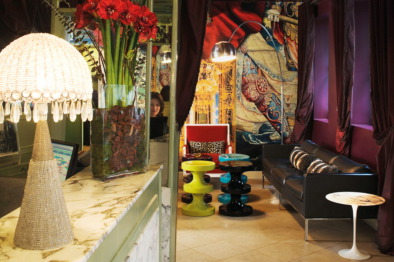
205 Christian Lacroix: interior of the Hotel du Petit Moulin, Paris, 2004. In the reception, 1960s Swedish design mingles with decorative luxury in the Marais district.
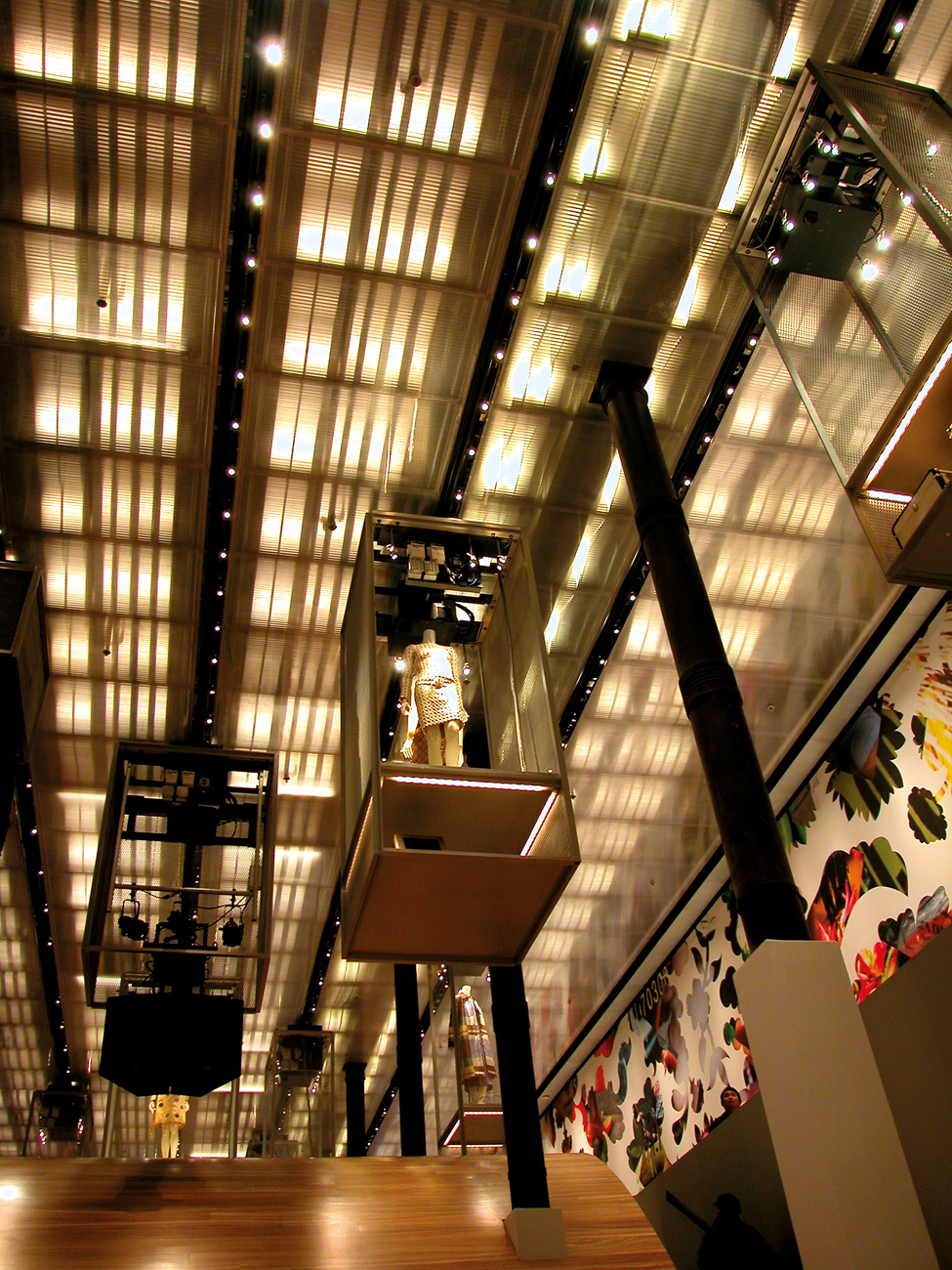
The establishment of fashion brands through flagship store design has also increased.[206] Prada, for instance, reconfigured the former SoHo branch of the Solomon R. Guggenheim Museum in New York, originally a nineteenth-century warehouse, with an interior by Rem Koolhaas (b. 1944) of the Office for Metropolitan Architecture (OMA) in 2001. OMA are best known for uniting the latest technology with cutting-edge architectural theory. The entrance and ground floor are comparatively empty, dominated by a round glass lift, with the main store in the basement. Another key feature is the sweeping blond zebrawood structure that connects the two floors. Clothing is suspended in cages from the ceiling, and the transparent changing-room walls turn opaque white when the rooms are in use.[207] The Prada store, or Epicenter (2003), in Tokyo, designed by Herzog & de Meuron, is another example. A glazed structure surrounded by a landscaped area, unusual for Tokyo, provides a hallmark stylish and simple building. Digital projections and databases of the collections are found in the store. Haute-couture shops such as this find resonance in the capital cities of the developed world, as the motivation is to offer luxury goods at high prices to maintain exclusivity and the brand’s status.
206 Rem Koolhaas, Office for Metropolitan Architecture (OMA): interior of Prada store, New York, 2001. A zebrawood wave structure connects the two floors, with steps to the right and cages containing clothing displayed above.

207 Herzog & de Meuron: interior, Prada store (Epicenter), Tokyo, 2003. The futuristic interior features only a database for the stock, with a minimal quantity of clothing on display.
Branding also dominates other market sectors where values and attractiveness are communicated through interior design.[208] For example, sports giant Reebok opened its new world headquarters just outside Boston, Massachusetts, in 2002, establishing an entire ‘Brandscape’. Designed by NBBJ architects, the four edifices are linked by Reebok’s unmistakable sportswear brand image. The walkway leading into the building is in the form of a running track, and the interior is sleek and streamlined, with the different elements flowing effortlessly into one another. Reebok’s identity is reinforced in all aspects of the company’s designs, from trainers to high-street stores and the look of their headquarters. Brand recognition is therefore assured.
The sportswear company Nike has opened a series of Nike Towns in major cities throughout the world, including New York, Berlin and London, with vast and minimal interiors.[209] At the London flagship store the stock is sparsely in evidence: the space is devoted to reinforcing the brand through blown-up images of sporting heroes, a vast projector screen showing sporting events, and a floor decorated with layouts of games courts.[210] Loud music pumps throughout the stores, creating an ambience that accentuates youth, sport and energy. Such an emphasis on a consistent corporate identity produces interiors that are seemingly designed irrespective of where the space is located geographically. Criticized by some writers, particularly Naomi Klein in No Logo (2000), as a form of North American hegemony, this consistency does ensure the global appeal, or at least the recognition, of the brand. Retail spaces are now carefully designed to attract particular sections of society: in the case of Nike Town, the target is the younger consumer interested in the fashion appeal of sportswear and physical fitness. A similar approach was taken in the interior design of the 4-you Youth Savings Bank in Krems, Austria, created by the Unit in 2000.[211] In contradiction to the conventional interiors of banks, which emphasize solidity and respectability, the 4-you Youth Savings Bank was designed to appeal to the younger generation. The floor is bright blue with the yellow markings of a baseball court. A huge baseball-glove seat, based on the Zanotta ‘Joe Sofa’ (1971), invites lounging, and the informality is reinforced through a row of PCs rather than cash desks.
208 NBBJ: interior, Reebok headquarters, Canton, Massachusetts, 2002. The new corporate headquarters is entered via a road modelled on a running track, which leads to this integrated, flowing space.

209 Nike in-house design team: interior, Nike Town, 5th Avenue, New York, 1997. Global brand identity is reinforced with the emphasis on youth and athleticism.
Mandarina Duck, an Italian luggage firm, creates wacky, off-the-wall objects for a sophisticated adult consumer. Droog Design was selected to design their prestigious Parisian store using their playful corporate image. Founded by Renny Ramakers (b. 1948) and Gijs Bakker (b. 1942), Droog Design made their mark with their first show at the Milan Furniture Fair in 1993, when they challenged preconceptions about users, objects and space. Issues of sustainability are a key element in their work. Rag Chair by Tejo Remy (b. 1960), for example, is a collection of discarded and disused materials and clothing, tied together with belts to form a chair. Remy has also reused discarded milk bottles, hung from rods in the ceiling in sets of twelve to create lamps.[212] Mandarina Duck purchased a property on Paris’s prime designer shopping street for their flagship store. The two-storey space was remodelled with plain white ceilings, walls and floors with free-standing objects, or ‘cocoons’, used to display the merchandise. The cocoons were labelled ‘circle’, ‘tunnel’, ‘wall’, ‘curtain’ and ‘enclosure’. The ‘wall’ consists of one wall with metal pins, used to clasp the luggage for sale, and another is made up of red, yellow and green rubber bands stretched horizontally, into which the bags are inserted. The shoppers are guided through the store by means of a curtain made of thin, curving translucent plastic strips. A three-and-a-half-metre, doughnut-shaped metal container conceals clothing, and customers are encouraged to discover the merchandise through encounters with unfamiliar objects. More like an art installation than a shop interior, the concept had to be easily translatable for Mandarina Duck’s international chain of stores.

210 Nike in-house design team: London flagship store, Oxford Circus, London. This vast retail space is sparsely decorated to allow the projection of sporting imagery on a giant scale.
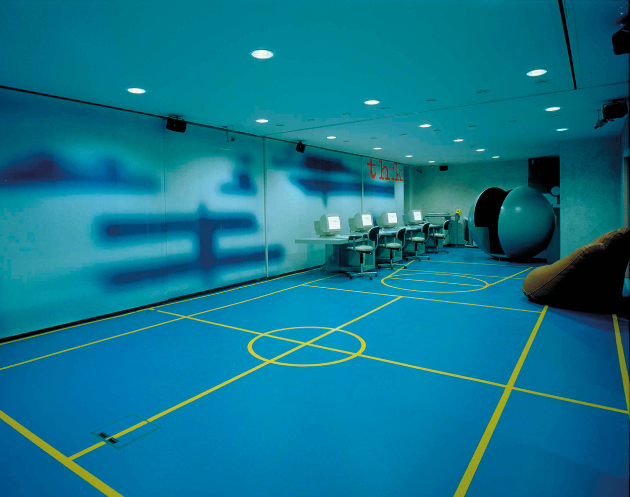
211 Unit (Wolfgang Bürgler and Georg Petrovic): interior, 4-you Youth Savings Bank, Krems, Austria, 2000. A baseball theme is used to attract and reassure teenage savers.
An ambience of conviviality and relaxation has been created through the interior design of the global chains of coffee shops. Starbucks, the first and most famous, was established in Seattle in the 1970s, embarking on its worldwide expansion in 1987. The owner, Howard Schultz, used the expertise of other global brands such as McDonalds, Pepsi and Kentucky Fried Chicken in his bid to expand, and by 2018 Starbucks had stores in seventy-six countries. The phenomenal success of Starbucks can be partly explained by its reinforcement of core corporate values through the nature of its stores. Jazz plays gently in the background and newspapers are available, as customers relax on leather sofas, surrounded by tasteful artwork and the aroma of coffee. Urbane and sophisticated, the dark wood surroundings enhance the gourmet image of real coffee.

212 Droog Design: interior, Mandarina Duck, Paris, 2001. An example of the ‘cocoon’ constructed in the boutique interior to display clothing, concealed inside the structure.

213 Virgin in-house design team: interior, Virgin Atlantic aeroplane, upper-class suite, 2006. Competition for prime passengers is played out through the provision of luxury and comfort on boring long-haul flights. Chairs convert into beds and optimum personal space is ensured through screens.
Global branding also dictates the interior design of transport. For example, the Virgin brand is used to sell products and services as diverse as cable TV, mobile phones and wedding planning. Originally founded as a record retailer in 1970 and then a record label, the company built an image of youthfulness and entrepreneurship. In 1984, it launched Virgin Atlantic Airways in direct competition to the more established (and the more establishment) British Airways. Its familiar red-and-white logo is displayed everywhere, from the tailfins right through to the marketing materials. As competition to gain passengers for airlines becomes more vigorous, so Virgin Atlantic attracts more exclusive clients using ‘design’, by offering unique beds in the upper-class suite, for example. The interior design of aeroplanes goes beyond the usual questions of style, materials and use; issues of space and safety have also to be considered, as well as the added dimension of weight. The problem of fitting beds into a restricted space was solved by Virgin Atlantic’s in-house design team in an ingenious way.[213] The beds convert from seats, which are upholstered in leather; with the touch of a button the chair flips over and the other side is covered in supportive foam. The upper-class suite also features a bar area.

214 Claudio Lazzarini and Carl Pickering: enclosed deck of the 118 WallyPower, 2004. The designers have eschewed traditional nautical styling for this technically innovative, luxury yacht. A glass-sided deckhouse shelters a capacious but sparsely furnished saloon with white upholstery, plain wooden flooring and surrounds. The steps down to the cabins are centrally placed, followed by the modernist dining area and controls beyond.
The interior design of boats is a similarly specialist field with more limited parameters than land-based interior design. Before the advent of mass air travel in the late 1950s, ocean liners were the most common means of international travel. The interiors of the ships very often reflected the national identity of the line owners, as on the British-owned Cunard Line and the French-owned French Line. In the post-war era, the designs were undertaken by star architects and designers. James Gardner (1907–1995), Dennis Lennon and Hugh Casson (1910–1999) designed for Cunard’s flagship Queen Elizabeth 2 (1969) and Gio Ponti for the Italian Giulio Cesare (1951). Ship interior design is now mainly concentrated on the cruise market, where waterborne holidays are provided en masse in floating, glitzy hotels that cater for an older clientele, dominated by the North American market. The Queen Mary 2, which entered service in 2004 for the Cunard Line, features a six-storey central atrium, casinos and multifarious entertainment spaces designed by Tilberg Design, based in Sweden. There has also been a growth in yacht design for the luxury market. Wally, based in Monte Carlo, was founded by the Italian Luca Bassani (b. 1956). In 2004, the firm commissioned architects Claudio Lazzarini and Carl Pickering to collaborate on the interior design of the 118 WallyPower.[214] The design team makes no reference to traditional nautical styling, and instead has placed a geometrically shaped glass structure on top of the wooden deck. The space within is completely open plan, with a dining table for sixteen and a flight deck rather than a cockpit; reaching speeds of up to 63 knots, the boat is powered by gas turbines.
If there is one style that distinguishes interior design in the early twenty-first century, it is the ‘non-style’ of minimalism. The minimal style has had an impact on the domestic interior, as the impetus from the media is to declutter your home, use neutral shades and negate individualist style. This makes a home easier to sell, but has meant a move away from a cosy, family home. The chief exponent of the minimal style is British architect John Pawson (b. 1949). His stripped-back interiors are void of what he regards as unnecessary ornament and clutter. Pawson designed a series of minimalist shops for Calvin Klein: the first, a new building, opened in Tokyo in 1994, and in 1995 the New York store opened. An existing neoclassical building on the corner of Madison Avenue, with plain white walls, pale stone flooring and precision lighting, was reworked. He repeated the formula with the Calvin Klein store in Paris, which opened in 2002, again using pristine minimalism to reflect the sparse and simple identity of the American fashion brand. Pawson’s style was also used to maximum effect in the design of the Nový Dvůr Monastery in the Czech Republic.[215] The original Baroque manor house lies at the heart of the monastery, designed as a home for forty Cistercian monks with new sleeping cubicles and a church. It is perhaps appropriate, given that his designs for domestic spaces resemble monasteries, that Pawson has now turned his hand to designing a real one.
A more emotionally sustainable and spiritual dimension is detectable today in some aspects of interior design practice, as designers struggle with the global impact of their work and critically evaluate design’s broader contribution to culture and society. This is evident in the psychological use of colour and light in public buildings such as prisons and hospitals. There is also a growing tendency among interior designers to develop as reflective practitioners, taking theoretical issues into account as part of their practice. The study of the interior is now more academically respectable. Where once it was seen as lacking the gravitas of product design or graphics, it has begun to emerge from the dominance of architecture as a discipline in its own right. Since 2000 there has been a marked increase in publications about the history and theory of the subject. Edited collections such as Susie McKellar and Penny Sparke’s Interior Design and Identity (2004) and Hilde Heynen and Gülsüm Baydar’s Negotiating Domesticity: Spatial Productions of Gender in Modern Architecture (2005), and theoretical analyses such as Charles Rice’s The Emergence of the Interior: Architecture, Modernity, Domesticity (2007), have added significantly to the field of study. Intimus: Interior Design Theory Reader (2006), edited by Mark Taylor and Julieanna Preston, presents the key texts for the development of the subject. Monographs of individual designers and decorators have also been published, including Penny Sparke’s Elsie de Wolfe: The Birth of Modern Interior Decoration (2005). Practising architects, who previously had not considered interior design as central to their practice, now write on the subject: for instance, New York-based architect Joel Sanders’s essay ‘Curtain Wars: architects, decorators and the twentieth-century domestic interior’ (2002) describes the professional architect’s longing to be involved in interior decor. These publications, along with the founding of the Modern Interiors Research Centre at Kingston University, London, mean that the academic subject of interior design has now been firmly established.
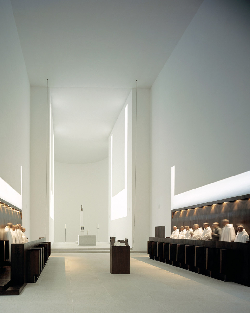
215 John Pawson: interior of Chapel, Nový Dvůr Monastery, Czech Republic, 2004. The minimalist style is ideal to create a spiritual space for prayer and reflection.
The latest developing trend in interior design is that of the interactive interior. In the domestic space, lighting can be fitted that reacts to the occupants’ movements within a room, or even their mood. Developments in new technology also make the complete convergence of all home entertainment possible, creating the intelligent living space. Electronic companies such as Panasonic are working on technology for the future, with a home cinema and television system that can be projected onto a white wall. An entire wall could be decorated with projected images, which the inhabitant could specify and arrange as they wished, with built-in alarms and message possibilities. Entry to the home need no longer be by key, but can be controlled by retinal scanner. The possibilities of new technology are set to challenge the interior designer and consumer alike, within both public and private spaces. Interior design has been turned virtually inside out: as the Victorian home analysed at the beginning of this book was designed to keep the threat of modernity at bay, so now the results of technology determine the appearance and use of interior space.