Chapter 2
Describing Populations
Chapter Summary
In Chapter 2, we encounter distributions of data. A distribution of data is a description of how frequently various data values occur. In health research, we are interested in describing the distribution of data in the population. There are three ways we can do this. We can use literary language, graphic language, or mathematic language.
In literary language, we can describe a distribution of data by reporting which data values occur most frequently, less frequently, and least frequently. A literary description of a distribution of data is relatively easy to construct, but it leaves out quite a bit of detail about the distribution.
A better way to describe a distribution of data is using graphic language. There are several ways we can graphically describe a distribution; four of which are introduced in Chapter 2. These are a bar graph, a histogram, a stem-and-leaf plot and a frequency polygon.
A bar graph is used to describe distributions of discrete data. Discrete data include ordinal and nominal data. Ordinal data are values that can be ordered in a meaningful way, but the spacing between the data values is not considered. Nominal data are values that describe groups that cannot be ordered in a meaningful way.
A bar graph has data values on the horizontal axis and either the frequency, proportion, or percent of each of the data values on the vertical axis. A bar is drawn for each data value, the height of which corresponds to the frequency, proportion, or percent of data values in the population equal to that specific value.
A histogram is used to describe continuous data. Continuous data have a large number of possible ordered values that are evenly-spaced.
A histogram is similar to a bar graph in that data values are on the horizontal axis; frequency, proportion, or percent is on vertical axis; and bars of various heights are used to represent the occurrence of the corresponding data values. There are two differences between a bar graph and a histogram. First, the bars in a histogram touch each other while there are spaces between the bars in a bar graph. This distinction reflects the differences between discrete data, in which there are spaces between data values and continuous data, in which (theoretically) there are no spaces between values.
The second distinction between a bar graph and a histogram is that the data values in a bar graph are specific values, while data values in a histogram are represented by intervals of values. This distinction is due to the fact that there are (theoretically) an infinite number of possible values for continuous data. If there are an infinite number of possible values, then the probability associated with any single value is essentially equal to zero. To have nonzero probabilities for continuous data, we need to think of intervals of values.
When we use histograms to describe a distribution of data, we need to decide how narrow the intervals will be. The narrower the intervals, the greater is the number of bars. As we approach an infinite number of bars that are infinitely narrow, the bars disappear. Then, we are left with just the tops of the bars that have the appearance of a line instead of a collection of bars. When we reach this point, we call the graph a frequency polygon.
The third graphic approach to describing distributions of data considered in this chapter is the stem-and-leaf plot. A stem-and-leaf plot is similar to a histogram, but it is easier to construct, especially when we graph relatively few data values. To begin, we put the left digit(s) for each value in a column. These are called the stem. Each of the components of the stem is like an interval of values in a histogram. Then, we list in a row following each component of the stem the right-most digit for each of the values that have that particular set of numbers to the left. These right-most digits are called the leaves. The result is like a histogram in which the number of leaves corresponds to the height of a bar in a histogram.
Most often, we use a mathematic description of the distribution of data in the population. To describe a distribution mathematically, we must first state the type of distribution and then, provide values for the parameters of the distribution. Parameters are numbers that designate a specific distribution of the stated type.
The type of distribution we considered, using the mathematic approach, was the Gaussian (or normal) distribution. The Gaussian distribution is a symmetric bell-shaped distribution. To specify a particular Gaussian distribution, we need to provide numeric values for two parameters. One parameter describes the location of the distribution in a continuum of values. The other parameter describes how dispersed the data are around that location.
The parameter of location for a Gaussian distribution is the mean. The mean can be thought of as the center of gravity of a distribution that reflects not only on which side of a distribution data values occur, but also how far away they are from the middle of the distribution. This is in contrast to the median, which reflects only on which side of the distribution data values occur.
The parameter of dispersion for a Gaussian distribution is the variance (or its square root: the standard deviation). The variance can be thought of as the mean of the squared differences between the data values and the mean of the distribution.
Once we can describe the distribution of data in the population, we can begin thinking about the role of chance in selecting a sample from that population. There are two ways we might do this. One of these is based on a graphic description of the distribution. The other is based on a mathematic description of the distribution.
The graphic approach is related to Venn diagrams and Venn equations examined in Chapter 1. Instead of a rectangle, all possible observations are represented by the entire distribution. For the events, we use the portion(s) of the distribution that corresponds to the values for which the probability is being calculated.
For the mathematic approach, we use the mathematic description of the distribution and the values of the parameters to calculate probabilities. Rather than do this for each distribution, these calculations have been performed for us and tabulated for standard distributions (see Appendix B). One of the standard distributions that can be used for a Gaussian distribution is called the standard normal distribution.
The standard normal distribution is a Gaussian distribution with a mean equal to zero and a standard deviation equal to one. When we want to calculate a probability for a datum from a Gaussian distribution, we can convert the mean of the distribution to a mean of zero by subtracting the actual mean from each data value. Then, we can convert the standard deviation to a value of one by dividing the difference between the mean and a data value by the actual standard deviation. We call the result a standard normal deviate or a z-value.
This process of converting a datum to a z-value determines what value on the standard normal scale corresponds to a particular value on the original scale. Then, we can determine the probability of an interval of values defined by that datum by determining the probability of an interval of values defined by the corresponding z-value. To determine the probability for an interval of values defined by a z-value, we use a statistical table.
A statistical table for the standard normal distribution appears in Table B.1 of the textbook and this workbook. Table B.1 gives us the probabilities of getting a data value in an interval equal to the specific z-value or greater. This is called the upper tail of the distribution. In the standard normal distribution, the upper half of the distribution corresponds to positive z-values. The lower half of the distribution does not appear in Table B.1, but the standard normal distribution is a symmetric distribution centered on zero, so what is true for a positive value or more is the same as what is true for a negative value or less. To find probabilities for intervals of values in the middle of the standard normal distribution, we determine the probabilities for the tails excluded by the interval and subtract the probability from one.
Glossary
- Bar Graph – a graph used to describe a distribution of discrete data. Data values appear on the horizontal axis and frequency, proportion, or percent appear on the vertical axis. The height of a bar corresponding to specific data value reflects how often that data value occurs. The bars in a bar graph do not touch as an indication that there are gaps between possible data values.
- Continuous Data – data with a large number of possible values that are ordered and evenly-spaced. Examples of continuous data include weight, height, blood pressure, age, and serum cholesterol. Antonym: Discrete Data.
- Data – information. Anything that can be measured or observed. Singular: Datum
- Discrete Data – data with a limited number of values between which there are no possible values. Examples of discrete data include ordinal data such as level of agreement and stage of disease and nominal data such as country of origin and gender. Antonym: Continuous Data.
- Dispersion – how spread out data values are around some location.
- Distribution – a description of how frequently various data values occur.
- Frequency Polygon – a graphic representation of the distribution of continuous data. A frequency polygon results from increasing the number of bars in a histogram to infinity.
- Gaussian Distribution – a symmetric, bell-shaped curve with data near the middle of the distribution occurring most frequently and data toward the extremes occurring more and more rarely as the distance from the middle increases. Synonym: Normal Distribution
- Histogram – a graphic representation of the distribution of continuous data in which bars are used to represent the frequency (or proportion or percent) of values (represented on the vertical axis) within specified intervals of data (represented on the horizontal axis). The bars in a histogram touch each other as an indication that there are no gaps in possible values between the intervals.
- Interquartile Range (IQR) – a measure of dispersion that is not affected by spacing between data values. The IQR is found by dividing the data values in half by determining the median and, then, dividing each half in half using the medians of the halves. The IQR is the distance between the median of the lower half and the median of the upper half. The IQR can be used to calculate the standard deviation of continuous data that occur in a Gaussian distribution.
- Location – a point in a distribution around which the data values are centered.
- Mean – the center of gravity of a distribution that is influenced by to which side and how far away data values are from the middle of the distribution. The mean is the parameter of location of a Gaussian distribution.
- Median – the physical center of a distribution with half the data values occurring above it and half the data values occurring below it. Unlike the mean, the distance from the center of the distribution at which data values occur does not affect their influence on the value of the median.
- Mode – the most frequently occurring data value in a distribution. A distribution can have no mode, one mode, or more than one mode.
- Nominal Data – data values that cannot be ordered in a meaningful way. Nominal data also include any data with only two possible values (even if they can be ordered). Examples of nominal data include country of origin, gender, names of medications, discharge diagnoses, and blood type.
- One-Tailed (One-Sided) Probability – the probability associated with one of the extremes of a distribution (i.e., high values or low values, but not both).
- Ordinal Data – data values that can be ordered, in which the spacing between values is not considered. Examples of ordinal data include level of agreement, stage of disease, and Apgar score.
- Parameter – a number that describes the distribution in the population. Gaussian distributions have two parameters: the mean (specifying location) and variance or standard deviation (specifying dispersion).
- Population – collection of all possible data values. This is the group that research is intended to address.
- Range – difference between the highest and lowest data values. The range is sometimes used to reflect the dispersion of a distribution.
- Skewed Distribution – a distribution with more data values at one extreme than at the other extreme. Synonym: Asymmetric Distribution
- Standard Deviation – the square root of the variance.
- Standard Normal Deviate – a value from the standard normal distribution. Synonym: z-value.
- Standard Normal Distribution – a Gaussian distribution with a mean of zero and a standard deviation of one.
- Statistical Table – usually refers to a table that provides probabilities associated with various values of a standard distribution.
- Stem-and-Leaf Plot – a graphic method of describing a distribution of continuous data. The “stem” is made up of all but the rightmost digit of each number and the “leaves” are the rightmost digits. A stem-and-leaf plot is easy to construct without using a graphics program. It looks like the mirror image of a histogram rotated 90 degrees.
- Two-Tailed (or Two-sided) Probability – the probability associated with both of the extremes of a distribution (i.e., high values and low values).
- Variance – the parameter of dispersion of a Gaussian distribution. The variance is the mean of the squared differences between each data value and the mean.
Equations
 |
mean of the distribution of data in the population. (see Equation {2.1}) |
 |
variance of the distribution of data in the population. (see Equation{2.3}) |
 |
standard deviation of the distribution of data in the population calculated from the variance. (see Equation{2.4}) |
 |
standard deviation of the distribution of data in the population calculated from the interquartile range. (see Equation{2.5}) |
 |
conversion of a datum to a standard normal deviate (i.e., z-value). (see Equation{2.6}) |
Examples
Suppose we are studying births in a certain population and we measure birth weight, birth order, gender, mother's race, and mother's age.
Table 2.1 Types of data
| MEASUREMENT | TYPE OF DATA |
| Birth weight | Continuous (large number of evenly-spaced values) |
| Birth order | Ordinal (spacing unknown) |
| Gender | Nominal (two groups of unordered values) |
| Mother's race | Nominal (limited number of groups with unordered values) |
| Mother's age | Continuous (large number of evenly-spaced values) |
2.1. Indicate the type of data for each measurement taken in the study.
In Table 2.2 the percent of births according mothers' race are listed.
Table 2.2 Percent births in a certain population according to mother's race
| RACE | Percent |
| African American | 30% |
| Asian | 10% |
| Hispanic | 35% |
| Native American | 5% |
| White | 20% |
2.2. Describe the distribution of births according to race graphically.
Since these are discrete data, we select “column chart” in Excel1
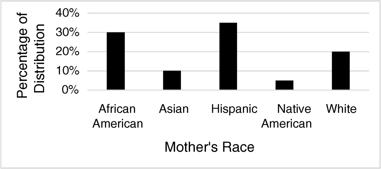
Figure 2.1 Bar graph of mother's race
Table 2.3 lists birthweights in a certain population.
Table 2.3 Percent of births according to birth weight (gm)
| BIRTH WEIGHT | PERCENT |
| 1,500–1,749 | 1% |
| 1,750–1,999 | 2% |
| 2,000–2,249 | 5% |
| 2,250–2,499 | 11% |
| 2,500–2,749 | 15% |
| 2,750–2,999 | 26% |
| 3,000–3,249 | 17% |
| 3,250–3,499 | 10% |
| 3,500–3,749 | 8% |
| 3,750–3,999 | 3% |
| 4,000–4,249 | 1% |
| 4,250–4,499 | 1% |
2.3. Describe the distribution of birth weights graphically.
Birth weights are continuous data, so we want to use a histogram to describe them. We can get a histogram by selecting “column chart,” right-clicking on one of the bars, and selecting “Format Data Series.” Then, click on the column chart icon and set the “Gap Width” to zero.
2.4. What is the probability that an infant in the population will have a birth weight of less than 2,000 gm?
To determine a probability, we sum the percentages (or proportions) that satisfy the criterion. For birth weight less than 2,000 gm, we add the 1,500–1,749 and 1,750–1,999 category percentages.

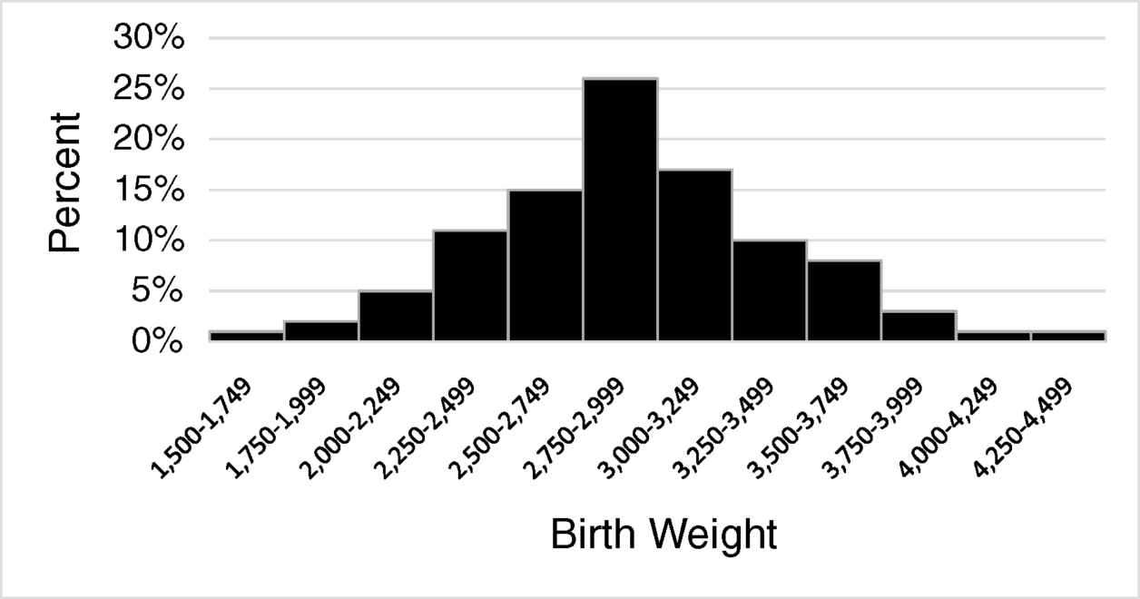
Figure 2.2 Histogram of birth weights
2.5. What is the probability that an infant in the population will have a birth weight of at least 2,000 gm but less than 3,500 gm?
To determine the probability for a wide range of values, it is sometimes easier to find the complement of the probabilities of the excluded part of the distribution.

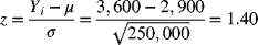
Now, let us assume the distribution of birth weights is a Gaussian distribution with a mean equal to 2,900 gm and a variance equal to 250,000 gm.
2.6. What standard normal deviate corresponds to a birth weight of 3,600 gm?
We find the standard normal deviate (z-value), by subtracting the mean and dividing by the standard deviation.
2.7. What is the probability of getting a standard normal deviate equal to or less than 1.40?
To find probabilities related to specific standard normal deviates, we use Table B1. The probabilities in Table B1 are in the upper tail of the standard normal distribution (or in the lower tail for the negative equivalent of the z-value).
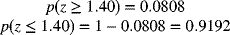
2.8. What is the probability an infant in the population will have a birth weight of at least 3.600 gm?
A z-value of 1.40 in the standard normal distribution corresponds to a birth weight of 3,600 gm, so the probability of a birth weight equal to or greater than 3,600 gm is the same as the probability of a z-value of 1.40 or larger found in previous example.

2.9. What is the probability an infant in the population will have a birth weight of exactly 3,600 gm?
The answer is zero! This is a trick question designed to emphasize that the probability of any specific value in a continuum is essentially equal to zero. The reason for this is there are, at least theoretically, an infinite number of possible values. Any number divided by infinity is essentially equal to zero.
2.10. What is the probability an infant in the population will have a birth weight of at least 2,100?
The answer to this question involves two steps. First, we need to find what z-value corresponds to a birth weight of 2,100 gm. Then, we need to find what probability is associated with the z-value. For the first step, we get:
The probability associated with 1.60 or more is 0.0548, so the probability of 2,100 or more is 1.0000–0.0548 = 0.9452.
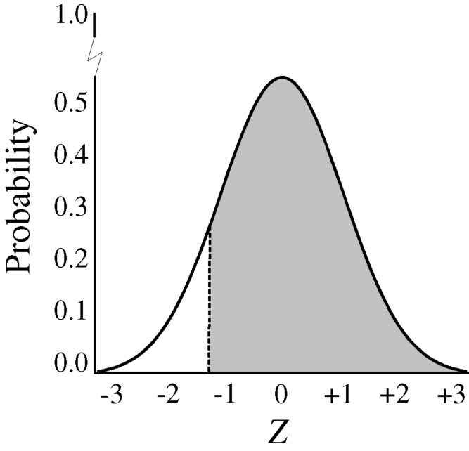
Figure 2.3 z = −1.60 or more
Exercises
2.1. In a particular population, the mean birth weight is equal to 3,500 grams and the standard deviation of birth weights is equal to 800 grams. Given that information, and assuming that birth weight has a Gaussian distribution, which of the following is closest to the probability that an infant selected randomly will weigh between 3000 and 4000 grams?
- 0.2676
- 0.4648
- 0.5352
- 0.7324
- 0.9175
2.2. Suppose we are interested in the length of gestation among live births in a particular population. If the mean gestation period is equal to 38 weeks and the standard deviation is equal to 1 week, and if we assume the distribution of gestational age is a Gaussian distribution, which of the following is closest to the probability that any given pregnancy will last longer than 38 weeks?
- 0.0228
- 0.0456
- 0.5000
- 0.9544
- 0.9772
2.3. In a particular population, the mean age is 45 years and the variance of age is equal to 225 years2. Given that information, and assuming age has a Gaussian distribution, what is the probability a person selected randomly will be between 30 and 60 years of age?
- 0
- 0.1587
- 0.3174
- 0.6826
- 0.8413
2.4. The mean systolic blood pressure in a particular population is 130 mmHg and has a standard deviation of 20 mmHg. Hypertension is considered severe if a patient has a systolic blood pressure equal to or greater than 180 mmHg. Given that information, and assuming that the distribution of systolic blood pressures is a Gaussian distribution, what percent of the population would have severe hypertension?
- 0.6%
- 2.0%
- 6.0%
- 17.1%
- 20.2%
2.5. Consider a population in which the mean systolic blood pressure is 130 mmHg with a standard deviation of 20 mmHg. People with systolic blood pressure between 140 mmHg and 180 mmHg are considered to have mild to moderate hypertension. Given that information, and assuming that the distribution of systolic blood pressures is a Gaussian distribution, what percent of the population would have mild to moderate hypertension?
- 3.0%
- 3.3%
- 30.2%
- 43.8%
- 67.1%
2.6. Consider a population in which the mean systolic blood pressure is 130 mmHg with a standard deviation of 20 mmHg. People with systolic blood pressure below 90 mmHg are considered to have hypotension. Given that information, and assuming that the distribution of systolic blood pressures is a Gaussian distribution, what percent of the population would have hypotension?
- 2.3%
- 4.6%
- 24.3%
- 45.4%
- 47.7%