Approximately simulating the sampling distribution of the mean
Attaching confidence limits to estimates
“Population” and “sample” are pretty easy concepts to understand. A population is a huge collection of individuals, and a sample is a group of individuals you draw from a population. Measure the sample-members on some trait or attribute, calculate statistics that summarize the sample, and you’re off and running.
In addition to those summary statistics, you can use the statistics to estimate the population parameters. This is a big deal: Just on the basis of a small percentage of individuals from the population, you can draw a picture of the entire population.
How definitive is that picture? In other words, how much confidence can you have in your estimates? To answer this question, you have to have a context for your estimates. How probable are they? How likely is the true value of a parameter to be within a particular lower bound and upper bound?
In this chapter, I introduce the context for estimates, show how that context plays into confidence in those estimates, and show you how to use R to calculate confidence levels.
Understanding Sampling Distributions
So you have a population, and you pull a sample out of this population. You measure the sample-members on some attribute and calculate the sample mean. Return the sample-members to the population. Draw another sample, assess the new sample-members, and then calculate their mean. Repeat this process again and again, always with same number of individuals as in the original sample. If you could do this an infinite amount of times (with the same sample size every time), you’d have an infinite amount of means. Those sample means form a distribution of their own. This distribution is called the sampling distribution of the mean.
For a sample mean, this is the “context” I mention at the beginning of this chapter. Like any other number, a statistic makes no sense by itself. You have to know where it comes from in order to understand it. Of course, a statistic comes from a calculation performed on sample data. In another sense, a statistic is part of a sampling distribution.
In general, a sampling distribution is the distribution of all possible values of a statistic for a given sample size.
I’ve italicized the definition for a reason: It's extremely important. After many years of teaching statistics, I can tell you that this concept usually sets the boundary line between people who understand statistics and people who don’t.
So … if you understand what a sampling distribution is, you’ll understand what the field of statistics is all about. If you don’t, you won’t. It’s almost that simple.
If you don’t know what a sampling distribution is, statistics will be a cookbook type of subject for you: Whenever you have to apply statistics, you’ll find yourself plugging numbers into formulas and hoping for the best. On the other hand, if you’re comfortable with the idea of a sampling distribution, you’ll grasp the big picture of inferential statistics.
To help clarify the idea of a sampling distribution, take a look at Figure 9-1. It summarizes the steps in creating a sampling distribution of the mean.
FIGURE 9-1: Creating the sampling distribution of the mean.
A sampling distribution — like any other group of scores — has a mean and a standard deviation. The symbol for the mean of the sampling distribution of the mean (yes, I know that's a mouthful) is .
The standard deviation of a sampling distribution is a pretty hot item. It has a special name: standard error. For the sampling distribution of the mean, the standard deviation is called the standard error of the mean. Its symbol is .
An EXTREMELY Important Idea: The Central Limit Theorem
The situation I asked you to imagine never happens in the real world. You never take an infinite amount of samples and calculate their means, and you never actually create a sampling distribution of the mean. Typically, you draw one sample and calculate its statistics.
So if you have only one sample, how can you ever know anything about a sampling distribution — a theoretical distribution that encompasses an infinite number of samples? Is this all just a wild-goose chase?
No, it’s not. You can figure out a lot about a sampling distribution because of a great gift from mathematicians to the field of statistics: the central limit theorem.
According to the central limit theorem:
The sampling distribution of the mean is approximately a normal distribution if the sample size is large enough.
Large enough means about 30 or more.
The mean of the sampling distribution of the mean is the same as the population mean.
In equation form, that’s
The standard deviation of the sampling distribution of the mean (also known as the standard error of the mean) is equal to the population standard deviation divided by the square root of the sample size.
The equation for the standard error of the mean is
Notice that the central limit theorem says nothing about the population. All it says is that if the sample size is large enough, the sampling distribution of the mean is a normal distribution, with the indicated parameters. The population that supplies the samples doesn't have to be a normal distribution for the central limit theorem to hold.
What if the population is a normal distribution? In that case, the sampling distribution of the mean is a normal distribution, regardless of the sample size.
Figure 9-2 shows a general picture of the sampling distribution of the mean, partitioned into standard error units.
FIGURE 9-2: The sampling distribution of the mean, partitioned.
(Approximately) Simulating the central limit theorem
It almost doesn’t sound right: How can a population that’s not normally distributed produce a normally distributed sampling distribution?
To give you an idea of how the central limit theorem works, I walk you through a simulation. This simulation creates something like a sampling distribution of the mean for a very small sample, based on a population that’s not normally distributed. As you’ll see, even though the population is not a normal distribution, and even though the sample is small, the sampling distribution of the mean looks quite a bit like a normal distribution.
Imagine a huge population that consists of just three scores — 1, 2, and 3, and each one is equally likely to appear in a sample. That kind of population is definitely not a normal distribution.
Imagine also that you can randomly select a sample of three scores from this population. Table 9-1 shows all possible samples and their means.
TABLE 9-1 ALL Possible Samples of Three Scores (and Their Means) from a Population Consisting of the Scores 1, 2, and 3
Sample
Mean
Sample
Mean
Sample
Mean
1,1,1
1.00
2,1,1
1.33
3,1,1
1.67
1,1,2
1.33
2,1,2
1.67
3,1,2
2.00
1,1,3
1.67
2,1,3
2.00
3,1,3
2.33
1,2,1
1.33
2,2,1
1.67
3,2,1
2.00
1,2,2
1.67
2,2,2
2.00
3,2,2
2.33
1,2,3
2.00
2,2,3
2.33
3,2,3
2.67
1,3,1
1.67
2,3,1
2.00
3,3,1
2.33
1,3,2
2.00
2,3,2
2.33
3,3,2
2.67
1,3,3
2.33
2,3,3
2.67
3,3,3
3.00
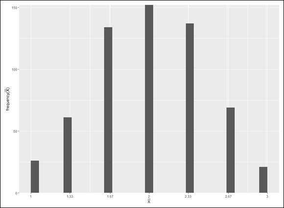
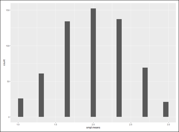
If you look closely at the table, you can almost see what’s about to happen in the simulation. The sample mean that appears most frequently is 2.00. The sample means that appear least frequently are 1.00 and 3.00. Hmmm… .
In the simulation, you randomly select a score from the population and then randomly select two more. That group of three scores is a sample. Then you calculate the mean of that sample. You repeat this process for a total of 600 samples, resulting in 600 sample means. Finally, you graph the distribution of the sample means.
What does the simulated sampling distribution of the mean look like? I walk you through it in R. You begin by creating a vector for the possible scores, and another for the probability of sampling each score:
The first two arguments, of course, provide the scores to sample and the probability of each score. The third is the sample size. The fourth indicates that after you select a score for the sample, you replace it. (You put it back in the population, in other words.) This procedure (unsurprisingly called “sampling with replacement”) simulates a huge population from which you can select any score at any time.
Each time you draw a sample, you take its mean and append it (add it to the end of) the smpl.means vector:
smpl.means <- append(smpl.means, mean(smpl))
I don’t want you to have to manually repeat this whole process 600 times. Fortunately, like all computer languages, R has a way of handling this: Its for-loop does all the work. To do the sampling, the calculation, and the appending 600 times, the for-loop looks like this:
Then run the for-loop. If you want to run the loop over and over again, make sure you reset smpl.means to NULL each time. If you want to get different results each time, don’t set the seed to the same number (or don’t set it at all).
What does the sampling distribution look like? Use ggplot() to do the honors. The data values (the 600 sample means) are in a vector, so the first argument is NULL. The smpl.means vector maps to the x-axis. And you’re creating a histogram, so the geom function is geom_histogram():
ggplot(NULL,aes(x=smpl.means)) + geom_histogram()
Figure 9-3 shows the histogram for the sampling distribution of the mean.
FIGURE 9-3: Sampling distribution of the mean based on 600 samples of size 3 from a population consisting of the equally probable scores 1, 2, and 3.
Looks a lot like the beginnings of a normal distribution, right? I explore the distribution further in a moment, but first I’ll show you how to make the graph a bit more informative. Suppose you want the labeled points on the x-axis to reflect the values of the mean in the smpl.means vector. You can’t just specify the vector values for the x-axis, because the vector has 600 of them. Instead, you list the unique values:
FIGURE 9-4: The sampling distribution of the mean with the x-axis rescaled and cool axis labels.
Predictions of the central limit theorem
How do the characteristics of the sampling distribution match up with what the central limit theorem predicts?
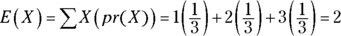
To derive the predictions, you have to start with the population. Think of each population value (1, 2, or 3) as an X, and think of each probability as pr(X). Mathematicians would refer to X as a discrete random variable.
The mean of a discrete random variable is called its expected value. The notation for the expected value of X is E(X).
To find E(X), you multiply each X by its probability and then add all those products together. For this example, that’s
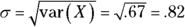
To find the variance of X, subtract E(X) from each X, square each deviation, multiply each squared deviation by the probability of X, and add the products. For this example:
Pretty close! Even with a non-normally distributed population and a small sample size, the central limit theorem gives an accurate picture of the sampling distribution of the mean.
Confidence: It Has Its Limits!
I tell you about sampling distributions because they help answer the question I pose at the beginning of this chapter: How much confidence can you have in the estimates you create?
The procedure is to calculate a statistic and then use that statistic to establish upper and lower bounds for the population parameter with, say, 95 percent confidence. (The interpretation of confidence limits is a bit more involved than that, as you’ll see.) You can do this only if you know the sampling distribution of the statistic and the standard error of the statistic. In the next section, I show how to do this for the mean.
Finding confidence limits for a mean
The FarBlonJet Corporation manufactures navigation systems. (Corporate motto: “Taking a trip? Get FarBlonJet.”) The company has developed a new battery to power its portable model. To help market this system, FarBlonJet wants to know how long, on average, each battery lasts before it burns out.
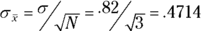
The FarBlonJet employees like to estimate that average with 95 percent confidence. They test a sample of 100 batteries and find that the sample mean is 60 hours, with a standard deviation of 20 hours. The central limit theorem, remember, says that with a large enough sample (30 or more), the sampling distribution of the mean approximates a normal distribution. The standard error of the mean (the standard deviation of the sampling distribution of the mean) is
The sample size, N, is 100. What about σ? That's unknown, so you have to estimate it. If you know σ, that would mean you know μ, and establishing confidence limits would be unnecessary.
The best estimate of σ is the standard deviation of the sample. In this case, that's 20. This leads to an estimate of the standard error of the mean.
The best estimate of the population mean is the sample mean: 60. Armed with this information — estimated mean, estimated standard error of the mean, normal distribution — you can envision the sampling distribution of the mean, which is shown in Figure 9-5. Consistent with Figure 9-2, each standard deviation is a standard error of the mean.
FIGURE 9-5: The sampling distribution of the mean for the FarBlonJet battery.
Now that you have the sampling distribution, you can establish the 95 percent confidence limits for the mean. Starting at the center of the distribution, how far out to the sides do you have to extend until you have 95 percent of the area under the curve? (For more on area under a normal distribution and what it means, see Chapter 8.)
One way to answer this question is to work with the standard normal distribution and find the z-score that cuts off 2.5 percent of the area in the upper tail. Then multiply that z-score by the standard error. Add the result to the sample mean to get the upper confidence limit; subtract the result from the mean to get the lower confidence limit.
Figure 9-6 shows these bounds on the sampling distribution.
FIGURE 9-6: The 95 percent confidence limits on the FarBlonJet sampling distribution.
What does this tell you, exactly? One interpretation is that if you repeat this sampling and estimation procedure many times, the confidence intervals you calculate (which would be different every time you do it) would include the population mean 95 percent of the time.
Fit to a t
The central limit theorem specifies (approximately) a normal distribution for large samples. In the real world, however, you deal with smaller samples, and the normal distribution isn’t appropriate. What do you do?
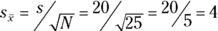
First of all, you pay a price for using a smaller sample — you have a larger standard error. Suppose the FarBlonJet Corporation found a mean of 60 and a standard deviation of 20 in a sample of 25 batteries. The estimated standard error is
which is twice as large as the standard error for N=100.
Second, you don’t get to use the standard normal distribution to characterize the sampling distribution of the mean. For small samples, the sampling distribution of the mean is a member of a family of distributions called the t-distribution. The parameter that distinguishes members of this family from one another is called degrees of freedom.
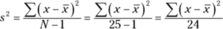
As I said in Chapter 5, think of “degrees of freedom” as the denominator of your variance estimate. For example, if your sample consists of 25 individuals, the sample variance that estimates population variance is
The number in the denominator is 24, and that’s the value of the degrees of freedom parameter. In general, degrees of freedom (df) = N–1 (N is the sample size) when you use the t-distribution the way I show you in this section.
Figure 9-7 shows two members of the t-distribution family (df = 3 and df = 10), along with the normal distribution for comparison. As the figure shows, the greater the df, the more closely t approximates a normal distribution.
FIGURE 9-7: Some members of the t-distribution family.
To determine the lower and upper bounds for the 95 percent confidence level for a small sample, work with the member of the t-distribution family that has the appropriate df. Find the value that cuts off the upper 2.5 percent of the area in the upper tail of the distribution. Then multiply that value by the standard error.
Add the result to the mean to get the upper confidence limit; subtract the result from the mean to get the lower confidence limit.
R provides dt() (density function), pt() (cumulative density function), qt() (quantile), and rt() (random number generation) for working with the t-distribution. For the confidence intervals, I use qt().
 Introducing sampling distributions
 In general, a sampling distribution is the distribution of all possible values of a statistic for a given sample size.
 .
. .
.


 as the x-axis label and
  as the y-axis label: