Chapter 8

What’s Normal?

IN THIS CHAPTER

check Meeting the normal distribution family

check Working with standard deviations and the normal distribution

check Understanding R's normal distribution functions

One of the main jobs of a statistician is to estimate characteristics of a population. The job becomes easier if the statistician can make some assumptions about the populations he or she studies.

Here’s an assumption that works over and over again: A specific attribute, ability, or trait is distributed throughout a population so that (1) most people have an average or near-average amount of the attribute, and (2) progressively fewer people have increasingly extreme amounts of the attribute. In this chapter, I discuss this assumption and its implications for statistics. I also discuss R functions related to this assumption.

Hitting the Curve

Attributes in the physical world, like length or weight, are all about objects you can see and touch. It’s not that easy in the world of social scientists, statisticians, market researchers, and businesspeople. They have to be creative when they measure traits that they can’t put their hands around — like “intelligence,” “musical ability,” or “willingness to buy a new product.”

The assumption I mention in this chapter’s introduction — that most people are around the average and progressively fewer people are toward the extremes — seems to work out well for those intangible traits. Because this happens often, it’s become an assumption about how most traits are distributed.

It’s possible to capture this assumption in a graphical way. Figure 8-1 shows the well-known bell curve that describes the distribution of a wide variety of attributes. The horizontal axis represents measurements of the ability under consideration. A vertical line drawn down the center of the curve would correspond to the average of the measurements.

image

FIGURE 8-1: The bell curve.

Assume that it's possible to measure a trait like intelligence and assume that this curve represents the distribution of intelligence in the population: The bell curve shows that most people have about average intelligence, only a few have little intelligence, and only a few are geniuses. That seems to fit nicely with what we know about people, doesn't it?

Digging deeper

On the horizontal axis of Figure 8-1 you see x, and on the vertical axis, f(x). What do these symbols mean? The horizontal axis, as I mention, represents measurements, so think of each measurement as an x.

The explanation of f(x) is a little more involved. A mathematical relationship between x and f(x) creates the bell curve and enables you to visualize it. The relationship is rather complex, and I won't burden you with it right now. (I discuss it in a little while.) Just understand that f(x) represents the height of the curve for a specified value of x. This means that you supply a value for x (and for a couple of other things), and then that complex relationship returns a value of f(x).

Let me get into specifics. The formal name for “bell curve” is normal distribution. The term f(x) is called probability density, so a normal distribution is an example of a probability density function. Rather than give you a technical definition of probability density, I ask you to think of probability density as something that allows you to think about area under the curve as probability. Probability of … what? That’s coming up in the next subsection.

Parameters of a normal distribution

You often hear people talk about “the normal distribution.” That’s a misnomer. It’s really a family of distributions. The members of the family differ from one another in terms of two parameters — yes, parameters because I'm talking about populations. Those two parameters are the mean (μ) and the standard deviation (σ). The mean tells you where the center of the distribution is, and the standard deviation tells you how spread out the distribution is around the mean. The mean is in the middle of the distribution. Every member of the normal distribution family is symmetric — the left side of the distribution is a mirror image of the right. (Remember skewness, from Chapter 7? “Symmetric” means that the skewness of a normal distribution is zero.)

The characteristics of the normal distribution family are well known to statisticians. More important, you can apply those characteristics to your work.

How? This brings me back to probability. You can find some useful probabilities if you

  • Can lay out a line that represents the scale of the attribute you're measuring (the x-axis, in other words)
  • Can indicate on the line where the mean of the measurements is
  • Know the standard deviation
  • Can assume that the attribute is normally distributed throughout the population

I'll work with IQ scores to show you what I mean. Scores on the IQ test follow a normal distribution. The mean of the distribution of these scores is 100, and the standard deviation is 15. Figure 8-2 shows the probability density for this distribution.

image

FIGURE 8-2: The normal distribution of IQ, divided into standard deviations.

technicalstuff You might have read elsewhere that the standard deviation for IQ is 16 rather than 15. That’s the case for the Stanford-Binet version of the IQ test. For other versions, the standard deviation is 15.

As Figure 8-2 shows, I’ve laid out a line for the IQ scale (the x-axis). Each point on the line represents an IQ score. With the mean (100) as the reference point, I’ve marked off every 15 points (the standard deviation). I’ve drawn a dashed line from the mean up to f(100) (the height of the distribution where x = 100) and drawn a dashed line from each standard deviation point.

The figure also shows the proportion of area bounded by the curve and the horizontal axis, and by successive pairs of standard deviations. It also shows the proportion beyond three standard deviations on either side (55 and 145). Note that the curve never touches the horizontal. It gets closer and closer, but it never touches. (Mathematicians say that the curve is asymptotic to the horizontal.)

So between the mean and one standard deviation — between 100 and 115 — are .3413 (or 34.13 percent) of the scores in the population. Another way to say this: The probability that an IQ score is between 100 and 115 is .3413. At the extremes, in the tails of the distribution, .0013 (.13 percent) of the scores are on each side (less than 55 or greater than 145).

remember The proportions in Figure 8-2 hold for every member of the normal distribution family, not just for IQ scores. For example, in the “Caching Some z’s” sidebar in Chapter 6, I mention SAT scores, which have a mean of 500 and a standard deviation of 100. They're normally distributed, too. That means 34.13 percent of SAT scores are between 500 and 600, 34.13 percent between 400 and 500, and … well, you can use Figure 8-2 as a guide for other proportions.

Working with Normal Distributions

The complex relationship I told you about between x and f(x) is

images

If you supply values for μ (the mean), σ (the standard deviation), and x (a score), the equation gives you back a value for f(x), the height of the normal distribution at x. π and e are important constants in mathematics: π is approximately 3.1416 (the ratio of a circle's circumference to its diameter); e is approximately 2.71828. It's related to something called natural logarithms (described in Chapter 16) and to numerous other mathematical concepts.

Distributions in R

The normal distribution family is one of many distribution families baked into R. Dealing with these families is intuitive. Follow these guidelines:

  • Begin with the distribution family’s name in R (norm for the normal family, for example).
  • To the beginning of the family name, add d to work with the probability density function. For the probability density function for the normal family, then, it’s dnorm() — which is equivalent to the equation I just showed you.
  • For the cumulative density function (cdf ), add p (pnorm(), for example).
  • For quantiles, add q (qnorm(), which in mathematical terms is the inverse of the cdf ).
  • To generate random numbers from a distribution, add r. So rnorm() generates random numbers from a member of the normal distribution family.

Normal density function

When working with any normal distribution function, you have to let the function know which member of the normal distribution family you’re interested in. You do that by specifying the mean and the standard deviation.

So, if you happen to need the height of the IQ distribution for IQ = 100, here’s how to find it:

> dnorm(100,m=100,s=15)
[1] 0.02659615

remember This does not mean that the probability of finding an IQ score of 100 is .027. Probability density is not the same as probability. With a probability density function, it only makes sense to talk about the probability of a score between two boundaries — like the probability of a score between 100 and 115.

Plotting a normal curve

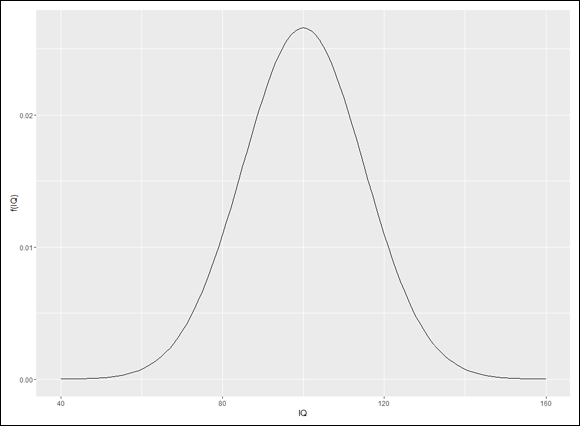
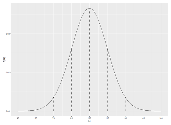
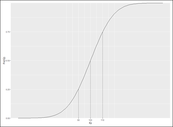
dnorm() is useful as a tool for plotting a normal distribution. I use it along with ggplot() to draw a graph for IQ that looks a lot like Figure 8-2.

Before I set up a ggplot() statement, I create three helpful vectors. The first

x.values <- seq(40,160,1)

is the vector I’ll give to ggplot() as an aesthetic mapping for the x-axis. This statement creates a sequence of 121 numbers, beginning with 40 (4 standard deviations below the mean) to 160 (4 standard deviations above the mean).

The second

sd.values <- seq(40,160,15)

is a vector of the nine standard deviation-values from 40 to 160. This figures into the creation of the vertical dashed lines at each standard deviation in Figure 8-2.

The third vector

zeros9 <- rep(0,9)

will also be part of creating the vertical dashed lines. It’s just a vector of nine zeros.

On to ggplot(). Because the data is a vector, the first argument is NULL. The aesthetic mapping for the x-axis is, as I mentioned earlier, the x.values vector. What about the mapping for the y-axis? Well, this is a plot of a normal density function for mean = 100 and sd =15, so you’d expect the y-axis mapping to be dnorm(x.values, m=100, s=15), wouldn’t you? And you’d be right! Here’s the ggplot() statement:

ggplot(NULL,aes(x=x.values,y=dnorm(x.values,m=100,s=15)))

Add a line geom function for the plot and labels for the axes, and here’s what I have:

ggplot(NULL,aes(x=x.values,y=dnorm(x.values,m=100,s=15))) +
geom_line() +
labs(x="IQ",y="f(IQ)")

And that draws Figure 8-3.

image

FIGURE 8-3: Initial plot of the normal density function for IQ.

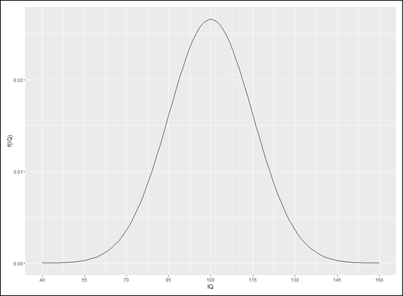
As you can see, ggplot() has its own ideas about the values to plot on the x-axis. Instead of sticking with the defaults, I want to place the sd.values on the x-axis. To change those values, I use scale_x_continuous() to rescale the x-axis. One of its arguments, breaks, sets the points on the x-axis for the values, and the other, labels, supplies the values. For each one, I supply sd.values:

scale_x_continuous(breaks=sd.values,labels = sd.values)

Now the code is

ggplot(NULL,aes(x=x.values,y=dnorm(x.values,m=100,s=15))) +
geom_line() +
labs(x="IQ",y="f(IQ)")+
scale_x_continuous(breaks=sd.values,labels = sd.values)

and the result is Figure 8-4.

image

FIGURE 8-4: The normal density function for IQ with standard deviations on the x-axis.

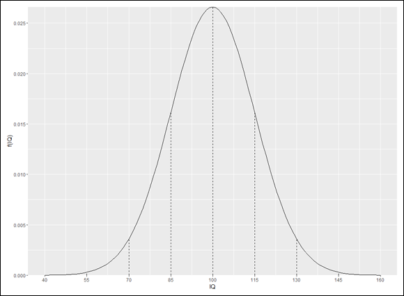
In ggplot world, vertical lines that start at the x-axis and end at the curve are called segments. So the appropriate geom function to draw them is geom_segment(). This function requires a starting point for each segment and an end point for each segment. I specify those points in an aesthetic mapping within the geom. The x-coordinates for the starting points for the nine segments are in sd.values. The segments start at the x-axis, so the nine y-coordinates are all zeros — which happens to be the contents of the zeros9 vector. The segments end at the curve, so the x-coordinates for the end-points are once again, sd.values. The y-coordinates? Those would be dnorm(sd.values, m=100,s=15). Adding a statement about dashed lines, the rather busy geom_segment() statement is

geom_segment((aes(x=sd.values,y=zeros9,xend =
sd.values,yend=dnorm(sd.values,m=100,s=15))),
linetype = "dashed")

The code now becomes

ggplot(NULL,aes(x=x.values,y=dnorm(x.values,m=100,s=15))) +
geom_line() +
labs(x="IQ",y="f(IQ)")+
scale_x_continuous(breaks=sd.values,labels = sd.values) +
geom_segment((aes(x=sd.values,y=zeros9,xend =
sd.values,yend=dnorm(sd.values,m=100,s=15))),
linetype = "dashed")

which produces Figure 8-5.

image

FIGURE 8-5: The IQ plot with vertical dashed line segments at the standard deviations.

One more little touch and I’m done showing you how it’s done. I’m not all that crazy about the space between the x-values and the x-axis. I’d like to remove that little slice of the graph and move the values up closer to where (at least I think) they should be.

To do that, I use scale_y_continuous(), whose expand argument controls the space between the x-values and the x-axis. It’s a two-element vector with defaults that set the amount of space you see in Figure 8-5. Without going too deeply into it, setting that vector to c(0,0) removes the spacing.

These lines of code draw the aesthetically pleasing Figure 8-6:


ggplot(NULL,aes(x=x.values,y=dnorm(x.values,m=100,s=15))) +
geom_line() +
labs(x="IQ",y="f(IQ)")+
scale_x_continuous(breaks=sd.values,labels = sd.values) +
geom_segment((aes(x=sd.values,y=zeros9,xend =
sd.values,yend=dnorm(sd.values,m=100,s=15))),
linetype = "dashed")+

scale_y_continuous(expand = c(0,0))

image

FIGURE 8-6: The finished product: The IQ plot with no spacing between the x-values and the x-axis.

Cumulative density function

The cumulative density function pnorm(x,m,s) returns the probability of a score less than x in a normal distribution with mean m and standard deviation s.

As you’d expect from Figure 8-2 (and the subsequent plots I created):

> pnorm(100,m=100,s=15)
[1] 0.5

How about the probability of less than 85?

> pnorm(85,m=100,s=15)
[1] 0.1586553

If you want to find the probability of a score greater than 85, pnorm() can handle that, too. It has an argument called lower.tail whose default value, TRUE, returns the probability of “less than.” For “greater than,” set the value to FALSE:

> pnorm(85,m=100,s=15, lower.tail = FALSE)
[1] 0.8413447

It’s often the case that you want the probability of a score between a lower bound and an upper bound — like the probability of an IQ score between 85 and 100. Multiple calls to pnorm() combined with a little arithmetic will get that done.

That’s not necessary, however. A function called pnormGC() in a terrific package called tigerstats does that and more. The letters GC stand for graphical calculator, but they could also stand for Georgetown College (in Georgetown, Kentucky), the school from which this package originates. (On the Packages tab, click Install, and then in the Install Packages dialog box, type tigerstats and click Install. When you see tigerstats on the Packages tab, select its check box.)

Now watch closely:

>pnormGC(c(85,100),region="between",m=100,s=15,graph=TRUE)
[1] 0.3413447

In addition to the answer, the graph=TRUE argument produces Figure 8-7.

image

FIGURE 8-7: Visualizing the probability of an IQ score between 85 and 100 (in the tigerstats package)

Plotting the cdf

Given that I’ve already done the heavy lifting when I showed you how to plot the density function, the R code for the cumulative density function is a snap:

ggplot(NULL,aes(x=x.values,y=pnorm(x.values,m=100,s=15))) +
geom_line() +
labs(x="IQ",y="Fn(IQ)")+
scale_x_continuous(breaks=sd.values,labels = sd.values) +
geom_segment((aes(x=sd.values,y=zeros9,xend =
sd.values,yend=pnorm(sd.values,mean=100,sd=15))),
linetype = "dashed")+

scale_y_continuous(expand=c(0,0))

Yes, all you do is change dnorm to pnorm and edit the y-axis label. Code reuse — it’s a beautiful thing. And so (I hope you agree) is Figure 8-8.

image

FIGURE 8-8: Cumulative density function of the IQ distribution.

The line segments shooting up from the x-axis clearly show that 100 is at the 50th percentile (.50 of the scores are below 100). Which brings me to quantiles of normal distributions, the topic of the next section.

Quantiles of normal distributions

The qnorm() function is the inverse of pnorm(). Give qnorm() an area, and it returns the score that cuts off that area (to the left) in the specified normal distribution:

> qnorm(0.1586553,m=100,s=15)
[1] 85

The area (to the left), of course, is a percentile (described in Chapter 6).

To find a score that cuts off an indicated area to the right:

> qnorm(0.1586553,m=100,s=15, lower.tail = FALSE)
[1] 115

Here’s how qnormGC() (in the tigerstats package) handles it:

> qnormGC(.1586553, region = "below",m=100,s=15, graph=TRUE)
[1] 85

This function also creates Figure 8-9.

image

FIGURE 8-9: Plot created by qnormGC().

You’re typically not concerned with the 15.86553rd percentile. Usually, it’s quartiles that attract your attention:

> qnorm(c(0,.25,.50,.75,1.00),m=100,s=15)
[1] -Inf 89.88265 100.00000 110.11735 Inf

The 0th and 100th percentiles (— Infinity and Infinity) show that the cdf never completely touches the x-axis nor reaches an exact maximum. The middle quartiles are of greatest interest, and best if rounded:

> round(qnorm(c(.25,.50,.75),m=100,s=15))
[1] 90 100 110

Plotting the cdf with quartiles

To replace the standard deviation values in Figure 8-8 with the three quartile values, you begin by creating two new vectors:

> q.values <-round(qnorm(c(.25,.50,.75),m=100,s=15))
> zeros3 <- c(0,0,0)

Now all you have to do is put those vectors in the appropriate places in scale_x_continuous() and in geom_segment():

ggplot(NULL,aes(x=x.values,y=pnorm(x.values,m=100,s=15))) +
geom_line() +
labs(x="IQ",y="Fn(IQ)")+
scale_x_continuous(breaks=q.values,labels = q.values) +
geom_segment((aes(x=q.values,y=zeros3,xend =
q.values,yend=pnorm(q.values,mean=100,sd=15))),
linetype = "dashed")+

scale_y_continuous(expand=c(0,0))

The code produces Figure 8-10.

image

FIGURE 8-10: The normal cumulative density function with quartile values.

Random sampling

The rnorm() function generates random numbers from a normal distribution.

Here are five random numbers from the IQ distribution:

> rnorm(5,m=100,s=15)
[1] 127.02944 75.18125 66.49264 113.98305 103.39766

Here’s what happens when you run that again:

> rnorm(5,m=100,s=15)
[1] 73.73596 91.79841 82.33299 81.59029 73.40033

Yes, the numbers are all different. (In fact, when you run rnorm(), I can almost guarantee your numbers will be different from mine.) Each time you run the function it generates a new set of random numbers. The randomization process starts with a number called a seed. If you want to reproduce randomization results, use the set.seed() function to set the seed to a particular number before randomizing:

> set.seed(7637060)
> rnorm(5,m=100,s=15)
[1] 71.99120 98.67231 92.68848 103.42207 99.61904

If you set the seed to that same number the next time you randomize, you get the same results:

> set.seed(7637060)
> rnorm(5,m=100,s=15)
[1] 71.99120 98.67231 92.68848 103.42207 99.61904

If you don’t, you won’t.

Randomization is the foundation of simulation, which comes up in Chapters 9 and 19. Bear in mind that R (or most any other software) doesn’t generate “true” random numbers. R generates “pseudo-random” numbers which are sufficiently unpredictable for most tasks that require randomization — like the simulations I discuss later.

A Distinguished Member of the Family

To standardize a set of scores so that you can compare them to other sets of scores, you convert each one to a z-score. (I discuss z-scores in Chapter 6.) The formula for converting a score to a z-score (also known as a standard score) is

images

The idea is to use the standard deviation as a unit of measure. For example, the Wechsler version of the IQ test (among others) has a mean of 100 and a standard deviation of 15. The Stanford-Binet version has a mean of 100 and a standard deviation of 16. How does a Wechsler score of, say, 110, stack up against a Stanford-Binet score of 110?

One way to answer this question is to put the two versions on a level playing field by standardizing both scores. For the Wechsler:

images

For the Stanford-Binet:

images

So 110 on the Wechsler is a slightly higher score than 110 on the Stanford-Binet.

Now, if you standardize all the scores in a normal distribution (such as either version of the IQ), you have a normal distribution of z-scores. Any set of z-scores (normally distributed or not) has a mean of 0 and a standard deviation of 1. If a normal distribution has those parameters, it's a standard normal distribution — a normal distribution of standard scores. Its equation is

images

Figure 8-11 shows the standard normal distribution. It looks like Figure 8-2, except that I've substituted 0 for the mean and I’ve entered standard deviation units in the appropriate places.

image

FIGURE 8-11: The standard normal distribution, divided up by standard deviations.

warning 
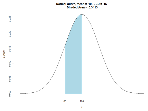
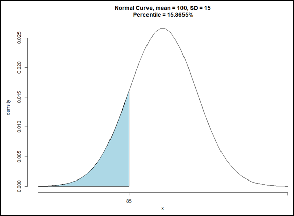
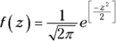
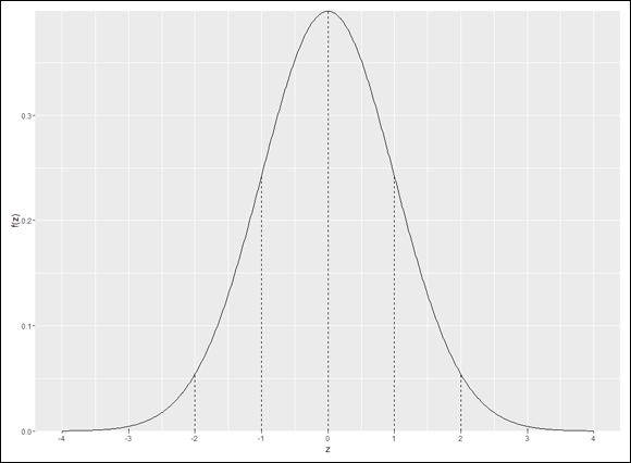
This is the member of the normal distribution family that most people are familiar with. It's the one they remember most from statistics courses, and it's the one that most people have in mind when they (mistakenly) say the normal distribution. It's also what people think of when they hear about “z-scores.” This distribution leads many to the mistaken idea that converting to z-scores somehow transforms a set of scores into a normal distribution.

The standard normal distribution in R

Working with the standard normal distribution in R couldn’t be easier. The only change you make to the four norm functions is to not specify a mean and a standard deviation — the defaults are 0 and 1.

Here are some examples:

> dnorm(0)
[1] 0.3989423
> pnorm(0)
[1] 0.5
> qnorm(c(.25,.50,.75))
[1] -0.6744898 0.0000000 0.6744898
> rnorm(5)
[1] -0.4280188 -0.9085506 0.6746574 1.0728058 -1.2646055

This also applies to the tigerstats functions:

> pnormGC(c(-1,0),region="between")
[1] 0.3413447
> qnormGC(.50, region = "below")
[1] 0

Plotting the standard normal distribution

To plot the standard normal distribution, you create a couple of new vectors

z.values <-seq(-4,4,.01)
z.sd.values <- seq(-4,4,1)

and make a few changes to the code you use earlier to plot the IQ distribution:

ggplot(NULL,aes(x=z.values,y=dnorm(z.values))) +
geom_line() +
labs(x="z",y="f(z)")+
scale_x_continuous(breaks=z.sd.values,labels=z.sd.values) +
geom_segment((aes(x=z.sd.values,y=zeros9,xend =
z.sd.values,yend=dnorm(z.sd.values))),linetype =
"dashed")+

scale_y_continuous(expand=c(0,0))

In addition to putting the new vectors into scale_x_continuous() and geom_segment(), the notable change is to drop the mean and standard deviation arguments from dnorm(). The code creates Figure 8-12.

image

FIGURE 8-12: The standard normal distribution, divided by standard deviations and plotted in ggplot().

I leave it to you as an exercise to plot the cumulative density function for the standard normal distribution.