Curvilinear Regression: When Relationships Get Complicated
IN THIS CHAPTER
Understanding exponents
Connecting logarithms to regression
Pursuing polynomials
In Chapters 14 and 15, I describe linear regression and correlation — two concepts that depend on the straight line as the best-fitting summary of a scatterplot.
But a line is isn’t always the best fit. Processes in a variety of areas, from biology to business, conform more to curves than to lines.
For example, think about when you learned a skill — like tying your shoelaces. When you first tried it, it took quite a while didn’t it? And then whenever you tried it again, it took progressively less time for you to finish, right? Until finally, you can tie your shoelaces very quickly but you can’t really get any faster — you’re now doing it is as efficiently as you can.
If you plotted shoelace-tying-time (in seconds) on the y-axis and trials (occasions when you tried to tie your shoes) on the x-axis, the graph might look something like Figure 16-1. A straight line is clearly not the best summary of a plot like this.
FIGURE 16-1: Hypothetical plot of learning a skill — like tying your shoelaces.
How do you find the best-fitting curve? (Another way to say this: “How do you formulate a model for these data?”) I’ll be happy to show you, but first I have to tell you about logarithms, and about an important number called e.
Why? Because those concepts form the foundation of three kinds of nonlinear regression.
What Is a Logarithm?
Plainly and simply, a logarithm is an exponent — a power to which you raise a number. In the equation
2 is an exponent. Does that mean that 2 is also a logarithm? Well … yes. In terms of logarithms,
That’s really just another way of saying . Mathematicians read it as “the logarithm of 100 to the base 10 equals 2.” It means that if you want to raise 10 to some power to get 100, that power is 2.
How about 1,000? As you know
so
How about 763? Uh… . Hmm… . That's like trying to solve
What could that answer possibly be? 102 means 10 × 10 and that gives you 100. 103 means and that’s 1,000. But 763?
Here’s where you have to think outside the dialog box. You have to imagine exponents that aren’t whole numbers. I know, I know: How can you multiply a number by itself a fraction at a time? If you could, somehow, the number in that 763 equation would have to be between 2 (which gets you to 100) and 3 (which gets you to 1,000).
In the 16th century, mathematician John Napier showed how to do it, and logarithms were born. Why did Napier bother with this? One reason is that it was a great help to astronomers. Astronomers have to deal with numbers that are, well, astronomical. Logarithms ease computational strain in a couple of ways. One way is to substitute small numbers for large ones: The logarithm of 1,000,000 is 6, and the logarithm of 100,000,000 is 8. Also, working with logarithms opens up a helpful set of computational shortcuts. Before calculators and computers appeared on the scene, this was a very big deal.
Incidentally,
which means that
You can use R’s log10() function to check that out:
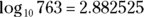
> log10(763) [1] 2.882525
If you reverse the process, you’ll see that
> 10^2.882525 [1] 763.0008
So, 2.882525 is a tiny bit off, but you get the idea.
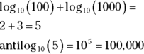
A bit earlier, I mentioned “computational shortcuts” that result from logarithms. Here’s one: If you want to multiply two numbers, add their logarithms, and then find the number whose logarithm is the sum. That last part is called “finding the antilogarithm.” Here’s a quick example: To multiply 100 by 1,000:
Here’s another computational shortcut: Multiplying the logarithm of a number x by a number b corresponds to raising x to the b power.
Ten, the number that’s raised to the exponent, is called the base. Because it’s also the base of our number system and everyone is familiar with it, logarithms of base 10 are called common logarithms. And, as you just saw, a common logarithm in R is log10.
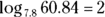
Does that mean you can have other bases? Absolutely. Any number (except 0 or 1 or a negative number) can be a base. For example,
So
And you can use R’s log() function to check that out:
> log(60.84,7.8) [1] 2
In terms of bases, one number is special …
What Is e?
Which brings me to e, a constant that’s all about growth.
Imagine the princely sum of $1 deposited in a bank account. Suppose that the interest rate is 2 percent a year. (Yes, this is just an example!) If it’s simple interest, the bank adds $.02 every year, and in 50 years you have $2.
If it’s compound interest, at the end of 50 years you have — which is just a bit more than $2.68, assuming that the bank compounds the interest once a year.
Of course, if the bank compounds interest twice a year, each payment is $.01, and after 50 years the bank has compounded it 100 times. That gives you , or just over $2.70. What about compounding it four times a year? After 50 years — 200 compoundings — you have , which results in the don’t-spend-it-all-in-one-place amount of $2.71 and a tiny bit more.
Focusing on “just a bit more” and “a tiny bit more,” and taking it to extremes, after 100,000 compoundings, you have $2.718268. After 100 million, you have $2.718282.
If you could get the bank to compound many more times in those 50 years, your sum of money approaches a limit — an amount it gets ever so close to, but never quite reaches. That limit is e.
The way I set up the example, the rule for calculating the amount is
where n represents the number of payments. Two cents is 1/50th of a dollar and I specified 50 years — 50 payments. Then I specified two payments a year (and each year’s payments have to add up to 2 percent) so that in 50 years you have 100 payments of 1/100th of a dollar, and so on.
So e is associated with growth. Its value is 2.718282 … The three dots mean that you never quite get to the exact value (like π, the constant that enables you to find the area of a circle).
The number e pops up in all kinds of places. It’s in the formula for the normal distribution (along with π; see Chapter 8), and it’s in distributions I discuss in Chapter 18 and in Appendix A). Many natural phenomena are related to e.
It’s so important that scientists, mathematicians, and business analysts use it as a base for logarithms. Logarithms to the base e are called natural logarithms. In many textbooks, a natural logarithm is abbreviated as ln. In R, it’s log.
Table 16-1 presents some comparisons (rounded to three decimal places) between common logarithms and natural logarithms.
TABLE 16-1 Some Common Logarithms (Log10) and Natural Logarithms (Log)
Number
Log10
Log
e
0.434
1.000
10
1.000
2.303
50
1.699
3.912
100
2.000
4.605
453
2.656
6.116
1000
3.000
6.908
One more thing: In many formulas and equations, it’s often necessary to raise e to a power. Sometimes the power is a fairly complicated mathematical expression. Because superscripts are usually printed in a small font, it can be a strain to have to constantly read them. To ease the eyestrain, mathematicians have invented a special notation: exp. Whenever you see exp followed by something in parentheses, it means to raise e to the power of whatever’s in the parentheses. For example,
R’s exp() function does that calculation for you:
> exp(1.6) [1] 4.953032
Applying the exp() function with natural logarithms is like finding the antilog with common logarithms.
Speaking of raising e, when executives at Google, Inc., filed its IPO, they said they wanted to raise $2,718,281,828, which is e times a billion dollars rounded to the nearest dollar.
And now … back to curvilinear regression.
Power Regression
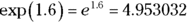
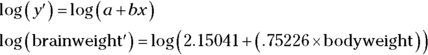
Biologists have studied the interrelationships between the sizes and weights of parts of the body. One fascinating relationship is the relation between body weight and brain weight. One way to study this is to assess the relationship across different species. Intuitively, it seems like heavier animals should have heavier brains — but what’s the exact nature of the relationship?
In the MASS package, you’ll find a data frame called Animals that contains the body weights (in kilograms) and brain weights (in grams) of 28 species. (To follow along, on the Package tab click Install. Then, in the Install Packages dialog box, type MASS. When MASS appears on the Packages tab, select its check box.)
Have you ever seen a dipliodocus? No? Outside of a natural history museum, no one else has, either. In addition to this dinosaur in row 6, Animals has triceratops in row 16 and brachiosaurus in row 26. Here, I’ll show you:
produces Figure 16-2. Note that the idea is to use body weight to predict brain weight.
FIGURE 16-2: The relationship between body weight and brain weight for 25 animal species.
Doesn’t look much like a linear relationship, does it? In fact, it’s not. Relationships in this field often take the form
Because the independent (predictor) variable x (body weight, in this case) is raised to a power, this type of model is called power regression.
R doesn’t have a specific function for creating a power regression model. Its lm() function creates linear models, as described in Chapter 14. But you can use lm() in this situation if you can somehow transform the data so that the relationship between the transformed body weight and the transformed brain weight is linear.
And this is why I told you about logarithms.
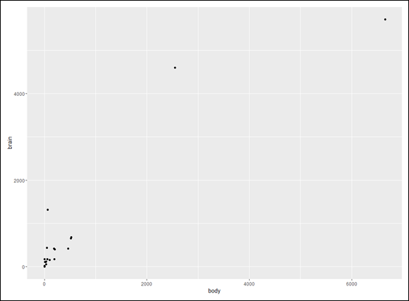
You can “linearize” the scatterplot by working with the logarithm of the body weight and the logarithm of the brain weight. Here’s some code to do just that. For good measure, I’ll throw in the animal name for each data point:
FIGURE 16-3: The relationship between the log of body weight and the log of brain weight for 25 animal species.
I’m surprised by the closeness of donkey and gorilla, but maybe my concept of gorilla comes from King Kong. Another surprise is the closeness of horse and giraffe.
Anyway, you can fit a regression line through this scatterplot. Here’s the code for the plot with the line and without the animal names:
The first argument in the last statement (method = “lm”) fits the regression line to the data points. The second argument (se=FALSE) prevents ggplot from plotting the 95 percent confidence interval around the regression line. These lines of code produce Figure 16-4.
FIGURE 16-4: The relationship between the log of body weight and the log of brain weight for 25 animal species, with a regression line.
This procedure — working with the log of each variable and then fitting a regression line — is exactly what to do in a case like this. Here’s the analysis:
powerfit <- lm(log(brain) ~ log(body), data = Animals.living)
As always, lm() indicates a linear model, and the dependent variable is on the left side of the tilde (~) with the predictor variable on the right side. After running the analysis,
> summary(powerfit) Call: lm(formula = log(brain) ~ log(body), data = Animals.living) Residuals: Min 1Q Median 3Q Max -0.9125 -0.4752 -0.1557 0.1940 1.9303 Coefficients: Estimate Std. Error t value Pr(>|t|) (Intercept) 2.15041 0.20060 10.72 2.03e-10 *** log(body) 0.75226 0.04572 16.45 3.24e-14 *** --- Signif. codes: 0 '***' 0.001 '**' 0.01 '*' 0.05 '.' 0.1 ' ' 1 Residual standard error: 0.7258 on 23 degrees of freedom Multiple R-squared: 0.9217, Adjusted R-squared: 0.9183 F-statistic: 270.7 on 1 and 23 DF, p-value: 3.243e-14
The high value of F (270.7) and the extremely low p-value let you know that the model is a good fit.
The coefficients tell you that in logarithmic form, the regression equation is
For the power regression equation, you have to take the antilog of both sides. As I mention earlier, when you’re working with natural logarithms, that’s the same as applying the exp() function:
All this is in keeping with what I say earlier in this chapter:
Adding the logarithms of numbers corresponds to multiplying the numbers.
Multiplying the logarithm of x by b corresponds to raising x to the b power.
Here’s how to use R to find the exp of the intercept:
> a <- exp(powerfit$coefficients[1]) > a (Intercept) 8.588397
You can plot the power regression equation as a curve in the original scatterplot:
That last statement is the business end, of course: powerfit$fitted.values contains the predicted brain weights in logarithmic form, and applying exp() to those values converts those predictions to the original units of measure. You map them to y to position the curve. Figure 16-5 shows the plot.
FIGURE 16-5: Original plot of brain weights and body weights of 25 species, with the power regression curve.
Exponential Regression
As I mention earlier, e figures into processes in a variety of areas. Some of those processes, like compound interest, involve growth. Others involve decay.
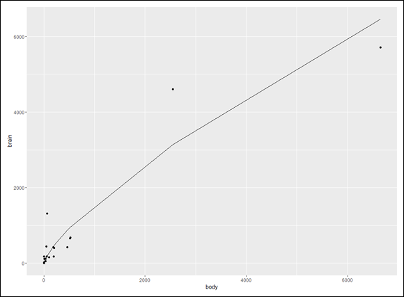
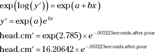
Here’s an example. If you’ve ever poured a glass of beer and let it stand, you might have noticed that the head gets smaller and smaller (it “decays,” in other words) as time passes. You haven’t done that? Okay. Go ahead and pour a tall, cool one and watch it for six minutes. I’ll wait.
… And we’re back. Was I right? Notice that I didn’t ask you to measure the height of the head as it decayed. Physicist Arnd Leike did that for us for three brands of beer.
He measured head-height every 15 seconds from 0 to 120 seconds after pouring the beer, then every 30 seconds from 150 seconds to 240 seconds, and, finally, at 300 seconds and 360 seconds. (In the true spirit of science, he then drank the beer.) Here are those intervals as a vector:
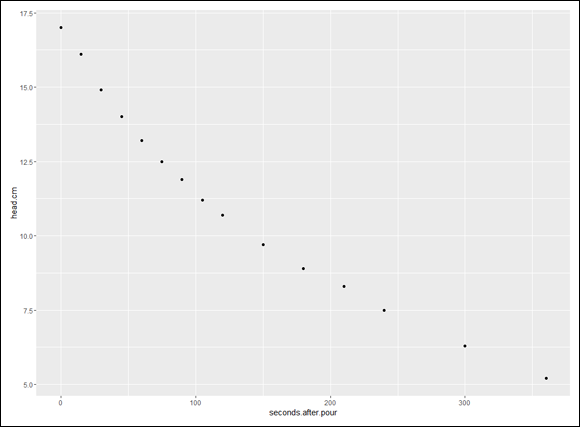
The last statement adds the regression line (method = “lm”) and doesn’t draw the confidence interval around the line (se = FALSE). You can see all this in Figure 16-7.
FIGURE 16-7: How log(head.cm) decays over time, including the regression line.
As in the preceding section, creating this plot points the way for carrying out the analysis. The general equation for the resulting model is
Because the predictor variable appears in an exponent (to which e is raised), this is called exponential regression.
And here’s how to do the analysis:
expfit <- lm(log(head.cm) ~ seconds.after.pour, data = beer.head)
Once again, lm() indicates a linear model, and the dependent variable is on the left side of the tilde (~), with the predictor variable on the right side. After running the analysis,
> summary(expfit) Call: lm(formula = log(head.cm) ~ seconds.after.pour, data = beer. head) Residuals: Min 1Q Median 3Q Max -0.031082 -0.019012 -0.001316 0.017338 0.047806 Coefficients: Estimate Std. Error t value Pr(>|t|) (Intercept) 2.785e+00 1.110e-02 250.99 < 2e-16 *** seconds.after.pour -3.223e-03 6.616e-05 -48.72 4.2e-16 *** --- Signif. codes: 0 '***' 0.001 '**' 0.01 '*' 0.05 '.' 0.1 ' ' 1 Residual standard error: 0.02652 on 13 degrees of freedom Multiple R-squared: 0.9946, Adjusted R-squared: 0.9941 F-statistic: 2373 on 1 and 13 DF, p-value: 4.197e-16
The F and p-value show that this model is a phenomenally great fit. The R-squared is among the highest you’ll ever see. In fact, Arnd did all this to show his students how an exponential process works. [If you want to see his data for the other two brands, check out Leike, A. (2002), “Demonstration of the exponential decay law using beer froth,” European Journal of Physics, 23(1), 21–26.]
According to the coefficients, the regression equation in logarithmic form is
For the exponential regression equation, you have to take the exponential of both sides — in other words, you apply the exp() function:
Analogous to what you did in the preceding section, you can plot the exponential regression equation as a curve in the original scatterplot:
In the last statement, expfit$fitted.values contains the predicted beer head-heights in logarithmic form, and applying exp() to those values converts those predictions to the original units of measure. Mapping them to y positions the curve. Figure 16-8 shows the plot.
FIGURE 16-8: The decay of head.cm over time, with the exponential regression curve.
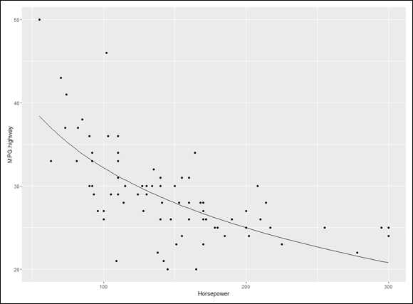
Logarithmic Regression
In the two preceding sections, I explain how power regression analysis works with the log of the x-variable and the log of the y-variable, and how exponential regression analysis works with the log of just the y-variable. As you might imagine, one more analytic possibility is available to you — working with just the log of the x-variable. The equation of the model looks like this:
Because the logarithm is applied to the predictor variable, this is called logarithmic regression.
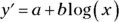
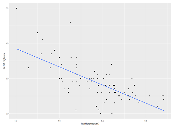
Here’s an example that uses the Cars93 data frame in the MASS package. (Make sure you have the MASS package installed. On the Packages tab, find the MASS check box and if it’s not selected, click it.)
This data frame, featured prominently in Chapter 3, holds data on a number of variables for 93 cars in the model year 1993. Here, I focus on the relationship between Horsepower (the x-variable) and MPG.highway (the y-variable).
This is the code to create the scatterplot in Figure 16-9:
Figure 16-11 shows the plot with the regression curve.
FIGURE 16-11: MPG.highway and Horsepower, with the logarithmic regression curve.
Polynomial Regression: A Higher Power
In all the types of regression I describe earlier in this chapter, the model is a line or a curve that does not change direction. It is possible, however, to create a model that incorporates a direction-change. This is the province of polynomial regression.
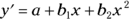
I touch on direction-change in Chapter 12, in the context of trend analysis. To model one change of direction, the regression equation has to have an x-term raised to the second power:
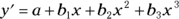
To model two changes of direction, the regression equation has to have an x-term raised to the third power:
and so forth.
I illustrate polynomial regression with another data frame from the MASS package. (On the Packages tab, find MASS. If its check box isn’t selected, click it.)
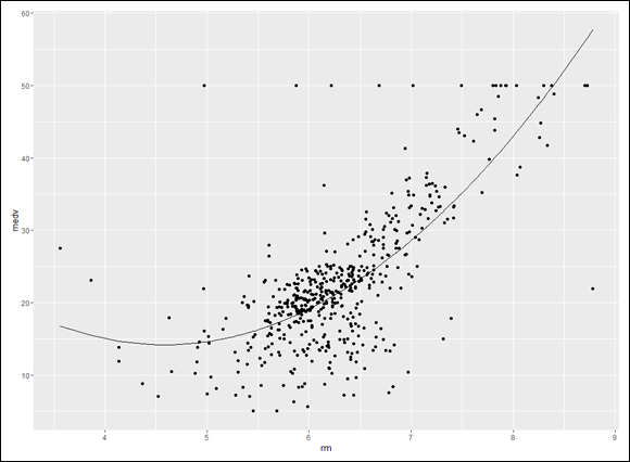
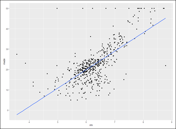
This data frame is called Boston. It holds data on housing values in the Boston suburbs. Among its 14 variables are rm (the number of rooms in a dwelling) and medv (the median value of the dwelling). I focus on those two variables in this example, with rm as the predictor variable.
Begin by creating the scatterplot and regression line:
FIGURE 16-12: Scatterplot of median value (medv) vs rooms (rm) in the Boston data frame, with the regression line.
The linear regression model is
linfit <- lm(medv ~ rm, data=Boston) > summary(linfit) Call: lm(formula = medv ~ rm, data = Boston) Residuals: Min 1Q Median 3Q Max -23.346 -2.547 0.090 2.986 39.433 Coefficients: Estimate Std. Error t value Pr(>|t|) (Intercept) -34.671 2.650 -13.08 <2e-16 *** rm 9.102 0.419 21.72 <2e-16 *** --- Signif. codes: 0 '***' 0.001 '**' 0.01 '*' 0.05 '.' 0.1 ' ' 1 Residual standard error: 6.616 on 504 degrees of freedom Multiple R-squared: 0.4835, Adjusted R-squared: 0.4825 F-statistic: 471.8 on 1 and 504 DF, p-value: < 2.2e-16
The F and p-value show that this is a good fit. R-squared tells you that about 48 percent of the SSTotal for medv is tied up in the relationship between rm and medv. (Check out Chapter 15 if that last sentence sounds unfamiliar.)
The coefficients tell you that the linear model is
But perhaps a model with a change of direction provides a better fit. To set this up in R, create a new variable rm2 — which is just rm squared:
rm2 <- Boston$rm^2
Now treat this as a multiple regression analysis with two predictor variables: rm and rm2:
polyfit2 <-lm(medv ~ rm + rm2, data=Boston)
You can’t just go ahead and use rm^2 as the second predictor variable: lm() won’t work with it in that form.
After you run the analysis, here are the details:
> summary(polyfit2) Call: lm(formula = medv ~ rm + rm2, data = Boston) Residuals: Min 1Q Median 3Q Max -35.769 -2.752 0.619 3.003 35.464 Coefficients: Estimate Std. Error t value Pr(>|t|) (Intercept) 66.0588 12.1040 5.458 7.59e-08 *** rm -22.6433 3.7542 -6.031 3.15e-09 *** rm2 2.4701 0.2905 8.502 < 2e-16 *** --- Signif. codes: 0 '***' 0.001 '**' 0.01 '*' 0.05 '.' 0.1 ' ' 1 Residual standard error: 6.193 on 503 degrees of freedom Multiple R-squared: 0.5484, Adjusted R-squared: 0.5466 F-statistic: 305.4 on 2 and 503 DF, p-value: < 2.2e-16
Looks like a better fit than the linear model. The F-statistic here is higher, and this time R-squared tells you that almost 55 percent of the SSTotal for medv is due to the relationship between medv and the combination of rm and rm^2. The increase in F and in R-squared comes at a cost — the second model has 1 less df (503 versus 504).
The coefficients indicate that the polynomial regression equation is
Is it worth the effort to add rm^2 to the model? To find out, I use anova() to compare the linear model with the polynomial model:
> anova(linfit,polyfit2) Analysis of Variance Table Model 1: medv ~ rm Model 2: medv ~ rm + rm2 Res.Df RSS Df Sum of Sq F Pr(>F) 1 504 22062 2 503 19290 1 2772.3 72.291 < 2.2e-16 *** --- Signif. codes: 0 '***' 0.001 '**' 0.01 '*' 0.05 '.' 0.1 ' ' 1
The high F-ratio (72.291) and extremely low Pr(>F) indicate that adding rm^2 is a good idea.
Here’s the code for the scatterplot, along with the curve for the polynomial model:
The predicted values for the polynomial model are in polyfit2$fitted.values, which you use in the last statement to position the regression curve in Figure 16-13.
FIGURE 16-13: Scatterplot of median value (medv) versus rooms (rm) in the Boston data frame, with the polynomial regression curve.
The curve in the figure shows a slight downward trend in the dwelling’s value as rooms increase from fewer than four to about 4.5, and then the curve trends more sharply upward.
Which Model Should You Use?
I present a variety of regression models in this chapter. Deciding on the one that’s right for your data is not necessarily straightforward. One superficial answer might be to try each one and see which one yields the highest F and R-squared.
The operative word in that last sentence is “superficial.” The choice of model should depend on your knowledge of the domain from which the data comes and the processes in that domain. Which regression type allows you to formulate a theory about what might be happening in the data?
For instance, in the Boston example, the polynomial model showed that dwelling-value decreases slightly as the number of rooms increases at the low end, and then value steadily increases as the number of rooms increases. The linear model couldn’t discern a trend like that. Why would that trend occur? Can you come up with a theory? Does the theory make sense?
I’ll leave you with an exercise. Remember the shoelace-tying example at the beginning of this chapter? All I gave you was Figure 16-1, but here are the numbers:
 Understanding exponents


 . Mathematicians read it as “the logarithm of 100 to the base 10 equals 2.” It means that if you want to raise 10 to some power to get 100, that power is 2.


 and that’s 1,000. But 763?

 — which is just a bit more than $2.68, assuming that the bank compounds the interest once a year.
 , or just over $2.70. What about compounding it four times a year? After 50 years — 200 compoundings — you have
  , which results in the don’t-spend-it-all-in-one-place amount of $2.71 and a tiny bit more.

 Because the independent (predictor) variable x (body weight, in this case) is raised to a power, this type of model is called power regression.
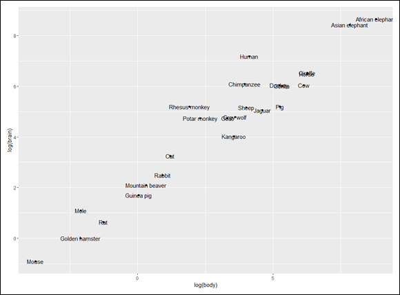


 You can’t just go ahead and use