A model is something you know and can work with that helps you understand something you know little about. A model is supposed to mimic, in some way, the thing it’s modeling. A globe, for example, is a model of the earth. A street map is a model of a neighborhood. A blueprint is a model of a building.
Researchers use models to help them understand natural processes and phenomena. Business analysts use models to help them understand business processes. The models these people use might include concepts from mathematics and statistics — concepts that are so well known they can shed light on the unknown. The idea is to create a model that consists of concepts you understand, put the model through its paces, and see if the results look like real-world results.
In this chapter, I discuss modeling. My goal is to show how you can harness R to help you understand processes in your world.
Modeling a Distribution
In one approach to modeling, you gather data and group them into a distribution. Next, you try to figure out a process that results in that kind of a distribution. Restate that process in statistical terms so that it can generate a distribution, and then see how well the generated distribution matches up with the real one. This “process you figure out and restate in statistical terms” is the model.
If the distribution you generate matches up well with the real data, does this mean your model is “right”? Does it mean that the process you guessed is the process that produces the data?
Unfortunately, no. The logic doesn't work that way. You can show that a model is wrong, but you can’t prove that it's right.
Plunging into the Poisson distribution
In this section, I walk you through an example of modeling with the Poisson distribution. I discuss this distribution in Appendix A, where I tell you it seems to characterize an array of processes in the real world. By “characterize a process,” I mean that a distribution of real-world data looks a lot like a Poisson distribution. When this happens, it’s possible that the kind of process that produces a Poisson distribution is also responsible for producing the data.
What is that process? Start with a random variable x that tracks the number of occurrences of a specific event in an interval. In Appendix A, the “interval” is a sample of 1,000 universal joints, and the specific event is “defective joint.” Poisson distributions are also appropriate for events occurring in intervals of time, and the event can be something like “arrival at a toll booth.”
Next, I outline the conditions for a Poisson process and use both defective joints and toll booth arrivals to illustrate:
The numbers of occurrences of the event in two non-overlapping intervals are independent.
The number of defective joints in one sample is independent of the number of defective joints in another. The number of arrivals at a toll booth during one hour is independent of the number of arrivals during another.
The probability of an occurrence of the event is proportional to the size of the interval.
The chance that you'll find a defective joint is larger in a sample of 10,000 than it is in a sample of 1,000. The chance of an arrival at a toll booth is greater for one hour than it is for a half-hour.
The probability of more than one occurrence of the event in a small interval is 0 or close to 0.
In a sample of 1,000 universal joints, you have an extremely low probability of finding two defective ones right next to one another. At any time, two vehicles don't arrive at a toll booth simultaneously.
As I show you in Appendix A, the formula for the Poisson distribution is
In this equation, μ represents the average number of occurrences of the event in the interval you’re looking at, and e is the constant 2.781828 (followed by infinitely many more decimal places).
Modeling with the Poisson distribution
Time to use the Poisson in a model. At the FarBlonJet Corporation, web designers track the number of hits per hour on the intranet home page. They monitor the page for 200 consecutive hours and group the data, as listed in Table 18-1.
TABLE 18-1 Hits Per Hour on the FarBlonJet Intranet Home Page
Hits per Hour
Observed Hours
Hits/Hour X Observed Hours
0
10
0
1
30
30
2
44
88
3
44
132
4
36
144
5
18
90
6
10
60
7
8
56
Total
200
600
The first column shows the variable Hits per Hour. The second column, Observed Hours, shows the number of hours in which each value of hits per hour occurred. In the 200 hours observed, 10 of those hours went by with no hits, 30 hours had one hit, 44 had two hits, and so on. These data lead the web designers to use a Poisson distribution to model hits per hour. Here’s another way to say this: They believe that a Poisson process produces the number of hits per hour on the web page.
Multiplying the first column by the second column results in the third column. Summing the third column shows that in the 200 observed hours, the intranet page received 600 hits. So the average number of hits per hour is 3.00.
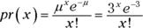
Applying the Poisson distribution to this example,
Figure 18-1 shows the density function for the Poisson distribution with .
The second statement plots the bars. Its first argument (stat="identity") specifies that the height of each bar is the corresponding density function value mapped to y. The indicated width (.5) in its second argument narrows the bars a bit from the default value (.9). The third statement puts 0–7 on the x-axis.
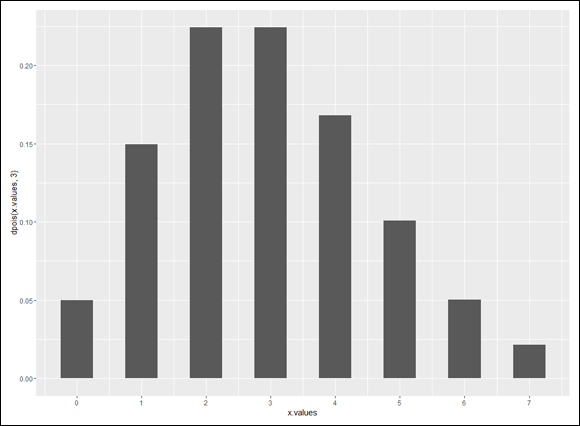
The purpose of a model is to predict. For this model, you want to use the Poisson distribution to predict the distribution of hits per hour. To do this, multiply each Poisson probability by 200 — the total number of hours:
The first statement uses the data frame, with the indicated aesthetic mappings to x, y, and fill. The second statement plots the bars. The position= "dodge" argument puts the two categories of bars side-by-side, and color = "black" draws a black border around the bars (which won’t show up on the black-filled bars, of course). As before, the third statement puts the values in the x.values vector on the x-axis.
The fourth statement changes the fill-colors of the bars to colors that show up on the page you’re reading, and the final statement removes the default gray background. (That makes the bars easier to see.)
Figure 18-2 shows the plot. The observed and the predicted look pretty close, don’t they?
FIGURE 18-2: FarBlonJet intranet home page hits per hour, observed and Poisson-predicted ().
Testing the model's fit
Well, “looking pretty close” isn’t enough for a statistician. A statistical test is a necessity. As is the case with all statistical tests, this one starts with a null hypothesis and an alternative hypothesis. Here they are:
H0: The distribution of observed hits per hour follows a Poisson distribution.
H1: Not H0
The appropriate statistical test involves an extension of the binomial distribution. It’s called the multinomial distribution — “multi” because it encompasses more categories than just “success” and “failure.” This is a difficult distribution to work with.
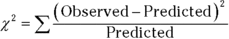
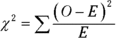
Fortunately, pioneering statistician Karl Pearson (inventor of the correlation coefficient) noticed that χ2 (“chi-square”), a distribution I show you in Chapter 10, approximates the multinomial. Originally intended for one-sample hypothesis tests about variances, χ2 has become much better known for applications like the one I’m about to show you.
Pearson’s big idea was this: If you want to know how well a hypothesized distribution (like the Poisson) fits a sample (like the observed hours), use the distribution to generate a hypothesized sample (your predicted hours, for instance), and work with this formula:
Usually, the formula is written with Expected rather than Predicted, and both Observed and Expected are abbreviated. The usual form of this formula is
For this example,
what does that total up to? You can use R as a calculator to figure this out — I’ve already called the vector of predicted values Predicted, and I don’t feel like changing the name to Expected:
To find out, you evaluate chi.squared against the χ2 distribution. The goal is to find the probability of getting a value at least as high as the calculated value, 3.566111. The trick is to know how many degrees of freedom (df) you have. For a goodness-of-fit application like this one
where k = the number of categories and m = the number of parameters estimated from the data. The number of categories is 8 (0 Hits per Hour through 7 Hits per Hour). The number of parameters? I used the observed hours to estimate the parameter μ, so m in this example is 1. That means df = 8–1–1 = 6.
To find the probability of obtaining a value of chi.squared (3.566111) or more, I use pchisq() with 6 degrees of freedom:
The third argument, lower.tail = FALSE, indicates that I want the area to the right of 3.56111 in the distribution (because I’m looking for the probability of a value that extreme or higher). If α = .05, the returned probability (.7351542) tells me to not reject H0 — meaning you can’t reject the hypothesis that the observed data come from a Poisson distribution.
This is one of those infrequent times when it’s beneficial to not reject H0 — if you want to make the case that a Poisson process is producing the data. A low value of χ2 indicates a close match between the data and the Poisson predictions. If the probability had been just a little greater than .05, not rejecting H0 would look suspicious. The high probability, however, makes it reasonable to not reject H0 — and to think that a Poisson process might account for the data.
A word about chisq.test()
R provides the function chisq.test(), which by its name suggests that you can use it instead of the calculation I show you in the preceding section. You can, but you have to be careful.
This function can take up to eight arguments, but I discuss only three:
The first argument is the vector of data — the observed values. The second is the vector of Poisson-predicted probabilities. I have to include p= because it’s not really the second argument in the list of arguments the function takes.
For the same reason, I include rescale.p= in the third argument, which tells the function to “rescale” the vector of probabilities. Why is that necessary? One requirement for this function is that the probabilities have to add up to 1.00, and these probabilities do not:
> sum(dpois(x.values,3)) [1] 0.9880955
“Rescaling” changes the values so that they do add up to 1.00.
When you run that function, this happens:
> chisq.test(Observed,p=dpois(x.values,3),rescale.p=TRUE) Chi-squared test for given probabilities data: Observed X-squared = 3.4953, df = 7, p-value = 0.8357 Warning message: In chisq.test(Observed, p = dpois(x.values, 3), rescale.p = TRUE) : Chi-squared approximation may be incorrect
Let’s examine the output. In the line preceding the warning message, notice the use of X2 rather than χ2. This is because the calculated value approximates χ2, and the shape and appearance of X approximate the shape and appearance of χ. The X-squared value is pretty close to the value I calculated earlier, but it’s off because of the rescaled probabilities.
But another problem lurks. Note that df equals 7 rather than the correct value, 6, and thus the test against the wrong member of the χ2 family. Why the discrepancy? Because chisq.test() doesn’t know how you arrived at the probabilities. It has no idea that you had to use the data to estimate one parameter (μ), and thus lose a degree of freedom. So in addition to the warning message about the chi-squared approximation, you have to also be aware that the degrees of freedom aren’t correct for this type of example.
When would you use chisq.test()? Here’s a quick example: You toss a coin 100 times and it comes up Heads 65 times. The null hypothesis is that the coin is fair. Your decision?
> chisq.test(c(65,35), p=c(.5,.5)) Chi-squared test for given probabilities data: c(65, 35) X-squared = 9, df = 1, p-value = 0.0027
The low p-value tells you to reject the null hypothesis.
In Chapter 20 I show you another application of chisq.test().
Playing ball with a model
Baseball is a game that generates huge amounts of statistics — and many people study these statistics closely. The Society for American Baseball Research (SABR) has sprung from the efforts of a band of dedicated fan-statisticians (fantasticians?) who delve into the statistical nooks and crannies of the Great American Pastime. They call their work sabermetrics. (I made up “fantasticians.” They call themselves “sabermetricians.”)
The reason I mention this is that sabermetrics supplies a nice example of modeling. It’s based on the obvious idea that during a game, a baseball team’s objective is to score runs and to keep its opponent from scoring runs. The better a team does at both tasks, the more games it wins. Bill James, who gave sabermetrics its name and is its leading exponent, discovered a neat relationship between the number of runs a team scores, the number of runs the team allows, and its winning percentage. He calls it the Pythagorean percentage:
The squares in the expression reminded James of the Pythagorean theorem, hence the name “Pythagorean percentage.” Think of it as a model for predicting games won. (This is James’ original formula, and I use it throughout. Over the years, sabermetricians have found that 1.83 is more accurate than 2.)
Calculate this percentage and multiply it by the number of games a team plays. Then compare the answer to the team’s wins. How well does the model predict the number of games each team won during the 2016 season?
To find out, I found all the relevant data (number of games won and lost, runs scored, and runs allowed) for every National League (NL) team in 2016. (Thank you, www.baseball-reference.com.) I put the data into a data frame called NL2016.
The three-letter abbreviations in the Team column alphabetically order the NL teams from ARI (Arizona Diamondbacks) to WSN (Washington Nationals). (I strongly feel that a much higher number to the immediate right of NYM would make the world a better place, but that’s just me.)
The next step is to find the Pythagorean percentage for each team:
The expression Won + Lost, of course, gives the number of games each team played. Don’t they all play the same number of games? Nope. Sometimes a game is rained out and then not rescheduled if the outcome wouldn’t affect the final standings.
All that remains is to find χ2 and test it against a chi-squared distribution:
I didn’t use the Won data in Column 2 to estimate any parameters, like a mean or a variance, and then apply those parameters to calculate predicted wins. Instead, the predictions came from other data — the Runs Scored and the Runs Allowed. For this reason, df = k–m–1= 15–0–1 = 14. The test is
As in the previous example, lower.tail=FALSE indicates that I want the area to the right of 3.40215 in the distribution (because I’m looking for the probability of a value that extreme or higher).
The very high p-value tells you that with 14 degrees of freedom, you have a huge chance of finding a value of χ2 at least as high as the X2 you’d calculate from these observed values and these predicted values. Another way to say this: The calculated value of X2 is very low, meaning that the predicted wins are close to the actual wins. Bottom line: The model fits the data extremely well.
If you’re a baseball fan (as I am), it’s fun to match up Won with Predicted.wins for each team. This gives you an idea of which teams overperformed and which ones underperformed given how many runs they scored and how many they allowed. These two expressions
The W-P column shows that PHI (the Philadelphia Phillies) outperformed their prediction by 11 games — and that was the biggest overperformance in the National League in 2016.
Who was the biggest underperformer? Interestingly enough, that would be CHC (the Chicago Cubs — six games worse than their prediction). If you followed the 2016 postseason, however, you know they more than made up for this… .
A Simulating Discussion
Another approach to modeling is to simulate a process. The idea is to define as much as you can about what a process does and then somehow use numbers to represent that process and carry it out. It’s a great way to find out what a process does in case other methods of analysis are very complex.
Taking a chance: The Monte Carlo method
Many processes contain an element of randomness. You just can’t predict the outcome with certainty. To simulate this type of process, you have to have some way of simulating the randomness. Simulation methods that incorporate randomness are called Monte Carlo simulations. The name comes from the city in Monaco whose main attraction is gambling casinos.
In the next few sections, I show you a couple of examples. These examples aren’t so complex that you can’t analyze them. I use them for just that reason: You can check the results against analysis.
Loading the dice
In Chapter 17, I talk about a die (one member of a pair of dice) that’s biased to come up according to the numbers on its faces: A 6 is six times as likely as a 1, a 5 is five times as likely, and so on. On any toss, the probability of getting a number n is n/21.
Suppose you have a pair of dice loaded this way. What would the outcomes of 2,000 tosses of these dice look like? What would be the average of those 2,000 tosses? What would be the variance and the standard deviation? You can use R to set up Monte Carlo simulations and answer these questions.
I begin by writing an R function to calculate the probability of each possible outcome. Before I develop the function, I’ll trace the reasoning for you. For each outcome (2–12), I have to have all the ways of producing the outcome. For example, to roll a 4, I can have a 1 on the first die and a 3 on the second, 2 on the first die and 2 on the second, or 3 on the first and 1 on the second. The probability (I call it loaded.pr) of a 4, then, is
Rather than enumerate all possibilities for each outcome and then calculate the probability, I create a function called loaded.pr() to do the work. I want it to work like this:
> loaded.pr(4) [1] 0.02267574
First, I set up the function:
loaded.pr <-function(x){
Next, I want to stop the whole thing and print a warning if x is less than 2 or greater than 12:
if(x <2 | x >12) warning("x must be between 2 and 12, inclusive")
Then I set a variable called first that tracks the value of the first die, depending on the value of x. If x is less than 7, I set first to 1. If x is 7 or more, I set first to 6 (the maximum value of a die-toss):
if(x < 7) first=1 else first=6
The variable second (the value of the second die), of course, is x-first:
second = x-first
I’ll want to keep track of the sum for the numerator (as in the equation I just showed you), so I start the value at zero:
sum = 0
Now comes the business end: a for loop that does the calculating given the values of first (the toss of the first die) and second (the toss of the second die):
for(first in first:second){ second = x-first sum = sum + (first*second) }
Because of the preceding if statement, if x is less than 7, first increases from 1 to x–1 with each iteration of the for loop (and second decreases). If x is 7 or greater, first decreases from 6 to x–6 with each iteration (and second increases).
Finally, when the loop is finished, the function returns the sum divided by 212:
} return(sum/21^2) }
Here it is all together:
loaded.pr <- function(x){ if(x < 2 | x > 12) warning("x must be between 2 and 12, inclusive") if(x < 7) first=1 else first=6 second = x-first sum = 0 for(first in first:second){ second = x-first sum=sum + (first*second) } return(sum/21^2) }
To set up the probability distribution, I create a vector for the outcomes
outcome <- seq(2,12)
and use a for loop to create a vector pr.outcome to hold the corresponding probabilities:
pr.outcome <- NULL for(x in outcome){pr.outcome <- c(pr.outcome,loaded.pr(x))}
In each iteration of the loop, the curly-bracketed statement on the right appends a calculated probability to the vector.
Here are the probabilities rounded to three decimal places so that they look good on the page:
And now I’m ready to randomly sample 2,000 times from this discrete probability distribution — the equivalent of 2,000 tosses of a pair of loaded dice.
Randomization functions in R are really “pseudorandom.” They start from a “seed” number and work from there. If you set the seed, you can determine the course of the randomization; if you don’t set it, the randomization takes off on its own each time you run it.
So I start by setting a seed:
set.seed(123)
This isn’t necessary, but if you want to reproduce my results, start with that function and that seed number. If you don’t, your results won’t look exactly like mine (which is not necessarily a bad thing).
For the random sampling, I use the sample() function and assign the results to results:
The first argument, of course, is the set of values for the variable (the possible dice-tosses), the second is the number of samples, the third specifies sampling with replacement, and the fourth is the vector of probabilities I just calculated.
To reproduce the exact results, remember to set that seed before every time you use sample().
Here’s a quick look at the distribution of the results:
The first row is the possible outcomes, and the second is the frequencies of the outcomes. So 39 of the 2,000 tosses resulted in 4, and 165 of them came up 12. I leave it as an exercise for you to graph these results.
What about the statistics for these simulated tosses?
How do these values match up with the parameters of the random variable? This is what I meant earlier by “checking against analysis.” In Chapter 17, I show how to calculate the expected value (the mean), the variance, and the standard deviation for a discrete random variable.
Table 18-2 shows that the results from the simulation match up closely with the parameters of the random variable. You might try repeating the simulation with a lot more simulated tosses — 10,000, perhaps. Will increased tosses pull the simulation statistics closer to the distribution parameters?
TABLE 18-2 Statistics from the Loaded-Dice-Tossing Simulation and the Parameters of the Discrete Distribution
Simulation Statistic
Distribution Parameter
Mean
8.6925
8.666667
Variance
4.423155
4.444444
Standard Deviation
2.10313
2.108185
Simulating the central limit theorem
This might surprise you, but statisticians often use simulations to make determinations about some of their statistics. They do this when mathematical analysis becomes very difficult.
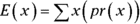
For example, some statistical tests depend on normally distributed populations. If the populations aren’t normal, what happens to those tests? Do they still do what they’re supposed to? To answer that question, statisticians might create non-normally distributed populations of numbers, simulate experiments with them, and apply the statistical tests to the simulated results.
In this section, I use simulation to examine an important statistical item: the central limit theorem. In Chapter 9, I introduce this theorem in connection with the sampling distribution of the mean. In fact, I simulate sampling from a population with only three possible values to show you that even with a small sample size, the sampling distribution starts to look normally distributed.
Here, I set up a normally distributed population and draw 10,000 samples of 25 scores each. I calculate the mean of each sample and then set up a distribution of those 10,000 means. The idea is to see how that distribution’s statistics match up with the central limit theorem’s predictions.
The population for this example has the parameters of the population of scores on the IQ test, a distribution I use for examples in several chapters. It’s a normal distribution with and . According to the central limit theorem, the mean of the distribution of means (the sampling distribution of the mean) should be 100, and the standard deviation (the standard error of the mean) should be 3 — the population standard deviation (15) divided by the square root of the sample size (5). The central limit theorem also predicts that the sampling distribution of the mean is normally distributed.
The rnorm() function does the sampling. For one sample of 25 numbers from a normally distributed population with a mean of 100 and a standard deviation of 15, the function is
rnorm(25,100,15)
and if I want the sample mean, it’s
mean(rnorm(25,100,15))
I’ll put that function inside a for loop that repeats 10,000 times and appends each newly calculated sample mean to a vector called sampling.distribution, which I initialize:
Be sure to reset sampling.distribution to NULL before each time you run the for loop.
What does the sampling distribution look like? To keep things looking clean, I round off the sample means in sampling.distribution and then create a table:
table(round(sampling.distribution))
I’d show you the table, but the numbers get all scrambled up on the page. Instead, I’ll go ahead and use ggplot() to graph the sampling distribution.
 Discovering models
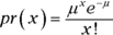
 .
.
 .
.
 ).
).


 When would you use
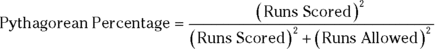

 and
and  . According to the central limit theorem, the mean of the distribution of means (the sampling distribution of the mean) should be 100, and the standard deviation (the standard error of the mean) should be 3 — the population standard deviation (15) divided by the square root of the sample size (5). The central limit theorem also predicts that the sampling distribution of the mean is normally distributed.
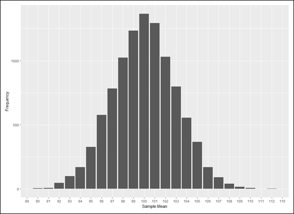
 ) based on 10,000 samples from a normal distribution with
  and
and  .
.