Discovering how correlation connects to regression
Drawing conclusions from correlations
Analyzing items
In Chapter 14, I introduce the concepts of regression, a tool for summarizing and testing relationships between (and among) variables. In this chapter, I introduce you to the ups and downs of correlation, another tool for looking at relationships. I use the example of employee aptitude and performance from Chapter 14 and show how to think about the data in a slightly different way. The new concepts connect to what I show you in Chapter 14, and you’ll see how those connections work. I also show you how to test hypotheses about relationships and how to use R functions for correlation.
Scatter plots Again
A scatter plot is a graphical way of showing a relationship between two variables. In Chapter 14, I show you a scatter plot of the data for employees at FarMisht Consulting, Inc. I reproduce that scatter plot here as Figure 15-1. Each point represents one employee’s score on a measure of Aptitude (on the x-axis) and on a measure of Performance (on the y-axis).
FIGURE 15-1: Aptitude and Performance at FarMisht Consulting.
Understanding Correlation
In Chapter 14, I refer to Aptitude as the independent variable and to Performance as the dependent variable. The objective in Chapter 14 is to use Aptitude to predict Performance.
Although I use scores on one variable to predict scores on the other, I do not mean that the score on one variable causes a score on the other. “Relationship” doesn’t necessarily mean “causality.”
Correlation is a statistical way of looking at a relationship. When two things are correlated, it means that they vary together. Positive correlation means that high scores on one are associated with high scores on the other, and that low scores on one are associated with low scores on the other. The scatter plot in Figure 15-1 is an example of positive correlation.
Negative correlation, on the other hand, means that high scores on the first thing are associated with low scores on the second. Negative correlation also means that low scores on the first are associated with high scores on the second. An example is the correlation between body weight and the time spent on a weight-loss program. If the program is effective, the higher the amount of time spent on the program, the lower the body weight. Also, the lower the amount of time spent on the program, the higher the body weight.
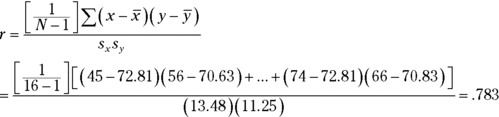
TABLE 15-1 Aptitude Scores and Performance Scores for 16 FarMisht Consultants
Consultant
Aptitude
Performance
1
45
56
2
81
74
3
65
56
4
87
81
5
68
75
6
91
84
7
77
68
8
61
52
9
55
57
10
66
82
11
82
73
12
93
90
13
76
67
14
83
79
15
61
70
16
74
66
Mean
72.81
70.63
Variance
181.63
126.65
Standard Deviation
13.48
11.25
In keeping with the way I use Aptitude and Performance in Chapter 14, Aptitude is the x-variable and Performance is the y-variable.
The formula for calculating the correlation between the two is
The term on the left, r, is called the correlation coefficient. It’s also called Pearson’s product-moment correlation coefficient, after its creator, Karl Pearson.
The two terms in the denominator on the right are the standard deviation of the x-variable and the standard deviation of the y-variable. The term in the numerator is called the covariance. Another way to write this formula is
The covariance represents x and y varying together. Dividing the covariance by the product of the two standard deviations imposes some limits. The lower limit of the correlation coefficient is –1.00, and the upper limit is +1.00.
A correlation coefficient of –1.00 represents perfect negative correlation (low x-scores associated with high y-scores, and high x-scores associated with low y-scores). A correlation of +1.00 represents perfect positive correlation (low x-scores associated with low y-scores and high x-scores associated with high y-scores). A correlation of 0.00 means that the two variables are not related.
What, exactly, does this number mean? I’m about to tell you.
Correlation and Regression
Figure 15-2 shows the scatter plot of just the 16 employees in Table 15-1 with the line that “best fits” the points. It’s possible to draw an infinite number of lines through these points. Which one is best?
FIGURE 15-2: Scatter plot of 16 FarMisht consultants, including the regression line.
To be the best, a line has to meet a specific standard: If you draw the distances in the vertical direction between the points and the line, and you square those distances, and then you add those squared distances, the best-fitting line is the one that makes the sum of those squared distances as small as possible. This line is called the regression line.
The regression line’s purpose in life is to enable you to make predictions. As I mention in Chapter 14, without a regression line, the best predicted value of the y-variable is the mean of the y's. A regression line takes the x-variable into account and delivers a more precise prediction. Each point on the regression line represents a predicted value for y. In the symbology of regression, each predicted value is a y'.
Why do I tell you all this? Because correlation is closely related to regression. Figure 15-3 focuses on one point in the scatter plot, and on its distance to the regression line and to the mean. (This is a repeat of Figure 14-3.)
FIGURE 15-3: One point in the scatter plot and its associated distances
Notice the three distances laid out in the figure. The distance labeled (y-y') is the difference between the point and the regression line’s prediction for where the point should be. (In Chapter 14, I call that a residual.) The distance labeled (y-) is the difference between the point and the mean of the y's. The distance labeled (y'-) is the gain in prediction capability that you get from using the regression line to predict the point instead of using the mean to predict the point.
Figure 15-3 shows that the three distances are related like this:
As I point out in Chapter 14, you can square all the residuals and add them, square all the deviations of the predicted points from the mean and add them, and square all the deviations of the actual points from the mean and add them, too.
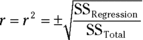
It turns out that these sums of squares are related in the same way as the deviations I just showed you:
If SSRegression is large in comparison to SSResidual, the relationship between the x-variable and the y-variable is a strong one. It means that, throughout the scatter plot, the variability around the regression line is small.
On the other hand, if SSRegression is small in comparison to SSResidual, the relationship between the x-variable and the y-variable is weak. In this case, the variability around the regression line is large throughout the scatter plot.
One way to test SSRegression against SSResidual is to divide each by its degrees of freedom (1 for SSRegression and N–2 for SSResidual) to form variance estimates (also known as mean-squares, or MS), and then divide one by the other to calculate an F. If MSRegression is significantly larger than MSResidual, you have evidence that the x-y relationship is strong. (See Chapter 14 for details.)
Here’s the clincher, as far as correlation is concerned: Another way to assess the size of SSRegression is to compare it with SSTotal. Divide the first by the second. If the ratio is large, this tells you the x-y relationship is strong. This ratio has a name. It’s called the coefficient of determination. Its symbol is r2. Take the square root of this coefficient, and you have … the correlation coefficient!
The plus-or-minus sign (±) means that r is either the positive or negative square root, depending on whether the slope of the regression line is positive or negative.
So, if you calculate a correlation coefficient and you quickly want to know what its value signifies, just square it. The answer — the coefficient of determination — lets you know the proportion of the SSTotal that’s tied up in the relationship between the x-variable and the y-variable. If it’s a large proportion, the correlation coefficient signifies a strong relationship. If it’s a small proportion, the correlation coefficient signifies a weak relationship.
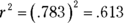
In the Aptitude-Performance example, the correlation coefficient is .783. The coefficient of determination is
In this sample of 16 consultants, the SSRegression is 61.3 percent of the SSTotal. Sounds like a large proportion, but what’s large? What’s small? Those questions scream out for hypothesis tests.
Testing Hypotheses About Correlation
In this section, I show you how to answer important questions about correlation. Like any other kind of hypothesis testing, the idea is to use sample statistics to make inferences about population parameters. Here, the sample statistic is r, the correlation coefficient. By convention, the population parameter is ρ (rho), the Greek equivalent of r. (Yes, it does look like the letter p, but it really is the Greek equivalent of r.)
Two kinds of questions are important in connection with correlation: (1) Is a correlation coefficient greater than 0? (2) Are two correlation coefficients different from one another?
Is a correlation coefficient greater than zero?
Returning once again to the Aptitude-Performance example, you can use the sample r to test hypotheses about the population ρ — the correlation coefficient for all consultants at FarMisht Consulting.
Assuming that you know in advance (before you gather any sample data) that any correlation between Aptitude and Performance should be positive, the hypotheses are
H0: ρ ≤ 0
H1: ρ > 0
Set α = .05.
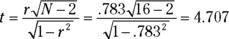
The appropriate statistical test is a t-test. The formula is
This test has N–2 df.
For the example, the values in the numerator are set: r is .783 and ρ (in H0) is 0. What about the denominator? I won’t burden you with the details. I’ll just tell you that’s
With a little algebra, the formula for the t-test simplifies to
For the example,
With and (one-tailed), the critical value of t is 1.76. Because the calculated value is greater than the critical value, the decision is to reject H0.
Do two correlation coefficients differ?
FarKlempt Robotics has a consulting branch that assesses aptitude and performance with the same measurement tools that FarMisht Consulting uses. In a sample of 20 consultants at FarKlempt Robotics, the correlation between Aptitude and Performance is .695. Is this different from the correlation (.783) at FarMisht Consulting? If you have no way of assuming that one correlation should be higher than the other, the hypotheses are
H0: ρFarMisht = ρFarKlempt
H1: ρFarMisht ≠ ρFarKlempt
Again, .
For highly technical reasons, you can’t set up a t-test for this one. In fact, you can’t even work with .783 and .695, the two correlation coefficients.
Instead, what you do is transform each correlation coefficient into something else and then work with the two “something elses” in a formula that gives you — believe it or not — a z-test.
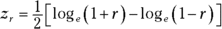
The transformation is called Fisher’s r to z transformation. Fisher is the statistician who is remembered as the F in F-test. He transforms the r into a z by doing this:
If you know what loge means, fine. If not, don’t worry about it. (I explain it in Chapter 16.) R takes care of all of this for you, as you see in a moment.
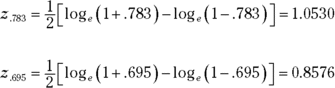
Anyway, for this example
After you transform r to z, the formula is
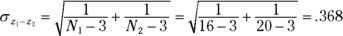
The denominator turns out to be easier than you might think. It’s
For this example,
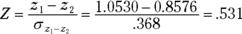
The whole formula is
The next step is to compare the calculated value to a standard normal distribution. For a two-tailed test with α = .05, the critical values in a standard normal distribution are 1.96 in the upper tail and –1.96 in the lower tail. The calculated value falls between those two, so the decision is to not reject H0.
Correlation in R
In this section, I work with the FarMisht example. The data frame, FarMisht.frame, holds the data points shown over in Table 14-4. Here’s how I created it:
The Pearson product-moment correlation coefficient that cor() calculates in this example is the default for its method argument:
cor(Farmisht.frame, method = “pearson”)
Two other possible values for method are “spearman” and “kendall”, which I cover in Appendix B.
Testing a correlation coefficient
To find a correlation coefficient, and test it at the same time, R provides cor.test(). Here is a one-tailed test (specified by alternative = “greater”):
> with(FarMisht.frame, cor.test(Aptitude,Performance,
           alternative = "greater"))
Pearson's product-moment correlation data: Aptitude and Performance t = 4.7068, df = 14, p-value = 0.0001684 alternative hypothesis: true correlation is greater than 0 95 percent confidence interval: 0.5344414 1.0000000 sample estimates: cor 0.7827927
As is the case with cor(), you can specify “spearman” or “kendall” as the method for cor.test().
Testing the difference between two correlation coefficients
In the earlier section “Do two correlation coefficients differ?” I compare the Aptitude-Performance correlation coefficient (.695) for 20 consultants at FarKlempt Robotics with the correlation (.783) for 16 consultants at FarMisht Consulting.
The comparison begins with Fisher’s r to z transformation for each coefficient. The test statistic (Z) is the difference of the transformed values divided by the standard error of the difference.
A function called r.test() does all the work if you provide the coefficients and the sample sizes. This function lives in the psych package, so on the Packages tab, click Insert. Then in the Insert Packages dialog box, type psych. When psych appears on the Packages tab, select its check box.
Here’s the function, and its arguments:
r.test(r12=.783, n=16, r34=.695, n2=20)
This one is pretty particular about how you state the arguments. The first argument is the first correlation coefficient. The second is its sample size. The third argument is the second correlation coefficient, and the fourth is its sample size. The 12 label for the first coefficient and the 34 label for the second indicate that the two coefficients are independent.
If you run that function, this is the result:
Correlation tests Call:r.test(n = 16, r12 = 0.783, r34 = 0.695, n2 = 20) Test of difference between two independent correlations z value 0.53 with probability 0.6
Calculating a correlation matrix
In addition to finding a single correlation coefficient, cor() can find all the pairwise correlation coefficients for a data frame, resulting in a correlation matrix:
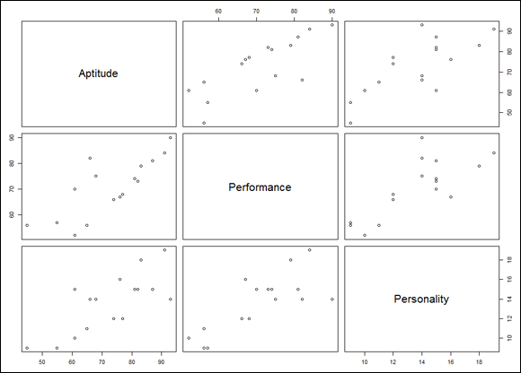
FIGURE 15-4: The correlation matrix for Aptitude, Performance, and Personality, rendered in base R graphics.
The main diagonal, of course, holds the names of the variables. Each off-diagonal cell is a scatter plot of the pair of variables named in the row and the column. For example, the cell to the immediate right of Aptitude is the scatter plot of Aptitude (y-axis) and Performance (x-axis). The cell just below Aptitude is the reverse — it’s the scatter plot of Performance (y-axis) and Aptitude (x-axis).
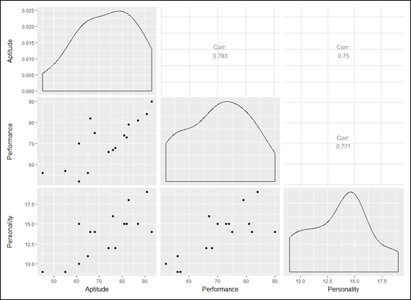
As I also mention in Chapter 3, a package called GGally (built on ggplot2) provides ggpairs(), which produces a bit more. Find GGally on the Packages tab and select its check box. Then
FIGURE 15-5: The correlation matrix for Aptitude, Performance, and Personality, rendered in GGally (a ggplot2-based package).
The main diagonal provides a density function for each variable, the upper off-diagonal cells present the correlation coefficients, and the remaining cells show pairwise scatter plots.
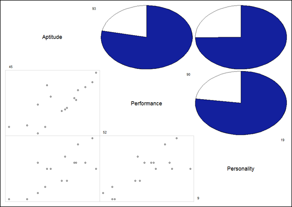
More elaborate displays are possible with the corrgram package. On the Packages tab, click Install, and in the Install dialog box, type corrgram and click Install. (Be patient. This package installs a lot of items.) Then, on the Packages tab, find corrgram and select its check box.
The corrgram() function works with a data frame and enables you to choose options for what goes into the main diagonal (diag.panel) of the resulting matrix, what goes into the cells in the upper half of the matrix (upper.panel), and what goes into the cells in the lower half of the matrix (lower.panel). For the main diagonal, I chose to show the minimum and maximum values for each variable. For the upper half, I specified a pie chart to show the value of a correlation coefficient: The filled-in proportion represents the value. For the lower half, I’d like a scatter plot in each cell:
FIGURE 15-6: The correlation matrix for Aptitude, Performance, and Personality, rendered in the corrgram package.
Multiple Correlation
The correlation coefficients in the correlation matrix described in the preceding section combine to produce a multiple correlation coefficient. This is a number that summarizes the relationship between the dependent variable — Performance, in this example — and the two independent variables (Aptitude and Personality).
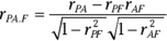
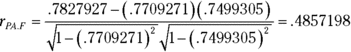
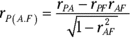
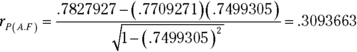
To show you how these correlation coefficients combine, I abbreviate Performance as P, Aptitude as A, and Personality as F (FarMisht Personality Inventory). So rPA is the correlation coefficient for Performance and Aptitude (.7827927), rPF is the correlation coefficient for Performance and Personality (.7709271), and rAF is the correlation coefficient for Aptitude and Personality (.7499305).
Here’s the formula that puts them all together:
The uppercase R on the left indicates that this is a multiple correlation coefficient, as opposed to the lowercase r, which indicates a correlation between two variables. The subscript P.AF means that the multiple correlation is between Performance and the combination of Aptitude and Personality.
For this example,
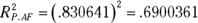
If you square this number, you get the multiple coefficient of determination. In Chapter 14, you met Multiple R-Squared, and that’s what this is. For this example, that result is
Multiple correlation in R
The easiest way to calculate a multiple correlation coefficient is to use lm() and proceed as in multiple regression:
> FarMisht.multreg <- lm(Performance ~ Aptitude + Personality, data = FarMisht.frame) > summary(FarMisht.multreg) Call: lm(formula = Performance ~ Aptitude + Personality, data = FarMisht.frame) Residuals: Min 1Q Median 3Q Max -8.689 -2.834 -1.840 2.886 13.432 Coefficients: Estimate Std. Error t value Pr(>|t|) (Intercept) 20.2825 9.6595 2.100 0.0558 . Aptitude 0.3905 0.1949 2.003 0.0664 . Personality 1.6079 0.8932 1.800 0.0951 . --- Signif. codes: 0 '***' 0.001 '**' 0.01 '*' 0.05 '.' 0.1 ' ' 1 Residual standard error: 6.73 on 13 degrees of freedom Multiple R-squared: 0.69, Adjusted R-squared: 0.6423 F-statistic: 14.47 on 2 and 13 DF, p-value: 0.0004938
In the next-to-last line, Multiple R-squared is right there, waiting for you.
If you have to work with that quantity for some reason, that’s
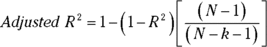
In the output of lm(), you see Adjusted R-squared. Why is it necessary to “adjust” R-squared?
In multiple regression, adding independent variables (like Personality) sometimes makes the regression equation less accurate. The multiple coefficient of determination, R-squared, doesn’t reflect this. Its denominator is SSTotal (for the dependent variable), and that never changes. The numerator can only increase or stay the same. So any decline in accuracy doesn’t result in a lower R-squared.
Taking degrees of freedom into account fixes the flaw. Every time you add an independent variable, you change the degrees of freedom, and that makes all the difference. Just so you know, here’s the adjustment:
The k in the denominator is the number of independent variables.
If you ever have to work with this quantity (and I’m not sure why you would), here’s how to retrieve it:
Performance and Aptitude are associated with Personality (in the example). Each one’s association with Personality might somehow hide the true correlation between them.
What would their correlation be if you could remove that association? Another way to ask this: What would be the Performance-Aptitude correlation if you could hold Personality constant?
One way to hold Personality constant is to find the Performance-Aptitude correlation for a sample of consultants who have one Personality score — 17, for example. In a sample like this, the correlation of each variable with Personality is 0. This usually isn’t feasible in the real world, however.
Another way is to find the partial correlation between Performance and Aptitude. This is a statistical way of removing each variable’s association with Personality in your sample. You use the correlation coefficients in the correlation matrix to do this:
Once again, P stands for Performance, A for Aptitude, and F for Personality. The subscript PA.F means that the correlation is between Performance and Aptitude with Personality “partialled out.”
For this example,
Partial Correlation in R
A package called ppcor holds the functions for calculating partial correlation and for calculating semipartial correlation, which I cover in the next section.
On the Packages tab, click Install. In the Install Packages dialog box, type ppcor and then click Install. Next, find ppcor in the Packages dialog box and select its check box.
The function pcor.test() calculates the correlation between Performance and Aptitude with Personality partialled out:
> with (FarMisht.frame, pcor.test(x=Performance, y=Aptitude,
            z=Personality))
estimate p.value statistic n gp Method 1 0.4857199 0.06642269 2.0035 16 1 pearson
In addition to the correlation coefficient (shown below estimate), it calculates a t-test of the correlation with N–3 df (shown below statistic) and an associated p-value.
If you prefer to calculate all the possible partial correlations (and associated p-values and t-statistics) in the data frame, use pcor():
Each cell under $estimate is the partial correlation of the cell’s row variable with the cell’s column variable, with the third variable partialled out. If you have more than three variables, each cell is the row-column partial correlation with everything else partialled out.
Semipartial Correlation
It’s possible to remove the correlation with Personality from just Aptitude without removing it from Performance. This is called semipartial correlation. The formula for this one also uses the correlation coefficients from the correlation matrix:
The subscript P(A.F) means that the correlation is between Performance and Aptitude with Personality partialled out of Aptitude only.
Applying this formula to the example,
Some statistics textbooks refer to semipartial correlation as part correlation.
Semipartial Correlation in R
As I mention earlier in this chapter, the ppcor package has the functions for calculating semipartial correlation. To find the semipartial correlation between Performance and Aptitude with Personality partialled out of Aptitude only, use spcor.test():
> with (FarMisht.frame, spcor.test(x=Performance, y=Aptitude,
            z=Personality))
estimate p.value statistic n gp Method 1 0.3093664 0.2618492 1.172979 16 1 pearson
As you can see, the output is similar to the output for pcor.test(). Again, estimate is the correlation coefficient and statistic is a t-test of the correlation coefficient with N–3 df.
To find the semipartial corrleations for the whole data frame, use spcor():
Notice that, unlike the matrices in the output for pcor(), in these matrices the numbers above the diagonal are not the same as the numbers below the diagonal.
The easiest way to explain is with an example. In the $estimate matrix, the value in the first column, second row (0.3093364) is the correlation between Performance (the row variable) and Aptitude (the column variable) with Personality partialled out of Aptitude. The value in the second column, first row (0.3213118) is the correlation between Aptitude (which is now the row variable) and Performance (which is now the column variable) with Personality partialled out of Performance.
What happens when you have more than three variables? In that case, each cell value is the row-column correlation with everything else partialled out of the column variable.
 Understanding what correlation is all about
 Although I use scores on one variable to predict scores on the other, I do not mean that the score on one variable causes a score on the other. “Relationship” doesn’t necessarily mean “causality.”
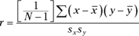


 ) is the difference between the point and the mean of the y's. The distance labeled (y'-
 ) is the gain in prediction capability that you get from using the regression line to predict the point instead of using the mean to predict the point.
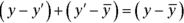


 and
and  (one-tailed), the critical value of t is 1.76. Because the calculated value is greater than the critical value, the decision is to reject H0.
 .
. The transformation is called Fisher’s r to z transformation. Fisher is the statistician who is remembered as the F in F-test. He transforms the r into a z by doing this: