In Chapter 11, I show you how to test hypotheses with two samples. In Chapter 12, I show you how to test hypotheses when you have more than two samples. The common thread in both chapters is one independent variable (also called a factor).
Many times, you have to test the effects of more than one factor. In this chapter, I show how to analyze two factors within the same set of data. Several types of situations are possible, and I describe R functions that deal with each one.
Cracking the Combinations
Imagine that a company has two methods of presenting its training information: One is via a person who presents the information orally, and the other is via a text document. Imagine also that the information is presented in either a humorous way or a technical way. I refer to the first factor as Presentation Method and to the second as Presentation Style.
Combining the two levels of Presentation Method with the two levels of Presentation Style gives four combinations. The company randomly assigns 4 people to each combination, for a total of 16 people. After providing the training, they test the 16 people on their comprehension of the material.
Figure 13-1 shows the combinations, the four comprehension scores within each combination, and summary statistics for the combinations, rows, and columns.
FIGURE 13-1: Combining the levels of Presentation Method with the levels of Presentation Style.
With each of two levels of one factor combined with each of two levels of the other factor, this kind of study is called a 2 X 2 factorial design.
Here are the hypotheses:
H0: μSpoken = μText
H1: Not H0
and
H0: μHumorous = μTechnical
H1: Not H0
Because the two presentation methods (Spoken and Text) are in the rows, I refer to Presentation Type as the row factor. The two presentation styles (Humorous and Technical) are in the columns, so Presentation Style is the column factor.
Interactions
When you have rows and columns of data and you’re testing hypotheses about the row factor and the column factor, you have an additional consideration. Namely, you have to be concerned about the row-column combinations. Do the combinations result in peculiar effects?
For the example I present, it’s possible that combining Spoken and Text with Humorous and Technical yields an unexpected result. In fact, you can see that in the data in Figure 13-1: For Spoken presentation, the Humorous style produces a higher average than the Technical style. For Text presentation, the Humorous style produces a lower average than the Technical style.
A situation like that is called an interaction. In formal terms, an interaction occurs when the levels of one factor affect the levels of the other factor differently. The label for the interaction is row factor × column factor, so for this example, that's Method × Type.
The hypotheses for this are
H0: Presentation Method does not interact with Presentation Style
H1: Not H0
The analysis
The statistical analysis is, once again, an analysis of variance (ANOVA). As is the case with the ANOVAs I show you earlier, it depends on the variances in the data. It’s called a two-factor ANOVA, or a two-way ANOVA.
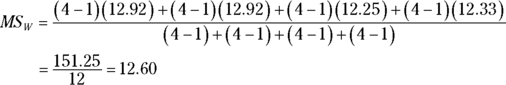
The first variance is the total variance, labeled MST. That's the variance of all 16 scores around their mean (the grand mean), which is 44.81:
The denominator tells you that df = 15 for MST.
The next variance comes from the row factor. That’s MSMethod, and it’s the variance of the row means around the grand mean:
The 8 in the equation multiplies each squared deviation because you have to take into account the number of scores that produced each row mean. The df for MSMethod is the number of rows – 1, which is 1.
Similarly, the variance for the column factor is
The df for MSStyle is 1 (the number of columns – 1).
Another variance is the pooled estimate based on the variances within the four row-column combinations. It’s called the MSWithin, or MSW. (For details on MSw and pooled estimates, see Chapter 12.). For this example,
This one is the error term (the denominator) for each F you calculate. Its denominator tells you that df = 12 for this MS.
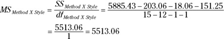
The last variance comes from the interaction between the row factor and the column factor. In this example, it’s labeled MSMethod X Type. You can calculate this in a couple of ways. The easiest way is to take advantage of this general relationship:
And this one:
Another way to calculate this is
The MS is
For this example,
To test the hypotheses, you calculate three Fs:
For df = 1 and 12, the critical F at α = .05 is 4.75. (You can use qf() to verify). The decision is to reject H0 for the Presentation Method and the Method X Style interaction, and to not reject H0 for the Presentation Style.
It’s possible, of course, to have more than two levels of each factor. It’s also possible to have more than two factors. In that case, things (like interactions) become way more complex.
Two-Way ANOVA in R
As in any analysis, the first step is to get the data in shape, and in R that means getting the data into long format.
Start with vectors for the scores in each of the columns in Figure 13-1:
Again, the f-values and p-values indicate rejection of the null hypothesis for Method and for the Style X Method interaction, but not for Style.
With just two levels of each factor, no post-analysis tests are necessary to explore a significant result.
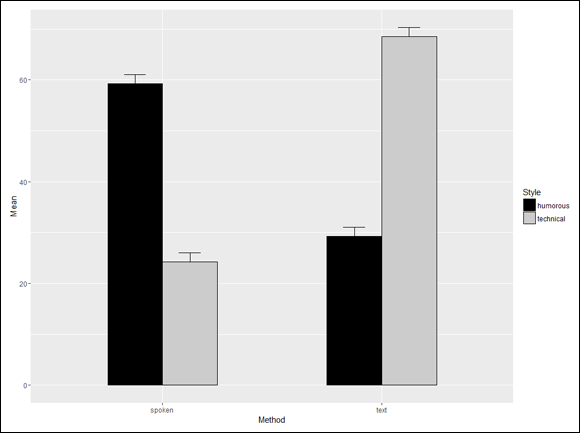
Visualizing the two-way results
The best way to show the results of a study like this one is with a grouped bar plot that shows the means and the standard errors. The foundation for the plot is a data frame that holds these statistics for each combination of levels of the independent variables:
> mse.frame Method Style Mean SE 1 spoken humorous 59.25 1.796988 2 text humorous 29.25 1.750000 3 spoken technical 24.25 1.796988 4 text technical 68.50 1.755942
To create this data frame, start by creating four vectors:
On to the visualization. In ggplot2, begin with a ggplot() statement that maps the components of the data to the components of the graph:
ggplot(mse.frame,aes(x=Method,y=Mean,fill=Style))
Now use a geom_bar that takes the given mean as its statistic:
geom_bar(stat = "identity", position = "dodge", color = "black", width = .5)
The position argument sets up this plot as a grouped bar plot, the color argument specifies “black” as the border color, and width sets up a size for nice-looking bars. You might experiment a bit to see whether another width is more to your liking.
If you don’t change the colors of the bars, they appear as light red and light blue, which are pleasant enough but would be indistinguishable on a black-and-white page. Here’s how to change the colors:
scale_fill_grey(start = 0,end = .8)
In the grey scale, 0 corresponds to black and 1 to white. Finally, the geom_errorbar adds the bars for the standard errors:
Using Mean as the value of ymin ensures that you plot only the upper error bar, which is what you typically see in published bar plots. The position argument uses the position_dodge() function to center the error bars.
FIGURE 13-2: Means and standard errors of the presentation study.
This graph clearly shows the Method X Style interaction. For the spoken presentation, humorous is more effective than technical, and it’s the reverse for the text presentation.
Two Kinds of Variables … at Once
What happens when you have a Between Groups variable and a Within Groups variable … at the same time? How can that happen?
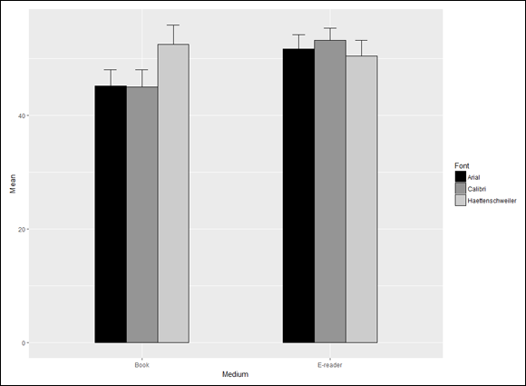
Very easily. Here’s an example. Suppose you want to study the effects of presentation media on the reading speeds of fourth-graders. You randomly assign the fourth-graders (I’ll call them subjects) to read either books or e-readers. So “Medium” is the Between Groups variable.
Let’s say you’re also interested in the effects of font. So you assign each subject to read each of these fonts: Haettenschweiler, Arial, and Calibri. (I’ve never seen a document in Haettenschweiler, but it’s my favorite font because “Haettenschweiler” is fun to say. Try it. Am I right?) Because each subject reads all the fonts, “Font” is the Within Groups variable. For completeness, you have to randomly order the fonts for each subject.
Table 13-1 shows data that might result from a study like this. The dependent variable is the score on a reading comprehension test.
TABLE 13-1 Data for a Study of Presentation Media (Between Groups variable) and Font (Within Groups variable)
Medium
Subject
Haettenschweiler
Arial
Calibri
Book
Alice
48
40
38
Brad
55
43
45
Chris
46
45
44
Donna
61
53
53
e-reader
Eddie
43
45
47
Fran
50
52
54
Gil
56
57
57
Harriet
53
53
55
Because this kind of analysis mixes a Between Groups variable with a Within Groups variable, it’s called a Mixed ANOVA.
To show you how the analysis works, I present the kind of table that results from a Mixed ANOVA. It’s a bit more complete than the output of an ANOVA in R, but bear with me. Table 13-2 shows it to you in a generic way. It’s categorized into a set of sources that make up Between Groups variability and a set of sources that make up Within Groups (also known as Repeated Measures) variability.
In the Between category, A is the name of the Between Groups variable. (In the example, that’s Medium.) Read “S/A” as “Subjects within A.” This just says that the people in one level of A are different from the people in the other levels of A.
In the Within category, B is the name of the Within Groups variable. (In the example, that’s Font.) A X B is the interaction of the two variables. B X S/A is something like the B variable interacting with subjects within A. As you can see, anything associated with B falls into the Within Groups category.
The first thing to note is the three F-ratios. The first one tests for differences among the levels of A, the second for differences among the levels of B, and the third for the interaction of the two. Notice also that the denominator for the first F-ratio is different from the denominator for the other two. This happens more and more as ANOVAs increase in complexity.
Next, it’s important to be aware of some relationships. At the top level:
SSBetween + SSWithin = SSTotal
dfBetween + dfWithin = dfTotal
The Between component breaks down further:
SSA + SSS/A = SSBetween
dfA + dfS/A = dfBetween
The Within component breaks down, too:
SSB + SSA X B + SSB X S/A = SSWithin
dfB + dfA X B + dfB X S/A = dfWithin
It’s possible to have more than one Between Groups factor and more than one repeated measure in a study.
On to the analysis… .
Mixed ANOVA in R
First, I show you how to use the data from Table 13-1 to build a data frame in long format. When finished, it looks like this:
> mixed.frame Medium Font Subject Score 1 Book Haettenschweiler Alice 48 2 Book Haettenschweiler Brad 55 3 Book Haettenschweiler Chris 46 4 Book Haettenschweiler Donna 61 5 Book Arial Alice 40 6 Book Arial Brad 43 7 Book Arial Chris 45 8 Book Arial Donna 53 9 Book Calibri Alice 38 10 Book Calibri Brad 45 11 Book Calibri Chris 44 12 Book Calibri Donna 53 13 E-reader Haettenschweiler Eddie 43 14 E-reader Haettenschweiler Fran 50 15 E-reader Haettenschweiler Gil 56 16 E-reader Haettenschweiler Harriet 53 17 E-reader Arial Eddie 45 18 E-reader Arial Fran 52 19 E-reader Arial Gil 57 20 E-reader Arial Harriet 53 21 E-reader Calibri Eddie 47 22 E-reader Calibri Fran 54 23 E-reader Calibri Gil 57 24 E-reader Calibri Harriet 55
I begin with a vector for the Book scores and a vector for the e-reader scores:
I complete a similar process for the subjects: one vector for the Book subjects and another for the e-reader subjects. Note that I have to repeat each list three times:
The arguments show that Score depends on Medium and Font and that Font is repeated throughout each Subject.
To see the table:
> summary(mixed.anova) Error: Subject Df Sum Sq Mean Sq F value Pr(>F) Medium 1 108.4 108.37 1.227 0.31 Residuals 6 529.9 88.32 Error: Subject:Font Df Sum Sq Mean Sq F value Pr(>F) Font 2 40.08 20.04 5.681 0.018366 * Medium:Font 2 120.25 60.13 17.043 0.000312 *** Residuals 12 42.33 3.53 --- Signif. codes: 0 '***' 0.001 '**' 0.01 '*' 0.05 '.' 0.1 ' ' 1
You can reject the null hypothesis about Font and about the interaction of Medium and Font, but not about Medium.
Visualizing the Mixed ANOVA results
You use ggplot() to create a bar plot of the means and standard errors. Begin by creating this data frame, which contains the necessary information:
> mse.frame Medium Font Mean SE 1 Book Haettenschweiler 52.50 3.427827 2 Book Arial 45.25 2.780138 3 Book Calibri 45.00 3.082207 4 E-reader Haettenschweiler 50.50 2.783882 5 E-reader Arial 51.75 2.495830 6 E-reader Calibri 53.25 2.174665
To create this data frame, follow the same steps as in the earlier “Visualizing the two-way results” section, with appropriate changes. The ggplot code is also the same as in that earlier section, with changes to variable names:
The result is Figure 13-3. The figure shows the Between Groups variable on the x-axis and levels of the repeated measure in the bars — but that’s just my preference. You might prefer vice versa. In this layout, the different ordering of the heights of the bars from Book to e-reader reflects the interaction.
FIGURE 13-3: Means and standard errors for the Book-versus-e-reader study.
After the Analysis
As I point out in Chapter 12, a significant result in an ANOVA tells you that an effect is lurking somewhere in the data. Post-analysis tests tell you where. Two types of tests are possible: planned or unplanned. Chapter 12 provides the details.
In this example, the Between Groups variable has only two levels. For this reason, if the result is statistically significant, no further test would be necessary. The Within Groups variable, Font, is significant. Ordinarily, the test would proceed as described in Chapter 12. In this case, however, the interaction between Media and Font necessitates a different path.
With the interaction, post-analysis tests can proceed in either (or both) of two ways. You can examine the effects of each level of the A variable (the Between Groups variable) on the levels of the B variable (the repeated measure), or you can examine the effects of each level of the B variable on the levels of the A variable. Statisticians refer to these as simple main effects.
For this example, the first way examines the means for the three fonts in a book and the means for the three fonts in the e-reader. The second way examines the means for the book versus the mean for the e-reader with Haettenschweiler font, with Arial, and with Calibri.
Statistics texts provide complicated formulas for calculating these analyses. R makes them easy. To analyze the three fonts in the book, do a repeated measures ANOVA for Subjects 1–4. To analyze the three fonts in the e-reader, do a repeated measures ANOVA for Subjects 5–8.
For the analysis of the book versus the e-reader in the Haettenschweiler font, that’s a single-factor ANOVA for the Haettenschweiler data. You’d complete a similar procedure for each of the other fonts.
Multivariate Analysis of Variance
The examples thus far in this chapter involve a dependent variable and more than one independent variable. Is it possible to have more than one dependent variable? Absolutely! That gives you MANOVA — the abbreviation for the title of this section.
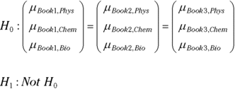
When might you encounter this type of situation? Suppose you’re thinking of adopting one of three textbooks for a basic science course. You have 12 students, and you randomly assign four of them to read Book 1, another four to read Book 2, and the remaining four to read Book 3. You’re interested in how each book promotes knowledge in physics, chemistry, and biology, so after the students read the books, they take a test of fundamental knowledge in each of those three sciences.
The independent variable is Book, and the dependent variable is multivariate — it’s a vector that consists of Physics score, Chemistry score, and Biology score. Table 13-3 shows the data.
TABLE 13-3 Data for the Science Textbook MANOVA Study
Student
Book
Physics
Chemistry
Biology
Art
Book 1
50
66
71
Brenda
Book 1
53
45
56
Cal
Book 1
52
48
65
Dan
Book 1
54
51
68
Eva
Book 2
75
55
88
Frank
Book 2
72
58
85
Greg
Book 2
64
59
79
Hank
Book 2
76
59
82
Iris
Book 3
68
67
55
Jim
Book 3
61
56
59
Kendra
Book 3
62
66
63
Lee
Book 3
64
78
61
The dependent variable for the first student in the Book 1 sample is a vector consisting of 50, 66, and 71.
What are the hypotheses in a case like this? The null hypothesis has to take all components of the vector into account, so here are the null and the alternative:
I don’t go into the same depth on MANOVA in this chapter as I did on ANOVA. I don’t discuss SS, MS, and df. That would require knowledge of math (matrix algebra) and other material that’s beyond the scope of this chapter. Instead, I dive right in and show you how to get the analysis done.
MANOVA in R
The data frame for the MANOVA looks just like Table 13-3:
> Textbooks.frame Student Book Physics Chemistry Biology 1 Art Book1 50 66 71 2 Brenda Book1 53 45 56 3 Cal Book1 52 48 65 4 Dan Book1 54 51 68 5 Eva Book2 75 55 88 6 Frank Book2 72 58 85 7 Greg Book2 64 59 79 8 Hank Book2 76 59 82 9 Iris Book3 68 67 55 10 Jim Book3 61 56 59 11 Kendra Book3 62 66 63 12 Lee Book3 64 78 61
In ANOVA, the dependent variable for the analysis is a single column. In MANOVA, the dependent variable for the analysis is a matrix. In this case, it’s a matrix with 12 rows (one for each student) and three columns (Physics, Chemistry, and Biology).
To create the matrix, use the cbind() function to bind the appropriate columns together. You can do this inside the manova() function that performs the analysis:
m.analysis <- manova(cbind(Physics,Chemistry,Biology) ~ Book,
           data = Textbooks.frame)
The formula inside the parentheses shows the 12 X 3 matrix (the result of cbind()) depending on Book, with Textbooks.frame as the source of the data.
As always, apply summary() to see the table:
> summary(m.analysis) Df Pillai approx F num Df den Df Pr(>F) Book 2 1.7293 17.036 6 16 3.922e-06 *** Residuals 9 --- Signif. codes: 0 '***' 0.001 '**' 0.01 '*' 0.05 '.' 0.1 ' ' 1
The only new item is Pillai, a test statistic that results from a MANOVA. It’s a little complicated, so I’ll leave it alone. Suffice to say that R turns Pillai into an F-ratio (with 6 and 16 df) and that’s what you use as the test statistic. The high F and exceptionally low p-value indicate rejection of the null hypothesis.
Pillai is the default test. In the summary statement, you can specify other MANOVA test statistics. They’re called "Wilks", "Hotelling-Lawley", and "Roy". For example:
> summary(m.analysis, test = "Roy") Df Roy approx F num Df den Df Pr(>F) Book 2 10.926 29.137 3 8 0.0001175 *** Residuals 9 --- Signif. codes: 0 '***' 0.001 '**' 0.01 '*' 0.05 '.' 0.1 ' ' 1
The different tests result in different values for F and df, but the overall decision is the same.
This example is a MANOVA extension of an ANOVA with just one factor. It’s possible to have multiple dependent variables with more complex designs (like the ones I discuss earlier in this chapter).
Visualizing the MANOVA results
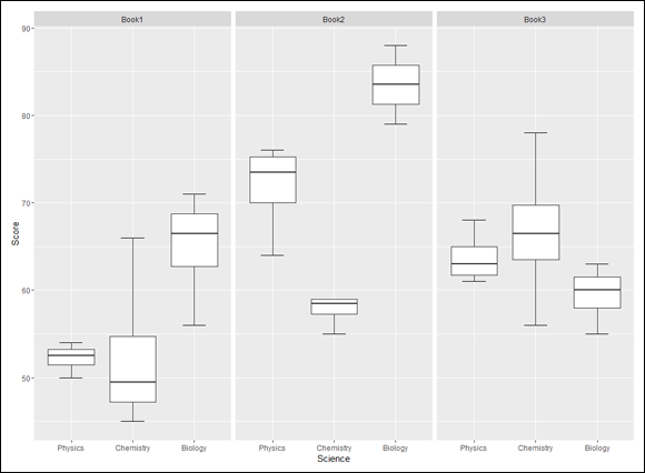
The objective of the study is to show how the distribution of Physics, Chemistry, and Biology scores differs from book to book. A separate set of boxplots for each book visualizes the differences. Figure 13-4 shows what I’m talking about.
FIGURE 13-4: Three boxplots show the distribution of scores for Physics, Chemistry, and Biology for each book.
The ggplot2 faceting capability splits the data by Book and creates the three side-by-side graphs. Each graph is called a facet. (See the “Exploring the data” section in Chapter 4.)
To set this all up, you have to reshape the Textbooks.frame into long format. With the reshape2 package installed (on the Packages tab, select the check box next to reshape2), apply the melt() function:
When a MANOVA results in rejection of the null hypothesis, one way to proceed is to perform an ANOVA on each component of the dependent variable. The results tell you which components contribute to the significant MANOVA.
The summary.aov() function does this for you. Remember that m.analysis holds the results of the MANOVA in this section’s example:
> summary.aov(m.analysis) Response Physics : Df Sum Sq Mean Sq F value Pr(>F) Book 2 768.67 384.33 27.398 0.0001488 *** Residuals 9 126.25 14.03 --- Signif. codes: 0 '***' 0.001 '**' 0.01 '*' 0.05 '.' 0.1 ' ' 1 Response Chemistry : Df Sum Sq Mean Sq F value Pr(>F) Book 2 415.5 207.750 3.6341 0.06967 . Residuals 9 514.5 57.167 --- Signif. codes: 0 '***' 0.001 '**' 0.01 '*' 0.05 '.' 0.1 ' ' 1 Response Biology : Df Sum Sq Mean Sq F value Pr(>F) Book 2 1264.7 632.33 27.626 0.0001441 *** Residuals 9 206.0 22.89 --- Signif. codes: 0 '***' 0.001 '**' 0.01 '*' 0.05 '.' 0.1 ' ' 1
These analyses show that Physics and Biology contribute to the overall effect, and Chemistry just misses significance.
Notice the word Response in these tables. This is R-terminology for “dependent variable.”
This separate-ANOVAs procedure doesn’t consider the relationships among pairs of components. The relationship is called correlation, which I discuss in Chapter 15.
 Working with two variables
 With each of two levels of one factor combined with each of two levels of the other factor, this kind of study is called a 2 X 2 factorial design.


 Notice the word
  This separate-ANOVAs procedure doesn’t consider the relationships among pairs of components. The relationship is called correlation, which I discuss in