Blues was the title of a work by Archibald Motley. It was not a piece of advertising art but rather a piece of fine art; an example of a modest but growing revolution in the visual arts of the United States in the early 1920s, which was relatively localized but was historically important and wider in its implications. Motley was among the principal African American painters of the Harlem Renaissance, which took place between the end of World War I and the Great Depression. In fact, it is likely that he painted Blues in Paris, from where several of his canvases associated with the Harlem Renaissance emanated. A number of the artists, including Motley, Aaron Douglas, and Jacob Lawrence, were working in idioms that owed much to the School of Paris, though they were most profoundly influenced by Winold Reiss, an artist of Bavarian extraction who worked in Harlem.
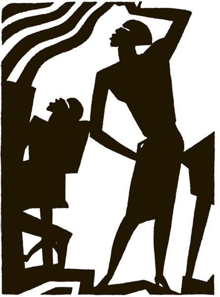
Several of these young black artists were interested in establishing their identities as African American artists by responding to their environments. Sometimes their work was more abstract in its delineation and use of shapes; this particularly applied to Aaron Douglas, whose murals and prints were angular and simplified, as can be seen from his Play de Blues, one of the prints he did for Opportunity magazine in 1926 to accompany poems by Langston Hughes (Figure 1.1). Most of the Renaissance artists occasionally drew inspiration from jazz and other black music, using symbolist, expressionist, or abstract means and motifs to convey their perceptions. (Motley’s Blues was not a depiction of a blues singer, but rather a glimpse of jazz musicians in performance at a dance.)
That the artists found inspiration from jazz was essentially due to the coincidence of the popularizing of the music and its availability on phonograph records at the time, as well as the accessibility (when they could afford the entrance fees) of live performances in the scores of Harlem venues. Whatever the merits of Motley’s Blues as expressionist art may be, it has to be admitted that it conveys relatively little about the music of jazz or, for that matter, of the blues. To quite an extent this also applies to Douglas, whose works were more symbolist in character, frequently using light, translucent colors, and textures that conveyed a sense of luminosity, though it can be argued that his use of unusual color harmonies with slight discordant notes in his paintings were a means to communicate his belief in the growing significance of the black community and its music. But for the majority of black people in Harlem, expressionist or symbolist art may have had little meaning. Coincident though the fine art of the Harlem Renaissance was with both the Jazz Age and art deco, it is probable that it would not have successfully sold many records in a period of popularization of jazz music.
Figure 1.1 Aaron Douglas, Play de Blues Reprinted by permission of the National Urban League.
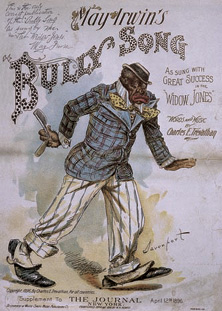
With the coming of the Jazz Age and the availability of jazz, blues, and other black music on 78 rpm records, the means for making them known, and for selling them, had to be found. There was a precedent in the form of sheet music, which had been selling to the music-reading black public since the Civil War. Even earlier, there had been numerous published parodies or imitations of black rural music and dance, as in the case of “Jump Jim Crow” and “Jim Along Josey,” which dated back to the 1840s and which continued with the popularizing of the minstrel shows. These were exploitative of black entertainment, but after the Civil War minstrel shows with all-black casts were not uncommon, and black vaudeville was gaining ground. A revival of the parody came in the form of the “bully” and “coon” songs of the 1890s, the sheet music for which frequently portrayed caricatures of blacks—though few were as notorious as that for the 1896 hit, May Irwin’s “Bully Song,” with its “razor-totin’ bad man” (Figure 1.2).
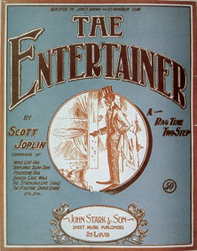
In the first decade of the twentieth century the highly successful genre of piano ragtime was being developed by such composers as Scott Joplin, James Scott, and Artie Matthews. Ragtime pieces too were published as sheet music, and many covers featured illustrated vignettes, often with an offensive caricature: Joplin’s celebrated “The Entertainer,” for instance, had both vignette and mild caricature (Figure 1.3), though this may have been more acceptable to him than the rag-picking down-and-out character who figured on the cover of his “Original Rags.”* (Images marked with an asterisk in this chapter can be viewed on the Hearing Eye Web site.)
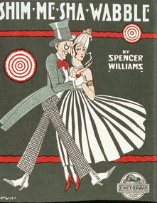
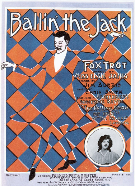
In the period before World War I, there was a mix of genres as black popular music and early jazz took hold, and sheet music covers began to show an awareness of the new trends in poster design pioneered by Parisian artists such as Henri de Toulouse-Lautrec and Jules Cheret. The sheet music for jazz pianist Spencer Williams’s “Shim-Me-Sha-Wabble” was striking in its modern design (Figure 1.4), but it was challenged by an extraordinary cover for the famous jazz item “Ballin’ the Jack,” written by black composer Chris Smith (Figure 1.6). This was published in 1919, five years after the appearance of the first published blues. Of these, “St. Louis Blues” by W. C. Handy is the most famous, even if the sober and uninspired cover to the sheet music may have contributed little to its success with jazz bands and Harlem orchestras (Figure 1.5).
Figure 1.2 (left) “Bully Song.” Sheet music cover, 1896. Paul Oliver collection.
Figure 1.3 (right) “The Entertainer.” Sheet music cover, 1903. Paul Oliver collection.
Figure 1.4 (left) “Shim-Me-Sha-Wabble.” Sheet music cover, 1917. Paul Oliver collection.
Figure 1.5 (right) “The St. Louis Blues.” Sheet music cover, 1914. Paul Oliver collection.
Figure 1.6 (opposite) “Ballin’ the Jack.” Sheet music cover, 1919. Paul Oliver collection.
It was not the published music that initiated the boom in popular appreciation of the blues, but rather the achievement of the black music entrepreneur Perry Bradford in convincing the OKeh record company to record his protégée Mamie Smith, when Sophie Tucker was indisposed. The story of his success has been told many times. In August 1920 she made her second record, “Crazy Blues,” accompanied by her Jazz Hounds, who included the trumpet player Johnny Dunn and Bradford himself on piano. With this record Mamie Smith made history, selling some 75,000 copies within weeks of release. The market for recordings by black singers and musicians was opened up as never before, and was to remain so for half a century.
To advertise the fledgling blues records, appropriate designs had to be devised that would promote the new medium, inform the readers, stimulate their interest, and arouse the desire to purchase both phonographs and the discs to play on them. A number of companies such as Victor, for instance, manufactured their own phonographs, arguing in their publicity that a Victor record sounded at its best on a Victor machine. But they were careful to avoid any sense of exclusive use. For the record companies, the sudden popularity of records directed at the African American market required the creation of advertisements that would be acceptable to their audience. Since broadcasting was still not generally available, record companies were obliged to use newspapers and magazines as their principal advertising media.
In this period the main vehicles for advertising jazz and blues records were the featured music and theatre pages of the black newspapers, including the New York Age and the Amsterdam News. Reflecting the wide diffusion of these musical forms compared with the limited popularity of Harlem fine art, the newspapers that carried musical and theatrical advertisements also included the Courier in Pittsburgh, Baltimore’s Afro-American, and, most notably, the Chicago Defender. Although the newspapers mentioned were available in the North, there were few black newspapers in the southern states, and certain northern papers, like the Defender, were banned in some regions and cities of the segregated South.
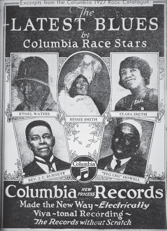
Segregation did not officially apply in the North, but the black ghetto areas of the cities, such as the South Side of Chicago, Harlem in New York, Hastings Street in Detroit, and “Naptown” in Indianapolis, were examples of de facto segregation, which also had a bearing on marketing. The record industry itself, under the influence of Ralph Peer of the OKeh company, began to segregate its record catalogues, differentiating between white hillbilly or old-time records and Race records, the “race” being the African Americans. Frequently they were marketed in separate Race record catalogues, or in series of issues under this name (Figure 1.7). But segregation went even further, with the number series being categorized by the color of the performers. (In 1921, for example, OKeh began to market blues records in its 8000 series; Columbia, with such artists as Bessie Smith and Clara Smith recording for them, introduced their 14000 series at the close of 1923.)
Figure 1.7 Columbia Race records catalogue cover, 1927. Paul Oliver collection.
Segregated record catalogues continued well into the 1930s, but there were also record companies that were solely for the African American market, like Black Swan, which was founded by Harry Pace, a former partner in publishing with W. C. Handy, some of whose records were re-released by Paramount. A subsidiary of the Wisconsin Chair Company, Paramount was indeed, for blues collectors, the paramount producer of records. Some 25 percent of all blues and gospel recordings of the 1920s and early 1930s were produced by it, the discs being issued in the Paramount 12000 series for some ten years from 1922. But many other companies existed and sought to attract purchasers, so competition for space in the newspapers was keen.
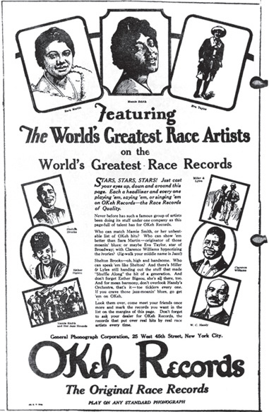
The earliest companies to issue Race records, such as OKeh, Columbia, and Victor, already had established forms of advertising, generally based on what might be termed “the celebrity artist model.” These tended to show smiling, coquettish women artists turning to the camera and hence to the reader, with details of their new records given, often with a few glowing words. Male artists usually appeared more serious but sometimes with a slight smile, looking directly at the camera. Companies such as OKeh and Columbia still persisted with such images into the late 1920s, occasionally arranging them in large, even full-page, advertisements in the Chicago Defender (Figure 1.8). The newspaper charged $1,000 for such a full-page ad, so they did not appear frequently and were hardly ever used to publicize the issues of the smaller record companies.
After a period of several months during which they attempted several strategies, including long, column-width lists of their issued records—“Hot Stuff! Real Hits”—the record companies began to use portraits of the singers, with a commentary and shorter list. Competition was accelerating,1 and each record company endeavored to assert its pre-eminence in the field: OKeh reiterated its claim to having produced “The Original Race Records,” while Paramount was confidently asserting that it was “The Popular Race Record.” Companies also assured their customers of the value of their issues. In November 1926, OKeh advertised “Cotton Club Stomp” coupled with “Pig Foot Blues,” by George Mc-Clennon’s Jazz Devils, declaring that “both hits are packed full of George’s new tricks. Six bits is mighty little to pay for so much.”2 But on the same page the Perfect Record Company was asserting, “The best records made are the Perfect Records by Rev. J. M. Gates and his Congregation … Have you heard ‘Baptize Me’ / ‘You Belong to That Funeral Train’—at 39c each Why Pay More?” Six months later, OKeh was confident enough to raise its prices a little, advertising new releases with the slogan “Don’t miss this record folks—it’s worth a lot more than the 75 cents it costs.”
Figure 1.8 Full-page ad for OKeh Records, Chicago Defender, 1920s. [Detail.] Paul Oliver collection.
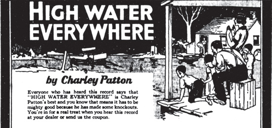
These examples appeared in the Defender, which devoted a single page of its regular Saturday edition to “The Defender’s Movie and Stage Department.” Retitled in 1928 as “STAGE-MUSIC-MOVIES,” it bore the legend “Constructive Criticism Hurts Nobody,” though that was soon replaced by “Reliable for 24 years.” This page was the preferred space for record advertisements, though occasionally they appeared in the news and sports pages. Sometimes an advertisement for a record would be without a rival, like the one for Charley Patton’s “High Water Everywhere,” the singer’s eyewitness account of the 1927 Mississippi floods, which was issued three years after the event.* Sometimes a lone advertisement for a record had other rivals for the reader’s attention: OKeh’s publicity for “New Two-Sixteen Blues” by Little Hat Jones shared the news page with other advertisements inviting the reader to get “Straight Black Hair. Yours in minutes,” or to “Have Luck in Love. Gain your sweetheart’s love and affection.”
But isolated record ads on the page were comparatively rare; generally, two or three or even more might be included on one page, fighting each other for attention. So, for instance, the lower half of the page for Saturday, 4 December, 1928, was shared by three advertisements. One, with a drawn portrait of the singer, was for a spiritual, “Christians Fight On,” sung by guitarist Sam Butler on Vocalion. Adjacent to this was an advertisement for a piece of close harmony, “Wasn’t It Nice,” by Howell, Horsley, and Bradford on Columbia, which had a drawing of a loving couple in winter clothes. Largest, over four columns and higher than the others, was publicity for a Blind Lemon Jefferson blues, “That Black Snake Moan” on Paramount, with a cameo portrait of the singer. Behind him were depicted the heads and forms of black snakes, lurking among rocks and skulls.*
Where a cameo portrait was used it was frequently a photograph printed in halftone, but sometimes a line drawing, copied from a photograph, was used instead. In view of the limitations of reproduction in newspapers of the period, a line drawing could be clearer than a halftone photograph. It might be incorporated in a drawing depicting the content of the blues, at times humorously, as with Ma Rainey’s “famous Corn Field Blues,” “Those Dogs of Mine.” The title referred not to her pets but to her feet, made sore with corns caused by tight shoes, as a surreal drawing indicated (Figure 1.9). Hardly less surreal was the illustration for Edith Johnson’s “Honey Dripper Blues,” with herself as a flower and pianist Roosevelt Sykes as a hovering honeybee.*
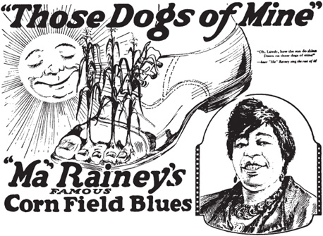
Figure 1.9 Ad for Ma Rainey, “Those Dogs of Mine.” Chicago Defender, 9 August 1924. [Detail.] Paul Oliver collection.
Such humor was used in some illustrations for Paramount advertisements, but the majority were relatively literal in their interpretation of the title, or a verse or two, from the A side of a record. Women singers from the vaudeville stage had dominated the first five or six years of recorded blues, but with the great success of the issued records by Papa Charlie Jackson, Blind Lemon Jefferson, and Blind Blake in 1926, the position changed, male singers becoming more prominent. Rural blues and the blues of migrants to the cities in the 1920s and ’30s often expressed the experience of the singer and frequently that of many of his or her listeners. The range of subject matter was very broad, with many blues songs about labor and unemployment, migration and hoboing, love, sex, and separation; but other subjects represented included voodoo, gambling, narcotics, petty and violent crime, imprisonment, natural disasters, war, sickness, and death.3
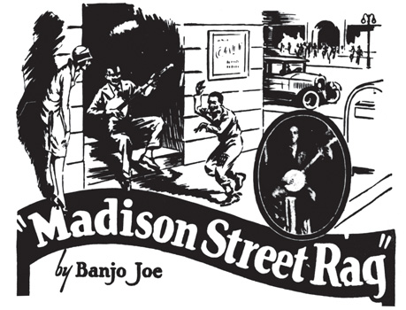
Figure 1.10 Ad for Banjo Joe, “Madison Street Rag.” Chicago Defender, 11 February 1928. [Detail.] Paul Oliver collection.
To repeat the portraits of singers and musicians with no further graphics to attract readers was to risk the loss of a company’s place in the market. It is evident from the diversity of blues themes and their relevance to events of the day that record purchasers were interested in the content of the blues lyrics as well as in the artistry on offer. This probably accounts for the major shift in the advertising policy of a number of the record companies that occurred in the mid-1920s with the issue of records by largely self-accompanied folk blues singers. Prior to this, Paramount had experimented with graphic illustrations incorporated in their advertisements, among the earliest being two for issues by Ida Cox in 1923: “Any Woman’s Blues” showed a despairing woman with her rolling pin at hand, bemoaning that “a good man is hard to hold”; more arresting, if literal, was the depiction of a number of nightspots, including Tom Anderson’s Café, to illustrate Cox’s “I’ve Got the Blues for Rampart Street.”* While Columbia was still inclined to place importance on the portraits of singers, OKeh, Brunswick, Vocalion, and Victor began to make extensive use of line illustrations. Some of their graphics were lacking imagination or appeal, but Paramount was vigorous in its employment of pictorial advertisements.
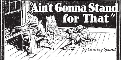
Figure 1.11 Ad for Charley Spand, “Ain’t Gonna Stand for That.” Chicago Defender, 30 November 1929. [Detail.] Paul Oliver collection.
Generally, a portrait of the singer, either with a halftone screened photograph or with a drawing copied from a likeness, would be used in cameo form, overlapping, or apparently slipped behind or beside, a line illustration. Among them were depictions of the player-singers entertaining in their respective milieux, which were often accompanied by a sentence or two of description. This was the case with Gus Cannon, known on his solo records as “Banjo Joe”: “Just hear him strum that mean banjo—as the Queen looks on, and the double-jointed boy dances a jig!” ran the opening words of the text advertising “Madison Street Rag.” The illustration showed the banjoist on a doorstep, the boy jigging in the side street with an admiring young woman, and a view of the traffic and crowds in the nearby main highway (Figure 1.10).
Frequently the singer was drawn as a participant in the scene illustrated, but this was entirely appropriate as virtually all blues were composed and sung about incidents or experiences in the lives of the singers themselves. The accompanying text, usually only a few lines, customarily incorporated extracts from the blues as sung. So for Charley Spand’s “Ain’t Gonna Stand for That,” a sleeping man was shown wrapped in a check blanket, his trousers in the hands of a woman who hands a wad of notes through a window to another man below (Figure 1.11). A quotation from the lyric was adapted in the text: “He used to sleep on clean sheets, but now he has to sleep on the floor,” it ran. “Not only that, but his baby gives his money away—and that ain’t all!”
Figure 1.12 Ad for Charley Patton, “High Water Everywhere.” Chicago Defender, 12 April 1930. [Detail.] Paul Oliver collection.
As the composition of the advertisements progressed from simple portraiture, or groups of portraits, to illustrations with recognizable visual themes and contexts, they became increasingly spatial, in that the scenes depicted became progressively more three-dimensional. And as the illustrators became more accustomed to blues themes, they employed the illusion of space with greater sophistication. A figure, or group of figures, might be drawn in relation to the internal space of the illustration, in effect, inviting the viewer to join them; much as hearing the record might engage the listener as its theme unfolded. A noteworthy example is the advertisement for Charley Patton’s “High Water Everywhere,” mentioned earlier, which depicts a family on the porch of their cabin, looking out over the wreckage caused by the 1927 flood: implicitly directed to follow their gaze toward the interior of the picture, the reader too is drawn further into the scene (Figure 1.12).
Such illustrations might be regarded as too descriptive, but they provided visual contexts for the themes, which many prospective buyers of blues records could relate to. Rather than summarize the content of a recording, artists also tended to illustrate a single verse or to allude to the theme, leaving much to arouse the viewer’s curiosity. Some blues could hardly be illustrated literally, especially at a time when the Defender was declaring, under the headline “Let’s Cut Out Vulgarity,” that “vulgarity has no place on the stage.”4
Blues singers were accustomed to using double entendre devices in their lyrics, and though the illustrations were not explicit, the copywriters gave hints as to the content. “Poor Blind Lemon! He says ‘Competition pops up in every man’s life—it even worries him in his dreams.’ Here he stops in ‘to comb his hair’, and look what he sees. What does it all mean? You’ll know when you hear this new Paramount record ‘Competition Bed Blues’ …” The illustration showed the singer entering a room in his outdoor winter garments and surprising a young woman who is clearly changing the bedclothes.*
To give a sense of metaphoric allusion, the artist sometimes used a “dream-cloud” device, in which a haunting or thought image was shown in a cloud above or beside the singer, as in the publicity for Blind Blake’s “Panther Squall Blues,” which showed a swirling, fearsome but eagerly smiling leopard in a cloud by the heads of an embracing couple. “Hear Blind Blake tell about this red-hot loving woman of his,” ran the copy. “It takes some loving to make a panther squall, but she does it.”
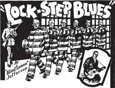
So diverse were the themes of blues that they included many subjects that were otherwise unfamiliar in recorded song, permitting the illustrator to draw upon a broad spectrum of contexts. For instance, songs that dealt with many aspects of crime and punishment were relatively rare in popular song, apart from the blues, until the advent of rap. Much crime was a result of extreme poverty, aggravated by racist restrictions on employment. “No Job Blues” by Ramblin’ Thomas from Texas gave voice to the plight of the unemployed: deserted by his “meal-ticket woman” and arrested for “vag,” the singer is sentenced by the judge to break rocks “deep down in the mine.”5 (To be arrested for “vag” was to be charged as a vagrant, a punishable offense in Texas at the time.) The graphic, which included a small portrait of Ramblin’ Thomas playing guitar, showed the prisoner seated on a rock pile with his long-handled hammer. A dream-cloud image by his head was of his “meal-ticket woman” serving a baked chicken to which he had no access.* Taking the opportunity to show a group rather than a solitary prisoner, Blind Lemon Jefferson’s “Lock-Step Blues” was illustrated with a drawing of the singer leading a gang of five convicts in prison stripes as they were being marched off under armed guard, presumably to forced labor (Figure 1.13).6
Violent crime figured in a number of blues. On “Terrible Murder Blues,” Bertha Henderson sang (to Blind Blake’s solemn guitar accompaniment):
I was walkin’ down one street with a man named Stack,
His woman took a dagger and stuck me in my back.
Took my .45, you oughta heard it roar—
Done killed that woman and cain’t stay here no more.
They done put bloodhounds on my track,
And if they catch me they’ll take me back.
To the electric chair I’ll go—
Done killed that woman and cain’t stay here no more.7
Figure 1.13 Ad for Blind Lemon Jefferson, “Lock-Step Blues.” Chicago Defender, 27 October 1928. [Detail.] Paul Oliver collection.
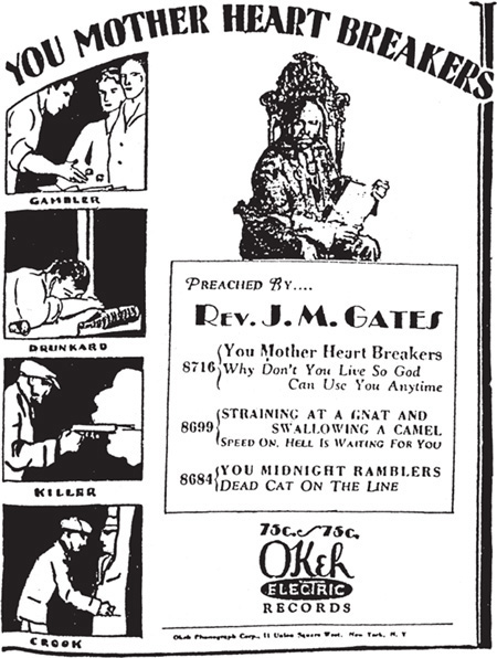
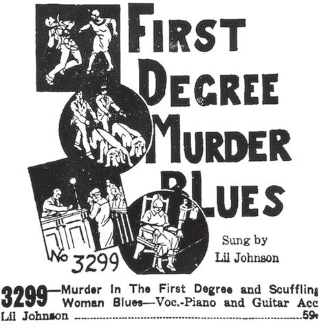
The sequence of events implied seems to have prompted a different approach to the artwork. Rather than a single illustration, a succession of vignettes depicted what the copywriter described as “Shoots him down in cold blood. Bloodhounds, jury trial, death sentence, electric chair—no wonder Bertha Henderson moans and whines one of the best Blues hits of the year.” (Unfortunately, her blues had been misheard: the victim was a woman, not a man.) This narrative form of a succession of small images was employed by OKeh the following year, 1929, to underline the fierce warnings of Rev. J. M. Gates on his “You Mother Heart Breakers” of the distress caused by crime; the heartbreakers included the gambler, drunkard, killer, and crook, the latter being drawn as a hold-up robber (Figure 1.14). Clearly the format was successful for such themes, and the cameos that illustrated Bertha Henderson’s blues were used again by F. W. Boerner on one of his advertisement sheets to illustrate Lil Johnson’s “Murder in the First Degree” (listed on the sheet as “First Degree Murder Blues”), made several years later, in 1936, for Vocalion (Figure 1.15).
Figure 1.14 Ad for Rev. J. M. Gates, “You Mother Heart Breakers.” Chicago Defender, 21 September 1929. Paul Oliver collection.
Paramount and OKeh collapsed with the Depression, but Vocalion, Columbia, Brunswick, and several dime-store labels continued until the United States entered World War II, when shellac, used for 78 rpm records, was reserved for military use only. F. W. Boerner, who had continued his mail order record service for several years after Paramount folded, adapted several former Paramount advertisements to later issues from other companies. For example, the drawing for pianist Lee (Leothus) Green’s “Death Alley Blues,”* which depicted a gunman lurking in a garbage-strewn back street, was re-used to sell Peetie Wheatstraw’s “Kidnapper’s Blues,” also made for Vocalion in 1936 (Figure 1.16). Boerner, however, added no text with the illustrations and did not even give the name of the record company; the series number was all that he needed for mail orders. His re-use of illustrations alone was testimony enough to the effectiveness of the former Paramount drawings in attracting purchasers.
Comparison of the illustrations, which were always printed in black and white, indicates that they were drawn in India ink (i.e., dense black ink). Most of the drawing was done with a pen, but night skies and occasionally dense vegetation might have been drawn with a sable-hair brush. Textures, for example of grass, were sketched manually, but in some instances, such as a stone wall or rough ground, a printed texture was cut to shape and applied. Other patterns, such as check suits and floral or patterned blouses and dresses, were frequently shown. These were familiar techniques at the time and did not present difficulties for the illustrator.
More of a problem was the representation of African American features, without placing undue emphasis on black skin. Most illustrators let the light play on the faces of the people and used dark tones for the shadows. This device made them racially explicit without minstrel-like emphasis, though elements of stereotyping persisted: thick lips, advanced upper jaws and receding lower jaws, short hair, and high foreheads were frequently employed, while the poses of figures were often round-shouldered and casual, and gestures were sometimes exaggerated. Whatever the theme of the action, it had to take place within a particular environment, but in order to make the advertisements relevant to potential purchasers from all parts of the country, both rural and urban, the settings had to be relatively familiar or at least recognizable. They included country lanes, cotton fields, cabins, street scenes, back yards, and simple interiors, but the locations were rarely more specific.
Figure 1.15 Ad for Lil Johnson, “First Degree Murder Blues.” Mail order sales sheet, 1936. Paul Oliver collection.
Many questions arise from all this. How were the advertisements produced, and who was responsible for their design? What were the critical reactions to this advertising, and how do the illustrations rate as art—if at all? As far as I am aware, no one has gathered all the advertisements together, though Franz Hoffmann has made considerable advances in this direction.8 The numbers published, relative to the record companies involved, have not been quantified, though they must run into four figures. In his discography of the Paramount label, Max Vreede reproduced nearly a hundred advertisements from the Chicago Defender alone.9 In fact, the company issued well over a thousand records, with twice that number of titles, a substantial proportion of which were advertised in the African American press.10
Figure 1.16 Ad for Peetie Wheatstraw, “Kidnapper’s Blues.” Mail order sales sheet, 1936. Paul Oliver collection.
A major discovery in the 1980s, of what has been described as “a huge stash” of promotional material, was made by a couple of newspaper reporters from Wisconsin. It included the original Paramount artwork for many of its blues issues, some of which has been reproduced in calendar form by their eventual purchaser, John Tefteller. They reveal that the draftsmanship was often more crisp and confident in the use of line than had been evident in their reproductions in the Chicago Defender. They also show with greater clarity the photographic portraits of many of the singers. With regard to the Paramount advertisements in the African American newspapers, these were the outcome of an initiative by British-born salesman Art Satherley, who convinced the executives at Port Washington that they should advertise in the Defender, which had a circulation figure of 200,000 per issue. Blues researchers and historians Stephen Calt and Gayle Wardlow noted that a young employee, Henry Stephany, prepared the material and an unspecified Milwaukee company did the layouts. Photographs were taken of some of the artists by Dan Burley, a black employee of the newspaper, by arrangement with Mayo Williams, a prominent black talent scout, recording salesman, and session manager, whom Calt and Wardlow interviewed. While he admitted that advertisements were sometimes sent to him for approval, he criticized them for not including “language in those ads that was typically Negroid,” arguing that they could have employed more slang expressions, but that “they wrote the ads definitely from a white man’s point of view.”11 This statement is questionable, for mild slang was certainly used; had it been much stronger, it would undoubtedly have lost Paramount many potential purchasers from among the newspaper-reading black public.
Regrettably, little serious critical attention has been given to the advertising of Race records, a chapter in Jeff Todd Titon’s book Early Downhome Blues being a rare exception. Titon attributes the recording of rural blues and hillbilly music to “that cluster of ideas which locates virtue in a simpler life closer to nature, back in time, on a farm or in the mountains. The music growing out of this folk-like existence must be simple, substantial, untainted,” and he draws attention to what he terms “the plantation stereotype.” In his view, “most downhome blues advertisements emphasized the predicament of the country-bumpkin ‘I’ of the song, attributing his misfortune to his naivete,” and he argues that the “down-home blues freed the record companies from directly confronting the image of stylish urban black.” (Nevertheless, urban settings were not uncommon; far from there being a prevailing country-bumpkin image, fashionable dresses and smart suits were as frequently depicted.) While he suggests that when urban figures are included they are drawn as if they were white, or of indeterminate race, Titon concedes that “however black people responded to the advertisements—whether they were insulted, amused, or both—they certainly bought the records.”12 And that, after all, was what the whole advertising enterprise was about.
How the advertisements attracted purchasers and how they rate as art are two different issues, though interconnected. Clearly there were difficulties for the illustrators, but it can be as readily argued that they showed a surprising degree of inventiveness and rapport with the performers and their themes, in their rural and urban contexts. In the majority of cases it is unlikely that they heard the record before designing the advertisement, for the pressure to get advertisements to match the relentless pace of new issues was demanding.
With regard to the illustrators, John Tefteller conducted “an exhaustive research” to ascertain who the artists were, or to trace their descendants, but he was unsuccessful in this.13 Consequently, it is not known whether the artists were African American or not. The drawings are not signed, but though some have an element of caricature, they appear to show a familiarity with many aspects of black life. Many of the drawings revealed that, whoever created them, they were well aware of the conditions to which the blues referred. Certain of the people depicted, including the singers, appear to have been drawn from life or to have been developed from photographs (although, as in the case of Blind Lemon Jefferson or Crying Sam Collins, only one photograph is known to exist).
While the northern cities had expanded immensely with the influx of black migrants from the South, the great majority of African Americans were still living in segregated and deprived circumstances, whether these were rural or urban. Why, then, did they buy records? It is important to realize that for the majority of southern blacks there was little access to the media apart from news-papers—where these were obtainable. Blues records, which were usually stocked in furniture stores and other outlets or sold by traveling agents, were often the principal means whereby blacks could hear and share the views, the predicaments, the amusements, and the pains of others like themselves from different parts of the nation. Even if some advertisements were gauche or misdirected, the majority introduced people to the music and content of the 78 rpm releases with sufficient accuracy to encourage them to buy the discs. Many would play their 78s repeatedly on their hand-wound phonographs, often until they were worn gray and inaudible.
That the style and presentation of the graphics for Race records are instantly recognizable is largely due to the fact that there were no clear precedents and no forms with which to compare them. Hillbilly or, as it was soon to be termed, old-time music was almost exclusively advertised with photographs or, less frequently, drawings of the musicians, singers, and string bands featured on the records. (The very few exceptions still focused on the performers rather than their contexts and did nothing to convey their content.) There were no antecedents either: devised for, and restricted to, a specialized market, blues ads exerted hardly any influence in the wider field of commercial art.
The art of the Race record advertisement was not the art of the Harlem Renaissance, which was not strong in illustration (with the notable exceptions of Miguel Covarrubias, who was Mexican and only arrived in Harlem in 1927, and Aaron Douglas, whose silhouette abstractions were similar to his paintings). The advertising art of the record companies was not visually and intellectually sophisticated; it was a form of popular art, developed for the propagation of a popular music for the members of what was, in half the nation, a segregated sector that was to suffer discrimination for another three to four decades. Just as the blues music of the period cannot be separated from its social contexts, so should the illustrations that helped in “Selling That Stuff ” be similarly considered and evaluated.14 Through them we are given a valuable insight, as were the record buyers, into the lives, the problems, and the music making of many sections of the African American minority in the 1920s.
To see all the blues advertisements marked with an asterisk, please go to the Hearing Eye Web site at www.oup.com/us/thehearingeye. We regret that we have not been able to include these ads in the book: many of the original newspapers were in such poor condition when Paul Oliver photographed them in the Chicago Defender archives in the late 1950s that they could not be reproduced in print to an acceptable standard—particularly in those instances where the photographs too have since been lost, and only photocopies survive.

1. In 1924 the Chicago Defender, in an article reporting the merger of Black Swan with Paramount, noted that the former company had “adopted an extensive advertising program. At one time they were using space in forty colored periodicals. This caused the white companies to extend their advertising likewise into the Race papers.” Chicago Defender, c. April 1924.
2. For details of the advertisements quoted or reproduced, either in this book or on its companion Web site, see Works Cited below.
3. See Paul Oliver, Blues Fell This Morning: Meaning in the Blues (1960; reprint, Cambridge: Cambridge University Press, 1990).
4. “Let’s Cut Out Vulgarity,” Chicago Defender, “Stage-Music-Movies,” 8 June 1929.
5. Ramblin’ Thomas, “No Job Blues.” Recorded Chicago, c. February 1928, and currently available on Ramblin’ Thomas and the Dallas Blues Singers (Document DOCD 5107, 1990).
6. That Jefferson was blind may appear somewhat anomalous in both the drawing and the recording, but as Luigi Monge has shown, Jefferson made extensive use of visual imagery, suggesting that he was not blind from birth. See Luigi Monge, “The Language of Blind Lemon Jefferson: The Covert Theme of Blindness,” Black Music Research Journal 20.1 (2000): 35–81.
7. Bertha Henderson, “Terrible Murder Blues” (composer unknown). Recorded Chicago, c. May 1928, and currently available on Blind Blake, Vol. 2, 1927–1928 (Document DOCD 5025, 1991).
8. Franz Hoffmann, Jazz Advertised 1910–1967. Vol. 4: Out of the Chicago Defender 1910–1934 (Berlin: privately printed, 1980).
9. Max E. Vreede, Paramount 12000, 13000 (London: Storyville Publications, 1971).
10. For more on the history of Paramount, see Tony Burke, “Paramount Records and the Blues Twilight Zone,” Blues and Rhythm 185 (Christmas 2003): 17; and Alex van der Tuuk, Paramount’s Rise and Fall (Denver: Mainspring Press, 2003).
11. Quoted in Stephen Calt and Gayle Dean Wardlow, “The Buying and Selling of Paramounts,” 78 Quarterly 5 (1990): 10.
12. Jeff Todd Titon, Early Downhome Blues: A Musical and Cultural Analysis (Urbana: University of Illinois Press, 1977), 266. A few advertisements included white people, such as that for Blind Lemon Jefferson’s “Southern Women Blues,” where he was clearly shown playing for the dances of the “white folks.” While much can be read into some of the drawings, as it can be in the blues lyrics, the young man chasing three white girls with a huge utensil in his hand, illustrating “All I Want Is a Spoonful” by Papa Charlie Jackson, must have challenged the Defender’s limits of acceptability. Reproduced in ibid., 255.
13. John Tefteller, “The Story of the Images,” notes to the calendar Classic Blues Artwork from the 1920s (Grants Pass, OR: Blues Images, 2004).
14. “Selling That Stuff ” was the title of a recording by the Hokum Boys, Paramount 12714.
The following list of advertisements, quoted or reprinted either in this book or on the companion Web site, includes the name of the performer(s) as advertised, the title of the recording, the issue label and number, and the date on which it was advertised in the Chicago Defender, unless otherwise stated. (Full discographical details, with personnel, matrix numbers, and recording dates can be found in Dixon, Godrich, and Rye, Blues and Gospel Records 1890–1943—see Texts, below, for complete citation.)
Banjo Joe. “Madison Street Rag.” Paramount 12588. 11 February 1928.
Blind Blake. “Panther Squall Blues.” Paramount 12723. 16 March 1929.
Butler, Sam. “Christians Fight On.” Vocalion 1056. 4 December 1926.
Cox, Ida. “Any Woman’s Blues.” Paramount 12053. 6 October 1923.
———. “I’ve Got the Blues for Rampart Street.” Paramount 12063. 1 December 1923.
Gates, Rev. J. M. “Baptize Me.” Perfect 116. 26 November 1926.
———. “You Mother Heart Breakers.” OKeh 8716. 21 September 1929.
Green, Leothus. “Death Alley Blues.” Paramount 12865. 14 December 1929.
Henderson, Bertha. “Terrible Murder Blues.” Paramount 12645. 21 July 1928.
Howell, Horsley, and Bradford. “Wasn’t It Nice.” Columbia 14168-D. 4 December 1926.
Jefferson, Blind Lemon. “Competition Bed Blues.” Paramount 12728. 23 March 1928.
———. “Lock-Step Blues.” Paramount 12679. 27 October 1928.
———. “That Black Snake Moan.” Paramount 12407. 4 December 1926.
Johnson, Edith. “Honey Dripper Blues.” Paramount 12823. 16 November 1929.
Johnson, Lil. “Murder in the First Degree.” Vocalion 03299. Publicity sheet, 1936.
Little Hat Jones. “New Two-Sixteen Blues.” OKeh 8712. 7 September 1929.
McClennon, George. “Cotton Club Stomp.” OKeh 8397. 26 November 1926.
Patton, Charley. “High Water Everywhere.” Paramount 12909. 12 April 1930.
Rainey, Ma. “Those Dogs of Mine.” Paramount 12215. 9 August 1924.
Ramblin’ Thomas. “No Job Blues.” Paramount 2609. 7 April 1928.
Spand, Charley. “Ain’t Gonna Stand for That.” Paramount 12856. 30 November 1929.
Wheatstraw, Peetie. “Kidnapper’s Blues.” Vocalion 03249. Publicity sheet, 1936.
Blind Blake. Blind Blake, Volume 2, 1927–1928. Document DOCD 5025, 1991.
Ramblin’ Thomas. Ramblin’ Thomas and the Dallas Blues Singers. Document DOCD 5107, 1990.
Burke, Tony. “Paramount Records and the Blues Twilight Zone.” Blues and Rhythm 185 (Christmas 2003): 17.
Calt, Stephen, and Wardlow, Gayle Dean. “The Buying and Selling of Paramounts.” 78 Quarterly 5 (1990): 7–24.
Dixon, Robert M. W., John Godrich, and Howard W. Rye. Blues and Gospel Records 1890–1943, 4th ed. Oxford: Clarendon Press, 1997.
Hoffmann, Franz. Jazz Advertised 1910–1967. Vol. 4: Out of the Chicago Defender 1910–1934. Berlin: privately printed, 1980.
“Let’s Cut Out Vulgarity.” Chicago Defender. “Stage-Music-Movies.” 8 June 1929.
Monge, Luigi. “The Language of Blind Lemon Jefferson: The Covert Theme of Blindness.” Black Music Research Journal 20.1 (2000): 35–81.
Oliver, Paul. Blues Fell This Morning: Meaning in the Blues. 1960. Reprint, Cambridge: Cambridge University Press, 1990.
Tefteller, John. “The Story of the Images.” Notes to Classic Blues Artwork from the 1920s. Calendar. Grants Pass, OR: Blues Images, 2004.
Titon, Jeff Todd. Early Downhome Blues: A Musical and Cultural Analysis. Urbana: University of Illinois Press, 1977.
van der Tuuk, Alex. Paramount’s Rise and Fall. Denver: Mainspring Press, 2003.
Vreede, Max E. Paramount 12000, 13000. London: Storyville Publications, 1971.