Chapter 7. Responsive Workflow
It’s one thing to understand all the pieces of a responsive website. It’s another thing altogether to be able to create one.
In this chapter, we’ll look at the process for creating a responsive design, starting with user research and content strategy, then designing in text, sketching, and creating responsive prototypes.
We’ll look at style tiles and other new approaches to design that provide alternatives to creating unresponsive, fixed-size designs in tools like Photoshop.
And at the end of the chapter, we’ll finish up by looking at how to sell responsive design—both to clients and to coworkers—and how to adjust your approach to working with clients when you’re doing a responsive project.
If you want to delve deeper into how to adjust your workflow to produce responsive websites, check out Stephen Hay’s book Responsive Design Workflow (http://responsivedesignworkflow.com).
Strategy and Planning
Before you even start thinking about the design of a website, you need to step back for a moment and think about the goals of the website.
Unless it’s the rare occasion when you’re just making a site for fun or practice, your goal isn’t to build a website, it’s to solve a problem: how to communicate with customers, how to sell products online, and so forth.
The website is the tool you’re creating to solve the problem.
You should know from the start what the goals are for the website or project, whether from your own communication with the client or stakeholders, or from information passed on from a project manager or other staff. “Our company needs a website” isn’t a goal. Dig a bit deeper and find out who the company is trying to communicate with, and what it hopes the website will accomplish.
Creating a website, whether it’s responsive or not, is not straightforward. There are a lot of creative decisions made during the process, starting with what content is included on the site, where the content goes, and what paths users will take through the site. If you know the goals of the site, you’ll make better decisions during the design process.
Note
I use the term “client” a lot in this section, but I don’t just mean it in the sense of a client who hires an agency to build a website.
Anytime you work on a website for someone else, that person or group is your client. So, if you are in-house web staff, the stakeholders for a project would be considered your clients.
User Research
At the start of the project, you’ll likely be doing user research and developing personas, scenarios, and other resources to guide you in the site design process.
For the most part, none of this work is specific to responsive design, so we won’t go into details here. There are a lot of great resources out there, in case you want to learn more: in particular, check out Communicating Design: Developing Web Site Documentation for Design and Planning, Second Edition (http://communicatingdesign.com) by Dan Brown, which will tell you how to create much of the documentation you need during the web design process, such as personas, flow charts, wireframes, competitive reviews, and usability reports.
One warning, though, particular to responsive design: as you’re developing personas, resist the temptation to make them correspond with device types. You aren’t creating a website for a “mobile user” and a “desktop user,” you’re creating a site for users who each may be using different devices at different times to access the website.
Note
If you’ve never done user research and you don’t have any idea what personas or scenarios are, check out “What & Why of Usability” (http://www.usability.gov/what-and-why/index.html) on Usability.gov, especially the section on User Research Basics and the Glossary.
Content
Content is the most important part of any website. You should address content first during the design process, rather than trying to piece it into a finished visual design at the end.
In Chapter 2, we looked at how to create a content strategy for your site and discussed starting the design process with a content audit. We also talked about how to create content that will work well across screen sizes.
Information architecture
Once you’ve decided what content you need on your site, the next step is to organize and label it, and develop a structure for the site. This part of the process is called information architecture (IA).
The general IA principles you’d use for any website still apply to responsive sites, but you need to make sure that the site architecture will work on small screens, where there may not be room for a large or detailed navigation.
Also remember that your site architecture will not be set in stone, so the IA and design need to be flexible enough to accommodate future changes, as organizational or project needs require. If you don’t leave room for changes, you may end up feeling like any new content added after the site launch needs to be shoehorned into existing boxes, where it may not belong.
Note
Not familiar with the idea of information architecture? Check out Martin Belam’s “What is ‘Information Architecture’?” (http://www.guardian.co.uk/help/insideguardian/2010/feb/02/what-is-information-architecture) on The Guardian.
Content outline
As you start organizing the content that will go on the new site, your first step should be creating a simple high-level outline of the content areas. This will be reflected in the main navigation of the website.
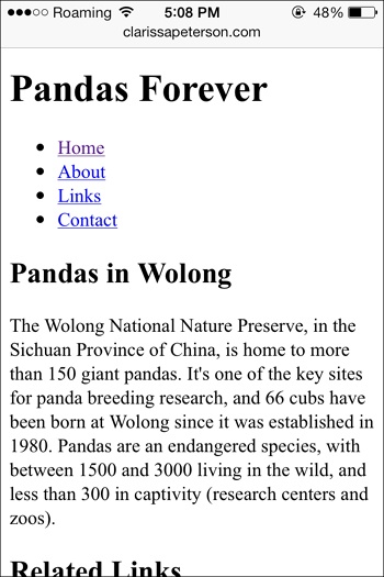
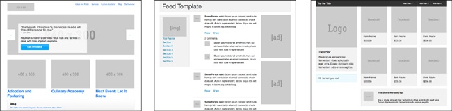
For example, Figure 7-1 is a screenshot showing the main navigation on Mule Design’s website. This is followed by a simple content outline.

Home
About (Who We Are)
Individual Bio #1
Individual Bio #2
Etc.
Services (What We Do)
Portfolio (Our Work)
Client #1
Client #2
Etc.
Blog (Our Blog)
Blog Entry #1
Blog Entry #2
Etc.
Contact (Hire Us)
The top-level content areas are pretty much the same as what you’d find on many design agency websites: Home, About, Services, Portfolio, Blog, and Contact. You’ll notice that the text on the website is different from what’s in the outline: “Who We Are” instead of “About.”
As you are first creating a content outline, it’s best to use general terms like “About” to give you an idea of where the content fits in, rather than deciding on the specific wording for your page titles or navigation. Otherwise you’ll get too hung up on things like whether the terms fit well in the navigation, if they have similar lengths, and so on.
As you continue with compiling or developing the content for the site, you’ll be able to add more detail to each section.
Just as with your content inventory, you don’t need to list every individual item (like blog posts, or products on an ecommerce site); just get the categories and the main content pieces down.
Content Before Layout
Once you have worked through a content strategy and created an information architecture, you can start thinking about what the content will look like on the screen.
The content is the most important part of the website, so you’re going to build your design around the content, not the other way around.
The best way to get started is to create an unstyled web page containing all your content. This shuld include all the page components, marked up with semantic HTML (appropriate heading levels, etc.).
Doing this before you start the visual work of sketches and wireframes or prototypes allows you to think about the role that each piece of content will play on the page, before you get distracted by how it will look.
Components
First, determine what pieces of content will go on a page. Some examples may include the site logo, a search box, the main navigation, the body content, and the footer.
You need to think of these as separate pieces of content in this part of the design process, so that you can move them around on the page as you create a prototype.
For example, it’s common to think of the page “header” as a solid unit, containing the site logo, search box, navigation, and so on. But you need to step outside the box, so to speak, because not all of these items will necessarily stay in the “header” area as you design responsively.
Some examples of the site-wide components that you might include:
Logo
Search box
Primary navigation
Secondary navigation
Informational links
Copyright notice
Ad(s)
Social media links
Login link
And depending on the type of page, you may have components like:
Title
Body content
Secondary content
Synopsis
Author
Date
Pull quote(s)
Designing in Text
Next, take all the content elements you need on your page and mark them up with basic, structured HTML. We looked at how to do this in Chapter 3. For example, in Figure 7-2 and Figure 7-3, you can see our example web page from that chapter, before we added any CSS.
Remember that for a responsive website, the first design is no design; that is, the first design you should create is what a user will see if his browser or device is unable to render the CSS and JavaScript.

With just this basic code, you already have a functional web page that is mobile-ready, responsive, and accessible. By starting out your design this way, you’re making sure that your web page will be functional for all users.
It’s much easier to start with a page that’s accessible to everyone, rather than trying to add in accessibility and compatibility later.
Linear Design
As you’re adding the structured text to your page, you’re going to create what’s called a linear design.
Linear design is a pretty simple idea. Imagine someone is reading your web page from start to finish—all of it. What order would you want them to read in? Your HTML should be in that order.
This seems pretty basic, but traditionally it’s been common to do a visual design first, then write code to accommodate the design, and then fit content into the spaces. This often leads to the actual HTML being in a strange order.
But with small mobile devices, everything will pretty much be displayed in one column, so users will read it in a linear order anyway.
By starting with a linear design for your unstyled text, you’re starting off with something that will work on narrow screens, and also that will work in browsers that can’t display your styles.
Content Hierarchy
You need to make some decisions at this point. What parts of the content are most important?
The most important content should come first on the page. Imagine someone is reading your page from top to bottom. Likely you’ll have the site’s title and/or logo at the top of the page, so that when users arrive on the page, they’ll know where they are. The page title will also need to be near the top, so users know what the page is about.
Keep in mind you aren’t making final design decisions yet, so don’t stress out over getting everything right. You can always make changes later.
You also want to avoid thinking of your content in terms of layout at this point, because with responsive design it won’t always be in the same place. You may be used to placing certain elements in a sidebar, but some screen sizes may not have room for a sidebar, so those elements will have to go above or below the main content. Focus your thinking on the hierarchy of the content.
Thinking About Layout
Once you know what’s going to go on each page, you’ll start working out what each page will look like. You’ll need to think about how the design will look on screens of various sizes.
Before you move on to formal wireframes or prototypes, you may want to start by making rough sketches.
Sketching
Stephen Hay, in his book Responsive Design Workflow (http://responsivedesignworkflow.com), calls sketching “thinking on a surface.” You can do small sketches, with few details, to try many ideas quickly. Later, when you have your ideas more fleshed out, you can move on to more detailed sketches.
Start by thinking about how the site will look on various sizes of screen, from small mobile phones to huge monitors.
Don’t worry if you can’t “draw.” You’re only drawing shapes and lines, and it doesn’t even matter if the lines are straight.
Make notes on what works and what doesn’t work, so you can incorporate those thoughts into the design later. Your preliminary sketches are not meant to be deliverables for the client; they’re just a design tool. You can share the most helpful sketches with your team members—or not. It’s up to you.
Think of the various screen sizes—mobile phone, small tablet, larger tablet, and so on—and make rectangles of those approximate sizes to draw your layout ideas in. But don’t use a ruler to measure the rectangles—you’re not aiming toward specific devices for the design breakpoints, you’re just looking at general device categories.
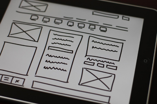
You can draw on paper, or you may find it easier to visualize a device screen by drawing directly on the device with a stylus, as in Figure 7-4. A good iPad app for sketching is Paper (http://www.fiftythree.com/paper).
Start Small
Whether you’re starting with sketches or prototypes, it’s best to use a small-screen-first approach. Start with the design for the smallest screen size, and work your way up to the widest screen size. We’ll talk in Chapter 8 about how to determine the range of screen sizes you should design for, but essentially the smallest screen size is going to be a mobile phone–sized screen.
Why not go from large to small? After all, the desktop-sized design is going to be more detailed, so wouldn’t it be easier to get it out of the way first?
Actually, it’s quite the opposite. I like to use this metaphor to explain: imagine you live in an apartment, and you have the opportunity to move into a much larger house. There will be plenty of room for your furniture and belongings, and even extra space to add some new pictures on the walls and other decorations.
Then imagine moving from a house into a small apartment. Everything is squished together, you have boxes piled against the walls because there’s no room to unpack them, and even then you have to get rid of half your furniture.
Now imagine doing that with a website. Trying to fit everything from a desktop-sized screen onto a small screen is incredibly difficult.
It’s much easier to start with the small screen, because then you’ll end up only using what you can actually fit into the design. It will force you to pay more attention to your content and what is actually necessary, rather than just sticking everything in there because there’s room.
The same thing goes if you live in a small apartment: you only own what you have room for, yet somehow you manage to fit in everything you need. If you live in a larger house where there’s plenty of extra room, though, you’ll tend to accumulate lots of extra belongings that you don’t really need and never use.
However, there are times when starting your design with the desktop-sized screen may be a better option, such as when you’re doing a redesign of an existing website and you have to use the existing fixed-width design as part of the responsive design. If you already have a desktop-sized design, and it needs to stay like it is, starting there might be more effective.
Keep in mind too that starting with the design for small screens first doesn’t mean you can’t be thinking about the larger screens as you go along. Sometimes it’s helpful to move back and forth, at least during the preliminary process.
Mobile First
You’ve probably heard the term “mobile first,” and you may be wondering if it’s the same thing as “small-screen first.” Although the concepts have some overlap, they aren’t exactly the same.
“Mobile first,” a term popularized by Luke Wroblewski in his book Mobile First (http://www.abookapart.com/products/mobile-first), is an approach to creating websites and web apps in which your design prioritizes users who are using mobile devices and how those users interact with the site. It requires that you think first about the constraints and capabilities of mobile devices. And the word “first” in that context means considering mobile to be more important than nonmobile.
Making sure your site works well on touchscreens is important, and in Chapter 8 we’ll talk about devices and address topics such as touch-target sizes. But as you’re designing a responsive site, it’s best to be as flexible as possible with regard to devices, aiming to design a device-agnostic site that will work well on any type of device.
There isn’t such a fine line between mobile and nonmobile devices anymore. You can buy a desktop computer that has a touchscreen. You can hook a monitor and keyboard up to your mobile phone and use it as a “computer.” The lines will only continue to blur.
So when I use the phrase “small-screen first” in this book, I’m referring only to the process of designing a responsive layout and design for a website. And I don’t use the word “first” to mean that small screens are more important, but rather in a chronological sense—you are designing for small screens before you design for larger screens.
All the screen sizes are equally important, and even though you are starting with the smallest screen, you’ll probably end up spending more time on how the design looks on wider screens.
Prototypes
Once you have a rough idea of your layout, you can start putting it together.
Wireframes Versus Prototypes
Before you dive into the visual design, you need to start with a good backbone of the site layout and how it’s going to work, and where things go on the screen.
There are two different ways to visualize the site layout. Traditionally, web design has used wireframes, which are static drawings of what a page looks like.
But with responsive design, you don’t just have one design; you have a design that changes depending on the width of the screen. So, it’s becoming more common to use responsive prototypes, which are basically wireframes built in responsive HTML. They can be viewed on various screens to see how the design changes with the viewport width.
Wireframes
Traditionally, the next step in the web design process would be creating wireframes.
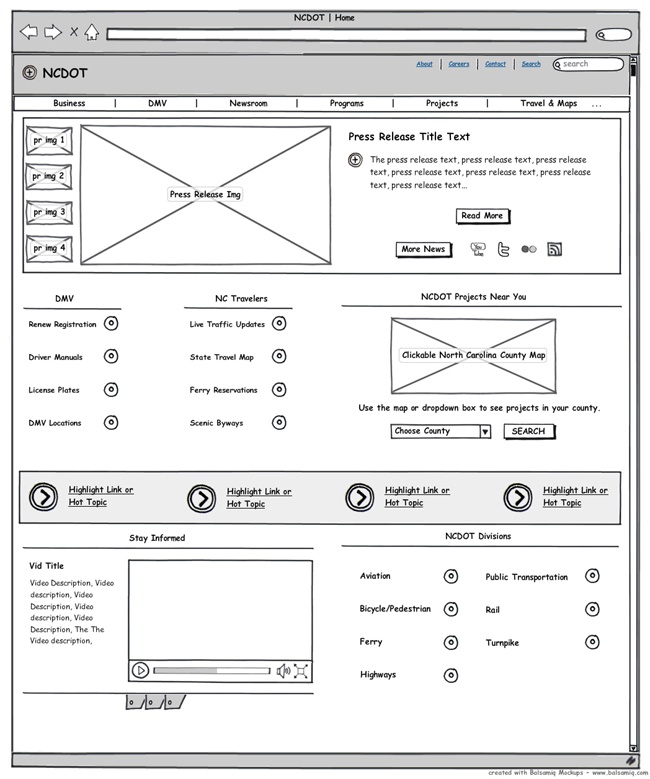
Wireframes for a website are a model of where the individual components should go on the page. An example is shown in Figure 7-5. You can see the general shape of things, but a wireframe specifically leaves out the visual details, which will come later.
For a fixed-width website, a wireframe lays out the exact locations of the different page components: header, navigation, search box, columns, and so on.
But for a responsive site, you don’t have just one location for each component, as the layout changes across viewport widths. So, rather than creating formal documents that are not a true representation of a responsive website, you’ll likely find it’s more effective to create responsive prototypes (sometimes referred to as responsive wireframes).
Responsive Prototypes
A prototype (also a term used in industrial design and other fields) is a model that not only demonstrates how something will look, but also how it will work.
A prototype is not necessarily produced by the same method as the final product. For example, when a new car has been designed, often a prototype is made and sent to car shows to get consumer feedback, before a decision is made as to whether the car should actually be manufactured. These prototypes are individually manufactured in research labs, not made with the usual factory assembly line process, and they may not even be drivable.
Similarly, your responsive prototype doesn’t need to be coded in the same way that the actual website will be coded, and interactive elements don’t need to work. You might build a prototype with HTML, or use a prototyping application (we’ll look at a few of those in a bit).
A responsive prototype is a “real” web page, in that you can view it in a browser, but it’s just the basic layout, with a similar look to a wireframe. In fact, it is essentially the same thing as a wireframe, with the difference being that the layout is responsive, so that you can resize your browser window or look at the prototype on different devices to see how the layout changes.
Prototypes may be at any depth of fidelity: anywhere from minimal detail to very close to the actual end product. A car prototype may look like a real car but be just for visual show, lacking an engine and the rest of what’s under the hood. Or it may be a working car, but only meant to travel at low speed for demonstrations, lacking safety features that would make it highway-ready.
The same thing applies with a website prototype. Generally, you’ll start out early in the process with a low-fidelity prototype, and as you get further along, it will be more in-depth.
What’s In a Prototype?
Your prototype should show the basics of the layout, and how the site layout responds to changes in viewport width.
Although you can continue to make changes to the layout later in the process after you’ve started working on the visual design, it’s easier to get a lot of the layout decisions taken care of now, when you can focus only on the layout.
Although you will likely have prototypes for a few different types of pages (e.g., front page, interior page), don’t attempt to connect them so you can click from one to the next as if they were part of the actual website. That just adds complexity, when you should only be focused on layout. Later on in the process you may want to make interactive prototypes that can be used to test how the site actually works (such as a checkout process), but for now your prototypes should be only visual, not interactive.
Start With the Basics
The first responsive prototypes you create will just give a rough idea of content placement and content hierarchy on the page at the various viewport widths. Eventually, you’ll move on to higher-fidelity prototypes.
You don’t want to be thinking about details such as typefaces or colors here, just the layout. Choose a simple sans-serif font for everything, and use borders and shades of gray to separate various items on the page. This will help you focus on the layout. If you make your responsive prototype look too realistic, clients may have trouble understanding that it isn’t the “real” website.
If you’re doing responsive prototypes, start out from the beginning testing them on different devices, in a range of device categories, so that any issues can be addressed early.
As you start with low-fi prototypes, you can either use placeholders for content, or use actual content. The benefit of using actual content is that you can get an idea of how it will fit in the layout. For example, if you have the words “Example Page Title” at the top of the page, they may fit fine where you want the title, but later when you have to plug in an actual page title that’s 10 words long instead of 3—it may not fit.
Also, when you’re creating prototypes, don’t just think about how an ideal page on your website would look. Make sure your prototypes can handle the edge cases: the most complicated pages on your site.
How Many Page Layouts to Create
As you start looking at actual pages on the site, you need to decide which pages, or page categories, to create layouts for.
Because parts of the design will look the same on most pages or on every page (e.g., the header and navigation are likely the same on every page), you’ll only need to create layouts for a few types of pages.
Go through your content outline and figure out the types of pages you have, based on content.
For example, on a newspaper website, some types of pages might be:
The home page, which will be unique
Article pages, each containing one article
Category pages (e.g., a “Local” section with links to the current articles in that category)
Photo gallery pages, which are freestanding pages similar to articles, but contain primarily photos instead of text
Informational pages, such as a “Privacy Policy”
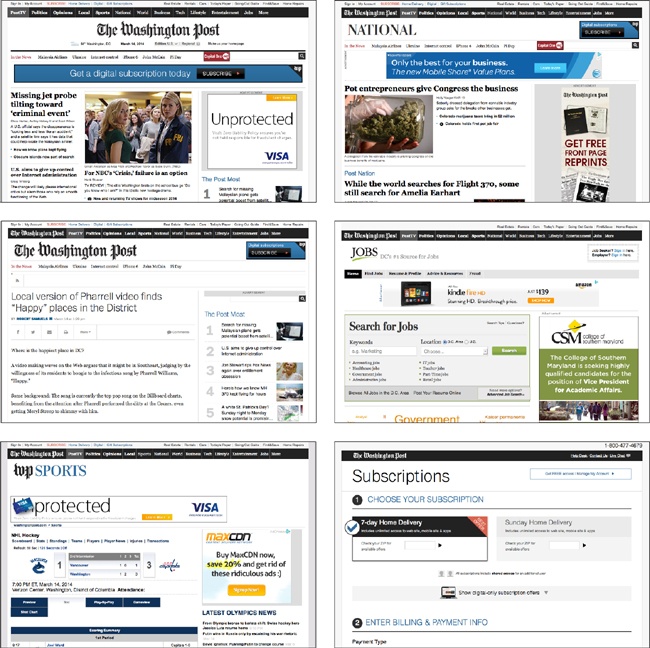
You can see these types of layouts from The Washington Post website in Figure 7-6.
There will be elements that are consistent throughout all the pages. For example, every page on the site will probably have the same header, navigation, and search box at the top—but not necessarily. In Figure 7-6, the navigation bar is the same on every page type except the front page, which omits the logo for “The Washington Post” on the left side of the bar.
Think about how each page can be divided into components, which are self-contained pieces of content that can be moved around the page, or replicated on other pages.
Some page types will be mostly similar to other types. For example, the article pages and the information pages just described will probably be very similar, as they both contain mostly text. However, the article pages will need to have a place for metadata such as author and date, whereas the informational pages will not.
You’ll do one or more layouts during the design process, for each of the different page types. Generally, two to five page types are common. These should be the most complicated layouts, because the simpler layouts can often be derived from those. For example, you would not need to create a separate prototype for the informational page, because it’s just an article page with some of the components removed.
It’s tempting to do the front page first, because it’s what feels like the “face” of the website. But it’s often easier to start with the most straightforward interior pages and then, when you have a solid layout for those, move on to the more complex home page.
Frameworks
To make the prototyping process quicker, you may want to use a framework. A framework is a downloadable set of HTML and CSS that contains all the elements needed to make a basic website. You can create a responsive HTML prototype in an hour or two by starting with a framework, rather than having to start from scratch. Frameworks can also be used as the basic code for actual websites.
With a framework, the included CSS adds basic style to the HTML elements. Thus, your paragraphs, headings, lists, buttons, and form fields all look good (but basic) from the start, without you having to write CSS to style them. The framework will also include instructions on how to use the CSS classes to add responsive layout to your page elements, including columns and navigation.
Even if you only have a basic knowledge of HTML and CSS, you can easily use a framework to create a responsive prototype fairly quickly, like the ones in Figure 7-7. Using a framework isn’t a substitute for knowing how the code works when creating an actual website, but during the prototyping process, it means that design team members will be able to create or work on responsive HTML prototypes—they don’t need to be developers to be able to use frameworks and modify the code as needed.
Foundation by ZURB (http://foundation.zurb.com), as you can see in the example prototypes, is a great place to start. It has a small-screen-first, 12-column flexible grid, with semantic markup. Bootstrap (http://getbootstrap.com) is another commonly used framework. You can also search the Web for “responsive framework” and find dozens of other options. They are all different, so check a selection out to find the framework that best meets your needs.
Prototyping Tools
If you don’t want to create a prototype in HTML, there are several tools that you can use to create responsive prototypes—both desktop and online applications.
However, for the most part, these tools will not create true responsive prototypes that can be viewed at any screen size. Instead, they will let you create several separate static wireframes at different screen sizes.
Some responsive prototyping tools include:
Balsamiq (http://balsamiq.com/)
Froont (http://www.froont.com/)
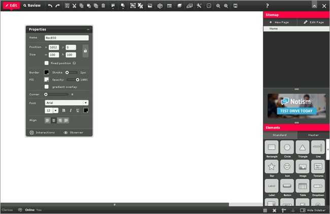
HotGloo (http://www.hotgloo.com/responsive-prototype-tool), as pictured in Figure 7-8
Also check out Balsamiq’s article “Responsive Design with Mockups” (http://support.balsamiq.com/customer/portal/articles/615901-responsive-design-with-mockups) for some tips on getting started.
Visual Design
Moving on from the prototype, the next step is creating a visual design for the website. This is where you add colors, typography, and branding elements. Once again, this needs to happen a little differently than with a fixed-width site.
Traditionally, the design would be presented to clients or stakeholders in one or more Photoshop comps (a flat visual representation of what the site will look like), to show the front page and interior pages of the site. However, with a responsive site, you don’t want to show them just one static view of the page.
It’s best to involve clients earlier in the process by showing them the responsive prototypes. This will help make sure they have a clear understanding of what a responsive site is, throughout the process. When you get to the visual design part of the process, there are ways to present visual design elements other than those Photoshop comps.
Style Tiles
If we aren’t going to show clients a pixel-perfect design comp, how do we bridge the gap from prototypes to a fully designed site? Style tiles are one place you can start.
Designer Samantha Warren came up with the idea of Style Tiles (http://styletil.es) as a “design deliverable consisting of fonts, colors and interface elements that communicate the essence of a visual brand for the web.”
Warren explains that creating style tiles is similar to the process used by interior designers when designing a room in a house. The interior designer doesn’t just come up with three different room designs off the bat. First, the designer works with the client to decide on colors, textures, and materials; design options are then based on those choices.
You can see an example of style tiles in Figure 7-9.
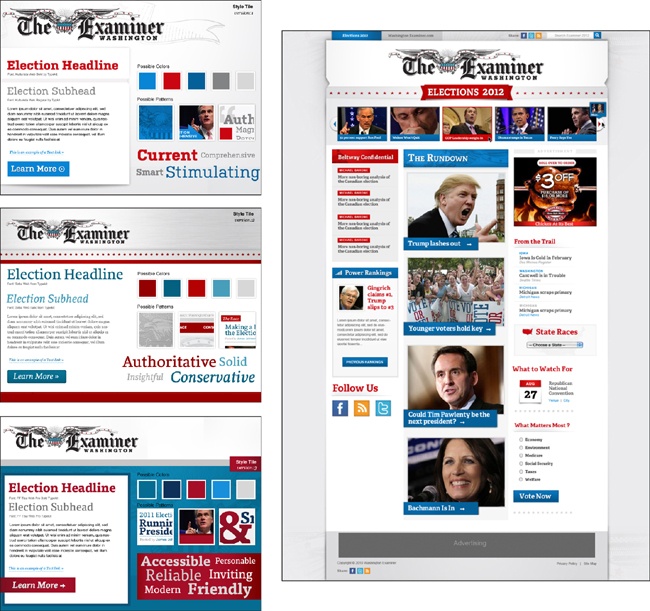
Using style tiles helps you get the core design elements worked out before committing to a full design.
Start out by listening to the client, and asking questions—all the things that you normally do during requirements gathering. Try in particular to get an idea of the visual look and feel that the client wants from the site. Adjectives are good. Additionally, make sure to find out if there are existing branding or style guidelines that need to follow.
When creating style tiles, you can either use an image-editing tool like Photoshop, or work directly in the browser. Either way, you can iterate as much as needed to come to an agreement. It’s a lot easier to iterate now than later. But don’t feel like you can’t make style changes later—sometimes you don’t know the full effect of design decisions until you see them on the live site design.
Note
Visit the Style Tiles website (http://styletil.es) to find out more about style tiles and download a free Photoshop template.
Testing and Adjusting
The responsive process requires continual testing as you go along. As soon as you have an HTML prototype, you should be testing it on different devices to see what happens. If a layout that seemed good in theory ends up not working on particular screen sizes, it’s better to discover the problem early on, rather than trying to make adjustments to an almost-finished site.
We’ll go into the how-to of testing in more detail in Chapter 8.
Style Guide
A style guide collects and documents all the design decisions that have been made for the site. What typefaces are used, and where? What are the correct font sizes? What do buttons look like?
It can be as basic or as detailed as needed for the project, and it serves two purposes. First, the style guide helps you make sure you’re consistent during the development process. If submit buttons are always supposed to be blue, why does a particular form have a green submit button?
Sometimes inconsistencies happen because we don’t notice mistakes in our code, and sometimes because design decisions are made for a particular page without anyone realizing that those particular decisions have already been made for the site as a whole. A website will have a much better feel if there is visual consistency throughout the site.
The second purpose is that the style guide documents design decisions for whoever will be managing the site in the future, and helps maintain a website’s design identity over time, as staff members change. Whoever designed the site is probably familiar with which typefaces go where and why, but when the client’s internal web staff has to add a new feature later, will they know which typeface to use?
Style guides have been used in print design for many years, and are sometimes called style manuals or branding guidelines. Often, a company will have a general style manual that addresses things like logo usage. A website style guide should start there and go into more detail.
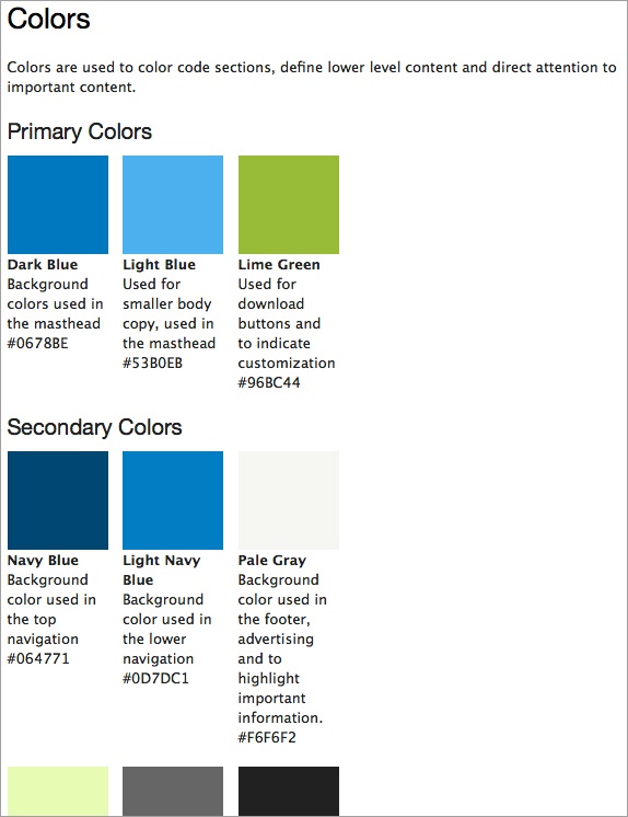
Besides just listing the design elements (typefaces, colors, etc.), it’s helpful to actually show them, as in Figure 7-10, so it’s easy to see at a glance what they look like. You can also specify the particular CSS that’s used to create specific effects.
The style guide doesn’t have to only include visual style; it can also include content style and coding standards (or those can be in separate style guides).
Although it’s common to create a style guide as a document in Word or some other text application, it can often be easier to create it in HTML, which allows you to more accurately show how styles look on the screen. Otherwise, you could include screenshots of examples.
Here are some examples of things you may wish to include in a style guide:
Typography
Colors and textures
Layout system/grid
Styles for HTML elements such as list items, form elements, or blockquotes
Appropriate markup (Is
<h1>the site title or the page title?)Logo usage
Voice
General styles like punctuation and word usage, if not using a commercial style guide like The AP Stylebook or The Chicago Manual of Style
A good place to start is the Style Guide Boilerplate (http://brettjankord.com/projects/style-guide-boilerplate/) from Brett Jankord.
Here are some examples of good web style guides of various types:
Starbucks.com (http://www.starbucks.com/static/reference/styleguide/) (style guide)
South Tees Hospitals NHS Foundation Trust (http://www.southtees.nhs.uk/style-guide/) (style guide)
Drupal.org (http://drupal.org/coding-standards) (coding standards)
BBC’s digital services (http://www.bbc.co.uk/gel) (global experience language)
Paul Robert Lloyd (http://www.paulrobertlloyd.com/about/styleguide/) (markup style guide)
Responsive Design Tools
What tools should you be using when designing websites?
Keep in mind that the right tool is going to be the one that works for you, to get you to the end product. There is no right answer, and the clients don’t care, they just want a website.
Adobe Photoshop
Photoshop has traditionally been the most common tool for designing websites. However, a Photoshop comp is just, in essence, a picture of a website. If your goal were to make a website that looks exactly the same in every browser—and that was the goal, for many years—a picture would work. But now that we’re trying to make a website that will look different depending on the viewport width, a picture of a website is not as helpful.
You still may want to use Photoshop for some parts of the process, though, such as designing specific page elements or image assets.
Note
If you are using Photoshop, make it work better for your responsive process. Check out Dan Rose’s “Repurposing Photoshop For The Web” (http://www.smashingmagazine.com/2013/04/22/repurposing-photoshop/) on Smashing Magazine.
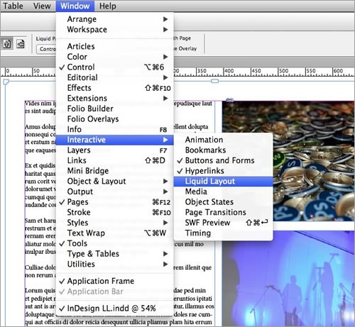
Adobe InDesign
A lot of designers have found that Adobe InDesign works much better for responsive design. (Photoshop was never meant to be a web design tool. Photoshop was meant to be used for photos, and InDesign for design. Makes sense, doesn’t it?)
InDesign has specific features that help you to build responsive layouts, such as grids, styles, includes, and liquid page rules. Figure 7-11 shows the liquid layout option, which allows you to create layouts for multiple device sizes.
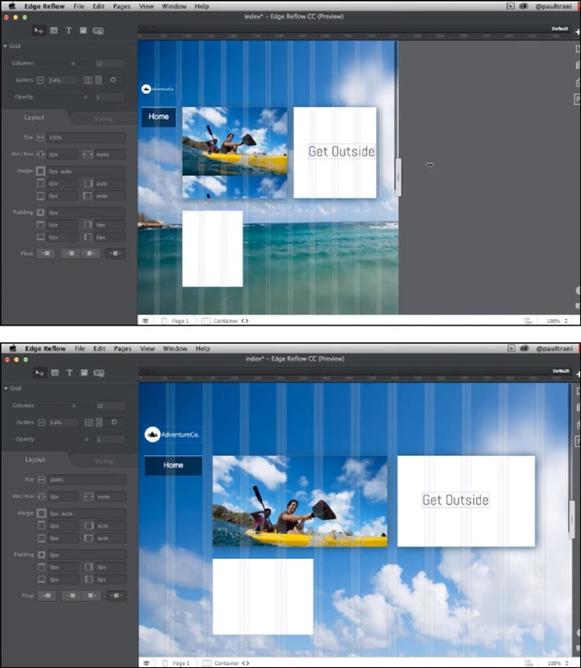
Adobe Edge Reflow
Edge Reflow is a new design tool from Adobe that allows you to create responsive designs with media queries, and export the HTML and CSS of your design to hand off to developers. It’s not meant to create production-ready code, but rather to create responsive layouts for various screen sizes, and enable designers “to share their responsive design intent.”
It’s kind of like creating comps, except they’re responsive.
Using Edge Reflow, the designer creates responsive layouts based on grid columns, and adds CSS effects like fonts or drop shadows. But the application’s interface is purely design, with no access to the actual HTML and CSS except for exporting. You can see what the Edge Reflow interface looks like in Figure 7-12.
adobe Dreamweaver
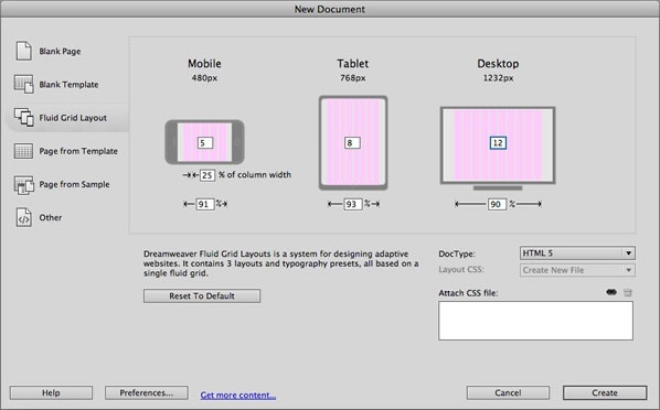
Adobe Dreamweaver is still around. It recently added something called Fluid Grid Layout, which allows you to create responsive layouts.
Unfortunately, when creating a website in Dreamweaver, you can only specify three layouts, as you can see in Figure 7-13, rather than being able to add media queries for different components of the site at the most appropriate breakpoints.
Within each layout, you can choose the number of columns you’d like, and add and move elements within the grid. The resulting CSS uses percentage widths and floats, so the layouts can adapt to different screen sizes.
The Browser
Although those are all useful tools, many designers find it easier to skip the image editors and design directly in the browser.
By starting in the browser, you can be sure that what you’re designing won’t end up looking different when it’s in the browser.
I’ve been a client many times, working with many different agencies, and it never fails that even for static websites, the actual website looks fairly different from the Photoshop comps. Fonts render differently in a browser, and things don’t align the way they’re supposed to. Developers try to replicate the Photoshop design, but they’re using a totally different tool, so it’s not all that simple. So why put in so much effort making something look “perfect,” when it’s not actually going to look the same in the end product?
By designing in the browser, you can make your design responsive to start, so there’s no question about how the site is supposed to look across screen sizes.
The code produced by the designer doesn’t need to be the same code that ends up being turned into the actual website, so don’t worry if it’s not perfect. But it can be a good starting place to save time later, especially if it’s properly structured HTML.
There are also disadvantages to designing in the browser. You have less control over directly manipulating objects, such as lines and shapes. If there are graphic elements on the page, they have to be produced separately.
Designers who aren’t designing in the browser should be working closely with developers during the design process, to understand how their designs will be rendered on various screen sizes. They should at least have a basic understanding of how HTML and CSS work, and how the code for responsive design, such as media queries, works in particular.
If you’re designing in the browser, you can create pages using the text editor that comes with your computer, such as TextEdit on Mac OS or Notepad on Microsoft Windows. Or you can use a code editor such as Sublime Text (http://www.sublimetext.com), which has an interface particularly suited to writing various flavors of code.
Selling Responsive Design
If you’re reading this book, you might already be sold on the idea of responsive design, but it’s likely that you’ll still need to sell it to others.
This might be a matter of convincing your coworkers that your company should consider responsive design for a website redesign. Or, if you work at an agency, it might involve convincing clients that this is the best option for their websites.
Whatever your role, you’ll probably be working with people who haven’t heard of responsive design, or don’t really get what it is.
In this section, you’ll look at how to sell the idea of responsive design to your clients, coworkers, and other stakeholders.
Why Bother with Responsive Design?
Several months ago, I was chatting about responsive design with two people who work at a small web shop. One of them was a developer, and he was really excited about the idea of being able to create websites that will work on any device. Their agency hadn’t done any responsive design projects yet, but he was trying to learn all he could.
The other person in the conversation was a salesperson at the web shop. I asked him if they had been trying to sell responsive design to potential customers, and he said no. They were going to continue selling their customers separate desktop and mobile websites.
The reason: the sales team felt like customers would be willing to pay more if they were getting two websites instead of one.
That may be true, but besides being a bit unethical, it’s just not a good business practice. For many websites, responsive design is the best option if you want a website that’s going to be usable for years into the future. There are some situations where a separate mobile site might be a better option—but that shouldn’t be your default option without considering responsive design.
Not even letting your clients know that responsive design is an option means that they are likely to get websites that they’re unhappy with shortly after launch, when they realize that they don’t work on all devices and aren’t flexible enough to keep up with changes to the web landscape.
If you actually want your company to make money, your goal shouldn’t be keeping your customers satisfied only until their last checks have cleared. If you’re providing them with websites that will meet their needs for a few years, that will translate into repeat business and referrals.
If your agency is resisting responsive design because it’s too hard or because you think you’ll make more money selling separate mobile sites, you should think about whether the websites you’re selling today will result in happy customers that will help you grow your business in the future. What’s more, being able to produce well-designed responsive websites will give you a competitive advantage, because not everybody knows how yet.
Educating Your Clients
It’s your responsibility to educate your clients and potential clients on what comprises a good website.
They will come to you with ideas, but not always good ones. Don’t just do everything they ask for; take their ideas and make them into something better, using your own skills and knowledge. That’s what they’re paying you for.
Clients will frequently just say that they want a “mobile site” or “mobile app,” and they think they must have a separate website in order to have it work on mobile. They may not know that there are other options.
If clients come to you and say they just want a website, you can educate them on what the options are, including responsive design. If they don’t know much about how websites work, they probably won’t even know that responsive design exists, and even if they do, they may have misconceptions about how it works.
This is your opportunity to let them know that responsive design may be a better option for them, so they can have just one site rather than multiple sites to maintain, and so that site will work on all devices, not just certain sizes of screens.
Your job is to determine what the best solution is for each client’s problem, and sell them that solution. If they’ve never heard of responsive design, but you think that’s what they should do with their website, you need to both help them understand what responsive design is and convince them that it’s the best way to solve their problem.
Emphasizing Responsive
Keep in mind that your end goal isn’t just producing a great responsive website that meets business goals and user needs; it’s producing that website and making sure the client is happy with it.
If you create the greatest website in the world, but the client is unhappy because it’s not what they thought they’d be getting, you have a problem.
You need to make sure that clients understand what’s going on throughout the entire process. Remind them at each point in the process that you’re creating a responsive site, and what that means. Show them the design on various devices so they grasp what happens to the layout on different screen sizes.
If you get to the end of the process for a responsive site and you find out the client is confused because the website looks different on his phone than on his computer (yes, I’ve heard of that happening), then you weren’t communicating the idea of responsive design well enough.
Responsive design is a new idea to people. Don’t assume they get it the first time you explain it. Show them. Make sure they understand.
Responsive Design Is Not Always the Best Option
Keep in mind that responsive design isn’t always going to be the answer. Most of the time it’s a good solution, but here are some reasons why it might not be:
The team working on the project doesn’t have enough experience with responsive design to do it well (but make sure you get experience, so you can implement it in the next project).
The client doesn’t have enough money for the additional cost of a responsive website (but make sure they know a responsive design will likely save them money in the long run).
The site is for a short-term project, such as an upcoming event, and you can focus on specific devices and don’t need to worry about future device compatibility.
Cost
Here’s a question you’ll hear a lot from clients: how much does a responsive site cost?
They want a concrete answer. Is it 25% more than a fixed-width site? Is it twice as much? Is it X dollars more?
Unfortunately, there isn’t one answer to that question. What goes into creating a responsive site varies, just as what goes into creating any website varies. You’ll certainly find that out if you ask multiple agencies for a quote on the same website project.
Designing a responsive site almost definitely costs more than designing a fixed-width site in the same circumstances. There is more work to do: instead of one size layout, you have to create a layout that varies across screen sizes, so at minimum that means adding media queries.
But it really depends on how complex the site is. A few media queries might be enough, or there may be design elements that require additional attention.
It depends, too, on how responsive the clients want the site to be. You can delve pretty far into the details, for example, making font sizes vary slightly depending on the screen width to take best advantage of the space. Although that may make the site look and function better, it’s not necessary for a responsive site.
Does it cost more? Yes, but they’re not paying more for the same end result. A responsive site is going to work on more devices, meaning that they’ll increase their potential user base. A responsive site is going to last longer, so extra money spent is an investment in the future.
Something to keep in mind is that if your team members who are creating the website are new to responsive design, you’re certainly going to be spending extra time learning and trying things out as you go along. It may take you extra tries to get something to work right, and you may have to do research to find the best way to accomplish something. This will take extra staff time, and you need to plan ahead for this. Generally this isn’t a cost you can pass on to the client.
Working with Clients
As I explained earlier, the term “client” doesn’t just refer to agency clients; it includes internal clients for in-house web staff, and other stakeholders on a project. So even if you don’t work at an agency or freelance, this section applies to you.
Your clients or stakeholders will generally come to the table with preexisting expectations of what they want. They’ll ask for a website, but what they really need is their problem solved. And you need to help them figure out what the ideal solution is, by first asking questions:
What kind of content do they want to put on the website?
Who is the audience for this content? Do they have analytics to back this up?
How often will the website be updated, and by whom?
What problems do they have with the existing site that they want to avoid in the new site?
The more you learn, the better end result you can give them.
Deliverables
Deliverables for a responsive website may end up being a lot different from what you’re used to for a fixed-width website, such as wireframes and comp revisions.
You’ll still have deliverables, such as content structure, responsive prototypes, and style tiles, but because you’re changing the way you think about the process, you also need to change the way you think about the deliverables.
To start out, your job when designing a website isn’t to create deliverables, it’s to design a website. Deliverables are just pieces of that process that help make sure the project is on track.
Maybe you’ve worked on projects where there’s an initial requirements-gathering meeting with a client, and then the very next thing that happens after your team has worked on the design for a while is that there’s a meeting to show the client your proposed designs. The client has no idea of what’s been worked on in the meantime; a few designs to choose from are just “revealed.” They get to pick one design from the options, and that’s what they’re stuck with for the rest of the process.
Although this is dramatic and exciting, it often doesn’t lead to the clients getting a product they’re happy with, because they were excluded from the design process. It’s better for clients to share their opinions as the project proceeds.
On a responsive site, you can’t treat deliverables as end products the way you may be used to doing, because there needs to be more flexibility in the process. Deliverables are working documentation of an iterative process; they aren’t set in stone.
You don’t want to get into a situation where interim design documents are “approved” by the client (i.e., the high-level stakeholder holding the purse strings), and then, when it is discovered later that something different would work better, the client won’t allow the change because the previous work has already been “approved” by the higher-ups and they don’t want to go back to them and say that the previous decisions were wrong. Nothing should be locked in during the process.
To produce a product that clients are truly happy with, you need to realize that they are a part of the design team. Allow them to be part of the process from the beginning, and make decisions collaboratively.
Of course, allowing changes throughout the process doesn’t mean you should let the client request changes to the scope of the project without adding to the cost. By making the high-level decisions early on, and narrowing it down from there, you should be able to stay on track to come up with a final design that pleases the client.
And keep in mind that not all project documents are deliverables. Document your team’s work as you go along, so everybody is clear on where the project is going and what needs to happen to get there. Working documents don’t need to be shared with the client.
Note
Need some help in creating your project documents? Check out Dan Brown’s book Communicating Design: Developing Web Site Documentation for Design and Planning, Second Edition (http://communicatingdesign.com). He’ll show you how to create site maps, flow charts, wireframes, personas, and more.
Presentation
If you’re working as part of a team, and you meet with the client to show them the in-progress design, all the people who worked on the design (visual designers, UX designers, etc.) should be present so they are able to get any feedback firsthand. You don’t want changes being filtered through a project manager who may not understand what’s going on.
Although having responsive prototypes is nice because you can show the client how the site is responsive at different viewport widths, you need to retain control of the presentation. During the early parts of the process, use your own computer: you don’t want the clients using their phones/devices yet if all the bugs haven’t been worked out.
You may want to simply show screenshots early in the process, so that you can focus on the way the site looks between major breakpoints, and not on the behavior or interaction of the site.
Start by showing the small screen first. Explain that this layout will be what users see on small devices like mobile phones, as well as some older browsers and devices with fewer capabilities. Then move on to larger screen widths.
Also, make sure that early meetings focus on big issues and not little details. You want a font size that works with the layout, not a layout built around the client wanting this exact font size.
Keep the discussion on track, but make sure you’re going slowly enough that the client can actually look at everything.
Remember to show the client the design progress frequently enough that there aren’t any big surprises. You want to avoid what’s called “the big reveal,” where you show the design all at once.
When you move to showing a live prototype and demonstrating how the layout changes when the size of the viewport changes, make sure the client understands that resizing a browser window isn’t the same as actually looking at the site on different actual devices. If there aren’t a variety of devices available at the meeting, bring screenshots.
Make sure that the client knows that anything about the design can be changed—and should be, if it doesn’t look like the best solution. They should feel free to offer feedback at any point. Clients with a fresh eye will often see bugs or issues that your team hasn’t even noticed.
Note
Need a way to add annotations to HTML-based prototypes? Check out Metaframe (https://github.com/elliance/metaframe/) from Elliance, which allows you to use a simple CSS class to add numbered notes on top of your page design.
Summary
In this chapter, we looked at why you should start off with user research and a content strategy before creating a visual design for a website.
We looked at the steps in the design process, starting with sketching design ideas and thinking from a small-screen-first perspective. We talked about prototypes, and how responsive prototypes differ from traditional wireframes.
We looked at using style tiles to come up with a look and feel for a website, and what tools you can use to design for responsive websites.
Finally, we talked about selling responsive design to clients or to coworkers, and how to work with clients on responsive projects to make sure they have a clear understanding of what they will be getting.
In the next chapter, Chapter 8, we’ll be looking at the user experience of responsive sites, and how mobile devices need to change the way you think about design.