Chapter 11
Analyzing geographic data with 3D Map
In this chapter, you will:
Analyzing geographic data with 3D Map
3D Map allows you to build a pivot table on a three-dimensional globe of the Earth. Provided that your data has any geographic field such as Street, City, State, or Zip Code, you can plot the data on a map.
Once the data is on the map, you can fly through the data, zooming in to study a city or zooming back out to a 50,000-foot view. You can either use 3D Map to interactively study the data or build a tour from various scenes and render that tour as a video for distribution to people who do not have 3D Map.
 Note
Note
The 3D Map feature was known as an add-in called Power Map in Excel 2013 and also formerly known as GeoFlow. If you have previously used Power Map or GeoFlow, you can find that functionality in Excel 2019 as 3D Map.
Preparing data for 3D Map
Although 3D Map uses the Power Pivot Data Model, there is no need to load your data into Power Pivot. You can just select one cell from a data set with a geographic field such as Country, State, County, City, Street, or Zip Code. On the Insert tab, in the Tours group, choose 3D Map, as shown in Figure 11-1.

3D Map converts the current data set to a table and loads it to the Power Pivot Data Model before launching 3D Map. This step might take 10 to 20 seconds as Power Pivot is loaded in the background.
3D Map converts the data to latitude and longitude by using Bing Maps. If your data is outside the United States, you should include a field for country code. Otherwise, Paris will show up in Kentucky, and Melbourne will show up on the east coast of Florida.
There are three special types of geographic data that 3D Map can consume:
3D Map can deal with latitude and longitude as two separate fields. Note that west and south values should be negative.
It is possible to plot the data not on a globe but on a custom map, such as the floor plan for an airport or a store. In this case, you need to provide x and y data, remembering that x runs across the map, starting with 0 at the left edge, and y starts at 0 at the bottom edge.
3D Map now allows for custom shapes. You need to have a KML or SHP file describing the shapes. The names in your data set should match values in the KML file.
Although you don’t have to preload the data into the Power Pivot Data Model, you can take that extra step if you need to define relationships between tables.
Geocoding data
The process of locating points on a map is called geocoding. When you first launch 3D Map, you have to choose the geographic fields. If you’ve used meaningful headings such as City or State, 3D Map auto-detects these fields.
In the Choose Geography section, select the check box next to each geographic field. In the Geography and Map Level section, choose a field type for each of the geographic fields (see Figure 11-2).

 Tip
Tip
Fields such as “123 Main Street” should be marked as Street. Fields such as “123 Main Street, Akron, OH” should be marked as Full Address. Marking “123 Main Street” as an address will lead to most of your data points placed in the wrong state.
Choose one of your geographic fields as the map level. If you choose State, you will get one point per state. If you choose Address, you will get one point for each unique address.
After you’ve chosen the geographic fields, click Next in the lower-right corner.
It takes a short while for 3D Map to complete the geocoding process. When it is finished, a percentage appears in the top of the PivotTable Fields list. Click this percentage to see a list of data points that could not be mapped (see Figure 11-3). Items with a red X are not going to appear on the map. Items with a yellow ! are going to appear at the address shown.

Note
When an address is not found, there is currently no tool to place that data point on the map. Other mapping tools such as MapPoint would give you choices such as using a similar address or even adding the point to the center of the zip code. But 3D Map currently simply advises you to add more geographic fields to the original data set.
Building a column chart in 3D Map
3D Map offers five types of layers: Stacked Column, Clustered Column, Bubble, Heat Map, and Region. The processes for building Stacked Column and Clustered Column layers are similar:
Choose either the Clustered Column or Stacked Column icon in the bottom half of the Layer pane. Height, Category, and Time areas appear.
Drag a numeric field to the Height area. Use the drop-down arrow at the right edge of the field to choose
Sum,Average,Count Not Blank,Count Distinct,Max,Min, orNo Aggregation.If you want the columns to be different colors, drag a field to the Category area. A large legend covers up the map. Click the legend, and resize handles appear. Right-click the legend and choose Edit to control the font, size, and color.
To animate the map over time, drag a date or time field to the Time area. Right-click the large time legend and customize how the dates and times appear.
Figure 11-4 shows an initial map using a clustered column chart.

Navigating through the map
Initially, the zoom level is set to show all of your data points. You might discover that a few outliers cause the map to be zoomed out too far. For example, if you are analyzing customer data for an auto repair shop, you might find a few customers who stopped in for a repair while they were driving through on vacation. If 98 percent of your customers are near Charlotte, North Carolina, but three or four customers from New York and California are in the data set, the map will show everything from New York to California.
You can zoom in or out by using the + or – icons in the lower right of the map. You can use the mouse wheel to quickly zoom in or out.
As you start to zoom in, you might realize that you are zooming in on the wrong section of the map. Click and drag the map to re-center it. Or double-click any white space on the map to center the map at that point while zooming in.
Figure 11-5 shows a map zoomed in to show Florida.

By default, you usually look straight down on the map, but it is easier to see the height of each column if you tip the map. Use the up arrow and down arrow icons on the map to tip the map up or down. Or use the Alt key and the mouse: Hold down Alt and drag the mouse straight up to tip the map so that you are viewing the map from a point closer to the ground.
Hold down Alt and drag the mouse straight down to move the vantage point higher. When you hold down Alt and drag the mouse left or right, you rotate the view left or right. Figure 11-6 shows Miami from a lower vantage point, as you would see the points from the Atlantic Ocean.

Labeling individual points
In many data sets, you see unusual data points. To see the details about a particular data point, hover over the point’s column, and a tooltip appears, with identifiers for the data point. When you move away from the column, the tooltip is hidden.
If you are building a tour, you might want to display an annotation or a text box on a certain point. An annotation includes a custom title and the value of any fields you choose—or it can include a picture. A text box includes just text.
Right-click any point and choose Annotation or Text Box to build the label.
Building pie or bubble charts on a map
A bubble chart plots a single circle for each data point. The size of the circle tells you about the data point. If you add a Category field, the circle changes to a pie chart, with each category appearing as a wedge in the pie chart.
Unlike with column charts, you will likely want your bubble markers to be an aggregate of all points in a state or city. To change the level for a map, click the Pencil icon to the right of Geography at the top of the Layer pane. Then change the level to State and click Next. Drag a numeric field to the size area. Drag a text field to the category area.
You might need to adjust the size of the bubbles or pie charts. There are four symbols across the top of the Layer pane. The fourth symbol is a Settings gear icon. Click it and choose Layer Options. Slicers appear that let you change the opacity, size, thickness, and colors used (see Figure 11-7).

Using heat maps and region maps
3D Maps also offers heat maps and shaded region maps. A heat map is centered on an individual point and shows varying shades of green, yellow, and red to show intensity. A region map fills an outline with the same color and is useful for showing data by country, state, or county.
Figure 11-8 shows a map with two layers: One layer is a region map by state, and the other layer is a heat map by city.

You might want to create region maps for shapes other than state or country. There are many free SHP or KML files available on the Internet. You can have 3D Map import these custom regions and then shade those areas on the map. To import a custom region, use Import Regions from the 3D Map ribbon.
Exploring 3D Map settings
There are a number of useful settings in 3D Map. Here are some of my favorites:
Aerial Photography Map—If you will be zooming in to the city level, you can show an aerial photograph over the map. Use the Themes drop-down menu in 3D Map and choose the second theme.
Add Map Labels—Click the Map Labels icon in the ribbon to add labels to the map. If you are zoomed completely out, the labels will be country names. As you zoom in, the labels change to states, cities, and even street names. Note that labels are an all-or-nothing proposition. You cannot easily show some labels and not others.
Flat Map—If you want to see the entire Earth at one time, use the Flat Map icon in the 3D Map ribbon.
Figure 11-9 shows a flat map with labels added.

Fine-tuning 3D Map
There are situations where the defaults used by 3D Map are not the best. Here are troubleshooting methods for various situations.
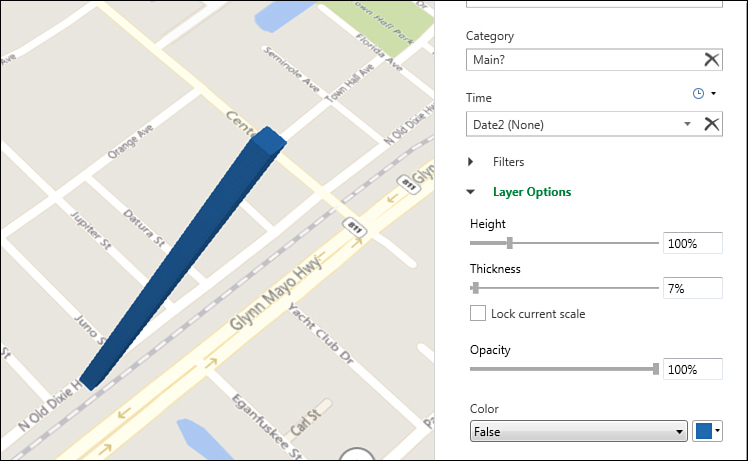
By default, each column in a column chart takes up a fair amount of space on the map. For example, if you plot every house on your street, each column takes up about one city block. You won’t be able to make out the detail for each house. Click the Settings gear icon and then Layer Options. Change the Thickness setting to 5% or 10%. 3D Map makes each column very narrow (see Figure 11-10).
3D Map looks great on a huge 1080p monitor. If you are stuck on a tiny laptop, though, you should hide the Tour and Layer panes by using the icons in the 3D Map ribbon.
Most legends start out way too large. You can either resize them or right-click and choose Hide to remove them altogether.
The Funnel icon in the Layer pane allows you to add filters to any field. 3D Map cannot render 5,000 check boxes, so you might have to use the Search utility within the filters to find items to show or hide.
When you hover over a data point, the resulting tooltip is called a data card. You can customize what appears in the card by selecting Layer Options from the gear menu and then clicking the icon below Customize Data Card.
Combining two data sets
If you want to combine two data sets, you need to do some pre-work. First, convert each data set to a table using Home, Format As Table. Then, from each data set, use Power Pivot, Add To Data Model.
If you are stuck in Excel 2013 or 2016 without the Power Pivot tab, you can create a fake pivot table from each data set and select the check box for Add This Data To The Data Model to load the data to the Data Model. Alternatively, you could use the Power Query tools to edit a table. After viewing the data in the Power Query Editor, use Home, Close And Load To, Add To This Workbook Data Model.
To combine different map types, add a layer using the Add Layer icon. Each layer can be shown at a different geography. You might have a column chart by city on Layer 1 and a region chart by state on Layer 2. The Layer Manager allows you to show and hide various layers.
Animating data over time
You can add a date or time field to any map layer. A time scrubber appears at the bottom of the map. Grab the scrubber and drag it left or right to show the data at any point in time. Use the Play button on the left side of the scrubber to have 3D Map animate the entire time period.
When you add the date or time field to the Time area, a small clock icon appears above the field. There are three choices in this drop-down menu:
Data Shows For An Instant—The data appears when the time scrubber reaches this date, but then the data disappears once the scrubber passes the date.
Date Accumulates Over Time—This option is appropriate for showing how ticket sales happened. If you sold 10 tickets on Monday and then another 5 tickets on Tuesday, you would want the map to show 15 tickets on Tuesday.
Data Stays Until It Is Replaced—Say that you have a list of housing sales for the past 30 years. If a house sold for $200,000 in 2001 and then for $225,000 in 2005, you would want to show $200,000 for all points from 2001 until the end of 2004.
To control the speed of the animation, click the gear icon in the Layer pane and choose Scene Options. The Speed slider in the Time section controls how fast the time will change. Watch the Scene Duration setting at the top of this panel to see how long it will take to animate through the entire period covered by the data set.
You can use the Start Date and End Date drop-down menus to limit the animation to just a portion of the time period.
Building a tour
You can use a tour in 3D Map to tell a story. Each scene in the tour can focus on a section of the map, and 3D Map will automatically fly from one scene to the next.
As you have been experimenting in 3D Map, you have been working on Scene 1 in the Tour pane. If you click the gear icon and then Scene Options, you will see that the default scene duration is 10 seconds, with a default transition duration of 3 seconds. Therefore, when you play a tour, this first scene lasts 10 seconds. The time to fly to the next scene takes 3 seconds.
Once you have the timing correct for the first scene, you can add a second scene by selecting Home, New Scene, Copy Scene 1. Customize the second scene to zoom in on a different section of the country or to show a different view of the map.
Say that you want to have the first scene show the data accumulate over time and then you want the next three scenes to zoom in to three interesting parts of the country. You have to remove the Time field from the Layer pane at the start of Scene 2, or the entire timeline will animate again.
Alternatively, perhaps you want to zoom in to an area at a particular part of the timeline. In this example, you might have these scenes:
You start with an establishing shot that shows the whole country at the beginning of the time period. Use the Scene Options and set both the start and end date to the earliest date in the data set. By using the same date for start and end, the opening scene will not animate over time.
You then have a scene that animates over part of the timeline, perhaps 1971 to 1995.
Next is a scene that zooms in to Florida in 1995. Use Scene Options to set the start and end date to December 31, 1995, to prevent the data from re-animating.
Finally, you have a scene that is a copy of Scene 2 but with the date range changed from 1996 to 2018.
Tip
Note that annotations and text boxes will appear throughout one scene and through the transition to the next scene. If you have a 6-second scene and a 20-second transition, the text box will appear for all 26 seconds. You might want to go to the extra effort to break this up as a 6-second scene with the text box and a 0-second transition, followed by a 1-second scene with no text box and a 20-second transition.
To have the map constantly moving, change the Effect drop-down menu to something other than No Effect. For example, with Circle or Figure 8, the camera flies in an arc above the scene. Depending on how long the scene lasts, you may not get a complete circle. Adjust the Effect speed to increase the chances of finishing the circle.
Click Play Tour to hide all panels and play the tour in full-screen mode. Drag the mouse over the tour to reveal Play and Pause buttons at the bottom of the screen. Press the Esc key to go back to 3D Map.
Creating a video from 3D Map
To share a tour with others, you can use 3D Map to render a video. Build a tour first and then click Create Video. You can choose from three video resolutions and add a sound track.
Note
Rendering a several-minute tour in full HD resolution can take more than an hour on a fast PC.
Case study: Using a store map instead of a globe
Say that you have a database of sales in a retail mall. For each day, you have sales for each of several stores in the mall. You would like to animate how sales unfold during the business day in the mall. For example, items located near the coffee bar might sell best in the morning, while high-ticket items might sell best in the evening:
Find a drawing or an image of the store map. Figure out the height and width of the image. In this case, say that the image is 800 pixels wide and 366 pixels tall.
Build a table in Excel with a unique list of store names. (You could also use a unique list of departments or categories.)
Figure out the x and y location for each unique store name. Remember that x measures the number of pixels across the image, starting at the left edge. In Figure 11-11, the image is inserted into Excel. It fills columns E:U. Because the total width is 800, each column represents about 47 pixels. Sears is around 620 pixels from the left edge. For the y value, remember to start at the bottom. Since the image is 366 pixels tall and fills 29 rows, each row is about 12.62 pixels tall. Cell C15 shows that the word Sears falls at about 176 pixels from the bottom edge.
 Caution
The first time I tried finding x and y locations, I used the cursor location in Photoshop. It was fast and easy. But then I realized that Photoshop is measuring the y location starting at the top edge instead of the bottom edge. This initially seemed like a bad mistake, but since the data was keyed into Excel, a helper column with a formula of =366-F2 was able to quickly correct the Y values.
Create a table from your sales data by using Ctrl+T. Add the data to the Data Model.
Create a table from your location data by using Ctrl+T. Add the data to the Data Model.
In Power Pivot, create a relationship between the two tables.
From a blank cell in Excel, choose Insert, 3D Map. 3D Map shows you the fields from the Data Model.

In the Choose Geography section of the Layer pane, choose X and Y.
In the Geography and Map Level section, assign X as X Coordinate. Assign Y as Y Coordinate. 3D Map now asks you a question: Change To A Custom Map? (see Figure 11-12).

Click Yes to choose a custom map. In the Change Map Type dialog box, choose New Custom Map.
In the Custom Map Options dialog box, click the Picture icon next to Browse for the Background Picture. Select the same picture used for step 3. As shown in Figure 11-13, the dialog box starts out with Min and Max values for X and Y that represent the data in your data set. Because no data points are falling at the 0,0 coordinate or at the 800,366 coordinate, these estimates will always be incorrect.
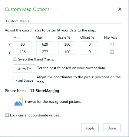
Change the Min for X and the Min for Y to 0. Change the Max for X to the picture width. Change the Max for Y to the picture height. Click Apply to see your data on the picture. Click Done when everything looks correct.
In the 3D Map Layer pane, click Next.
Your data is now plotted on a custom map of the mall, as shown in Figure 11-14. You can use 3D Map navigation to tip, rotate, and zoom the map.

Next steps
Chapter 12, “Enhancing pivot table reports with macros,” introduces you to simple macros you can use to enhance your pivot table reports.