WE’RE NOW AT THE POINT in the book when we’ve made much progress. We’ve drawn and designed characters and poses of all different types. Now we’ll get a chance to put two or more characters together in a scene. The beginner draws two figures in a scene by simply sticking them stiffly in a panel. But as you may have guessed, there’s more to it than that. To bring a scene to life, the characters have to interrelate visually. That requires some staging, posing, and layout. Here’s the chapter that will give you the tips you need to get started.
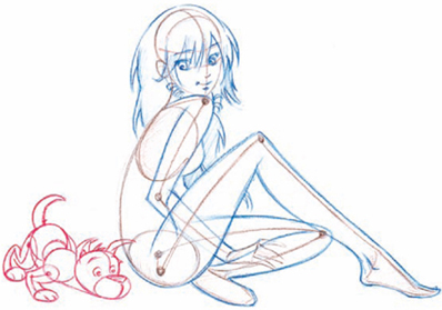
We’ll explore how to create energy between characters with something simple and fun: introducing a cuddly, little pal into the picture. Two personalities together, interacting, create a scene. Plus, introducing a pet is a surefire way to win readers’ hearts; their presence always adds a welcome element of comic cuteness. And because the animals are small and simple to draw, the composition of the scenes is going to be easy. We won’t even worry about backgrounds at this stage.


DIRECT EYE CONTACT
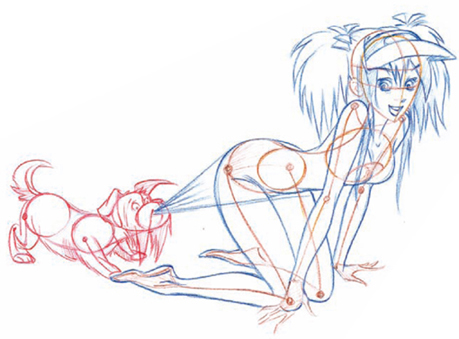
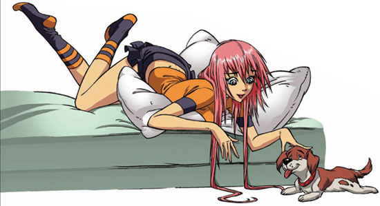
Ah, that’s it, a little more to the left—perfect! Now the puppy is in heaven having his head scratched. A “scratch” is done with the fingertips; a “pet” is done with the palm. Note the direct eye contract between the two characters, which communicates the sense of love. Also notice that by placing the two characters at different levels—one on the bed, one on the ground—you add more visual interest than if both were on the floor together, but we’ll get to that more on this page.
Eye contact is important, whether your two characters look at each other or not. One option besides mutual eye contact is to have one character look at the other, while that character looks at something else. Another is to have one character look at readers, engaging them and drawing them into the scene.
NO EYE CONTACT
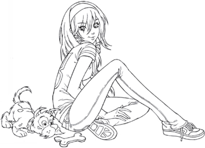
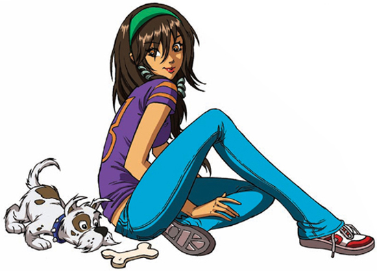
Here we have only one character looking at the other; the girl looks at her pet, while the dog is busy doing his own thing—sniffing out that special treat. It’s a cute moment; the girl takes on the point of view of the reader as someone who’s observing the dog, who is, in turn, transfixed on the bone. The dog takes on a quasi-hunting posture, which is comedic, because after all, he’s hunting an inanimate bone! He’s probably a feckless hunter, but don’t tell him that. The girl’s back is positioned toward the dog to show that he has circled his way around her to track down his prize. Her position also allows for a cute over-the-shoulder glance at her friend.
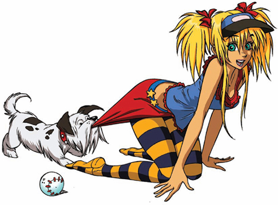
EYE CONTACT WITH THE READER
Wrong idea, puppy! Not the skirt, the ball! Grab the ball! Here we have the classic tug-of-war with a dog. Unfortunately, he was supposed to play fetch, instead! Note how the girl looks out at readers, drawing them into the scene playfully. Position the pup low to the ground, so he really looks like he’s giving a good yank. The type of dog you choose for the scene is also important. Some toy dogs are delicate looking and don’t appear to be able to tug hard. So better make it a terrier. They may be small, but they’re chesty and tough. Place the ball in the foreground and make it large, or the reader may miss the point of the joke.
LOOKING IN THE SAME DIRECTION
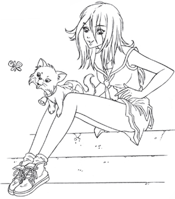
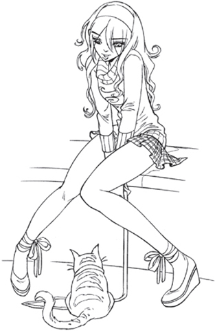
Cats have no compunction about walking on anything, even their owners. Here, the girl’s legs act as a plank to let the kitten get closer to the butterfly that has captured its imagination. Cats have an amazing ability to follow anything with their eyes. Put something that’s moving in front of them, and they will become fixated on it like a radar system. This butterfly has the cat hypnotized and is staying just out of reach, teasingly. A tilt of the cat’s head reads as a happy, inquisitive gaze. The classic head tilt also works for dogs. The two main characters (the girl and the cat) share the same eye line, which is transfixed on the butterfly.
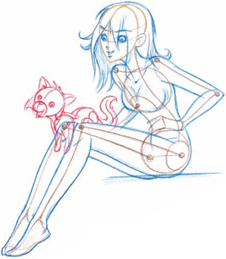
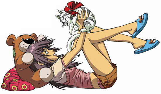
Having an animal roll over and flop around on its back is the universal way to communicate a playful mood. It works whether the character is a dog, cat—or even a girl! Here, the girl holds the kitten as if it were a cuddly baby. On the facing page, the playfulness comes from the “stubbornness” of the cat.


ONE CHARACTER LIFTING ANOTHER
Here, you’ll want to show the communication between the characters in this shared moment. A good way to do that is to make use of the side view, in which you can draw them both face to face in profile. Having the girl raise her cat above her gives the pose a very active feel. But there’s still a strong sense of connection between the characters, since the girl lifts her head up toward her pet. This connection would not be as pronounced if the girl’s head were lying flat on the ground. So the artist lifts it up by placing a huge teddy bear underneath it. The reader thinks the stuffed animal is a prop that belongs there, but it’s a device put there to get her head up so that the composition works better. Artists make choices like this all the time, without the reader realizing why the props have been added.

LOOKING UP AND DOWN
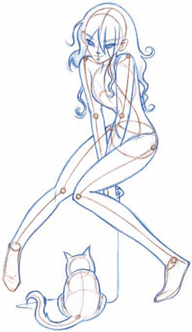
In this simple setup, the girl looks down, trying to elicit a response from her portly feline, while the cat sits in front of her, content just to watch her try. Who hasn’t tried to get a cat to “do” something but to no avail? The fun lies in the fact that the little one of the pair is the “boss.”
Since the cat is only seen from the back at this angle, you must make it extra-round and pudgy. That will bring out its cuteness and compensate for the fact that none of its features are visible.
Now we’ll take all of the principles we’ve learned throughout the book and combine them to create ministories in the form of full scenes, called pinups. Used in graphic novels, pinups are giant panels that each take up an entire page. They add visual excitement to a story by breaking up the continuous stream of smaller sequential panels that can get mundane after a number of uninterrupted pages. For artists, pinups are fun to draw, because they allow you to focus all of your energies into creating a single, finished piece of work. As a result, you get to really sink into the creative process. However, for these pinups to become scenes rather than merely pretty drawings, they require certain elements:
• Generally, multiple characters interacting with one another.
• An identifiable location, even if it’s a fantasy or more abstract location.
• An activity. The characters must be doing something; they can’t just be posing purposelessly.
• Character development; for example, are they cute, evil, good, jealous, and so on.
• A point to the scene.
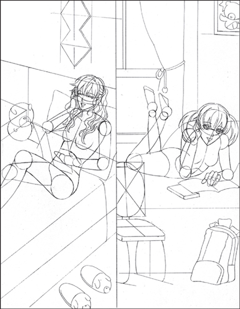
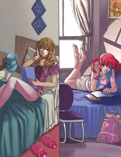
Here’s a picture of two shoujo girls chatting away on their cell phones. Should it be a regular panel, or does it qualify as a scene that warrants the full-sized, pinup treatment? Let’s see if it fits our requirements:
• Does it have more than one character? Check. (There are two girls who interact with each other.)
• Does it have an identifiable location? Check. (There are two bedrooms.)
• Are the characters doing something? Check. (They’re talking on the phone to each other.)
• Is there good character development? Check. (The girls are chatty, cute teens.)
• Does the scene have a point? Check. (The girls are friends who are having an animated conversation.)
• Affirmative on all five counts. Yep, it’s a scene with a story all right, and that makes it a good pinup panel—you can give it a full page.
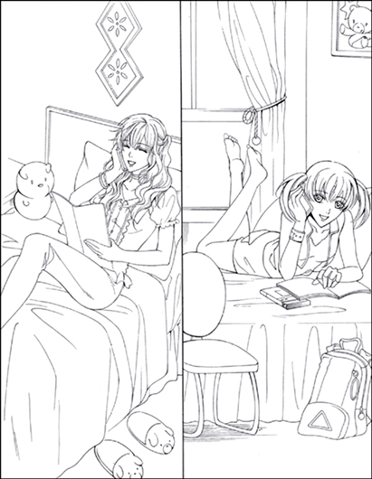
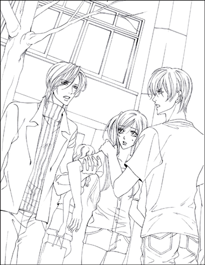
INKED VERSION
This is the stage in the process when the clothing is added and any drapery in the background gets its fabrics and folds. All of the details come in. The step is also when the pencil drawing gets inked. The inked drawing is then ready for reproduction in the manga graphic novel. Some artists ink over their pencils; others use a light box to trace their drawings in ink onto a separate piece of paper and that way preserve the original pencil drawing underneath.
COLOR SUGGESTION
Western audiences (particularly in America) prefer anime-style coloring, also known as cel shading, which results in hard edges of color. They see this primarily in TV animation. But they generally haven’t been exposed to the other style of shoujo coloring, popularly seen in Japan, that is a softer type of coloring, without the hard edges where one color ends and another begins. This section provides you with examples of this soft shoujo coloring style. It’s good to familiarize yourself with both approaches.
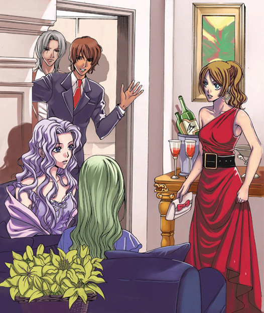
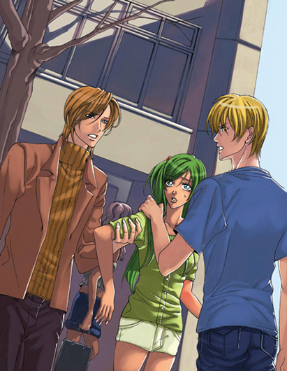
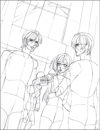
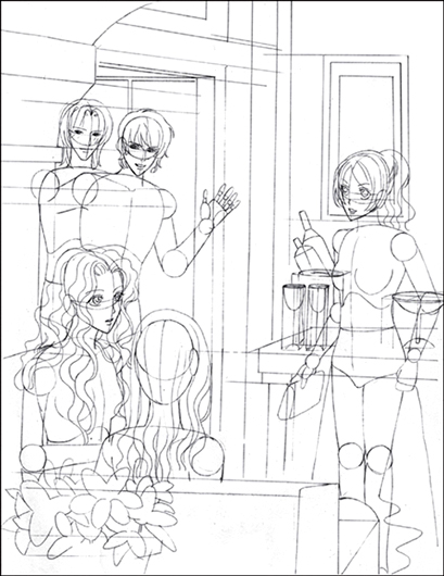
Two guys. One girl. This could spell trouble. This picture is drawn on a slight diagonal: The vertical lines of the building are slanted, as are the people. This is called a tilted frame and is typically used to heighten the dramatic tension within a scene.
In addition, the entire scene is drawn in a predominantly vertical fashion. Notice how the characters and building are positioned vertically—there’s nothing going on horizontally. This type of composition allows you to place numerous characters in a small space within in a fairly close shot, without making it look like a tight squeeze.
INKED VERSION
Unless the perspective is purposely warped, which is sometimes the case in wide panoramas, buildings must be drawn ruler-straight. If they’re hand-drawn and a bit on the wiggly side, they’ll draw attention to themselves. You don’t want that! What you actually want is for the buildings to recede into the background and become unnoticed so that the focus remains on the characters in the foreground. Therefore, in addition to ruler-straight lines, keep the buildings fairly simple. This means no fancy windows with people’s silhouettes in them and no gargoyles or individually drawn bricks. Nothing to make the background pop. Use thin lines, not thick ones, for backgrounds. The thinner, the better.
COLOR SUGGESTION
Here, the skin color is reflecting the emotional state of the characters, which is getting hotter. The skin tone has more orange in it, making it fiery, dialing up the degrees of the scene a notch or two. Likewise, the building is yellowish and purple, giving it a baked look. Temperatures are rising, and soon something is going to explode. In this way, colors can reflect the tension of a scene.
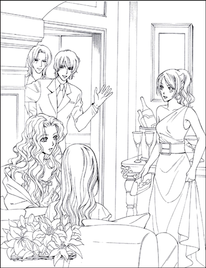
We’re having a party … and who invited those guys? These friendly party crashers don’t take no for an answer. They simply flash their smiles and hope their charm does the rest. Notice how the eye moves from the boys counterclockwise to the girls on the couch, then to the girl standing by herself, and then back to the boys again. In other words, the placement of the figures encourages the eye to make a continuous loop, which keeps your eye within the panel.
In addition, there’s a lot of overlapping that occurs here, which creates a sense of depth: The girls on the couch overlap the two boys entering the room, and the girl on the right overlaps the table. All of this creates a nice foreground/background dynamic.
INKED VERSION
“Dress up” is part of the fun of shoujo manga, and readers love to see it. It’s a world filled with fancy clothes and stunning locations. Readers thrill to live vicariously through their favorite characters. Whether they drive a million-dollar exotic car, wear outrageously expensive clothes, or jet-set to exotic resorts, our characters live the lives about which we can only dream.
COLOR SUGGESTION
Which girl’s party is it? The brunette, of course. Why? Because she’s the one wearing the red dress. The bold primary color, instead of a muted or pastel tone, makes her stand apart from the other girls, and even the guys. The vibrant red color underlines her role as the main figure on the page.
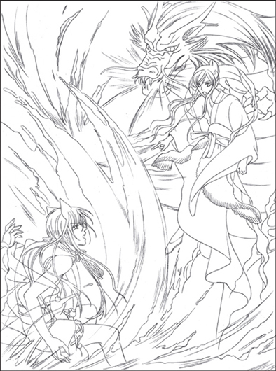
In this exciting scene, a magical girl fights a magical boy (another type of shoujo character). But although the magical boy has significant powers, the magical girl’s arsenal trumps the boy’s: She has a dragon for a protector-friend! Hard to beat that. What’s important to note here is that there’s a great deal going on in this scene, which is why the characters have been placed on opposite corners of the panel. There’s actually too much action going on to put them together in the middle. That would cause what is known in artistic terms as eye fatigue. This way, there’s a visual pause in the center.

INKED VERSION
Even at a distance, both figures appear to interact. With her finger pointing at the magical boy and the dragon leaning forward to spew fire at him, the girl takes on the role of the attacker. The boy, who is leaning back, is the defender. So their postures show one playing off the other.
Note the lack of horizontal and vertical backgrounds. This is typical of the abstract fantasy scenes, which have more organic, curved designs for the environment.
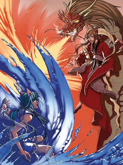
COLOR SUGGESTION
It’s always tempting to go for the stereotype, which in this case would mean coloring the dragon green. But that would turn the dragon into something a little more pedestrian, like a medieval lizard. Ho hum. In addition, a blue magical boy and a green dragon wouldn’t have such different color values, and the elements of the picture would start to blend. You don’t want that, especially because those characters are on opposite sides, storywise (they are each other’s nemesis). This way, the colors clash, which underscores the theme of a fight scene.