What “Finance” really means is “financial news.” When you open it, you arrive at what looks like a glorious, beautifully designed financial magazine. Swipe horizontally to see stock-market graphs; tiles for the day’s winners and losers; article blurbs and headlines; videos; and stats for bonds, rates, currencies, and commodities (Figure 4-8).
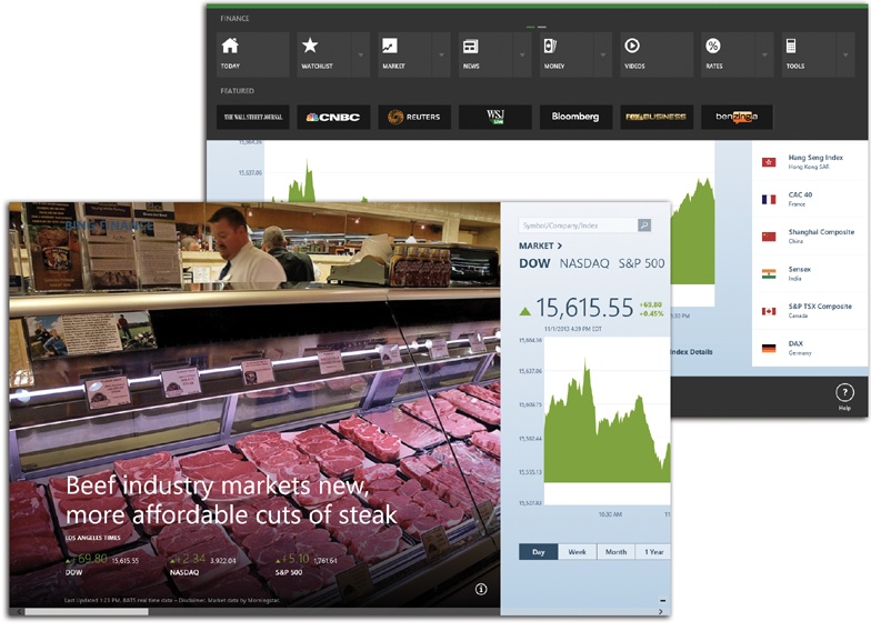
Figure 4-8. This book would have to be 32 feet wide to show you all the financial goodies that appear in this massively complete, horizontally scrolling financial app. You can tap or click just about anything to drill down for more information.
Read this chapter’s writeup about the News app for a complete
understanding of how these apps work. But for now, don’t miss the App
bar, shown at top in Figure 4-8. (Swipe inward
from the top or bottom of the screen, right-click any blank spot, or
press  +Z.) It offers tiles like these:
Today. Brings you back to the opening collection of news and stats.
Watchlist. Your own portfolio (or just stocks you want to watch). Tap the
 button to specify each company name, or
stock symbol, that you want this page to track.
button to specify each company name, or
stock symbol, that you want this page to track.Market, Rates. Huge rows of financial tables representing today’s financial-market activity in every conceivable category, or today’s interest rates for various mortgages, bank accounts, and credit cards.
News, Money, Videos. A direct link to the financial-news, personal-finance, and videos sections of this “magazine.”
Tools. Handy calculators for mortgages, auto payments, currency conversion, retirement planning, and so on.
Best of Web. A display of tiles for Web sites Microsoft thinks you might like—or learn from—on topics like investing, spending, donating, or borrowing.
A  button next to an App bar tile means “Click or
tap here to open a second row of buttons, providing quicker access to
the categories within.”
button next to an App bar tile means “Click or
tap here to open a second row of buttons, providing quicker access to
the categories within.”