Chris Ware’s comics routinely include peculiar and inscrutable devices, external to the comics narrative, designed to testify to the intensity of Ware’s authorial attention: his readers encounter fake catalog advertisements and coupons, collectible trading cards, fold-up paper-craft projects, souvenir calendars, essays and indicia in painfully minute text, and multi-part diagrams of almost inevitably discouraging complexity. These devices may serve as barriers against the casual reader just as much as they reward those who are more serious or more committed. By their density and their meticulous design, Ware’s non-narrative devices imply that a complete appreciation of The ACME Novelty Library or Jimmy Corrigan comes only with intense readerly labor. Obviously outside the story’s main narrative diegesis, these ancillary materials nevertheless often revise the reader’s sense of the main text.1 The fold-up paper-craft models in Jimmy Corrigan, for example, not only offer an alternative construction of narrative time, but also potentially blur the line between reader, active participant, and character.2 Moreover, Jimmy Corrigan’s diagrams, by revealing things to the reader that are unknown to the point-of-view characters, substantially alter the emotional tenor of the graphic novel’s conclusion, broadening its scope beyond Jimmy’s breakdown, worry, and isolation. Ware’s meticulous diagrams reveal and obscure this information at the same time: by stationing details in pointedly difficult diagrams, he distances their effects and their meaning from a casual or preliminary reading of his comic. This complicating, literary use of diagrams to layer meaning between readings is the subject of this essay’s first section, but Ware’s diagrams also have implications that go beyond an interpretation of Jimmy Corrigan. In the end, they also suggest a fundamental formal connection between comics and diagrams that comics critics have written little about, and the second half of this essay will describe this connection and some of the possibilities for comics storytelling that it, in turn, makes possible.
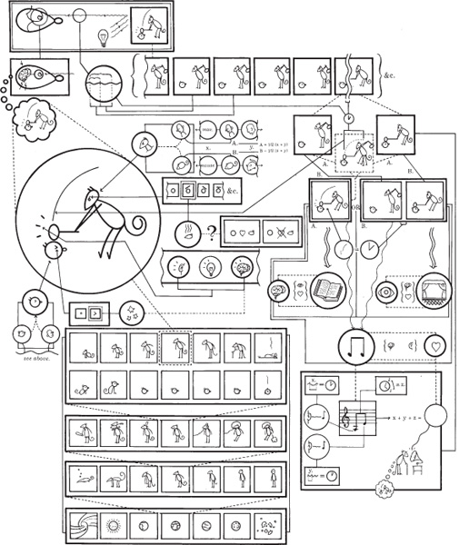
The three diagrams that concern the characters in Jimmy Corrigan all conceal or obscure information about those characters that is revealed nowhere else in the book, but the purpose of the book’s first diagram is most difficult to assess.3 The front endpapers, dense with apparatus in characteristically eye-straining text, contain a daunting diagram that offers to explain the “new pictorial language” of comics and cartooning and the way that this “language” is “good for showing stuff” and “leaving out big words” (ii). In one large circle, near the left edge of the diagram, Ware’s recurring character Quimby (the mouse) strikes Sparky (the bodiless cat head) with a mallet; fine arrows lead into this circle to annotate the various elements of the simple, readily legible single-panel cartoon (see fig. 7.1). The trio of lines radiating from the mallet, for example, may indicate sound, or brightness, or a mental state; another part of the diagram shows that since Sparky’s eye is an angle and not a dot, we should read those three lines as indicating pain or concussion (shown as three floating stars). Another set of boxes shows a series of possible positions for the line that represents Quimby’s eyebrow and shows that the current angle indicates anger (that is, lines of heat coming from his head), which could arise either because he loves Sparky (a heart between their heads) or because he doesn’t love Sparky (a crossed-out heart). Other parts of the diagram situate this moment in the history of the cosmos, locate the drawing style between more realistic pictures and language, suggest the way that sound (and thereby nostalgia) can be inferred from the image, and show that the anthropomorphic creatures are a hybrid of human and animal forms. Each of the sub-diagrams in this thoroughly annotated cartoon consists of densely packed panels full of precisely the sorts of cartoon icons the diagram is ostensibly designed to elucidate. Thus, only those readers who are already conversant with its idiom of symbols will be able to interpret its explanations, which are in turn more complicated than the single slapstick panel they propose to explain.
In some ways, this image is Ware’s equivalent for the Pioneer spacecraft plaque: a dense, heavily encrypted diagram, in which much of the diagram’s work is dedicated to explicating its own system of codes. A portion of the diagram even seems to take issue with Scott McCloud’s often-repeated definition of comics as juxtaposed sequential images.4 The single-panel cartoon in the large circle, after all, would not count as “comics” by McCloud’s definition, since there are no other images in sequence with it. In the upper left corner of Ware’s diagram, a set of panels attached to the motion-line arc behind Quimby’s mallet seem to assert that this single panel, encoding movement as it does, is equivalent in its denotation with a two-panel sequence (which is also pictured). The motion line and action lines are equivalent, Ware suggests, to the imagined time elapsing in the gutter between separate panels. Moreover, the diagram asserts, a single-panel cartoon that uses symbols instead of serial images is closer in its methods to reading, making more use of the mind than the eye and the heart. The two-panel sequence, by contrast, is more akin to theater and privileges the eye instead of the mind.
In short, Ware’s diagram seems to be arguing for a sense of the comics medium that is much nearer to language and linguistic concerns than McCloud’s: one that gives as much credit to comics’ elaborate system of signs as it does to the basic grammar of visual sequences. This revised definition might also allow for more variety in the nature of visual juxtaposition than mere narrative sequence, since several of the series of panels in this diagram aren’t sequential: often they present arrays or ranges of possibilities, from which a single example is selected.5 Sometimes panels are set in sequence because one analyzes or determines its neighbor. The relations may be associative, analytic, or metonymic; they need not tell a story. The Quimby-Sparky diagram thus prepares the reader for a comics grammar even more challenging than the one Jimmy Corrigan typically employs. The irony of this dense, compact, and complicated explanation of the way to understand a comic is, of course, that the reader must already know comics shorthand in order to be able to read it in the first place: it excludes the unpracticed reader it pretends to instruct. Set next to a prose essay that asserts comics’ extreme popularity with “dumb people,” the diagram offers to mock or frustrate even Ware’s more expert readers.
Fig. 7.1. Ware’s key to the “New Pictorial Language” explains something simple in a very complicated way. Chris Ware, Jimmy Corrigan: The Smartest Kid on Earth (New York: Pantheon, 2000), endpapers.
This diagram in the endpapers of Jimmy Corrigan is hardly the most complicated or obscure of Ware’s diagrams. Ware’s design for the storefront of 826 Valencia presents an abbreviated history of human desires and achievements in more than two hundred pictographs and panels;6 many of his early Quimby the Mouse strips toy with diagrammatic devices;7 and a huge two-panel diagram in The ACME Report maps out four quadrants of virtues and vices, temperaments and facial expressions, seasons, fields of endeavor, and so forth.8 Most of the diagrams in Jimmy Corrigan, by contrast, seem quite deliberate in their relation to the narrative, revealing information about the interconnection of the characters that is available to no one within the story.
The three major diagrams that involve the characters and their histories offer supplements, explanations, and complications hidden in the main story. Some of these details are quite distant from the central narrative: the large fold-out map-diagram from the interior of the dust jacket (pp. iii–iv of the paperback) shows the death of Jimmy’s paternal grandmother and the immigration from Ireland of Jimmy’s great-great-grandfather, a physician also named “J. Corrigan,” as well as the capture, transportation, and sale of Amy’s ancestors as slaves in the period before the Civil War. It also reveals that Jimmy is lying when he tells his adopted half-sister Amy that he “sorta stopped reading” comics “when [he] grew up” (329): in fact, he not only bags and boxes current issues of Superman, as the map-diagram reveals, but he also catalogues his collection. Jimmy’s kitchen closet is devoted to long boxes, the specialty hardware of comics storage (see plate 1).
All these details expand the fictional world of Jimmy Corrigan (putting roots into locations far from Chicago and Waukosha), and in that sense they offer a reward for the reader’s investigation and eyestrain, even if their revelations only obliquely affect the graphic novel’s plot. True, the diagram suggests, more than the main “text” of the novel might, that Jimmy Corrigan represents one segment of a long historical sequence of tragic and lonely characters appearing and disappearing on a much larger stage. There is something frustrating, however, about the insistent triviality of some of these data: a floor plan of Jimmy’s apartment; a six-step description of his comics storage process; four tiny in flagrante delicto panels of the bachelor William Corrigan philandering his way through Chicago. This elaborate diagram enriches the world of Jimmy Corrigan mainly by suggesting that the pained minutiae of the main diegesis are supported by thousands of similarly awkward moments that the graphic novel never shows us.
A second diagram (38–39), discussed at length in Thomas Bredehoft’s article on “comics architecture” in Jimmy Corrigan, reveals through a series of shifts in chronology and perspective that the windows in Jimmy’s Chicago apartment were originally installed by Jimmy’s great-grandfather William, who later emerges as an important character in the nineteenth-century sections of the book.9 This apparently trivial coincidence, placed as it is among Jimmy’s fevered and worried fantasies about meeting his father for the first time, seems almost reassuring: it asserts a connection through his male forebears, a connection that literally shelters him even though he is unaware of it.10 The diagram also tells us, however, that Jimmy’s father isn’t long for this world: in a series of small, blue, right-to-left-reading panels at the bottom of the diagram’s first page, the father’s present moment is immediately succeeded by a headstone and a grave. For the careful reader, then, this diagram telegraphs Jimmy’s father’s death more than three hundred pages before it happens. This kind of extension of the reader’s awareness is not possible in the main narrative frame, tethered as the comic is (at this point) to Jimmy’s point of view. To establish an external or authorial perspective, Ware inserts a diagram: since the diagram uses the space of the page to convey information instead of a viewpoint on the story, it naturally suggests a more abstracted, more objective position that allows, for example, generations to be compressed into a brief space. By presenting an alternative to the steady sequential march of comics narrative, Ware’s diagrams allow the sort of retrospective or omniscient view of the story’s events that other authors might reserve for captions in the voice of a third-person narrator.11
The final and most telling of the diagrams in Jimmy Corrigan also uses this strategy, covering several generations in a small portion of the page. This two-page diagram appears near the end of the book, immediately after its climax, when Amy pushes Jimmy away after hearing the news of their father’s death (357–58) (see plates 9 and 10). At first glance, the austere, diagrammatic, and open use of space on these pages seems like a fairly cold sequel to Amy’s unheard words of apology as she realizes that Jimmy has disappeared. The diagram, however, encodes enough information about Amy’s ancestry (and Jimmy’s) that reading it carefully forces a revision in both the meaning of the book’s conclusion and the underlying connections between the book’s two chronologically separate stories. The diagram traces Amy’s ancestry back through the information barrier—unbreachable for the characters—of her adoption. In snapshots of three generations, the diagram shows Amy’s mother giving her up for adoption in 1964, deposits Amy’s maternal grandfather in a World War II soldier’s grave, and reveals that her mother’s father’s mother was the daughter of Jimmy’s great-grandfather, the looming, abusive father in the historical flashback sections of the graphic novel. Jimmy’s great-grandfather fires May, the African American maid who is Amy’s great-great-grandmother, when May is pregnant with his illegitimate child. In a typical turn of Ware’s little tragedies, in fact, he fires her for offering a bit of kindness toward his son behind his back (243); she returns in winter, a few months later, “weighed down by some burden, concealed at the waist of her coat,” but runs off into the snow after James sees her, offering no explanation (250).
This diagram is the only confirmation offered in the book that this “burden” is William Corrigan’s unborn child (and James’s never-known half-sister). The fact of Amy and Jimmy’s consanguinity—and, moreover, her very close blood relation to little James, who is now the old man she calls “Granpa”—makes Jimmy’s panicked retreat on the previous pages a tragedy of possible connections unrealized. Without the information in this diagram, Jimmy’s Thanksgiving return to his mother and his work cubicle seems like a sad return to his own status quo, one in a series of missed opportunities for the maladroit protagonist; with the information in this diagram, however, Jimmy’s disappearance is a tragic failure of family reconciliation for Amy as well.
There are several reasons why Ware might bury this connection between Amy and her adopted family in a diagram (and, for that matter, in small and visually obscure details in the diagram), and I’d like to argue that the effect he achieves with this choice is actually quite subtle. Ware might have simply secreted the information here like an Easter egg for the most diligent reader, to reward more careful scrutiny with a more poignant ending. This would make a nice parable about readerly care for students in a literature class, but it’s hard to come away from Ware’s work with a sense that he imagines rewarding his fans. (The hardcover Jimmy Corrigan’s dust jacket, after all, touts it as “a bold experiment in reader tolerance.”) Ware might instead resort to the diagram here, as in the early diagram about Jimmy’s window, because these facts can only be related outside of the narrative diegesis. Since Jimmy Corrigan is anchored so closely in a few characters’ points of view (mostly Jimmy’s and James’s), information known to none of these characters can only appear outside of the visual narrative. Furthermore, and perhaps more interesting, it’s possible that the eventual revelation relies on a process of scrutiny or investigation in order for its emotional impact to feel earned or genuine: if Amy’s family history were simply delivered, instead of being something the reader must hunt for, or encounter on a second or third reading, the coincidence of the characters’ kinship might seem considerably contrived. As it is, and with the precedent of the other diagram establishing historical coincidences, the unlikely connection between these two characters feels more like a secret than a fiction.
Ware’s persistent interest in diagrams also reaches beyond the immediate narrative needs of his graphic novel. Ware is clearly curious about the possibilities created by importing allied media into his comics, or by learning from the devices of related media. As we will see, the common grammar of comics and diagrams—their shared reliance on juxtapositions or continuities in two-dimensional space to indicate connections of meaning—establishes a number of non-narrative possibilities with which Ware and other cartoonists occasionally experiment.
The art of the diagram is one of a number of ways in which Ware’s comics technique is informed by disciplines or media that aren’t often considered by literary critics. Gene Kannenberg has written comprehensively on Ware’s interest in typography and type design, for example;12 and Ware is also clearly interested in music and in architecture.13 In Jimmy Corrigan in particular, Ware also repeatedly invokes the early, pre-cinematic technology of moving pictures. Like comics, and like Ware’s several diagrams, these early devices— the zoetrope, magic lantern slides, and the zoopraxiscope of the early photographer Eadweard Muybridge, all of which appear in Jimmy Corrigan—rely on sequential images to depict events in series.14 Within the graphic novel, of course, all of these moving-picture images are also comics: unless we remove, cut apart, and build Ware’s model zoetrope, the twelve images of a crutch-walking robot can only be read as a comic, with its images helpfully moving from left to right along the top of the page.15 McCloud has pointed to the similarity between these two mediums’ ways of representing motion, claiming that “before it’s projected, film is just a [ . . . ] very slow comic,” printed on celluloid instead of on paper.16 Ware’s various invocations of early motion-picture technology, represented as comics (with minimal changes from panel to panel, in the case of the zoetrope), thus also direct us to reexamine the “very slow” sequences that are ubiquitous in Jimmy Corrigan. It’s easy to describe these slow, moment-to-moment sequences—Jimmy’s father awkwardly keeping Jimmy company in a doctor’s office, for example (125)—as static, but the repetition of images also heightens our attention to slight variations of motion, body language, and facial expression.17 Like these evocations of early motion-picture technology, Ware’s diagrams urge us to reexamine the methods of the main comic as well as the fundamental proximity of the related media. Navigating Ware’s dense and deliberately obscure diagrams should prepare the reader to read diagram-like devices on his comics pages as well as the structural or grammatical similarity between comics and diagrams in their foundations.
Ware’s sense of the comics medium is clearly related to the visual workings of diagrams, and in the end his work asserts a basic connection between the grammar of comics storytelling and the grammar of information display that may open up interesting new possibilities for comics. As it happens, Ware’s comics are akin to diagrams in a number of ways, some of which (though not trivial) are more straightforward than the fundamental similarity of their “grammars.” The first of these is the flat, simplified cartooning style that characterizes most of Ware’s mature work, in which many objects and even characters nearly resemble pictographs or ideograms.
Describing his own rougher but similarly simplified visual work, Art Spiegelman repeatedly compares this drawing style to diagrams. Spiegelman similarly asserts, for example, that Dick Tracy’s Chester Gould “understood better than anyone that comic strip drawing isn’t really drawing at all, but rather a kind of diagramming.”18 In an essay on his early one-page piece “Don’t Get Around Much Anymore,” Spiegelman asserts, “All comic-strip drawings must function as diagrams, simplified picture-words that indicate more than they show.”19 Here, Spiegelman refers to more than Gould’s in-panel text labels (e.g., “Two-way TV wristwatch”) or their relation to the speech balloon and other graphic devices: he uses the idea of a diagram to describe the cartooning style that Scott McCloud calls “iconic.” Iconic drawings are simplified to the point of being almost pure symbol, with inessential or non-semantic visual elements abstracted away. McCloud sees these iconic drawings as being “more like words,” in that their process of signification is diminishingly a matter of resembling the thing they represent, increasingly a matter of accepted symbolic conventions.20
Ware, too, describes a desire for his drawings to “read like words”—for them to trigger meaning as immediately as a printed word will for a literate reader, “so that when you see them you can’t make yourself not read them.”21 As a model of the immediate pictorial legibility that Ware desires, Daniel Raeburn, following Spiegelman, cites Ernie Bushmiller’s Nancy: “It takes more effort not to read Nancy than it does to read it.”22 The uniformity of Ware’s line, the openness of his visual forms, his flat fields of color, and the simplification of organic background elements like trees and bushes until they resemble symbols on an architect’s plan: all of these elements of Ware’s style are engineered to approach this Bushmiller-like (or Gould-like) immediacy, a kind of stylistic transparency.
And yet, Ware’s comics are, as a general rule, anything but easy to read. Along with this seemingly transparent cartooning, Ware at times delivers dense text, complicated page layouts, and central characters whose main attributes are emotional paralysis or painful awkwardness. McCloud argues that the iconic style of drawing somehow enables reader “identification” with the characters, and although McCloud’s assertion here is among his most dubious, there is one element of truth behind it: since this iconic or diagrammatic drawing privileges the semantically charged parts of a drawing, iconic drawings of characters’ faces are (or can be) easier to read for their emotional signification.23 If we construe things like eyebrow position or the line created by the mouth as emotional signifiers—as they do seem to be—then the reduction of a cartoon face to these significant lines makes the character’s internal state read, ideally, as clearly as a word, legible in every panel where we see his face.24 It’s hard to imagine a protagonist more closed off to emotional connection than Jimmy, but the repeated, virtually unchanging icon of his worried face telegraphs his emotions with excruciating clarity. Although the women in Jimmy Corrigan are drawn just as iconically, Ware takes pains to obscure their faces (other than Amy’s) in nearly every panel, presumably to limit the legibility of their interior states. Jimmy’s mother, for example, is visible many times before we see her face, tiny and at the bottom of the panel, at the end of their Thanksgiving dinner (371); even in James’s dream of impressing the red-haired girl, we only see the side of her bonnet (246).25
Whatever Ware is aiming at with his diagrammatic, iconic drawing, then, it isn’t merely the reader’s identification with the characters or any ease of access to the character’s interiority. Instead, it seems to be an appeal to the possibility that drawings might approach the semiotic directness of language, even though the two kinds of mark-making participate in distinct kinds of signification. Whereas words are, with the possible exception of onomatopoeia, always arbitrary signifiers, even very iconic drawings rely on natural (non-arbitrary) signification: they visually resemble the things they signify.26 And yet, if iconic or diagrammatic drawing approaches certain language-like qualities of signification—its “common nouns” referring to general types rather than to specific individuals; its simplification, as Spiegelman suggests, indicating texture or subtext it does not show—then iconic drawings would seem to be the natural vocabulary of both the diagram and the cartooned literary comic.27
However, this iconic vocabulary is then activated by the grammar of visual juxtaposition that is generally understood to be central to comics as a medium. Ware’s interest in diagrams clearly goes beyond their pictographic idiom. The way that diagrams relate and manipulate their symbols is also a large part of Ware’s “comics poetics,” but this is an aspect of Ware’s work (and an aspect of the comics medium) that has received little attention. The preeminent theorist of the diagram is probably Edward Tufte, the author of several landmark books on information design. Tufte’s work, directed toward statisticians and graphic designers, primarily advocates greater clarity and “integrity” in information displays, offering strategies for revising cluttered, deceptive, or otherwise ineffective diagrams and for maximizing a chart’s “data-to-ink ratio.”28 Given that these are Tufte’s goals, we should expect him to offer relatively little about the potential literary uses of diagrams or about ways that comics like Ware’s might deliberately exploit complexity or clutter. In the course of distinguishing clear information design from “chartjunk,” however, Tufte does offer a number of insights into the language of graphics that can help us to see how Ware’s comics work. For example, Tufte advocates against high-contrast juxtapositions of color or equal-width bands of black and white because of the “after-images and vibration,”29 or the “shimmer” and “moiré vibration,”30 that these graphic elements can cause. Ware uses both of these discomforting effects deliberately in Jimmy Corrigan. High-contrast red and green vibrate, for example, in the panel during Jimmy’s visit to the doctor’s office when he mutters, “Uh . . . I guess” (112).31 And the optical discomfort of Tufte’s black-and-white “shimmer” is visible on nearly every page of Jimmy Corrigan, in the too-narrow white gutters between his thick, even panel borders. In both of these cases, Ware flouts the “rules” of graphic design deliberately in order to ratchet up the visual discomfort that accompanies Jimmy’s ever-mounting anxiety.
Although he is concerned with clarity more than with art, Tufte’s examples of well-designed diagrams do occasionally resemble comics. In a chapter on “Multiples in Space and Time,” for example, he presents a set of Muybridge’s motion-analysis photographs on the same page as Huygens’s time-series drawing of Saturn’s orbital path and a set of maps showing continental drift. As Ware’s interest in Muybridge reminds us, each of these time-series diagrams reads, sequentially, like a comic.32 Diagrams of the movement of a seahorse or a gecko also use simplified images (cartoons) in sequence throughout the time-series section of Tufte’s chapter on “Graphical Excellence.”33 Notably, Tufte treats these comics or proto-comics as if they are interchangeable with the other, more chart-like diagrams in these chapters. He also analyzes a number of comics or comics-like diagrams in a chapter of Visual Explanations that deals with the diagrams used to explain magic tricks. Because sleight of hand requires several stages of movement, these diagrams typically include multiple images of the same disembodied hands, revealing or suggesting the gestures and manipulations that make the trick work. Nearly all of these diagrams combine drawings with words, and they often also have recourse to other cartooning shorthand: motion lines, impact lines, and ghosted overlapping images. As Tufte points out, these are “device[s] often used in comics.”34 The fact that Tufte does not seem to distinguish between explanatory comics and explanatory diagrams could provide his most provocative contribution to the study of comics, even if this contribution is never articulated in those terms.
It’s natural for comics or comics-like sequences such as Muybridge’s photographs to appear in discussions of the diagrammatic representation of events unfolding over time or depictions of time-series data. If a single dimension of information (data about a single variable) is plotted over time, a straightforward two-dimensional graph is the obvious choice. If more than one variable must be correlated over a relatively small number of time samples, time-slice diagrams for the data—one graph per sampled moment—can essentially be read as a comic with graphs or charts for sequential “panels.”35 But for diagrams and charts, the measured progress of time is only one of many different sorts of data that the two dimensions of the page can describe. A chart could plot inflation against unemployment, temperature against conductivity, atomic number against atomic volume, or years in Chicago against that Chicagoan’s average monthly phone bill.36
Diagrams use spatial proximity to denote a wide range of connections— linkages of meaning, and not necessarily of time. Since comics is a narrative medium, it inevitably uses the device of graphic juxtaposition mainly for narrative ends. If comics is such a near cousin to the diagram, however, and if diagrams can borrow the graphic idiom of comics to explain the movements of a seahorse or a sleight of hand, then there can be little reason for comics not to borrow from the wider range of graphic semantics allowed to the diagram. In particular, both Chris Ware’s diagrams and Edward Tufte’s appropriation of sequential art should remind us of the valuable possibility for literary comics of diagram-like non-chronological juxtapositions, sequences of images that are related in ways that have less to do with time than with other interrelations of meaning: metaphor, options and potentialities, thematic synopsis, spatial relationships, and many other unplumbed possibilities.
We need not look far to find graphic juxtapositions in Ware’s work that depict relationships other than chronological sequence. The several “title page” embellishments in the early pages of Jimmy Corrigan, for example, offer juxtapositions that are more metaphorical or metatextual than narrative. An early page in the graphic novel offers a twelve-panel grid of possible faces for Jimmy’s father (28), juxtaposed like the possible positions of Quimby’s eyebrow in the endpapers diagram. Furthermore, in some two-page spreads in The ACME Novelty Library 18, spatial juxtaposition serves more thematic or symbolic purposes. One common layout in this issue has six sections of text and panels arrayed around a single central panel that crosses the gap between pages. These central images are sometimes snapshots of the characters at roughly the same period in the story, but they are sometimes images of an empty room, for example, or an orchid blossom—the latter suggesting an elaborate group of thematic connections between the protagonist’s broken relationship, her later career as a florist, and the emotional aftermath of her decision to have an abortion. The orchid also echoes (in its appearance and its placement on the page) two similarly symmetrical gynecological images from pornographic video and a student painting on the preceding pages, making the naturally sexual aspect of the flower much more explicit. While these central thematic panels are not among Ware’s most aggressively experimental maneuvers, they do clearly participate in the grammar of diagrams, by which spatial proximity or arrangement may indicate relationships other than chronological sequence.
A number of other cartoonists have also exploited the diagrammatic potential of the comics page. Cartoonists as different as Dan Zettwoch and Posy Simmonds find it useful to include a non-narrative, labeled illustration into an otherwise sequential series of panels or pages.37 Peter Blegvad’s playfully experimental Leviathan frequently mixes sequential images with juxtapositions motivated by less chronological concerns: alternative options, graphs or allegorical maps, and even in one case a statistical graphic borrowed from Tufte’s The Visual Display of Quantitative Information.38 In Paul Karasik and David Mazzucchelli’s comics adaptation of Paul Auster’s City of Glass, the panels that accompany Peter Stillman’s monologue and the other extended speeches are sequential in the sense that they follow the order of the text, but their relationship to the text and to each other owes more to a metaphorical principle of juxtaposition.39 In all of these cases, the diagrammatic potential of comics (even if it is not acknowledged in those terms) allows the pictorial space of the page to pull away from strict, camera-like storytelling, into the pictorial equivalent of synopsis, analysis, or explanation.
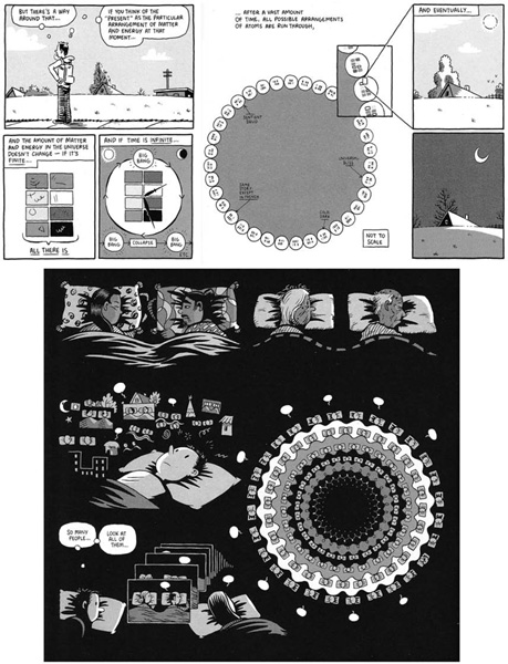
After Ware, the contemporary cartoonist most interested in the poetics or potential of the diagram is probably Kevin Huizenga, whose work had until recently only appeared in anthologies and self-published mini-comics. Huizenga’s comics, often motivated by large and abstract intellectual questions, consistently treat diagrams as one of many options for conveying these ideas. In the first issue of Ganges, for example, Huizenga’s eponymous protagonist Glenn Ganges contemplates the possibility that, given infinite time and a finite amount of matter in the universe, infinite combinations—like the books in Borges’s Library of Babel—would eventually bring about every possible universe. While Glenn is lost in these thoughts, the comic’s diegetic imagery disappears in favor of diagrams, which label some of the permutations of the many universes with “same story, except in French,” “sentient squid,” and “universal bliss” (see fig. 7.2).40 In a different story later in the same collection, as Glenn watches his wife sleeping, he imagines all the people over the centuries who have also lain awake watching their beloveds, and his thoughts dissolve into a mandala of paired heads on pillows, suggesting the infinite numbers of these human sleepers.41 The first of these examples is definitely a diagram; the second, a cartoon illustration of Glenn’s preoccupation. And yet they are nearly the same image: circular repetition implying infinite recursion, diminishingly small units, of which Glenn himself is part of only one. Proximity in these images implies a relationship of comparison, more than causation, and their relationship to the main world of Huizenga’s comic is neither entirely diegetic (Glenn doesn’t literally see these things) nor entirely non-diegetic (they are illustrations of what Glenn’s internal monologue describes). In a comic marked by graphical simplicity, these diagram-like comics are crucial to illuminating Huizenga’s ideas. It’s difficult to imagine these ideas conveyed visually without recourse to a diagram. Like Ware’s diagrams, as Tufte would suggest, they encode information densely; also like Ware’s diagrams, they offer an alternative to strictly diegetic imagery and its limited explanatory perspective.
Chris Ware’s diagrams are, thus, more than merely another complication in a complex graphic novel and more than merely another excursion into the realm of non-diegetic ephemera. As we have seen, Ware uses these diagrams to conceal and to reveal information that alters the emotional tenor of Jimmy Corrigan. Formally, by invoking the non-narrative aspects of the diagram— its capacity to use juxtaposition for non-temporal relationships of meaning— Ware’s diagrams suggest new possibilities of metaphor, meta-narrative, and other more “poetic” devices for the still-developing language of comics. It’s a testament to the pliability of this strange hybrid medium that it can so easily absorb the techniques of other media (film, theater, painting, prose), but the close relationship between comics and diagrams is as fundamental as the speech balloon. Ware’s diagrams, finally, help to remind us of this affinity, the basic connection between comics’ sequential images and the time-series in a chart, and to demonstrate the potential for formal invention that this affinity implies. The diagrams in Jimmy Corrigan, in particular, show not only the secret interrelations of his main characters, but also the capacity of comics at once to conceal and to reveal, to mean in multiple ways simultaneously.
Fig. 7.2. Two diagrammatic visions of infinity from Kevin Huizenga’s Ganges. Image courtesy of Kevin Huizenga. Kevin Huizenga, Ganges 1 (Seattle: Fantagraphics, 2006), n.p.
I owe several of this essay’s points (large and small) to conversations with my friend and frequent collaborator Mike Wenthe, who always deserves my grateful acknowledgment. I am also indebted to Kevin Huizenga, not only for granting permission to reproduce his work in this collection, but also for a conversation at the Small Press Expo that sparked my interest in the connection between comics and diagrams. Two of my former students, Shawn Cheng and Lindsay Nordell, significantly added to my understanding of Ware’s graphic design in essays they wrote when Jimmy Corrigan was hot off the presses. I would also like to thank the editors of this collection and my co-panelists at the 2007 MLA Convention, whose clear sight and energy saw the work into publication.
1. Here, I am not using the term diegesis in contrast to mimesis in the Aristotelian sense—that is, not to invoke a question of telling versus showing. (The visual aspect of a comic is straightforward mimesis or imitation, in the Aristotelian sense. As Aristotle uses these terms, the only diegetic element of a comic would be its narrative captions.) Rather, I mean diegesis in the sense that film scholars use the term, as distinct from the non-diegetic elements of a film: the soundtrack, the subtitles, and so forth, which are available to the viewer but outside the world of the film and its characters. Borrowing this terminology from film studies, the ordinary non-diegetic elements of a comic include labels, narrative captions, and, to an extent, sound effects or speech balloons (which denote diegetic sounds but in forms that the characters do not perceive).
2. See Thomas A. Bredehoft, “Comics Architecture, Multidimensionality, and Time: Chris Ware’s Jimmy Corrigan: The Smartest Kid on Earth,” Modern Fiction Studies 52 (2006) 869–90.
3. Chris Ware, Jimmy Corrigan: The Smartest Kid on Earth (New York: Pantheon, 2000), iii–iv. Further citations of this text will appear parenthetically in the body of the essay.
4. Scott McCloud, Understanding Comics: The Invisible Art (Northampton, MA: Kitchen Sink, 1993), 7–9.
5. McCloud famously categorizes panel-to-panel transitions into six types, all of which are narrative in nature except for the “non-sequitur” type. McCloud, Understanding Comics, 70–73.
6. This complicated narrative diagram also appears as the back cover of Chris Ware, Quimby the Mouse (Seattle: Fantagraphics, 2003).
7. See, for example, Ware, Quimby, 10.
8. In this case, the diagram may be more an expression of Ware’s effort and attention than a narrative or explanatory device: much of the graphic effort in the image goes to elements (like the manifold radiating lines) that carry little meaning. This profusion of effort for a few small jokes (for example, comparing the artist’s conducting, painting, and theater with God’s rock guitar, advertising, and pornography) is in keeping with the aesthetic of surplus detail and information that animates The ACME Report.
9. Thomas A. Bredehoft, “Comics Architecture, Multidimensionality, and Time: Chris Ware’s Jimmy Corrigan: The Smartest Kid on Earth,” Modern Fiction Studies 52 (2006): 885.
10. Of course, this is also the section of the book in which a gargantuan Superman—often, in Ware’s comics, a figure for the abandoning or abusive father—crushes Jimmy’s house (an imagined house in which he’s tucking in his imaginary son, Billy).
11. Bredehoft focuses on the diagram’s capacity to represent other, non-linear ways of construing time or narrative. He makes much of the “circularity” of this diagram, which begins and ends with the same view through the apartment window, altered by the progress of decades. Bredehoft, “Comics Architecture,” 879.
12. Gene Kannenberg Jr., “The Comics of Chris Ware: Text, Image, and Visual Narrative Strategies,” in The Language of Comics: Word and Image, ed. Robin Varnum and Christina T. Gibbons (Jackson: University Press of Mississippi, 2001), 174–83. See also Daniel Raeburn, Chris Ware (New Haven: Yale University Press, 2004), 18–21.
13. See Raeburn, Chris Ware, 23–26. Ware reacts to Goethe’s assertion that architecture is “frozen music” by writing, “This is, I think, the aesthetic key to the development of cartoons as an art form.” Chris Ware, The ACME Novelty Datebook (Montreal: Drawn & Quarterly, 2003), 190.
14. William Corrigan glazes the windows in the “Zoopraxographical Hall” at the Chicago World’s Columbian Exposition “for an Englishman” (254); though Muybridge isn’t mentioned by name, it must be his exhibit. The magic lantern slides tell a story with projected serial images on 136–38, and the fold-up zoetrope is on 22–23.
15. As Bredehoft points out, the structure of the zoetrope prevents it from telling an extended narrative, or indeed any narrative that “escapes the essential circularity of its mechanism.” Every set of zoetrope images must return frequently to its original position and go through the same motions again. Bredehoft extends this claim, too, suggesting that this device “raises the question of how the particular architecture of comics does and does not constrain comics narratives in terms of time and sequence.” Bredehoft, “Comics Architecture,” 871. In some ways, diagrams raise the same question, but they also offer alternative answers that can expand the ways a comic describes or construes time.
16. McCloud, Understanding Comics, 8.
17. For an analysis of Ware’s use of slowness in his comics, see Georgiana Banita’s essay in this volume.
18. Art Spiegelman, “Comix: An Idiosyncratic Historical and Aesthetic Overview,” in Art Spiegelman: Comix, Essays, Graphics, & Scraps: From Maus to Now to “Maus” to Now (Palermo: Sellerio Editore—La Centrale dell’Arte, 1998), 77.
19. Spiegelman, “Don’t Get Around Much Anymore: A Guided Tour,” in Art Spiegelman, 8.
20. McCloud, Understanding Comics, 49. Unlike words, however, cartoon drawings remain natural rather than arbitrary symbols. Even McCloud’s highly abstracted stick-figure face resembles a human face in important ways; a cartoon drawing of a tree will look like a (perhaps highly generalized) tree, rather than being an unrelated set of marks (T-R-E-E) or sounds (el arból).
21. Chris Ware, qtd. in Raeburn, 20.
22. Raeburn, Chris Ware, 20, quoting Spiegelman, “Comix,” 74. Spiegelman, in turn, attributes this observation to the cartoonist Wally Wood, though he supplies no source for the anecdote.
23. McCloud, Understanding Comics, 41–43. For a thorough dismantling of McCloud’s theory, see Jonathan Frome, “Identification in Comics,” Comics Journal (April 1999): 82–86. Frome perceptively points out, for example, that a flat character or a cruel villain, drawn in the same style as an interesting, sympathetic protagonist, would not encourage the same sort of reader identification; Charlie Brown encourages more identification than “a nameless boy with no story context” because readers are led to identify with fictional characters by story and personality, not because of the way they’re drawn (ibid., 82). The cats in Maus are drawn just as “iconically” as the mice, but the Nazis are rarely individualized enough to merit a reader’s sympathy. Personally, I find it incredible that McCloud’s assertions about reader identification have survived in our critical discourse for as long as they have.
24. For a report on the psychology of facial expressions, see Malcolm Gladwell, “The Naked Face,” New Yorker, August 5, 2002, 38–49.
25. The full-face view of James’s deceased mother in his keepsake photo (145, 264) is thus all the more haunting.
26. The distinction between arbitrary and natural signifiers hearkens back to the linguistic theory of Ferdinand de Saussure. According to Saussurian linguistics, ordinary linguistic signs (words) do not resemble the things they represent; the connection between sign and signified is therefore arbitrary. Even the most “iconic” drawing of a face or a teacup resembles the object it represents; some standard comics iconography (like the thought balloon) begins to drift into arbitrary signification, but the drawings themselves remain natural and not arbitrary signs. Ferdinand de Saussure, Course in General Linguistics, trans. Wade Baskin (New York: McGraw Hill, 1966).
27. It’s worth remembering, however, that complex and nuanced effects are also possible in comics that take up a much more particularized, much less iconic drawing style. Eddie Campbell’s pen-and-ink cartooning, for example, relies on sketchy, impressionistic renderings of appearance, rather than static iconic forms.
28. In particular, see Edward Tufte, The Visual Display of Quantitative Information, 2nd ed. (Cheshire, CT: Graphics Press, 2001).
29. Edward Tufte, Envisioning Information (Cheshire, CT: Graphics Press, 1990) 82.
30. Tufte, Visual Display, 107–8.
31. Raeburn also mentions the vibrational effect of color in this panel. Raeburn, Chris Ware, 71.
32. In Understanding Comics, McCloud also conjures up Muybridge’s time-series photographs (and other technologies of the moving image) in a discussion of the ways in which comics depict movement (108–10).
33. Tufte, Visual Display, 36.
34. Edward Tufte, Visual Explanations: Images and Quantities, Evidence and Narrative (Cheshire, CT: Graphics Press, 1997), 61.
35. Several of these appear in Tufte, Visual Explanations, 105–9. See also Tufte, Visual Display, 42.
36. Tufte, Visual Display, 48, 49, 103, 129.
37. See, for example, Dan Zettwoch’s character model-sheet diagrams in “Storm of the Hillsmen,” in Kramers Ergot 7 (Oakland, CA: Buenaventura, 2008), 40, or his multiple cutaways and instructional illustrations of the haunted-house illusion in “Cross Fader,” in Kramers Ergot 6 (Oakland, CA: Buenaventura and Avodah Books, 2006), 6–13. Posy Simmonds illustrates Gemma Bovery’s fantasy of a life with her young French lover (and a job as a professional interior designer) with an elaborate allegorical diagram-cum-frontispiece: Gemma Bovery (New York: Pantheon, 1999), 70.
38. Peter Blegvad, The Book of Leviathan (Woodstock, NY: Overlook, 2000), 26–27, 156.
39. Paul Auster, Paul Karasik, and David Mazzucchelli, Paul Auster’s City of Glass (New York: Avon, 1994), 15–23, 27–29, 38–45, etc.
40. Kevin Huizenga, Ganges 1 (Seattle: Fantagraphics, 2006), 3.
41. Ibid., 28. Further impressive diagram-comics happen in Huizenga’s self-published “Gloriana” (Super Monster 14), which was republished as Or Else 2 (Montreal: Drawn & Quarterly, 2005).