WWW To download the web content for this chapter go to the website www.routledge.com/cw/wright, select this book then click on Chapter 2.
Pulling keys is a core skill for artists compositing visual effects. For bluescreen and greenscreen shots we have excellent keyers such as Keylight and Primatte, but we start here with a variety of ways of pulling keys in general – and save the keyers for the following chapter. There are two reasons for this. First, as you will see in the next chapter on keyers, we often have to pull “auxiliary keys” to assist the keyer, and we should have that information before tackling the keyers. Second, we frequently have to pull keys for non-greenscreen tasks. For both of these missions we will need an array of techniques for pulling keys on arbitrary targets in arbitrary scenes. So this chapter is about a million ways to pull a key.
The Terminology Turmoil – the language of visual effects has accumulated terminology over the years from a variety of different disciplines such as visual effects, video and CG animation. As a result we have four different words for the same thing here – key, matte, mask, and alpha – all of which do essentially the same thing, namely use a one-channel grayscale image to mark regions that are “inside” and “outside”. What is inside or outside simply depends on how you use it. Here is a micro-glossary of our “key” terms (sorry about that) as seen from the perspective of their historical origins, so you can see why there is so much confusion:
- Matte – (film opticals) a one-channel image that isolates a target object from its background for compositing.
- Key – (video) a one-channel image that isolates a target object from its background to isolate it for special treatment like color correction or blurring.
- Mask – (visual effects) a one-channel image that isolates a target object for special treatment like color correction or blurring.
- Alpha – (CG animation) a one-channel image created by the CG renderer to isolate the foreground image from the background image for compositing.
Note that you could, by the above definitions, take an alpha channel from a CG render and use it as a mask for a color correction operation. Or draw a mask for a color correction operation then turn around and use it as a key in a composite. In this book I switch terminology apropos the topic (i.e. “alpha” for CG, “key” for keyers, etc.), but hopefully this explanation will help you understand that they are not fundamentally different things.
This chapter on keying contains a major section on rotoscoping because that is yet another way to create a key that does not use a keyer. It also fits well in a chapter about a million ways to pull a key because I teach my students to “key what you can, then roto the rest”. The roto information provided herein is designed to make your roto work faster and better. There are tips on organization, keyframing strategies, how to roto special problems like motion blurred objects, and several inspection techniques so that you find the problems, and not your boss.
First up on the keying hit parade is the ever-popular luma key. Luma keys get their name from the world of video where the video signal is naturally separated into luminance (brightness) and chrominance (color). A luma keyer isolates some range of the luminance values of an image to create the key. This key can then be used in any number of ways to isolate an item of interest for selected manipulation like color correction or blurring.
Luma keys are simple to create and flexible in their use because the target is often darker or lighter than the rest of the picture so this lightness or darkness can be used as the criteria of the key. Of course, they are usually mixed with other objects of the same luminance so we need techniques for isolating the one we want. This section describes how luma keyers work, their strengths and weaknesses, and how to make your own customized versions to solve special problems.
A luma keyer takes in an RGB image and first creates a luminance version of it, which is a monochrome (one-channel grayscale) image. A threshold value is set, and all pixel values greater than or equal to the threshold are set to 100% white, while all pixel values less than the threshold are set to black. Of course, this will produce a hard-edged key that is practically useless in the real world, so luma keyers typically have two settings: one for the black threshold and one for the white threshold. More on this shortly.
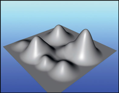
My favorite visualization of a luminance key is to imagine a luminance image laid down flat on a table and the pixels pulled up into mountains. The height of each “mountain” is based on how bright the pixels are. Bright pixels make tall mountain peaks, medium-gray makes low rolling hills, and dark pixels make valleys like those shown in Figure 2.1.

Figure 2.1
Monochrome image visualized as brightness “mountains”

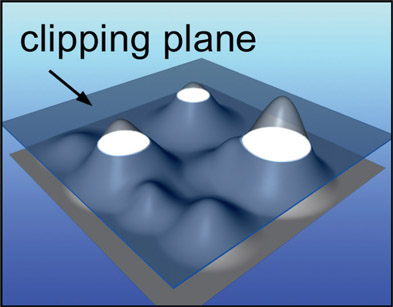
Figure 2.2
Clipping plane clips the tallest (brightest) mountain peaks
You can now imagine the threshold point of the luma key as a clipping plane that slices off the peaks of the mountains like Figure 2.2. The white areas are the intersection of the clipping plane with the mountain peaks and form the resulting luma key.
This metaphor provides a number of interesting insights to the luma key. The first and most obvious issue is how there are several mountain peaks sliced off by the clipping plane, not just the one we may be interested in. This means that the luminance key will have “snared” unwanted regions of the picture and this is one big problem with luma keys – they are not very discriminating. Some method will have to be devised to isolate just the item we are interested in. Another point is how the clipped regions will get larger if the threshold point (clipping plane) is lowered and smaller if it is raised, which expands and contracts the size of the key. Yet another problem with luma keys is that your target object might have a lot of variation in its luminance, which results in the luma key snaring most of the picture and is not at all helpful. We may need to switch to a more discriminating type of key such as a chroma key.
There are two approaches to the problem of snaring more regions than you want. The first is to garbage matte the area of interest. Crude, but effective, if the garbage mattes do not require too much time to make. The second approach entails altering the heights of the “mountain peaks” in the luminance image so that the one you are interested in is the tallest. This is covered in the following Section 2.1.2: Making Your Own Luminance Image.

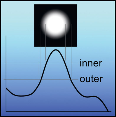
Figure 2.3
Inner and outer thresholds for soft edge key
Simply binarizing the image (separating it into just black and white pixel values) at a single threshold value creates a very hard edged key, but most uses require a soft edge. The soft edge issue is addressed by having two threshold values in the luma keyer settings. One setting is the inner, 100% density edge, and the other is the outer 0% density, with a gradient between them. Switching to a cross section view of one of the “mountain peaks” in Figure 2.3 it can be seen how these inner and outer settings create a soft edged key. Everything greater than the inner threshold value is pulled up to 100% white. Everything below the outer threshold value is pulled down to a zero black. The pixels in-between these two values take on various shades of gray, which creates the soft-edged key shown in the inset above the mountain peak.
There are two important things to be aware of about the luminance image that is generated internally by the luma keyer. The first is that there are a variety of ways to calculate this luminance image, and some of these variations might isolate your target better than the default. The second thing to be aware of is that it does not have to be a luminance image at all. Luma keyers will accept monochrome (one channel) images in addition to RGB images as inputs. We can take serious advantage of this fact by feeding it a customized monochrome image that we have created that better isolates the target.
The normal idea of a luminance image is to convert a three-channel color image to a monochrome image, such that the apparent brightness of the monochrome image matches the apparent brightness of the color image to the human eye. As usual, this is more complicated than it first seems. The obvious approach of simply taking 1/3 of each of the three channels and summing them together doesn’t work because the eye’s sensitivity to each of the three primary colors is different. The eye is most sensitive to green, so it appears much brighter to the eye than equal values of red or blue.
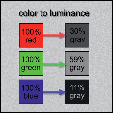
Figure 2.4 shows how the eye responds differently to the three primary colors as luminance by taking a set of three color chips made up of primary colors. While each chip is 100% of its pure color, when converted to luminance they each produce a different gray. The 100% red chip produces a 30% gray, the green chip a 59% gray, and the poor blue chip a paltry 11% gray.
Here’s the point: if you do not create the luminance image with the proper proportions of the red, green and blue values that correctly correspond to the eye’s sensitivities, the results will look wrong. A simple 1/3 averaging of all three colors would result, for example, in a blue sky looking too bright because the blue would be over-represented. A green forest would appear too dark because the green would be under-represented. One standard equation that mixes the right proportions of RGB values to create a luminance image for a color monitors is:
| Equation 2.1 |
This means each luminance pixel is the sum of 30% of the red plus 59% of the green plus 11% of the blue. Be advised that the exact proportions differ slightly depending on what colorspace you are working in, so they may not be the exact values used in your luma keyer. And, of course, these percentage mixes can be different for media other than color monitors. If your software has a channel math operation then you can use it to create your own luminance images using Equation 2.1.
But making a luminance image that looks right to the eye is not the objective here. What we really want is to make a luminance image that best separates the target from the surrounding picture. Armed with this information you can now think about “rolling your own” luminance image that better separates your target by juggling the relative values of the red, green, and blue channels. Some luma keyers allow you to juggle the RGB ratios within their settings. Try different settings to make your target item stand out from the background better. If your luma keyer does not permit you to tweak the RGB values then feed it a luminance image you created externally with some other method such as a monochrome node that does allow you to adjust the RGB mix ratios.

Figure 2.5
Flowgraph for generating a custom luminance image
If your monochrome operation does not permit you to change the RGB mix proportions then another way you can “roll your own” luminance image is with a color curve or other operation in your software that allows you to scale the RGB values individually, then sum the RGB channels together. The flowgraph in Figure 2.5 shows the sequence of operations. The RGB image goes into the color curve, where each color channel is scaled to the desired percentage mix value as shown in Figure 2.6. The 3-channel output goes to a channel split operation so the R, G, and B channels can be separated then summed together to create a custom luminance image with the attributes you need. This luminance image is then connected to the luma keyer to pull the actual key.
Another approach is to not use a luminance image at all. The luma key process is simply based on the brightness values in a monochrome image. This-one channel image is usually created by making a luminance version of the color image, but it is not against the laws of man or nature to make the one-channel image in other ways. For example, just separate the green channel and pipe it into the luma keyer. Perhaps the blue channel has a better separation of your target from the rest of the picture, or maybe a mix of 50% of the red channel plus 50% of the green channel will work best. It totally depends on the color content of your target and the surrounding pixels. Unfortunately, the RGB colorspace of an image is so complex that you cannot simply analyze it to determine the best approach. Experience and a lot of trial and error are invariably required. Fortunately, the iterations can be very quick and a good approach can usually be discovered in a few minutes.
Perhaps you are using some primitive software that does not have a luma keyer, or you don’t like your luma keyer for some reason. Maybe you just want to demonstrate your pixel prowess. Fine. You can make your own luma keyer using a color curve node, which every software package has. The first step is to make your best monochrome (one-channel) image that separates the target from the background using one of the techniques described above, then pipe it to a color curve node to scale it to a “hicon” (high contrast) key.
So, how do we set up the color curve demonstrated in Figure 2.7? The target is the white letter “A” in the target image on the left, a deliberately easy target for demo purposes. The color curve labeled “hard clip” uses a single threshold value, but this results in a hard key with jagged edges (the effect is exaggerated for demo purposes). The color curve labeled “soft clip” shows a slope introduced to the color curve to create a soft edge for the key. The gentler the slope of the line, the softer the edge. Of course, nothing says that the target object will be the white object. A black object could be the target, so in that event the color curve would be set to pull all pixels lighter than the black target pixels up to 100% white. This produces a black key on a white background, which can be inverted later if needed. Alternately, the color curve could pull the black pixels up to 100% white and all others down to black to produce a white key on a black background directly.
WWW Fig 2–7 luma key target.tiff – use this image to test your skill at a soft-edged luma key for an easy white target.
Very often the target object is a middle-gray, like the big gray “A” in Figure 2.8. The pixel values of the target object are pulled up to 100% white with the color curve, and all pixel values greater and less than the target are both pulled down to black. The sloped sides ensure a nice soft edge to the key. Occasionally the luma key is pulled on the darkest or lightest element in the frame so the simple soft clip shown in Figure 2.7 can be used, but most often it will be some middle gray like this example where you have to suppress pixels that are both lighter and darker than the target.
WWW Fig 2–8 luma key target.tiff – use this image to test your skill at a soft-edged luma key for this less easy middle-gray target.

Figure 2.9 Details of a luma key scaling operation
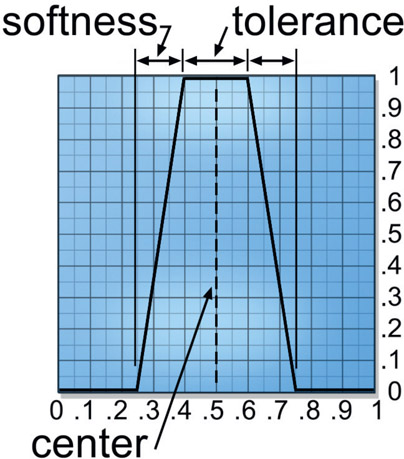
Figure 2.9 shows the details of shaping the luma key with a curve in the color curve node. The “center” represents the average luminance value of the target. The “tolerance” is how wide a range of luminance will end up in the 100% white region of the resulting key. The “softness” reflects the steepness of the slope between black and white, and the steeper this slope the harder the key edges will be. Only four control points are needed to adjust the tolerance and softness. Measuring a few pixel values will give you a starting point, but you will probably end up adjusting the four control points visually while watching the resulting key in order to see the effects of the changes to the tolerance and softness.
Rolling your own luma key with a color curve like this does have one distinct advantage over the off-the-shelf luma keyer, and that is the ability to adjust the curvature of the curves – they don’t have to be the straight lines of a regular luma keyer. This gives you one more layer of control over the edges of your key, and in compositing control is the name of the game.
To summarize the homemade luma key process, Figure 2.10 shows a flowgraph of the operations described above. The RGB image is piped into a “monochrome” node, which makes a luminance version of color images. Hopefully yours has internal settings that can be tweaked for best results. The mono image is then piped to a color curve to scale it up to the final key. Alternately, instead of the mono node, a single channel of the RGB image might be used, or perhaps some mix of two channels as described above for making your own luma keys.
Chroma keys also get their name from video work where the video signal is naturally separated into luminance and chrominance. They are more discriminating than color-blind luma keys for isolating a target because they consider both the chrominance (color) and luminance (brightness) of the image to create a key. The chroma key too, comes with a list of limitations and liabilities which are explored in this section along with some workarounds and how to make your own chroma key.
A chroma keyer takes in the RGB image and converts it to an HSV (Hue, Saturation, Value or, if you prefer, color, saturation, brightness) or HSL type of representation internally. The reason that the original RGB version is not used internally is because the keyer needs to distinguish between, say, the level of saturation, which is not an RGB attribute, but is an HSV attribute. A starting pixel value is set which represents the “center” of the chroma key. Then separate ranges are set for Hue, Saturation, and Value. Pixels within these ranges go to 100% white, and those outside go to black. Of course, this would result in a very hard-edged key, so any chroma keyer worth its pixels also allows you to set tolerances for each setting to give you a nice soft-edged key.
The chroma key is very flexible for two important reasons. First, it allows you to go after any arbitrary color. It does not have to be a carefully controlled greenscreen, for example. Second, it accommodates the natural variations in the color of real surfaces by having saturation and value ranges to expand its window of acceptance. If you examine the color of skin, for example, you will find that the shadow regions not only get darker, but also have lower saturation. To pull a key on skin, therefore, you need something that will not only select the RGB color you picked for the main skin tone, but also follow it down into the shadows with lower saturation and brightness.
Having said all that, let me also say that the chroma key is not a very high quality key. It is prone to hard edges that require blurring, eroding, and other edge processing to attempt to clean up. It also does not do semi-transparent regions very well at all. Like the color-blind luma key it will also snare parts of the picture you don’t want, so you end up spending time creating garbage mattes to keep the intended target.
You must also never use a chroma keyer for greenscreen keying, except to pull garbage mattes in preparation for more sophisticated matte-extraction processes by a real keyer. For greenscreen work it is terrible for edge-blended pixels – those wisps of blonde hair mixed with the greenscreen, for example.

Figure 2.11 Flowgraph for combining multiple chroma keys
Some of the shortcomings of the chroma key can be compensated for by pulling several chroma keys and combining them with a maximum operation. That is to say, use a maximum operation to merge several chroma keys together as shown in the flowgraph in Figure 2.11. Each chroma key pulls a key from a slightly different region of the color-space so that, when combined, they cover the entire target.
You can roll your own chroma keyer rather like we did with the luma key in Section 2.1.3: Making Your Own Luma Keyer. Start with an operation that converts the RGB image to HSV, then pipe the HSV image to a color curve. Keep in mind that the RED curve now has Hue data, the GREEN curve has Saturation, and the BLUE curve has Value (brightness). You can now adjust the three curves to include/exclude the different ranges of Hue, Saturation, and Value of the target object.
The next step is to multiply all three channels together to produce the key. From a work-flow standpoint you would then go back to the color curve operation and refine the curves to get coverage of the target object. Following that you might refine the resulting key by increasing contrast, garbage matting, dilating and blurring the thing. Because you are using the color curve node you now have the option of adjusting the curvature of the curves to refine edges even further.
While an interesting exercise to think about, unlike the luma key where we can actually make substantial improvements over the basic luma keyer if we are clever, making your own chroma keyer will probably be more hassle than its worth. You might try it once to test your mettle, but an off-the-shelf chroma keyer is hard to improve upon.
WWW Chroma key target.tif – use this colorful image to test your skill at pulling chroma keys on various parts of the picture. Also great content for trying different luma keys.
Here is an interesting and flexible variation on the chroma keyer theme that you can make at home. While it is based on utterly different principles than the classic chroma keyer that converts the image to an HSV type of representation to work from, it is still based on the specific color of the item of interest, not simply its luminance. Since it is based on making a key for any arbitrary color, I have tossed it into the chroma key category. It is actually a three-dimensional color keyer that uses a grossly simplified version of the operating principles of Primatte.

Figure 2.13
Green backing pixels plotted in RGB color cube
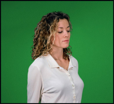
As you may know, any given pixel can be located in an RGB color cube by its RGB code values. If we imagine a normal three-dimensional coordinate system labeled RGB instead of XYZ, we can imagine any given pixel being located somewhere in this “RGB cube” by using its RGB values as its XYZ location coordinates. We could then take a greenscreen plate like the one in Figure 2.12 and plot the location of just the green backing pixels in this RGB cube. Since all of the pixels in the green backing part of the picture have very similar RGB values, they would all cluster together into a fuzzy green blob like the one shown in the RGB cube of Figure 2.13.
Now, what if we could isolate this little constellation of green pixels? Suppose we picked a point right in the center of the green pixel constellation by choosing the appropriate RGB value, then measured the distance between this center point and all of the pixels in the image. The green backing pixels all hover in the vicinity of the center point, so the distance to them would be zero or close to it. All other pixels would be located much further from the center point, giving them distance values much greater than zero.
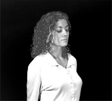
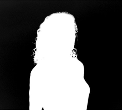
Suppose, further, that we created a new version of the greenscreen image that showed the distance each pixel is from this center point – call it a distance map. Pixels very close to the center point would be black because their distance to the center point is at or near zero. The entire green backing region would therefore be black, while the skin pixels, being further away, would have some shade of gray. What we wind up with is a grayscale image of the same picture with the brightness of each pixel indicating its distance from the green backing color, like the distance map in Figure 2.14. The closer a pixel is to the center point RGB value the blacker it is. By using a color curve to separate the black “near” pixels from the lighter “far” pixels, a hicon key can be made like the one in Figure 2.15.
This three-dimensional color key can be created for any arbitrary RGB value, not just a bluescreen or greenscreen, which is what makes it as flexible as the chroma key. The target color’s RGB value is used as the center point, then the distance map is created relative to it. If the skin tones were used for the center point, the skin would have been black and all other pixels shifted in gray value to reflect their “RGB distance” from this new center point in the color cube.
Now the icky part – the math. It is simply based on the trigonometry equation for calculating the distance between two points in 3D space. You might remember from your favorite trig class; for point 1 located at x1, y1, z1 and point 2 located at x2, y2, z2, the distance between point 1 and point 2 is
| Equation 2.2 |
To apply this equation to our key, point 1 becomes the center point RGB value and point 2 becomes the RGB value of each pixel in the image, with all RGB values represented as floating point values between 0 and 1.0. This means that the smallest distance value we can get is 0 and the largest is 1.0, which results in a grayscale image with pixel values ranging between 0 and 1.0. To reformat the trig equation for RGB colors it becomes:
| Equation 2.3 |
Where R1G1B1 is the normalized value (floating point values between 0 and 1.0) of the center point, that is, the color you want to isolate, and R2G2B2 is the normalized value of each pixel in the image. This equation can be entered in a math node or some other expression format that your software supports and you can create your own three-dimensional chroma keys. Good hunting!
WWW Fig 2–12 greenscreen.tiff – use this greenscreen image to see if you can make a 3D chroma keyer.
Difference mattes are one of those things that sounds really great until you try it. They don’t work very well under most circumstances and have nasty edges in almost all situations. Their most suitable application is usually garbage matting. However, for those occasional situations where they might be helpful, the difference matte is herein presented, warts and all. I am using the word “matte” here because in visual effects it is traditionally referred to as a “difference matte” rather than a “difference key”.
The difference matte works by detecting the difference between two plates, one plate with the target object to be isolated, and the other a clean plate without the target. For example, a scene with the actor in it, and the same scene without the actor. This obviously requires the scene to be shot twice with either a locked off camera or, if the camera is moving, two passes with a motion control camera. In the real world this rarely happens, but under some circumstances you can create your own clean plate by pasting pieces of several frames together. However it is done, a clean plate is required.
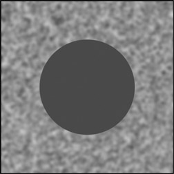
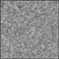
A target over its background is illustrated with the monochrome image in Figure 2.16. This simplified example will make the process much easier to follow than a color image with complex content. The background is the speckled region and our target is the dark gray circle, which is standing in for the actor. Figure 2.17 represents the clean plate. To create the raw difference matte the difference is taken between the target and clean plates. For those pixels where both plates share the common background, the difference is zero. Those pixels within the target have some difference compared to the clean plate. That difference may be small or large, depending on the image content of the target relative to the clean plate.
In the real world, the background region in the target and clean plates are never actually identical due to film grain plus any other differences in the clean plate such as a small change in lighting, a leaf blown by the wind, or a camera that has been bumped. This will show up as contamination of the black background region.
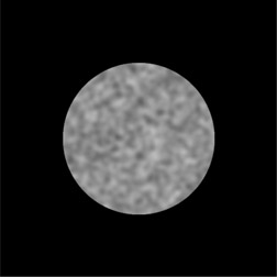
The raw difference matte produced by the difference operation can be seen in Figure 2.18. Note that it is not a nice 100% clean white matte ready to go. It has all kinds of variations in it due to the fact that the background pixels are of varying value and the foreground pixels are also of varying value so the results of their differences will also be of varying values. To convert the low density raw difference matte into a useable solid hicon matte like Figure 2.19 it needs to be scaled up to 100% white and any noise in the background region scaled down to zero. This scaling invariably results in the jaggy edges you see here.
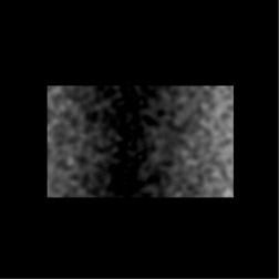
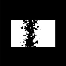
Now for the bad news. Remember those pixels in the target mentioned above that were close in value to the pixels in the clean plate? They and their close associates spoil the difference matte. Why this is so can be seen in Figure 2.20, which represents a slightly more complex target. This target has pixels that are both lighter and darker than the background, and some that are equal to it. So when the raw difference matte is derived in Figure 2.21 there is a black strip down the center because those pixels in the target which are close to the pixel values in the background result in differences at or near zero. Both the left and right ends are brighter because they are much darker or lighter than the background resulting in greater difference values.
When the raw difference matte is scaled to create the solid hicon version shown in Figure 2.22 there is a serious “hole” in the matte. And this is the problem with difference mattes. The target object will very often have pixel values that are very close to the background resulting in holes in the matte. The raw difference matte normally must be scaled up hard to get a solid matte for these small difference pixels, and this produces a very hard-edged matte overall. However, there are occasions where the difference matte will work fine, so it should not be totally dismissed.
For reasons that are now all too obvious, some software packages do not offer a difference matte feature, but you can make your own. The math behind the difference matte is simply the absolute value of image A minus image B, with one being the clean plate and the other being the target plate. It does not matter which image is subtracted from which. When subtracting any two images there will necessarily be some negative code values that we need to recover and use as part of the difference matte. It is the absolute value operation that recovers those negative code values.
Making your own difference matte is a two-step process. First, create the difference image by taking the difference between images A and B – which will result in a three-channel image. Then, convert that three-channel difference image into the one-channel difference matte. Following is the procedure.
There are three ways you can make a difference image. The first is that your software has a built in “difference” operation. If this is the case we are done and you can skip down to Section 2.3.2.2: Making the Difference Matte below. The second method is to use a math node and enter the difference equation:
| Equation 2.4 |
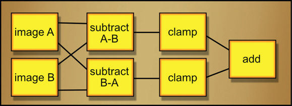
The third way is to use discrete nodes to perform the difference operation thusly:
Note the clamps in the flowgraph of Figure 2.23. They are essential because without them the resulting negative code values would cancel the subtractions out resulting in a big black zero after the “add” node. However you do it, start by getting the RGB difference image, which is then made into the difference matte.

Figure 2.24
The complete workflow for making a difference matte
Starting with the RGB difference image from above, it has to be converted into the one channel matte then dialed in (adjusted). In order to use every scrap of image data for the matte the first step is to sum all three RGB channels to a one-channel image. That one-channel image is then piped into a color lookup node and dialed in. The parts of the matte that represent the target are pulled up to 1.0 and all else is pulled down to zero.
The complete workflow is illustrated in Figure 2.24. Images A and B are frames with and without the target – the boy, in this example. Following them, the difference image is the result of the absolute value of the subtraction of images A and B. The one-channel difference image is the result of summing all three RGB channels, then the final difference matte is the result of piping it through the color lookup node to dial in the hicon matte. Make sure the output of color lookup node is clamped to keep all code values between zero and 1.0.
As you can see from this real-world example the results are less than stellar, which is the main problem with the difference matte to begin with. That, and the nasty hard edges you invariably end up with. Note that the one-channel difference matte has a halo around the character where we might expect black. That is due to the boy’s shadow landing on the rock wall, which altered its brightness between the two frames. The presence, then absence, of the character in a shot will cause lighting differences which show up in the difference matte. However, the results are very dependent on the picture content so in some situations you might actually get something useful. It is usually worth a quick test.
WWW Fig 2–24 A and B.tiff – try your hand at creating the difference image then the hicon difference matte with your software.
Here is a sweet little number that you will find indispensable perhaps only once or twice a year, but when you need it, there is no other game in town. The situation is that you need a matte for the bumps of a rough surface – a stippled ceiling, the textured grass of a lawn, the rough bark on a tree, etc. You want to isolate and treat the bumpy bits, perhaps to suppress, color, or highlight them. The bump matte will give you a matte of just the bumps – and here is the really sweet part – even when they are on an uneven surface.
A luminance key will not do. Because of the uneven brightness, many of the bump tips are darker than the brighter regions of the surface. An edge detect will not do. That will give you little rings around the bumps, not the bumps themselves. You need a method that just lifts out the bumps, regardless of their absolute brightness. The bump matte is based on the local brightness of the region immediately surrounding each bump, so it continuously adapts to the variation in brightness everywhere in the picture.
The idea is to make a luminance version of the target plate that makes the bumps stand out as much as possible. This luminance version is then blurred and subtracted from the original bumpy luminance version. Wherever the bumps stick up above the blurred plate you will get a little matte point.
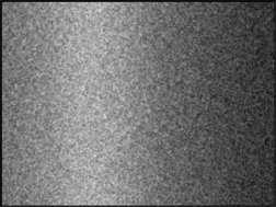
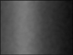
Figure 2.25 represents a generic bumpy surface. Note how the left edge is a medium brightness, it gets brighter towards the center, then gets much darker towards the right edge. This is not a flat, evenly lit surface. Figure 2.26 shows the blurred version of the original bumpy plate, and Figure 2.27 shows the resulting bump matte. Note how each bump became a matte point even though the surface was unevenly lit. It is as if the bumps were “shaved off” the main surface in Figure 2.25 and laid down on a flat surface.
The action can be followed in the slice graph in Figure 2.28 where a slice line has been drawn horizontally across the bumpy target image in Figure 2.25. The bumps in the image create the bumpy slice line. After the image is blurred, the bumps are all smoothed down, but the overall contours of the surface are retained in the slice line labeled “blurred”. The blurred surface will in fact be the average of the bumpy surface. When the blurred plate is subtracted from the bumpy plate all of the bumps that stick up above the blurred version are left as the bump matte shown at the bottom of Figure 2.28.
Figure 2.29 shows an important refinement of the matte where the matte points have been increased by first lowering the blurred plate a bit before the subtraction operation. Simply subtracting a small value (such as 0.05) from the blurred plate “lowers” it so that the remaining bumps stick up higher. The resulting matte has both larger and “taller” (brighter) matte points. Increasing and decreasing the amount of blur is another refinement. The greater the blur, the larger the bumps that will be trapped in the bump matte.
Figure 2.30 illustrates a flowgraph of the bump matte operations. Starting with the target image on the left, the luminance version is created. Next it is blurred, then a small constant such as 0.05 may be subtracted from it to increase the size of the bumps in the map. If you want to decrease the size of the bumps then you would add a constant instead. The adjusted blurred image is then subtracted from the luminance image of the target plate.
WWW Fig 2–25 bump surface.tif – see if you can create a bump matte from this image.
In the real world of compositing we are often required to pull a key to isolate some arbitrary object in an arbitrary scene. Here the problem is that we do not have a nice clean uniform backing region, like with a greenscreen, to which we can apply a few simple rules to create a nice key. Under these circumstances an entirely different approach is needed. For these situations I offer the color difference key.
Simply put, the idea is to take advantage of the differences between the color channels of an image to create a key for an arbitrary object. We already saw how one color channel might be used to pull a luma key. Here we take it up a notch to basically bounce one color channel off of another to get our key by subtracting all possible combinations of the three color channels from each other and picking through the results to find what will help to build a key for the target object. Using Figure 2.31 as a super-simplified training example, the main image has a soft purple spot (our target) over a brown background. The RGB values of the target and backing are printed for easy reference. With 3 color channels there are exactly 6 possible combinations of subtracting one channel from the other – blue minus red, red minus blue, red minus green, green minus red, green minus blue and blue minus green – all 6 of which are displayed around the main image. Note that the results of each combination are different.
Taking the upper left gray image as an example, it is labeled B-R, meaning “blue minus red”. Its resulting code values are printed for the backing region (–0.2) and the target object (0.2). We can follow the math starting with the brown backing region with an RGB value of 0.3 0.2 0.1. If we take blue minus red where red = 0.3 and blue = 0.1, we get 0.1 minus 0.3 which equals –0.2. Note that this is a negative number so because we are working with floating point values the results must be clamped to zero for this to work. If you are using an integer based system it will automatically clamp the results to zero for you because they do not support negative numbers. For the purple target object the same blue-minus-red operation gives a completely different result, 0.2, because for the target object red = 0.5 and blue = 0.7, so 0.7 minus 0.5 = 0.2. These are the color differences that we can use to make a key.
Looking around the circle of all the possible subtracted images you can see that each one returns a completely different result for the backing and target regions. We take advantage of this fact to make our key by selecting the best one to scale up to a hicon black and white matte. In this example that would be the B minus G case as it would require the least amount of scaling to make it black and white.
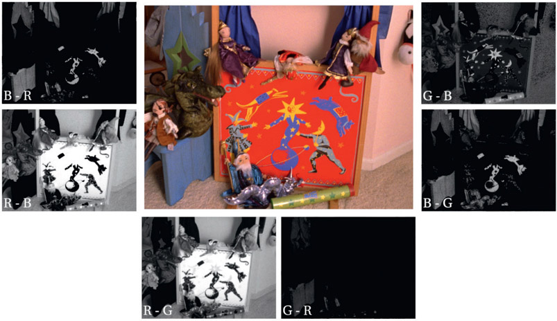
When we take a look at the real world example in Figure 2.32 it becomes clear that the real world is more complex. Again, all six possible combinations of subtracting the channels are presented for inspection. Let’s say that we want a key for just the blue objects painted on the face of the puppet stage. Upon inspection it appears that both B minus R and B minus G give useful results. So which should we use? The answer is: both of them!
The idea is that there might be several useful results that we can sum together to build up the final key. The step-by-step procedure is illustrated in Figure 2.33. First we take the two promising mattes, B minus R and B minus G and sum them together. This builds up the density of our raw key so we don’t have to scale it up so hard to get a solid key. Next, the raw key is scaled up to make a hicon key, then finally the target objects are garbage matted out to remove the inevitable unwanted items. Again, be sure to add a clamp after every subtraction so that the negative values don’t cancel out the positives.

Figure 2.32 All possible color difference mattes for a real shot

Figure 2.33
Creating a key using multiple color difference mattes
More than simply summing one or two of the various color difference mattes, in some cases you can improve your key by subtracting one of the other mattes to suppress those pesky unwanted objects that got caught in your key. So the process is to first set up all six possible color difference subtractions, inspect them all, then choose those that will build up your target key. Then (if possible), subtract one that will suppress unwanted elements. Finally, scale the results to a solid hicon matte and garbage matte out the rest.
One obvious question about now is why not just use a chroma key? After all, it is keying on the color of the target object and is highly selective. My advice is to first try a chroma key, because it is quick. If it works and produces nice edges then you are done. If not, break out the color difference key because it will usually give you much nicer edges than the chroma keyer.
WWW Fig 2–32 color diff key.tif – try your hand at some color difference keys with this colorful image.
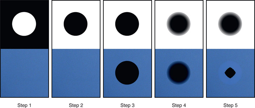
There are several sections of this book (one coming up shortly) that use what I call the “blur and grow” technique to extend the edges of an RGB image much better than a regular dilate operation. “Blur and grow” is a generally useful technique that you should have at your disposal because of its many applications to compositing. Figure 2.34 shows the steps using a grainy piece of bluescreen below with its matte above. In this demo we will first punch a hole in the bluescreen then fill it in with the blur and glow technique. This technique is also applicable to making clean plates for greenscreens, removing tracking markers, and a myriad of other useful compositing applications.
Step 1 – add a matte for the target area (shown in the top half of the picture) to the alpha channel of the RGB channels.
Step 2 – invert the alpha channel.
Step 3 – premultiply the RGB channels by the alpha channel to punch a black hole in the RGB layers.
If you don’t have an official premultiply operation you can replicate this step either by multiplying the RGB channels by the alpha yourself, or color grade it to zero black using the alpha channel as a mask. Either way you need to end up with the black hole punched in the bluescreen shown in step 3.
Step 4 – use the inverted alpha channel as a mask, perform a four-channel blur of the RGB and alpha channels.
This will blur just the inside edge pixels of all four channels leaving the rest of the RGBA layers untouched. This blur is what “grows” the pixels into the black hole and the size of the blur controls how thick the newly grown edge is.
Step 5 – unpremultiply the RGB channels by the alpha. This raises all the dark blurry pixels up to the same brightness as their original edge pixels. Note that the average colors around the perimeter of the hole are nicely “grown” into the interior.
Another point here is that while this technique will grow the surrounding colors towards the center, any texture like grain or noise will be lost so it might have to be regrained.
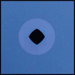
The dilate operation will also extend edge pixels but with the problem shown in Figure 2.35 where the extended pixels are much brighter than the main field. The reason this happens is that it is expanding brighter pixels over darker ones so the brighter grain pixels take over the extended region. The blur-and-grow technique maintains the average pixel value of the edge pixels which is what you want in order to maintain the original brightness.
I’m assuming that you are generally familiar with your software’s rotoscoping tools so this section is concerned with tips, tricks and techniques that will improve both your quality and productivity. We will see the wisdom of establishing control point coherency and take a look at the virtues of dividing the roto job into separate multiple shapes. There is a discussion of Bezier vs. B-spline and when to use which, plus an extensive section on keyframe strategies. I have included a special technique for rotoscoping motion blurred or defocused images and offer three ways to inspect your finished work. I trust that you will find this information helpful on the job.
Just a word on terminology, which varies from software to software. In this book a “shape” is a closed spline that is filled with color to make the roto mask and a “point” is a control point that is used to adjust a shape. The term “edge jitter” refers to a shape edge that wobbles in and out rapidly when it shouldn’t. I also use the term “rotoing” which is not a real word but that’s what people say, plus I stubbornly refuse to type the excessively lengthy word “rotoscoping” over and over.
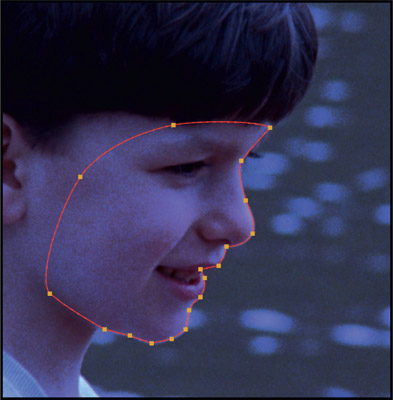
The idea behind control point coherency is that each control point should be associated with a physical landmark on the target and not be allowed to drift around the perimeter of the shape. The example in Figure 2.36 marks the cheekbone control point with a white arrow that stays on the cheekbone over the length of the shot. If the control points are allowed to slide around the spline it will introduce edge jitter in a form that is most difficult to cure. To help with the control point coherency, good practice is to start with the most complex frame first. This will establish the maximum number of control points required which will avoid the embarrassing need to add extra control points later in the roto process, and the risk of the added points that alter the spline’s position in surprising ways.
Best practice is to always use the fewest possible number of control points. An excessive number of control points hurts in two different ways. First, the more control points the more time required to set each keyframe. Second, the more control points the greater the risk of edge jitter. When it comes to control points less is better.
A key principle of rotoscoping is, to the degree possible, to perform the keyframe animation by transforming whole shapes and minimizing “point twiddling”. Translating, rotating, and scaling an entire shape avoids the edge jitter that you can get by shifting control points. Besides giving better results it is also a faster workflow. Since rotoscoping is a time-consuming process every effort needs to be made to develop work habits that are quick. Remember, in visual effects, speed is life.
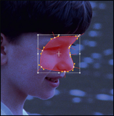
Figure 2.37 illustrates the wrong approach, with a single large shape for the entire face. As the head turns and the lips and jaw move with speech it will take an enormous amount of point twiddling to keep the spline on target. Figure 2.38 shows the right approach with separate shapes (colored for illustration purposes) for each key body part. Try to identify body parts that will move as a rigid unit such as the forehead and jaw in this example. The upper and lower lips are flexible and will need continuous shape changes so they are separate. Further, even though the upper lip, for example, will flex and change shape, by having it as a separate shape you can “rough it in” with a transformation then go back and dial in the individual control points as needed. This is a faster and better workflow than just dragging all of the points around.
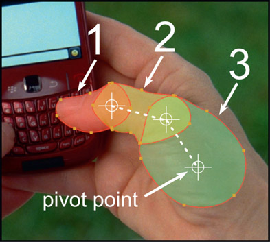
With proper shape breakdown comes another opportunity to speed up your roto work and that is by grouping the shapes into hierarchical linked articulation structures like Figure 2.39. Overlapping shapes were drawn for each rigid segment of the thumb then linked to each other hierarchically. Rotating shape 3 will carry shape 2 which caries shape 1. It is essential to place the pivot points where they occur naturally on the target so the articulation motion will match the live action motion.
There are two big wins by creating a matching “skeleton structure” to the live action. The first is speed. When the thumb flexes, shape 3 is first rotated to match the live action which carries with it shapes 2 and 1, but now shape 2 ends up close to where it should be anyway. A small rotation is added to shape 2 to finalize its position, which carries shape 1 closer to its target. Then a small tweak to shape 1 and you are done.
The second big advantage is smoothness of motion. The fact that the roto “skeleton” matches the live action skeleton means that its motion will be accurate, natural and smooth. Moving each shape individually or dragging around a bunch of control points will result in more off-target control points and more edge jitter.
Rotoscoping a fully articulated object like a bipedal human or a quadrupedal animal could require the use of dozens to hundreds of roto shapes. The roto artist is in grave danger of being overwhelmed by the sheer number of shapes, which will result in mistakes and reduced productivity – two big job killers. The solution is proper organization, which entails two things – a logical folder structure and an intuitive naming convention.
The folder structure should model the roto target hierarchy like the example in Figure 2.40. Folders are listed as all caps while shapes are colored blue. The highest level of the folders match the large body parts of head, torso, left and right arms and left and right legs. Within a folder are both splines and other folders such as the L ARM folder (expanded) which contains 4 splines plus the HAND folder (expanded). Inside the HAND folder the THUMB folder is expanded to show its splines.
The folders are all linked hierarchically so that HEAD, L ARM, R ARM, L LEG and R LEG are all children of TORSO. When TORSO is moved all the other folders and shapes move with it. Everything gets an intuitive name – upper arm, elbow, lower arm – rather than the default names of spline107, spline108, spline109, which will quickly become confusing. It does take a bit of time to change the names but the payback in productivity is huge.
Most rotoscoping systems also allow you to color the splines, which is very helpful when you are looking at a screen filled with 200 items. Along with the color options you will hopefully also have hide/show options so you could, for example, hide all the splines on the screen except for the THUMB folder and the splines in it.
There are two types of splines used in rotoscoping, the Bezier (named for French engineer Pierre Bézier) and the B-spline (Basis spline). Hopefully your software has both. The question here is which to use and when. There are religious differences on this topic with some swearing by the Bezier and others lauding the virtues of the B-spline. The truth is that they each have their appropriate uses and you will be a faster and better roto artist if you use both of them appropriately.
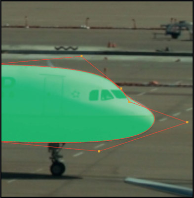
The Bezier spline shown in Figure 2.41 is most appropriate for complex organic objects like people and animals. It has great local control over the shape of the spline with tension and slope controls at each point so it is best for complex outlines that change shape a lot. Note that the Bezier spline passes through its control points. The B-spline is best for man-made mechanical things like cars and airplanes, like the example in Figure 2.42. In fact, B-splines are used in the CAD-CAM systems that are used to design these types of objects because they are ideal for smooth continuously changing curvatures like car fenders and engine nacelles. Note that the B-spline does not pass through its control points, and working with them is a bit like bending piano wire with rubber bands.
Of course, one can mix the two types in a single roto job. The jet in Figure 2.42, for example, might do better with Bezier splines on the landing gear because of its complexity. If the boy in Figure 2.41 was carrying a ball it would be better done with a B-spline. For truly square corners and rectilinear shapes like doors and windows the Bezier is the spline of choice because the control points can be set to sharp corners and the spline to a straight line.
Making wise choices for your keyframing strategies can save a lot of rework time and improve quality. The key is to study the shot carefully before starting by “ping-ponging” it (play back-and-forth) in the viewer and watch one body part at a time to formulate your plan. In this section we will look at four different keyframing strategies and when to use them.
For complex articulate roto targets like the dancer in Figure 2.43 where both velocities and shapes are changing rapidly. For this situation rotoing on 2s is usually the best approach. The idea is to roto every other frame then perform an inspection (see Section 2.7.6: Inspection below). If there are some in-between frames that need some tweaking then do that on a second pass, but do not attempt to roto a clip like this on 1s – every single frame. Not only will it take a lot longer but you will likely introduce a lot of edge jitter.
If the roto target has a complex outline but is moving slowly like the example in Figure 2.44 you can keyframe the clip in binary multiples then follow that with successive refinement. A binary multiple means keyframing on 4s, 8s, or 16s – numbers that are multiples of 2 (the binary), so that you can always do an in-between exactly half-way between the keyframes. Doing the in-betweens is the successive refinement. The beauty of this approach is that when you do an in-between frame the original keyframes on either side have done 90% of the work for you and you just have to tweak things a bit. This is much faster and better quality (less edge jitter) than doing the entire clip on 2s, for example. You may end up on 2s when done, but you will get there faster and better with binary multiples and successive refinement than it you just blast ahead on 2s for the entire clip.

Figure 2.44
Slow-moving but complex shape on binary multiples
Table 2.1 illustrates the workflow. On the first pass a keyframe was done on 8s (every 8 frames), step 8 (incrementing the timeline 8 frames per keyframe). Since it started on frame 1, every 8 frames would set a keyframes at 1, 9, and 17. The second pass starts on frame 5, exactly half-way between the first pass keyframes at frame 1 and 9, but it is also done on 8s to fill in frames 5 and 13. The third pass (if required) starts on frame 3, exactly halfway between keyframes 1 and 5. Note that it must done on 4s (step 4) in order to fill in frames 3, 7, 11, and 15. The final results are shown in the bottom row ending up with keyframes on 2s.
Table 2.1
Keyframe on binary multiples with successive refinement


Figure 2.45
Smoothly moving target with uniform shape change
If the roto target is moving smoothly with a uniform shape change like a passing train, plane, or car (Figure 2.45) you can save a great deal of time by keyframing with bifurcation (cut in half). The idea is to do a key frame at the first and last frames of the clip, then add one halfway between them. With keyframes at the first, middle, and last frames you then go halfway between the first and middle frame to add the next keyframe, then go halfway between the middle and last frames to add another keyframe. The keyframe passes and the final results are shown in Table 2.2.
Table 2.2
Keyframe halfway between previous keyframes on each keyframing pass

Rotoscoping humans and other living creatures is intrinsically difficult but made even more so by the constantly changing directions and velocities of the various moving body parts. Keyframing on motion extremes is one thing that you can do to make a difficult situation more manageable. The idea is to select a moving body part and watch it carefully while it is playing to identify the frames where the motion changes direction – the motion extremes – and plant keyframes on those frames. From there you can switch to another in-betweening strategy such as bifurcation to successively refine the keyframes. But the critical starting point is to set keyframes at the motion extremes.
Figure 2.46 shows a typical motion extreme for the dancing character’s hand. The white dots identify the path of motion over all six frames while the red dot shows where the hand is on each frame. The distance between the white dots indicates the velocities for each frame and there is clearly a velocity increase between frame 5 and 6. But frame 4 is clearly the motion extreme as that is where the hand changes direction so a keyframe goes on frame 4.
If you fail to identify the motion extremes you guarantee yourself more work by requiring more keyframes than necessary. For example, let’s say we were keyframing on 2s and placed keyframes on frames 3 and 5. The motion interpolation of the roto system would place frame 4 midway between 3 and 5, which would be way off target, requiring a major new keyframe be added for frame 5. However, with a keyframe at 4 and others at frames 1 and 6, for example, the interpolated positions would require only minor refinement. Time and work saved.
Motion Blur is one of the problem areas for rotoscoping as it represents the combination of two difficult problems, namely how to handle the roto transparency for the motion blur and the edge contamination of the motion blur itself. First we will look at the roto task to get a good mask then we will look at the edge contamination to get a good fix. While some systems have a built-in motion blur capability, we will assume it fails to do the job and look at the workflow where feather control points are pulled out of the roto shapes manually to create motion blur.
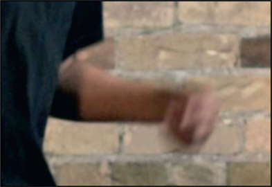
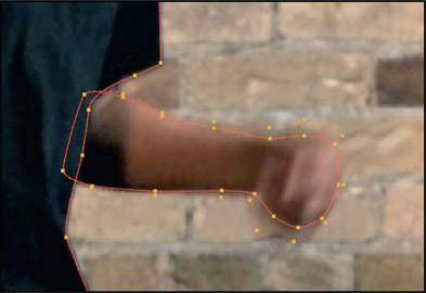
The hard part about rotoing motion blur is to properly manage the degree of transparency in the motion-blurred regions of the roto. Using the heavily motion blurred hand in Figure 2.47 as the roto target, the first question is where to draw the roto spline. Referring to Figure 2.48, place the inner spline along the edge of the solid part of the motion blur as the core matte (100% solid region), then pull the roto feather edge out to the far edge of the visible motion blur. It can be difficult to see these vague boundaries so use the viewer gamma and brightness adjustments to increase or decrease brightness or contrast to make things easier to see. Sometimes viewing just one channel will make things easier to see.
The blurring due to depth of field represents the same roto problem as motion blur but with one simplification – its feathered edge will have a consistent width while the motion-blurred object like the hand in Figure 2.47 will have a variable-width feathered edge all around. The defocused target can be given a single-feather width value while the motion-blurred object will need the individual feather control points to be adjusted to the local conditions. Figure 2.48 shows the feather control points near the elbow barely pulled out while at the hand they are much further out vertically but less so horizontally. So with motion blur you need the total local control that you can only get with individual feather control points.
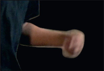
Figure 2.49 shows the mask created by the feathered roto and the resulting motion blurred edges. This mask is then used to premultiply the original plate to produce the premultiplied motion blur target in Figure 2.50 that is ready to comp.
Some software will have “auto-motion blur” where the system will blur the mask based on how much it has moved between frames. The problem here is that you do not want to roto the entire job without pulling out the feather points, then test the system’s motion blur only to find it inadequate, then go back to the beginning and start pulling out all the feather points. That will not only take a lot more time but you are now having to pull out feather points for every key frame so the results will be prone to chatter. It is much better to do the feather points as you draw the keyframes so you will have the previous and next keyframes as a reference for consistency.
I suggest you select a worst-case short frame range to test the system’s auto-motion blur to determine whether it will do the job or not. And the test is to use it to comp the motion blurred object over the intended background plate and see if things look right. If not, go back and try pulling out the feather points to see if you can do better than the machine – but don’t forget to turn off the auto-motion blur feature.

Figure 2.51
Motion blur contaminated with original backgrounds
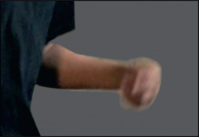
The motion blur transition pixels are unfortunately a continuously varying mix of the foreground object and the background. The solid core of the motion blur is 100% foreground and the very outer edge of the motion blur is 100% background with a linear cross-dissolve between these two edges. The problem this contamination creates can be seen in Figure 2.51 where the premultiplied foreground from Figure 2.50 has been composited over a neutral gray background.
The overly bright motion blur is color contamination from the background brick wall which is brighter than the composited background, resulting in an unconvincing motion blur. If the background wall had been darker than the composited background then the motion blur would look too dark. To solve this problem some artists might try to color correct the motion-blurred region or choke in on the motion blur in an attempt to reduce – not fix – the edge contamination. But that is obviously a sub-optimal solution. What we really want to do is somehow remove the background color contamination from the original motion blur so we can get the results shown in Figure 2.52. But that’s impossible, right?
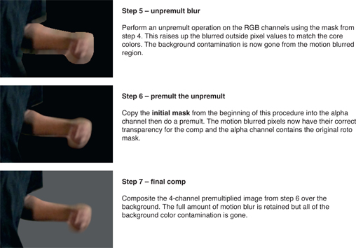
The following procedure will remove the background color contamination from motion blur. It is a multi-step procedure based on the “blur and grow” technique outlined in Section 2.6 above, but it is well worth the effort as the results are truly amazing. All of the background color contamination in the motion blurred edges will be removed and replaced with just and only the colors of the arm and hand. There is no reduction in the amount of motion blur.
The edge decontamination procedure in Figure 2.53 will affect all of the edges of the roto mask including the shirt in this example, not just the motion-blurred parts. If you see any background colors along your edges anywhere around the roto at step 7 just tuck the roto shape in a bit to get it inside the foreground and the edge discoloration will disappear.
WWW Roto Edge Decontamination – this folder contains the high resolution images for the steps shown in Figure 2.53 so that you may compare them to your own test.
There are two key principles when it comes to inspecting your rotos. The first is to inspect continuously, not just at the end. As soon as the head is done, inspect. When the torso is complete, inspect. When the entire shot is done, inspect again. You do not want the compositor that gets your rotos to find your mistakes. It is much more efficient for the studio if the roto artist finds and fixes them first instead of passing them on to the compositor. Plus, you don’t want to get a reputation for sloppy work. The second key inspection principle is to inspect the work with a variety of methods, not just one. Here we will look at three inspection techniques each of which will reveal different types of problems.

Figure 2.54
Original clip
The Overlay Test – this is where your system places a red overlay on top of the original clip based on your roto masks like the example in Figure 2.55. What you are looking for is a uniform margin around the edge. If your roto is consistently a bit large or a bit small the compositor can deal with that pretty easily. What he or she can’t deal with is a constantly changing roto edge. In this example there is a region on the right that pulls in from the otherwise uniform margin and another region on the left that has drifted out. This inspection is done by single-stepping through the frames one at a time.
The Matte Test – this is where you play just the black-and-white roto matte itself, looking for edge jitter. This is the easiest way to spot it, and this test is done at speed – 24 frames per second. Edge jitter problems can be difficult to fix, which is why we have several key-framing strategies, plus the keyframe coherency criteria above, all of which are designed to minimize the chances of introducing edge jitter in the first place.

Figure 2.56 Matte test
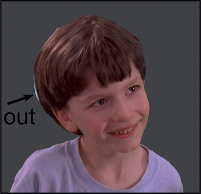
The Comp Test – this is where the target object is composited first over a dark background, then over a light background. Each one will reveal a different problem because the character’s original background will have light and dark areas. In the example in Figure 2.57 the light sky piece reveals that the roto went outside the head. When composited over a light background any outside pieces in the dark areas of the original background will show up. This inspection is done by single-stepping through the shot one frame at a time.
This completes the survey of a million ways to pull (or roto) a key. In the next chapter we will be taking a close look at keyers – how they work, what can be done to help them pull a better key, and several workflow suggestions.
