 Colors and Bubbles: Representing Quantities on Maps
In This Chapter
Colors and Bubbles: Representing Quantities on Maps

Some of the data we seek to present to our users is geographical in nature. What are the sales for each territory? How are our customers distributed throughout the region? What does worldwide production of a given product or commodity look like? Being able to represent these facts and figures on a map gives the data instant context. The map data visualization lets you do just that.
Using the map data visualization, we can add instant meaning to data that has a geographic component. We can see that a trend correlates to population centers. It is easy to note that a particular opinion breaks down along regional lines. Conclusions that are not at all obvious from columns of location names and statistics jump off the page when data is plotted on a map.
Even if you can’t tell Colorado from Wyoming in the United States or couldn’t find Sweden, Switzerland, or Swaziland on a globe, you can use the map data visualization in Reporting Services. So grab your GPS and let’s navigate the world of maps.
We are going to begin by associating quantities with regions on a map. This is done through two different techniques. First we look at putting a “bubble” over each geographic region. On this type of map, called a bubble map, the size of the bubble shows the relative size of the quantity being mapped. The second technique we examine involves changing the color or shading of the geographic region to represent relative quantities. This is known as a color analytical map.
At the end of the chapter, we will switch from representing quantities on a map to doing what you would expect with a map—namely, representing locations. We will plot the location of employee addresses on a map. In this example, we will use Bing Maps to provide context for the points we plot. You didn’t know Bing Maps included the planet Noxicomian? You might be surprised!
Creating a bubble map
Manipulating map layout
Business Need Galactic Delivery Services (GDS) is considering expanding its operations to include the planet Earth. Although Earth is not a big participant in interplanetary commerce, it is believed that Earthlings’ strong tendency toward procrastination will make the previous-day delivery service quite popular, even for packages going from one place to another on Earth. In order to determine where to establish shipping hubs, the GDS planning department needs a geographic representation of the volume of shipping by existing carriers in the United States. (My apologies to non-American readers. Please know that this exercise is not so much a manifestation of American ego as it is a reflection of the fact that SQL Server Reporting Services ships with only U.S. maps in its default map gallery.)
1. Create a New Report and a New Dataset
2. Place a Map Item on the Report and Populate It
 SSDT and Visual Studio Steps
1. Create a new Reporting Services project called Chapter07 in the MSSQLRS folder. (If you need help with this task, see Chapter 5.)
2. Create a shared data source called Galactic for the Galactic database. (Again, if you need help with this task, see Chapter 5.)
3. Add a blank report called Earth US Deliveries to the Chapter07 project. (Do not use the Report Wizard.)
4. In the Report Data window, click the New drop-down menu. Select Data Source from the menu that appears. The Data Source Properties dialog box appears.
5. As we have done previously, create a new data source named Galactic that references the Galactic shared data source. Click OK to exit the Data Source Properties dialog box.
6. In the Report Data window, right-click the entry for the Galactic data source, and select Add Dataset from the context menu. The Dataset Properties dialog box appears.
7. Enter EarthUSDeliveries for the name.
8. Click the Query Designer button. The Query Designer window opens displaying the Graphical Query Designer. Click the Edit as Text button to switch to the Generic Query Designer.
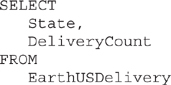
9. Enter the following in the SQL pane (upper portion) of the Generic Query Designer window:
10. Click the Run Query button on the Generic Query Designer toolbar to run the query and make sure no errors exist. Correct any typos that may be detected. Click OK to exit the Query Designer window. Click OK to exit the Dataset Properties dialog box.
 Report Builder Steps
1. Using the web portal, create a new folder in the Galactic Delivery Services folder. Enter Chapter07 as the name of this folder. (If you need help with this task, see Chapter 5.)
2. Launch Report Builder from the web portal.
3. With New Report highlighted in the left column, click Blank Report. The Report Builder shows a new blank report.
4. In the Report Data window, click the New drop-down menu. Select Data Source from the menu that appears. The Data Source Properties dialog box appears.
5. As we have done previously, create a new data source named Galactic that references the Galactic shared data source. Click OK to exit the Data Source Properties dialog box.
6. In the Report Data window, right-click the entry for the Galactic data source, and select Add Dataset from the context menu. The Dataset Properties dialog box appears.
7. Enter EarthUSDeliveries for the name.
8. Click the Query Designer button. The Query Designer window opens displaying the Graphical Query Designer.
9. Click the Edit as Text button to switch to the Generic Query Designer.
10. Enter the following in the SQL pane (upper portion) of the Generic Query Designer window:
11. Click the Run Query button on the Generic Query Designer toolbar to run the query and make sure no errors exist. Correct any typos that may be detected. Click OK to exit the Query Designer window. Click OK to exit the Dataset Properties dialog box.
Task Notes To put data on a map, we only need two columns in our result set. One column contains the label we will use to tie records to regions on our map. In this case, it is the state abbreviation in the State column. A second column contains the quantities to represent on the map. This is, of course, the DeliveryCount column.
SSDT, Visual Studio, and Report Builder Steps
1. Drag the edges of the design surface to make it larger so the design surface fills the available space on the screen.
2. If you are using Report Builder, select the Click to add title text box, and delete it. (The title will be contained within the map itself.)
3. If you are using SSDT or Visual Studio, select the map report item in the Toolbox window. Click and drag to place the map on the design surface. The map should cover almost the entire design surface because it will be the only item on the report. The Choose a source of spatial data page of the Map Wizard appears.
4. If you are using Report Builder, click on Map in the Insert ribbon, and select Map Wizard. The Choose a source of spatial data page of the Map Wizard appears.
 NOTE
NOTE
In SSDT and Visual Studio, the Map Wizard dialog box is entitled “New Map Layer.” In Report Builder, it is entitled “New Map.” The wizard functions the same for all three. The images will come from SSDT, but apply to all three environments.
5. The Map gallery radio button should be selected to allow us to choose a map from the Map gallery.
6. Click on each of the three USA map options in the Map gallery and note the differences in the Map preview.
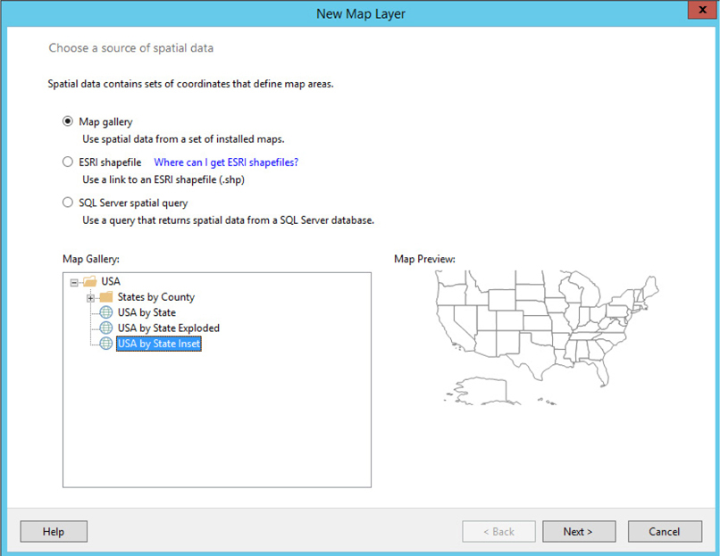
7. For this report, we will use the USA by State Inset map. Select this map and click Next. The Choose spatial data and map view options page of the wizard appears.
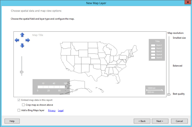
8. This page of the wizard allows you to adjust the size of the map using the slider on the left and to move the map using the four arrows. If needed, size and center the map so the entire thing fits in the window. You can also adjust the map resolution using the slider on the right. Click Next. The Choose map visualization page of the wizard appears.

9. Click the Bubble Map item, and click Next. The Choose the analytical dataset page of the wizard appears.
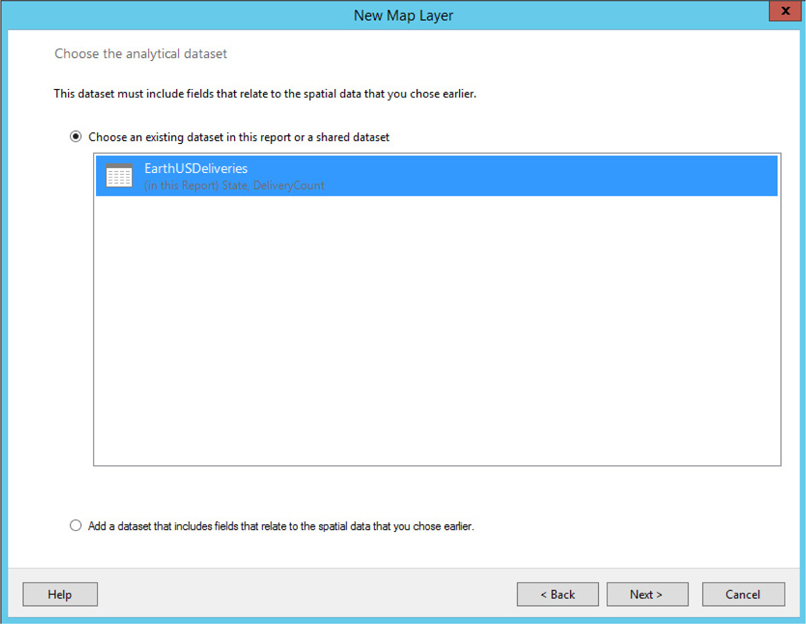
10. The Choose an existing dataset in this report or a shared dataset radio button should be selected by default. Select the entry for the EarthUSDeliveries dataset.
11. Click Next. The Specify the match fields for spatial and analytical data page of the wizard appears.
NOTE
The Spatial data area (middle section) of the page shows content of the spatial data fields that go with the USA by State Inset map we selected earlier. These fields identify each region on the map—in this case, each state on the map. The Analytical data area (bottom section) of the page shows the content of the EarthUSDeliveries dataset we created earlier and selected as our analytical dataset.
12. Our task on this page is to identify one spatial data field and one analytical data field that will tie analytical data to regions on the map. In the top section of the page, check the check box in the Match Fields column next to STUSPS. (STUSPS is the U.S. Postal Service state abbreviation.) A drop-down list will appear in the STUSPS row in the Analytical Dataset Fields column.
13. Select State from this drop-down list.

NOTE
This matching process between spatial data and analytical data is case sensitive.
14. Click Next. The Choose color theme and data visualization page of the wizard appears.
15. The Use bubble sizes to visualize data check box should be checked. Select [Sum(DeliveryCount)] from the drop-down list right below this check box.
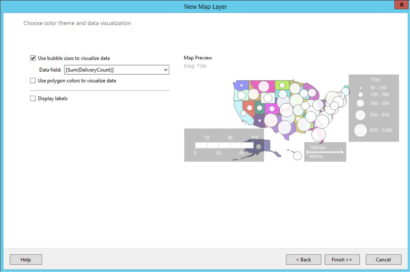
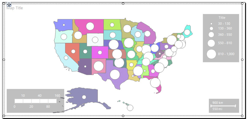
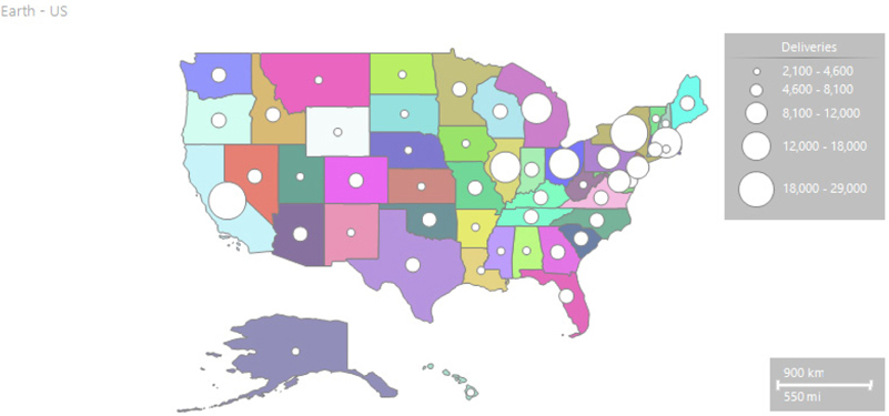
16. Click Finish. The map is created on the design surface as shown.
17. Resize the map to fill the entire design surface, if it does not do so already.
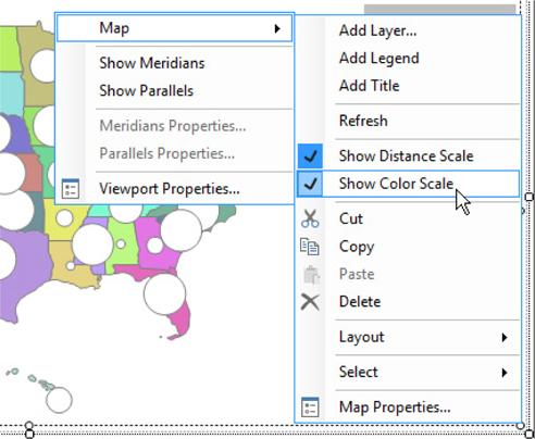
18. Right-click anywhere in the map, and select Map | Show Color Scale as shown. This will uncheck this item and remove the color scale from the map.
19. Double-click the Map Title, and replace “Map Title” with Earth – US, and then press ENTER.
20. Double-click the Title in the map legend showing the bubble size scale. Replace “Title” with Deliveries, and then press ENTER. This is a little tricky because you are editing white on white, but you can do it.
21. Preview/run the report. The report should appear as shown.
22. If you are using SSDT or Visual Studio, click Save All on the toolbar. If you are using Report Builder, save the report as Earth US Deliveries in the Chapter07 folder on the report server.
Task Notes The size of the bubbles on our map is proportional to the number of deliveries made in each state. The scale on the right side of the map gives us an idea of the quantities associated with each size bubble. More important, however, is the relative size of the bubbles. This lets us quickly determine areas of the country that have higher concentrations of deliveries.
In Steps 12 and 13, we instructed the map as to how it should tie analytical data from the EarthUSDeliveries dataset we created with the spatial data inherent in the map. For this particular set of data, we used the two-letter state abbreviations standardized by the U.S. Postal Service. If, instead of two-letter abbreviations, our analytical data had contained state names, then we could have used the STATENAME field to make this association. The spatial data also includes the Federal Information Processing Standard (FIPS) state code in the STATEFP field.
Of course, different maps have different spatial data associated with them. In addition to the maps of the United States, Reporting Services includes a map of each U.S. state showing its constituent counties. Rather than state abbreviations, names, and codes, these maps will have county identifiers instead. (Technically, the state of Louisiana is divided into parishes and the state of Alaska is divided into boroughs, but these divisions are still referred to as counties in the Reporting Services maps.)
When making the tie between your own analytical dataset and the spatial data inherent in a map, make sure you are selecting the appropriate fields from both so you achieve a match. In the previous example, our data contains a field called “State.” Because our data contains addresses, this State field actually contains the two-letter state abbreviation. It is tempting to link the State field to the STATENAME field rather than to a field with the cryptic name of STUSPS. Be sure to use the sample spatial data and sample analytical data displayed on the Specify the match fields for spatial and analytical data page of the wizard to determine the proper fields to link.
Reporting Services is not limited to creating maps of the United States. (It can even create maps of planetary systems, as we will see in our next example!) For a number of reasons, Microsoft chose to ship only U.S. maps with the product. The Environmental Systems Research Institute (ESRI) shapefile standard is widely accepted and will provide access to a large variety of maps for your use. In addition, we can create our own maps using the SQL Server spatial data types. First, a little background.
Beginning with the 2008 release, SQL Server has provided data types for storing the definition of items from two-dimensional geometry. These are known as the spatial data types. The spatial data types let us represent the following items:
Points
Lines
Polygons (multisided closed figures)
We use various functions to define these items. For instance:

defines the point signifying the center of Seattle, Washington, USA. In this case, we are using the coordinate system utilized by GPS devices. The first parameter is a string representing a point with a given longitude (–122.3308333) and latitude (47.6063889). The second parameter identifies the geography instance or coordinate system we are using.
Here is another example. This example defines a line that roughly approximates Interstate Highway 5 as it goes north from downtown Seattle:

Again, the 4326 in the second parameter shows we are using the coordinate system utilized by GPS systems.
The functions described in the previous section encode the point, line, or polygon into a binary representation of the spatial entity. This binary representation can then be efficiently stored in a SQL Server table. This allows us to do things like store the exact geographic location of any address in a database.
SQL Server has two spatial data types: geography and geometry. The geography data type is designed to store data in a curved two-dimensional space. This would apply to mapping of points on the surface of the earth, which is curved.
If you are creating a spatial representation of something on a much smaller scale, such as an office floor plan, or if you believe in a flat earth, then you can use the geometry data type. The geometry data type is designed to store data in a flat two-dimensional space.
In addition to representing spatial data objects on a map in Reporting Services, you can do things like calculate the distance between two points, determine whether a point lies inside a given polygon, determine whether two polygons intersect, and so on. These uses of spatial data types are beyond the scope of this book. What we will do is use spatial data types to assist us with the creation of maps in Reporting Services.
It may surprise you to discover that it is a bit tough to track down a map of the planetary systems where Galactic Delivery Services completes its deliveries. So, rather than having you hunt all day for an ESRI map of Noxicomian, we are going to make use of the polygon feature of the geometry spatial data type and build our own map. (We are going to discount the curvature of space for this exercise and plot our planets in a flat coordinate system.)
The Planet table in the Galactic database contains a field called PlanetGeometry. This field has a data type of geometry and contains a polygon representing each planet. We will use this data to create a map of these planets.
Now, polygons, by definition, have straight sides, whereas circles (planets) are curved. This presents a bit of a challenge. The polygons in the Planet table fields are 16-sided figures. If you squint a bit at the map we create from these polygons, they look circular—good enough for our purposes at any rate.
Creating a color analytical map
Using spatial data types to define map polygons
Business Need Galactic Delivery Services has a board of directors meeting coming up. The CEO would like to show the distribution of deliveries among the planets served by GDS, but would like to show that information in a manner that really captures the board members’ attention. After some thought, the CEO has decided he wants a map showing the planets in this part of the galaxy with the shading of each planet representing the number of deliveries for that planet.
1. Create a New Report and Two New Datasets
2. Place a Map Item on the Report and Populate It
SSDT, Visual Studio, and Report Builder Steps
1. If you are using SSDT or Visual Studio, reopen the Chapter07 project, if it was closed. Close the Earth US Deliveries report and add a blank report called Deliveries Per Planet to the Chapter07 project.
2. If you are using Report Builder, create a new blank report.
3. In the Report Data window, click the New drop-down menu. Select Data Source from the menu that appears. The Data Source Properties dialog box appears.
4. As we have done previously, create a new data source named Galactic that references the Galactic shared data source. Click OK to exit the Data Source Properties dialog box.
5. In the Report Data window, right-click the entry for the Galactic data source, and select Add Dataset from the context menu. The Dataset Properties dialog box appears.
6. Enter SpatialData for the name.
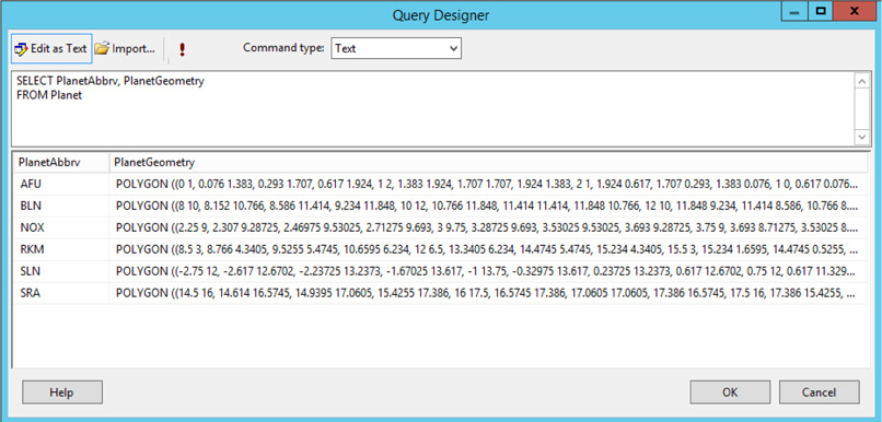
7. Click the Query Designer button. The Query Designer window opens.
8. Click the Edit as Text button to switch to the Generic Query Designer.
9. Enter the following in the SQL pane (upper portion) of the Generic Query Designer window:

10. Run the query to make sure no errors exist. Correct any typos that may be detected. You’ll see a result set similar to the following illustration.
11. Click OK to exit the Query Designer window. Click OK to exit the Dataset Properties dialog box.
12. In the Report Data window, right-click the entry for the Galactic data source, and select Add Dataset to create a second dataset. The Dataset Properties dialog box appears.
13. Enter DeliveryData for the name.
14. Click the Query Designer button. The Query Designer window opens.
15. Click the Edit as Text button to switch to the Generic Query Designer.
16. Enter the following in the SQL pane (upper portion) of the Generic Query Designer window:

17. Run the query to make sure no errors exist. Correct any typos that may be detected.
18. Click OK to exit the Query Designer window. Click OK to exit the Dataset Properties dialog box.
Task Notes This time we created two queries to use in our map report. That’s because one of the queries is going to create the regions on the map for us. The SpatialData query will use the polygons in the PlanetGeometry field of the Planet table to create the planets on the map. The PlanetAbbrv field in that dataset will be used to associate the quantities in the DeliveryData dataset with the different regions.
When you executed the spatial query, the content of each PlanetGeometry field was displayed as a text string. This string shows the POLYGON function that was used to create each polygon. This is only a representation of the actual data in each field that the Generic Query Builder is displaying for our benefit. The actual content of each PlanetGeometry field is a binary representation of the polygon that is much more efficient for storage and calculation.
SSDT, Visual Studio, and Report Builder Steps
1. Drag the edges of the design surface to make it larger so the design surface fills the available space on the screen.
2. If you are using Report Builder, select the Click to add title text box, and delete it.
3. If you are using SSDT or Visual Studio, select the map report item in the Toolbox window. Click and drag to place the map on the design surface. The map should cover almost the entire design surface because it will be the only item on the report. The Choose a source of spatial data page of the Map Wizard appears.
4. If you are using Report Builder, click on Map in the Insert ribbon, and select Map Wizard. The Choose a source of spatial data page of the Map Wizard appears.
5. Select the SQL Server spatial query radio button.
6. Click Next. The Choose a dataset with SQL Server spatial data page of the Map Wizard appears.
7. Click the entry for the SpatialData dataset to select it.
8. Click Next. The Choose spatial data and map view options page of the Map Wizard appears. The field containing the spatial data is selected using the Spatial field drop-down list. The Map Wizard found the spatial data in the PlanetGeometry field, selected it, and plotted it as a number of circles in the map layout as shown. Use the sizing slider on the left to ensure all six circles are completely visible in the frame.

9. Click Next. The Choose map visualization page of the Map Wizard appears.
10. Select Color Analytical Map.
11. Click Next. The Choose the analytical dataset page of the Map Wizard appears.
12. Click the entry for the DeliveryData database to select it.
13. Click Next. The Specify the match fields for spatial and analytical data page of the Map Wizard appears.
14. Check the check box in the Match Fields column next to PlanetAbbrv. A drop-down list will appear in the Analytical Dataset Fields column.
15. Select DeliveryPlanetAbbrv from this drop-down list.
16. Click Next. The Choose color theme and data visualization page of the Map Wizard appears.
17. Select [Count(DeliveryNumber)] from the Field to visualize the list. This will cause the color of each spatial region to vary, depending on the number of deliveries.
18. Select Red-Yellow-Green from the Color rule drop-down list. This will make the planets with more deliveries appear green and the planets with fewer deliveries appear red. The colors won’t look good on the design screen, but they will look great when you preview/run the report.
19. Check the Display labels check box.
20. Make sure #PlanetAbbrv is selected in the Data field drop-down list under the Display labels check box.
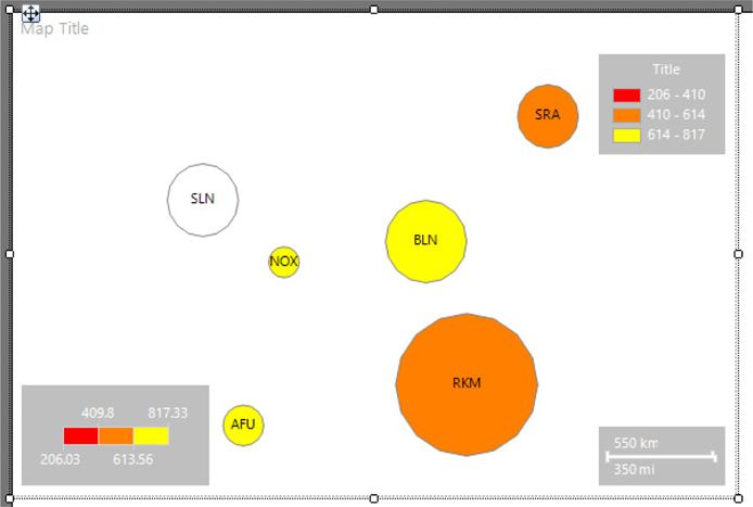
21. Click Finish. The map is created on the design surface as shown.
22. Resize the map to fill the entire design surface, if it does not already.
23. Right-click anywhere in the map, and select Map | Show Distance Scale. This will uncheck this item and remove the distance scale from the map.
24. Double-click the Map Title, replace “Map Title” with Deliveries per Planet, and then press ENTER.
25. Right-click in the lower part of the map legend, and select Delete Legend from the context menu. This will remove the legend from the map.
26. Click in the white area in the center of the map. This selects the map viewport. The Properties window will say “MapViewport” at the top.
27. Set the BackgroundColor property to Black.
28. When you selected the map viewport, a new window appeared to the right of the map. This is the Map Layers window. (You may need to scroll right to see this window.) Use the four arrows and the slider at the bottom of the Map Layers window to position the circles in the map viewport. They should occupy the entire viewport without any of the planets being obscured by the color scale in the lower-left corner of the map.
29. At the top of the Map Layers window is an entry for PolygonLayer1. (Its label will probably say, “PolygonL…” Right-click the entry for PolygonLayer1 in the Map Layers window, and select Polygon Color Rule from the context menu as shown.

30. The Map Color Rules Properties dialog box appears. Go to the Distribution page of this dialog box.
31. In the Change distribution options to divide data into subranges drop-down box, select Equal Distribution.
32. Click OK to exit the Map Color Rules Properties dialog box.
33. Preview/run the report. The report should appear as shown.

34. If you are using SSDT or Visual Studio, click Save All on the toolbar. If you are using Report Builder, save the report as Deliveries per Planet in the Chapter07 folder on the report server.
Task Notes As with the chart, each individual item on a map has its own properties dialog box. As you look to format the various parts of the map, try right-clicking the item you wish to format. Odds are you will find a properties entry in the resulting context menu.
The Map Layers window functions similarly to the Chart Data window. The Map Layers window allows us to control the data that is being displayed on the map. It also controls how that data is being visualized. You saw in this example how to use the Map Color Rules Properties dialog box to control the distribution on our color analytical scale.
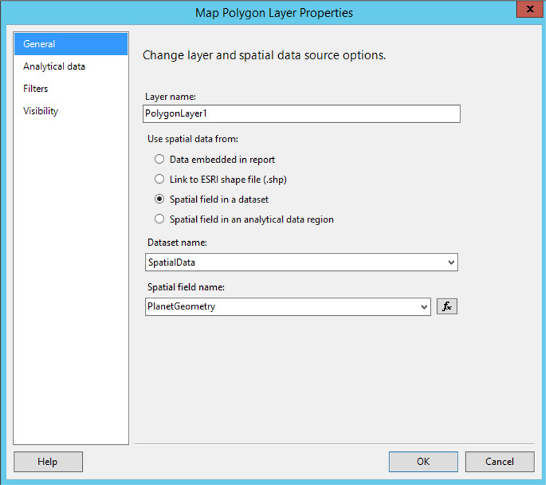
Right-clicking the entry in the Map Layers window of a particular layer and then selecting Layer Data from the context menu will display the Map Polygon Layer Properties dialog box shown here. This dialog box allows you to control which datasets and which fields within those datasets are being used as a source for spatial information and which are being used for analytical data.
Thus far, we have created maps with only one layer. In our next example, we create a map with two layers.
Creating a Basic Marker map
Using a Bing Maps layer
Business Need GDS is doing business continuation planning. They are starting with the delivery hub on the planet Noxicomian. The Noxicomian delivery hub is located in the city of Oakley, so employees living in Oakley will be able to respond fastest in the event of an emergency. The business continuation planning committee has asked for a map showing the home location of all employees living in Oakley.
1. Create the Map Report
SSDT, Visual Studio, and Report Builder Steps
1. If you are using SSDT or Visual Studio, reopen the Chapter07 project, if it was closed. Close the Deliveries Per Planet report, and add a blank report called Employee Homes to the Chapter07 project.
2. If you are using Report Builder, create a new blank report.
3. In the Report Data window, click the New drop-down menu. Select Data Source from the menu that appears. The Data Source Properties dialog box appears.
4. As we have done previously, create a new data source named Galactic that references the Galactic shared data source. Click OK to exit the Data Source Properties dialog box.
5. In the Report Data window, right-click the entry for the Galactic data source, and select Add Dataset from the context menu. The Dataset Properties dialog box appears.
6. Enter NOXEmployees for the name.
7. Click the Query Designer button. The Query Designer window opens.
8. Click the Edit as Text button to switch to the Generic Query Designer.
9. Enter the following in the SQL pane (upper portion) of the Generic Query Designer window:
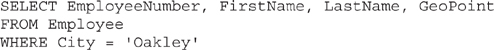
10. Run the query to make sure no errors exist. Correct any typos that may be detected. You’ll see a result set similar to the following illustration.
11. Click OK to exit the Query Designer window. Click OK to exit the Dataset Properties dialog box.
12. Drag the edges of the design surface to make it larger so the design surface fills the available space on the screen.
13. If you are using Report Builder, select the Click to add title text box, and delete it.
14. If you are using SSDT or Visual Studio, select the map report item in the Toolbox window. Click and drag to place the map on the design surface. The map should cover almost the entire design surface because it will be the only item on the report. The Choose a source of spatial data page of the Map Wizard appears.
15. If you are using Report Builder, click on Map in the Insert ribbon, and select Map Wizard. The Choose a source of spatial data page of the Map Wizard appears.
16. Select the SQL Server spatial query radio button.
17. Click Next. The Choose a dataset with SQL Server spatial data page of the Map Wizard appears.
18. Click the entry for the NOXEmployees dataset to select it.
19. Click Next. The Choose spatial data and map view options page of the Map Wizard appears. The Map Wizard found spatial data in the GeoPoint field, selected it, and plotted it as a number of points in the map layout area.
20. Check the Add a Bing Maps layer check box. The Tile type drop-down list appears and, after a moment, a Bing map appears in the map layout area if you have access to the Internet.
21. Select Hybrid from the Tile type drop-down list. The Bing map changes to a hybrid map in the map layout area.
22. Click Next. The Choose map visualization page of the Map Wizard appears.
23. Select Basic Marker Map, if it is not already selected.
24. Click Next. The Choose color theme and data visualization page of the Map Wizard appears.
25. Select Star from the Marker drop-down list.
26. Check the Display labels check box. The Data field drop-down list appears.
27. Select [LastName] from the Data field drop-down list.
28. Click Finish. The map is created on the design surface.
29. Resize the map to fill the entire design surface, if it does not already.
30. Right-click anywhere in the map, and select Map | Show Color Scale. This will uncheck this item and remove the color scale from the map.
31. Double-click the Map Title, replace “Map Title” with Employees in Oakley, UZ on Planet Noxicomian, and then press ENTER.
32. Right-click in the lower part of the map legend, and select Delete Legend from the context menu. This will remove the legend from the map.
33. Scroll right so you can see the Map Layers window.
34. Right-click the entry for PointLayer1, and select Point Properties from the context menu. The Map Point Properties dialog box appears.
35. Click the fx button next to the Tooltip text box. The Expression dialog box appears.
36. Enter the following in the Set expression for: Tooltip text box:

37. Click OK to exit the Expression dialog box.
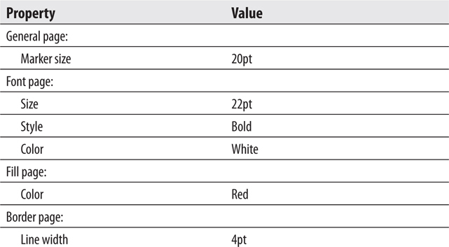
38. Set the following properties in the Map Point Properties dialog box:
39. Click OK to exit the Map Point Properties dialog box.
40. Right-click the entry for PointLayer1, and select Point Color Rule from the context menu. The Map Color Rules Properties dialog box appears.
41. Select the Apply template style radio button, if it is not already selected.
42. Click OK to exit the Map Color Rules Properties dialog box.
43. Use the four arrows and the slider at the bottom of the Map Layers window to position the points in the map viewport. Make sure all the Last Name labels fit in the map viewport and that none are obscured by the distance scale.
44. Preview/run the report. The report should appear as shown.

45. Hover the mouse pointer over one of the point markers to see the tooltip text.
46. If you are using SSDT or Visual Studio, click Save All on the toolbar. If you are using Report Builder, save the report as Employee Homes in the Chapter07 folder on the report server.
Task Notes In this task, you were introduced to the concept of layers on the map. One layer is added over the top of another layer to deliver more information on the map. In the map you just created, there are two layers: the point layer that contains the stars indicating employee homes and the tile layer that contains the Bing map. Maps may also contain a polygon layer and/or a line layer.
The properties of the items in each layer are controlled by a number of dialog boxes. These dialog boxes are launched by the context menu for each layer shown in the Map Layers window. Clicking Layer Data in the context menu will display the dialog box that controls which dataset, if any, provides spatial data for the layer and which dataset, if any, provides analytical data for the layer.
In the tile layer, there is a dialog box to control the type of Bing map used as a background of the map item. This can be a road map, an aerial map (satellite image), or a hybrid of the two. We saw this layer for the first time in our current example.
In the point layer, there are dialog boxes to control the color of each point, the size of each point, and the marker used for each point. Each of these characteristics can change to correspond to the data being presented, if desired. We saw this in the Earth US Deliveries report, our bubble map. To create a bubble map, the Map Wizard uses a circular marker that is colored a semitransparent white for each point. The size of these point markers varies in proportion to the data.
In the polygon layer, there is a dialog box to control the color of each polygon region. The color can change to correspond to the data being presented, if desired. We saw this in the Deliveries per Planet report, our color analytical map.
In the line layer, there are dialog boxes to control the color and the size of each line. Each of these characteristics can change to correspond to the data being presented, if desired.
NOTE
As you have no doubt figured out, this is not a map of Oakley, UZ on the Planet Noxicomian. See if you can figure out what terrestrial Oakley I have playing the role for us in this map.
We have now covered all the basic aspects of creating reports in Reporting Services. In the next two chapters, we continue to look at report creation, but we move to the intermediate and advanced levels. Building on what you have learned so far, we create more complex reports with more interactivity.
With each new feature you encounter, you gain new tools for turning data into business intelligence.