
Figure 4.1.Race and ethnicity according to the US Census Bureau, 1790 to 2010. Given that race and ethnicity are socially constructed concepts, the way in which people are classified changes over time and space. Data source: US Census.
Chapter 4
Race and ethnicity
One of the most common, and yet most controversial, ways in which people view each other is through the lens of race and ethnicity. For centuries, and even millennia, humans have used this lens to determine who is part of their group and who is considered an outsider. Differences in the way people look, talk, dress, eat, and behave have, sadly, been tied to war, slavery, and all types of human exploitation. But at the same time, these differences contribute to the wonderful diversity of our world. As people have migrated and mixed, new ideas have evolved, from culinary innovation, to religion and philosophy, to architecture and design, and much more.
Because of the importance of race and ethnicity in our perceptions of the world, geographers are interested in understanding their spatial distribution and how these distributions impact social cohesion and conflict, how they contribute to cultural change, and how they influence our landscapes. In this chapter, we explore what race and ethnicity are, where different groups live in the United States, segregation and integration, how race and ethnicity spatially relate to other socioeconomic characteristics, and how they impact the way we create our landscapes.
What is race and ethnicity?
Throughout history people have sought to categorize and organize features of the world to better make sense of it. The world is a very diverse place, and categories help people simplify and make it manageable for understanding. Along with myriad physical and natural features of the earth, such as plant and animal species and soil types, people for millennia have classified humans into different categories. These categories reflect group identities, helping to create bonds between people of the same group, but can also serve to reinforce an “us versus them” attitude by excluding people from different groups. Often, these categories have had a geographical origin, with people classified according to where they come from.
Among the most common ways of classifying humans are through the concepts of race and ethnicity. Ethnicity groups people by a shared cultural heritage. This shared heritage can include belief and value systems, language, food and clothing, cultural traditions, and a shared ancestral homeland. Going back thousands of years, the ancient Greeks and Romans differentiated the people of the Mediterranean region, as well as more distant Germanic and Persian people, among others, by geographically based ethnic classifications. The Bible mentions myriad ethnic groups from the ancient Roman Empire, such as the Hittites, Amorites, Canaanites, Perizzites, Hivites, and Jebusites, often alluding to conflict and disdain between these ancient cultures.
Moving to the present, we commonly use ethnic classifications such as Latino or Hispanic, Chinese, or Arab, among many more, that reflect the region or country from which people come. In each of these cases, people identified (either by themselves or others) as part of an ethnic group are likely to have common sets of cultural characteristics. It must be noted that ethnicity differs from nationality; whereas nationality refers to the nation to which a person currently belongs or used to belong, ethnicity refers to cultural heritage. Thus, there are ethnic Chinese living throughout the world who are not citizens of China and have never set foot in their ancestral homeland.
In contrast to ethnicity, race has traditionally been tied to differences in physical traits of humans, such as skin color, eye shape, bone structure, and hair texture. As with ethnicity, racial categories tend to be grouped by geographical regions. The idea of race is much more recent than that of ethnicity and gained traction as European colonialism in the sixteenth century began an intense process of globalization. While people and places of the earth were brought together culturally, economically, and politically, natural philosophy and taxonomy, or the science of classifying organisms, was growing in influence. As part of the growing trend in taxonomy, early classifications divided humans into four or five racial groups. These groups roughly aligned with the continents, resulting in “races” of Asians, Africans, Europeans, and Native Americans. Not all classifications corresponded perfectly with the continents, however. Some saw a single race running from Europe and North Africa through Persia and into central India and parts of Indonesia, while others used different classifications, for instance, splitting the northern Scandinavia Lapp people apart from the rest of Europe and Asia.
Ultimately, the categories of race and ethnicity are socially constructed by humans. They are not fixed, scientifically determined biological categories but rather are based on how different groups of people view themselves and others. For instance, classifying Europeans as a single race or ethnicity may face resistance from those who say a typically tall, blond Swede is physically and culturally very distinct from a typically shorter and darker Greek. Certainly, Nazi Germany viewed the Aryans as distinct from other Europeans. The same holds true for Asians from Cambodia and Japan and for Africans from South Sudan and Nigeria.
Measuring race and ethnicity
Human geographers are interested in mapping and analyzing the spatial patterns of race and ethnicity. By understanding where different groups of people live and how they interact with other groups in other locations, geographers can better understand how different elements of culture, be it language, religion, food, fashion, music, architecture, or other, interact and blend over space and time to create the earth’s cultural landscapes. Furthermore, by quantifying and mapping race and ethnicity, policymakers can better analyze which groups are struggling to be equal partners in a society. If some racial or ethnic groups face greater disadvantages than other groups in a society, then public and private organizations can target programs to help improve their socioeconomic situation.
The question then becomes, which groups should be counted and measured? As discussed, race and ethnicity are socially constructed. There are no fixed scientific categories that can be used for classifying people. Consequently, there has been great variation over space and time regarding which groups are enumerated by national governments.
The US Census
Countries around the world collect data on their populations via censuses. In the United States, the Constitution requires that a census of the population be taken every ten years in order to allocate taxes and legislative representatives among states on the basis of population size. As part of this population count, the US government has also collected demographic data on various characteristics of the population, including race and ethnicity.
Given that the United States was founded partly on the basis of slavery, censuses from 1790 through 1850 classified people exclusively according to whether they were white or black and free or enslaved (figure 4.1). At later points in time, additional general categories where added, which as of 2010 included White, Black, American Indian/Alaska Native, Asian, Hawaiian/Pacific Islander, Other, and Hispanic. Within each of these general categories were more specific categories based on country of origin. These specific categories change over time, depending on migration flows and other social perceptions of race and ethnicity.
Figure 4.1.Race and ethnicity according to the US Census Bureau, 1790 to 2010. Given that race and ethnicity are socially constructed concepts, the way in which people are classified changes over time and space. Data source: US Census.
Remember that the concepts of race and ethnicity are socially constructed—humans create categories, which people must then be placed in. But trying to fit people into a limited set of categories can cause problems. Prior to 1960, census takers would determine which category to put people in. Thus, race and ethnicity were imposed externally by US government census takers. Since the 1960 census, however, individuals have been able to select their own race or ethnicity, thus allowing people to record the group they most strongly self-identify with.
Yet when faced with a limited number of choices, some people still struggled to classify themselves. Through the 1990 census, people could choose only one race or ethnicity, so someone with a Chinese mother and Vietnamese father would have to pick just one on the census form. The same was true for someone with a white mother and black father (such as former President Obama)—you could be black or white, but not both. This limitation changed with the 2000 census, which began to allow respondents to choose one or more races. Because of this, since 2000, it is possible to count the number of multiracial residents of the United States.
Figure 4.2 shows the section of the 2010 census form that asks about race and ethnicity. It includes five race categories: White, Black or African American, American Indian or Alaska Native, Asian (with several national subcategories), and Native Hawaiian or Other Pacific Islander (also with several national subcategories). A sixth category includes Some other race. But note that Hispanic, Latino, or Spanish origin is a separate category.
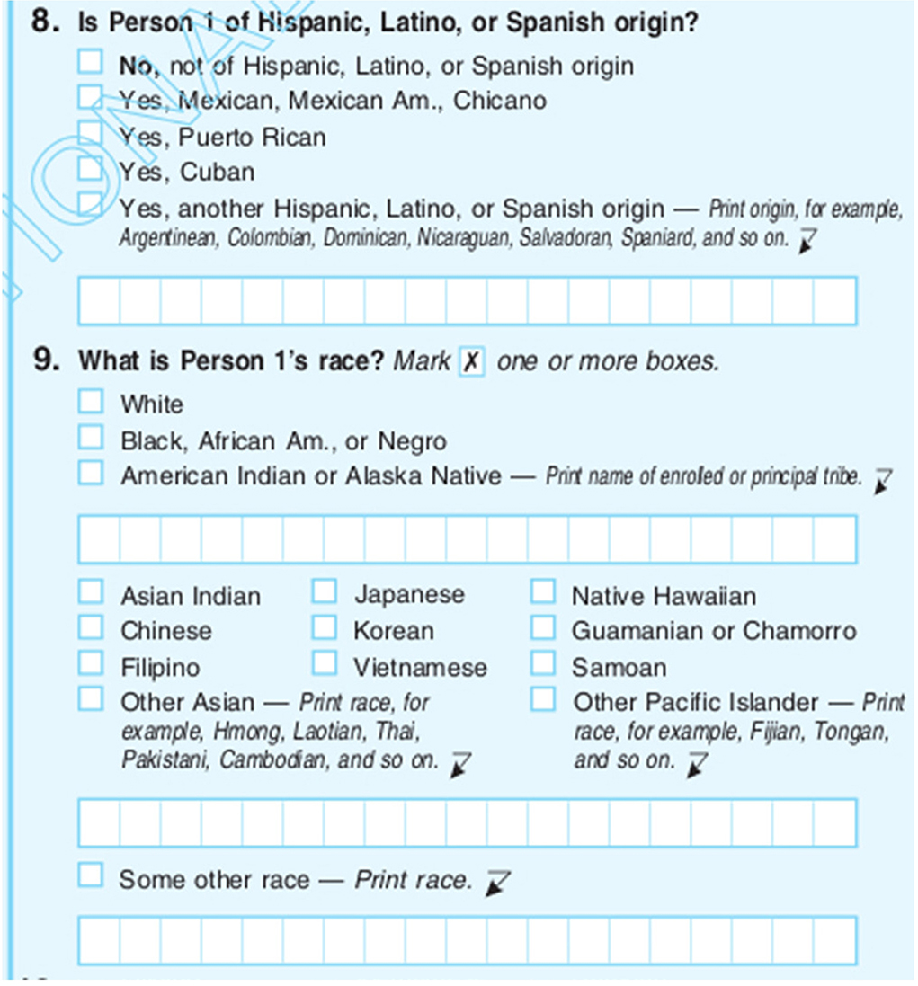
Figure 4.2.Options for race and ethnicity on the 2010 US census form. Some people struggle to decide exactly which box(es) they best fit in. Data source: US Census.
This still presents many residents of the United States with a challenge when trying to decide where they fit. Many Latinos consider their Latino heritage to be their primary racial/ethnic identity, yet the US census form requires them to say they are Latino (question 8), but then choose a race in addition (question 9). In 2010, the majority of Latinos (53 percent) listed their race as white, with another 36 percent choosing “Some other race.”
Since Hispanic or Latino is counted separately from race, when analyzing and mapping data, geographers often separate them out from their racial category. For example, non-Hispanic white is often used when mapping the white population of the United States. Hispanic or Latino (all races) can then be mapped separately. If all people who classified themselves as white are mapped, a large number of Hispanics will be included in the data.
Other groups struggle to identify themselves in the census as well. People from the Middle East and North Africa, according to US census definitions, fall under the White racial category. Yet many Arabs, Persians, and Turks feel that it is a poor fit. As a group that sometimes faces discrimination and hate crimes, many do not feel that they are white in the same way that those of European descent are.
Because of the difficulty some people face when classifying themselves by US census categories, Some other race was the third most commonly selected category (7 percent) after White alone (72 percent) and Black alone (13 percent) in the 2010 census (figure 4.3). The majority of those who selected Some other race were of Hispanic origin.

Figure 4.3.Puerto Rican Day parade in Manhattan. Forced to pick a race in addition to their Hispanic ethnicity, over half of Latinos in the US identified themselves as white in the 2010 census. Another 36 percent said they are “Some other race.” Photo by Lev Radin. Shutterstock. Stock photo ID: 197628662.
Other countries
As illustrated by changes in US census classifications of race and ethnicity, categories are heavily dependent on the social and historical context of each country.
While Americans traditionally saw race in terms of black and white, eighteenth-century Spaniards in the Americas saw many gradations, with different names for different combinations of Spaniard, Amerindian, African, and white (figure 4.4). This detailed classification scheme has since given way in Mexico to no census questions on race or ethnicity, with only a related question that asks if a person speaks an indigenous language.
The historical and social nature of racial and ethnic categories can be seen in other countries as well. In the Brazilian census, people can write in any ethnic group but must select a race that includes white, black, yellow (for Asian), and mixed. It is interesting to note that in the US, people could not select more than one race until the year 2000, whereas the mixed category in Brazil was first used in the 1872 census. This reflects a greater mixing of races throughout Brazil’s history, as compared to an ideology of strict racial segregation in the US.

Figure 4.4.Eighteenth-century painting showing sixteen racial combinations of colonial Latin America. Data source: Museo Nacional del Virreinato, Tepotzotlán, Mexico. Artist unknown.
In Canada, as in Brazil, one can write in any ethnicity as well. Residents then select from a range of racial and ethnic categories, such as Latin American, Arab, Chinese, and West Asian (i.e., Iranian, Afghan), as well as white and black. The United Kingdom also allows for writing in one’s ethnicity; in addition, it has categories that relate to its colonial past, including Black Caribbean, Pakistani, and Bangladeshi. It also includes Gypsy or Irish Traveller as a subcategory of white (figure 4.5).
France asks about one’s nationality in its census form, but only for those born as citizens of another country. For those born French, no information is collected on race or ethnicity. This follows the French notion of egalité, or equality, and its emphasis on French identity over ethnic or racial identity. While this “colorblind” ideology has its appeal, in reality, France is a very multicultural society with stark socioeconomic differences between traditional French and minority racial and ethnic communities. A lack of data on race and ethnicity makes understanding the spatial and social patterns of these differences difficult to study.

Figure 4.5.A vintage Romani (also known as gypsy) caravan at the Appleby Horse Fair in Appleby, Cumbria, UK. The UK census has subcategories for white that include Gypsy or Irish Traveller. Photo by David Muscroft. Shutterstock. Stock photo ID: 262638497.
Spatial distribution of race and ethnicity
As seen in the previous section, there are myriad ways to classify humans by race and ethnicity. Consequently, it is difficult to talk about spatial distributions at a global scale; people from different countries would create maps based on wildly different categories. Therefore, it is more useful to look at race and ethnicity at larger scales, from countries down to local communities, where a single country’s classification can be used.
Mapping distributions at different scales illustrates different processes of spatial interaction. For instance, racial and ethnic patterns mapped by state can be useful for showing international immigration flows and how they are impacting state laws on everything from driver license requirements to bilingual education legislation. It can also reflect interstate migration flows and how economic conditions in each state contribute to these movements. Zooming in to county-level patterns, a finer-grained picture can be seen. Whereas a state may have a large population of a specific race or ethnicity, it may become clear that urban counties have much higher concentrations of that group than rural counties, reflecting the gravitational pull of urban economies. Moving to an even larger scale, processes of integration and segregation can be viewed within a city to understand the degree to which different races and ethnicities interact or do not interact at the neighborhood level.
As of 2015, the US Census Bureau estimated that the majority of the United States was white non-Hispanic, followed by Hispanic (all races), then black or African American (non-Hispanic) and Asian (non-Hispanic) (table 4.1). The smallest two groups consisted of American Indian and Alaska Native (non-Hispanic) and Native Hawaiian and other Pacific Islander (non-Hispanic).
These numbers have changed significantly over the course of US history, although exact comparisons over time are difficult due to modifications in how race and ethnicity have been defined in the US census. The white non-Hispanic population has fallen steadily from nearly 90 percent in the first half of the twentieth century to just under 80 percent of the US population in 1980 and finally to 62 percent as of 2015 (figure 4.6). Change in the black or African American population has been less significant, fluctuating around 10 to 12 percent through most of the twentieth century and constituting 13 percent in 2015.
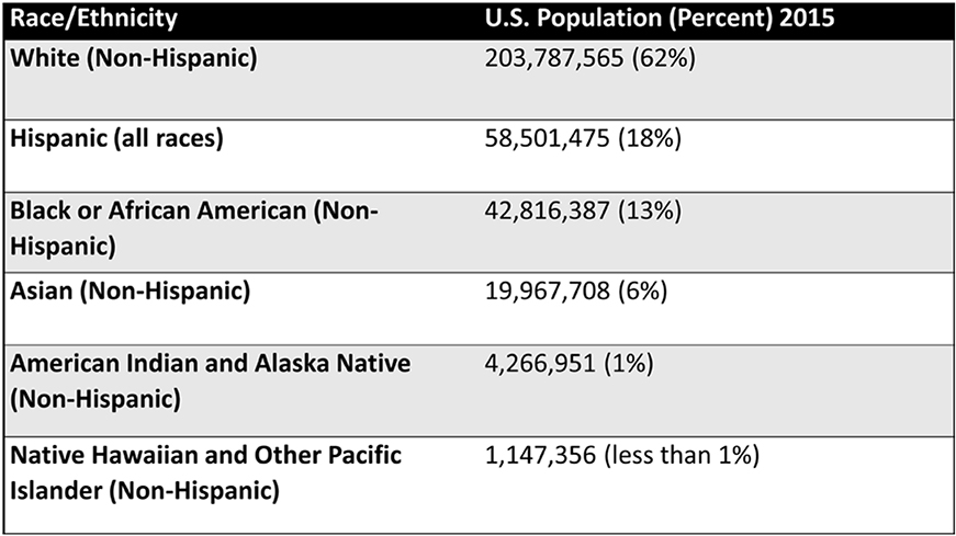
Table 4.1.Race and ethnic population of United States, 2015. Data source: US Census.
While the white non-Hispanic population has seen the largest decrease, Hispanic and Asian populations have increased the most. Asians made up only 0.2 percent of the US population through 1950, but by 1980, they constituted 1.5 percent of the population, and by 2015, they constituted 6 percent. Likewise, the Hispanic population has grown substantially. Not consistently counted as a separate group until the late twentieth century, the Hispanic population grew from 6.4 percent of the US population in 1980 to 18 percent in 2015.
The following sections examine spatial distributions and spatial interaction for the four largest racial and ethnic groups in the United States: white (non-Hispanic), Hispanic (all-races), black or African American (non-Hispanic), and Asian (non-Hispanic).
State-level patterns
White (non-Hispanic)
At a state level of analysis, broad regional patterns of each major group can be observed. Whites still dominate the majority of the country, at 62 percent of the total population, especially as one moves away from the southernmost states. White concentrations in many states are high, with the top quintile reaching 82 to 93 percent (figure 4.7). States with high proportions of whites are the result of early immigration and settlement patterns that predominated from Europe during the seventeenth through twentieth centuries that have not been the focus of more recent immigration flows from other regions.

Figure 4.6.US race/ethnicity, 1980 to 2015. The most dramatic changes nationally have been a decline in the white non-Hispanic population and an increase in the Hispanic and Asian populations. Data source: US Census.
Between 2000 and 2014, the white non-Hispanic population fell in every state but not in the District of Columbia. This decline can be attributed to low fertility rates among the white population and immigration of nonwhites from other countries. In 2015, non-Hispanic whites had the second-lowest fertility rate after Asians. At 1.71 children per woman, the fertility rate was significantly below replacement level. Furthermore, as shown in chapter 3, immigration from Asia and Latin America accounted for significant population gains in recent years, reducing the proportion of whites in many parts of the country.
Latino or Hispanic (All-Races)
When viewing the Hispanic population by state, it is useful to see the spatial patterns of both counts and rates. In figure 4.8, it is clear that the largest Hispanic clusters are in states along the southern border, such as California, Texas, and Florida, as well as in New York. In fact, California, Texas, and Florida alone account for over 50 percent of all Hispanics in the United States. Slightly different patterns are seen when viewing Hispanics as a percentage of the total population. California and Texas stand out, but so too does New Mexico, all of which have Hispanic populations of at least 31 percent.
Again, these distributions can be explained by fertility rates and immigration. Between births and immigration, Hispanics accounted for over half of the total population increase in the United States between the 2000 and 2010 censuses. States along the southern border have absorbed substantial Latino immigration for many decades, with large numbers of Mexicans and Central Americans immigrating to California and Texas, while Cubans and Puerto Ricans have immigrated to Florida. New York also has a large number of Latino immigrants, with many from Puerto Rico and the Dominican Republic.
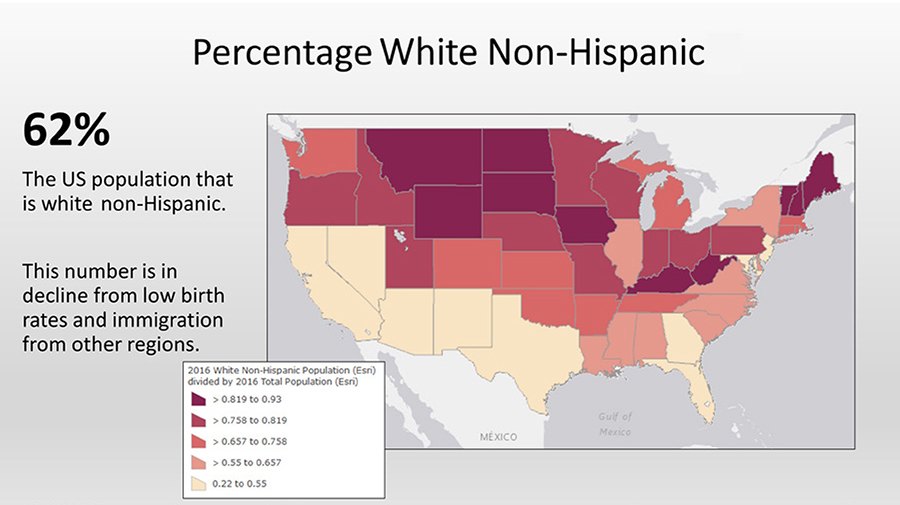
Figure 4.7.Percentage of white (non-Hispanic), 2016. The white population is the largest single racial/ethnic group in the United States, but its distribution varies significantly by state. Explore this map at http://arcg.is/2ldqHzT. Data sources: Esri, US Census Bureau.

Figure 4.8.Hispanic population (all races), 2016. Much of the southwestern United States has high proportions of Latinos, while California, Texas, Florida, and New York have the largest number of Latinos. Explore this map at http://arcg.is/2ldy0Ye. Data sources: Esri, US Census Bureau.
In 2015, Hispanics in the United States had the highest fertility rate of all major racial or ethnic groups, at 2.53 children per woman, which further expands their demographic footprint. However, it must be noted that there is a large difference by generation. First-generation Hispanics have a fertility rate of 3.35 children, but by the third generation, it falls to 1.98—below replacement level. With a decline in immigration from Latin America in recent years, fewer Hispanics will be first generation, resulting in fertility rates that are expected to closely match those of whites and other major groups in coming decades.

Figure 4.9.Black or African American distribution. While southern states stand out with high percentages of African Americans, large numbers of African Americans can be seen in a wider geographic distribution. Explore this map at http://arcg.is/2ldz26O. Data sources: Esri, US Census Bureau.
Black or African American (non-Hispanic)
At the state scale, the black or African American population as a percentage of population is clearly concentrated in the southern states (figure 4.9). However, when looking at count data, the population is much less spatially concentrated. For instance, New York and Texas have lower proportions of blacks than do Louisiana and Alabama. However, in raw numbers, both New York and Texas have larger black populations. Likewise, the map shows California, Nevada, and Arizona with similar proportions of blacks, but as a count, California has a much larger black population than its two neighbors. These discrepancies can be attributed to the large total population of states such as California, Texas, and New York. While there are large numbers of African Americans in those states, there are even larger numbers of other races and ethnicities.
Clustering of the black population in the South has fluctuated throughout US history. While slavery ended in 1876, Southern blacks faced limited economic opportunity as sharecroppers. This, combined with legal segregation and Ku Klux Klan violence, meant that poverty was difficult to escape and mobility was limited. In the early twentieth century, around 90 percent of blacks lived in the South, but this began to change with the outbreak of World War I in 1914. The war cut the flow of migrant workers from Europe, resulting in recruitment of Southern blacks for industrial jobs in northern cities such as Chicago, Detroit, and Philadelphia. Active job recruitment in Southern black newspapers led to migration flows from the rural South to the urban North. Known as the Great Migration, this flow led to a massive shift in the distribution of blacks in the United States. By its peak around 1970, less than one half of blacks lived in the South. But as economic conditions improved in the South, and as deindustrialization began to shutter factories in the North, blacks began to return to what some refer to as the black cultural homeland of the southern states. Because of this, by the year 2010, 55 percent of the black population lived in the South.

Figure 4.10.Asian population distribution is more concentrated among a limited number of states, generally along the coast and border regions of the US. Explore this map at http://arcg.is/2ldv267. Data sources: Esri, US Census Bureau.
Asian (non-Hispanic)
The Asian population is largely concentrated in a handful of states (figure 4.10). About 31 percent of Asians live in California alone. Adding just New York, Texas, and New Jersey accounts for over 50 percent of the Asian population. When viewed at a proportion of the population, Hawaii stands out at 36 percent. After that, the next largest concentration is in California, with 14 percent. Growth of the Asian population has been primarily due to immigration. As pointed out in the previous chapter, Asian immigration, highly restricted until the mid-twentieth century, in recent years has been higher than for all other groups, including Hispanics, although it is growing from a much smaller base. Births have a minimal impact on Asian growth. The fertility rate for Asians is the lowest of all major racial and ethnic groups, at 1.66 children, well below replacement level.
County-level patterns
White (non-Hispanic)
At a county scale of analysis, additional spatial patterns can be discerned for each major racial or ethnic group. As of 2014, the average white proportion was lowest in large and medium-sized metropolitan counties and highest in the most rural counties. For instance, figure 4.11 shows that the white population in and around cities such as Chicago, Detroit, Indianapolis, and Milwaukee is significantly lower than in nearby rural counties.
But while rural areas tend to be more white than urban areas, many rural counties are more diverse than they used to be. As economic opportunity has shifted to urban areas, young whites have been migrating from nonmetropolitan counties to urban areas. In some cases, the only people willing to take on jobs in rural economies, such as on dairy farms, slaughterhouses, and labor-intensive agriculture, are nonwhite immigrants, typically from Latin America and Asia.

Figure 4.11.White population proportion by county, 2016. Urban counties tend to be more racially diverse, while most rural counties have higher proportions of whites. Explore this map at http://arcg.is/2lYHif0. Data sources: Esri, US Census Bureau.

Figure 4.12.Hispanics, 2016, rate by county. While California, Texas, Florida, and New York have large Hispanic populations, they are not evenly distributed throughout each state. Explore this map at http://arcg.is/2lYKCqm. Data sources: Esri, US Census Bureau.
As the demographics of the United States shift away from being predominately white, the number of counties with nonwhite majorities is growing. By 2014, there were 431 counties where the white population was no longer a majority. Of these, 210 were large metropolitan counties, but another 221 were nonmetropolitan counties with smaller urban and rural populations.
Latino or Hispanic (all races)
County maps also paint a different picture of the spatial distribution of Hispanics compared to state-level analysis (figure 4.12). While California and Texas have large Hispanic populations, those populations are not evenly distributed across the states. In California, northern counties have lower percentages of Hispanics, while parts of the southern border, Los Angeles, and Central Valley counties have higher percentages. Los Angeles County alone has over 4.9 million Hispanics, about 50 percent of the county population. In Texas, southern counties have much higher percentages of Hispanics than counties to the north and east of the state. Harris County (which includes Houston) has nearly two million Hispanics, over 40 percent of the county population. In Florida, Miami-Dade stands out with nearly two million Hispanics (over 66 percent of the county population), while the northern panhandle has relatively low percentages. New York State, which has a large Hispanic population, shows the most spatial concentration, with very few high-percentage Hispanic counties outside of the southern portion of the state.
Perhaps more interesting than focusing on counties with large Hispanic populations is to look at counties with fast-growing Hispanic populations (figure 4.13). The fastest-growing Hispanic populations are no longer in the heavily-Latino Southwest but rather in the South, Midwest, and other rural areas. As young people from predominately white rural counties migrate to larger urban areas, they are often replaced by Hispanic immigrants. In the South, many Hispanics hold jobs often seen as undesirable by white and black residents, such as working in poultry plants and picking tomatoes, while in Upstate New York, the dairy industry has become heavily dependent on Hispanic immigrants. In some counties, immigration merely slowed population decline, but in other cases, it was enough to actually increase county populations and contribute to new vitality in otherwise struggling places.
But while Latino immigrants may be a demographic and economic salvation for some counties, the rapid increase in their numbers has, in some cases, led to a backlash among the traditional white population. Businesses catering to the Latino population, including posting signage in Spanish, in traditionally white small towns has led some to feel that their culture is being displaced by new arrivals. At the same time, school districts have had to adapt by adding English as a second language classes—something unheard of prior to rapid ethnic change. Consequently, support for more restrictive immigration policies has increased in places that were long immune to ethnic concerns. This does not imply that all white residents of counties facing change feel anxiety or fear, but it does illustrate how ethnic change is not always a smooth and conflict-free process.
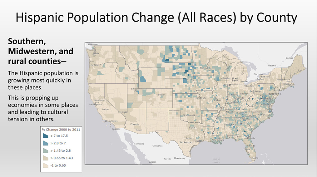
Figure 4.13.Hispanic population change, 2000 to 2011. The most dramatic growth in the Latino population has been in much of the South and Midwest, not in traditional Latino clusters in the Southwest. Explore this map at http://arcg.is/2jXlVu1. Data sources: Esri, US Census Bureau.
Black or African American (non-Hispanic)
The black or African American population is highly concentrated at the county scale of analysis. Figure 4.14 shows a band of high-proportion black counties running from the southern portion of the Mississippi River through Virginia. This area, often referred to as the Black Belt, was traditionally the center of cotton and tobacco production that historically relied on black labor.
As discussed previously in this chapter, there has been a return migration of blacks to the South. In line with most migration in the US, this return migration tends to consist of urban-to-urban moves, as blacks leave cities in the North for cities in the South. This process can be seen in counties comprising the Atlanta metropolitan area, which have seen a substantial increase in the black population, along with other Southern urban and suburban counties. Outside of the South, black populations are concentrated in larger metropolitan counties, such as those containing New York and Chicago.
Asian (non-Hispanic)
When viewing the Asian population by county, it is clear that they are clustered in a relatively small number of areas (figure 4.15). One of the heaviest concentrations is found in the Silicon Valley region around the San Francisco Bay Area. Coastal Southern California has high concentrations as well. In Washington, the Seattle area stands out, while in Texas, the urban areas of Dallas, Houston, and Austin contain clusters. Large urban areas in the Northeast, from Boston south through Washington, DC, also have significant Asian proportions, as do a handful of other counties in the Midwest and South.

Figure 4.14.Black or African American proportion by county, 2016. The historic footprint of tobacco and cotton plantation slave economies can still be seen in the spatial distribution of African American concentrations. Explore this map at http://arcg.is/2lYCDcR. Data sources: Esri, US Census Bureau.

Figure 4.15.Asian proportion of population by county, 2016. Asians are more concentrated in urban regions of the United States. Explore this map at http://arcg.is/2lYJXW2. Data sources: Esri, US Census Bureau.
Clusters of Asians in urban areas are largely due to the pull forces of metropolitan economies. Asians have higher levels of education, such as bachelor’s and graduate degrees, than the general US population, as well as higher incomes. Thus, they tend to concentrate in urban areas that rely on more educated workforces.
But not all Asians are highly educated urban dwellers and, as with Latinos, some rural counties are pulling in less-educated Asian immigrants to replace declining white populations. This can be seen in counties scattered through the Midwest and South. As an example, Huron, South Dakota, a small town of 13,000 people in Beadle County, has attracted hundreds of people from the Karen ethnic group of Myanmar in Southeast Asia. As a lower-educated group, many enthusiastically work in the local turkey-processing plant for wages substantially above the minimum wage. Recruitment of Karen refugees began as the plant struggled to attract and retain US-born residents, who do not want to work in meat-processing plants or prefer to pursue employment opportunities in larger urban areas. This pattern can be found in a number of agricultural and food-processing counties.

Figure 4.16.Chinatown, San Francisco. Ethnic groups often form enclaves that cater to their cultural traditions, be it food, clothing, festivals and celebrations, or more. Photo by Andrey Bayda. Royalty-free stock photo ID: 91115285. Shutterstock.com.
Census tract-level patterns
Moving to an even finer scale of analysis, that of census tracts (small geographic units of approximately 2,500 to 8,000 people), it becomes possible to measure the degree of racial and ethnic clustering and segregation at the local level.
People tend to be sorted by neighborhood in myriad ways, from communities with young families to those of retirees; from blue collar workers to “creative class” technology and media professionals; from the homeless of skid row to loft-dwelling artists. As you may guess from the subject of this chapter, one of the most salient ways in which people are sorted is by race or ethnicity. For much of US history, blacks and whites lived in separate neighborhoods. Then, as new immigrant groups arrived, ethnic enclaves formed, creating Chinatowns, Little Italys, Little Tokyos, Koreatowns, Latino barrios, and many more (figure 4.16).
Ethnic enclaves are places occupied by a relatively homogenous ethnic population. They are characterized by businesses catering to the resident ethnic group, such as restaurants, food markets, and clothing stores, with products from the ethnic culture. Signage may use the ethnic group’s language, and business names may reflect important people and places from the homeland. Festivals and celebrations tied to the ethnic culture are typically held in these enclaves as well.
Some ethnic enclaves go back a century or more, while others are relatively newly formed. For instance, San Francisco’s Chinatown formed well over one hundred years ago, while Little Bangladesh in Los Angeles was officially designated much more recently, in 2010.
Historically, ethnic enclaves formed closer to the inner core of cities, in older and cheaper housing close to busy warehousing and industrial land uses. While many are still located in older central city places, increasingly they can be found in what is known as ethnoburbs, suburban communities that were traditionally dominated by whites (figure 4.17). This ethnic transformation of the suburbs has been dramatic in many places. In fact, while the suburbs in 1990 were over 80 percent white, by 2010, they were only 65 percent so, roughly similar to the white population share of the US.

Figure 4.17.Ethnoburb: Falls Church, Virginia. The Eden Center strip mall serves a large Vietnamese American population in the suburbs of Washington, DC. Photo by Nicole S Glass. Royalty-free stock photo ID: 1040070511. Shutterstock.com.
While many minorities live in ethnic enclaves and ethnoburbs, ethnic groups can also be more spatially dispersed throughout a city. Some ethnic enclaves form as a new group immigrates to a city, but then fade as members blend in with the majority culture through spatial assimilation. Spatial assimilation is the process by which an ethnic group blends in with the broader US society, in terms of both cultural behaviors and residential location, as people move out of ethnic enclaves to dispersed locations. For instance, Little Italy in cities such as New York and San Francisco now have few Italian residents. Most Italians from these places assimilated into American culture and moved to scattered locations throughout the city and suburbs, leaving only a few Italian restaurants in the original enclave (figure 4.18). The same has happened with most early-twentieth-century ethnic immigrants, be they Italian, Irish, German, Polish, or others.
Another dispersed ethnic settlement pattern has been described as heterolocal. With heterolocal settlement, an ethnic group is spatially separate, living in scattered residential areas, but maintains strong cultural connections nevertheless. This can be done via telecommunications, such as cell phones and social media, as well as community organizations, religious establishments, and ethnic-catering businesses.
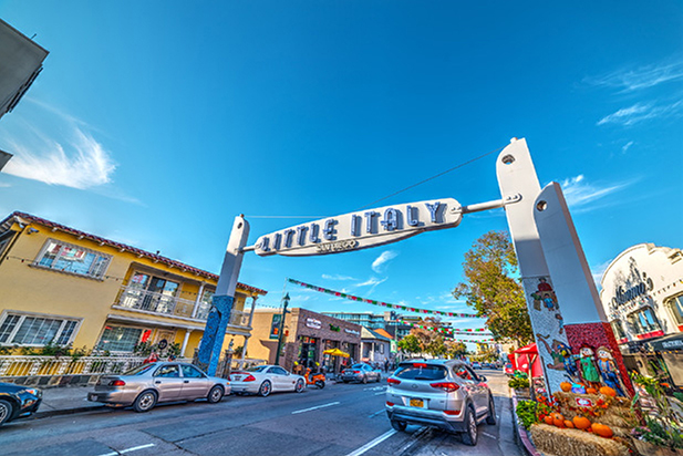
Figure 4.18.Little Italy in San Diego. Many ethnic groups that immigrated in the early-twentieth century, such as the Italians, have gone through the process of spatial assimilation, whereby they no longer live in ethnic enclaves. What remains in many of their former enclaves are ethnically oriented businesses, such as restaurants. Photo by Gabriele Maltinti. Royalty-free stock photo ID: 601397378. Shutterstock.com.
Measuring ethnic clusters: The location quotient
Identifying racial or ethnic clusters can be done in different ways. Hot spot analysis, where clusters are identified with a degree of statistical significance, was introduced in chapter 1. Another tool commonly used to identify clusters is the location quotient. Economists frequently use this tool to identify places with higher than average employment in specific industries, such as high tech or mining. But the location quotient is also useful for geographers in identifying places with higher than average concentrations of a racial or ethnic group. The advantage of using the location quotient over a simple choropleth map showing ethnic populations is that it calculates a standardized value that allows for comparison of different racial groups and different time periods.
The location quotient consists of a simple formula:

If the proportion in the census tract is the same as the proportion of the ethnic group in the study area (i.e., the city, county, state, or nation), then the location quotient is 1 (figure 4.19). A value less than 1 means the proportion of the ethnic group in that census tract is lower than in the overall study area. If it is over 1, then the proportion is higher. For instance, if the location quotient for Somalis in a census tract in Minneapolis, Minnesota, is 0.5, then the proportion of Somalis in that tract is one-half that of their overall share in the state. Somalis are underrepresented in that tract. If the location quotient is 2 in a tract, then the proportion of Somalis is twice the overall share of the state. Somalis are overrepresented in that tract.
Measuring segregation: The index of dissimilarity
Given the history of racial and ethnic segregation in the US, it is useful to view their spatial patterns not only in terms of clustering but also in terms of segregation. While the location quotient identifies places with concentrations of specific racial or ethnic groups, other tools compare how integrated or segregated two groups are.
The index of dissimilarity is a commonly used tool for calculating segregation that measures how evenly two groups are distributed throughout an area. The index ranges from 0 to 100, where 0 means perfect integration and 100 means total segregation. If black-white segregation is being measured at the census tract level, a score of 0 would indicate that blacks and whites are randomly distributed throughout all census tracts and none would have to move in order to achieve perfect integration. A score of 100 would indicate that blacks and whites live in completely different census tracts and 100 percent of one group would have to move in order to achieve integration.

Figure 4.19.Somali concentrations that are twenty to thirty-four times that found overall in the state of Minnesota can be seen in red. The cluster near the center includes the Cedar-Riverside neighborhood, often referred to as “Little Mogadishu” after the capital city of Somalia. Data source: US Census.
The index of dissimilarity can be used to compare any two racial or ethnic groups, but given the numerical dominance of the white population in the US, whites are typically used as the reference group.
Black-white segregation, as measured by the index of dissimilarity, peaked in US metropolitan areas at 79 during 1960 and 1970. Since then, there has been a steady decline in segregation, reaching 59 by the 2010 census. But while overall segregation has decreased, many cities with large black populations remain highly segregated (figure 4.20). For example, the Detroit, Milwaukee, and New York metropolitan regions, as of 2010, still had dissimilarity scores of over 79, meaning that more than 79 percent of the black population would have to move in order to reach full integration. In contrast, the Las Vegas metropolitan region had a score of less than 36, representing very little segregation.
Hispanic-white segregation is less dramatic than black-white segregation, fluctuating around 50 from 1980 to 2000 and dropping slightly to 48 in 2010. But again, scores vary by metropolitan region. As places with large Hispanic populations, the Los Angeles and New York regions had scores over 63. In these cities, the sheer number of Hispanics means that large segregated communities can form, where the vast majority of residents are of the same ethnic background. Where Hispanic populations are smaller, large homogenous communities are less likely to form. For instance, Seattle and Portland, with fewer Hispanics than cities on the southern border, had scores under 35.
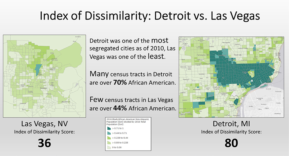
Figure 4.20.Index of dissimilarity: Detroit vs. Las Vegas. Explore these maps at http://arcg.is/2lYGx5x. Data sources: Esri, US Census Bureau.
The lowest levels of segregation are found between Asians and whites. Between 1980 and 2010, scores remained around 41, meaning that only about 41 percent of Asians would have to move in order to achieve integration. At the high end, metropolitan regions such as New York and Houston had 2010 scores of close to 49, while Denver, Phoenix, and Las Vegas had scores at the low end of 30 or less.
Causes of clustering and segregation
To understand the reasons behind racial and ethnic clustering and segregation, it is essential to consider several different factors: racial and ethnic attitudes, financial resources, laws and government policies, and discrimination.
Beginning in the early twentieth century, as blacks began moving from southern states to cities in the North, whites in northern cities began to move to different neighborhoods, away from newly arriving blacks.
Various factors contributed to this white flight, the movement of whites away from racially diversifying neighborhoods. Some white residents moved from pure racial animosity, while others moved due to concerns over changing property values, crime rates, and school quality. As a neighborhood begins to change from white to nonwhite, it can reach a tipping point, at which the pace of white flight increases. In some cases, the white population of a neighborhood will accept a limited number of nonwhite residents, but at a certain point, that number will be perceived as too high, prompting an increase in the rate of whites who move to another place.
To ensure that the neighborhoods to which whites moved would remain racially homogenous, restrictive covenants were used (figure 4.21). These legally enforceable documents restricted who could purchase, rent, or occupy a property based on race, ethnicity, or religion. African Americans, Latinos, Jews, Asians, and other were prevented from living in neighborhoods across the US because of these documents. While racially restricted covenants were ruled illegal by the US Supreme Court in 1948, individuals could still refuse to sell or rent on the basis of discriminatory criteria until the 1968 Fair Housing Act.

Figure 4.21.Restrictive covenants: Housing development in Seattle. Image source: King County Public Records.
While racially restrictive covenants and white flight clearly led to segregation, the actions of real estate agents also contributed via racial steering and blockbusting. Racial steering is when real estate agents guide clients to neighborhoods of the client’s own race or ethnicity, regardless of their income or neighborhood preference. For example, a black homebuyer may be shown homes in black neighborhoods but not homes of equal value in white neighborhoods. Up through the 1940s, racial steering was part of the real estate agent’s code of ethics, which stated that an agent “should never be instrumental in introducing into a neighborhood a character of property or occupancy, members of any race or nationality, or any individual whose presence would clearly be detrimental to property values in that neighborhood.”
Through blockbusting, real estate agents would play on whites’ racial fears by encouraging them to sell in neighborhoods at risk of racial change. In a sense, this strategy played on the idea of a tipping point. By selling a home on a city block to a nonwhite family, for instance, an agent could then more easily convince white residents that the neighborhood was changing and that it was a good time to sell. This naturally benefitted the agents, who make money from the buying and selling of houses.
Federal Housing Administration policies from 1934 through 1968 also contributed to segregation. During this time, urban neighborhoods were ranked from A through D on the basis of mortgage credit risk (figure 4.22). Neighborhoods with A ratings were considered the lowest risk. These places were defined as “homogenous” and not yet fully built up. In essence, these were the new suburban areas whites where fleeing to. Neighborhoods in the B category were “still desirable.” In contrast, neighborhoods ranked C were aging, with expiring racial restrictions and “infiltration of a lower grade population.” These places had higher credit risks, and banks were encouraged to limit lending there. Finally, neighborhoods with a D rating were the worst for lending. This redlining, or the drawing of a red line on a map (sometimes literally and sometimes figuratively) around certain neighborhoods where mortgages were difficult to get, gave whites further reason to sell quickly and move. As loans became more difficult to get in redlined neighborhoods, home prices could only fall.

Figure 4.22.Mortgage risk map for Richmond, Virginia. Beginning in the 1930s, maps such as these were made for many US cities. Older neighborhoods with diversifying populations (yellow and red) received lower rankings than newer, whiter neighborhoods (green and blue). Data source: The U.S. National Archives and Records Administration.
Changes in housing law now prohibit racially restrictive covenants, racial steering, blockbusting, redlining, and other discriminatory practices, yet the historic footprints of segregated communities still shape the racial and ethnic distributions found in US cities.
Despite changes in housing law, discrimination can still contribute to segregation. Racial minorities attempting to rent sometimes run into landlords who lie about the availability of units or do not inform them of special offers and incentives for moving in. And when purchasing homes, minorities are rejected for mortgages at higher rates than whites. Nevertheless, housing discrimination is significantly less than in the past.
While discrimination is less prevalent now than in the past, segregation and clustering can still occur for other reasons. Income is a powerful factor in sorting people by residential location, and in the US average incomes vary by race and ethnicity. Table 4.2 shows the 2014 median household income of the four major racial and ethnic groups. While incomes can vary at the individual level—there are low-income Asians and high-income blacks—on average, groups will be sorted along socioeconomic lines. Based on average incomes, Asians will be disproportionately in more expensive neighborhoods, while blacks will be in less expensive neighborhoods. Whites, based on average income, will be in places closer to Asians, while Hispanics will be in places closer to blacks. Even if housing discrimination is eliminated, we will still find segregation and clustering until income differences between groups is eliminated as well.

Table 4.2.Ethnic and racial groups in the US are segregated partially due to differences in median household income. Data source: US Census.
Lastly, segregation and clustering can occur not from a discriminatory desire to stay away from other groups but from a desire to be with one’s own group. This can be especially true for new immigrants, who look for places where residents share a common language, where local markets stock foods from the homeland, and where connections for jobs and housing can be more easily obtained. As shown, Asians have high incomes on average. This should allow them to live wherever they want, yet large Asian communities can be found in cities throughout the United States. Research shows that groups other than immigrants also have preferences for neighborhoods of their own race. Whites tend to prefer neighborhoods with more white residents, while blacks and Hispanics also prefer neighborhoods with a substantial proportion of their own group. With that said, it is difficult to disentangle how much residential choice is due to personal preference and how much is due to a sensation of discrimination, or “otherness” when living as a minority in a community.
Go to ArcGIS Online to complete exercise 4.1: “Measuring spatial distribution with population ratios,” and exercise 4.2: “Measuring spatial distribution with the location quotient.”
Spatial relationships
Geographers are not interested in mapping the spatial distributions of racial and ethnic neighborhoods merely to know where they are. Rather, mapping often helps illustrate important spatial relationships between ethnic groups and quality of life issues. Targeted public and private programs aimed at improving quality of life can be developed by understanding how race or ethnicity relates spatially to a wide range of variables, such as consumer needs, income and housing, levels of education, health, crime, exposure to environmental hazards, and many more.
Consumer markets
As you intuitively know from observing different neighborhoods in different places, similar types of people cluster together. These similarities translate into similar consumer behaviors that vary by geographic location; thus there is a strong spatial relationship between where clusters of similar types of people live and the types of products and services they consume. By understanding this spatial relationship, companies, government agencies, and nonprofit organizations can target their products and services by geographic location, modifying their mix of goods and services and marketing strategies so that they appeal to the people who live in each place.
There are numerous examples of how race and ethnicity relate to consumer markets. When an ethnic group includes a large proportion of recent immigrants, they may prefer smaller local businesses that cater specifically to their tastes in food and clothing over national chains. These behaviors offer opportunities for small entrepreneurs and challenges to mainstream stores, which may have to change their merchandising and marketing strategies to attract customers. Governmental and nongovernmental organizations can also use information on consumer behavior to guide health programs. Consumption of junk food, cigarettes, alcohol, and other unhealthy products can vary by race and ethnicity, and by understanding these differences, health program strategies can be targeted to different groups.
Consumer clusters are identified through market segmentation analysis. This analysis uses a wide range of demographic and lifestyle data to identify neighborhoods with similar characteristics, with the goal of identifying unique consumer market segments. The ArcGIS platform includes Tapestry Segmentation data, which divides the US population into fourteen broad Life Mode segments that are further divided into sixty-seven more detailed segments. Of these, two Life Modes and eleven detailed segments focus on ethnically diverse neighborhood types (figure 4.23).
When mapped, Tapestry segments illustrate the complex geographic patterns of demography and lifestyle that spatially correlate with unique consumption patterns. Figure 4.24 shows the Tapestry Segmentation for Denver, Colorado. A business looking to open in the ethnically diverse census tracts outlined in black, referred to as the Ethnic Enclaves and Next Wave Life Modes, will have to target its marketing campaign and products to an audience that is significantly different from that in other areas of the city, such as the Affluent Estates or Senior Styles. For instance, residents of the Las Casas segment of the Next Wave Life Mode consume more baby products and children’s apparel and rent more than own homes. They also have lower incomes than the US median. Based on this type of information, a second-hand children’s clothing store may make sense, while a do-it-yourself home-repair construction supply store may not.

Figure 4.23.Market segmentation analysis. Data source: Esri.
Go to ArcGIS Online to complete exercise 4.3: “Spatial relationships: Tapestry segmentation, race, and ethnicity.”
Income and housing
Aggregate differences in median income by race and ethnicity (as seen in table 4.2) play out spatially in relation to housing. A simple visual analysis of figures 4.20 and 4.25 shows a strong spatial relationship between race, income, and the value of homes. Blacks in Detroit are concentrated in neighborhoods with low incomes and, as a result, low home values. Many of these neighborhoods contain overcrowding, substandard housing, and deferred maintenance of homes. By understanding the relationship between spatial concentrations of race, income, and housing, policymakers can begin to explore solutions to Detroit’s persistent segregation and urban decay.
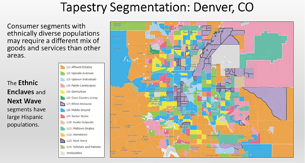
Figure 4.24.Tapestry Segmentation in Denver, Colorado. Data source: Esri.
For instance, while discrimination, especially in the past, may be partially responsible for these patterns of race, income, and housing, there is evidence that places themselves play a strong role in perpetuating them. Children who spend their whole lives in low-income neighborhoods earn less as adults than those who grow up in higher-income neighborhoods. Better schools, less exposure to crime, and more stable two-parent households provide advantages in higher-income places that translate into higher incomes. For this reason, a government program was established to allow some residents of poor neighborhoods to use rental-assistance vouchers to move to neighborhoods with low rates of poverty. The income, education level, and family structure of the recipients did not change; the only change was the income level of the neighborhood they moved to. The result was that, as adults, the children who moved to the new neighborhoods earned significantly more than the children who remained in low-income, segregated places. The difference in income was greatest for children who moved at a younger age, meaning the more time spent in a higher-income neighborhood, the greater the increase in earnings as an adult. The difference was much larger for boys than for girls, showing that boys are more negatively affected by places of high-concentration poverty and segregation.
That places matter in the life outcomes of people leads to potential policy solutions. It may make sense to stop providing low-income housing in segregated low-income communities. Instead, housing vouchers and subsidized units could be placed in neighborhoods with low levels of poverty—although this can be very difficult from a political standpoint. But, of course, it is unrealistic to move everyone out of poor segregated neighborhoods. For this reason, a holistic approach may be needed to end multigenerational cycles of poverty in these places. Attempts to provide jobs alone, or to just improve schools, may be insufficient when children are enmeshed in neighborhoods with myriad social and economic problems.

Figure 4.25.Median household income (left) and median home value (right) in Detroit, 2015. Explore these maps at http://arcg.is/2lYXSLv. Data sources: Esri, US Census Bureau.
Understanding the spatial relationship between racial and ethnic clusters, poverty, and housing can lead to other group-specific solutions as well. While Asians, on average, have high incomes, there is variation by nationality. The Chinese and Indians tend to have higher levels of education and income. Therefore, spatial clusters of these groups tend to be in higher-value neighborhoods with fewer social problems. However, many Southeast Asians, such as the Vietnamese, Cambodians, and Laotians, have lower incomes and often cluster in lower-income places with high crime and social ills. Housing vouchers to help poor Southeast Asians move to new neighborhoods may not work when English language skills are limited. Instead, a first step may require more intense English language instruction in local schools. Furthermore, war-related trauma suffered by Southeast Asian immigrants may have an impact on their US born children, which would require specialized resources in local neighborhoods. In either case, the solutions aimed at helping improve the lives of Southeast Asians would likely be different than for blacks in Detroit.
Go to ArcGIS Online to complete exercise 4.4: “Spatial relationships: Income, race, and ethnicity.”
Crime
As another example, the spatial relationship between racial and ethnic clusters and crime can help illuminate contemporary concerns over police-minority friction. Race and ethnicity are not causes of crime, but they have a strong spatial relationship with factors that do cause crime, such as lack of opportunity for people with low incomes and lack of education, single-parent households unable to supervise youth, and other variables. For instance, figure 4.26 shows that overall crime has a strong spatial relationship with the low-income minority communities of Detroit.
High crime rates lead to a heavier police presence in minority communities. In many cities, a disproportionate number of police officers are of a different race or ethnicity than the communities in which they serve. Coming from different neighborhoods and different backgrounds can cause friction and real or perceived discrimination against minority communities.
At least one reason behind the lack of minorities serving as police in their own communities is the higher arrest and conviction rates for minorities, especially for drug use or possession. While drug use among minority communities is not higher than for white communities, arrest and conviction rates are. This can be for a number of reasons. For instance, a lack of private space in homes and yards in poor, minority communities can lead to more illegal drug use in public spaces where risk of arrest is higher. Residents of more affluent communities often have more private space in which to use drugs and therefore may be less likely to get arrested. This can be compounded by higher levels of police patrols in high-crime, low-income minority communities. Racial bias by police and courts can also lead to more arrests and convictions of minorities for drug use.

Figure 4.26.Crime index for Detroit, 2016. Explore these maps at http://arcg.is/2lYXSLv. Data sources: Esri, AGS.
The result is that more young adults from low-income minority communities have criminal records and do not qualify to become police officers. Even though whites in more affluent areas may also have used drugs, they are less likely to be caught and punished. Thus, many cities struggle to build trust among police and minority communities.
Environmental quality
Racial and ethnic clusters also have spatial relationships with health problems and environmental hazards. All three of these come together in the concept of environmental justice. Often, when a polluting factory, toxic landfill, smelly wastewater treatment plant, or waste incinerator is to be built, the site is near low-income, and thus frequently minority, neighborhoods. Rarely are sites near higher-income, and thus disproportionately white, neighborhoods. Because of the disproportionate impact of these types of facilities on low-income minority communities, the US government, in 1994, established environmental justice policy for the “fair treatment and meaningful involvement of all people regardless of race, color, national origin, or income with respect to the development, implementation and enforcement of environmental laws, regulations and policies.”
Remaining with the example of Detroit, there are three local examples of environmental justice. One is a waste incinerator located in a predominately black and poor neighborhood. Reports of foul odors and high rates of asthma in the surrounding area have been attributed to the incinerator. The second is a riverfront park, also in a lower-income minority community, closed to the public because of contaminated soils. The third involves a city policy to cut off water to homes of residents who do not pay their water bill. Some consider clean water to be a human right that cannot be denied by government. In each of these cases, environmental threats overlay with the location of low-income, minority communities.
Go to ArcGIS Online to complete exercise 4.5: “Environmental justice.”
Race, ethnicity, and cultural landscapes
Cultural landscapes are the material imprint that people make on places. Different cultures create places with distinct sights, sounds, and smells. Traveling place to place, one can experience sensory diversity in types of architecture, businesses and products, languages on signs, soundscapes of traffic, smells of foods, and much more. These unique cultural characteristics reflected in the landscape reveal who settled a place and who lives there now.
While geographers can often identify racial and ethnic clusters with census data, some communities can be found only by exploring the cultural landscape. For instance, Little Italys in many cities now have few Italian residents, so locating them with census data on Italian heritage would be impossible. Yet Little Italys can still be found by identifying cultural landscapes where there are a disproportionate number of Italian restaurants or stores with goods from Italy. Little India and Little Tokyo in the Los Angeles region reflect this problem (figure 4.27). Both populations are heterolocal, with no large cluster in the region, yet Little India and Little Tokyo are thriving districts filled with restaurants, clothing stores, and mini-markets that cater to the ethnic population. These important centers of Indian and Japanese culture in Southern California would not be identified by relying on census data. Only fieldwork examining the cultural landscape can lead to an understanding of this ethnic place.
The concept of sense of place, or the emotional attachment of people with places, was introduced in chapter 1. As people form racial and ethnic clusters, they transform physical and human landscapes to reflect their own cultural tastes and preferences. Through this process, regions and communities can form a unique sense of place tied to their racial or ethnic identity.
As an example, at a broad regional scale, we have seen that Hispanics have historically concentrated in the southwestern United States. Given that much of this area was originally settled by the Spanish, many landscape elements reflect their influence. Cities founded by the Spanish all evolved around a central plaza faced by a church and government building. Cities such as Los Angeles, California; Santa Fe, New Mexico; and San Antonio, Texas, all grew from central plazas such as these, which are now tourist points of interest. Spanish land-use patterns can also be seen in the landscape. Large ranchos from well over a century ago influence city boundaries and street orientation, some of which follow rancho property lines. Architectural styles can also reflect Spanish influence, with terracotta tile roofs, arches, and stucco walls of homes and public buildings. And, of course, Spanish place-names, also known as toponyms, are reflected in signage for cities (Los Angeles), streets (Santa Monica Boulevard), rivers (Rio Grande), mountains (Sierra Nevada), and myriad other places in the Southwest.

Figure 4.27.Little Tokyo, Los Angeles, California. This heterolocal community comes from around the Los Angeles region for Japanese-themed shops and food. The Japanese cultural landscape is evident in signs, products, and people. Photo by Kit Leong. Royalty-free stock photo ID: 704666428. Shutterstock.com.
As Spanish Alta California became part of the United States in the nineteenth century, Anglo settlement quickly superseded the Latino population. Nevertheless, themes of the original Hispanic cultural landscape remained, especially in the Spanish colonial architectural style and promotion of the region with images of Spanish missions surrounded by lush agricultural land.
Outside of architecture and some promotional imagery, the Southwest gradually came to resemble an Anglo cultural landscape. English language toponyms for cities, streets, and other places came to dominate; businesses catered to the consumer tastes of the Anglo population in clothing, food, and other goods; and commercial architecture followed trends out of New York and Chicago.
The cultural landscape of downtown Los Angeles offers a clear example of how race and ethnicity modify places to reflect group identities. As Los Angeles grew rapidly in the early twentieth century, Broadway became the primary street for theaters and shopping. The street bustled with pedestrian traffic during the day and night as a central point of activity for the city. Streetcars linked Broadway with expanding areas of residential growth, allowing for easy access to the city center. But by the end of the 1940s, the city was changing. Suburban growth accelerated in the 1950s and beyond. The predominately Anglo population moved farther from downtown, and the streetcars were removed throughout the region and replaced by freeways. Urban renewal downtown cleared many residential neighborhoods and replaced them with office buildings occupied by workers who commuted daily from the suburbs. Downtown businesses and theaters relocated to new suburban areas as well, vacating streets such as Broadway.
But as the Anglo population vacated Broadway, falling commercial and residential rents became attractive to nearby Latino residents of East Los Angeles, who were prevented from living in many other parts of the city due to restrictive covenants, and attractive as well to new immigrants. As the Latino population steadily grew, Broadway was transformed to a distinctly Latino cultural landscape. Signage came to be nearly exclusively in Spanish; numerous quinceañera and bridal shops opened; and street vendors selling tacos, cut fruit with chile, and other Mexican foods set up on sidewalks. Music coming from storefronts reflected the latest Ranchero stars. Non-Hispanic business owners, many of whom were immigrants from other parts of the world, learned Spanish in order to sell to their Latino clientele (figure 4.28).

Figure 4.28.Downtown Los Angeles shifted from having an Anglo cultural landscape with many theaters to a largely Hispanic cultural landscape, with jewelry stores and other businesses exhibiting Spanish language signage. Photo by Hayk Shalunts. Royalty-free stock photo ID: 377672158. Shutterstock.com.
In recent years, Broadway, and downtown Los Angeles in general, have been going through yet another sociodemographic change, with resulting alterations to the cultural landscape. As American central cities have become safer in the past decade, and as some people prefer pedestrian-oriented neighborhoods over freeway-centric development, downtowns have been making a comeback, attracting new residents with higher incomes. New apartments and condominiums are being occupied by young professionals, and businesses are returning to cater to their tastes. The cultural landscape is now reflecting a younger, hipper demographic. Latino businesses on Broadway are being replaced by upscale cafés and bars, higher-end clothing stores, and boutique hotels (figure 4.29). The nearby Grand Central Market, which once offered low-cost meats and produce, now contains dozens of restaurants, including an artisanal wine bar, organic juices, and places with trendy names such as Eggslut.
Los Angeles remains a majority Latino city, so the cultural landscape will reflect that culture even if a higher-income population transforms downtown. For instance, elements of the Latino cultural landscape are being integrated into urban planning regulations for the area, including the legalization of street vending and decorative wall murals. And, of course, food from Latin America remains a central part of the Angelino’s diet. Despite changes to the Grand Central Market, there are still several establishments that serve Mexican food, a Salvadoran Pupusería, and a Latino dry goods stand offering chiles and moles.
Go to ArcGIS Online to complete exercise 4.6: “The cultural landscape.”

Figure 4.29.More recently, trendy clothing stores and higher-end apartments in downtown Los Angeles are pushing out much of the Hispanic cultural landscape. Photo by Hayk Shalunts. Royalty-free stock photo ID: 377682217. Shutterstock.com.
Racial and ethnic conflict
Unfortunately, a discussion of race and ethnicity cannot omit the concepts of racism and xenophobia. The two concepts are similar in that they both represent antipathy or discrimination against another group. In the case of racism, this discrimination is aimed at people of another race, while xenophobia is aimed at people of a different ethnic or cultural group.
Slavery was clearly based on the racist idea that whites were superior to blacks and thus had the right to force them into bondage. This ideology continued even after slavery was abolished, resulting in the patterns of segregation discussed earlier in this chapter.
When taken to an extreme, racism and xenophobia can lead to genocide or ethnic cleansing. Genocide, as defined by the United Nations, is the intent to destroy a group of people based on nationality, ethnicity, race, or religion. The United Nations includes ethnic cleansing as a type of genocidal act, whereby a group is forced to leave a specific territory in order to make it ethnically homogenous.
Within the United States, the Native American population faced genocide at the hands of European settlers. With the diffusion westward of European settlers in the United States in the eighteenth and nineteenth centuries, they came across land already occupied by various Native American tribes. From around the 1770s through 1815, hundreds of Indian towns in the eastern and southern portions of the United States were burned and the residents killed or forced to flee. A clear process of genocide through ethnic cleansing officially began in 1830 with the Indian Removal Act, which authorized the removal of all Indians east of the Mississippi River for relocation to Indian Territory in Oklahoma and Kansas. As a result, roughly 30 percent of the population of affected tribes died from disease, starvation, and exposure to the elements. The US military used force to ensure compliance and killed many who resisted.
As settlers moved farther west, the genocide continued. In some cases, armed groups of settlers attacked and killed Indians, while in other cases the US Army did the killing as part of the Indian Wars. Hunting of buffalo and other Indian game further reduced Indian numbers through starvation and ensuing disease. From the time of initial European contact with the Native Americans of North America to the twentieth century, ethnic cleansing had removed Indians from nearly all of their territory, and it is estimated that their population declined by 70 to 90 percent.
Later in the twentieth century, there were numerous cases of genocide and ethnic cleansing. The term genocide was coined in 1944 to describe Nazi crimes against Jews in Europe and was adopted by the United Nations in 1948. Later, in the 1990s, ethnic cleansing came into wide usage to describe the ethnic violence that tore apart the former country of Yugoslavia in Eastern Europe. During this conflict, ethnic Serb forces killed roughly 100,000 Bosnian and Croatian residents in an attempt to clear the Yugoslav republic of Bosnia-Herzegovina of these groups (figure 4.30). Also in the 1990s, the country of Rwanda in sub-Saharan Africa was torn apart by ethnic conflict. In this case, the majority Hutus killed approximately 800,000 people from the minority Tutsi ethnic group during a three-month period.

Figure 4.30.Genocide in Bosnia. United Nations forensic experts unearth victims from a mass grave in the city of Srebrenica. Photo by Northfoto. Shutterstock. Stock photo ID: 90838403.
A somewhat lesser known case of ethnic cleansing, but one that is important in understanding ongoing conflict in Iraq, was the Arabization policy in northern Iraq. During the 1970s and 1980s, the Iraqi government forcibly removed ethnic Kurds and Turkmen from oil-rich lands in northern Iraq in order to consolidate control of the region. Hundreds of thousands were killed or forced by the Iraqi military to flee, their villages were bulldozed, and property title was turned over to new Arab immigrants from other parts of Iraq. Images of chemical weapons used in this campaign against Kurdish villagers in 1988 were employed by the US government to justify military intervention on human rights grounds in 1990. Ongoing disagreements over the borders of the Iraqi Kurdistan autonomous region, blurred and confused by the Arabization policy, still taint relations between Kurds and the central government of Iraq. Many Kurds wish to secede from Iraq and form an independent Kurdistan, leading to the ongoing question of whether Iraq will continue to exist in its current form.
References
Adamy, J., and P. Overberg. 2016. “Places Most Unsettled by Rapid Demographic Change Are Drawn to Donald Trump.” Wall Street Journal, Novermber 1, 2016. http://www.wsj.com/articles/places-most-unsettled-by-rapid-demographic-change-go-for-donald-trump-1478010940.
Alba, R. D., J. R. Logan, B. J. Stults, G. Marzan, and W. Zhang. 1999. “Immigrant Groups in the Suburbs: A Reexamination of Suburbanization and Spatial Assimilation.” American Sociological Review 64, no. 3: 446. doi: https://doi.org/10.1177/0002716215594611
Allen, J., and Eugene Turner. 2002. Changing Faces, Changing Places. Mapping Southern California. Northridge, CA: The Center for Geographical Studies.
Blake, J. 2010. “Arab- and Persian-American Campaign: ‘Check It Right’ on Census.” CNN, May 14, 2010. http://www.cnn.com/2010/US/04/01/census.check.it.right.campaign.
Chetty, R., and N. Hendren. 2017. “The Impacts of Neighborhoods on Intergenerational Mobility I: Childhood Exposure Effects.” EconPapers. http://econpapers.repec.org/RePEc:nbr:nberwo:23001.
Constable, P. 2012. “Alabama Law Drives Out Illegal Immigrants but Also Has Unexpected Consequences.” Washington Post, June 17, 2012. https://www.washingtonpost.com/local/alabama-law-drives-out-illegal-immigrants-but-also-has-unexpected-consequences/2012/06/17/gJQA3Rm0jV_story.html?utm_term=.4794790f6f58.
Frey, W. H. 2004. “The New Great Migration: Black Americans’ Return to the South, 1965−2000.” Brookings, May 1, 2004. https://www.brookings.edu/research/the-new-great-migration-black-americans-return-to-the-south-1965-2000.
Garner, S. 2014. “How the Evolution of L.A.’s Broadway Traces the Life of the City.” Curbed, November 14, 2014. https://www.curbed.com/2014/11/14/10023252/los-angeles-broadway-history.
Gebeloff, J. E. R. 2016. “Affluent and Black, and Still Trapped by Segregation.” New York Times, August 21, 2016. https://www.nytimes.com/2016/08/21/us/milwaukee-segregation-wealthy-black-families.html?_r=0.
Hardwick, S. W., and J. E. Meacham. 2005. “Heterolocalism, Networks of Ethnicity, and Refugee Communities in the Pacific Northwest: The Portland Story.” The Professional Geographer 57, no. 4: 539–557. doi: https://doi.org/10.1111/j.1467-9272.2005.00498.x.
Havekes, E., Bader, M., and Krysan, M. 2016. “Realizing Racial and Ethnic Neighborhood Preferences? Exploring the Mismatches Between What People Want, Where They Search, and Where They Live.” Population Research and Policy Review, 35: 101–126. doi: http://doi.org/10.1007/s11113-015-9369-6.
Hawthorne, C. 2014. “‘Latino Urbanism’ Influences a Los Angeles in Flux.” Los Angeles Times, December 6, 2014. http://www.latimes.com/entertainment/arts/la-et-cm-latino-immigration-architecture-20141206-story.html.
Human Rights Watch. 2004. “III. Background: Forced Displacement and Arabization of Northern Iraq.” In Claims in Conflict: Reversing Ethnic Cleansing in Northern Iraq. https://www.hrw.org/reports/2004/iraq0804/4.htm#_Toc78803800.
James, Michael. 2017, “Race.” The Stanford Encyclopedia of Philosophy (Spring 2017 edition), Edward N. Zalta (ed.). https://plato.stanford.edu/archives/spr2017/entries/race.
Logan, J., and B. Stults. 2011. “The Persistence of Segregation in the Metropolis: New Findings from the 2010 Census.” Census brief prepared for Project US2010.
Madrigal, A. C. 2014. “The Racist Housing Policy That Made Your Neighborhood.” The Atlantic, May 22, 2014. https://www.theatlantic.com/business/archive/2014/05/the-racist-housing-policy-that-made-your-neighborhood/371439.
Mejia, B. 2016. “Fiesta Broadway Lives on as the Street Slowly Loses its Latino Heart.” Los Angeles Times, April 24, 2016. http://www.latimes.com/local/california/la-me-adv-broadway-latinos-20160424-story.html.
Navarro, M. 2012. “For Many Latinos, Racial Identity Is More Culture Than Color.” New York Times, January 14, 2012. http://www.nytimes.com/2012/01/14/us/for-many-latinos-race-is-more-culture-than-color.html.
Neil C. Bruce. 2013. Real Estate Steering and the Fair Housing Act of 1968, 12 Tulsa L. J. 758. http://digitalcommons.law.utulsa.edu/tlr/vol12/iss4/8.
Ojmarrh Mitchell, and Michael S. Caudy. 2015. “Examining Racial Disparities in Drug Arrests.” Justice Quarterly 32, no. 2. doi: http://dx.doi.org/10.1080/07418825.2012.761721.
The Pew Charitable Trusts. 2014. “Changing Patterns in U.S. Immigration and Population. Immigrants Slow Population Decline in Many Counties.” Pew. http://www.pewtrusts.org/en/research-and-analysis/issue-briefs/2014/12/changing-patterns-in-us-immigration-and-population.
Piccorossi, M. 2015. “What Census Calls Us: A Historical Timeline.” Pew Research Center’s Social & Demographic Trends Project. http://www.pewsocialtrends.org/interactives/multiracial-timeline.
Public Broadcasting Service (PBS). 2016. “South Dakota Town Embraces New Immigrants Vital to Meat Industry.” PBS, July 2, 2016. http://www.pbs.org/newshour/bb/south-dakota-town-embraces-new-immigrants-vital-to-meat-industry.
Shertzer, A., and R. P. Walsh. 2015. “Racial Sorting and the Emergence of Segregation in American Cities.” National Bureau of Economic Research. http://www.nber.org/papers/w22077.
Sisson, C. K. 2014. “Why African-Americans are Moving Back to the South.” Christian Science Monitor, March 16, 2014. https://www.csmonitor.com/USA/Society/2014/0316/Why-African-Americans-are-moving-back-to-the-South.
Stille, A. 2014. “Can the French Talk About Race?” The New Yorker, July 1, 2014. https://www.newyorker.com/news/news-desk/can-the-french-talk-about-race.
Suh, M. 2015. “Total Fertility Rate for Population Estimates and Projections, by Race-Hispanic Origin and Generation: 1965−1970, 2015−2020 and 2060−2065.” Pew Research Center’s Hispanic Trends Project. http://www.pewhispanic.org/2015/09/28/modern-immigration-wave-brings-59-million-to-u-s-driving-population-growth-and-change-through-2065/9-26-2015-1-30-23-pm-2.
US Census Bureau. 2002. “Demographic Trends in the 20th Century.” Census 2000 Special Reports. https://www.census.gov/prod/2002pubs/censr-4.pdf.
———. “Racial and Ethnic Residential Segregation in the United States: 1980−2000.” Census 2000 Special Reports. https://www.census.gov/hhes/www/housing/housing_patterns/pdftoc.html.
———. 2011. “Overview of Race and Hispanic Origin: 2010.” 2010 Census Briefs. https://www.census.gov/prod/cen2010/briefs/c2010br-02.pdf.
———. “The Hispanic Population: 2010.” 2010 Census Briefs. https://www.census.gov/prod/cen2010/briefs/c2010br-04.pdf.
———. “The Black Population: 2010.” 2010 Census Briefs. https://www.census.gov/prod/cen2010/briefs/c2010br-06.pdf.
US Census Bureau Public Information Office. 2016. “2010 Census Shows America’s Diversity—2010 Census.” US Census Bureau Newsroom Archive. https://www.census.gov/newsroom/releases/archives/2010_census/cb11-cn125.html.
US Department of Agriculture Economic Research Service. 2013. Atlas of Rural and Small-Town America. Washington, DC: USDA ERS. https://www.ers.usda.gov/data-products/atlas-of-rural-and-small-town-america.