Manuscript appears on the underside of engravings from the 1859 and 1864 Webster’s. Most blocks bear the name of the image illustrated and the source from which it was copied. Crabb, Fairhole, Wood’s Botany, Francis are commonly cited names along with Tomlinson and the English Encyclopedia noted above. Tephrosia (above) was used in the 1864 but was copied from the 1859 Webster. Roman numerals were used to identify pages in that section as it was a last minute addition.

The images John Andrew engraved for the 1859 edition were copied from the Imperial Dictionary as was the Friction wheel (above). Palmetto exhibits the only known palimpsest in the manuscript. It is always interesting to find those unusual abberations. Similarly, there is something pleasurable in finding examples of unnecessary embellishment as these on the Friction-clutch and Tassets engravings. Lobster, copied from Edwards, appears in the 1864 Webster’s. The metal electrotype of this image appears at the base of the facing page. Notice how the block was cut to allow for more text. (The second antennae broke off this block.)
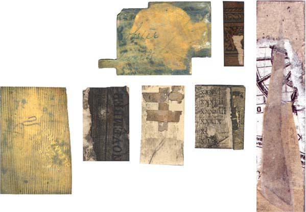
Blocks from the International rarely have markings on the bottom. This engraving (left) has a squiggly pencil mark and lines from the machining process. It also has a stamp from “A. P. J. & Co. 28 Beekman St. N. Y.” The last images are of old “underlay” removed from the engravings showing printed matter and masking tape (center block). The tall image shows my own underlay for an electrotype of a pine tree.
The component of this project missing from the printed pages of the book is the physical engraved block. Page 439 contains representations of the blocks to give the reader a sense of what the original blocks are like. The image opposite showcases some of the manuscript and the old underlay that was formerly stuck to the bottoms of the blocks. There is also an example of the underlay I did to fill in an electrotype that had begun to sag in the center of the image. The second page primarily shows scans of the tops of engravings.
While cleaning the old underlay I discovered manuscript on the bottom of the old blocks, written beautifully and clearly in various shades of blue or sepia ink. The text usually names the image and cites the source and page from which it was copied. It was hidden by old underlay. This manuscript thrills me as it provides a further sense of the hand of the engravers.
The black line blocks are like little sculptures. The wood has become blackened from the applications of graphite used in the electrotyping process. The new school blocks from the International leave the wood surface of the surrounding block intact save for a border just around the image. This uncut surface area would print as what I term a “black field,” and further explanation of this may be found below. What is fascinating about the blocks reproduced here is that many retain photographically transferred imagery. The additional scenery gives an idea of the source material for many of the images. It is interesting to think about what the engraver W. F. Hopson chose to keep in an image. For some birds he kept the branches upon which they were perched and for others he didn’t. Was he making choices based on artistic considerations, size, or time, or was it mostly a function of what he enjoyed engraving?
It has always been my hope that I could put faces to the men and women who created the engravings printed in this book. John Andrew (1815–1879) and his shop made the engravings for the 1859 and 1864 Webster’s; William Fowler Hopson (1849–1935) engraved the 1890 International. There is scant mention of other engravers involved with the project, although there are letters by Charlotte B. Cogswell that indicate she may have made some engravings for the 1864 Webster’s.
John Andrew was an influential engraver. His son mentions in a letter that he “introduced bolted blocks for large newspaper cuts and was the first to use photography for enlarging and reducing on the wood. And although a good businessman, he was a strong, original, and very rapid workman.”
George and Charles Merriam relied on John Andrew to be more than a mere copyist. In the preface to the 1859 Webster’s they refer to him as a “skillful artist.” We can see proof of this in the financial arrangements for that book. For the first group of engravings made for the 1859 edition he was paid $1.24 per engraving. He complained it did not cover the cost to square up such small blocks and if the Merriams wanted high quality work they would need to pay him at least $1.50 per engraving. In subsequent shipments they did, and for the original State Seals and Races of Man he was paid up to $14 per engraving. There is more evidence of his artistic input from his letters to the Merriams while engraving the 1864 Webster’s. He makes numerous suggestions of engravings he believes could be improved in the new edition. In one letter he writes, “I think you had better let me do you new cuts [for] ‘Abbey’ ‘PineApple’ & ‘Acorn’ . . . the style is not good.” He also requests a copy of La Chartre so he can make a better engraving for Fandango. Andrew obviously took great pride in his work. In one instance he requests to buy back some of his engraved blocks of fishes copied from Yarrel’s A History of British Fishes. (Interestingly, some of the fishes in that book were copied directly from the “father of wood engraving,” Thomas Bewick, an engraver with whom Andrew was sometimes compared.) In another he remarks that if they feel he has sent any bad engraving they should “throw it out at once.” To give a better sense of this artist and printer I leave you with these remarks from his son:
Penguins from 1859 with chalk in lines. (Actual size)
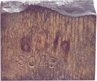
Edge of Penguin engraving showing sculptural relief.

The typeface suggests this die stock may have been taken from a manual or catalog. (Actual size)
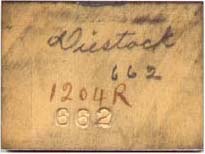
It is uncommon to see the name on the side of engravings for the International. The 1204R appears on the electrotype made from this engraving.

Quesal much enlarged to show off remaining photographically transferred imagery. Notice the reverse text caption at bottom. The fine lines of this image suggests it was a metal engraving.
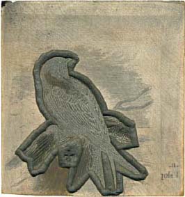
Sola contemplates the beauty of negative space.
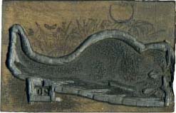
The circle at the top of this engraving is a plug that was put in the block to repair an imperfection before the engraving was done.
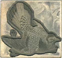
Turtledove with additional transferred imagery surrounding engraved portion. (All images in this column are shown at their actual size.)

At left is a photo of a block from the 1890 International. The above photo of Crustaceans shows the variety of engravings. The drab crab on the far left is a magnesium cut, while the copper electrotypes have many hues. The bright copper lobster has its original wood engraving on the far right side of the image. The dark wood engraving (left center) is from the 1864 edition.
He was a free generous man and made friends wherever he went. He was always cheerful and bore up under reverses that would have broken a weaker man down.
The other letters I have seen are from Charlotte B. Cogswell, who explains why she was late in completing the engravings she promised to the Merriams. But I have no confirmation that she was working on the Webster’s.
William Fowler Hopson played an enormous role in the look of the Webster’s. Beyond being a talented new school engraver who began his career by engraving the new images for the 1890 International, he also had an exhibition of his bookplates at the Library of Congress in 1929. Hopson’s engravings are interesting because he carved his name in a handful of them. Why would he do this in a reference book? Was it because they were original drawings, perhaps, or was it because he was especially proud of these images? Engravings with Hopson’s name carved in them are Stalactites and Stalagmites (342), Surf Duck (349), Toboggan (364), and Widgeon (400).
The evolution of the binding process of the Webster’s mirrors that of the Industrial Revolution. Binding the Webster’s was done by binderies separate from the printers in the 1859 edition. The work was almost all done by hand. A Mr. Matthews is mentioned in the Bienecke Archives. The 1864 Webster’s begins the same way, with Matthews binding the finer calf versions and a Mr. Reynolds binding the rest. But orders were far greater than the binders could keep up with and Matthews was busy binding some encyclopedia, so Henry O. Houghton, who was the owner of the Riverside Press where the massive 1864 edition was being printed, decided to take fate into his own hands and create his own bindery. He suggested this idea to the Merriams in a letter dated August 3, 1864. Because of the massive drain of workers caused by the Civil War (John Andrew suffered with this problem, too; at one point he mentions losing four engravers to the war), H. O. Houghton sailed to England to recruit able bookbinders to help him reach his goal of completing 100 Webster’s a day. From the G. & C. Merriam Archive in the Bienecke Library at Yale, one can find how they accomplished this. In folder 641 is described the “number of persons required to make 100 Webster’s dictionaries per day”: 20 people made the paper; 4 tanned the leather; 15 were paid for printing, 56 were employed with the binding, 32 women did folding and sewing, while 24 men marbled the edges and performed the other tasks of binding. H. O. Houghten’s letters show a great sensitivity to design and excellence of production that make it clear why Riverside Press was such a success. The 1864 Webster’s (then the “largest single volume ever made in quantity”) has more than 100 sections that were hand sewn by twos onto single raised cords. But the 1890 edition was produced more cheaply than the 1864 because it was machine sewn. (A copy of the 1864 dictionary bound with sheepskin cost G. & C. Merriam Co. $4.46 to produce, and the 1890 bound in sheepskin cost $2.03 to produce, as noted in the G. & C. Merriam Co. Archive).
The most curious and visually striking engravings in the Pictorial Webster’s are those surrounded by black. It makes them appear almost as negatives. This black area is the surface of the block that was not engraved. These were used to produce the International Dictionary in the 1890s. (The large Revolver on page 428 from the 1909 edition is an exception.) It was not an efficient use of the engraver’s time to carve away the excess surface, as electrotypes had been made from these blocks for purposes of printing the edition. It may also have been easier to make an even wax impression of the block with the extra surface area.
Often in Pictorial Webster’s, an original wood engraving is printed on the same page as the electrotype. This was done for the beauty of the repeated image and for purposes of comparison.
Another most curious aspect of the book may be the numbers accompanying the title of every image. Pictorial Webster’s reveals these numbers to the public for the first time. As explained in the Key, the digits (letters and numbers) following the dash have been inserted to give extra information to the reader. The other numbers were stamped into the sides of the engravings with a steel number punch as part of an indexing system used to organize them. Each edition uses a different starting point for the numbering but the engravings appear to be numbered in series according to where they would appear in the dictionaries. Most of the engravings also have an “R” at the conclusion of the index number, the exceptions being the wood engravings from the International editions. My best guess is the “R” signifies “Recut” or “Reproduction.” Another possibility is that the R stamp indicates Riverside Press, where the dictionaries were printed. Some of the images have a double “RR,” which indicates they are photo-etched reproductions.
Sometimes many images would be engraved into a single block. These were re-engraved either to update the older version or because the old image no longer printed well. Presumably, the electrotype would be the size of this entire block. That sheet of copper would then be backed by hot metal (a mixture of lead, tin, and antimony) and mounted on a block of wood to be type-high and only then cut apart with a saw to make individual blocks. The Cup is intriguing, as instead of a number written on the side of the block, there is a question mark. Unable to find an image of this cup in the Webster’s dictionaries, one might suppose it was just a “doodle” by W. F. Hopson, who decided to immortalize his coffee cup on a blank space of boxwood, and 100 years later this printing does just that.
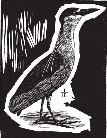
Some engravings made for electrotyping reveal practice marks made by the engraver. This Night Heron (left) has wonderful examples of marks made from at least four different tools. Careful study of the block reveals what tools were used. Indentations in the wood at the start of the cuts made by the shaft of the burins behind the cutting edge indicate that all of the practice marks started at the top of the block with the tools being pushed toward the bottom. The direction of the cuts is helpful as the entry point of a tool approximates the shape of the burin, revealing even in a print the type of tool used.
1. SPITSTICKER. The marks on the left side of the printed image were made by a spitsticker. The largest supplier of engraving tools in America, E. C. Lyons, calls it an elliptic tint tool, and their #3 size fits into these marks. Spitstickers have sharp tips and curved sides. They can make lines of varying widths, and make curves quite readily. The engraver began these lines with the point just breaking the surface of the block but then would push the tool deep into the block as it was moved along. The tool was too deep to cut a clean edge and the width of the line wavers as the tool rises and falls in depth. The spitsticker was leaned over as it was brought back to the surface to finish the leftmost line, while the blunt end of the second line indicates the tool was leaned forward, brought to a stop, and the wood curl was brushed or planed away. The long white neckfeathers that come down the back of the Night Heron were engraved with the spitsticker.
2. TINT TOOL. To the right of these lines are two lines made by a burin corresponding to an E. C. Lyons #3 tint tool. Tint tools have straight sides for making straight lines to build up tones by making multiple parallel lines. Properly used, they should not vary in depth nor in the width of line they create. The tip of the tint tool was wider and the angle greater than that of the spitsticker, thus the channel is less deep with a less sharply angled bottom. The vertical cross-hatching lines on the ground were made with the tint tool as well.
3. GRAVER. The graver is the workhorse of engraving tools. It is shaped like an elongated diamond. It is extremely versatile and presumably was the most comfortable tool in a nineteenth-century engraver’s hand. The fact that the width of the thin lines on this block vary slightly makes it more likely that they were made with a graver rather than multiple tiny tint tools. It appears that some of the larger marks may have been made by working into thin lines made first by the graver. The thin lines on the Heron making up the back feathers, the beak, and the round eye would have been made with a graver as well.
4. ROUND GRAVER. Round graver is the name E. C. Lyons gives for the burin with the curved profile. A Lyons #54 round graver fits neatly in the wide cuts on the right of the practice area. This large burin may have been used to clear out the white area just below the beak and eye of the Heron and was certainly the tool used to carve the wood away from the edge of the image.
In preparing his address “Wood Engraving and Wood Engravers” for the Society of Printers, Boston, Hiram Merrill wrote:
A wavy line, dating back to Bewick’s time or earlier, was too often used by the engravers in John Andrew & Son’s engraving shop in Boston, where I served as an apprentice. It was called the “Andrew’s wiggle” by those inclined to be critical. (Hiram Merrill Archive).
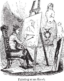
This comment is interesting as it gives the viewer something unique to look for to identify engravings by John Andrew. But what is this Andrew’s Wiggle? Is it wavy lines one often sees used in backgrounds of engraving, similar to the wavy lines in the wallpaper of the Easel engraving? Or is it something more like a squiggly drawn line as seen in the shadows in the bottom-right area?
Many of the engravings from the 1859 and 1864 editions have a similar “squiggle” or “wiggle” in areas of shadow, but the squiggly lines on the bottom of the Amphitheater engraving on page 9 might be the best example in the book. The “wiggle” is somewhat of a virtuosic flourish that would require an extra burin to make the curved lines, and must have taken more time to execute. It is tempting to imagine the artist sitting at the easel is none other than John Andrew, who eschews painting the female nude for something resembling a Rembrandt self-portrait.
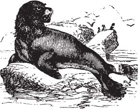
While some dictionaries evolved to using photographs to illustrate entries, the trend in Webster’s went the other way. The early illustrations place every entry in a context. In the 1859 edition all the zoological entries are shown in a habitat, all instruments are being played, and most machines are in use. Even fish were depicted beached on the shore. The engraving of the sea lion shown here is one of my favorites. It appears as if the artist merely placed the head of a lion on the body of a seal.
By 1864 the engravings are smaller, and the background is scaled back, but most images are still given an atmosphere. Even inanimate objects such as compasses (page 77) are rendered with shadows as if they march across a page. People are included for scale and for context. (See the man by the Sperm Whale on page 335 or the person being led toward the guillotine on page 167.) This extra information often contains nineteenth-century references, which enhance an image. The gravestones would identify the tree on page 400 as a yew, as yews were common in old cemeteries.
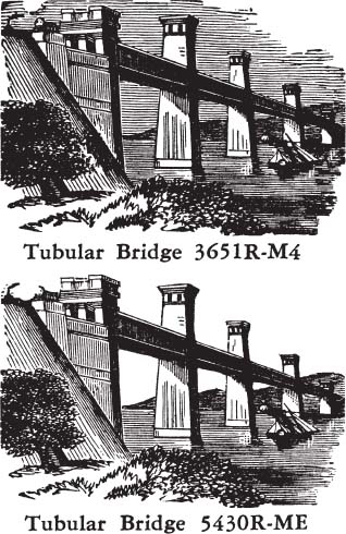
The trend in the Webster dictionaries to strip the image down continues in the International Dictionary. Interestingly, even as changes in styles led to more photo-realistic images, the illustrations become more solely of the things themselves. The two engravings of the tubular bridges illustrate this trend.
Likewise, in the 1864 edition, the Colossus of Rhodes on page 76 had more of Rhodes in the background. Once we get to the “&” section of images from the twentieth century, one can see that except for a few images like Gantry, the illustrations have adopted an extreme economy of line. The human form even becomes disembodied. Foundation on page 419 is a prime example, an undergarment on an implied female torso with no head or limbs. The hamster at the bottom of the page never made it into a Webster’s dictionary.
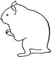
There is a short note in the case in which it was found. It explains that while the cut was at the engravers, the editors made the decision not to use it. Perhaps the editors decided people knew what a hamster looked like, or they deemed it to be too stylized to be of use.
There are a great number of smaller engravings, such as this Trident and Fasces that appear to be smaller versions of larger engravings. See the larger fasces on page 119 with the word “fascist” printed below. The fasces (axe-head coming out of a stylized faggot, a name I became familiar with in the fourth grade: “No, I am not a bundle of sticks.”) was a symbol for Mussolini’s fascist regime in Italy. The tiny trees on page 361 are good examples of the small-sized engravings. Many of these have the letter “C” written in pencil on the bottom of them. My guess is it indicates that they were created for the first illustrated Webster’s Collegiate Dictionary.
In the first pages I capitalized the species name of an animal named for a person or place, such as the Alligator Mississippiensis, as was the nineteenth-century convention. I soon decided I should follow modern convention of only capitalizing the genus. So, the trilobite Calymene named for Dr. Blumenbach, I presume, should read “C. blumenbachii.” I did not look up any of the current scientific names for species.
PAGE 8. The Alpaca has what appears to be an unrelated white circle in the design. The circle is from a plug that was put in the block to fix irregularities during the finishing process of the block, not after the engraving had begun. It is quite likely that the second version of the Fins engraving was made due to the problems the plug may have caused in printing. The plug would have been completely flat at the time of the initial printing, but the swelling and shrinking of the wood due to fluctuations in humidity may have caused the plugs, which are tapered and widest at the top, to work their way out. The reason the circle doesn’t show up the same in all of the copies of the book is that over the course of the print run the plug was pushed back into place and the halo around the raised plug disappeared.
PAGE 9. How many eyes do you see in the illustration of the American? Is there a phantom eye to the left of the true eye on this image?
PAGE 44. Engraved in maple, the Bison is my first copy of an old engraving.
PAGES 62 AND 63. The two engravings of Castle talk to one of my fascinations with the project. When I was young, my family visited Great Britain. I remember being terribly confused because I was never sure whether a castle was a “real” castle or not. Many of the real castles are in ruins or are only towers whereas some buildings were built in the style of a castle, and look far more perfect than any of the real castles. Furthermore, could a castle be real if it had never been the site of a battle? So which is the real Castle engraving?
PAGE 82. The corner of the copper of this electrotype was folded over on itself. I carefully folded it back so that it would print, and that accounts for the interesting texture of the upper left corner.
PAGE 246. The Notes are actually Rests.
PAGE 334. The little “sc” carved after “Hopson” on stalactites and stalagmites or on Toboggan Slide (p. 364) stands for sculpsit, meaning “engraved” or “carved.”