One of the key goals of JavaServer Faces was to create an API from which the developer community could create a robust set of complementary, third-party component libraries and implementations. Although not actually part of the core JSF libraries, these third-party libraries play an important role in the overall JSF development community by offering exceptional value-add capabilities above and beyond what is available with the base components from the specification. Therefore, this appendix offers a brief overview of this area. It begins by briefly describing two notable third-party libraries: Sun’s Extended UI component library and JScape’s WebGalileo Faces. It then offers a detailed look at Oracle’s ADF Faces component library, which illustrates how a custom Faces UI component library can go above and beyond what is included in the Standard set of components provided in the specification.
As shown in Chapter 17, Sun’s Studio Creator development environment version 2 bundles their default extended UI component library into the IDE. This UI component library provides richer functionality than what is available with the Standard components. The extended components include an improved table/grid component that supports column sorting, paging, and inline editing support. Other components include a tree, file upload, and a popup calendar.
The extended components are also capable of rendering in an applicationwide appearance known as a theme. Four accompanying themes are also provided with the components as starter examples.
More information on these components can be found at the Studio Creator Web page at Sun’s Web site: http://developers.sun.com/prodtech/javatools/jscreator/.
Like Sun’s extended components, JScape’s WebGalileo Faces also provides a rich set of Faces UI components that pick up where the Standard components stop. WebGalileo Faces components consist of fully customizable components such as tree components, tables, date pickers, and so on.
More information on JScape’s WebGalileo Faces UI component library can be found at http://www.jscape.com/webgalileofaces/.
Oracle’s ADF Faces has garnered considerable attention since it was first released in a series of Early Adopter (EA) releases from Oracle’s Technology Network Web site at http://otn.oracle.com. ADF Faces is a robust JSF component library that has its roots in an earlier technology known as UIX, which was a J2EE-based Web technology designed specifically for Oracle’s Applications. In fact, one of the key architects of UIX, Adam Winer, was also one of the key JSF JSR Expert Group members. Thus, a lot of the lessons learned from building an industrial-strength J2EE Web framework with UIX have been directly applied to the JSF API.
As JSF became a standard, Oracle’s UIX technology was revamped and fully standardized onto the JSF API. This was a fairly simple conversion since the original UIX was already very similar to what became standard for JSF.
The remainder of this appendix is devoted to providing useful information on developing JSF applications with ADF Faces.
ADF Faces can be acquired in two ways. First, it is already bundled with Oracle JDeveloper 10g (as mentioned in Chapter 17). Second, it can be downloaded separately from the Apache MyFaces Web site. At the time of this writing, the source code of the ADF Faces component library was in the process of being donated to the Apache MyFaces project. Further information on the ADF Faces contribution to Apache MyFaces can be found at http://myfaces.apache.org.
Many tutorials on using Oracle’s ADF Faces within JDeveloper 10g can be found at the JDeveloper homepage of Oracle’s Technology Network Web site at http://www.oracle.com/technology/products/jdev/.
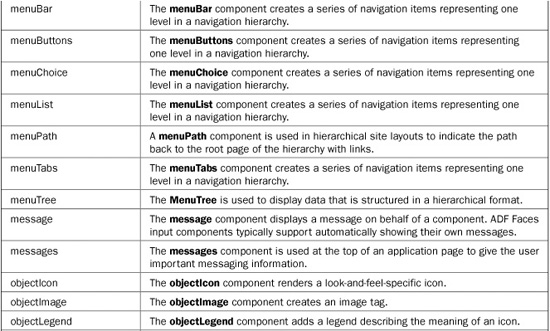
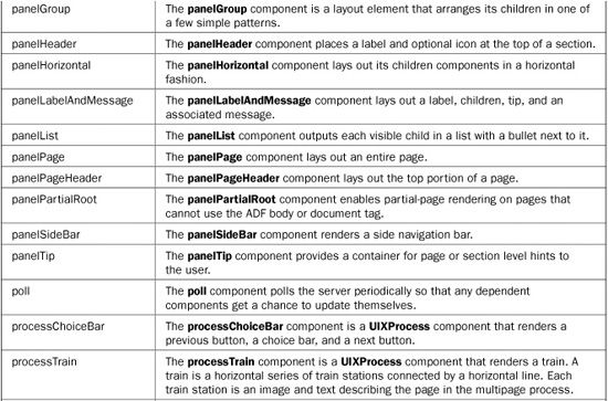
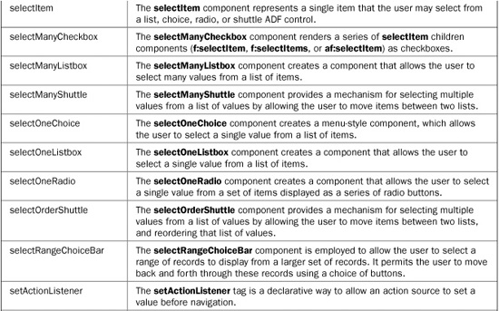
The following section serves as a quick component reference for the two main libraries of ADF Faces: ADF Faces Core and ADF Faces HTML.
The ADF Faces Core library represents the real bulk of the ADF Faces components. These components provide the core functionality that ADF Faces provides. The ADF Faces Core library is accessible in JSP via a JSP tag library that has a URI of http://xmlns.oracle.com/adf/faces with a default prefix of af. A quick reference of the ADF Faces Core library is provided in Table B-1.

TABLE B-1 The ADF Faces Core Library
Table B-2 presents the ADF Faces HTML component library along with short descriptions of each component. This library is accessible in JSP via the JSP tag library at the URI of http://xmlns.oracle.com/adf/faces/html with a default prefix of afh.
TABLE B-2 The ADF Faces HTML Library
The remainder of the chapter is devoted to focusing on the unique features of the ADF Faces component library. Specifically covered in this section are the following:
• ADF Faces Partial Page Rendering (PPR) feature
• The ADF Faces processScope
• The ADF Faces dialog framework
• ADF Faces skinning feature
The ADF Faces Partial Page Rendering (PPR) technology, which is sometimes referred to as Partial Page Refresh, allows individual portions of an ADF Faces page to be refreshed without having to refresh the entire page, thus improving the end user’s experience. Using PPR in ADF Faces applications is very easy because many components are automatically PPR-enabled. Some of these components include tree, treeTable, menuTree, table, showDetail, and page, as well as all of the input/select components (inputText, selectManyCheckBox, and so on). It’s also important to point out that in addition to the ADF Faces components that are PPR-enabled and can initiate a PPR request, any JSF components (outside of ADF Faces) can be redrawn independent of a page refresh as a result of a PPR request.
Of the ADF Faces components that support PPR, all share several common PPR-associated attributes. They are described in Table B-3.
To better understand how to work with PPR in ADF Faces, let’s walk through a simple example. Assume that there is an input field (inputText) and an output field (outputText) on a page and that changing a value in the input field (and tabbing out of the field) causes the value of the output field to change. For this example, the output field will simply display the current value in the input field. In addition to the input and output fields, also assume that there is a Java class (PprTest) that is registered as a managed bean (pprbean) with request scope. This bean will have two properties. The first is input (of type CoreInputText). The second is output (of type CoreOutputText). There is also a currentTime property (of type Date) that will be used to print the current time on the page. Finally, the class will also contain a method that can process a ValueChangeEvent for the input field. The following is the source for the class:
TABLE B-3 Component Attributes Involved in PPR
// import statements omitted

public class PprTest {
  public PprTest() {
  }

  private Date currentTime = new java.util.Date();
  private CoreInputText input;
  private CoreOutputText output;

  public void handleValueChange(ValueChangeEvent vce) {
    output.setValue(input.getValue());
  }

// Getters and Setters omitted
}
As you can see, the handleValueChange( ) method applies the value of the input component to the output component during a ValueChangeEvent. (Incidentally, an alternative way to do this would be to set the value of the output component with vce.getNewValue( ), which simply retrieves the new value from the event instead of the input component. This eliminates the need to bind the input component.)
In the JSP page, both the input field and output field will be bound to their respective bean property counterparts. The input field will also have its valueChangeListener attribute set to the method in the managed bean that assigns the value of the input field to the output field. This is shown next:
<af:inputText label="Enter Value:"
    valueChangeListener="#{pprbean.handleValueChange}"
    binding="#{pprbean.input}"/>

and in the following:

<af:outputText binding="#{pprbean.output}"/>
Normally, a page would require a button (commandButton) to perform a submission to force the value change in the output field. Alternatively, a JavaScript-based automatic form submission could also be enabled without a button by setting the input field’s JavaScript attribute Onchange to form.submit( ). However, in both these cases, the entire page would have to be refreshed.
The ADF Faces PPR feature alleviates the need to include a button, or add JavaScript code to autosubmit the form. Instead, ADF Faces PPR can autosubmit the form, but only refresh part of a page simultaneously. To enable PPR in the example, a few changes are needed. First, two additional attributes must be added to the inputText tag, as shown next:
<af:inputText id="input1" label="Enter Value:"
    valueChangeListener="#{pprbean.handleValueChange}"
    binding="#{pprbean.input}" autoSubmit="true"/>
The autoSubmit attribute causes the form to partially submit when a value has changed. The id attribute is used to identify the input field, as described next.
The second change is to add the partialTriggers attribute to the output field, as shown in the following:
<af:outputText binding="#{pprbean.output}" partialTriggers="input1"/>
Notice that the input field ID is used by the output field and is assigned to the partialTriggers attribute. This attribute can also contain multiple space-separated IDs to establish dependencies on multiple fields.
Finally, to demonstrate that only the interdependent fields are being refreshed and not the entire page, you can use another outputText field that is value-bound to the currentTime property of the managed bean. (Notice the use of the ADF Faces convertDateTime to display the current time.)
<af:outputText value="#{pprbean.currentTime}" >
  <af:convertDateTime type="time" timeStyle="long"/>
</af:outputText>
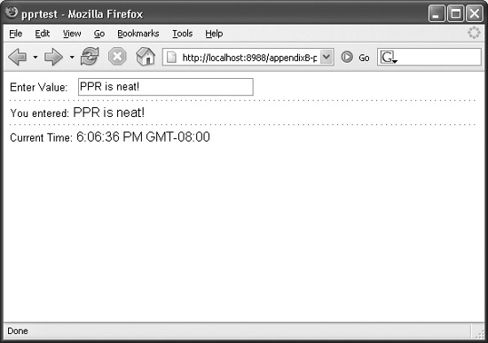
As shown in Figure B-1, when a user changes a value in the input field and then tabs out of the field, a partial submit occurs and only the dependent output field is updated. However, the output field displaying the current time does not refresh.
The preceding example was used purely to explain the procedures for enabling PPR in ADF Faces applications. This same approach can be applied to the more complex ADF Faces components, such as table and treeTable, which can use PPR in a similar fashion.
FIGURE B-1 PPR in action: Only the output field is refreshed.
You may be surprised to find out that in addition to ADF Faces components supporting PPR, it is also possible to enable non-ADF Faces components to support PPR as well. While non-ADF Faces components don’t necessarily have the partialTriggers attribute, it is possible to programmatically assign a partial trigger (target) programmatically. For example, it is possible to use a standard h:outputText to display the value entered in the input field (via PPR) from our previous example instead of an af:outputText.
To do this, we could replace the af:outputText with an h:outputText.
<h:outputText id="std_output" binding="#{pprbean.stdOutput}"/>
Notice that the new h:outputText is also bound to a backing bean property, so this would require adding the property stdOutput of type HtmlOutputText (along with setters and getters) to the backing bean. Also notice that in order to programmatically assign a partial trigger, the component must have its id set.
Next, in the code that handles the ValueChangeEvent, we simply add a statement to enable PPR for the standard output field and then set its value based on the input field’s value as was done before:
public void handleValueChange(ValueChangeEvent vce) {
  // No longer needed  - output.setValue(input.getValue());

  // Add partial target programmatically to stdOutput component
  AdfFacesContext.getCurrentInstance().addPartialTarget(stdOutput);
  stdOutput.setValue(input.getValue());

}
To simplify and provide a consistent method for interpage communication, ADF Faces provides the processScope. Before JavaServer Faces, interpage communication was often done by simply providing an extra request parameter argument, such as ?rowid=99. For very simple applications, where noncomplex data-types are needed to be stored between page viewings, this provided a solution. However, it has the problem of being easily hacked because the variables are exposed in the request string.
The other common approach was to use the HttpSession to store objects as session-scoped variables instead. It involved placing an object onto the HttpSession, such as a shopping cart with items. This had the benefit of being able to store complex data-types; however, other problems can arise, like the following:
• Multiple windows, such as when using HTML frames, cause problems with session-scoped variables since both pages could be operating on the same session-scoped variable.
• Pressing the Back button can cause problems because the page you are navigating back to might rely on a session-scoped variable that may have changed in the page you came from.
The ADF Faces processScope feature is aimed at eliminating or reducing these problems. In short, the ADF Faces processScope provides an additional scope to the existing Faces applicationScope, sessionScope, and requestScope objects. As with the oft-used sessionScope, developers are able to store values/objects onto the processScope but without the previously mentioned problems. The key difference from the sessionScope is that the values stored onto the processScope are only visible from the user’s current process. This means that if a new window of the same page is displayed and subsequent navigations occur, they will have an independent processScope from the original. This automatically forks off another instance of the processScope. Even better, if the user then clicks the Back button on the original page, the processScope is reset to its original state.
Retrieving and editing an item such as a Cart object that has an ItemCount property from the processScope can be done using the following code in an action method:
public String incrementCart_action() {
… (other code)
  // retrieve "Cart" object from processScope
  AdfFacesContext afctx = AdfFacesContext.getCurrentInstance();
  Cart pscart = (Cart) afctx.getProcessScope().get("cart");

  // Update itemcount value in Cart
  int current  = pscart.getItemcount();
  current++;

  // Create new instance of Cart and set new itemcount
  Cart newcart = new Cart();
  newcart.setItemcount(current);

  //place new Cart back onto processScope
  afctx.getProcessScope().put("cart", newcart);
…
  return "proceed";
}
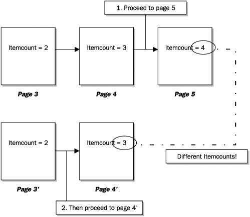
Using this approach to increment a Cart object’s itemcount, one could create a series of pages that are linked together with a series of action methods (as previously described) that each increment the Cart’s itemcount and return a String value to enable a navigation to the next page (which also has an increment button and similar action method) and so on. At runtime when following the sequence of pages and clicking the increment buttons, the Cart’s itemcount would be incremented as expected. The interesting thing about using the processScope feature is that if you spawned a new browser window (using CTRL-N), it would effectively spawn a new Cart with its own independent itemcount which starts at the same point where the parent browser’s page was. This is depicted in Figure B-2.
Subsequent clicks on the newly spawned page would refer to its own copy of the Cart object and thus maintain a different itemcount, as depicted in Figure B-3.
You could test this behavior by clicking the original browser to proceed to page 5 and increment the itemcount to a value of 4, but then click in the other browser to proceed to page 4’ to see that its value is now 3 and is independent of the first browser.
You would also find that the browser’s Back button returns the Cart back to its original state so you could effectively decrement the Cart’s itemcount by simply clicking the browser’s Back button.
To display items stored in the processScope in a JSP page, you can use the JSF EL expression: #{processScope.objectkey}. To extract the current itemCount from the Cart object stored in the processScope, use the following:
<h:outputText value="#{processScope.cart.itemcount}"/>
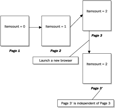
FIGURE B-2 Spawning a new Cart by launching a new browser window
FIGURE B-3 Separate itemcounts based on the original Cart object
Incidentally, both Standard and ADF Faces components can access items stored in the processScope because they are equally available via JSF EL. For example, this statement
<af:outputText value="#{processScope.cart.itemcount}"/>
would work as well.
Web applications often allow the user to invoke dialog windows for a variety of reasons. However, to implement this functionality in a generic sense requires the addition of custom-coded JavaScript. The ADF Faces dialog framework, on the other hand, allows the developer to create popup dialogs without having to resort to custom JavaScript code.
The best way to learn how to use the ADF Faces dialog framework is to start with a simple example. The one used here creates a popup window that displays a message and has a button that closes the window. To create this dialog, you first start with an initial page that serves as a starting point from which the dialog window will be launched (home.jsp). An ADF Faces commandLink can be added to the page with attribute settings for the launched window, as shown next.
<af:commandLink text="About"
  action="dialog:about"
  useWindow="true"
  windowHeight="300" windowWidth="300"/>
Notice the action attribute which has its value set to a special dialog:about value. The “dialog” prefix instructs ADF Faces to treat this navigation as a dialog window launch. The action referred to responds to the following navigation rule in the application’s facesconfig.xml file.
<navigation-rule>
  <from-view-id>*</from-view-id>
  <navigation-case>
    <from-outcome>dialog:about</from-outcome>
    <to-view-id>/about.jsp</to-view-id>
  </navigation-case>
</navigation-rule>
Next a dialog page, about.jsp, must be created. It can contain any content. In this example, it is used as an about page, which shows the application’s version information. The single important component on the about page is the button that allows it to close. This is coded as shown next:
<af:commandButton text="return">
  <af:returnActionListener/>
</af:commandButton>
Notice that this button contains a default returnActionListener inside it. This is the default action listener that allows the dialog to simply close the window and return to the page that launched it. At this point, the about dialog window will work as expected, as shown in Figure B-4.
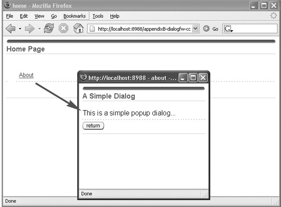
FIGURE B-4 Creating a simple about dialog page in ADF Faces
An obvious enhancement for this dialog would be to make one that accepts an input value and then sends this value back to the launch page. To enable this case, we can build a dialog that allows the user to enter a value into a text field in the dialog and then have it appear in a text field on the main page (home.jsp).
As before, we can add another command component to the home page to launch the dialog. This time we’ll use a commandButton, as shown next:
<af:commandButton id="lookup_button" text="Lookup"
    action="dialog:lookup" useWindow="true"
     windowHeight="200"  windowWidth="300"
     returnListener="#{backing_home.handleReturn}"
     partialSubmit="true" />
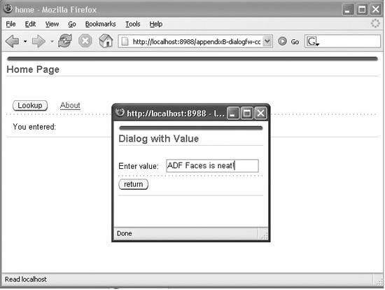
The new button’s action is set to a dialog navigation case (not shown) that directs the user to a different dialog page (lookup.jsp) which accepts a value. The new Lookup dialog is shown hovering above the main (Home) page in Figure B-5.
We’ll continue reviewing the remainder of launch button’s attributes shortly, but first let’s have a look at the lookup.jsp dialog page’s most important components:
<af:inputText label="Enter value:" id="inputText1" />
<af:commandButton text="return"
   action="#{backing_lookup.returnAction}"/>
As you can see, this dialog contains an input field that allows the user to enter a value along with a button that is bound to an action method returnAction( ) in the page’s backing bean. The source for this method is as follows:
public String returnAction(){
  AdfFacesContext.getCurrentInstance().returnFromDialog(inputText1.getValue()
    , null);
  return null;
}
As shown here, this method calls the ADF Faces context method, returnFromDialog( ), which closes down the dialog and sends back a value in the first argument. In this example, the value of the input text field (inputText1) is passed back.
In order for the value sent back from the dialog to be processed, a corresponding returnListener must be used. Recall from the button of the launch page where a handleReturn( ) method was referred to in the button’s returnListener attribute, as shown next:
returnListener="#{backing_home.handleReturn}"
The handleReturn( ) method is a method in the backing bean of the launch page that processes the incoming value from the dialog. It is shown next:
public void handleReturn(ReturnEvent event) {
  if (event.getReturnValue() != null){
    outputText1.setValue(event.getReturnValue());
  }
}
FIGURE B-5 A dialog that accepts an input value
As you can see, it sets the output text field on the launch page to the value returned from the ReturnEvent. When the dialog finishes, the original launch page must be refreshed in order to show the new value returned from the dialog. This is done by setting the partialSubmit attribute of the original launch button to true as well as setting the partialTriggers attribute of the text field being updated to the ID of the launch button.
<af:outputText id="outputText1" partialTriggers="lookup_button"/>
Recalling the PPR discussion, the partialTriggers attribute establishes a dependency from the output text field to the launch button and forces a partial refresh to update the output field. Figure B-6 shows the update value of the output text field.
FIGURE B-6 An updated field based on a dialog
With ADF Faces skinning technology, developers can create applicationwide look and feels, which govern the overall user interface appearance of the application. Other Web technologies have similar features and are sometimes referred to as themes.
The default look and feel, or “skin,” that is presented with the ADF Faces components is known as the Oracle look and feel. This look and feel was originally created for Oracle applications and is shown in Figure B-7.
To quickly change this look and feel to another built-in look and feel simply requires a quick edit of the /WEB-INF/adf-faces-config.xml file. In addition to the built-in oracle look and feel, there are also two other built-in look and feels, simple and minimal, which can then be extended upon. To switch to the minimal look and feel, you must edit the adf-faces-config.xml and replace the default oracle skin-family with minimal, as shown next:
…
<skin-family>minimal</skin-family>
…
Re-running the application presents it in its minimal look and feel, as shown in Figure B-8.
It is possible to build upon the minimal look and feel (skin), shown in Figure B-8, and create a new, custom look and feel. Here is how the process works. First, create a new file, adf-faces-skin.xml, in the WEB-INF directory. The contents of this file will define the new custom skin. It’s shown next. (This skin is named custom but could be any name you define.)
FIGURE B-7 ADF Faces default look and feel
FIGURE B-8 ADF Faces minimal look and feel
<?xml version="1.0" encoding="ISO-8859-1"?>
<skins xmlns="http://xmlns.oracle.com/adf/view/faces/skin">
  <skin>
    <id>
      custom.desktop
    </id>
    <family>
      custom
    </family>
    <render-kit-id>
      oracle.adf.desktop
    </render-kit-id>
    <style-sheet-name>
      skins/custom/custom.css
    </style-sheet-name>
  </skin>
</skins>
Now that a new adf-faces-skins.xml has been created, the skin-family defined inside must be referenced in the main adf-faces-config.xml, as shown in the following:
<skin-family>custom</skin-family>
The final step is to place the referenced custom files that are in the skin-family definition in the adf-faces-skins.xml onto the file system so they are accessible at runtime. This involves creating a skins subdirectory along with a child custom directory under the HTML root. The custom directory will contain a style sheet named custom.css that will hold all of the styles of the individual elements of the user interface, such as button appearance, foreground font, and so on. Since images are often referred to in the styles, a corresponding images directory containing any referred images is usually added in this location.
Taking a closer look at the example custom.css file, you will see style entries such as:
…
.AFDefaultFontFamily:alias {
  font-family:Tahoma,Arial,Helvetica,Geneva,sans-serif;
}
.AFLinkForeground:alias {color:#003399}
…
These entries apply visual attributes to the default font family as well as for the foreground link color. The following is an example of using styles to apply images to the front and back portions of a button:
.AFButtonEndIcon:alias {
  content:url(/skins/custom/images/btnEnd.gif); width:7px; height:18px
}
.AFButtonEndIcon:alias:rtl {
  content:url(/skins/custom/images/btnStart.gif); width:7px; height:18px
}
To determine which stylable elements can be referred to in the custom.css style sheet, check the global styles definition file, adf-faces-skins-doc.xml, which is provided by ADF Faces. This file provides a complete set of definitions for the named styles, icons, and components that can be referred to in the adf-faces-skins.xml file. It has the following form:
<?xml version='1.0' encoding='ISO-8859-1'?>
<skinMetadata xmlns="http://xmlns.oracle.com/adf/faces/view/skin/metadata"
                     xmlns:html="http://www.w3.org/TR/REC-html40"
                     id="minimal-desktop"
                     name="Minimal Skin keys" >
  <globalMetadata>
    <styles>
      <namedStyle id=".AFDefaultFontFamily:alias">
        <description>
          Specifies the default font family list ("font-family" property) for
          the skin.
        </description>
      </namedStyle>
…
(more global style definitions)
…
    </styles>
    <icons>
      <icon id="af|panelBox::dark-header-start-icon">
        <description>

          This icon is rendered at the start of the header region for
          dark panelBoxes.
        </description>
      </icon>
…
… (more global icon definitions)
…
    </icons>
  </globalMetadata>
  <componentMetadata>
    <component name="af:selectInputDate">
      <icons>
        <icon id="af|selectInputDate::launch-icon">
          <description>
            The button icon which is used to launch the secondary
            date picker dialog.
          </description>
        </icon>
       </icons>
    </component>
   </component>
…
…(more component definitions)
…
  </componentMetadata>
</skinMetadata>
The previous code example shows single items from the globalMetadata group (styles and icons) and a single component group from the componentMetadata.
After the custom.css has been edited with new/updated styles for the different UI elements, the custom look and feel will take on a different appearance from the base minimal look and feel from which it extends. Figure B-9 shows the new custom skin at runtime.
The following list summarizes the steps necessary to create a custom skin.
1. Create a CSS (3.0) style sheet (such as custom.css).
FIGURE B-9 A custom look and feel (skin)
2. Add any referenced external resources in the style sheet, such as a directory of referenced images.
3. Reference style sheet and external resources in a skin-family declaration in an adf-faces-skins.xml file.
4. Reference the custom skin-family in the main adf-faces-config.xml file.
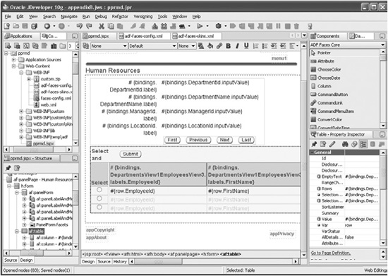
Oracle JDeveloper 10g provides a sleek design time experience for working with ADF Faces. In addition to offering built-in development support for the Standard specification components (core and HTML), JDeveloper also provides integrated, visual development support for ADF Faces. These features include visual rendering of the ADF Faces components in the JSP visual editor, integrated context-sensitive documentation, integration of the components on the Component Palette, and re-entrant wizards allowing quick code generation for composite components (such as tables and select menus), as well as advanced databinding support when building applications using the overall ADF framework.
The ADF Faces design time experience provided by Oracle JDeveloper 10g is shown in Figure B-10.
More information on the JSF design time experience can be found in Chapter 17 and by going to the Oracle JDeveloper Web site at http://www.oracle.com/technology/products/jdev.
Before concluding this appendix, it is necessary to mention an important Web site to consider when searching for third-party components: JSFCentral. This site provides a detailed index of a wide variety of independently developed JSF technologies, including references to various Faces UI component libraries. JSFCentral is located at http://jsfcentral.com.