The beauty of JavaServer Faces lies in the fact that it is a framework specification. Being a specification means that there can be many implementations of the specification—each implementation unique in its own right (for example, added features that go beyond the specification, performance enhancements, and so on). Conformance to the JSF specification ensures that each implementation is fully compatible at an API level so that applications can easily be migrated from one implementation to another.
MyFaces is a popular open source implementation of the JavaServer Faces specification that provides a fully API-compliant and Sun Technology Compatible Kit (TCK) certified implementation of the framework along with substantial added functionality. MyFaces’ added functionality is principally comprised of a separately packaged library called Tomahawk that includes extensions to the base JSF UI components, a set of custom UI components, a set of custom validators, and support for using the Tiles framework with JSF. Additionally, MyFaces includes a new subproject called Tobago that includes a set of layout-oriented components. MyFaces also includes a repository for experimental development called the Sandbox. Finally, at the time of this book’s writing, Oracle donated its ADF Faces component library to the MyFaces project and it is currently going through the Apache incubation process so that it can become a formally Apache-licensed code set.
This chapter covers acquiring, installing, and using MyFaces along with broad coverage of the MyFaces-specific Tomahawk functionality that extends beyond the JavaServer Faces specification.
As a point of interest, while each JavaServer Faces implementation must conform to the specification, each can have many proprietary elements that may prevent applications from being migrated from one implementation to another. MyFaces, however, has been designed so that its proprietary Tomahawk components and extensions can be used on any JSF implementation. For example, you can use the Tomahawk component library with the Sun JavaServer Faces reference implementation.
In summary, MyFaces is comprised of two distinct sets of functionality: the core implementation of the JSF specification and a set of enhanced and custom components known as Tomahawk. These functionalities can be used in tandem or independent of each other—the choice is yours. For example, you may want to use the MyFaces JSF implementation, but may not be interested in the Tomahawk library. Conversely, you may simply want to use the Tomahawk components with another JSF implementation. Of course, you can use them together as well.
MyFaces is available free of charge and can be downloaded from the Apache MyFaces site at http://myfaces.apache.org/. Because MyFaces is open source, you have a couple of options when downloading the MyFaces software. You can download the software in its binary, precompiled form, or you can download the source code for compiling on your own. For most cases, the binary distribution will suffice. However, if you want to make changes to the MyFaces source code, the source distribution is available.
If you choose to download a binary distribution of MyFaces, you again have a couple of options. You can download a released version of the code, which has been rigorously tested and certified as being of good quality, or you can download a nightly build of the code, which is less stable and not intended for production use. The released versions of MyFaces are broken down into yet another level of options:
• Main Distribution Includes the JSF specification implementation libraries and the MyFaces common code library.
• Tomahawk Distribution Includes the Tomahawk library and the MyFaces common code library.
• Example Applications Distribution Includes a set of example MyFaces applications.
Opting to use a nightly build allows you to have access to the latest enhancements and bug fixes that have been made to the MyFaces codebase ahead of an official release. However, it’s important to point out that nightly builds have no guarantee on quality because adding a new feature to MyFaces could potentially break another feature that has been stable for some time.
Similar to downloading a binary distribution of MyFaces, if you choose to download a source distribution, you have a couple of options. You can download the source for an officially released version of MyFaces or you can choose to get the “latest and greatest” version of the MyFaces source code directly from the MyFaces Subversion source control repository. Just as with the binary distribution, choosing to download the latest MyFaces source code can get you the newest enhancements and bug fixes to the software, but it may also be laden with new bugs.
Since MyFaces is an implementation of the JavaServer Faces Web application framework specification and not a stand-alone application, MyFaces distributions are principally comprised of the MyFaces implementation of the JavaServer Faces API libraries and their associated files, such as Document Type Definitions (DTDs) for XML configuration files and JSP Tag Library Descriptor (TLD) files. Additionally, MyFaces distributions include the Tomahawk API libraries for the MyFaces-specific features. JavaDoc format API documentation is provided as well.
Similar to the binary distribution, the source distribution is comprised of the MyFaces implementation of the JavaServer Faces API libraries and their associated files along with the Tomahawk libraries for the MyFaces-specific features. The major difference, however, is that all of the code for the libraries is in source form. This is particularly useful for projects for which the source code may need to be changed or where you may want access to the source code for debugging an application and so on. As a point of interest, you can browse the MyFaces source code online at http://svn.apache.org/viewcvs.cgi/myfaces/.
Once you have downloaded your desired MyFaces distribution, this section will assist you in installing and using the MyFaces libraries. As discussed earlier, MyFaces is composed of two sets of functionality—an implementation of the JSF specification and a set of enhanced and custom components known as Tomahawk. The functionality you choose to use will drive the steps you must follow to install and use MyFaces. The remainder of this section is broken down into two areas specific to each piece of functionality.
NOTE It’s very important to point out that MyFaces is undergoing many changes to its distribution packaging. The details in this chapter about acquiring and using the MyFaces implementation are up to date at this book’s publishing; however, they may become incorrect once changes are made to the MyFaces distributions. Please check the MyFaces Web site for the latest information on acquiring and using MyFaces.
Using the MyFaces JSF implementation is the same as using any other JSF implementation. You simply have to place the appropriate jar files in your Web application’s /WEB-INF/lib directory (or in a directory that your application server has access to via its classpath). MyFaces has two main jar files that contain the JSF implementation: myfaces-api.jar and myfaces-impl.jar. Additionally, MyFaces has a myfaces-common.jar file that contains common code shared between the JSF implementation and the Tomahawk library. Copy those three jar files to your Web application’s WEB-INF/lib directory and you’re ready to go.
The rest of the process for using the MyFaces JSF implementation—such as configuring your Web application’s web.xml file, configuring a faces-config.xml file, and referencing JSF TLD files from JSPs—is the same as any other JSF implementation and is covered in Chapter 2.
Using the MyFaces Tomahawk library is as simple as placing the tomahawk.jar and myfaces-commons.jar files in your Web application’s /WEB-INF/lib directory (or in a directory that your application server has access to via its classpath) and configuring the MyFaces Extensions Filter. Note that you can alternatively use the myfaces-all.jar file instead of the tomahawak.jar file.
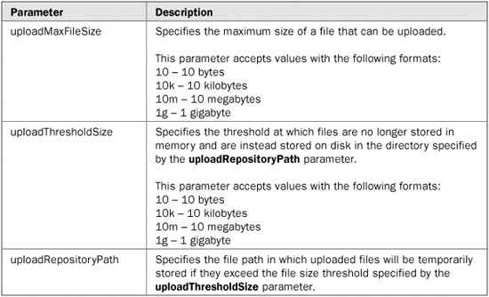
After installing the Tomahawk jar file, the next step in making use of the Tomahawk library is to configure the MyFaces Extensions Filter in your Web application’s web.xml file. The MyFaces Extensions Filter manages inserting the required support resources (for example, scripts, style sheets, and images) into JSPs for the Tomahawk custom components. Many of the Tomahawk custom components require support resources, and instead of burdening you, the developer, with having to add the support resources to your application (and maintain them), they are stored in the Tomahawk library. The Extensions Filter manages retrieving the resources from the library and automatically inserting them into the necessary JSPs at runtime.
NOTE Installation of the MyFaces Extensions Filter is only required if you are making use of the Tomahawk custom components. The extended components and Tiles support do not require the filter.
Following is the Extensions Filter definition that must be inserted into the web.xml file:
<filter>
  <filter-name>MyFacesExtensionsFilter</filter-name>
  <filter-class>
    org.apache.myfaces.component.html.util.ExtensionsFilter
  </filter-class>
  <init-param>
    <param-name>uploadMaxFileSize</param-name>
    <param-value>10m</param-value>
  </init-param>
  <init-param>
    <param-name>uploadThresholdSize</param-name>
    <param-value>50k</param-value>
  </init-param>
  <init-param>
    <param-name>uploadRepositoryPath</param-name>
    <param-value>/tmp</param-value>
  </init-param>
</filter>
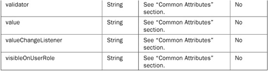
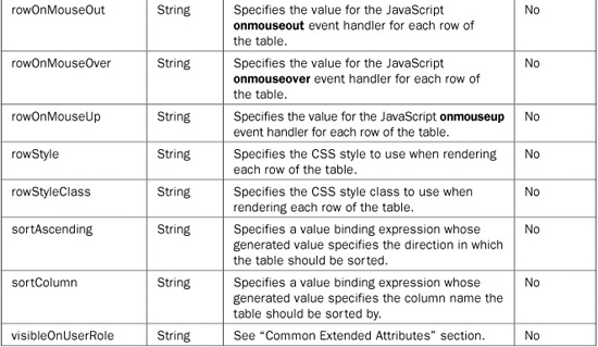
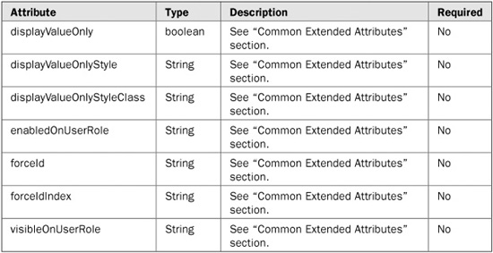
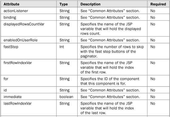
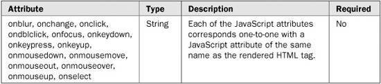
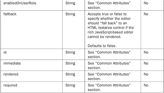
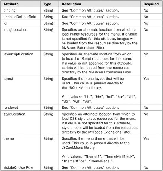
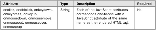
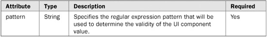
The Extensions Filter has three optional initialization parameters that can be set to modify the behavior of the Input File Upload custom component. The following table explains the usage of each of the initialization parameters. Note that the parameters are not required and, if not specified, default values will be applied.
In addition to adding the MyFaces Extensions Filter to your application’s web.xml file, you must insert filter mapping definitions that specify which URLs the filter should be applied to. There are two filter mappings that must be defined. The first mapping, shown here, maps the filter to the main JSF servlet.
<filter-mapping>
  <filter-name>MyFacesExtensionsFilter</filter-name>
  <servlet-name>Faces Servlet</servlet-name>
</filter-mapping>
The names specified by the <filter-name> and <servlet-name> tags must match exactly with the names defined for the MyFaces Extensions Filter and the JSF servlet, respectively. Note that you can alternatively map the filter to the main JSF servlet using a URL pattern as shown here:
<filter-mapping>
  <filter-name>MyFacesExtensionsFilter</filter-name>
  <url-pattern>*.jsf</url-pattern>
</filter-mapping>
The second mapping maps the Extensions Filter back to URLs generated by the filter. It is shown here:
<filter-mapping>
  <filter-name>MyFacesExtensionsFilter</filter-name>
  <url-pattern>/faces/myFacesExtensionResource/*</url-pattern>
</filter-mapping>
When the Extensions Filter inserts resources into JSPs it is actually inserting references to resources (for example, links to style sheets or scripts) that will be served by the Extensions Filter. Those references all begin with /faces/myFacesExtensionResource/, thus the need to set up a filter mapping to that path.
To make use of the Tomahawk extended and custom components in your JSPs, you must include the following tag library directive:
<%@ taglib prefix="t" uri="http://myfaces.apache.org/tomahawk"%>
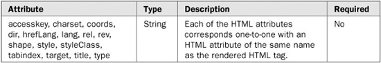
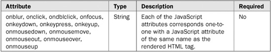
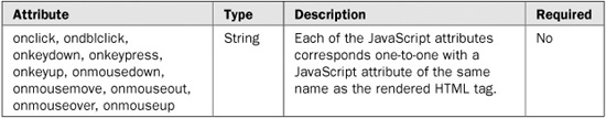
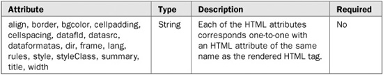
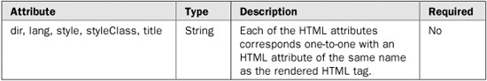
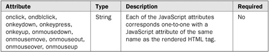
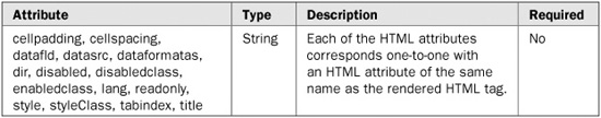
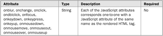
The MyFaces Tomahawk library provides extended functionality to many of the components in the JavaServer Faces Standard HTML Library. The extended functionality includes things such as role-based display/non-display of components, the ability to display only the value of components (instead of rendering the components with a value), and the ability to definitively specify the ID of components. The extended components are just that—an extension of the base components defined by the JSF specification. All of the functionality of the base components is intact and the components are used exactly the same way you would use the base components—you simply have some added functionality to use as well.
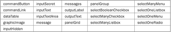
The following table lists the components that MyFaces provides extended functionality for.
Each of the extended components has a section dedicated to it in this chapter that shows its extended attributes and use. For information on how to use the base functionality of the components, see Chapter 18.
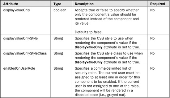
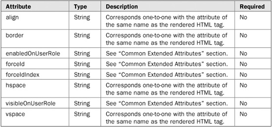
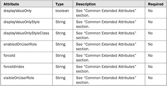
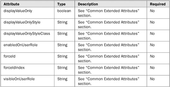
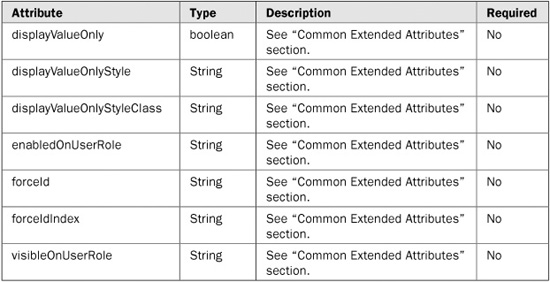
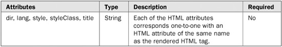
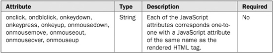
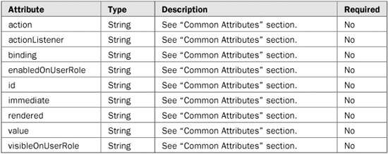
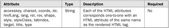
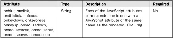
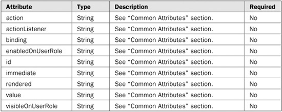
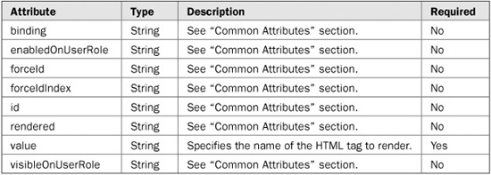
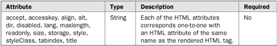
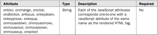
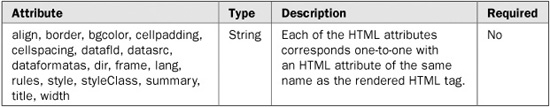
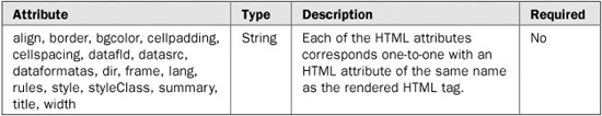
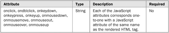
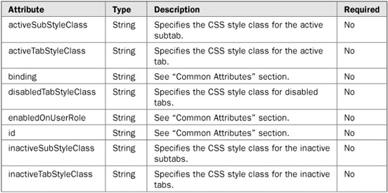
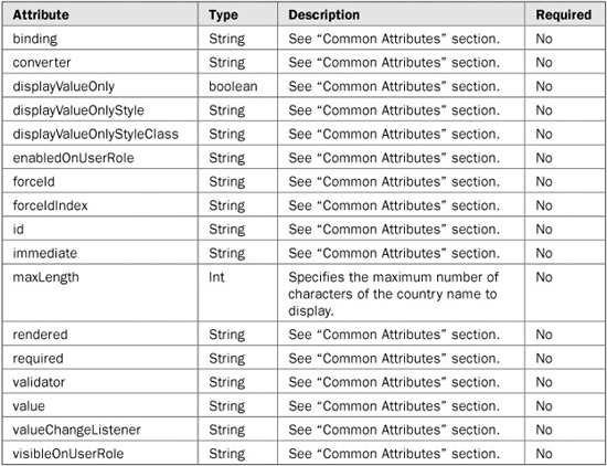
The majority of the extended components have the same set of extended attributes. Instead of repeating the descriptions of the common attributes in each component’s section, they are listed in Table 20-1.
Tag name: <t:commandButton>
Component class: org.apache.myfaces.component.html.ext.HtmlCommandButton
Component type: org.apache.myfaces.HtmlCommandButton
Tag name: <t:commandLink>
Component class: org.apache.myfaces.component.html.ext.HtmlCommandLink
Component type: org.apache.myfaces.HtmlCommandLink
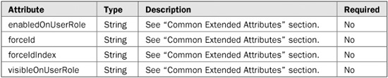
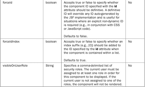
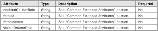
TABLE 20-1 The Common Extended Attributes for the Extended Components
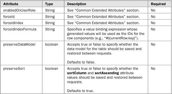
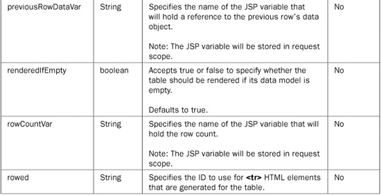
Tag name: <t:dataTable>
Component class: org.apache.myfaces.component.html.ext.HtmlDataTable
Component type: org.apache.myfaces.HtmlDataTable
Tag name: <t:graphicImage>
Component class: org.apache.myfaces.component.html.ext.HtmlGraphicImage
Component type: org.apache.myfaces.HtmlGraphicImage
Tag name: <t:inputHidden>
Component class: org.apache.myfaces.component.html.ext.HtmlInputHidden
Component type: org.apache.myfaces.HtmlInputHidden
Tag name: <t:inputSecret>
Component class: org.apache.myfaces.component.html.ext.HtmlInputSecret
Component type: org.apache.myfaces.HtmlInputSecret
Tag name: <t:inputText>
Component class: org.apache.myfaces.component.html.ext.HtmlInputText
Component type: org.apache.myfaces.HtmlInputText
Tag name: <t:inputTextarea>
Component class: org.apache.myfaces.component.html.ext.HtmlInputTextarea
Component type: org.apache.myfaces.HtmlInputTextarea
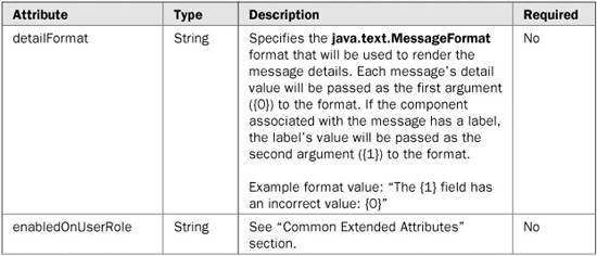
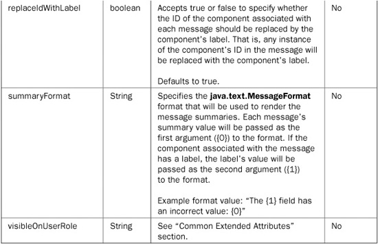
Tag name: <t:message>
Component class: org.apache.myfaces.component.html.ext.HtmlMessage
Component type: org.apache.myfaces.HtmlInputMessage

Tag name: <t:messages>
Component class: org.apache.myfaces.component.html.ext.HtmlMessages
Component type: org.apache.myfaces.HtmlMessages
Tag name: <t:outputLabel>
Component class: org.apache.myfaces.component.html.ext.HtmlOutputLabel
Component type: org.apache.myfaces.HtmlOutputLabel
Tag name: <t:outputText>
Component class: org.apache.myfaces.component.html.ext.HtmlOutputText
Component type: org.apache.myfaces.HtmlOutputText

Tag name: <t:panelGrid>
Component class: org.apache.myfaces.component.html.ext.HtmlPanelGrid
Component type: org.apache.myfaces.HtmlPanelGrid

Tag name: <t:panelGroup>
Component class: org.apache.myfaces.component.html.ext.HtmlPanelGroup
Component type: org.apache.myfaces.HtmlPanelGroup
Tag name: <t:selectBooleanCheckbox>
Component class: org.apache.myfaces.component.html.ext.HtmlSelectBooleanCheckbox
Component type: org.apache.myfaces.HtmlSelectBooleanCheckbox
Tag name: <t:selectManyCheckbox>
Component class: org.apache.myfaces.component.html.ext.HtmlSelectManyCheckbox
Component type: org.apache.myfaces.HtmlSelectManyCheckbox

Tag name: <t:selectManyListbox>
Component class: org.apache.myfaces.component.html.ext.HtmlSelectManyListbox
Component type: org.apache.myfaces.HtmlSelectManyListbox
Tag name: <t:selectManyMenu>
Component class: org.apache.myfaces.component.html.ext.HtmlSelectManyMenu
Component type: org.apache.myfaces.HtmlSelectManyMenu

Tag name: <t:selectOneListbox>
Component class: org.apache.myfaces.component.html.ext.HtmlSelectOneListbox
Component type: org.apache.myfaces.HtmlSelectOneListbox

Tag name: <t:selectOneMenu>
Component class: org.apache.myfaces.component.html.ext.HtmlSelectOneMenu
Component type: org.apache.myfaces.HtmlSelectOneMenu

Tag name: <t:selectOneRadio>
Component class: org.apache.myfaces.component.html.ext.HtmlSelectOneRadio
Component type: org.apache.myfaces.HtmlSelectOneRadio

The MyFaces Tomahawk library provides a set of custom components that extend beyond what is provided by the JSF specification. Table 20-2 lists each of the custom components and gives a short description of each component’s functionality.


TABLE 20-2 The MyFaces Custom Components
NOTE Since MyFaces is an open source technology and is constantly in development, there may be some components missing from this list and in the descriptions that follow. To see the current list of Tomahawk components in development, please refer to http://myfaces.apache.org/tomahawk/tlddoc/index.html.
The remainder of this section discusses each custom component in detail, including a complete description of the component, tables listing each of the component’s attributes, and a usage example for the component.
In the tables that describe each component’s attributes, pay special attention to the Required column. It simply denotes whether or not the given attribute is required when using the component. If an attribute is required and you do not specify it when using the component, the component will throw a javax.servlet.jsp.JspException at runtime. Note that you can declare an error page in your JSP with a page directive to capture any JspExceptions that might be thrown, as shown here:
<%@ page errorPage="error.jsp" %>
If an exception occurs, the page specified by the errorPage attribute will be internally redirected to display an error page.
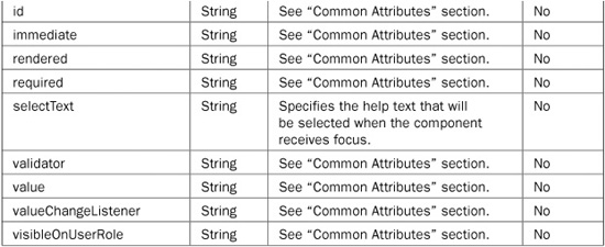
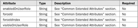
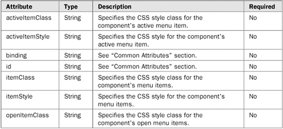
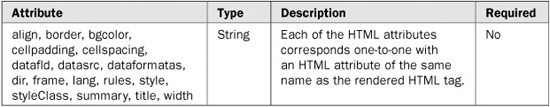
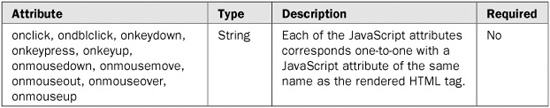
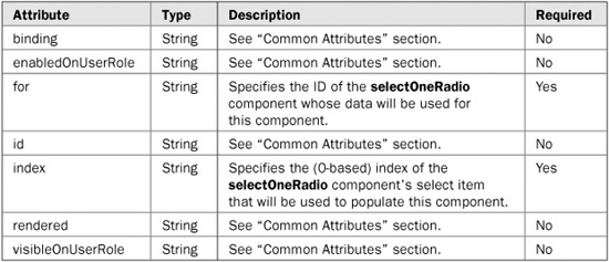
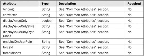
Many of the custom components have several attributes in common. Instead of repeating the descriptions of the common attributes in each component’s section, they are listed in Table 20-3.
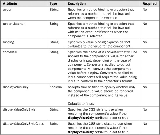
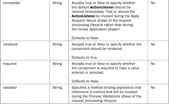
TABLE 20-3 The Common Attributes for the MyFaces Custom Components
Tag name: <t:aliasBean>
Component class: org.apache.myfaces.custom.aliasbean.AliasBean
Component type: org.apache.myfaces.AliasBean
The aliasBean component is used to create a new bean with a specified value. The bean’s value can be the result of an expression or a hard-coded value.
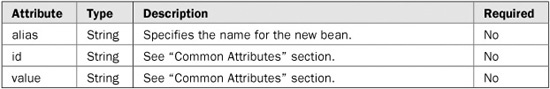
<t:aliasBean alias="#{newBean}" value="#{existingBean}"/>
Tag name: <t:aliasBeansScope>
Component class: org.apache.myfaces.custom.aliasbean.AliasBeansScope
Component type: org.apache.myfaces.AliasBeansScope
The aliasBeansScope component is used to create a context (scope) for which beans defined with the aliasBean component will be available. Beans defined by the aliasBean component inside enclosing aliasBeansScope component tags will be visible to any other components inside the enclosing tags.

<t:aliasBeansScope>
  <t:aliasBean alias="#{newBean}" value="#{existingBean}"/>
  <t:aliasBean alias="#{newBean2}" value="bean value"/>
</t:aliasBeansScope>
Tag name: <t:buffer>
Component class: org.apache.myfaces.custom.buffer.Buffer
Component type: org.apache.myfaces.Buffer
The buffer component is used to store (buffer) a portion of a page’s rendered output in a JSP variable. The buffered output can then be later displayed at the desired point.
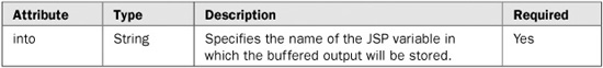
<t:buffer into="pageBuffer">
  <h:outputText value="page content"/>
</t:buffer>

<!-- Display buffered content -->
<h:outputText value="#{pageBuffer}" escape="false"/>
Tag name: <t:checkbox>
Component class: org.apache.myfaces.custom.checkbox.HtmlCheckbox
Component type: org.apache.myfaces.HtmlCheckbox
The checkbox component is used to render an HTML checkbox control populated with data from a selectManyCheckbox component whose layout is set to spread.
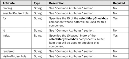
<t:selectManyCheckbox id="colors" layout="spread">
  <f:selectItem itemValue="0" itemLabel="Red"/>
  <f:selectItem itemValue="1" itemLabel="Green"/>
  <f:selectItem itemValue="2" itemLabel="Blue"/>
</t:selectManyCheckBox>

<t:checkbox for="colors" index="0"/>
<t:checkbox for="colors" index="1"/>
Tag name: <t:collapsiblePanel>
Component class: org.apache.myfaces.custom.checkbox.HtmlCollapsiblePanel
Component type: org.apache.myfaces.HtmlCollapsiblePanel
The collapsiblePanel component is used to create a panel that can have two states: visible and collapsed. In the visible state the panel’s contents are shown. In the collapsed state the panel’s contents are hidden.
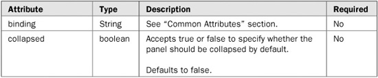
<t:collapsiblePanel collapsed="#{panelBean.collapsed}" value="Panel Title">
  <h:outputText value="Line 1"/>
  <h:outputText value="Line 2"/>
</t:collapsiblePanel>
Tag name: <t:commandNavigation>
Component class: org.apache.myfaces.custom.navigation.HtmlCommandNavigation
Component type: org.apache.myfaces.HtmlCommandNavigation
The commandNavigation component is used to render a clickable menu item for a menu created using the panelNavigation component.
NOTE Although the panelNavigation component and the associated commandNavigation component are still included in the Tomahawk library, they have been supplanted by the panelNavigation2 and commandNavigation2 components, respectively.
<t:panelNavigation id="linkMenu">
  <t:commandNavigation action="gotoMenuItem1">
    <h:outputText value="Menu Item 1"/>
  </t:commandNavigation>
  <t:commandNavigation action="gotoMenuItem2">
    <h:outputText value="Menu Item 2"/>
  </t:commandNavigation>
</t:panelNavigation>
Tag name: <t:commandNavigation2>
Component class: org.apache.myfaces.custom.navmenu.htmlnavmenu.HtmlCommandNavigationItem
Component type: org.apache.myfaces.HtmlCommandNavigationItem
The commandNavigation2 component is used to render a clickable menu item for a menu created using the panelNavigation2 component.

<t:panelNavigation2 id="linkMenu">
  <t:commandNavigation2 action="gotoMenuItem1">
    <h:outputText value="Menu Item 1"/>
  </t:commandNavigation2>
  <t:commandNavigation2 action="gotoMenuItem2">
    <h:outputText value="Menu Item 2"/>
  </t:commandNavigation2>
</t:panelNavigation2>
Tag name: <t:commandSortHeader>
Component class: org.apache.myfaces.custom.sortheader.HtmlCommandSortHeader
Component type: org.apache.myfaces.HtmlCommandSortHeader
The commandSortHeader component is used to render a sortable column header for a dataTable component.
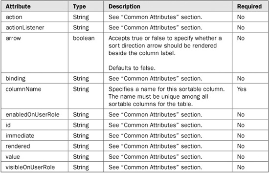
<t:dataTable value="#{search.results}" var="result">
  <h:column>
    <f:facet name="header">
      <t:commandSortHeader columnName="name" arrow="true">
        <h:outputText value="Name"/>
      </t:commandSortHeader>
    </f:facet>
    <h:outputText value="#{result.name}"/>
  </h:column>
  <h:column>
    <f:facet name="header">
      <h:outputText value="Description"/>
    </f:facet>
    <h:outputText value="#{result.description}"/>
  </h:column>
</t:dataTable>
Tag name: <t:dataList>
Component class: org.apache.myfaces.custom.datalist.HtmlDataList
Component type: org.apache.myfaces.HtmlDataList
The dataList component is used to render a data table as a list instead of a traditional table. Each row is rendered as an item in the list.


<t:dataList type="orderedList" value="#{addressForm.countries}" var="country">
  <h:outputText value="#{country.name}"/>
</t:dataList>
Tag name: <t:dataScroller>
Component class: org.apache.myfaces.custom.datascroller.HtmlDataScroller
Component type: org.apache.myfaces.HtmlDataScoller
The dataScroller component is used to render a paging mechanism for scrolling through “pages” of data. Note that this component is dependent on the Tomahawk extended version of the dataTable component and will not work with the standard JSF implementation of the dataTable component.


<t:dataTable id="countries"
          value="#{addressForm.countries}"
            var="country"
           rows="10">
  <h:column>
    <f:facet name="header">
      <h:outputText value="Code"/>
    </f:facet>
    <h:outputText value="#{country.code}"/>
  </h:column>
  <h:column>
    <f:facet name="header">
      <h:outputText value="Name"/>
    </f:facet>
    <h:outputText value="#{country.name}"/>
  </h:column>
</t:dataTable>
<t:dataScroller for="countries"
           fastStep="10"
       pageCountVar="pageCount"
       pageIndexVar="pageIndex"
          paginator="true">
  <f:facet name="first">
    <t:graphicImage url="images/arrow-first.gif"/>
  </f:facet>
  <f:facet name="last">
    <t:graphicImage url="images/arrow-last.gif"/>
  </f:facet>
  <f:facet name="previous">
    <t:graphicImage url="images/arrow-previous.gif"/>
  </f:facet>
  <f:facet name="next">
    <t:graphicImage url="images/arrow-next.gif"/>
  </f:facet>
  <f:facet name="fastforward">
    <t:graphicImage url="images/arrow-ff.gif"/>
  </f:facet>
  <f:facet name="fastrewind">
    <t:graphicImage url="images/arrow-fr.gif"/>
  </f:facet>
</t:dataScroller>
Tag name: <t:div>
Component class: org.apache.myfaces.custom.div.Div
Component type: org.apache.myfaces.Div
The div component is used to render a set of HTML <div> tags around content.


<t:div>
  <h:outputText value="content"/>
</t:div>
Tag name: <t:htmlTag>
Component class: org.apache.myfaces.custom.htmlTag.HtmlTag
Component type: org.apache.myfaces.HtmlTag
The htmlTag component is used to render an HTML tag (e.g., <br>, <p>, <h1>). Any HTML tag can be rendered using this tag.
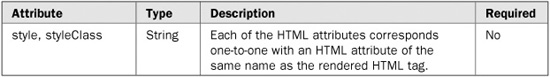
<!-- renders a <br> tag -->
<t:htmlTag value="br"/>

<!-- renders a <p> tag -->
<t:htmlTag value="p"/>

<!-- renders a <h1> tag -->
<t:htmlTag value="h1"/>
Tag name: <t:inputCalendar>
Component class: org.apache.myfaces.custom.calendar.HtmlInputCalendar
Component type: org.apache.myfaces.HtmlInputCalendar
The inputCalendar component is used to render a calendar component that allows users to choose a date from a month view, and select different months using a toolbar.
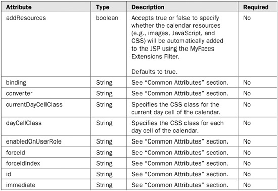


<t:inputCalendar value="#{userForm.birthDate}"/>
Tag name: <t:inputDate>
Component class: org.apache.myfaces.custom.date.HtmlInputDate
Component type: org.apache.myfaces.HtmlInputDate
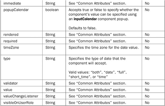
The inputDate component is used to render a set of fields for entering a date. The set of fields rendered for entering the date is based on the type of date specified using the type attribute.
<t:inputDate id="date" value="#{userForm.birthDate}" type="date"/>
Tag name: <t:inputFileUpload>
Component class: org.apache.myfaces.custom.fileupload.HtmlInputFileUpload
Component type: org.apache.myfaces.HtmlInputFileUpload
The inputFileUpload component is used to render a file upload control (textfield) that allows users to select a file from their browser and upload its contents to the server. Note that the form’s encoding type must be set to “multipart/form-data” in order for the file upload functionality to work in the browser. Following is an example of configuring the form’s encoding type:
<h:form id="uploadForm" name="uploadForm" enctype="multipart/form-data">
…
</h:form>
NOTE Use of the inputFileUpload component requires that the MyFaces Extensions Filter be set up in your application’s web.xml file. Additionally, you must create a backing bean that contains an org.apache.myfaces.custom.fileupload.UploadedFile field to store the uploaded files’ contents in. The UploadedFile field must be bound to the inputFileUpload component using the value attribute.

<t:inputFileUpload id="fileUpload" value="uploadForm.file"/>
Following is an example backing bean in which to store the uploaded file. Note that the bean must have an org.apache.myfaces.custom.fileuploadUploadedFile field to hold the uploaded files’ content.
import org.apache.myfaces.custom.fileupload.UploadedFile;

public class UploadForm {
  private UploadedFile file;

  public UploadedFile getFile() {
    return file;
  }

  public void setFile(UploadedFile file) {
   this.file = file;
}
Tag name: <t:inputHtml>
Component class: org.apache.myfaces.custom.inputHtml.InputHtml
Component type: org.apache.myfaces.InputHtml
The inputHtml component is used to render a Kupu HTML editor. Kupu is a very popular JavaScript-based HTML editor library. For more details on Kupu, visit the project Web site at http://kupu.oscom.org/.
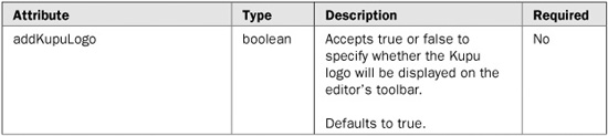
<t:inputHtml/>
Tag name: <t:inputTextHelp>
Component class: org.apache.myfaces.custom.inputTextHelp.HtmlInputTextHelp
Component type: org.apache.myfaces.HtmlInputTextHelp
The inputTextHelp component is used to render an input text component pre-populated with help text that will either be cleared or selected when the text field receives focus.


<!-- Text that will be cleared on focus -->
<t:inputTextHelp helpText="Enter search term"/>

<!-- Text that will be selected on focus -->
<t:inputTextHelp selectText="Enter search term"/>
Tag name: <t:jscookMenu>
Component class: org.apache.myfaces.custom.navmenu.jscookmenu.HtmlCommandJSCookMenu
Component type: org.apache.myfaces.JSCookMenu
The jscookMenu component is used to render a JSCookMenu menu. JSCookMenu is a very popular JavaScript menuing library created by Heng Yuan. For more details on JSCookMenu, visit the project Web site at http://www.cs.ucla.edu/~heng/JSCookMenu.
<t:jscookMenu layout="hbr" theme="ThemeIE">
  <t:navigationMenuItem id="menuItem1"
                 itemLabel="Menu Item 1"
                    action="goMenuItem1"/>
  <t:navigationMenuItem id="menuItem2"
                 itemLabel="Menu Item 2"
                    action="goMenuItem2"/>
</t:jscookMenu>
Tag name: <t:jsValueChangeListener>
Component class: org.apache.myfaces.custom.jslistener.JsValueChangeListener
Component type: org.apache.myfaces.JsValueChangeListener
The jsValueChangeListener component is used to create a JavaScript value change listener that works similar to the way a JSF value change listener works. The JavaScript value change listener is used to capture change events on a component and trigger changes in other components when the events occur. This is useful for keeping two components’ values in sync.
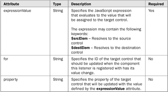
<h:inputText id="email">
  <t:jsValueChangeListener for="emailConfirm"
                      property="value"
               expressionValue="$srcElem.value"/>
</h:inputText>
Tag name: <t:jsValueSet>
Component class: org.apache.myfaces.custom.jsvalueset.HtmlJsValueSet
Component type: org.apache.myfaces.HtmlJsValueSet
The jsValueSet component is used to create a JavaScript variable with the specified name and value. This tag is useful for assigning values from JSF beans to JavaScript variables using a value binding expression.
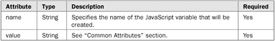
<t:jsValueSet name="username" value="#{loginForm.username}"/>
Tag name: <t:newspaperTable>
Component class: org.apache.myfaces.custom.newspaper.HtmlNewspaperTable
Component type: org.apache.myfaces.HtmlNewspaperTable
The newspaperTable component is used to create a data table that wraps its content into multiple columns instead of having one long column.
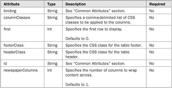

<t:newspaperTable newspaperColumns="3"
                             value="#{addressForm.countries}"
                               var="country">
  <h:column>
    <h:outputText value="#{country.code}"/>
  </h:column>
  <h:column>
    <h:outputText value="#{country.name}"/>
  </h:column>
</t:newspaperTable>
Tag name: <t:panelNavigation>
Component class: org.apache.myfaces.custom.navigation.HtmlPanelNavigation
Component type: org.apache.myfaces.HtmlPanelNavigation
The panelNavigation component is used to render a clickable menu composed of menu items created using the commandNavigation component.
NOTE Although the panelNavigation component and the associated commandNavigation component are still included in the Tomahawk library, they have been supplanted by the panelNavigation2 and commandNavigation2 components, respectively.

<t:panelNavigation id="linkMenu">
  <t:commandNavigation action="gotoMenuItem1">
    <h:outputText value="Menu Item 1"/>
  </t:commandNavigation>
  <t:commandNavigation action="gotoMenuItem2">
    <h:outputText value="Menu Item 2"/>
  </t:commandNavigation>
</t:panelNavigation>
Tag name: <t:panelNavigation2>
Component class: org.apache.myfaces.custom.navmenu.htmlnavmenu.HtmlPanelNavigationMenu
Component type: org.apache.myfaces.HtmlPanelNavigationMenu
The panelNavigation2 component is used to render a clickable menu composed of menu items created using the commandNavigation2 component.

<t:panelNavigation2 id="linkMenu">
  <t:commandNavigation2 action="gotoMenuItem1">
    <h:outputText value="Menu Item 1"/>
  </t:commandNavigation2>
  <t:commandNavigation2 action="gotoMenuItem2">
    <h:outputText value="Menu Item 2"/>
  </t:commandNavigation2>
</t:panelNavigation2>
Tag name: <t:panelStack>
Component class: org.apache.myfaces.custom.panelstack.HtmlPanelStack
Component type: org.apache.myfaces.HtmlPanelStack
The panelStack component is used to create a group of stacked panels where each panel is stacked on top of one another and one panel is visible.
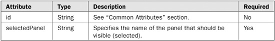
<t:panelStack id="stack" selectedPanel="#{stackBean.selected}">
  <h:panelGroup id="panel1">
    <h:outputText value="Panel 1"/>
  </h:panelGroup>
  <h:panelGroup id="panel2">
    <h:outputText value="Panel 2"/>
  </h:panelGroup>
</t:panelStack>
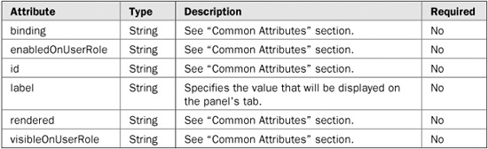
Tag name: <t:panelTab>
Component class: org.apache.myfaces.custom.tabbedpane.HtmlPanelTab
Component type: org.apache.myfaces.HtmlPanelTab
The panelTab component is used to create an individual tab panel for a tabbed pane defined by the panelTabbedPane component.

<t:panelTabbedPane>
  <t:panelTab id="tab1" label="Tab 1">
    <h:outputText value="Tab 1"/>
  </t:panelTab>
  <t:panelTab id="tab2" label="Tab 2">
    <h:outputText value="Tab 2"/>
  </t:panelTab>
</t:panelTabbedPane>
Tag name: <t:panelTabbedPane>
Component class: org.apache.myfaces.custom.tabbedpane.HtmlTabbedPane
Component type: org.apache.myfaces.HtmlPanelTabbedPane
The panelTabbedPane component is used to create a tabbed pane consisting of multiple tab panels defined by the panelTab component. Each tab panel has its own tab with a label that, when clicked, activates that tab and makes its content visible.
<t:panelTabbedPane>
  <t:panelTab id="tab1" label="Tab 1">
    <h:outputText value="Tab 1"/>
  </t:panelTab>
  <t:panelTab id="tab2" label="Tab 2">
    <h:outputText value="Tab 2"/>
  </t:panelTab>
</t:panelTabbedPane>
Tag name: <t:popup>
Component class: org.apache.myfaces.custom.popup.HtmlPopup
Component type: org.apache.myfaces.HtmlPopup
The popup component is used to display a user-defined tool tip (pop-up) when a specified element is moused over.
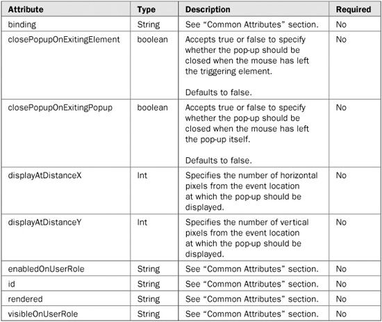
<t:popup>
  <h:outputText value="This text will have the tooltip."/>
  <f:facet name="popup">
    <h:outputText value="This is the content inside the popup"/>
  </f:facet>
</t:popup>
Tag name: <t:radio>
Component class: org.apache.myfaces.custom.radio.HtmlRadio
Component type: org.apache.myfaces.HtmlRadio
The radio component is used to render an HTML radio control populated with data from a selectOneRadio component whose layout is set to spread.
<t:selectOneRadio id="colors" layout="spread">
  <f:selectItem itemValue="0" itemLabel="Red"/>
  <f:selectItem itemValue="1" itemLabel="Green"/>
  <f:selectItem itemValue="2" itemLabel="Blue"/>
</t:selectOneRadio>

<t:radio for="colors" index="0"/>
<t:radio for="colors" index="1"/>
Tag name: <t:saveState>
Component class: org.apache.myfaces.custom.savestate.UISaveState
Component type: org.apache.myfaces.SaveState
The saveState component is used to save arbitrary objects with the same scope as the JSF component tree. This scope persists objects longer than request scope, but shorter than session scope.
NOTE Any objects stored using this component must implement the java.io.Serializable interface.
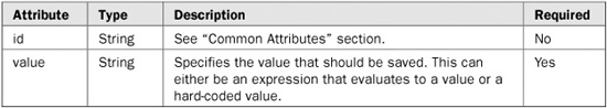
<t:saveState id="savedForm" value="#{myForm}"/>
Tag name: <t:selectOneCountry>
Component class: org.apache.myfaces.custom.selectOneCountry.SelectOneCountry
Component type: org.apache.myfaces.SelectOneCountry
The selectOneCountry component is used to render a selectOne component populated with the list of ISO 3166 countries.
<t:selectOneCountry maxLength="25"/>
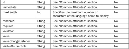
Tag name: <t:selectOneLanguage>
Component class: org.apache.myfaces.custom.selectOneLanguage.SelectOneLanguage
Component type: org.apache.myfaces.SelectOneLanguage
The selectOneLanguage component is used to render a selectOne component populated with the list of ISO 639 languages.
<t:selectOneLanguage maxLength="25"/>
Tag name: <t:stylesheet>
Component class: org.apache.myfaces.custom.stylesheet.Stylesheet
Component type: org.apache.myfaces.Stylesheet
The stylesheet component is used to render a link to a cascading style sheet or to inline the contents of the specified style sheet.
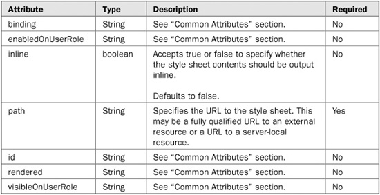
<t:stylesheet path="/css/site.css"/>
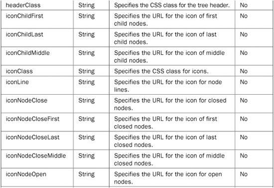
Tag name: <t:tree>
Component class: org.apache.myfaces.custom.tree.HtmlTree
Component type: org.apache.myfaces.HtmlTree
The tree component is used to render a tree component that allows users to traverse nodes of data.
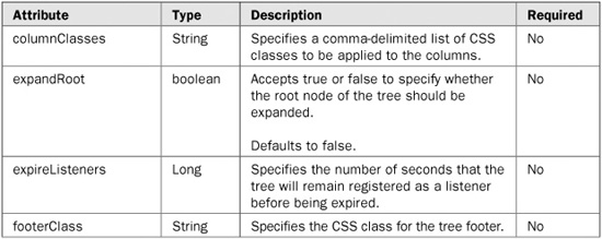
<t:tree id="tree" value="#{resultsForm.treeModel}"/>
Tag name: <t:tree2>
Component class: org.apache.myfaces.custom.tree2.HtmlTree
Component type: org.apache.myfaces.HtmlTree2
The tree2 component is used to render a tree component that allows users to traverse nodes of data. The tree2 component is newer than the other tree components and more popular.
NOTE Use of the tree2 component can require that the MyFaces Extensions Filter be set up in your application’s web.xml file. This is because the component uses the filter to serve some resources if no alternative is specified. You must also create a backing bean that contains an org.apache.myfaces.custom.tree2.TreeNode field to store the tree data in. The TreeNode field must be bound to the tree2 component using the value attribute. There are two implementations of TreeNode available: TreeNodeBase and TreeNodeChecked. TreeNodeChecked inherits TreeNodeBase and adds some conveniences for using checkboxes inside the tree.
<t:tree2 id="tree" value="#{tree.tree}" clientSideToggle="true"
   varNodeToggler="t" var="node">
  <f:facet name="facetName_analysisFolder">
    <h:panelGroup>
      <h:selectBooleanCheckbox value="#{node.checked}" />
      <t:graphicImage value="images/yellow-folder-closed.png" border="0"/>
      <h:outputText value="#{node.description}" styleClass="nodeFolder"/>
    </h:panelGroup>
  </f:facet>
  <f:facet name="facetName_root">
<h:panelGroup>
   <t:graphicImage value="images/yellow-folder-closed.png" border="0"/>
   <h:outputText value="#{node.description}" styleClass="nodeFolder"/>
 </h:panelGroup>
</f:facet>
</t:tree2>
The following is an example backing bean in which to store the tree data. Note that the bean must have some classes from the org.apache.myfaces.custom.tree2 package imported.
import org.apache.myfaces.custom.tree2.TreeNode;
import org.apache.myfaces.custom.tree2.TreeNodeBase;
import org.apache.myfaces.custom.tree2.TreeNodeChecked;

public class TreeBacking {

  public TreeBacking() {

    tree = new TreeNodeBase("facetName_root","displayName", false);

     tree.getChildren().add(
        new TreeNodeChecked("facetName_analysisFolder", "displayName" ,
    "id", false, true));
}
  }
  private TreeNode tree;
  public TreeNode getTree() {
    return tree;
  }

  public void setFile(TreeNode tree) {
   this.tree = tree;
}
Tag name: <t:treeColumn>
Component class: org.apache.myfaces.custom.tree.HtmlTreeColumn
Component type: org.apache.myfaces.HtmlTreeColumn
The treeColumn component is used to make a tree component render as a table with one column (defined by this component) displayed as the tree. The other columns are normal table columns.

<t:tree id="tableTree" value="#{resultsForm.treeModel}" var="treeItem">
  <t:treeColumn>
    <h:outputText value="#{treeItem.name}"/>
  </t:treeColumn>
  <h:column>
    <h:outputText value="#{treeItem.description}"/>
  </h:column>
</t:tree>
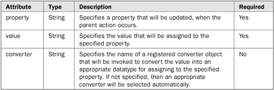
Tag name: <t:updateActionListener>
Component class: org.apache.myfaces.custom.updateactionlistener.UpdateActionListener
Component type: none
The updateActionListener is not a custom component in the sense of the JavaServer Faces specification. It is a specialized ActionListener implementation, useful when dealing with http parameters. Instead of adding lots of parameters with the <f:param> tag to a <h:commandLink>, the UpdateActionListener is able to push a complete object to another backing bean.
<h:dataTable id="masterTable" value="#{masterBean.data}" var="current" …>
   …
   <h:commandLink action="showDetails">
      <h:grapicImage …>
      <t:updateActionListener value="#{current}"
                property="#{detailBean.entry}" />
   </h:commandLink>
   …

</h:dataTable>
The MyFaces Tomahawk library provides a set of custom validators that extend beyond what is provided by the JSF specification. Currently, the majority of the MyFaces custom validators are wrappers for validation routines provided by the Jakarta Commons Validator framework. The MyFaces validators simply proxy validation calls to the underlying Jakarta Commons validation routines for processing. Leveraging the Jakarta Commons code reduces code duplication and provides a familiar set of validation routines to those users who have used those routines in other frameworks, such as Struts. For more information on the Jakarta Commons Validator framework, visit the Jakarta Commons Web site at http://jakarta.apache.org/commons/validator/.
Table 20-4 lists each of the MyFaces custom validators and a short description of each validator’s purpose.
The remainder of this section discusses each validator in detail, including a complete description of the validator, a table listing each of the validator’s attributes, and a usage example for the validator.
In the tables that describe each validator’s attributes, pay special attention to the Required column. It simply denotes whether or not the given attribute is required when using the validator. If an attribute is required and you do not specify it when using the validator, the validator will throw a javax.servlet.jsp.JspException at runtime. Note that you can declare an error page in your JSP with a page directive to capture any JspExceptions that might be thrown, as shown here:
<%@ page errorPage="error.jsp" %>
If an exception occurs, the page specified by the errorPage attribute will be internally redirected to display an error page.
The validateCreditCard validator is used to determine whether or not the value of the enclosing UI component is a valid credit card number. It supports validating that the value is a valid American Express, Discover, MasterCard, or Visa credit card number. Each of these credit card type validations can be individually enabled or disabled using attributes of the validateCreditCard validator. By default, validateCreditCard validates the UI component value to be any of the supported credit card type numbers. The none attribute provides a convenient mechanism for disabling all credit card type number validations.

TABLE 20-4 The MyFaces Custom Validators

The following example illustrates the basic usage of the validateCreditCard validator:
<h:inputText id="creditCardNumber"
          value="#{paymentForm.creditCardNumber}"
       required="true">
  <t:validateCreditCard/>
</h:inputText>
This tag will look up the value of the inputText UI component and perform the validation against that value. Because no attributes have been specified for the validateCreditCard tag and all of the credit card type attributes default to true when not specified, the value specified will be validated to be a valid number for one of the credit card types.
The validateEmail validator is used to determine whether or not the value of the enclosing UI component is a valid e-mail address. The e-mail address validation is performed by checking the format of the e-mail address. The validation ensures that the address has an “@” symbol as well as other common format characteristics. If the address does not conform to the common format characteristics, it will be deemed invalid.
The following example illustrates the basic usage of the validateEmail validator:
<h:inputText id="emailAddress"
          value="#{paymentForm.emailAddress}"
       required="true">
  <t:validateEmail/>
</h:inputText>
This tag will look up the value of the inputText UI component and perform the validation against that value.
An alternative way to use the validateEmail validator is to use the standard JSF validator and specify validateEmail with the validatorId attribute, as shown here:
<h:inputText id="emailAddress"
          value="#{paymentForm.emailAddress}"
       required="true">
  <f:validator validatorId="org.apache.myfaces.validator.Email"/>
</h:inputText>
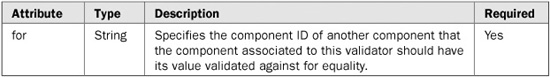
The validateEqual validator is used to determine whether or not the value of the enclosing UI component equals the value of another specified UI component. This validator is especially useful for the scenario where it is necessary to validate that a user has input the same value into two separate fields on a form (e.g., password and password confirm).
NOTE When using the validateEqual validator, the component referenced by the for attribute must exist in the JSF component tree before the component to which the validateEqual validator is being applied. For example, if the validateEqual validator is being used to validate if a passwordConfirm field value is equal to the value in a password field, the password field must exist in the JSF component tree before the passwordConfirm field in order for the validateEqual validator to work.
The following example illustrates the basic usage of the validateEqual validator:
<h:inputText id="password"
          value="#{paymentForm.password}"
       required="true">
  <t:validateEqual for="passwordConfirm"/>
</h:inputText>
This tag will look up the value of the inputText UI component and perform the validation against that value.
The validateRegExpr validator is used to determine whether or not the value of the enclosing UI component matches the specified regular expression. A regular expression is a group of characters that describes a character sequence. This general description, called a pattern, can then be used to find matches in other character sequences. Regular expressions can specify wildcard characters, sets of characters, and various quantifiers. Thus, you can specify a regular expression that represents a general form that can match several different specific character sequences.
The syntax and rules that define a regular expression are similar to those used by the Perl programming language. Although no single rule is complicated, there are a large number of them and a complete discussion is beyond the scope of this book. However, a few of the more commonly used constructs are described here.
In general, a regular expression is comprised of normal characters, character classes (sets of characters), wildcard characters, and quantifiers. A normal character is matched as is. Thus, if a pattern consists of “xy”, the only input sequence that will match it is “xy”. Characters such as newlines and tabs are specified using the standard escape sequences, which begin with a backslash (\). For example, a newline is specified by \n. In the language of regular expressions, a normal character is also called a literal.
A character class is a set of characters. A character class is specified by putting the characters in the class between brackets. For example, the class [wxyz] matches w, x, y, or z. To specify an inverted set, precede the characters with a circumflex (^). For example, [^wxyz] matches any character except w, x, y, or z. You can specify a range of characters using a hyphen. For example, to specify a character class that will match the digits 1 through 9, use [1–9].
The wildcard character is the dot (.), and it matches any character. Thus, a pattern that consists of “.” will match these (and other) input sequences: “A”, “a”, “x”, and so on.
A quantifier determines how many times an expression is matched. The quantifiers are shown here:
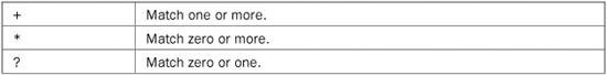
For example, the pattern x+ will match x, xx, and xxx, among others.
For more information on regular expressions, visit the comprehensive review of them on the Wikipedia encyclopedia Web site at http://en.wikipedia.org/wiki/Regular_expression.
The following example illustrates the basic usage of the validateRegExpr validator:
<h:inputText id="ssNumber"
          value="#{paymentForm.ssNumber}"
       required="true">
  <t:validateRegExpr pattern="^d{3}-\d{2}-\d{4}$"/>
</h:inputText>
This tag will look up the value of the inputText UI component and perform the validation against that value. The regular expression specified here with the pattern attribute is for matching a Social Security Number (e.g., 333-22-4444). The expression expects the value to have three digits followed by a hyphen followed by two digits followed by a hyphen and finally followed by four digits. If the UI component’s value does not match that pattern, the validation will fail.
In addition to the many extended components, custom components, and custom validations provided by the MyFaces Tomahawk library, there is support for using the Tiles framework with JSF. Tiles is a user interface layout framework that was originally developed as an extension to the Struts framework. Tiles has become very popular and its usefulness extends beyond just Struts-based applications. Tiles can be used to simplify and enhance all Java Web applications. This section provides an overview of the Tiles framework followed by step-by-step instructions for using the MyFaces support for Tiles with JSF applications.
Tiles expands the concept of code reuse via JSP includes by allowing you to define layouts (or templates) and then specify how the layouts are populated with content. To understand the value of Tiles, first consider how the JSP include paradigm works. Each JSP specifies its layout and explicitly populates that layout through includes. Most JSP layouts are identical, sourcing in the same files, in the same places, and then having a section of unique content, which is usually body content. Thus, there is significant duplication. Tiles takes the reverse approach.
With Tiles, you define a master layout JSP that specifies each of the includes that fill in the layout and then you define which content should fill in the layout in an external configuration file. The same layout can be used over and over by simply specifying different filler content for the layout in the configuration file.
For example, consider a typical Web site layout that has a header at the top of the page, a menu on the left, body content in the middle, and a footer on the bottom, as shown in Figure 20-1. If you were to implement this page using only JSP includes, each JSP that has this layout would have to explicitly include the header, menu, and footer sections of the page, and the body content would be in the JSP itself. Essentially, the only unique part of the page is the body content.
Alternatively, if you were to implement this layout with Tiles, you’d create one JSP that includes the header, menu, and footer and then dynamically include the body based on a parameter passed to the layout that indicates which JSP to use for the body content. This Tiles layout could then be reused for as many pages as you’d like and the only thing your content JSPs would have to contain is the body content that goes in the middle of the page. Tiles takes care of wrapping the body content JSP with the layout. As you can see, Tiles significantly enhances JSP development and allows for an even greater amount of reuse than JSP includes offer.
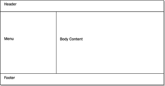
FIGURE 20-1 Typical Web site layout
As described, Tiles allows you to exploit the concept of JSP includes by providing a framework for defining and dynamically populating page layouts. Each page layout is simply a JSP that defines a template frame (or outline) with placeholders for where content should go. At runtime, Tiles replaces the placeholders with their associated content, creating a complete page and unique instance of the layout. To accomplish this, Tiles uses its concepts of definitions and attributes.
A Tiles definition creates a piece of content that Tiles can insert into a JSP using that definition’s name. Each definition consists of a name (or identifier), a layout JSP, and a set of attributes associated to the definition. Once defined, a definition can be included in a page or, as is most often the case, be used as the target of a JSF navigation rule. In both cases, when the definition is encountered, Tiles passes to the layout JSP specified by the definition the set of attributes that were declared for that definition. An attribute value can be the path to a JSP, a literal string, or a list of either.
To facilitate the use of definitions and attributes, Tiles uses an XML configuration file (tiles-defs.xml) for storing their definitions. Tiles also provides a JSP tag library for defining definitions and attributes. Additionally, the Tiles Tag Library is used for inserting attributes into JSPs. For an in-depth discussion of the Tiles framework, see the Tiles chapter in Struts: The Complete Reference by James Holmes (McGraw-Hill, 2004).
Now that you’ve reviewed the benefits of using the Tiles framework and how it works, you are ready to update your application to use Tiles. Here is the list of steps that you will follow to add Tiles to your application:
1. Add Tomahawk library to your application.
2. Download and add the Tiles library to your application.
3. Add Tiles View Handler configuration to the faces-config.xml file.
4. Create layout JSPs.
5. Update existing JSPs to work with layouts.
6. Create a tiles-defs.xml file.
7. Specify the location of the Tiles configuration file in the web.xml file.
8. Repackage and run the updated application.
The following sections walk you through each step of the process in detail.
Adding the MyFaces Tomahawk library to your Web application is as simple as placing the tomahawk.jar and myfaces-commons.jar files in your application’s /WEB-INF/lib directory (or in a directory that your application server has access to via its classpath).
As mentioned, the Tiles library is distributed as part of the Struts framework. In order to acquire the Tiles library, you must download a Struts distribution and copy the Tiles library from the distribution to your Web application. Struts has multiple distributions available: binary, source, and library. You can choose any of these distributions; however, the library distribution is the easiest to work with for this scenario.
NOTE At the time of this writing, work was underway to separate the Tiles framework from Struts, making it an independent project once again. When that separation is complete, it will only be necessary to download the Tiles distribution to get the Tiles library.
The Tiles library is contained in the struts.jar file that comes packaged with Struts distributions. Simply copy struts.jar to your application’s /WEB-INF/lib directory (or to a directory that your application server has access to via its classpath). Each of the JSPs modified and created to use Tiles must include the following tag library reference:
<%@ taglib prefix="tiles" uri="http://struts.apache.org/tags-tiles" %>
In order to integrate Tiles with JSF, the MyFaces custom Tiles View Handler must be used. The Tiles View Handler extends the behavior of the default JSF View Handler by adding in logic to look up Tiles definitions and process accordingly if found. Basically, the Tiles View Handler looks at each view ID passing through and attempts to find a matching Tiles definition inside your Tiles definitions file. If a matching definition is found, the view ID is handled as a Tiles page; otherwise, it is processed normally.
To match view IDs to Tiles definitions, the Tiles View Handler substitutes the view ID’s extension with .tiles and then looks for a definition in the Tiles definitions file with that name. For example, /page.jsp becomes /page.tiles. If your application makes use of path mapping instead of extension mapping for JSF pages, .tiles will be appended to the path to perform a matching definition lookup. Note that you can modify the extension that the Tiles View Handler uses to match view IDs to Tiles definitions by setting a context parameter in your application’s web.xml file. Following is an example of doing that.
<context-param>
  <param-name>tiles-extension</param-name>
  <param-value>.tilesdef</param-value>
</context-param>
The bolded portion of the following snippet is what must be added to your application’s faces-config.xml file to enable the Tiles View Handler.
<faces-config>
  <application>
    <view-handler>
      org.apache.myfaces.application.jsp.JspTilesViewHandlerImpl
    </view-handler>
  </application>
</faces-config>
Now that you have added the necessary libraries to your application and configured the web.xml and faces-config.xml files, you can create the layout JSPs. To illustrate the basic concepts of Tiles, this section demonstrates how to create one layout based on the structure of the application’s existing pages. Following is an example login.jsp page that will be used to extract a common template:
<%@ taglib prefix="f" uri="http://java.sun.com/jsf/core" %>
<%@ taglib prefix="h" uri="http://java.sun.com/jsf/html" %>

<html>
<head>
<title>Login Page</title>
</head>

<f:view>
<body>

<font size="+1">ABC, Inc. Portal</font><br>
<hr width="100%" noshade="true">

<h:form>
<table>
<tr>
<td align="right">Username:</td>
<td>
<h:inputText id="username"
  value="#{LoginBean.username}" required="true"/>
</td>
</tr>
<tr>
<td align="right">Password:</td>
<td>
<h:inputSecret id="password"
  value="#{LoginBean.password}" required="true"/>
</td>
</tr>
<tr>
<td></td>
<td><h:commandButton value="Login" action="login"/></td>
</tr>
</table>
</h:form>

<hr width="100%" noshade="true">
Copyright © ABC, Inc.

</body>
</f:view>

<html>
The body content of the page is shown in bold. This section will be different for each distinct page. The rest of the page, however, will be consistent across several pages, thus allowing it to be abstracted into a general-purpose layout.
There are three JSP files that make up the layout: mainLayout.jsp, header.jsp, and footer.jsp. The mainLayout.jsp file is shown here:
<%@ taglib prefix="f" uri="http://java.sun.com/jsf/core" %>
<%@ taglib prefix="h" uri="http://java.sun.com/jsf/html" %>
<%@ taglib prefix="tiles" uri="http://struts.apache.org/tags-tiles" %>

<html>
<head>
<title><tiles:getAsString name="title"/></title>
</head>

<f:view>
<body>

<f:subview id="header">
<tiles:insert attribute="header" flush="false"/>
</f:subview>

<f:subview id="body">
<tiles:insert attribute="body" flush="false"/>
</f:subview>

<f:subview id="footer">
<tiles:insert attribute="footer" flush="false"/>
</f:subview>

</body>
</f:view>

</html>
This JSP defines the layout’s template and is used to source in the other layout JSPs as well as the body content that will be defined by pages utilizing the layout. The body content and other layout JSPs are sourced in with <tiles:insert> tags. These tags specify the names of attributes defined in the Tiles configuration file whose values are the names of the JSPs that should be inserted into the JSP at runtime. Observe that each of the <tiles:insert> tags is wrapped in <f:subview> tags. This is necessary because the Tiles content is dynamically included. Notice also the use of the <tiles:getAsString> tag between the <title> tags. This tag works similarly to the <tiles:insert> tag, but instead of using the specified attribute’s value as the name of a page to include, it is used as a literal string. This is useful for defining variables that can be customized by page definitions that extend layout definitions in the Tiles configuration file.
Following are the header and footer layout JSPs.
header.jsp:
<font size="+1">ABC, Inc. Portal</font><br>
<hr width="100%" noshade="true">
footer.jsp:
<hr width="100%" noshade="true">
Copyright © ABC, Inc.
As you can see, the header and footer JSPs are quite simple and do not contain much HTML. The content of these JSPs could have been placed directly in the mainLayout.jsp file instead of here and content pages would still only have to contain the body content of the page. However, breaking the pages up into smaller chunks allows for more flexibility in how layouts are used. For example, if you wanted all pages to have the standard header and footer, you wouldn’t have to worry about changing anything. On the other hand, if you needed some pages to have a custom header and footer and others to use the standard ones, separating the header and footer into discrete chunks would allow you to do that. You would simply define values for the header and footer attributes at the layout level, and each page that wanted a custom header, footer, or both would override the necessary attributes with new values at the page level. This will make more sense after you see the Tiles configuration file, which is discussed shortly.
Once you have created the layout JSPs, the next step is to update your application’s original JSPs to contain only the body content of their pages. To do this, you must remove each of the pieces of the original page that were used to craft the common layout. Following is the updated login.jsp page containing only body content:
<%@ taglib prefix="f" uri="http://java.sun.com/jsf/core" %>
<%@ taglib prefix="h" uri="http://java.sun.com/jsf/html" %>

<h:form>
<table>
<tr>
<td align="right">Username:</td>
<td>
<h:inputText id="username"
  value="#{LoginBean.username}" required="true"/>
</td>
</tr>
<tr>
<td align="right">Password:</td>
<td>
<h:inputSecret id="password"
  value="#{LoginBean.password}" required="true"/>
</td>
</tr>
<tr>
<td></td>
<td><h:commandButton value="Login" action="login"/></td>
</tr>
</table>
</h:form>
As you can see, the updated page no longer contains the header or footer portions of the content. At runtime, the layout JSPs will surround the contents of this updated page with the common layout content to create the complete page.
As mentioned, there are two ways to declare Tiles layouts: with Tiles tags in a master JSP that gets included into each of the layout JSPs or by declaring them in an XML configuration file. This example uses the configuration file option because it is the most flexible and easy-to-maintain approach. Following is the tiles-defs.xml file that declares the layouts. This file should be placed inside your application’s /WEB-INF/ folder.
<?xml version="1.0"?>

<!DOCTYPE tiles-definitions PUBLIC
  "-//Apache Software Foundation//DTD Tiles Configuration 1.1//EN"
  "http://jakarta.apache.org/struts/dtds/tiles-config_1_1.dtd">

<tiles-definitions>

  <!-- Main Layout -->
  <definition name="main.layout" path="/mainLayout.jsp">
        <put name="title"  value=""/>
        <put name="header" value="/header.jsp"/>
        <put name="body"   value=""/>
        <put name="footer" value="/footer.jsp" />
  </definition>

  <!-- Login Page -->
  <definition name="login.tiles" extends="main.layout">
        <put name="title"  value="Login Page"/>
        <put name="body"   value="/login.jsp"/>
  </definition>

</tiles-definitions>
There are two Tiles definitions in this file. The first definition in the file declares a layout named main.layout. The .layout extension given to the definition’s name is used to denote that it is a layout definition. This is not a formal naming scheme; however, it is a simple way to distinguish the types of definitions. Generally speaking, layout definitions specify the template for a page and the list of attributes whose values will be used to fill in the template. Page definitions extend layout definitions and provide values for the attributes defined in the extended layout. So, essentially, page definitions are instances of a layout with attributes set to the content for a specific page. Remember that in order for the MyFaces Tiles View Handler to identify page definitions, they must have a .tiles extension (this extension is configurable).
Notice that the first definition defines four attributes with put tags. These attributes will be available for use by the layout JSP specified by the path attribute. The layout JSP uses these attributes to supply it with the locations of its content. Additionally, attributes can be used to supply literal strings, as is the case with the title attribute. This attribute will be used by mainLayout.jsp to enable a dynamic title based on the value set by page definitions that extend the layout definition.
The second definition in the file declares a page definition named login.tiles. This definition extends the main.layout layout definition and supplies values for the attributes that don’t have values in the layout definition. This definition can override any of the attributes in the layout definition if so desired; however, only the title and body attributes are overridden in this case.
After creating a tiles-defs.xml file for your application, you must update your application’s web.xml file with a context parameter pointing to the Tiles definitions configuration file, as shown here:
<!DOCTYPE web-app PUBLIC
  "-//Sun Microsystems, Inc.//DTD Web Application 2.3//EN"
  "http://java.sun.com/dtd/web-app_2_3.dtd">
<web-app>
  <!-- Tiles Configuration File -->
  <context-param>
    <param-name>tiles-definitions</param-name>
    <param-value>/WEB-INF/tiles-defs.xml</param-value>
  </context-param>
</web-app
The tiles-definitions context parameter is used to inform the MyFaces Tiles View Handler of the location of your Tiles definitions configuration file. To use multiple Tiles definitions files, simply delimit them with commas (,) as shown here:
<param-value>
  /WEB-INF/tiles-defs.xml,
  /WEB-INF/tiles-defs-2.xml,
  /WEB-INF/tiles-defs-3.xml
</param-value>
Because no Java code was modified during this process, it’s not necessary to recompile your application. However, several files have been added and a few have been modified, so the application needs to be repackaged and redeployed before it is run. Once you have your updated application running, everything should work as it did before. However, now you can add new pages and make global changes to the application with minimal effort.