Chapter 1
Introduction
THIS book is targeted at computer-science, mathematics, and engineering-sciences students in their last undergraduate years or early postgraduate phase. A second audience is practitioners in these fields who want to develop their own data-visualization applications but who have not had extensive exposure to computer graphics or visualization lectures. The book strives to strike an effective balance between providing enough technical and algorithmic understanding of the workings and often subtle trade-offs of the most widespread data-visualization algorithms while allowing the reader to quickly and easily assimilate the required information. We strive to present visualization algorithms in a simple-to-complex order that minimizes the time required to get the knowledge needed to proceed with implementation.
Data visualization is an extensive field at the crossroads of mathematics, computer science, cognitive and perception science, and engineering. Covering every discipline that shares principles with visualization, ranging from signal theory to imaging and from computer graphics to statistics, requires in itself at least one separate book. Our goal is to provide a compact introduction to the field that allows readers to learn about visualization techniques. Hence, several more specialized visualization algorithms and techniques have been omitted. On one hand, we have chosen to focus on those techniques and methods that have a broad applicability in visualization applications, occur in most practical problems in various guises, and do not demand a specialized background to be understood. On the other hand, we have also included a number of less mainstream research-grade visualization techniques. With these methods, we aim to give the reader an idea of the large variety of applications of data visualizations, illustrate the range of problems that can be tackled by such methods, and also emphasize the strong connections between visualization and related disciplines such as imaging or computer graphics.
Whenever applicable, existing commonalities of structure, principles, or functionality between the presented visualization methods are emphasized. This should help the reader better understand and remember a number of underlying fundamental principles and design issues that span the visualization field. First, these principles allow one to design and use visualization applications for a problem domain or data type much easier than if one had to learn the required techniques anew. Second, this helps students understand the nature of such cross-domain principles as sampling, interpolation, and reconstruction, and design issues such as optimizing the trade-off between speed, memory consumption, and data representation accuracy. We believe this approach of understanding mathematics and software design by seeing their concrete application in a practical domain may benefit computer-science students, in particular, who have a less extensive mathematical background.
Throughout the book, we illustrate algorithmic and software design issues by providing (pseudo)code fragments written in the C++ programming language. Exercises covering the various topics discussed in the book, including datasets and source code, are also provided as additional online resources. (See Section 1.5.) These can be of help for experimenting with the various techniques and methods discussed in the main text, but also for organizing educational material for courses being taught based on this book. The reader is assumed to have an average understanding of the C++ language, i.e., be familiar with the language syntax and have basic knowledge of data structures and object-oriented programming. Whenever possible, the examples are described in terms of plain structured programming. Object-oriented notation is used only when it simplifies notation and helps understand the described algorithms. No particular software toolkit, library, or system is used to support this description. There is a single exception to this rule: in a few instances, we make use of a small set of concepts present in the OpenGL programming library, such as graphics operations and data types, to illustrate some visualization techniques. OpenGL is one of the best-known and most well-supported graphics libraries in use, has a quite easy learning curve, and provides a compact and concise way to express a wide range of graphical operations. Knowledge of OpenGL is not required to follow the material in this book. However, the provided code fragments should allow and encourage readers who are interested in implementing several of the presented techniques to get a quick start. For both a quick start in programming OpenGL applications as well as an in-depth reference to the library, we strongly recommend the classics, also known as the Red Book [Shreiner et al. 03] and the Blue Book [Shreiner 04].
We have decided to follow a toolkit-independent exposition of visualization principles and techniques for several reasons. First, we believe that understanding the main principles and working of data-visualization algorithms should not be intermixed with the arduous process of learning the inevitably specific interfaces and assumptions of a software toolkit. Second, we do not assume that all readers have the extensive programming knowledge typically required to master the efficient usage of some visualization software toolkits in use nowadays. Finally, different users have different requirements and work in different contexts, so the choice of a specific toolkit would inevitably limit the scope of the presentation.
Last but not least, designing a complete visualization system involves many subtle decisions. When designing a complex, real-world visualization system, such decisions involve many types of constraints, such as performance, platform (in)dependence, available programming languages and styles, user-interface toolkits, input/output data format constraints, integration with third-party code, and more. Although important for the success of a system design, such aspects are not in the realm of data visualization but of software architecture, design, and programming. All in all, we believe that presenting the field of data visualization in a manner as independently as possible from a toolkit choice makes this book accessible to a broader, less specialized audience.
1.1 How Visualization Works
The purpose of visualization is to get insight, by means of interactive graphics, into various aspects related to some process we are interested in, such as a scientific simulation or some real-world process. There are many definitions of visualization. Following Williams et al., visualization is “a cognitive process performed by humans in forming a mental image of a domain space. In computer and information science it is, more specifically, the visual representation of a domain space using graphics, images, animated sequences, and sound augmentation to present the data, structure, and dynamic behavior of large, complex data sets that represent systems, events, processes, objects, and concepts” [Williams et al. 95].
In most applications, the path from the given process to the final images is quite complicated and involves a series of elaborate data-processing operations. Ultimately, however, the visualization process produces one or several images that should be able to convey insight into the considered process. In the words of pioneers in the field, visualization is “the use of computers or techniques for comprehending data or to extract knowledge from the results of simulations, computations, or measurements” [McCormick et al. 87].
Visualization and insight.
The term “insight” is used very frequently in visualization-related disciplines and texts. However, what exactly does insight mean in this context? Visualization can help obtain several types of insight by answering several types of questions (see Figure 1.1). In the current context, we use the word “insight” to describe two types of information we get from a visualization application:
answers to concrete questions about a given problem;
facts about a given problem that we were not aware of.
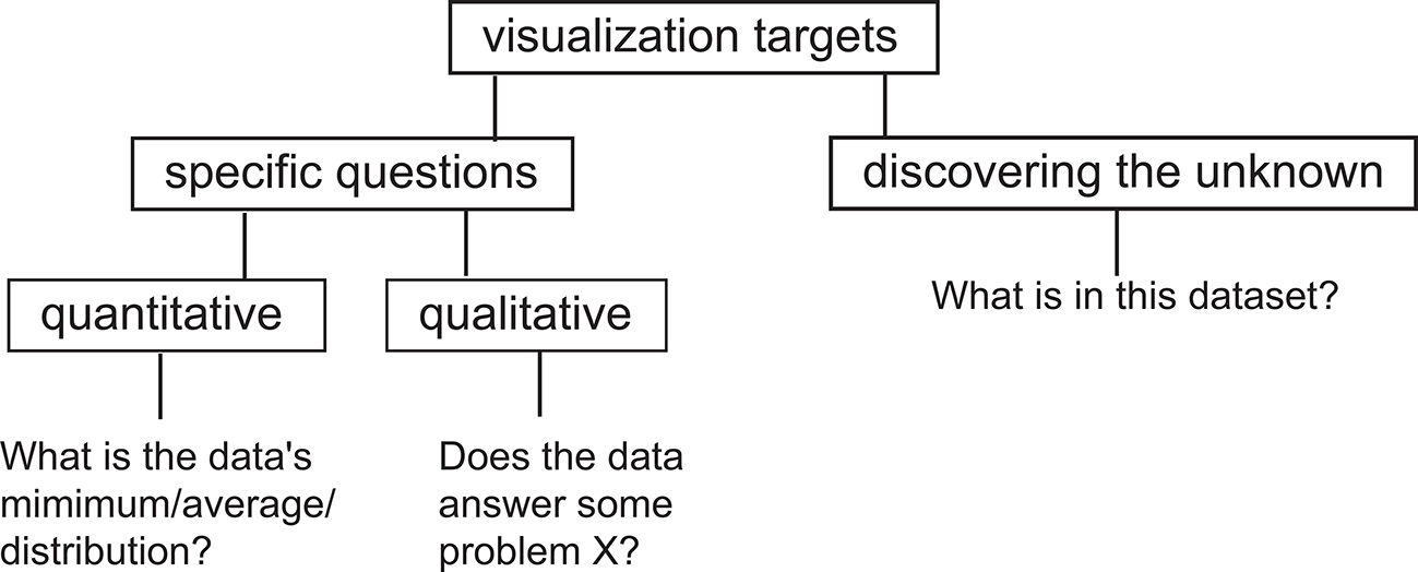
Figure 1.1. Types of questions targeted by the visualization process.
Concrete questions:
In the first case, we have some concrete questions about a given phenomenon, process, or dataset.1 The purpose of visualization in this context is to answer these questions as well, and as quickly, as possible. Such questions can be quantitative, e.g., “given a two-dimensional (2D) land map, how high are the highest points?” In this case we are interested in a measurable answer on a given scale of reference, e.g., “the highest peak is 2500 meters above sea level.” A sample list of quantitative questions targeted by visualization applications includes:
Which are the minimum, maximum, or outliers of the values in a dataset, and for which data points do they occur?
What is the distribution of the values in a dataset?
Do values of different datasets exhibit correlations, and how much?
How well do values in a dataset match a given model or pattern?
Quantitative vs. qualitative questions.
At this point, readers may ask themselves why we need visualization to answer concrete questions such as what is the maximum value of a dataset, when a simple textual display would suffice. There are, indeed, many cases when this is true and when simple tools such as a text-based query-and-answer system work the best. However, there are also many cases when visualization works better for answering concrete, quantitative questions. In these cases, the answer to the question is not a single number but typically a set of numbers. For example, while the question “what is the value of a function f (x) at a given point x” can be answered by printing the value, the question “what are the values of f (x) for all x in a given interval” is best answered by plotting the graph of f (x) over that interval. Distributions, correlations, and trends of a value set are also best understood when depicted visually. Clearly, in some situations, task performance is better using visual representations, whereas in others, text-based representations are more efficient. An early study by Larkin and Simon [Larkin and Simon 87] on the effectiveness of visual representations on human task performance outlined two ways in which visual representations can outperform text-based ones:
by substituting (rapid) perceptual inferences for difficult logical inferences;
by reducing the search for information required for task completion.
Although not exhaustive, their research gives some theoretical underpinning to the intuitive appeal of using visualization to comprehend information.2
In addition to quantitative questions, a large number of questions targeted by visualization are of a qualitative nature, e.g., “given a medical scan of a patient, are there any anomalies that may indicate clinical problems?” A typical answer to this question would involve the discovery of patterns that have particular characteristics in terms of shape, position, or data values, which a human expert such as a medical doctor would classify as anomalous, based on his previous clinical experience. In such cases, it is quite hard, if not impossible, to answer the questions using fully automatic means, given the vague definition of the question and the high variability of the input data. The decisional input of the human expert, supported by interactive visualizations, is indispensable.
Exact vs. fuzzy questions.
In scientific and engineering practice, questions typically range between extremely precise ones and very vague ones. Visualization is useful for both types of questions. Although it can be argued that precise questions can be answered with simple search-like queries that do not need any visual support, it can also be argued that displaying the answer of such queries in a visual manner makes them simpler to assimilate. Moreover, the visual support can provide additional information that may not be explicitly requested by the question but that can open broader perspectives on the studied problem. For example, displaying the highest peak on a land map both by indicating the peak’s height as a number and also its position on a 3D elevation visualization shows not only the absolute height value but also how that value relates to the average height on the map (how high it is compared to the overall landscape, how many land points are at or close to the maximal height, and so on). This information, although not directly requested, can help formulate subsequent questions, which ultimately help the user to acquire a deeper understanding of the data at hand. This is one of the meanings of the term “insight.”
Discover the unknown:
In the second case, we may have no precise questions about our process at hand. However, we are interested in (literally) looking at, or examining, the information that this process provides. Why, one might ask, should we look at some data if we have no concrete questions to ask about it? There are several reasons for this. First, we may have had similar data in the past that was interesting, helpful, or critical for a given application, and we may want to find out if the current data is of the same kind. Second, we may have the feeling that, by examining a certain piece of data, we can acquire information on the process that produced it that we simply cannot obtain by other means. This role of visualization closely matches the perspective of a researcher who is interested in studying a phenomenon in order to find out novel facts and establish unexpected correlations. This is a second meaning of the term “insight.”
The two types of questions are not separated in practice but rather serve two types of complementary scenarios. In the first scenario type, one has a number of precise questions to answer and is quite familiar with the type of data and application. This scenario is best targeted by fine-tuned visualizations answering those precise questions. However, after answering such questions, one may discover that some fundamental problem is still not solved, because the questions were too precise. In this situation, switching to the more exploratory, open-ended visualization scenario is a good continuation. This scenario follows a typical bottom-up pattern, going from precise to more general queries. In the second scenario type, the user receives a dataset that he is largely unfamiliar with. In this case, the best approach is to start with some exploratory visualization that presents a general overview of the data. After the general impression is formed, the user can decide, based on particularities discovered in the general view, which more specific, detailed visualization to use next, and thus which more precise question to answer. This scenario follows a top-down pattern, going from an overview to a detailed investigation. In the visualization field, this type of investigation is sometimes referred to as the visualization mantra of “overview, zoom, and details-on-demand,” as coined by Shneiderman [Card et al. 99, Bederson and Shneiderman 03].
Finally, an important drive for visualizing data is sheer curiosity. Visualization methods often produce unexpected and beautiful imagery from many exotic types of data. Such images are intriguing and interesting to the eye. When examined in more detail, they can lead researchers to discover unexpected and valuable things about the processes and datasets at hand.
Examples.
Figure 1.2 shows four examples of visualizations, each targeting different types of questions, and illustrating different visualization techniques. Figure 1.2(a) shows a visualization of average temperature and rainfall data over Europe in July over the period 1960–1990. Temperature is shown by color (red for large values, green for low values). Rainfall levels are indicated by the shaded bumps, with the highest-looking bumps indicating maxima. The central bump indicated by the arrow answers the question “where is the highest-rainfall region?” As this bump is green, we see that this region also has a mild temperature. Red, shallow bumps in the low part of the map show hot and dry regions. This visualization is discussed next in Chapter 5, Section 5.4.1.

Figure 1.2. Visualization examples targeting different types of questions.
Figure 1.2(b) shows a visualization of fluid flow in a box. Fluid enters through an inlet in the back, then flows and swirls inside the box, and exits through an outlet in the front. The drawn tubes indicate paths of different fluid particles as they advance from the inlet towards the outlet. Tubes are colored by the flow speed (blue for low speeds, red for high speeds). To answer the question “where are the fastest flow regions?,” we can look for the red-colored tubes. This image also allows us to discover a potentially unknown phenomenon: Close to the outlet, the flow splits into two distinct rotating layers, indicated by the two thick spiral-like tube bundles. Such an insight cannot be easily obtained without actually depicting the flow. This visualization is discussed next in Chapter 6, Section 6.5.3.
Figure 1.2(c) visualizes the population migration patterns in the United States. Red dots indicate city locations on an imaginary map. Cities between which there is some significant population migration are connected by black lines. Next, lines are “bundled” together so that the coarse-scale population flows between regions in the country become better visible as thick black bundles. Such bundles thus address the question “where and which are the main migration flows?” This insight is hard to convey without a visual representation. This visualization is discussed in Chapter 11, Section 11.4.2.
Figure 1.2(d) visualizes the changes in the open-source software repository of the popular Mozilla Firefox browser between 2002 and 2006. Each horizontal pixel line represents a file in this repository. Files are stacked vertically ordered by their creation date, with older files at the bottom, and newer files at the top. Each file pixel-line is cut into several segments, each segment representing a different version, or revision, of that file. Versions are colored by the identity of the software developer who added them to the repository. Looking at the emerging envelope (shown by the dashed curve), we see that the software grows in time at a superlinear rate. Assuming the trend holds, we can thus predict how large the software will be several months in the future. Separately, we see a dominant green color on most of the files starting from 2004. This shows that a major part of the contributions have come from a single developer (indicated by the green color), thus answers the question “which are the most active developer(s)?” More generally, this visualization lets us correlate developer activity with time periods and specific files, all in a single image. This visualization is discussed in Chapter 11, Section 11.6.3.
Subfields of data visualization.
Traditionally, data visualization has been structured along two main fields: scientific visualization and information visualization. A third, newer field, called visual analytics has emerged in the past several years, as a bridge between and also an extension of the former two fields. Below we give a brief overview of these fields.
Scientific visualization:
Visualization has emerged as a separate discipline in the 1980s of the last century, as a response to the increasingly large amount of data generated by computer numerical simulations of various physical processes, such as fluid flow, heat convection, or material deformations. As such, the attribute “scientific” associated to its name reflected, at that time, the focus on visualization solutions on providing insight into scientific simulations. Loosely put, scientific visualization, or scivis for short, can be described as being “primarily concerned with the visualization of three-dimensional phenomena (architectural, meteorological, medical, biological, etc.), where the emphasis is on realistic renderings of volumes, surfaces, illumination sources, and so forth, perhaps with a dynamic (time) component” [Friendly 08]. A salient aspect of scientific visualization is the depiction of datasets that have a natural spatial embedding, i.e., datasets whose elements or data points have positions with particular significance in space. Figures 1.2(a,b) show two examples of scientific visualization. In Figure 1.2(a), points represent geographical locations on a 2D map. In Figure 1.2(b), points represent locations in a 3D flow volume. Given this aspect, scientific visualization has been, more recently, also known under the name of spatial data visualization.
Information visualization:
Besides spatial data, covered by scientific visualization, many other data types exist whose data elements do not have prescribed spatial positions. Simple examples are relational datasets, such as trees, graphs, and networks. Although such datasets require (like any other dataset) some spatial representation in order to be drawn on a piece of paper or computer screen, the spatial information is assigned to the data elements during the visualization construction, rather than given by the data elements themselves. These data types, including also tables, time series, documents, and software source code, form the object of a separate branch called information visualization, or infovis for short. The increase in number, size, and types of digital artifacts caused by the information society in the last decade, sometimes known under the term “big data,” has been a particular catalyst of the growth of interest in information visualization. Figure 1.2(c) illustrates a type of information visualization technique. The graph being shown can come from a geographical map, like in our example, but can be also coming from any relational database.
Visual anaytics:
Recognizing the need to combine visualization solutions with data analysis and data mining front-ends, a new discipline has emerged from the information visualization, scientific visualization, and data-mining communities: visual analytics. Briefly put, the central goal of visual analytics is to provide techniques and tools that support end users in their analytical reasoning by means of interactive visual interfaces [Wong and Thomas 04, Thomas and Cook 05, Meyer et al. 12]. Although, at the current moment, no clearly defined boundary exists between visual analytics and the more traditional infovis and scivis fields it has emerged from, several aspects differentiate visual analytics from its predecessors. First, visual analytics focuses on the entire so-called sensemaking process that starts with data acquisition, continues through a number of repeated and refined visualization scenarios (where interaction is heavily involved to allow users to explore different viewpoints or test and refine different hypotheses), and ends by presenting the insight acquired by the users on the underlying phenomena of interest. As such, visual analytics is typically characterized by a tight combination of data analysis, data mining, and visualization technologies and tools. Separately, visual analytics typically focuses on processes or datasets which are either too large, or too complex, to be fully understood by a single (static) image. As such, data mining, multiple views, and interactive and iterative visual inspection of the data are inseparable components of visual analytics. Figure 1.2(d) shows a snapshot from a visual analytics process. Here, the repository 2D view used can be seen as a classical infovis example. However, to understand, or make sense, of the development process taking place during the history of the studied software repository, several sorting and coloring options, interactively chosen by the user, need to be applied.
Interactive exploration.
A further fundamental feature of visualizations is their interactive aspect. The visualization process is rarely a static one. In most applications, there is a need to visualize a large amount of data that would not directly fit on a single screen, a high-dimensional dataset containing a large number of independent data values per data point, or both. In such cases, displaying a static image that contains all the data is not possible. Moreover, even when this is possible, there usually are many ways of constructing the data-to-image mapping, which the user might like to try out in order to better understand the data at hand. All these aspects benefit from the use of interactive visualizations. Such applications offer the possibility of modifying several parameters, ranging from the view angle, zoom factor, and color usage to the type of visualization method used, and observing the changes in the produced image. If the interact-visualize-observe feedback loop (see Figure 1.3) is performed quickly enough, the user effectively gets the sensation of “navigating” through the data, a feature which strongly encourages and supports the exploration process. In particular, interactive visualizations are a crucial component of the sensemaking loop in visual analytics.

Figure 1.3. Conceptual view of the visualization process.
What type of insight can we expect from a visualization application, and what should we not expect? How can we measure how much insight a given image provides us into a certain process? And how can we construct visualization applications that provide us with the most insight into a problem or dataset of a given nature? To answer such questions, we must first understand how to construct a visualization application, how to represent the various types of data involved in the visualization process, how to set the various parameters of this process, and how to interpret the results. These are the topics of the following chapters.
1.2 Positioning in the Field
Since data visualization knows a long history, and can be taught or approached from many angles, it is important to position the material covered in this book with respect to a number of other prominent visualization books in the current literature. Without being exhaustive, we outline below how this book positions itself with respect to a number of highly-visible titles in the current visualization literature.
Interactive Data Visualization: Foundations, Techniques, and Applications.
In this recent book, Ward et al. present a broad overview of interactive data-visualization techniques, with a strong focus on information visualization, interaction, and design guidelines [Ward et al. 10]. The aims and scope of our book is also somewhat different. [Ward et al. 10] focuses, for its largest part, on teaching how to design a (new) visualization application. As such, extensive space is dedicated to explaining the design process and design principles that are behind the construction of visualization applications. Equal attention is dedicated to the role and effective usage of interaction in the design of such applications. Finally, the process of evaluation of visualization applications is described in detail. Summarizing, [Ward et al. 10] adopts a top-down approach, starting from the aims of visualization and working out towards the design, implementation, and evaluation details of several techniques and algorithms. In contrast, the current book positions itself earlier in the teaching and practice workflow, and also adopts a more bottom-up approach. We focus more on spatial data visualization, also known as scientific visualization (scivis), and less on information visualization (infovis). Second, while [Ward et al. 10] focuses on tasks and users, and works it way from there towards introducing algorithms and techniques, we start by introducing fundamental data structures and algorithms, and work our way up towards applications. Interaction and evaluation are only briefly mentioned in our book, as we believe that these are more advanced mechanisms, to be studied only after the reader has achieved a good understanding of the basic algorithms and data structures involved in crafting a visualization application. Overall, we believe that our book is best positioned as support for a broad introductory course on data visualization, while [Ward et al. 10] can be used as support for a more advanced follow-up course on information visualization.
The Visualization Toolkit.
Companion to the immensely successful Visualization Toolkit (VTK) software library, the fourth edition (2006) of this book represents the standard guide for developers who wish to integrate VTK into their data-visualization applications [Schroeder et al. 06]. The VTK book serves a dual purpose. On the one hand, it introduces the basic principles of data visualization in terms of algorithms, visualization process pipeline, and dataset representations. On the other hand, it shows how all these elements map to software implementations in the VTK library. The VTK book follows a structure largely similar to our book—a computer graphics primer, data representation, fundamental algorithms for various data types, and image processing. Advanced visualization algorithms, web visualization, and visualization examples are treated in separate chapters.
The aims and scope of our current book are different than [Schroeder et al. 06]. First and foremost, our intended audience aims to cover all students and practitioners interested in using existing, and designing new, visualization applications, whether using the VTK software as a basis or not. There are advantages and disadvantages to this approach. On the one hand, learning data visualization by using VTK guarantees a uniform way of designing one’s source code, and also the availability of a wealth of already-implemented algorithms and data structures ready to be used. On the other hand, the learning curve of VTK is, at times, far from being gentle—students are supposed to be familiar with object-orientation and, more importantly, invest a non-trivial amount of time into learning the VTK programming interfaces and idioms before being able to design their own visualization algorithms. In contrast, we emphasize less on code-level implementation details of visualization algorithms and data structures, but focus more on the design rationale behind these algorithms, in an implementation-neutral fashion. Overall, we believe that [Schroeder et al. 06] book can be best positioned as a technical add-on to our book for professionals interested in developing visualization software based on the VTK toolkit, and partially for students who need to complete visualization assignments using the same toolkit. Our book and [Schroeder et al. 06] can be seen as complementary—the former serving as an introduction to the theory of visualization, and the latter serving as a practical help for bridging theory and algorithmic concepts with a concrete software implementation.
The Visualization Handbook.
In this book, Hansen and Johnson take the challenge of presenting several state-of-the-art visualization techniques, with a main focus on spatial data visualization (scivis) [Hansen and Johnson 05]. The book follows a structure largely similar to our book, with chapters covering the visualization of scalar, vector, and tensor data, and geometric or domain modeling. Additional chapters cover large-scale data visualization, virtual environments, and software frameworks for visualization. Finally, the book covers a set of selected topics on perception issues and applications of visualization in several domains.
The book edited by Hansen and Johnson was, at its publication moment, very well received as a necessary complement to an earlier edition of the VTK handbook [Schroeder et al. 06]. The current book strives to complement the more implementation-focused VTK handbook, though from a different perspective. The book of Hansen and Johnson is aimed at a more advanced public in terms of visualization and computer graphics background—typically, PhD students and professionals with basic knowledge of data visualization and an extensive mathematical background. The focus is also more on research-grade visualization methods and techniques presented in terms of novel algorithms and/or refinements of classical algorithms in separate chapters, written by experts in each visualization subfield. As such, [Hansen and Johnson 05] is a good example of a collection of “selected topics” in visualization. In contrast, our book aims broadly at entry-level students and practitioners who are not familiar with data visualization, may have a more limited mathematical background, and want to first get familiar with the classical algorithms before studying more involved topics.
Information Visualization Literature.
Apart from the above, several books exist on more focused topics within the visualization field. For information visualization, the books of Ware [Ware 04] and Spence [Spence 07], both at their second edition, give a detailed coverage of the theory, methods, techniques, and application examples in the field of information visualization. In the same field, the book of Card et al. provides an early, but very readable and instructive, overview of information visualization techniques and applications [Card et al. 99]. In contrast, our book dedicates a single chapter (Chapter 11) to information visualization. Also, we dedicate little space to the usage of interaction techniques and perceptual issues. The main reason behind this difference is that the current book aims to teach its readers to use existing visualization techniques, with a broad focus on data visualization in general. In contrast, the books listed above focus mainly on teaching their audience how to design new visualizations, with a more specific focus on information visualization, and a “design by example” approach based on case studies.
In the category of information visualization literature, the book of Tufte on visual display of quantitative information represents a reference point [Tufte 01]. This book, aimed at designers of (new) visualizations, presents both a history of graphical design from a visualization perspective, and also a set of good design principles and potential pitfalls that should be considered when designing effective visualizations. Although the focus stays mainly on the design of statistical graphics, which can be seen as a part of information visualization, the discussed design guidelines and examples are also relevant for scientific visualization at large. In contrast to Tufte, where the picture design is central, we take in our book a more data-and-algorithm centric approach, and focus more on data representation and visualization algorithm details than on the design of the final picture.
1.3 Book Structure
The organization of this book follows a bottom-up structure. We assume that the reader has a minimal familiarity with computer graphics principles and techniques and is interested in starting from this basis and working to understand and eventually develop visualization methods. We introduce visualization techniques and principles gradually. We start with the simplest ones, which require just a minimal computer graphics and programming background. As the book unfolds, more complex mathematical and algorithmic notions are introduced to help readers understand the workings and trade-offs of advanced visualization techniques. Each chapter covers one separate visualization topic by presenting a number of visualization methods and algorithms for that topic. Just as the chapters themselves, the algorithms in a chapter are introduced in an increasing level of difficulty and specificity. We conclude several chapters by presenting a selection of the most recent advances in the field of visualization, in the form of one specialized, research-level algorithm or method.
Chapter 2.
We begin, in Chapter 2, with a simple example that introduces data visualization to the reader: drawing the graph of a function of two variables using a height plot. We use this example to introduce several essential ingredients of data visualization, such as sampling and the dataset concept, and also relate visualization to computer graphics. These concepts are illustrated by easy-to-follow C++ code fragments based on OpenGL. This chapter also serves as a minimal (and thus limited) introduction to OpenGL.
Chapter 3.
In Chapter 3, we continue our presentation of the dataset concept by describing the most frequently used types of datasets in visualization. For each dataset type, we describe its particular advantages, as well as its specific requirements. We use the running example of the function height plot visualization introduced in Chapter 2 to illustrate the various differences between the presented dataset types. For each dataset type, we detail the implementation of several fundamental operations: sampling, interpolation, reconstruction, and computing derivatives. After completing this chapter, the reader should have a good understanding of the various trade-offs that exist between different dataset types, be able to choose the right type of dataset for a given visualization problem at hand, and understand several aspects related to efficiently implementing datasets in software.
Chapter 4.
Chapter 4 presents the visualization pipeline, the popular data-driven architecture used to construct most visualization applications nowadays. This chapter has two goals. At a conceptual level, the reader is introduced to the various data-processing stages that form the visualization process: data acquisition, data filtering or enrichment, data mapping, and rendering. At an implementation level, the architecture of a visualization application, seen as a set of data-processing algorithms interconnected by the datasets they read and write, is explained. After completing this chapter, the reader should understand the various steps involved in the construction of a particular visualization application, ranging from the conceptual data-processing stages up to an actual high-level software architecture specified in terms of interconnected algorithms and datasets. Readers interested in implementing visualization applications can use the practical information provided here as a guideline on how to structure the high-level architecture of their applications in terms of computational modules with decoupled functionality.
In the next seven chapters of the book (Chapter 5 up to Chapter 11), we present the main visualization methods and algorithms that are used in practice in visualization applications.
Chapters 5–7.
The following three chapters (Chapters 5, 6, and 7) discuss visualization methods for the most common data types in the visualization practice, ordered in increasing level of difficulty, i.e., scalars, vectors, and tensors, respectively.
Chapter 8.
Chapter 8 presents domain-modeling techniques, which encompass those visualization techniques that manipulate both the data attributes and the underlying domain sampling, or grid, these live on. In particular, we discuss algorithms for domain resampling, grid-less interpolation, and construction of sampled representations from unstructured point sets.
Chapter 9.
Chapter 9 is an overview of image visualization methods and discusses the particularities of image data, i.e., scalars sampled on uniform two-dimensional grids. Here, specific techniques for image data are discussed, such as edge detection, histogram normalization, segmentation, and shape representation and analysis.
Chapter 10.
Chapter 10 discusses volume visualization techniques, which target three-dimensional scalar fields sampled on uniform grids. Although the image and volume techniques presented in Chapters 9 and 10 can be seen as particular forms of scalar visualization, we discuss them separately, as image and volume visualization are, by themselves, vast research and application fields, which have developed many particular techniques suited to their specific data and goals.
Chapter 11.
Chapter 11 switches the focus from the visualization of scientific datasets, which typically come from the sampling of continuous functions over compact spatial domains, to the visualization of information, or infovis. The infovis field targets the visual understanding of more general datasets such as text, database tables, trees, and graphs. As such, datasets need not be the result of a sampling process of some continuous signal defined over some spatial domain, many specific visualization methods have been developed to cope with the increased level of abstraction of the data. Given the sheer size of this field, as well as the focus of this book on the visualization of scientific datasets, Chapter 11 provides only a brief incursion in the field of infovis. Several differences between scientific and information visualization are highlighted in order to give the reader some insight on the particular challenges that the infovis field is confronted with. Algorithms for the visualization of tables, trees, static and dynamic graphs, multivariate data, and program source code text are discussed.
Chapter 12.
Chapter 12 concludes the book, outlining current development directions in the field of visualization.
Appendix.
The appendix provides an overview of existing popular visualization software systems. First, we present a classification of the different types of visualization systems from a software architecture perspective (Section A.1). The purpose of this classification is to emphasize some important choices that influence the construction of visualization systems. Next, a selection of representative visualization software systems is presented in the areas of scientific visualization, imaging, and information visualization (Section A.2, Section A.3, Section A.4, Section A.5). Although not exhaustive, this overview should give the interested reader a starting point to search further for existing software that best matches a given set of requirements for a given application domain.
After completing this book, the reader should have a good impression of the palette of existing techniques for visualizing the various types of datasets present in the scientific visualization practice, the various trade-offs involved with each technique, and some of the main issues involved in the efficient implementation of the presented techniques into actual software. More advanced readers should, at this point, be able to implement functional, albeit simple, versions of several of the visualization algorithms discussed in this book. However, this book is not about implementing visualization algorithms. Readers interested in this topic should consult the specialized literature describing the design and use of visualization software toolkits [Schroeder et al. 06, Kitware, Inc. 04]. The aim of this book is to present an overview of data-visualization methods and teach the reader about the various trade-offs involved in the design of such methods, ranging from modeling issues to visual presentation and software design. But above all, we feel that this book has reached its goal if it inspires the reader to further study and explore the exciting world of visualization.
1.4 Notation
Throughout the book, we shall use the following notation conventions. Scalars and position vectors are denoted using italics, e.g., x, y. Direction vectors are denoted using bold, e.g., p, q. Continuous domains, such as surfaces in 3D, are denoted by calligraphic letters, e.g., 𝒮. Discrete domains, such as datasets containing data sampled on grids, are denoted by uppercase letters, e.g., 𝒮. Finally, pseudocode and C++ code fragments are written using computer font, e.g., printf.
1.5 Online Material
This book has an accompanying website:
http://www.cs.rug.nl/svcg/DataVisualizationBook
The website contains exercises, advanced examples, project suggestions, and practice exam questions (with answers) to expand or test your understanding of the topics covered in the book. Datasets and source code are provided.
Exercises include “exploration” visualizations that illustrate basic visualization techniques discussed in the book. Using the provided ParaView scripts and additional datasets, one can change parameters to explore various aspects of the data and also the visualization algorithms being illustrated. These exercises are easy to use and require no programming. They can be used for individual exploration or for additional course material (e.g., tutorials or lab sessions).
More complicated visualization techniques are addressed in advanced examples that consist of code fragments (in C or C++). These examples require compilation and possibly some code changes. They can serve as the basis for laboratory sessions in which students modify and/or extend the presented visualization algorithms.
Potential exam questions (without answers) are also available. Upon request, solutions will be made available to qualified instructors.
Finally, project proposals describe several larger-scale projects that cover a combination of visualization algorithms. Each project can form the basis of a practical assignment used in conjunction with a course, to test the students’ abilities to design, implement, and demonstrate a larger piece of work. In contrast to the advanced examples, projects do not offer code fragments, and leave more freedom in terms of design and implementation choices.
Acknowledgments
The second edition of this book would have not been possible without the support and cooperation of a large number of people. Without being able to acknowledge all of them, or acknowledge the efforts of all contributors equally, a few names deserve special praise.
First of all, I want to express my thanks to Prof. Nelson Max from the Computer Science Department of the College of Engineering, UC Davis, USA. Prof. Max has dedicated a tremendous amount of time (and attention) in submitting several rounds of detailed corrections and suggestions for improvement to the first edition of this book. Without his effort, the second edition of this book would not have been able to reach its present form.
Second, I would like to thank all colleagues who contributed datasets, images, and source code to this book. Their names are too numerous to mention here, so credits to their contributions are listed throughout the book itself. Their willingness to share research results was indispensable to allow the second edition of this book to cover the extensive set of data-visualization topics considered and, in particular, illustrate these by state-of-the-art visualization examples.
Third, my thanks go to my editor, Sarah Chow, from CRC Press. Her kind and constant support, careful guidance, and encouragements have been crucial to the successful completion of the second edition of this book.
Thanks go also to the University of Groningen, my current employer, for the freedom provided in managing my time during the entire period of writing the second edition. Next to this, I acknowledge the financial support offered by several organizations (CAPES/BRANETEC grant 028/2011 and CNPq grants 479070/2013-0 and 202535/2011-8, Brazil; and ANCS grant PN-II-RU-TE-2011-3-0249, Romania). This support has been indispensable in performing various parts of the research work described in this book.
Finally, but not lastly, I thank my wife and son for their constant support and structural patience that they demonstrated during the long writing hours invested by me the past one and a half years. Without their back-up, the second edition of this book would have not been possible.