Chapter 4: Formatting Your Pages
Web pages rely on another language, known as Cascading Style Sheets (CSS), to apply formatting. This chapter introduces you to the language and allows you to start making your pages more beautiful.
Create an Embedded Style Sheet
Understanding Units of Measurement
Set the Font and Text Size on Your Page
Understanding Color on the Web
Determine a Color Scheme Using Kuler
Control Background Image Tiling
Apply Additional Text Formatting
Control Whitespace with Margins
Introduction to CSS
HTML is a language designed to define the structure of a document. As it evolved, tags were added to HTML to handle formatting, but these were difficult to work with, difficult to edit, and added considerably to the page’s file size. Cascading Style Sheets (CSS) was introduced both to solve all of these issues as well add additional formatting controls. With CSS, you can change your text properties, control the spacing between elements on your page, draw borders, add images, and much more. You can use CSS to format any Web page, regardless of the version of HTML or XHTML you are using.
Writing CSS
Like HTML, CSS documents are plain text and can be written in any text editor. Modern HTML editors include support for CSS as well, so the editor in which you are writing your HTML should also work for your CSS.
CSS Syntax
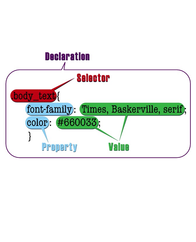
The syntax of CSS is quite a bit different from HTML. CSS documents are made up of a series of rules. Each rule includes a selector and a declaration. Selectors are case-sensitive, whereas the values and properties that make up declarations are not. Like HTML, CSS is whitespace-insensitive.
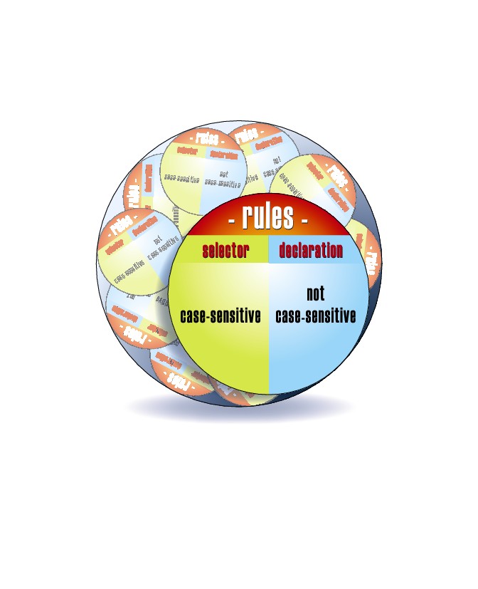
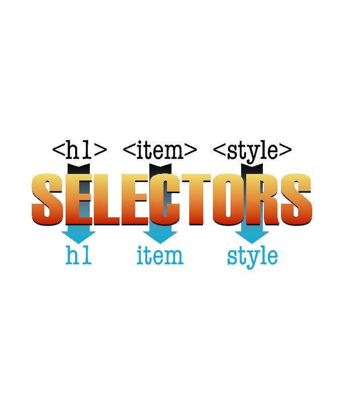
Selectors
Selectors define the parts of the HTML document to which the rules will apply. Selectors can be HTML elements, or they can correspond to the values of ID or class attributes within HTML. More complex selectors allow you to apply rules to elements based on their position relative to other elements.
Declarations
CSS declarations are made up of properties and values. The properties define the category of formatting to be applied. The property is then set to a value. Properties and their values are separated by a colon, and each pair ends in a semicolon. All of the declarations to be applied to a particular selector are enclosed within curly braces. You can find a complete list of properties and values available in CSS in HTML, XHTML, and CSS: Your visual blueprint for designing effective Web pages (Wiley, 2008).
Embedded Style Sheets
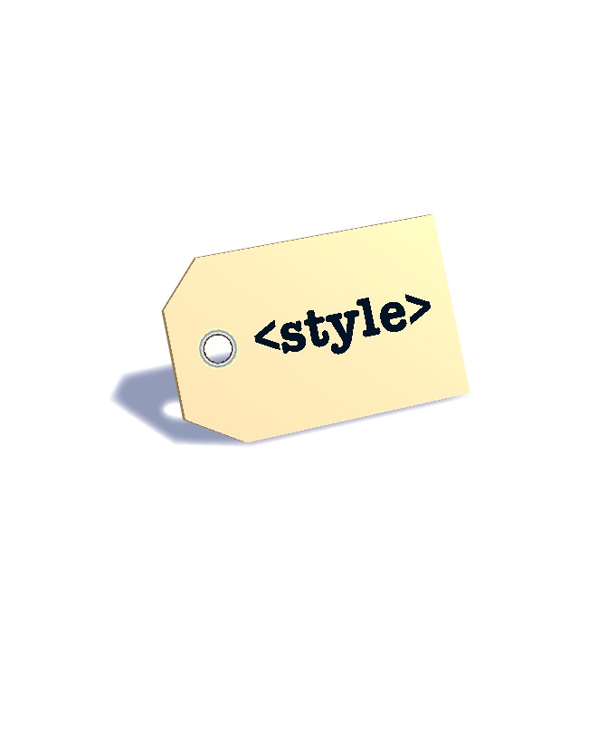
Styles that you want to apply to one particular Web page can be embedded directly within the page by placing a <style> tag block in the head of the document and then putting your style rules within the tag block.
External Style Sheets
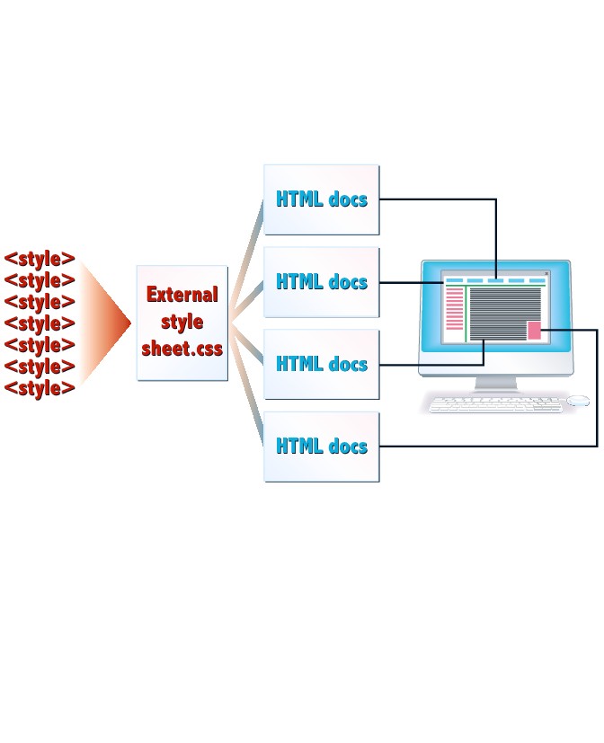
Groups of styles can be combined in a single document, with a .css extension, to create an external style sheet. External style sheets can be linked to any number of HTML documents, so you can create a single style sheet that defines and controls the formatting of your entire Web site.
Inline Styles
Style properties and values can be placed directly within HTML tags using the style attribute. This is the least flexible method of applying CSS and should be avoided if at all possible because it makes it much more difficult to maintain a consistent look and feel for your site.
Browser Support
Today, most modern browsers support CSS in much the same way. You will still find issues with older browsers, such as Microsoft Internet Explorer 6, so you should carefully test your pages to be sure that they display the way you want them to.

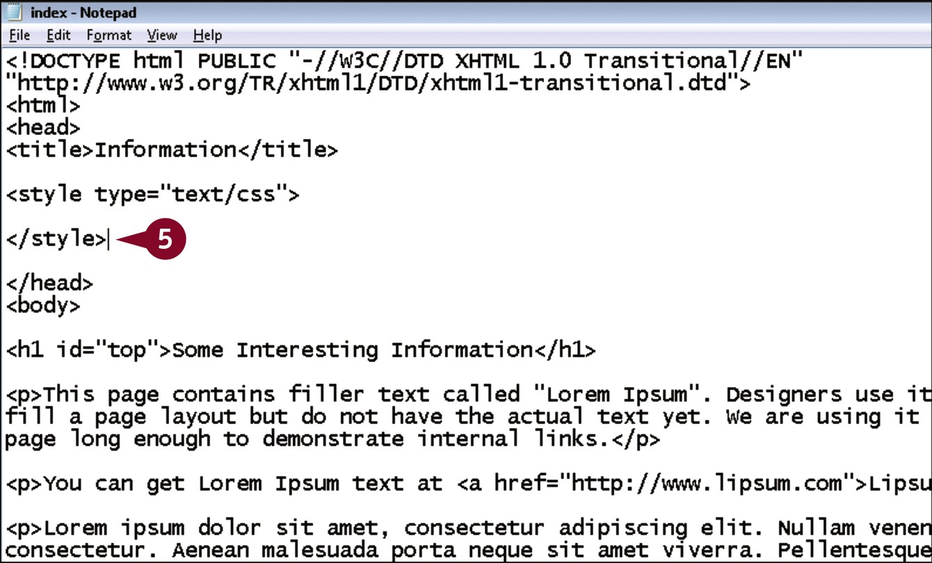
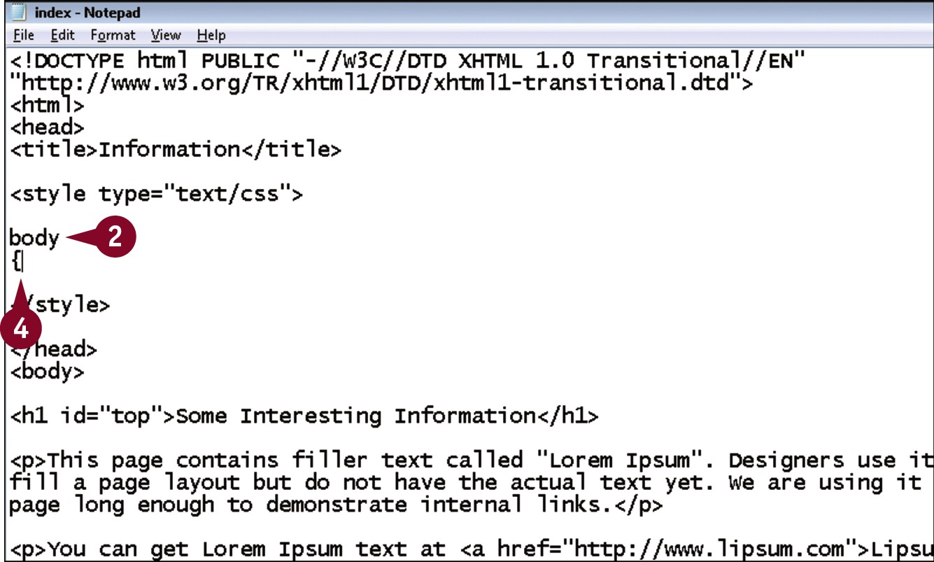
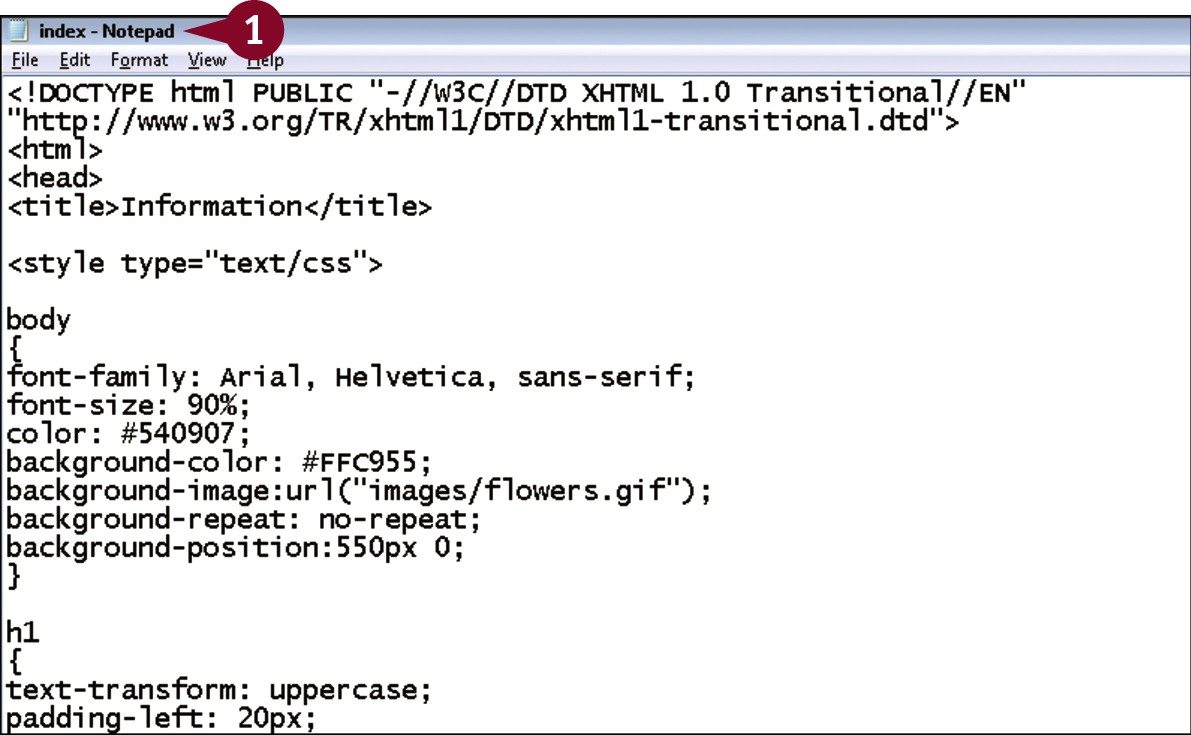
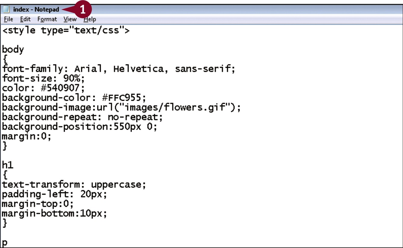
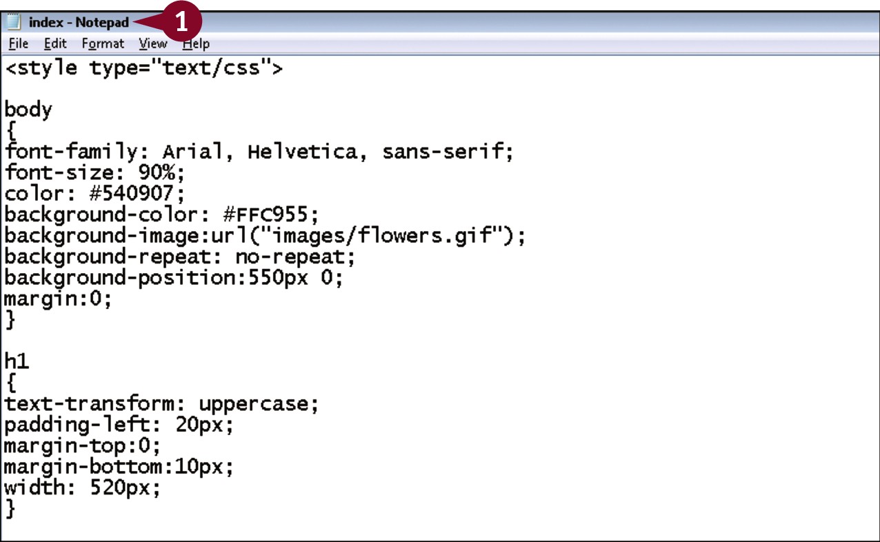
Create an Embedded Style Sheet
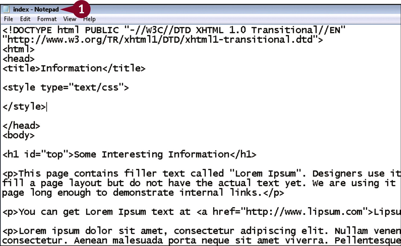
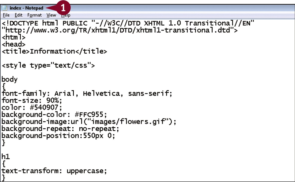
Embedded style sheets place the style rules directly within an HTML page. They are a useful starting point in learning CSS because you only have to refer to one document. Embedded styles are placed in the head of the document within a <style> tag block. The tag has a required attribute, type, which is always set to a value of text/css. Be sure to remember to add the closing </style> tag, because without it the browser does not display anything on the page.
Create an Embedded Style Sheet
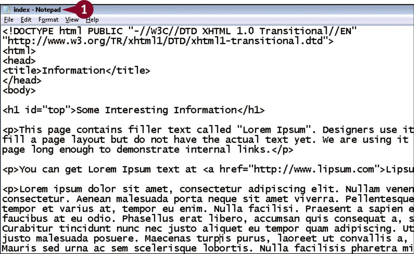
 In your editor, open the page into which you want to add the styles.
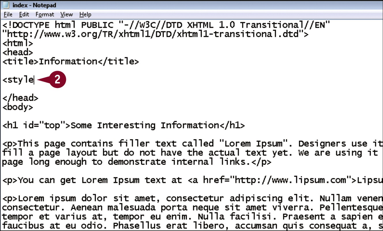
 Within the head section, type <style.
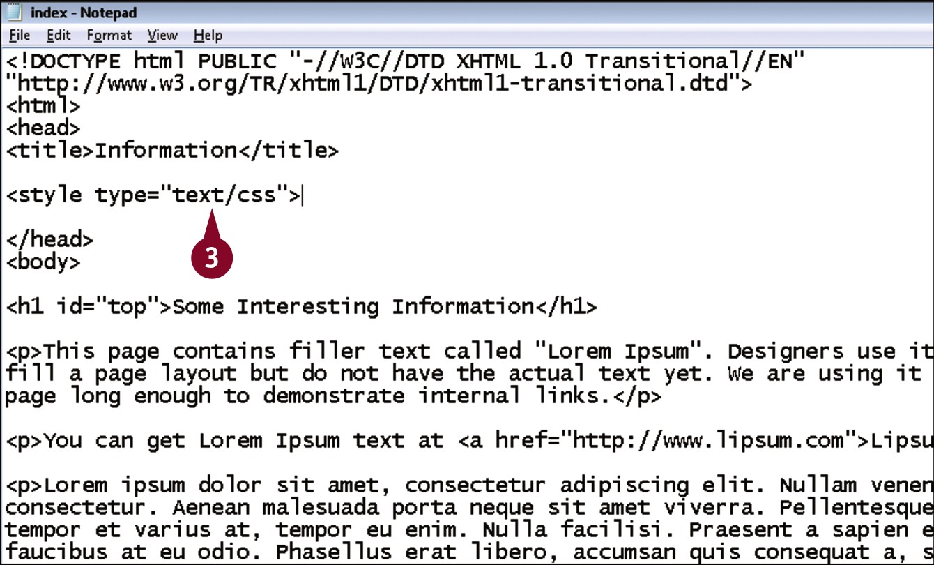
 Type type=”text/css”>.
 Press
Press  twice.
 Type </style>.
The embedded style sheet is created in the page.
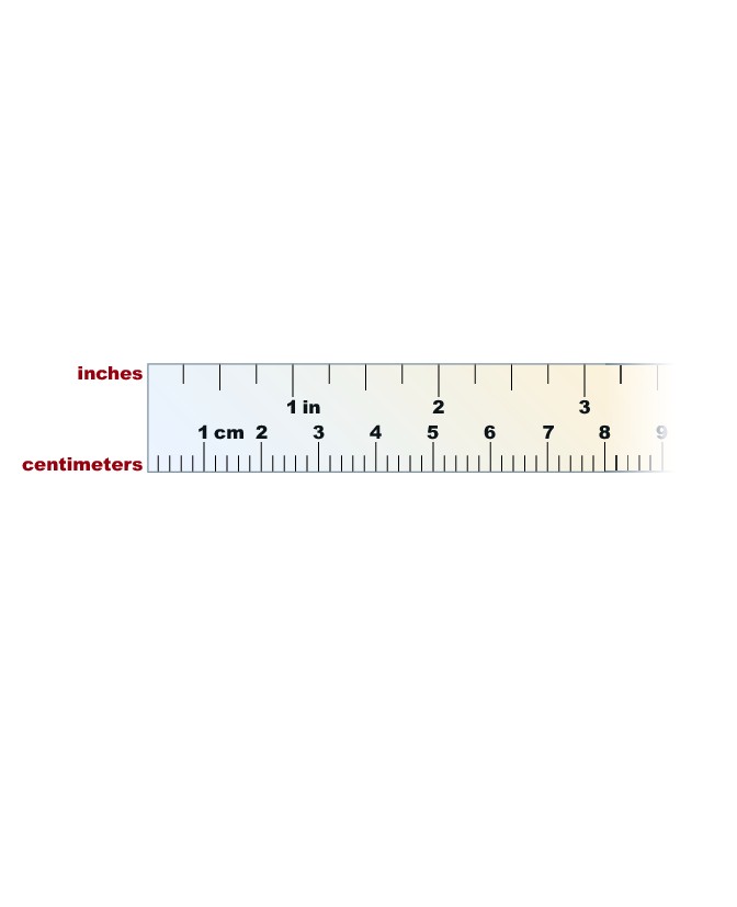
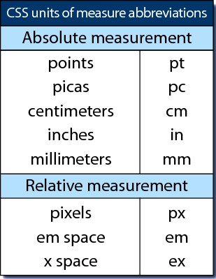
Understanding Units of Measurement
Many CSS properties require that you specify a unit of measurement, such as spacing between elements, border widths, and font size. The language supports a wide variety of units of measurement. Understanding which one to use in what situations helps you become a better CSS designer and helps avoid common errors that occur when measurements do not work the way a designer expected. Units available range from those with which you are familiar to some you may have never heard of before. In most page designs, you will use a combination of several units of measurement.
English and Metric Units
CSS supports measuring values in inches, centimeters, and millimeters. However, the actual size of an inch, centimeter, or millimeter cannot be predicted from one computer monitor to the next, so using these units under any circumstance is not recommended.
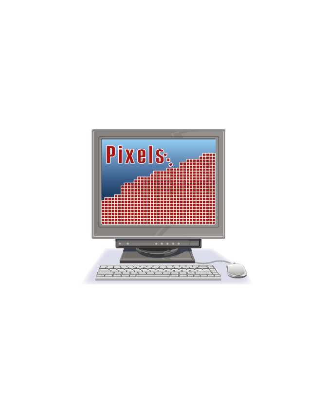
Pixels
Pixels are the building blocks of your computer monitor. Like the English and metric units, the exact size of a pixel cannot be predicted, but because it is a real unit of measurement in computer monitors, many CSS designers use pixels for setting widths of borders, padding, and margins around elements. Using pixels for font sizes is not recommended.
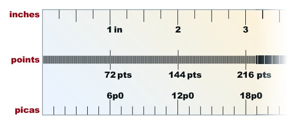
Points and Picas
Graphic designers for centuries have relied on points and picas. There are 72 points in one inch, and 6 picas in an inch, so logically there are 12 points in 1 pica. Even though you are probably familiar with sizing text via points, they are not recommended on the Web because they are based on inches, which is an unreliable unit.
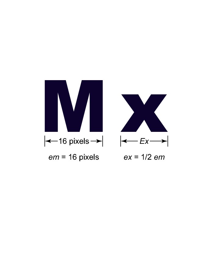
Ems and Exes
An em is a unit of measurement defined as the width of a capital letter M in the current font. In practice, browsers treat an em as an equivalent to the font size, so if your text is 16 pixels, 1 em would equal 16 pixels. If your text is 14 pixels, 1 em equals 14 pixels. Exes are defined as the width of a lowercase x, but most browsers treat it simply as 1/2 em.
Percents
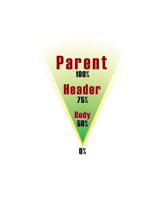
You can also measure elements using percentages. CSS rules inherit from other rules, so a property with a percentage value will be that percent of whatever the element in question’s parent element is, or failing that, the size defined in the body. For example, if you set the size of the body at 90%, and then a paragraph at 80%, the paragraph’s size would be 80% of 90% of the default size.
Internet Explorer and Font Scaling
Browsers are supposed to allow users to resize the text on their screen. However, IE does not quite follow this rule; instead, it allows the user to resize text only if the designer set that text using a relative unit of measure. Therefore, this text scaling works in IE only if you set your font size in ems, exes, or percents. Note that this applies only to font size; other properties are not affected.

Specifying Units
CSS does not define a default unit of measure, so you must always provide it. Most units have associated abbreviations, so if you want to use pixels, you can write px. The only time this does not apply is when the value is 0, because a unit is obviously not needed.
Set the Font and Text Size on Your Page
Typography is very limited on the Web. Web pages do not contain embedded fonts; rather, they merely contain a set of instructions to the browser as to what font should be used. The CSS font-face property is used to provide these instructions on what fonts to use. The font-size property allows you to set the size of your text. These properties can be applied to any element that can contain text, such as a heading or paragraph, or to the page as whole, as in the example below.
Set the Font and Text Size on Your Page
In your editor, open a page that contains an embedded style sheet.
Within the style block, type body.
Press .
Type {.
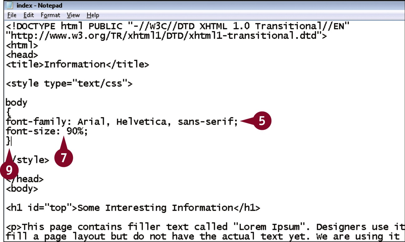
Type font-family: ?, replacing ? with a set of font names or categories such as Arial, Helvetica, sans-serif;.
 Press .
 Type font-size: ?, replacing ? with a value and unit of measurement, such as 90%;.
 Press .
 Type }.
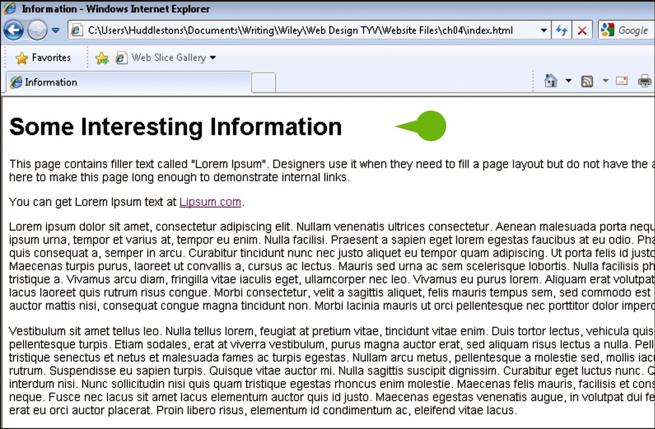
• When viewed in a browser, the text on the page now appears in the font face and size you specified.
Understanding Color on the Web
Color is an important part of any design. Choosing the right color scheme for your site can have a huge impact on the mood, look, and feel of your site. Take a look at some of your favorite Web sites and think about the impact of color on your impression of the sites. Bright colors usually convey a lighter, happier sense than dark colors, but depending on the purpose of the site, either might be appropriate. In order to effectively use color, you need to have an understanding of how color works on the Web.
RGB
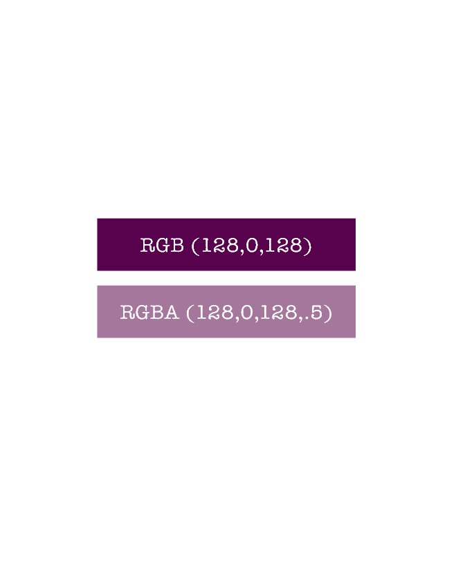
Computer monitors generate color by combining red, green, and blue light, and are thus known as RGB devices. Each color is expressed numerically, with values ranging from 0 to 255. Therefore, you can express purple as rgb(128,0,128) — 128 of red, no green, and 128 blue.
Hexadecimal
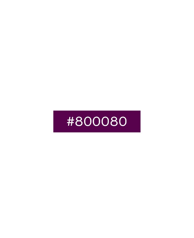
Hexadecimal is a counting system that uses 16 primary digits, rather than the 10 you are used to. The additional 6 digits are represented by the first 6 letters of the English alphabet, A through F. Hexadecimal allows you to count from 0 to 255 using only 2 digits rather than 3, and is thus useful for color values. Purple is expressed in hexadecimal as #800080.
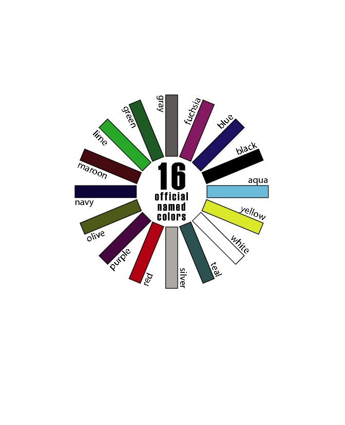
Named Colors
The official specification identifies 16 named colors for the Web: aqua, black, blue, fuchsia, gray, green, lime, maroon, navy, olive, purple, red, silver, teal, white, and yellow. In practice, however, all modern browsers recognize 140 named colors. You can view a list of all of the colors in the appendix.
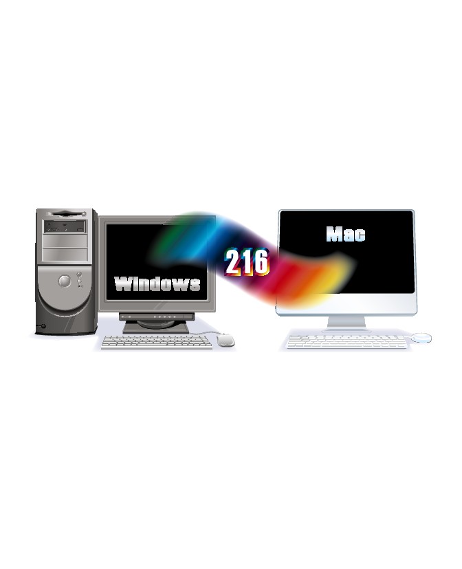
The Web-Safe Palette
In the early days of the Web, most monitors were capable of displaying only 256 colors, of which only 216 were shared between Windows and Macintosh systems. Thus, the Web-safe palette, representing those 216 colors, was developed. Today, there is no reason to limit yourself to this palette because all modern monitors can handle millions of colors.
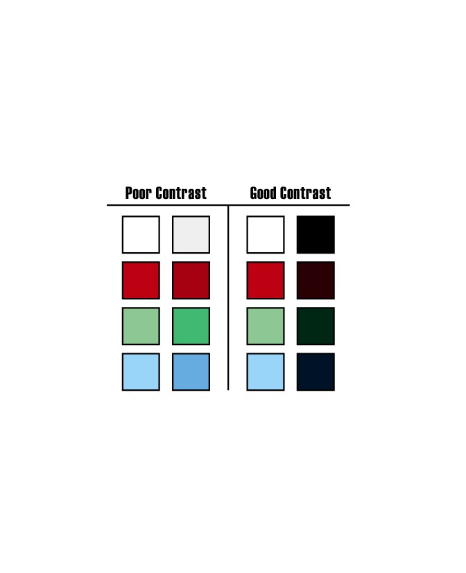
Accessibility and Colors
Current estimates are that about 5% of the population is to some degree color blind. Color blindness normally manifests itself as an inability to distinguish contrasts between similar colors. When you are picking your site’s color palette, keep this issue in mind and be sure to select colors with sufficient contrast. This is particularly important when picking your text and background colors. Web sites such as www.vischeck.com/vischeck/vischeckURL.php can be helpful in checking your site’s colors.
CSS 3 and Alpha
Version 3 of the CSS specification will add the ability to specify an alpha channel, or transparency, to colors. You can use the RGBA syntax: rgba(128,0,128,.5), which creates a purple with 50 percent transparency. Browser support for CSS3 is still very sporadic, so you should carefully test this to ensure that it works in your target browser set.
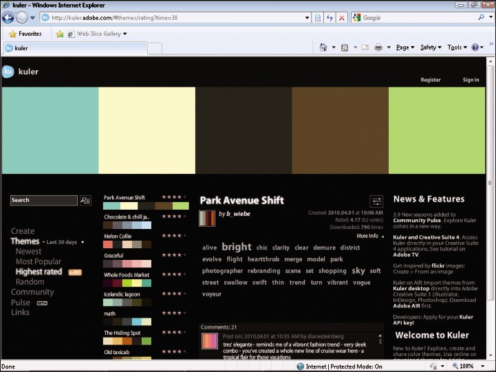
Determine a Color Scheme Using Kuler
Adobe Kuler is a free online resource that allows designers to access and use color schemes created by others in the community. As an online service, it is available anytime you are connected to the Internet. You can use Kuler to select from one of thousands of color schemes. Once you have found a set of colors that you like, you can get the specific values of those colors so that you can use them in your site’s design. You can also change individual colors within each set if you want.
Determine a Color Scheme Using Kuler
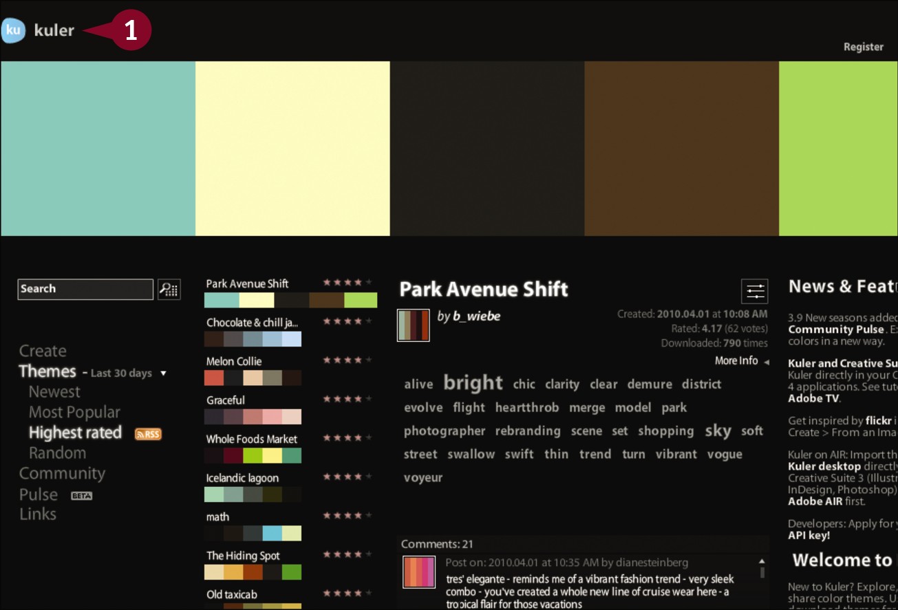
In your Web browser, go to http://kuler.adobe.com.
The Kuler home page opens.
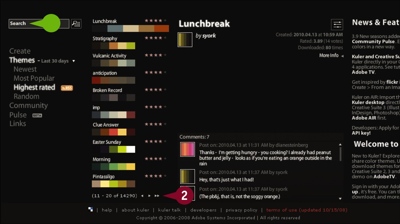
Click the arrow buttons to browse through the color schemes.
• You can also search for schemes by name.
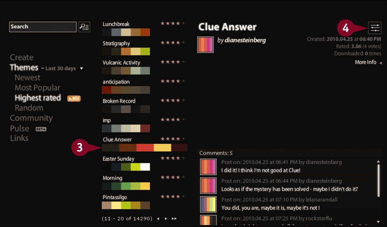
Click a scheme you want to use.
Click the Make changes to this theme and view color values button ( ).
).
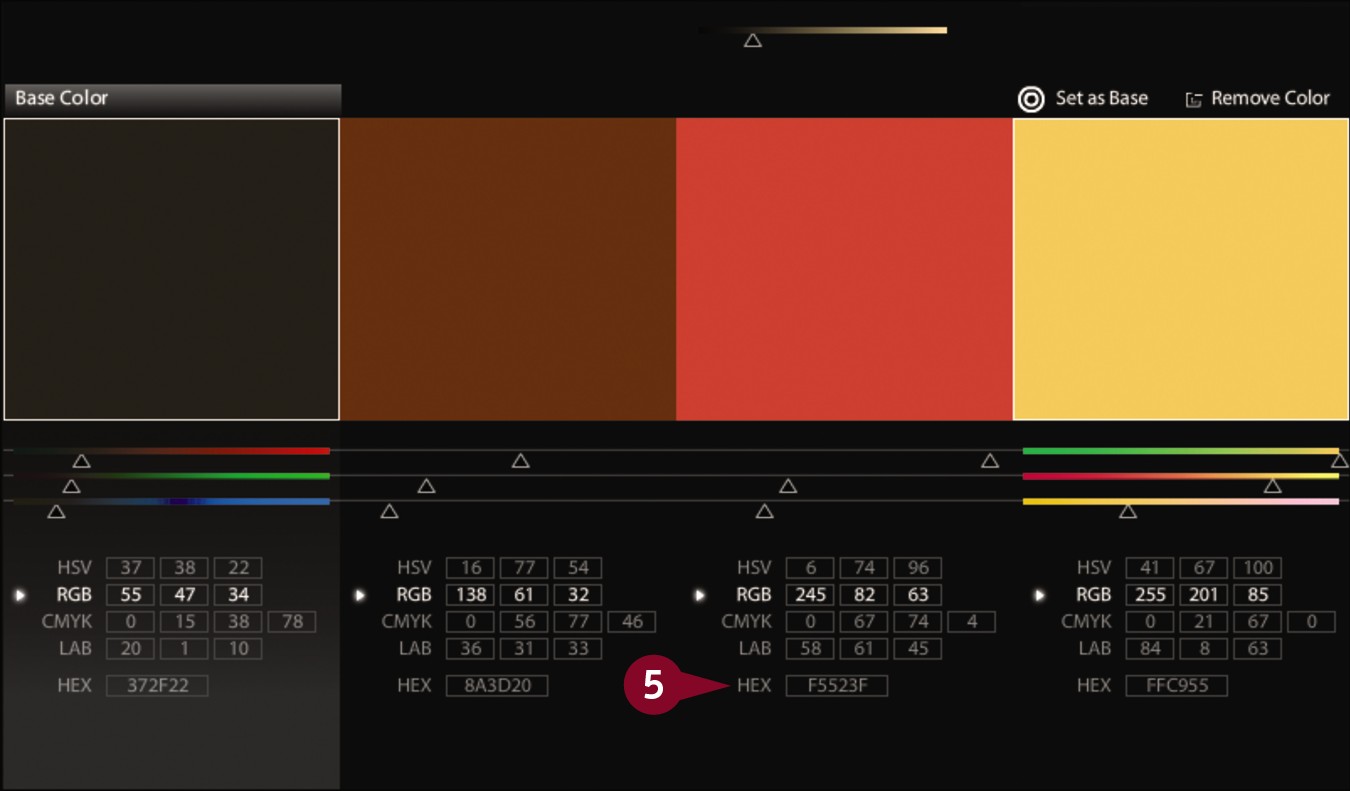
The color values page opens.
Note the hexadecimal or rgb values of each color in the scheme.
You can now use these colors on your page.
Set Text Color
The CSS color property technically applies a color to the foreground of any element. In practice, however, only text is in the foreground; thus, the property is used most often to change the color of text. Be sure that the color you choose fits within your site’s design, but also provides sufficient contrast with the background of your page to ensure that the text remains readable. You can apply color to entire blocks of text, or, as is shown in later sections, to individual words or even characters.
Set Text Color
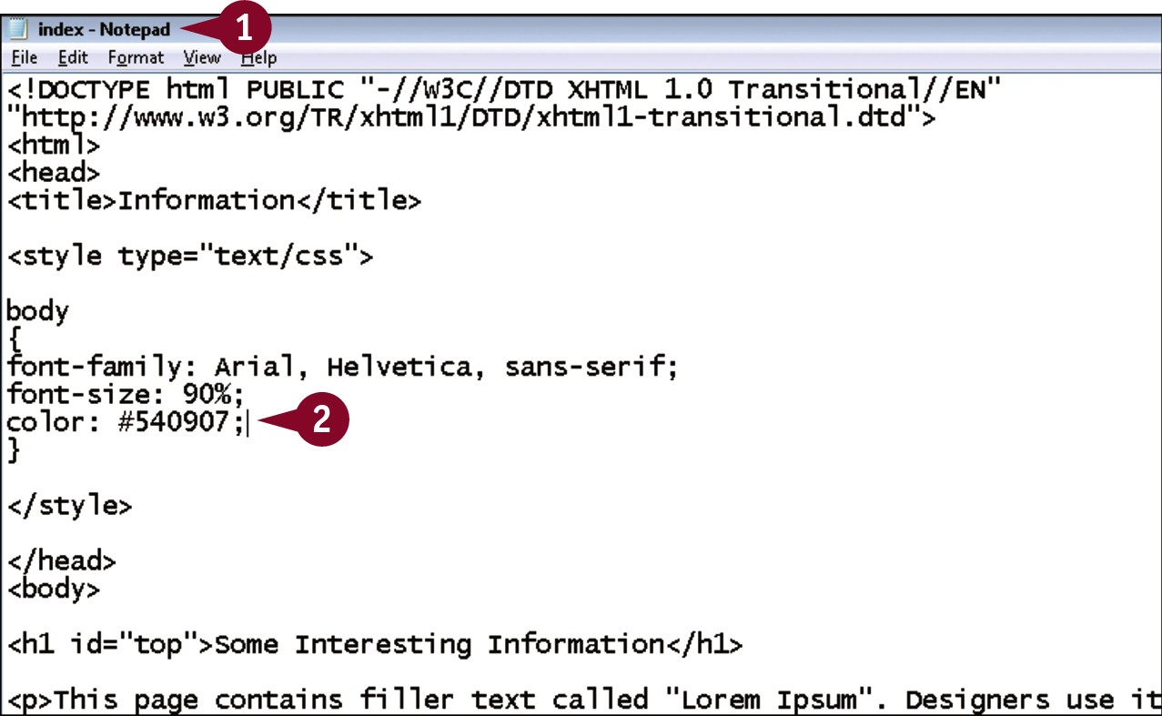
In your editor, open a page that contains an embedded style sheet with an existing body style declaration.
Within the declaration, type color: #?;, replacing ? with a hexadecimal value for the color you want to use.
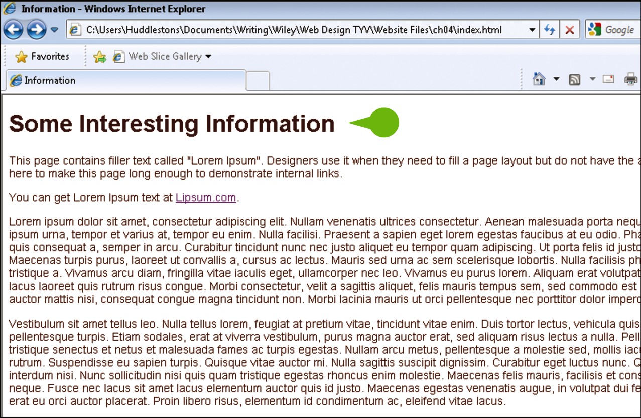
• When viewed in a browser, the text on the page is now in the specified color.
Set a Background Color
You can change the background color of your page or of elements within the page with the CSS background-color property. The background color needs to contrast with the text color to ensure readability. The default value of background-color is none, meaning that elements are transparent. Almost every browser sets the background of the body to white, although if you want to use a white background, you may want to expressly set the body’s background to white to safeguard against browsers that might have a different default.
Set a Background Color
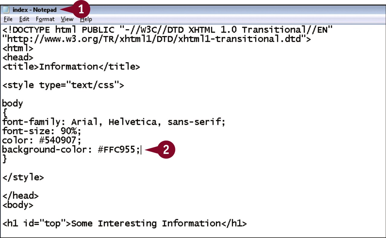
In your editor, open a document that contains an embedded style sheet and an existing body declaration.
Within the declaration, type background-color: #?;, replacing ? with a hexadecimal value for the color you want to use.
• When viewed in a browser, the page now has the specified background color.
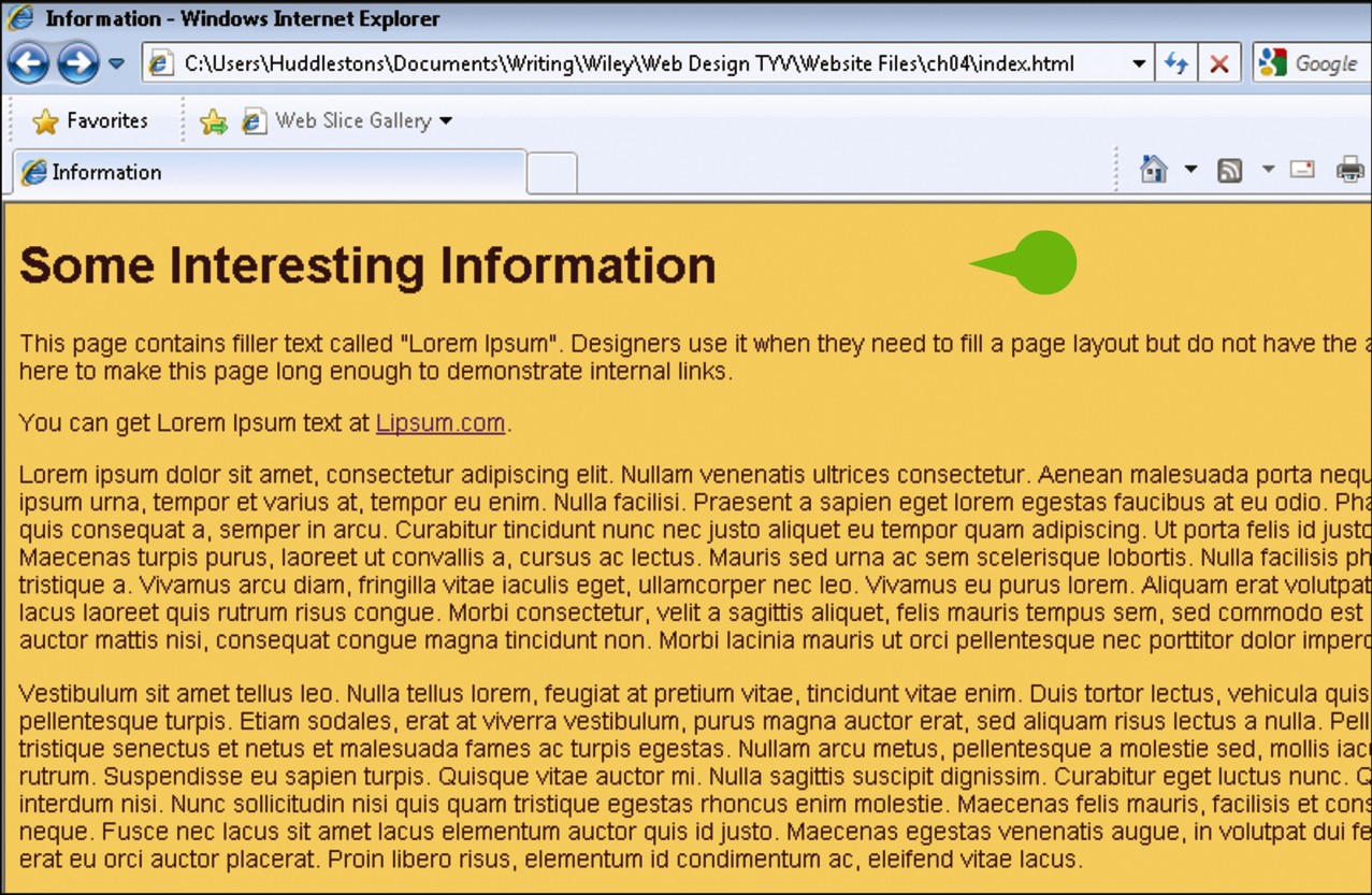
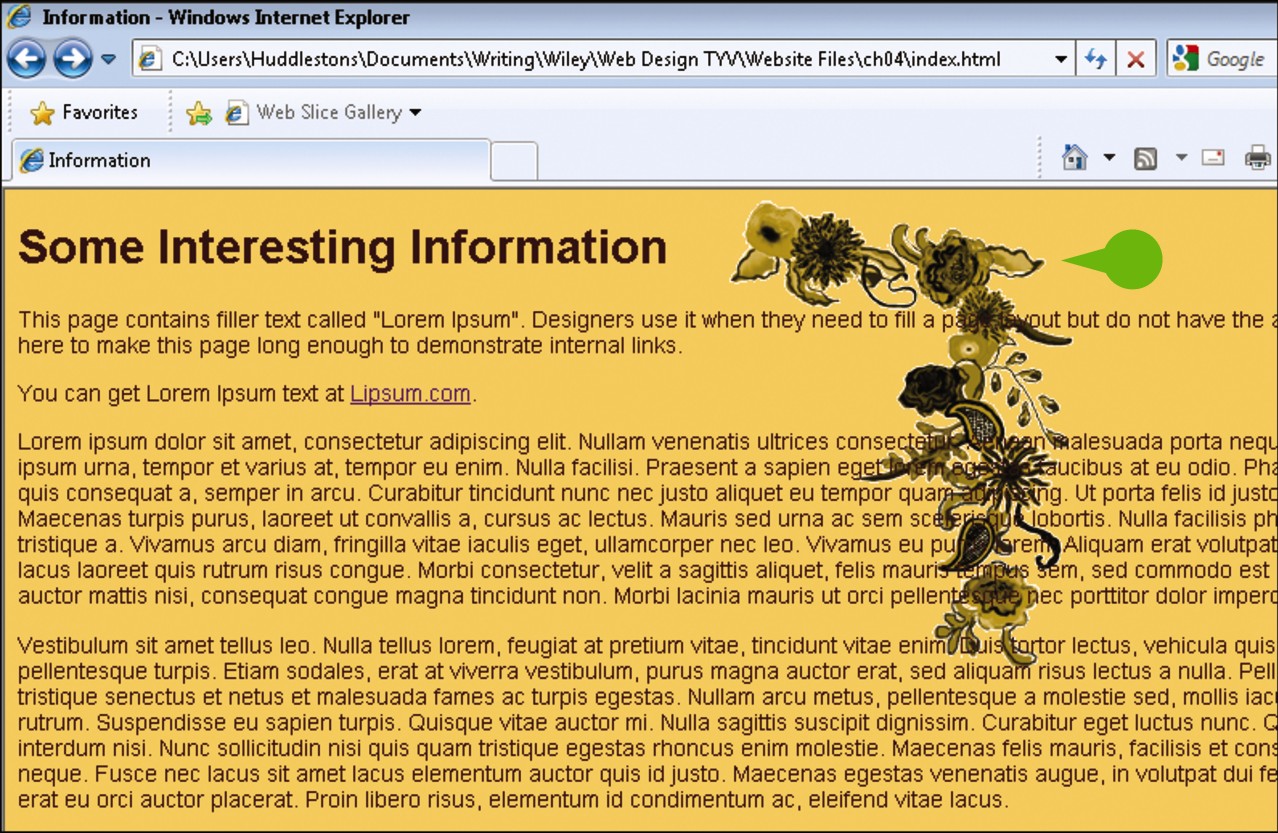
Add a Background Image
You can use an image as the background on your page with the CSS background-image property. A background image can be placed within any element on the page, although putting it in the body so that it comprises the background for the entire page is common. Although you can in theory use any JPEG, GIF, or PNG for your background, you should be careful to ensure that the image does not distract from the page, so you should pick an image that does not contain a lot of contrast and is overall fairly subtle.
Add a Background Image
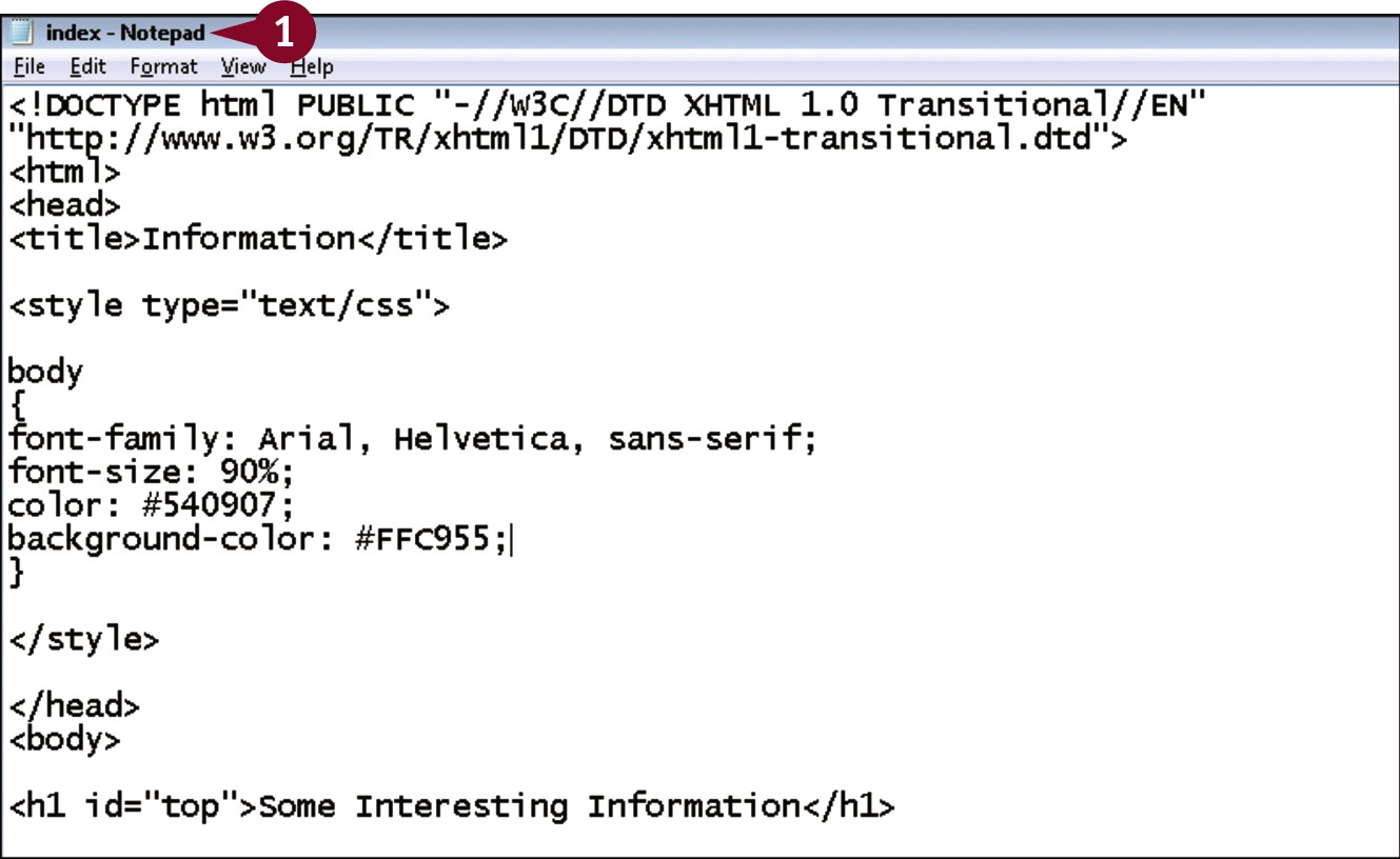
In your editor, open a document that contains an embedded style sheet and an existing body declaration.
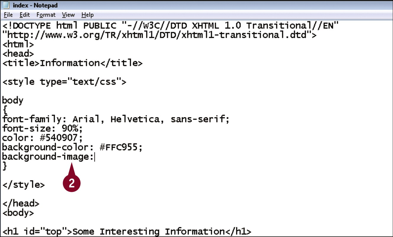
Within the declaration, type background-image:.
Type url(“?”);, replacing ? with a relative or absolute path to the image you wish to use.
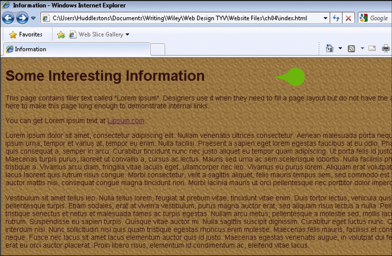
• When viewed in a browser, the image appears, tiling horizontally and vertically on the screen.
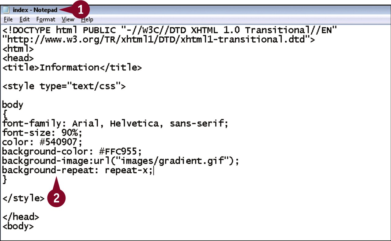
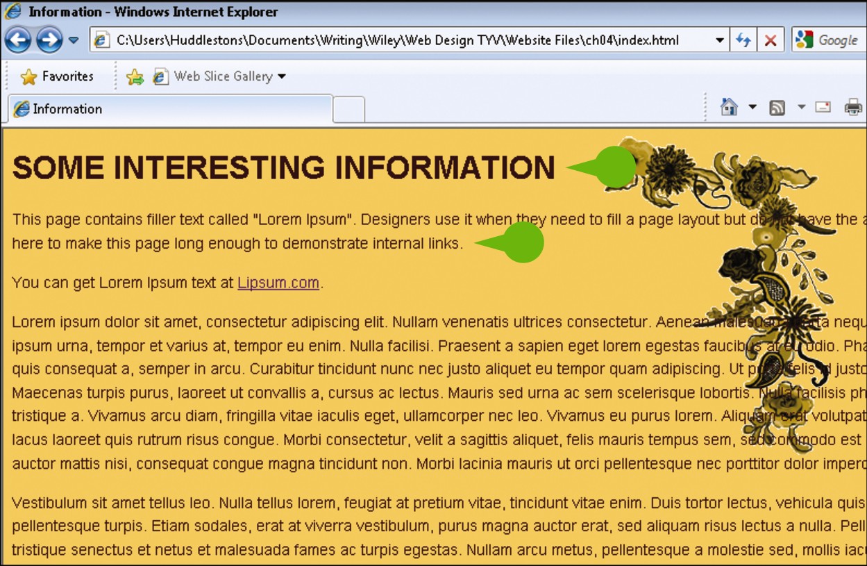
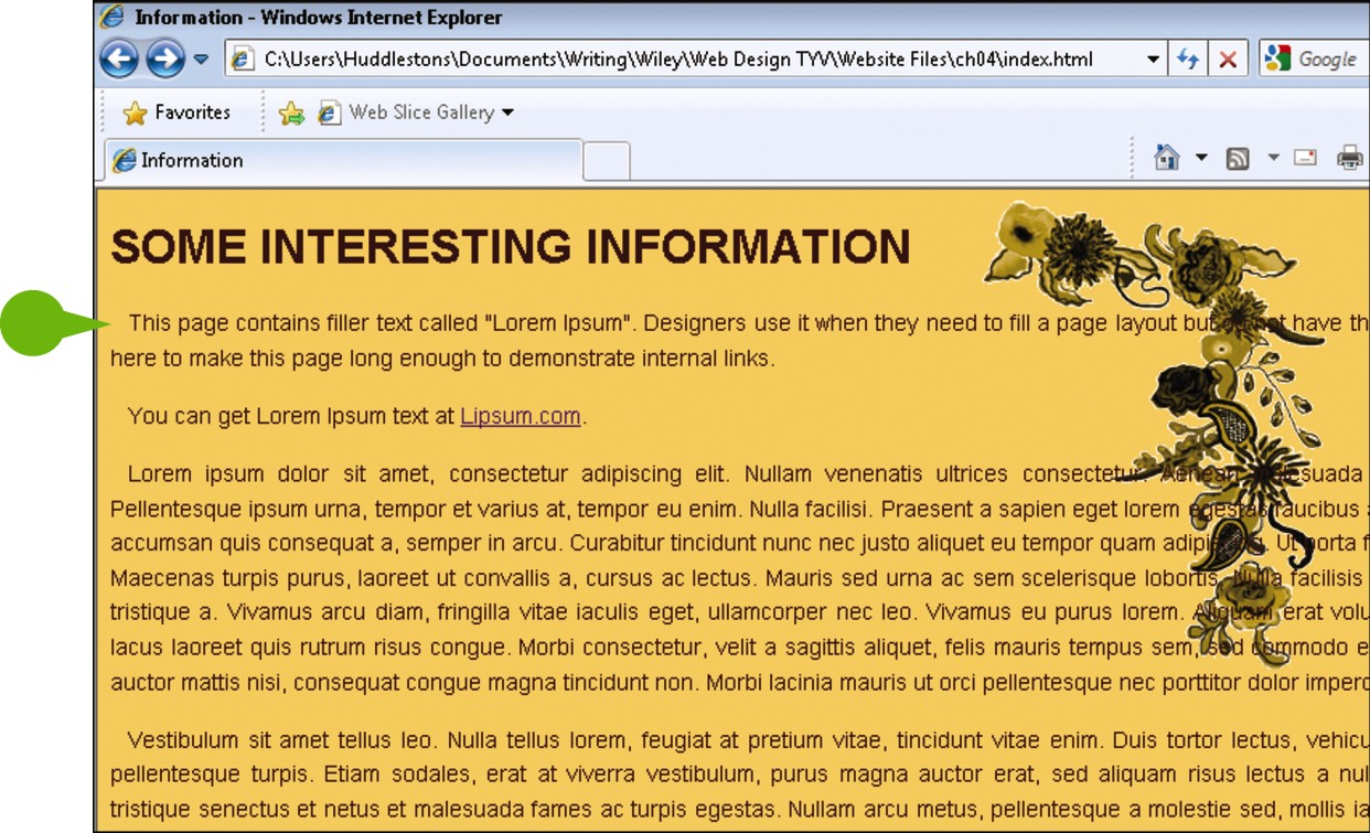
Control Background Image Tiling
By default, background images tile both horizontally and vertically. The background-repeat property allows you to control this behavior. A value of repeat-x causes the image to only tile horizontally; repeat-y creates a vertical tile, and no-repeat prevents tiling altogether. If you can use an image with a transparent background, the background color of the page shows through the transparent areas of the image. You may want to set a background color on the page even if the image is not transparent as a fallback in case the image fails to load.
Control Background Image Tiling
In your editor, open a document that contains an embedded style sheet and an existing body declaration with a background-image rule.
Within the declaration, type background-repeat: ?, replacing ? with either repeat-x, repeat-y, or no-repeat.
• When viewed in a browser, the image either repeats horizontally, vertically, or not at all.
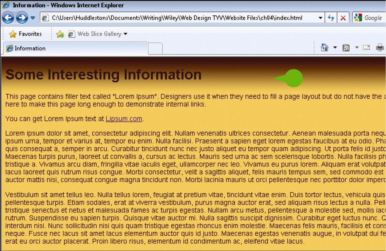
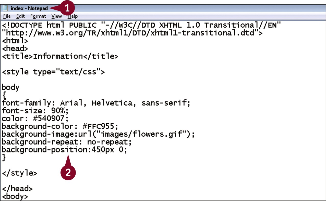
Position Background Images
Background images are initially positioned in the top right corner of the element into which they are placed, but the background-position property allows you to control this. The property takes two values, separated by commas: the first the distance from the top edge, the second the distance from the left. These distances can be set using any valid unit of measurement. If you set the position using pixels, the image remains in place even if the browser is resized, but using percentages as the values allows the image to move as the browser scales.
Position Background Images
In your editor, open a document that contains an embedded style sheet and an existing body declaration and background-image rule.
Within the declaration, type background-position:? ?, replacing the first ? with the distance from the top of the page, and the second with the distance from the left.
Note: Be sure to include the unit of measurement you want to use.
• When viewed in a browser, the image is now positioned at the indicated spot. If the image is set to tile, it tiles from that location.
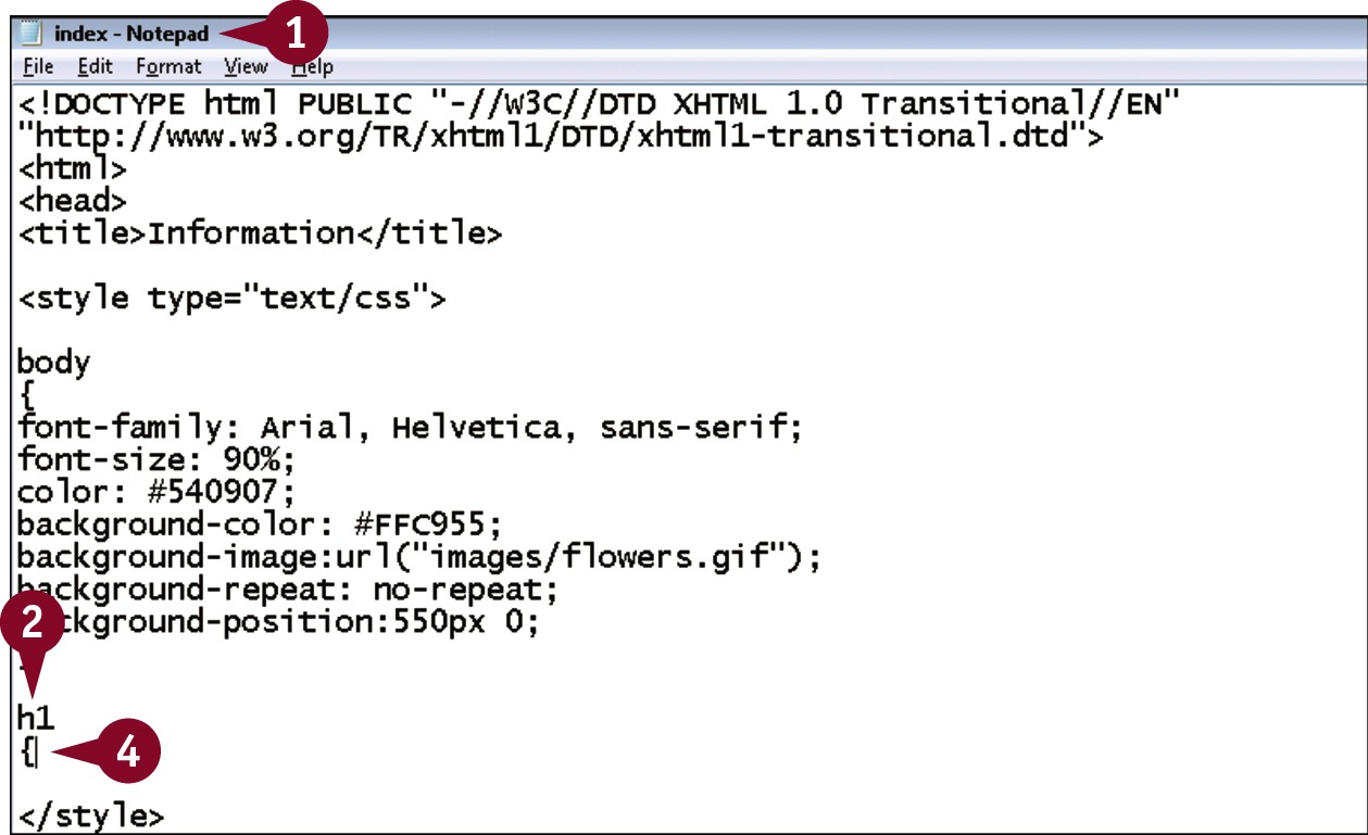
Apply Additional Text Formatting
In addition to setting the font and color, you can also control additional text properties including line height and capitalization. The CSS line-height property is the distance from the bottom or baseline of one line of text to the baseline of the next line. Adjusting the line-height can help improve readability by spacing out the text, but be careful to not add so much that you begin to have the opposite effect. The transform property, which accepts values of uppercase, lowercase, and capitalize, allows you to control the capitalization of text, which is particularly helpful with headings.
Apply Additional Text Formatting
In your editor, open a document that contains an embedded style sheet.
Within the style sheet, type h1.
Press .
Type {.
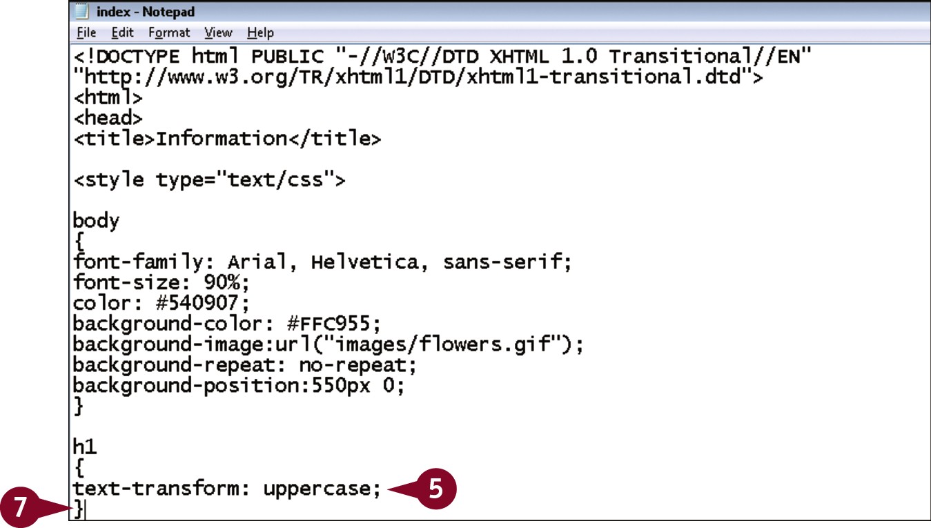
Type text-transform: ?;, replacing ? with uppercase, lowercase, or capitalize.
Press .
Type }.
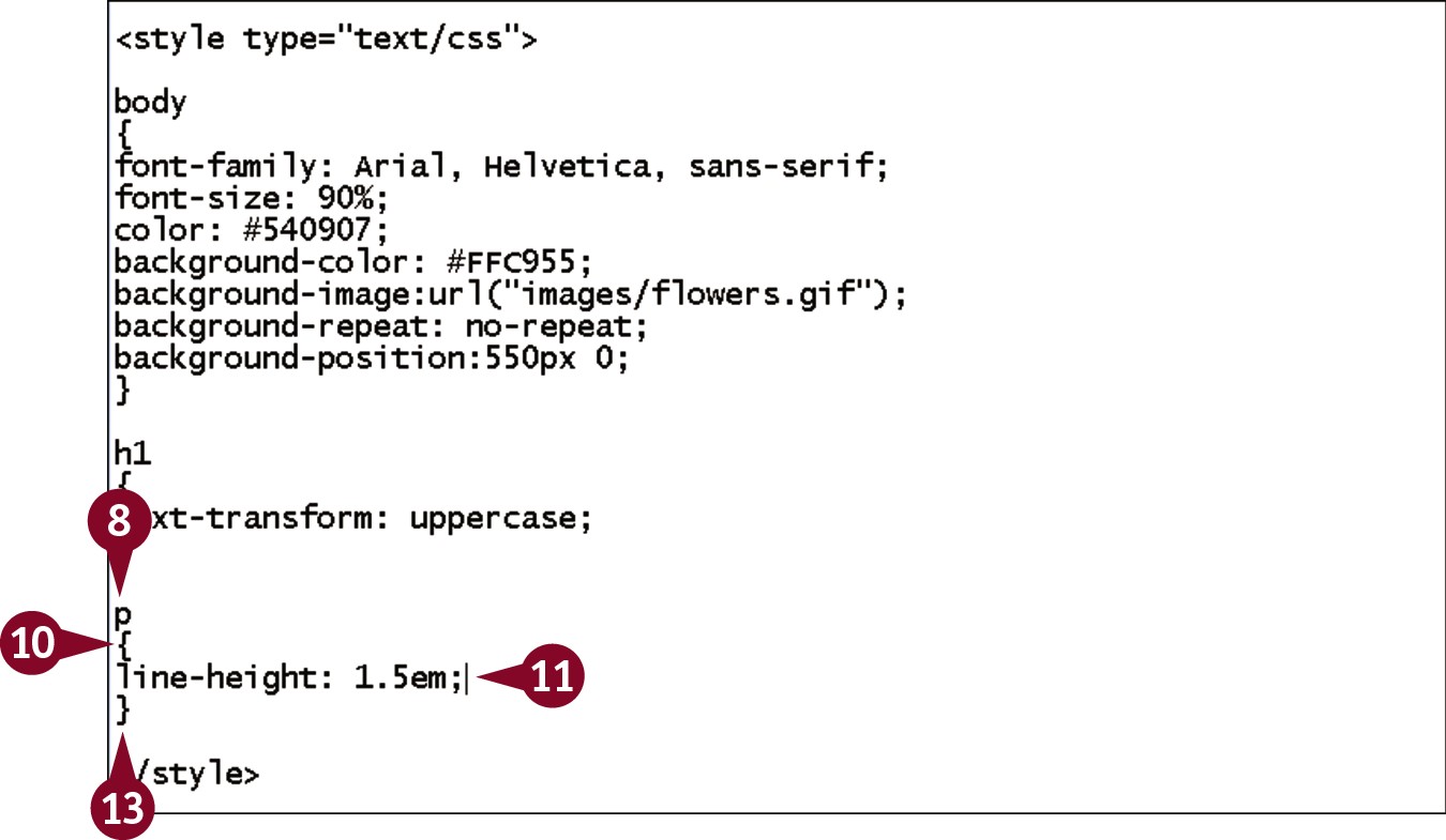
Type p.
Press .
 Type {.
 Type line-height: ?;, replacing ? with the height you want to apply.
 Press .
 Type }.
• When viewed in a browser, the main heading on the page has the text transformation applied, and the paragraphs have the line height.
Indent and Align Text
CSS can be used to control indentation of the first line of text and its alignment. The text-indent property indents the first line of a block of text such as a paragraph. Note that only the first line of text is indented. You can use any valid unit of measurement for this property, although pixels and ems are the most common, and should experiment to determine what value gives you the best look. The text-align property allows for values of center, left, right, and justify.
Indent and Align Text
In your editor, open a document that contains an embedded style sheet.
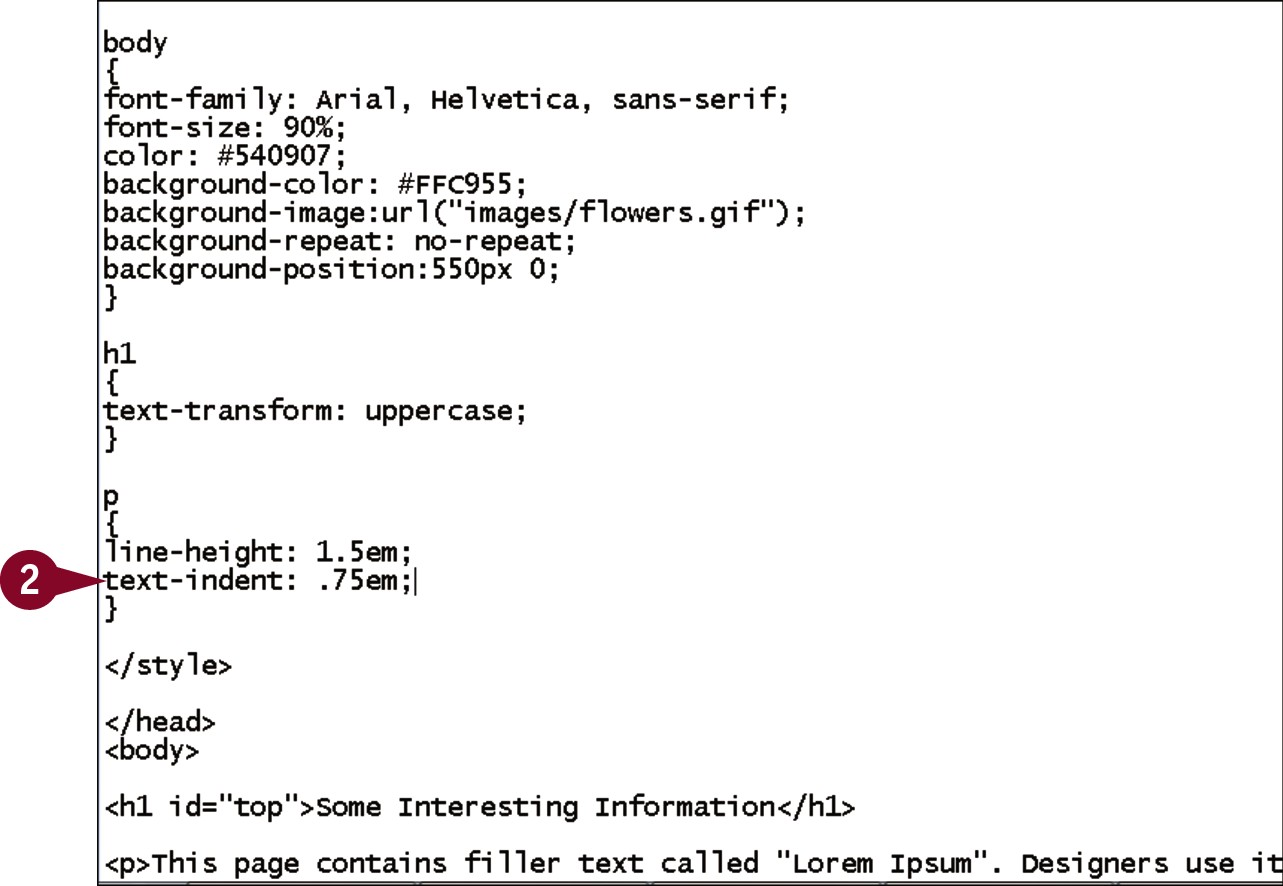
Within an existing p declaration, type text-indent: ?;, replacing ? with the amount of first-line indentation you want.
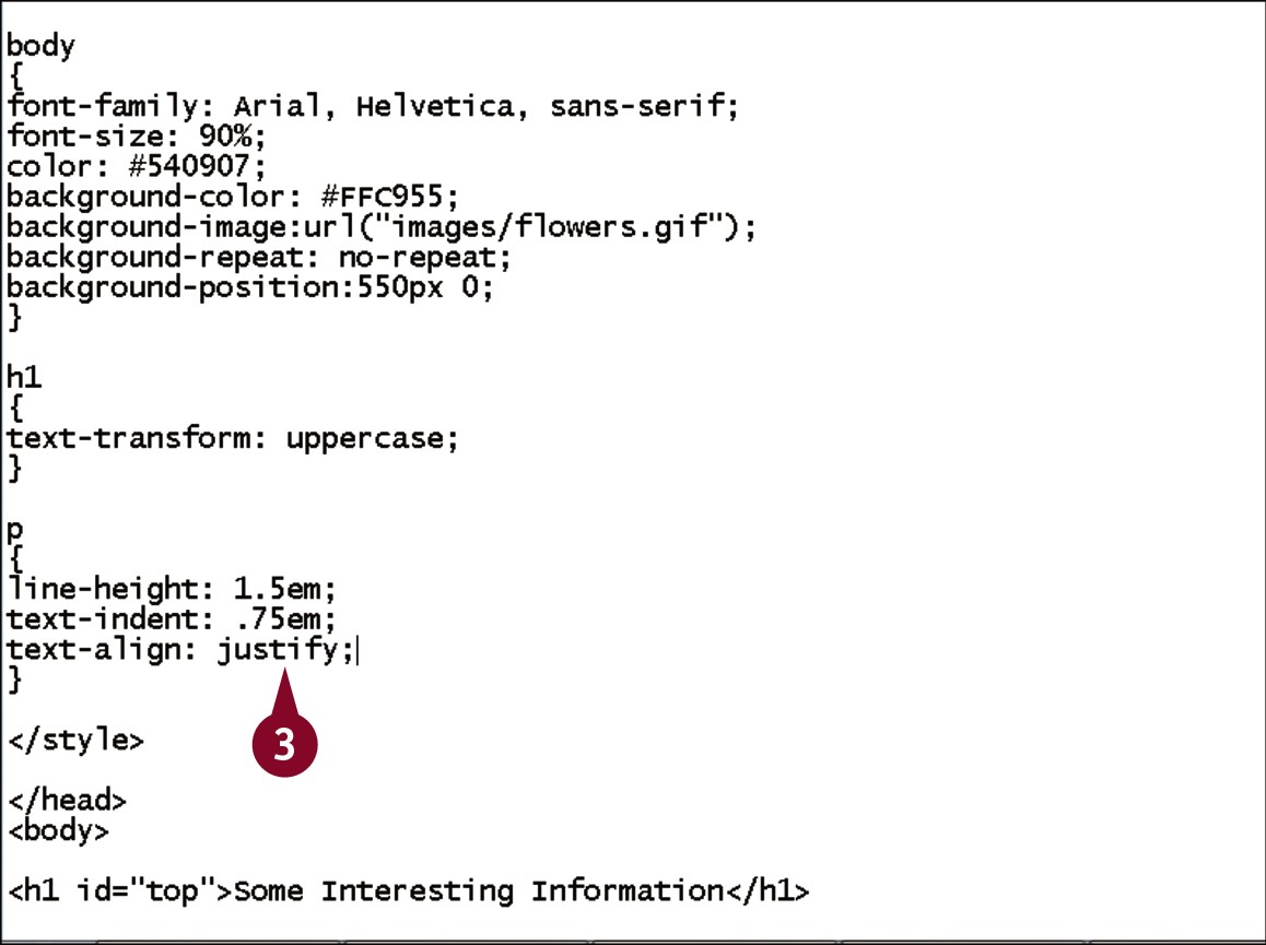
Within an existing p declaration, type text-align: ?;, replacing ? with right, left, center, or justify.
• When viewed in a browser, the first line of each paragraph is indented and aligned according to the values you set.
Apply Spacing with Padding
The space around elements on your page is defined by something known as the box model. The innermost section of the model is the element’s content. The content is surrounded on all four sides by padding, which in turn is surrounded by a border. Outside the border is a margin. The padding property allows you to control the space between the content and the border; in essence, it allows you to move the element within the box. You can easily remember this by thinking of a physical package: You add padding between the fragile contents and the edge of the package.
Apply Spacing with Padding

In your editor, open a document that contains an embedded style sheet.
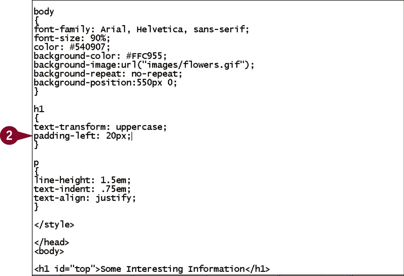
Within an existing h1 declaration, type padding-left: ?;, replacing ? with the amount of padding you want to apply.
Press .
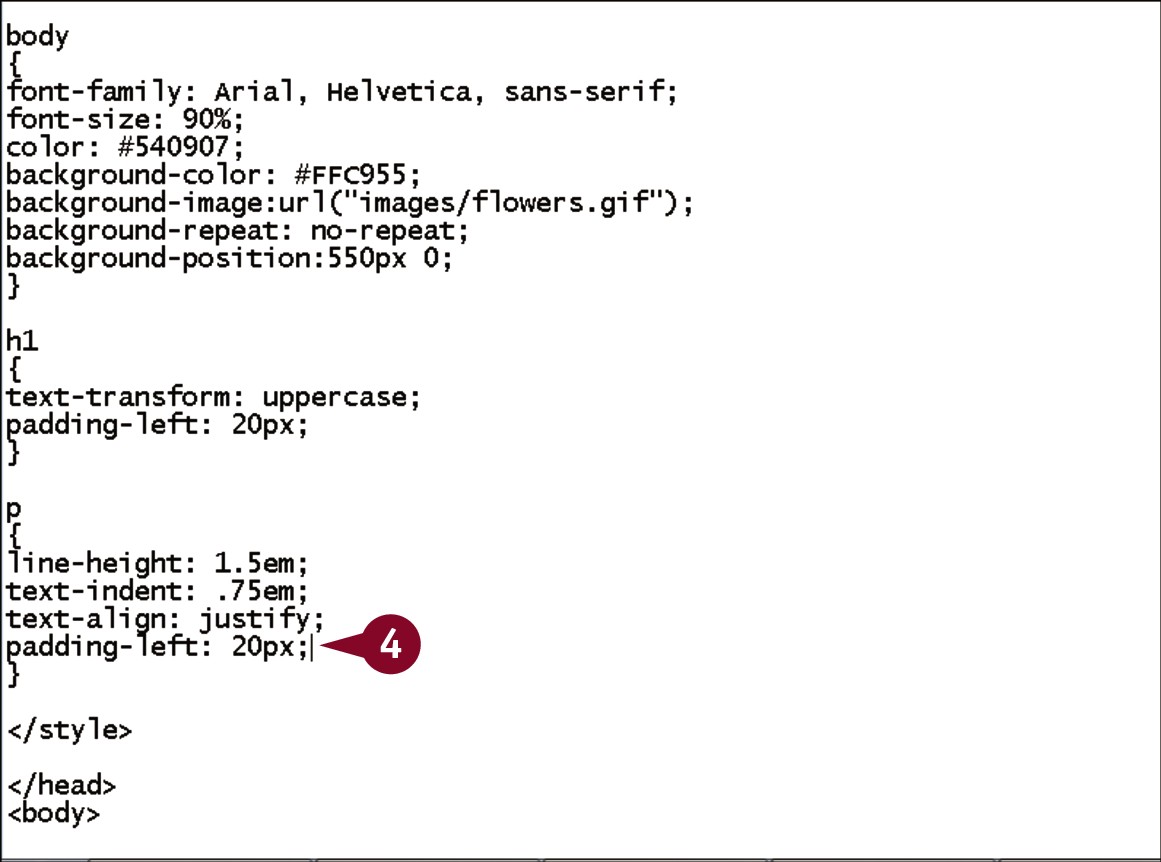
Within an existing p declaration, type padding-left: ?;, replacing ? with the amount of padding you want to apply.
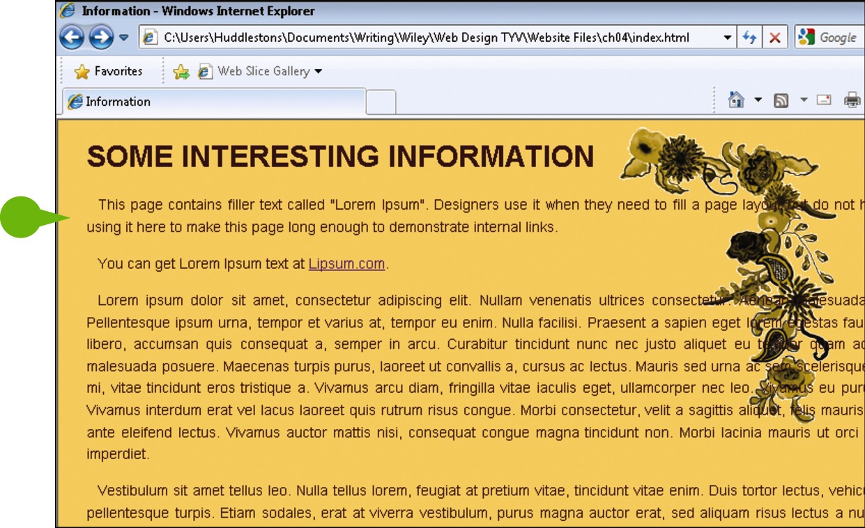
• When viewed in a browser, the headings and paragraphs have the specified padding.
Control Whitespace with Margins
The outermost section of the box model is the margin, which represents the space between elements on the page. CSS contains five properties for setting margins: margin-top, margin-right, margin-bottom, and margin-left let you set each side individually, whereas the margin property is a shortcut for setting all four margins together. This shortcut property can take a single value to set all four margins. You can also provide two values, where the first applies to the top and bottom and the second to the left and right, or four values, where the first sets the top, the second the right, the third the bottom, and the fourth the left.
Control Whitespace with Margins
In your editor, open a document that contains an embedded style sheet and an existing body declaration.
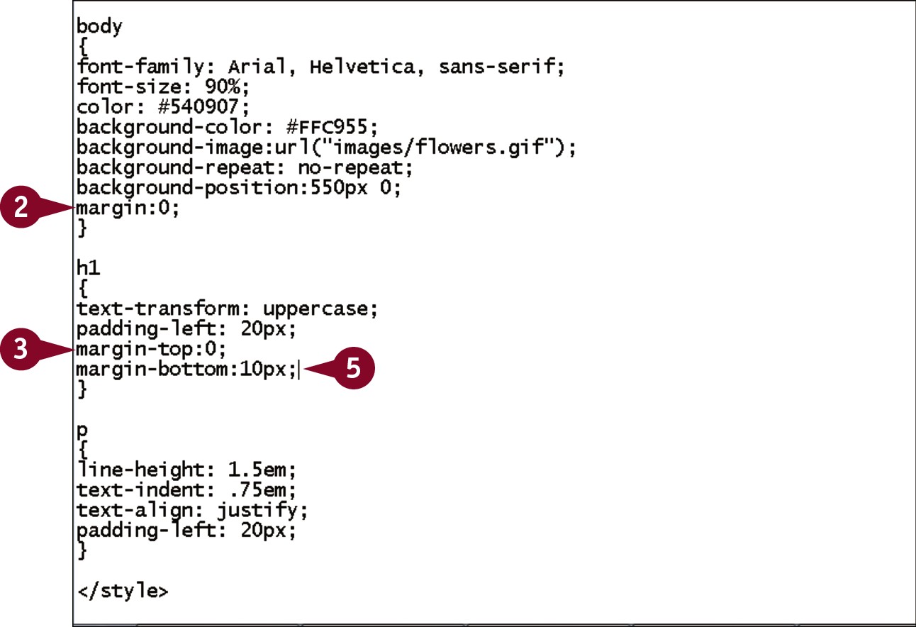
Within the body declaration, type margin:0;.
Within the existing h1 declaration, type margin-top:0;.
Press .
Type margin-bottom:?;, replacing ? with the amount of bottom margin you want.
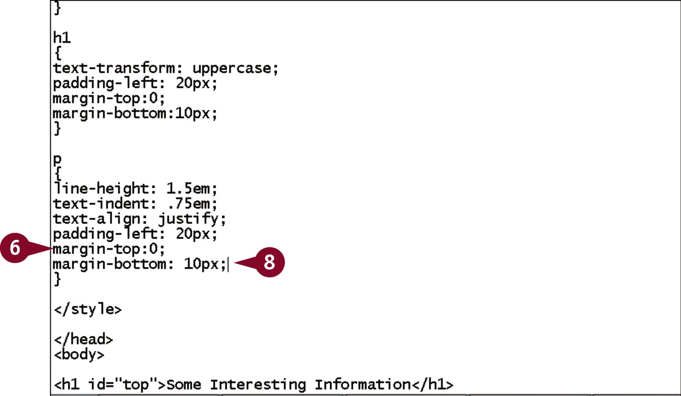
Within the existing p declaration, type margin-top:0;.
Press .
Type margin-bottom: ?;, replacing ? with the desired amount of bottom margin.
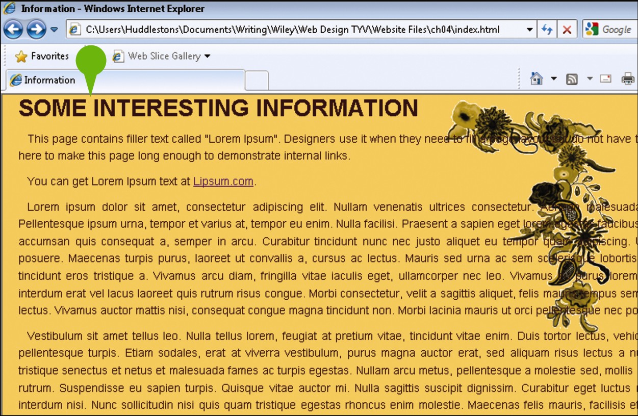
• When viewed in a browser, the page no longer has space around the edges. The space between the headings and the paragraphs has also changed.
Specify Widths
By default, elements are as wide as the element that contains them. Elements directly within the body of the document are as wide as the browser window. You can control this behavior using the CSS width property. The width is calculated as only the width of the element’s content, so the total size of the element is actually its width, plus the left and right padding values, plus the left and right border widths. Keep this in mind when you are attempting to calculate the space needed to place elements next to each other on the page.
Specify Widths
In your editor, open a document that contains an embedded style sheet and an existing body declaration.
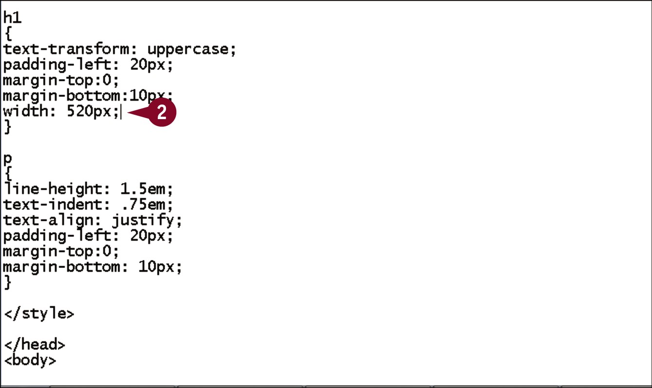
Within the existing h1 declaration, type width: ?;, replacing ? with the desired width of the element.
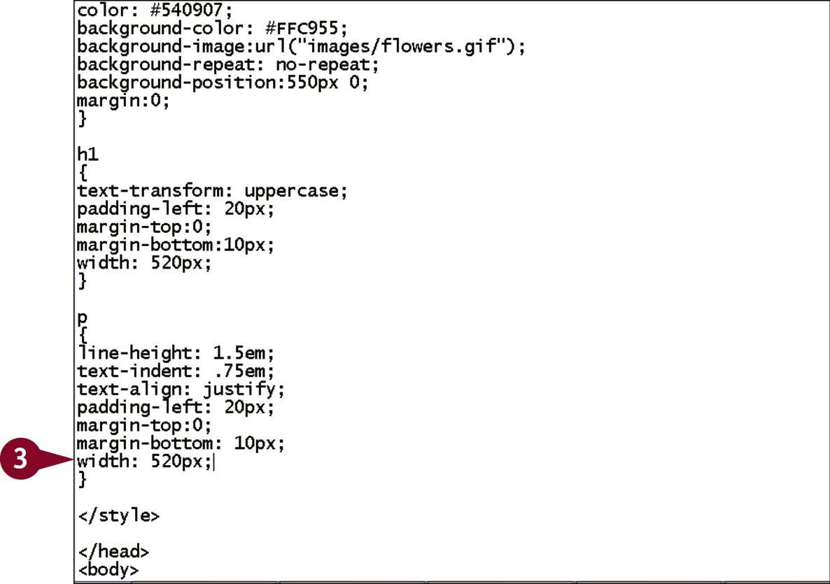
Within the existing p declaration, type width: ?;, replacing ? with the desired width of the element.
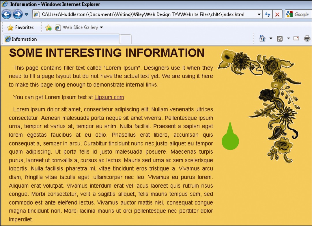
• When viewed in a browser, the elements have the specified widths. This is most apparent on the paragraphs.
Add Borders
You can draw visual lines around elements using the CSS border property. To add a border, you need to set its width, color, and style. These three properties can be set in any order. You can also use border-top, border-bottom, border-left, or border-right to set individual borders. Each of these takes the same three values as noted above: width, color, and style. The width of the border can be set in any unit of measurement, but pixels are used most often. The color can be any valid color name or a hexadecimal value. The style is set using one of ten keywords.
Add Borders
In your editor, open a document that contains an embedded style sheet.
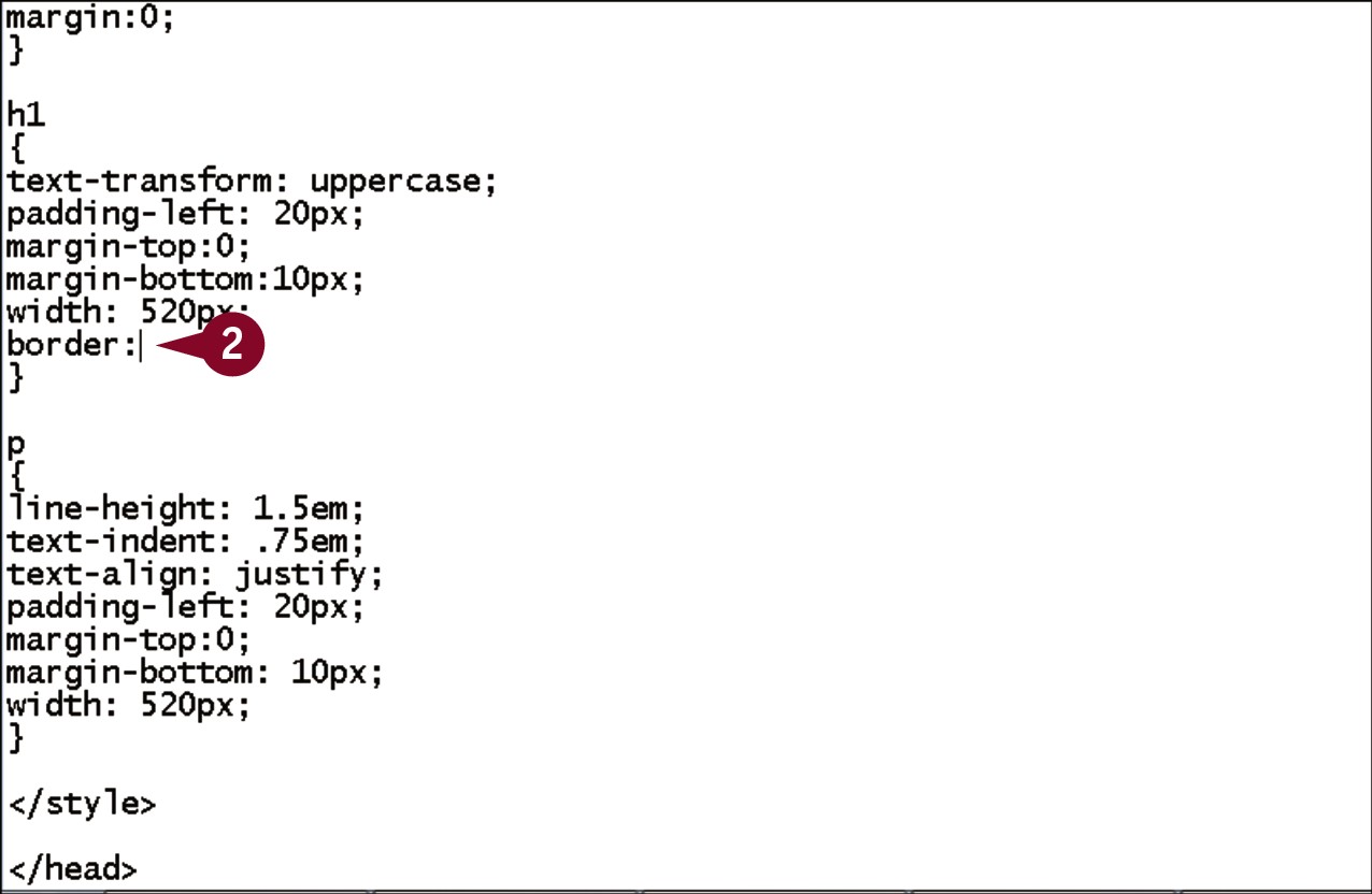
Within the existing h1 declaration, type border:.
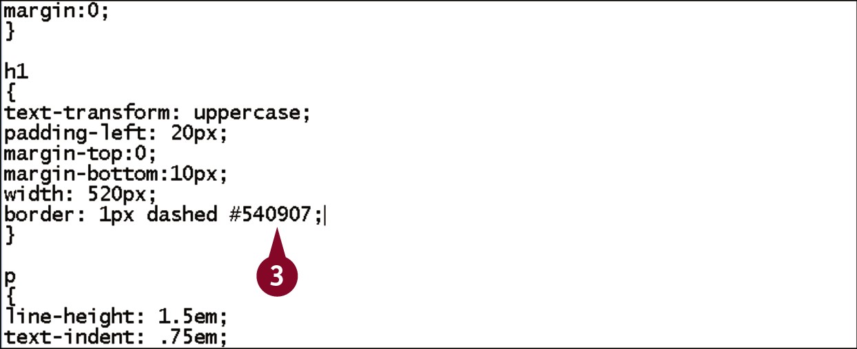
Type ? ? ?;, replacing the first ? with the desired width, the second with the desired color, and the third with a style keyword such as solid or dashed.
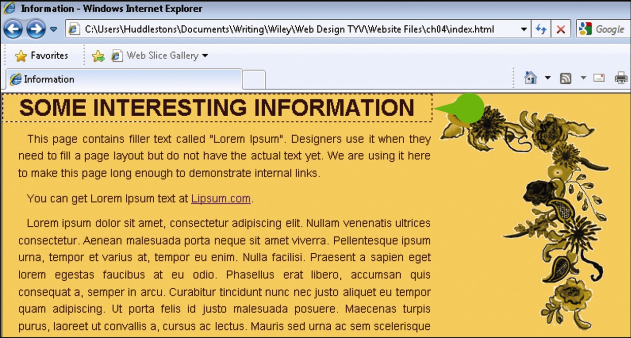
• When viewed in a browser, the heading has the border around it.